Invary
A cool, defense-grade cybersecurity marketing interface built on a pale blue-gray canvas with a single warm coral accent. The system reads as precise and technical — large tight Inter display headlines, light Work Sans body copy, all-caps Roboto Mono UI labels, soft-rounded white cards lit by inner blue-gray glows, and near-black "secure zone" bands that punctuate the long-scroll page. Brand voltage comes from the coral CTA (#f7604a) and from a 3-D product-diagram illustration shown directly in the hero rather than from decorative color.
---
version: alpha
name: Invary-design-analysis
description: "A cool, defense-grade cybersecurity marketing interface built on a pale blue-gray canvas with a single warm coral accent. The system reads as precise and technical — large tight Inter display headlines, light Work Sans body copy, all-caps Roboto Mono UI labels, soft-rounded white cards lit by inner blue-gray glows, and near-black \"secure zone\" bands that punctuate the long-scroll page. Brand voltage comes from the coral CTA (#f7604a) and from a 3-D product-diagram illustration shown directly in the hero rather than from decorative color."
colors:
primary: "#f7604a"
primary-active: "#ff7662"
ink: "#434c62"
ink-strong: "#394045"
body: "#5c6479"
muted: "#7a8288"
on-primary: "#222222"
canvas: "#ffffff"
surface-soft: "#eff4f8"
surface-blue: "#e2e8f9"
surface-blue-strong: "#cad5ec"
glow-blue: "#aab6d2"
surface-dark: "#2f3438"
surface-darkest: "#000000"
hairline: "#dddddd"
hairline-strong: "#c8c8c8"
hairline-soft: "#fafafa"
neutral: "#565656"
typography:
display:
fontFamily: "Inter Variable, Inter, sans-serif"
fontSize: 61.44px
fontWeight: 600
lineHeight: 1.0
letterSpacing: -0.96px
title:
fontFamily: "Inter Variable, Inter, sans-serif"
fontSize: 26.88px
fontWeight: 400
lineHeight: 1.2
letterSpacing: -0.384px
body:
fontFamily: "Work Sans Variable, Work Sans, sans-serif"
fontSize: 19.2px
fontWeight: 300
lineHeight: 1.77
letterSpacing: -0.384px
button:
fontFamily: "Roboto Mono Variable, Roboto Mono, ui-monospace, monospace"
fontSize: 15.36px
fontWeight: 500
lineHeight: 1.77
letterSpacing: normal
rounded:
xs: 3px
sm: 5px
md: 10px
lg: 14px
xl: 17px
xxl: 19px
xxxl: 29px
spacing:
xxs: 5px
xs: 7px
sm: 10px
md: 12px
lg: 19px
xl: 29px
xxl: 34px
xxxl: 38px
components:
top-nav:
backgroundColor: "{colors.surface-soft}"
textColor: "{colors.ink-strong}"
typography: "{typography.button}"
nav-link:
backgroundColor: transparent
textColor: "{colors.ink-strong}"
typography: "{typography.button}"
logo-badge:
backgroundColor: "{colors.primary}"
textColor: "{colors.canvas}"
rounded: "{rounded.xxxl}"
button-primary:
backgroundColor: transparent
textColor: "{colors.on-primary}"
typography: "{typography.button}"
padding: 9.6px 19.2px 9.6px 0px
button-cta:
backgroundColor: "{colors.primary}"
textColor: "{colors.canvas}"
typography: "{typography.button}"
rounded: "{rounded.sm}"
padding: 10px 19px
button-cta-active:
backgroundColor: "{colors.primary-active}"
textColor: "{colors.canvas}"
typography: "{typography.button}"
rounded: "{rounded.sm}"
button-outline:
backgroundColor: transparent
textColor: "{colors.primary}"
borderColor: "{colors.primary}"
typography: "{typography.button}"
rounded: "{rounded.sm}"
padding: 10px 19px
learn-more-link:
backgroundColor: transparent
textColor: "{colors.primary}"
typography: "{typography.button}"
hero:
backgroundColor: "{colors.surface-soft}"
textColor: "{colors.ink}"
typography: "{typography.display}"
padding: 38px
diagram-card:
backgroundColor: "{colors.canvas}"
textColor: "{colors.muted}"
rounded: "{rounded.xl}"
feature-card:
backgroundColor: "{colors.canvas}"
textColor: "{colors.ink}"
borderColor: "{colors.surface-blue-strong}"
typography: "{typography.title}"
rounded: "{rounded.xl}"
padding: 29px
dark-band:
backgroundColor: "{colors.surface-dark}"
textColor: "{colors.canvas}"
typography: "{typography.display}"
padding: 38px
dark-feature-card:
backgroundColor: "{colors.surface-darkest}"
textColor: "{colors.canvas}"
typography: "{typography.body}"
rounded: "{rounded.lg}"
padding: 29px
use-case-card:
backgroundColor: "{colors.canvas}"
textColor: "{colors.ink}"
borderColor: "{colors.surface-blue}"
typography: "{typography.title}"
rounded: "{rounded.xl}"
padding: 29px
card:
backgroundColor: "{colors.canvas}"
textColor: "{colors.ink}"
rounded: "{rounded.xl}"
footer:
backgroundColor: "{colors.surface-dark}"
textColor: "{colors.canvas}"
typography: "{typography.button}"
padding: 38px
---
## Overview
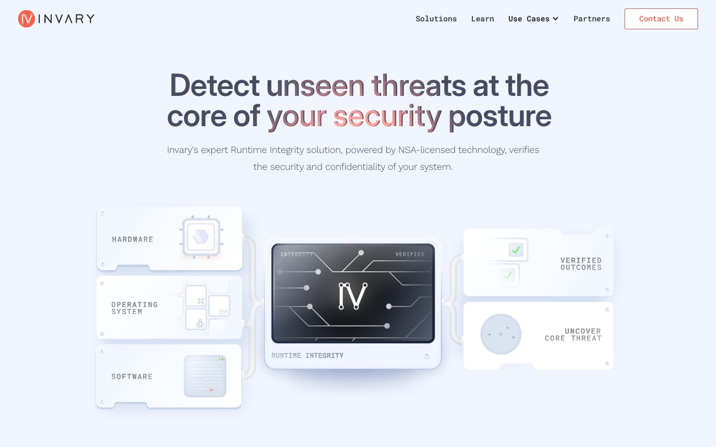
Invary's landing page is a cool, defense-grade cybersecurity surface — a pale blue-gray canvas (`{colors.surface-soft}` — #eff4f8) carrying tight Inter display headlines, light Work Sans body copy, and all-caps Roboto Mono UI labels. The system reads as precise and technical: a single warm coral accent (`{colors.primary}` — #f7604a) does all the action-layer work against an otherwise muted blue-gray-and-white palette, and near-black "secure zone" bands (`{colors.surface-dark}` — #2f3438) punctuate the long scroll.
The type voice is a three-family split. **Inter Variable** at weight 600 with tight negative tracking (-0.96px) carries the big display headlines ("Detect unseen threats at the core of your security posture"). **Work Sans Variable** at weight 300 — unusually light — handles running body copy. **Roboto Mono Variable** at weight 500 handles all the UI chrome: nav links, buttons, "LEARN MORE" links, and the small technical labels (HARDWARE, OPERATING SYSTEM, RUNTIME INTEGRITY) inside the product diagram. The mono labels are the system's signature texture — they make the page feel like instrumentation.
Brand voltage comes from **the 3-D product-diagram illustration** shown directly in the hero — a chain of soft white panels (Hardware / OS / Software → Runtime Integrity device → Verified Outcomes) rather than from accent color. Coral appears sparingly: the logo badge, the primary CTA, the outline of the "Contact Us" button, and small accent glows on cards.
Two near-black bands ("Runtime Integrity Continuously Verifies" and the closing "Ensure Your Runtime Integrity" footer) invert the palette to dark surfaces — these are the only dark zones and they break the long white-and-pale-blue scroll into chapters.
**Key Characteristics:**
- Pale blue-gray canvas (`{colors.surface-soft}` — #eff4f8) as the hero floor, with pure white (`{colors.canvas}`) for content cards.
- Single warm coral accent (`{colors.primary}` — #f7604a) reserved for the logo badge, CTA buttons, outline buttons, and small card glows. Press/lit state lifts to `{colors.primary-active}` (#ff7662).
- Three-family type system: Inter (display), Work Sans (body, light weight 300), Roboto Mono (all UI labels and buttons).
- Soft-rounded white cards (`{rounded.xl}` — 17px) lit by inner blue-gray glow shadows (`{colors.glow-blue}` — #aab6d2) rather than drop shadows.
- Near-black bands (`{colors.surface-dark}` — #2f3438, `{colors.surface-darkest}` — #000000) chapter the page and host coral-glow cards.
- All-caps mono micro-labels inside the product diagram give the page an instrument-panel feel.
- Tight display tracking (-0.96px) and very light body weight (300) read as engineered and calm, not loud.
## Colors
### Brand & Accent
- **Primary** (`{colors.primary}` — #f7604a): The one warm accent. Logo badge, "Connect with an Expert" CTA fill, "Contact Us" outline + label, "LEARN MORE" links, and the coral glow accents on cards.
- **Primary Active** (`{colors.primary-active}` — #ff7662): A lighter coral seen on the lit/glowing state of the CTA button and card accent dots.
### Surface
- **Canvas** (`{colors.canvas}` — #ffffff): Content card surfaces and the lower body sections.
- **Surface Soft** (`{colors.surface-soft}` — #eff4f8): The pale blue-gray hero/nav band — the page's default cool floor.
- **Surface Blue** (`{colors.surface-blue}` — #e2e8f9): Soft blue card borders / tints on use-case cards.
- **Surface Blue Strong** (`{colors.surface-blue-strong}` — #cad5ec): Slightly stronger blue border/tint on feature cards.
- **Glow Blue** (`{colors.glow-blue}` — #aab6d2): The inner-glow shadow color that lights the white diagram and feature cards.
- **Surface Dark** (`{colors.surface-dark}` — #2f3438): The dark "secure zone" band and footer background — the only dark surfaces.
- **Surface Darkest** (`{colors.surface-darkest}` — #000000): The dark-feature cards nested inside the dark band.
- **Hairline** (`{colors.hairline}` — #dddddd): 1px dividers and subtle borders on light surfaces.
- **Hairline Strong** (`{colors.hairline-strong}` — #c8c8c8): A slightly darker divider tone.
- **Hairline Soft** (`{colors.hairline-soft}` — #fafafa): Barely-there fills between same-canvas sections.
### Text
- **Ink** (`{colors.ink}` — #434c62): Display headlines and primary text — a desaturated slate-blue, not pure black.
- **Ink Strong** (`{colors.ink-strong}` — #394045): Nav links and the darkest body text.
- **Body** (`{colors.body}` — #5c6479): Secondary running text.
- **Muted** (`{colors.muted}` — #7a8288): Diagram micro-labels and tertiary captions.
- **Neutral** (`{colors.neutral}` — #565656): Mid-gray supporting text.
- **On Primary** (`{colors.on-primary}` — #222222): The measured button label color (near-black) on text/nav buttons.
## Typography
### Font Family
The system runs three open-source variable families, each with a strict role:
- **Inter Variable** (weight 600, tight tracking) — display headlines (h1/h2) and card titles (h3).
- **Work Sans Variable** (weight 300, light) — running body copy. The light weight is a deliberate voice choice and reads as calm and technical.
- **Roboto Mono Variable** (weight 500) — all UI chrome: nav links, buttons, "LEARN MORE" links, and the all-caps micro-labels inside the product diagram.
All three are freely available (Google Fonts / open licenses), so no substitution is required to ship the system faithfully. If Inter Variable is unavailable, system `sans-serif` at weight 600 with ~-0.04em tracking approximates the display voice; for Work Sans, any humanist sans at weight 300 works; for Roboto Mono, `ui-monospace` is the fallback.
### Hierarchy
| Token | Size | Weight | Line Height | Letter Spacing | Use |
|---|---|---|---|---|---|
| `{typography.display}` | 61.44px | 600 | 1.0 | -0.96px | Hero h1/h2 ("Detect unseen threats…"), dark-band heads, footer head — Inter |
| `{typography.title}` | 26.88px | 400 | 1.2 | -0.384px | Feature-card titles, use-case titles, sub-headings (h3) — Inter |
| `{typography.body}` | 19.2px | 300 | 1.77 | -0.384px | Running body copy, sub-headlines — Work Sans (light) |
| `{typography.button}` | 15.36px | 500 | 1.77 | normal | Nav links, buttons, "LEARN MORE" links, diagram labels — Roboto Mono |
### Principles
The display/body/UI boundary is strict: Inter for headlines, Work Sans for prose, Roboto Mono for anything interactive or instrument-like. The mono labels (set uppercase in the product diagram and CTAs) are part of the brand texture — keep buttons and small technical labels in Roboto Mono and never substitute the body sans there.
Display headlines stay at weight 600 with -0.96px tracking; the h3/title role drops to weight 400 for a softer sub-head voice. Body copy stays light (weight 300) — bolding it would break the calm engineered tone.
### Note on Font Substitutes
No licensed/custom typefaces are used — Inter, Work Sans, and Roboto Mono are all open-source and shippable as-is. Fallback stacks are documented in the `fontFamily` values above.
## Layout
### Spacing System
- **Base rhythm:** Irregular but clusters around multiples of ~5–7px. Most frequent measured values are 19px and 10px.
- **Tokens:** `{spacing.xxs}` 5px · `{spacing.xs}` 7px · `{spacing.sm}` 10px · `{spacing.md}` 12px · `{spacing.lg}` 19px · `{spacing.xl}` 29px · `{spacing.xxl}` 34px · `{spacing.xxxl}` 38px.
- **Card internal padding:** ~`{spacing.xl}` (29px) on feature, use-case, and dark-feature cards (derived from observed card geometry).
- **Inline gaps:** `{spacing.sm}` (10px) and `{spacing.lg}` (19px) are the dominant gap units between grouped elements.
### Grid & Container
- **Hero:** centered single-column headline + sub-head, with the product-diagram illustration spanning full width below.
- **Feature row** ("Your security is built on an assumption"): 3-up white cards at desktop.
- **Dark band:** 2-up dark-feature cards centered inside the near-black band.
- **Use Cases grid:** 3 columns × 2 rows of use-case cards at desktop.
- **Footer:** centered logo + headline + CTA, with a horizontal link row beneath.
### Whitespace Philosophy
The page breathes through large display type and generous band padding rather than dense grids. Each band carries one headline and one cluster of cards. The pale-blue hero, white content bands, and near-black "secure zone" bands alternate to chapter the scroll.
## Elevation & Depth
| Level | Treatment | Use |
|---|---|---|
| Flat | No shadow | Body bands, nav, dark bands |
| Inner glow (blue) | `rgb(170, 182, 210) 0px 0px 10px 0px inset` (`{colors.glow-blue}`) | White diagram panels and feature cards — a soft inset rim-light |
| Inner glow (soft blue) | `rgba(170, 182, 210, 0.3) 0px 0px 10px 0px inset` | Lower-intensity card glow |
| Soft halo | `rgba(129, 140, 170, 0.75) 0px 0px 3.5px 0px` (and inset variant) | Small accent dots / lit elements |
| Dark inner glow | `rgb(14, 20, 26) 0px 0px 10px 0px inset` | Dark-feature cards inside the near-black band |
The signature elevation move is the **inner blue-gray glow** rather than a drop shadow — white cards appear lit from within, which suits the high-assurance security tone. The measured generic `card` component carries `shadow: none`; glows are applied selectively to diagram and feature panels.
### Decorative Depth
- The hero product diagram is a 3-D illustration of soft-extruded white panels with inset glows — it is illustrative content, not a system token.
- Coral glow accents (`{colors.primary}` / `{colors.primary-active}`) appear as small lit dots on the corners of feature cards and on the dark-band cards.
## Shapes
### Border Radius Scale
| Token | Value | Use |
|---|---|---|
| `{rounded.xs}` | 3px | Tiny inline elements |
| `{rounded.sm}` | 5px | CTA / outline buttons |
| `{rounded.md}` | 10px | Small panels, nested chips |
| `{rounded.lg}` | 14px | Dark-feature cards |
| `{rounded.xl}` | 17px | Standard content cards (feature, use-case, diagram panels — measured 17.28px) |
| `{rounded.xxl}` | 19px | Larger card containers |
| `{rounded.xxxl}` | 29px | Largest measured radius; used for the circular logo badge (derived — approximated to a full circle at small size) |
### Photography / Illustration Geometry
The hero diagram panels use the `{rounded.xl}` (~17px) corner radius consistently. The logo mark sits in a coral circle (derived from the largest measured radius). No photographic imagery is used on the landing page — illustration and UI chrome carry the visuals.
## Components
### Navigation
**`top-nav`** — Top bar on the pale `{colors.surface-soft}` hero band. Carries the `{component.logo-badge}` + "INVARY" wordmark at left, mono nav links center-right (`{component.nav-link}` — Solutions / Learn / Use Cases / Partners), and a `{component.button-outline}` "Contact Us" at far right. Links in `{typography.button}` (Roboto Mono 15.36px / 500).
**`logo-badge`** — The circular coral mark ("IV") at top-left. Background `{colors.primary}`, glyph in `{colors.canvas}`, rounded to a full circle (`{rounded.xxxl}` — derived).
**`nav-link`** — Inline mono nav item. Transparent background, `{colors.ink-strong}` text, `{typography.button}`.
### Buttons
**`button-primary`** — The measured text/nav button: transparent background, `{colors.on-primary}` (#222222) label, `{typography.button}`, square (radius 0px) with asymmetric padding (9.6px 19.2px 9.6px 0px). Used for inline link-style actions.
**`button-cta`** — The filled coral primary call-to-action ("Connect with an Expert"). Background `{colors.primary}`, label `{colors.canvas}`, `{typography.button}`, rounded `{rounded.sm}` (5px), padding ~10px × 19px (derived). Carries a subtle coral inner glow when lit.
**`button-cta-active`** — Lit/pressed state of the CTA, shifting the fill to `{colors.primary-active}` (#ff7662).
**`button-outline`** — The "Contact Us" header button. Transparent background, coral border + label (`{colors.primary}`), `{typography.button}`, rounded `{rounded.sm}`.
**`learn-more-link`** — The small all-caps "LEARN MORE" link at the bottom of use-case cards. Transparent background, `{colors.primary}` text, `{typography.button}`.
### Cards & Containers
**`hero`** — The pale blue-gray hero band (`{colors.surface-soft}`). Centered `{typography.display}` headline with a coral-tinted mid-phrase, a light `{typography.body}` sub-head, and the full-width product-diagram illustration below.
**`diagram-card`** — The soft white panels in the hero illustration (HARDWARE / OPERATING SYSTEM / SOFTWARE / VERIFIED OUTCOMES / UNCOVER CORE THREAT). Background `{colors.canvas}`, mono micro-labels in `{colors.muted}`, rounded `{rounded.xl}`, lit by the blue inner glow (`{colors.glow-blue}`).
**`feature-card`** — The 3-up white cards ("State-based detection surfaces problems now", etc.). Background `{colors.canvas}`, title in `{typography.title}` / `{colors.ink}`, soft blue border (`{colors.surface-blue-strong}`), rounded `{rounded.xl}`, padding ~`{spacing.xl}` (29px). Each carries a small coral glow accent in a corner.
**`use-case-card`** — The 6-up grid cards (HPC + AI, Cloud Infrastructure, DoD and IC, Confidential Computing, Zero Trust, Kernel Security). Background `{colors.canvas}`, coral line icon top-left, title in `{typography.title}`, body copy in `{typography.body}`, blue border (`{colors.surface-blue}`), rounded `{rounded.xl}`, padding ~`{spacing.xl}`, with a `{component.learn-more-link}` at the bottom.
**`card`** — The generic measured card primitive: white background, rounded `{rounded.xl}` (17.28px), `shadow: none`. The base shape that feature/use-case cards specialize.
### Dark Bands
**`dark-band`** — The near-black "Runtime Integrity Continuously Verifies" band. Background `{colors.surface-dark}` (#2f3438), heading + sub-head in `{colors.canvas}` over `{typography.display}` / `{typography.body}`. Hosts 2-up dark-feature cards.
**`dark-feature-card`** — Cards inside the dark band ("Analyze in-memory…", "Continually measure…"). Background `{colors.surface-darkest}` (#000000), text in `{colors.canvas}` over `{typography.body}`, coral line icon, rounded `{rounded.lg}`, with a coral inner-glow accent and a dark inner glow.
### Footer
**`footer`** — The closing near-black band ("Ensure Your Runtime Integrity"). Background `{colors.surface-dark}`, INVARY wordmark + logo badge centered at top, `{typography.display}` headline, a `{component.button-cta}`, and a mono link row (Solutions / Learn / About / Contact) plus copyright in `{typography.button}` / `{colors.canvas}`. A thin coral gradient strip closes the very bottom.
## Do's and Don'ts
### Do
- Reserve `{colors.primary}` (#f7604a) for the logo badge, CTAs, outline buttons, and small card glows. The system is otherwise blue-gray-and-white.
- Keep all UI chrome — buttons, nav, "LEARN MORE", diagram labels — in Roboto Mono (`{typography.button}`). The mono labels are the brand texture.
- Keep body copy in Work Sans at weight 300. The light weight is intentional.
- Use inner blue-gray glow (`{colors.glow-blue}`) to light white cards instead of drop shadows.
- Use the near-black bands (`{colors.surface-dark}`) to chapter long pages; nest pure-black cards (`{colors.surface-darkest}`) inside them.
- Set display headlines in Inter 600 with tight -0.96px tracking.
- Keep content cards at `{rounded.xl}` (~17px); buttons at `{rounded.sm}` (5px).
### Don't
- Don't bolden body copy past weight 300 or set prose in Inter — it breaks the calm engineered voice.
- Don't put body sans into buttons or technical labels — those stay mono.
- Don't introduce a second accent hue; coral is the only warm color.
- Don't drop heavy shadows on cards — the system lights surfaces from within.
- Don't place dark surfaces outside the designated "secure zone" band and footer.
- Don't document hover states — only default and active/lit (`{component.button-cta-active}`) are in scope.
## Responsive Behavior
### Breakpoints
| Name | Width | Key Changes |
|---|---|---|
| Mobile | < 768px | Nav collapses; hero diagram stacks vertically; feature/use-case grids go 1-up; display headline scales down |
| Tablet | 768–1024px | Feature cards 2-up; use-case grid 2-up; nav tightens |
| Desktop | 1024–1440px | Full nav; feature cards 3-up; use-case grid 3×2; diagram shown full width |
| Wide | > 1440px | Same as desktop with more outer breathing room |
> Note: exact breakpoint values were not measured — the table reflects standard SaaS-grid behavior inferred from the captured desktop layout (see Known Gaps).
### Touch Targets
- `{component.button-cta}` and `{component.button-outline}` use ~10px × 19px padding around a 15.36px mono label — adequate tap area at desktop; mobile sizing not measured.
- Nav links and "LEARN MORE" links rely on the mono label box; spacing should be padded to a 44px minimum on touch.
### Collapsing Strategy
- The hero product diagram (Hardware/OS/Software → device → outcomes chain) should stack vertically on narrow screens rather than scale to illegibility.
- Card grids reduce columns (3 → 2 → 1) rather than shrinking cards.
- Dark bands keep full-bleed backgrounds at every width; their cards collapse to 1-up on mobile.
## Iteration Guide
1. Focus on ONE component at a time and reference its YAML key directly (`{component.feature-card}`, `{component.dark-feature-card}`).
2. Variants (`-active`, etc.) live as separate entries in `components:`.
3. Use `{token.refs}` everywhere — never inline a hex in a component.
4. Document default and active/lit states only — never hover.
5. Keep the three-family split intact: Inter display, Work Sans body (weight 300), Roboto Mono UI.
6. Coral is scarce and deliberate — add it to actions and accents, never to large fills.
7. Light white cards with inner blue glow, not drop shadows; reserve dark surfaces for the secure-zone band and footer.
## Known Gaps
- Only the landing page was captured; interior pages (Solutions, Learn, Use Cases, Partners) are unmeasured.
- Breakpoint widths, mobile type scaling, and mobile padding were not measured — the responsive table is inferred from the desktop capture.
- The `button-primary` measurement (transparent, #222222 label, 0px radius, asymmetric padding) appears to capture a text/link-style button; the visually prominent filled coral CTA and outline button are documented as `button-cta` and `button-outline` with some padding values marked derived.
- Smaller body/caption sizes (use-case card descriptions, footer copyright) read smaller than the measured 19.2px body but were not individually captured — they are not given dedicated tokens.
- The logo-badge circular radius is approximated from the largest measured radius (29px) and marked derived; a true full-circle (9999px) token was not measured.
- Exact card border colors vs. fill tints (`{colors.surface-blue}` / `{colors.surface-blue-strong}`) are inferred from the accent palette and screenshots; precise per-card border assignments may vary.
- Animation, transition timings, and the coral glow intensity transitions are out of scope.
- Form/input components (e.g., a contact form) were not present on the captured page.
<!-- Documented by duply · real-world design systems as ready-to-use DESIGN.md for AI coding agents · https://duply.ai/invary/design-md -->
Color Palette
Accent
Neutrals
Typography
display61.44px · 600 · 1
The quick brown fox jumpstitle26.88px · 400 · 1.2
The quick brown fox jumpsbody19.2px · 300 · 1.77
The quick brown fox jumpsbutton15.36px · 500 · 1.77
The quick brown fox jumpsSpacing & Shape
Spacing
| Name | Value | Preview |
|---|---|---|
| xxs | 5px | |
| xs | 7px | |
| sm | 10px | |
| md | 12px | |
| lg | 19px | |
| xl | 29px | |
| xxl | 34px | |
| xxxl | 38px |
Border Radius
| Name | Value | Preview |
|---|---|---|
| xs | 3px | |
| sm | 5px | |
| md | 10px | |
| lg | 14px | |
| xl | 17px | |
| xxl | 19px | |
| xxxl | 29px |
More like this


---
version: alpha
name: Invary-design-analysis
description: "A cool, defense-grade cybersecurity marketing interface built on a pale blue-gray canvas with a single warm coral accent. The system reads as precise and technical — large tight Inter display headlines, light Work Sans body copy, all-caps Roboto Mono UI labels, soft-rounded white cards lit by inner blue-gray glows, and near-black \"secure zone\" bands that punctuate the long-scroll page. Brand voltage comes from the coral CTA (#f7604a) and from a 3-D product-diagram illustration shown directly in the hero rather than from decorative color."

colors:
  primary: "#f7604a"
  primary-active: "#ff7662"
  ink: "#434c62"
  ink-strong: "#394045"
  body: "#5c6479"
  muted: "#7a8288"
  on-primary: "#222222"
  canvas: "#ffffff"
  surface-soft: "#eff4f8"
  surface-blue: "#e2e8f9"
  surface-blue-strong: "#cad5ec"
  glow-blue: "#aab6d2"
  surface-dark: "#2f3438"
  surface-darkest: "#000000"
  hairline: "#dddddd"
  hairline-strong: "#c8c8c8"
  hairline-soft: "#fafafa"
  neutral: "#565656"

typography:
  display:
    fontFamily: "Inter Variable, Inter, sans-serif"
    fontSize: 61.44px
    fontWeight: 600
    lineHeight: 1.0
    letterSpacing: -0.96px
  title:
    fontFamily: "Inter Variable, Inter, sans-serif"
    fontSize: 26.88px
    fontWeight: 400
    lineHeight: 1.2
    letterSpacing: -0.384px
  body:
    fontFamily: "Work Sans Variable, Work Sans, sans-serif"
    fontSize: 19.2px
    fontWeight: 300
    lineHeight: 1.77
    letterSpacing: -0.384px
  button:
    fontFamily: "Roboto Mono Variable, Roboto Mono, ui-monospace, monospace"
    fontSize: 15.36px
    fontWeight: 500
    lineHeight: 1.77
    letterSpacing: normal

rounded:
  xs: 3px
  sm: 5px
  md: 10px
  lg: 14px
  xl: 17px
  xxl: 19px
  xxxl: 29px

spacing:
  xxs: 5px
  xs: 7px
  sm: 10px
  md: 12px
  lg: 19px
  xl: 29px
  xxl: 34px
  xxxl: 38px

components:
  top-nav:
    backgroundColor: "{colors.surface-soft}"
    textColor: "{colors.ink-strong}"
    typography: "{typography.button}"
  nav-link:
    backgroundColor: transparent
    textColor: "{colors.ink-strong}"
    typography: "{typography.button}"
  logo-badge:
    backgroundColor: "{colors.primary}"
    textColor: "{colors.canvas}"
    rounded: "{rounded.xxxl}"
  button-primary:
    backgroundColor: transparent
    textColor: "{colors.on-primary}"
    typography: "{typography.button}"
    padding: 9.6px 19.2px 9.6px 0px
  button-cta:
    backgroundColor: "{colors.primary}"
    textColor: "{colors.canvas}"
    typography: "{typography.button}"
    rounded: "{rounded.sm}"
    padding: 10px 19px
  button-cta-active:
    backgroundColor: "{colors.primary-active}"
    textColor: "{colors.canvas}"
    typography: "{typography.button}"
    rounded: "{rounded.sm}"
  button-outline:
    backgroundColor: transparent
    textColor: "{colors.primary}"
    borderColor: "{colors.primary}"
    typography: "{typography.button}"
    rounded: "{rounded.sm}"
    padding: 10px 19px
  learn-more-link:
    backgroundColor: transparent
    textColor: "{colors.primary}"
    typography: "{typography.button}"
  hero:
    backgroundColor: "{colors.surface-soft}"
    textColor: "{colors.ink}"
    typography: "{typography.display}"
    padding: 38px
  diagram-card:
    backgroundColor: "{colors.canvas}"
    textColor: "{colors.muted}"
    rounded: "{rounded.xl}"
  feature-card:
    backgroundColor: "{colors.canvas}"
    textColor: "{colors.ink}"
    borderColor: "{colors.surface-blue-strong}"
    typography: "{typography.title}"
    rounded: "{rounded.xl}"
    padding: 29px
  dark-band:
    backgroundColor: "{colors.surface-dark}"
    textColor: "{colors.canvas}"
    typography: "{typography.display}"
    padding: 38px
  dark-feature-card:
    backgroundColor: "{colors.surface-darkest}"
    textColor: "{colors.canvas}"
    typography: "{typography.body}"
    rounded: "{rounded.lg}"
    padding: 29px
  use-case-card:
    backgroundColor: "{colors.canvas}"
    textColor: "{colors.ink}"
    borderColor: "{colors.surface-blue}"
    typography: "{typography.title}"
    rounded: "{rounded.xl}"
    padding: 29px
  card:
    backgroundColor: "{colors.canvas}"
    textColor: "{colors.ink}"
    rounded: "{rounded.xl}"
  footer:
    backgroundColor: "{colors.surface-dark}"
    textColor: "{colors.canvas}"
    typography: "{typography.button}"
    padding: 38px
---

## Overview

Invary's landing page is a cool, defense-grade cybersecurity surface — a pale blue-gray canvas (`{colors.surface-soft}` — #eff4f8) carrying tight Inter display headlines, light Work Sans body copy, and all-caps Roboto Mono UI labels. The system reads as precise and technical: a single warm coral accent (`{colors.primary}` — #f7604a) does all the action-layer work against an otherwise muted blue-gray-and-white palette, and near-black "secure zone" bands (`{colors.surface-dark}` — #2f3438) punctuate the long scroll.

The type voice is a three-family split. **Inter Variable** at weight 600 with tight negative tracking (-0.96px) carries the big display headlines ("Detect unseen threats at the core of your security posture"). **Work Sans Variable** at weight 300 — unusually light — handles running body copy. **Roboto Mono Variable** at weight 500 handles all the UI chrome: nav links, buttons, "LEARN MORE" links, and the small technical labels (HARDWARE, OPERATING SYSTEM, RUNTIME INTEGRITY) inside the product diagram. The mono labels are the system's signature texture — they make the page feel like instrumentation.

Brand voltage comes from **the 3-D product-diagram illustration** shown directly in the hero — a chain of soft white panels (Hardware / OS / Software → Runtime Integrity device → Verified Outcomes) rather than from accent color. Coral appears sparingly: the logo badge, the primary CTA, the outline of the "Contact Us" button, and small accent glows on cards.

Two near-black bands ("Runtime Integrity Continuously Verifies" and the closing "Ensure Your Runtime Integrity" footer) invert the palette to dark surfaces — these are the only dark zones and they break the long white-and-pale-blue scroll into chapters.

**Key Characteristics:**
- Pale blue-gray canvas (`{colors.surface-soft}` — #eff4f8) as the hero floor, with pure white (`{colors.canvas}`) for content cards.
- Single warm coral accent (`{colors.primary}` — #f7604a) reserved for the logo badge, CTA buttons, outline buttons, and small card glows. Press/lit state lifts to `{colors.primary-active}` (#ff7662).
- Three-family type system: Inter (display), Work Sans (body, light weight 300), Roboto Mono (all UI labels and buttons).
- Soft-rounded white cards (`{rounded.xl}` — 17px) lit by inner blue-gray glow shadows (`{colors.glow-blue}` — #aab6d2) rather than drop shadows.
- Near-black bands (`{colors.surface-dark}` — #2f3438, `{colors.surface-darkest}` — #000000) chapter the page and host coral-glow cards.
- All-caps mono micro-labels inside the product diagram give the page an instrument-panel feel.
- Tight display tracking (-0.96px) and very light body weight (300) read as engineered and calm, not loud.

## Colors

### Brand & Accent
- **Primary** (`{colors.primary}` — #f7604a): The one warm accent. Logo badge, "Connect with an Expert" CTA fill, "Contact Us" outline + label, "LEARN MORE" links, and the coral glow accents on cards.
- **Primary Active** (`{colors.primary-active}` — #ff7662): A lighter coral seen on the lit/glowing state of the CTA button and card accent dots.

### Surface
- **Canvas** (`{colors.canvas}` — #ffffff): Content card surfaces and the lower body sections.
- **Surface Soft** (`{colors.surface-soft}` — #eff4f8): The pale blue-gray hero/nav band — the page's default cool floor.
- **Surface Blue** (`{colors.surface-blue}` — #e2e8f9): Soft blue card borders / tints on use-case cards.
- **Surface Blue Strong** (`{colors.surface-blue-strong}` — #cad5ec): Slightly stronger blue border/tint on feature cards.
- **Glow Blue** (`{colors.glow-blue}` — #aab6d2): The inner-glow shadow color that lights the white diagram and feature cards.
- **Surface Dark** (`{colors.surface-dark}` — #2f3438): The dark "secure zone" band and footer background — the only dark surfaces.
- **Surface Darkest** (`{colors.surface-darkest}` — #000000): The dark-feature cards nested inside the dark band.
- **Hairline** (`{colors.hairline}` — #dddddd): 1px dividers and subtle borders on light surfaces.
- **Hairline Strong** (`{colors.hairline-strong}` — #c8c8c8): A slightly darker divider tone.
- **Hairline Soft** (`{colors.hairline-soft}` — #fafafa): Barely-there fills between same-canvas sections.

### Text
- **Ink** (`{colors.ink}` — #434c62): Display headlines and primary text — a desaturated slate-blue, not pure black.
- **Ink Strong** (`{colors.ink-strong}` — #394045): Nav links and the darkest body text.
- **Body** (`{colors.body}` — #5c6479): Secondary running text.
- **Muted** (`{colors.muted}` — #7a8288): Diagram micro-labels and tertiary captions.
- **Neutral** (`{colors.neutral}` — #565656): Mid-gray supporting text.
- **On Primary** (`{colors.on-primary}` — #222222): The measured button label color (near-black) on text/nav buttons.

## Typography

### Font Family
The system runs three open-source variable families, each with a strict role:
- **Inter Variable** (weight 600, tight tracking) — display headlines (h1/h2) and card titles (h3).
- **Work Sans Variable** (weight 300, light) — running body copy. The light weight is a deliberate voice choice and reads as calm and technical.
- **Roboto Mono Variable** (weight 500) — all UI chrome: nav links, buttons, "LEARN MORE" links, and the all-caps micro-labels inside the product diagram.

All three are freely available (Google Fonts / open licenses), so no substitution is required to ship the system faithfully. If Inter Variable is unavailable, system `sans-serif` at weight 600 with ~-0.04em tracking approximates the display voice; for Work Sans, any humanist sans at weight 300 works; for Roboto Mono, `ui-monospace` is the fallback.

### Hierarchy

| Token | Size | Weight | Line Height | Letter Spacing | Use |
|---|---|---|---|---|---|
| `{typography.display}` | 61.44px | 600 | 1.0 | -0.96px | Hero h1/h2 ("Detect unseen threats…"), dark-band heads, footer head — Inter |
| `{typography.title}` | 26.88px | 400 | 1.2 | -0.384px | Feature-card titles, use-case titles, sub-headings (h3) — Inter |
| `{typography.body}` | 19.2px | 300 | 1.77 | -0.384px | Running body copy, sub-headlines — Work Sans (light) |
| `{typography.button}` | 15.36px | 500 | 1.77 | normal | Nav links, buttons, "LEARN MORE" links, diagram labels — Roboto Mono |

### Principles
The display/body/UI boundary is strict: Inter for headlines, Work Sans for prose, Roboto Mono for anything interactive or instrument-like. The mono labels (set uppercase in the product diagram and CTAs) are part of the brand texture — keep buttons and small technical labels in Roboto Mono and never substitute the body sans there.

Display headlines stay at weight 600 with -0.96px tracking; the h3/title role drops to weight 400 for a softer sub-head voice. Body copy stays light (weight 300) — bolding it would break the calm engineered tone.

### Note on Font Substitutes
No licensed/custom typefaces are used — Inter, Work Sans, and Roboto Mono are all open-source and shippable as-is. Fallback stacks are documented in the `fontFamily` values above.

## Layout

### Spacing System
- **Base rhythm:** Irregular but clusters around multiples of ~5–7px. Most frequent measured values are 19px and 10px.
- **Tokens:** `{spacing.xxs}` 5px · `{spacing.xs}` 7px · `{spacing.sm}` 10px · `{spacing.md}` 12px · `{spacing.lg}` 19px · `{spacing.xl}` 29px · `{spacing.xxl}` 34px · `{spacing.xxxl}` 38px.
- **Card internal padding:** ~`{spacing.xl}` (29px) on feature, use-case, and dark-feature cards (derived from observed card geometry).
- **Inline gaps:** `{spacing.sm}` (10px) and `{spacing.lg}` (19px) are the dominant gap units between grouped elements.

### Grid & Container
- **Hero:** centered single-column headline + sub-head, with the product-diagram illustration spanning full width below.
- **Feature row** ("Your security is built on an assumption"): 3-up white cards at desktop.
- **Dark band:** 2-up dark-feature cards centered inside the near-black band.
- **Use Cases grid:** 3 columns × 2 rows of use-case cards at desktop.
- **Footer:** centered logo + headline + CTA, with a horizontal link row beneath.

### Whitespace Philosophy
The page breathes through large display type and generous band padding rather than dense grids. Each band carries one headline and one cluster of cards. The pale-blue hero, white content bands, and near-black "secure zone" bands alternate to chapter the scroll.

## Elevation & Depth

| Level | Treatment | Use |
|---|---|---|
| Flat | No shadow | Body bands, nav, dark bands |
| Inner glow (blue) | `rgb(170, 182, 210) 0px 0px 10px 0px inset` (`{colors.glow-blue}`) | White diagram panels and feature cards — a soft inset rim-light |
| Inner glow (soft blue) | `rgba(170, 182, 210, 0.3) 0px 0px 10px 0px inset` | Lower-intensity card glow |
| Soft halo | `rgba(129, 140, 170, 0.75) 0px 0px 3.5px 0px` (and inset variant) | Small accent dots / lit elements |
| Dark inner glow | `rgb(14, 20, 26) 0px 0px 10px 0px inset` | Dark-feature cards inside the near-black band |

The signature elevation move is the **inner blue-gray glow** rather than a drop shadow — white cards appear lit from within, which suits the high-assurance security tone. The measured generic `card` component carries `shadow: none`; glows are applied selectively to diagram and feature panels.

### Decorative Depth
- The hero product diagram is a 3-D illustration of soft-extruded white panels with inset glows — it is illustrative content, not a system token.
- Coral glow accents (`{colors.primary}` / `{colors.primary-active}`) appear as small lit dots on the corners of feature cards and on the dark-band cards.

## Shapes

### Border Radius Scale

| Token | Value | Use |
|---|---|---|
| `{rounded.xs}` | 3px | Tiny inline elements |
| `{rounded.sm}` | 5px | CTA / outline buttons |
| `{rounded.md}` | 10px | Small panels, nested chips |
| `{rounded.lg}` | 14px | Dark-feature cards |
| `{rounded.xl}` | 17px | Standard content cards (feature, use-case, diagram panels — measured 17.28px) |
| `{rounded.xxl}` | 19px | Larger card containers |
| `{rounded.xxxl}` | 29px | Largest measured radius; used for the circular logo badge (derived — approximated to a full circle at small size) |

### Photography / Illustration Geometry
The hero diagram panels use the `{rounded.xl}` (~17px) corner radius consistently. The logo mark sits in a coral circle (derived from the largest measured radius). No photographic imagery is used on the landing page — illustration and UI chrome carry the visuals.

## Components

### Navigation

**`top-nav`** — Top bar on the pale `{colors.surface-soft}` hero band. Carries the `{component.logo-badge}` + "INVARY" wordmark at left, mono nav links center-right (`{component.nav-link}` — Solutions / Learn / Use Cases / Partners), and a `{component.button-outline}` "Contact Us" at far right. Links in `{typography.button}` (Roboto Mono 15.36px / 500).

**`logo-badge`** — The circular coral mark ("IV") at top-left. Background `{colors.primary}`, glyph in `{colors.canvas}`, rounded to a full circle (`{rounded.xxxl}` — derived).

**`nav-link`** — Inline mono nav item. Transparent background, `{colors.ink-strong}` text, `{typography.button}`.

### Buttons

**`button-primary`** — The measured text/nav button: transparent background, `{colors.on-primary}` (#222222) label, `{typography.button}`, square (radius 0px) with asymmetric padding (9.6px 19.2px 9.6px 0px). Used for inline link-style actions.

**`button-cta`** — The filled coral primary call-to-action ("Connect with an Expert"). Background `{colors.primary}`, label `{colors.canvas}`, `{typography.button}`, rounded `{rounded.sm}` (5px), padding ~10px × 19px (derived). Carries a subtle coral inner glow when lit.

**`button-cta-active`** — Lit/pressed state of the CTA, shifting the fill to `{colors.primary-active}` (#ff7662).

**`button-outline`** — The "Contact Us" header button. Transparent background, coral border + label (`{colors.primary}`), `{typography.button}`, rounded `{rounded.sm}`.

**`learn-more-link`** — The small all-caps "LEARN MORE" link at the bottom of use-case cards. Transparent background, `{colors.primary}` text, `{typography.button}`.

### Cards & Containers

**`hero`** — The pale blue-gray hero band (`{colors.surface-soft}`). Centered `{typography.display}` headline with a coral-tinted mid-phrase, a light `{typography.body}` sub-head, and the full-width product-diagram illustration below.

**`diagram-card`** — The soft white panels in the hero illustration (HARDWARE / OPERATING SYSTEM / SOFTWARE / VERIFIED OUTCOMES / UNCOVER CORE THREAT). Background `{colors.canvas}`, mono micro-labels in `{colors.muted}`, rounded `{rounded.xl}`, lit by the blue inner glow (`{colors.glow-blue}`).

**`feature-card`** — The 3-up white cards ("State-based detection surfaces problems now", etc.). Background `{colors.canvas}`, title in `{typography.title}` / `{colors.ink}`, soft blue border (`{colors.surface-blue-strong}`), rounded `{rounded.xl}`, padding ~`{spacing.xl}` (29px). Each carries a small coral glow accent in a corner.

**`use-case-card`** — The 6-up grid cards (HPC + AI, Cloud Infrastructure, DoD and IC, Confidential Computing, Zero Trust, Kernel Security). Background `{colors.canvas}`, coral line icon top-left, title in `{typography.title}`, body copy in `{typography.body}`, blue border (`{colors.surface-blue}`), rounded `{rounded.xl}`, padding ~`{spacing.xl}`, with a `{component.learn-more-link}` at the bottom.

**`card`** — The generic measured card primitive: white background, rounded `{rounded.xl}` (17.28px), `shadow: none`. The base shape that feature/use-case cards specialize.

### Dark Bands

**`dark-band`** — The near-black "Runtime Integrity Continuously Verifies" band. Background `{colors.surface-dark}` (#2f3438), heading + sub-head in `{colors.canvas}` over `{typography.display}` / `{typography.body}`. Hosts 2-up dark-feature cards.

**`dark-feature-card`** — Cards inside the dark band ("Analyze in-memory…", "Continually measure…"). Background `{colors.surface-darkest}` (#000000), text in `{colors.canvas}` over `{typography.body}`, coral line icon, rounded `{rounded.lg}`, with a coral inner-glow accent and a dark inner glow.

### Footer

**`footer`** — The closing near-black band ("Ensure Your Runtime Integrity"). Background `{colors.surface-dark}`, INVARY wordmark + logo badge centered at top, `{typography.display}` headline, a `{component.button-cta}`, and a mono link row (Solutions / Learn / About / Contact) plus copyright in `{typography.button}` / `{colors.canvas}`. A thin coral gradient strip closes the very bottom.

## Do's and Don'ts

### Do
- Reserve `{colors.primary}` (#f7604a) for the logo badge, CTAs, outline buttons, and small card glows. The system is otherwise blue-gray-and-white.
- Keep all UI chrome — buttons, nav, "LEARN MORE", diagram labels — in Roboto Mono (`{typography.button}`). The mono labels are the brand texture.
- Keep body copy in Work Sans at weight 300. The light weight is intentional.
- Use inner blue-gray glow (`{colors.glow-blue}`) to light white cards instead of drop shadows.
- Use the near-black bands (`{colors.surface-dark}`) to chapter long pages; nest pure-black cards (`{colors.surface-darkest}`) inside them.
- Set display headlines in Inter 600 with tight -0.96px tracking.
- Keep content cards at `{rounded.xl}` (~17px); buttons at `{rounded.sm}` (5px).

### Don't
- Don't bolden body copy past weight 300 or set prose in Inter — it breaks the calm engineered voice.
- Don't put body sans into buttons or technical labels — those stay mono.
- Don't introduce a second accent hue; coral is the only warm color.
- Don't drop heavy shadows on cards — the system lights surfaces from within.
- Don't place dark surfaces outside the designated "secure zone" band and footer.
- Don't document hover states — only default and active/lit (`{component.button-cta-active}`) are in scope.

## Responsive Behavior

### Breakpoints

| Name | Width | Key Changes |
|---|---|---|
| Mobile | < 768px | Nav collapses; hero diagram stacks vertically; feature/use-case grids go 1-up; display headline scales down |
| Tablet | 768–1024px | Feature cards 2-up; use-case grid 2-up; nav tightens |
| Desktop | 1024–1440px | Full nav; feature cards 3-up; use-case grid 3×2; diagram shown full width |
| Wide | > 1440px | Same as desktop with more outer breathing room |

> Note: exact breakpoint values were not measured — the table reflects standard SaaS-grid behavior inferred from the captured desktop layout (see Known Gaps).

### Touch Targets
- `{component.button-cta}` and `{component.button-outline}` use ~10px × 19px padding around a 15.36px mono label — adequate tap area at desktop; mobile sizing not measured.
- Nav links and "LEARN MORE" links rely on the mono label box; spacing should be padded to a 44px minimum on touch.

### Collapsing Strategy
- The hero product diagram (Hardware/OS/Software → device → outcomes chain) should stack vertically on narrow screens rather than scale to illegibility.
- Card grids reduce columns (3 → 2 → 1) rather than shrinking cards.
- Dark bands keep full-bleed backgrounds at every width; their cards collapse to 1-up on mobile.

## Iteration Guide

1. Focus on ONE component at a time and reference its YAML key directly (`{component.feature-card}`, `{component.dark-feature-card}`).
2. Variants (`-active`, etc.) live as separate entries in `components:`.
3. Use `{token.refs}` everywhere — never inline a hex in a component.
4. Document default and active/lit states only — never hover.
5. Keep the three-family split intact: Inter display, Work Sans body (weight 300), Roboto Mono UI.
6. Coral is scarce and deliberate — add it to actions and accents, never to large fills.
7. Light white cards with inner blue glow, not drop shadows; reserve dark surfaces for the secure-zone band and footer.

## Known Gaps

- Only the landing page was captured; interior pages (Solutions, Learn, Use Cases, Partners) are unmeasured.
- Breakpoint widths, mobile type scaling, and mobile padding were not measured — the responsive table is inferred from the desktop capture.
- The `button-primary` measurement (transparent, #222222 label, 0px radius, asymmetric padding) appears to capture a text/link-style button; the visually prominent filled coral CTA and outline button are documented as `button-cta` and `button-outline` with some padding values marked derived.
- Smaller body/caption sizes (use-case card descriptions, footer copyright) read smaller than the measured 19.2px body but were not individually captured — they are not given dedicated tokens.
- The logo-badge circular radius is approximated from the largest measured radius (29px) and marked derived; a true full-circle (9999px) token was not measured.
- Exact card border colors vs. fill tints (`{colors.surface-blue}` / `{colors.surface-blue-strong}`) are inferred from the accent palette and screenshots; precise per-card border assignments may vary.
- Animation, transition timings, and the coral glow intensity transitions are out of scope.
- Form/input components (e.g., a contact form) were not present on the captured page.

<!-- Documented by duply · real-world design systems as ready-to-use DESIGN.md for AI coding agents · https://duply.ai/invary/design-md -->