Hightouch
A warm, editorial marketing surface for a data/AI marketing platform — near-black ink on white canvas, a large humanist-geometric Nuckle display headline, and the unusual choice of a small monospace (DM Mono) for body copy. Brand voltage comes from gradient hero washes (amber-to-mint), real product-UI cards floated on layered soft shadows, and a strict near-monochrome action layer with black pill buttons. Green accents (deep forest and pale mint) appear sparingly; the system reads confident, technical, and slightly unconventional.
---
version: alpha
name: Hightouch-design-analysis
description: A warm, editorial marketing surface for a data/AI marketing platform — near-black ink on white canvas, a large humanist-geometric Nuckle display headline, and the unusual choice of a small monospace (DM Mono) for body copy. Brand voltage comes from gradient hero washes (amber-to-mint), real product-UI cards floated on layered soft shadows, and a strict near-monochrome action layer with black pill buttons. Green accents (deep forest and pale mint) appear sparingly; the system reads confident, technical, and slightly unconventional.
colors:
ink: "#141213"
body: "#302d2e"
canvas: "#ffffff"
neutral-soft: "#f5f5f5"
neutral: "#ebebeb"
hairline: "#c7c2c3"
muted: "#808080"
black: "#000000"
accent-green: "#0f492e"
accent-mint: "#e3fcee"
accent-blue: "#007aff"
accent-violet: "#765bf0"
on-ink: "#ffffff"
typography:
display:
fontFamily: "Nuckle, Inter, sans-serif"
fontSize: 64px
fontWeight: 400
lineHeight: 1.156
letterSpacing: -1.92px
title:
fontFamily: "Nuckle, Inter, sans-serif"
fontSize: 27.37px
fontWeight: 700
lineHeight: 1.169
letterSpacing: -0.342px
heading:
fontFamily: "Nuckle, Inter, sans-serif"
fontSize: 22.81px
fontWeight: 400
lineHeight: 1.403
letterSpacing: -0.114px
button:
fontFamily: "Nuckle, Inter, sans-serif"
fontSize: 13.2px
fontWeight: 400
lineHeight: 1.5
letterSpacing: 0.363px
body-mono:
fontFamily: "DM Mono, ui-monospace, monospace"
fontSize: 9.17px
fontWeight: 500
lineHeight: 1.527
letterSpacing: 0.2751px
rounded:
xs: 4px
sm: 6px
md: 8px
lg: 12px
card: 14px
xl: 16px
xxl: 24px
xxxl: 32px
blob: 128px
pill: 9999px
spacing:
xxs: 4px
xs: 8px
sm: 12px
md: 16px
lg: 24px
xl: 32px
xxl: 40px
huge: 64px
section: 96px
mega: 160px
components:
top-nav:
backgroundColor: "{colors.canvas}"
textColor: "{colors.ink}"
typography: "{typography.button}"
announcement-banner:
backgroundColor: "{colors.accent-mint}"
textColor: "{colors.ink}"
typography: "{typography.button}"
button-primary:
backgroundColor: "{colors.ink}"
textColor: "{colors.on-ink}"
typography: "{typography.button}"
rounded: "{rounded.xl}"
padding: 12px 16px
button-primary-active:
backgroundColor: "{colors.body}"
textColor: "{colors.on-ink}"
rounded: "{rounded.xl}"
button-secondary:
backgroundColor: "{colors.canvas}"
textColor: "{colors.ink}"
typography: "{typography.button}"
rounded: "{rounded.xl}"
padding: 12px 16px
nav-link:
backgroundColor: transparent
textColor: "{colors.ink}"
typography: "{typography.button}"
hero-band:
backgroundColor: "{colors.canvas}"
textColor: "{colors.ink}"
typography: "{typography.display}"
padding: 96px
showcase-card:
backgroundColor: "{colors.canvas}"
textColor: "{colors.ink}"
rounded: "{rounded.xxl}"
feature-card:
backgroundColor: "{colors.neutral-soft}"
textColor: "{colors.ink}"
typography: "{typography.heading}"
rounded: "{rounded.xl}"
padding: 32px
product-mockup-card:
backgroundColor: "{colors.canvas}"
textColor: "{colors.ink}"
rounded: "{rounded.xl}"
padding: 24px
stat-block:
backgroundColor: transparent
textColor: "{colors.ink}"
typography: "{typography.display}"
logo-wall:
backgroundColor: "{colors.canvas}"
textColor: "{colors.muted}"
badge-mint:
backgroundColor: "{colors.accent-mint}"
textColor: "{colors.accent-green}"
typography: "{typography.button}"
rounded: "{rounded.pill}"
padding: 4px 12px
card-flat:
backgroundColor: "{colors.canvas}"
textColor: "{colors.ink}"
rounded: "{rounded.xs}"
---
## Overview
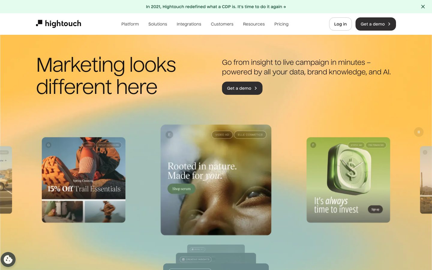
Hightouch's marketing surface is a warm, editorial take on technical SaaS. The page floor is white (`{colors.canvas}` — #ffffff) with near-black ink (`{colors.ink}` — #141213) carrying every headline and primary action. The hero band breaks the white with a soft amber-to-mint gradient wash, on top of which **product-UI cards float on deep layered soft shadows** — real marketing-asset previews (ad creatives, campaign tiles, analytics widgets) shown directly rather than illustrated.
The type system is deliberately unconventional. The display face is **Nuckle** — a humanist-geometric typeface used at a large 64px for the hero headline with heavy negative tracking (-1.92px). Body copy runs in **DM Mono**, a monospace, at a very small measured size — the mono body is part of the brand's technical, "data-platform" voice. The split is unusual: most SaaS systems pair a display face with a humanist sans body; Hightouch pairs Nuckle display with monospace body.
Brand voltage comes from three places: the **gradient hero wash**, the **floating product cards** on multi-layer shadows, and a strict **near-monochrome action layer** — black pill-ish buttons (`{rounded.xl}` 16px) with no accent color on CTAs. Green accents (`{colors.accent-green}` deep forest, `{colors.accent-mint}` pale mint) appear sparingly — the mint powers the top announcement banner and small badges; the forest green is a text/icon accent inside product chrome.
**Key Characteristics:**
- White canvas (`{colors.canvas}`) with near-black ink (`{colors.ink}` — #141213). The ink is a warm off-black, not pure #000000.
- `Nuckle` humanist-geometric display face at 64px weight 400 with strong negative letter-spacing (-1.92px). The hero headline is the brand signature.
- `DM Mono` monospace for body copy — a deliberate technical voice. Measured small; see Known Gaps.
- Black CTA buttons (`{component.button-primary}`) at `{rounded.xl}` (16px) — near-pill at the demo-button scale. Monochrome action layer, no accent CTAs.
- Amber-to-mint gradient hero wash with product-asset cards floated on layered soft drop shadows.
- Green accent pair: `{colors.accent-green}` (#0f492e) forest and `{colors.accent-mint}` (#e3fcee) pale mint. Used on the announcement banner and badges, never on primary CTAs.
- Border radius is dominant at `{rounded.xs}` (4px, the most-measured radius) for small chrome and `{rounded.xl}` (16px) / `{rounded.xxl}` (24px) for cards and buttons.
- Logo wall of customer brands rendered in muted gray (`{colors.muted}`) below the hero.
## Colors
### Brand & Accent
- **Accent Green** (`{colors.accent-green}` — #0f492e): A deep forest green used as a text/icon accent inside product UI fragments and small labels. Low frequency — a quiet brand signal, not a fill color.
- **Accent Mint** (`{colors.accent-mint}` — #e3fcee): The pale mint that fills the top announcement banner and small pill badges. The most visible accent surface.
- **Accent Blue** (`{colors.accent-blue}` — #007aff): A system/utility blue appearing rarely inside product mockups (links, selected states).
- **Accent Violet** (`{colors.accent-violet}` — #765bf0): A single-use accent observed inside product chrome — appears once.
### Surface
- **Canvas** (`{colors.canvas}` — #ffffff): The default page floor.
- **Neutral Soft** (`{colors.neutral-soft}` — #f5f5f5): The most-used neutral fill — feature-card backgrounds and soft section dividers.
- **Neutral** (`{colors.neutral}` — #ebebeb): A slightly stronger neutral for nested fills and dividers.
- **Hairline** (`{colors.hairline}` — #c7c2c3): The 1px border tone on light surfaces.
### Text
- **Ink** (`{colors.ink}` — #141213): All headlines and primary text — a warm near-black.
- **Body** (`{colors.body}` — #302d2e): Default running-text color, used for monospace body copy.
- **Muted** (`{colors.muted}` — #808080): Secondary text and the muted logo-wall treatment.
- **Black** (`{colors.black}` — #000000): True black, used sparingly inside imagery and icons.
- **On Ink** (`{colors.on-ink}` — #ffffff): Text on black buttons and dark surfaces.
## Typography
### Font Family
The system runs **Nuckle** for display, headings, and button labels, and **DM Mono** for body copy. Nuckle is a humanist-geometric typeface — the hero uses it at weight 400 with heavy negative tracking, while `{typography.title}` jumps to weight 700. DM Mono is an open-source monospace (Google Fonts) and carries the running text — an intentionally technical pairing for a data-platform brand.
The split is functional:
- Nuckle (display + UI, weight 400-700, negative tracking on display) — h1, h2, h3, buttons
- DM Mono (body, weight 500, slight positive tracking) — paragraphs, captions, labels
### Hierarchy
| Token | Size | Weight | Line Height | Letter Spacing | Use |
|---|---|---|---|---|---|
| `{typography.display}` | 64px | 400 | 1.156 | -1.92px | Hero h1 ("Marketing looks different here") — Nuckle |
| `{typography.title}` | 27.37px | 700 | 1.169 | -0.342px | Section/card titles — Nuckle bold |
| `{typography.heading}` | 22.81px | 400 | 1.403 | -0.114px | Sub-headings, intro lines — Nuckle |
| `{typography.button}` | 13.2px | 400 | 1.5 | 0.363px | Button labels, nav links — Nuckle |
| `{typography.body-mono}` | 9.17px | 500 | 1.527 | 0.2751px | Running body text, captions — DM Mono |
### Principles
Nuckle owns the display layer — the hero headline at 64px with -1.92px tracking is the brand's loudest statement. The bold weight (700) is reserved for `{typography.title}`-scale section heads; the hero stays at the lighter weight 400, letting size and tracking carry the impact. DM Mono handles all running copy — never put body text in Nuckle, never put a headline in DM Mono.
### Note on Font Substitutes
**Nuckle** is a commercial/licensed typeface (Adam Ladd / OHno-adjacent foundry distribution) and should not be assumed available as a free web font. A usable open-source substitute is **Inter** at weight 400-700 with negative letter-spacing applied at display sizes (-0.03em), or **Hanken Grotesk** for a closer humanist-geometric feel. **DM Mono** is open-source (Google Fonts) and ships as-is; **JetBrains Mono** or **IBM Plex Mono** are acceptable monospace fallbacks.
## Layout
### Spacing System
- **Base unit:** 4px.
- **Tokens:** `{spacing.xxs}` 4px · `{spacing.xs}` 8px · `{spacing.sm}` 12px · `{spacing.md}` 16px · `{spacing.lg}` 24px · `{spacing.xl}` 32px · `{spacing.xxl}` 40px · `{spacing.huge}` 64px · `{spacing.section}` 96px · `{spacing.mega}` 160px.
- **Most-used rhythm:** 12px (`{spacing.sm}`) and 16px (`{spacing.md}`) are the highest-frequency micro-gaps; 24px (`{spacing.lg}`) dominates card-internal spacing.
- **Section padding:** `{spacing.section}` (96px) for major vertical breaks; `{spacing.mega}` (160px) for the largest editorial gaps.
### Grid & Container
- **Editorial body:** Single centered column with full-bleed gradient and image bands.
- **Hero band:** Two-zone split — left headline in Nuckle display, right sub-headline + `{component.button-primary}`.
- **Feature bands:** Wide horizontal cards (`{component.feature-card}`) stacking full-width, each pairing copy on the left with a product mockup on the right.
- **Stat row:** 3-up metric blocks ("1000+", "200%", "52%").
- **Logo wall:** Multi-row grid of muted customer logos.
### Whitespace Philosophy
The system uses generous vertical rhythm (96-160px between major bands) and tight internal gaps (12-16px). The hero gives the Nuckle headline room to breathe at 64px; the feature bands pack product chrome densely inside otherwise spacious cards.
## Elevation & Depth
| Level | Treatment | Use |
|---|---|---|
| Flat | No shadow, no border | Body sections, top nav, logo wall |
| Card surface | `{colors.neutral-soft}` fill, no shadow | Feature-card backgrounds |
| Floating card (soft) | `rgba(0,0,0,0.02) 0px 1.885px 1.885px`, `rgba(0,0,0,0.04) 0px 3.77px 3.77px`, `rgba(0,0,0,0.04) 0px 11.31px 22.621px` | Product mockup cards, nested chrome |
| Floating card (deep) | `rgba(0,0,0,0.05) 0px -1px 6px`, `rgba(0,0,0,0.04) 0px 12px 12px`, `rgba(0,0,0,0.02) 0px 27px 16px`, `rgba(0,0,0,0.01) 0px 47px 19px` | Hero showcase cards floated on the gradient wash |
The elevation philosophy is **soft, layered, and realistic** — multi-stop shadows at very low alpha create the illusion of cards floating above the gradient hero. No hard borders, no neumorphism. The deep four-stop shadow (the most frequent shadow, 42 instances) is the signature elevation for the floating hero asset cards.
### Decorative Depth
- The hero gradient (amber → peach → mint) is the primary decorative surface; product-asset cards float above it with the deep layered shadow.
- Product UI fragments inside cards carry their own internal chrome shadows from the product itself — these are content, not system tokens.
## Shapes
### Border Radius Scale
| Token | Value | Use |
|---|---|---|
| `{rounded.xs}` | 4px | The dominant radius (most-measured) — small chrome, inputs, tags, image corners |
| `{rounded.sm}` | 6px | Rare — small inline elements |
| `{rounded.md}` | 8px | Rare — small buttons/menu items |
| `{rounded.lg}` | 12px | Mid-size card and badge corners |
| `{rounded.card}` | 14px | Specific card corner treatment |
| `{rounded.xl}` | 16px | Primary buttons, product mockup cards |
| `{rounded.xxl}` | 24px | Large showcase/feature cards |
| `{rounded.xxxl}` | 32px | Largest container corners (rare) |
| `{rounded.blob}` | 128px | Very large rounded shapes / pill-like blobs |
| `{rounded.pill}` | 9999px | Pill badges, circular controls |
### Photography Geometry
Hero showcase cards use `{rounded.xxl}` (24px) corners holding full-bleed marketing imagery. Smaller image tiles and product chrome use `{rounded.xs}` (4px). Circular carousel controls and badges use `{rounded.pill}`.
## Components
### Top Navigation & Banner
**`announcement-banner`** — A full-width pale-mint bar pinned above the nav. Background `{colors.accent-mint}` (#e3fcee), text `{colors.ink}`, type `{typography.button}`. Carries a single message ("In 2021, Hightouch redefined what a CDP is…") with a dismiss control.
**`top-nav`** — White nav bar with the lowercase "hightouch" wordmark + glyph at left, horizontal menu (Platform, Solutions, Integrations, Customers, Resources, Pricing) center in `{typography.button}`, and a right cluster with a `{component.button-secondary}` "Log in" and a black `{component.button-primary}` "Get a demo".
**`nav-link`** — Inline menu items, transparent background, `{colors.ink}` text, `{typography.button}`.
### Buttons
**`button-primary`** — The signature CTA. Background `{colors.ink}` (#141213), text `{colors.on-ink}`, type `{typography.button}` (Nuckle 13.2px), rounded `{rounded.xl}` (16px). The "Get a demo" button carries a trailing chevron. Active state `button-primary-active` shifts to `{colors.body}` (#302d2e) — derived as a marginally lighter warm-black pressed tone.
**`button-secondary`** — White outline button ("Log in"). Background `{colors.canvas}`, text `{colors.ink}`, 1px `{colors.hairline}` border, rounded `{rounded.xl}`.
### Cards & Containers
**`hero-band`** — The gradient hero. Sits on `{colors.canvas}` with a full-bleed amber-to-mint gradient overlay. Left zone holds the `{typography.display}` headline; right zone holds a `{typography.heading}` sub-line and a `{component.button-primary}`. Floating `{component.showcase-card}` tiles sit below on the deep layered shadow.
**`showcase-card`** — Marketing-asset preview cards floated on the hero gradient. Background `{colors.canvas}`, rounded `{rounded.xxl}` (24px), elevated with the deep four-stop shadow. Each holds a full-bleed ad creative (e.g., "15% Off Trail Essentials", "Rooted in nature").
**`feature-card`** — Wide horizontal band cards ("Never run out of on-brand ads", "Activate your complete customer data"). Background `{colors.neutral-soft}` (#f5f5f5), rounded `{rounded.xl}` (16px), padding `{spacing.xl}` (32px). Pairs `{typography.title}` copy on the left with an embedded product mockup on the right.
**`product-mockup-card`** — Cards showing actual Hightouch product UI (campaign editor, analytics chart, audience builder). Background `{colors.canvas}`, rounded `{rounded.xl}`, padding `{spacing.lg}` (24px), soft layered shadow. The product chrome is shown as content.
**`stat-block`** — Large metric callouts ("1000+", "200%", "52%") in `{typography.display}` ink, with a small DM Mono label beneath. Transparent background, 3-up row.
**`logo-wall`** — Customer logo grid (Spotify, DoorDash, Aritzia, Domino's, etc.) rendered in muted `{colors.muted}` gray on `{colors.canvas}`.
**`card-flat`** — Generic squared content card. Background `{colors.canvas}`, rounded `{rounded.xs}` (4px), no shadow — the measured baseline card used for compliance badges and small tiles.
### Tags / Badges
**`badge-mint`** — Small pill label inside product creatives and section tags. Background `{colors.accent-mint}`, text `{colors.accent-green}`, type `{typography.button}`, rounded `{rounded.pill}`, padding 4px × 12px.
## Do's and Don'ts
### Do
- Reserve `{colors.ink}` (#141213) for primary CTAs and headlines. The action layer is monochrome black, never green or blue.
- Use Nuckle for every display headline at the lighter weight 400 with negative tracking; reserve weight 700 for `{typography.title}`-scale section heads.
- Keep body copy in DM Mono — the monospace body is the brand's technical voice.
- Float `{component.showcase-card}` tiles on the gradient hero using the deep layered shadow. The realistic float is signature.
- Use `{colors.accent-mint}` for the banner and small badges only; use `{colors.accent-green}` as a quiet text/icon accent.
- Show real product UI inside feature bands rather than illustrating it.
- Keep small chrome at `{rounded.xs}` (4px) and cards at `{rounded.xl}`/`{rounded.xxl}`.
### Don't
- Don't put accent green, blue, or violet on primary CTAs. The button is always black.
- Don't render body copy in Nuckle or headlines in DM Mono — the pairing boundary is strict.
- Don't add hard borders to floating cards; use the layered low-alpha shadows.
- Don't overuse the mint banner color as a general fill — it's reserved for the announcement banner and badges.
- Don't bold the hero headline; size and tracking, not weight, carry its impact.
- Don't add hover-state styling beyond press — primary darkens slightly on press; nothing else changes.
## Responsive Behavior
### Breakpoints
| Name | Width | Key Changes |
|---|---|---|
| Mobile | < 768px | Hamburger nav; hero headline scales down from 64px; showcase cards collapse to a swipeable carousel; feature bands stack copy above mockup; stat row goes 1-up |
| Tablet | 768–1024px | Top nav tightens; feature bands keep horizontal split; stat row 3-up may wrap |
| Desktop | 1024–1440px | Full nav with all menu items; hero two-zone split; floating showcase cards visible in a row |
| Wide | > 1440px | Same as desktop with extra outer breathing room; gradient hero extends full-bleed |
### Touch Targets
- `{component.button-primary}` and `{component.button-secondary}` use 12px × 16px padding around `{typography.button}` labels — meeting comfortable tap size at rendered scale.
- Carousel controls render as `{rounded.pill}` circles; verify they meet 44px minimum.
### Collapsing Strategy
- Top nav collapses to a hamburger menu below 768px.
- The hero's left/right zones stack vertically on mobile — headline first, then sub-line + CTA.
- Showcase cards become a horizontally swipeable carousel on small screens.
- Wide feature bands collapse their two-zone split to a vertical stack.
- Stat blocks reflow from 3-up to 1-up.
### Image Behavior
- Showcase card imagery crops to `{rounded.xxl}` corners and scales proportionally.
- Product mockups inside feature cards retain native aspect ratios as the card resizes.
- The hero gradient remains full-bleed at every breakpoint.
## Iteration Guide
1. Focus on ONE component at a time. Reference its YAML key directly (`{component.feature-card}`, `{component.showcase-card}`).
2. Variants of an existing component (`-active`, `-secondary`) live as separate entries in `components:`.
3. Use `{token.refs}` everywhere — never inline hex.
4. Never document hover. Default and Active/Pressed states only.
5. Display headlines stay Nuckle 400 with negative tracking; body stays DM Mono. The pairing does not blur.
6. The action layer stays monochrome black — resist adding accent-colored CTAs.
7. When in doubt about emphasis: bigger Nuckle before bolder Nuckle.
## Known Gaps
- **Nuckle is a licensed/commercial typeface** and is not assumed available as a free web font; open-source substitutes (Inter, Hanken Grotesk) are documented in Typography. `fonts_licensed` was empty in the analysis, so the licensing flag is inferred from the typeface identity, not measured.
- The measured `body-mono` size (9.17px) is unusually small for running text — it likely reflects a caption/label sample rather than primary paragraph copy. Primary body size at full scale was not separately captured and may be larger.
- `button-primary` was measured with `padding: 0px` and `radius: 16px`; the 12px × 16px padding documented here is derived from screenshot ground-truth, as the measured zero-padding reflects a wrapper element rather than the rendered button box.
- The hero gradient (amber → peach → mint) is observed in screenshots but no gradient stops were captured as tokens; exact color stops are not in scope.
- The measured `card` component reported `radius: 0px, shadow: none` (documented as `card-flat`); the floating showcase/product cards were reconstructed from the shadow and radius token tables plus screenshots.
- Accent-blue (#007aff) and accent-violet (#765bf0) appear at very low frequency inside product chrome; their exact roles in the UI system are not confirmed.
- Form inputs, validation states, footer, and pricing-page-specific components were not extracted in detail.
- Animation and transition timings (carousel auto-advance, banner dismiss) are not in scope.
<!-- Documented by duply · real-world design systems as ready-to-use DESIGN.md for AI coding agents · https://duply.ai/hightouch/design-md -->
Color Palette
Accent
Neutrals
Typography
display64px · 400 · 1.156
The quick brown fox jumpstitle27.37px · 700 · 1.169
The quick brown fox jumpsheading22.81px · 400 · 1.403
The quick brown fox jumpsbutton13.2px · 400 · 1.5
The quick brown fox jumpsbody-mono9.17px · 500 · 1.527
The quick brown fox jumpsSpacing & Shape
Spacing
| Name | Value | Preview |
|---|---|---|
| xxs | 4px | |
| xs | 8px | |
| sm | 12px | |
| md | 16px | |
| lg | 24px | |
| xl | 32px | |
| xxl | 40px | |
| huge | 64px | |
| section | 96px | |
| mega | 160px |
Border Radius
| Name | Value | Preview |
|---|---|---|
| xs | 4px | |
| sm | 6px | |
| md | 8px | |
| lg | 12px | |
| card | 14px | |
| xl | 16px | |
| xxl | 24px | |
| xxxl | 32px | |
| blob | 128px | |
| pill | 9999px |
More like this


---
version: alpha
name: Hightouch-design-analysis
description: A warm, editorial marketing surface for a data/AI marketing platform — near-black ink on white canvas, a large humanist-geometric Nuckle display headline, and the unusual choice of a small monospace (DM Mono) for body copy. Brand voltage comes from gradient hero washes (amber-to-mint), real product-UI cards floated on layered soft shadows, and a strict near-monochrome action layer with black pill buttons. Green accents (deep forest and pale mint) appear sparingly; the system reads confident, technical, and slightly unconventional.

colors:
  ink: "#141213"
  body: "#302d2e"
  canvas: "#ffffff"
  neutral-soft: "#f5f5f5"
  neutral: "#ebebeb"
  hairline: "#c7c2c3"
  muted: "#808080"
  black: "#000000"
  accent-green: "#0f492e"
  accent-mint: "#e3fcee"
  accent-blue: "#007aff"
  accent-violet: "#765bf0"
  on-ink: "#ffffff"

typography:
  display:
    fontFamily: "Nuckle, Inter, sans-serif"
    fontSize: 64px
    fontWeight: 400
    lineHeight: 1.156
    letterSpacing: -1.92px
  title:
    fontFamily: "Nuckle, Inter, sans-serif"
    fontSize: 27.37px
    fontWeight: 700
    lineHeight: 1.169
    letterSpacing: -0.342px
  heading:
    fontFamily: "Nuckle, Inter, sans-serif"
    fontSize: 22.81px
    fontWeight: 400
    lineHeight: 1.403
    letterSpacing: -0.114px
  button:
    fontFamily: "Nuckle, Inter, sans-serif"
    fontSize: 13.2px
    fontWeight: 400
    lineHeight: 1.5
    letterSpacing: 0.363px
  body-mono:
    fontFamily: "DM Mono, ui-monospace, monospace"
    fontSize: 9.17px
    fontWeight: 500
    lineHeight: 1.527
    letterSpacing: 0.2751px

rounded:
  xs: 4px
  sm: 6px
  md: 8px
  lg: 12px
  card: 14px
  xl: 16px
  xxl: 24px
  xxxl: 32px
  blob: 128px
  pill: 9999px

spacing:
  xxs: 4px
  xs: 8px
  sm: 12px
  md: 16px
  lg: 24px
  xl: 32px
  xxl: 40px
  huge: 64px
  section: 96px
  mega: 160px

components:
  top-nav:
    backgroundColor: "{colors.canvas}"
    textColor: "{colors.ink}"
    typography: "{typography.button}"
  announcement-banner:
    backgroundColor: "{colors.accent-mint}"
    textColor: "{colors.ink}"
    typography: "{typography.button}"
  button-primary:
    backgroundColor: "{colors.ink}"
    textColor: "{colors.on-ink}"
    typography: "{typography.button}"
    rounded: "{rounded.xl}"
    padding: 12px 16px
  button-primary-active:
    backgroundColor: "{colors.body}"
    textColor: "{colors.on-ink}"
    rounded: "{rounded.xl}"
  button-secondary:
    backgroundColor: "{colors.canvas}"
    textColor: "{colors.ink}"
    typography: "{typography.button}"
    rounded: "{rounded.xl}"
    padding: 12px 16px
  nav-link:
    backgroundColor: transparent
    textColor: "{colors.ink}"
    typography: "{typography.button}"
  hero-band:
    backgroundColor: "{colors.canvas}"
    textColor: "{colors.ink}"
    typography: "{typography.display}"
    padding: 96px
  showcase-card:
    backgroundColor: "{colors.canvas}"
    textColor: "{colors.ink}"
    rounded: "{rounded.xxl}"
  feature-card:
    backgroundColor: "{colors.neutral-soft}"
    textColor: "{colors.ink}"
    typography: "{typography.heading}"
    rounded: "{rounded.xl}"
    padding: 32px
  product-mockup-card:
    backgroundColor: "{colors.canvas}"
    textColor: "{colors.ink}"
    rounded: "{rounded.xl}"
    padding: 24px
  stat-block:
    backgroundColor: transparent
    textColor: "{colors.ink}"
    typography: "{typography.display}"
  logo-wall:
    backgroundColor: "{colors.canvas}"
    textColor: "{colors.muted}"
  badge-mint:
    backgroundColor: "{colors.accent-mint}"
    textColor: "{colors.accent-green}"
    typography: "{typography.button}"
    rounded: "{rounded.pill}"
    padding: 4px 12px
  card-flat:
    backgroundColor: "{colors.canvas}"
    textColor: "{colors.ink}"
    rounded: "{rounded.xs}"
---

## Overview

Hightouch's marketing surface is a warm, editorial take on technical SaaS. The page floor is white (`{colors.canvas}` — #ffffff) with near-black ink (`{colors.ink}` — #141213) carrying every headline and primary action. The hero band breaks the white with a soft amber-to-mint gradient wash, on top of which **product-UI cards float on deep layered soft shadows** — real marketing-asset previews (ad creatives, campaign tiles, analytics widgets) shown directly rather than illustrated.

The type system is deliberately unconventional. The display face is **Nuckle** — a humanist-geometric typeface used at a large 64px for the hero headline with heavy negative tracking (-1.92px). Body copy runs in **DM Mono**, a monospace, at a very small measured size — the mono body is part of the brand's technical, "data-platform" voice. The split is unusual: most SaaS systems pair a display face with a humanist sans body; Hightouch pairs Nuckle display with monospace body.

Brand voltage comes from three places: the **gradient hero wash**, the **floating product cards** on multi-layer shadows, and a strict **near-monochrome action layer** — black pill-ish buttons (`{rounded.xl}` 16px) with no accent color on CTAs. Green accents (`{colors.accent-green}` deep forest, `{colors.accent-mint}` pale mint) appear sparingly — the mint powers the top announcement banner and small badges; the forest green is a text/icon accent inside product chrome.

**Key Characteristics:**
- White canvas (`{colors.canvas}`) with near-black ink (`{colors.ink}` — #141213). The ink is a warm off-black, not pure #000000.
- `Nuckle` humanist-geometric display face at 64px weight 400 with strong negative letter-spacing (-1.92px). The hero headline is the brand signature.
- `DM Mono` monospace for body copy — a deliberate technical voice. Measured small; see Known Gaps.
- Black CTA buttons (`{component.button-primary}`) at `{rounded.xl}` (16px) — near-pill at the demo-button scale. Monochrome action layer, no accent CTAs.
- Amber-to-mint gradient hero wash with product-asset cards floated on layered soft drop shadows.
- Green accent pair: `{colors.accent-green}` (#0f492e) forest and `{colors.accent-mint}` (#e3fcee) pale mint. Used on the announcement banner and badges, never on primary CTAs.
- Border radius is dominant at `{rounded.xs}` (4px, the most-measured radius) for small chrome and `{rounded.xl}` (16px) / `{rounded.xxl}` (24px) for cards and buttons.
- Logo wall of customer brands rendered in muted gray (`{colors.muted}`) below the hero.

## Colors

### Brand & Accent
- **Accent Green** (`{colors.accent-green}` — #0f492e): A deep forest green used as a text/icon accent inside product UI fragments and small labels. Low frequency — a quiet brand signal, not a fill color.
- **Accent Mint** (`{colors.accent-mint}` — #e3fcee): The pale mint that fills the top announcement banner and small pill badges. The most visible accent surface.
- **Accent Blue** (`{colors.accent-blue}` — #007aff): A system/utility blue appearing rarely inside product mockups (links, selected states).
- **Accent Violet** (`{colors.accent-violet}` — #765bf0): A single-use accent observed inside product chrome — appears once.

### Surface
- **Canvas** (`{colors.canvas}` — #ffffff): The default page floor.
- **Neutral Soft** (`{colors.neutral-soft}` — #f5f5f5): The most-used neutral fill — feature-card backgrounds and soft section dividers.
- **Neutral** (`{colors.neutral}` — #ebebeb): A slightly stronger neutral for nested fills and dividers.
- **Hairline** (`{colors.hairline}` — #c7c2c3): The 1px border tone on light surfaces.

### Text
- **Ink** (`{colors.ink}` — #141213): All headlines and primary text — a warm near-black.
- **Body** (`{colors.body}` — #302d2e): Default running-text color, used for monospace body copy.
- **Muted** (`{colors.muted}` — #808080): Secondary text and the muted logo-wall treatment.
- **Black** (`{colors.black}` — #000000): True black, used sparingly inside imagery and icons.
- **On Ink** (`{colors.on-ink}` — #ffffff): Text on black buttons and dark surfaces.

## Typography

### Font Family
The system runs **Nuckle** for display, headings, and button labels, and **DM Mono** for body copy. Nuckle is a humanist-geometric typeface — the hero uses it at weight 400 with heavy negative tracking, while `{typography.title}` jumps to weight 700. DM Mono is an open-source monospace (Google Fonts) and carries the running text — an intentionally technical pairing for a data-platform brand.

The split is functional:
- Nuckle (display + UI, weight 400-700, negative tracking on display) — h1, h2, h3, buttons
- DM Mono (body, weight 500, slight positive tracking) — paragraphs, captions, labels

### Hierarchy

| Token | Size | Weight | Line Height | Letter Spacing | Use |
|---|---|---|---|---|---|
| `{typography.display}` | 64px | 400 | 1.156 | -1.92px | Hero h1 ("Marketing looks different here") — Nuckle |
| `{typography.title}` | 27.37px | 700 | 1.169 | -0.342px | Section/card titles — Nuckle bold |
| `{typography.heading}` | 22.81px | 400 | 1.403 | -0.114px | Sub-headings, intro lines — Nuckle |
| `{typography.button}` | 13.2px | 400 | 1.5 | 0.363px | Button labels, nav links — Nuckle |
| `{typography.body-mono}` | 9.17px | 500 | 1.527 | 0.2751px | Running body text, captions — DM Mono |

### Principles
Nuckle owns the display layer — the hero headline at 64px with -1.92px tracking is the brand's loudest statement. The bold weight (700) is reserved for `{typography.title}`-scale section heads; the hero stays at the lighter weight 400, letting size and tracking carry the impact. DM Mono handles all running copy — never put body text in Nuckle, never put a headline in DM Mono.

### Note on Font Substitutes
**Nuckle** is a commercial/licensed typeface (Adam Ladd / OHno-adjacent foundry distribution) and should not be assumed available as a free web font. A usable open-source substitute is **Inter** at weight 400-700 with negative letter-spacing applied at display sizes (-0.03em), or **Hanken Grotesk** for a closer humanist-geometric feel. **DM Mono** is open-source (Google Fonts) and ships as-is; **JetBrains Mono** or **IBM Plex Mono** are acceptable monospace fallbacks.

## Layout

### Spacing System
- **Base unit:** 4px.
- **Tokens:** `{spacing.xxs}` 4px · `{spacing.xs}` 8px · `{spacing.sm}` 12px · `{spacing.md}` 16px · `{spacing.lg}` 24px · `{spacing.xl}` 32px · `{spacing.xxl}` 40px · `{spacing.huge}` 64px · `{spacing.section}` 96px · `{spacing.mega}` 160px.
- **Most-used rhythm:** 12px (`{spacing.sm}`) and 16px (`{spacing.md}`) are the highest-frequency micro-gaps; 24px (`{spacing.lg}`) dominates card-internal spacing.
- **Section padding:** `{spacing.section}` (96px) for major vertical breaks; `{spacing.mega}` (160px) for the largest editorial gaps.

### Grid & Container
- **Editorial body:** Single centered column with full-bleed gradient and image bands.
- **Hero band:** Two-zone split — left headline in Nuckle display, right sub-headline + `{component.button-primary}`.
- **Feature bands:** Wide horizontal cards (`{component.feature-card}`) stacking full-width, each pairing copy on the left with a product mockup on the right.
- **Stat row:** 3-up metric blocks ("1000+", "200%", "52%").
- **Logo wall:** Multi-row grid of muted customer logos.

### Whitespace Philosophy
The system uses generous vertical rhythm (96-160px between major bands) and tight internal gaps (12-16px). The hero gives the Nuckle headline room to breathe at 64px; the feature bands pack product chrome densely inside otherwise spacious cards.

## Elevation & Depth

| Level | Treatment | Use |
|---|---|---|
| Flat | No shadow, no border | Body sections, top nav, logo wall |
| Card surface | `{colors.neutral-soft}` fill, no shadow | Feature-card backgrounds |
| Floating card (soft) | `rgba(0,0,0,0.02) 0px 1.885px 1.885px`, `rgba(0,0,0,0.04) 0px 3.77px 3.77px`, `rgba(0,0,0,0.04) 0px 11.31px 22.621px` | Product mockup cards, nested chrome |
| Floating card (deep) | `rgba(0,0,0,0.05) 0px -1px 6px`, `rgba(0,0,0,0.04) 0px 12px 12px`, `rgba(0,0,0,0.02) 0px 27px 16px`, `rgba(0,0,0,0.01) 0px 47px 19px` | Hero showcase cards floated on the gradient wash |

The elevation philosophy is **soft, layered, and realistic** — multi-stop shadows at very low alpha create the illusion of cards floating above the gradient hero. No hard borders, no neumorphism. The deep four-stop shadow (the most frequent shadow, 42 instances) is the signature elevation for the floating hero asset cards.

### Decorative Depth
- The hero gradient (amber → peach → mint) is the primary decorative surface; product-asset cards float above it with the deep layered shadow.
- Product UI fragments inside cards carry their own internal chrome shadows from the product itself — these are content, not system tokens.

## Shapes

### Border Radius Scale

| Token | Value | Use |
|---|---|---|
| `{rounded.xs}` | 4px | The dominant radius (most-measured) — small chrome, inputs, tags, image corners |
| `{rounded.sm}` | 6px | Rare — small inline elements |
| `{rounded.md}` | 8px | Rare — small buttons/menu items |
| `{rounded.lg}` | 12px | Mid-size card and badge corners |
| `{rounded.card}` | 14px | Specific card corner treatment |
| `{rounded.xl}` | 16px | Primary buttons, product mockup cards |
| `{rounded.xxl}` | 24px | Large showcase/feature cards |
| `{rounded.xxxl}` | 32px | Largest container corners (rare) |
| `{rounded.blob}` | 128px | Very large rounded shapes / pill-like blobs |
| `{rounded.pill}` | 9999px | Pill badges, circular controls |

### Photography Geometry
Hero showcase cards use `{rounded.xxl}` (24px) corners holding full-bleed marketing imagery. Smaller image tiles and product chrome use `{rounded.xs}` (4px). Circular carousel controls and badges use `{rounded.pill}`.

## Components

### Top Navigation & Banner

**`announcement-banner`** — A full-width pale-mint bar pinned above the nav. Background `{colors.accent-mint}` (#e3fcee), text `{colors.ink}`, type `{typography.button}`. Carries a single message ("In 2021, Hightouch redefined what a CDP is…") with a dismiss control.

**`top-nav`** — White nav bar with the lowercase "hightouch" wordmark + glyph at left, horizontal menu (Platform, Solutions, Integrations, Customers, Resources, Pricing) center in `{typography.button}`, and a right cluster with a `{component.button-secondary}` "Log in" and a black `{component.button-primary}` "Get a demo".

**`nav-link`** — Inline menu items, transparent background, `{colors.ink}` text, `{typography.button}`.

### Buttons

**`button-primary`** — The signature CTA. Background `{colors.ink}` (#141213), text `{colors.on-ink}`, type `{typography.button}` (Nuckle 13.2px), rounded `{rounded.xl}` (16px). The "Get a demo" button carries a trailing chevron. Active state `button-primary-active` shifts to `{colors.body}` (#302d2e) — derived as a marginally lighter warm-black pressed tone.

**`button-secondary`** — White outline button ("Log in"). Background `{colors.canvas}`, text `{colors.ink}`, 1px `{colors.hairline}` border, rounded `{rounded.xl}`.

### Cards & Containers

**`hero-band`** — The gradient hero. Sits on `{colors.canvas}` with a full-bleed amber-to-mint gradient overlay. Left zone holds the `{typography.display}` headline; right zone holds a `{typography.heading}` sub-line and a `{component.button-primary}`. Floating `{component.showcase-card}` tiles sit below on the deep layered shadow.

**`showcase-card`** — Marketing-asset preview cards floated on the hero gradient. Background `{colors.canvas}`, rounded `{rounded.xxl}` (24px), elevated with the deep four-stop shadow. Each holds a full-bleed ad creative (e.g., "15% Off Trail Essentials", "Rooted in nature").

**`feature-card`** — Wide horizontal band cards ("Never run out of on-brand ads", "Activate your complete customer data"). Background `{colors.neutral-soft}` (#f5f5f5), rounded `{rounded.xl}` (16px), padding `{spacing.xl}` (32px). Pairs `{typography.title}` copy on the left with an embedded product mockup on the right.

**`product-mockup-card`** — Cards showing actual Hightouch product UI (campaign editor, analytics chart, audience builder). Background `{colors.canvas}`, rounded `{rounded.xl}`, padding `{spacing.lg}` (24px), soft layered shadow. The product chrome is shown as content.

**`stat-block`** — Large metric callouts ("1000+", "200%", "52%") in `{typography.display}` ink, with a small DM Mono label beneath. Transparent background, 3-up row.

**`logo-wall`** — Customer logo grid (Spotify, DoorDash, Aritzia, Domino's, etc.) rendered in muted `{colors.muted}` gray on `{colors.canvas}`.

**`card-flat`** — Generic squared content card. Background `{colors.canvas}`, rounded `{rounded.xs}` (4px), no shadow — the measured baseline card used for compliance badges and small tiles.

### Tags / Badges

**`badge-mint`** — Small pill label inside product creatives and section tags. Background `{colors.accent-mint}`, text `{colors.accent-green}`, type `{typography.button}`, rounded `{rounded.pill}`, padding 4px × 12px.

## Do's and Don'ts

### Do
- Reserve `{colors.ink}` (#141213) for primary CTAs and headlines. The action layer is monochrome black, never green or blue.
- Use Nuckle for every display headline at the lighter weight 400 with negative tracking; reserve weight 700 for `{typography.title}`-scale section heads.
- Keep body copy in DM Mono — the monospace body is the brand's technical voice.
- Float `{component.showcase-card}` tiles on the gradient hero using the deep layered shadow. The realistic float is signature.
- Use `{colors.accent-mint}` for the banner and small badges only; use `{colors.accent-green}` as a quiet text/icon accent.
- Show real product UI inside feature bands rather than illustrating it.
- Keep small chrome at `{rounded.xs}` (4px) and cards at `{rounded.xl}`/`{rounded.xxl}`.

### Don't
- Don't put accent green, blue, or violet on primary CTAs. The button is always black.
- Don't render body copy in Nuckle or headlines in DM Mono — the pairing boundary is strict.
- Don't add hard borders to floating cards; use the layered low-alpha shadows.
- Don't overuse the mint banner color as a general fill — it's reserved for the announcement banner and badges.
- Don't bold the hero headline; size and tracking, not weight, carry its impact.
- Don't add hover-state styling beyond press — primary darkens slightly on press; nothing else changes.

## Responsive Behavior

### Breakpoints

| Name | Width | Key Changes |
|---|---|---|
| Mobile | < 768px | Hamburger nav; hero headline scales down from 64px; showcase cards collapse to a swipeable carousel; feature bands stack copy above mockup; stat row goes 1-up |
| Tablet | 768–1024px | Top nav tightens; feature bands keep horizontal split; stat row 3-up may wrap |
| Desktop | 1024–1440px | Full nav with all menu items; hero two-zone split; floating showcase cards visible in a row |
| Wide | > 1440px | Same as desktop with extra outer breathing room; gradient hero extends full-bleed |

### Touch Targets
- `{component.button-primary}` and `{component.button-secondary}` use 12px × 16px padding around `{typography.button}` labels — meeting comfortable tap size at rendered scale.
- Carousel controls render as `{rounded.pill}` circles; verify they meet 44px minimum.

### Collapsing Strategy
- Top nav collapses to a hamburger menu below 768px.
- The hero's left/right zones stack vertically on mobile — headline first, then sub-line + CTA.
- Showcase cards become a horizontally swipeable carousel on small screens.
- Wide feature bands collapse their two-zone split to a vertical stack.
- Stat blocks reflow from 3-up to 1-up.

### Image Behavior
- Showcase card imagery crops to `{rounded.xxl}` corners and scales proportionally.
- Product mockups inside feature cards retain native aspect ratios as the card resizes.
- The hero gradient remains full-bleed at every breakpoint.

## Iteration Guide

1. Focus on ONE component at a time. Reference its YAML key directly (`{component.feature-card}`, `{component.showcase-card}`).
2. Variants of an existing component (`-active`, `-secondary`) live as separate entries in `components:`.
3. Use `{token.refs}` everywhere — never inline hex.
4. Never document hover. Default and Active/Pressed states only.
5. Display headlines stay Nuckle 400 with negative tracking; body stays DM Mono. The pairing does not blur.
6. The action layer stays monochrome black — resist adding accent-colored CTAs.
7. When in doubt about emphasis: bigger Nuckle before bolder Nuckle.

## Known Gaps

- **Nuckle is a licensed/commercial typeface** and is not assumed available as a free web font; open-source substitutes (Inter, Hanken Grotesk) are documented in Typography. `fonts_licensed` was empty in the analysis, so the licensing flag is inferred from the typeface identity, not measured.
- The measured `body-mono` size (9.17px) is unusually small for running text — it likely reflects a caption/label sample rather than primary paragraph copy. Primary body size at full scale was not separately captured and may be larger.
- `button-primary` was measured with `padding: 0px` and `radius: 16px`; the 12px × 16px padding documented here is derived from screenshot ground-truth, as the measured zero-padding reflects a wrapper element rather than the rendered button box.
- The hero gradient (amber → peach → mint) is observed in screenshots but no gradient stops were captured as tokens; exact color stops are not in scope.
- The measured `card` component reported `radius: 0px, shadow: none` (documented as `card-flat`); the floating showcase/product cards were reconstructed from the shadow and radius token tables plus screenshots.
- Accent-blue (#007aff) and accent-violet (#765bf0) appear at very low frequency inside product chrome; their exact roles in the UI system are not confirmed.
- Form inputs, validation states, footer, and pricing-page-specific components were not extracted in detail.
- Animation and transition timings (carousel auto-advance, banner dismiss) are not in scope.

<!-- Documented by duply · real-world design systems as ready-to-use DESIGN.md for AI coding agents · https://duply.ai/hightouch/design-md -->