Hanko
A dark, developer-first authentication-platform interface anchored on a near-black canvas (#1d1d1f) with oversized white Geist display headlines and a single signature light-blue pill CTA (#aedfff). The system reads as confident, technical, and privacy-minded — heavily rounded pill shapes, product UI fragments (passcode entry, MFA setup, passkey sign-in) shown directly inside dark cards, soft drop shadows, and a sky-blue closing CTA band that briefly flips the page to light.
---
version: alpha
name: Hanko-design-analysis
description: A dark, developer-first authentication-platform interface anchored on a near-black canvas (#1d1d1f) with oversized white Geist display headlines and a single signature light-blue pill CTA (#aedfff). The system reads as confident, technical, and privacy-minded — heavily rounded pill shapes, product UI fragments (passcode entry, MFA setup, passkey sign-in) shown directly inside dark cards, soft drop shadows, and a sky-blue closing CTA band that briefly flips the page to light.
colors:
primary: "#aedfff"
primary-soft: "#b7c7d1"
on-primary: "#222222"
canvas: "#1d1d1f"
surface: "#222528"
ink: "#ffffff"
ink-inverse: "#333333"
body: "#f8f8f2"
muted: "#b7c7d1"
muted-soft: "#999999"
divider: "#333333"
accent-periwinkle: "#6a7cda"
accent-green: "#c8e9ac"
accent-sky: "#3898ec"
accent-azure: "#0082f3"
accent-slate: "#5d6c7b"
neutral-100: "#fafafa"
neutral-200: "#d9d9d9"
neutral-300: "#cccccc"
neutral-400: "#c8c8c8"
neutral-900: "#000000"
typography:
display:
fontFamily: "Geist, sans-serif"
fontSize: 66px
fontWeight: 600
lineHeight: 1.3
letterSpacing: 0
title:
fontFamily: "Geist, sans-serif"
fontSize: 18px
fontWeight: 500
lineHeight: 1.3
letterSpacing: 0
heading-card:
fontFamily: "Geist, sans-serif"
fontSize: 18px
fontWeight: 600
lineHeight: 1.333
letterSpacing: 0.5px
eyebrow:
fontFamily: "Geist, sans-serif"
fontSize: 13px
fontWeight: 600
lineHeight: 1.3
letterSpacing: 0.5px
body:
fontFamily: "Geist, sans-serif"
fontSize: 18px
fontWeight: 500
lineHeight: 1.3
letterSpacing: 0
button:
fontFamily: "Geist, sans-serif"
fontSize: 13px
fontWeight: 400
lineHeight: 1.538
letterSpacing: 0
rounded:
xs: 8px
sm: 10px
md: 12px
lg: 16px
pill: 60px
blob: 200px
spacing:
xxs: 4px
xs: 8px
sm: 10px
md: 16px
lg: 20px
xl: 24px
xxl: 30px
components:
top-nav:
backgroundColor: "{colors.canvas}"
textColor: "{colors.body}"
typography: "{typography.button}"
padding: 10px 20px
nav-pill:
backgroundColor: transparent
textColor: "{colors.body}"
typography: "{typography.button}"
rounded: "{rounded.pill}"
padding: 10px 20px
button-primary:
backgroundColor: "{colors.primary}"
textColor: "{colors.on-primary}"
typography: "{typography.button}"
rounded: "{rounded.pill}"
padding: 20px
button-secondary:
backgroundColor: transparent
textColor: "{colors.ink}"
typography: "{typography.button}"
rounded: "{rounded.pill}"
padding: 20px
hero-band:
backgroundColor: "{colors.canvas}"
textColor: "{colors.ink}"
typography: "{typography.display}"
padding: 30px
eyebrow-label:
backgroundColor: transparent
textColor: "{colors.muted}"
typography: "{typography.eyebrow}"
product-flow-card:
backgroundColor: "{colors.surface}"
textColor: "{colors.body}"
typography: "{typography.body}"
rounded: "{rounded.lg}"
padding: 24px
feature-card:
backgroundColor: "{colors.surface}"
textColor: "{colors.body}"
typography: "{typography.heading-card}"
rounded: "{rounded.lg}"
padding: 24px
feature-pill:
backgroundColor: "{colors.surface}"
textColor: "{colors.ink}"
typography: "{typography.title}"
rounded: "{rounded.pill}"
padding: 20px 30px
inline-input:
backgroundColor: "{colors.surface}"
textColor: "{colors.body}"
typography: "{typography.body}"
rounded: "{rounded.xs}"
padding: 10px 16px
passcode-cell:
backgroundColor: "{colors.surface}"
textColor: "{colors.ink}"
typography: "{typography.body}"
rounded: "{rounded.xs}"
padding: 10px
logo-marquee:
backgroundColor: "{colors.canvas}"
textColor: "{colors.muted}"
typography: "{typography.body}"
padding: 24px
testimonial-card:
backgroundColor: "{colors.surface}"
textColor: "{colors.body}"
typography: "{typography.body}"
rounded: "{rounded.lg}"
padding: 24px
cta-band-light:
backgroundColor: "{colors.primary}"
textColor: "{colors.ink-inverse}"
typography: "{typography.display}"
rounded: "{rounded.lg}"
padding: 30px
footer:
backgroundColor: "{colors.canvas}"
textColor: "{colors.muted}"
typography: "{typography.body}"
padding: 30px
---
## Overview
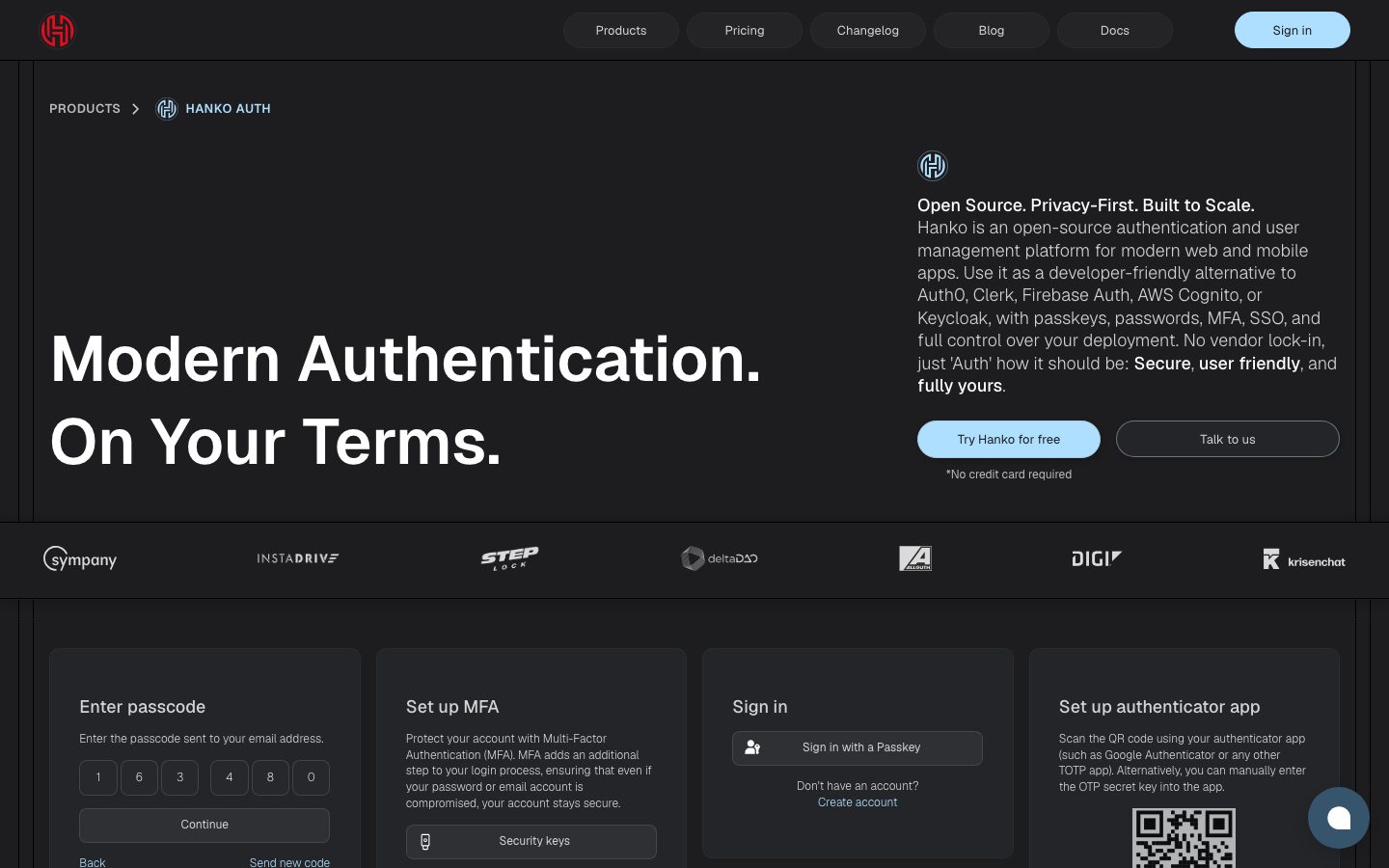
Hanko's marketing surface is a dark, developer-first authentication-platform interface — a near-black canvas (`{colors.canvas}` — #1d1d1f) carrying oversized white Geist display headlines (`{colors.ink}` — #ffffff) and a single signature light-blue pill CTA (`{colors.primary}` — #aedfff). The system reads as confident and technical without being noisy: the hero pairs a giant "Modern Authentication. On Your Terms." headline with a quiet product paragraph, then immediately shows the actual product — passcode entry, MFA setup, passkey sign-in cards — rendered inside dark surface tiles.
The type voice is single-family: **Geist** (Vercel's open-source geometric sans) runs everything from the 66px display headline down to 13px button labels. Hierarchy comes from size and weight (500–600) rather than from multiple families, which keeps the system feeling engineered and uniform.
Brand voltage is delivered three ways: the **light-blue pill CTA** (`{colors.primary}`) that is the only saturated color on most bands, **heavily rounded pill geometry** (buttons, nav items, and standalone "GDPR compliant" pills all use ~60px radius), and **real product UI fragments shown directly inside cards** rather than marketing illustrations. The page closes with a sky-blue CTA band (`{colors.cta-band-light}`) that briefly flips to light before the dark footer resolves it.
**Key Characteristics:**
- Dark canvas (`{colors.canvas}` — #1d1d1f) across nearly every band; the only light surface is the closing CTA band in `{colors.primary}`.
- Single typeface — **Geist** — for display, body, and UI. No display/body family split.
- One saturated brand color: light blue `{colors.primary}` (#aedfff) on the primary CTA and the closing CTA band. Text on it is dark (`{colors.on-primary}` — #222222).
- Pill-everything geometry: nav links, buttons, and standalone capability pills use `{rounded.pill}` (60px); larger decorative blobs reach `{rounded.blob}` (200px).
- Product UI fragments (passcode grid, MFA, passkey sign-in, authenticator QR) embedded directly inside `{component.product-flow-card}` surfaces.
- Card surfaces are a barely-lighter near-black (`{colors.surface}` — #222528) separated from canvas by `{colors.divider}` (#333333) hairlines and soft drop shadows.
- Secondary text leans cool blue-gray (`{colors.muted}` — #b7c7d1); body copy is off-white (`{colors.body}` — #f8f8f2).
## Colors
### Brand & Accent
- **Primary** (`{colors.primary}` — #aedfff): The single signature color. Used on the "Try Hanko for free" pill CTA and the full-width closing CTA band. Text on primary is `{colors.on-primary}` (#222222).
- **Primary Soft** (`{colors.primary-soft}` — #b7c7d1): A muted blue-gray used as a secondary tone — secondary text, icon strokes, and softened accent moments. High frequency in the measured palette.
- **Accent set** — small, sparingly-used hues seen inside product UI fragments and decorative graphics: `{colors.accent-periwinkle}` (#6a7cda), `{colors.accent-green}` (#c8e9ac), `{colors.accent-sky}` (#3898ec), `{colors.accent-azure}` (#0082f3), `{colors.accent-slate}` (#5d6c7b). These never appear on primary CTAs.
### Surface
- **Canvas** (`{colors.canvas}` — #1d1d1f): The default page floor on every band except the light CTA.
- **Surface** (`{colors.surface}` — #222528): Card, input, and pill backgrounds — a barely-lighter near-black that reads as a raised tile against canvas.
- **Divider** (`{colors.divider}` — #333333): Hairline borders between cards and sections on the dark canvas.
### Text
- **Ink** (`{colors.ink}` — #ffffff): Display headlines and high-emphasis text on dark canvas.
- **Body** (`{colors.body}` — #f8f8f2): Off-white running text.
- **Muted** (`{colors.muted}` — #b7c7d1): Cool blue-gray secondary text — descriptions, captions, footer links.
- **Muted Soft** (`{colors.muted-soft}` — #999999): Tertiary text — fine print and de-emphasized labels.
- **Ink Inverse** (`{colors.ink-inverse}` — #333333): Dark text used on the light-blue CTA band, where ink-white would not read.
- **On Primary** (`{colors.on-primary}` — #222222): Dark label text on the light-blue primary CTA.
### Neutrals
- `{colors.neutral-100}` (#fafafa), `{colors.neutral-200}` (#d9d9d9), `{colors.neutral-300}` (#cccccc), `{colors.neutral-400}` (#c8c8c8), `{colors.neutral-900}` (#000000): Low-frequency grays used for logo marquee fills, dividers, and image shadows.
## Typography
### Font Family
The system runs **Geist** for everything — display headlines, body, captions, and buttons. Geist is Vercel's open-source geometric sans, freely available, so no substitution is required (no licensed faces were flagged in the capture). The fallback stack is `Geist, sans-serif`.
Hierarchy is built from size + weight alone:
- Weight 600 — display headlines, card headings, eyebrow labels
- Weight 500 — section titles and body copy
- Weight 400 — button labels
### Hierarchy
| Token | Size | Weight | Line Height | Letter Spacing | Use |
|---|---|---|---|---|---|
| `{typography.display}` | 66px | 600 | 1.3 | 0 | Hero h1 ("Modern Authentication. On Your Terms.") and the closing CTA headline |
| `{typography.heading-card}` | 18px | 600 | 1.333 | 0.5px | Card headings ("Framework-agnostic", "Profile Element") |
| `{typography.title}` | 18px | 500 | 1.3 | 0 | Section subheads, standalone capability pills |
| `{typography.body}` | 18px | 500 | 1.3 | 0 | Default running text and paragraph copy |
| `{typography.eyebrow}` | 13px | 600 | 1.3 | 0.5px | Uppercase section labels ("PRODUCTS", "FLEXIBLE HOSTING OPTIONS", "HANKO AUTH") |
| `{typography.button}` | 13px | 400 | 1.538 | 0 | Button and nav-link labels |
### Principles
Geist is the entire voice. Emphasis comes from scaling (66px display vs 18px body) and from weight shifts (600 vs 500), never from a second family. The eyebrow style — 13px / 600 / 0.5px tracking, typically set uppercase — is the system's signature small label and appears above most section heads. Display headlines stay at weight 600 and a relaxed 1.3 line height even at 66px, which keeps the giant hero text feeling open rather than condensed.
### Note on Font Substitutes
Geist is open-source and shipped as-is; no proprietary substitute is needed. If Geist is unavailable, **Inter** is the closest fallback in proportion and x-height.
## Layout
### Spacing System
- **Base unit:** ~ derived from a loose 2px/4px grid; the most frequent measured values cluster at 10, 16, 20, 24, and 30px.
- **Tokens:** `{spacing.xxs}` 4px · `{spacing.xs}` 8px · `{spacing.sm}` 10px · `{spacing.md}` 16px · `{spacing.lg}` 20px · `{spacing.xl}` 24px · `{spacing.xxl}` 30px.
- **Card internal padding:** `{spacing.xl}` (24px) for product-flow and feature cards; `{spacing.lg}` (20px) for buttons.
- **Inline gaps:** `{spacing.sm}` (10px) and `{spacing.md}` (16px) dominate the measured gap values — used between buttons, inputs, and grid items.
### Grid & Container
- **Hero:** asymmetric split — oversized headline lower-left, product paragraph + CTA cluster upper-right.
- **Product-flow grid:** 4-up row of dark cards on desktop (passcode / MFA / sign-in / authenticator).
- **Feature grids:** 3-up at desktop for "Framework-agnostic / Forget frontend state handling / Profile Element"; hosting options shown 3-up.
- **Testimonial wall:** masonry-style multi-column grid of quote cards near the page bottom.
### Whitespace Philosophy
The dark canvas does much of the spacing work — generous negative space around the giant hero headline, and full-width logo marquee + capability-pill stacks separated by ample vertical rhythm. Cards are packed efficiently (24px internal padding) but bands breathe between them.
## Elevation & Depth
| Level | Treatment | Use |
|---|---|---|
| Flat | No shadow, no border | Hero band, footer, body sections on raw canvas |
| Hairline | 1px `{colors.divider}` border | Card and tile edges against canvas |
| Soft drop shadow | `rgba(0,0,0,0.17) 1px 2px 5px` / `rgba(0,0,0,0.1) 4px 4px 9px` | Product-flow cards, feature cards |
| Raised | `rgba(0,0,0,0.16) 0px 8px 24px` / `rgba(0,0,0,0.16) 0px 5px 40px` | Floating chat widget, prominent product mockups |
The measured shadow set is offset-heavy and low-alpha — many use horizontal offsets (e.g. `5px 2px 5px`, `6px 6px 5px`) at 10–20% black, giving cards a soft, slightly directional lift rather than a centered glow. The philosophy is **subtle, soft depth on a dark surface** — no neumorphism, no glassmorphism.
### Decorative Depth
- Product UI fragments inside cards carry their own internal chrome shadows (these are product, not system tokens).
- The closing CTA band inverts to `{colors.primary}` light blue — color contrast, not shadow, does the elevation work there.
## Shapes
### Border Radius Scale
| Token | Value | Use |
|---|---|---|
| `{rounded.xs}` | 8px | Inputs, passcode cells, small inner elements (most frequent measured radius) |
| `{rounded.sm}` | 10px | Minor tiles |
| `{rounded.md}` | 12px | Mid-size cards |
| `{rounded.lg}` | 16px | Product-flow cards, feature cards, CTA band (second-most frequent radius) |
| `{rounded.pill}` | 60px | Buttons, nav links, standalone capability pills |
| `{rounded.blob}` | 200px | Large decorative rounded shapes / oversized container blobs |
### Geometry Notes
The system is emphatically rounded — pill shapes (`{rounded.pill}`) define the interactive layer (buttons, nav, "GDPR compliant" / "Multi-language support" / "EU hosting options" capability pills), and `{rounded.lg}` (16px) defines content cards. Larger radii (100–200px) appear on oversized decorative containers. Logos in the trust marquee are monochrome wordmarks with no container chrome.
## Components
### Navigation
**`top-nav`** — Dark canvas bar pinned to the top of every page. Background `{colors.canvas}`, label text `{colors.body}` in `{typography.button}`. Carries the red Hanko mark at left, a centered cluster of pill nav links (Products, Pricing, Changelog, Blog, Docs), and a `{component.button-primary}` "Sign in" at right.
**`nav-pill`** — Individual nav items rendered as transparent pills, rounded `{rounded.pill}`, padding 10×20px. Text in `{colors.body}`.
### Buttons
**`button-primary`** — The signature CTA. Background `{colors.primary}` (#aedfff), label `{colors.on-primary}` (#222222) in `{typography.button}`, rounded `{rounded.pill}` (60px), padding 20px. Used for "Try Hanko for free" and "Sign in".
**`button-secondary`** — Outlined pill on dark canvas. Transparent background, text `{colors.ink}`, 1px `{colors.divider}` border, rounded `{rounded.pill}`, padding 20px. Used for "Talk to us".
### Hero
**`hero-band`** — Full-width dark hero. Background `{colors.canvas}`, giant headline in `{typography.display}` (Geist 66px / 600), white `{colors.ink}`. Right column holds the product paragraph in `{colors.body}`, a `{component.button-primary}` + `{component.button-secondary}` cluster, and a "*No credit card required" caption in `{colors.muted-soft}`.
**`eyebrow-label`** — Small uppercase section label in `{typography.eyebrow}`, color `{colors.muted}`. Sits above section heads ("PRODUCTS", "FLEXIBLE HOSTING OPTIONS").
### Cards & Containers
**`product-flow-card`** — Dark tile showing a real Hanko auth flow (passcode entry, MFA setup, passkey sign-in, authenticator QR). Background `{colors.surface}` (#222528), text `{colors.body}`, rounded `{rounded.lg}` (16px), padding `{spacing.xl}` (24px), soft drop shadow. Hanko shows the actual product chrome inside these cards rather than illustrating it.
**`feature-card`** — Used in 3-up feature grids ("Framework-agnostic", "Forget frontend state handling", "Profile Element"). Background `{colors.surface}`, heading in `{typography.heading-card}`, body in `{typography.body}`, rounded `{rounded.lg}`, padding `{spacing.xl}`.
**`feature-pill`** — Standalone full-pill capability badges ("GDPR compliant", "Multi-language support", "EU hosting options"). Background `{colors.surface}`, text `{colors.ink}` in `{typography.title}`, rounded `{rounded.pill}`, padding 20×30px.
**`testimonial-card`** — Quote cards in the testimonial wall. Background `{colors.surface}`, body in `{typography.body}`, name/role in `{colors.muted}`, rounded `{rounded.lg}`, padding `{spacing.xl}`.
### Inputs & Forms
**`inline-input`** — Email / code field inside product-flow cards. Background `{colors.surface}`, text `{colors.body}` in `{typography.body}`, rounded `{rounded.xs}` (8px), padding 10×16px.
**`passcode-cell`** — Single-digit passcode box. Background `{colors.surface}`, digit in `{colors.ink}`, rounded `{rounded.xs}`, padding 10px. Rendered in a row of six.
### Trust & Closing
**`logo-marquee`** — Full-width row of monochrome customer wordmarks (Sympany, INSTADRIVE, STEP, deltaDAO, DIGI, krisenchat). Background `{colors.canvas}`, marks tinted toward `{colors.muted}`.
**`cta-band-light`** — The closing "Start building your Auth today" band — the only light surface on the page. Background `{colors.primary}` (#aedfff), headline in `{typography.display}` color `{colors.ink-inverse}` (#333333), with a `{component.button-primary}` centered. Rounded `{rounded.lg}` where it sits as a contained band.
**`footer`** — Dark footer that resolves the page after the light CTA band. Background `{colors.canvas}`, link text `{colors.muted}` in `{typography.body}`, padding `{spacing.xxl}` (30px). Carries the "Authentication and User Management" product summary and API-first / Hanko Elements / Open Source columns.
## Do's and Don'ts
### Do
- Keep `{colors.primary}` (#aedfff) as the single saturated brand color — reserve it for the primary CTA and the closing CTA band.
- Use Geist for everything; build hierarchy from size and weight, not a second family.
- Set section eyebrows in `{typography.eyebrow}` uppercase with 0.5px tracking — it's the system's signature label.
- Embed real product UI fragments inside `{component.product-flow-card}` — Hanko shows the auth flow, it doesn't illustrate it.
- Use pill geometry (`{rounded.pill}`) for the interactive and badge layer; `{rounded.lg}` for content cards.
- Keep secondary text in cool blue-gray (`{colors.muted}` — #b7c7d1) and body in off-white (`{colors.body}` — #f8f8f2) for contrast on the near-black canvas.
- Use the light CTA band sparingly as a single page-closing inversion before the footer.
### Don't
- Don't introduce additional saturated CTA colors — the accent set (`{colors.accent-periwinkle}`, `{colors.accent-green}`, etc.) belongs inside product fragments, never on primary actions.
- Don't put white text on the light-blue CTA band — use `{colors.ink-inverse}` (#333333) there.
- Don't pile multiple light surfaces into the page; the dark canvas is the default and the light band is a single scarce moment.
- Don't tighten display tracking — Geist display stays at weight 600 with a relaxed 1.3 line height.
- Don't add hover styling beyond the documented default and active/pressed states.
- Don't square off the interactive layer — pill radius is part of the brand voice.
## Responsive Behavior
### Breakpoints
| Name | Width | Key Changes |
|---|---|---|
| Mobile | < 768px | Nav collapses; hero headline scales down from 66px and stacks above the product paragraph; product-flow cards stack 1-up; feature grids 1-up; capability pills stack |
| Tablet | 768–1024px | Nav tightens; product-flow cards 2-up; feature grids 2-up; logo marquee wraps |
| Desktop | 1024–1440px | Full pill nav; 4-up product-flow row; 3-up feature grids; full-width logo marquee |
| Wide | > 1440px | Same as desktop with more outer breathing room around the centered content column |
### Touch Targets
- `{component.button-primary}` padding of 20px yields a comfortably tappable pill above 44px.
- `{component.nav-pill}` at 10×20px padding meets tap minimums within the pill silhouette.
- `{component.passcode-cell}` and `{component.inline-input}` sit inside product-flow cards at 10px padding — adequate within their grouped rows.
### Collapsing Strategy
- The asymmetric hero (headline + right-side product paragraph) collapses to a single stacked column on mobile.
- The 4-up product-flow row reduces columns (4 → 2 → 1) rather than shrinking card content.
- Capability pills ("GDPR compliant", etc.) stack vertically on narrow viewports.
- The testimonial masonry wall reduces to fewer columns then a single stream.
### Image Behavior
- Customer logos in the marquee stay monochrome and scale proportionally.
- Product UI fragments inside cards retain native aspect ratios; the cards resize around them.
## Iteration Guide
1. Focus on ONE component at a time. Reference its YAML key directly (`{component.product-flow-card}`, `{component.cta-band-light}`).
2. Variants of an existing component (`-active`, `-disabled`, `-focused`) live as separate entries in `components:`.
3. Use `{token.refs}` everywhere — never inline a hex.
4. Never document hover. Default and Active/Pressed states only.
5. Keep the palette monochrome-dark with one blue accent; introducing more saturated colors at the action layer breaks the voice.
6. The light-blue CTA band is the page's only light surface — don't add others casually.
7. When in doubt about emphasis: bigger Geist before a second typeface (there is no second typeface).
## Known Gaps
- The measured `button-primary` and `card` components report `radius: 0px` and `shadow: none`, which contradicts the clearly pill-shaped buttons and rounded, shadowed cards visible in the screenshots. Radii and shadows are documented from the measured `radius`/`shadows` token sets plus screenshot ground-truth; the `0px` component reading is treated as a capture artifact (likely an unstyled inner element).
- The Hanko logo mark is bright red in the screenshots, but no red value was captured in the color analysis — the brand red is a Known Gap and should be sampled directly before use.
- Color roles in the capture are partially mislabeled for a dark theme (e.g., #ffffff tagged "ink" is the headline color on dark canvas, and #333333 tagged "muted/body" is used as inverse text on the light CTA band). Roles were reassigned to match the observed dark-canvas usage.
- Letter-spacing for display and body was reported as "normal" and is documented as 0; the precise sub-pixel tracking was not measured.
- Spacing values are clustered and irregular (7, 13, 14, 18, 29px appear alongside the round values); the token scale is a derived normalization of the most frequent measured values.
- Active/pressed and focus states for buttons and inputs were not captured; only default styling is documented.
- Animation, transition timings, and the testimonial-wall scroll behavior are out of scope.
- The pricing page was captured but no pricing-specific tokens (tier cards, toggles) were extracted; those components are a Known Gap.
<!-- Documented by duply · real-world design systems as ready-to-use DESIGN.md for AI coding agents · https://duply.ai/hanko/design-md -->
Color Palette
Accent
Neutrals
Typography
display66px · 600 · 1.3
The quick brown fox jumpstitle18px · 500 · 1.3
The quick brown fox jumpsheading-card18px · 600 · 1.333
The quick brown fox jumpseyebrow13px · 600 · 1.3
The quick brown fox jumpsbody18px · 500 · 1.3
The quick brown fox jumpsbutton13px · 400 · 1.538
The quick brown fox jumpsSpacing & Shape
Spacing
| Name | Value | Preview |
|---|---|---|
| xxs | 4px | |
| xs | 8px | |
| sm | 10px | |
| md | 16px | |
| lg | 20px | |
| xl | 24px | |
| xxl | 30px |
Border Radius
| Name | Value | Preview |
|---|---|---|
| xs | 8px | |
| sm | 10px | |
| md | 12px | |
| lg | 16px | |
| pill | 60px | |
| blob | 200px |
More like this


---
version: alpha
name: Hanko-design-analysis
description: A dark, developer-first authentication-platform interface anchored on a near-black canvas (#1d1d1f) with oversized white Geist display headlines and a single signature light-blue pill CTA (#aedfff). The system reads as confident, technical, and privacy-minded — heavily rounded pill shapes, product UI fragments (passcode entry, MFA setup, passkey sign-in) shown directly inside dark cards, soft drop shadows, and a sky-blue closing CTA band that briefly flips the page to light.

colors:
  primary: "#aedfff"
  primary-soft: "#b7c7d1"
  on-primary: "#222222"
  canvas: "#1d1d1f"
  surface: "#222528"
  ink: "#ffffff"
  ink-inverse: "#333333"
  body: "#f8f8f2"
  muted: "#b7c7d1"
  muted-soft: "#999999"
  divider: "#333333"
  accent-periwinkle: "#6a7cda"
  accent-green: "#c8e9ac"
  accent-sky: "#3898ec"
  accent-azure: "#0082f3"
  accent-slate: "#5d6c7b"
  neutral-100: "#fafafa"
  neutral-200: "#d9d9d9"
  neutral-300: "#cccccc"
  neutral-400: "#c8c8c8"
  neutral-900: "#000000"

typography:
  display:
    fontFamily: "Geist, sans-serif"
    fontSize: 66px
    fontWeight: 600
    lineHeight: 1.3
    letterSpacing: 0
  title:
    fontFamily: "Geist, sans-serif"
    fontSize: 18px
    fontWeight: 500
    lineHeight: 1.3
    letterSpacing: 0
  heading-card:
    fontFamily: "Geist, sans-serif"
    fontSize: 18px
    fontWeight: 600
    lineHeight: 1.333
    letterSpacing: 0.5px
  eyebrow:
    fontFamily: "Geist, sans-serif"
    fontSize: 13px
    fontWeight: 600
    lineHeight: 1.3
    letterSpacing: 0.5px
  body:
    fontFamily: "Geist, sans-serif"
    fontSize: 18px
    fontWeight: 500
    lineHeight: 1.3
    letterSpacing: 0
  button:
    fontFamily: "Geist, sans-serif"
    fontSize: 13px
    fontWeight: 400
    lineHeight: 1.538
    letterSpacing: 0

rounded:
  xs: 8px
  sm: 10px
  md: 12px
  lg: 16px
  pill: 60px
  blob: 200px

spacing:
  xxs: 4px
  xs: 8px
  sm: 10px
  md: 16px
  lg: 20px
  xl: 24px
  xxl: 30px

components:
  top-nav:
    backgroundColor: "{colors.canvas}"
    textColor: "{colors.body}"
    typography: "{typography.button}"
    padding: 10px 20px
  nav-pill:
    backgroundColor: transparent
    textColor: "{colors.body}"
    typography: "{typography.button}"
    rounded: "{rounded.pill}"
    padding: 10px 20px
  button-primary:
    backgroundColor: "{colors.primary}"
    textColor: "{colors.on-primary}"
    typography: "{typography.button}"
    rounded: "{rounded.pill}"
    padding: 20px
  button-secondary:
    backgroundColor: transparent
    textColor: "{colors.ink}"
    typography: "{typography.button}"
    rounded: "{rounded.pill}"
    padding: 20px
  hero-band:
    backgroundColor: "{colors.canvas}"
    textColor: "{colors.ink}"
    typography: "{typography.display}"
    padding: 30px
  eyebrow-label:
    backgroundColor: transparent
    textColor: "{colors.muted}"
    typography: "{typography.eyebrow}"
  product-flow-card:
    backgroundColor: "{colors.surface}"
    textColor: "{colors.body}"
    typography: "{typography.body}"
    rounded: "{rounded.lg}"
    padding: 24px
  feature-card:
    backgroundColor: "{colors.surface}"
    textColor: "{colors.body}"
    typography: "{typography.heading-card}"
    rounded: "{rounded.lg}"
    padding: 24px
  feature-pill:
    backgroundColor: "{colors.surface}"
    textColor: "{colors.ink}"
    typography: "{typography.title}"
    rounded: "{rounded.pill}"
    padding: 20px 30px
  inline-input:
    backgroundColor: "{colors.surface}"
    textColor: "{colors.body}"
    typography: "{typography.body}"
    rounded: "{rounded.xs}"
    padding: 10px 16px
  passcode-cell:
    backgroundColor: "{colors.surface}"
    textColor: "{colors.ink}"
    typography: "{typography.body}"
    rounded: "{rounded.xs}"
    padding: 10px
  logo-marquee:
    backgroundColor: "{colors.canvas}"
    textColor: "{colors.muted}"
    typography: "{typography.body}"
    padding: 24px
  testimonial-card:
    backgroundColor: "{colors.surface}"
    textColor: "{colors.body}"
    typography: "{typography.body}"
    rounded: "{rounded.lg}"
    padding: 24px
  cta-band-light:
    backgroundColor: "{colors.primary}"
    textColor: "{colors.ink-inverse}"
    typography: "{typography.display}"
    rounded: "{rounded.lg}"
    padding: 30px
  footer:
    backgroundColor: "{colors.canvas}"
    textColor: "{colors.muted}"
    typography: "{typography.body}"
    padding: 30px
---

## Overview

Hanko's marketing surface is a dark, developer-first authentication-platform interface — a near-black canvas (`{colors.canvas}` — #1d1d1f) carrying oversized white Geist display headlines (`{colors.ink}` — #ffffff) and a single signature light-blue pill CTA (`{colors.primary}` — #aedfff). The system reads as confident and technical without being noisy: the hero pairs a giant "Modern Authentication. On Your Terms." headline with a quiet product paragraph, then immediately shows the actual product — passcode entry, MFA setup, passkey sign-in cards — rendered inside dark surface tiles.

The type voice is single-family: **Geist** (Vercel's open-source geometric sans) runs everything from the 66px display headline down to 13px button labels. Hierarchy comes from size and weight (500–600) rather than from multiple families, which keeps the system feeling engineered and uniform.

Brand voltage is delivered three ways: the **light-blue pill CTA** (`{colors.primary}`) that is the only saturated color on most bands, **heavily rounded pill geometry** (buttons, nav items, and standalone "GDPR compliant" pills all use ~60px radius), and **real product UI fragments shown directly inside cards** rather than marketing illustrations. The page closes with a sky-blue CTA band (`{colors.cta-band-light}`) that briefly flips to light before the dark footer resolves it.

**Key Characteristics:**
- Dark canvas (`{colors.canvas}` — #1d1d1f) across nearly every band; the only light surface is the closing CTA band in `{colors.primary}`.
- Single typeface — **Geist** — for display, body, and UI. No display/body family split.
- One saturated brand color: light blue `{colors.primary}` (#aedfff) on the primary CTA and the closing CTA band. Text on it is dark (`{colors.on-primary}` — #222222).
- Pill-everything geometry: nav links, buttons, and standalone capability pills use `{rounded.pill}` (60px); larger decorative blobs reach `{rounded.blob}` (200px).
- Product UI fragments (passcode grid, MFA, passkey sign-in, authenticator QR) embedded directly inside `{component.product-flow-card}` surfaces.
- Card surfaces are a barely-lighter near-black (`{colors.surface}` — #222528) separated from canvas by `{colors.divider}` (#333333) hairlines and soft drop shadows.
- Secondary text leans cool blue-gray (`{colors.muted}` — #b7c7d1); body copy is off-white (`{colors.body}` — #f8f8f2).

## Colors

### Brand & Accent
- **Primary** (`{colors.primary}` — #aedfff): The single signature color. Used on the "Try Hanko for free" pill CTA and the full-width closing CTA band. Text on primary is `{colors.on-primary}` (#222222).
- **Primary Soft** (`{colors.primary-soft}` — #b7c7d1): A muted blue-gray used as a secondary tone — secondary text, icon strokes, and softened accent moments. High frequency in the measured palette.
- **Accent set** — small, sparingly-used hues seen inside product UI fragments and decorative graphics: `{colors.accent-periwinkle}` (#6a7cda), `{colors.accent-green}` (#c8e9ac), `{colors.accent-sky}` (#3898ec), `{colors.accent-azure}` (#0082f3), `{colors.accent-slate}` (#5d6c7b). These never appear on primary CTAs.

### Surface
- **Canvas** (`{colors.canvas}` — #1d1d1f): The default page floor on every band except the light CTA.
- **Surface** (`{colors.surface}` — #222528): Card, input, and pill backgrounds — a barely-lighter near-black that reads as a raised tile against canvas.
- **Divider** (`{colors.divider}` — #333333): Hairline borders between cards and sections on the dark canvas.

### Text
- **Ink** (`{colors.ink}` — #ffffff): Display headlines and high-emphasis text on dark canvas.
- **Body** (`{colors.body}` — #f8f8f2): Off-white running text.
- **Muted** (`{colors.muted}` — #b7c7d1): Cool blue-gray secondary text — descriptions, captions, footer links.
- **Muted Soft** (`{colors.muted-soft}` — #999999): Tertiary text — fine print and de-emphasized labels.
- **Ink Inverse** (`{colors.ink-inverse}` — #333333): Dark text used on the light-blue CTA band, where ink-white would not read.
- **On Primary** (`{colors.on-primary}` — #222222): Dark label text on the light-blue primary CTA.

### Neutrals
- `{colors.neutral-100}` (#fafafa), `{colors.neutral-200}` (#d9d9d9), `{colors.neutral-300}` (#cccccc), `{colors.neutral-400}` (#c8c8c8), `{colors.neutral-900}` (#000000): Low-frequency grays used for logo marquee fills, dividers, and image shadows.

## Typography

### Font Family
The system runs **Geist** for everything — display headlines, body, captions, and buttons. Geist is Vercel's open-source geometric sans, freely available, so no substitution is required (no licensed faces were flagged in the capture). The fallback stack is `Geist, sans-serif`.

Hierarchy is built from size + weight alone:
- Weight 600 — display headlines, card headings, eyebrow labels
- Weight 500 — section titles and body copy
- Weight 400 — button labels

### Hierarchy

| Token | Size | Weight | Line Height | Letter Spacing | Use |
|---|---|---|---|---|---|
| `{typography.display}` | 66px | 600 | 1.3 | 0 | Hero h1 ("Modern Authentication. On Your Terms.") and the closing CTA headline |
| `{typography.heading-card}` | 18px | 600 | 1.333 | 0.5px | Card headings ("Framework-agnostic", "Profile Element") |
| `{typography.title}` | 18px | 500 | 1.3 | 0 | Section subheads, standalone capability pills |
| `{typography.body}` | 18px | 500 | 1.3 | 0 | Default running text and paragraph copy |
| `{typography.eyebrow}` | 13px | 600 | 1.3 | 0.5px | Uppercase section labels ("PRODUCTS", "FLEXIBLE HOSTING OPTIONS", "HANKO AUTH") |
| `{typography.button}` | 13px | 400 | 1.538 | 0 | Button and nav-link labels |

### Principles
Geist is the entire voice. Emphasis comes from scaling (66px display vs 18px body) and from weight shifts (600 vs 500), never from a second family. The eyebrow style — 13px / 600 / 0.5px tracking, typically set uppercase — is the system's signature small label and appears above most section heads. Display headlines stay at weight 600 and a relaxed 1.3 line height even at 66px, which keeps the giant hero text feeling open rather than condensed.

### Note on Font Substitutes
Geist is open-source and shipped as-is; no proprietary substitute is needed. If Geist is unavailable, **Inter** is the closest fallback in proportion and x-height.

## Layout

### Spacing System
- **Base unit:** ~ derived from a loose 2px/4px grid; the most frequent measured values cluster at 10, 16, 20, 24, and 30px.
- **Tokens:** `{spacing.xxs}` 4px · `{spacing.xs}` 8px · `{spacing.sm}` 10px · `{spacing.md}` 16px · `{spacing.lg}` 20px · `{spacing.xl}` 24px · `{spacing.xxl}` 30px.
- **Card internal padding:** `{spacing.xl}` (24px) for product-flow and feature cards; `{spacing.lg}` (20px) for buttons.
- **Inline gaps:** `{spacing.sm}` (10px) and `{spacing.md}` (16px) dominate the measured gap values — used between buttons, inputs, and grid items.

### Grid & Container
- **Hero:** asymmetric split — oversized headline lower-left, product paragraph + CTA cluster upper-right.
- **Product-flow grid:** 4-up row of dark cards on desktop (passcode / MFA / sign-in / authenticator).
- **Feature grids:** 3-up at desktop for "Framework-agnostic / Forget frontend state handling / Profile Element"; hosting options shown 3-up.
- **Testimonial wall:** masonry-style multi-column grid of quote cards near the page bottom.

### Whitespace Philosophy
The dark canvas does much of the spacing work — generous negative space around the giant hero headline, and full-width logo marquee + capability-pill stacks separated by ample vertical rhythm. Cards are packed efficiently (24px internal padding) but bands breathe between them.

## Elevation & Depth

| Level | Treatment | Use |
|---|---|---|
| Flat | No shadow, no border | Hero band, footer, body sections on raw canvas |
| Hairline | 1px `{colors.divider}` border | Card and tile edges against canvas |
| Soft drop shadow | `rgba(0,0,0,0.17) 1px 2px 5px` / `rgba(0,0,0,0.1) 4px 4px 9px` | Product-flow cards, feature cards |
| Raised | `rgba(0,0,0,0.16) 0px 8px 24px` / `rgba(0,0,0,0.16) 0px 5px 40px` | Floating chat widget, prominent product mockups |

The measured shadow set is offset-heavy and low-alpha — many use horizontal offsets (e.g. `5px 2px 5px`, `6px 6px 5px`) at 10–20% black, giving cards a soft, slightly directional lift rather than a centered glow. The philosophy is **subtle, soft depth on a dark surface** — no neumorphism, no glassmorphism.

### Decorative Depth
- Product UI fragments inside cards carry their own internal chrome shadows (these are product, not system tokens).
- The closing CTA band inverts to `{colors.primary}` light blue — color contrast, not shadow, does the elevation work there.

## Shapes

### Border Radius Scale

| Token | Value | Use |
|---|---|---|
| `{rounded.xs}` | 8px | Inputs, passcode cells, small inner elements (most frequent measured radius) |
| `{rounded.sm}` | 10px | Minor tiles |
| `{rounded.md}` | 12px | Mid-size cards |
| `{rounded.lg}` | 16px | Product-flow cards, feature cards, CTA band (second-most frequent radius) |
| `{rounded.pill}` | 60px | Buttons, nav links, standalone capability pills |
| `{rounded.blob}` | 200px | Large decorative rounded shapes / oversized container blobs |

### Geometry Notes
The system is emphatically rounded — pill shapes (`{rounded.pill}`) define the interactive layer (buttons, nav, "GDPR compliant" / "Multi-language support" / "EU hosting options" capability pills), and `{rounded.lg}` (16px) defines content cards. Larger radii (100–200px) appear on oversized decorative containers. Logos in the trust marquee are monochrome wordmarks with no container chrome.

## Components

### Navigation

**`top-nav`** — Dark canvas bar pinned to the top of every page. Background `{colors.canvas}`, label text `{colors.body}` in `{typography.button}`. Carries the red Hanko mark at left, a centered cluster of pill nav links (Products, Pricing, Changelog, Blog, Docs), and a `{component.button-primary}` "Sign in" at right.

**`nav-pill`** — Individual nav items rendered as transparent pills, rounded `{rounded.pill}`, padding 10×20px. Text in `{colors.body}`.

### Buttons

**`button-primary`** — The signature CTA. Background `{colors.primary}` (#aedfff), label `{colors.on-primary}` (#222222) in `{typography.button}`, rounded `{rounded.pill}` (60px), padding 20px. Used for "Try Hanko for free" and "Sign in".

**`button-secondary`** — Outlined pill on dark canvas. Transparent background, text `{colors.ink}`, 1px `{colors.divider}` border, rounded `{rounded.pill}`, padding 20px. Used for "Talk to us".

### Hero

**`hero-band`** — Full-width dark hero. Background `{colors.canvas}`, giant headline in `{typography.display}` (Geist 66px / 600), white `{colors.ink}`. Right column holds the product paragraph in `{colors.body}`, a `{component.button-primary}` + `{component.button-secondary}` cluster, and a "*No credit card required" caption in `{colors.muted-soft}`.

**`eyebrow-label`** — Small uppercase section label in `{typography.eyebrow}`, color `{colors.muted}`. Sits above section heads ("PRODUCTS", "FLEXIBLE HOSTING OPTIONS").

### Cards & Containers

**`product-flow-card`** — Dark tile showing a real Hanko auth flow (passcode entry, MFA setup, passkey sign-in, authenticator QR). Background `{colors.surface}` (#222528), text `{colors.body}`, rounded `{rounded.lg}` (16px), padding `{spacing.xl}` (24px), soft drop shadow. Hanko shows the actual product chrome inside these cards rather than illustrating it.

**`feature-card`** — Used in 3-up feature grids ("Framework-agnostic", "Forget frontend state handling", "Profile Element"). Background `{colors.surface}`, heading in `{typography.heading-card}`, body in `{typography.body}`, rounded `{rounded.lg}`, padding `{spacing.xl}`.

**`feature-pill`** — Standalone full-pill capability badges ("GDPR compliant", "Multi-language support", "EU hosting options"). Background `{colors.surface}`, text `{colors.ink}` in `{typography.title}`, rounded `{rounded.pill}`, padding 20×30px.

**`testimonial-card`** — Quote cards in the testimonial wall. Background `{colors.surface}`, body in `{typography.body}`, name/role in `{colors.muted}`, rounded `{rounded.lg}`, padding `{spacing.xl}`.

### Inputs & Forms

**`inline-input`** — Email / code field inside product-flow cards. Background `{colors.surface}`, text `{colors.body}` in `{typography.body}`, rounded `{rounded.xs}` (8px), padding 10×16px.

**`passcode-cell`** — Single-digit passcode box. Background `{colors.surface}`, digit in `{colors.ink}`, rounded `{rounded.xs}`, padding 10px. Rendered in a row of six.

### Trust & Closing

**`logo-marquee`** — Full-width row of monochrome customer wordmarks (Sympany, INSTADRIVE, STEP, deltaDAO, DIGI, krisenchat). Background `{colors.canvas}`, marks tinted toward `{colors.muted}`.

**`cta-band-light`** — The closing "Start building your Auth today" band — the only light surface on the page. Background `{colors.primary}` (#aedfff), headline in `{typography.display}` color `{colors.ink-inverse}` (#333333), with a `{component.button-primary}` centered. Rounded `{rounded.lg}` where it sits as a contained band.

**`footer`** — Dark footer that resolves the page after the light CTA band. Background `{colors.canvas}`, link text `{colors.muted}` in `{typography.body}`, padding `{spacing.xxl}` (30px). Carries the "Authentication and User Management" product summary and API-first / Hanko Elements / Open Source columns.

## Do's and Don'ts

### Do
- Keep `{colors.primary}` (#aedfff) as the single saturated brand color — reserve it for the primary CTA and the closing CTA band.
- Use Geist for everything; build hierarchy from size and weight, not a second family.
- Set section eyebrows in `{typography.eyebrow}` uppercase with 0.5px tracking — it's the system's signature label.
- Embed real product UI fragments inside `{component.product-flow-card}` — Hanko shows the auth flow, it doesn't illustrate it.
- Use pill geometry (`{rounded.pill}`) for the interactive and badge layer; `{rounded.lg}` for content cards.
- Keep secondary text in cool blue-gray (`{colors.muted}` — #b7c7d1) and body in off-white (`{colors.body}` — #f8f8f2) for contrast on the near-black canvas.
- Use the light CTA band sparingly as a single page-closing inversion before the footer.

### Don't
- Don't introduce additional saturated CTA colors — the accent set (`{colors.accent-periwinkle}`, `{colors.accent-green}`, etc.) belongs inside product fragments, never on primary actions.
- Don't put white text on the light-blue CTA band — use `{colors.ink-inverse}` (#333333) there.
- Don't pile multiple light surfaces into the page; the dark canvas is the default and the light band is a single scarce moment.
- Don't tighten display tracking — Geist display stays at weight 600 with a relaxed 1.3 line height.
- Don't add hover styling beyond the documented default and active/pressed states.
- Don't square off the interactive layer — pill radius is part of the brand voice.

## Responsive Behavior

### Breakpoints

| Name | Width | Key Changes |
|---|---|---|
| Mobile | < 768px | Nav collapses; hero headline scales down from 66px and stacks above the product paragraph; product-flow cards stack 1-up; feature grids 1-up; capability pills stack |
| Tablet | 768–1024px | Nav tightens; product-flow cards 2-up; feature grids 2-up; logo marquee wraps |
| Desktop | 1024–1440px | Full pill nav; 4-up product-flow row; 3-up feature grids; full-width logo marquee |
| Wide | > 1440px | Same as desktop with more outer breathing room around the centered content column |

### Touch Targets
- `{component.button-primary}` padding of 20px yields a comfortably tappable pill above 44px.
- `{component.nav-pill}` at 10×20px padding meets tap minimums within the pill silhouette.
- `{component.passcode-cell}` and `{component.inline-input}` sit inside product-flow cards at 10px padding — adequate within their grouped rows.

### Collapsing Strategy
- The asymmetric hero (headline + right-side product paragraph) collapses to a single stacked column on mobile.
- The 4-up product-flow row reduces columns (4 → 2 → 1) rather than shrinking card content.
- Capability pills ("GDPR compliant", etc.) stack vertically on narrow viewports.
- The testimonial masonry wall reduces to fewer columns then a single stream.

### Image Behavior
- Customer logos in the marquee stay monochrome and scale proportionally.
- Product UI fragments inside cards retain native aspect ratios; the cards resize around them.

## Iteration Guide

1. Focus on ONE component at a time. Reference its YAML key directly (`{component.product-flow-card}`, `{component.cta-band-light}`).
2. Variants of an existing component (`-active`, `-disabled`, `-focused`) live as separate entries in `components:`.
3. Use `{token.refs}` everywhere — never inline a hex.
4. Never document hover. Default and Active/Pressed states only.
5. Keep the palette monochrome-dark with one blue accent; introducing more saturated colors at the action layer breaks the voice.
6. The light-blue CTA band is the page's only light surface — don't add others casually.
7. When in doubt about emphasis: bigger Geist before a second typeface (there is no second typeface).

## Known Gaps

- The measured `button-primary` and `card` components report `radius: 0px` and `shadow: none`, which contradicts the clearly pill-shaped buttons and rounded, shadowed cards visible in the screenshots. Radii and shadows are documented from the measured `radius`/`shadows` token sets plus screenshot ground-truth; the `0px` component reading is treated as a capture artifact (likely an unstyled inner element).
- The Hanko logo mark is bright red in the screenshots, but no red value was captured in the color analysis — the brand red is a Known Gap and should be sampled directly before use.
- Color roles in the capture are partially mislabeled for a dark theme (e.g., #ffffff tagged "ink" is the headline color on dark canvas, and #333333 tagged "muted/body" is used as inverse text on the light CTA band). Roles were reassigned to match the observed dark-canvas usage.
- Letter-spacing for display and body was reported as "normal" and is documented as 0; the precise sub-pixel tracking was not measured.
- Spacing values are clustered and irregular (7, 13, 14, 18, 29px appear alongside the round values); the token scale is a derived normalization of the most frequent measured values.
- Active/pressed and focus states for buttons and inputs were not captured; only default styling is documented.
- Animation, transition timings, and the testimonial-wall scroll behavior are out of scope.
- The pricing page was captured but no pricing-specific tokens (tier cards, toggles) were extracted; those components are a Known Gap.

<!-- Documented by duply · real-world design systems as ready-to-use DESIGN.md for AI coding agents · https://duply.ai/hanko/design-md -->