
shadcn-ui
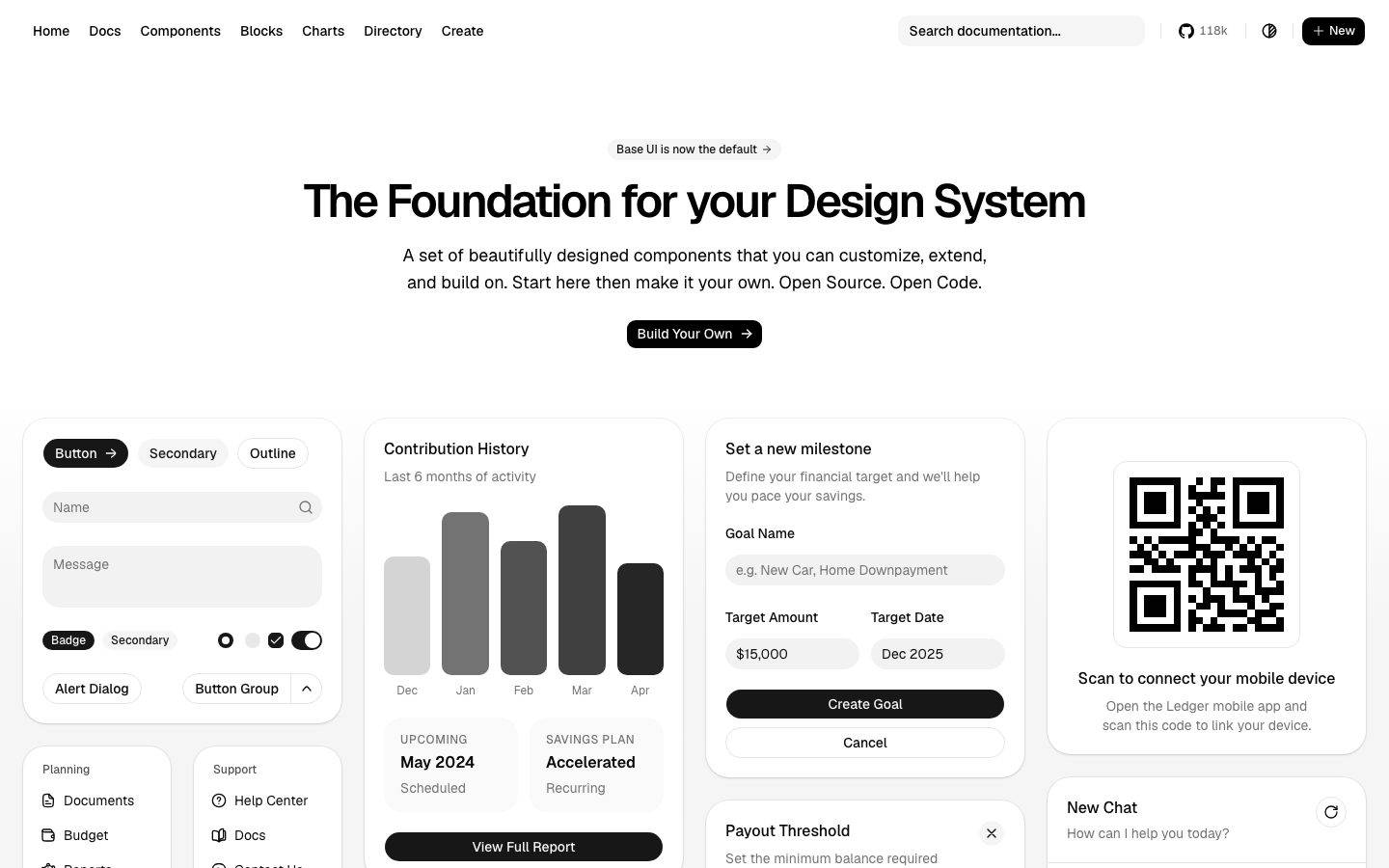
A stark, developer-first design system built on a white canvas with near-black primary actions and Vercel's open-source Geist typeface. The landing surface reads as a component showroom — dense grids of soft-rounded cards (charts, forms, chat, QR, navigation lists) shown as live product chrome rather than marketing illustration. Voltage comes entirely from monochrome contrast, generous rounding on showcase cards, and a single confident Geist display headline; color accents (indigo, blues, reds) live only inside the demo components, never on the brand chrome.
Works withClaude CodeCursorCodexGemini CLICopilotv0LovableBoltWindsurfReplit
---
version: alpha
name: shadcn-ui-design-analysis
description: "A stark, developer-first design system built on a white canvas with near-black primary actions and Vercel's open-source Geist typeface. The landing surface reads as a component showroom — dense grids of soft-rounded cards (charts, forms, chat, QR, navigation lists) shown as live product chrome rather than marketing illustration. Voltage comes entirely from monochrome contrast, generous rounding on showcase cards, and a single confident Geist display headline; color accents (indigo, blues, reds) live only inside the demo components, never on the brand chrome."
colors:
  ink: "#000000"
  primary: "#0a0a0a"
  surface-dark: "#171717"
  surface-dark-elevated: "#262626"
  body: "#404040"
  muted: "#737373"
  muted-soft: "#a1a1a1"
  canvas: "#ffffff"
  surface-soft: "#fafafa"
  surface-muted: "#f5f5f5"
  hairline: "#e5e5e5"
  border-strong: "#cccccc"
  on-primary: "#ffffff"
  accent-indigo: "#3e43f0"
  accent-blue: "#155dfc"
  accent-blue-deep: "#1447e6"
  accent-blue-bright: "#3080ff"
  accent-blue-soft: "#eff6ff"
  accent-red: "#e40014"
  accent-red-soft: "#ff6568"
  accent-cream: "#f6f7eb"
typography:
  h1:
    fontFamily: "Geist, sans-serif"
    fontSize: 48px
    fontWeight: 600
    lineHeight: 1.1
    letterSpacing: -0.05em
  body:
    fontFamily: "Geist, sans-serif"
    fontSize: 18px
    fontWeight: 400
    lineHeight: 1.556
    letterSpacing: normal
  button:
    fontFamily: "Geist, sans-serif"
    fontSize: 14px
    fontWeight: 500
    lineHeight: 1.429
    letterSpacing: normal
rounded:
  xs: 6px
  sm: 8px
  md: 10px
  lg: 14px
  xl: 18px
  xxl: 20px
  xxxl: 24px
spacing:
  xxs: 4px
  xs: 6px
  sm: 8px
  smd: 10px
  md: 12px
  mdl: 14px
  lg: 16px
  xl: 20px
  xxl: 24px
  xxxl: 48px
  section: 80px
components:
  top-nav:
    backgroundColor: "{colors.canvas}"
    textColor: "{colors.ink}"
    typography: "{typography.button}"
  hero-band:
    backgroundColor: "{colors.canvas}"
    textColor: "{colors.ink}"
    typography: "{typography.h1}"
    padding: 80px
  button-primary:
    backgroundColor: "{colors.primary}"
    textColor: "{colors.on-primary}"
    typography: "{typography.button}"
    rounded: "{rounded.md}"
    padding: 8px 16px 8px 12px
  button-secondary:
    backgroundColor: "{colors.surface-muted}"
    textColor: "{colors.ink}"
    typography: "{typography.button}"
    rounded: "{rounded.md}"
  button-outline:
    backgroundColor: "{colors.canvas}"
    textColor: "{colors.ink}"
    typography: "{typography.button}"
    rounded: "{rounded.md}"
  badge-pill:
    backgroundColor: "{colors.primary}"
    textColor: "{colors.on-primary}"
    typography: "{typography.button}"
    rounded: "{rounded.xxl}"
  card:
    backgroundColor: "{colors.canvas}"
    textColor: "{colors.ink}"
    typography: "{typography.body}"
    rounded: "{rounded.md}"
  showcase-card:
    backgroundColor: "{colors.canvas}"
    textColor: "{colors.ink}"
    typography: "{typography.body}"
    rounded: "{rounded.xl}"
  nested-panel:
    backgroundColor: "{colors.surface-soft}"
    textColor: "{colors.body}"
    typography: "{typography.body}"
    rounded: "{rounded.lg}"
  input:
    backgroundColor: "{colors.canvas}"
    textColor: "{colors.ink}"
    typography: "{typography.button}"
    rounded: "0px"
  footer:
    backgroundColor: "{colors.canvas}"
    textColor: "{colors.muted}"
    typography: "{typography.button}"
---

## Overview

shadcn/ui's landing surface is a **developer-first component showroom** — a pure white canvas (`{colors.canvas}` — #ffffff) with near-black primary actions (`{colors.primary}` — #0a0a0a), set entirely in Vercel's open-source **Geist** typeface. The page is functionally a wall of live UI: contribution charts, milestone forms, QR panels, chat threads, navigation lists, and savings targets, all rendered as real product chrome inside soft-rounded cards rather than as marketing illustration.

The brand voice is **stark and monochrome**. There is exactly one display moment — the `{typography.h1}` hero headline ("The Foundation for your Design System") at 48px, weight 600, with aggressive -0.05em tracking. Everything else is functional UI type at 18px body or 14px button size. There is no decorative accent on the brand chrome: primary CTAs are black, secondary/outline buttons are gray-on-white, and the only color that appears anywhere (indigo, blues, reds, cream) lives *inside* the demo components — chart bars, status dots, links.

The system's signature is its **rounding hierarchy on nested surfaces**. Large showcase cards use `{rounded.xl}` (18px) — the single most frequently measured radius — while the interactive controls inside them (buttons, badges, small cards) drop to `{rounded.md}` (10px). Nested panels within cards (the "Planning" / "Support" sub-lists, savings tiles) sit on `{colors.surface-soft}` (#fafafa) at `{rounded.lg}` (14px). The result is a layered, calm density: many components on screen at once, each visually contained without heavy borders or shadows.

**Key Characteristics:**
- Pure white canvas (`{colors.canvas}`) with near-black primary CTA (`{colors.primary}` — #0a0a0a). Buttons are `{rounded.md}` (10px) with weight-500 Geist labels and slightly asymmetric padding (8px 16px 8px 12px — extra right room for the trailing arrow icon).
- Geist across the board — one open-source typeface handling display, body, and UI. No serif, no second family.
- A single big display headline in `{typography.h1}` (48px / 600 / -0.05em). Everything else stays at body (18px) or button (14px) scale.
- Showcase cards use `{rounded.xl}` (18px, the dominant measured radius); inner controls drop to `{rounded.md}` (10px); nested list panels use `{rounded.lg}` (14px) on `{colors.surface-soft}`.
- Color accents (`{colors.accent-indigo}`, `{colors.accent-blue}`, `{colors.accent-red}`, `{colors.accent-cream}`) appear only inside demo components — never on brand chrome.
- Near-flat elevation. The measured card shadow is a hairline 1px ring plus a faint drop (`rgba(0,0,0,0.1) 0px 1px 3px`); most cards ship with no shadow at all.
- Grayscale neutral ramp does the heavy lifting: `#0a0a0a` → `#171717` → `#262626` → `#404040` → `#737373` → `#a1a1a1` → `#cccccc` → `#e5e5e5` → `#f5f5f5` → `#fafafa` → `#ffffff`.

## Colors

### Brand & Action
- **Ink** (`{colors.ink}` — #000000): The dominant text color — headlines, labels, primary body copy. The single most frequent computed color on the page.
- **Primary** (`{colors.primary}` — #0a0a0a): Near-black fill for primary CTAs ("Build Your Own", "Create Goal", "Save Threshold") and the black "Button" / "Badge" pills. Reads as black against white; distinct from pure `{colors.ink}` text.
- **On Primary** (`{colors.on-primary}` — #ffffff): Text/icon on black buttons and dark pills.

### Neutral Surface Ramp
- **Canvas** (`{colors.canvas}` — #ffffff): The page floor and card fill.
- **Surface Soft** (`{colors.surface-soft}` — #fafafa): Nested panels, sub-list backgrounds ("Planning", "Support"), muted input wells, savings tiles.
- **Surface Muted** (`{colors.surface-muted}` — #f5f5f5): Secondary button fill, subtle chip backgrounds.
- **Hairline** (`{colors.hairline}` — #e5e5e5): The 1px border tone on cards, inputs, and dividers.
- **Border Strong** (`{colors.border-strong}` — #cccccc): Slightly heavier borders and disabled control outlines.
- **Surface Dark** (`{colors.surface-dark}` — #171717): Dark chrome tone available for inverted controls (dark mode / dark button hovers in the kit).
- **Surface Dark Elevated** (`{colors.surface-dark-elevated}` — #262626): A one-step-lighter dark surface for nesting on dark.

### Text
- **Ink** (`{colors.ink}` — #000000): Headlines and primary labels.
- **Body** (`{colors.body}` — #404040): Running text on light surfaces.
- **Muted** (`{colors.muted}` — #737373): Secondary text — descriptions, captions, footer body.
- **Muted Soft** (`{colors.muted-soft}` — #a1a1a1): Tertiary text — placeholders, disabled labels, faint helper text.

### Accents (inside demo components only)
- **Accent Indigo** (`{colors.accent-indigo}` — #3e43f0): The strongest chromatic accent, used sparingly inside product-UI fragments.
- **Accent Blue** (`{colors.accent-blue}` — #155dfc), **Blue Deep** (`{colors.accent-blue-deep}` — #1447e6), **Blue Bright** (`{colors.accent-blue-bright}` — #3080ff), **Blue Soft** (`{colors.accent-blue-soft}` — #eff6ff): A blue family for links, focus rings, and info states shown inside the demo cards.
- **Accent Red** (`{colors.accent-red}` — #e40014) and **Red Soft** (`{colors.accent-red-soft}` — #ff6568): Danger / destructive states (e.g. the "Danger Zone" row).
- **Accent Cream** (`{colors.accent-cream}` — #f6f7eb): A soft warm tint measured on a small highlight surface.

These accent hues never touch the brand chrome — no colored CTAs, no colored headlines. The system's identity is monochrome; the palette color is a property of the components being showcased, not the site.

## Typography

### Font Family
The system runs a single typeface — **Geist**, Vercel's open-source sans-serif — for display, body, and UI. Geist is freely available (SIL-friendly / open source) and can be shipped directly; no licensed substitute is required. A recommended fallback stack is `Geist, -apple-system, BlinkMacSystemFont, "Segoe UI", Roboto, sans-serif`.

### Hierarchy

| Token | Size | Weight | Line Height | Letter Spacing | Use |
|---|---|---|---|---|---|
| `{typography.h1}` | 48px | 600 | 1.1 | -0.05em | The single hero display headline ("The Foundation for your Design System") |
| `{typography.body}` | 18px | 400 | 1.556 | normal | Hero sub-headline and running body copy |
| `{typography.button}` | 14px | 500 | 1.429 | normal | Button labels, nav links, card labels, form fields |

### Principles
There is one display moment and it is Geist at 48px / 600 with tight -0.05em tracking — the negative letter-spacing is what gives the headline its confident, engineered feel. Body copy relaxes to weight 400 at 18px with generous 1.556 line-height for readability. Interface type (buttons, labels, nav, form fields) sits at 14px / weight 500 — the workhorse size across the dense card grid.

The measured type scale is deliberately minimal — only three roles were captured. Intermediate steps (card titles, section labels, prices seen in the screenshots) are rendered with the same three roles at different colors/weights rather than new sizes; where the kit uses additional sizes, they are not present in this measurement (see Known Gaps).

### Note on Font Substitutes
None required — Geist is open source and shipped directly. If unavailable, **Inter** is the closest widely-available substitute (Geist and Inter share similar humanist-geometric proportions), applied with the same -0.05em tracking on the display headline.

## Layout

### Spacing System
- **Base unit:** 2px micro-grid stepping up to a 4px rhythm.
- **Tokens:** `{spacing.xxs}` 4px · `{spacing.xs}` 6px · `{spacing.sm}` 8px · `{spacing.smd}` 10px · `{spacing.md}` 12px · `{spacing.mdl}` 14px · `{spacing.lg}` 16px · `{spacing.xl}` 20px · `{spacing.xxl}` 24px · `{spacing.xxxl}` 48px · `{spacing.section}` 80px.
- **Dominant control padding:** `{spacing.sm}` (8px) is by far the most frequent measured step — it sets the internal padding of buttons, list rows, and compact controls.
- **Card internal spacing:** `{spacing.xl}` (20px) is the second-heaviest step, governing gaps between elements inside showcase cards.
- **Section rhythm:** `{spacing.section}` (80px) is the single large vertical gap — the space between the hero band and the component grid below.

### Grid & Container
- The landing body is a **4-column masonry-style grid** of showcase cards at desktop: a controls/forms column, a charts/balance column, a milestone/threshold/account column, and a QR/chat/breadcrumb column.
- The hero band is a centered single column — eyebrow badge, `{typography.h1}` headline, `{typography.body}` sub-line, and one primary CTA.
- Cards within each column stack vertically with consistent gutters; card heights vary with content (true masonry).

### Whitespace Philosophy
The hero band is airy — a generous `{spacing.section}` (80px) of breathing room before the grid begins. Below the fold, density flips: the component grid is intentionally packed to demonstrate how many components coexist cleanly. The calm comes not from whitespace but from consistent rounding, hairline borders, and the strict monochrome palette — many components, one visual language.

## Elevation & Depth

| Level | Treatment | Use |
|---|---|---|
| Flat | No shadow, no border | Hero band, most inner content, footer |
| Hairline | 1px `{colors.hairline}` border, no shadow | Default cards, inputs, dividers |
| Ring + faint drop | `oklab(0.145 … / 0.05) 0 0 0 1px` inset ring plus `rgba(0,0,0,0.1) 0px 1px 3px` drop | Elevated / floating cards and popovers (measured, freq 15) |
| Empty | Explicit no-shadow stack | Cards that rely on border alone (the `card` component ships shadow-none by default) |

The elevation philosophy is **near-flat and border-first**. The most common elevated treatment is a 1px ring drawn as a shadow (a crisp hairline outline) combined with a very faint `0 1px 3px` drop — just enough to lift a popover off the page. There is no heavy shadow, no glassmorphism, no neumorphism. Depth is communicated primarily by the surface ramp (`{colors.surface-soft}` panels nested on `{colors.canvas}` cards) rather than by shadow.

### Decorative Depth
- Chart bars inside the "Contribution History" card use grayscale fills from the neutral ramp (`{colors.muted-soft}`, `{colors.body}`, `{colors.primary}`) to convey value without color.
- Nested list panels ("Planning", "Support", "Overview", "Account") sit on `{colors.surface-soft}` to recede one layer beneath their parent card.

## Shapes

### Border Radius Scale

| Token | Value | Use |
|---|---|---|
| `{rounded.xs}` | 6px | Small chips, tight controls (freq 16) |
| `{rounded.sm}` | 8px | Compact buttons, inline controls (freq 9) |
| `{rounded.md}` | 10px | Primary/secondary buttons, `card` component, default control radius |
| `{rounded.lg}` | 14px | Nested panels inside cards |
| `{rounded.xl}` | 18px | Showcase card outer radius — the single most-measured radius (freq 49) |
| `{rounded.xxl}` | 20px | Larger cards and pill-style badges (freq 24) |
| `{rounded.xxxl}` | 24px | The largest cards and container blocks (freq 21) |

The rounding is **layered by nesting depth**: the biggest container gets the biggest radius (`{rounded.xl}`–`{rounded.xxxl}`, 18–24px), interior panels step down to `{rounded.lg}` (14px), and interactive controls (buttons, badges) land at `{rounded.md}` (10px). This concentric decrease is a defining visual rhythm of the system.

### Photography / Media Geometry
There is no marketing photography — the page shows only UI. Media-like objects (the QR code panel) sit inside a `{rounded.xl}` card with an inner white plate; the QR itself is a square bitmap with no rounding.

## Components

### Navigation

**`top-nav`** — White horizontal nav pinned to the top. Background `{colors.canvas}`, links in `{typography.button}` (Geist 14px / 500) in `{colors.ink}`. Left cluster: Home, Docs, Components, Blocks, Charts, Directory, Create. Right cluster: a search field, a GitHub star count ("118k"), a theme toggle, and a black "+ New" `{component.button-primary}`. Flat — no border or shadow measured on the bar.

### Hero

**`hero-band`** — Centered single-column hero. Carries a small eyebrow badge ("Base UI is now the default →"), the `{typography.h1}` headline, a `{typography.body}` sub-line in `{colors.body}`, and a single centered `{component.button-primary}` ("Build Your Own →"). Vertical rhythm uses `{spacing.section}` (80px) before the grid begins.

### Buttons

**`button-primary`** — The signature action. Background `{colors.primary}` (#0a0a0a), text `{colors.on-primary}`, type `{typography.button}` (Geist 14px / 500), rounded `{rounded.md}` (10px), padding 8px 16px 8px 12px (the asymmetry leaves room for a trailing arrow icon). Used for "Build Your Own", "Create Goal", "Save Threshold", "View Full Report", "+ New".

**`button-secondary`** — Gray fill button. Background `{colors.surface-muted}` (#f5f5f5), text `{colors.ink}`, type `{typography.button}`, rounded `{rounded.md}`. The "Secondary" pill in the button showcase.

**`button-outline`** — White button with a hairline border. Background `{colors.canvas}`, text `{colors.ink}`, 1px `{colors.hairline}` border, type `{typography.button}`, rounded `{rounded.md}`. Used for "Cancel", "Outline", "Alert Dialog", "Button Group".

### Cards & Panels

**`showcase-card`** — The large outer card containing a demo (Contribution History, Set a new milestone, Scan-to-connect QR, New Chat, Savings Targets). Background `{colors.canvas}`, rounded `{rounded.xl}` (18px), hairline border, mostly flat (no shadow). This is the dominant surface of the landing grid.

**`card`** — The base card primitive as measured: background `{colors.canvas}`, rounded `{rounded.md}` (10px), shadow-none by default. Used for smaller composed cards and the kit's default card export.

**`nested-panel`** — A recessed panel inside a showcase card ("Planning", "Support", "Overview", "Account" sub-lists; the "UPCOMING May 2024" and "SAVINGS PLAN" tiles). Background `{colors.surface-soft}` (#fafafa), text `{colors.body}`, rounded `{rounded.lg}` (14px). Sits one visual layer beneath its parent.

### Badges

**`badge-pill`** — A rounded label pill. The black "Badge" pill uses background `{colors.primary}`, text `{colors.on-primary}`; the "Secondary" pill uses `{colors.surface-muted}` on `{colors.ink}`. Type `{typography.button}`, rounded `{rounded.xxl}` (20px). Also carries small status dots (e.g. the "Pending Setup" amber-style indicator inside demo cards).

### Inputs

**`input`** — Text field as measured: background `{colors.canvas}`, text `{colors.ink}`, placeholder in `{colors.muted-soft}`, type `{typography.button}`. **Measured border-radius was 0px** (see Known Gaps — visible form inputs in the screenshots appear rounded, so this likely reflects the search field capture rather than the kit's default input). Hairline border in `{colors.hairline}`; "Name" / "Message" / "Goal Name" / currency fields all follow this pattern.

### Footer

**`footer`** — Minimal single-line footer on `{colors.canvas}`. Text in `{colors.muted}` at `{typography.button}` scale: "Built by shadcn at Vercel. The source code is available on GitHub." Inline links underlined in `{colors.ink}`.

## Do's and Don'ts

### Do
- Keep primary CTAs black (`{colors.primary}`). shadcn's action color is near-black, never a brand hue.
- Use Geist for everything. One typeface, three roles — display / body / UI.
- Apply -0.05em tracking on the `{typography.h1}` headline. The tight tracking is the display voice.
- Layer radii concentrically: `{rounded.xl}`+ for outer cards, `{rounded.lg}` for nested panels, `{rounded.md}` for buttons and badges.
- Recede nested panels onto `{colors.surface-soft}` rather than adding shadows or borders.
- Keep color accents (indigo, blue, red, cream) inside demo components — treat them as content, not chrome.
- Lean on the grayscale ramp for hierarchy: `{colors.ink}` → `{colors.body}` → `{colors.muted}` → `{colors.muted-soft}`.

### Don't
- Don't put accent color on brand chrome — no colored buttons, no colored headlines.
- Don't add heavy shadows. The system's max elevation is a 1px ring plus a faint `0 1px 3px` drop.
- Don't mix a second typeface. Geist carries all roles.
- Don't flatten the radius hierarchy — a button at `{rounded.xl}` or a card at `{rounded.md}` breaks the concentric rhythm.
- Don't document hover states here — default and active/pressed only.
- Don't introduce a display size beyond `{typography.h1}`; secondary emphasis comes from weight and color, not new sizes.

## Responsive Behavior

### Breakpoints
Breakpoints were not directly measured; the following is the observed desktop structure with standard collapse behavior noted as **derived** from the grid layout.

| Name | Width | Key Changes (derived) |
|---|---|---|
| Mobile | < 768px | Nav collapses; hero h1 scales down from 48px; 4-column card grid stacks to 1-up |
| Tablet | 768–1024px | Card grid reduces to 2-up; nav tightens |
| Desktop | 1024–1440px | Full 4-column showcase grid; complete top-nav |
| Wide | > 1440px | Same as desktop with more outer margin |

### Touch Targets
- `{component.button-primary}` padding of 8px 16px 8px 12px yields a compact but tappable control at the measured 14px label size.
- Nav links and list rows rely on the 8px (`{spacing.sm}`) padding rhythm; effective tap area on mobile would need verification (derived — not measured).

### Collapsing Strategy (derived)
- The 4-column masonry grid reduces columns rather than shrinking cards.
- The hero stays single-column at every width; only the headline scales.
- Nested panels inside showcase cards maintain their `{rounded.lg}` radius and `{colors.surface-soft}` fill at all sizes.

## Iteration Guide

1. Focus on ONE component at a time. Reference its YAML key directly (`{component.showcase-card}`, `{component.button-primary}`).
2. Variants (`-active`, `-disabled`, `-focused`) live as separate entries in `components:`.
3. Use `{token.refs}` everywhere — never inline a hex on a color-bearing prop.
4. Never document hover. Default and active/pressed states only.
5. Keep the palette monochrome at the chrome layer; color belongs inside demo components.
6. Preserve the concentric radius rhythm: outer card > nested panel > control.
7. When emphasis is needed, reach for weight and color from the neutral ramp before adding a new type size.

## Known Gaps

- **Input radius conflict:** the measured `input` component reports `border-radius: 0px`, but the visible form fields in the screenshots are clearly rounded. The measurement likely captured the borderless search field; the kit's true default input radius (commonly `{rounded.xs}`–`{rounded.md}`) was not confirmed and should be verified.
- **Type scale is sparse:** only three typography roles (h1, body, button) were measured. Card titles, section labels, prices, and captions visible in the screenshots are rendered with these roles at varied color/weight; any additional discrete sizes in the kit are not captured.
- **No caption / label role measured:** small uppercase labels ("UPCOMING", "SAVINGS PLAN", "RETIREMENT") appear in the screenshots but their exact size / weight / tracking were not extracted; a caption-uppercase role could not be confirmed.
- **Active/pressed and focus states** for buttons and inputs were not measured; focus-ring color (likely from the blue accent family) is inferred, not confirmed.
- **Breakpoints and responsive rules** are derived from the observed grid, not measured.
- **Dark mode:** the neutral ramp includes dark surfaces (`{colors.surface-dark}`, `{colors.surface-dark-elevated}`) and a theme toggle is visible, but the dark theme's full token mapping was not captured on the light landing measurement.
- **Accent usage mapping:** the accent hues (indigo, blues, reds, cream) are measured as present but their precise component assignments (which chart, which link, which state) were not individually resolved.
- **Geist** is treated as directly shippable (open source); `fonts_licensed` was empty, so no substitute is required — Inter is offered only as an optional fallback.

<!-- Documented by Duply · real-world design systems as ready-to-use DESIGN.md for AI coding agents · https://duply.ai/ui/design-md -->
Color Palette
Accent
Neutrals
Typography
h148px · 600 · 1.1
The quick brown fox jumpsbody18px · 400 · 1.556
The quick brown fox jumpsbutton14px · 500 · 1.429
The quick brown fox jumpsSpacing & Shape
Spacing
| Name | Value | Preview |
|---|---|---|
| xxs | 4px | |
| xs | 6px | |
| sm | 8px | |
| smd | 10px | |
| md | 12px | |
| mdl | 14px | |
| lg | 16px | |
| xl | 20px | |
| xxl | 24px | |
| xxxl | 48px | |
| section | 80px |
Border Radius
| Name | Value | Preview |
|---|---|---|
| xs | 6px | |
| sm | 8px | |
| md | 10px | |
| lg | 14px | |
| xl | 18px | |
| xxl | 20px | |
| xxxl | 24px |
FAQ
- What colors does shadcn-ui use?
- shadcn-ui's core palette includes #000000, #0a0a0a, #171717, #262626, #404040. The full color set with usage roles (canvas, ink, surfaces, accent, semantic) is documented in the shadcn-ui DESIGN.md.
- What font does shadcn-ui use?
- shadcn-ui's primary typeface is Geist. The complete type scale (sizes, weights, line-height and letter-spacing per role), with an open substitute where the original is licensed, is documented in the DESIGN.md.
- What is the shadcn-ui design system?
- A stark, developer-first design system built on a white canvas with near-black primary actions and Vercel's open-source Geist typeface. The landing surface reads as a component showroom — dense grids of soft-rounded cards (charts, forms, chat, QR, navigation lists) shown as live product chrome
Get this as a working kit
shadcn-ui Launch Kit + DESIGN.md
$299$225
One-time payment
- A complete production-stack template, styled like shadcn-ui, fully built and wired.
- One-time payment and the codebase is yours. No platform fees, no subscription.
Open it with Claude Code, Cursor, or any coding agent and build in plain language, then ship a complete web app.
- Your private DESIGN.md
- Marketing pages, blog, SEO & legal
- Email capture, newsletter & contact
- Accept payments (Stripe)
- Analytics (GA4 + PostHog)
- One-click deploy
- Auth, login & roles
- A full app dashboard, when you grow
More like this
---
version: alpha
name: shadcn-ui-design-analysis
description: "A stark, developer-first design system built on a white canvas with near-black primary actions and Vercel's open-source Geist typeface. The landing surface reads as a component showroom — dense grids of soft-rounded cards (charts, forms, chat, QR, navigation lists) shown as live product chrome rather than marketing illustration. Voltage comes entirely from monochrome contrast, generous rounding on showcase cards, and a single confident Geist display headline; color accents (indigo, blues, reds) live only inside the demo components, never on the brand chrome."
colors:
  ink: "#000000"
  primary: "#0a0a0a"
  surface-dark: "#171717"
  surface-dark-elevated: "#262626"
  body: "#404040"
  muted: "#737373"
  muted-soft: "#a1a1a1"
  canvas: "#ffffff"
  surface-soft: "#fafafa"
  surface-muted: "#f5f5f5"
  hairline: "#e5e5e5"
  border-strong: "#cccccc"
  on-primary: "#ffffff"
  accent-indigo: "#3e43f0"
  accent-blue: "#155dfc"
  accent-blue-deep: "#1447e6"
  accent-blue-bright: "#3080ff"
  accent-blue-soft: "#eff6ff"
  accent-red: "#e40014"
  accent-red-soft: "#ff6568"
  accent-cream: "#f6f7eb"
typography:
  h1:
    fontFamily: "Geist, sans-serif"
    fontSize: 48px
    fontWeight: 600
    lineHeight: 1.1
    letterSpacing: -0.05em
  body:
    fontFamily: "Geist, sans-serif"
    fontSize: 18px
    fontWeight: 400
    lineHeight: 1.556
    letterSpacing: normal
  button:
    fontFamily: "Geist, sans-serif"
    fontSize: 14px
    fontWeight: 500
    lineHeight: 1.429
    letterSpacing: normal
rounded:
  xs: 6px
  sm: 8px
  md: 10px
  lg: 14px
  xl: 18px
  xxl: 20px
  xxxl: 24px
spacing:
  xxs: 4px
  xs: 6px
  sm: 8px
  smd: 10px
  md: 12px
  mdl: 14px
  lg: 16px
  xl: 20px
  xxl: 24px
  xxxl: 48px
  section: 80px
components:
  top-nav:
    backgroundColor: "{colors.canvas}"
    textColor: "{colors.ink}"
    typography: "{typography.button}"
  hero-band:
    backgroundColor: "{colors.canvas}"
    textColor: "{colors.ink}"
    typography: "{typography.h1}"
    padding: 80px
  button-primary:
    backgroundColor: "{colors.primary}"
    textColor: "{colors.on-primary}"
    typography: "{typography.button}"
    rounded: "{rounded.md}"
    padding: 8px 16px 8px 12px
  button-secondary:
    backgroundColor: "{colors.surface-muted}"
    textColor: "{colors.ink}"
    typography: "{typography.button}"
    rounded: "{rounded.md}"
  button-outline:
    backgroundColor: "{colors.canvas}"
    textColor: "{colors.ink}"
    typography: "{typography.button}"
    rounded: "{rounded.md}"
  badge-pill:
    backgroundColor: "{colors.primary}"
    textColor: "{colors.on-primary}"
    typography: "{typography.button}"
    rounded: "{rounded.xxl}"
  card:
    backgroundColor: "{colors.canvas}"
    textColor: "{colors.ink}"
    typography: "{typography.body}"
    rounded: "{rounded.md}"
  showcase-card:
    backgroundColor: "{colors.canvas}"
    textColor: "{colors.ink}"
    typography: "{typography.body}"
    rounded: "{rounded.xl}"
  nested-panel:
    backgroundColor: "{colors.surface-soft}"
    textColor: "{colors.body}"
    typography: "{typography.body}"
    rounded: "{rounded.lg}"
  input:
    backgroundColor: "{colors.canvas}"
    textColor: "{colors.ink}"
    typography: "{typography.button}"
    rounded: "0px"
  footer:
    backgroundColor: "{colors.canvas}"
    textColor: "{colors.muted}"
    typography: "{typography.button}"
---

## Overview

shadcn/ui's landing surface is a **developer-first component showroom** — a pure white canvas (`{colors.canvas}` — #ffffff) with near-black primary actions (`{colors.primary}` — #0a0a0a), set entirely in Vercel's open-source **Geist** typeface. The page is functionally a wall of live UI: contribution charts, milestone forms, QR panels, chat threads, navigation lists, and savings targets, all rendered as real product chrome inside soft-rounded cards rather than as marketing illustration.

The brand voice is **stark and monochrome**. There is exactly one display moment — the `{typography.h1}` hero headline ("The Foundation for your Design System") at 48px, weight 600, with aggressive -0.05em tracking. Everything else is functional UI type at 18px body or 14px button size. There is no decorative accent on the brand chrome: primary CTAs are black, secondary/outline buttons are gray-on-white, and the only color that appears anywhere (indigo, blues, reds, cream) lives *inside* the demo components — chart bars, status dots, links.

The system's signature is its **rounding hierarchy on nested surfaces**. Large showcase cards use `{rounded.xl}` (18px) — the single most frequently measured radius — while the interactive controls inside them (buttons, badges, small cards) drop to `{rounded.md}` (10px). Nested panels within cards (the "Planning" / "Support" sub-lists, savings tiles) sit on `{colors.surface-soft}` (#fafafa) at `{rounded.lg}` (14px). The result is a layered, calm density: many components on screen at once, each visually contained without heavy borders or shadows.

**Key Characteristics:**
- Pure white canvas (`{colors.canvas}`) with near-black primary CTA (`{colors.primary}` — #0a0a0a). Buttons are `{rounded.md}` (10px) with weight-500 Geist labels and slightly asymmetric padding (8px 16px 8px 12px — extra right room for the trailing arrow icon).
- Geist across the board — one open-source typeface handling display, body, and UI. No serif, no second family.
- A single big display headline in `{typography.h1}` (48px / 600 / -0.05em). Everything else stays at body (18px) or button (14px) scale.
- Showcase cards use `{rounded.xl}` (18px, the dominant measured radius); inner controls drop to `{rounded.md}` (10px); nested list panels use `{rounded.lg}` (14px) on `{colors.surface-soft}`.
- Color accents (`{colors.accent-indigo}`, `{colors.accent-blue}`, `{colors.accent-red}`, `{colors.accent-cream}`) appear only inside demo components — never on brand chrome.
- Near-flat elevation. The measured card shadow is a hairline 1px ring plus a faint drop (`rgba(0,0,0,0.1) 0px 1px 3px`); most cards ship with no shadow at all.
- Grayscale neutral ramp does the heavy lifting: `#0a0a0a` → `#171717` → `#262626` → `#404040` → `#737373` → `#a1a1a1` → `#cccccc` → `#e5e5e5` → `#f5f5f5` → `#fafafa` → `#ffffff`.

## Colors

### Brand & Action
- **Ink** (`{colors.ink}` — #000000): The dominant text color — headlines, labels, primary body copy. The single most frequent computed color on the page.
- **Primary** (`{colors.primary}` — #0a0a0a): Near-black fill for primary CTAs ("Build Your Own", "Create Goal", "Save Threshold") and the black "Button" / "Badge" pills. Reads as black against white; distinct from pure `{colors.ink}` text.
- **On Primary** (`{colors.on-primary}` — #ffffff): Text/icon on black buttons and dark pills.

### Neutral Surface Ramp
- **Canvas** (`{colors.canvas}` — #ffffff): The page floor and card fill.
- **Surface Soft** (`{colors.surface-soft}` — #fafafa): Nested panels, sub-list backgrounds ("Planning", "Support"), muted input wells, savings tiles.
- **Surface Muted** (`{colors.surface-muted}` — #f5f5f5): Secondary button fill, subtle chip backgrounds.
- **Hairline** (`{colors.hairline}` — #e5e5e5): The 1px border tone on cards, inputs, and dividers.
- **Border Strong** (`{colors.border-strong}` — #cccccc): Slightly heavier borders and disabled control outlines.
- **Surface Dark** (`{colors.surface-dark}` — #171717): Dark chrome tone available for inverted controls (dark mode / dark button hovers in the kit).
- **Surface Dark Elevated** (`{colors.surface-dark-elevated}` — #262626): A one-step-lighter dark surface for nesting on dark.

### Text
- **Ink** (`{colors.ink}` — #000000): Headlines and primary labels.
- **Body** (`{colors.body}` — #404040): Running text on light surfaces.
- **Muted** (`{colors.muted}` — #737373): Secondary text — descriptions, captions, footer body.
- **Muted Soft** (`{colors.muted-soft}` — #a1a1a1): Tertiary text — placeholders, disabled labels, faint helper text.

### Accents (inside demo components only)
- **Accent Indigo** (`{colors.accent-indigo}` — #3e43f0): The strongest chromatic accent, used sparingly inside product-UI fragments.
- **Accent Blue** (`{colors.accent-blue}` — #155dfc), **Blue Deep** (`{colors.accent-blue-deep}` — #1447e6), **Blue Bright** (`{colors.accent-blue-bright}` — #3080ff), **Blue Soft** (`{colors.accent-blue-soft}` — #eff6ff): A blue family for links, focus rings, and info states shown inside the demo cards.
- **Accent Red** (`{colors.accent-red}` — #e40014) and **Red Soft** (`{colors.accent-red-soft}` — #ff6568): Danger / destructive states (e.g. the "Danger Zone" row).
- **Accent Cream** (`{colors.accent-cream}` — #f6f7eb): A soft warm tint measured on a small highlight surface.

These accent hues never touch the brand chrome — no colored CTAs, no colored headlines. The system's identity is monochrome; the palette color is a property of the components being showcased, not the site.

## Typography

### Font Family
The system runs a single typeface — **Geist**, Vercel's open-source sans-serif — for display, body, and UI. Geist is freely available (SIL-friendly / open source) and can be shipped directly; no licensed substitute is required. A recommended fallback stack is `Geist, -apple-system, BlinkMacSystemFont, "Segoe UI", Roboto, sans-serif`.

### Hierarchy

| Token | Size | Weight | Line Height | Letter Spacing | Use |
|---|---|---|---|---|---|
| `{typography.h1}` | 48px | 600 | 1.1 | -0.05em | The single hero display headline ("The Foundation for your Design System") |
| `{typography.body}` | 18px | 400 | 1.556 | normal | Hero sub-headline and running body copy |
| `{typography.button}` | 14px | 500 | 1.429 | normal | Button labels, nav links, card labels, form fields |

### Principles
There is one display moment and it is Geist at 48px / 600 with tight -0.05em tracking — the negative letter-spacing is what gives the headline its confident, engineered feel. Body copy relaxes to weight 400 at 18px with generous 1.556 line-height for readability. Interface type (buttons, labels, nav, form fields) sits at 14px / weight 500 — the workhorse size across the dense card grid.

The measured type scale is deliberately minimal — only three roles were captured. Intermediate steps (card titles, section labels, prices seen in the screenshots) are rendered with the same three roles at different colors/weights rather than new sizes; where the kit uses additional sizes, they are not present in this measurement (see Known Gaps).

### Note on Font Substitutes
None required — Geist is open source and shipped directly. If unavailable, **Inter** is the closest widely-available substitute (Geist and Inter share similar humanist-geometric proportions), applied with the same -0.05em tracking on the display headline.

## Layout

### Spacing System
- **Base unit:** 2px micro-grid stepping up to a 4px rhythm.
- **Tokens:** `{spacing.xxs}` 4px · `{spacing.xs}` 6px · `{spacing.sm}` 8px · `{spacing.smd}` 10px · `{spacing.md}` 12px · `{spacing.mdl}` 14px · `{spacing.lg}` 16px · `{spacing.xl}` 20px · `{spacing.xxl}` 24px · `{spacing.xxxl}` 48px · `{spacing.section}` 80px.
- **Dominant control padding:** `{spacing.sm}` (8px) is by far the most frequent measured step — it sets the internal padding of buttons, list rows, and compact controls.
- **Card internal spacing:** `{spacing.xl}` (20px) is the second-heaviest step, governing gaps between elements inside showcase cards.
- **Section rhythm:** `{spacing.section}` (80px) is the single large vertical gap — the space between the hero band and the component grid below.

### Grid & Container
- The landing body is a **4-column masonry-style grid** of showcase cards at desktop: a controls/forms column, a charts/balance column, a milestone/threshold/account column, and a QR/chat/breadcrumb column.
- The hero band is a centered single column — eyebrow badge, `{typography.h1}` headline, `{typography.body}` sub-line, and one primary CTA.
- Cards within each column stack vertically with consistent gutters; card heights vary with content (true masonry).

### Whitespace Philosophy
The hero band is airy — a generous `{spacing.section}` (80px) of breathing room before the grid begins. Below the fold, density flips: the component grid is intentionally packed to demonstrate how many components coexist cleanly. The calm comes not from whitespace but from consistent rounding, hairline borders, and the strict monochrome palette — many components, one visual language.

## Elevation & Depth

| Level | Treatment | Use |
|---|---|---|
| Flat | No shadow, no border | Hero band, most inner content, footer |
| Hairline | 1px `{colors.hairline}` border, no shadow | Default cards, inputs, dividers |
| Ring + faint drop | `oklab(0.145 … / 0.05) 0 0 0 1px` inset ring plus `rgba(0,0,0,0.1) 0px 1px 3px` drop | Elevated / floating cards and popovers (measured, freq 15) |
| Empty | Explicit no-shadow stack | Cards that rely on border alone (the `card` component ships shadow-none by default) |

The elevation philosophy is **near-flat and border-first**. The most common elevated treatment is a 1px ring drawn as a shadow (a crisp hairline outline) combined with a very faint `0 1px 3px` drop — just enough to lift a popover off the page. There is no heavy shadow, no glassmorphism, no neumorphism. Depth is communicated primarily by the surface ramp (`{colors.surface-soft}` panels nested on `{colors.canvas}` cards) rather than by shadow.

### Decorative Depth
- Chart bars inside the "Contribution History" card use grayscale fills from the neutral ramp (`{colors.muted-soft}`, `{colors.body}`, `{colors.primary}`) to convey value without color.
- Nested list panels ("Planning", "Support", "Overview", "Account") sit on `{colors.surface-soft}` to recede one layer beneath their parent card.

## Shapes

### Border Radius Scale

| Token | Value | Use |
|---|---|---|
| `{rounded.xs}` | 6px | Small chips, tight controls (freq 16) |
| `{rounded.sm}` | 8px | Compact buttons, inline controls (freq 9) |
| `{rounded.md}` | 10px | Primary/secondary buttons, `card` component, default control radius |
| `{rounded.lg}` | 14px | Nested panels inside cards |
| `{rounded.xl}` | 18px | Showcase card outer radius — the single most-measured radius (freq 49) |
| `{rounded.xxl}` | 20px | Larger cards and pill-style badges (freq 24) |
| `{rounded.xxxl}` | 24px | The largest cards and container blocks (freq 21) |

The rounding is **layered by nesting depth**: the biggest container gets the biggest radius (`{rounded.xl}`–`{rounded.xxxl}`, 18–24px), interior panels step down to `{rounded.lg}` (14px), and interactive controls (buttons, badges) land at `{rounded.md}` (10px). This concentric decrease is a defining visual rhythm of the system.

### Photography / Media Geometry
There is no marketing photography — the page shows only UI. Media-like objects (the QR code panel) sit inside a `{rounded.xl}` card with an inner white plate; the QR itself is a square bitmap with no rounding.

## Components

### Navigation

**`top-nav`** — White horizontal nav pinned to the top. Background `{colors.canvas}`, links in `{typography.button}` (Geist 14px / 500) in `{colors.ink}`. Left cluster: Home, Docs, Components, Blocks, Charts, Directory, Create. Right cluster: a search field, a GitHub star count ("118k"), a theme toggle, and a black "+ New" `{component.button-primary}`. Flat — no border or shadow measured on the bar.

### Hero

**`hero-band`** — Centered single-column hero. Carries a small eyebrow badge ("Base UI is now the default →"), the `{typography.h1}` headline, a `{typography.body}` sub-line in `{colors.body}`, and a single centered `{component.button-primary}` ("Build Your Own →"). Vertical rhythm uses `{spacing.section}` (80px) before the grid begins.

### Buttons

**`button-primary`** — The signature action. Background `{colors.primary}` (#0a0a0a), text `{colors.on-primary}`, type `{typography.button}` (Geist 14px / 500), rounded `{rounded.md}` (10px), padding 8px 16px 8px 12px (the asymmetry leaves room for a trailing arrow icon). Used for "Build Your Own", "Create Goal", "Save Threshold", "View Full Report", "+ New".

**`button-secondary`** — Gray fill button. Background `{colors.surface-muted}` (#f5f5f5), text `{colors.ink}`, type `{typography.button}`, rounded `{rounded.md}`. The "Secondary" pill in the button showcase.

**`button-outline`** — White button with a hairline border. Background `{colors.canvas}`, text `{colors.ink}`, 1px `{colors.hairline}` border, type `{typography.button}`, rounded `{rounded.md}`. Used for "Cancel", "Outline", "Alert Dialog", "Button Group".

### Cards & Panels

**`showcase-card`** — The large outer card containing a demo (Contribution History, Set a new milestone, Scan-to-connect QR, New Chat, Savings Targets). Background `{colors.canvas}`, rounded `{rounded.xl}` (18px), hairline border, mostly flat (no shadow). This is the dominant surface of the landing grid.

**`card`** — The base card primitive as measured: background `{colors.canvas}`, rounded `{rounded.md}` (10px), shadow-none by default. Used for smaller composed cards and the kit's default card export.

**`nested-panel`** — A recessed panel inside a showcase card ("Planning", "Support", "Overview", "Account" sub-lists; the "UPCOMING May 2024" and "SAVINGS PLAN" tiles). Background `{colors.surface-soft}` (#fafafa), text `{colors.body}`, rounded `{rounded.lg}` (14px). Sits one visual layer beneath its parent.

### Badges

**`badge-pill`** — A rounded label pill. The black "Badge" pill uses background `{colors.primary}`, text `{colors.on-primary}`; the "Secondary" pill uses `{colors.surface-muted}` on `{colors.ink}`. Type `{typography.button}`, rounded `{rounded.xxl}` (20px). Also carries small status dots (e.g. the "Pending Setup" amber-style indicator inside demo cards).

### Inputs

**`input`** — Text field as measured: background `{colors.canvas}`, text `{colors.ink}`, placeholder in `{colors.muted-soft}`, type `{typography.button}`. **Measured border-radius was 0px** (see Known Gaps — visible form inputs in the screenshots appear rounded, so this likely reflects the search field capture rather than the kit's default input). Hairline border in `{colors.hairline}`; "Name" / "Message" / "Goal Name" / currency fields all follow this pattern.

### Footer

**`footer`** — Minimal single-line footer on `{colors.canvas}`. Text in `{colors.muted}` at `{typography.button}` scale: "Built by shadcn at Vercel. The source code is available on GitHub." Inline links underlined in `{colors.ink}`.

## Do's and Don'ts

### Do
- Keep primary CTAs black (`{colors.primary}`). shadcn's action color is near-black, never a brand hue.
- Use Geist for everything. One typeface, three roles — display / body / UI.
- Apply -0.05em tracking on the `{typography.h1}` headline. The tight tracking is the display voice.
- Layer radii concentrically: `{rounded.xl}`+ for outer cards, `{rounded.lg}` for nested panels, `{rounded.md}` for buttons and badges.
- Recede nested panels onto `{colors.surface-soft}` rather than adding shadows or borders.
- Keep color accents (indigo, blue, red, cream) inside demo components — treat them as content, not chrome.
- Lean on the grayscale ramp for hierarchy: `{colors.ink}` → `{colors.body}` → `{colors.muted}` → `{colors.muted-soft}`.

### Don't
- Don't put accent color on brand chrome — no colored buttons, no colored headlines.
- Don't add heavy shadows. The system's max elevation is a 1px ring plus a faint `0 1px 3px` drop.
- Don't mix a second typeface. Geist carries all roles.
- Don't flatten the radius hierarchy — a button at `{rounded.xl}` or a card at `{rounded.md}` breaks the concentric rhythm.
- Don't document hover states here — default and active/pressed only.
- Don't introduce a display size beyond `{typography.h1}`; secondary emphasis comes from weight and color, not new sizes.

## Responsive Behavior

### Breakpoints
Breakpoints were not directly measured; the following is the observed desktop structure with standard collapse behavior noted as **derived** from the grid layout.

| Name | Width | Key Changes (derived) |
|---|---|---|
| Mobile | < 768px | Nav collapses; hero h1 scales down from 48px; 4-column card grid stacks to 1-up |
| Tablet | 768–1024px | Card grid reduces to 2-up; nav tightens |
| Desktop | 1024–1440px | Full 4-column showcase grid; complete top-nav |
| Wide | > 1440px | Same as desktop with more outer margin |

### Touch Targets
- `{component.button-primary}` padding of 8px 16px 8px 12px yields a compact but tappable control at the measured 14px label size.
- Nav links and list rows rely on the 8px (`{spacing.sm}`) padding rhythm; effective tap area on mobile would need verification (derived — not measured).

### Collapsing Strategy (derived)
- The 4-column masonry grid reduces columns rather than shrinking cards.
- The hero stays single-column at every width; only the headline scales.
- Nested panels inside showcase cards maintain their `{rounded.lg}` radius and `{colors.surface-soft}` fill at all sizes.

## Iteration Guide

1. Focus on ONE component at a time. Reference its YAML key directly (`{component.showcase-card}`, `{component.button-primary}`).
2. Variants (`-active`, `-disabled`, `-focused`) live as separate entries in `components:`.
3. Use `{token.refs}` everywhere — never inline a hex on a color-bearing prop.
4. Never document hover. Default and active/pressed states only.
5. Keep the palette monochrome at the chrome layer; color belongs inside demo components.
6. Preserve the concentric radius rhythm: outer card > nested panel > control.
7. When emphasis is needed, reach for weight and color from the neutral ramp before adding a new type size.

## Known Gaps

- **Input radius conflict:** the measured `input` component reports `border-radius: 0px`, but the visible form fields in the screenshots are clearly rounded. The measurement likely captured the borderless search field; the kit's true default input radius (commonly `{rounded.xs}`–`{rounded.md}`) was not confirmed and should be verified.
- **Type scale is sparse:** only three typography roles (h1, body, button) were measured. Card titles, section labels, prices, and captions visible in the screenshots are rendered with these roles at varied color/weight; any additional discrete sizes in the kit are not captured.
- **No caption / label role measured:** small uppercase labels ("UPCOMING", "SAVINGS PLAN", "RETIREMENT") appear in the screenshots but their exact size / weight / tracking were not extracted; a caption-uppercase role could not be confirmed.
- **Active/pressed and focus states** for buttons and inputs were not measured; focus-ring color (likely from the blue accent family) is inferred, not confirmed.
- **Breakpoints and responsive rules** are derived from the observed grid, not measured.
- **Dark mode:** the neutral ramp includes dark surfaces (`{colors.surface-dark}`, `{colors.surface-dark-elevated}`) and a theme toggle is visible, but the dark theme's full token mapping was not captured on the light landing measurement.
- **Accent usage mapping:** the accent hues (indigo, blues, reds, cream) are measured as present but their precise component assignments (which chart, which link, which state) were not individually resolved.
- **Geist** is treated as directly shippable (open source); `fonts_licensed` was empty, so no substitute is required — Inter is offered only as an optional fallback.

<!-- Documented by Duply · real-world design systems as ready-to-use DESIGN.md for AI coding agents · https://duply.ai/ui/design-md -->