GitGuardian
A dark, security-engineering interface anchored on a near-black navy canvas (#000514) with white display type, pill-shaped CTAs, and a cool blue accent family. The system reads as serious developer-security tooling — deep gradient hero, soft-cornered dark cards holding product UI screenshots, condensed Funnel Display headlines, and a restrained blue/periwinkle accent set against an otherwise monochrome dark surface. Brand voltage comes from the oversized Funnel Display hero headline and the blue-green gradient hero band rather than from saturated accent color.
---
version: alpha
name: GitGuardian-design-analysis
description: A dark, security-engineering interface anchored on a near-black navy canvas (#000514) with white display type, pill-shaped CTAs, and a cool blue accent family. The system reads as serious developer-security tooling — deep gradient hero, soft-cornered dark cards holding product UI screenshots, condensed Funnel Display headlines, and a restrained blue/periwinkle accent set against an otherwise monochrome dark surface. Brand voltage comes from the oversized Funnel Display hero headline and the blue-green gradient hero band rather than from saturated accent color.
colors:
primary: "#141d31"
canvas: "#000514"
surface-deep: "#03101f"
surface-card: "#081736"
surface-elevated: "#1b2d55"
ink: "#ffffff"
body: "#cccfd7"
muted: "#a6abbb"
hairline: "#384056"
surface-light: "#f9f9fc"
surface-light-alt: "#e8eaee"
accent-blue: "#4e73db"
accent-sky: "#3898ec"
accent-periwinkle: "#a6b9e3"
accent-lavender: "#c7d2ea"
black: "#000000"
neutral-light: "#dddddd"
neutral-mid: "#cccccc"
neutral-dark: "#333333"
neutral-darker: "#222222"
typography:
display-xl:
fontFamily: "Funnel Display, sans-serif"
fontSize: 72px
fontWeight: 700
lineHeight: 1.0
letterSpacing: normal
eyebrow:
fontFamily: "Funnel Display, sans-serif"
fontSize: 13px
fontWeight: 500
lineHeight: 1.0
letterSpacing: 0.26px
title-sm:
fontFamily: "Funnel Display, sans-serif"
fontSize: 15px
fontWeight: 700
lineHeight: 1.2
letterSpacing: normal
title-alt:
fontFamily: "Instrument Sans, sans-serif"
fontSize: 16px
fontWeight: 700
lineHeight: 1.4
letterSpacing: normal
body-md:
fontFamily: "Haskoy, sans-serif"
fontSize: 16px
fontWeight: 500
lineHeight: 1.5
letterSpacing: normal
button:
fontFamily: "Haskoy, sans-serif"
fontSize: 12px
fontWeight: 500
lineHeight: 1.17
letterSpacing: 0.8px
rounded:
xs: 4px
sm: 6px
md: 8px
lg: 14px
xl: 16px
xxl: 32px
pill: 70px
full: 100px
spacing:
xxs: 4px
xs: 8px
sm: 12px
md: 16px
lg: 24px
xl: 40px
xxl: 80px
hero: 208px
components:
button-primary:
backgroundColor: "{colors.primary}"
textColor: "{colors.ink}"
typography: "{typography.button}"
rounded: "{rounded.pill}"
padding: 6px 10px
button-light:
backgroundColor: "{colors.surface-light}"
textColor: "{colors.canvas}"
typography: "{typography.button}"
rounded: "{rounded.pill}"
padding: 6px 10px
button-outline:
backgroundColor: transparent
textColor: "{colors.ink}"
typography: "{typography.button}"
rounded: "{rounded.pill}"
padding: 6px 10px
nav-link:
backgroundColor: transparent
textColor: "{colors.ink}"
typography: "{typography.button}"
top-nav:
backgroundColor: "{colors.canvas}"
textColor: "{colors.ink}"
typography: "{typography.button}"
announcement-bar:
backgroundColor: "{colors.surface-deep}"
textColor: "{colors.ink}"
typography: "{typography.button}"
badge-pill:
backgroundColor: "{colors.surface-card}"
textColor: "{colors.ink}"
typography: "{typography.eyebrow}"
rounded: "{rounded.pill}"
padding: 6px 16px
card:
backgroundColor: "{colors.surface-card}"
textColor: "{colors.body}"
typography: "{typography.body-md}"
rounded: "{rounded.xl}"
padding: 24px
feature-card:
backgroundColor: "{colors.surface-card}"
textColor: "{colors.body}"
typography: "{typography.body-md}"
rounded: "{rounded.xl}"
padding: 24px
testimonial-card:
backgroundColor: "{colors.surface-card}"
textColor: "{colors.body}"
typography: "{typography.body-md}"
rounded: "{rounded.xl}"
padding: 24px
category-label:
backgroundColor: "{colors.surface-elevated}"
textColor: "{colors.muted}"
typography: "{typography.eyebrow}"
rounded: "{rounded.sm}"
padding: 4px 12px
input:
backgroundColor: "{colors.surface-light}"
textColor: "{colors.canvas}"
typography: "{typography.body-md}"
radius: "0px"
padding: 12px 16px
footer:
backgroundColor: "{colors.canvas}"
textColor: "{colors.muted}"
typography: "{typography.body-md}"
padding: 80px
---
## Overview
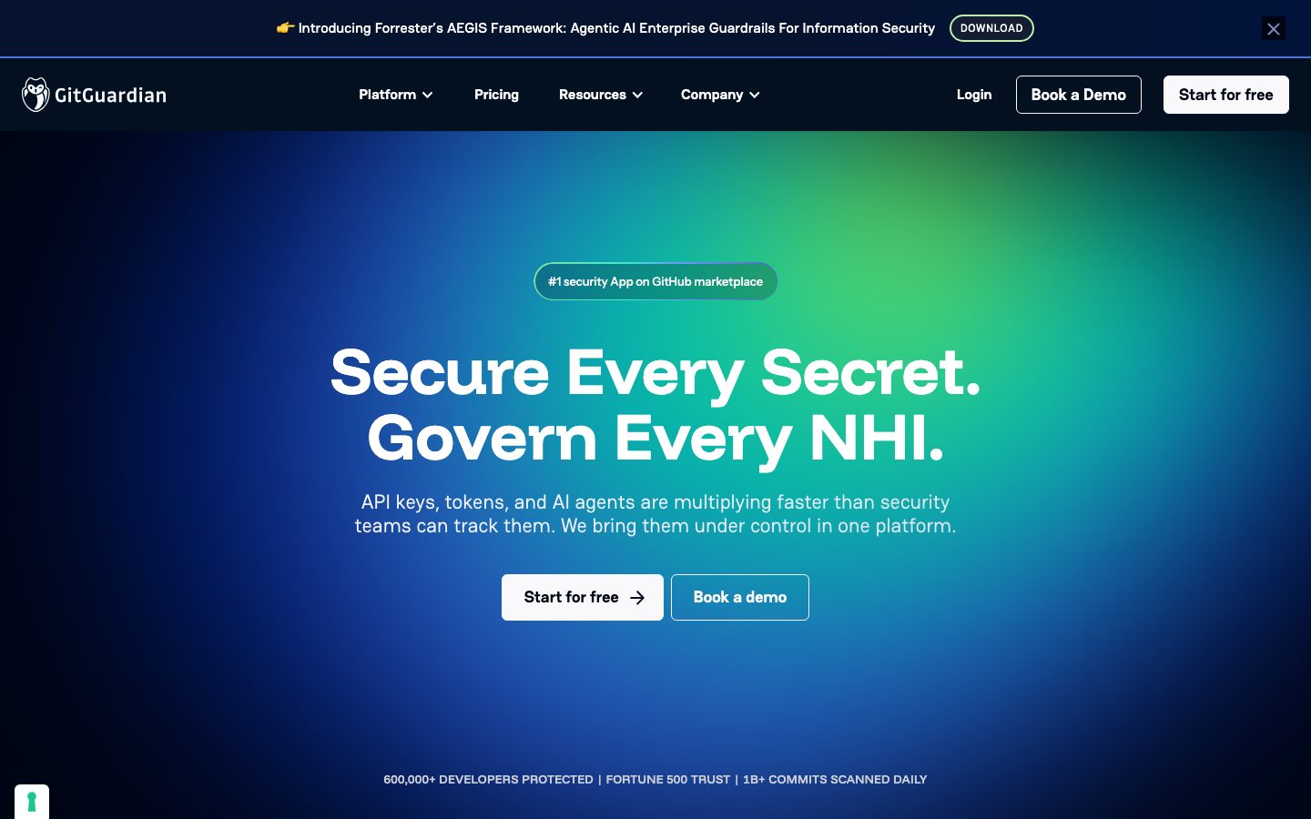
GitGuardian's marketing surface is a dark, security-engineering interface — a near-black navy canvas (`{colors.canvas}` — #000514) carrying white display type (`{colors.ink}` — #ffffff), pill-shaped CTAs, and dark soft-cornered cards (`{colors.surface-card}` — #081736) that hold real product UI screenshots. The system reads as serious developer-security tooling: confident, technical, and restrained with color.
The hero band opens with an oversized **Funnel Display** headline ("Secure Every Secret. Govern Every NHI.") in white at 72px / weight 700, set over a blue-to-green diagonal gradient that fades back into the navy canvas. Below the hero, the page settles into a strictly dark, monochrome rhythm of dark cards on darker canvas — the brand voltage lives in the hero gradient and the size of the display type, not in saturated accent fills.
Type voice is multi-family but functionally split: **Funnel Display** carries headlines and eyebrows (the condensed, geometric display voice), **Instrument Sans** appears on a secondary heading role, and **Haskoy** handles body copy and button labels. Body text is a soft cool-gray (`{colors.body}` — #cccfd7) and secondary text steps down to `{colors.muted}` (#a6abbb), keeping the dark surface readable without ever using pure white for running copy.
**Key Characteristics:**
- Dark navy canvas (`{colors.canvas}` — #000514) across the entire page — there is no light "page floor". Cards step up to `{colors.surface-card}` (#081736) and `{colors.surface-elevated}` (#1b2d55).
- Oversized Funnel Display hero headline (72px / 700) in white over a blue-green gradient. The gradient is the single most chromatic moment in the system.
- Pill-shaped buttons (`{rounded.pill}` — 70px). Primary CTAs come in two finishes: dark navy (`{component.button-primary}`, #141d31) and bright white (`{component.button-light}`).
- Dark cards (`{rounded.xl}` — 16px) holding real product UI screenshots — incident tables, investigation maps, scoring panels — shown directly rather than illustrated.
- Cool blue accent family (`{colors.accent-blue}` — #4e73db, `{colors.accent-sky}` — #3898ec, `{colors.accent-periwinkle}` — #a6b9e3, `{colors.accent-lavender}` — #c7d2ea) used sparingly on icons, links, and product-UI chrome.
- Small category labels in `{typography.eyebrow}` (Funnel Display 13px / 500 / 0.26px tracking) tag each feature block ("CONSOLIDATION", "PRIORITIZATION", "AUTOMATION").
- Spacing rhythm runs on a 4px base with heavy reliance on 24px and 40px steps, plus an 80px band-padding tier.
## Colors
### Surface
- **Canvas** (`{colors.canvas}` — #000514): The universal page floor — a near-black navy. Everything sits on top of this.
- **Surface Deep** (`{colors.surface-deep}` — #03101f): The announcement bar and the darkest nested panels.
- **Surface Card** (`{colors.surface-card}` — #081736): The standard card background — feature cards, testimonial cards, product-screenshot cards.
- **Surface Elevated** (`{colors.surface-elevated}` — #1b2d55): Raised inner panels and category-label chips inside cards.
- **Hairline** (`{colors.hairline}` — #384056): The 1px border / divider tone on dark surfaces.
- **Surface Light** (`{colors.surface-light}` — #f9f9fc): The near-white fill for light buttons and form inputs — one of the few light surfaces in the system.
- **Surface Light Alt** (`{colors.surface-light-alt}` — #e8eaee): A secondary light tone for inverted UI fragments.
### Brand / Primary
- **Primary** (`{colors.primary}` — #141d31): The dark-navy button fill. Reads as near-canvas with just enough lift to register as an interactive surface.
### Accent
GitGuardian's accent set is a cool blue family used sparingly — never on hero CTAs, only on icons, inline links, and product-UI chrome:
- **Accent Blue** (`{colors.accent-blue}` — #4e73db): Primary link / icon accent.
- **Accent Sky** (`{colors.accent-sky}` — #3898ec): Brighter interactive blue for inline UI elements.
- **Accent Periwinkle** (`{colors.accent-periwinkle}` — #a6b9e3): Soft accent for diagrams and secondary icons.
- **Accent Lavender** (`{colors.accent-lavender}` — #c7d2ea): The lightest accent tint, used in product-UI fragments and faint highlights.
### Text
- **Ink** (`{colors.ink}` — #ffffff): All headlines and primary white text on dark surfaces.
- **Body** (`{colors.body}` — #cccfd7): Default running-text color — a soft cool-gray, never pure white.
- **Muted** (`{colors.muted}` — #a6abbb): Secondary text — sub-labels, footer body, trust-bar lines.
### Neutral
A small generic neutral set was measured and is reserved for inverted UI fragments and embedded product chrome: `{colors.black}` (#000000), `{colors.neutral-light}` (#dddddd), `{colors.neutral-mid}` (#cccccc), `{colors.neutral-dark}` (#333333), `{colors.neutral-darker}` (#222222). These are not part of the brand surface palette — they appear inside screenshots of product UI shown on light backgrounds.
## Typography
### Font Family
The system runs three families, each open-source and freely available:
- **Funnel Display** — the display + eyebrow voice. Condensed, geometric, used at extreme sizes for the hero headline and at small sizes (with positive tracking) for category eyebrows.
- **Instrument Sans** — a secondary heading face used on the `title-alt` role (16px / 700).
- **Haskoy** — the workhorse body + UI face, used for running copy and button labels.
All three are open-source (Funnel Display and Instrument Sans are available via Google Fonts; Haskoy is an open SIL-licensed face), so no substitute is required. `fonts_licensed` was empty in the measured analysis — nothing here is a paid/custom typeface that needs swapping.
### Hierarchy
| Token | Family | Size | Weight | Line Height | Letter Spacing | Use |
|---|---|---|---|---|---|---|
| `{typography.display-xl}` | Funnel Display | 72px | 700 | 1.0 | normal | Hero h1 ("Secure Every Secret. Govern Every NHI.") |
| `{typography.eyebrow}` | Funnel Display | 13px | 500 | 1.0 | 0.26px | Category labels / eyebrows ("CONSOLIDATION", trust-bar line) |
| `{typography.title-sm}` | Funnel Display | 15px | 700 | 1.2 | normal | Small headings, card titles |
| `{typography.title-alt}` | Instrument Sans | 16px | 700 | 1.4 | normal | Secondary heading role |
| `{typography.body-md}` | Haskoy | 16px | 500 | 1.5 | normal | Default running-text |
| `{typography.button}` | Haskoy | 12px | 500 | 1.17 | 0.8px | Button labels, nav links |
### Principles
The hierarchy is steep: the hero headline jumps to 72px while supporting headings sit at 13–16px. This is a deliberate single-loud-voice pattern — one oversized Funnel Display statement per band, with everything else dropping to small Haskoy/Instrument Sans supporting type. Eyebrow labels carry positive letter-spacing (0.26px) and button labels carry 0.8px tracking; display and body type stay at normal tracking. Body copy never uses pure white (`{colors.ink}`) — it steps down to `{colors.body}` for comfortable reading on the dark canvas.
### Note on Font Substitutes
No substitution is required — all three typefaces are open-source. If a build environment lacks them, fall back to a geometric sans for Funnel Display, a grotesque sans for Instrument Sans, and a humanist sans for Haskoy, but the measured spec ships the real faces.
## Layout
### Spacing System
- **Base unit:** 4px.
- **Tokens:** `{spacing.xxs}` 4px · `{spacing.xs}` 8px · `{spacing.sm}` 12px · `{spacing.md}` 16px · `{spacing.lg}` 24px · `{spacing.xl}` 40px · `{spacing.xxl}` 80px · `{spacing.hero}` 208px.
- **Most-used steps:** 24px (62 occurrences) and 40px (52) are the dominant rhythm units, with 16px (51) and 8px (50) handling tight internal spacing.
- **Section padding:** `{spacing.xxl}` (80px) for major band separation; `{spacing.hero}` (208px) appears once as the deep hero vertical padding (derived as a single measured outlier).
- **Card internal padding:** `{spacing.lg}` (24px) is the standard card padding.
### Grid & Container
- **Editorial body:** Centered single column with multi-up card grids.
- **Feature grids:** 3-up "Non-Human Identity & Secrets Security" tiles; 2-up "Secure your code from the start" grid; stacked full-width "Remediate incidents at scale" rows pairing copy left + product screenshot right.
- **Trust bar:** Single horizontal logo row beneath the hero.
### Whitespace Philosophy
The dark canvas does the heavy lifting for separation — bands are delineated by 80px vertical padding and by the contrast between `{colors.canvas}` and the slightly-lighter `{colors.surface-card}` cards rather than by rules or dividers. Internal card spacing stays tight (24px) so product screenshots dominate the card area.
## Elevation & Depth
| Level | Treatment | Use |
|---|---|---|
| Flat | No shadow — surface color does the work | Body bands, nav, most cards |
| Card lift | `{colors.surface-card}` raised above `{colors.canvas}` | Feature / testimonial cards |
| Soft glow | `rgba(0,0,0,0.15) 0px 0px 7px 0px` | Subtle ambient shadow on a small set of elements (4 occurrences) |
| Drop shadow | `rgba(0,0,0,0.13) 0px 14px 14px 0px` | Heavier downward shadow on floating product-screenshot panels (3 occurrences) |
| Diffuse glow | `rgba(0,0,0,0.15) 0px 0px 15px 0px` | Single soft radial glow |
| Hairline ring | `rgba(0,0,0,0.15) 0px 0px 0px 1px` | 1px containment ring on one element |
On a dark canvas, elevation is communicated primarily through **surface-color stepping** (canvas → surface-card → surface-elevated) rather than shadow. The measured box-shadows are low-alpha and used sparingly — there is no heavy neumorphism or glassmorphism.
### Decorative Depth
- The hero's blue-green diagonal gradient creates an atmospheric depth zone behind the headline — the brightest area of the whole page, fading back into navy at the edges.
- Product UI screenshots embedded in cards carry their own internal chrome and light backgrounds (the neutral palette) — they are shown as real product, not illustrated.
## Shapes
### Border Radius Scale
| Token | Value | Use |
|---|---|---|
| `{rounded.xs}` | 4px | Small chips, tight inner elements (38 occurrences) |
| `{rounded.sm}` | 6px | Category-label chips, small controls (16 occurrences) |
| `{rounded.md}` | 8px | Mid-size controls |
| `{rounded.lg}` | 14px | Larger inner elements |
| `{rounded.xl}` | 16px | Standard card radius — feature, testimonial, product cards (35 occurrences) |
| `{rounded.xxl}` | 32px | Large rounded containers |
| `{rounded.pill}` | 70px | Pill buttons (the measured CTA radius) |
| `{rounded.full}` | 100px | Fully-rounded pills / badge wrappers |
The two anchor radii are `{rounded.xl}` (16px) for cards and `{rounded.pill}` (70px) for buttons. Inputs are the one square exception — measured at 0px radius.
### Photography / Geometry
Product UI screenshots inside cards retain their native rectangular geometry with `{rounded.xl}` card corners around them. Trust-bar partner logos sit flat with no container radius.
## Components
### Navigation
**`announcement-bar`** — A thin promo strip pinned above the nav ("👉 Introducing Forrester's AEGIS Framework…") with a small outlined "DOWNLOAD" pill and a close button at right. Background `{colors.surface-deep}`, text `{colors.ink}`, type `{typography.button}`.
**`top-nav`** — The primary nav on `{colors.canvas}`. Carries the GitGuardian wordmark + owl logo at left, center menu (Platform, Pricing, Resources, Company) in `{typography.button}`, and a right cluster with "Login" text-link, an outlined "Book a Demo" pill, and a white "Start for free" pill.
**`nav-link`** — Transparent menu items, text `{colors.ink}`, type `{typography.button}` (Haskoy 12px / 500 / 0.8px tracking).
### Buttons
**`button-primary`** — The dark-navy CTA. Background `{colors.primary}` (#141d31), text `{colors.ink}`, type `{typography.button}`, rounded `{rounded.pill}` (70px), padding 6px × 10px. (Visual padding appears more generous in the hero; 6px × 10px is the measured computed value.)
**`button-light`** — The bright white CTA used for the primary hero action ("Start for free"). Background `{colors.surface-light}` (#f9f9fc), text `{colors.canvas}`, same pill radius and type as `button-primary`. Often paired with a small arrow glyph.
**`button-outline`** — Transparent pill with a hairline border, text `{colors.ink}`. Used for the secondary "Book a Demo" / "Book a demo" actions in nav and hero.
### Cards & Containers
**`card`** — The base container. Background `{colors.surface-card}` (#081736), rounded `{rounded.xl}` (16px), no shadow, padding `{spacing.lg}` (24px). Body text `{colors.body}`.
**`feature-card`** — Used in the 3-up "Non-Human Identity & Secrets Security" grid and the 2-up "Secure your code from the start" grid. Background `{colors.surface-card}`, rounded `{rounded.xl}`, padding 24px. Carries a small icon, a title, a short description in `{typography.body-md}`, and a "Learn more" link.
**`testimonial-card`** — Customer-quote cards beneath the trust bar. Background `{colors.surface-card}`, rounded `{rounded.xl}`, padding 24px. Top carries the quote in `{typography.body-md}`; bottom carries an avatar + name + role.
**`category-label`** — Small uppercase tag chip prefixing each "Remediate incidents at scale" block ("CONSOLIDATION", "CONTEXTUAL INSIGHTS", "PRIORITIZATION", "AUTOMATION", "CUSTOMIZATION"). Background `{colors.surface-elevated}`, text `{colors.muted}`, type `{typography.eyebrow}`, rounded `{rounded.sm}` (6px), padding 4px × 12px.
**`badge-pill`** — The hero's "#1 security App on GitHub marketplace" badge. Background `{colors.surface-card}`, text `{colors.ink}`, type `{typography.eyebrow}`, rounded `{rounded.pill}`, padding 6px × 16px.
### Inputs & Forms
**`input`** — The email-capture field ("Your Company email address") in the pre-footer CTA band. Background `{colors.surface-light}`, text `{colors.canvas}`, type `{typography.body-md}`, **radius 0px** (square corners — the one non-rounded surface in the system), padding 12px × 16px.
### Footer
**`footer`** — Closes the page on the same `{colors.canvas}` (#000514) as the rest of the body — no surface inversion. Text `{colors.muted}`, type `{typography.body-md}`, vertical padding `{spacing.xxl}` (80px). The dark-on-dark footer continues the single-surface treatment of the entire page.
## Do's and Don'ts
### Do
- Keep the entire page on `{colors.canvas}` (#000514) and step up to `{colors.surface-card}` / `{colors.surface-elevated}` for cards. Surface color, not shadow, carries elevation.
- Reserve the oversized Funnel Display 72px headline for the hero. One loud display statement per band.
- Use pill buttons (`{rounded.pill}` — 70px). Offer both `{component.button-light}` (white) and `{component.button-primary}` (dark navy) for primary/secondary CTA pairing.
- Use `{colors.body}` (#cccfd7) for running copy and `{colors.muted}` (#a6abbb) for secondary text — never pure white for paragraphs.
- Tag feature blocks with `{component.category-label}` uppercase eyebrows in `{typography.eyebrow}` (0.26px tracking).
- Embed real product UI screenshots inside `{component.card}` — show the product, don't illustrate it.
- Apply the cool blue accents (`{colors.accent-blue}`, `{colors.accent-sky}`) only on icons, links, and product chrome — never on CTA fills.
### Don't
- Don't introduce a light page background. The system is dark end-to-end, including the footer.
- Don't put saturated accent color on primary CTAs — buttons stay navy or white.
- Don't bold body copy or set it in pure white; body stays Haskoy 500 in `{colors.body}`.
- Don't round inputs — the measured input radius is 0px (square), a deliberate contrast against the pill buttons.
- Don't add heavy shadows. The measured shadows are low-alpha and rare; lean on surface stepping.
- Don't mix the display families — Funnel Display for headlines/eyebrows, Haskoy for body/buttons, Instrument Sans only on its `title-alt` role.
## Responsive Behavior
The analysis captured desktop landing + pricing renders plus a tall full-page composite. The breakpoints below are derived from the layout structure rather than measured at multiple widths — treat them as guidance, not verified values.
### Breakpoints (derived)
| Name | Width | Key Changes |
|---|---|---|
| Mobile | < 768px | Hamburger nav; hero h1 scales down from 72px; feature grids collapse to 1-up; copy + product-screenshot rows stack |
| Tablet | 768–1024px | Nav tightens; 3-up feature grid → 2-up; testimonial cards 2-up |
| Desktop | 1024–1440px | Full horizontal nav; 3-up feature grid; copy-left / screenshot-right rows |
| Wide | > 1440px | Centered max-width container with added outer breathing room |
### Touch Targets
- Pill buttons use a measured 6px × 10px padding with `{typography.button}` at 12px — effective tap area should be padded up to a 44px minimum on touch surfaces (the raw measured padding is tighter than WCAG's target).
- Nav links rely on the same small button type; spacing between them provides the tap separation.
### Collapsing Strategy
- The hero's centered headline + dual CTA pair stacks vertically on mobile.
- The "Remediate incidents at scale" alternating copy/screenshot rows collapse to single-column (copy first, screenshot below).
- Feature grids reduce columns (3 → 2 → 1) rather than shrinking cards.
- The trust-bar logo row wraps to multiple rows on narrow widths.
## Iteration Guide
1. Focus on ONE component at a time. Reference its YAML key directly (`{component.feature-card}`, `{component.button-light}`).
2. Variants of an existing component live as separate entries in `components:` (e.g., the white vs. navy button finishes).
3. Use `{token.refs}` everywhere — never inline a hex in a component.
4. Document default and Active/Pressed states only — no hover docs.
5. Keep the page dark end-to-end; the only light surfaces are `{component.button-light}` and `{component.input}`.
6. The oversized Funnel Display hero headline is the system's loudest voice — scale it before bolding anything.
7. When adding emphasis, prefer a surface step (`{colors.surface-card}` → `{colors.surface-elevated}`) over a shadow.
## Known Gaps
- **Active/pressed button states were not measured.** Only the default `{component.button-primary}` background (#141d31) was captured; press/disabled tints would need an interaction capture to confirm.
- **The hero gradient** (blue → green diagonal) is visible in screenshots but was not extracted as discrete stop values — the accent blues (`{colors.accent-blue}`, `{colors.accent-sky}`) are the nearest measured tones, but the exact gradient stops are a gap.
- **Semantic colors** (success / warning / error) were not surfaced in the measured palette — product UI screenshots show red/green status dots but those live inside embedded chrome, not as system tokens.
- **The 208px hero spacing value** appeared once (derived as a single outlier) and may be a one-off composite measurement rather than a reusable token.
- **Responsive breakpoints are derived** from layout structure, not measured across viewport widths.
- **Funnel Display, Instrument Sans, and Haskoy** were all reported as non-licensed (open-source), so no substitution is documented — but the precise weights loaded for each (beyond those measured) are unconfirmed.
- **Multiple near-identical dark accents** (`#03101f`, `#081736`, `#1b2d55`, `#384056`) were measured; their exact functional boundaries (which is divider vs. nested panel vs. chip) are inferred from screenshots and may need refinement.
- **Animation / transition timings** (hero gradient motion, incident-chart reveal) are out of scope.
<!-- Documented by duply · real-world design systems as ready-to-use DESIGN.md for AI coding agents · https://duply.ai/gitguardian/design-md -->
Color Palette
Accent
Neutrals
Typography
display-xl72px · 700 · 1
The quick brown fox jumpseyebrow13px · 500 · 1
The quick brown fox jumpstitle-sm15px · 700 · 1.2
The quick brown fox jumpstitle-alt16px · 700 · 1.4
The quick brown fox jumpsbody-md16px · 500 · 1.5
The quick brown fox jumpsbutton12px · 500 · 1.17
The quick brown fox jumpsSpacing & Shape
Spacing
| Name | Value | Preview |
|---|---|---|
| xxs | 4px | |
| xs | 8px | |
| sm | 12px | |
| md | 16px | |
| lg | 24px | |
| xl | 40px | |
| xxl | 80px | |
| hero | 208px |
Border Radius
| Name | Value | Preview |
|---|---|---|
| xs | 4px | |
| sm | 6px | |
| md | 8px | |
| lg | 14px | |
| xl | 16px | |
| xxl | 32px | |
| pill | 70px | |
| full | 100px |
More like this


---
version: alpha
name: GitGuardian-design-analysis
description: A dark, security-engineering interface anchored on a near-black navy canvas (#000514) with white display type, pill-shaped CTAs, and a cool blue accent family. The system reads as serious developer-security tooling — deep gradient hero, soft-cornered dark cards holding product UI screenshots, condensed Funnel Display headlines, and a restrained blue/periwinkle accent set against an otherwise monochrome dark surface. Brand voltage comes from the oversized Funnel Display hero headline and the blue-green gradient hero band rather than from saturated accent color.

colors:
  primary: "#141d31"
  canvas: "#000514"
  surface-deep: "#03101f"
  surface-card: "#081736"
  surface-elevated: "#1b2d55"
  ink: "#ffffff"
  body: "#cccfd7"
  muted: "#a6abbb"
  hairline: "#384056"
  surface-light: "#f9f9fc"
  surface-light-alt: "#e8eaee"
  accent-blue: "#4e73db"
  accent-sky: "#3898ec"
  accent-periwinkle: "#a6b9e3"
  accent-lavender: "#c7d2ea"
  black: "#000000"
  neutral-light: "#dddddd"
  neutral-mid: "#cccccc"
  neutral-dark: "#333333"
  neutral-darker: "#222222"

typography:
  display-xl:
    fontFamily: "Funnel Display, sans-serif"
    fontSize: 72px
    fontWeight: 700
    lineHeight: 1.0
    letterSpacing: normal
  eyebrow:
    fontFamily: "Funnel Display, sans-serif"
    fontSize: 13px
    fontWeight: 500
    lineHeight: 1.0
    letterSpacing: 0.26px
  title-sm:
    fontFamily: "Funnel Display, sans-serif"
    fontSize: 15px
    fontWeight: 700
    lineHeight: 1.2
    letterSpacing: normal
  title-alt:
    fontFamily: "Instrument Sans, sans-serif"
    fontSize: 16px
    fontWeight: 700
    lineHeight: 1.4
    letterSpacing: normal
  body-md:
    fontFamily: "Haskoy, sans-serif"
    fontSize: 16px
    fontWeight: 500
    lineHeight: 1.5
    letterSpacing: normal
  button:
    fontFamily: "Haskoy, sans-serif"
    fontSize: 12px
    fontWeight: 500
    lineHeight: 1.17
    letterSpacing: 0.8px

rounded:
  xs: 4px
  sm: 6px
  md: 8px
  lg: 14px
  xl: 16px
  xxl: 32px
  pill: 70px
  full: 100px

spacing:
  xxs: 4px
  xs: 8px
  sm: 12px
  md: 16px
  lg: 24px
  xl: 40px
  xxl: 80px
  hero: 208px

components:
  button-primary:
    backgroundColor: "{colors.primary}"
    textColor: "{colors.ink}"
    typography: "{typography.button}"
    rounded: "{rounded.pill}"
    padding: 6px 10px
  button-light:
    backgroundColor: "{colors.surface-light}"
    textColor: "{colors.canvas}"
    typography: "{typography.button}"
    rounded: "{rounded.pill}"
    padding: 6px 10px
  button-outline:
    backgroundColor: transparent
    textColor: "{colors.ink}"
    typography: "{typography.button}"
    rounded: "{rounded.pill}"
    padding: 6px 10px
  nav-link:
    backgroundColor: transparent
    textColor: "{colors.ink}"
    typography: "{typography.button}"
  top-nav:
    backgroundColor: "{colors.canvas}"
    textColor: "{colors.ink}"
    typography: "{typography.button}"
  announcement-bar:
    backgroundColor: "{colors.surface-deep}"
    textColor: "{colors.ink}"
    typography: "{typography.button}"
  badge-pill:
    backgroundColor: "{colors.surface-card}"
    textColor: "{colors.ink}"
    typography: "{typography.eyebrow}"
    rounded: "{rounded.pill}"
    padding: 6px 16px
  card:
    backgroundColor: "{colors.surface-card}"
    textColor: "{colors.body}"
    typography: "{typography.body-md}"
    rounded: "{rounded.xl}"
    padding: 24px
  feature-card:
    backgroundColor: "{colors.surface-card}"
    textColor: "{colors.body}"
    typography: "{typography.body-md}"
    rounded: "{rounded.xl}"
    padding: 24px
  testimonial-card:
    backgroundColor: "{colors.surface-card}"
    textColor: "{colors.body}"
    typography: "{typography.body-md}"
    rounded: "{rounded.xl}"
    padding: 24px
  category-label:
    backgroundColor: "{colors.surface-elevated}"
    textColor: "{colors.muted}"
    typography: "{typography.eyebrow}"
    rounded: "{rounded.sm}"
    padding: 4px 12px
  input:
    backgroundColor: "{colors.surface-light}"
    textColor: "{colors.canvas}"
    typography: "{typography.body-md}"
    radius: "0px"
    padding: 12px 16px
  footer:
    backgroundColor: "{colors.canvas}"
    textColor: "{colors.muted}"
    typography: "{typography.body-md}"
    padding: 80px
---

## Overview

GitGuardian's marketing surface is a dark, security-engineering interface — a near-black navy canvas (`{colors.canvas}` — #000514) carrying white display type (`{colors.ink}` — #ffffff), pill-shaped CTAs, and dark soft-cornered cards (`{colors.surface-card}` — #081736) that hold real product UI screenshots. The system reads as serious developer-security tooling: confident, technical, and restrained with color.

The hero band opens with an oversized **Funnel Display** headline ("Secure Every Secret. Govern Every NHI.") in white at 72px / weight 700, set over a blue-to-green diagonal gradient that fades back into the navy canvas. Below the hero, the page settles into a strictly dark, monochrome rhythm of dark cards on darker canvas — the brand voltage lives in the hero gradient and the size of the display type, not in saturated accent fills.

Type voice is multi-family but functionally split: **Funnel Display** carries headlines and eyebrows (the condensed, geometric display voice), **Instrument Sans** appears on a secondary heading role, and **Haskoy** handles body copy and button labels. Body text is a soft cool-gray (`{colors.body}` — #cccfd7) and secondary text steps down to `{colors.muted}` (#a6abbb), keeping the dark surface readable without ever using pure white for running copy.

**Key Characteristics:**
- Dark navy canvas (`{colors.canvas}` — #000514) across the entire page — there is no light "page floor". Cards step up to `{colors.surface-card}` (#081736) and `{colors.surface-elevated}` (#1b2d55).
- Oversized Funnel Display hero headline (72px / 700) in white over a blue-green gradient. The gradient is the single most chromatic moment in the system.
- Pill-shaped buttons (`{rounded.pill}` — 70px). Primary CTAs come in two finishes: dark navy (`{component.button-primary}`, #141d31) and bright white (`{component.button-light}`).
- Dark cards (`{rounded.xl}` — 16px) holding real product UI screenshots — incident tables, investigation maps, scoring panels — shown directly rather than illustrated.
- Cool blue accent family (`{colors.accent-blue}` — #4e73db, `{colors.accent-sky}` — #3898ec, `{colors.accent-periwinkle}` — #a6b9e3, `{colors.accent-lavender}` — #c7d2ea) used sparingly on icons, links, and product-UI chrome.
- Small category labels in `{typography.eyebrow}` (Funnel Display 13px / 500 / 0.26px tracking) tag each feature block ("CONSOLIDATION", "PRIORITIZATION", "AUTOMATION").
- Spacing rhythm runs on a 4px base with heavy reliance on 24px and 40px steps, plus an 80px band-padding tier.

## Colors

### Surface
- **Canvas** (`{colors.canvas}` — #000514): The universal page floor — a near-black navy. Everything sits on top of this.
- **Surface Deep** (`{colors.surface-deep}` — #03101f): The announcement bar and the darkest nested panels.
- **Surface Card** (`{colors.surface-card}` — #081736): The standard card background — feature cards, testimonial cards, product-screenshot cards.
- **Surface Elevated** (`{colors.surface-elevated}` — #1b2d55): Raised inner panels and category-label chips inside cards.
- **Hairline** (`{colors.hairline}` — #384056): The 1px border / divider tone on dark surfaces.
- **Surface Light** (`{colors.surface-light}` — #f9f9fc): The near-white fill for light buttons and form inputs — one of the few light surfaces in the system.
- **Surface Light Alt** (`{colors.surface-light-alt}` — #e8eaee): A secondary light tone for inverted UI fragments.

### Brand / Primary
- **Primary** (`{colors.primary}` — #141d31): The dark-navy button fill. Reads as near-canvas with just enough lift to register as an interactive surface.

### Accent
GitGuardian's accent set is a cool blue family used sparingly — never on hero CTAs, only on icons, inline links, and product-UI chrome:
- **Accent Blue** (`{colors.accent-blue}` — #4e73db): Primary link / icon accent.
- **Accent Sky** (`{colors.accent-sky}` — #3898ec): Brighter interactive blue for inline UI elements.
- **Accent Periwinkle** (`{colors.accent-periwinkle}` — #a6b9e3): Soft accent for diagrams and secondary icons.
- **Accent Lavender** (`{colors.accent-lavender}` — #c7d2ea): The lightest accent tint, used in product-UI fragments and faint highlights.

### Text
- **Ink** (`{colors.ink}` — #ffffff): All headlines and primary white text on dark surfaces.
- **Body** (`{colors.body}` — #cccfd7): Default running-text color — a soft cool-gray, never pure white.
- **Muted** (`{colors.muted}` — #a6abbb): Secondary text — sub-labels, footer body, trust-bar lines.

### Neutral
A small generic neutral set was measured and is reserved for inverted UI fragments and embedded product chrome: `{colors.black}` (#000000), `{colors.neutral-light}` (#dddddd), `{colors.neutral-mid}` (#cccccc), `{colors.neutral-dark}` (#333333), `{colors.neutral-darker}` (#222222). These are not part of the brand surface palette — they appear inside screenshots of product UI shown on light backgrounds.

## Typography

### Font Family
The system runs three families, each open-source and freely available:
- **Funnel Display** — the display + eyebrow voice. Condensed, geometric, used at extreme sizes for the hero headline and at small sizes (with positive tracking) for category eyebrows.
- **Instrument Sans** — a secondary heading face used on the `title-alt` role (16px / 700).
- **Haskoy** — the workhorse body + UI face, used for running copy and button labels.

All three are open-source (Funnel Display and Instrument Sans are available via Google Fonts; Haskoy is an open SIL-licensed face), so no substitute is required. `fonts_licensed` was empty in the measured analysis — nothing here is a paid/custom typeface that needs swapping.

### Hierarchy

| Token | Family | Size | Weight | Line Height | Letter Spacing | Use |
|---|---|---|---|---|---|---|
| `{typography.display-xl}` | Funnel Display | 72px | 700 | 1.0 | normal | Hero h1 ("Secure Every Secret. Govern Every NHI.") |
| `{typography.eyebrow}` | Funnel Display | 13px | 500 | 1.0 | 0.26px | Category labels / eyebrows ("CONSOLIDATION", trust-bar line) |
| `{typography.title-sm}` | Funnel Display | 15px | 700 | 1.2 | normal | Small headings, card titles |
| `{typography.title-alt}` | Instrument Sans | 16px | 700 | 1.4 | normal | Secondary heading role |
| `{typography.body-md}` | Haskoy | 16px | 500 | 1.5 | normal | Default running-text |
| `{typography.button}` | Haskoy | 12px | 500 | 1.17 | 0.8px | Button labels, nav links |

### Principles
The hierarchy is steep: the hero headline jumps to 72px while supporting headings sit at 13–16px. This is a deliberate single-loud-voice pattern — one oversized Funnel Display statement per band, with everything else dropping to small Haskoy/Instrument Sans supporting type. Eyebrow labels carry positive letter-spacing (0.26px) and button labels carry 0.8px tracking; display and body type stay at normal tracking. Body copy never uses pure white (`{colors.ink}`) — it steps down to `{colors.body}` for comfortable reading on the dark canvas.

### Note on Font Substitutes
No substitution is required — all three typefaces are open-source. If a build environment lacks them, fall back to a geometric sans for Funnel Display, a grotesque sans for Instrument Sans, and a humanist sans for Haskoy, but the measured spec ships the real faces.

## Layout

### Spacing System
- **Base unit:** 4px.
- **Tokens:** `{spacing.xxs}` 4px · `{spacing.xs}` 8px · `{spacing.sm}` 12px · `{spacing.md}` 16px · `{spacing.lg}` 24px · `{spacing.xl}` 40px · `{spacing.xxl}` 80px · `{spacing.hero}` 208px.
- **Most-used steps:** 24px (62 occurrences) and 40px (52) are the dominant rhythm units, with 16px (51) and 8px (50) handling tight internal spacing.
- **Section padding:** `{spacing.xxl}` (80px) for major band separation; `{spacing.hero}` (208px) appears once as the deep hero vertical padding (derived as a single measured outlier).
- **Card internal padding:** `{spacing.lg}` (24px) is the standard card padding.

### Grid & Container
- **Editorial body:** Centered single column with multi-up card grids.
- **Feature grids:** 3-up "Non-Human Identity & Secrets Security" tiles; 2-up "Secure your code from the start" grid; stacked full-width "Remediate incidents at scale" rows pairing copy left + product screenshot right.
- **Trust bar:** Single horizontal logo row beneath the hero.

### Whitespace Philosophy
The dark canvas does the heavy lifting for separation — bands are delineated by 80px vertical padding and by the contrast between `{colors.canvas}` and the slightly-lighter `{colors.surface-card}` cards rather than by rules or dividers. Internal card spacing stays tight (24px) so product screenshots dominate the card area.

## Elevation & Depth

| Level | Treatment | Use |
|---|---|---|
| Flat | No shadow — surface color does the work | Body bands, nav, most cards |
| Card lift | `{colors.surface-card}` raised above `{colors.canvas}` | Feature / testimonial cards |
| Soft glow | `rgba(0,0,0,0.15) 0px 0px 7px 0px` | Subtle ambient shadow on a small set of elements (4 occurrences) |
| Drop shadow | `rgba(0,0,0,0.13) 0px 14px 14px 0px` | Heavier downward shadow on floating product-screenshot panels (3 occurrences) |
| Diffuse glow | `rgba(0,0,0,0.15) 0px 0px 15px 0px` | Single soft radial glow |
| Hairline ring | `rgba(0,0,0,0.15) 0px 0px 0px 1px` | 1px containment ring on one element |

On a dark canvas, elevation is communicated primarily through **surface-color stepping** (canvas → surface-card → surface-elevated) rather than shadow. The measured box-shadows are low-alpha and used sparingly — there is no heavy neumorphism or glassmorphism.

### Decorative Depth
- The hero's blue-green diagonal gradient creates an atmospheric depth zone behind the headline — the brightest area of the whole page, fading back into navy at the edges.
- Product UI screenshots embedded in cards carry their own internal chrome and light backgrounds (the neutral palette) — they are shown as real product, not illustrated.

## Shapes

### Border Radius Scale

| Token | Value | Use |
|---|---|---|
| `{rounded.xs}` | 4px | Small chips, tight inner elements (38 occurrences) |
| `{rounded.sm}` | 6px | Category-label chips, small controls (16 occurrences) |
| `{rounded.md}` | 8px | Mid-size controls |
| `{rounded.lg}` | 14px | Larger inner elements |
| `{rounded.xl}` | 16px | Standard card radius — feature, testimonial, product cards (35 occurrences) |
| `{rounded.xxl}` | 32px | Large rounded containers |
| `{rounded.pill}` | 70px | Pill buttons (the measured CTA radius) |
| `{rounded.full}` | 100px | Fully-rounded pills / badge wrappers |

The two anchor radii are `{rounded.xl}` (16px) for cards and `{rounded.pill}` (70px) for buttons. Inputs are the one square exception — measured at 0px radius.

### Photography / Geometry
Product UI screenshots inside cards retain their native rectangular geometry with `{rounded.xl}` card corners around them. Trust-bar partner logos sit flat with no container radius.

## Components

### Navigation

**`announcement-bar`** — A thin promo strip pinned above the nav ("👉 Introducing Forrester's AEGIS Framework…") with a small outlined "DOWNLOAD" pill and a close button at right. Background `{colors.surface-deep}`, text `{colors.ink}`, type `{typography.button}`.

**`top-nav`** — The primary nav on `{colors.canvas}`. Carries the GitGuardian wordmark + owl logo at left, center menu (Platform, Pricing, Resources, Company) in `{typography.button}`, and a right cluster with "Login" text-link, an outlined "Book a Demo" pill, and a white "Start for free" pill.

**`nav-link`** — Transparent menu items, text `{colors.ink}`, type `{typography.button}` (Haskoy 12px / 500 / 0.8px tracking).

### Buttons

**`button-primary`** — The dark-navy CTA. Background `{colors.primary}` (#141d31), text `{colors.ink}`, type `{typography.button}`, rounded `{rounded.pill}` (70px), padding 6px × 10px. (Visual padding appears more generous in the hero; 6px × 10px is the measured computed value.)

**`button-light`** — The bright white CTA used for the primary hero action ("Start for free"). Background `{colors.surface-light}` (#f9f9fc), text `{colors.canvas}`, same pill radius and type as `button-primary`. Often paired with a small arrow glyph.

**`button-outline`** — Transparent pill with a hairline border, text `{colors.ink}`. Used for the secondary "Book a Demo" / "Book a demo" actions in nav and hero.

### Cards & Containers

**`card`** — The base container. Background `{colors.surface-card}` (#081736), rounded `{rounded.xl}` (16px), no shadow, padding `{spacing.lg}` (24px). Body text `{colors.body}`.

**`feature-card`** — Used in the 3-up "Non-Human Identity & Secrets Security" grid and the 2-up "Secure your code from the start" grid. Background `{colors.surface-card}`, rounded `{rounded.xl}`, padding 24px. Carries a small icon, a title, a short description in `{typography.body-md}`, and a "Learn more" link.

**`testimonial-card`** — Customer-quote cards beneath the trust bar. Background `{colors.surface-card}`, rounded `{rounded.xl}`, padding 24px. Top carries the quote in `{typography.body-md}`; bottom carries an avatar + name + role.

**`category-label`** — Small uppercase tag chip prefixing each "Remediate incidents at scale" block ("CONSOLIDATION", "CONTEXTUAL INSIGHTS", "PRIORITIZATION", "AUTOMATION", "CUSTOMIZATION"). Background `{colors.surface-elevated}`, text `{colors.muted}`, type `{typography.eyebrow}`, rounded `{rounded.sm}` (6px), padding 4px × 12px.

**`badge-pill`** — The hero's "#1 security App on GitHub marketplace" badge. Background `{colors.surface-card}`, text `{colors.ink}`, type `{typography.eyebrow}`, rounded `{rounded.pill}`, padding 6px × 16px.

### Inputs & Forms

**`input`** — The email-capture field ("Your Company email address") in the pre-footer CTA band. Background `{colors.surface-light}`, text `{colors.canvas}`, type `{typography.body-md}`, **radius 0px** (square corners — the one non-rounded surface in the system), padding 12px × 16px.

### Footer

**`footer`** — Closes the page on the same `{colors.canvas}` (#000514) as the rest of the body — no surface inversion. Text `{colors.muted}`, type `{typography.body-md}`, vertical padding `{spacing.xxl}` (80px). The dark-on-dark footer continues the single-surface treatment of the entire page.

## Do's and Don'ts

### Do
- Keep the entire page on `{colors.canvas}` (#000514) and step up to `{colors.surface-card}` / `{colors.surface-elevated}` for cards. Surface color, not shadow, carries elevation.
- Reserve the oversized Funnel Display 72px headline for the hero. One loud display statement per band.
- Use pill buttons (`{rounded.pill}` — 70px). Offer both `{component.button-light}` (white) and `{component.button-primary}` (dark navy) for primary/secondary CTA pairing.
- Use `{colors.body}` (#cccfd7) for running copy and `{colors.muted}` (#a6abbb) for secondary text — never pure white for paragraphs.
- Tag feature blocks with `{component.category-label}` uppercase eyebrows in `{typography.eyebrow}` (0.26px tracking).
- Embed real product UI screenshots inside `{component.card}` — show the product, don't illustrate it.
- Apply the cool blue accents (`{colors.accent-blue}`, `{colors.accent-sky}`) only on icons, links, and product chrome — never on CTA fills.

### Don't
- Don't introduce a light page background. The system is dark end-to-end, including the footer.
- Don't put saturated accent color on primary CTAs — buttons stay navy or white.
- Don't bold body copy or set it in pure white; body stays Haskoy 500 in `{colors.body}`.
- Don't round inputs — the measured input radius is 0px (square), a deliberate contrast against the pill buttons.
- Don't add heavy shadows. The measured shadows are low-alpha and rare; lean on surface stepping.
- Don't mix the display families — Funnel Display for headlines/eyebrows, Haskoy for body/buttons, Instrument Sans only on its `title-alt` role.

## Responsive Behavior

The analysis captured desktop landing + pricing renders plus a tall full-page composite. The breakpoints below are derived from the layout structure rather than measured at multiple widths — treat them as guidance, not verified values.

### Breakpoints (derived)

| Name | Width | Key Changes |
|---|---|---|
| Mobile | < 768px | Hamburger nav; hero h1 scales down from 72px; feature grids collapse to 1-up; copy + product-screenshot rows stack |
| Tablet | 768–1024px | Nav tightens; 3-up feature grid → 2-up; testimonial cards 2-up |
| Desktop | 1024–1440px | Full horizontal nav; 3-up feature grid; copy-left / screenshot-right rows |
| Wide | > 1440px | Centered max-width container with added outer breathing room |

### Touch Targets
- Pill buttons use a measured 6px × 10px padding with `{typography.button}` at 12px — effective tap area should be padded up to a 44px minimum on touch surfaces (the raw measured padding is tighter than WCAG's target).
- Nav links rely on the same small button type; spacing between them provides the tap separation.

### Collapsing Strategy
- The hero's centered headline + dual CTA pair stacks vertically on mobile.
- The "Remediate incidents at scale" alternating copy/screenshot rows collapse to single-column (copy first, screenshot below).
- Feature grids reduce columns (3 → 2 → 1) rather than shrinking cards.
- The trust-bar logo row wraps to multiple rows on narrow widths.

## Iteration Guide

1. Focus on ONE component at a time. Reference its YAML key directly (`{component.feature-card}`, `{component.button-light}`).
2. Variants of an existing component live as separate entries in `components:` (e.g., the white vs. navy button finishes).
3. Use `{token.refs}` everywhere — never inline a hex in a component.
4. Document default and Active/Pressed states only — no hover docs.
5. Keep the page dark end-to-end; the only light surfaces are `{component.button-light}` and `{component.input}`.
6. The oversized Funnel Display hero headline is the system's loudest voice — scale it before bolding anything.
7. When adding emphasis, prefer a surface step (`{colors.surface-card}` → `{colors.surface-elevated}`) over a shadow.

## Known Gaps

- **Active/pressed button states were not measured.** Only the default `{component.button-primary}` background (#141d31) was captured; press/disabled tints would need an interaction capture to confirm.
- **The hero gradient** (blue → green diagonal) is visible in screenshots but was not extracted as discrete stop values — the accent blues (`{colors.accent-blue}`, `{colors.accent-sky}`) are the nearest measured tones, but the exact gradient stops are a gap.
- **Semantic colors** (success / warning / error) were not surfaced in the measured palette — product UI screenshots show red/green status dots but those live inside embedded chrome, not as system tokens.
- **The 208px hero spacing value** appeared once (derived as a single outlier) and may be a one-off composite measurement rather than a reusable token.
- **Responsive breakpoints are derived** from layout structure, not measured across viewport widths.
- **Funnel Display, Instrument Sans, and Haskoy** were all reported as non-licensed (open-source), so no substitution is documented — but the precise weights loaded for each (beyond those measured) are unconfirmed.
- **Multiple near-identical dark accents** (`#03101f`, `#081736`, `#1b2d55`, `#384056`) were measured; their exact functional boundaries (which is divider vs. nested panel vs. chip) are inferred from screenshots and may need refinement.
- **Animation / transition timings** (hero gradient motion, incident-chart reveal) are out of scope.

<!-- Documented by duply · real-world design systems as ready-to-use DESIGN.md for AI coding agents · https://duply.ai/gitguardian/design-md -->