Giga
A cinematic, dark-canvas enterprise-AI interface that opens on a full-bleed landscape photograph and resolves into a near-black product surface. The system pairs a light-weight serif display face (emilioDisplay) for editorial headlines with Inter for all UI and body copy, leaning on generous whitespace, pill-shaped white CTAs, and dark glassy product-mockup cards. Brand voltage comes from the airy serif headline over photography and from real product chrome (agent-creation modals) shown inside dark cards — accent color is used sparingly.
---
version: alpha
name: Giga-design-analysis
description: A cinematic, dark-canvas enterprise-AI interface that opens on a full-bleed landscape photograph and resolves into a near-black product surface. The system pairs a light-weight serif display face (emilioDisplay) for editorial headlines with Inter for all UI and body copy, leaning on generous whitespace, pill-shaped white CTAs, and dark glassy product-mockup cards. Brand voltage comes from the airy serif headline over photography and from real product chrome (agent-creation modals) shown inside dark cards — accent color is used sparingly.
colors:
canvas: "#000000"
surface-deep: "#0b0b0e"
surface: "#111111"
surface-alt: "#131313"
surface-elevated: "#171615"
surface-raised: "#262828"
surface-raised-alt: "#282828"
neutral-600: "#333333"
muted: "#606060"
muted-soft: "#8d8d8d"
hairline: "#333333"
neutral-300: "#bbbbbb"
neutral-200: "#e6e6e6"
surface-light: "#f9f9f9"
ink: "#ffffff"
on-dark: "#ffffff"
on-dark-muted: "#8d8d8d"
accent-blue: "#0090ff"
accent-blue-alt: "#0099ff"
accent-violet: "#6e56cf"
accent-orange: "#f76b15"
accent-red: "#fe2c02"
accent-navy: "#071427"
typography:
display-xl:
fontFamily: "emilioDisplay, Spectral, Georgia, serif"
fontSize: 66.24px
fontWeight: 300
lineHeight: 1.2
letterSpacing: -1.9872px
display-lg:
fontFamily: "emilioDisplay, Spectral, Georgia, serif"
fontSize: 48px
fontWeight: 300
lineHeight: 1.3
letterSpacing: -0.96px
label:
fontFamily: "interText, Inter, sans-serif"
fontSize: 14px
fontWeight: 400
lineHeight: 1.5
letterSpacing: normal
body:
fontFamily: "interText, Inter, sans-serif"
fontSize: 16px
fontWeight: 400
lineHeight: 2.0
letterSpacing: normal
button:
fontFamily: "interText, Inter, sans-serif"
fontSize: 14px
fontWeight: 400
lineHeight: 1.714
letterSpacing: normal
rounded:
none: 0px
xs: 4px
sm: 6px
md: 8px
lg: 10px
xl: 12px
xxl: 16px
pill: 9999px
spacing:
xxs: 4px
xs: 6px
sm: 8px
smd: 10px
md: 12px
lg: 16px
xl: 20px
xxl: 24px
xxxl: 32px
section: 40px
components:
top-nav:
backgroundColor: transparent
textColor: "{colors.on-dark}"
typography: "{typography.button}"
nav-link:
backgroundColor: transparent
textColor: "{colors.on-dark}"
typography: "{typography.button}"
button-primary:
backgroundColor: "{colors.ink}"
textColor: "{colors.canvas}"
typography: "{typography.button}"
rounded: "{rounded.none}"
padding: 0px 12px 0px 22px
button-pill:
backgroundColor: "{colors.ink}"
textColor: "{colors.canvas}"
typography: "{typography.button}"
rounded: "{rounded.pill}"
padding: 12px 24px
button-pill-dark:
backgroundColor: "{colors.canvas}"
textColor: "{colors.on-dark}"
typography: "{typography.button}"
rounded: "{rounded.pill}"
padding: 12px 24px
eyebrow-badge:
backgroundColor: transparent
textColor: "{colors.on-dark}"
typography: "{typography.label}"
rounded: "{rounded.pill}"
padding: 6px 16px
section-eyebrow:
backgroundColor: transparent
textColor: "{colors.accent-orange}"
typography: "{typography.label}"
video-thumb-card:
backgroundColor: "{colors.surface-elevated}"
textColor: "{colors.on-dark}"
typography: "{typography.label}"
rounded: "{rounded.xl}"
padding: 8px
product-mockup-card:
backgroundColor: "{colors.surface-deep}"
textColor: "{colors.on-dark}"
rounded: "{rounded.xxl}"
padding: 24px
agent-modal:
backgroundColor: "{colors.surface-raised}"
textColor: "{colors.on-dark}"
typography: "{typography.label}"
rounded: "{rounded.xl}"
padding: 20px
feature-cell:
backgroundColor: transparent
textColor: "{colors.on-dark-muted}"
typography: "{typography.label}"
stat-block:
backgroundColor: transparent
textColor: "{colors.on-dark}"
typography: "{typography.display-lg}"
logo-cloud:
backgroundColor: transparent
textColor: "{colors.on-dark-muted}"
typography: "{typography.label}"
case-study-card:
backgroundColor: "{colors.surface-light}"
textColor: "{colors.canvas}"
typography: "{typography.body}"
rounded: "{rounded.xxl}"
padding: 24px
case-study-visual:
backgroundColor: "{colors.accent-orange}"
textColor: "{colors.on-dark}"
typography: "{typography.display-lg}"
rounded: "{rounded.xl}"
footer:
backgroundColor: "{colors.surface-light}"
textColor: "{colors.muted}"
typography: "{typography.label}"
padding: 40px
text-link:
backgroundColor: transparent
textColor: "{colors.on-dark}"
typography: "{typography.body}"
---
## Overview
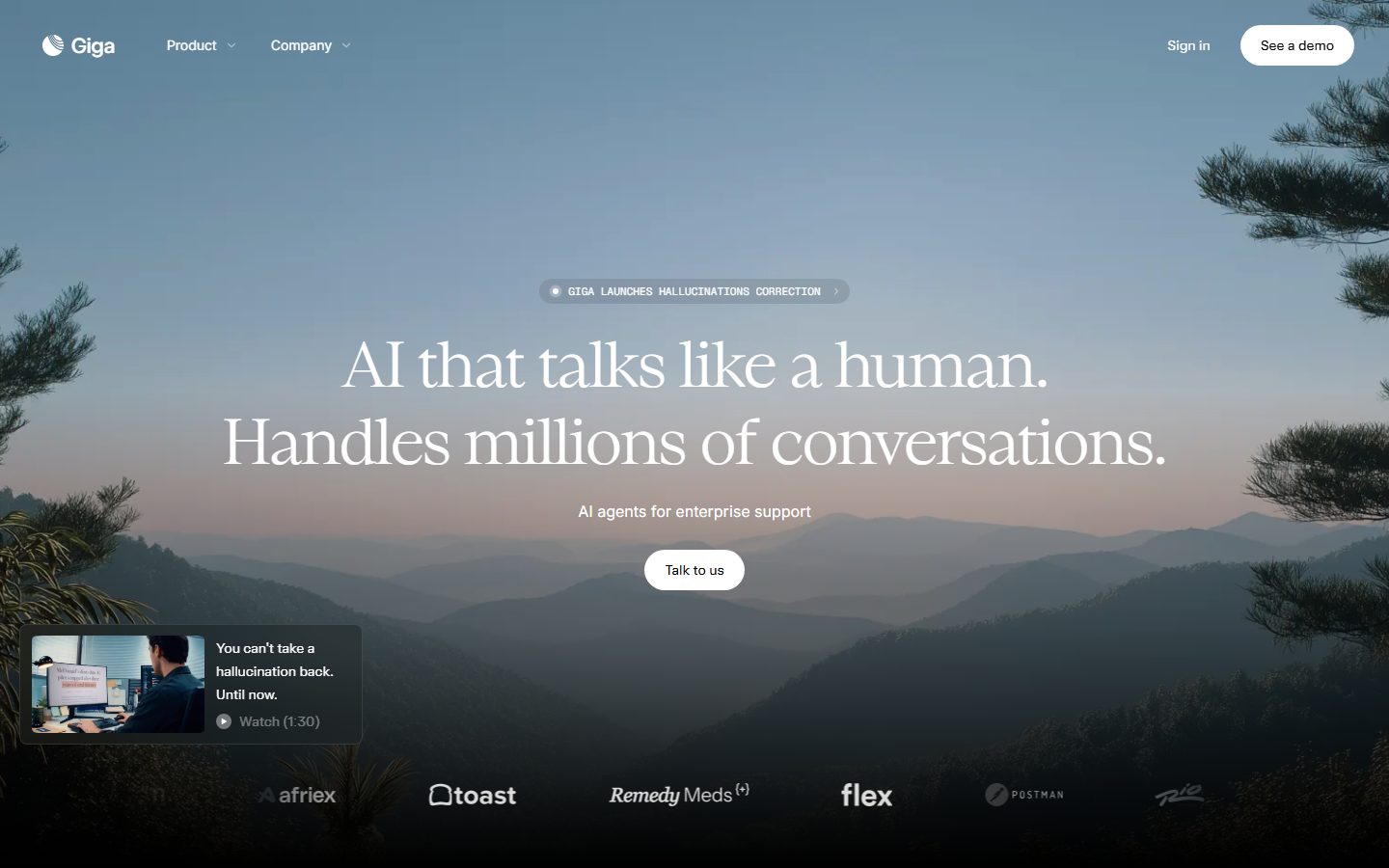
Giga's marketing surface is a cinematic, dark-canvas enterprise-AI interface. It opens on a full-bleed mountain-landscape photograph at sunset, with a light-weight serif headline floating over it, and then resolves downward into a near-black product surface (`{colors.canvas}` — #000000) where dark product-mockup cards carry the actual Giga agent-creation chrome. The system reads as premium, calm, and editorial — the opposite of busy SaaS — relying on photography, restraint, and a single elegant serif voice.
Type voice splits into two roles: **emilioDisplay** (a light-weight serif display face, weight 300, with strong negative letter-spacing — used for h1 and h2 editorial headlines) and **interText** (Inter — used for body copy, navigation, buttons, eyebrows, and all UI). The serif at weight 300 over photography is the brand's signature gesture; everything functional is Inter.
Component voltage comes from **real product UI shown inside dark cards** — the "Create new agent" modal, "Create insight" form, and voice-experience players are shown as actual product chrome at small scale, layered over landscape imagery inside `{component.product-mockup-card}` containers. Giga shows the product rather than illustrating it.
Color is overwhelmingly monochrome — black canvas, white text, gray support tones — with accents (`{colors.accent-orange}` — #f76b15, `{colors.accent-blue}` — #0090ff, `{colors.accent-violet}` — #6e56cf) appearing only in tiny eyebrow markers, focus rings, and a single orange case-study visual block. The page closes on a light surface (`{colors.surface-light}` — #f9f9f9) footer — the only light region — which inverts the dark body to signal the end of the scroll.
**Key Characteristics:**
- Black canvas (`{colors.canvas}` — #000000) for the entire product body; white CTAs are pill-shaped (`{rounded.pill}`).
- Light-weight serif display headlines (emilioDisplay, weight 300) with heavy negative tracking (-1.99px at h1) over photography — the brand's distinctive editorial voice.
- Inter (interText) for all body, nav, buttons, and small labels.
- Dark glassy product-mockup cards (`{colors.surface-deep}` — #0b0b0e) layering real Giga UI over landscape photos.
- Eyebrow labels in monospace-style uppercase Inter, often tinted `{colors.accent-orange}`.
- Large stat blocks ("90%", "90") rendered at display scale.
- Sparse accent usage — orange focus-ring glow (`rgba(247,107,21,0.235)`), blue and violet only in micro-moments.
- A light footer (`{colors.surface-light}`) closes the dark page.
## Colors
### Brand & Accent
- **Accent Orange** (`{colors.accent-orange}` — #f76b15): The primary accent. Used for section eyebrows, the focus-ring glow (`rgba(247,107,21,0.235) 0px 0px 0px 3.19407px`), and the full-bleed DoorDash case-study visual block. The most prominent of an otherwise restrained accent set.
- **Accent Blue** (`{colors.accent-blue}` — #0090ff) and **Accent Blue Alt** (`{colors.accent-blue-alt}` — #0099ff): Small interactive moments — the "Voice Experience" icon, link highlights.
- **Accent Violet** (`{colors.accent-violet}` — #6e56cf): A rare accent appearing in product UI fragments.
- **Accent Red** (`{colors.accent-red}` — #fe2c02): Appears in product chrome and small highlights.
- **Accent Navy** (`{colors.accent-navy}` — #071427): A deep blue-black used as a near-canvas tint inside product imagery.
### Surface
- **Canvas** (`{colors.canvas}` — #000000): The default page floor for the entire product body.
- **Surface Deep** (`{colors.surface-deep}` — #0b0b0e): Product-mockup card backgrounds, deepest panels.
- **Surface** (`{colors.surface}` — #111111) and **Surface Alt** (`{colors.surface-alt}` — #131313): Nested dark panels and section blocks.
- **Surface Elevated** (`{colors.surface-elevated}` — #171615): Video-thumbnail card, slightly raised dark chrome.
- **Surface Raised** (`{colors.surface-raised}` — #262828) and **Surface Raised Alt** (`{colors.surface-raised-alt}` — #282828): The agent-creation modal body, input fields inside dark cards.
- **Neutral 600** (`{colors.neutral-600}` — #333333): Borders, dividers, and hairlines on dark surfaces (also serves as `{colors.hairline}`).
- **Neutral 300 / 200** (`{colors.neutral-300}` — #bbbbbb / `{colors.neutral-200}` — #e6e6e6): Light gray tones for footer dividers and faint UI.
- **Surface Light** (`{colors.surface-light}` — #f9f9f9): The footer and case-study card — the only light surface, used to close the page.
### Text
- **Ink / On Dark** (`{colors.ink}` / `{colors.on-dark}` — #ffffff): All headlines and primary text over the dark canvas.
- **Muted** (`{colors.muted}` — #606060): Footer body text, fine print on light surfaces.
- **Muted Soft / On Dark Muted** (`{colors.muted-soft}` / `{colors.on-dark-muted}` — #8d8d8d): Secondary text on dark surfaces — feature descriptions, logo-cloud labels.
## Typography
### Font Family
The system runs **emilioDisplay** for editorial display headlines (h1, h2) and **interText** (Inter) for everything else — body, navigation, buttons, eyebrows, and labels. emilioDisplay is a light-weight serif display face used exclusively at weight 300 with strong negative letter-spacing; it carries the brand's calm, editorial, premium voice over photography. Inter handles all functional and supporting type.
The split is strict:
- emilioDisplay (display, weight 300, negative tracking) — h1, h2, large stat numbers
- interText / Inter (weight 400, normal tracking) — body, labels, buttons, nav, eyebrows
### Hierarchy
| Token | Size | Weight | Line Height | Letter Spacing | Use |
|---|---|---|---|---|---|
| `{typography.display-xl}` | 66.24px | 300 | 1.2 | -1.9872px | Hero h1 ("AI that talks like a human.") — emilioDisplay |
| `{typography.display-lg}` | 48px | 300 | 1.3 | -0.96px | Section heads ("Built to handle complexity"), large stat numbers — emilioDisplay |
| `{typography.label}` | 14px | 400 | 1.5 | normal | h3 / eyebrows, feature-cell labels, nav, badges — Inter |
| `{typography.body}` | 16px | 400 | 2.0 | normal | Running body copy, testimonial text — Inter |
| `{typography.button}` | 14px | 400 | 1.714 | normal | Button + CTA labels — Inter |
### Principles
The serif display is the brand voice — weight 300 only, never bolder. The heavy negative letter-spacing (-1.99px at h1, -0.96px at h2) tightens the airy serif into a cohesive headline mass; without it the face reads as loose and off-brand. Body copy uses a generous 2.0 line-height for a relaxed, editorial reading rhythm. Eyebrow labels are small (14px) Inter, frequently uppercase and tinted `{colors.accent-orange}`.
### Note on Font Substitutes
emilioDisplay is a custom/proprietary display serif and is not available as a public web font. **Spectral** at weight 300, **Newsreader** at weight 300, or **Source Serif 4** Light are usable open-source substitutes — preserve the light weight and apply roughly -0.03em letter-spacing on large sizes to keep the tight-headline signature. interText is Inter and ships freely.
## Layout
### Spacing System
- **Base unit:** effectively 2px, but the dominant rhythm is 4px-derived. The most frequent measured gaps are 12px, 10px, and 20px.
- **Tokens:** `{spacing.xxs}` 4px · `{spacing.xs}` 6px · `{spacing.sm}` 8px · `{spacing.smd}` 10px · `{spacing.md}` 12px · `{spacing.lg}` 16px · `{spacing.xl}` 20px · `{spacing.xxl}` 24px · `{spacing.xxxl}` 32px · `{spacing.section}` 40px.
- **Card internal padding:** `{spacing.xxl}` (24px) for product-mockup cards; `{spacing.xl}` (20px) for the agent modal; `{spacing.sm}` (8px) for the small video-thumbnail card.
- **Tight UI clusters:** 6–12px gaps dominate inside nav, badges, and product chrome.
### Grid & Container
- **Hero:** centered single-column composition — eyebrow badge, two-line serif headline, sub-line, single CTA — all axis-centered over full-bleed photography.
- **Feature bands:** left serif heading + right 3-up or 4-up `{component.feature-cell}` row of icon/label/description triples.
- **Product bands:** ~50/50 split — text column with stepped sub-nav links on one side, `{component.product-mockup-card}` over photography on the other.
- **Logo cloud:** single horizontal row of partner logos.
- **Footer:** multi-column link list (Product / Company / Resources) on `{colors.surface-light}`.
### Whitespace Philosophy
Giga uses large, calm vertical spacing — the hero gives the serif headline room to breathe over photography, and product bands are separated by deep black gutters. The density is editorial-magazine, not dashboard-dense: a single heading, a short support line, and one cluster of cards per band.
## Elevation & Depth
| Level | Treatment | Use |
|---|---|---|
| Flat | No shadow, on black canvas | Body sections, nav, feature cells |
| Soft drop | `rgba(0,0,0,0.05) 0px 10px 20px 0px` | Light-surface cards (footer/case-study area) |
| Deep card | `rgba(0,0,0,0.7) 0px 12px 32px -16px` | Product-mockup cards and the agent modal floating over photography |
| Double-deep | `rgba(0,0,0,0.7) 0px 12px 32px -16px, rgba(0,0,0,0.7) 0px 12px 60px 0px` | The most-elevated dark modals — strong dual-layer drop for the "Create new agent" surface |
| Focus glow | `rgba(247,107,21,0.235) 0px 0px 0px 3.19407px` | Orange focus ring on active inputs/controls (a green variant `rgba(189,238,99,0.235)` also appears) |
The elevation philosophy is **dark-on-dark with heavy soft shadows** — because the canvas is black, depth is created by stacking near-black cards with strong, wide, low-opacity dark shadows rather than light. Focus states glow with a soft 3.19px orange ring instead of a hard border.
### Decorative Depth
- Product-mockup cards layer dark glassy modals over landscape photography; the photo recedes while the modal floats.
- The DoorDash case-study uses a solid `{colors.accent-orange}` block (`{component.case-study-visual}`) as a chromatic anchor against the otherwise monochrome page.
## Shapes
### Border Radius Scale
| Token | Value | Use |
|---|---|---|
| `{rounded.none}` | 0px | The primary text button (`{component.button-primary}`) — square corners |
| `{rounded.xs}` | 4px | Smallest inline chips |
| `{rounded.sm}` | 6px | Small controls, dropdown items |
| `{rounded.md}` | 8px | Input fields, small buttons inside product chrome |
| `{rounded.lg}` | 10px | Nested panels |
| `{rounded.xl}` | 12px | Modals, video-thumbnail card, mid cards |
| `{rounded.xxl}` | 16px | Product-mockup cards, case-study cards |
| `{rounded.pill}` | 9999px | White CTA buttons, eyebrow badges, the brand logo mark — the most frequent radius (21 occurrences) |
### Photography Geometry
The hero photograph is full-bleed (no radius). Product-mockup imagery and landscape panels inside bands carry `{rounded.xxl}` (16px) corners. Partner logos in the logo cloud are monochrome SVG marks placed inline. The brand "Giga" logo mark is a small pill/circular glyph.
## Components
### Navigation
**`top-nav`** — Transparent nav pinned over the hero photograph. Carries the "Giga" wordmark + circular mark at left, "Product" and "Company" dropdown menus center-left, and a right cluster with "Sign in" text link plus the "See a demo" pill button. Labels in `{typography.button}` (Inter 14px). Background stays transparent so the photograph reads through.
**`nav-link`** — Transparent inline menu items in `{colors.on-dark}`, `{typography.button}`.
### Buttons
**`button-primary`** — The measured base button: square corners (`{rounded.none}`), asymmetric padding (0px 12px 0px 22px), label in `{typography.button}`. Background `{colors.ink}` (white), text `{colors.canvas}` (black). Used for compact text+icon CTAs.
**`button-pill`** — The signature white CTA (e.g. "Talk to us", "See a demo", "Learn more"). Background `{colors.ink}` (#ffffff), text `{colors.canvas}` (#000000), `{rounded.pill}`, padding ~12px × 24px, label in `{typography.button}`. The pill silhouette over photography is a hero gesture.
**`button-pill-dark`** — The inverse used on light surfaces (footer / case-study card): background `{colors.canvas}` (black), text `{colors.on-dark}` (white), `{rounded.pill}`.
### Badges & Eyebrows
**`eyebrow-badge`** — The pill announcement chip in the hero ("GIGA LAUNCHES HALLUCINATIONS CORRECTION"). Transparent fill with a hairline outline, `{rounded.pill}`, padding 6px × 16px, label in `{typography.label}`, text `{colors.on-dark}`, often with a small leading dot.
**`section-eyebrow`** — Small uppercase section markers ("CUSTOM AGENTS", "SMART SUGGESTIONS", "NATURAL VOICE") in `{typography.label}` tinted `{colors.accent-orange}`, preceded by a small accent square.
### Cards & Product Surfaces
**`product-mockup-card`** — The signature dark card: a landscape photograph with a floating dark product modal layered on top. Background `{colors.surface-deep}` (#0b0b0e), `{rounded.xxl}` (16px), padding `{spacing.xxl}` (24px), deep dual-layer drop shadow. Used in the Agent Canvas, Smart Insights, and Voice Experience bands.
**`agent-modal`** — The floating product chrome ("Create new agent", "Create insight"). Background `{colors.surface-raised}` (#262828), `{rounded.xl}` (12px), padding `{spacing.xl}` (20px), label/input text in `{typography.label}`. Carries tabs (Chat / Voice / Multi-modal), a file-drop zone, and Cancel / Create buttons. Real product UI shown at small scale.
**`video-thumb-card`** — The small "You can't take a hallucination back. Until now." watch card in the hero. Background `{colors.surface-elevated}` (#171615), `{rounded.xl}`, padding `{spacing.sm}` (8px), thumbnail + two-line title + "Watch (1:30)" play affordance in `{typography.label}`.
**`case-study-card`** — The DoorDash spotlight card on a light surface. Background `{colors.surface-light}` (#f9f9f9), text `{colors.canvas}`, `{rounded.xxl}`, padding `{spacing.xxl}` (24px). Holds the logo, headline, "Learn more" `{component.button-pill-dark}`, and a quote in `{typography.body}`.
**`case-study-visual`** — The full orange metric block paired with the case-study card. Background `{colors.accent-orange}` (#f76b15), a large stat ("0%") in `{typography.display-lg}`, text `{colors.on-dark}`, `{rounded.xl}`. The single saturated color block on the page.
### Content Blocks
**`feature-cell`** — A 3-up/4-up triple of icon + bold label + muted description ("Extremely customizable", "Auto policy writing", etc.). Transparent background, label in `{typography.label}` `{colors.on-dark}`, description in `{colors.on-dark-muted}`.
**`stat-block`** — Large numeric callouts ("90%" deflection rate, "90" supported languages). Number in `{typography.display-lg}` `{colors.on-dark}`, with a small `{typography.label}` caption above.
**`logo-cloud`** — Single horizontal row of partner marks (afriex, toast, Remedy Meds, flex, Postman, Rio, DoorDash) in `{colors.on-dark-muted}`, captioned in `{typography.label}`.
### Footer
**`footer`** — The page-closing light surface. Background `{colors.surface-light}` (#f9f9f9), text `{colors.muted}` (#606060), `{typography.label}`, padding `{spacing.section}` (40px). Multi-column link list (Product / Company / Resources) with the Giga wordmark, copyright, and a small compliance badge. The only light region on the page — its inversion signals the end of the scroll.
**`text-link`** — Inline links in `{colors.on-dark}` on dark surfaces, `{typography.body}`.
## Do's and Don'ts
### Do
- Keep the canvas black (`{colors.canvas}` — #000000) for the product body; reserve `{colors.surface-light}` for the footer and case-study card only.
- Set every editorial headline in emilioDisplay at weight 300 with heavy negative letter-spacing. The light serif over photography is the brand.
- Use Inter (interText) for all body, nav, buttons, eyebrows, and product UI. Never set body copy in the serif.
- Make CTAs white pills (`{component.button-pill}`) with black text. The pill-over-photo is the signature CTA.
- Show real product chrome inside `{component.product-mockup-card}` over landscape imagery — Giga demonstrates the product rather than illustrating it.
- Keep accents scarce — orange eyebrows, orange focus glow, and the single orange case-study block. Color is punctuation, not theme.
- Use deep dual-layer dark shadows to float cards on the black canvas; light shadows only on the light footer surface.
### Don't
- Don't bolden the serif beyond weight 300 — it breaks the airy editorial voice.
- Don't drop the negative letter-spacing on display headlines; the loose serif reads as off-brand.
- Don't introduce additional saturated color blocks beyond the single orange case-study visual.
- Don't put the serif into body copy or buttons.
- Don't add bright borders for focus — the system uses a soft orange glow ring, not a hard outline.
- Don't repeat the light surface mid-page; reserve it for closing the scroll.
- Don't document hover styling — the system encodes default and pressed/active states only.
## Responsive Behavior
### Breakpoints
| Name | Width | Key Changes |
|---|---|---|
| Mobile | < 768px | Nav collapses to a menu trigger; hero h1 scales down from 66px; product bands stack text above mockup card; feature cells go 1-up; footer columns stack |
| Tablet | 768–1024px | Nav stays horizontal but tightens; feature cells 2-up; product bands keep the text/mockup split but narrow |
| Desktop | 1024–1440px | Full nav with both dropdowns; 3–4-up feature cells; ~50/50 product bands |
| Wide | > 1440px | Same as desktop with more outer breathing room around the centered hero composition |
### Touch Targets
- `{component.button-pill}` provides ample tap area with 12px × 24px padding.
- `{component.button-primary}` uses asymmetric 0–22px padding; verify minimum 44px effective height on touch.
- `{component.nav-link}` and `{component.eyebrow-badge}` rely on generous surrounding padding to reach comfortable tap sizes.
### Collapsing Strategy
- The centered hero composition (badge → headline → sub-line → CTA) stays vertically stacked at every breakpoint and only scales.
- Product bands collapse their text/mockup split to a single column, text first then the `{component.product-mockup-card}`.
- Feature-cell rows reduce columns (4 → 2 → 1) rather than shrinking type.
- The logo cloud wraps to multiple rows on narrow viewports.
- The case-study card and orange visual stack vertically on mobile.
### Image Behavior
- The hero photograph stays full-bleed and crops to fill at all sizes.
- Landscape imagery inside product cards retains `{rounded.xxl}` corners and scales proportionally; the floating modal stays legible.
## Iteration Guide
1. Focus on ONE component at a time and reference its YAML key directly (`{component.product-mockup-card}`, `{component.button-pill}`).
2. Variants (`-pill`, `-pill-dark`, `-primary`) live as separate entries in `components:`.
3. Use `{token.refs}` everywhere — never inline a hex in a component.
4. Never document hover. Default and active/pressed states only.
5. Display headlines stay emilioDisplay weight 300 with negative tracking; body stays Inter 400. The split does not blur.
6. The black canvas is the default; the light footer is the only intentional inversion.
7. When in doubt about emphasis: bigger serif before any color — accent color is reserved punctuation.
## Known Gaps
- emilioDisplay is a custom/proprietary display serif (not flagged in `fonts_licensed`, but no public web font exists); the open-source substitutes documented in Typography are the shipping recommendation.
- `button-primary` was measured with a 0px radius and asymmetric padding, while the visible hero CTAs ("Talk to us", "See a demo") render as white pills — the pill button is documented separately as `button-pill` from screenshot ground truth; the exact mapping of which DOM element carried the 0px measurement is uncertain.
- The measured `card` component reported `radius: 9999px` with no shadow, which most likely reflects the pill logo/badge rather than a content card; content card radii were inferred from the radius scale and screenshots.
- A green focus-ring glow (`rgba(189,238,99,0.235)`) and an OKLab white glow were measured once each but the green base color was not captured as a named token — left out rather than guessed.
- Exact section vertical spacing between major bands was not measured beyond the 4–40px component-level gaps; the largest band gutters are derived from screenshots, not tokens.
- Dropdown-open, form-validation, and video-player states are not in scope (single landing capture).
- Animation, scroll, and transition timings are not captured.
<!-- Documented by duply · real-world design systems as ready-to-use DESIGN.md for AI coding agents · https://duply.ai/giga/design-md -->
Color Palette
Accent
Neutrals
Typography
display-xl66.24px · 300 · 1.2
The quick brown fox jumpsdisplay-lg48px · 300 · 1.3
The quick brown fox jumpslabel14px · 400 · 1.5
The quick brown fox jumpsbody16px · 400 · 2
The quick brown fox jumpsbutton14px · 400 · 1.714
The quick brown fox jumpsSpacing & Shape
Spacing
| Name | Value | Preview |
|---|---|---|
| xxs | 4px | |
| xs | 6px | |
| sm | 8px | |
| smd | 10px | |
| md | 12px | |
| lg | 16px | |
| xl | 20px | |
| xxl | 24px | |
| xxxl | 32px | |
| section | 40px |
Border Radius
| Name | Value | Preview |
|---|---|---|
| none | 0px | |
| xs | 4px | |
| sm | 6px | |
| md | 8px | |
| lg | 10px | |
| xl | 12px | |
| xxl | 16px | |
| pill | 9999px |
More like this


---
version: alpha
name: Giga-design-analysis
description: A cinematic, dark-canvas enterprise-AI interface that opens on a full-bleed landscape photograph and resolves into a near-black product surface. The system pairs a light-weight serif display face (emilioDisplay) for editorial headlines with Inter for all UI and body copy, leaning on generous whitespace, pill-shaped white CTAs, and dark glassy product-mockup cards. Brand voltage comes from the airy serif headline over photography and from real product chrome (agent-creation modals) shown inside dark cards — accent color is used sparingly.
colors:
  canvas: "#000000"
  surface-deep: "#0b0b0e"
  surface: "#111111"
  surface-alt: "#131313"
  surface-elevated: "#171615"
  surface-raised: "#262828"
  surface-raised-alt: "#282828"
  neutral-600: "#333333"
  muted: "#606060"
  muted-soft: "#8d8d8d"
  hairline: "#333333"
  neutral-300: "#bbbbbb"
  neutral-200: "#e6e6e6"
  surface-light: "#f9f9f9"
  ink: "#ffffff"
  on-dark: "#ffffff"
  on-dark-muted: "#8d8d8d"
  accent-blue: "#0090ff"
  accent-blue-alt: "#0099ff"
  accent-violet: "#6e56cf"
  accent-orange: "#f76b15"
  accent-red: "#fe2c02"
  accent-navy: "#071427"
typography:
  display-xl:
    fontFamily: "emilioDisplay, Spectral, Georgia, serif"
    fontSize: 66.24px
    fontWeight: 300
    lineHeight: 1.2
    letterSpacing: -1.9872px
  display-lg:
    fontFamily: "emilioDisplay, Spectral, Georgia, serif"
    fontSize: 48px
    fontWeight: 300
    lineHeight: 1.3
    letterSpacing: -0.96px
  label:
    fontFamily: "interText, Inter, sans-serif"
    fontSize: 14px
    fontWeight: 400
    lineHeight: 1.5
    letterSpacing: normal
  body:
    fontFamily: "interText, Inter, sans-serif"
    fontSize: 16px
    fontWeight: 400
    lineHeight: 2.0
    letterSpacing: normal
  button:
    fontFamily: "interText, Inter, sans-serif"
    fontSize: 14px
    fontWeight: 400
    lineHeight: 1.714
    letterSpacing: normal
rounded:
  none: 0px
  xs: 4px
  sm: 6px
  md: 8px
  lg: 10px
  xl: 12px
  xxl: 16px
  pill: 9999px
spacing:
  xxs: 4px
  xs: 6px
  sm: 8px
  smd: 10px
  md: 12px
  lg: 16px
  xl: 20px
  xxl: 24px
  xxxl: 32px
  section: 40px
components:
  top-nav:
    backgroundColor: transparent
    textColor: "{colors.on-dark}"
    typography: "{typography.button}"
  nav-link:
    backgroundColor: transparent
    textColor: "{colors.on-dark}"
    typography: "{typography.button}"
  button-primary:
    backgroundColor: "{colors.ink}"
    textColor: "{colors.canvas}"
    typography: "{typography.button}"
    rounded: "{rounded.none}"
    padding: 0px 12px 0px 22px
  button-pill:
    backgroundColor: "{colors.ink}"
    textColor: "{colors.canvas}"
    typography: "{typography.button}"
    rounded: "{rounded.pill}"
    padding: 12px 24px
  button-pill-dark:
    backgroundColor: "{colors.canvas}"
    textColor: "{colors.on-dark}"
    typography: "{typography.button}"
    rounded: "{rounded.pill}"
    padding: 12px 24px
  eyebrow-badge:
    backgroundColor: transparent
    textColor: "{colors.on-dark}"
    typography: "{typography.label}"
    rounded: "{rounded.pill}"
    padding: 6px 16px
  section-eyebrow:
    backgroundColor: transparent
    textColor: "{colors.accent-orange}"
    typography: "{typography.label}"
  video-thumb-card:
    backgroundColor: "{colors.surface-elevated}"
    textColor: "{colors.on-dark}"
    typography: "{typography.label}"
    rounded: "{rounded.xl}"
    padding: 8px
  product-mockup-card:
    backgroundColor: "{colors.surface-deep}"
    textColor: "{colors.on-dark}"
    rounded: "{rounded.xxl}"
    padding: 24px
  agent-modal:
    backgroundColor: "{colors.surface-raised}"
    textColor: "{colors.on-dark}"
    typography: "{typography.label}"
    rounded: "{rounded.xl}"
    padding: 20px
  feature-cell:
    backgroundColor: transparent
    textColor: "{colors.on-dark-muted}"
    typography: "{typography.label}"
  stat-block:
    backgroundColor: transparent
    textColor: "{colors.on-dark}"
    typography: "{typography.display-lg}"
  logo-cloud:
    backgroundColor: transparent
    textColor: "{colors.on-dark-muted}"
    typography: "{typography.label}"
  case-study-card:
    backgroundColor: "{colors.surface-light}"
    textColor: "{colors.canvas}"
    typography: "{typography.body}"
    rounded: "{rounded.xxl}"
    padding: 24px
  case-study-visual:
    backgroundColor: "{colors.accent-orange}"
    textColor: "{colors.on-dark}"
    typography: "{typography.display-lg}"
    rounded: "{rounded.xl}"
  footer:
    backgroundColor: "{colors.surface-light}"
    textColor: "{colors.muted}"
    typography: "{typography.label}"
    padding: 40px
  text-link:
    backgroundColor: transparent
    textColor: "{colors.on-dark}"
    typography: "{typography.body}"
---

## Overview

Giga's marketing surface is a cinematic, dark-canvas enterprise-AI interface. It opens on a full-bleed mountain-landscape photograph at sunset, with a light-weight serif headline floating over it, and then resolves downward into a near-black product surface (`{colors.canvas}` — #000000) where dark product-mockup cards carry the actual Giga agent-creation chrome. The system reads as premium, calm, and editorial — the opposite of busy SaaS — relying on photography, restraint, and a single elegant serif voice.

Type voice splits into two roles: **emilioDisplay** (a light-weight serif display face, weight 300, with strong negative letter-spacing — used for h1 and h2 editorial headlines) and **interText** (Inter — used for body copy, navigation, buttons, eyebrows, and all UI). The serif at weight 300 over photography is the brand's signature gesture; everything functional is Inter.

Component voltage comes from **real product UI shown inside dark cards** — the "Create new agent" modal, "Create insight" form, and voice-experience players are shown as actual product chrome at small scale, layered over landscape imagery inside `{component.product-mockup-card}` containers. Giga shows the product rather than illustrating it.

Color is overwhelmingly monochrome — black canvas, white text, gray support tones — with accents (`{colors.accent-orange}` — #f76b15, `{colors.accent-blue}` — #0090ff, `{colors.accent-violet}` — #6e56cf) appearing only in tiny eyebrow markers, focus rings, and a single orange case-study visual block. The page closes on a light surface (`{colors.surface-light}` — #f9f9f9) footer — the only light region — which inverts the dark body to signal the end of the scroll.

**Key Characteristics:**
- Black canvas (`{colors.canvas}` — #000000) for the entire product body; white CTAs are pill-shaped (`{rounded.pill}`).
- Light-weight serif display headlines (emilioDisplay, weight 300) with heavy negative tracking (-1.99px at h1) over photography — the brand's distinctive editorial voice.
- Inter (interText) for all body, nav, buttons, and small labels.
- Dark glassy product-mockup cards (`{colors.surface-deep}` — #0b0b0e) layering real Giga UI over landscape photos.
- Eyebrow labels in monospace-style uppercase Inter, often tinted `{colors.accent-orange}`.
- Large stat blocks ("90%", "90") rendered at display scale.
- Sparse accent usage — orange focus-ring glow (`rgba(247,107,21,0.235)`), blue and violet only in micro-moments.
- A light footer (`{colors.surface-light}`) closes the dark page.

## Colors

### Brand & Accent
- **Accent Orange** (`{colors.accent-orange}` — #f76b15): The primary accent. Used for section eyebrows, the focus-ring glow (`rgba(247,107,21,0.235) 0px 0px 0px 3.19407px`), and the full-bleed DoorDash case-study visual block. The most prominent of an otherwise restrained accent set.
- **Accent Blue** (`{colors.accent-blue}` — #0090ff) and **Accent Blue Alt** (`{colors.accent-blue-alt}` — #0099ff): Small interactive moments — the "Voice Experience" icon, link highlights.
- **Accent Violet** (`{colors.accent-violet}` — #6e56cf): A rare accent appearing in product UI fragments.
- **Accent Red** (`{colors.accent-red}` — #fe2c02): Appears in product chrome and small highlights.
- **Accent Navy** (`{colors.accent-navy}` — #071427): A deep blue-black used as a near-canvas tint inside product imagery.

### Surface
- **Canvas** (`{colors.canvas}` — #000000): The default page floor for the entire product body.
- **Surface Deep** (`{colors.surface-deep}` — #0b0b0e): Product-mockup card backgrounds, deepest panels.
- **Surface** (`{colors.surface}` — #111111) and **Surface Alt** (`{colors.surface-alt}` — #131313): Nested dark panels and section blocks.
- **Surface Elevated** (`{colors.surface-elevated}` — #171615): Video-thumbnail card, slightly raised dark chrome.
- **Surface Raised** (`{colors.surface-raised}` — #262828) and **Surface Raised Alt** (`{colors.surface-raised-alt}` — #282828): The agent-creation modal body, input fields inside dark cards.
- **Neutral 600** (`{colors.neutral-600}` — #333333): Borders, dividers, and hairlines on dark surfaces (also serves as `{colors.hairline}`).
- **Neutral 300 / 200** (`{colors.neutral-300}` — #bbbbbb / `{colors.neutral-200}` — #e6e6e6): Light gray tones for footer dividers and faint UI.
- **Surface Light** (`{colors.surface-light}` — #f9f9f9): The footer and case-study card — the only light surface, used to close the page.

### Text
- **Ink / On Dark** (`{colors.ink}` / `{colors.on-dark}` — #ffffff): All headlines and primary text over the dark canvas.
- **Muted** (`{colors.muted}` — #606060): Footer body text, fine print on light surfaces.
- **Muted Soft / On Dark Muted** (`{colors.muted-soft}` / `{colors.on-dark-muted}` — #8d8d8d): Secondary text on dark surfaces — feature descriptions, logo-cloud labels.

## Typography

### Font Family
The system runs **emilioDisplay** for editorial display headlines (h1, h2) and **interText** (Inter) for everything else — body, navigation, buttons, eyebrows, and labels. emilioDisplay is a light-weight serif display face used exclusively at weight 300 with strong negative letter-spacing; it carries the brand's calm, editorial, premium voice over photography. Inter handles all functional and supporting type.

The split is strict:
- emilioDisplay (display, weight 300, negative tracking) — h1, h2, large stat numbers
- interText / Inter (weight 400, normal tracking) — body, labels, buttons, nav, eyebrows

### Hierarchy

| Token | Size | Weight | Line Height | Letter Spacing | Use |
|---|---|---|---|---|---|
| `{typography.display-xl}` | 66.24px | 300 | 1.2 | -1.9872px | Hero h1 ("AI that talks like a human.") — emilioDisplay |
| `{typography.display-lg}` | 48px | 300 | 1.3 | -0.96px | Section heads ("Built to handle complexity"), large stat numbers — emilioDisplay |
| `{typography.label}` | 14px | 400 | 1.5 | normal | h3 / eyebrows, feature-cell labels, nav, badges — Inter |
| `{typography.body}` | 16px | 400 | 2.0 | normal | Running body copy, testimonial text — Inter |
| `{typography.button}` | 14px | 400 | 1.714 | normal | Button + CTA labels — Inter |

### Principles
The serif display is the brand voice — weight 300 only, never bolder. The heavy negative letter-spacing (-1.99px at h1, -0.96px at h2) tightens the airy serif into a cohesive headline mass; without it the face reads as loose and off-brand. Body copy uses a generous 2.0 line-height for a relaxed, editorial reading rhythm. Eyebrow labels are small (14px) Inter, frequently uppercase and tinted `{colors.accent-orange}`.

### Note on Font Substitutes
emilioDisplay is a custom/proprietary display serif and is not available as a public web font. **Spectral** at weight 300, **Newsreader** at weight 300, or **Source Serif 4** Light are usable open-source substitutes — preserve the light weight and apply roughly -0.03em letter-spacing on large sizes to keep the tight-headline signature. interText is Inter and ships freely.

## Layout

### Spacing System
- **Base unit:** effectively 2px, but the dominant rhythm is 4px-derived. The most frequent measured gaps are 12px, 10px, and 20px.
- **Tokens:** `{spacing.xxs}` 4px · `{spacing.xs}` 6px · `{spacing.sm}` 8px · `{spacing.smd}` 10px · `{spacing.md}` 12px · `{spacing.lg}` 16px · `{spacing.xl}` 20px · `{spacing.xxl}` 24px · `{spacing.xxxl}` 32px · `{spacing.section}` 40px.
- **Card internal padding:** `{spacing.xxl}` (24px) for product-mockup cards; `{spacing.xl}` (20px) for the agent modal; `{spacing.sm}` (8px) for the small video-thumbnail card.
- **Tight UI clusters:** 6–12px gaps dominate inside nav, badges, and product chrome.

### Grid & Container
- **Hero:** centered single-column composition — eyebrow badge, two-line serif headline, sub-line, single CTA — all axis-centered over full-bleed photography.
- **Feature bands:** left serif heading + right 3-up or 4-up `{component.feature-cell}` row of icon/label/description triples.
- **Product bands:** ~50/50 split — text column with stepped sub-nav links on one side, `{component.product-mockup-card}` over photography on the other.
- **Logo cloud:** single horizontal row of partner logos.
- **Footer:** multi-column link list (Product / Company / Resources) on `{colors.surface-light}`.

### Whitespace Philosophy
Giga uses large, calm vertical spacing — the hero gives the serif headline room to breathe over photography, and product bands are separated by deep black gutters. The density is editorial-magazine, not dashboard-dense: a single heading, a short support line, and one cluster of cards per band.

## Elevation & Depth

| Level | Treatment | Use |
|---|---|---|
| Flat | No shadow, on black canvas | Body sections, nav, feature cells |
| Soft drop | `rgba(0,0,0,0.05) 0px 10px 20px 0px` | Light-surface cards (footer/case-study area) |
| Deep card | `rgba(0,0,0,0.7) 0px 12px 32px -16px` | Product-mockup cards and the agent modal floating over photography |
| Double-deep | `rgba(0,0,0,0.7) 0px 12px 32px -16px, rgba(0,0,0,0.7) 0px 12px 60px 0px` | The most-elevated dark modals — strong dual-layer drop for the "Create new agent" surface |
| Focus glow | `rgba(247,107,21,0.235) 0px 0px 0px 3.19407px` | Orange focus ring on active inputs/controls (a green variant `rgba(189,238,99,0.235)` also appears) |

The elevation philosophy is **dark-on-dark with heavy soft shadows** — because the canvas is black, depth is created by stacking near-black cards with strong, wide, low-opacity dark shadows rather than light. Focus states glow with a soft 3.19px orange ring instead of a hard border.

### Decorative Depth
- Product-mockup cards layer dark glassy modals over landscape photography; the photo recedes while the modal floats.
- The DoorDash case-study uses a solid `{colors.accent-orange}` block (`{component.case-study-visual}`) as a chromatic anchor against the otherwise monochrome page.

## Shapes

### Border Radius Scale

| Token | Value | Use |
|---|---|---|
| `{rounded.none}` | 0px | The primary text button (`{component.button-primary}`) — square corners |
| `{rounded.xs}` | 4px | Smallest inline chips |
| `{rounded.sm}` | 6px | Small controls, dropdown items |
| `{rounded.md}` | 8px | Input fields, small buttons inside product chrome |
| `{rounded.lg}` | 10px | Nested panels |
| `{rounded.xl}` | 12px | Modals, video-thumbnail card, mid cards |
| `{rounded.xxl}` | 16px | Product-mockup cards, case-study cards |
| `{rounded.pill}` | 9999px | White CTA buttons, eyebrow badges, the brand logo mark — the most frequent radius (21 occurrences) |

### Photography Geometry
The hero photograph is full-bleed (no radius). Product-mockup imagery and landscape panels inside bands carry `{rounded.xxl}` (16px) corners. Partner logos in the logo cloud are monochrome SVG marks placed inline. The brand "Giga" logo mark is a small pill/circular glyph.

## Components

### Navigation

**`top-nav`** — Transparent nav pinned over the hero photograph. Carries the "Giga" wordmark + circular mark at left, "Product" and "Company" dropdown menus center-left, and a right cluster with "Sign in" text link plus the "See a demo" pill button. Labels in `{typography.button}` (Inter 14px). Background stays transparent so the photograph reads through.

**`nav-link`** — Transparent inline menu items in `{colors.on-dark}`, `{typography.button}`.

### Buttons

**`button-primary`** — The measured base button: square corners (`{rounded.none}`), asymmetric padding (0px 12px 0px 22px), label in `{typography.button}`. Background `{colors.ink}` (white), text `{colors.canvas}` (black). Used for compact text+icon CTAs.

**`button-pill`** — The signature white CTA (e.g. "Talk to us", "See a demo", "Learn more"). Background `{colors.ink}` (#ffffff), text `{colors.canvas}` (#000000), `{rounded.pill}`, padding ~12px × 24px, label in `{typography.button}`. The pill silhouette over photography is a hero gesture.

**`button-pill-dark`** — The inverse used on light surfaces (footer / case-study card): background `{colors.canvas}` (black), text `{colors.on-dark}` (white), `{rounded.pill}`.

### Badges & Eyebrows

**`eyebrow-badge`** — The pill announcement chip in the hero ("GIGA LAUNCHES HALLUCINATIONS CORRECTION"). Transparent fill with a hairline outline, `{rounded.pill}`, padding 6px × 16px, label in `{typography.label}`, text `{colors.on-dark}`, often with a small leading dot.

**`section-eyebrow`** — Small uppercase section markers ("CUSTOM AGENTS", "SMART SUGGESTIONS", "NATURAL VOICE") in `{typography.label}` tinted `{colors.accent-orange}`, preceded by a small accent square.

### Cards & Product Surfaces

**`product-mockup-card`** — The signature dark card: a landscape photograph with a floating dark product modal layered on top. Background `{colors.surface-deep}` (#0b0b0e), `{rounded.xxl}` (16px), padding `{spacing.xxl}` (24px), deep dual-layer drop shadow. Used in the Agent Canvas, Smart Insights, and Voice Experience bands.

**`agent-modal`** — The floating product chrome ("Create new agent", "Create insight"). Background `{colors.surface-raised}` (#262828), `{rounded.xl}` (12px), padding `{spacing.xl}` (20px), label/input text in `{typography.label}`. Carries tabs (Chat / Voice / Multi-modal), a file-drop zone, and Cancel / Create buttons. Real product UI shown at small scale.

**`video-thumb-card`** — The small "You can't take a hallucination back. Until now." watch card in the hero. Background `{colors.surface-elevated}` (#171615), `{rounded.xl}`, padding `{spacing.sm}` (8px), thumbnail + two-line title + "Watch (1:30)" play affordance in `{typography.label}`.

**`case-study-card`** — The DoorDash spotlight card on a light surface. Background `{colors.surface-light}` (#f9f9f9), text `{colors.canvas}`, `{rounded.xxl}`, padding `{spacing.xxl}` (24px). Holds the logo, headline, "Learn more" `{component.button-pill-dark}`, and a quote in `{typography.body}`.

**`case-study-visual`** — The full orange metric block paired with the case-study card. Background `{colors.accent-orange}` (#f76b15), a large stat ("0%") in `{typography.display-lg}`, text `{colors.on-dark}`, `{rounded.xl}`. The single saturated color block on the page.

### Content Blocks

**`feature-cell`** — A 3-up/4-up triple of icon + bold label + muted description ("Extremely customizable", "Auto policy writing", etc.). Transparent background, label in `{typography.label}` `{colors.on-dark}`, description in `{colors.on-dark-muted}`.

**`stat-block`** — Large numeric callouts ("90%" deflection rate, "90" supported languages). Number in `{typography.display-lg}` `{colors.on-dark}`, with a small `{typography.label}` caption above.

**`logo-cloud`** — Single horizontal row of partner marks (afriex, toast, Remedy Meds, flex, Postman, Rio, DoorDash) in `{colors.on-dark-muted}`, captioned in `{typography.label}`.

### Footer

**`footer`** — The page-closing light surface. Background `{colors.surface-light}` (#f9f9f9), text `{colors.muted}` (#606060), `{typography.label}`, padding `{spacing.section}` (40px). Multi-column link list (Product / Company / Resources) with the Giga wordmark, copyright, and a small compliance badge. The only light region on the page — its inversion signals the end of the scroll.

**`text-link`** — Inline links in `{colors.on-dark}` on dark surfaces, `{typography.body}`.

## Do's and Don'ts

### Do
- Keep the canvas black (`{colors.canvas}` — #000000) for the product body; reserve `{colors.surface-light}` for the footer and case-study card only.
- Set every editorial headline in emilioDisplay at weight 300 with heavy negative letter-spacing. The light serif over photography is the brand.
- Use Inter (interText) for all body, nav, buttons, eyebrows, and product UI. Never set body copy in the serif.
- Make CTAs white pills (`{component.button-pill}`) with black text. The pill-over-photo is the signature CTA.
- Show real product chrome inside `{component.product-mockup-card}` over landscape imagery — Giga demonstrates the product rather than illustrating it.
- Keep accents scarce — orange eyebrows, orange focus glow, and the single orange case-study block. Color is punctuation, not theme.
- Use deep dual-layer dark shadows to float cards on the black canvas; light shadows only on the light footer surface.

### Don't
- Don't bolden the serif beyond weight 300 — it breaks the airy editorial voice.
- Don't drop the negative letter-spacing on display headlines; the loose serif reads as off-brand.
- Don't introduce additional saturated color blocks beyond the single orange case-study visual.
- Don't put the serif into body copy or buttons.
- Don't add bright borders for focus — the system uses a soft orange glow ring, not a hard outline.
- Don't repeat the light surface mid-page; reserve it for closing the scroll.
- Don't document hover styling — the system encodes default and pressed/active states only.

## Responsive Behavior

### Breakpoints

| Name | Width | Key Changes |
|---|---|---|
| Mobile | < 768px | Nav collapses to a menu trigger; hero h1 scales down from 66px; product bands stack text above mockup card; feature cells go 1-up; footer columns stack |
| Tablet | 768–1024px | Nav stays horizontal but tightens; feature cells 2-up; product bands keep the text/mockup split but narrow |
| Desktop | 1024–1440px | Full nav with both dropdowns; 3–4-up feature cells; ~50/50 product bands |
| Wide | > 1440px | Same as desktop with more outer breathing room around the centered hero composition |

### Touch Targets
- `{component.button-pill}` provides ample tap area with 12px × 24px padding.
- `{component.button-primary}` uses asymmetric 0–22px padding; verify minimum 44px effective height on touch.
- `{component.nav-link}` and `{component.eyebrow-badge}` rely on generous surrounding padding to reach comfortable tap sizes.

### Collapsing Strategy
- The centered hero composition (badge → headline → sub-line → CTA) stays vertically stacked at every breakpoint and only scales.
- Product bands collapse their text/mockup split to a single column, text first then the `{component.product-mockup-card}`.
- Feature-cell rows reduce columns (4 → 2 → 1) rather than shrinking type.
- The logo cloud wraps to multiple rows on narrow viewports.
- The case-study card and orange visual stack vertically on mobile.

### Image Behavior
- The hero photograph stays full-bleed and crops to fill at all sizes.
- Landscape imagery inside product cards retains `{rounded.xxl}` corners and scales proportionally; the floating modal stays legible.

## Iteration Guide

1. Focus on ONE component at a time and reference its YAML key directly (`{component.product-mockup-card}`, `{component.button-pill}`).
2. Variants (`-pill`, `-pill-dark`, `-primary`) live as separate entries in `components:`.
3. Use `{token.refs}` everywhere — never inline a hex in a component.
4. Never document hover. Default and active/pressed states only.
5. Display headlines stay emilioDisplay weight 300 with negative tracking; body stays Inter 400. The split does not blur.
6. The black canvas is the default; the light footer is the only intentional inversion.
7. When in doubt about emphasis: bigger serif before any color — accent color is reserved punctuation.

## Known Gaps

- emilioDisplay is a custom/proprietary display serif (not flagged in `fonts_licensed`, but no public web font exists); the open-source substitutes documented in Typography are the shipping recommendation.
- `button-primary` was measured with a 0px radius and asymmetric padding, while the visible hero CTAs ("Talk to us", "See a demo") render as white pills — the pill button is documented separately as `button-pill` from screenshot ground truth; the exact mapping of which DOM element carried the 0px measurement is uncertain.
- The measured `card` component reported `radius: 9999px` with no shadow, which most likely reflects the pill logo/badge rather than a content card; content card radii were inferred from the radius scale and screenshots.
- A green focus-ring glow (`rgba(189,238,99,0.235)`) and an OKLab white glow were measured once each but the green base color was not captured as a named token — left out rather than guessed.
- Exact section vertical spacing between major bands was not measured beyond the 4–40px component-level gaps; the largest band gutters are derived from screenshots, not tokens.
- Dropdown-open, form-validation, and video-player states are not in scope (single landing capture).
- Animation, scroll, and transition timings are not captured.

<!-- Documented by duply · real-world design systems as ready-to-use DESIGN.md for AI coding agents · https://duply.ai/giga/design-md -->