Pally
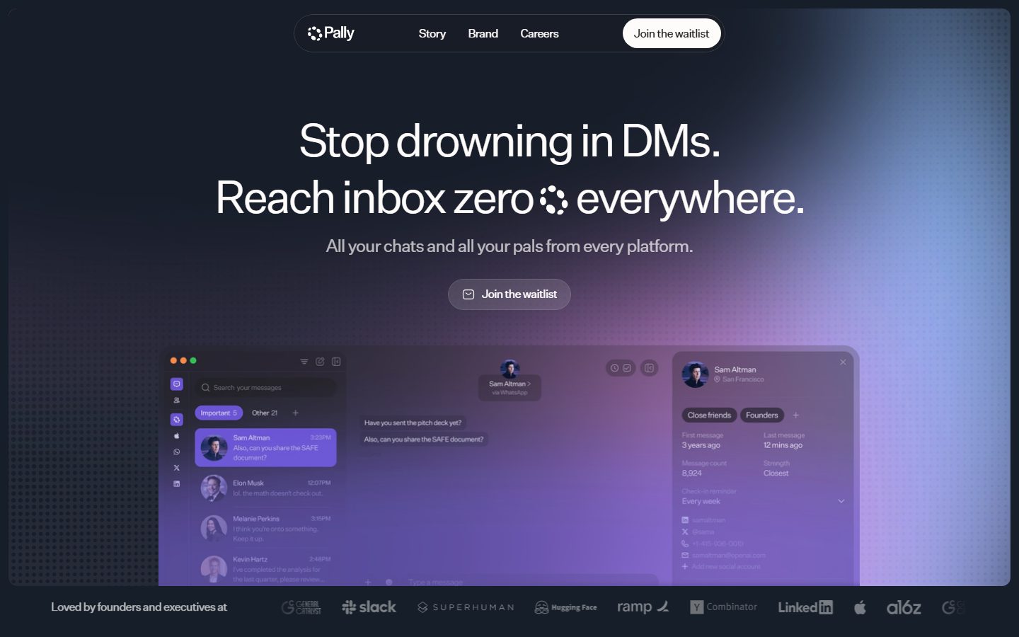
A dark, single-screen waitlist landing for a unified-messaging product, anchored on a deep navy canvas (#161e29) with near-white display type and a single bright-white pill CTA. The mood is calm, premium, and product-forward — an oversized low-contrast headline set in a tightly-tracked grotesque, a floating pill navigation bar, and a violet-tinted product UI screenshot doing the heavy lifting beneath the fold-line. Brand voltage comes from the tight negative letter-spacing on huge headlines and from the realistic app mockup rather than from accent color.
---
version: alpha
name: Pally-design-analysis
description: A dark, single-screen waitlist landing for a unified-messaging product, anchored on a deep navy canvas (#161e29) with near-white display type and a single bright-white pill CTA. The mood is calm, premium, and product-forward — an oversized low-contrast headline set in a tightly-tracked grotesque, a floating pill navigation bar, and a violet-tinted product UI screenshot doing the heavy lifting beneath the fold-line. Brand voltage comes from the tight negative letter-spacing on huge headlines and from the realistic app mockup rather than from accent color.
colors:
  canvas: "#161e29"
  canvas-black: "#000000"
  surface-dark: "#222934"
  surface-soft: "#f7f5f3"
  surface-soft-alt: "#f7f5f2"
  ink: "#fefcfb"
  ink-inverse: "#000000"
  white: "#ffffff"
  muted: "#1e1d1d"
  muted-strong: "#4b4841"
  link: "#0000ee"
  accent-violet: "#7a66e1"
  accent-orange: "#e68748"
  accent-pink: "#eab4f3"
  accent-pink-soft: "#dfa7e9"
  accent-cream: "#eae5dd"
typography:
  display-xl:
    fontFamily: "Inter, sans-serif"
    fontSize: 64px
    fontWeight: 400
    lineHeight: 1.1
    letterSpacing: -3.84px
  display-lg:
    fontFamily: "Inter, sans-serif"
    fontSize: 48px
    fontWeight: 400
    lineHeight: 1.1
    letterSpacing: -1.92px
  title:
    fontFamily: "Inter, sans-serif"
    fontSize: 26px
    fontWeight: 400
    lineHeight: 1.2
    letterSpacing: -1.04px
  body:
    fontFamily: "Inter, sans-serif"
    fontSize: 24px
    fontWeight: 400
    lineHeight: 1.2
    letterSpacing: -0.96px
  nav-link:
    fontFamily: "Inter, sans-serif"
    fontSize: 16px
    fontWeight: 400
    lineHeight: 1.2
    letterSpacing: -0.5px
  button:
    fontFamily: "Inter, sans-serif"
    fontSize: 16px
    fontWeight: 400
    lineHeight: 1.2
    letterSpacing: -0.5px
rounded:
  sm: 5px
  md: 12px
  lg: 19px
  xl: 30px
  pill: 100px
  full: 1000px
spacing:
  xxs: 4px
  xs: 8px
  sm: 10px
  md: 12px
  lg: 20px
  xl: 24px
  xxl: 28px
components:
  top-nav:
    backgroundColor: "{colors.surface-dark}"
    textColor: "{colors.ink}"
    typography: "{typography.nav-link}"
    rounded: "{rounded.pill}"
    padding: 10px 20px
  nav-link:
    backgroundColor: transparent
    textColor: "{colors.ink}"
    typography: "{typography.nav-link}"
  button-primary:
    backgroundColor: "{colors.white}"
    textColor: "{colors.ink-inverse}"
    typography: "{typography.button}"
    rounded: "{rounded.pill}"
    padding: 12px 24px
  button-secondary:
    backgroundColor: "{colors.surface-dark}"
    textColor: "{colors.ink}"
    typography: "{typography.button}"
    rounded: "{rounded.pill}"
    padding: 12px 24px
  hero-band:
    backgroundColor: "{colors.canvas}"
    textColor: "{colors.ink}"
    typography: "{typography.display-xl}"
    padding: 28px
  hero-subhead:
    backgroundColor: transparent
    textColor: "{colors.ink}"
    typography: "{typography.body}"
  product-mockup-card:
    backgroundColor: "{colors.surface-dark}"
    textColor: "{colors.ink}"
    rounded: "{rounded.md}"
  trust-bar:
    backgroundColor: "{colors.canvas-black}"
    textColor: "{colors.ink}"
    typography: "{typography.nav-link}"
    padding: 20px
---

## Overview

Pally's landing surface is a single, calm, dark-canvas waitlist page for a unified-messaging product ("Stop drowning in DMs. Reach inbox zero everywhere."). The page floor is a deep navy (`{colors.canvas}` — #161e29), display type is near-white (`{colors.ink}` — #fefcfb), and the lone bright element is a white pill CTA in the nav. The system reads as premium and product-forward: oversized headline, generous breathing room, and a realistic violet-tinted app screenshot anchoring the lower half of the viewport.

The type voice is a single grotesque — **Test Untitled Sans** (a licensed face, substituted with **Inter** here) — run at weight 400 across every role, from the 64px hero headline to 24px body. What gives the headline its character is the aggressive negative letter-spacing: -3.84px at the hero size, scaling down proportionally. The headline is intentionally low-contrast against the dark canvas, treating type more as texture than as a shout.

Component voltage comes from **the product UI screenshot embedded in-page** — a messaging client showing conversation lists, chat threads, and a contact panel rendered in violet/lavender tones (`{colors.accent-violet}` — #7a66e1). Pally doesn't illustrate the product; it shows the actual app chrome. Accent color lives almost entirely inside that screenshot, not in the marketing chrome.

**Key Characteristics:**
- Deep-navy canvas (`{colors.canvas}` — #161e29) across the entire page — there is no light-mode surface in the marketing flow.
- A single white pill CTA (`{component.button-primary}`) — background `{colors.white}`, text `{colors.ink-inverse}` (#000000), fully rounded (`{rounded.pill}`). It is the only high-contrast object in the chrome.
- Floating pill navigation bar (`{component.top-nav}`) — a rounded-pill container holding the logo, three nav links, and the white CTA.
- Oversized grotesque display type with extreme negative tracking (-3.84px at 64px). The headline is the brand's primary visual signature.
- Product screenshot as hero artifact — a realistic messaging-app mockup tinted violet/lavender (`{colors.accent-violet}`, `{colors.accent-pink}`), rounded at `{rounded.md}` (12px).
- A near-black trust bar (`{colors.canvas-black}` — #000000) closing the first viewport, carrying "Loved by founders and executives at" + partner logos.
- Accent palette (violet, orange, pink, cream) appears almost exclusively inside the product screenshot, not on marketing chrome.

## Colors

### Brand & Accent
- **Accent Violet** (`{colors.accent-violet}` — #7a66e1): The dominant accent inside the product screenshot — selected conversation rows, highlight chips, and the lavender glow behind the mockup.
- **Accent Pink** (`{colors.accent-pink}` — #eab4f3) and **Accent Pink Soft** (`{colors.accent-pink-soft}` — #dfa7e9): Secondary tints in the product UI gradient and ambient background glow on the right side of the hero.
- **Accent Orange** (`{colors.accent-orange}` — #e68748): A scarce warm accent (window controls / status dots inside the mockup).
- **Accent Cream** (`{colors.accent-cream}` — #eae5dd): A soft warm neutral used as a faint surface tint inside the mockup.
- **Link** (`{colors.link}` — #0000ee): The default browser-blue link color was measured on anchor elements; it does not appear as a styled marketing color and is effectively a fallback. Documented for faithfulness only.

### Surface
- **Canvas** (`{colors.canvas}` — #161e29): The single page floor — deep navy, used everywhere.
- **Canvas Black** (`{colors.canvas-black}` — #000000): The near-black trust bar at the bottom of the first viewport, and the most frequently measured color overall (likely also border/overlay tone).
- **Surface Dark** (`{colors.surface-dark}` — #222934): The floating nav pill, the hero secondary CTA pill, and the product-mockup card body.
- **Surface Soft** (`{colors.surface-soft}` — #f7f5f3) and **Surface Soft Alt** (`{colors.surface-soft-alt}` — #f7f5f2): Warm off-white tints measured at low frequency — used inside light areas of the product screenshot.
- **White** (`{colors.white}` — #ffffff): The primary CTA pill fill.

### Text
- **Ink** (`{colors.ink}` — #fefcfb): All display and headline text against the dark canvas — a warm near-white.
- **Ink Inverse** (`{colors.ink-inverse}` — #000000): Text on the white CTA pill.
- **Muted** (`{colors.muted}` — #1e1d1d): A low-contrast text tone measured on h2-level type.
- **Muted Strong** (`{colors.muted-strong}` — #4b4841): A warm dark neutral used in secondary mockup text.

## Typography

### Font Family
The system runs a single typeface, **Test Untitled Sans Regular**, across every role at weight 400. This is a licensed/trial grotesque (the "Test" prefix indicates a trial cut) and is **not licensed for production shipping** — it is substituted here with **Inter**. The fallback stack walks `Inter, -apple-system, BlinkMacSystemFont, "Segoe UI", sans-serif`.

The single-family approach means hierarchy is built entirely from **size and letter-spacing**, not weight or family contrast. Every role is weight 400; the negative tracking tightens as the size grows.

### Hierarchy

| Token | Size | Weight | Line Height | Letter Spacing | Use |
|---|---|---|---|---|---|
| `{typography.display-xl}` | 64px | 400 | 1.1 | -3.84px | Hero h1 ("Stop drowning in DMs…") |
| `{typography.display-lg}` | 48px | 400 | 1.1 | -1.92px | Section heads (h2) |
| `{typography.title}` | 26px | 400 | 1.2 | -1.04px | Sub-headings (h4) |
| `{typography.body}` | 24px | 400 | 1.2 | -0.96px | Hero sub-line, running text |
| `{typography.nav-link}` | 16px | 400 | 1.2 | -0.5px | Nav links, button labels — **derived** (not measured; scaled from the measured ratio) |
| `{typography.button}` | 16px | 400 | 1.2 | -0.5px | CTA labels — **derived** (not measured; scaled from nav-link) |

### Principles
The brand signature is **negative letter-spacing scaled to size** — roughly -6% of the font size (-3.84px on 64px, -1.92px on 48px). Reproducing this is essential; the same family at neutral tracking reads as generic. Keep every role at weight 400 — the system never bolds for emphasis, it enlarges.

### Note on Font Substitutes
**Test Untitled Sans** is a trial cut of Untitled Sans (Klim Type Foundry) and must not be shipped. **Inter** at weight 400 with ~-0.06em letter-spacing is a usable approximation that preserves the tight-grotesque feel. **Neue Haas Grotesk** or **Söhne** are closer commercial alternatives if licensing allows.

## Layout

### Spacing System
- **Base unit:** ~2px effective; the dominant measured rhythm is 10px (76 occurrences).
- **Tokens:** `{spacing.xxs}` 4px · `{spacing.xs}` 8px · `{spacing.sm}` 10px · `{spacing.md}` 12px · `{spacing.lg}` 20px · `{spacing.xl}` 24px · `{spacing.xxl}` 28px.
- **Dominant gap:** `{spacing.sm}` (10px) — the most-used internal gap, in nav clusters and chip rows.
- **Button padding:** ~12px × 24px (`{spacing.md}` × `{spacing.xl}`).
- **Nav padding:** ~10px × 20px (`{spacing.sm}` × `{spacing.lg}`).

### Grid & Container
- **Single-column centered layout** — headline, sub-line, and CTA stack vertically and center-align in the hero.
- **Floating nav pill** sits centered at the top with comfortable horizontal inset.
- **Product mockup** spans a wide centered region beneath the CTA, near full content width.
- **Trust bar** runs full-bleed edge-to-edge at the base of the viewport.

### Whitespace Philosophy
The page is deliberately spacious — a large empty navy field around the centered headline, with the product screenshot grounding the lower half. Below the first viewport the page is mostly empty dark canvas (per the tall capture), reinforcing a single-message, single-action waitlist focus.

## Elevation & Depth

| Level | Treatment | Use |
|---|---|---|
| Flat | No shadow | Canvas, hero text, trust bar |
| Floating pill | Subtle implied lift on the nav pill | `{component.top-nav}` |
| Product card | Soft drop shadow + ambient violet glow | `{component.product-mockup-card}` |

No shadow tokens were measured (`shadows: []`). The product screenshot visibly carries a soft drop shadow and an ambient lavender/violet bloom behind it, but exact values are not extracted — see Known Gaps. The depth philosophy is **soft and atmospheric**: glow and gradient on the dark canvas rather than hard shadows.

### Decorative Depth
- A diffuse violet-to-pink gradient glow sits behind the product mockup and in the upper-right of the hero, lifting the otherwise flat navy field.
- The product screenshot retains its own internal chrome (window controls, panel borders) which reads as depth-as-content rather than a system token.

## Shapes

### Border Radius Scale

| Token | Value | Use |
|---|---|---|
| `{rounded.sm}` | 5px | Small inner chips / mockup UI elements |
| `{rounded.md}` | 12px | Product-mockup card corners, mid-size containers |
| `{rounded.lg}` | 19px | Larger inner panels |
| `{rounded.xl}` | 30px | Large rounded containers |
| `{rounded.pill}` | 100px | Nav bar, primary + secondary CTA pills |
| `{rounded.full}` | 1000px | Fully-round avatars and circular controls |

Additional large radii were measured (117px, 180px, 3000px) — these are decorative/blob radii on glow shapes and oversized rounded surfaces rather than reusable component tokens; they are treated as one-off ornamental values (derived).

### Photography Geometry
The product mockup card uses `{rounded.md}` (12px) corners. Avatars inside the mockup are circular (`{rounded.full}`). The system favors fully-rounded pills (`{rounded.pill}`) for all interactive chrome.

## Components

### Navigation

**`top-nav`** — A floating pill navigation bar centered at the top of the page. Background `{colors.surface-dark}`, rounded `{rounded.pill}` (100px), padding ~10px × 20px. Holds the Pally wordmark + logo glyph at left, three `{component.nav-link}` items (Story, Brand, Careers) in the center, and a white `{component.button-primary}` ("Join the waitlist") at right.

**`nav-link`** — Inline text navigation item. Transparent background, `{colors.ink}` text, type `{typography.nav-link}`.

### Buttons

**`button-primary`** — The signature white pill CTA. Background `{colors.white}`, text `{colors.ink-inverse}` (#000000), type `{typography.button}`, rounded `{rounded.pill}`, padding ~12px × 24px. The single highest-contrast object on the page; appears in the nav.

**`button-secondary`** — The hero in-flow CTA ("Join the waitlist" with a leading mail icon). Background `{colors.surface-dark}` (a dark translucent pill), text `{colors.ink}`, type `{typography.button}`, rounded `{rounded.pill}`, padding ~12px × 24px. Lower contrast than the primary, sitting directly on the dark canvas.

### Hero

**`hero-band`** — The centered hero region on `{colors.canvas}`. Carries the oversized h1 in `{typography.display-xl}` (`{colors.ink}` text), the sub-line in `{component.hero-subhead}`, and the `{component.button-secondary}` beneath.

**`hero-subhead`** — The supporting line ("All your chats and all your pals from every platform."). Transparent background, `{colors.ink}` text, type `{typography.body}`.

### Content

**`product-mockup-card`** — The realistic messaging-app screenshot anchoring the lower hero. Background `{colors.surface-dark}`, rounded `{rounded.md}` (12px), carrying the app's own internal chrome — conversation list, chat thread, and contact-detail panel rendered in violet/lavender (`{colors.accent-violet}`, `{colors.accent-pink}`). Shown directly as content rather than illustrated.

**`trust-bar`** — A full-bleed near-black band at the base of the first viewport. Background `{colors.canvas-black}` (#000000), text `{colors.ink}`, type `{typography.nav-link}`, padding ~20px. Carries "Loved by founders and executives at" + a row of partner logos (Slack, Superhuman, Hugging Face, Ramp, Y Combinator, LinkedIn, Apple, a16z, etc.).

## Do's and Don'ts

### Do
- Keep the entire marketing surface on `{colors.canvas}` (#161e29). There is no light mode here.
- Reserve `{colors.white}` for the single primary pill CTA. One bright object per viewport.
- Reproduce the tight negative letter-spacing (~-6% of font size). It is the brand's core type signature.
- Run every type role at weight 400 — build hierarchy from size, not weight.
- Confine accent color (violet/pink/orange) to the product screenshot and ambient glow, not to marketing chrome.
- Use `{rounded.pill}` for all interactive chrome — nav, buttons.
- Show the actual product UI in `{component.product-mockup-card}` rather than illustrating it.

### Don't
- Don't bold the headline for emphasis — enlarge it instead.
- Don't add a second high-contrast CTA in the same viewport; the white pill should stand alone.
- Don't apply neutral letter-spacing to display type — it reads as generic without the tight tracking.
- Don't ship the "Test Untitled Sans" trial font — use the documented substitute.
- Don't introduce light surfaces into the marketing flow; the navy canvas is continuous.
- Don't add hover-state styling beyond the default + pressed convention.

## Responsive Behavior

### Breakpoints

| Name | Width | Key Changes |
|---|---|---|
| Mobile | < 768px | Hero h1 scales down from 64px; nav pill condenses; product mockup shrinks proportionally; trust-bar logos wrap |
| Tablet | 768–1024px | Hero centered; nav pill stays horizontal; mockup near full width |
| Desktop | 1024–1440px | Full floating nav pill with all links; large centered hero; wide product mockup |
| Wide | > 1440px | Same as desktop with additional outer breathing room |

The captured mobile reference shows the same single-column, centered composition scaled down — headline, sub-line, CTA, then mockup, then trust bar — with no structural reflow.

### Touch Targets
- `{component.button-primary}` and `{component.button-secondary}` are pill-shaped with ~12px × 24px padding, comfortably exceeding 44px tap height.
- `{component.nav-link}` items sit within the padded nav pill, providing adequate tap area.

### Collapsing Strategy
- The single-column hero stack requires no column collapsing.
- The trust-bar logo row wraps or scrolls on narrow widths.
- The product mockup scales proportionally and remains the lower-viewport anchor at every breakpoint.

### Image Behavior
- The product screenshot retains its aspect ratio and `{rounded.md}` corners while scaling.
- Avatars inside the mockup stay circular (`{rounded.full}`).

## Iteration Guide

1. Focus on ONE component at a time. Reference its YAML key directly (`{component.button-primary}`, `{component.product-mockup-card}`).
2. Variants of an existing component (`-active`, `-disabled`) live as separate entries in `components:`.
3. Use `{token.refs}` everywhere — never inline hex.
4. Never document hover. Default and Active/Pressed states only.
5. Display type stays weight 400 with tight negative tracking. The single-family rule does not blur.
6. The white pill CTA is the only bright element — keep it scarce.
7. When in doubt about emphasis: bigger headline before any weight or color change.

## Known Gaps

- **Shadows are not captured** (`shadows: []`). The product mockup and floating nav clearly use soft drop shadows and an ambient violet glow, but exact blur/spread/alpha values were not measured.
- **Button and nav-link typography are derived**, not measured — only h1/h2/h4/body were captured. The 16px / -0.5px values are scaled estimates and should be confirmed against the live CSS.
- **Test Untitled Sans is a licensed trial font** and cannot be shipped; Inter is documented as the substitute.
- **The `#0000ee` link color** is the unstyled browser default measured on anchors; it is not a deliberate brand color and should not be used as one.
- **Only the landing page was captured** — Story, Brand, and Careers pages are out of scope, so component coverage reflects a single waitlist screen.
- **No form/input components** were extracted; the "Join the waitlist" action likely opens a form not present in this capture.
- **Large decorative radii (117px, 180px, 3000px)** were measured but are treated as one-off ornamental/blob values rather than reusable tokens; their precise application is unconfirmed.
- **Animation and transition timings** (glow movement, CTA press, mockup reveal) are not in scope.

<!-- Documented by duply · real-world design systems as ready-to-use DESIGN.md for AI coding agents · https://duply.ai/pally/design-md -->
Color Palette
Accent
Neutrals
Typography
display-xl64px · 400 · 1.1
The quick brown fox jumpsdisplay-lg48px · 400 · 1.1
The quick brown fox jumpstitle26px · 400 · 1.2
The quick brown fox jumpsbody24px · 400 · 1.2
The quick brown fox jumpsnav-link16px · 400 · 1.2
The quick brown fox jumpsbutton16px · 400 · 1.2
The quick brown fox jumpsSpacing & Shape
Spacing
| Name | Value | Preview |
|---|---|---|
| xxs | 4px | |
| xs | 8px | |
| sm | 10px | |
| md | 12px | |
| lg | 20px | |
| xl | 24px | |
| xxl | 28px |
Border Radius
| Name | Value | Preview |
|---|---|---|
| sm | 5px | |
| md | 12px | |
| lg | 19px | |
| xl | 30px | |
| pill | 100px | |
| full | 1000px |
More like this


---
version: alpha
name: Pally-design-analysis
description: A dark, single-screen waitlist landing for a unified-messaging product, anchored on a deep navy canvas (#161e29) with near-white display type and a single bright-white pill CTA. The mood is calm, premium, and product-forward — an oversized low-contrast headline set in a tightly-tracked grotesque, a floating pill navigation bar, and a violet-tinted product UI screenshot doing the heavy lifting beneath the fold-line. Brand voltage comes from the tight negative letter-spacing on huge headlines and from the realistic app mockup rather than from accent color.
colors:
  canvas: "#161e29"
  canvas-black: "#000000"
  surface-dark: "#222934"
  surface-soft: "#f7f5f3"
  surface-soft-alt: "#f7f5f2"
  ink: "#fefcfb"
  ink-inverse: "#000000"
  white: "#ffffff"
  muted: "#1e1d1d"
  muted-strong: "#4b4841"
  link: "#0000ee"
  accent-violet: "#7a66e1"
  accent-orange: "#e68748"
  accent-pink: "#eab4f3"
  accent-pink-soft: "#dfa7e9"
  accent-cream: "#eae5dd"
typography:
  display-xl:
    fontFamily: "Inter, sans-serif"
    fontSize: 64px
    fontWeight: 400
    lineHeight: 1.1
    letterSpacing: -3.84px
  display-lg:
    fontFamily: "Inter, sans-serif"
    fontSize: 48px
    fontWeight: 400
    lineHeight: 1.1
    letterSpacing: -1.92px
  title:
    fontFamily: "Inter, sans-serif"
    fontSize: 26px
    fontWeight: 400
    lineHeight: 1.2
    letterSpacing: -1.04px
  body:
    fontFamily: "Inter, sans-serif"
    fontSize: 24px
    fontWeight: 400
    lineHeight: 1.2
    letterSpacing: -0.96px
  nav-link:
    fontFamily: "Inter, sans-serif"
    fontSize: 16px
    fontWeight: 400
    lineHeight: 1.2
    letterSpacing: -0.5px
  button:
    fontFamily: "Inter, sans-serif"
    fontSize: 16px
    fontWeight: 400
    lineHeight: 1.2
    letterSpacing: -0.5px
rounded:
  sm: 5px
  md: 12px
  lg: 19px
  xl: 30px
  pill: 100px
  full: 1000px
spacing:
  xxs: 4px
  xs: 8px
  sm: 10px
  md: 12px
  lg: 20px
  xl: 24px
  xxl: 28px
components:
  top-nav:
    backgroundColor: "{colors.surface-dark}"
    textColor: "{colors.ink}"
    typography: "{typography.nav-link}"
    rounded: "{rounded.pill}"
    padding: 10px 20px
  nav-link:
    backgroundColor: transparent
    textColor: "{colors.ink}"
    typography: "{typography.nav-link}"
  button-primary:
    backgroundColor: "{colors.white}"
    textColor: "{colors.ink-inverse}"
    typography: "{typography.button}"
    rounded: "{rounded.pill}"
    padding: 12px 24px
  button-secondary:
    backgroundColor: "{colors.surface-dark}"
    textColor: "{colors.ink}"
    typography: "{typography.button}"
    rounded: "{rounded.pill}"
    padding: 12px 24px
  hero-band:
    backgroundColor: "{colors.canvas}"
    textColor: "{colors.ink}"
    typography: "{typography.display-xl}"
    padding: 28px
  hero-subhead:
    backgroundColor: transparent
    textColor: "{colors.ink}"
    typography: "{typography.body}"
  product-mockup-card:
    backgroundColor: "{colors.surface-dark}"
    textColor: "{colors.ink}"
    rounded: "{rounded.md}"
  trust-bar:
    backgroundColor: "{colors.canvas-black}"
    textColor: "{colors.ink}"
    typography: "{typography.nav-link}"
    padding: 20px
---

## Overview

Pally's landing surface is a single, calm, dark-canvas waitlist page for a unified-messaging product ("Stop drowning in DMs. Reach inbox zero everywhere."). The page floor is a deep navy (`{colors.canvas}` — #161e29), display type is near-white (`{colors.ink}` — #fefcfb), and the lone bright element is a white pill CTA in the nav. The system reads as premium and product-forward: oversized headline, generous breathing room, and a realistic violet-tinted app screenshot anchoring the lower half of the viewport.

The type voice is a single grotesque — **Test Untitled Sans** (a licensed face, substituted with **Inter** here) — run at weight 400 across every role, from the 64px hero headline to 24px body. What gives the headline its character is the aggressive negative letter-spacing: -3.84px at the hero size, scaling down proportionally. The headline is intentionally low-contrast against the dark canvas, treating type more as texture than as a shout.

Component voltage comes from **the product UI screenshot embedded in-page** — a messaging client showing conversation lists, chat threads, and a contact panel rendered in violet/lavender tones (`{colors.accent-violet}` — #7a66e1). Pally doesn't illustrate the product; it shows the actual app chrome. Accent color lives almost entirely inside that screenshot, not in the marketing chrome.

**Key Characteristics:**
- Deep-navy canvas (`{colors.canvas}` — #161e29) across the entire page — there is no light-mode surface in the marketing flow.
- A single white pill CTA (`{component.button-primary}`) — background `{colors.white}`, text `{colors.ink-inverse}` (#000000), fully rounded (`{rounded.pill}`). It is the only high-contrast object in the chrome.
- Floating pill navigation bar (`{component.top-nav}`) — a rounded-pill container holding the logo, three nav links, and the white CTA.
- Oversized grotesque display type with extreme negative tracking (-3.84px at 64px). The headline is the brand's primary visual signature.
- Product screenshot as hero artifact — a realistic messaging-app mockup tinted violet/lavender (`{colors.accent-violet}`, `{colors.accent-pink}`), rounded at `{rounded.md}` (12px).
- A near-black trust bar (`{colors.canvas-black}` — #000000) closing the first viewport, carrying "Loved by founders and executives at" + partner logos.
- Accent palette (violet, orange, pink, cream) appears almost exclusively inside the product screenshot, not on marketing chrome.

## Colors

### Brand & Accent
- **Accent Violet** (`{colors.accent-violet}` — #7a66e1): The dominant accent inside the product screenshot — selected conversation rows, highlight chips, and the lavender glow behind the mockup.
- **Accent Pink** (`{colors.accent-pink}` — #eab4f3) and **Accent Pink Soft** (`{colors.accent-pink-soft}` — #dfa7e9): Secondary tints in the product UI gradient and ambient background glow on the right side of the hero.
- **Accent Orange** (`{colors.accent-orange}` — #e68748): A scarce warm accent (window controls / status dots inside the mockup).
- **Accent Cream** (`{colors.accent-cream}` — #eae5dd): A soft warm neutral used as a faint surface tint inside the mockup.
- **Link** (`{colors.link}` — #0000ee): The default browser-blue link color was measured on anchor elements; it does not appear as a styled marketing color and is effectively a fallback. Documented for faithfulness only.

### Surface
- **Canvas** (`{colors.canvas}` — #161e29): The single page floor — deep navy, used everywhere.
- **Canvas Black** (`{colors.canvas-black}` — #000000): The near-black trust bar at the bottom of the first viewport, and the most frequently measured color overall (likely also border/overlay tone).
- **Surface Dark** (`{colors.surface-dark}` — #222934): The floating nav pill, the hero secondary CTA pill, and the product-mockup card body.
- **Surface Soft** (`{colors.surface-soft}` — #f7f5f3) and **Surface Soft Alt** (`{colors.surface-soft-alt}` — #f7f5f2): Warm off-white tints measured at low frequency — used inside light areas of the product screenshot.
- **White** (`{colors.white}` — #ffffff): The primary CTA pill fill.

### Text
- **Ink** (`{colors.ink}` — #fefcfb): All display and headline text against the dark canvas — a warm near-white.
- **Ink Inverse** (`{colors.ink-inverse}` — #000000): Text on the white CTA pill.
- **Muted** (`{colors.muted}` — #1e1d1d): A low-contrast text tone measured on h2-level type.
- **Muted Strong** (`{colors.muted-strong}` — #4b4841): A warm dark neutral used in secondary mockup text.

## Typography

### Font Family
The system runs a single typeface, **Test Untitled Sans Regular**, across every role at weight 400. This is a licensed/trial grotesque (the "Test" prefix indicates a trial cut) and is **not licensed for production shipping** — it is substituted here with **Inter**. The fallback stack walks `Inter, -apple-system, BlinkMacSystemFont, "Segoe UI", sans-serif`.

The single-family approach means hierarchy is built entirely from **size and letter-spacing**, not weight or family contrast. Every role is weight 400; the negative tracking tightens as the size grows.

### Hierarchy

| Token | Size | Weight | Line Height | Letter Spacing | Use |
|---|---|---|---|---|---|
| `{typography.display-xl}` | 64px | 400 | 1.1 | -3.84px | Hero h1 ("Stop drowning in DMs…") |
| `{typography.display-lg}` | 48px | 400 | 1.1 | -1.92px | Section heads (h2) |
| `{typography.title}` | 26px | 400 | 1.2 | -1.04px | Sub-headings (h4) |
| `{typography.body}` | 24px | 400 | 1.2 | -0.96px | Hero sub-line, running text |
| `{typography.nav-link}` | 16px | 400 | 1.2 | -0.5px | Nav links, button labels — **derived** (not measured; scaled from the measured ratio) |
| `{typography.button}` | 16px | 400 | 1.2 | -0.5px | CTA labels — **derived** (not measured; scaled from nav-link) |

### Principles
The brand signature is **negative letter-spacing scaled to size** — roughly -6% of the font size (-3.84px on 64px, -1.92px on 48px). Reproducing this is essential; the same family at neutral tracking reads as generic. Keep every role at weight 400 — the system never bolds for emphasis, it enlarges.

### Note on Font Substitutes
**Test Untitled Sans** is a trial cut of Untitled Sans (Klim Type Foundry) and must not be shipped. **Inter** at weight 400 with ~-0.06em letter-spacing is a usable approximation that preserves the tight-grotesque feel. **Neue Haas Grotesk** or **Söhne** are closer commercial alternatives if licensing allows.

## Layout

### Spacing System
- **Base unit:** ~2px effective; the dominant measured rhythm is 10px (76 occurrences).
- **Tokens:** `{spacing.xxs}` 4px · `{spacing.xs}` 8px · `{spacing.sm}` 10px · `{spacing.md}` 12px · `{spacing.lg}` 20px · `{spacing.xl}` 24px · `{spacing.xxl}` 28px.
- **Dominant gap:** `{spacing.sm}` (10px) — the most-used internal gap, in nav clusters and chip rows.
- **Button padding:** ~12px × 24px (`{spacing.md}` × `{spacing.xl}`).
- **Nav padding:** ~10px × 20px (`{spacing.sm}` × `{spacing.lg}`).

### Grid & Container
- **Single-column centered layout** — headline, sub-line, and CTA stack vertically and center-align in the hero.
- **Floating nav pill** sits centered at the top with comfortable horizontal inset.
- **Product mockup** spans a wide centered region beneath the CTA, near full content width.
- **Trust bar** runs full-bleed edge-to-edge at the base of the viewport.

### Whitespace Philosophy
The page is deliberately spacious — a large empty navy field around the centered headline, with the product screenshot grounding the lower half. Below the first viewport the page is mostly empty dark canvas (per the tall capture), reinforcing a single-message, single-action waitlist focus.

## Elevation & Depth

| Level | Treatment | Use |
|---|---|---|
| Flat | No shadow | Canvas, hero text, trust bar |
| Floating pill | Subtle implied lift on the nav pill | `{component.top-nav}` |
| Product card | Soft drop shadow + ambient violet glow | `{component.product-mockup-card}` |

No shadow tokens were measured (`shadows: []`). The product screenshot visibly carries a soft drop shadow and an ambient lavender/violet bloom behind it, but exact values are not extracted — see Known Gaps. The depth philosophy is **soft and atmospheric**: glow and gradient on the dark canvas rather than hard shadows.

### Decorative Depth
- A diffuse violet-to-pink gradient glow sits behind the product mockup and in the upper-right of the hero, lifting the otherwise flat navy field.
- The product screenshot retains its own internal chrome (window controls, panel borders) which reads as depth-as-content rather than a system token.

## Shapes

### Border Radius Scale

| Token | Value | Use |
|---|---|---|
| `{rounded.sm}` | 5px | Small inner chips / mockup UI elements |
| `{rounded.md}` | 12px | Product-mockup card corners, mid-size containers |
| `{rounded.lg}` | 19px | Larger inner panels |
| `{rounded.xl}` | 30px | Large rounded containers |
| `{rounded.pill}` | 100px | Nav bar, primary + secondary CTA pills |
| `{rounded.full}` | 1000px | Fully-round avatars and circular controls |

Additional large radii were measured (117px, 180px, 3000px) — these are decorative/blob radii on glow shapes and oversized rounded surfaces rather than reusable component tokens; they are treated as one-off ornamental values (derived).

### Photography Geometry
The product mockup card uses `{rounded.md}` (12px) corners. Avatars inside the mockup are circular (`{rounded.full}`). The system favors fully-rounded pills (`{rounded.pill}`) for all interactive chrome.

## Components

### Navigation

**`top-nav`** — A floating pill navigation bar centered at the top of the page. Background `{colors.surface-dark}`, rounded `{rounded.pill}` (100px), padding ~10px × 20px. Holds the Pally wordmark + logo glyph at left, three `{component.nav-link}` items (Story, Brand, Careers) in the center, and a white `{component.button-primary}` ("Join the waitlist") at right.

**`nav-link`** — Inline text navigation item. Transparent background, `{colors.ink}` text, type `{typography.nav-link}`.

### Buttons

**`button-primary`** — The signature white pill CTA. Background `{colors.white}`, text `{colors.ink-inverse}` (#000000), type `{typography.button}`, rounded `{rounded.pill}`, padding ~12px × 24px. The single highest-contrast object on the page; appears in the nav.

**`button-secondary`** — The hero in-flow CTA ("Join the waitlist" with a leading mail icon). Background `{colors.surface-dark}` (a dark translucent pill), text `{colors.ink}`, type `{typography.button}`, rounded `{rounded.pill}`, padding ~12px × 24px. Lower contrast than the primary, sitting directly on the dark canvas.

### Hero

**`hero-band`** — The centered hero region on `{colors.canvas}`. Carries the oversized h1 in `{typography.display-xl}` (`{colors.ink}` text), the sub-line in `{component.hero-subhead}`, and the `{component.button-secondary}` beneath.

**`hero-subhead`** — The supporting line ("All your chats and all your pals from every platform."). Transparent background, `{colors.ink}` text, type `{typography.body}`.

### Content

**`product-mockup-card`** — The realistic messaging-app screenshot anchoring the lower hero. Background `{colors.surface-dark}`, rounded `{rounded.md}` (12px), carrying the app's own internal chrome — conversation list, chat thread, and contact-detail panel rendered in violet/lavender (`{colors.accent-violet}`, `{colors.accent-pink}`). Shown directly as content rather than illustrated.

**`trust-bar`** — A full-bleed near-black band at the base of the first viewport. Background `{colors.canvas-black}` (#000000), text `{colors.ink}`, type `{typography.nav-link}`, padding ~20px. Carries "Loved by founders and executives at" + a row of partner logos (Slack, Superhuman, Hugging Face, Ramp, Y Combinator, LinkedIn, Apple, a16z, etc.).

## Do's and Don'ts

### Do
- Keep the entire marketing surface on `{colors.canvas}` (#161e29). There is no light mode here.
- Reserve `{colors.white}` for the single primary pill CTA. One bright object per viewport.
- Reproduce the tight negative letter-spacing (~-6% of font size). It is the brand's core type signature.
- Run every type role at weight 400 — build hierarchy from size, not weight.
- Confine accent color (violet/pink/orange) to the product screenshot and ambient glow, not to marketing chrome.
- Use `{rounded.pill}` for all interactive chrome — nav, buttons.
- Show the actual product UI in `{component.product-mockup-card}` rather than illustrating it.

### Don't
- Don't bold the headline for emphasis — enlarge it instead.
- Don't add a second high-contrast CTA in the same viewport; the white pill should stand alone.
- Don't apply neutral letter-spacing to display type — it reads as generic without the tight tracking.
- Don't ship the "Test Untitled Sans" trial font — use the documented substitute.
- Don't introduce light surfaces into the marketing flow; the navy canvas is continuous.
- Don't add hover-state styling beyond the default + pressed convention.

## Responsive Behavior

### Breakpoints

| Name | Width | Key Changes |
|---|---|---|
| Mobile | < 768px | Hero h1 scales down from 64px; nav pill condenses; product mockup shrinks proportionally; trust-bar logos wrap |
| Tablet | 768–1024px | Hero centered; nav pill stays horizontal; mockup near full width |
| Desktop | 1024–1440px | Full floating nav pill with all links; large centered hero; wide product mockup |
| Wide | > 1440px | Same as desktop with additional outer breathing room |

The captured mobile reference shows the same single-column, centered composition scaled down — headline, sub-line, CTA, then mockup, then trust bar — with no structural reflow.

### Touch Targets
- `{component.button-primary}` and `{component.button-secondary}` are pill-shaped with ~12px × 24px padding, comfortably exceeding 44px tap height.
- `{component.nav-link}` items sit within the padded nav pill, providing adequate tap area.

### Collapsing Strategy
- The single-column hero stack requires no column collapsing.
- The trust-bar logo row wraps or scrolls on narrow widths.
- The product mockup scales proportionally and remains the lower-viewport anchor at every breakpoint.

### Image Behavior
- The product screenshot retains its aspect ratio and `{rounded.md}` corners while scaling.
- Avatars inside the mockup stay circular (`{rounded.full}`).

## Iteration Guide

1. Focus on ONE component at a time. Reference its YAML key directly (`{component.button-primary}`, `{component.product-mockup-card}`).
2. Variants of an existing component (`-active`, `-disabled`) live as separate entries in `components:`.
3. Use `{token.refs}` everywhere — never inline hex.
4. Never document hover. Default and Active/Pressed states only.
5. Display type stays weight 400 with tight negative tracking. The single-family rule does not blur.
6. The white pill CTA is the only bright element — keep it scarce.
7. When in doubt about emphasis: bigger headline before any weight or color change.

## Known Gaps

- **Shadows are not captured** (`shadows: []`). The product mockup and floating nav clearly use soft drop shadows and an ambient violet glow, but exact blur/spread/alpha values were not measured.
- **Button and nav-link typography are derived**, not measured — only h1/h2/h4/body were captured. The 16px / -0.5px values are scaled estimates and should be confirmed against the live CSS.
- **Test Untitled Sans is a licensed trial font** and cannot be shipped; Inter is documented as the substitute.
- **The `#0000ee` link color** is the unstyled browser default measured on anchors; it is not a deliberate brand color and should not be used as one.
- **Only the landing page was captured** — Story, Brand, and Careers pages are out of scope, so component coverage reflects a single waitlist screen.
- **No form/input components** were extracted; the "Join the waitlist" action likely opens a form not present in this capture.
- **Large decorative radii (117px, 180px, 3000px)** were measured but are treated as one-off ornamental/blob values rather than reusable tokens; their precise application is unconfirmed.
- **Animation and transition timings** (glow movement, CTA press, mockup reveal) are not in scope.

<!-- Documented by duply · real-world design systems as ready-to-use DESIGN.md for AI coding agents · https://duply.ai/pally/design-md -->