GetApron
A warm, confident fintech-for-small-business interface built on a buttercream-yellow palette, chunky Champ display headlines, and pill-shaped controls. The system reads as friendly-but-serious money software — full-bleed photographic hero, pale-yellow feature cards holding live product UI fragments, bright-yellow primary CTAs, and rounded corners throughout. Brand voltage comes from the heavy Champ display face and a single saturated yellow accent against soft near-white canvas.
---
version: alpha
name: GetApron-design-analysis
description: A warm, confident fintech-for-small-business interface built on a buttercream-yellow palette, chunky Champ display headlines, and pill-shaped controls. The system reads as friendly-but-serious money software — full-bleed photographic hero, pale-yellow feature cards holding live product UI fragments, bright-yellow primary CTAs, and rounded corners throughout. Brand voltage comes from the heavy Champ display face and a single saturated yellow accent against soft near-white canvas.
colors:
primary: "#ffd801"
on-primary: "#000000"
ink: "#000000"
on-dark: "#ffffff"
canvas: "#fffef9"
surface-card: "#fff6d4"
surface-card-alt: "#fbefaf"
typography:
display:
fontFamily: "Champ, DM Sans, sans-serif"
fontSize: 72px
fontWeight: 800
lineHeight: 1.014
letterSpacing: normal
title:
fontFamily: "Champ, DM Sans, sans-serif"
fontSize: 26px
fontWeight: 500
lineHeight: 1.4
letterSpacing: normal
body:
fontFamily: "DM Sans, sans-serif"
fontSize: 20px
fontWeight: 400
lineHeight: 1.5
letterSpacing: 0.2px
button:
fontFamily: "DM Sans, sans-serif"
fontSize: 16px
fontWeight: 500
lineHeight: 1.0
letterSpacing: 0.16px
rounded:
md: 16px
lg: 20px
full: 9999px
spacing:
xxs: 4px
xs: 8px
sm: 12px
md: 16px
ml: 20px
lg: 24px
xl: 32px
xxl: 48px
section: 80px
components:
top-nav:
backgroundColor: "{colors.surface-card}"
textColor: "{colors.ink}"
typography: "{typography.button}"
button-primary:
backgroundColor: "{colors.primary}"
textColor: "{colors.on-primary}"
typography: "{typography.button}"
rounded: "{rounded.full}"
padding: 16px 32px
button-secondary:
backgroundColor: transparent
textColor: "{colors.ink}"
typography: "{typography.button}"
rounded: "{rounded.full}"
padding: 16px 32px
button-outline-on-dark:
backgroundColor: transparent
textColor: "{colors.on-dark}"
typography: "{typography.button}"
rounded: "{rounded.full}"
padding: 16px 32px
hero-band:
backgroundColor: transparent
textColor: "{colors.on-dark}"
typography: "{typography.display}"
padding: 80px
feature-card:
backgroundColor: "{colors.surface-card}"
textColor: "{colors.ink}"
typography: "{typography.title}"
rounded: "{rounded.lg}"
padding: 32px
feature-card-alt:
backgroundColor: "{colors.surface-card-alt}"
textColor: "{colors.ink}"
typography: "{typography.title}"
rounded: "{rounded.lg}"
padding: 32px
testimonial-card:
backgroundColor: "{colors.canvas}"
textColor: "{colors.ink}"
typography: "{typography.body}"
rounded: "{rounded.md}"
padding: 24px
badge-pill:
backgroundColor: "{colors.primary}"
textColor: "{colors.on-primary}"
typography: "{typography.button}"
rounded: "{rounded.full}"
padding: 8px 16px
---
## Overview
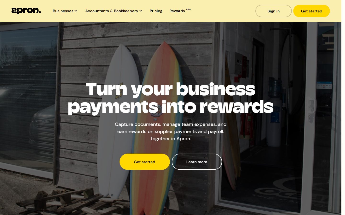
GetApron's marketing surface is a warm, confident fintech interface aimed at small-business owners. The page floor is a near-white warm canvas (`{colors.canvas}` — #fffef9), feature sections sit on buttercream-yellow cards (`{colors.surface-card}` — #fff6d4), and a single saturated yellow (`{colors.primary}` — #ffd801) does all the accent and CTA work. The result reads as friendly money software — soft, rounded, approachable, but still legible and serious.
The type voice splits cleanly into two roles: **Champ** — a heavy display face used at weight 800 / 72px for the hero and section headlines and at weight 500 / 26px for card titles — and **DM Sans** for body copy and button labels. Champ is the brand's voltage: chunky, near-condensed, set tight (line-height 1.014 at hero scale). DM Sans handles everything else with a relaxed 1.5 line-height and slightly positive letter-spacing (0.2px on body).
Component voltage comes from **live product UI fragments shown inside the pale-yellow feature cards** — an inbox with invoices, AI categorisation tags, QuickBooks/Xero sync logos, bank-connection rows, reconciliation receipts. Apron doesn't illustrate the product; it embeds real product chrome at small scale inside the marketing flow.
The hero is a full-bleed photograph (surfboards leaning against a workshop) with a dark overlay and white headline (`{colors.on-dark}` — #ffffff) — the only place white text appears. Everything below returns to black-on-cream.
**Key Characteristics:**
- Warm near-white canvas (`{colors.canvas}` — #fffef9) with buttercream feature cards (`{colors.surface-card}` — #fff6d4).
- Bright-yellow primary CTA (`{colors.primary}` — #ffd801) with black label (`{colors.on-primary}` — #000000). Fully pill-shaped (`{rounded.full}`).
- Heavy **Champ** display face (weight 800, 72px) for hero + section heads; **DM Sans** for body and buttons.
- Pill-shaped buttons everywhere — `{rounded.full}` (9999px) on primary, secondary, and outline variants.
- Feature cards hold real product UI fragments (inbox, AI tags, bank rows) rather than decorative illustration.
- Soft, warm-tinted single shadow (`rgba(70,58,0,0.1) 0 4px 12px`) used sparingly on floating testimonial / UI cards.
- Border radius is hierarchical: `{rounded.md}` (16px) for testimonial cards, `{rounded.lg}` (20px) for feature cards, `{rounded.full}` for buttons and tag pills.
- Section rhythm runs on an 80px (`{spacing.section}`) vertical beat with 32px (`{spacing.xl}`) and 24px (`{spacing.lg}`) as the dominant internal spacings.
## Colors
### Brand & Accent
- **Primary** (`{colors.primary}` — #ffd801): The single saturated brand yellow. All primary CTAs, the "Get started" nav button, and tag/badge pills. This is the only high-chroma color in the system.
- **Surface Card** (`{colors.surface-card}` — #fff6d4): The buttercream pale-yellow used for the nav bar and the majority of feature-section cards. The dominant non-white surface.
- **Surface Card Alt** (`{colors.surface-card-alt}` — #fbefaf): A very slightly deeper pale-yellow variant used on alternating cards for subtle banding within long feature stacks.
### Surface
- **Canvas** (`{colors.canvas}` — #fffef9): The warm near-white page floor between feature bands.
### Text
- **Ink** (`{colors.ink}` — #000000): All headlines and body copy on light surfaces — pure black for maximum contrast against the warm canvas.
- **On Primary** (`{colors.on-primary}` — #000000): Black label text on the yellow primary button. Apron keeps button labels black, never white.
- **On Dark** (`{colors.on-dark}` — #ffffff): White text used only over the photographic hero (and any future dark-overlay band).
The palette is deliberately tiny — one yellow, two cream surfaces, black text, white-on-image. There are no measured grays, blues, or semantic status colors; see Known Gaps.
## Typography
### Font Family
The system runs **Champ** for display + card titles and **DM Sans** for body and UI labels. Champ is a heavy contemporary display face (weight 800 at hero scale, weight 500 for card titles) set very tight (line-height 1.014 at 72px) — it carries all the brand personality. DM Sans handles running text (20px / 400 / 1.5) and button labels (16px / 500). The boundary is strict: headlines and card titles use Champ; everything textual or interactive below title scale uses DM Sans.
### Hierarchy
| Token | Size | Weight | Line Height | Letter Spacing | Use |
|---|---|---|---|---|---|
| `{typography.display}` | 72px | 800 | 1.014 | normal | Hero h1 ("Turn your business payments into rewards") and section h2 heads — Champ |
| `{typography.title}` | 26px | 500 | 1.4 | normal | Feature card titles ("A single inbox for your documents") — Champ |
| `{typography.body}` | 20px | 400 | 1.5 | 0.2px | Running body copy, card descriptions, hero sub-headline — DM Sans |
| `{typography.button}` | 16px | 500 | 1.0 | 0.16px | Button labels, nav links, tag pills — DM Sans |
### Principles
Champ is the brand voice — the hero and every section headline use it at weight 800. The drop to weight 500 at card-title size (26px) keeps Champ present but quieter inside cards. Never set body copy in Champ; never set a section headline in DM Sans. Body copy carries slightly positive letter-spacing (0.2px) which keeps DM Sans airy against the warm canvas.
### Note on Font Substitutes
**Champ** is a licensed display typeface (Displaay Type Foundry) and is not freely redistributable. Where Champ is unavailable, **Archivo** at weight 800 (for display) and weight 500 (for titles) is the closest open-source approximation — it shares Champ's tight, near-condensed grotesque proportions. **Hanken Grotesk** Bold is a second alternative. **DM Sans** is already open-source (Google Fonts) and ships as-is; it doubles as the fallback for Champ in the stack.
## Layout
### Spacing System
- **Base unit:** 4px.
- **Tokens:** `{spacing.xxs}` 4px · `{spacing.xs}` 8px · `{spacing.sm}` 12px · `{spacing.md}` 16px · `{spacing.ml}` 20px · `{spacing.lg}` 24px · `{spacing.xl}` 32px · `{spacing.xxl}` 48px · `{spacing.section}` 80px.
- **Dominant rhythms (by measured frequency):** 32px and 24px are the most common internal paddings/gaps; 8px handles tight clusters (icon + label); 48px and 80px handle band-level spacing.
- **Section padding:** `{spacing.section}` (80px) is the major vertical beat between editorial bands.
- **Card internal padding:** `{spacing.xl}` (32px) for feature cards; `{spacing.lg}` (24px) for testimonial cards.
### Grid & Container
- **Editorial body:** Centered single-column marketing flow with full-bleed photographic bands at the hero and mid-page.
- **Feature sections:** Title + body on the left, embedded product-UI fragment on the right, inside a single wide pale-yellow card.
- **Testimonials:** 2-up card row floating over a photographic band.
- **Logo strip:** Single horizontal row of partner/customer wordmarks beneath the intro band.
(Exact container max-width and column counts were not measured — see Known Gaps.)
### Whitespace Philosophy
Apron uses generous vertical whitespace (80px section beats) and large 32px card padding to keep the dense product-UI fragments from feeling cramped. The warm canvas between bands lets the buttercream cards read as distinct objects rather than a continuous wash.
## Elevation & Depth
| Level | Treatment | Use |
|---|---|---|
| Flat | No shadow | Nav bar, feature cards on canvas, body bands |
| Warm soft shadow | `rgba(70, 58, 0, 0.1) 0px 4px 12px 0px` | Floating testimonial cards and product-UI fragment cards lifted off photographic bands |
The system uses exactly one measured shadow — a low-alpha, warm-tinted (brown-yellow) soft drop shadow. The brown tint (rather than neutral black) keeps shadows harmonised with the buttercream palette. There is no neumorphism, no glassmorphism, and no heavy elevation; color-block contrast (yellow on cream) does most of the separation work.
### Decorative Depth
- Product UI fragments embedded in feature cards (inbox rows, invoice tags, reconciliation receipts) carry their own internal chrome and small shadows — these are product screenshots shown as content, not system tokens.
- The hero photograph carries a dark overlay so the white Champ headline stays legible; the overlay tone was not measured.
## Shapes
### Border Radius Scale
| Token | Value | Use |
|---|---|---|
| `{rounded.md}` | 16px | Testimonial cards, smaller floating UI cards |
| `{rounded.lg}` | 20px | Feature cards (the dominant card radius) |
| `{rounded.full}` | 9999px | All buttons, nav CTA, tag/badge pills |
### Photography Geometry
The hero is a full-bleed rectangular photograph (no rounding at the viewport edge). Mid-page photographic bands (chillies, customer photos) appear as polaroid-style tilted snapshots inside or behind cards. Product-UI fragment cards inherit the `{rounded.lg}` (20px) family. Buttons and pills are fully rounded (`{rounded.full}`), the system's signature shape.
## Components
### Navigation
**`top-nav`** — Pale-yellow nav bar (`{colors.surface-card}` — #fff6d4) pinned to the top of the page. Carries the lowercase "apron." wordmark at left, primary menu (Businesses, Accountants & Bookkeepers, Pricing, Rewards) center, and a right-side cluster with a "Sign in" `{component.button-secondary}` and a yellow "Get started" `{component.button-primary}`. Menu items render in `{typography.button}` (DM Sans 16 / 500).
### Buttons
**`button-primary`** — The signature CTA. Background `{colors.primary}` (#ffd801), label `{colors.on-primary}` (#000000), type `{typography.button}`, fully pill-shaped (`{rounded.full}`). Padding is `16px 32px` (derived — the measured padding came back as `0px` from an inner wrapper element, so the visual padding is interpolated from the screenshots; confirm against production CSS).
**`button-secondary`** — Transparent "Sign in" pill in the nav. Background transparent, label `{colors.ink}`, `{typography.button}`, `{rounded.full}`, padding `16px 32px` (derived, same caveat as primary).
**`button-outline-on-dark`** — The "Learn more" pill over the photographic hero. Background transparent with a white hairline outline, label `{colors.on-dark}` (#ffffff), `{typography.button}`, `{rounded.full}`. Sits beside the yellow "Get started" button in the hero CTA row.
### Hero
**`hero-band`** — Full-bleed photographic band with a dark overlay. Headline in `{typography.display}` (Champ 72 / 800) and sub-headline in `{typography.body}`, both in `{colors.on-dark}`. CTA row pairs `{component.button-primary}` with `{component.button-outline-on-dark}`. Vertical padding ~`{spacing.section}` (80px).
### Cards & Containers
**`feature-card`** — The dominant content card. Background `{colors.surface-card}` (#fff6d4), rounded `{rounded.lg}` (20px), internal padding `{spacing.xl}` (32px). Carries a Champ title (`{typography.title}`), a DM Sans description (`{typography.body}`), and an embedded product-UI fragment (inbox, AI tags, sync logos).
**`feature-card-alt`** — Identical structure on the slightly deeper buttercream surface (`{colors.surface-card-alt}` — #fbefaf), used to band alternating cards within long feature stacks.
**`testimonial-card`** — White card floating over a photographic band. Background `{colors.canvas}` (#fffef9), rounded `{rounded.md}` (16px), padding `{spacing.lg}` (24px), lifted with the warm soft shadow (`rgba(70,58,0,0.1) 0 4px 12px`). Carries a star rating, a short quote in `{typography.body}`, and an attributed name.
### Tags / Badges
**`badge-pill`** — Small yellow pill used for AI categorisation tags inside product-UI fragments ("Smart Agency", "Marketing", invoice line tags). Background `{colors.primary}` (#ffd801), label `{colors.on-primary}` (#000000), `{typography.button}`, `{rounded.full}`, padding `8px 16px` (derived from screenshot proportions).
## Do's and Don'ts
### Do
- Reserve `{colors.primary}` (#ffd801) for CTAs and tag pills — it's the only saturated color and should stay scarce enough to read as "action".
- Use Champ weight 800 for hero/section headlines and weight 500 for card titles. Keep its tight line-height (1.014 at display scale).
- Set body and button text in DM Sans with its measured letter-spacing (0.2px body, 0.16px button).
- Embed real product UI fragments inside `{component.feature-card}` rather than drawing illustrations of the product.
- Keep every button and tag fully pill-shaped (`{rounded.full}`); use 20px / 16px radii only on cards.
- Use the warm-tinted shadow (`rgba(70,58,0,0.1)`) — never a neutral black shadow — so elevation harmonises with the buttercream palette.
### Don't
- Don't introduce a second accent color. The system is a one-yellow palette against cream and black.
- Don't put white text anywhere except over the photographic hero overlay.
- Don't set body copy in Champ or section headlines in DM Sans — the two-face boundary is strict.
- Don't use button label colors other than black (`{colors.on-primary}`); Apron keeps yellow buttons paired with black labels.
- Don't square off buttons or tags — the full-pill shape is a brand signature.
- Don't add hover-state styling beyond default and pressed; variants live as separate component entries.
## Responsive Behavior
The reference captures were taken at desktop and full-page scroll widths. Specific breakpoint values, column counts, and mobile reflow rules were not measured, so the guidance below is inferred from the captured layouts and must be confirmed (see Known Gaps).
- **Hero:** The full-bleed photograph and centered Champ headline are expected to scale the headline down from 72px on narrow screens; the two-button CTA row likely stacks vertically.
- **Feature cards:** The title-left / product-UI-right split inside `{component.feature-card}` is expected to stack to single-column on mobile, with the UI fragment below the copy.
- **Testimonials:** The 2-up `{component.testimonial-card}` row likely collapses to 1-up on mobile.
- **Nav:** The horizontal `{component.top-nav}` menu likely collapses to a hamburger below tablet width.
### Touch Targets
- `{component.button-primary}` and `{component.button-secondary}` use generous pill padding (derived 16px × 32px), comfortably exceeding 44px tap height.
- Exact mobile tap-target sizing was not measured.
## Iteration Guide
1. Focus on ONE component at a time. Reference its YAML key directly (`{component.feature-card}`, `{component.button-primary}`).
2. Variants of an existing component (`-alt`, `-secondary`, `-on-dark`) live as separate entries in `components:`.
3. Use `{token.refs}` everywhere — never inline a hex into a component.
4. Never document hover. Default and Active/Pressed states only.
5. Headlines stay Champ (800 display / 500 title); body and buttons stay DM Sans. The two-face split does not blur.
6. Keep yellow scarce: CTAs and tags only. When you need emphasis, use bigger Champ before more yellow.
7. Shadows stay warm-tinted and singular — don't introduce neutral or multi-layer elevation.
## Known Gaps
- **Champ is a licensed display typeface** (Displaay) and cannot be shipped freely; Archivo 800/500 or Hanken Grotesk Bold are documented open-source substitutes. `fonts_licensed` came back empty in the analysis, but Champ is not a public web font.
- **No dark text gray, body-secondary, or muted tone was measured** — only pure black (#000000). Secondary/caption text colors, if any, are unconfirmed.
- **No semantic status colors** (success / warning / error) were captured; the product UI fragments may use them internally but they were not extracted.
- **Eyebrow/section-label type** (e.g. "### INVOICE CAPTURE ###", "### BILL PAY ###") was not captured as a distinct typography role — its size/weight/tracking are unknown.
- **The measured primary button padding is `0px`**, which reflects an inner wrapper rather than the visible control; the documented `16px 32px` is derived from screenshots and should be confirmed against production CSS. Button height was not measured.
- **No h3 role** was measured (only h1/h2 at 72px and h4 at 26px); intermediate heading sizes are unconfirmed.
- **Footer** was not captured in either reference page — its background, link structure, and type are out of scope.
- **Container max-width, grid columns, and all responsive breakpoints** were not measured; responsive behavior above is inferred from the captured layouts.
- **Hero overlay tone** and any photographic-band treatments were not extracted as tokens.
- The pricing-owners page was captured but no pricing-specific components (tier cards, toggles) were measured into the analysis.
<!-- Documented by duply · real-world design systems as ready-to-use DESIGN.md for AI coding agents · https://duply.ai/getapron/design-md -->
Color Palette
Accent
Neutrals
Typography
display72px · 800 · 1.014
The quick brown fox jumpstitle26px · 500 · 1.4
The quick brown fox jumpsbody20px · 400 · 1.5
The quick brown fox jumpsbutton16px · 500 · 1
The quick brown fox jumpsSpacing & Shape
Spacing
| Name | Value | Preview |
|---|---|---|
| xxs | 4px | |
| xs | 8px | |
| sm | 12px | |
| md | 16px | |
| ml | 20px | |
| lg | 24px | |
| xl | 32px | |
| xxl | 48px | |
| section | 80px |
Border Radius
| Name | Value | Preview |
|---|---|---|
| md | 16px | |
| lg | 20px | |
| full | 9999px |
More like this


---
version: alpha
name: GetApron-design-analysis
description: A warm, confident fintech-for-small-business interface built on a buttercream-yellow palette, chunky Champ display headlines, and pill-shaped controls. The system reads as friendly-but-serious money software — full-bleed photographic hero, pale-yellow feature cards holding live product UI fragments, bright-yellow primary CTAs, and rounded corners throughout. Brand voltage comes from the heavy Champ display face and a single saturated yellow accent against soft near-white canvas.

colors:
  primary: "#ffd801"
  on-primary: "#000000"
  ink: "#000000"
  on-dark: "#ffffff"
  canvas: "#fffef9"
  surface-card: "#fff6d4"
  surface-card-alt: "#fbefaf"

typography:
  display:
    fontFamily: "Champ, DM Sans, sans-serif"
    fontSize: 72px
    fontWeight: 800
    lineHeight: 1.014
    letterSpacing: normal
  title:
    fontFamily: "Champ, DM Sans, sans-serif"
    fontSize: 26px
    fontWeight: 500
    lineHeight: 1.4
    letterSpacing: normal
  body:
    fontFamily: "DM Sans, sans-serif"
    fontSize: 20px
    fontWeight: 400
    lineHeight: 1.5
    letterSpacing: 0.2px
  button:
    fontFamily: "DM Sans, sans-serif"
    fontSize: 16px
    fontWeight: 500
    lineHeight: 1.0
    letterSpacing: 0.16px

rounded:
  md: 16px
  lg: 20px
  full: 9999px

spacing:
  xxs: 4px
  xs: 8px
  sm: 12px
  md: 16px
  ml: 20px
  lg: 24px
  xl: 32px
  xxl: 48px
  section: 80px

components:
  top-nav:
    backgroundColor: "{colors.surface-card}"
    textColor: "{colors.ink}"
    typography: "{typography.button}"
  button-primary:
    backgroundColor: "{colors.primary}"
    textColor: "{colors.on-primary}"
    typography: "{typography.button}"
    rounded: "{rounded.full}"
    padding: 16px 32px
  button-secondary:
    backgroundColor: transparent
    textColor: "{colors.ink}"
    typography: "{typography.button}"
    rounded: "{rounded.full}"
    padding: 16px 32px
  button-outline-on-dark:
    backgroundColor: transparent
    textColor: "{colors.on-dark}"
    typography: "{typography.button}"
    rounded: "{rounded.full}"
    padding: 16px 32px
  hero-band:
    backgroundColor: transparent
    textColor: "{colors.on-dark}"
    typography: "{typography.display}"
    padding: 80px
  feature-card:
    backgroundColor: "{colors.surface-card}"
    textColor: "{colors.ink}"
    typography: "{typography.title}"
    rounded: "{rounded.lg}"
    padding: 32px
  feature-card-alt:
    backgroundColor: "{colors.surface-card-alt}"
    textColor: "{colors.ink}"
    typography: "{typography.title}"
    rounded: "{rounded.lg}"
    padding: 32px
  testimonial-card:
    backgroundColor: "{colors.canvas}"
    textColor: "{colors.ink}"
    typography: "{typography.body}"
    rounded: "{rounded.md}"
    padding: 24px
  badge-pill:
    backgroundColor: "{colors.primary}"
    textColor: "{colors.on-primary}"
    typography: "{typography.button}"
    rounded: "{rounded.full}"
    padding: 8px 16px
---

## Overview

GetApron's marketing surface is a warm, confident fintech interface aimed at small-business owners. The page floor is a near-white warm canvas (`{colors.canvas}` — #fffef9), feature sections sit on buttercream-yellow cards (`{colors.surface-card}` — #fff6d4), and a single saturated yellow (`{colors.primary}` — #ffd801) does all the accent and CTA work. The result reads as friendly money software — soft, rounded, approachable, but still legible and serious.

The type voice splits cleanly into two roles: **Champ** — a heavy display face used at weight 800 / 72px for the hero and section headlines and at weight 500 / 26px for card titles — and **DM Sans** for body copy and button labels. Champ is the brand's voltage: chunky, near-condensed, set tight (line-height 1.014 at hero scale). DM Sans handles everything else with a relaxed 1.5 line-height and slightly positive letter-spacing (0.2px on body).

Component voltage comes from **live product UI fragments shown inside the pale-yellow feature cards** — an inbox with invoices, AI categorisation tags, QuickBooks/Xero sync logos, bank-connection rows, reconciliation receipts. Apron doesn't illustrate the product; it embeds real product chrome at small scale inside the marketing flow.

The hero is a full-bleed photograph (surfboards leaning against a workshop) with a dark overlay and white headline (`{colors.on-dark}` — #ffffff) — the only place white text appears. Everything below returns to black-on-cream.

**Key Characteristics:**
- Warm near-white canvas (`{colors.canvas}` — #fffef9) with buttercream feature cards (`{colors.surface-card}` — #fff6d4).
- Bright-yellow primary CTA (`{colors.primary}` — #ffd801) with black label (`{colors.on-primary}` — #000000). Fully pill-shaped (`{rounded.full}`).
- Heavy **Champ** display face (weight 800, 72px) for hero + section heads; **DM Sans** for body and buttons.
- Pill-shaped buttons everywhere — `{rounded.full}` (9999px) on primary, secondary, and outline variants.
- Feature cards hold real product UI fragments (inbox, AI tags, bank rows) rather than decorative illustration.
- Soft, warm-tinted single shadow (`rgba(70,58,0,0.1) 0 4px 12px`) used sparingly on floating testimonial / UI cards.
- Border radius is hierarchical: `{rounded.md}` (16px) for testimonial cards, `{rounded.lg}` (20px) for feature cards, `{rounded.full}` for buttons and tag pills.
- Section rhythm runs on an 80px (`{spacing.section}`) vertical beat with 32px (`{spacing.xl}`) and 24px (`{spacing.lg}`) as the dominant internal spacings.

## Colors

### Brand & Accent
- **Primary** (`{colors.primary}` — #ffd801): The single saturated brand yellow. All primary CTAs, the "Get started" nav button, and tag/badge pills. This is the only high-chroma color in the system.
- **Surface Card** (`{colors.surface-card}` — #fff6d4): The buttercream pale-yellow used for the nav bar and the majority of feature-section cards. The dominant non-white surface.
- **Surface Card Alt** (`{colors.surface-card-alt}` — #fbefaf): A very slightly deeper pale-yellow variant used on alternating cards for subtle banding within long feature stacks.

### Surface
- **Canvas** (`{colors.canvas}` — #fffef9): The warm near-white page floor between feature bands.

### Text
- **Ink** (`{colors.ink}` — #000000): All headlines and body copy on light surfaces — pure black for maximum contrast against the warm canvas.
- **On Primary** (`{colors.on-primary}` — #000000): Black label text on the yellow primary button. Apron keeps button labels black, never white.
- **On Dark** (`{colors.on-dark}` — #ffffff): White text used only over the photographic hero (and any future dark-overlay band).

The palette is deliberately tiny — one yellow, two cream surfaces, black text, white-on-image. There are no measured grays, blues, or semantic status colors; see Known Gaps.

## Typography

### Font Family
The system runs **Champ** for display + card titles and **DM Sans** for body and UI labels. Champ is a heavy contemporary display face (weight 800 at hero scale, weight 500 for card titles) set very tight (line-height 1.014 at 72px) — it carries all the brand personality. DM Sans handles running text (20px / 400 / 1.5) and button labels (16px / 500). The boundary is strict: headlines and card titles use Champ; everything textual or interactive below title scale uses DM Sans.

### Hierarchy

| Token | Size | Weight | Line Height | Letter Spacing | Use |
|---|---|---|---|---|---|
| `{typography.display}` | 72px | 800 | 1.014 | normal | Hero h1 ("Turn your business payments into rewards") and section h2 heads — Champ |
| `{typography.title}` | 26px | 500 | 1.4 | normal | Feature card titles ("A single inbox for your documents") — Champ |
| `{typography.body}` | 20px | 400 | 1.5 | 0.2px | Running body copy, card descriptions, hero sub-headline — DM Sans |
| `{typography.button}` | 16px | 500 | 1.0 | 0.16px | Button labels, nav links, tag pills — DM Sans |

### Principles
Champ is the brand voice — the hero and every section headline use it at weight 800. The drop to weight 500 at card-title size (26px) keeps Champ present but quieter inside cards. Never set body copy in Champ; never set a section headline in DM Sans. Body copy carries slightly positive letter-spacing (0.2px) which keeps DM Sans airy against the warm canvas.

### Note on Font Substitutes
**Champ** is a licensed display typeface (Displaay Type Foundry) and is not freely redistributable. Where Champ is unavailable, **Archivo** at weight 800 (for display) and weight 500 (for titles) is the closest open-source approximation — it shares Champ's tight, near-condensed grotesque proportions. **Hanken Grotesk** Bold is a second alternative. **DM Sans** is already open-source (Google Fonts) and ships as-is; it doubles as the fallback for Champ in the stack.

## Layout

### Spacing System
- **Base unit:** 4px.
- **Tokens:** `{spacing.xxs}` 4px · `{spacing.xs}` 8px · `{spacing.sm}` 12px · `{spacing.md}` 16px · `{spacing.ml}` 20px · `{spacing.lg}` 24px · `{spacing.xl}` 32px · `{spacing.xxl}` 48px · `{spacing.section}` 80px.
- **Dominant rhythms (by measured frequency):** 32px and 24px are the most common internal paddings/gaps; 8px handles tight clusters (icon + label); 48px and 80px handle band-level spacing.
- **Section padding:** `{spacing.section}` (80px) is the major vertical beat between editorial bands.
- **Card internal padding:** `{spacing.xl}` (32px) for feature cards; `{spacing.lg}` (24px) for testimonial cards.

### Grid & Container
- **Editorial body:** Centered single-column marketing flow with full-bleed photographic bands at the hero and mid-page.
- **Feature sections:** Title + body on the left, embedded product-UI fragment on the right, inside a single wide pale-yellow card.
- **Testimonials:** 2-up card row floating over a photographic band.
- **Logo strip:** Single horizontal row of partner/customer wordmarks beneath the intro band.

(Exact container max-width and column counts were not measured — see Known Gaps.)

### Whitespace Philosophy
Apron uses generous vertical whitespace (80px section beats) and large 32px card padding to keep the dense product-UI fragments from feeling cramped. The warm canvas between bands lets the buttercream cards read as distinct objects rather than a continuous wash.

## Elevation & Depth

| Level | Treatment | Use |
|---|---|---|
| Flat | No shadow | Nav bar, feature cards on canvas, body bands |
| Warm soft shadow | `rgba(70, 58, 0, 0.1) 0px 4px 12px 0px` | Floating testimonial cards and product-UI fragment cards lifted off photographic bands |

The system uses exactly one measured shadow — a low-alpha, warm-tinted (brown-yellow) soft drop shadow. The brown tint (rather than neutral black) keeps shadows harmonised with the buttercream palette. There is no neumorphism, no glassmorphism, and no heavy elevation; color-block contrast (yellow on cream) does most of the separation work.

### Decorative Depth
- Product UI fragments embedded in feature cards (inbox rows, invoice tags, reconciliation receipts) carry their own internal chrome and small shadows — these are product screenshots shown as content, not system tokens.
- The hero photograph carries a dark overlay so the white Champ headline stays legible; the overlay tone was not measured.

## Shapes

### Border Radius Scale

| Token | Value | Use |
|---|---|---|
| `{rounded.md}` | 16px | Testimonial cards, smaller floating UI cards |
| `{rounded.lg}` | 20px | Feature cards (the dominant card radius) |
| `{rounded.full}` | 9999px | All buttons, nav CTA, tag/badge pills |

### Photography Geometry
The hero is a full-bleed rectangular photograph (no rounding at the viewport edge). Mid-page photographic bands (chillies, customer photos) appear as polaroid-style tilted snapshots inside or behind cards. Product-UI fragment cards inherit the `{rounded.lg}` (20px) family. Buttons and pills are fully rounded (`{rounded.full}`), the system's signature shape.

## Components

### Navigation

**`top-nav`** — Pale-yellow nav bar (`{colors.surface-card}` — #fff6d4) pinned to the top of the page. Carries the lowercase "apron." wordmark at left, primary menu (Businesses, Accountants & Bookkeepers, Pricing, Rewards) center, and a right-side cluster with a "Sign in" `{component.button-secondary}` and a yellow "Get started" `{component.button-primary}`. Menu items render in `{typography.button}` (DM Sans 16 / 500).

### Buttons

**`button-primary`** — The signature CTA. Background `{colors.primary}` (#ffd801), label `{colors.on-primary}` (#000000), type `{typography.button}`, fully pill-shaped (`{rounded.full}`). Padding is `16px 32px` (derived — the measured padding came back as `0px` from an inner wrapper element, so the visual padding is interpolated from the screenshots; confirm against production CSS).

**`button-secondary`** — Transparent "Sign in" pill in the nav. Background transparent, label `{colors.ink}`, `{typography.button}`, `{rounded.full}`, padding `16px 32px` (derived, same caveat as primary).

**`button-outline-on-dark`** — The "Learn more" pill over the photographic hero. Background transparent with a white hairline outline, label `{colors.on-dark}` (#ffffff), `{typography.button}`, `{rounded.full}`. Sits beside the yellow "Get started" button in the hero CTA row.

### Hero

**`hero-band`** — Full-bleed photographic band with a dark overlay. Headline in `{typography.display}` (Champ 72 / 800) and sub-headline in `{typography.body}`, both in `{colors.on-dark}`. CTA row pairs `{component.button-primary}` with `{component.button-outline-on-dark}`. Vertical padding ~`{spacing.section}` (80px).

### Cards & Containers

**`feature-card`** — The dominant content card. Background `{colors.surface-card}` (#fff6d4), rounded `{rounded.lg}` (20px), internal padding `{spacing.xl}` (32px). Carries a Champ title (`{typography.title}`), a DM Sans description (`{typography.body}`), and an embedded product-UI fragment (inbox, AI tags, sync logos).

**`feature-card-alt`** — Identical structure on the slightly deeper buttercream surface (`{colors.surface-card-alt}` — #fbefaf), used to band alternating cards within long feature stacks.

**`testimonial-card`** — White card floating over a photographic band. Background `{colors.canvas}` (#fffef9), rounded `{rounded.md}` (16px), padding `{spacing.lg}` (24px), lifted with the warm soft shadow (`rgba(70,58,0,0.1) 0 4px 12px`). Carries a star rating, a short quote in `{typography.body}`, and an attributed name.

### Tags / Badges

**`badge-pill`** — Small yellow pill used for AI categorisation tags inside product-UI fragments ("Smart Agency", "Marketing", invoice line tags). Background `{colors.primary}` (#ffd801), label `{colors.on-primary}` (#000000), `{typography.button}`, `{rounded.full}`, padding `8px 16px` (derived from screenshot proportions).

## Do's and Don'ts

### Do
- Reserve `{colors.primary}` (#ffd801) for CTAs and tag pills — it's the only saturated color and should stay scarce enough to read as "action".
- Use Champ weight 800 for hero/section headlines and weight 500 for card titles. Keep its tight line-height (1.014 at display scale).
- Set body and button text in DM Sans with its measured letter-spacing (0.2px body, 0.16px button).
- Embed real product UI fragments inside `{component.feature-card}` rather than drawing illustrations of the product.
- Keep every button and tag fully pill-shaped (`{rounded.full}`); use 20px / 16px radii only on cards.
- Use the warm-tinted shadow (`rgba(70,58,0,0.1)`) — never a neutral black shadow — so elevation harmonises with the buttercream palette.

### Don't
- Don't introduce a second accent color. The system is a one-yellow palette against cream and black.
- Don't put white text anywhere except over the photographic hero overlay.
- Don't set body copy in Champ or section headlines in DM Sans — the two-face boundary is strict.
- Don't use button label colors other than black (`{colors.on-primary}`); Apron keeps yellow buttons paired with black labels.
- Don't square off buttons or tags — the full-pill shape is a brand signature.
- Don't add hover-state styling beyond default and pressed; variants live as separate component entries.

## Responsive Behavior

The reference captures were taken at desktop and full-page scroll widths. Specific breakpoint values, column counts, and mobile reflow rules were not measured, so the guidance below is inferred from the captured layouts and must be confirmed (see Known Gaps).

- **Hero:** The full-bleed photograph and centered Champ headline are expected to scale the headline down from 72px on narrow screens; the two-button CTA row likely stacks vertically.
- **Feature cards:** The title-left / product-UI-right split inside `{component.feature-card}` is expected to stack to single-column on mobile, with the UI fragment below the copy.
- **Testimonials:** The 2-up `{component.testimonial-card}` row likely collapses to 1-up on mobile.
- **Nav:** The horizontal `{component.top-nav}` menu likely collapses to a hamburger below tablet width.

### Touch Targets
- `{component.button-primary}` and `{component.button-secondary}` use generous pill padding (derived 16px × 32px), comfortably exceeding 44px tap height.
- Exact mobile tap-target sizing was not measured.

## Iteration Guide

1. Focus on ONE component at a time. Reference its YAML key directly (`{component.feature-card}`, `{component.button-primary}`).
2. Variants of an existing component (`-alt`, `-secondary`, `-on-dark`) live as separate entries in `components:`.
3. Use `{token.refs}` everywhere — never inline a hex into a component.
4. Never document hover. Default and Active/Pressed states only.
5. Headlines stay Champ (800 display / 500 title); body and buttons stay DM Sans. The two-face split does not blur.
6. Keep yellow scarce: CTAs and tags only. When you need emphasis, use bigger Champ before more yellow.
7. Shadows stay warm-tinted and singular — don't introduce neutral or multi-layer elevation.

## Known Gaps

- **Champ is a licensed display typeface** (Displaay) and cannot be shipped freely; Archivo 800/500 or Hanken Grotesk Bold are documented open-source substitutes. `fonts_licensed` came back empty in the analysis, but Champ is not a public web font.
- **No dark text gray, body-secondary, or muted tone was measured** — only pure black (#000000). Secondary/caption text colors, if any, are unconfirmed.
- **No semantic status colors** (success / warning / error) were captured; the product UI fragments may use them internally but they were not extracted.
- **Eyebrow/section-label type** (e.g. "### INVOICE CAPTURE ###", "### BILL PAY ###") was not captured as a distinct typography role — its size/weight/tracking are unknown.
- **The measured primary button padding is `0px`**, which reflects an inner wrapper rather than the visible control; the documented `16px 32px` is derived from screenshots and should be confirmed against production CSS. Button height was not measured.
- **No h3 role** was measured (only h1/h2 at 72px and h4 at 26px); intermediate heading sizes are unconfirmed.
- **Footer** was not captured in either reference page — its background, link structure, and type are out of scope.
- **Container max-width, grid columns, and all responsive breakpoints** were not measured; responsive behavior above is inferred from the captured layouts.
- **Hero overlay tone** and any photographic-band treatments were not extracted as tokens.
- The pricing-owners page was captured but no pricing-specific components (tier cards, toggles) were measured into the analysis.

<!-- Documented by duply · real-world design systems as ready-to-use DESIGN.md for AI coding agents · https://duply.ai/getapron/design-md -->