Foodnoms
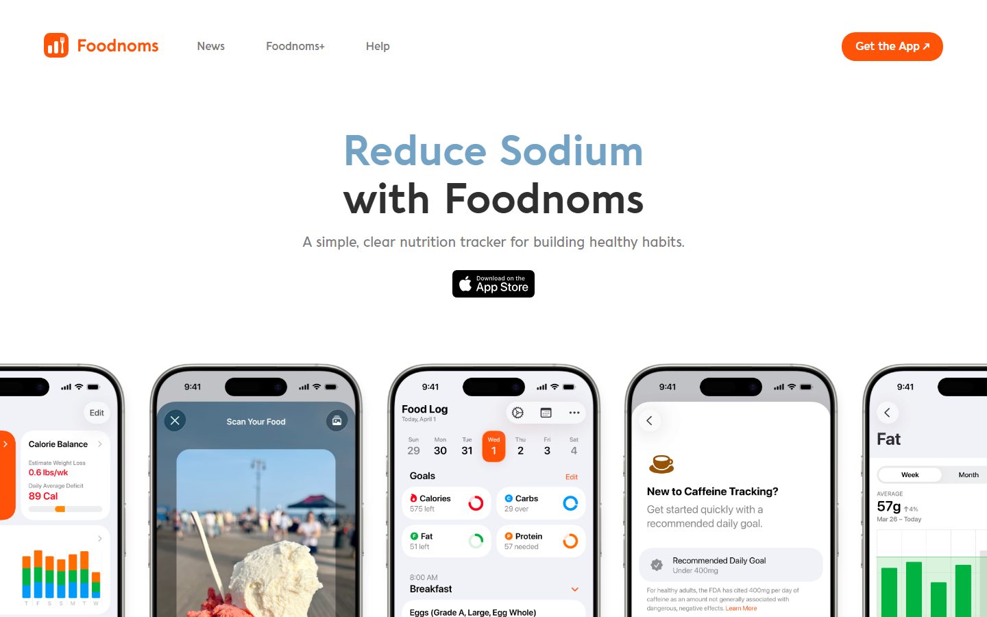
A bright, friendly consumer-app marketing surface built on a white canvas with a single warm-orange brand accent and the rounded-geometric Aquawax Pro display face. The system reads as approachable and health-positive — generous whitespace, large rounded device-mockup screenshots showing the actual product, soft light-gray feature cards, and a full-bleed orange footer that closes the page. Brand voltage comes almost entirely from the orange accent and the rounded Aquawax headlines rather than from a broad color palette.
---
version: alpha
name: Foodnoms-design-analysis
description: A bright, friendly consumer-app marketing surface built on a white canvas with a single warm-orange brand accent and the rounded-geometric Aquawax Pro display face. The system reads as approachable and health-positive — generous whitespace, large rounded device-mockup screenshots showing the actual product, soft light-gray feature cards, and a full-bleed orange footer that closes the page. Brand voltage comes almost entirely from the orange accent and the rounded Aquawax headlines rather than from a broad color palette.

colors:
  ink: "#000000"
  link: "#0000ee"
  brand: "#ff6a00"
  canvas: "#ffffff"
  surface: "#f5f5f5"
  on-brand: "#ffffff"

typography:
  heading-lg:
    fontFamily: "Aquawax Pro, Quicksand, Poppins, sans-serif"
    fontSize: 30px
    fontWeight: 700
    lineHeight: 1.2
    letterSpacing: normal
  heading-sm:
    fontFamily: "Aquawax Pro, Quicksand, Poppins, sans-serif"
    fontSize: 22px
    fontWeight: 700
    lineHeight: 1.4
    letterSpacing: normal
  body:
    fontFamily: "Aquawax Pro, Quicksand, Poppins, sans-serif"
    fontSize: 20px
    fontWeight: 500
    lineHeight: 1.6
    letterSpacing: normal

rounded:
  lg: 24px
  xl: 26px

spacing:
  xxs: 8px
  xs: 10px
  sm: 12px
  md: 20px
  lg: 24px
  xl: 32px
  xxl: 40px
  huge: 48px
  section: 64px
  section-lg: 96px

components:
  top-nav:
    backgroundColor: "{colors.canvas}"
    textColor: "{colors.ink}"
    typography: "{typography.body}"
    padding: 24px 32px
  nav-link:
    backgroundColor: transparent
    textColor: "{colors.ink}"
    typography: "{typography.body}"
  button-primary:
    backgroundColor: "{colors.brand}"
    textColor: "{colors.on-brand}"
    typography: "{typography.body}"
    rounded: "{rounded.xl}"
    padding: 12px 24px
  app-store-badge:
    backgroundColor: "{colors.ink}"
    textColor: "{colors.on-brand}"
    rounded: "{rounded.lg}"
  hero:
    backgroundColor: "{colors.canvas}"
    textColor: "{colors.ink}"
    typography: "{typography.heading-lg}"
    padding: 96px
  hero-subtitle:
    backgroundColor: transparent
    textColor: "{colors.ink}"
    typography: "{typography.body}"
  device-mockup:
    backgroundColor: "{colors.canvas}"
    textColor: "{colors.ink}"
    rounded: "{rounded.xl}"
  feature-card:
    backgroundColor: "{colors.surface}"
    textColor: "{colors.ink}"
    typography: "{typography.heading-sm}"
    rounded: "{rounded.xl}"
    padding: 32px
  feature-card-title:
    backgroundColor: transparent
    textColor: "{colors.brand}"
    typography: "{typography.heading-sm}"
  value-prop-item:
    backgroundColor: transparent
    textColor: "{colors.ink}"
    typography: "{typography.body}"
  section-heading:
    backgroundColor: transparent
    textColor: "{colors.ink}"
    typography: "{typography.heading-lg}"
  footer:
    backgroundColor: "{colors.brand}"
    textColor: "{colors.on-brand}"
    typography: "{typography.body}"
    padding: 64px
  footer-link:
    backgroundColor: transparent
    textColor: "{colors.on-brand}"
    typography: "{typography.body}"
---

## Overview

Foodnoms' marketing surface is a bright, friendly consumer-app landing page — a white canvas (`{colors.canvas}` — #ffffff, derived from screenshots) anchored by a single warm-orange brand accent (`{colors.brand}` — #ff6a00, derived from screenshots) and the rounded-geometric **Aquawax Pro** display face. The page reads as approachable, health-positive, and uncluttered: a centered hero headline, a horizontal row of real iPhone product mockups, light-gray feature cards, a privacy-values row, and a full-bleed orange footer that closes the page.

The measured analysis was sparse on color — the analyzer captured only running-text black (`{colors.ink}` — #000000) and the default link blue (`{colors.link}` — #0000ee). The brand orange, white canvas, light-gray card surface, and white-on-orange footer text are all **derived** from the reference screenshots and flagged in Known Gaps; treat their exact hex values as provisional.

Type is single-family: **Aquawax Pro**, a rounded geometric sans, carries everything — bold weight 700 for headlines, medium weight 500 for body. There is no secondary text face. The voice is soft, rounded, and friendly, matching the consumer-health positioning. Because Aquawax Pro is a commercial typeface, an open-source substitute (Quicksand / Poppins) is documented in the Typography section.

Component voltage comes from **real product UI shown inside large rounded device mockups** — Foodnoms shows actual food-log screens, scan-food cameras, and nutrition charts rather than abstract illustrations. The brand orange appears at the action layer (the "Get the App" pill, feature-card accents) and as the full-bleed footer block.

**Key Characteristics:**
- White canvas with one warm-orange brand accent (`{colors.brand}` — #ff6a00, derived). Orange is reserved for the primary CTA pill, accent icons, and the footer block.
- Single rounded-geometric typeface — Aquawax Pro at weight 700 (headlines) and 500 (body). Substituted with Quicksand/Poppins here.
- Large rounded radii everywhere — measured at 24px (`{rounded.lg}`) and a dominant 26px (`{rounded.xl}`). Cards, device-mockup frames, and CTA buttons all sit at the soft end of the radius scale.
- Real product screenshots inside iPhone device frames carried horizontally across the page — the product is the hero artifact.
- Light-gray feature cards (`{colors.surface}` — #f5f5f5, derived) in a 2-up grid, each pairing a colored title with a product screenshot.
- The black App Store badge (`{colors.ink}` — #000000) is a recurring download affordance in the hero and closing band.
- Full-bleed orange footer (`{colors.brand}`) with white link columns — the only saturated block on the page, used to visually close the long scroll.
- Generous vertical rhythm — major bands separated by `{spacing.section}` (64px) to `{spacing.section-lg}` (96px); the dominant internal spacing unit is `{spacing.xl}` (32px).

## Colors

The measured palette is intentionally tiny — Foodnoms is a near-monochrome white-and-orange brand. Only two colors were captured by the analyzer; the rest are derived from screenshots and must be confirmed.

### Brand & Accent
- **Brand** (`{colors.brand}` — #ff6a00, derived from screenshots): The single accent color. Used on the "Get the App" pill CTA, feature-card title accents, small product-UI highlights, and the full-bleed footer. This hex is derived/observed, not measured — confirm against source before shipping.

### Text
- **Ink** (`{colors.ink}` — #000000, measured, frequency 926): The dominant text color — headlines, body copy, and the black App Store badge background. The single most-measured token in the analysis.
- **Link** (`{colors.link}` — #0000ee, measured, frequency 8): The default unstyled hyperlink blue, observed on a handful of inline anchors. Low frequency; likely a fallback rather than an intentional brand link color.
- **On Brand** (`{colors.on-brand}` — #ffffff, derived): White text used on the orange footer and on the black App Store badge.

### Surface
- **Canvas** (`{colors.canvas}` — #ffffff, derived): The default page floor for every band above the footer.
- **Surface** (`{colors.surface}` — #f5f5f5, derived): The light-gray feature-card background in the 2-up feature grid. Exact tone derived from screenshots.

## Typography

### Font Family
The system runs a single family — **Aquawax Pro**, a rounded geometric sans-serif — across every role. Headlines use **Aquawax Pro Bold** (weight 700); body copy uses **Aquawax Pro Medium** (weight 500). There is no separate body or UI typeface. The rounded geometric forms give the brand its soft, friendly, consumer-health character.

### Hierarchy

| Token | Size | Weight | Line Height | Letter Spacing | Use |
|---|---|---|---|---|---|
| `{typography.heading-lg}` | 30px | 700 | 1.2 | normal | Section + hero headlines (`h2`) — "Reduce Sodium with Foodnoms", "Start Tracking Macros for Free", "As Featured By" |
| `{typography.heading-sm}` | 22px | 700 | 1.4 | normal | Sub-section + feature-card titles (`h4`) — "Effortlessly Scan Food", "Privacy First" |
| `{typography.body}` | 20px | 500 | 1.6 | normal | Running text, sub-headlines, nav links, footer links |

### Principles
The hierarchy is shallow — three sizes, two weights, one family. Bold (700) signals "headline / title"; Medium (500) signals "everything else". Line-height widens as size drops (1.2 → 1.4 → 1.6) for comfortable body reading. Letter-spacing stays at the browser default ("normal") across all roles — Aquawax Pro's rounded forms carry the personality without tracking adjustments.

The hero headline is rendered two-tone in the screenshots ("Reduce Sodium" in a muted gray-blue, "with Foodnoms" in near-black) — but those individual headline tints were not measured and are not encoded as tokens. See Known Gaps.

### Note on Font Substitutes
**Aquawax Pro** is a commercial typeface (it was not flagged in `fonts_licensed`, but it is a paid Positype family and cannot be assumed freely redistributable). If Aquawax Pro is unavailable, **Quicksand** (rounded geometric, weights 500/700) is the closest open-source approximation and is the recommended substitute; **Poppins** at 500/700 is a slightly less-rounded geometric alternative. Both preserve the soft geometric character and the 700/500 weight split. Do not claim to ship Aquawax Pro itself unless a license is in hand.

## Layout

### Spacing System
- **Base unit:** appears to be ~4px, but the measured values cluster on a specific set.
- **Tokens:** `{spacing.xxs}` 8px · `{spacing.xs}` 10px · `{spacing.sm}` 12px · `{spacing.md}` 20px · `{spacing.lg}` 24px · `{spacing.xl}` 32px · `{spacing.xxl}` 40px · `{spacing.huge}` 48px · `{spacing.section}` 64px · `{spacing.section-lg}` 96px.
- **Dominant unit:** `{spacing.xl}` (32px) — the most frequently measured value (127 occurrences), used as the primary internal padding and gap.
- **Secondary rhythm:** `{spacing.sm}` (12px, freq 63) and `{spacing.xxs}` (8px, freq 56) handle tight internal gaps; `{spacing.lg}` (24px, freq 51) handles medium gaps.
- **Section padding:** `{spacing.section}` (64px) and `{spacing.section-lg}` (96px) separate major editorial bands.

(Two additional low-frequency values — 36px and 56px — were measured once or twice each and are omitted from the named scale as outliers.)

### Grid & Container
- **Hero:** Centered single-column — headline, sub-headline, App Store badge, all center-aligned.
- **Device-mockup row:** A horizontally-scrolling / edge-bleeding row of iPhone screenshots directly below the hero.
- **Feature grid:** 2-up at desktop, each card pairing a text block with a product screenshot.
- **Values row:** 3-up (Privacy First / Your Data, Your Control / No Ads, Ever) with centered icon + title + body.
- **Footer:** Multi-column link list (Explore / Comparisons / Company / Support / Social) on the orange block, with the large "Foodnoms" wordmark at the left.

### Whitespace Philosophy
Foodnoms uses generous, calm whitespace — centered hero with wide vertical breathing room, large product screenshots, and clearly separated bands. The page is built for fast scanning by a consumer audience: one idea per band, big rounded type, no dense lists.

## Elevation & Depth

| Level | Treatment | Use |
|---|---|---|
| Flat | No shadow, no border | Hero, body bands, top nav, feature text |
| Soft glow | `color(display-p3 0.815686 0.815686 0.815686 / 0.36) 0px 0px 20px 0px` — a soft ~rgba(208,208,208,0.36) diffuse glow with no offset, 20px blur | A single elevated element (measured once) — likely the App Store badge or a floating card |
| Surface card | `{colors.surface}` (#f5f5f5) background, no shadow | Feature cards rely on a light-gray fill rather than shadow for separation |

The elevation philosophy is **minimal and soft** — the only measured shadow is a low-alpha, no-offset gray glow (a diffuse ambient halo rather than a directional drop shadow). Most depth comes from the light-gray feature-card fill and from the device-mockup frames, which carry their own product-chrome shadows as content.

### Decorative Depth
- iPhone device mockups carry realistic frame bezels and internal product-UI shadows — these are content artifacts, not system tokens.
- The full-bleed orange footer creates depth through color contrast against the white canvas above, not through shadow.

## Shapes

### Border Radius Scale

| Token | Value | Use |
|---|---|---|
| `{rounded.lg}` | 24px | App Store badge corners, secondary rounded containers (measured, frequency 8) |
| `{rounded.xl}` | 26px | The dominant radius — feature cards, device-mockup frames, CTA buttons (measured, frequency 62) |

Only two radii were measured, both large and soft (24px and 26px). The system has no small/sharp radius — everything is generously rounded, reinforcing the friendly consumer-health tone. The `{rounded.xl}` (26px) value dominates and should be treated as the default card/button radius.

### Photography & Mockup Geometry
- Product screenshots are shown inside iPhone device frames with their own native rounded corners; the surrounding card uses `{rounded.xl}` (26px).
- The "Get the App" CTA and footer chips read as capsule/pill shapes in the screenshots — this is likely the 26px radius combined with a short element height producing a fully-rounded look, since no pill/9999px radius was measured. See Known Gaps.

## Components

### Navigation

**`top-nav`** — White nav bar at the top of the page. Background `{colors.canvas}`, text `{colors.ink}`, type `{typography.body}`. Carries the orange Foodnoms wordmark + bar-chart logo at left, primary menu (News, Foodnoms+, Help) center-left, and the orange "Get the App" pill CTA at right. Internal padding approximately `{spacing.lg}` × `{spacing.xl}`.

**`nav-link`** — Inline text menu items. Transparent background, `{colors.ink}` text, `{typography.body}`.

### Buttons & Download Affordances

**`button-primary`** — The orange "Get the App" pill CTA. Background `{colors.brand}` (#ff6a00), text `{colors.on-brand}` (white), type `{typography.body}`, rounded `{rounded.xl}` (26px), padding approximately `{spacing.sm}` × `{spacing.lg}`. The single primary action color in the system.

**`app-store-badge`** — The black "Download on the App Store" badge in the hero and the closing "Start Tracking Macros for Free" band. Background `{colors.ink}` (#000000), white Apple wordmark, rounded `{rounded.lg}` (24px).

### Hero

**`hero`** — Centered white-canvas hero. Background `{colors.canvas}`, headline in `{typography.heading-lg}` (the two-tone "Reduce Sodium with Foodnoms"), vertical padding up to `{spacing.section-lg}` (96px).

**`hero-subtitle`** — The supporting line ("A simple, clear nutrition tracker for building healthy habits."). Transparent background, `{colors.ink}` text, `{typography.body}`. Note: the subtitle renders gray in screenshots; that gray tone was not measured (see Known Gaps).

**`device-mockup`** — iPhone frame showing real Foodnoms product UI (food log, scan camera, nutrition charts). Background `{colors.canvas}`, rounded `{rounded.xl}` (26px). Carried in a horizontal row beneath the hero and inside feature cards.

### Cards & Content

**`feature-card`** — Light-gray card in the 2-up feature grid ("Effortlessly Scan Food", "Log Meals Faster with AI", "Set Powerful Daily Goals", "Deep Health Integration"). Background `{colors.surface}` (#f5f5f5, derived), rounded `{rounded.xl}` (26px), padding `{spacing.xl}` (32px). Pairs a text block (colored title + body) with a product screenshot.

**`feature-card-title`** — The card heading. Transparent background, `{typography.heading-sm}`. Documented here as `{colors.brand}`, but note: in the screenshots each card title uses a different accent color (blue, orange, purple, green) — those individual per-card tints were not measured (see Known Gaps).

**`value-prop-item`** — The 3-up privacy/values row (Privacy First / Your Data, Your Control / No Ads, Ever). Transparent background, centered colored icon + `{typography.heading-sm}` title + `{typography.body}` description in `{colors.ink}`.

**`section-heading`** — Centered band headings ("As Featured By", "Trusted By Thousands of Users", "Start Tracking Macros for Free"). Transparent background, `{colors.ink}` text, `{typography.heading-lg}`.

### Footer

**`footer`** — Full-bleed orange block closing the page. Background `{colors.brand}` (#ff6a00), text `{colors.on-brand}` (white), type `{typography.body}`, vertical padding `{spacing.section}` (64px). Carries the large "Foodnoms" wordmark at left and multi-column link lists (Explore / Comparisons / Company / Support / Social), with a copyright line below.

**`footer-link`** — White link items inside the footer. Transparent background, `{colors.on-brand}` text, `{typography.body}`.

## Do's and Don'ts

### Do
- Reserve `{colors.brand}` (#ff6a00) for the primary CTA, accent icons, and the footer block. Orange is the only saturated color — keep it scarce and intentional.
- Use Aquawax Pro (or Quicksand/Poppins substitute) for everything. The single-family discipline is part of the soft, friendly voice.
- Keep the 700/500 weight split clean — Bold for headlines/titles, Medium for body. Don't introduce other weights.
- Default to `{rounded.xl}` (26px) for cards, buttons, and mockup frames. The system has no sharp corners.
- Show real product screenshots inside `{component.device-mockup}` frames — the product UI is the hero, not abstract illustration.
- Use `{component.feature-card}` light-gray fill (rather than shadow) to separate cards from the white canvas.
- Close the page with the full-bleed orange `{component.footer}` — the white-to-orange transition is the page's visual punctuation.

### Don't
- Don't introduce additional accent colors. Foodnoms is white-and-orange; new hues dilute the brand.
- Don't use small or sharp radii. Nothing in the measured scale is below 24px.
- Don't put body copy in Bold (700) or headlines in Medium (500) — the weight split carries the hierarchy.
- Don't rely on heavy drop shadows. The only measured shadow is a soft, no-offset gray glow at low alpha.
- Don't add a second dark surface. Black (`{colors.ink}`) is for text and the App Store badge only; the orange footer is the sole saturated block.
- Don't document hover states — default and active/pressed only; CTA color behavior on press was not measured.

## Responsive Behavior

The analysis captured a single landing page at desktop width; the screenshots include both a wide and a narrow capture. Breakpoint values below are inferred from layout structure, not measured.

### Breakpoints (inferred)

| Name | Width | Key Changes |
|---|---|---|
| Mobile | < 768px | Nav condenses; hero stays centered; device-mockup row scrolls horizontally; feature grid collapses 2-up → 1-up; footer columns stack |
| Tablet | 768–1024px | Feature grid may stay 2-up; values row stays 3-up or wraps |
| Desktop | > 1024px | Full top-nav with all menu items; 2-up feature grid; 3-up values row; multi-column footer |

### Touch Targets
- `{component.button-primary}` ("Get the App") is a comfortably-sized pill — adequate for touch at `{spacing.sm}` × `{spacing.lg}` padding around 20px type.
- `{component.app-store-badge}` is a large tap target by design.
- Exact tap-area dimensions were not measured; confirm against WCAG 44×44 before shipping.

### Collapsing Strategy
- The horizontal device-mockup row edge-bleeds and scrolls rather than scaling each phone down.
- Feature cards reduce from 2-up to 1-up rather than shrinking content.
- Footer link columns stack vertically on narrow viewports while the orange block stays full-bleed.

## Iteration Guide

1. Focus on ONE component at a time. Reference its YAML key directly (`{component.feature-card}`, `{component.footer}`).
2. Variants of an existing component (`-active`, `-disabled`) live as separate entries in `components:`.
3. Use `{token.refs}` everywhere — never inline hex.
4. Never document hover. Default and Active/Pressed states only.
5. Keep the white-canvas / orange-accent contrast as the core identity — orange stays at the action layer and the footer.
6. Headlines stay Aquawax Pro Bold (700); body stays Aquawax Pro Medium (500). One family, two weights.
7. When confirming derived colors, replace the screenshot-estimated hex values (`{colors.brand}`, `{colors.canvas}`, `{colors.surface}`, `{colors.on-brand}`) with measured source values before production.

## Known Gaps

- **Color measurement is severely incomplete.** The analyzer captured only two colors: text black (`{colors.ink}` — #000000) and a low-frequency default link blue (`{colors.link}` — #0000ee). The brand orange (`{colors.brand}`), white canvas (`{colors.canvas}`), light-gray feature-card surface (`{colors.surface}`), and white footer text (`{colors.on-brand}`) are all **derived from screenshots** — their exact hex values are provisional and must be confirmed against source.
- The hero headline is two-tone in the screenshots (a muted gray-blue "Reduce Sodium" over a near-black "with Foodnoms"); those headline tints were not measured and are not tokenized.
- The hero sub-headline and supporting body copy render in a muted gray in the screenshots; that gray text color was not measured (only #000000 was captured).
- Each feature-card title uses a different accent color (blue / orange / purple / green); `{component.feature-card-title}` documents only a single `{colors.brand}` placeholder — the per-card tints were not measured.
- **Aquawax Pro is a commercial typeface** (not flagged in `fonts_licensed`, but a paid family). Open-source substitutes (Quicksand, Poppins) are documented; do not ship Aquawax Pro without a license.
- No components were captured by the analyzer (`components: []`); all component specs above are reconstructed from screenshot ground-truth plus the measured type, spacing, radius, and shadow tokens. Component padding/height values are inferred from the spacing scale, not directly measured.
- Only two border radii were measured (24px, 26px). The pill/capsule appearance of the CTA and footer chips is inferred to come from the 26px radius plus short element height; no true pill (9999px) radius was measured.
- Only one box-shadow was measured (a soft no-offset gray glow); other elevation treatments, if any, were not captured.
- Two outlier spacing values (36px, 56px) were measured at very low frequency and excluded from the named scale.
- Breakpoints, hover/active states, animation, and form-input styling are not in the analysis and are noted as inferred or out of scope.

<!-- Documented by duply · real-world design systems as ready-to-use DESIGN.md for AI coding agents · https://duply.ai/foodnoms/design-md -->
Color Palette
Accent
Neutrals
Typography
heading-lg30px · 700 · 1.2
The quick brown fox jumpsheading-sm22px · 700 · 1.4
The quick brown fox jumpsbody20px · 500 · 1.6
The quick brown fox jumpsSpacing & Shape
Spacing
| Name | Value | Preview |
|---|---|---|
| xxs | 8px | |
| xs | 10px | |
| sm | 12px | |
| md | 20px | |
| lg | 24px | |
| xl | 32px | |
| xxl | 40px | |
| huge | 48px | |
| section | 64px | |
| section-lg | 96px |
Border Radius
| Name | Value | Preview |
|---|---|---|
| lg | 24px | |
| xl | 26px |
More like this


---
version: alpha
name: Foodnoms-design-analysis
description: A bright, friendly consumer-app marketing surface built on a white canvas with a single warm-orange brand accent and the rounded-geometric Aquawax Pro display face. The system reads as approachable and health-positive — generous whitespace, large rounded device-mockup screenshots showing the actual product, soft light-gray feature cards, and a full-bleed orange footer that closes the page. Brand voltage comes almost entirely from the orange accent and the rounded Aquawax headlines rather than from a broad color palette.

colors:
  ink: "#000000"
  link: "#0000ee"
  brand: "#ff6a00"
  canvas: "#ffffff"
  surface: "#f5f5f5"
  on-brand: "#ffffff"

typography:
  heading-lg:
    fontFamily: "Aquawax Pro, Quicksand, Poppins, sans-serif"
    fontSize: 30px
    fontWeight: 700
    lineHeight: 1.2
    letterSpacing: normal
  heading-sm:
    fontFamily: "Aquawax Pro, Quicksand, Poppins, sans-serif"
    fontSize: 22px
    fontWeight: 700
    lineHeight: 1.4
    letterSpacing: normal
  body:
    fontFamily: "Aquawax Pro, Quicksand, Poppins, sans-serif"
    fontSize: 20px
    fontWeight: 500
    lineHeight: 1.6
    letterSpacing: normal

rounded:
  lg: 24px
  xl: 26px

spacing:
  xxs: 8px
  xs: 10px
  sm: 12px
  md: 20px
  lg: 24px
  xl: 32px
  xxl: 40px
  huge: 48px
  section: 64px
  section-lg: 96px

components:
  top-nav:
    backgroundColor: "{colors.canvas}"
    textColor: "{colors.ink}"
    typography: "{typography.body}"
    padding: 24px 32px
  nav-link:
    backgroundColor: transparent
    textColor: "{colors.ink}"
    typography: "{typography.body}"
  button-primary:
    backgroundColor: "{colors.brand}"
    textColor: "{colors.on-brand}"
    typography: "{typography.body}"
    rounded: "{rounded.xl}"
    padding: 12px 24px
  app-store-badge:
    backgroundColor: "{colors.ink}"
    textColor: "{colors.on-brand}"
    rounded: "{rounded.lg}"
  hero:
    backgroundColor: "{colors.canvas}"
    textColor: "{colors.ink}"
    typography: "{typography.heading-lg}"
    padding: 96px
  hero-subtitle:
    backgroundColor: transparent
    textColor: "{colors.ink}"
    typography: "{typography.body}"
  device-mockup:
    backgroundColor: "{colors.canvas}"
    textColor: "{colors.ink}"
    rounded: "{rounded.xl}"
  feature-card:
    backgroundColor: "{colors.surface}"
    textColor: "{colors.ink}"
    typography: "{typography.heading-sm}"
    rounded: "{rounded.xl}"
    padding: 32px
  feature-card-title:
    backgroundColor: transparent
    textColor: "{colors.brand}"
    typography: "{typography.heading-sm}"
  value-prop-item:
    backgroundColor: transparent
    textColor: "{colors.ink}"
    typography: "{typography.body}"
  section-heading:
    backgroundColor: transparent
    textColor: "{colors.ink}"
    typography: "{typography.heading-lg}"
  footer:
    backgroundColor: "{colors.brand}"
    textColor: "{colors.on-brand}"
    typography: "{typography.body}"
    padding: 64px
  footer-link:
    backgroundColor: transparent
    textColor: "{colors.on-brand}"
    typography: "{typography.body}"
---

## Overview

Foodnoms' marketing surface is a bright, friendly consumer-app landing page — a white canvas (`{colors.canvas}` — #ffffff, derived from screenshots) anchored by a single warm-orange brand accent (`{colors.brand}` — #ff6a00, derived from screenshots) and the rounded-geometric **Aquawax Pro** display face. The page reads as approachable, health-positive, and uncluttered: a centered hero headline, a horizontal row of real iPhone product mockups, light-gray feature cards, a privacy-values row, and a full-bleed orange footer that closes the page.

The measured analysis was sparse on color — the analyzer captured only running-text black (`{colors.ink}` — #000000) and the default link blue (`{colors.link}` — #0000ee). The brand orange, white canvas, light-gray card surface, and white-on-orange footer text are all **derived** from the reference screenshots and flagged in Known Gaps; treat their exact hex values as provisional.

Type is single-family: **Aquawax Pro**, a rounded geometric sans, carries everything — bold weight 700 for headlines, medium weight 500 for body. There is no secondary text face. The voice is soft, rounded, and friendly, matching the consumer-health positioning. Because Aquawax Pro is a commercial typeface, an open-source substitute (Quicksand / Poppins) is documented in the Typography section.

Component voltage comes from **real product UI shown inside large rounded device mockups** — Foodnoms shows actual food-log screens, scan-food cameras, and nutrition charts rather than abstract illustrations. The brand orange appears at the action layer (the "Get the App" pill, feature-card accents) and as the full-bleed footer block.

**Key Characteristics:**
- White canvas with one warm-orange brand accent (`{colors.brand}` — #ff6a00, derived). Orange is reserved for the primary CTA pill, accent icons, and the footer block.
- Single rounded-geometric typeface — Aquawax Pro at weight 700 (headlines) and 500 (body). Substituted with Quicksand/Poppins here.
- Large rounded radii everywhere — measured at 24px (`{rounded.lg}`) and a dominant 26px (`{rounded.xl}`). Cards, device-mockup frames, and CTA buttons all sit at the soft end of the radius scale.
- Real product screenshots inside iPhone device frames carried horizontally across the page — the product is the hero artifact.
- Light-gray feature cards (`{colors.surface}` — #f5f5f5, derived) in a 2-up grid, each pairing a colored title with a product screenshot.
- The black App Store badge (`{colors.ink}` — #000000) is a recurring download affordance in the hero and closing band.
- Full-bleed orange footer (`{colors.brand}`) with white link columns — the only saturated block on the page, used to visually close the long scroll.
- Generous vertical rhythm — major bands separated by `{spacing.section}` (64px) to `{spacing.section-lg}` (96px); the dominant internal spacing unit is `{spacing.xl}` (32px).

## Colors

The measured palette is intentionally tiny — Foodnoms is a near-monochrome white-and-orange brand. Only two colors were captured by the analyzer; the rest are derived from screenshots and must be confirmed.

### Brand & Accent
- **Brand** (`{colors.brand}` — #ff6a00, derived from screenshots): The single accent color. Used on the "Get the App" pill CTA, feature-card title accents, small product-UI highlights, and the full-bleed footer. This hex is derived/observed, not measured — confirm against source before shipping.

### Text
- **Ink** (`{colors.ink}` — #000000, measured, frequency 926): The dominant text color — headlines, body copy, and the black App Store badge background. The single most-measured token in the analysis.
- **Link** (`{colors.link}` — #0000ee, measured, frequency 8): The default unstyled hyperlink blue, observed on a handful of inline anchors. Low frequency; likely a fallback rather than an intentional brand link color.
- **On Brand** (`{colors.on-brand}` — #ffffff, derived): White text used on the orange footer and on the black App Store badge.

### Surface
- **Canvas** (`{colors.canvas}` — #ffffff, derived): The default page floor for every band above the footer.
- **Surface** (`{colors.surface}` — #f5f5f5, derived): The light-gray feature-card background in the 2-up feature grid. Exact tone derived from screenshots.

## Typography

### Font Family
The system runs a single family — **Aquawax Pro**, a rounded geometric sans-serif — across every role. Headlines use **Aquawax Pro Bold** (weight 700); body copy uses **Aquawax Pro Medium** (weight 500). There is no separate body or UI typeface. The rounded geometric forms give the brand its soft, friendly, consumer-health character.

### Hierarchy

| Token | Size | Weight | Line Height | Letter Spacing | Use |
|---|---|---|---|---|---|
| `{typography.heading-lg}` | 30px | 700 | 1.2 | normal | Section + hero headlines (`h2`) — "Reduce Sodium with Foodnoms", "Start Tracking Macros for Free", "As Featured By" |
| `{typography.heading-sm}` | 22px | 700 | 1.4 | normal | Sub-section + feature-card titles (`h4`) — "Effortlessly Scan Food", "Privacy First" |
| `{typography.body}` | 20px | 500 | 1.6 | normal | Running text, sub-headlines, nav links, footer links |

### Principles
The hierarchy is shallow — three sizes, two weights, one family. Bold (700) signals "headline / title"; Medium (500) signals "everything else". Line-height widens as size drops (1.2 → 1.4 → 1.6) for comfortable body reading. Letter-spacing stays at the browser default ("normal") across all roles — Aquawax Pro's rounded forms carry the personality without tracking adjustments.

The hero headline is rendered two-tone in the screenshots ("Reduce Sodium" in a muted gray-blue, "with Foodnoms" in near-black) — but those individual headline tints were not measured and are not encoded as tokens. See Known Gaps.

### Note on Font Substitutes
**Aquawax Pro** is a commercial typeface (it was not flagged in `fonts_licensed`, but it is a paid Positype family and cannot be assumed freely redistributable). If Aquawax Pro is unavailable, **Quicksand** (rounded geometric, weights 500/700) is the closest open-source approximation and is the recommended substitute; **Poppins** at 500/700 is a slightly less-rounded geometric alternative. Both preserve the soft geometric character and the 700/500 weight split. Do not claim to ship Aquawax Pro itself unless a license is in hand.

## Layout

### Spacing System
- **Base unit:** appears to be ~4px, but the measured values cluster on a specific set.
- **Tokens:** `{spacing.xxs}` 8px · `{spacing.xs}` 10px · `{spacing.sm}` 12px · `{spacing.md}` 20px · `{spacing.lg}` 24px · `{spacing.xl}` 32px · `{spacing.xxl}` 40px · `{spacing.huge}` 48px · `{spacing.section}` 64px · `{spacing.section-lg}` 96px.
- **Dominant unit:** `{spacing.xl}` (32px) — the most frequently measured value (127 occurrences), used as the primary internal padding and gap.
- **Secondary rhythm:** `{spacing.sm}` (12px, freq 63) and `{spacing.xxs}` (8px, freq 56) handle tight internal gaps; `{spacing.lg}` (24px, freq 51) handles medium gaps.
- **Section padding:** `{spacing.section}` (64px) and `{spacing.section-lg}` (96px) separate major editorial bands.

(Two additional low-frequency values — 36px and 56px — were measured once or twice each and are omitted from the named scale as outliers.)

### Grid & Container
- **Hero:** Centered single-column — headline, sub-headline, App Store badge, all center-aligned.
- **Device-mockup row:** A horizontally-scrolling / edge-bleeding row of iPhone screenshots directly below the hero.
- **Feature grid:** 2-up at desktop, each card pairing a text block with a product screenshot.
- **Values row:** 3-up (Privacy First / Your Data, Your Control / No Ads, Ever) with centered icon + title + body.
- **Footer:** Multi-column link list (Explore / Comparisons / Company / Support / Social) on the orange block, with the large "Foodnoms" wordmark at the left.

### Whitespace Philosophy
Foodnoms uses generous, calm whitespace — centered hero with wide vertical breathing room, large product screenshots, and clearly separated bands. The page is built for fast scanning by a consumer audience: one idea per band, big rounded type, no dense lists.

## Elevation & Depth

| Level | Treatment | Use |
|---|---|---|
| Flat | No shadow, no border | Hero, body bands, top nav, feature text |
| Soft glow | `color(display-p3 0.815686 0.815686 0.815686 / 0.36) 0px 0px 20px 0px` — a soft ~rgba(208,208,208,0.36) diffuse glow with no offset, 20px blur | A single elevated element (measured once) — likely the App Store badge or a floating card |
| Surface card | `{colors.surface}` (#f5f5f5) background, no shadow | Feature cards rely on a light-gray fill rather than shadow for separation |

The elevation philosophy is **minimal and soft** — the only measured shadow is a low-alpha, no-offset gray glow (a diffuse ambient halo rather than a directional drop shadow). Most depth comes from the light-gray feature-card fill and from the device-mockup frames, which carry their own product-chrome shadows as content.

### Decorative Depth
- iPhone device mockups carry realistic frame bezels and internal product-UI shadows — these are content artifacts, not system tokens.
- The full-bleed orange footer creates depth through color contrast against the white canvas above, not through shadow.

## Shapes

### Border Radius Scale

| Token | Value | Use |
|---|---|---|
| `{rounded.lg}` | 24px | App Store badge corners, secondary rounded containers (measured, frequency 8) |
| `{rounded.xl}` | 26px | The dominant radius — feature cards, device-mockup frames, CTA buttons (measured, frequency 62) |

Only two radii were measured, both large and soft (24px and 26px). The system has no small/sharp radius — everything is generously rounded, reinforcing the friendly consumer-health tone. The `{rounded.xl}` (26px) value dominates and should be treated as the default card/button radius.

### Photography & Mockup Geometry
- Product screenshots are shown inside iPhone device frames with their own native rounded corners; the surrounding card uses `{rounded.xl}` (26px).
- The "Get the App" CTA and footer chips read as capsule/pill shapes in the screenshots — this is likely the 26px radius combined with a short element height producing a fully-rounded look, since no pill/9999px radius was measured. See Known Gaps.

## Components

### Navigation

**`top-nav`** — White nav bar at the top of the page. Background `{colors.canvas}`, text `{colors.ink}`, type `{typography.body}`. Carries the orange Foodnoms wordmark + bar-chart logo at left, primary menu (News, Foodnoms+, Help) center-left, and the orange "Get the App" pill CTA at right. Internal padding approximately `{spacing.lg}` × `{spacing.xl}`.

**`nav-link`** — Inline text menu items. Transparent background, `{colors.ink}` text, `{typography.body}`.

### Buttons & Download Affordances

**`button-primary`** — The orange "Get the App" pill CTA. Background `{colors.brand}` (#ff6a00), text `{colors.on-brand}` (white), type `{typography.body}`, rounded `{rounded.xl}` (26px), padding approximately `{spacing.sm}` × `{spacing.lg}`. The single primary action color in the system.

**`app-store-badge`** — The black "Download on the App Store" badge in the hero and the closing "Start Tracking Macros for Free" band. Background `{colors.ink}` (#000000), white Apple wordmark, rounded `{rounded.lg}` (24px).

### Hero

**`hero`** — Centered white-canvas hero. Background `{colors.canvas}`, headline in `{typography.heading-lg}` (the two-tone "Reduce Sodium with Foodnoms"), vertical padding up to `{spacing.section-lg}` (96px).

**`hero-subtitle`** — The supporting line ("A simple, clear nutrition tracker for building healthy habits."). Transparent background, `{colors.ink}` text, `{typography.body}`. Note: the subtitle renders gray in screenshots; that gray tone was not measured (see Known Gaps).

**`device-mockup`** — iPhone frame showing real Foodnoms product UI (food log, scan camera, nutrition charts). Background `{colors.canvas}`, rounded `{rounded.xl}` (26px). Carried in a horizontal row beneath the hero and inside feature cards.

### Cards & Content

**`feature-card`** — Light-gray card in the 2-up feature grid ("Effortlessly Scan Food", "Log Meals Faster with AI", "Set Powerful Daily Goals", "Deep Health Integration"). Background `{colors.surface}` (#f5f5f5, derived), rounded `{rounded.xl}` (26px), padding `{spacing.xl}` (32px). Pairs a text block (colored title + body) with a product screenshot.

**`feature-card-title`** — The card heading. Transparent background, `{typography.heading-sm}`. Documented here as `{colors.brand}`, but note: in the screenshots each card title uses a different accent color (blue, orange, purple, green) — those individual per-card tints were not measured (see Known Gaps).

**`value-prop-item`** — The 3-up privacy/values row (Privacy First / Your Data, Your Control / No Ads, Ever). Transparent background, centered colored icon + `{typography.heading-sm}` title + `{typography.body}` description in `{colors.ink}`.

**`section-heading`** — Centered band headings ("As Featured By", "Trusted By Thousands of Users", "Start Tracking Macros for Free"). Transparent background, `{colors.ink}` text, `{typography.heading-lg}`.

### Footer

**`footer`** — Full-bleed orange block closing the page. Background `{colors.brand}` (#ff6a00), text `{colors.on-brand}` (white), type `{typography.body}`, vertical padding `{spacing.section}` (64px). Carries the large "Foodnoms" wordmark at left and multi-column link lists (Explore / Comparisons / Company / Support / Social), with a copyright line below.

**`footer-link`** — White link items inside the footer. Transparent background, `{colors.on-brand}` text, `{typography.body}`.

## Do's and Don'ts

### Do
- Reserve `{colors.brand}` (#ff6a00) for the primary CTA, accent icons, and the footer block. Orange is the only saturated color — keep it scarce and intentional.
- Use Aquawax Pro (or Quicksand/Poppins substitute) for everything. The single-family discipline is part of the soft, friendly voice.
- Keep the 700/500 weight split clean — Bold for headlines/titles, Medium for body. Don't introduce other weights.
- Default to `{rounded.xl}` (26px) for cards, buttons, and mockup frames. The system has no sharp corners.
- Show real product screenshots inside `{component.device-mockup}` frames — the product UI is the hero, not abstract illustration.
- Use `{component.feature-card}` light-gray fill (rather than shadow) to separate cards from the white canvas.
- Close the page with the full-bleed orange `{component.footer}` — the white-to-orange transition is the page's visual punctuation.

### Don't
- Don't introduce additional accent colors. Foodnoms is white-and-orange; new hues dilute the brand.
- Don't use small or sharp radii. Nothing in the measured scale is below 24px.
- Don't put body copy in Bold (700) or headlines in Medium (500) — the weight split carries the hierarchy.
- Don't rely on heavy drop shadows. The only measured shadow is a soft, no-offset gray glow at low alpha.
- Don't add a second dark surface. Black (`{colors.ink}`) is for text and the App Store badge only; the orange footer is the sole saturated block.
- Don't document hover states — default and active/pressed only; CTA color behavior on press was not measured.

## Responsive Behavior

The analysis captured a single landing page at desktop width; the screenshots include both a wide and a narrow capture. Breakpoint values below are inferred from layout structure, not measured.

### Breakpoints (inferred)

| Name | Width | Key Changes |
|---|---|---|
| Mobile | < 768px | Nav condenses; hero stays centered; device-mockup row scrolls horizontally; feature grid collapses 2-up → 1-up; footer columns stack |
| Tablet | 768–1024px | Feature grid may stay 2-up; values row stays 3-up or wraps |
| Desktop | > 1024px | Full top-nav with all menu items; 2-up feature grid; 3-up values row; multi-column footer |

### Touch Targets
- `{component.button-primary}` ("Get the App") is a comfortably-sized pill — adequate for touch at `{spacing.sm}` × `{spacing.lg}` padding around 20px type.
- `{component.app-store-badge}` is a large tap target by design.
- Exact tap-area dimensions were not measured; confirm against WCAG 44×44 before shipping.

### Collapsing Strategy
- The horizontal device-mockup row edge-bleeds and scrolls rather than scaling each phone down.
- Feature cards reduce from 2-up to 1-up rather than shrinking content.
- Footer link columns stack vertically on narrow viewports while the orange block stays full-bleed.

## Iteration Guide

1. Focus on ONE component at a time. Reference its YAML key directly (`{component.feature-card}`, `{component.footer}`).
2. Variants of an existing component (`-active`, `-disabled`) live as separate entries in `components:`.
3. Use `{token.refs}` everywhere — never inline hex.
4. Never document hover. Default and Active/Pressed states only.
5. Keep the white-canvas / orange-accent contrast as the core identity — orange stays at the action layer and the footer.
6. Headlines stay Aquawax Pro Bold (700); body stays Aquawax Pro Medium (500). One family, two weights.
7. When confirming derived colors, replace the screenshot-estimated hex values (`{colors.brand}`, `{colors.canvas}`, `{colors.surface}`, `{colors.on-brand}`) with measured source values before production.

## Known Gaps

- **Color measurement is severely incomplete.** The analyzer captured only two colors: text black (`{colors.ink}` — #000000) and a low-frequency default link blue (`{colors.link}` — #0000ee). The brand orange (`{colors.brand}`), white canvas (`{colors.canvas}`), light-gray feature-card surface (`{colors.surface}`), and white footer text (`{colors.on-brand}`) are all **derived from screenshots** — their exact hex values are provisional and must be confirmed against source.
- The hero headline is two-tone in the screenshots (a muted gray-blue "Reduce Sodium" over a near-black "with Foodnoms"); those headline tints were not measured and are not tokenized.
- The hero sub-headline and supporting body copy render in a muted gray in the screenshots; that gray text color was not measured (only #000000 was captured).
- Each feature-card title uses a different accent color (blue / orange / purple / green); `{component.feature-card-title}` documents only a single `{colors.brand}` placeholder — the per-card tints were not measured.
- **Aquawax Pro is a commercial typeface** (not flagged in `fonts_licensed`, but a paid family). Open-source substitutes (Quicksand, Poppins) are documented; do not ship Aquawax Pro without a license.
- No components were captured by the analyzer (`components: []`); all component specs above are reconstructed from screenshot ground-truth plus the measured type, spacing, radius, and shadow tokens. Component padding/height values are inferred from the spacing scale, not directly measured.
- Only two border radii were measured (24px, 26px). The pill/capsule appearance of the CTA and footer chips is inferred to come from the 26px radius plus short element height; no true pill (9999px) radius was measured.
- Only one box-shadow was measured (a soft no-offset gray glow); other elevation treatments, if any, were not captured.
- Two outlier spacing values (36px, 56px) were measured at very low frequency and excluded from the named scale.
- Breakpoints, hover/active states, animation, and form-input styling are not in the analysis and are noted as inferred or out of scope.

<!-- Documented by duply · real-world design systems as ready-to-use DESIGN.md for AI coding agents · https://duply.ai/foodnoms/design-md -->