Fey
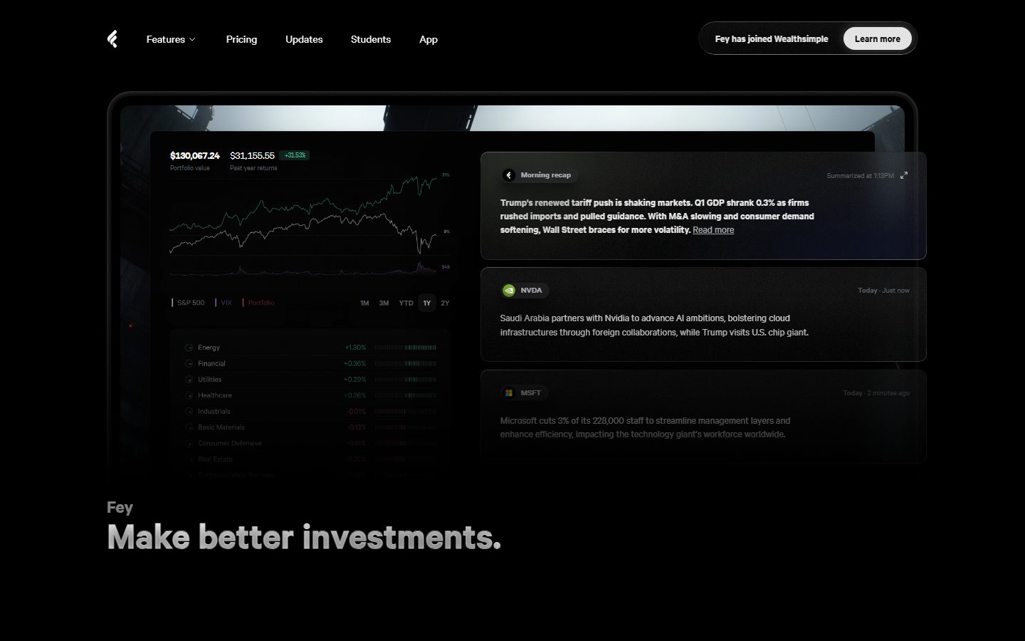
A dark, cinematic fintech interface built on pure-black canvas (#000000) with near-white type, a single light-gray primary button, and the Calibre typeface set heavy (600–700). The system reads as premium, focused investing software — deep multi-layer drop shadows float dashboard cards and news panels above the void, pill-radius CTAs, and sparing chromatic accents (mint green for gains, orange and blue for highlights) puncture an otherwise monochrome dark surface. Product UI fragments — portfolio charts, news feeds, insider-transaction rows — are shown directly inside floating cards rather than illustrated.
---
version: alpha
name: Fey-design-analysis
description: A dark, cinematic fintech interface built on pure-black canvas (#000000) with near-white type, a single light-gray primary button, and the Calibre typeface set heavy (600–700). The system reads as premium, focused investing software — deep multi-layer drop shadows float dashboard cards and news panels above the void, pill-radius CTAs, and sparing chromatic accents (mint green for gains, orange and blue for highlights) puncture an otherwise monochrome dark surface. Product UI fragments — portfolio charts, news feeds, insider-transaction rows — are shown directly inside floating cards rather than illustrated.

colors:
  canvas: "#000000"
  ink: "#ffffff"
  body: "#e6e6e6"
  muted: "#868f97"
  muted-soft: "#787878"
  primary: "#e6e6e6"
  on-primary: "#000000"
  link: "#479ffa"
  accent-green: "#4ebe96"
  accent-orange: "#ffa16c"
  accent-pink: "#e75ece"
  surface-raised: "#0b0b0b"
  surface-card: "#131313"
  surface-elevated: "#1a1b20"
  hairline: "#333339"
  border: "#404044"
  border-soft: "#3e3e3e"

typography:
  display-xl:
    fontFamily: "Calibre, Inter, sans-serif"
    fontSize: 54px
    fontWeight: 600
    lineHeight: 1.0
    letterSpacing: normal
  title-lg:
    fontFamily: "Calibre, Inter, sans-serif"
    fontSize: 26px
    fontWeight: 600
    lineHeight: 1.0
    letterSpacing: normal
  title-md:
    fontFamily: "Calibre, Inter, sans-serif"
    fontSize: 18px
    fontWeight: 700
    lineHeight: 1.3
    letterSpacing: normal
  title-sm:
    fontFamily: "Calibre, Inter, sans-serif"
    fontSize: 14px
    fontWeight: 600
    lineHeight: 1.0
    letterSpacing: normal
  body:
    fontFamily: "Calibre, Inter, sans-serif"
    fontSize: 14px
    fontWeight: 600
    lineHeight: 1.36
    letterSpacing: normal
  button:
    fontFamily: "Calibre, Inter, sans-serif"
    fontSize: 14px
    fontWeight: 600
    lineHeight: 1.32
    letterSpacing: normal

rounded:
  xs: 4px
  sm: 6px
  md: 10px
  lg: 14px
  xl: 16px
  xxl: 24px
  pill: 99px
  full: 999px

spacing:
  xxs: 6px
  xs: 8px
  sm: 14px
  md: 16px
  lg: 18px
  xl: 20px
  xxl: 24px
  xxxl: 28px
  section: 34px

components:
  top-nav:
    backgroundColor: "{colors.canvas}"
    textColor: "{colors.ink}"
    typography: "{typography.title-sm}"
  nav-link:
    backgroundColor: transparent
    textColor: "{colors.ink}"
    typography: "{typography.title-sm}"
  button-primary:
    backgroundColor: "{colors.primary}"
    textColor: "{colors.on-primary}"
    typography: "{typography.button}"
    rounded: "{rounded.pill}"
    padding: 7px 16px
  announcement-pill:
    backgroundColor: "{colors.surface-raised}"
    textColor: "{colors.body}"
    typography: "{typography.title-sm}"
    rounded: "{rounded.pill}"
  hero-band:
    backgroundColor: "{colors.canvas}"
    textColor: "{colors.ink}"
    typography: "{typography.display-xl}"
  dashboard-card:
    backgroundColor: "{colors.surface-card}"
    textColor: "{colors.ink}"
    rounded: "{rounded.xl}"
  news-card:
    backgroundColor: "{colors.surface-elevated}"
    textColor: "{colors.body}"
    typography: "{typography.body}"
    rounded: "{rounded.xl}"
    padding: 24px
  feature-card:
    backgroundColor: "{colors.surface-raised}"
    textColor: "{colors.ink}"
    typography: "{typography.title-md}"
    rounded: "{rounded.xl}"
    padding: 20px
  insider-row:
    backgroundColor: "{colors.surface-card}"
    textColor: "{colors.ink}"
    typography: "{typography.body}"
    rounded: "{rounded.lg}"
    padding: 8px
  ticker-badge:
    backgroundColor: "{colors.surface-elevated}"
    textColor: "{colors.body}"
    typography: "{typography.title-sm}"
    rounded: "{rounded.sm}"
    padding: 6px 8px
  gain-badge:
    backgroundColor: transparent
    textColor: "{colors.accent-green}"
    typography: "{typography.title-sm}"
  text-link:
    backgroundColor: transparent
    textColor: "{colors.link}"
    typography: "{typography.body}"
  command-key:
    backgroundColor: "{colors.surface-card}"
    textColor: "{colors.body}"
    typography: "{typography.body}"
    rounded: "{rounded.lg}"
    padding: 24px
  input:
    backgroundColor: transparent
    textColor: "{colors.body}"
    typography: "{typography.body}"
    rounded: "{rounded.xs}"

---

## Overview

Fey's marketing surface is a dark, cinematic fintech interface — pure-black canvas (`{colors.canvas}` — #000000) carrying near-white display type (`{colors.ink}` — #ffffff) and a single light-gray primary button (`{colors.primary}` — #e6e6e6 with black text). The system reads as premium, focused investing software: every band floats product UI fragments — portfolio charts, AI news summaries, insider-transaction rows — on dark cards lifted off the void by deep multi-layer drop shadows.

Type voice is monolithic: **Calibre** carries everything — the 54px hero headline, section heads, card labels, body copy, buttons. The face is set heavy (weight 600 on most roles, 700 on subtitles), with normal letter-spacing, giving the whole page a confident, slightly condensed editorial weight. There is no second typeface and no display/body split — Calibre at different sizes does all the work.

Color voltage is almost entirely monochrome. The page is black, white, and grays; chromatic accents appear sparingly and functionally — mint green (`{colors.accent-green}` — #4ebe96) for positive performance figures, orange (`{colors.accent-orange}` — #ffa16c) for a single highlight headline ("Earnings in real time"), blue (`{colors.link}` — #479ffa) for inline links, and a rare pink (`{colors.accent-pink}` — #e75ece). The restraint makes each accent feel like data, not decoration.

**Key Characteristics:**
- Pure-black canvas (`{colors.canvas}` — #000000) with white headlines and #e6e6e6 body text — a true dark theme, not a charcoal one.
- A single, inverted primary button (`{component.button-primary}`) — light-gray (#e6e6e6) fill with black text, fully pill-radius (`{rounded.pill}` — 99px). The only bright surface in the action layer.
- Calibre as the sole typeface, set heavy (600–700) across display, body, and UI roles.
- Deep, layered drop shadows float dashboard and news cards above the black canvas — the system's primary depth signal (there are almost no visible borders).
- Product UI fragments shown directly inside floating cards — portfolio charts with mint/red performance rows, AI news summaries, insider-transaction lists with avatars.
- Layered dark surfaces — `{colors.surface-raised}` (#0b0b0b), `{colors.surface-card}` (#131313), `{colors.surface-elevated}` (#1a1b20) — separate near-black tones that distinguish card layers from canvas.
- Border radius is generous: `{rounded.xl}` (16px) dominates cards and panels; `{rounded.pill}` (99px) handles buttons and announcement pills.

## Colors

### Brand & Action
- **Primary** (`{colors.primary}` — #e6e6e6): The inverted primary button fill. Light gray on black canvas, paired with `{colors.on-primary}` (#000000) text. Fey's CTA is bright-on-dark rather than colored.
- **On Primary** (`{colors.on-primary}` — #000000): Text on the primary button.

### Accents (sparing, functional)
- **Accent Green** (`{colors.accent-green}` — #4ebe96): Positive performance figures and gain badges (e.g., "+31.53%"). The signature "up" color.
- **Accent Orange** (`{colors.accent-orange}` — #ffa16c): A single highlight heading ("Earnings in real time") and low-contrast accent text.
- **Link** (`{colors.link}` — #479ffa): Inline text links ("Read more").
- **Accent Pink** (`{colors.accent-pink}` — #e75ece): A rare chromatic accent appearing once in product UI.

### Surface
- **Canvas** (`{colors.canvas}` — #000000): The page floor. Pure black.
- **Surface Raised** (`{colors.surface-raised}` — #0b0b0b): The first lift off canvas — feature cards, low panels.
- **Surface Card** (`{colors.surface-card}` — #131313): Dashboard cards, insider rows, command keys.
- **Surface Elevated** (`{colors.surface-elevated}` — #1a1b20): The highest-tinted dark surface — news cards, ticker badges.

### Text
- **Ink** (`{colors.ink}` — #ffffff): Headlines and primary text.
- **Body** (`{colors.body}` — #e6e6e6): Running text and most paragraph copy.
- **Muted** (`{colors.muted}` — #868f97): Secondary text — sub-labels, captions, supporting copy.
- **Muted Soft** (`{colors.muted-soft}` — #787878): Tertiary text — fine print, timestamps.

### Lines
- **Hairline** (`{colors.hairline}` — #333339): The faintest divider tone on dark surfaces.
- **Border** (`{colors.border}` — #404044): The standard 1px border tone where a card edge is rendered.
- **Border Soft** (`{colors.border-soft}` — #3e3e3e): An alternate border tone near the hairline.

## Typography

### Font Family
The system runs **Calibre** for everything — display headlines, section heads, card titles, body copy, buttons, and nav links. There is no secondary typeface. Calibre is a commercial typeface (Klim Type Foundry); if it is unavailable, **Inter** is the closest open-source substitute and the documented fallback in the stack. Inter at matching weights (600–700) preserves the heavy, slightly-condensed feel, though Calibre's tighter apertures differ subtly. The fallback walks `Inter, sans-serif`.

Calibre here is set heavy — weight 600 on the hero, section heads, body, and buttons, and 700 on the 18px subtitle role. Letter-spacing stays normal across every role.

### Hierarchy

| Token | Size | Weight | Line Height | Letter Spacing | Use |
|---|---|---|---|---|---|
| `{typography.display-xl}` | 54px | 600 | 1.0 | normal | Hero headline ("Make better investments.") |
| `{typography.title-lg}` | 26px | 600 | 1.0 | normal | Section heads ("From overwhelming to effortless.") |
| `{typography.title-md}` | 18px | 700 | 1.3 | normal | Card titles / subtitles |
| `{typography.title-sm}` | 14px | 600 | 1.0 | normal | Small labels, nav items, ticker badges |
| `{typography.body}` | 14px | 600 | 1.36 | normal | Running text, card descriptions |
| `{typography.button}` | 14px | 600 | 1.32 | normal | Button labels |

### Principles
Calibre does everything — the hierarchy is built from size and (slightly) weight, never from a typeface switch. Note that body copy here is also weight 600: Fey uses a heavy body to keep small 14px text legible on pure black. Headlines stay at 600 even at 54px — the system never goes to 700 for display, reserving the heavier 700 for the 18px subtitle role only. Line-height tightens toward 1.0 on display and label roles, giving the page its dense, deliberate feel.

### Note on Font Substitute
Calibre is a licensed commercial typeface and is not bundled. **Inter** at weight 600/700 is the documented substitute; **Manrope** or **Söhne** are closer in character if available under license. Never claim to ship Calibre — substitute and disclose.

## Layout

### Spacing System
- **Base unit:** roughly 2px, with the most frequent steps at 6, 8, and 24px.
- **Tokens:** `{spacing.xxs}` 6px · `{spacing.xs}` 8px · `{spacing.sm}` 14px · `{spacing.md}` 16px · `{spacing.lg}` 18px · `{spacing.xl}` 20px · `{spacing.xxl}` 24px · `{spacing.xxxl}` 28px · `{spacing.section}` 34px.
- **Card internal padding:** `{spacing.xxl}` (24px) for news cards and command keys; `{spacing.xl}` (20px) for feature cards; `{spacing.xs}` (8px) for tight insider rows.
- **Button padding:** 7px × 16px on the primary button.

Note: the measured spacing set is fine-grained and clusters at small values (6/8px high-frequency); larger vertical band rhythm on this long-scroll dark page is driven by full-viewport spacer regions rather than fixed token gaps (see Known Gaps).

### Grid & Container
- **Hero band:** Centered single column — a large floating dashboard-card artifact above an h1 headline.
- **Highlights row:** Horizontal carousel of product cards ("Beautiful Stock and ETF pages", "Insider transactions", "Graph comparison") with a left/right arrow control.
- **Editorial bands:** Single centered column with section head + supporting copy, alternating with full-bleed product imagery and floating cards.

### Whitespace Philosophy
Fey uses large, dramatic vertical whitespace — long black voids separate bands so each floating product artifact lands like a stage-lit object. The darkness IS the whitespace: cards float in black with nothing competing for attention. The result reads as cinematic and premium-focused rather than dense.

## Elevation & Depth

Elevation is the system's primary visual device — on pure black, depth comes almost entirely from layered drop shadows and tinted dark surfaces, not from borders.

| Level | Treatment | Use |
|---|---|---|
| Canvas | `{colors.canvas}` (#000000), no shadow | Page floor, hero background |
| Tinted surface | `{colors.surface-raised}` / `{colors.surface-card}` / `{colors.surface-elevated}` step-up tones | Cards distinguished from canvas by tone alone |
| Hairline ring | `rgb(19,20,25) 0px 0px 0px 0.75px` + soft drop | Subtle 0.75px ring around panels (measured) |
| Floating card | `rgba(0,0,0,0.66) 0 53px 87px`, `rgba(0,0,0,0.4) 0 20px 28px`, `rgba(0,0,0,0.26) 0 4px 7px` (measured 3-layer stack) | Hero dashboard card, major floating artifacts |
| Deep float | `rgba(0,0,0,0.45) 0 45px 75px` + multi-layer falloff (measured) | News panels and elevated product cards |
| Glow | `rgba(255,255,255,0.25) 0 0 14px` (measured) | Rare white-glow accent on a highlighted element |

The depth philosophy is **cinematic dark elevation** — very large blur radii (up to ~87px) at high black-alpha float cards convincingly above the void. A measured `rgba(0,0,0,0.8) 0 0 44px` ambient glow and a `rgba(0,0,0,0.85) 0 1px 0` crisp inner edge also appear. No neumorphism, no glassmorphism — just deep, soft, layered black shadows on near-black cards.

### Decorative Depth
- Product UI fragments inside cards (portfolio charts, news feeds) carry their own internal chrome and micro-shadows — shown as content, not system tokens.
- A floating 3D rock object appears mid-page as a hero-illustration accent above a navigation bar mockup.

## Shapes

### Border Radius Scale

| Token | Value | Use |
|---|---|---|
| `{rounded.xs}` | 4px | Inputs |
| `{rounded.sm}` | 6px | Small ticker / tag badges |
| `{rounded.md}` | 10px | Small interior elements |
| `{rounded.lg}` | 14px | Insider rows, command keys |
| `{rounded.xl}` | 16px | Dominant — dashboard cards, news cards, feature cards (measured 15× frequency) |
| `{rounded.xxl}` | 24px | Larger panels |
| `{rounded.pill}` | 99px | Primary button, announcement pill (measured 7×) |
| `{rounded.full}` | 999px | Fully-round controls, avatars |

Measured radii also include outliers at 50px and 275px (very large rounded containers / circular masks) — used for the round icon-nav cluster and circular avatar crops.

### Photography & Imagery Geometry
- Avatar photos in the insider-transactions card crop to circles (`{rounded.full}`).
- Full-bleed product imagery (the headphones/earnings band, the monitor mockup, the rock object) appears edge-to-edge or within rounded display frames.
- Product UI fragments inside cards retain native chrome and internal radii.

## Components

### Navigation

**`top-nav`** — Transparent bar over the black canvas at the top of the page. Carries the Fey logomark at left, a horizontal menu (Features, Pricing, Updates, Students, App) in `{typography.title-sm}`, and a right-side `{component.announcement-pill}` housing an "Fey has joined Wealthsimple" note plus a "Learn more" `{component.button-primary}`.

**`nav-link`** — Transparent inline menu item, text `{colors.ink}`, type `{typography.title-sm}` (Calibre 14px / 600).

### Buttons

**`button-primary`** — The signature inverted CTA. Background `{colors.primary}` (#e6e6e6), text `{colors.on-primary}` (#000000), type `{typography.button}`, padding 7px × 16px, fully rounded `{rounded.pill}` (99px). The only bright surface in the action layer — used for "Learn more" and primary actions.

**`text-link`** — Inline link, no background, text `{colors.link}` (#479ffa), type `{typography.body}`. Used for "Read more" inside news cards.

### Pills & Badges

**`announcement-pill`** — A pill-radius wrapper holding an inline announcement + embedded `{component.button-primary}`. Background `{colors.surface-raised}`, text `{colors.body}`, rounded `{rounded.pill}`.

**`ticker-badge`** — Small rounded badge for ticker symbols (NVDA, MSFT) in news cards. Background `{colors.surface-elevated}`, text `{colors.body}`, type `{typography.title-sm}`, rounded `{rounded.sm}`, padding 6px × 8px.

**`gain-badge`** — Inline positive-performance figure. Transparent background, text `{colors.accent-green}` (#4ebe96), type `{typography.title-sm}`. Used for "+31.53%" and green performance rows.

### Cards & Containers

**`hero-band`** — The opening band: a large floating `{component.dashboard-card}` artifact above the hero headline. Background `{colors.canvas}`, headline in `{typography.display-xl}` (54px), eyebrow ("Fey") in `{colors.muted}`.

**`dashboard-card`** — The hero portfolio artifact showing real product UI: portfolio value, year-return chart, sector performance rows with mint/red figures. Background `{colors.surface-card}`, rounded `{rounded.xl}` (16px), lifted by the deep measured 3-layer drop shadow.

**`news-card`** — AI news-summary panel ("Morning recap", company headlines). Background `{colors.surface-elevated}`, text `{colors.body}`, type `{typography.body}`, rounded `{rounded.xl}`, padding `{spacing.xxl}` (24px). Carries a `{component.ticker-badge}`, timestamp in `{colors.muted-soft}`, and a `{component.text-link}`.

**`feature-card`** — Highlights-carousel card ("Beautiful Stock and ETF pages", "Insider transactions", "Graph comparison"). Background `{colors.surface-raised}`, title in `{typography.title-md}`, rounded `{rounded.xl}`, padding `{spacing.xl}` (20px).

**`insider-row`** — Row inside the insider-transactions card: circular avatar + name + company + buy/sell tag. Background `{colors.surface-card}`, text `{colors.ink}`, type `{typography.body}`, rounded `{rounded.lg}`, padding `{spacing.xs}` (8px).

### Inputs & Keys

**`input`** — Text input. Transparent background, text `{colors.body}`, type `{typography.body}`, rounded `{rounded.xs}` (4px). (Background/border tones not measured — see Known Gaps.)

**`command-key`** — Keyboard-key affordance in the "At your command." band (⌘ command + K keys). Background `{colors.surface-card}`, text `{colors.body}`, rounded `{rounded.lg}`, padding `{spacing.xxl}` (24px).

## Do's and Don'ts

### Do
- Keep the canvas pure black (`{colors.canvas}` — #000000) and let layered shadows do the elevation work. Depth comes from shadow, not borders.
- Use the single inverted `{component.button-primary}` (light-gray fill, black text, pill radius) as the only bright action surface.
- Set all type in Calibre (substitute Inter) at heavy weights — 600 for display and body, 700 for the 18px subtitle.
- Reserve `{colors.accent-green}` for positive performance data and `{colors.accent-orange}` for the single highlight heading. Accents are functional, not decorative.
- Step dark surfaces deliberately — `{colors.surface-raised}` → `{colors.surface-card}` → `{colors.surface-elevated}` — to separate card layers on black.
- Show real product UI fragments inside floating cards (charts, news feeds, insider rows) rather than illustrating the product.
- Use `{rounded.xl}` (16px) as the default card radius and `{rounded.pill}` for buttons and announcement pills.

### Don't
- Don't introduce a second typeface. Calibre (or Inter substitute) carries every role.
- Don't color the primary button — Fey's CTA is light-gray/black, never a brand hue.
- Don't scatter accent colors. Green, orange, blue, and pink each appear sparingly and with meaning; flooding the page with them breaks the monochrome discipline.
- Don't render heavy visible borders on cards — separation comes from tinted surfaces and deep shadows.
- Don't lighten the canvas to charcoal. The pure-black floor is what makes the floating cards read.
- Don't add hover-state styling beyond default and pressed.

## Responsive Behavior

### Breakpoints
Only the desktop landing page was captured, so breakpoint behavior is inferred from layout structure rather than measured.

| Name | Width | Key Changes (inferred) |
|---|---|---|
| Mobile | < 768px | Top nav likely collapses to a menu trigger; hero dashboard-card scales down; highlights carousel becomes swipe; bands stack single-column |
| Tablet | 768–1024px | Nav tightens; feature/highlight cards reduce to fewer-up; floating cards scale proportionally |
| Desktop | 1024–1440px | Full horizontal nav; hero dashboard-card + news panels at full size; highlights carousel with arrow control |
| Wide | > 1440px | Same as desktop with more outer black breathing room |

### Touch Targets
- `{component.button-primary}` padding (7px × 16px) yields a compact control; effective tap area should be padded to meet 44px on touch.
- Carousel arrow controls and the round icon-nav cluster need adequate spacing on touch — not verified from the desktop capture.

### Collapsing Strategy
- The hero's floating dashboard-card and adjacent news panels likely stack vertically on narrow viewports.
- The highlights row (`{component.feature-card}` carousel) converts from arrow-paged to swipe.
- Full-bleed imagery bands (rock object, headphones earnings band, monitor mockup) scale to viewport width.

### Image Behavior
- Avatar photos crop to circles at all sizes.
- Product UI fragments inside cards retain native aspect ratios as cards resize.
- Full-bleed cinematic imagery scales edge-to-edge.

## Iteration Guide

1. Focus on ONE component at a time. Reference its YAML key directly (`{component.dashboard-card}`, `{component.news-card}`).
2. Variants of an existing component (`-active`, `-disabled`, `-focused`) live as separate entries in `components:`.
3. Use `{token.refs}` everywhere — never inline a hex in a component.
4. Never document hover. Default and Active/Pressed states only.
5. Keep all type in Calibre/Inter at heavy weights — the single-typeface discipline is the brand voice.
6. Depth is shadow, not border. New cards float on tinted dark surfaces with the measured layered drop shadows.
7. When adding emphasis, go bigger in Calibre before introducing a new accent color — the monochrome restraint is deliberate.

## Known Gaps

- **Calibre is a licensed commercial typeface** (Klim Type Foundry) and is not bundled; `fonts_licensed` was empty in the analysis, but the substitute (Inter) is documented in the Typography section. Do not claim to ship Calibre.
- Only the desktop **landing page** was captured — all responsive behavior is inferred, not measured.
- **Input** background and border tones were not measured (only its 4px radius was captured); the documented transparent background is a placeholder pending extraction of a real form surface.
- **Vertical band rhythm** on this long-scroll page is dominated by large full-viewport spacer voids; the measured spacing tokens (clustered at 6/8/24px) describe component-internal spacing, not section gaps.
- The **accent-pink** (#e75ece) appeared once at low frequency; its exact role inside product UI is not confirmed.
- **Hover, transition, and carousel animation timings** (highlights paging, earnings audio playback, command palette) are out of scope.
- **Logo, icon-nav cluster, and 3D rock artifact** styling are shown as imagery/product chrome and were not tokenized.
- The very large measured radii (50px, 275px) and the white-glow / ambient measured shadows are documented but their precise component bindings were not all confirmed from the single capture.

<!-- Documented by duply · real-world design systems as ready-to-use DESIGN.md for AI coding agents · https://duply.ai/feyapp/design-md -->
Color Palette
Accent
Neutrals
Typography
display-xl54px · 600 · 1
The quick brown fox jumpstitle-lg26px · 600 · 1
The quick brown fox jumpstitle-md18px · 700 · 1.3
The quick brown fox jumpstitle-sm14px · 600 · 1
The quick brown fox jumpsbody14px · 600 · 1.36
The quick brown fox jumpsbutton14px · 600 · 1.32
The quick brown fox jumpsSpacing & Shape
Spacing
| Name | Value | Preview |
|---|---|---|
| xxs | 6px | |
| xs | 8px | |
| sm | 14px | |
| md | 16px | |
| lg | 18px | |
| xl | 20px | |
| xxl | 24px | |
| xxxl | 28px | |
| section | 34px |
Border Radius
| Name | Value | Preview |
|---|---|---|
| xs | 4px | |
| sm | 6px | |
| md | 10px | |
| lg | 14px | |
| xl | 16px | |
| xxl | 24px | |
| pill | 99px | |
| full | 999px |
More like this


---
version: alpha
name: Fey-design-analysis
description: A dark, cinematic fintech interface built on pure-black canvas (#000000) with near-white type, a single light-gray primary button, and the Calibre typeface set heavy (600–700). The system reads as premium, focused investing software — deep multi-layer drop shadows float dashboard cards and news panels above the void, pill-radius CTAs, and sparing chromatic accents (mint green for gains, orange and blue for highlights) puncture an otherwise monochrome dark surface. Product UI fragments — portfolio charts, news feeds, insider-transaction rows — are shown directly inside floating cards rather than illustrated.

colors:
  canvas: "#000000"
  ink: "#ffffff"
  body: "#e6e6e6"
  muted: "#868f97"
  muted-soft: "#787878"
  primary: "#e6e6e6"
  on-primary: "#000000"
  link: "#479ffa"
  accent-green: "#4ebe96"
  accent-orange: "#ffa16c"
  accent-pink: "#e75ece"
  surface-raised: "#0b0b0b"
  surface-card: "#131313"
  surface-elevated: "#1a1b20"
  hairline: "#333339"
  border: "#404044"
  border-soft: "#3e3e3e"

typography:
  display-xl:
    fontFamily: "Calibre, Inter, sans-serif"
    fontSize: 54px
    fontWeight: 600
    lineHeight: 1.0
    letterSpacing: normal
  title-lg:
    fontFamily: "Calibre, Inter, sans-serif"
    fontSize: 26px
    fontWeight: 600
    lineHeight: 1.0
    letterSpacing: normal
  title-md:
    fontFamily: "Calibre, Inter, sans-serif"
    fontSize: 18px
    fontWeight: 700
    lineHeight: 1.3
    letterSpacing: normal
  title-sm:
    fontFamily: "Calibre, Inter, sans-serif"
    fontSize: 14px
    fontWeight: 600
    lineHeight: 1.0
    letterSpacing: normal
  body:
    fontFamily: "Calibre, Inter, sans-serif"
    fontSize: 14px
    fontWeight: 600
    lineHeight: 1.36
    letterSpacing: normal
  button:
    fontFamily: "Calibre, Inter, sans-serif"
    fontSize: 14px
    fontWeight: 600
    lineHeight: 1.32
    letterSpacing: normal

rounded:
  xs: 4px
  sm: 6px
  md: 10px
  lg: 14px
  xl: 16px
  xxl: 24px
  pill: 99px
  full: 999px

spacing:
  xxs: 6px
  xs: 8px
  sm: 14px
  md: 16px
  lg: 18px
  xl: 20px
  xxl: 24px
  xxxl: 28px
  section: 34px

components:
  top-nav:
    backgroundColor: "{colors.canvas}"
    textColor: "{colors.ink}"
    typography: "{typography.title-sm}"
  nav-link:
    backgroundColor: transparent
    textColor: "{colors.ink}"
    typography: "{typography.title-sm}"
  button-primary:
    backgroundColor: "{colors.primary}"
    textColor: "{colors.on-primary}"
    typography: "{typography.button}"
    rounded: "{rounded.pill}"
    padding: 7px 16px
  announcement-pill:
    backgroundColor: "{colors.surface-raised}"
    textColor: "{colors.body}"
    typography: "{typography.title-sm}"
    rounded: "{rounded.pill}"
  hero-band:
    backgroundColor: "{colors.canvas}"
    textColor: "{colors.ink}"
    typography: "{typography.display-xl}"
  dashboard-card:
    backgroundColor: "{colors.surface-card}"
    textColor: "{colors.ink}"
    rounded: "{rounded.xl}"
  news-card:
    backgroundColor: "{colors.surface-elevated}"
    textColor: "{colors.body}"
    typography: "{typography.body}"
    rounded: "{rounded.xl}"
    padding: 24px
  feature-card:
    backgroundColor: "{colors.surface-raised}"
    textColor: "{colors.ink}"
    typography: "{typography.title-md}"
    rounded: "{rounded.xl}"
    padding: 20px
  insider-row:
    backgroundColor: "{colors.surface-card}"
    textColor: "{colors.ink}"
    typography: "{typography.body}"
    rounded: "{rounded.lg}"
    padding: 8px
  ticker-badge:
    backgroundColor: "{colors.surface-elevated}"
    textColor: "{colors.body}"
    typography: "{typography.title-sm}"
    rounded: "{rounded.sm}"
    padding: 6px 8px
  gain-badge:
    backgroundColor: transparent
    textColor: "{colors.accent-green}"
    typography: "{typography.title-sm}"
  text-link:
    backgroundColor: transparent
    textColor: "{colors.link}"
    typography: "{typography.body}"
  command-key:
    backgroundColor: "{colors.surface-card}"
    textColor: "{colors.body}"
    typography: "{typography.body}"
    rounded: "{rounded.lg}"
    padding: 24px
  input:
    backgroundColor: transparent
    textColor: "{colors.body}"
    typography: "{typography.body}"
    rounded: "{rounded.xs}"

---

## Overview

Fey's marketing surface is a dark, cinematic fintech interface — pure-black canvas (`{colors.canvas}` — #000000) carrying near-white display type (`{colors.ink}` — #ffffff) and a single light-gray primary button (`{colors.primary}` — #e6e6e6 with black text). The system reads as premium, focused investing software: every band floats product UI fragments — portfolio charts, AI news summaries, insider-transaction rows — on dark cards lifted off the void by deep multi-layer drop shadows.

Type voice is monolithic: **Calibre** carries everything — the 54px hero headline, section heads, card labels, body copy, buttons. The face is set heavy (weight 600 on most roles, 700 on subtitles), with normal letter-spacing, giving the whole page a confident, slightly condensed editorial weight. There is no second typeface and no display/body split — Calibre at different sizes does all the work.

Color voltage is almost entirely monochrome. The page is black, white, and grays; chromatic accents appear sparingly and functionally — mint green (`{colors.accent-green}` — #4ebe96) for positive performance figures, orange (`{colors.accent-orange}` — #ffa16c) for a single highlight headline ("Earnings in real time"), blue (`{colors.link}` — #479ffa) for inline links, and a rare pink (`{colors.accent-pink}` — #e75ece). The restraint makes each accent feel like data, not decoration.

**Key Characteristics:**
- Pure-black canvas (`{colors.canvas}` — #000000) with white headlines and #e6e6e6 body text — a true dark theme, not a charcoal one.
- A single, inverted primary button (`{component.button-primary}`) — light-gray (#e6e6e6) fill with black text, fully pill-radius (`{rounded.pill}` — 99px). The only bright surface in the action layer.
- Calibre as the sole typeface, set heavy (600–700) across display, body, and UI roles.
- Deep, layered drop shadows float dashboard and news cards above the black canvas — the system's primary depth signal (there are almost no visible borders).
- Product UI fragments shown directly inside floating cards — portfolio charts with mint/red performance rows, AI news summaries, insider-transaction lists with avatars.
- Layered dark surfaces — `{colors.surface-raised}` (#0b0b0b), `{colors.surface-card}` (#131313), `{colors.surface-elevated}` (#1a1b20) — separate near-black tones that distinguish card layers from canvas.
- Border radius is generous: `{rounded.xl}` (16px) dominates cards and panels; `{rounded.pill}` (99px) handles buttons and announcement pills.

## Colors

### Brand & Action
- **Primary** (`{colors.primary}` — #e6e6e6): The inverted primary button fill. Light gray on black canvas, paired with `{colors.on-primary}` (#000000) text. Fey's CTA is bright-on-dark rather than colored.
- **On Primary** (`{colors.on-primary}` — #000000): Text on the primary button.

### Accents (sparing, functional)
- **Accent Green** (`{colors.accent-green}` — #4ebe96): Positive performance figures and gain badges (e.g., "+31.53%"). The signature "up" color.
- **Accent Orange** (`{colors.accent-orange}` — #ffa16c): A single highlight heading ("Earnings in real time") and low-contrast accent text.
- **Link** (`{colors.link}` — #479ffa): Inline text links ("Read more").
- **Accent Pink** (`{colors.accent-pink}` — #e75ece): A rare chromatic accent appearing once in product UI.

### Surface
- **Canvas** (`{colors.canvas}` — #000000): The page floor. Pure black.
- **Surface Raised** (`{colors.surface-raised}` — #0b0b0b): The first lift off canvas — feature cards, low panels.
- **Surface Card** (`{colors.surface-card}` — #131313): Dashboard cards, insider rows, command keys.
- **Surface Elevated** (`{colors.surface-elevated}` — #1a1b20): The highest-tinted dark surface — news cards, ticker badges.

### Text
- **Ink** (`{colors.ink}` — #ffffff): Headlines and primary text.
- **Body** (`{colors.body}` — #e6e6e6): Running text and most paragraph copy.
- **Muted** (`{colors.muted}` — #868f97): Secondary text — sub-labels, captions, supporting copy.
- **Muted Soft** (`{colors.muted-soft}` — #787878): Tertiary text — fine print, timestamps.

### Lines
- **Hairline** (`{colors.hairline}` — #333339): The faintest divider tone on dark surfaces.
- **Border** (`{colors.border}` — #404044): The standard 1px border tone where a card edge is rendered.
- **Border Soft** (`{colors.border-soft}` — #3e3e3e): An alternate border tone near the hairline.

## Typography

### Font Family
The system runs **Calibre** for everything — display headlines, section heads, card titles, body copy, buttons, and nav links. There is no secondary typeface. Calibre is a commercial typeface (Klim Type Foundry); if it is unavailable, **Inter** is the closest open-source substitute and the documented fallback in the stack. Inter at matching weights (600–700) preserves the heavy, slightly-condensed feel, though Calibre's tighter apertures differ subtly. The fallback walks `Inter, sans-serif`.

Calibre here is set heavy — weight 600 on the hero, section heads, body, and buttons, and 700 on the 18px subtitle role. Letter-spacing stays normal across every role.

### Hierarchy

| Token | Size | Weight | Line Height | Letter Spacing | Use |
|---|---|---|---|---|---|
| `{typography.display-xl}` | 54px | 600 | 1.0 | normal | Hero headline ("Make better investments.") |
| `{typography.title-lg}` | 26px | 600 | 1.0 | normal | Section heads ("From overwhelming to effortless.") |
| `{typography.title-md}` | 18px | 700 | 1.3 | normal | Card titles / subtitles |
| `{typography.title-sm}` | 14px | 600 | 1.0 | normal | Small labels, nav items, ticker badges |
| `{typography.body}` | 14px | 600 | 1.36 | normal | Running text, card descriptions |
| `{typography.button}` | 14px | 600 | 1.32 | normal | Button labels |

### Principles
Calibre does everything — the hierarchy is built from size and (slightly) weight, never from a typeface switch. Note that body copy here is also weight 600: Fey uses a heavy body to keep small 14px text legible on pure black. Headlines stay at 600 even at 54px — the system never goes to 700 for display, reserving the heavier 700 for the 18px subtitle role only. Line-height tightens toward 1.0 on display and label roles, giving the page its dense, deliberate feel.

### Note on Font Substitute
Calibre is a licensed commercial typeface and is not bundled. **Inter** at weight 600/700 is the documented substitute; **Manrope** or **Söhne** are closer in character if available under license. Never claim to ship Calibre — substitute and disclose.

## Layout

### Spacing System
- **Base unit:** roughly 2px, with the most frequent steps at 6, 8, and 24px.
- **Tokens:** `{spacing.xxs}` 6px · `{spacing.xs}` 8px · `{spacing.sm}` 14px · `{spacing.md}` 16px · `{spacing.lg}` 18px · `{spacing.xl}` 20px · `{spacing.xxl}` 24px · `{spacing.xxxl}` 28px · `{spacing.section}` 34px.
- **Card internal padding:** `{spacing.xxl}` (24px) for news cards and command keys; `{spacing.xl}` (20px) for feature cards; `{spacing.xs}` (8px) for tight insider rows.
- **Button padding:** 7px × 16px on the primary button.

Note: the measured spacing set is fine-grained and clusters at small values (6/8px high-frequency); larger vertical band rhythm on this long-scroll dark page is driven by full-viewport spacer regions rather than fixed token gaps (see Known Gaps).

### Grid & Container
- **Hero band:** Centered single column — a large floating dashboard-card artifact above an h1 headline.
- **Highlights row:** Horizontal carousel of product cards ("Beautiful Stock and ETF pages", "Insider transactions", "Graph comparison") with a left/right arrow control.
- **Editorial bands:** Single centered column with section head + supporting copy, alternating with full-bleed product imagery and floating cards.

### Whitespace Philosophy
Fey uses large, dramatic vertical whitespace — long black voids separate bands so each floating product artifact lands like a stage-lit object. The darkness IS the whitespace: cards float in black with nothing competing for attention. The result reads as cinematic and premium-focused rather than dense.

## Elevation & Depth

Elevation is the system's primary visual device — on pure black, depth comes almost entirely from layered drop shadows and tinted dark surfaces, not from borders.

| Level | Treatment | Use |
|---|---|---|
| Canvas | `{colors.canvas}` (#000000), no shadow | Page floor, hero background |
| Tinted surface | `{colors.surface-raised}` / `{colors.surface-card}` / `{colors.surface-elevated}` step-up tones | Cards distinguished from canvas by tone alone |
| Hairline ring | `rgb(19,20,25) 0px 0px 0px 0.75px` + soft drop | Subtle 0.75px ring around panels (measured) |
| Floating card | `rgba(0,0,0,0.66) 0 53px 87px`, `rgba(0,0,0,0.4) 0 20px 28px`, `rgba(0,0,0,0.26) 0 4px 7px` (measured 3-layer stack) | Hero dashboard card, major floating artifacts |
| Deep float | `rgba(0,0,0,0.45) 0 45px 75px` + multi-layer falloff (measured) | News panels and elevated product cards |
| Glow | `rgba(255,255,255,0.25) 0 0 14px` (measured) | Rare white-glow accent on a highlighted element |

The depth philosophy is **cinematic dark elevation** — very large blur radii (up to ~87px) at high black-alpha float cards convincingly above the void. A measured `rgba(0,0,0,0.8) 0 0 44px` ambient glow and a `rgba(0,0,0,0.85) 0 1px 0` crisp inner edge also appear. No neumorphism, no glassmorphism — just deep, soft, layered black shadows on near-black cards.

### Decorative Depth
- Product UI fragments inside cards (portfolio charts, news feeds) carry their own internal chrome and micro-shadows — shown as content, not system tokens.
- A floating 3D rock object appears mid-page as a hero-illustration accent above a navigation bar mockup.

## Shapes

### Border Radius Scale

| Token | Value | Use |
|---|---|---|
| `{rounded.xs}` | 4px | Inputs |
| `{rounded.sm}` | 6px | Small ticker / tag badges |
| `{rounded.md}` | 10px | Small interior elements |
| `{rounded.lg}` | 14px | Insider rows, command keys |
| `{rounded.xl}` | 16px | Dominant — dashboard cards, news cards, feature cards (measured 15× frequency) |
| `{rounded.xxl}` | 24px | Larger panels |
| `{rounded.pill}` | 99px | Primary button, announcement pill (measured 7×) |
| `{rounded.full}` | 999px | Fully-round controls, avatars |

Measured radii also include outliers at 50px and 275px (very large rounded containers / circular masks) — used for the round icon-nav cluster and circular avatar crops.

### Photography & Imagery Geometry
- Avatar photos in the insider-transactions card crop to circles (`{rounded.full}`).
- Full-bleed product imagery (the headphones/earnings band, the monitor mockup, the rock object) appears edge-to-edge or within rounded display frames.
- Product UI fragments inside cards retain native chrome and internal radii.

## Components

### Navigation

**`top-nav`** — Transparent bar over the black canvas at the top of the page. Carries the Fey logomark at left, a horizontal menu (Features, Pricing, Updates, Students, App) in `{typography.title-sm}`, and a right-side `{component.announcement-pill}` housing an "Fey has joined Wealthsimple" note plus a "Learn more" `{component.button-primary}`.

**`nav-link`** — Transparent inline menu item, text `{colors.ink}`, type `{typography.title-sm}` (Calibre 14px / 600).

### Buttons

**`button-primary`** — The signature inverted CTA. Background `{colors.primary}` (#e6e6e6), text `{colors.on-primary}` (#000000), type `{typography.button}`, padding 7px × 16px, fully rounded `{rounded.pill}` (99px). The only bright surface in the action layer — used for "Learn more" and primary actions.

**`text-link`** — Inline link, no background, text `{colors.link}` (#479ffa), type `{typography.body}`. Used for "Read more" inside news cards.

### Pills & Badges

**`announcement-pill`** — A pill-radius wrapper holding an inline announcement + embedded `{component.button-primary}`. Background `{colors.surface-raised}`, text `{colors.body}`, rounded `{rounded.pill}`.

**`ticker-badge`** — Small rounded badge for ticker symbols (NVDA, MSFT) in news cards. Background `{colors.surface-elevated}`, text `{colors.body}`, type `{typography.title-sm}`, rounded `{rounded.sm}`, padding 6px × 8px.

**`gain-badge`** — Inline positive-performance figure. Transparent background, text `{colors.accent-green}` (#4ebe96), type `{typography.title-sm}`. Used for "+31.53%" and green performance rows.

### Cards & Containers

**`hero-band`** — The opening band: a large floating `{component.dashboard-card}` artifact above the hero headline. Background `{colors.canvas}`, headline in `{typography.display-xl}` (54px), eyebrow ("Fey") in `{colors.muted}`.

**`dashboard-card`** — The hero portfolio artifact showing real product UI: portfolio value, year-return chart, sector performance rows with mint/red figures. Background `{colors.surface-card}`, rounded `{rounded.xl}` (16px), lifted by the deep measured 3-layer drop shadow.

**`news-card`** — AI news-summary panel ("Morning recap", company headlines). Background `{colors.surface-elevated}`, text `{colors.body}`, type `{typography.body}`, rounded `{rounded.xl}`, padding `{spacing.xxl}` (24px). Carries a `{component.ticker-badge}`, timestamp in `{colors.muted-soft}`, and a `{component.text-link}`.

**`feature-card`** — Highlights-carousel card ("Beautiful Stock and ETF pages", "Insider transactions", "Graph comparison"). Background `{colors.surface-raised}`, title in `{typography.title-md}`, rounded `{rounded.xl}`, padding `{spacing.xl}` (20px).

**`insider-row`** — Row inside the insider-transactions card: circular avatar + name + company + buy/sell tag. Background `{colors.surface-card}`, text `{colors.ink}`, type `{typography.body}`, rounded `{rounded.lg}`, padding `{spacing.xs}` (8px).

### Inputs & Keys

**`input`** — Text input. Transparent background, text `{colors.body}`, type `{typography.body}`, rounded `{rounded.xs}` (4px). (Background/border tones not measured — see Known Gaps.)

**`command-key`** — Keyboard-key affordance in the "At your command." band (⌘ command + K keys). Background `{colors.surface-card}`, text `{colors.body}`, rounded `{rounded.lg}`, padding `{spacing.xxl}` (24px).

## Do's and Don'ts

### Do
- Keep the canvas pure black (`{colors.canvas}` — #000000) and let layered shadows do the elevation work. Depth comes from shadow, not borders.
- Use the single inverted `{component.button-primary}` (light-gray fill, black text, pill radius) as the only bright action surface.
- Set all type in Calibre (substitute Inter) at heavy weights — 600 for display and body, 700 for the 18px subtitle.
- Reserve `{colors.accent-green}` for positive performance data and `{colors.accent-orange}` for the single highlight heading. Accents are functional, not decorative.
- Step dark surfaces deliberately — `{colors.surface-raised}` → `{colors.surface-card}` → `{colors.surface-elevated}` — to separate card layers on black.
- Show real product UI fragments inside floating cards (charts, news feeds, insider rows) rather than illustrating the product.
- Use `{rounded.xl}` (16px) as the default card radius and `{rounded.pill}` for buttons and announcement pills.

### Don't
- Don't introduce a second typeface. Calibre (or Inter substitute) carries every role.
- Don't color the primary button — Fey's CTA is light-gray/black, never a brand hue.
- Don't scatter accent colors. Green, orange, blue, and pink each appear sparingly and with meaning; flooding the page with them breaks the monochrome discipline.
- Don't render heavy visible borders on cards — separation comes from tinted surfaces and deep shadows.
- Don't lighten the canvas to charcoal. The pure-black floor is what makes the floating cards read.
- Don't add hover-state styling beyond default and pressed.

## Responsive Behavior

### Breakpoints
Only the desktop landing page was captured, so breakpoint behavior is inferred from layout structure rather than measured.

| Name | Width | Key Changes (inferred) |
|---|---|---|
| Mobile | < 768px | Top nav likely collapses to a menu trigger; hero dashboard-card scales down; highlights carousel becomes swipe; bands stack single-column |
| Tablet | 768–1024px | Nav tightens; feature/highlight cards reduce to fewer-up; floating cards scale proportionally |
| Desktop | 1024–1440px | Full horizontal nav; hero dashboard-card + news panels at full size; highlights carousel with arrow control |
| Wide | > 1440px | Same as desktop with more outer black breathing room |

### Touch Targets
- `{component.button-primary}` padding (7px × 16px) yields a compact control; effective tap area should be padded to meet 44px on touch.
- Carousel arrow controls and the round icon-nav cluster need adequate spacing on touch — not verified from the desktop capture.

### Collapsing Strategy
- The hero's floating dashboard-card and adjacent news panels likely stack vertically on narrow viewports.
- The highlights row (`{component.feature-card}` carousel) converts from arrow-paged to swipe.
- Full-bleed imagery bands (rock object, headphones earnings band, monitor mockup) scale to viewport width.

### Image Behavior
- Avatar photos crop to circles at all sizes.
- Product UI fragments inside cards retain native aspect ratios as cards resize.
- Full-bleed cinematic imagery scales edge-to-edge.

## Iteration Guide

1. Focus on ONE component at a time. Reference its YAML key directly (`{component.dashboard-card}`, `{component.news-card}`).
2. Variants of an existing component (`-active`, `-disabled`, `-focused`) live as separate entries in `components:`.
3. Use `{token.refs}` everywhere — never inline a hex in a component.
4. Never document hover. Default and Active/Pressed states only.
5. Keep all type in Calibre/Inter at heavy weights — the single-typeface discipline is the brand voice.
6. Depth is shadow, not border. New cards float on tinted dark surfaces with the measured layered drop shadows.
7. When adding emphasis, go bigger in Calibre before introducing a new accent color — the monochrome restraint is deliberate.

## Known Gaps

- **Calibre is a licensed commercial typeface** (Klim Type Foundry) and is not bundled; `fonts_licensed` was empty in the analysis, but the substitute (Inter) is documented in the Typography section. Do not claim to ship Calibre.
- Only the desktop **landing page** was captured — all responsive behavior is inferred, not measured.
- **Input** background and border tones were not measured (only its 4px radius was captured); the documented transparent background is a placeholder pending extraction of a real form surface.
- **Vertical band rhythm** on this long-scroll page is dominated by large full-viewport spacer voids; the measured spacing tokens (clustered at 6/8/24px) describe component-internal spacing, not section gaps.
- The **accent-pink** (#e75ece) appeared once at low frequency; its exact role inside product UI is not confirmed.
- **Hover, transition, and carousel animation timings** (highlights paging, earnings audio playback, command palette) are out of scope.
- **Logo, icon-nav cluster, and 3D rock artifact** styling are shown as imagery/product chrome and were not tokenized.
- The very large measured radii (50px, 275px) and the white-glow / ambient measured shadows are documented but their precise component bindings were not all confirmed from the single capture.

<!-- Documented by duply · real-world design systems as ready-to-use DESIGN.md for AI coding agents · https://duply.ai/feyapp/design-md -->