
Family
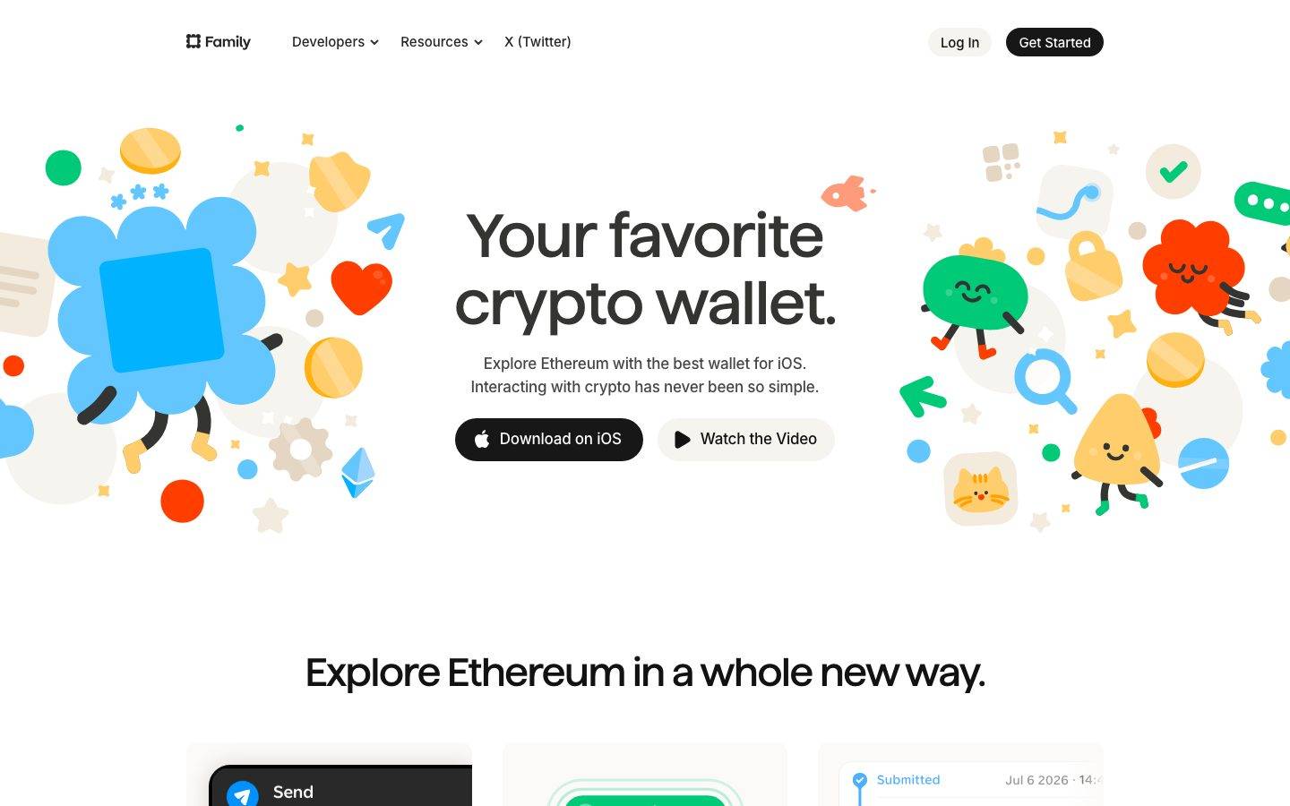
A playful, crypto-wallet marketing surface built on a bright white canvas with warm cream card surfaces, near-black pill CTAs, and a custom rounded display face ("Family") for headlines. The system reads as friendly-but-precise consumer fintech — oversized soft-rounded headline type, illustrative confetti-style mascot art flanking the hero, iOS phone mockups shown directly in cards, and playful accent pops (blue + orange) against an otherwise near-monochrome palette. Brand voltage comes from the rounded display headline and the hand-drawn crypto mascots rather than from saturated color fields.
Works withClaude CodeCursorCodexGemini CLICopilotv0LovableBoltWindsurfReplit
---
version: alpha
name: Family-design-analysis
description: "A playful, crypto-wallet marketing surface built on a bright white canvas with warm cream card surfaces, near-black pill CTAs, and a custom rounded display face (\"Family\") for headlines. The system reads as friendly-but-precise consumer fintech — oversized soft-rounded headline type, illustrative confetti-style mascot art flanking the hero, iOS phone mockups shown directly in cards, and playful accent pops (blue + orange) against an otherwise near-monochrome palette. Brand voltage comes from the rounded display headline and the hand-drawn crypto mascots rather than from saturated color fields."
colors:
  primary: "#000000"
  ink: "#121212"
  ink-soft: "#222222"
  body: "#474645"
  muted: "#707070"
  muted-soft: "#808080"
  caption: "#848281"
  hairline: "#e4e4e4"
  canvas: "#ffffff"
  surface-cream: "#f6f4ef"
  surface-cream-soft: "#fbfaf9"
  on-primary: "#ffffff"
  accent-blue: "#1a88f8"
  accent-orange: "#f97316"
typography:
  display:
    fontFamily: "Family, Poppins, sans-serif"
    fontSize: 68px
    fontWeight: 500
    lineHeight: 1.1
    letterSpacing: -0.02em
  title:
    fontFamily: "Inter, sans-serif"
    fontSize: 19px
    fontWeight: 500
    lineHeight: 1.421
    letterSpacing: -0.0158em
  body:
    fontFamily: "Inter, sans-serif"
    fontSize: 14px
    fontWeight: 400
    lineHeight: 1.429
    letterSpacing: -0.0064em
rounded:
  xs: 2px
  sm: 4px
  md: 6px
  lg: 8px
  xl: 10px
  xxl: 12px
  xxxl: 24px
  card: 32px
  pill: 40px
  blob: 72px
spacing:
  xxs: 4px
  xs: 6px
  sm: 8px
  md: 10px
  lg: 12px
  xl: 16px
  xxl: 20px
components:
  top-nav:
    backgroundColor: "{colors.canvas}"
    textColor: "{colors.ink}"
    typography: "{typography.body}"
  button-primary:
    backgroundColor: "{colors.primary}"
    textColor: "{colors.on-primary}"
    typography: "{typography.body}"
    rounded: "{rounded.pill}"
    padding: 16px 20px
  button-secondary:
    backgroundColor: "{colors.primary}"
    textColor: "{colors.on-primary}"
    typography: "{typography.body}"
    rounded: "{rounded.pill}"
    padding: 16px 20px
  nav-login-pill:
    backgroundColor: "{colors.surface-cream}"
    textColor: "{colors.ink}"
    typography: "{typography.body}"
    rounded: "{rounded.pill}"
    padding: 8px 16px
  feature-card:
    backgroundColor: "{colors.surface-cream}"
    textColor: "{colors.ink}"
    typography: "{typography.title}"
    rounded: "{rounded.card}"
    padding: 20px
  feature-card-dark:
    backgroundColor: "{colors.ink}"
    textColor: "{colors.on-primary}"
    typography: "{typography.title}"
    rounded: "{rounded.card}"
    padding: 20px
  product-mockup-card:
    backgroundColor: "{colors.surface-cream-soft}"
    textColor: "{colors.ink}"
    rounded: "{rounded.blob}"
    padding: 16px
  blog-card:
    backgroundColor: "{colors.surface-cream-soft}"
    textColor: "{colors.ink}"
    typography: "{typography.title}"
    rounded: "{rounded.card}"
    padding: 16px
  section-eyebrow:
    backgroundColor: transparent
    textColor: "{colors.accent-orange}"
    typography: "{typography.body}"
  status-pill:
    backgroundColor: "{colors.canvas}"
    textColor: "{colors.accent-blue}"
    typography: "{typography.body}"
    rounded: "{rounded.lg}"
    padding: 6px 10px
  footer:
    backgroundColor: "{colors.canvas}"
    textColor: "{colors.muted}"
    typography: "{typography.body}"
---

## Overview

Family's marketing surface is a bright, playful consumer-fintech interface — a white canvas (`{colors.canvas}` — #ffffff) carrying warm cream card surfaces (`{colors.surface-cream}` — #f6f4ef), near-black pill CTAs (`{colors.primary}` — #000000), and an oversized rounded display headline set in the brand's custom **Family** typeface. The page reads as friendly and confident: soft geometry everywhere, hand-drawn crypto mascots flanking the hero, and iOS phone mockups shown directly inside cards.

Type voice splits cleanly into two roles: **Family** (the custom rounded display face — used only for the big headlines like "Your favorite crypto wallet." and "Explore Ethereum in a whole new way.") and **Inter** (used for everything else — titles, body, labels, nav). The Family headline runs at weight 500 with -0.02em tracking, giving it a soft, slightly geometric character that carries the entire brand mood.

Component voltage comes from **product UI shown directly in cards** — iOS wallet screens, QR scanners, swap panels, NFT galleries — combined with the confetti-style illustration set (the smiling blobs, coins, tokens, and Ethereum diamonds) that surrounds the hero headline. Family doesn't paint abstract marketing graphics; it shows the actual app chrome at phone scale plus a bespoke mascot cast.

Color is near-monochrome at the structural layer (black, ink grays, cream) with two accent pops used sparingly: `{colors.accent-blue}` (#1a88f8) and `{colors.accent-orange}` (#f97316), which appear as small status/eyebrow highlights and inside the illustration art — never as CTA fills.

**Key Characteristics:**
- White canvas with warm cream card surfaces (`{colors.surface-cream}` — #f6f4ef) — the whole page floats between white and a barely-tinted off-white (`{colors.surface-cream-soft}` — #fbfaf9).
- Near-black pill CTAs (`{colors.primary}` — #000000) with white labels, fully rounded (`{rounded.pill}` — 40px). Both hero buttons ("Download on iOS", "Watch the Video") share the same dark pill silhouette.
- Custom **Family** rounded display typeface for headlines (substituted with Poppins weight 500 here). Negative -0.02em tracking; soft geometric character.
- Very large corner radii — `{rounded.card}` (32px) on content cards and `{rounded.blob}` (72px) on the largest illustration/mockup containers. The system leans soft-rounded everywhere.
- Confetti-style mascot illustration set flanks the hero — smiling blobs, coins, tokens, Ethereum diamonds in blue, orange, red, green, and cream.
- iOS phone mockups shown directly inside cards for the Send / Receive / Swap and NFT feature bands.
- Accent color is scarce: `{colors.accent-blue}` and `{colors.accent-orange}` show up as small eyebrow labels, status pills, and inside the artwork — never on primary CTAs.
- Hairline definition comes from a very-light cream 1px inset border (`{colors.hairline}` — #e4e4e4) rather than heavy shadows.

## Colors

### Brand & Accent
- **Primary** (`{colors.primary}` — #000000): The dominant action color. All pill CTAs render near-black with white labels.
- **Accent Blue** (`{colors.accent-blue}` — #1a88f8): A scarce accent — status pills ("Submitted"), inline highlights, and blue elements inside the mascot art. Never a CTA fill.
- **Accent Orange** (`{colors.accent-orange}` — #f97316): Section eyebrow labels ("Seamless", "Simple", "Understandable", "Secure") and orange elements inside the illustration set.

### Surface
- **Canvas** (`{colors.canvas}` — #ffffff): The default page floor.
- **Surface Cream** (`{colors.surface-cream}` — #f6f4ef): Warm off-white feature-card fill. The signature card surface.
- **Surface Cream Soft** (`{colors.surface-cream-soft}` — #fbfaf9): A barely-tinted off-white for product-mockup and blog cards / faint section dividers.
- **Hairline** (`{colors.hairline}` — #e4e4e4): The 1px border tone used as an inset outline on cards and dividers.

### Text
- **Ink** (`{colors.ink}` — #121212): Headlines and primary text.
- **Ink Soft** (`{colors.ink-soft}` — #222222): Secondary headings, dark UI chrome.
- **Body** (`{colors.body}` — #474645): Default running-text tone (measured from the button/anchor text color).
- **Muted** (`{colors.muted}` — #707070): Secondary text — sub-headings, footer body.
- **Muted Soft** (`{colors.muted-soft}` — #808080): Tertiary text.
- **Caption** (`{colors.caption}` — #848281): Fine-print, captions, faint labels.
- **On Primary** (`{colors.on-primary}` — #ffffff): Text on the dark pill CTAs.

## Typography

### Font Family
The system runs **Family** (the brand's custom rounded display typeface) for the big headlines and **Inter** for everything else — titles, body copy, labels, and navigation. The boundary is strict: Family only appears in the marquee headline sizes; Inter handles all supporting text.

The split is functional:
- Family (display, weight 500, -0.02em tracking) — hero h1 and section headlines
- Inter (title + body, weight 400–500) — sub-heads, paragraphs, labels, nav

### Hierarchy

| Token | Size | Weight | Line Height | Letter Spacing | Use |
|---|---|---|---|---|---|
| `{typography.display}` | 68px | 500 | 1.1 | -0.02em | Hero h1 ("Your favorite crypto wallet.") and section headlines — Family |
| `{typography.title}` | 19px | 500 | 1.421 | -0.0158em | Card titles, sub-headings, feature labels — Inter |
| `{typography.body}` | 14px | 400 | 1.429 | -0.0064em | Default running-text, nav links, button labels, captions — Inter |

### Principles
Family is the brand voice — reserve it exclusively for large headlines. Inter carries every other text role. Keep the -0.02em tracking on the display face; without it the rounded headline loses its tightness. The measured weight is 500 on both the display and title roles — the system never goes bold-heavy; the softness of the letterforms carries the emphasis instead.

### Note on Font Substitutes
"Family" is the brand's own display typeface and is not distributed as a public web font. If it is unavailable, a **rounded geometric sans such as Poppins at weight 500** with -0.02em letter-spacing is a workable approximation for the headline; **Quicksand** at weight 500 is another close alternative for the soft-rounded character. Do not claim to ship the Family face — substitute it.

## Layout

### Spacing System
- **Base unit:** ~4px (with frequent 6/10/11px steps in the measured set).
- **Tokens:** `{spacing.xxs}` 4px · `{spacing.xs}` 6px · `{spacing.sm}` 8px · `{spacing.md}` 10px · `{spacing.lg}` 12px · `{spacing.xl}` 16px · `{spacing.xxl}` 20px.
- **Dominant steps:** 8px (most frequent), 12px, and 10px carry the bulk of the padding/gap rhythm; 16px and 20px handle larger internal card padding.
- **Card internal padding:** `{spacing.xxl}` (20px) on feature cards; `{spacing.xl}` (16px) on product-mockup and blog cards.

### Grid & Container
- **Editorial body:** Centered content column; hero uses a headline-centered layout with illustration bleeding off both left and right edges.
- **Feature grids:** 3-up "Explore Ethereum in a whole new way." grid at desktop; Send / Receive / Swap shown as a 3-up phone-mockup row.
- **Text feature grid:** 2-up columns of labeled paragraphs (Send & Receive, Decentralized Swaps, Full NFT Support, etc.).
- **Blog band:** paired "latest from Family" cards with pagination.

Larger section-level spacing (beyond 20px) was not captured in the measured set — see Known Gaps.

### Whitespace Philosophy
Family uses generous whitespace to let the oversized headline and mascot art breathe. Bands alternate between white canvas and cream cards, and phone mockups sit in ample negative space. The rhythm is calibrated for playful scanning: each band is one big headline plus a supporting row of cards or mockups.

## Elevation & Depth

| Level | Treatment | Use |
|---|---|---|
| Flat | No shadow, no border | Body sections, top nav, hero band |
| Hairline inset | `{colors.hairline}` (P3 cream) 1px inset border — `0 0 0 1px inset` | Feature cards, card outlines (measured, most frequent) |
| Soft hairline | `rgba(0,0,0,0.04) 0px 0px 0px 1px` | Subtle 1px outline on light cards |
| Card drop shadow | `rgba(0,0,0,0.1) 0px 3px 16px` | Elevated cards / floating mockup panels |
| Soft glow | `rgba(0,0,0,0.15) 0px 0px 24px` and `rgba(0,0,0,0.04) 0px 1px 6px, rgba(0,0,0,0.05) 0px 0px 24px` | Floating product mockups and hover-elevated surfaces |
| Focus ring | `rgba(0,0,0,0.8) 0px 0px 6px, inset 0px 0px 6px` | Emphasis / focused element (measured) |

The elevation philosophy is **soft and understated** — the dominant "border" is a barely-visible cream inset hairline; drop shadows are low-alpha and diffuse. No heavy shadows, no neumorphism.

### Decorative Depth
- The hero's confetti mascot illustrations (blobs, coins, tokens, Ethereum diamonds) provide the sense of depth and motion rather than layered shadow — they scatter around the headline at varying scales.
- iOS phone mockups carry their own native app-UI chrome, shown as content inside cards.

## Shapes

### Border Radius Scale

| Token | Value | Use |
|---|---|---|
| `{rounded.xs}` | 2px | Tiny inline accents |
| `{rounded.sm}` | 4px | Small chips |
| `{rounded.md}` | 6px | Small controls, list items |
| `{rounded.lg}` | 8px | Status pills, small buttons |
| `{rounded.xl}` | 10px | Inputs, compact cards (frequent) |
| `{rounded.xxl}` | 12px | Standard content cards (frequent) |
| `{rounded.xxxl}` | 24px | Larger cards |
| `{rounded.card}` | 32px | Feature cards, blog cards |
| `{rounded.pill}` | 40px | CTA pill buttons, nav login pill (frequent) |
| `{rounded.blob}` | 72px | Largest illustration / phone-mockup containers (frequent) |

### Geometry
The system leans strongly soft-rounded. Two radius clusters dominate the measured set: ~10–12px for everyday cards, and ~40–72px for the marquee pill buttons and large mockup containers. iOS phone mockups retain their native rounded-screen corners. Avatar/token art inside mockups is circular.

## Components

### Top Navigation

**`top-nav`** — White nav bar across the top. Carries the Family wordmark + logo at left, a center menu ("Developers", "Resources", "X (Twitter)"), and a right-side cluster with a light "Log In" pill (`{component.nav-login-pill}`) and a dark "Get Started" `{component.button-primary}`. Menu items in `{typography.body}` (Inter 14px / 400), color `{colors.ink}`.

### Buttons

**`button-primary`** — The signature CTA (e.g. "Get Started", "Download on iOS"). Background `{colors.primary}` (#000000), text `{colors.on-primary}` (#ffffff), type `{typography.body}`, fully rounded `{rounded.pill}` (40px). Screenshots show a generous pill with an inline glyph (Apple mark / play icon).

**`button-secondary`** — The second hero CTA ("Watch the Video"). Shares the dark pill silhouette — background `{colors.primary}`, text `{colors.on-primary}`, rounded `{rounded.pill}`. Distinguished by its leading play-triangle icon rather than by color.

**`nav-login-pill`** — A light pill in the nav for "Log In". Background `{colors.surface-cream}`, text `{colors.ink}`, rounded `{rounded.pill}`, padding 8px × 16px.

### Cards & Containers

**`feature-card`** — Used in the "Explore Ethereum in a whole new way." grid (Easy / Secure / Fast / Powerful / Fun). Background `{colors.surface-cream}` (#f6f4ef), rounded `{rounded.card}` (32px), padding `{spacing.xxl}` (20px). Carries a `{typography.title}` label and short `{typography.body}` description, plus a small product-UI or illustration fragment.

**`feature-card-dark`** — The dark inset variant seen in the feature grid (the near-black "Send / Swap / Receive / Purchase" list panel). Background `{colors.ink}` (#121212), text inverts to `{colors.on-primary}`, rounded `{rounded.card}`, padding `{spacing.xxl}`. The dark surface signals the actual app menu chrome.

**`product-mockup-card`** — A card holding an iOS phone mockup (Send screen, QR scanner, Swap panel, NFT gallery, wallet activity). Background `{colors.surface-cream-soft}` (#fbfaf9), rounded `{rounded.blob}` (72px) for the largest containers, padding `{spacing.xl}` (16px). The phone UI inside carries its own native chrome.

**`blog-card`** — Used in the "latest from Family" band. Background `{colors.surface-cream-soft}`, rounded `{rounded.card}`, padding `{spacing.xl}` (16px). Carries a `{typography.title}` headline, a published date, and a body excerpt in `{typography.body}`.

### Labels & Status

**`section-eyebrow`** — Small colored labels above section headlines ("Seamless", "Simple", "Understandable", "Secure"). Transparent background, text `{colors.accent-orange}`, type `{typography.body}`. These are the primary place accent orange appears in the layout.

**`status-pill`** — A small status chip shown inside the transaction mockups ("Submitted"). Background `{colors.canvas}`, text `{colors.accent-blue}`, type `{typography.body}`, rounded `{rounded.lg}` (8px), padding 6px × 10px.

### Footer

**`footer`** — Closes the page on the white canvas. Background `{colors.canvas}`, text `{colors.muted}`, type `{typography.body}`. Unlike many marketing sites, Family keeps its footer light — the whole page stays in the white-and-cream register end to end.

## Do's and Don'ts

### Do
- Reserve `{colors.primary}` (#000000) for pill CTAs. Both hero buttons share the same dark pill — the system is monochrome at the action layer.
- Use Family only for the marquee headlines; use Inter for everything else. Never blur the boundary.
- Keep the -0.02em tracking on the display headline — it defines the rounded voice.
- Use `{colors.surface-cream}` and `{colors.surface-cream-soft}` for card surfaces to keep the warm, soft mood.
- Show the actual iOS app UI inside `{component.product-mockup-card}` rather than illustrating around it.
- Keep accents (`{colors.accent-blue}`, `{colors.accent-orange}`) scarce — eyebrow labels, status pills, and illustration art only.
- Lean into the large radii — `{rounded.card}` (32px) and `{rounded.blob}` (72px) — soft geometry is central to the brand.

### Don't
- Don't use accent blue or orange as a CTA fill. They are highlight-only.
- Don't set body copy in the Family display face — it is headline-only.
- Don't add heavy drop shadows. Definition comes from the cream inset hairline and low-alpha diffuse shadows.
- Don't tighten the corner radius on cards below ~12px — sharp corners read as off-brand.
- Don't introduce saturated color fields on structural surfaces; keep the page white-and-cream, with color living inside the mascot art.
- Don't add hover-state styling beyond what the system encodes — default + pressed only.

## Responsive Behavior

The reference capture was a single desktop landing page, so responsive rules below are inferred from layout structure, not measured breakpoints.

### Breakpoints

| Name | Width | Key Changes (inferred) |
|---|---|---|
| Mobile | < 768px | Nav collapses to a compact bar; hero headline scales down from 68px; hero illustration crops to edges; feature grids stack 1-up; phone mockups stack single-column |
| Tablet | 768–1024px | Feature grids reduce to 2-up; nav tightens |
| Desktop | 1024–1440px | Full nav; 3-up feature grid; 3-up mockup row |
| Wide | > 1440px | Hero illustration bleeds further off both edges; content column stays centered |

### Touch Targets
- `{component.button-primary}` renders as a generous pill — comfortably exceeds 44px in height with its 16px vertical padding.
- `{component.nav-login-pill}` is a smaller pill; effective tap area is bounded by its pill silhouette.

### Collapsing Strategy
- Hero headline is the anchor; the surrounding mascot illustration scales/crops around it rather than reflowing.
- Feature grids reduce column count rather than shrinking cards.
- Phone mockups stack vertically on mobile, retaining native aspect ratios.

## Iteration Guide

1. Focus on ONE component at a time. Reference its YAML key directly (`{component.feature-card}`, `{component.product-mockup-card}`).
2. Variants of an existing component live as separate entries in `components:` (e.g. `feature-card-dark`).
3. Use `{token.refs}` everywhere — never inline hex.
4. Never document hover. Default and Active/Pressed states only.
5. Headlines stay Family 500 with -0.02em tracking; everything else stays Inter. The pairing does not blur.
6. Keep the palette near-monochrome; accents are highlight-only.
7. When in doubt about emphasis: bigger Family headline before more color.

## Known Gaps

- The frequency analyzer captured only **one component** (`button-primary`) with `radius: 0px` and `padding: 0px` — Family renders most CTAs as styled anchor/link elements, so the analyzer missed their true geometry. Pill radius (`{rounded.pill}` — 40px) and dark fill are documented from screenshot ground-truth plus the measured radius/color sets; button padding is expressed with measured spacing values but not directly captured.
- The measured `on-primary` color from the button was #474645 (likely a link/text color rather than the white label seen on dark pills); the CTA label color is documented as the measured `{colors.on-primary}` (#ffffff) from screenshot ground-truth.
- **Family** is the brand's custom display typeface and is not a public web font; an open-source substitute is documented in Typography.
- Only three typography roles were measured (display / title / body). Distinct nav-link, button-label, and caption type styles are not separately captured — they are approximated with `{typography.body}`.
- Section-level vertical spacing beyond 20px was not in the measured set; large-band rhythm is not documented as a token.
- Several dark neutrals (#262626, #282624, #171717) were measured at low frequency and are represented by `{colors.ink}` / `{colors.ink-soft}`; their exact assignment to surfaces is not confirmed.
- The mascot/illustration set colors (reds, greens, yellows in the hero art) were not extracted as tokens — they live in raster/vector artwork, not UI chrome.
- Animation, scroll, and transition timings are out of scope.
- Responsive breakpoints are inferred from a single desktop capture, not measured.

<!-- Documented by Duply · real-world design systems as ready-to-use DESIGN.md for AI coding agents · https://duply.ai/family/design-md -->
Color Palette
Accent
Neutrals
Typography
display68px · 500 · 1.1
The quick brown fox jumpstitle19px · 500 · 1.421
The quick brown fox jumpsbody14px · 400 · 1.429
The quick brown fox jumpsSpacing & Shape
Spacing
| Name | Value | Preview |
|---|---|---|
| xxs | 4px | |
| xs | 6px | |
| sm | 8px | |
| md | 10px | |
| lg | 12px | |
| xl | 16px | |
| xxl | 20px |
Border Radius
| Name | Value | Preview |
|---|---|---|
| xs | 2px | |
| sm | 4px | |
| md | 6px | |
| lg | 8px | |
| xl | 10px | |
| xxl | 12px | |
| xxxl | 24px | |
| card | 32px | |
| pill | 40px | |
| blob | 72px |
FAQ
- What colors does Family use?
- Family's core palette includes #000000, #121212, #222222, #474645, #707070. The full color set with usage roles (canvas, ink, surfaces, accent, semantic) is documented in the Family DESIGN.md.
- What font does Family use?
- Family's primary typeface is Family. The complete type scale (sizes, weights, line-height and letter-spacing per role), with an open substitute where the original is licensed, is documented in the DESIGN.md.
- What is the Family design system?
- A playful, crypto-wallet marketing surface built on a bright white canvas with warm cream card surfaces, near-black pill CTAs, and a custom rounded display face ("Family") for headlines. The system reads as friendly-but-precise consumer fintech — oversized soft-rounded headline type, illustrative
Get this as a working kit
Family Launch Kit + DESIGN.md
$299$225
One-time payment
- A complete production-stack template, styled like Family, fully built and wired.
- One-time payment and the codebase is yours. No platform fees, no subscription.
Open it with Claude Code, Cursor, or any coding agent and build in plain language, then ship a complete web app.
- Your private DESIGN.md
- Marketing pages, blog, SEO & legal
- Email capture, newsletter & contact
- Accept payments (Stripe)
- Analytics (GA4 + PostHog)
- One-click deploy
- Auth, login & roles
- A full app dashboard, when you grow
More like this
---
version: alpha
name: Family-design-analysis
description: "A playful, crypto-wallet marketing surface built on a bright white canvas with warm cream card surfaces, near-black pill CTAs, and a custom rounded display face (\"Family\") for headlines. The system reads as friendly-but-precise consumer fintech — oversized soft-rounded headline type, illustrative confetti-style mascot art flanking the hero, iOS phone mockups shown directly in cards, and playful accent pops (blue + orange) against an otherwise near-monochrome palette. Brand voltage comes from the rounded display headline and the hand-drawn crypto mascots rather than from saturated color fields."
colors:
  primary: "#000000"
  ink: "#121212"
  ink-soft: "#222222"
  body: "#474645"
  muted: "#707070"
  muted-soft: "#808080"
  caption: "#848281"
  hairline: "#e4e4e4"
  canvas: "#ffffff"
  surface-cream: "#f6f4ef"
  surface-cream-soft: "#fbfaf9"
  on-primary: "#ffffff"
  accent-blue: "#1a88f8"
  accent-orange: "#f97316"
typography:
  display:
    fontFamily: "Family, Poppins, sans-serif"
    fontSize: 68px
    fontWeight: 500
    lineHeight: 1.1
    letterSpacing: -0.02em
  title:
    fontFamily: "Inter, sans-serif"
    fontSize: 19px
    fontWeight: 500
    lineHeight: 1.421
    letterSpacing: -0.0158em
  body:
    fontFamily: "Inter, sans-serif"
    fontSize: 14px
    fontWeight: 400
    lineHeight: 1.429
    letterSpacing: -0.0064em
rounded:
  xs: 2px
  sm: 4px
  md: 6px
  lg: 8px
  xl: 10px
  xxl: 12px
  xxxl: 24px
  card: 32px
  pill: 40px
  blob: 72px
spacing:
  xxs: 4px
  xs: 6px
  sm: 8px
  md: 10px
  lg: 12px
  xl: 16px
  xxl: 20px
components:
  top-nav:
    backgroundColor: "{colors.canvas}"
    textColor: "{colors.ink}"
    typography: "{typography.body}"
  button-primary:
    backgroundColor: "{colors.primary}"
    textColor: "{colors.on-primary}"
    typography: "{typography.body}"
    rounded: "{rounded.pill}"
    padding: 16px 20px
  button-secondary:
    backgroundColor: "{colors.primary}"
    textColor: "{colors.on-primary}"
    typography: "{typography.body}"
    rounded: "{rounded.pill}"
    padding: 16px 20px
  nav-login-pill:
    backgroundColor: "{colors.surface-cream}"
    textColor: "{colors.ink}"
    typography: "{typography.body}"
    rounded: "{rounded.pill}"
    padding: 8px 16px
  feature-card:
    backgroundColor: "{colors.surface-cream}"
    textColor: "{colors.ink}"
    typography: "{typography.title}"
    rounded: "{rounded.card}"
    padding: 20px
  feature-card-dark:
    backgroundColor: "{colors.ink}"
    textColor: "{colors.on-primary}"
    typography: "{typography.title}"
    rounded: "{rounded.card}"
    padding: 20px
  product-mockup-card:
    backgroundColor: "{colors.surface-cream-soft}"
    textColor: "{colors.ink}"
    rounded: "{rounded.blob}"
    padding: 16px
  blog-card:
    backgroundColor: "{colors.surface-cream-soft}"
    textColor: "{colors.ink}"
    typography: "{typography.title}"
    rounded: "{rounded.card}"
    padding: 16px
  section-eyebrow:
    backgroundColor: transparent
    textColor: "{colors.accent-orange}"
    typography: "{typography.body}"
  status-pill:
    backgroundColor: "{colors.canvas}"
    textColor: "{colors.accent-blue}"
    typography: "{typography.body}"
    rounded: "{rounded.lg}"
    padding: 6px 10px
  footer:
    backgroundColor: "{colors.canvas}"
    textColor: "{colors.muted}"
    typography: "{typography.body}"
---

## Overview

Family's marketing surface is a bright, playful consumer-fintech interface — a white canvas (`{colors.canvas}` — #ffffff) carrying warm cream card surfaces (`{colors.surface-cream}` — #f6f4ef), near-black pill CTAs (`{colors.primary}` — #000000), and an oversized rounded display headline set in the brand's custom **Family** typeface. The page reads as friendly and confident: soft geometry everywhere, hand-drawn crypto mascots flanking the hero, and iOS phone mockups shown directly inside cards.

Type voice splits cleanly into two roles: **Family** (the custom rounded display face — used only for the big headlines like "Your favorite crypto wallet." and "Explore Ethereum in a whole new way.") and **Inter** (used for everything else — titles, body, labels, nav). The Family headline runs at weight 500 with -0.02em tracking, giving it a soft, slightly geometric character that carries the entire brand mood.

Component voltage comes from **product UI shown directly in cards** — iOS wallet screens, QR scanners, swap panels, NFT galleries — combined with the confetti-style illustration set (the smiling blobs, coins, tokens, and Ethereum diamonds) that surrounds the hero headline. Family doesn't paint abstract marketing graphics; it shows the actual app chrome at phone scale plus a bespoke mascot cast.

Color is near-monochrome at the structural layer (black, ink grays, cream) with two accent pops used sparingly: `{colors.accent-blue}` (#1a88f8) and `{colors.accent-orange}` (#f97316), which appear as small status/eyebrow highlights and inside the illustration art — never as CTA fills.

**Key Characteristics:**
- White canvas with warm cream card surfaces (`{colors.surface-cream}` — #f6f4ef) — the whole page floats between white and a barely-tinted off-white (`{colors.surface-cream-soft}` — #fbfaf9).
- Near-black pill CTAs (`{colors.primary}` — #000000) with white labels, fully rounded (`{rounded.pill}` — 40px). Both hero buttons ("Download on iOS", "Watch the Video") share the same dark pill silhouette.
- Custom **Family** rounded display typeface for headlines (substituted with Poppins weight 500 here). Negative -0.02em tracking; soft geometric character.
- Very large corner radii — `{rounded.card}` (32px) on content cards and `{rounded.blob}` (72px) on the largest illustration/mockup containers. The system leans soft-rounded everywhere.
- Confetti-style mascot illustration set flanks the hero — smiling blobs, coins, tokens, Ethereum diamonds in blue, orange, red, green, and cream.
- iOS phone mockups shown directly inside cards for the Send / Receive / Swap and NFT feature bands.
- Accent color is scarce: `{colors.accent-blue}` and `{colors.accent-orange}` show up as small eyebrow labels, status pills, and inside the artwork — never on primary CTAs.
- Hairline definition comes from a very-light cream 1px inset border (`{colors.hairline}` — #e4e4e4) rather than heavy shadows.

## Colors

### Brand & Accent
- **Primary** (`{colors.primary}` — #000000): The dominant action color. All pill CTAs render near-black with white labels.
- **Accent Blue** (`{colors.accent-blue}` — #1a88f8): A scarce accent — status pills ("Submitted"), inline highlights, and blue elements inside the mascot art. Never a CTA fill.
- **Accent Orange** (`{colors.accent-orange}` — #f97316): Section eyebrow labels ("Seamless", "Simple", "Understandable", "Secure") and orange elements inside the illustration set.

### Surface
- **Canvas** (`{colors.canvas}` — #ffffff): The default page floor.
- **Surface Cream** (`{colors.surface-cream}` — #f6f4ef): Warm off-white feature-card fill. The signature card surface.
- **Surface Cream Soft** (`{colors.surface-cream-soft}` — #fbfaf9): A barely-tinted off-white for product-mockup and blog cards / faint section dividers.
- **Hairline** (`{colors.hairline}` — #e4e4e4): The 1px border tone used as an inset outline on cards and dividers.

### Text
- **Ink** (`{colors.ink}` — #121212): Headlines and primary text.
- **Ink Soft** (`{colors.ink-soft}` — #222222): Secondary headings, dark UI chrome.
- **Body** (`{colors.body}` — #474645): Default running-text tone (measured from the button/anchor text color).
- **Muted** (`{colors.muted}` — #707070): Secondary text — sub-headings, footer body.
- **Muted Soft** (`{colors.muted-soft}` — #808080): Tertiary text.
- **Caption** (`{colors.caption}` — #848281): Fine-print, captions, faint labels.
- **On Primary** (`{colors.on-primary}` — #ffffff): Text on the dark pill CTAs.

## Typography

### Font Family
The system runs **Family** (the brand's custom rounded display typeface) for the big headlines and **Inter** for everything else — titles, body copy, labels, and navigation. The boundary is strict: Family only appears in the marquee headline sizes; Inter handles all supporting text.

The split is functional:
- Family (display, weight 500, -0.02em tracking) — hero h1 and section headlines
- Inter (title + body, weight 400–500) — sub-heads, paragraphs, labels, nav

### Hierarchy

| Token | Size | Weight | Line Height | Letter Spacing | Use |
|---|---|---|---|---|---|
| `{typography.display}` | 68px | 500 | 1.1 | -0.02em | Hero h1 ("Your favorite crypto wallet.") and section headlines — Family |
| `{typography.title}` | 19px | 500 | 1.421 | -0.0158em | Card titles, sub-headings, feature labels — Inter |
| `{typography.body}` | 14px | 400 | 1.429 | -0.0064em | Default running-text, nav links, button labels, captions — Inter |

### Principles
Family is the brand voice — reserve it exclusively for large headlines. Inter carries every other text role. Keep the -0.02em tracking on the display face; without it the rounded headline loses its tightness. The measured weight is 500 on both the display and title roles — the system never goes bold-heavy; the softness of the letterforms carries the emphasis instead.

### Note on Font Substitutes
"Family" is the brand's own display typeface and is not distributed as a public web font. If it is unavailable, a **rounded geometric sans such as Poppins at weight 500** with -0.02em letter-spacing is a workable approximation for the headline; **Quicksand** at weight 500 is another close alternative for the soft-rounded character. Do not claim to ship the Family face — substitute it.

## Layout

### Spacing System
- **Base unit:** ~4px (with frequent 6/10/11px steps in the measured set).
- **Tokens:** `{spacing.xxs}` 4px · `{spacing.xs}` 6px · `{spacing.sm}` 8px · `{spacing.md}` 10px · `{spacing.lg}` 12px · `{spacing.xl}` 16px · `{spacing.xxl}` 20px.
- **Dominant steps:** 8px (most frequent), 12px, and 10px carry the bulk of the padding/gap rhythm; 16px and 20px handle larger internal card padding.
- **Card internal padding:** `{spacing.xxl}` (20px) on feature cards; `{spacing.xl}` (16px) on product-mockup and blog cards.

### Grid & Container
- **Editorial body:** Centered content column; hero uses a headline-centered layout with illustration bleeding off both left and right edges.
- **Feature grids:** 3-up "Explore Ethereum in a whole new way." grid at desktop; Send / Receive / Swap shown as a 3-up phone-mockup row.
- **Text feature grid:** 2-up columns of labeled paragraphs (Send & Receive, Decentralized Swaps, Full NFT Support, etc.).
- **Blog band:** paired "latest from Family" cards with pagination.

Larger section-level spacing (beyond 20px) was not captured in the measured set — see Known Gaps.

### Whitespace Philosophy
Family uses generous whitespace to let the oversized headline and mascot art breathe. Bands alternate between white canvas and cream cards, and phone mockups sit in ample negative space. The rhythm is calibrated for playful scanning: each band is one big headline plus a supporting row of cards or mockups.

## Elevation & Depth

| Level | Treatment | Use |
|---|---|---|
| Flat | No shadow, no border | Body sections, top nav, hero band |
| Hairline inset | `{colors.hairline}` (P3 cream) 1px inset border — `0 0 0 1px inset` | Feature cards, card outlines (measured, most frequent) |
| Soft hairline | `rgba(0,0,0,0.04) 0px 0px 0px 1px` | Subtle 1px outline on light cards |
| Card drop shadow | `rgba(0,0,0,0.1) 0px 3px 16px` | Elevated cards / floating mockup panels |
| Soft glow | `rgba(0,0,0,0.15) 0px 0px 24px` and `rgba(0,0,0,0.04) 0px 1px 6px, rgba(0,0,0,0.05) 0px 0px 24px` | Floating product mockups and hover-elevated surfaces |
| Focus ring | `rgba(0,0,0,0.8) 0px 0px 6px, inset 0px 0px 6px` | Emphasis / focused element (measured) |

The elevation philosophy is **soft and understated** — the dominant "border" is a barely-visible cream inset hairline; drop shadows are low-alpha and diffuse. No heavy shadows, no neumorphism.

### Decorative Depth
- The hero's confetti mascot illustrations (blobs, coins, tokens, Ethereum diamonds) provide the sense of depth and motion rather than layered shadow — they scatter around the headline at varying scales.
- iOS phone mockups carry their own native app-UI chrome, shown as content inside cards.

## Shapes

### Border Radius Scale

| Token | Value | Use |
|---|---|---|
| `{rounded.xs}` | 2px | Tiny inline accents |
| `{rounded.sm}` | 4px | Small chips |
| `{rounded.md}` | 6px | Small controls, list items |
| `{rounded.lg}` | 8px | Status pills, small buttons |
| `{rounded.xl}` | 10px | Inputs, compact cards (frequent) |
| `{rounded.xxl}` | 12px | Standard content cards (frequent) |
| `{rounded.xxxl}` | 24px | Larger cards |
| `{rounded.card}` | 32px | Feature cards, blog cards |
| `{rounded.pill}` | 40px | CTA pill buttons, nav login pill (frequent) |
| `{rounded.blob}` | 72px | Largest illustration / phone-mockup containers (frequent) |

### Geometry
The system leans strongly soft-rounded. Two radius clusters dominate the measured set: ~10–12px for everyday cards, and ~40–72px for the marquee pill buttons and large mockup containers. iOS phone mockups retain their native rounded-screen corners. Avatar/token art inside mockups is circular.

## Components

### Top Navigation

**`top-nav`** — White nav bar across the top. Carries the Family wordmark + logo at left, a center menu ("Developers", "Resources", "X (Twitter)"), and a right-side cluster with a light "Log In" pill (`{component.nav-login-pill}`) and a dark "Get Started" `{component.button-primary}`. Menu items in `{typography.body}` (Inter 14px / 400), color `{colors.ink}`.

### Buttons

**`button-primary`** — The signature CTA (e.g. "Get Started", "Download on iOS"). Background `{colors.primary}` (#000000), text `{colors.on-primary}` (#ffffff), type `{typography.body}`, fully rounded `{rounded.pill}` (40px). Screenshots show a generous pill with an inline glyph (Apple mark / play icon).

**`button-secondary`** — The second hero CTA ("Watch the Video"). Shares the dark pill silhouette — background `{colors.primary}`, text `{colors.on-primary}`, rounded `{rounded.pill}`. Distinguished by its leading play-triangle icon rather than by color.

**`nav-login-pill`** — A light pill in the nav for "Log In". Background `{colors.surface-cream}`, text `{colors.ink}`, rounded `{rounded.pill}`, padding 8px × 16px.

### Cards & Containers

**`feature-card`** — Used in the "Explore Ethereum in a whole new way." grid (Easy / Secure / Fast / Powerful / Fun). Background `{colors.surface-cream}` (#f6f4ef), rounded `{rounded.card}` (32px), padding `{spacing.xxl}` (20px). Carries a `{typography.title}` label and short `{typography.body}` description, plus a small product-UI or illustration fragment.

**`feature-card-dark`** — The dark inset variant seen in the feature grid (the near-black "Send / Swap / Receive / Purchase" list panel). Background `{colors.ink}` (#121212), text inverts to `{colors.on-primary}`, rounded `{rounded.card}`, padding `{spacing.xxl}`. The dark surface signals the actual app menu chrome.

**`product-mockup-card`** — A card holding an iOS phone mockup (Send screen, QR scanner, Swap panel, NFT gallery, wallet activity). Background `{colors.surface-cream-soft}` (#fbfaf9), rounded `{rounded.blob}` (72px) for the largest containers, padding `{spacing.xl}` (16px). The phone UI inside carries its own native chrome.

**`blog-card`** — Used in the "latest from Family" band. Background `{colors.surface-cream-soft}`, rounded `{rounded.card}`, padding `{spacing.xl}` (16px). Carries a `{typography.title}` headline, a published date, and a body excerpt in `{typography.body}`.

### Labels & Status

**`section-eyebrow`** — Small colored labels above section headlines ("Seamless", "Simple", "Understandable", "Secure"). Transparent background, text `{colors.accent-orange}`, type `{typography.body}`. These are the primary place accent orange appears in the layout.

**`status-pill`** — A small status chip shown inside the transaction mockups ("Submitted"). Background `{colors.canvas}`, text `{colors.accent-blue}`, type `{typography.body}`, rounded `{rounded.lg}` (8px), padding 6px × 10px.

### Footer

**`footer`** — Closes the page on the white canvas. Background `{colors.canvas}`, text `{colors.muted}`, type `{typography.body}`. Unlike many marketing sites, Family keeps its footer light — the whole page stays in the white-and-cream register end to end.

## Do's and Don'ts

### Do
- Reserve `{colors.primary}` (#000000) for pill CTAs. Both hero buttons share the same dark pill — the system is monochrome at the action layer.
- Use Family only for the marquee headlines; use Inter for everything else. Never blur the boundary.
- Keep the -0.02em tracking on the display headline — it defines the rounded voice.
- Use `{colors.surface-cream}` and `{colors.surface-cream-soft}` for card surfaces to keep the warm, soft mood.
- Show the actual iOS app UI inside `{component.product-mockup-card}` rather than illustrating around it.
- Keep accents (`{colors.accent-blue}`, `{colors.accent-orange}`) scarce — eyebrow labels, status pills, and illustration art only.
- Lean into the large radii — `{rounded.card}` (32px) and `{rounded.blob}` (72px) — soft geometry is central to the brand.

### Don't
- Don't use accent blue or orange as a CTA fill. They are highlight-only.
- Don't set body copy in the Family display face — it is headline-only.
- Don't add heavy drop shadows. Definition comes from the cream inset hairline and low-alpha diffuse shadows.
- Don't tighten the corner radius on cards below ~12px — sharp corners read as off-brand.
- Don't introduce saturated color fields on structural surfaces; keep the page white-and-cream, with color living inside the mascot art.
- Don't add hover-state styling beyond what the system encodes — default + pressed only.

## Responsive Behavior

The reference capture was a single desktop landing page, so responsive rules below are inferred from layout structure, not measured breakpoints.

### Breakpoints

| Name | Width | Key Changes (inferred) |
|---|---|---|
| Mobile | < 768px | Nav collapses to a compact bar; hero headline scales down from 68px; hero illustration crops to edges; feature grids stack 1-up; phone mockups stack single-column |
| Tablet | 768–1024px | Feature grids reduce to 2-up; nav tightens |
| Desktop | 1024–1440px | Full nav; 3-up feature grid; 3-up mockup row |
| Wide | > 1440px | Hero illustration bleeds further off both edges; content column stays centered |

### Touch Targets
- `{component.button-primary}` renders as a generous pill — comfortably exceeds 44px in height with its 16px vertical padding.
- `{component.nav-login-pill}` is a smaller pill; effective tap area is bounded by its pill silhouette.

### Collapsing Strategy
- Hero headline is the anchor; the surrounding mascot illustration scales/crops around it rather than reflowing.
- Feature grids reduce column count rather than shrinking cards.
- Phone mockups stack vertically on mobile, retaining native aspect ratios.

## Iteration Guide

1. Focus on ONE component at a time. Reference its YAML key directly (`{component.feature-card}`, `{component.product-mockup-card}`).
2. Variants of an existing component live as separate entries in `components:` (e.g. `feature-card-dark`).
3. Use `{token.refs}` everywhere — never inline hex.
4. Never document hover. Default and Active/Pressed states only.
5. Headlines stay Family 500 with -0.02em tracking; everything else stays Inter. The pairing does not blur.
6. Keep the palette near-monochrome; accents are highlight-only.
7. When in doubt about emphasis: bigger Family headline before more color.

## Known Gaps

- The frequency analyzer captured only **one component** (`button-primary`) with `radius: 0px` and `padding: 0px` — Family renders most CTAs as styled anchor/link elements, so the analyzer missed their true geometry. Pill radius (`{rounded.pill}` — 40px) and dark fill are documented from screenshot ground-truth plus the measured radius/color sets; button padding is expressed with measured spacing values but not directly captured.
- The measured `on-primary` color from the button was #474645 (likely a link/text color rather than the white label seen on dark pills); the CTA label color is documented as the measured `{colors.on-primary}` (#ffffff) from screenshot ground-truth.
- **Family** is the brand's custom display typeface and is not a public web font; an open-source substitute is documented in Typography.
- Only three typography roles were measured (display / title / body). Distinct nav-link, button-label, and caption type styles are not separately captured — they are approximated with `{typography.body}`.
- Section-level vertical spacing beyond 20px was not in the measured set; large-band rhythm is not documented as a token.
- Several dark neutrals (#262626, #282624, #171717) were measured at low frequency and are represented by `{colors.ink}` / `{colors.ink-soft}`; their exact assignment to surfaces is not confirmed.
- The mascot/illustration set colors (reds, greens, yellows in the hero art) were not extracted as tokens — they live in raster/vector artwork, not UI chrome.
- Animation, scroll, and transition timings are out of scope.
- Responsive breakpoints are inferred from a single desktop capture, not measured.

<!-- Documented by Duply · real-world design systems as ready-to-use DESIGN.md for AI coding agents · https://duply.ai/family/design-md -->