Dynamic.xyz
A crypto wallet-infrastructure marketing surface built on a near-white canvas with deep-navy ink, a single periwinkle-blue primary CTA, and a custom Ufficiofireblocks display typeface. The system reads as institutional-fintech-meets-crypto — restrained whitespace, soft-shadowed light cards holding product UI fragments (a phone "Pay with Crypto" mockup), and full-bleed deep-navy bands that carry feature grids in inverted white-on-dark. Brand voltage comes from the navy/periwinkle pairing and a scarce mint-green accent rather than from loud color.
---
version: alpha
name: Dynamic.xyz-design-analysis
description: A crypto wallet-infrastructure marketing surface built on a near-white canvas with deep-navy ink, a single periwinkle-blue primary CTA, and a custom Ufficiofireblocks display typeface. The system reads as institutional-fintech-meets-crypto — restrained whitespace, soft-shadowed light cards holding product UI fragments (a phone "Pay with Crypto" mockup), and full-bleed deep-navy bands that carry feature grids in inverted white-on-dark. Brand voltage comes from the navy/periwinkle pairing and a scarce mint-green accent rather than from loud color.
colors:
primary: "#678bff"
ink: "#222644"
ink-black: "#0a0b0c"
body: "#676e7e"
canvas: "#fdfdfd"
on-primary: "#ffffff"
on-dark: "#ffffff"
surface-soft: "#f6f7f9"
surface-muted: "#f3f4f7"
surface-faint: "#eef0f4"
surface-blue-tint: "#f2f6ff"
hairline: "#e7e9ee"
border-muted: "#b3b5c6"
neutral-soft: "#afb1be"
neutral-line: "#e5e5e5"
neutral-dark: "#292a2d"
black: "#000000"
surface-dark: "#222644"
surface-dark-elevated: "#2b3057"
surface-dark-soft: "#333966"
accent-mint: "#79ffcf"
accent-mint-dark: "#192d2c"
typography:
display:
fontFamily: "Ufficiofireblocks, Inter, sans-serif"
fontSize: 52.8px
fontWeight: 600
lineHeight: 1.2
letterSpacing: -1.056px
heading:
fontFamily: "Ufficiofireblocks, Inter, sans-serif"
fontSize: 38px
fontWeight: 600
lineHeight: 1.26
letterSpacing: -0.76px
title:
fontFamily: "Ufficiofireblocks, Inter, sans-serif"
fontSize: 20px
fontWeight: 500
lineHeight: 1.6
letterSpacing: -0.4px
body:
fontFamily: "Ufficiofireblocks, Inter, sans-serif"
fontSize: 18px
fontWeight: 400
lineHeight: 1.66
letterSpacing: 0
button:
fontFamily: "Ufficiofireblocks, Inter, sans-serif"
fontSize: 16px
fontWeight: 400
lineHeight: 1.5
letterSpacing: 0
rounded:
xs: 4px
sm: 6px
md: 8px
ml: 10px
lg: 12px
xl: 16px
xxl: 24px
xxxl: 32px
pill: 50px
blob: 80px
spacing:
xxs: 4px
xtiny: 6px
xs: 8px
ten: 10px
sm: 12px
md: 16px
lg: 24px
xl: 32px
xxl: 48px
huge: 60px
section: 96px
components:
announcement-bar:
backgroundColor: "{colors.surface-soft}"
textColor: "{colors.ink-black}"
typography: "{typography.button}"
padding: 16px
top-nav:
backgroundColor: "{colors.canvas}"
textColor: "{colors.ink-black}"
typography: "{typography.button}"
height: 60px
button-primary:
backgroundColor: "{colors.primary}"
textColor: "{colors.on-primary}"
typography: "{typography.button}"
rounded: "{rounded.md}"
padding: 12px 24px
button-secondary:
backgroundColor: "{colors.canvas}"
textColor: "{colors.ink-black}"
typography: "{typography.button}"
rounded: "{rounded.md}"
padding: 12px 24px
button-text:
backgroundColor: transparent
textColor: "{colors.ink-black}"
typography: "{typography.button}"
nav-link:
backgroundColor: transparent
textColor: "{colors.ink-black}"
typography: "{typography.button}"
hero-band:
backgroundColor: "{colors.canvas}"
textColor: "{colors.ink}"
typography: "{typography.display}"
padding: 96px
product-mockup-card:
backgroundColor: "{colors.canvas}"
textColor: "{colors.ink}"
rounded: "{rounded.xl}"
browser-pill:
backgroundColor: "{colors.canvas}"
textColor: "{colors.body}"
typography: "{typography.button}"
rounded: "{rounded.pill}"
padding: 8px 16px
toggle-pill:
backgroundColor: "{colors.canvas}"
textColor: "{colors.ink}"
typography: "{typography.button}"
rounded: "{rounded.lg}"
padding: 12px 16px
stat-card:
backgroundColor: "{colors.surface-soft}"
textColor: "{colors.ink}"
typography: "{typography.title}"
rounded: "{rounded.xl}"
padding: 24px
dark-section:
backgroundColor: "{colors.surface-dark}"
textColor: "{colors.on-dark}"
typography: "{typography.heading}"
padding: 96px
feature-card-dark:
backgroundColor: "{colors.surface-dark-elevated}"
textColor: "{colors.on-dark}"
typography: "{typography.title}"
rounded: "{rounded.lg}"
padding: 24px
feature-tag-pill:
backgroundColor: "{colors.surface-dark-soft}"
textColor: "{colors.on-dark}"
typography: "{typography.button}"
rounded: "{rounded.md}"
padding: 6px 12px
card:
backgroundColor: "{colors.canvas}"
textColor: "{colors.ink}"
rounded: "{rounded.xl}"
padding: 32px
cta-band:
backgroundColor: "{colors.surface-soft}"
textColor: "{colors.ink}"
typography: "{typography.heading}"
rounded: "{rounded.xl}"
padding: 96px
footer:
backgroundColor: "{colors.canvas}"
textColor: "{colors.body}"
typography: "{typography.button}"
padding: 96px
logo-strip:
backgroundColor: "{colors.canvas}"
textColor: "{colors.neutral-soft}"
typography: "{typography.button}"
padding: 32px
---
## Overview
Dynamic.xyz is a wallet-infrastructure marketing surface that pairs institutional-fintech restraint with crypto-product energy. The canvas is near-white (`{colors.canvas}` — #fdfdfd), headlines sit in deep desaturated navy (`{colors.ink}` — #222644), and the single primary CTA color is a periwinkle blue (`{colors.primary}` — #678bff). The page alternates light editorial bands with full-bleed deep-navy sections (`{colors.surface-dark}`) that carry feature grids in inverted white-on-dark — a rhythm that visually structures the long-scroll page.
The type voice is a single custom display family, **Ufficiofireblocks** (Fireblocks' house typeface — Dynamic is a Fireblocks company). It runs from the 52.8px hero h1 down to the 16px button label, shifting weight (600 for display/heading, 500 for h3 titles, 400 for body/buttons) and tightening letter-spacing on the larger sizes (-1.056px on h1, -0.76px on h2). There is no separate body face — the system is monotypographic.
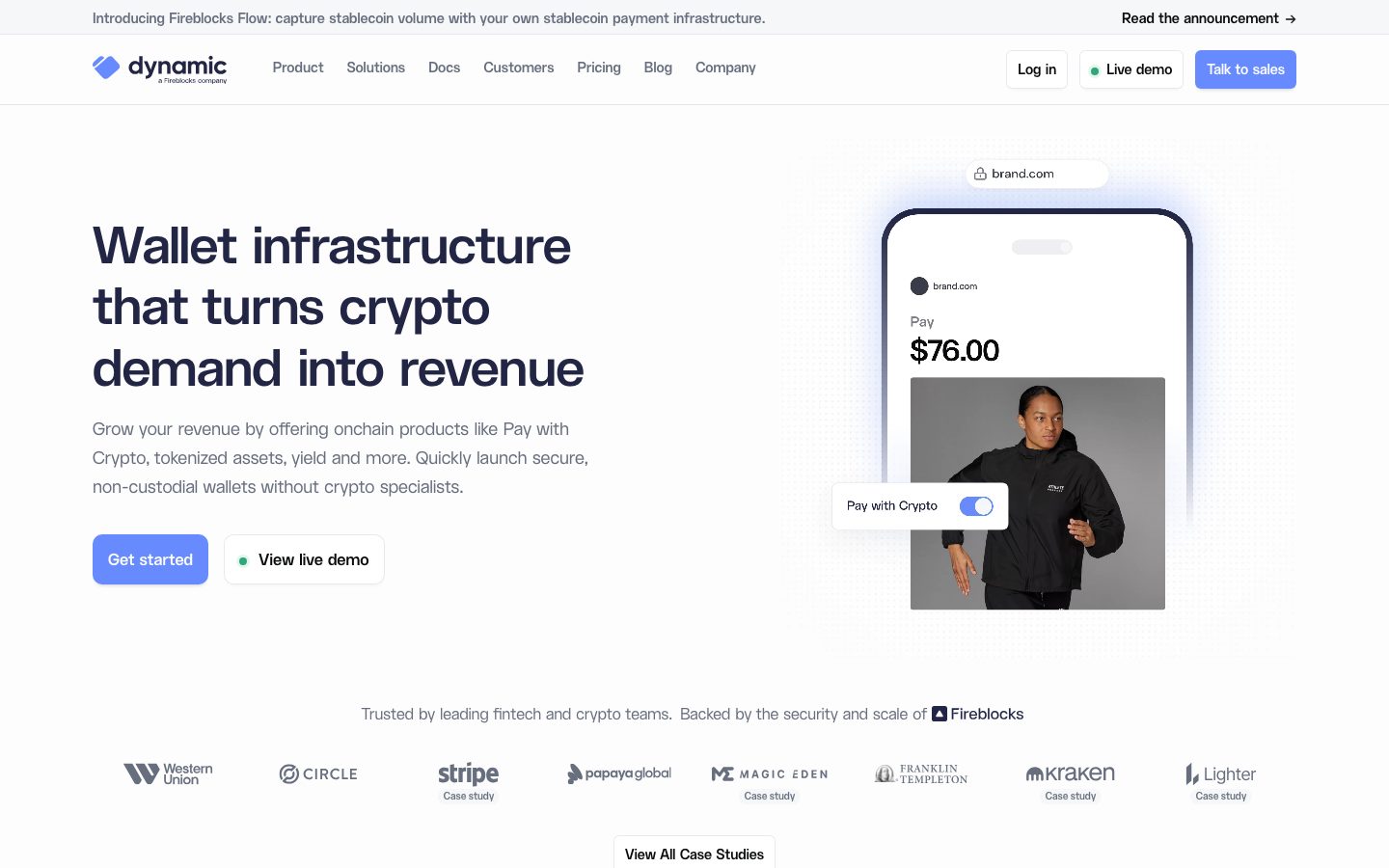
Brand voltage comes from two places: the **navy/periwinkle pairing** (deep #222644 surfaces against #678bff CTAs) and **product UI fragments shown directly inside cards** — the hero's phone mockup with a live "Pay with Crypto" toggle, the browser-bar "brand.com" pill, the product amount display. A scarce mint-green accent (`{colors.accent-mint}` — #79ffcf) appears as a small focus/status flourish rather than as a primary brand color.
**Key Characteristics:**
- Near-white canvas (`{colors.canvas}` — #fdfdfd) with deep-navy ink (`{colors.ink}` — #222644) and a single periwinkle-blue primary CTA (`{colors.primary}` — #678bff).
- A monotypographic system — everything is **Ufficiofireblocks** (substituted with Inter here), differentiated by weight (600/500/400) and size rather than by family.
- Full-bleed deep-navy bands (`{colors.surface-dark}`) carrying inverted white-on-dark feature grids ("Crypto features your customers demand", "Built for security, engineered for speed").
- Product UI fragments embedded directly in marketing surfaces — phone mockup, "Pay with Crypto" toggle, browser-bar pill — rather than illustrated approximations.
- Soft, low-alpha drop shadows (`rgba(24,39,75,0.08) 0px 4px 4px -4px`) and 1px inset hairline rings define light card elevation; the navy bands rely on color contrast instead.
- Border radius is hierarchical — `{rounded.md}` (8px) for buttons, `{rounded.xl}` (16px) for content/product cards, `{rounded.pill}` (50px) for the browser-bar and badge pills.
- Stat cards on light tint (`{colors.surface-soft}`) summarize headline metrics ("50M+ Users onboarded", "800+ External wallets supported", "< 1 Second signing speed").
## Colors
### Brand & Accent
- **Primary** (`{colors.primary}` — #678bff): The single action color. "Get started", "Talk to sales", "Create a free account", and the active toggle track all use this periwinkle blue. It is the only saturated color used at the action layer.
- **Accent Mint** (`{colors.accent-mint}` — #79ffcf): A scarce mint-green used for small status dots ("Live demo" indicator) and focus rings. Paired with its dark companion `{colors.accent-mint-dark}` (#192d2c) in tinted accent moments.
### Surface
- **Canvas** (`{colors.canvas}` — #fdfdfd): The default page floor and card surface.
- **Surface Soft** (`{colors.surface-soft}` — #f6f7f9): Announcement bar, stat cards, and the pre-footer CTA band.
- **Surface Muted** (`{colors.surface-muted}` — #f3f4f7) and **Surface Faint** (`{colors.surface-faint}` — #eef0f4): Soft section fills and nested panel backgrounds.
- **Surface Blue Tint** (`{colors.surface-blue-tint}` — #f2f6ff): A barely-blue tint used behind blue-accented product moments.
- **Surface Dark** (`{colors.surface-dark}` — #222644): The full-bleed deep-navy feature bands — the system's signature inverted surface. (Same value as ink — the brand uses one deep navy for both type and surface.)
- **Surface Dark Elevated** (`{colors.surface-dark-elevated}` — #2b3057): Nested cards/panels inside the navy bands.
- **Surface Dark Soft** (`{colors.surface-dark-soft}` — #333966): Feature tag pills inside the dark bands.
### Text
- **Ink** (`{colors.ink}` — #222644): All display headlines and primary headings.
- **Ink Black** (`{colors.ink-black}` — #0a0b0c): Nav links and high-contrast inline links.
- **Body** (`{colors.body}` — #676e7e): Default running-text — the most frequent text tone on the page.
- **On Primary / On Dark** (`{colors.on-primary}` / `{colors.on-dark}` — #ffffff): Text on primary buttons and inside the navy bands.
### Neutral & Hairline
- **Hairline** (`{colors.hairline}` — #e7e9ee): The 1px inset ring used on card and button outlines (appears in measured box-shadow inset rings).
- **Border Muted** (`{colors.border-muted}` — #b3b5c6) and **Neutral Soft** (`{colors.neutral-soft}` — #afb1be): Logo-strip marks, muted iconography, secondary borders.
- **Neutral Line** (`{colors.neutral-line}` — #e5e5e5): Faint dividers.
- **Neutral Dark** (`{colors.neutral-dark}` — #292a2d) and **Black** (`{colors.black}` — #000000): Near-black tones in product chrome and the wordmark.
## Typography
### Font Family
The entire system runs **Ufficiofireblocks** — Fireblocks' custom house typeface, used because Dynamic is a Fireblocks company. It carries every text role: display headlines, section headings, subtitle/title rows, body copy, and button labels. There is no secondary body face — differentiation is by weight and size only.
### Note on Font Substitutes
**Ufficiofireblocks is a custom/proprietary typeface and is not available as a public web font** — do not attempt to ship it. A usable open-source substitute is **Inter** (weight 600 for display/headings with ~-0.02em tracking, 500 for titles, 400 for body), which preserves the geometric-humanist proportions and the tight display letter-spacing. **Manrope** at weight 600/700 is an alternative for the display sizes if a slightly more geometric feel is wanted. All `fontFamily` tokens list Inter as the declared fallback.
### Hierarchy
| Token | Size | Weight | Line Height | Letter Spacing | Use |
|---|---|---|---|---|---|
| `{typography.display}` | 52.8px | 600 | 1.2 | -1.056px | Hero h1 ("Wallet infrastructure that turns crypto demand into revenue") |
| `{typography.heading}` | 38px | 600 | 1.26 | -0.76px | Section heads ("Scale that's battle-tested", "Built for security, engineered for speed") |
| `{typography.title}` | 20px | 500 | 1.6 | -0.4px | Feature card titles, stat labels, subtitle rows |
| `{typography.body}` | 18px | 400 | 1.66 | normal (0) | Default running-text, feature descriptions |
| `{typography.button}` | 16px | 400 | 1.5 | normal (0) | Button labels, nav links, captions |
### Principles
Because the system is monotypographic, hierarchy lives entirely in size + weight + tracking. The two display roles (h1, h2) are weight 600 with progressively tighter negative letter-spacing; the body and button roles drop to weight 400 with neutral tracking and generous line-height (1.66 body). Keep the contrast crisp: never set body copy at display weight, and preserve the negative letter-spacing on the large headings — it is what makes the family read as precise institutional fintech rather than generic sans.
## Layout
### Spacing System
- **Base unit:** ~4px, with a 6px secondary step appearing frequently in tight component padding.
- **Tokens:** `{spacing.xxs}` 4px · `{spacing.xtiny}` 6px · `{spacing.xs}` 8px · `{spacing.ten}` 10px · `{spacing.sm}` 12px · `{spacing.md}` 16px · `{spacing.lg}` 24px · `{spacing.xl}` 32px · `{spacing.xxl}` 48px · `{spacing.huge}` 60px · `{spacing.section}` 96px.
- **Section padding:** `{spacing.section}` (96px) — the dominant vertical rhythm between major bands (highest-frequency large value measured).
- **Card internal padding:** `{spacing.xl}` (32px) for content cards; `{spacing.lg}` (24px) for stat and dark feature cards; `{spacing.md}` (16px) for tight component padding.
### Grid & Container
- **Editorial body:** Hero uses a roughly 1:1 left/right split — h1 + sub-copy + button row left, product-mockup phone card right.
- **Stat row:** 3-up cards at desktop ("50M+", "800+", "< 1").
- **Feature grids:** 4-up at desktop inside the navy bands (Trade / Earn / Pay / Move; Enterprise self-custody / Fireblocks security / Defense in depth / Sub-second signing).
- **Footer:** Multi-column link list (General / Product / Solutions / Insights / Platform / Company / Legal).
### Whitespace Philosophy
Spacing is measured-but-not-airy — 96px section rhythm with 24-32px card padding. The light/dark band alternation does much of the structural work, so individual sections stay relatively dense (4-up feature grids) while the band transitions provide the breathing room.
## Elevation & Depth
| Level | Treatment | Use |
|---|---|---|
| Flat | No shadow, no border | Body sections, navy bands (color contrast carries depth) |
| Soft drop | `rgba(24, 39, 75, 0.08) 0px 4px 4px -4px` | Light cards, buttons, pills — the default soft lift |
| Hairline + drop | `rgb(231,233,238) 0px 0px 0px 1px inset, rgba(24,39,75,0.08) 0px 4px 4px -4px` | Outlined cards/buttons — a 1px `{colors.hairline}` inset ring plus the soft drop |
| Deeper drop | `rgba(24, 39, 75, 0.32) 0px 4px 4px -4px` | Higher-emphasis floating elements (product mockup chrome) |
| Mint focus ring | `rgb(227, 247, 239) 0px 0px 0px 3px` | Focus / active accent ring (pale mint) |
| Dark inset ring | `rgba(255,255,255,0.1) 0px 0px 0px 1px inset` | 1px white inset on elements inside the navy bands |
| Ambient lift | `rgba(24, 39, 75, 0.06) 0px 14px 32px -4px` | Large soft ambient shadow under the hero product mockup |
The elevation language is **soft and navy-tinted** — shadows use the brand navy at low alpha (0.06-0.32) rather than neutral black, and 1px inset rings substitute for borders. No heavy shadows, no glassmorphism. Inside the dark bands, depth is signaled by surface-tone steps (`{colors.surface-dark}` → `{colors.surface-dark-elevated}`) and faint white inset rings.
## Shapes
### Border Radius Scale
| Token | Value | Use |
|---|---|---|
| `{rounded.xs}` | 4px | Small inline chips, tight controls |
| `{rounded.sm}` | 6px | Small badges |
| `{rounded.md}` | 8px | Buttons, feature tag pills (most-frequent radius) |
| `{rounded.ml}` | 10px | Toggle/control containers |
| `{rounded.lg}` | 12px | Dark feature cards, mid panels |
| `{rounded.xl}` | 16px | Content cards, product-mockup cards, stat cards, CTA band |
| `{rounded.xxl}` | 24px | Larger panels |
| `{rounded.xxxl}` | 32px | Large feature blocks |
| `{rounded.pill}` | 50px | Browser-bar "brand.com" pill, badge pills |
| `{rounded.blob}` | 80px | Large decorative rounded shapes |
### Photography & Product Geometry
The hero product mockup is a phone frame (heavily rounded device chrome) holding a product photo (the model image) with squared-but-rounded inner corners and a floating "Pay with Crypto" toggle pill. Product UI fragments retain their native chrome rather than being re-styled to system radii.
## Components
### Navigation
**`announcement-bar`** — Full-width strip pinned above the nav, `{colors.surface-soft}` background, carrying the "Introducing Fireblocks Flow…" message left and a "Read the announcement →" link right in `{colors.ink-black}`. Padding `{spacing.md}` (16px).
**`top-nav`** — White (`{colors.canvas}`) nav, ~60px tall. Carries the lowercase "dynamic / a Fireblocks company" wordmark left, horizontal menu center (Product, Solutions, Docs, Customers, Pricing, Blog, Company) in `{typography.button}`, and a right cluster: "Log in" `{component.nav-link}`, "Live demo" with a mint status dot, and the "Talk to sales" `{component.button-primary}`.
**`nav-link`** — Transparent inline nav item, `{colors.ink-black}` text, `{typography.button}`.
### Buttons
**`button-primary`** — The signature CTA. Background `{colors.primary}` (#678bff), text `{colors.on-primary}`, type `{typography.button}`, rounded `{rounded.md}` (8px). Padding 12px × 24px (derived from `{spacing.sm}`/`{spacing.lg}` — the measured component padding was unreliable). Used for "Get started", "Talk to sales", "Create a free account".
**`button-secondary`** — White outlined button. Background `{colors.canvas}`, text `{colors.ink-black}`, 1px `{colors.hairline}` inset ring + soft drop shadow, same radius and padding as primary. Used for "Log in".
**`button-text`** — Inline text button, no background, `{colors.ink-black}` text, often with a leading mint dot ("View live demo").
### Hero & Product Mockups
**`hero-band`** — White-canvas hero with a left/right split: h1 in `{typography.display}` + sub-copy in `{typography.body}` + button row left; the product-mockup phone card right. Vertical padding `{spacing.section}` (96px).
**`product-mockup-card`** — The hero's right-side artifact: a phone frame showing a live "Pay $76.00" product screen with a product photo, carrying the ambient lift shadow (`rgba(24,39,75,0.06) 0px 14px 32px -4px`). Background `{colors.canvas}`, rounded `{rounded.xl}`.
**`browser-pill`** — A floating "🔒 brand.com" pill above the mockup. Background `{colors.canvas}`, `{colors.body}` text, rounded `{rounded.pill}` (50px), padding 8px × 16px, soft drop shadow.
**`toggle-pill`** — The floating "Pay with Crypto" control with a `{colors.primary}` active toggle track. Background `{colors.canvas}`, `{colors.ink}` text, rounded `{rounded.lg}`, padding `{spacing.sm}` × `{spacing.md}`.
### Cards & Containers
**`stat-card`** — Used in the "Scale that's battle-tested" 3-up row. Background `{colors.surface-soft}`, rounded `{rounded.xl}`, padding `{spacing.lg}` (24px). Carries a leading icon, a large metric, and a `{typography.title}` label.
**`card`** — Generic content card. Background `{colors.canvas}`, rounded `{rounded.xl}` (16px, measured), padding `{spacing.xl}` (32px), no shadow by default (per measured `card` component) or the soft-drop lift when elevated.
**`dark-section`** — Full-bleed deep-navy band ("Crypto features your customers demand", "Built for security, engineered for speed"). Background `{colors.surface-dark}` (#222644), text `{colors.on-dark}`, heading in `{typography.heading}`, padding `{spacing.section}` (96px). The system's signature inverted surface.
**`feature-card-dark`** — Feature cell inside the navy bands (Trade / Earn / Pay / Move). Background `{colors.surface-dark-elevated}` (#2b3057), text `{colors.on-dark}`, title in `{typography.title}`, rounded `{rounded.lg}`, padding `{spacing.lg}`. Carries a small icon, a title, and a body description.
**`feature-tag-pill`** — Small metric/spec pills inside dark feature cards ("2,400+ institutions", "$50T+ in transactions", "MPA", "Allowlists"). Background `{colors.surface-dark-soft}` (#333966), text `{colors.on-dark}`, rounded `{rounded.md}`, padding 6px × 12px.
### CTA & Footer
**`cta-band`** — Pre-footer "Set up Dynamic in minutes" panel. Background `{colors.surface-soft}`, rounded `{rounded.xl}`, padding `{spacing.section}` (96px). Carries an h2 in `{typography.heading}`, a sub-line, and a `{component.button-primary}` ("Create a free account") + `{component.button-secondary}` ("Talk to sales") pair centered.
**`logo-strip`** — The "Trusted by leading fintech and crypto teams" customer logo row (Western Union, Circle, Stripe, Papaya Global, Magic Eden, Franklin Templeton, Kraken, Lighter). Marks render in `{colors.neutral-soft}`, with small "Case study" captions in `{typography.button}`.
**`footer`** — Light footer on `{colors.canvas}`, body text `{colors.body}`. Multi-column link list (General / Product / Solutions / Insights / Platform / Company / Legal), the dynamic wordmark top-left, social icons, and the "© 2026 Dynamic Labs Inc." copyright line.
## Do's and Don'ts
### Do
- Reserve `{colors.primary}` (#678bff) for primary CTAs and the active toggle track. It is the only saturated action color in the system.
- Use the navy bands (`{colors.surface-dark}`) to structure long-scroll pages — alternate light editorial sections with full-bleed dark feature grids.
- Keep all text in Ufficiofireblocks (or the Inter substitute), differentiating by weight (600/500/400) and size, not by introducing a second family.
- Preserve negative letter-spacing on display and heading sizes (-1.056px / -0.76px) — it's core to the institutional-fintech voice.
- Embed real product UI fragments (phone mockup, "Pay with Crypto" toggle, browser pill) rather than illustrating around the product.
- Use navy-tinted low-alpha shadows (`rgba(24,39,75,0.08)`) and 1px inset hairline rings for light-card elevation.
- Inside dark bands, step surface tones (`{colors.surface-dark}` → `{colors.surface-dark-elevated}` → `{colors.surface-dark-soft}`) to signal depth instead of shadows.
### Don't
- Don't introduce a second body typeface — the system is monotypographic.
- Don't use the mint accent (`{colors.accent-mint}`) on primary CTAs; keep it scarce (status dots, focus rings).
- Don't set display headlines at the body weight (400) or drop the negative letter-spacing — both read as off-brand.
- Don't use heavy or neutral-black shadows; the elevation language is soft and navy-tinted.
- Don't place dark cards casually on light bands — the dark surface is a full-band structural device, not a per-card accent.
- Don't add hover-state styling beyond the documented default and active/pressed treatments.
## Responsive Behavior
### Breakpoints
| Name | Width | Key Changes |
|---|---|---|
| Mobile | < 768px | Hamburger nav; hero h1 scales down; product mockup stacks below copy; stat row 3-up → 1-up; dark-band feature grids 4-up → 1-up; footer columns collapse |
| Tablet | 768–1024px | Nav tightens; stat row 3-up holds or wraps 2-up; feature grids 4-up → 2-up |
| Desktop | 1024–1440px | Full horizontal nav; hero left/right split; 3-up stats; 4-up feature grids |
| Wide | > 1440px | Same as desktop with added outer breathing room around the centered container |
### Touch Targets
- `{component.button-primary}` and `{component.button-secondary}` carry 12px × 24px padding (derived) for comfortable tap area.
- The "Pay with Crypto" `{component.toggle-pill}` and `{component.browser-pill}` are product-chrome elements sized for legibility within the mockup.
### Collapsing Strategy
- The hero left/right split collapses to single-column on mobile — headline + sub-copy + buttons first, product mockup below.
- Feature grids inside the navy bands reduce column count (4 → 2 → 1) rather than scaling cards down.
- The stat row collapses 3 → 1.
- The light/dark band alternation is preserved at every breakpoint — the full-bleed navy sections remain edge-to-edge.
### Image Behavior
- The hero phone mockup scales proportionally; the product screen and floating pills stay legible.
- Customer logo marks in `{component.logo-strip}` wrap to multiple rows on narrow viewports.
## Iteration Guide
1. Focus on ONE component at a time. Reference its YAML key directly (`{component.dark-section}`, `{component.stat-card}`).
2. Variants (`-active`, `-disabled`, `-focused`) live as separate entries in `components:` — they were not measured here, so add them as you confirm states.
3. Use `{token.refs}` everywhere — never inline a hex in a component.
4. Never document hover. Default and active/pressed only.
5. Keep the system monotypographic — all roles stay Ufficiofireblocks (Inter substitute); differentiate by weight and size.
6. The navy bands are the structural rhythm device — reach for `{colors.surface-dark}` at the band level, not the card level.
7. When in doubt about emphasis: tighter, larger display type before any color change — the action color stays periwinkle blue only.
## Known Gaps
- **Ufficiofireblocks is a proprietary/custom typeface** (Fireblocks' house font) and cannot be shipped publicly; the Inter substitute is documented in Typography. The analysis `fonts_licensed` array was empty, but the family is clearly non-public — treat it as licensed.
- The measured `button-primary` component returned `color: #676e7e, radius: 0px, padding: 0px` — almost certainly capturing a wrapper/link element rather than the styled button. Button color, radius, and padding here are reconstructed from screenshot ground-truth (periwinkle fill, ~8px radius) and spacing tokens; padding values are marked derived.
- No active/pressed/disabled button states were measured — only default styling is documented.
- Form input styling (no sign-up/booking form on captured pages) is not extracted.
- The pricing page was captured but no pricing-specific component tokens (tier cards, toggles) were isolated in the analysis — pricing components are out of scope until measured.
- Exact CTA `primary-active` (pressed) color was not measured; not included rather than guessed.
- Animation and transition timings (toggle, mockup reveal, band scroll behavior) are not in scope.
- Several measured colors (#2b3057, #333966, #afb1be) are assigned roles by frequency and screenshot context; precise usage mapping for the deepest navy steps may need confirmation on additional dark-band screens.
<!-- Documented by duply · real-world design systems as ready-to-use DESIGN.md for AI coding agents · https://duply.ai/dynamic/design-md -->
Color Palette
Accent
Neutrals
Typography
display52.8px · 600 · 1.2
The quick brown fox jumpsheading38px · 600 · 1.26
The quick brown fox jumpstitle20px · 500 · 1.6
The quick brown fox jumpsbody18px · 400 · 1.66
The quick brown fox jumpsbutton16px · 400 · 1.5
The quick brown fox jumpsSpacing & Shape
Spacing
| Name | Value | Preview |
|---|---|---|
| xxs | 4px | |
| xtiny | 6px | |
| xs | 8px | |
| ten | 10px | |
| sm | 12px | |
| md | 16px | |
| lg | 24px | |
| xl | 32px | |
| xxl | 48px | |
| huge | 60px | |
| section | 96px |
Border Radius
| Name | Value | Preview |
|---|---|---|
| xs | 4px | |
| sm | 6px | |
| md | 8px | |
| ml | 10px | |
| lg | 12px | |
| xl | 16px | |
| xxl | 24px | |
| xxxl | 32px | |
| pill | 50px | |
| blob | 80px |
More like this


---
version: alpha
name: Dynamic.xyz-design-analysis
description: A crypto wallet-infrastructure marketing surface built on a near-white canvas with deep-navy ink, a single periwinkle-blue primary CTA, and a custom Ufficiofireblocks display typeface. The system reads as institutional-fintech-meets-crypto — restrained whitespace, soft-shadowed light cards holding product UI fragments (a phone "Pay with Crypto" mockup), and full-bleed deep-navy bands that carry feature grids in inverted white-on-dark. Brand voltage comes from the navy/periwinkle pairing and a scarce mint-green accent rather than from loud color.
colors:
  primary: "#678bff"
  ink: "#222644"
  ink-black: "#0a0b0c"
  body: "#676e7e"
  canvas: "#fdfdfd"
  on-primary: "#ffffff"
  on-dark: "#ffffff"
  surface-soft: "#f6f7f9"
  surface-muted: "#f3f4f7"
  surface-faint: "#eef0f4"
  surface-blue-tint: "#f2f6ff"
  hairline: "#e7e9ee"
  border-muted: "#b3b5c6"
  neutral-soft: "#afb1be"
  neutral-line: "#e5e5e5"
  neutral-dark: "#292a2d"
  black: "#000000"
  surface-dark: "#222644"
  surface-dark-elevated: "#2b3057"
  surface-dark-soft: "#333966"
  accent-mint: "#79ffcf"
  accent-mint-dark: "#192d2c"
typography:
  display:
    fontFamily: "Ufficiofireblocks, Inter, sans-serif"
    fontSize: 52.8px
    fontWeight: 600
    lineHeight: 1.2
    letterSpacing: -1.056px
  heading:
    fontFamily: "Ufficiofireblocks, Inter, sans-serif"
    fontSize: 38px
    fontWeight: 600
    lineHeight: 1.26
    letterSpacing: -0.76px
  title:
    fontFamily: "Ufficiofireblocks, Inter, sans-serif"
    fontSize: 20px
    fontWeight: 500
    lineHeight: 1.6
    letterSpacing: -0.4px
  body:
    fontFamily: "Ufficiofireblocks, Inter, sans-serif"
    fontSize: 18px
    fontWeight: 400
    lineHeight: 1.66
    letterSpacing: 0
  button:
    fontFamily: "Ufficiofireblocks, Inter, sans-serif"
    fontSize: 16px
    fontWeight: 400
    lineHeight: 1.5
    letterSpacing: 0
rounded:
  xs: 4px
  sm: 6px
  md: 8px
  ml: 10px
  lg: 12px
  xl: 16px
  xxl: 24px
  xxxl: 32px
  pill: 50px
  blob: 80px
spacing:
  xxs: 4px
  xtiny: 6px
  xs: 8px
  ten: 10px
  sm: 12px
  md: 16px
  lg: 24px
  xl: 32px
  xxl: 48px
  huge: 60px
  section: 96px
components:
  announcement-bar:
    backgroundColor: "{colors.surface-soft}"
    textColor: "{colors.ink-black}"
    typography: "{typography.button}"
    padding: 16px
  top-nav:
    backgroundColor: "{colors.canvas}"
    textColor: "{colors.ink-black}"
    typography: "{typography.button}"
    height: 60px
  button-primary:
    backgroundColor: "{colors.primary}"
    textColor: "{colors.on-primary}"
    typography: "{typography.button}"
    rounded: "{rounded.md}"
    padding: 12px 24px
  button-secondary:
    backgroundColor: "{colors.canvas}"
    textColor: "{colors.ink-black}"
    typography: "{typography.button}"
    rounded: "{rounded.md}"
    padding: 12px 24px
  button-text:
    backgroundColor: transparent
    textColor: "{colors.ink-black}"
    typography: "{typography.button}"
  nav-link:
    backgroundColor: transparent
    textColor: "{colors.ink-black}"
    typography: "{typography.button}"
  hero-band:
    backgroundColor: "{colors.canvas}"
    textColor: "{colors.ink}"
    typography: "{typography.display}"
    padding: 96px
  product-mockup-card:
    backgroundColor: "{colors.canvas}"
    textColor: "{colors.ink}"
    rounded: "{rounded.xl}"
  browser-pill:
    backgroundColor: "{colors.canvas}"
    textColor: "{colors.body}"
    typography: "{typography.button}"
    rounded: "{rounded.pill}"
    padding: 8px 16px
  toggle-pill:
    backgroundColor: "{colors.canvas}"
    textColor: "{colors.ink}"
    typography: "{typography.button}"
    rounded: "{rounded.lg}"
    padding: 12px 16px
  stat-card:
    backgroundColor: "{colors.surface-soft}"
    textColor: "{colors.ink}"
    typography: "{typography.title}"
    rounded: "{rounded.xl}"
    padding: 24px
  dark-section:
    backgroundColor: "{colors.surface-dark}"
    textColor: "{colors.on-dark}"
    typography: "{typography.heading}"
    padding: 96px
  feature-card-dark:
    backgroundColor: "{colors.surface-dark-elevated}"
    textColor: "{colors.on-dark}"
    typography: "{typography.title}"
    rounded: "{rounded.lg}"
    padding: 24px
  feature-tag-pill:
    backgroundColor: "{colors.surface-dark-soft}"
    textColor: "{colors.on-dark}"
    typography: "{typography.button}"
    rounded: "{rounded.md}"
    padding: 6px 12px
  card:
    backgroundColor: "{colors.canvas}"
    textColor: "{colors.ink}"
    rounded: "{rounded.xl}"
    padding: 32px
  cta-band:
    backgroundColor: "{colors.surface-soft}"
    textColor: "{colors.ink}"
    typography: "{typography.heading}"
    rounded: "{rounded.xl}"
    padding: 96px
  footer:
    backgroundColor: "{colors.canvas}"
    textColor: "{colors.body}"
    typography: "{typography.button}"
    padding: 96px
  logo-strip:
    backgroundColor: "{colors.canvas}"
    textColor: "{colors.neutral-soft}"
    typography: "{typography.button}"
    padding: 32px
---

## Overview

Dynamic.xyz is a wallet-infrastructure marketing surface that pairs institutional-fintech restraint with crypto-product energy. The canvas is near-white (`{colors.canvas}` — #fdfdfd), headlines sit in deep desaturated navy (`{colors.ink}` — #222644), and the single primary CTA color is a periwinkle blue (`{colors.primary}` — #678bff). The page alternates light editorial bands with full-bleed deep-navy sections (`{colors.surface-dark}`) that carry feature grids in inverted white-on-dark — a rhythm that visually structures the long-scroll page.

The type voice is a single custom display family, **Ufficiofireblocks** (Fireblocks' house typeface — Dynamic is a Fireblocks company). It runs from the 52.8px hero h1 down to the 16px button label, shifting weight (600 for display/heading, 500 for h3 titles, 400 for body/buttons) and tightening letter-spacing on the larger sizes (-1.056px on h1, -0.76px on h2). There is no separate body face — the system is monotypographic.

Brand voltage comes from two places: the **navy/periwinkle pairing** (deep #222644 surfaces against #678bff CTAs) and **product UI fragments shown directly inside cards** — the hero's phone mockup with a live "Pay with Crypto" toggle, the browser-bar "brand.com" pill, the product amount display. A scarce mint-green accent (`{colors.accent-mint}` — #79ffcf) appears as a small focus/status flourish rather than as a primary brand color.

**Key Characteristics:**
- Near-white canvas (`{colors.canvas}` — #fdfdfd) with deep-navy ink (`{colors.ink}` — #222644) and a single periwinkle-blue primary CTA (`{colors.primary}` — #678bff).
- A monotypographic system — everything is **Ufficiofireblocks** (substituted with Inter here), differentiated by weight (600/500/400) and size rather than by family.
- Full-bleed deep-navy bands (`{colors.surface-dark}`) carrying inverted white-on-dark feature grids ("Crypto features your customers demand", "Built for security, engineered for speed").
- Product UI fragments embedded directly in marketing surfaces — phone mockup, "Pay with Crypto" toggle, browser-bar pill — rather than illustrated approximations.
- Soft, low-alpha drop shadows (`rgba(24,39,75,0.08) 0px 4px 4px -4px`) and 1px inset hairline rings define light card elevation; the navy bands rely on color contrast instead.
- Border radius is hierarchical — `{rounded.md}` (8px) for buttons, `{rounded.xl}` (16px) for content/product cards, `{rounded.pill}` (50px) for the browser-bar and badge pills.
- Stat cards on light tint (`{colors.surface-soft}`) summarize headline metrics ("50M+ Users onboarded", "800+ External wallets supported", "< 1 Second signing speed").

## Colors

### Brand & Accent
- **Primary** (`{colors.primary}` — #678bff): The single action color. "Get started", "Talk to sales", "Create a free account", and the active toggle track all use this periwinkle blue. It is the only saturated color used at the action layer.
- **Accent Mint** (`{colors.accent-mint}` — #79ffcf): A scarce mint-green used for small status dots ("Live demo" indicator) and focus rings. Paired with its dark companion `{colors.accent-mint-dark}` (#192d2c) in tinted accent moments.

### Surface
- **Canvas** (`{colors.canvas}` — #fdfdfd): The default page floor and card surface.
- **Surface Soft** (`{colors.surface-soft}` — #f6f7f9): Announcement bar, stat cards, and the pre-footer CTA band.
- **Surface Muted** (`{colors.surface-muted}` — #f3f4f7) and **Surface Faint** (`{colors.surface-faint}` — #eef0f4): Soft section fills and nested panel backgrounds.
- **Surface Blue Tint** (`{colors.surface-blue-tint}` — #f2f6ff): A barely-blue tint used behind blue-accented product moments.
- **Surface Dark** (`{colors.surface-dark}` — #222644): The full-bleed deep-navy feature bands — the system's signature inverted surface. (Same value as ink — the brand uses one deep navy for both type and surface.)
- **Surface Dark Elevated** (`{colors.surface-dark-elevated}` — #2b3057): Nested cards/panels inside the navy bands.
- **Surface Dark Soft** (`{colors.surface-dark-soft}` — #333966): Feature tag pills inside the dark bands.

### Text
- **Ink** (`{colors.ink}` — #222644): All display headlines and primary headings.
- **Ink Black** (`{colors.ink-black}` — #0a0b0c): Nav links and high-contrast inline links.
- **Body** (`{colors.body}` — #676e7e): Default running-text — the most frequent text tone on the page.
- **On Primary / On Dark** (`{colors.on-primary}` / `{colors.on-dark}` — #ffffff): Text on primary buttons and inside the navy bands.

### Neutral & Hairline
- **Hairline** (`{colors.hairline}` — #e7e9ee): The 1px inset ring used on card and button outlines (appears in measured box-shadow inset rings).
- **Border Muted** (`{colors.border-muted}` — #b3b5c6) and **Neutral Soft** (`{colors.neutral-soft}` — #afb1be): Logo-strip marks, muted iconography, secondary borders.
- **Neutral Line** (`{colors.neutral-line}` — #e5e5e5): Faint dividers.
- **Neutral Dark** (`{colors.neutral-dark}` — #292a2d) and **Black** (`{colors.black}` — #000000): Near-black tones in product chrome and the wordmark.

## Typography

### Font Family
The entire system runs **Ufficiofireblocks** — Fireblocks' custom house typeface, used because Dynamic is a Fireblocks company. It carries every text role: display headlines, section headings, subtitle/title rows, body copy, and button labels. There is no secondary body face — differentiation is by weight and size only.

### Note on Font Substitutes
**Ufficiofireblocks is a custom/proprietary typeface and is not available as a public web font** — do not attempt to ship it. A usable open-source substitute is **Inter** (weight 600 for display/headings with ~-0.02em tracking, 500 for titles, 400 for body), which preserves the geometric-humanist proportions and the tight display letter-spacing. **Manrope** at weight 600/700 is an alternative for the display sizes if a slightly more geometric feel is wanted. All `fontFamily` tokens list Inter as the declared fallback.

### Hierarchy

| Token | Size | Weight | Line Height | Letter Spacing | Use |
|---|---|---|---|---|---|
| `{typography.display}` | 52.8px | 600 | 1.2 | -1.056px | Hero h1 ("Wallet infrastructure that turns crypto demand into revenue") |
| `{typography.heading}` | 38px | 600 | 1.26 | -0.76px | Section heads ("Scale that's battle-tested", "Built for security, engineered for speed") |
| `{typography.title}` | 20px | 500 | 1.6 | -0.4px | Feature card titles, stat labels, subtitle rows |
| `{typography.body}` | 18px | 400 | 1.66 | normal (0) | Default running-text, feature descriptions |
| `{typography.button}` | 16px | 400 | 1.5 | normal (0) | Button labels, nav links, captions |

### Principles
Because the system is monotypographic, hierarchy lives entirely in size + weight + tracking. The two display roles (h1, h2) are weight 600 with progressively tighter negative letter-spacing; the body and button roles drop to weight 400 with neutral tracking and generous line-height (1.66 body). Keep the contrast crisp: never set body copy at display weight, and preserve the negative letter-spacing on the large headings — it is what makes the family read as precise institutional fintech rather than generic sans.

## Layout

### Spacing System
- **Base unit:** ~4px, with a 6px secondary step appearing frequently in tight component padding.
- **Tokens:** `{spacing.xxs}` 4px · `{spacing.xtiny}` 6px · `{spacing.xs}` 8px · `{spacing.ten}` 10px · `{spacing.sm}` 12px · `{spacing.md}` 16px · `{spacing.lg}` 24px · `{spacing.xl}` 32px · `{spacing.xxl}` 48px · `{spacing.huge}` 60px · `{spacing.section}` 96px.
- **Section padding:** `{spacing.section}` (96px) — the dominant vertical rhythm between major bands (highest-frequency large value measured).
- **Card internal padding:** `{spacing.xl}` (32px) for content cards; `{spacing.lg}` (24px) for stat and dark feature cards; `{spacing.md}` (16px) for tight component padding.

### Grid & Container
- **Editorial body:** Hero uses a roughly 1:1 left/right split — h1 + sub-copy + button row left, product-mockup phone card right.
- **Stat row:** 3-up cards at desktop ("50M+", "800+", "< 1").
- **Feature grids:** 4-up at desktop inside the navy bands (Trade / Earn / Pay / Move; Enterprise self-custody / Fireblocks security / Defense in depth / Sub-second signing).
- **Footer:** Multi-column link list (General / Product / Solutions / Insights / Platform / Company / Legal).

### Whitespace Philosophy
Spacing is measured-but-not-airy — 96px section rhythm with 24-32px card padding. The light/dark band alternation does much of the structural work, so individual sections stay relatively dense (4-up feature grids) while the band transitions provide the breathing room.

## Elevation & Depth

| Level | Treatment | Use |
|---|---|---|
| Flat | No shadow, no border | Body sections, navy bands (color contrast carries depth) |
| Soft drop | `rgba(24, 39, 75, 0.08) 0px 4px 4px -4px` | Light cards, buttons, pills — the default soft lift |
| Hairline + drop | `rgb(231,233,238) 0px 0px 0px 1px inset, rgba(24,39,75,0.08) 0px 4px 4px -4px` | Outlined cards/buttons — a 1px `{colors.hairline}` inset ring plus the soft drop |
| Deeper drop | `rgba(24, 39, 75, 0.32) 0px 4px 4px -4px` | Higher-emphasis floating elements (product mockup chrome) |
| Mint focus ring | `rgb(227, 247, 239) 0px 0px 0px 3px` | Focus / active accent ring (pale mint) |
| Dark inset ring | `rgba(255,255,255,0.1) 0px 0px 0px 1px inset` | 1px white inset on elements inside the navy bands |
| Ambient lift | `rgba(24, 39, 75, 0.06) 0px 14px 32px -4px` | Large soft ambient shadow under the hero product mockup |

The elevation language is **soft and navy-tinted** — shadows use the brand navy at low alpha (0.06-0.32) rather than neutral black, and 1px inset rings substitute for borders. No heavy shadows, no glassmorphism. Inside the dark bands, depth is signaled by surface-tone steps (`{colors.surface-dark}` → `{colors.surface-dark-elevated}`) and faint white inset rings.

## Shapes

### Border Radius Scale

| Token | Value | Use |
|---|---|---|
| `{rounded.xs}` | 4px | Small inline chips, tight controls |
| `{rounded.sm}` | 6px | Small badges |
| `{rounded.md}` | 8px | Buttons, feature tag pills (most-frequent radius) |
| `{rounded.ml}` | 10px | Toggle/control containers |
| `{rounded.lg}` | 12px | Dark feature cards, mid panels |
| `{rounded.xl}` | 16px | Content cards, product-mockup cards, stat cards, CTA band |
| `{rounded.xxl}` | 24px | Larger panels |
| `{rounded.xxxl}` | 32px | Large feature blocks |
| `{rounded.pill}` | 50px | Browser-bar "brand.com" pill, badge pills |
| `{rounded.blob}` | 80px | Large decorative rounded shapes |

### Photography & Product Geometry
The hero product mockup is a phone frame (heavily rounded device chrome) holding a product photo (the model image) with squared-but-rounded inner corners and a floating "Pay with Crypto" toggle pill. Product UI fragments retain their native chrome rather than being re-styled to system radii.

## Components

### Navigation

**`announcement-bar`** — Full-width strip pinned above the nav, `{colors.surface-soft}` background, carrying the "Introducing Fireblocks Flow…" message left and a "Read the announcement →" link right in `{colors.ink-black}`. Padding `{spacing.md}` (16px).

**`top-nav`** — White (`{colors.canvas}`) nav, ~60px tall. Carries the lowercase "dynamic / a Fireblocks company" wordmark left, horizontal menu center (Product, Solutions, Docs, Customers, Pricing, Blog, Company) in `{typography.button}`, and a right cluster: "Log in" `{component.nav-link}`, "Live demo" with a mint status dot, and the "Talk to sales" `{component.button-primary}`.

**`nav-link`** — Transparent inline nav item, `{colors.ink-black}` text, `{typography.button}`.

### Buttons

**`button-primary`** — The signature CTA. Background `{colors.primary}` (#678bff), text `{colors.on-primary}`, type `{typography.button}`, rounded `{rounded.md}` (8px). Padding 12px × 24px (derived from `{spacing.sm}`/`{spacing.lg}` — the measured component padding was unreliable). Used for "Get started", "Talk to sales", "Create a free account".

**`button-secondary`** — White outlined button. Background `{colors.canvas}`, text `{colors.ink-black}`, 1px `{colors.hairline}` inset ring + soft drop shadow, same radius and padding as primary. Used for "Log in".

**`button-text`** — Inline text button, no background, `{colors.ink-black}` text, often with a leading mint dot ("View live demo").

### Hero & Product Mockups

**`hero-band`** — White-canvas hero with a left/right split: h1 in `{typography.display}` + sub-copy in `{typography.body}` + button row left; the product-mockup phone card right. Vertical padding `{spacing.section}` (96px).

**`product-mockup-card`** — The hero's right-side artifact: a phone frame showing a live "Pay $76.00" product screen with a product photo, carrying the ambient lift shadow (`rgba(24,39,75,0.06) 0px 14px 32px -4px`). Background `{colors.canvas}`, rounded `{rounded.xl}`.

**`browser-pill`** — A floating "🔒 brand.com" pill above the mockup. Background `{colors.canvas}`, `{colors.body}` text, rounded `{rounded.pill}` (50px), padding 8px × 16px, soft drop shadow.

**`toggle-pill`** — The floating "Pay with Crypto" control with a `{colors.primary}` active toggle track. Background `{colors.canvas}`, `{colors.ink}` text, rounded `{rounded.lg}`, padding `{spacing.sm}` × `{spacing.md}`.

### Cards & Containers

**`stat-card`** — Used in the "Scale that's battle-tested" 3-up row. Background `{colors.surface-soft}`, rounded `{rounded.xl}`, padding `{spacing.lg}` (24px). Carries a leading icon, a large metric, and a `{typography.title}` label.

**`card`** — Generic content card. Background `{colors.canvas}`, rounded `{rounded.xl}` (16px, measured), padding `{spacing.xl}` (32px), no shadow by default (per measured `card` component) or the soft-drop lift when elevated.

**`dark-section`** — Full-bleed deep-navy band ("Crypto features your customers demand", "Built for security, engineered for speed"). Background `{colors.surface-dark}` (#222644), text `{colors.on-dark}`, heading in `{typography.heading}`, padding `{spacing.section}` (96px). The system's signature inverted surface.

**`feature-card-dark`** — Feature cell inside the navy bands (Trade / Earn / Pay / Move). Background `{colors.surface-dark-elevated}` (#2b3057), text `{colors.on-dark}`, title in `{typography.title}`, rounded `{rounded.lg}`, padding `{spacing.lg}`. Carries a small icon, a title, and a body description.

**`feature-tag-pill`** — Small metric/spec pills inside dark feature cards ("2,400+ institutions", "$50T+ in transactions", "MPA", "Allowlists"). Background `{colors.surface-dark-soft}` (#333966), text `{colors.on-dark}`, rounded `{rounded.md}`, padding 6px × 12px.

### CTA & Footer

**`cta-band`** — Pre-footer "Set up Dynamic in minutes" panel. Background `{colors.surface-soft}`, rounded `{rounded.xl}`, padding `{spacing.section}` (96px). Carries an h2 in `{typography.heading}`, a sub-line, and a `{component.button-primary}` ("Create a free account") + `{component.button-secondary}` ("Talk to sales") pair centered.

**`logo-strip`** — The "Trusted by leading fintech and crypto teams" customer logo row (Western Union, Circle, Stripe, Papaya Global, Magic Eden, Franklin Templeton, Kraken, Lighter). Marks render in `{colors.neutral-soft}`, with small "Case study" captions in `{typography.button}`.

**`footer`** — Light footer on `{colors.canvas}`, body text `{colors.body}`. Multi-column link list (General / Product / Solutions / Insights / Platform / Company / Legal), the dynamic wordmark top-left, social icons, and the "© 2026 Dynamic Labs Inc." copyright line.

## Do's and Don'ts

### Do
- Reserve `{colors.primary}` (#678bff) for primary CTAs and the active toggle track. It is the only saturated action color in the system.
- Use the navy bands (`{colors.surface-dark}`) to structure long-scroll pages — alternate light editorial sections with full-bleed dark feature grids.
- Keep all text in Ufficiofireblocks (or the Inter substitute), differentiating by weight (600/500/400) and size, not by introducing a second family.
- Preserve negative letter-spacing on display and heading sizes (-1.056px / -0.76px) — it's core to the institutional-fintech voice.
- Embed real product UI fragments (phone mockup, "Pay with Crypto" toggle, browser pill) rather than illustrating around the product.
- Use navy-tinted low-alpha shadows (`rgba(24,39,75,0.08)`) and 1px inset hairline rings for light-card elevation.
- Inside dark bands, step surface tones (`{colors.surface-dark}` → `{colors.surface-dark-elevated}` → `{colors.surface-dark-soft}`) to signal depth instead of shadows.

### Don't
- Don't introduce a second body typeface — the system is monotypographic.
- Don't use the mint accent (`{colors.accent-mint}`) on primary CTAs; keep it scarce (status dots, focus rings).
- Don't set display headlines at the body weight (400) or drop the negative letter-spacing — both read as off-brand.
- Don't use heavy or neutral-black shadows; the elevation language is soft and navy-tinted.
- Don't place dark cards casually on light bands — the dark surface is a full-band structural device, not a per-card accent.
- Don't add hover-state styling beyond the documented default and active/pressed treatments.

## Responsive Behavior

### Breakpoints

| Name | Width | Key Changes |
|---|---|---|
| Mobile | < 768px | Hamburger nav; hero h1 scales down; product mockup stacks below copy; stat row 3-up → 1-up; dark-band feature grids 4-up → 1-up; footer columns collapse |
| Tablet | 768–1024px | Nav tightens; stat row 3-up holds or wraps 2-up; feature grids 4-up → 2-up |
| Desktop | 1024–1440px | Full horizontal nav; hero left/right split; 3-up stats; 4-up feature grids |
| Wide | > 1440px | Same as desktop with added outer breathing room around the centered container |

### Touch Targets
- `{component.button-primary}` and `{component.button-secondary}` carry 12px × 24px padding (derived) for comfortable tap area.
- The "Pay with Crypto" `{component.toggle-pill}` and `{component.browser-pill}` are product-chrome elements sized for legibility within the mockup.

### Collapsing Strategy
- The hero left/right split collapses to single-column on mobile — headline + sub-copy + buttons first, product mockup below.
- Feature grids inside the navy bands reduce column count (4 → 2 → 1) rather than scaling cards down.
- The stat row collapses 3 → 1.
- The light/dark band alternation is preserved at every breakpoint — the full-bleed navy sections remain edge-to-edge.

### Image Behavior
- The hero phone mockup scales proportionally; the product screen and floating pills stay legible.
- Customer logo marks in `{component.logo-strip}` wrap to multiple rows on narrow viewports.

## Iteration Guide

1. Focus on ONE component at a time. Reference its YAML key directly (`{component.dark-section}`, `{component.stat-card}`).
2. Variants (`-active`, `-disabled`, `-focused`) live as separate entries in `components:` — they were not measured here, so add them as you confirm states.
3. Use `{token.refs}` everywhere — never inline a hex in a component.
4. Never document hover. Default and active/pressed only.
5. Keep the system monotypographic — all roles stay Ufficiofireblocks (Inter substitute); differentiate by weight and size.
6. The navy bands are the structural rhythm device — reach for `{colors.surface-dark}` at the band level, not the card level.
7. When in doubt about emphasis: tighter, larger display type before any color change — the action color stays periwinkle blue only.

## Known Gaps

- **Ufficiofireblocks is a proprietary/custom typeface** (Fireblocks' house font) and cannot be shipped publicly; the Inter substitute is documented in Typography. The analysis `fonts_licensed` array was empty, but the family is clearly non-public — treat it as licensed.
- The measured `button-primary` component returned `color: #676e7e, radius: 0px, padding: 0px` — almost certainly capturing a wrapper/link element rather than the styled button. Button color, radius, and padding here are reconstructed from screenshot ground-truth (periwinkle fill, ~8px radius) and spacing tokens; padding values are marked derived.
- No active/pressed/disabled button states were measured — only default styling is documented.
- Form input styling (no sign-up/booking form on captured pages) is not extracted.
- The pricing page was captured but no pricing-specific component tokens (tier cards, toggles) were isolated in the analysis — pricing components are out of scope until measured.
- Exact CTA `primary-active` (pressed) color was not measured; not included rather than guessed.
- Animation and transition timings (toggle, mockup reveal, band scroll behavior) are not in scope.
- Several measured colors (#2b3057, #333966, #afb1be) are assigned roles by frequency and screenshot context; precise usage mapping for the deepest navy steps may need confirmation on additional dark-band screens.

<!-- Documented by duply · real-world design systems as ready-to-use DESIGN.md for AI coding agents · https://duply.ai/dynamic/design-md -->