
dylanbrouwer
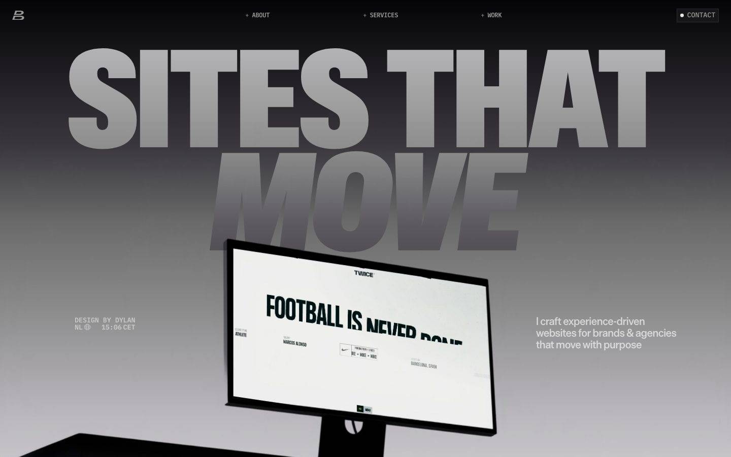
A high-contrast, motion-forward portfolio interface built on a gradient dark-to-light canvas, dominated by an oversized ABC Gravity display headline, a Die Grotesk B grotesque for headings and UI labels, and IBM Plex Mono for body/meta text. The system reads as a designer's showcase — near-monochrome greys, a single hot-orange accent, zero-radius editorial buttons and cards, and enormous typographic scale used as the primary visual event.
Works withClaude CodeCursorCodexGemini CLICopilotv0LovableBoltWindsurfReplit
---
version: alpha
name: dylanbrouwer-design-analysis
description: "A high-contrast, motion-forward portfolio interface built on a gradient dark-to-light canvas, dominated by an oversized ABC Gravity display headline, a Die Grotesk B grotesque for headings and UI labels, and IBM Plex Mono for body/meta text. The system reads as a designer's showcase — near-monochrome greys, a single hot-orange accent, zero-radius editorial buttons and cards, and enormous typographic scale used as the primary visual event."
colors:
  ink: "#3c3a3e"
  ink-soft: "#7b7a7c"
  graphite: "#333333"
  black: "#000000"
  near-black: "#040305"
  surface-dark: "#161616"
  surface-dark-elevated: "#222222"
  muted: "#a2a2a2"
  muted-soft: "#b9b7bb"
  hairline: "#c9c7cc"
  hairline-soft: "#dddddd"
  hairline-softer: "#cccccc"
  canvas: "#f1f1f1"
  surface: "#ffffff"
  surface-off: "#fafafa"
  accent-orange: "#ff4c24"
  accent-orange-active: "#ff6436"
  accent-blue: "#3898ec"
  accent-indigo: "#2d40ea"

typography:
  display-hero:
    fontFamily: "ABC Gravity Variable, Archivo Black, sans-serif"
    fontSize: 274px
    fontWeight: 400
    lineHeight: 0.74
    letterSpacing: -0.02em
  heading-lg:
    fontFamily: "Die Grotesk B, Space Grotesk, sans-serif"
    fontSize: 60px
    fontWeight: 500
    lineHeight: 1.0
    letterSpacing: -0.03em
  heading-md:
    fontFamily: "Die Grotesk B, Space Grotesk, sans-serif"
    fontSize: 36px
    fontWeight: 500
    lineHeight: 1.0
    letterSpacing: -0.03em
  body-mono:
    fontFamily: "IBM Plex Mono, ui-monospace, monospace"
    fontSize: 12px
    fontWeight: 500
    lineHeight: 1.3
    letterSpacing: -0.01em
  button:
    fontFamily: "Die Grotesk B, Space Grotesk, sans-serif"
    fontSize: 12px
    fontWeight: 500
    lineHeight: 1.3
    letterSpacing: -0.01em

rounded:
  none: 0px
  md: 12px
  lg: 14px

spacing:
  xxs: 4px
  xs: 6px
  sm: 8px
  md: 12px
  lg: 24px
  xl: 48px
  xxl: 72px
  section: 96px
  jumbo: 120px

components:
  top-nav:
    backgroundColor: transparent
    textColor: "{colors.muted}"
    typography: "{typography.button}"
    padding: 24px
  nav-link:
    backgroundColor: transparent
    textColor: "{colors.muted}"
    typography: "{typography.button}"
    rounded: "{rounded.none}"
    padding: 0px
  contact-pill:
    backgroundColor: "{colors.surface-dark}"
    textColor: "{colors.muted}"
    typography: "{typography.button}"
    rounded: "{rounded.md}"
    padding: 8px 12px
  button-primary:
    backgroundColor: transparent
    textColor: "{colors.muted}"
    typography: "{typography.button}"
    rounded: "{rounded.none}"
    padding: 0px
  hero-headline:
    backgroundColor: transparent
    textColor: "{colors.muted}"
    typography: "{typography.display-hero}"
  hero-lede:
    backgroundColor: transparent
    textColor: "{colors.surface}"
    typography: "{typography.heading-md}"
  meta-label:
    backgroundColor: transparent
    textColor: "{colors.muted}"
    typography: "{typography.body-mono}"
  card:
    backgroundColor: "{colors.surface}"
    textColor: "{colors.ink}"
    rounded: "{rounded.none}"
  project-card:
    backgroundColor: "{colors.surface}"
    textColor: "{colors.ink}"
    typography: "{typography.body-mono}"
    rounded: "{rounded.none}"
  project-tag:
    backgroundColor: "{colors.accent-orange}"
    textColor: "{colors.surface}"
    typography: "{typography.body-mono}"
    rounded: "{rounded.none}"
  process-card:
    backgroundColor: "{colors.surface-off}"
    textColor: "{colors.ink}"
    typography: "{typography.heading-md}"
    rounded: "{rounded.lg}"
  footer:
    backgroundColor: "{colors.canvas}"
    textColor: "{colors.ink}"
    typography: "{typography.body-mono}"
    padding: 48px
---

## Overview

dylanbrouwer.design is a designer's portfolio built as one continuous motion event. The landing surface opens on a **gradient dark-to-light canvas** — a near-black top (`{colors.black}` / `{colors.surface-dark}`) that dissolves down into the light `{colors.canvas}` (#f1f1f1) that carries the rest of the page. The dominant visual is an enormous **ABC Gravity** display headline ("SITES THAT MOVE") set at ~274px — the type IS the hero art, layered over a floating monitor render.

The type voice is a three-way split: **ABC Gravity Variable** (a heavy variable display face) for the marquee headline only; **Die Grotesk B** (a tight grotesque) for section headings and UI/button labels; and **IBM Plex Mono** (open-source monospace) for all body copy, meta lines, timestamps, and captions. The monospace body against the massive display headline is the signature tension of the system.

Color is near-monochrome — a full range of greys from `{colors.ink}` (#3c3a3e) through `{colors.muted}` (#a2a2a2) up to white and the #f1f1f1 canvas — punctuated by a single hot **`{colors.accent-orange}`** (#ff4c24) used on tags and small status dots. The palette is disciplined and industrial.

**Key Characteristics:**
- Gradient dark-to-light hero canvas — the page floor shifts from `{colors.black}` at the top to `{colors.canvas}` (#f1f1f1) below, with grey project sections following.
- Oversized ABC Gravity display headline (`{typography.display-hero}` — ~274px, weight 400, line-height 0.74, -0.02em tracking) rendered in `{colors.muted}` grey against the dark canvas.
- Die Grotesk B grotesque (`{typography.heading-lg}` / `{typography.heading-md}`) for section titles and all button/nav labels at tight -0.03em tracking.
- IBM Plex Mono at 12px for every body, meta and caption line — the monospace against giant display type is the core contrast.
- Zero border-radius on buttons and cards (measured `radius: 0px`) — hard editorial rectangles. A secondary 12–14px radius appears only on a small number of surfaces (process cards / image crops).
- Single hot-orange accent (`{colors.accent-orange}` — #ff4c24) reserved for tags, status dots and the "+ CONTACT" marker. Everything else is greyscale.
- No shadows measured anywhere — depth comes entirely from the canvas gradient and from photographic project renders, not from elevation tokens.

## Colors

### Accent
- **Accent Orange** (`{colors.accent-orange}` — #ff4c24): The single brand accent. Appears on the "+ CONTACT" dot, project tags, and small status markers. Its active/warmer variant is `{colors.accent-orange-active}` (#ff6436).
- **Accent Blue** (`{colors.accent-blue}` — #3898ec) and **Accent Indigo** (`{colors.accent-indigo}` — #2d40ea): Low-frequency accents (7 hits each) — these are Webflow platform defaults (focus rings / form states) rather than deliberate brand hues. See Known Gaps.

### Text / Ink
- **Ink** (`{colors.ink}` — #3c3a3e): The strongest text tone on light surfaces — used for headings on the light canvas.
- **Ink Soft** (`{colors.ink-soft}` — #7b7a7c): Secondary grey text.
- **Graphite** (`{colors.graphite}` — #333333): A darker neutral used sparingly on text/dividers.
- **Muted** (`{colors.muted}` — #a2a2a2): The measured button/label text color and the grey used to render the huge hero headline against the dark canvas.
- **Muted Soft** (`{colors.muted-soft}` — #b9b7bb): Tertiary grey.

### Surface
- **Black** (`{colors.black}` — #000000) and **Near-black** (`{colors.near-black}` — #040305): The top of the hero gradient and monitor/laptop renders.
- **Surface Dark** (`{colors.surface-dark}` — #161616) and **Surface Dark Elevated** (`{colors.surface-dark-elevated}` — #222222): Dark UI chrome — the contact pill and dark nested surfaces.
- **Canvas** (`{colors.canvas}` — #f1f1f1): The default page floor below the hero gradient.
- **Surface** (`{colors.surface}` — #ffffff): Cards and project image frames.
- **Surface Off** (`{colors.surface-off}` — #fafafa): A barely-off-white for process cards.

### Hairline
- **Hairline** (`{colors.hairline}` — #c9c7cc), **Hairline Soft** (`{colors.hairline-soft}` — #dddddd), **Hairline Softer** (`{colors.hairline-softer}` — #cccccc): The 1px divider / border tones between light sections.

## Typography

### Font Family
Three families run the system:
- **ABC Gravity Variable** — a heavy variable display face (Dinamo). Used only for the marquee hero headline at ~274px.
- **Die Grotesk B** — a tight grotesque. Used for section headings (`{typography.heading-lg}` / `{typography.heading-md}`) and all button + nav labels.
- **IBM Plex Mono** — open-source monospace. Used for all body copy, meta lines ("DESIGN BY DYLAN", "NL 15:06 CET"), captions and tags.

Both ABC Gravity and Die Grotesk B are commercial/custom typefaces. Substitutes are documented below.

### Hierarchy

| Token | Family | Size | Weight | Line Height | Letter Spacing | Use |
|---|---|---|---|---|---|---|
| `{typography.display-hero}` | ABC Gravity Variable | 274px | 400 | 0.74 | -0.02em | The one giant hero headline ("SITES THAT MOVE") |
| `{typography.heading-lg}` | Die Grotesk B | 60px | 500 | 1.0 | -0.03em | Section heads (h2) |
| `{typography.heading-md}` | Die Grotesk B | 36px | 500 | 1.0 | -0.03em | Sub-heads, hero lede, process card titles (h3) |
| `{typography.body-mono}` | IBM Plex Mono | 12px | 500 | 1.3 | -0.01em | Body, meta lines, captions, tags |
| `{typography.button}` | Die Grotesk B | 12px | 500 | 1.3 | -0.01em | Button + nav labels |

### Principles
The hero display size is a deliberate spectacle — line-height 0.74 lets "SITES THAT" and "MOVE" overlap and crowd the frame. Section headings stay at line-height 1.0 with tight -0.03em tracking for a dense grotesque block. Body copy is exclusively monospace at a small 12px — the mono-against-display tension is the intentional voice; never set running body in Die Grotesk B or the display face.

### Note on Font Substitutes
- **ABC Gravity Variable** is a licensed Dinamo typeface and cannot ship as a public web font. The closest open-source substitute is **Archivo Black** (heavy, geometric, condensed feel); **Anton** is a viable narrower alternative for the giant headline.
- **Die Grotesk B** is a commercial grotesque. **Space Grotesk** (weight 500) is the closest open substitute; **Inter** at 500 with -0.03em tracking is a fallback.
- **IBM Plex Mono** is open-source (SIL OFL) and ships as-is.

## Layout

### Spacing System
- **Base unit:** approximately 4px, but the measured scale is irregular (heavy clustering at 6px and 12px).
- **Tokens:** `{spacing.xxs}` 4px · `{spacing.xs}` 6px · `{spacing.sm}` 8px · `{spacing.md}` 12px · `{spacing.lg}` 24px · `{spacing.xl}` 48px · `{spacing.xxl}` 72px · `{spacing.section}` 96px · `{spacing.jumbo}` 120px.
- **Micro rhythm:** 6px (most frequent) and 12px dominate small padding/gaps — labels, meta rows, tag chips.
- **Section rhythm:** 72px / 96px / 120px separate the large editorial bands.
- A measured 274px gap mirrors the display-hero cap-height — the headline's own scale sets the top-of-page rhythm.

### Grid & Container
- Landing is a full-bleed single column: the hero headline spans the viewport width, with the floating monitor render centered beneath it.
- The hero lede ("I craft experience-driven websites…") is anchored bottom-right; meta line ("DESIGN BY DYLAN / NL 15:06 CET") bottom-left — a classic corner-anchored editorial layout.
- Project cards below sit in an asymmetric, staggered layout (portrait and landscape crops at varying vertical offsets) rather than a strict grid.
- The process band ("Define / Design / Develop") is a 3-up card row.

### Whitespace Philosophy
The page is spacious and confident — the giant headline consumes the entire first viewport, then long stretches of quiet grey canvas separate project artifacts. The whitespace is theatrical: it exists to make the oversized type and the floating device renders feel weightless.

## Elevation & Depth

No shadow tokens were measured (`shadows: []`). Depth is created entirely by two devices:

| Level | Treatment | Use |
|---|---|---|
| Flat | No shadow, no border | All buttons, cards, and UI chrome |
| Canvas gradient | Dark-to-light vertical gradient across the hero | The primary depth cue — top goes `{colors.black}`, bottom resolves to `{colors.canvas}` |
| Photographic render | 3D device mockups (monitor, laptop) with their own internal lighting | Project artifacts carry their own depth as content, not as system tokens |

The system deliberately avoids drop shadows. The floating-monitor render and gradient canvas do all of the depth work.

## Shapes

### Border Radius Scale

| Token | Value | Use |
|---|---|---|
| `{rounded.none}` | 0px | Buttons and cards (measured `radius: 0px`) — the default editorial rectangle |
| `{rounded.md}` | 12px | A small number of image crops / nested surfaces |
| `{rounded.lg}` | 14px | Process cards and rounded image frames (highest-frequency radius, 27 hits) |

The system is bimodal: measured interactive components (button, card) render at **0px**, while a set of image/content surfaces round to **12–14px**. Treat 0px as the default for UI and 14px for photographic content frames.

### Photography Geometry
Project imagery is shown as photographic device renders (monitors, laptops) and rectangular crops — some sharp-cornered, some at `{rounded.lg}` (14px). Aspect ratios vary (portrait and landscape) to feed the staggered project layout.

## Components

### Navigation

**`top-nav`** — Transparent bar pinned over the dark hero. Left: the "B" monogram mark. Center: text nav links ("+ ABOUT", "+ SERVICES", "+ WORK") in `{typography.button}` (Die Grotesk B 12px / 500) colored `{colors.muted}`. Right: the contact pill. Padding ~24px.

**`nav-link`** — Transparent text button, `{colors.muted}` label, `{typography.button}`, zero radius, zero padding. Each link is prefixed with a "+" glyph.

**`contact-pill`** — The "● CONTACT" control at top-right. Dark `{colors.surface-dark}` background, `{colors.muted}` label, `{typography.button}`, with a small `{colors.accent-orange}` status dot. Rounded `{rounded.md}` (derived — the pill's radius is inferred from screenshot; measured buttons read 0px).

### Buttons

**`button-primary`** — The measured button style: transparent background, `{colors.muted}` (#a2a2a2) label text, `{typography.button}`, `{rounded.none}` (0px), 0px padding. dylanbrouwer's buttons are minimal text-buttons ("+ MORE ABOUT ME", "SHOW ALL", "+ DISCOVER MORE") — a Die Grotesk B label with a leading "+" glyph, no fill, no rounded corners.

### Hero

**`hero-headline`** — The marquee display type ("SITES THAT MOVE") in `{typography.display-hero}` (ABC Gravity ~274px), rendered `{colors.muted}` grey against the dark gradient. Line-height 0.74 forces the two lines to overlap.

**`hero-lede`** — Bottom-right supporting sentence in `{typography.heading-md}` (Die Grotesk B 36px), rendered near-white (`{colors.surface}`) over the darker mid-gradient.

**`meta-label`** — Corner meta text ("DESIGN BY DYLAN", "NL 15:06 CET") in `{typography.body-mono}` (IBM Plex Mono 12px), `{colors.muted}`.

### Cards & Content

**`card`** — The base card: `{colors.surface}` (white) background, `{colors.ink}` text, `{rounded.none}` (0px), no shadow (both measured).

**`project-card`** — Staggered portfolio artifact. White/photographic surface, zero radius, with a `{typography.body-mono}` caption row beneath ("+ WELDEN & KAZRA — DESIGN / DEVELOPMENT"). Some crops round to `{rounded.lg}` (14px).

**`project-tag`** — Small status/label chip on project imagery. `{colors.accent-orange}` fill, `{colors.surface}` label, `{typography.body-mono}`, zero radius. The only place the hot orange fills a surface.

**`process-card`** — The "Define / Design / Develop" cards. `{colors.surface-off}` (#fafafa) surface, `{typography.heading-md}` title, rounded `{rounded.lg}` (14px). Each carries an abstract greyscale glyph above the label.

### Footer

**`footer`** — Light `{colors.canvas}` footer closing the page. Link columns (About / Services / Work / Contact, FAQ / Awwwards / Certified Partner) in `{typography.body-mono}`, `{colors.ink}` text, plus a "GET IN TOUCH" control. Padding ~48px.

## Do's and Don'ts

### Do
- Reserve `{typography.display-hero}` (ABC Gravity ~274px) for the single hero marquee. It is the page's main event — one per page.
- Keep all body, meta and caption text in `{typography.body-mono}` (IBM Plex Mono 12px). The monospace is the voice.
- Use Die Grotesk B for section heads and every button/nav label at tight -0.03em tracking.
- Keep buttons and cards at `{rounded.none}` (0px) — the hard rectangle is the system default.
- Reserve `{colors.accent-orange}` (#ff4c24) for tags, status dots and the contact marker. Never fill a large surface with it.
- Let the canvas gradient (`{colors.black}` → `{colors.canvas}`) carry depth instead of shadows.
- Prefix nav links and buttons with the "+" glyph — it is a consistent house convention.

### Don't
- Don't set running body copy in Die Grotesk B or ABC Gravity — body stays monospace.
- Don't add drop shadows; no shadow tokens exist in the system.
- Don't round buttons or cards — 0px is intentional. Reserve `{rounded.lg}` (14px) for photographic/content frames only.
- Don't introduce the Webflow-default blues (`{colors.accent-blue}` / `{colors.accent-indigo}`) as brand colors — they are platform artifacts.
- Don't use more than one giant display headline per page.
- Don't add hover-state documentation — default + pressed only.

## Responsive Behavior

### Breakpoints
Only the landing page (desktop) was captured; breakpoints below are inferred from the layout and marked accordingly.

| Name | Width | Key Changes (inferred) |
|---|---|---|
| Mobile | < 768px | Hero display type scales down dramatically from ~274px; nav collapses; project cards stack single-column |
| Tablet | 768–1024px | Staggered project layout tightens toward 2-up; hero lede reflows |
| Desktop | > 1024px | Full-width hero marquee with corner-anchored lede + meta; staggered multi-offset project layout |

### Touch Targets
- Text buttons (`{component.button-primary}`) are measured at 0px padding — on touch the effective tap area would need to be enlarged beyond the label bounds (a likely gap for mobile).
- Nav links are compact 12px labels; touch sizing is not captured.

### Collapsing Strategy
- The oversized hero headline must scale by viewport width — at ~274px it only fits desktop; mobile requires a substantial size reduction (derived).
- Staggered project cards reduce to a single stacked column on narrow screens.
- The 3-up process row collapses to stacked cards.

## Iteration Guide

1. Focus on ONE component at a time; reference its YAML key directly (`{component.project-card}`, `{component.process-card}`).
2. Variants live as separate entries in `components:`.
3. Use `{token.refs}` everywhere — never inline a hex in a component.
4. Never document hover. Default and pressed states only.
5. The type trinity is strict: ABC Gravity (hero only) → Die Grotesk B (headings + labels) → IBM Plex Mono (everything else). Do not blur it.
6. Depth comes from the canvas gradient and photographic renders, not shadows — don't add elevation tokens casually.
7. When in doubt about emphasis: bigger ABC Gravity before adding color. The system is monochrome with one orange spark.

## Known Gaps

- Only the **landing** page was captured; About, Services, Work and Contact surfaces were not measured. All non-hero component specs are inferred from the single landing screenshot.
- **ABC Gravity Variable** and **Die Grotesk B** are commercial/custom typefaces (not flagged in `fonts_licensed` but confirmed as licensed faces); documented open-source substitutes must be used to ship. Only IBM Plex Mono is freely available.
- Button and card measurements returned `radius: 0px` and `padding: 0px` — real tap padding and the contact-pill radius are inferred from screenshots and marked derived.
- The `{colors.accent-blue}` (#3898ec) and `{colors.accent-indigo}` (#2d40ea) values are low-frequency Webflow platform defaults (focus/form states), not confirmed brand colors.
- No shadow tokens were measured; if elevation is later introduced it must be re-extracted.
- The hero canvas gradient stops (dark-to-light) are observed from screenshots, not measured as explicit gradient tokens — exact color stops and angle are unknown.
- Responsive breakpoints, mobile hero type scaling, and animation/scroll-motion timings (the site is explicitly motion-forward — "sites that move") are entirely out of scope of the static capture.
- Form validation, focus, and disabled states were not observed.

<!-- Documented by Duply · real-world design systems as ready-to-use DESIGN.md for AI coding agents · https://duply.ai/dylanbrouwer/design-md -->
Color Palette
Accent
Neutrals
Typography
display-hero274px · 400 · 0.74
The quick brown fox jumpsheading-lg60px · 500 · 1
The quick brown fox jumpsheading-md36px · 500 · 1
The quick brown fox jumpsbody-mono12px · 500 · 1.3
The quick brown fox jumpsbutton12px · 500 · 1.3
The quick brown fox jumpsSpacing & Shape
Spacing
| Name | Value | Preview |
|---|---|---|
| xxs | 4px | |
| xs | 6px | |
| sm | 8px | |
| md | 12px | |
| lg | 24px | |
| xl | 48px | |
| xxl | 72px | |
| section | 96px | |
| jumbo | 120px |
Border Radius
| Name | Value | Preview |
|---|---|---|
| none | 0px | |
| md | 12px | |
| lg | 14px |
FAQ
- What colors does dylanbrouwer use?
- dylanbrouwer's core palette includes #3c3a3e, #7b7a7c, #333333, #000000, #040305. The full color set with usage roles (canvas, ink, surfaces, accent, semantic) is documented in the dylanbrouwer DESIGN.md.
- What font does dylanbrouwer use?
- dylanbrouwer's primary typeface is ABC Gravity Variable. The complete type scale (sizes, weights, line-height and letter-spacing per role), with an open substitute where the original is licensed, is documented in the DESIGN.md.
- What is the dylanbrouwer design system?
- A high-contrast, motion-forward portfolio interface built on a gradient dark-to-light canvas, dominated by an oversized ABC Gravity display headline, a Die Grotesk B grotesque for headings and UI labels, and IBM Plex Mono for body/meta text. The system reads as a designer's showcase
Get this as a working kit
dylanbrouwer Launch Kit + DESIGN.md
$299$225
One-time payment
- A complete production-stack template, styled like dylanbrouwer, fully built and wired.
- One-time payment and the codebase is yours. No platform fees, no subscription.
Open it with Claude Code, Cursor, or any coding agent and build in plain language, then ship a complete web app.
- Your private DESIGN.md
- Marketing pages, blog, SEO & legal
- Email capture, newsletter & contact
- Accept payments (Stripe)
- Analytics (GA4 + PostHog)
- One-click deploy
- Auth, login & roles
- A full app dashboard, when you grow
More like this
---
version: alpha
name: dylanbrouwer-design-analysis
description: "A high-contrast, motion-forward portfolio interface built on a gradient dark-to-light canvas, dominated by an oversized ABC Gravity display headline, a Die Grotesk B grotesque for headings and UI labels, and IBM Plex Mono for body/meta text. The system reads as a designer's showcase — near-monochrome greys, a single hot-orange accent, zero-radius editorial buttons and cards, and enormous typographic scale used as the primary visual event."
colors:
  ink: "#3c3a3e"
  ink-soft: "#7b7a7c"
  graphite: "#333333"
  black: "#000000"
  near-black: "#040305"
  surface-dark: "#161616"
  surface-dark-elevated: "#222222"
  muted: "#a2a2a2"
  muted-soft: "#b9b7bb"
  hairline: "#c9c7cc"
  hairline-soft: "#dddddd"
  hairline-softer: "#cccccc"
  canvas: "#f1f1f1"
  surface: "#ffffff"
  surface-off: "#fafafa"
  accent-orange: "#ff4c24"
  accent-orange-active: "#ff6436"
  accent-blue: "#3898ec"
  accent-indigo: "#2d40ea"

typography:
  display-hero:
    fontFamily: "ABC Gravity Variable, Archivo Black, sans-serif"
    fontSize: 274px
    fontWeight: 400
    lineHeight: 0.74
    letterSpacing: -0.02em
  heading-lg:
    fontFamily: "Die Grotesk B, Space Grotesk, sans-serif"
    fontSize: 60px
    fontWeight: 500
    lineHeight: 1.0
    letterSpacing: -0.03em
  heading-md:
    fontFamily: "Die Grotesk B, Space Grotesk, sans-serif"
    fontSize: 36px
    fontWeight: 500
    lineHeight: 1.0
    letterSpacing: -0.03em
  body-mono:
    fontFamily: "IBM Plex Mono, ui-monospace, monospace"
    fontSize: 12px
    fontWeight: 500
    lineHeight: 1.3
    letterSpacing: -0.01em
  button:
    fontFamily: "Die Grotesk B, Space Grotesk, sans-serif"
    fontSize: 12px
    fontWeight: 500
    lineHeight: 1.3
    letterSpacing: -0.01em

rounded:
  none: 0px
  md: 12px
  lg: 14px

spacing:
  xxs: 4px
  xs: 6px
  sm: 8px
  md: 12px
  lg: 24px
  xl: 48px
  xxl: 72px
  section: 96px
  jumbo: 120px

components:
  top-nav:
    backgroundColor: transparent
    textColor: "{colors.muted}"
    typography: "{typography.button}"
    padding: 24px
  nav-link:
    backgroundColor: transparent
    textColor: "{colors.muted}"
    typography: "{typography.button}"
    rounded: "{rounded.none}"
    padding: 0px
  contact-pill:
    backgroundColor: "{colors.surface-dark}"
    textColor: "{colors.muted}"
    typography: "{typography.button}"
    rounded: "{rounded.md}"
    padding: 8px 12px
  button-primary:
    backgroundColor: transparent
    textColor: "{colors.muted}"
    typography: "{typography.button}"
    rounded: "{rounded.none}"
    padding: 0px
  hero-headline:
    backgroundColor: transparent
    textColor: "{colors.muted}"
    typography: "{typography.display-hero}"
  hero-lede:
    backgroundColor: transparent
    textColor: "{colors.surface}"
    typography: "{typography.heading-md}"
  meta-label:
    backgroundColor: transparent
    textColor: "{colors.muted}"
    typography: "{typography.body-mono}"
  card:
    backgroundColor: "{colors.surface}"
    textColor: "{colors.ink}"
    rounded: "{rounded.none}"
  project-card:
    backgroundColor: "{colors.surface}"
    textColor: "{colors.ink}"
    typography: "{typography.body-mono}"
    rounded: "{rounded.none}"
  project-tag:
    backgroundColor: "{colors.accent-orange}"
    textColor: "{colors.surface}"
    typography: "{typography.body-mono}"
    rounded: "{rounded.none}"
  process-card:
    backgroundColor: "{colors.surface-off}"
    textColor: "{colors.ink}"
    typography: "{typography.heading-md}"
    rounded: "{rounded.lg}"
  footer:
    backgroundColor: "{colors.canvas}"
    textColor: "{colors.ink}"
    typography: "{typography.body-mono}"
    padding: 48px
---

## Overview

dylanbrouwer.design is a designer's portfolio built as one continuous motion event. The landing surface opens on a **gradient dark-to-light canvas** — a near-black top (`{colors.black}` / `{colors.surface-dark}`) that dissolves down into the light `{colors.canvas}` (#f1f1f1) that carries the rest of the page. The dominant visual is an enormous **ABC Gravity** display headline ("SITES THAT MOVE") set at ~274px — the type IS the hero art, layered over a floating monitor render.

The type voice is a three-way split: **ABC Gravity Variable** (a heavy variable display face) for the marquee headline only; **Die Grotesk B** (a tight grotesque) for section headings and UI/button labels; and **IBM Plex Mono** (open-source monospace) for all body copy, meta lines, timestamps, and captions. The monospace body against the massive display headline is the signature tension of the system.

Color is near-monochrome — a full range of greys from `{colors.ink}` (#3c3a3e) through `{colors.muted}` (#a2a2a2) up to white and the #f1f1f1 canvas — punctuated by a single hot **`{colors.accent-orange}`** (#ff4c24) used on tags and small status dots. The palette is disciplined and industrial.

**Key Characteristics:**
- Gradient dark-to-light hero canvas — the page floor shifts from `{colors.black}` at the top to `{colors.canvas}` (#f1f1f1) below, with grey project sections following.
- Oversized ABC Gravity display headline (`{typography.display-hero}` — ~274px, weight 400, line-height 0.74, -0.02em tracking) rendered in `{colors.muted}` grey against the dark canvas.
- Die Grotesk B grotesque (`{typography.heading-lg}` / `{typography.heading-md}`) for section titles and all button/nav labels at tight -0.03em tracking.
- IBM Plex Mono at 12px for every body, meta and caption line — the monospace against giant display type is the core contrast.
- Zero border-radius on buttons and cards (measured `radius: 0px`) — hard editorial rectangles. A secondary 12–14px radius appears only on a small number of surfaces (process cards / image crops).
- Single hot-orange accent (`{colors.accent-orange}` — #ff4c24) reserved for tags, status dots and the "+ CONTACT" marker. Everything else is greyscale.
- No shadows measured anywhere — depth comes entirely from the canvas gradient and from photographic project renders, not from elevation tokens.

## Colors

### Accent
- **Accent Orange** (`{colors.accent-orange}` — #ff4c24): The single brand accent. Appears on the "+ CONTACT" dot, project tags, and small status markers. Its active/warmer variant is `{colors.accent-orange-active}` (#ff6436).
- **Accent Blue** (`{colors.accent-blue}` — #3898ec) and **Accent Indigo** (`{colors.accent-indigo}` — #2d40ea): Low-frequency accents (7 hits each) — these are Webflow platform defaults (focus rings / form states) rather than deliberate brand hues. See Known Gaps.

### Text / Ink
- **Ink** (`{colors.ink}` — #3c3a3e): The strongest text tone on light surfaces — used for headings on the light canvas.
- **Ink Soft** (`{colors.ink-soft}` — #7b7a7c): Secondary grey text.
- **Graphite** (`{colors.graphite}` — #333333): A darker neutral used sparingly on text/dividers.
- **Muted** (`{colors.muted}` — #a2a2a2): The measured button/label text color and the grey used to render the huge hero headline against the dark canvas.
- **Muted Soft** (`{colors.muted-soft}` — #b9b7bb): Tertiary grey.

### Surface
- **Black** (`{colors.black}` — #000000) and **Near-black** (`{colors.near-black}` — #040305): The top of the hero gradient and monitor/laptop renders.
- **Surface Dark** (`{colors.surface-dark}` — #161616) and **Surface Dark Elevated** (`{colors.surface-dark-elevated}` — #222222): Dark UI chrome — the contact pill and dark nested surfaces.
- **Canvas** (`{colors.canvas}` — #f1f1f1): The default page floor below the hero gradient.
- **Surface** (`{colors.surface}` — #ffffff): Cards and project image frames.
- **Surface Off** (`{colors.surface-off}` — #fafafa): A barely-off-white for process cards.

### Hairline
- **Hairline** (`{colors.hairline}` — #c9c7cc), **Hairline Soft** (`{colors.hairline-soft}` — #dddddd), **Hairline Softer** (`{colors.hairline-softer}` — #cccccc): The 1px divider / border tones between light sections.

## Typography

### Font Family
Three families run the system:
- **ABC Gravity Variable** — a heavy variable display face (Dinamo). Used only for the marquee hero headline at ~274px.
- **Die Grotesk B** — a tight grotesque. Used for section headings (`{typography.heading-lg}` / `{typography.heading-md}`) and all button + nav labels.
- **IBM Plex Mono** — open-source monospace. Used for all body copy, meta lines ("DESIGN BY DYLAN", "NL 15:06 CET"), captions and tags.

Both ABC Gravity and Die Grotesk B are commercial/custom typefaces. Substitutes are documented below.

### Hierarchy

| Token | Family | Size | Weight | Line Height | Letter Spacing | Use |
|---|---|---|---|---|---|---|
| `{typography.display-hero}` | ABC Gravity Variable | 274px | 400 | 0.74 | -0.02em | The one giant hero headline ("SITES THAT MOVE") |
| `{typography.heading-lg}` | Die Grotesk B | 60px | 500 | 1.0 | -0.03em | Section heads (h2) |
| `{typography.heading-md}` | Die Grotesk B | 36px | 500 | 1.0 | -0.03em | Sub-heads, hero lede, process card titles (h3) |
| `{typography.body-mono}` | IBM Plex Mono | 12px | 500 | 1.3 | -0.01em | Body, meta lines, captions, tags |
| `{typography.button}` | Die Grotesk B | 12px | 500 | 1.3 | -0.01em | Button + nav labels |

### Principles
The hero display size is a deliberate spectacle — line-height 0.74 lets "SITES THAT" and "MOVE" overlap and crowd the frame. Section headings stay at line-height 1.0 with tight -0.03em tracking for a dense grotesque block. Body copy is exclusively monospace at a small 12px — the mono-against-display tension is the intentional voice; never set running body in Die Grotesk B or the display face.

### Note on Font Substitutes
- **ABC Gravity Variable** is a licensed Dinamo typeface and cannot ship as a public web font. The closest open-source substitute is **Archivo Black** (heavy, geometric, condensed feel); **Anton** is a viable narrower alternative for the giant headline.
- **Die Grotesk B** is a commercial grotesque. **Space Grotesk** (weight 500) is the closest open substitute; **Inter** at 500 with -0.03em tracking is a fallback.
- **IBM Plex Mono** is open-source (SIL OFL) and ships as-is.

## Layout

### Spacing System
- **Base unit:** approximately 4px, but the measured scale is irregular (heavy clustering at 6px and 12px).
- **Tokens:** `{spacing.xxs}` 4px · `{spacing.xs}` 6px · `{spacing.sm}` 8px · `{spacing.md}` 12px · `{spacing.lg}` 24px · `{spacing.xl}` 48px · `{spacing.xxl}` 72px · `{spacing.section}` 96px · `{spacing.jumbo}` 120px.
- **Micro rhythm:** 6px (most frequent) and 12px dominate small padding/gaps — labels, meta rows, tag chips.
- **Section rhythm:** 72px / 96px / 120px separate the large editorial bands.
- A measured 274px gap mirrors the display-hero cap-height — the headline's own scale sets the top-of-page rhythm.

### Grid & Container
- Landing is a full-bleed single column: the hero headline spans the viewport width, with the floating monitor render centered beneath it.
- The hero lede ("I craft experience-driven websites…") is anchored bottom-right; meta line ("DESIGN BY DYLAN / NL 15:06 CET") bottom-left — a classic corner-anchored editorial layout.
- Project cards below sit in an asymmetric, staggered layout (portrait and landscape crops at varying vertical offsets) rather than a strict grid.
- The process band ("Define / Design / Develop") is a 3-up card row.

### Whitespace Philosophy
The page is spacious and confident — the giant headline consumes the entire first viewport, then long stretches of quiet grey canvas separate project artifacts. The whitespace is theatrical: it exists to make the oversized type and the floating device renders feel weightless.

## Elevation & Depth

No shadow tokens were measured (`shadows: []`). Depth is created entirely by two devices:

| Level | Treatment | Use |
|---|---|---|
| Flat | No shadow, no border | All buttons, cards, and UI chrome |
| Canvas gradient | Dark-to-light vertical gradient across the hero | The primary depth cue — top goes `{colors.black}`, bottom resolves to `{colors.canvas}` |
| Photographic render | 3D device mockups (monitor, laptop) with their own internal lighting | Project artifacts carry their own depth as content, not as system tokens |

The system deliberately avoids drop shadows. The floating-monitor render and gradient canvas do all of the depth work.

## Shapes

### Border Radius Scale

| Token | Value | Use |
|---|---|---|
| `{rounded.none}` | 0px | Buttons and cards (measured `radius: 0px`) — the default editorial rectangle |
| `{rounded.md}` | 12px | A small number of image crops / nested surfaces |
| `{rounded.lg}` | 14px | Process cards and rounded image frames (highest-frequency radius, 27 hits) |

The system is bimodal: measured interactive components (button, card) render at **0px**, while a set of image/content surfaces round to **12–14px**. Treat 0px as the default for UI and 14px for photographic content frames.

### Photography Geometry
Project imagery is shown as photographic device renders (monitors, laptops) and rectangular crops — some sharp-cornered, some at `{rounded.lg}` (14px). Aspect ratios vary (portrait and landscape) to feed the staggered project layout.

## Components

### Navigation

**`top-nav`** — Transparent bar pinned over the dark hero. Left: the "B" monogram mark. Center: text nav links ("+ ABOUT", "+ SERVICES", "+ WORK") in `{typography.button}` (Die Grotesk B 12px / 500) colored `{colors.muted}`. Right: the contact pill. Padding ~24px.

**`nav-link`** — Transparent text button, `{colors.muted}` label, `{typography.button}`, zero radius, zero padding. Each link is prefixed with a "+" glyph.

**`contact-pill`** — The "● CONTACT" control at top-right. Dark `{colors.surface-dark}` background, `{colors.muted}` label, `{typography.button}`, with a small `{colors.accent-orange}` status dot. Rounded `{rounded.md}` (derived — the pill's radius is inferred from screenshot; measured buttons read 0px).

### Buttons

**`button-primary`** — The measured button style: transparent background, `{colors.muted}` (#a2a2a2) label text, `{typography.button}`, `{rounded.none}` (0px), 0px padding. dylanbrouwer's buttons are minimal text-buttons ("+ MORE ABOUT ME", "SHOW ALL", "+ DISCOVER MORE") — a Die Grotesk B label with a leading "+" glyph, no fill, no rounded corners.

### Hero

**`hero-headline`** — The marquee display type ("SITES THAT MOVE") in `{typography.display-hero}` (ABC Gravity ~274px), rendered `{colors.muted}` grey against the dark gradient. Line-height 0.74 forces the two lines to overlap.

**`hero-lede`** — Bottom-right supporting sentence in `{typography.heading-md}` (Die Grotesk B 36px), rendered near-white (`{colors.surface}`) over the darker mid-gradient.

**`meta-label`** — Corner meta text ("DESIGN BY DYLAN", "NL 15:06 CET") in `{typography.body-mono}` (IBM Plex Mono 12px), `{colors.muted}`.

### Cards & Content

**`card`** — The base card: `{colors.surface}` (white) background, `{colors.ink}` text, `{rounded.none}` (0px), no shadow (both measured).

**`project-card`** — Staggered portfolio artifact. White/photographic surface, zero radius, with a `{typography.body-mono}` caption row beneath ("+ WELDEN & KAZRA — DESIGN / DEVELOPMENT"). Some crops round to `{rounded.lg}` (14px).

**`project-tag`** — Small status/label chip on project imagery. `{colors.accent-orange}` fill, `{colors.surface}` label, `{typography.body-mono}`, zero radius. The only place the hot orange fills a surface.

**`process-card`** — The "Define / Design / Develop" cards. `{colors.surface-off}` (#fafafa) surface, `{typography.heading-md}` title, rounded `{rounded.lg}` (14px). Each carries an abstract greyscale glyph above the label.

### Footer

**`footer`** — Light `{colors.canvas}` footer closing the page. Link columns (About / Services / Work / Contact, FAQ / Awwwards / Certified Partner) in `{typography.body-mono}`, `{colors.ink}` text, plus a "GET IN TOUCH" control. Padding ~48px.

## Do's and Don'ts

### Do
- Reserve `{typography.display-hero}` (ABC Gravity ~274px) for the single hero marquee. It is the page's main event — one per page.
- Keep all body, meta and caption text in `{typography.body-mono}` (IBM Plex Mono 12px). The monospace is the voice.
- Use Die Grotesk B for section heads and every button/nav label at tight -0.03em tracking.
- Keep buttons and cards at `{rounded.none}` (0px) — the hard rectangle is the system default.
- Reserve `{colors.accent-orange}` (#ff4c24) for tags, status dots and the contact marker. Never fill a large surface with it.
- Let the canvas gradient (`{colors.black}` → `{colors.canvas}`) carry depth instead of shadows.
- Prefix nav links and buttons with the "+" glyph — it is a consistent house convention.

### Don't
- Don't set running body copy in Die Grotesk B or ABC Gravity — body stays monospace.
- Don't add drop shadows; no shadow tokens exist in the system.
- Don't round buttons or cards — 0px is intentional. Reserve `{rounded.lg}` (14px) for photographic/content frames only.
- Don't introduce the Webflow-default blues (`{colors.accent-blue}` / `{colors.accent-indigo}`) as brand colors — they are platform artifacts.
- Don't use more than one giant display headline per page.
- Don't add hover-state documentation — default + pressed only.

## Responsive Behavior

### Breakpoints
Only the landing page (desktop) was captured; breakpoints below are inferred from the layout and marked accordingly.

| Name | Width | Key Changes (inferred) |
|---|---|---|
| Mobile | < 768px | Hero display type scales down dramatically from ~274px; nav collapses; project cards stack single-column |
| Tablet | 768–1024px | Staggered project layout tightens toward 2-up; hero lede reflows |
| Desktop | > 1024px | Full-width hero marquee with corner-anchored lede + meta; staggered multi-offset project layout |

### Touch Targets
- Text buttons (`{component.button-primary}`) are measured at 0px padding — on touch the effective tap area would need to be enlarged beyond the label bounds (a likely gap for mobile).
- Nav links are compact 12px labels; touch sizing is not captured.

### Collapsing Strategy
- The oversized hero headline must scale by viewport width — at ~274px it only fits desktop; mobile requires a substantial size reduction (derived).
- Staggered project cards reduce to a single stacked column on narrow screens.
- The 3-up process row collapses to stacked cards.

## Iteration Guide

1. Focus on ONE component at a time; reference its YAML key directly (`{component.project-card}`, `{component.process-card}`).
2. Variants live as separate entries in `components:`.
3. Use `{token.refs}` everywhere — never inline a hex in a component.
4. Never document hover. Default and pressed states only.
5. The type trinity is strict: ABC Gravity (hero only) → Die Grotesk B (headings + labels) → IBM Plex Mono (everything else). Do not blur it.
6. Depth comes from the canvas gradient and photographic renders, not shadows — don't add elevation tokens casually.
7. When in doubt about emphasis: bigger ABC Gravity before adding color. The system is monochrome with one orange spark.

## Known Gaps

- Only the **landing** page was captured; About, Services, Work and Contact surfaces were not measured. All non-hero component specs are inferred from the single landing screenshot.
- **ABC Gravity Variable** and **Die Grotesk B** are commercial/custom typefaces (not flagged in `fonts_licensed` but confirmed as licensed faces); documented open-source substitutes must be used to ship. Only IBM Plex Mono is freely available.
- Button and card measurements returned `radius: 0px` and `padding: 0px` — real tap padding and the contact-pill radius are inferred from screenshots and marked derived.
- The `{colors.accent-blue}` (#3898ec) and `{colors.accent-indigo}` (#2d40ea) values are low-frequency Webflow platform defaults (focus/form states), not confirmed brand colors.
- No shadow tokens were measured; if elevation is later introduced it must be re-extracted.
- The hero canvas gradient stops (dark-to-light) are observed from screenshots, not measured as explicit gradient tokens — exact color stops and angle are unknown.
- Responsive breakpoints, mobile hero type scaling, and animation/scroll-motion timings (the site is explicitly motion-forward — "sites that move") are entirely out of scope of the static capture.
- Form validation, focus, and disabled states were not observed.

<!-- Documented by Duply · real-world design systems as ready-to-use DESIGN.md for AI coding agents · https://duply.ai/dylanbrouwer/design-md -->