Dia-Browser
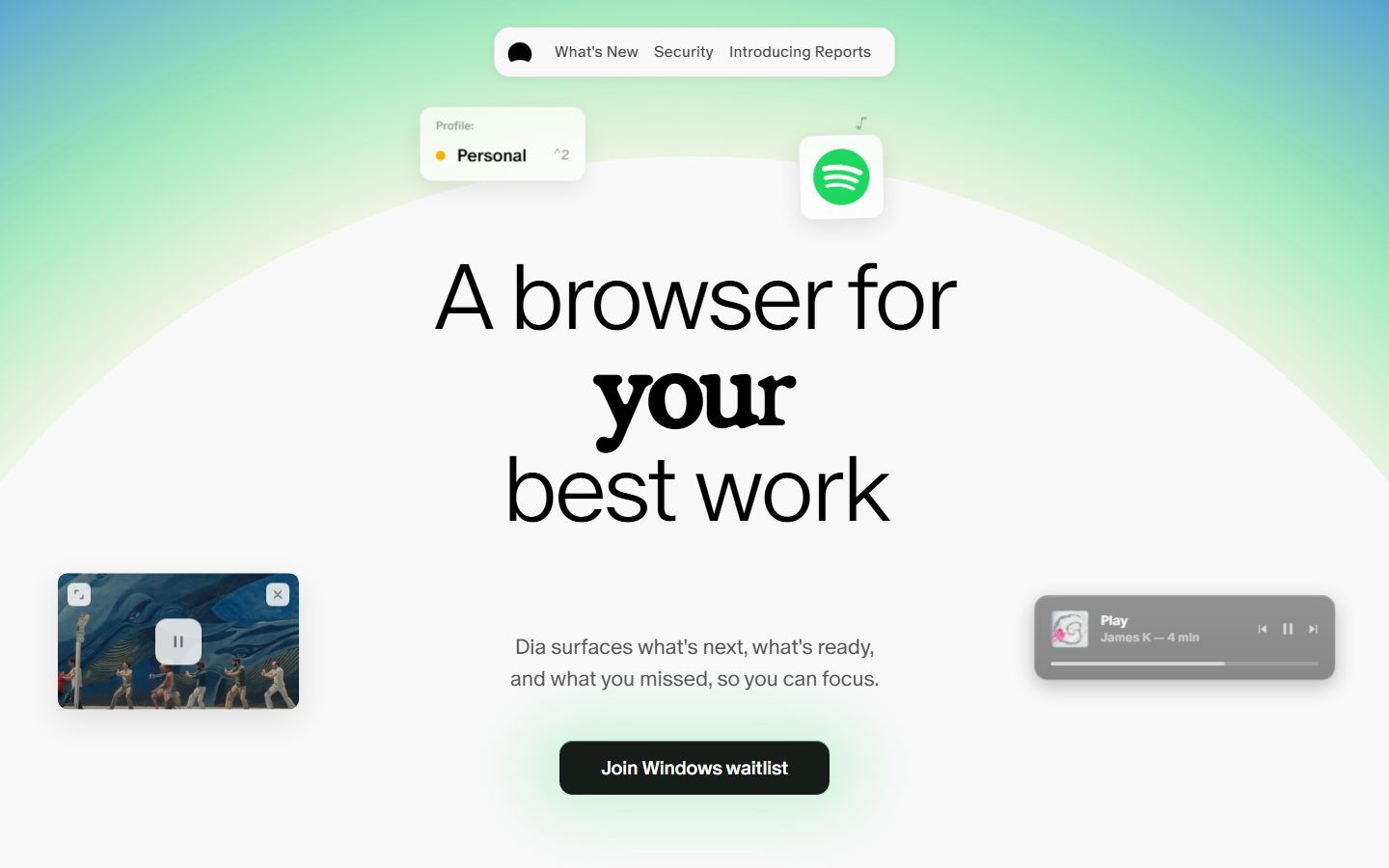
A soft, airy product-marketing page for the Dia browser built on a near-white canvas (#f8f8f8) with a watercolor green-to-blue aurora gradient behind a giant ultra-light display headline. The personality is calm and editorial — a thin 96px sans display headline punctuated by a single bold serif accent word ("your"), monochrome black UI chrome, and floating fully-rounded glass cards (profile chip, app-icon tile, picture-in-picture preview, media player) that demo the product as ambient artifacts rather than illustrations. Color is reserved almost entirely for product UI fragments; the layout itself stays grayscale.
---
version: alpha
name: Dia-Browser-design-analysis
description: A soft, airy product-marketing page for the Dia browser built on a near-white canvas (#f8f8f8) with a watercolor green-to-blue aurora gradient behind a giant ultra-light display headline. The personality is calm and editorial — a thin 96px sans display headline punctuated by a single bold serif accent word ("your"), monochrome black UI chrome, and floating fully-rounded glass cards (profile chip, app-icon tile, picture-in-picture preview, media player) that demo the product as ambient artifacts rather than illustrations. Color is reserved almost entirely for product UI fragments; the layout itself stays grayscale.

colors:
  primary: "#000000"
  ink: "#000000"
  on-primary: "#ffffff"
  on-dark: "#ffffff"
  canvas: "#f8f8f8"
  surface: "#ffffff"
  neutral-200: "#ebebeb"
  neutral-300: "#dddddd"
  neutral-350: "#d9d9d9"
  muted: "#929292"
  accent-lime: "#f2fcb3"
  accent-yellow: "#ffdc5c"
  accent-amber: "#ffb005"
  accent-gold: "#ffd400"
  accent-red: "#fa3d1d"
  accent-blue: "#0358f7"
  accent-sky: "#96d0ff"
  accent-steel: "#5092c7"
  accent-lavender: "#e1e1fe"
  accent-purple: "#c679c4"
  accent-magenta: "#fd02f5"
  accent-peach: "#ffada0"
  accent-brown: "#340b05"

typography:
  display-hero:
    fontFamily: "ABC Oracle, Inter, sans-serif"
    fontSize: 96px
    fontWeight: 300
    lineHeight: 1.05
    letterSpacing: -3.84px
  display-serif:
    fontFamily: "Exposure VAR, Fraunces, serif"
    fontSize: 48px
    fontWeight: 650
    lineHeight: 1.167
    letterSpacing: -2.4px
  body:
    fontFamily: "ABC Oracle, Inter, sans-serif"
    fontSize: 18px
    fontWeight: 400
    lineHeight: 1.5
    letterSpacing: -0.36px
  button:
    fontFamily: "ABC Oracle, Inter, sans-serif"
    fontSize: 10px
    fontWeight: 400
    lineHeight: 1.5
    letterSpacing: 0

rounded:
  xxs: 5px
  xs: 6px
  sm: 10px
  md: 12px
  lg: 14px
  xl: 16px
  xxl: 20px
  xxxl: 24px
  full: 9999px

spacing:
  xxs: 5px
  xs: 10px
  sm: 14px
  md: 16px
  lg: 20px
  xl: 30px
  xxl: 40px
  section: 70px
  section-lg: 80px
  section-xl: 90px

components:
  button-primary:
    backgroundColor: "{colors.primary}"
    textColor: "{colors.on-primary}"
    typography: "{typography.button}"
    rounded: "{rounded.lg}"
    padding: 20px 30px
  card:
    backgroundColor: "{colors.canvas}"
    textColor: "{colors.ink}"
    rounded: "{rounded.full}"
  top-nav-pill:
    backgroundColor: "{colors.surface}"
    textColor: "{colors.ink}"
    typography: "{typography.body}"
    rounded: "{rounded.full}"
    padding: 14px 20px
  floating-chip:
    backgroundColor: "{colors.surface}"
    textColor: "{colors.ink}"
    typography: "{typography.body}"
    rounded: "{rounded.xl}"
    padding: 14px 16px
  app-icon-tile:
    backgroundColor: "{colors.surface}"
    textColor: "{colors.ink}"
    rounded: "{rounded.xl}"
    padding: 12px
  pip-card:
    backgroundColor: "{colors.surface}"
    textColor: "{colors.ink}"
    rounded: "{rounded.lg}"
  media-player-card:
    backgroundColor: "{colors.muted}"
    textColor: "{colors.on-dark}"
    typography: "{typography.body}"
    rounded: "{rounded.xl}"
    padding: 16px 20px
  hero-headline:
    backgroundColor: transparent
    textColor: "{colors.ink}"
    typography: "{typography.display-hero}"
  section-heading:
    backgroundColor: transparent
    textColor: "{colors.ink}"
    typography: "{typography.display-serif}"
---

## Overview

Dia Browser's landing page is a calm, editorial product surface built on a near-white canvas (`{colors.canvas}` — #f8f8f8) with a soft watercolor aurora — green fading to blue — bleeding in from the top edge behind the hero. The whole composition reads as airy and confident: a single oversized headline, a one-line subhead, one black CTA, and a handful of floating product cards that drift around the headline like ambient screenshots.

The type voice is the signature move. The hero headline ("A browser for **your** best work") runs in an ultra-light 96px sans (`{typography.display-hero}` — ABC Oracle weight 300 with aggressive -3.84px negative tracking), interrupted by one bold serif accent word ("your") set in **Exposure VAR** at weight 650. The contrast between hairline sans and chunky serif is the entire brand personality — quiet copy with a single loud gesture.

Color is almost entirely deferred to product UI. The layout chrome stays strictly grayscale (black ink, white surfaces, soft gray canvas), while the measured accent palette — lime, yellow, amber, red, blue, lavender, magenta — lives inside the floating product fragments: the green Spotify tile, the amber "Personal" profile dot, the colorful album art in the media player. The page itself never paints with these accents; they arrive only as content.

**Key Characteristics:**
- Near-white canvas (`{colors.canvas}` — #f8f8f8) under a soft green→blue aurora gradient at the top of the hero.
- Ultra-light 96px hero headline (`{typography.display-hero}`) with one bold serif accent word in `{typography.display-serif}` (Exposure VAR 650).
- Single black pill CTA (`{component.button-primary}`) — `{colors.primary}` (#000000) with white label and a faint green glow beneath it.
- Floating fully-rounded glass cards (`{rounded.full}` at 9999px is the single most frequent radius alongside 20px) that demo the product as ambient artifacts.
- Monochrome layout chrome; the full accent palette appears only inside product UI fragments.
- Soft, low-alpha drop shadows with bright inset top-highlights — a subtle glassy depth treatment, never heavy.

## Colors

### Brand & Ink
- **Primary / Ink** (`{colors.primary}` / `{colors.ink}` — #000000): The single dominant brand color. Used for the headline text, the subhead, nav labels, and the CTA fill. Dia is functionally a black-on-white brand.
- **On Primary / On Dark** (`{colors.on-primary}` / `{colors.on-dark}` — #ffffff): White label on the black CTA and on dark media-player cards.

### Surface & Neutral
- **Canvas** (`{colors.canvas}` — #f8f8f8): The page floor — a soft off-white that keeps the aurora gradient from feeling harsh.
- **Surface** (`{colors.surface}` — #ffffff): Floating chips, app-icon tiles, the nav pill, and PiP cards.
- **Neutral 200 / 300 / 350** (`{colors.neutral-200}` — #ebebeb, `{colors.neutral-300}` — #dddddd, `{colors.neutral-350}` — #d9d9d9): Hairline dividers, card edges, and inactive control fills.
- **Muted** (`{colors.muted}` — #929292): Secondary/tertiary text and the translucent gray of the media-player card.

### Accent (product-UI only)
The measured accent set appears exclusively inside product fragments, never on the page chrome:
- **Lime** (`{colors.accent-lime}` — #f2fcb3) and the green inset glow under the CTA.
- **Yellow / Amber / Gold** (`{colors.accent-yellow}` — #ffdc5c, `{colors.accent-amber}` — #ffb005, `{colors.accent-gold}` — #ffd400): The "Personal" profile dot and warm UI accents.
- **Red** (`{colors.accent-red}` — #fa3d1d).
- **Blue / Sky / Steel** (`{colors.accent-blue}` — #0358f7, `{colors.accent-sky}` — #96d0ff, `{colors.accent-steel}` — #5092c7): The aurora's blue edge and link/UI blues.
- **Lavender** (`{colors.accent-lavender}` — #e1e1fe), **Purple** (`{colors.accent-purple}` — #c679c4), **Magenta** (`{colors.accent-magenta}` — #fd02f5), **Peach** (`{colors.accent-peach}` — #ffada0): Low-frequency tones pulled from album art and product thumbnails.
- **Brown** (`{colors.accent-brown}` — #340b05): A dark accent observed in product imagery.

## Typography

### Font Family
The system runs two custom commercial typefaces: **ABC Oracle** (a clean neo-grotesque by Dinamo, used for the hero headline, body, and button labels) and **Exposure VAR** (a variable display serif, used for the single bold serif accent word and section headings). Neither was flagged as freely licensable; both are commercial faces that must be licensed to ship and are documented with open substitutes below.

The split is deliberate and minimal:
- ABC Oracle (weight 300 hero, 400 body/button) — the calm sans voice carrying nearly all text.
- Exposure VAR (weight 650) — the loud serif gesture, used for the accent word and section heads only.

### Hierarchy

| Token | Family | Size | Weight | Line Height | Letter Spacing | Use |
|---|---|---|---|---|---|---|
| `{typography.display-hero}` | ABC Oracle | 96px | 300 | 1.05 | -3.84px | The giant hero headline ("A browser for … best work") |
| `{typography.display-serif}` | Exposure VAR | 48px | 650 | 1.167 | -2.4px | The bold serif accent word ("your") and section headings (h2) |
| `{typography.body}` | ABC Oracle | 18px | 400 | 1.5 | -0.36px | Subhead copy, nav labels, section sub-headings (h3) |
| `{typography.button}` | ABC Oracle | 10px | 400 | 1.5 | 0 | Small button / micro-label text |

### Principles
The hero headline lives or dies on its weight contrast: a hairline 300-weight sans with extreme negative tracking, broken by one heavyweight serif word. Never normalize the two — the whole brand gesture is the collision of thin sans and thick serif. Keep negative letter-spacing on the display sizes; ABC Oracle at 96px without -3.84px tracking loses its tight, magazine-cover compression.

### Note on Font Substitutes
Neither typeface is openly licensable. For **ABC Oracle**, substitute **Inter** (or **Space Grotesk** for a touch more character) at matching weights — keep weight 300 for the hero so the hairline quality survives. For **Exposure VAR**, substitute **Fraunces** (its optical/weight axis approximates Exposure's display character) or **Playfair Display** at a heavy weight. Do not claim to ship ABC Oracle or Exposure VAR without a license.

## Layout

### Spacing System
- **Base rhythm:** clusters around a 5px grain — measured stops at `{spacing.xxs}` 5px · `{spacing.xs}` 10px · `{spacing.sm}` 14px · `{spacing.md}` 16px · `{spacing.lg}` 20px · `{spacing.xl}` 30px · `{spacing.xxl}` 40px.
- **Section rhythm:** `{spacing.section}` 70px, `{spacing.section-lg}` 80px, and `{spacing.section-xl}` 90px are the larger vertical gaps between bands.
- **Most frequent steps:** 16px and 14px dominate component padding; 5px appears constantly as fine internal grain.

### Grid & Container
- The hero is a centered single-column composition: headline + subhead + CTA stacked on the vertical axis, with floating cards absolutely positioned in the left/right margins.
- Lower bands (per the long-scroll screenshot) align to a left-edge column with small serif/sans sub-heads — an editorial, left-aligned list rhythm rather than a card grid.

### Whitespace Philosophy
Dia leans into emptiness. The hero reserves enormous vertical breathing room around the 96px headline, and the long page below uses sparse, widely-spaced text blocks. Whitespace is the primary compositional tool — the floating product cards punctuate the void rather than filling it.

## Elevation & Depth

The system uses soft, glassy, low-alpha shadows with bright inset top-highlights — never heavy drop shadows.

| Level | Treatment (measured) | Use |
|---|---|---|
| Flat | No shadow | Canvas, headline text |
| Soft card | `rgba(0,0,0,0.06) 0px 2px 8px` + `rgba(0,0,0,0.04) 0px 0px 2px` | Resting chips and tiles |
| Floating card | `rgba(0,0,0,0.08) 0px 8px 22px` with `rgba(255,255,255,0.6) 0px 1px 0px inset` | Profile chip, app-icon tile, PiP preview |
| Lifted card | `rgba(0,0,0,0.1) 0px 6px 22px` / `0px 11px 33px` with white inset highlight | More prominent floating cards |
| Dark card | `rgba(0,0,0,0.25) 0px 6px 20px` with `rgba(255,255,255,0.15) 0px 1px 0px inset` | The translucent gray media-player card |
| Accent glow | `color(srgb 0.62 0.92 0.73 / 0.55) 0px 1px 0px inset` | The green glow under/around the CTA |

The consistent signature is the **white inset top-highlight** (`rgba(255,255,255,0.6) 0px 1px 0px inset`) that gives every floating card a glassy, lit-from-above edge.

## Shapes

### Border Radius Scale

| Token | Value | Use |
|---|---|---|
| `{rounded.xxs}` | 5px | Smallest inner accents |
| `{rounded.xs}` | 6px | Small inline controls |
| `{rounded.sm}` | 10px | Minor tiles |
| `{rounded.md}` | 12px | Common card / control radius (15 occurrences) |
| `{rounded.lg}` | 14px | PiP preview cards |
| `{rounded.xl}` | 16px | App-icon tiles, floating chips |
| `{rounded.xxl}` | 20px | The dominant rounded-card radius (57 occurrences) |
| `{rounded.xxxl}` | 24px | Larger panels |
| `{rounded.full}` | 9999px | Nav pill, fully-rounded cards, profile dots (58 occurrences — co-dominant with 20px) |

The two radius poles that define the look are **20px** (soft rounded cards) and **9999px** (fully-rounded pills and the nav bar). Together they account for the overwhelming majority of measured corners — the system is either gently rounded or fully pill-shaped, rarely in between.

### Geometry
Floating product fragments retain their native chrome (the Spotify square tile, the PiP video thumbnail). The aurora gradient at the top of the hero is a soft radial bleed with no hard edge, dissolving into `{colors.canvas}`.

## Components

### Navigation

**`top-nav-pill`** — A floating, fully-rounded white nav bar centered at the top of the page. Background `{colors.surface}`, rounded `{rounded.full}`, carrying a small black chat-bubble glyph at the left and three text links ("What's New", "Security", "Introducing Reports") in `{typography.body}` ink. It does not span the page width — it sits as an isolated pill above the hero.

### Buttons

**`button-primary`** — The single CTA ("Join Windows waitlist"). Background `{colors.primary}` (#000000), label `{colors.on-primary}` in `{typography.button}`, rounded `{rounded.lg}` (derived from the screenshot's softly-rounded corners — the measured button radius reported 0px, see Known Gaps), padding ~20px × 30px (derived). A faint green inset glow (the accent-glow shadow) blooms beneath it.

### Cards & Floating Artifacts

**`card`** — The base measured card: background `{colors.canvas}` (#f8f8f8), rounded `{rounded.full}` (9999px), no shadow. The generic fully-rounded container used for pill-shaped surfaces.

**`floating-chip`** — A small white info chip (e.g., the "Profile: Personal" card with the amber dot). Background `{colors.surface}`, rounded `{rounded.xl}`, glassy floating-card shadow with white inset highlight. Holds a tiny label in `{colors.muted}` and a value in `{colors.ink}` (`{typography.body}`).

**`app-icon-tile`** — A small white rounded tile holding a single app icon (the green Spotify mark). Background `{colors.surface}`, rounded `{rounded.xl}`, padding `{spacing.md}`, floating shadow. The icon's color is the only chroma — the tile itself stays white.

**`pip-card`** — A picture-in-picture video preview card (the whale/painting thumbnail with pause + close controls). Background `{colors.surface}`, rounded `{rounded.lg}`, lifted floating shadow. The video content fills the card; small rounded control buttons overlay it.

**`media-player-card`** — A translucent dark media-player card ("Play — James K — 4 min" with transport controls and a progress bar). Background `{colors.muted}` (the measured gray that reads as a translucent dark glass), text `{colors.on-dark}`, rounded `{rounded.xl}`, dark-card shadow with subtle white inset highlight. Carries circular album art, a track label, and skip/pause/skip controls.

### Headlines

**`hero-headline`** — The 96px ultra-light display headline (`{typography.display-hero}`), ink-colored on transparent, with a single word swapped to `{component.section-heading}` styling for the bold serif accent.

**`section-heading`** — Section heads in `{typography.display-serif}` (Exposure VAR 650), ink on transparent. Also the styling applied to the hero's accent word "your".

## Do's and Don'ts

### Do
- Keep the layout chrome strictly monochrome — black ink, white surfaces, `{colors.canvas}` floor. Let color arrive only through product UI fragments.
- Preserve the weight collision in the hero: hairline `{typography.display-hero}` sans broken by one bold `{typography.display-serif}` word.
- Keep the aggressive negative letter-spacing on display type (-3.84px / -2.4px) — it is the magazine-cover compression that defines the voice.
- Use fully-rounded (`{rounded.full}`) pills for nav and 20px (`{rounded.xxl}`) for soft cards — the two-pole radius system.
- Float product cards as ambient artifacts in the margins; let whitespace carry the composition.
- Give floating cards the white inset top-highlight for the glassy, lit-from-above look.

### Don't
- Don't paint accent colors onto the page chrome, CTA, or headline — accents belong to product UI only.
- Don't add a third typeface or normalize the sans/serif weight contrast.
- Don't use heavy or dark drop shadows; keep elevation soft and low-alpha (≤ 0.1 black on light cards).
- Don't crowd the hero — the emptiness is the design.
- Don't add hover-state styling beyond default and pressed.

## Responsive Behavior

| Name | Width | Key Changes |
|---|---|---|
| Mobile | < 768px | Hero headline scales down sharply from 96px; floating margin cards stack near the hero or shrink; nav pill tightens; subhead and CTA remain centered |
| Tablet | 768–1024px | Floating cards pull closer to the centered column; headline scales between mobile and full size |
| Desktop | ≥ 1024px | Full 96px hero; floating cards occupy the left/right margins around the headline |

### Touch Targets
- `{component.button-primary}` is the primary tap target; padding (derived ~20×30px) keeps it comfortably above minimum.
- `{component.top-nav-pill}` links and the small floating-card controls (pause/close on the PiP card) are small — on mobile these need expanded hit areas; exact tap dimensions were not measured (see Known Gaps).

### Collapsing Strategy
- The single-column hero holds its vertical stack at every breakpoint; the floating cards are the main thing that repositions.
- The mobile screenshot shows the floating cards reduced in scale and pulled tight around the headline rather than spread into wide margins.

### Image Behavior
- Product fragments (Spotify tile, PiP video, album art) retain native aspect ratios and shrink with the card.
- The aurora gradient continues to bleed from the top edge and dissolve into the canvas at all sizes.

## Iteration Guide

1. Focus on ONE component at a time and reference its YAML key directly (`{component.media-player-card}`, `{component.floating-chip}`).
2. Variants (`-active`, `-pressed`) belong as separate entries in `components:`.
3. Use `{token.refs}` everywhere — never inline a hex into a component.
4. Document default and pressed states only — never hover.
5. Keep the type duo intact: ABC Oracle sans + Exposure VAR serif, with the weight collision preserved.
6. Treat color as product-only voltage; the page stays grayscale.
7. When choosing radii, default to `{rounded.xxl}` (20px) for cards and `{rounded.full}` for pills — the two measured poles.

## Known Gaps

- The measured `button-primary` returned `radius: 0px` and `padding: 0px` — this almost certainly captured an inner text/anchor element, not the visible black pill. The CTA's rounded corners and padding are documented as **derived** from the screenshot; exact values need re-measurement on the rendered button.
- The hero "body" role was measured at 96px weight 300 — this is the display headline, not running body copy. The smaller subhead paragraph's exact size/weight was not separately captured; `{typography.body}` (18px, the h3 measurement) is the closest measured small-text token.
- Only the landing page was captured; the lower-scroll sections ("Start your day two steps ahead", "You focus, Dia suggests", "Find the answer without hunting it down") are visible in the long screenshot but their component specs, spacing, and any imagery were not measured.
- ABC Oracle and Exposure VAR are commercial typefaces; substitutes (Inter / Space Grotesk and Fraunces / Playfair Display) are documented and must be used unless the originals are licensed.
- The aurora gradient (green→blue) and the green CTA glow are visible but their exact color stops/angles were not extracted as tokens — only individual accent hexes (lime, sky, blue) were measured.
- The media-player card reads as translucent dark glass; it is documented with `{colors.muted}` (#929292, the nearest measured gray) — the true background may be a semi-transparent layer not captured as a solid token.
- Touch-target dimensions, breakpoint values, and animation/transition timings were not measured and are inferred from the desktop + mobile screenshots.

<!-- Documented by duply · real-world design systems as ready-to-use DESIGN.md for AI coding agents · https://duply.ai/diabrowser/design-md -->
Color Palette
Accent
Neutrals
Typography
display-hero96px · 300 · 1.05
The quick brown fox jumpsdisplay-serif48px · 650 · 1.167
The quick brown fox jumpsbody18px · 400 · 1.5
The quick brown fox jumpsbutton10px · 400 · 1.5
The quick brown fox jumpsSpacing & Shape
Spacing
| Name | Value | Preview |
|---|---|---|
| xxs | 5px | |
| xs | 10px | |
| sm | 14px | |
| md | 16px | |
| lg | 20px | |
| xl | 30px | |
| xxl | 40px | |
| section | 70px | |
| section-lg | 80px | |
| section-xl | 90px |
Border Radius
| Name | Value | Preview |
|---|---|---|
| xxs | 5px | |
| xs | 6px | |
| sm | 10px | |
| md | 12px | |
| lg | 14px | |
| xl | 16px | |
| xxl | 20px | |
| xxxl | 24px | |
| full | 9999px |
More like this


---
version: alpha
name: Dia-Browser-design-analysis
description: A soft, airy product-marketing page for the Dia browser built on a near-white canvas (#f8f8f8) with a watercolor green-to-blue aurora gradient behind a giant ultra-light display headline. The personality is calm and editorial — a thin 96px sans display headline punctuated by a single bold serif accent word ("your"), monochrome black UI chrome, and floating fully-rounded glass cards (profile chip, app-icon tile, picture-in-picture preview, media player) that demo the product as ambient artifacts rather than illustrations. Color is reserved almost entirely for product UI fragments; the layout itself stays grayscale.

colors:
  primary: "#000000"
  ink: "#000000"
  on-primary: "#ffffff"
  on-dark: "#ffffff"
  canvas: "#f8f8f8"
  surface: "#ffffff"
  neutral-200: "#ebebeb"
  neutral-300: "#dddddd"
  neutral-350: "#d9d9d9"
  muted: "#929292"
  accent-lime: "#f2fcb3"
  accent-yellow: "#ffdc5c"
  accent-amber: "#ffb005"
  accent-gold: "#ffd400"
  accent-red: "#fa3d1d"
  accent-blue: "#0358f7"
  accent-sky: "#96d0ff"
  accent-steel: "#5092c7"
  accent-lavender: "#e1e1fe"
  accent-purple: "#c679c4"
  accent-magenta: "#fd02f5"
  accent-peach: "#ffada0"
  accent-brown: "#340b05"

typography:
  display-hero:
    fontFamily: "ABC Oracle, Inter, sans-serif"
    fontSize: 96px
    fontWeight: 300
    lineHeight: 1.05
    letterSpacing: -3.84px
  display-serif:
    fontFamily: "Exposure VAR, Fraunces, serif"
    fontSize: 48px
    fontWeight: 650
    lineHeight: 1.167
    letterSpacing: -2.4px
  body:
    fontFamily: "ABC Oracle, Inter, sans-serif"
    fontSize: 18px
    fontWeight: 400
    lineHeight: 1.5
    letterSpacing: -0.36px
  button:
    fontFamily: "ABC Oracle, Inter, sans-serif"
    fontSize: 10px
    fontWeight: 400
    lineHeight: 1.5
    letterSpacing: 0

rounded:
  xxs: 5px
  xs: 6px
  sm: 10px
  md: 12px
  lg: 14px
  xl: 16px
  xxl: 20px
  xxxl: 24px
  full: 9999px

spacing:
  xxs: 5px
  xs: 10px
  sm: 14px
  md: 16px
  lg: 20px
  xl: 30px
  xxl: 40px
  section: 70px
  section-lg: 80px
  section-xl: 90px

components:
  button-primary:
    backgroundColor: "{colors.primary}"
    textColor: "{colors.on-primary}"
    typography: "{typography.button}"
    rounded: "{rounded.lg}"
    padding: 20px 30px
  card:
    backgroundColor: "{colors.canvas}"
    textColor: "{colors.ink}"
    rounded: "{rounded.full}"
  top-nav-pill:
    backgroundColor: "{colors.surface}"
    textColor: "{colors.ink}"
    typography: "{typography.body}"
    rounded: "{rounded.full}"
    padding: 14px 20px
  floating-chip:
    backgroundColor: "{colors.surface}"
    textColor: "{colors.ink}"
    typography: "{typography.body}"
    rounded: "{rounded.xl}"
    padding: 14px 16px
  app-icon-tile:
    backgroundColor: "{colors.surface}"
    textColor: "{colors.ink}"
    rounded: "{rounded.xl}"
    padding: 12px
  pip-card:
    backgroundColor: "{colors.surface}"
    textColor: "{colors.ink}"
    rounded: "{rounded.lg}"
  media-player-card:
    backgroundColor: "{colors.muted}"
    textColor: "{colors.on-dark}"
    typography: "{typography.body}"
    rounded: "{rounded.xl}"
    padding: 16px 20px
  hero-headline:
    backgroundColor: transparent
    textColor: "{colors.ink}"
    typography: "{typography.display-hero}"
  section-heading:
    backgroundColor: transparent
    textColor: "{colors.ink}"
    typography: "{typography.display-serif}"
---

## Overview

Dia Browser's landing page is a calm, editorial product surface built on a near-white canvas (`{colors.canvas}` — #f8f8f8) with a soft watercolor aurora — green fading to blue — bleeding in from the top edge behind the hero. The whole composition reads as airy and confident: a single oversized headline, a one-line subhead, one black CTA, and a handful of floating product cards that drift around the headline like ambient screenshots.

The type voice is the signature move. The hero headline ("A browser for **your** best work") runs in an ultra-light 96px sans (`{typography.display-hero}` — ABC Oracle weight 300 with aggressive -3.84px negative tracking), interrupted by one bold serif accent word ("your") set in **Exposure VAR** at weight 650. The contrast between hairline sans and chunky serif is the entire brand personality — quiet copy with a single loud gesture.

Color is almost entirely deferred to product UI. The layout chrome stays strictly grayscale (black ink, white surfaces, soft gray canvas), while the measured accent palette — lime, yellow, amber, red, blue, lavender, magenta — lives inside the floating product fragments: the green Spotify tile, the amber "Personal" profile dot, the colorful album art in the media player. The page itself never paints with these accents; they arrive only as content.

**Key Characteristics:**
- Near-white canvas (`{colors.canvas}` — #f8f8f8) under a soft green→blue aurora gradient at the top of the hero.
- Ultra-light 96px hero headline (`{typography.display-hero}`) with one bold serif accent word in `{typography.display-serif}` (Exposure VAR 650).
- Single black pill CTA (`{component.button-primary}`) — `{colors.primary}` (#000000) with white label and a faint green glow beneath it.
- Floating fully-rounded glass cards (`{rounded.full}` at 9999px is the single most frequent radius alongside 20px) that demo the product as ambient artifacts.
- Monochrome layout chrome; the full accent palette appears only inside product UI fragments.
- Soft, low-alpha drop shadows with bright inset top-highlights — a subtle glassy depth treatment, never heavy.

## Colors

### Brand & Ink
- **Primary / Ink** (`{colors.primary}` / `{colors.ink}` — #000000): The single dominant brand color. Used for the headline text, the subhead, nav labels, and the CTA fill. Dia is functionally a black-on-white brand.
- **On Primary / On Dark** (`{colors.on-primary}` / `{colors.on-dark}` — #ffffff): White label on the black CTA and on dark media-player cards.

### Surface & Neutral
- **Canvas** (`{colors.canvas}` — #f8f8f8): The page floor — a soft off-white that keeps the aurora gradient from feeling harsh.
- **Surface** (`{colors.surface}` — #ffffff): Floating chips, app-icon tiles, the nav pill, and PiP cards.
- **Neutral 200 / 300 / 350** (`{colors.neutral-200}` — #ebebeb, `{colors.neutral-300}` — #dddddd, `{colors.neutral-350}` — #d9d9d9): Hairline dividers, card edges, and inactive control fills.
- **Muted** (`{colors.muted}` — #929292): Secondary/tertiary text and the translucent gray of the media-player card.

### Accent (product-UI only)
The measured accent set appears exclusively inside product fragments, never on the page chrome:
- **Lime** (`{colors.accent-lime}` — #f2fcb3) and the green inset glow under the CTA.
- **Yellow / Amber / Gold** (`{colors.accent-yellow}` — #ffdc5c, `{colors.accent-amber}` — #ffb005, `{colors.accent-gold}` — #ffd400): The "Personal" profile dot and warm UI accents.
- **Red** (`{colors.accent-red}` — #fa3d1d).
- **Blue / Sky / Steel** (`{colors.accent-blue}` — #0358f7, `{colors.accent-sky}` — #96d0ff, `{colors.accent-steel}` — #5092c7): The aurora's blue edge and link/UI blues.
- **Lavender** (`{colors.accent-lavender}` — #e1e1fe), **Purple** (`{colors.accent-purple}` — #c679c4), **Magenta** (`{colors.accent-magenta}` — #fd02f5), **Peach** (`{colors.accent-peach}` — #ffada0): Low-frequency tones pulled from album art and product thumbnails.
- **Brown** (`{colors.accent-brown}` — #340b05): A dark accent observed in product imagery.

## Typography

### Font Family
The system runs two custom commercial typefaces: **ABC Oracle** (a clean neo-grotesque by Dinamo, used for the hero headline, body, and button labels) and **Exposure VAR** (a variable display serif, used for the single bold serif accent word and section headings). Neither was flagged as freely licensable; both are commercial faces that must be licensed to ship and are documented with open substitutes below.

The split is deliberate and minimal:
- ABC Oracle (weight 300 hero, 400 body/button) — the calm sans voice carrying nearly all text.
- Exposure VAR (weight 650) — the loud serif gesture, used for the accent word and section heads only.

### Hierarchy

| Token | Family | Size | Weight | Line Height | Letter Spacing | Use |
|---|---|---|---|---|---|---|
| `{typography.display-hero}` | ABC Oracle | 96px | 300 | 1.05 | -3.84px | The giant hero headline ("A browser for … best work") |
| `{typography.display-serif}` | Exposure VAR | 48px | 650 | 1.167 | -2.4px | The bold serif accent word ("your") and section headings (h2) |
| `{typography.body}` | ABC Oracle | 18px | 400 | 1.5 | -0.36px | Subhead copy, nav labels, section sub-headings (h3) |
| `{typography.button}` | ABC Oracle | 10px | 400 | 1.5 | 0 | Small button / micro-label text |

### Principles
The hero headline lives or dies on its weight contrast: a hairline 300-weight sans with extreme negative tracking, broken by one heavyweight serif word. Never normalize the two — the whole brand gesture is the collision of thin sans and thick serif. Keep negative letter-spacing on the display sizes; ABC Oracle at 96px without -3.84px tracking loses its tight, magazine-cover compression.

### Note on Font Substitutes
Neither typeface is openly licensable. For **ABC Oracle**, substitute **Inter** (or **Space Grotesk** for a touch more character) at matching weights — keep weight 300 for the hero so the hairline quality survives. For **Exposure VAR**, substitute **Fraunces** (its optical/weight axis approximates Exposure's display character) or **Playfair Display** at a heavy weight. Do not claim to ship ABC Oracle or Exposure VAR without a license.

## Layout

### Spacing System
- **Base rhythm:** clusters around a 5px grain — measured stops at `{spacing.xxs}` 5px · `{spacing.xs}` 10px · `{spacing.sm}` 14px · `{spacing.md}` 16px · `{spacing.lg}` 20px · `{spacing.xl}` 30px · `{spacing.xxl}` 40px.
- **Section rhythm:** `{spacing.section}` 70px, `{spacing.section-lg}` 80px, and `{spacing.section-xl}` 90px are the larger vertical gaps between bands.
- **Most frequent steps:** 16px and 14px dominate component padding; 5px appears constantly as fine internal grain.

### Grid & Container
- The hero is a centered single-column composition: headline + subhead + CTA stacked on the vertical axis, with floating cards absolutely positioned in the left/right margins.
- Lower bands (per the long-scroll screenshot) align to a left-edge column with small serif/sans sub-heads — an editorial, left-aligned list rhythm rather than a card grid.

### Whitespace Philosophy
Dia leans into emptiness. The hero reserves enormous vertical breathing room around the 96px headline, and the long page below uses sparse, widely-spaced text blocks. Whitespace is the primary compositional tool — the floating product cards punctuate the void rather than filling it.

## Elevation & Depth

The system uses soft, glassy, low-alpha shadows with bright inset top-highlights — never heavy drop shadows.

| Level | Treatment (measured) | Use |
|---|---|---|
| Flat | No shadow | Canvas, headline text |
| Soft card | `rgba(0,0,0,0.06) 0px 2px 8px` + `rgba(0,0,0,0.04) 0px 0px 2px` | Resting chips and tiles |
| Floating card | `rgba(0,0,0,0.08) 0px 8px 22px` with `rgba(255,255,255,0.6) 0px 1px 0px inset` | Profile chip, app-icon tile, PiP preview |
| Lifted card | `rgba(0,0,0,0.1) 0px 6px 22px` / `0px 11px 33px` with white inset highlight | More prominent floating cards |
| Dark card | `rgba(0,0,0,0.25) 0px 6px 20px` with `rgba(255,255,255,0.15) 0px 1px 0px inset` | The translucent gray media-player card |
| Accent glow | `color(srgb 0.62 0.92 0.73 / 0.55) 0px 1px 0px inset` | The green glow under/around the CTA |

The consistent signature is the **white inset top-highlight** (`rgba(255,255,255,0.6) 0px 1px 0px inset`) that gives every floating card a glassy, lit-from-above edge.

## Shapes

### Border Radius Scale

| Token | Value | Use |
|---|---|---|
| `{rounded.xxs}` | 5px | Smallest inner accents |
| `{rounded.xs}` | 6px | Small inline controls |
| `{rounded.sm}` | 10px | Minor tiles |
| `{rounded.md}` | 12px | Common card / control radius (15 occurrences) |
| `{rounded.lg}` | 14px | PiP preview cards |
| `{rounded.xl}` | 16px | App-icon tiles, floating chips |
| `{rounded.xxl}` | 20px | The dominant rounded-card radius (57 occurrences) |
| `{rounded.xxxl}` | 24px | Larger panels |
| `{rounded.full}` | 9999px | Nav pill, fully-rounded cards, profile dots (58 occurrences — co-dominant with 20px) |

The two radius poles that define the look are **20px** (soft rounded cards) and **9999px** (fully-rounded pills and the nav bar). Together they account for the overwhelming majority of measured corners — the system is either gently rounded or fully pill-shaped, rarely in between.

### Geometry
Floating product fragments retain their native chrome (the Spotify square tile, the PiP video thumbnail). The aurora gradient at the top of the hero is a soft radial bleed with no hard edge, dissolving into `{colors.canvas}`.

## Components

### Navigation

**`top-nav-pill`** — A floating, fully-rounded white nav bar centered at the top of the page. Background `{colors.surface}`, rounded `{rounded.full}`, carrying a small black chat-bubble glyph at the left and three text links ("What's New", "Security", "Introducing Reports") in `{typography.body}` ink. It does not span the page width — it sits as an isolated pill above the hero.

### Buttons

**`button-primary`** — The single CTA ("Join Windows waitlist"). Background `{colors.primary}` (#000000), label `{colors.on-primary}` in `{typography.button}`, rounded `{rounded.lg}` (derived from the screenshot's softly-rounded corners — the measured button radius reported 0px, see Known Gaps), padding ~20px × 30px (derived). A faint green inset glow (the accent-glow shadow) blooms beneath it.

### Cards & Floating Artifacts

**`card`** — The base measured card: background `{colors.canvas}` (#f8f8f8), rounded `{rounded.full}` (9999px), no shadow. The generic fully-rounded container used for pill-shaped surfaces.

**`floating-chip`** — A small white info chip (e.g., the "Profile: Personal" card with the amber dot). Background `{colors.surface}`, rounded `{rounded.xl}`, glassy floating-card shadow with white inset highlight. Holds a tiny label in `{colors.muted}` and a value in `{colors.ink}` (`{typography.body}`).

**`app-icon-tile`** — A small white rounded tile holding a single app icon (the green Spotify mark). Background `{colors.surface}`, rounded `{rounded.xl}`, padding `{spacing.md}`, floating shadow. The icon's color is the only chroma — the tile itself stays white.

**`pip-card`** — A picture-in-picture video preview card (the whale/painting thumbnail with pause + close controls). Background `{colors.surface}`, rounded `{rounded.lg}`, lifted floating shadow. The video content fills the card; small rounded control buttons overlay it.

**`media-player-card`** — A translucent dark media-player card ("Play — James K — 4 min" with transport controls and a progress bar). Background `{colors.muted}` (the measured gray that reads as a translucent dark glass), text `{colors.on-dark}`, rounded `{rounded.xl}`, dark-card shadow with subtle white inset highlight. Carries circular album art, a track label, and skip/pause/skip controls.

### Headlines

**`hero-headline`** — The 96px ultra-light display headline (`{typography.display-hero}`), ink-colored on transparent, with a single word swapped to `{component.section-heading}` styling for the bold serif accent.

**`section-heading`** — Section heads in `{typography.display-serif}` (Exposure VAR 650), ink on transparent. Also the styling applied to the hero's accent word "your".

## Do's and Don'ts

### Do
- Keep the layout chrome strictly monochrome — black ink, white surfaces, `{colors.canvas}` floor. Let color arrive only through product UI fragments.
- Preserve the weight collision in the hero: hairline `{typography.display-hero}` sans broken by one bold `{typography.display-serif}` word.
- Keep the aggressive negative letter-spacing on display type (-3.84px / -2.4px) — it is the magazine-cover compression that defines the voice.
- Use fully-rounded (`{rounded.full}`) pills for nav and 20px (`{rounded.xxl}`) for soft cards — the two-pole radius system.
- Float product cards as ambient artifacts in the margins; let whitespace carry the composition.
- Give floating cards the white inset top-highlight for the glassy, lit-from-above look.

### Don't
- Don't paint accent colors onto the page chrome, CTA, or headline — accents belong to product UI only.
- Don't add a third typeface or normalize the sans/serif weight contrast.
- Don't use heavy or dark drop shadows; keep elevation soft and low-alpha (≤ 0.1 black on light cards).
- Don't crowd the hero — the emptiness is the design.
- Don't add hover-state styling beyond default and pressed.

## Responsive Behavior

| Name | Width | Key Changes |
|---|---|---|
| Mobile | < 768px | Hero headline scales down sharply from 96px; floating margin cards stack near the hero or shrink; nav pill tightens; subhead and CTA remain centered |
| Tablet | 768–1024px | Floating cards pull closer to the centered column; headline scales between mobile and full size |
| Desktop | ≥ 1024px | Full 96px hero; floating cards occupy the left/right margins around the headline |

### Touch Targets
- `{component.button-primary}` is the primary tap target; padding (derived ~20×30px) keeps it comfortably above minimum.
- `{component.top-nav-pill}` links and the small floating-card controls (pause/close on the PiP card) are small — on mobile these need expanded hit areas; exact tap dimensions were not measured (see Known Gaps).

### Collapsing Strategy
- The single-column hero holds its vertical stack at every breakpoint; the floating cards are the main thing that repositions.
- The mobile screenshot shows the floating cards reduced in scale and pulled tight around the headline rather than spread into wide margins.

### Image Behavior
- Product fragments (Spotify tile, PiP video, album art) retain native aspect ratios and shrink with the card.
- The aurora gradient continues to bleed from the top edge and dissolve into the canvas at all sizes.

## Iteration Guide

1. Focus on ONE component at a time and reference its YAML key directly (`{component.media-player-card}`, `{component.floating-chip}`).
2. Variants (`-active`, `-pressed`) belong as separate entries in `components:`.
3. Use `{token.refs}` everywhere — never inline a hex into a component.
4. Document default and pressed states only — never hover.
5. Keep the type duo intact: ABC Oracle sans + Exposure VAR serif, with the weight collision preserved.
6. Treat color as product-only voltage; the page stays grayscale.
7. When choosing radii, default to `{rounded.xxl}` (20px) for cards and `{rounded.full}` for pills — the two measured poles.

## Known Gaps

- The measured `button-primary` returned `radius: 0px` and `padding: 0px` — this almost certainly captured an inner text/anchor element, not the visible black pill. The CTA's rounded corners and padding are documented as **derived** from the screenshot; exact values need re-measurement on the rendered button.
- The hero "body" role was measured at 96px weight 300 — this is the display headline, not running body copy. The smaller subhead paragraph's exact size/weight was not separately captured; `{typography.body}` (18px, the h3 measurement) is the closest measured small-text token.
- Only the landing page was captured; the lower-scroll sections ("Start your day two steps ahead", "You focus, Dia suggests", "Find the answer without hunting it down") are visible in the long screenshot but their component specs, spacing, and any imagery were not measured.
- ABC Oracle and Exposure VAR are commercial typefaces; substitutes (Inter / Space Grotesk and Fraunces / Playfair Display) are documented and must be used unless the originals are licensed.
- The aurora gradient (green→blue) and the green CTA glow are visible but their exact color stops/angles were not extracted as tokens — only individual accent hexes (lime, sky, blue) were measured.
- The media-player card reads as translucent dark glass; it is documented with `{colors.muted}` (#929292, the nearest measured gray) — the true background may be a semi-transparent layer not captured as a solid token.
- Touch-target dimensions, breakpoint values, and animation/transition timings were not measured and are inferred from the desktop + mobile screenshots.

<!-- Documented by duply · real-world design systems as ready-to-use DESIGN.md for AI coding agents · https://duply.ai/diabrowser/design-md -->