Definite
A dark, engineering-grade AI-analytics product surface anchored on a near-black
---
version: alpha
name: Definite-design-analysis
description: A dark, engineering-grade AI-analytics product surface anchored on a near-black #111111 canvas with high-contrast off-white headlines in Inter Tight, electric-blue (#0a99ff) accents, and a signature inset-hairline card shadow. The system reads as a precise data tool — dense product-UI fragments (filter sidebars, KPI grids, SQL tables) shown directly inside rounded dark cards, generous negative letter-spacing on oversized display type, and blue glow used sparingly to mark live/active state.
colors:
accent: "#0a99ff"
accent-deep: "#2563eb"
ink: "#f5f5f5"
body: "#b4b4b4"
muted: "#7a7a7a"
muted-soft: "#6e6e6e"
slate: "#6b7280"
neutral-light: "#cacaca"
neutral-pale: "#b8b8b8"
on-dark: "#ffffff"
canvas: "#111111"
surface: "#1a1a1a"
surface-soft: "#141414"
surface-deep: "#0a0a0a"
surface-raised: "#1f1f1f"
hairline: "#333333"
hairline-soft: "#3d3d3d"
border-strong: "#4f4f4f"
ink-deep: "#111827"
pure-black: "#000000"
typography:
display:
fontFamily: "Inter Tight, sans-serif"
fontSize: 96px
fontWeight: 500
lineHeight: 1.05
letterSpacing: -1.92px
heading:
fontFamily: "Inter Tight, sans-serif"
fontSize: 52px
fontWeight: 500
lineHeight: 1.05
letterSpacing: -1.3px
body:
fontFamily: "Inter Tight, sans-serif"
fontSize: 18px
fontWeight: 400
lineHeight: 1.55
letterSpacing: 0
button:
fontFamily: "Inter Tight, sans-serif"
fontSize: 16px
fontWeight: 400
lineHeight: 1.5
letterSpacing: 0
caption:
fontFamily: "Inter Tight, sans-serif"
fontSize: 14px
fontWeight: 400
lineHeight: 1.5
letterSpacing: 0
rounded:
xs: 2px
sm: 4px
md: 6px
lg: 8px
xl: 10px
xxl: 16px
pill: 999px
spacing:
xxs: 4px
xs: 6px
sm: 8px
md: 10px
lg: 12px
xl: 16px
xxl: 24px
section: 32px
components:
top-nav:
backgroundColor: "{colors.canvas}"
textColor: "{colors.body}"
typography: "{typography.button}"
height: 60px
button-primary:
backgroundColor: "{colors.on-dark}"
textColor: "{colors.canvas}"
typography: "{typography.button}"
rounded: "{rounded.pill}"
padding: 8px 16px
button-secondary:
backgroundColor: "{colors.surface-raised}"
textColor: "{colors.ink}"
typography: "{typography.button}"
rounded: "{rounded.pill}"
padding: 8px 16px
button-ghost:
backgroundColor: transparent
textColor: "{colors.muted}"
typography: "{typography.button}"
rounded: "{rounded.pill}"
padding: 8px 16px
nav-cta:
backgroundColor: "{colors.surface-raised}"
textColor: "{colors.ink}"
typography: "{typography.button}"
rounded: "{rounded.pill}"
padding: 8px 16px
text-link:
backgroundColor: transparent
textColor: "{colors.accent}"
typography: "{typography.body}"
eyebrow-label:
backgroundColor: transparent
textColor: "{colors.muted}"
typography: "{typography.caption}"
letterSpacing: 0
card:
backgroundColor: "{colors.surface}"
textColor: "{colors.body}"
typography: "{typography.body}"
rounded: "{rounded.xxl}"
padding: 24px
feature-card:
backgroundColor: "{colors.surface-soft}"
textColor: "{colors.body}"
typography: "{typography.body}"
rounded: "{rounded.xxl}"
padding: 24px
product-mockup-card:
backgroundColor: "{colors.surface-deep}"
textColor: "{colors.body}"
rounded: "{rounded.xxl}"
padding: 16px
dashboard-panel:
backgroundColor: "{colors.surface}"
textColor: "{colors.body}"
rounded: "{rounded.xl}"
padding: 16px
integration-tile:
backgroundColor: "{colors.on-dark}"
textColor: "{colors.canvas}"
rounded: "{rounded.xxl}"
size: 56px
filter-sidebar-item:
backgroundColor: transparent
textColor: "{colors.body}"
typography: "{typography.caption}"
rounded: "{rounded.md}"
padding: 6px 10px
filter-sidebar-item-active:
backgroundColor: "{colors.surface-raised}"
textColor: "{colors.ink}"
typography: "{typography.caption}"
rounded: "{rounded.md}"
padding: 6px 10px
badge-count:
backgroundColor: "{colors.accent}"
textColor: "{colors.on-dark}"
typography: "{typography.caption}"
rounded: "{rounded.pill}"
padding: 2px 8px
theme-toggle:
backgroundColor: "{colors.surface-raised}"
textColor: "{colors.body}"
typography: "{typography.caption}"
rounded: "{rounded.pill}"
padding: 4px 8px
testimonial-block:
backgroundColor: "{colors.canvas}"
textColor: "{colors.ink}"
typography: "{typography.heading}"
footer:
backgroundColor: "{colors.canvas}"
textColor: "{colors.muted}"
typography: "{typography.caption}"
padding: 32px
---
## Overview
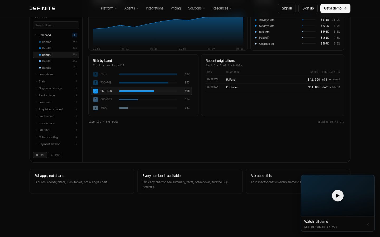
Definite's marketing surface is a dark, engineering-grade product interface built on a near-black canvas (`{colors.canvas}` — #111111) with high-contrast off-white headlines (`{colors.ink}` — #f5f5f5) and a single electric-blue accent (`{colors.accent}` — #0a99ff). The system reads as a serious data tool: it doesn't illustrate the product, it shows the product — filter sidebars, KPI rows, risk-band bar charts, and live SQL tables rendered at small scale inside rounded dark cards.
Type voice is a single family — **Inter Tight** — pushed to extremes. The hero h1 lands at a massive 96px with deeply negative letter-spacing (-1.92px), and headings stay at weight 500 (never heavier), giving the display type a tight, precise, slightly condensed character. Body copy drops to a calm `{colors.body}` (#b4b4b4) at 18px, leaving the off-white reserved for headlines and key numbers.
The brand voltage comes from two places: the **electric-blue glow** (`{colors.accent}` — #0a99ff) used to mark live/active/focused elements (charts, the "LIVE" pill, selected rows), and the **signature inset-hairline card shadow** — `rgba(0,0,0,0.4) 0 4px 14px` paired with a `rgba(255,255,255,0.04) 0 0 0 1px inset` rim that gives every dark card a faint top-edge highlight against the near-black floor.
**Key Characteristics:**
- Near-black canvas (`{colors.canvas}` — #111111) layered with a tight family of dark surfaces — `{colors.surface}` (#1a1a1a), `{colors.surface-soft}` (#141414), `{colors.surface-deep}` (#0a0a0a), `{colors.surface-raised}` (#1f1f1f) — that separate panels by subtle value shifts rather than borders.
- Inter Tight everywhere, weight 400–500, with aggressive negative tracking on display sizes (-1.92px / -1.3px). No second typeface.
- Single electric-blue accent (`{colors.accent}` — #0a99ff) used for links, active states, and glow — never spread across the action layer.
- Signature inset-hairline card shadow (frequency 102) gives dark cards a thin lit top edge — the system's primary depth cue.
- Product-UI fragments shown directly inside cards — dashboards, sidebars, SQL result tables, integration grids rendered at scale rather than illustrated.
- White integration tiles (`{colors.on-dark}` — #ffffff) form the only large bright surfaces — logo tiles pop against the dark canvas.
- Radius is dominated by `{rounded.xxl}` (16px, frequency 111) for cards and `{rounded.pill}` (999px, frequency 71) for buttons and badges.
- Muted button labels — measured button text is `{colors.muted}` (#7a7a7a), a deliberately low-key control voice consistent with the tool's restrained aesthetic.
## Colors
### Accent
- **Accent** (`{colors.accent}` — #0a99ff): The single brand accent. Inline links, active sidebar/chart state, the "LIVE" pill, and all glow shadows derive from this blue. Used sparingly — it marks "this is live/selected", not "click me".
- **Accent Deep** (`{colors.accent-deep}` — #2563eb): A deeper blue appearing in product-chart fills and gradient washes inside dashboard fragments. Secondary to the bright accent.
### Surface
- **Canvas** (`{colors.canvas}` — #111111): The page floor for the whole site.
- **Surface** (`{colors.surface}` — #1a1a1a): Standard card and panel background.
- **Surface Soft** (`{colors.surface-soft}` — #141414): A slightly deeper panel tone for nested feature cards.
- **Surface Deep** (`{colors.surface-deep}` — #0a0a0a): The darkest surface — product-mockup containers and recessed dashboard frames.
- **Surface Raised** (`{colors.surface-raised}` — #1f1f1f): The lightest dark tone — raised buttons, active sidebar items, toggles.
- **On Dark** (`{colors.on-dark}` — #ffffff): Pure white — used for integration logo tiles and the light primary CTA fill.
### Borders & Hairlines
- **Hairline** (`{colors.hairline}` — #333333): 1px dividers and panel outlines.
- **Hairline Soft** (`{colors.hairline-soft}` — #3d3d3d): Fainter internal dividers.
- **Border Strong** (`{colors.border-strong}` — #4f4f4f): Higher-contrast borders on interactive chrome.
### Text
- **Ink** (`{colors.ink}` — #f5f5f5): Headlines and key numbers — never pure white, slightly warmed off-white.
- **Body** (`{colors.body}` — #b4b4b4): Default running text.
- **Neutral Light / Pale** (`{colors.neutral-light}` — #cacaca / `{colors.neutral-pale}` — #b8b8b8): Slightly brighter secondary text inside dense data tables.
- **Muted** (`{colors.muted}` — #7a7a7a): Button labels, tertiary captions, eyebrow labels.
- **Muted Soft** (`{colors.muted-soft}` — #6e6e6e): Fine-print and inactive states.
- **Slate** (`{colors.slate}` — #6b7280): A cool-gray used inside product-UI fragments for secondary metadata.
- **Pure Black** (`{colors.pure-black}` — #000000): Recessed wells and the darkest gradient stops.
- **Ink Deep** (`{colors.ink-deep}` — #111827): A near-black blue-tinted surface inside product chrome.
The system has no documented success/warning/error semantic palette in the captured pages — see Known Gaps.
## Typography
### Font Family
The entire system runs **Inter Tight** — a tighter, more condensed cut of Inter — across display, headings, body, and UI. No second family was measured. Inter Tight is open-source (Google Fonts / SIL Open Font License) and can ship directly; `fonts_licensed` is empty, so no substitution is required. A safe fallback stack is `Inter Tight, Inter, -apple-system, sans-serif`.
The voice is built on weight restraint and negative tracking: headlines stay at weight 500 (never 600/700) and lean on size + tight letter-spacing for impact rather than bold weight.
### Hierarchy
| Token | Size | Weight | Line Height | Letter Spacing | Use |
|---|---|---|---|---|---|
| `{typography.display}` | 96px | 500 | 1.05 | -1.92px | Hero h1 ("From zero to AI analytics this afternoon.") |
| `{typography.heading}` | 52px | 500 | 1.05 | -1.3px | Section heads ("Plug in everything.", "Ask a question.") |
| `{typography.body}` | 18px | 400 | 1.55 | 0 | Default running text, sub-headlines |
| `{typography.button}` | 16px | 400 | 1.5 | 0 | Button + nav-link labels |
| `{typography.caption}` | 14px | 400 | 1.5 | 0 | Captions, eyebrow labels, sidebar items — derived from observed small UI text; the 14px step was not directly captured by the type probe but is the consistent small-text size in product chrome (derived) |
### Principles
Display type is large, tight, and mid-weight. The negative letter-spacing (-1.92px at 96px, scaling down to -1.3px at 52px) is core to the voice — Inter Tight without negative tracking reads as generic. Headlines occasionally mix an italic phrase ("this afternoon.", "everything.") within the same weight to add editorial cadence — the italic is a styling choice, not a separate token.
Never push headings past weight 500. The restraint is the brand signal — this is a tool that trusts its numbers, not a startup shouting.
### Note on Font Substitutes
No licensed/custom faces were flagged. Inter Tight is freely available and should ship as-is. If unavailable, standard **Inter** at weight 500 with -0.02em tracking is the nearest approximation.
## Layout
### Spacing System
- **Base unit:** 2px, with the working rhythm built on 6 / 8 / 10 / 12px increments.
- **Tokens:** `{spacing.xxs}` 4px · `{spacing.xs}` 6px · `{spacing.sm}` 8px · `{spacing.md}` 10px · `{spacing.lg}` 12px · `{spacing.xl}` 16px · `{spacing.xxl}` 24px · `{spacing.section}` 32px.
- **Dominant values:** 6px (frequency 266) and 10px (frequency 182) drive most internal padding and gaps — the tight rhythm matches the dense data-tool aesthetic.
- **Card internal padding:** `{spacing.xxl}` (24px) for editorial cards; `{spacing.xl}` (16px) for product-mockup frames.
### Grid & Container
- **Hero:** centered single column, oversized h1 with a centered button row beneath, then a product-UI mockup card below.
- **Feature bands:** 3-up card grids ("Full apps, not charts" / "Every number is auditable" / "Ask about this").
- **Integration band:** dense multi-row grid of white logo tiles (roughly 10-up at desktop).
- **Split editorial:** section heads sit left, supporting copy right (e.g., "Plug in everything." with the 500+ connectors line).
### Whitespace Philosophy
Internal spacing is tight (6–10px dominant) to support dense data display, but vertical band separation is generous — large dark gutters let the oversized headlines and product cards breathe against the near-black floor. The contrast between tight internal density and loose band spacing is the layout signature.
## Elevation & Depth
| Level | Treatment | Use |
|---|---|---|
| Flat | No shadow; value-shift surfaces only | Body sections, nav, panels separated by `{colors.surface}` vs `{colors.canvas}` |
| Inset-hairline card | `rgba(0,0,0,0.4) 0 4px 14px 0, rgba(255,255,255,0.04) 0 0 0 1px inset` | The signature card depth cue (frequency 102) — soft drop shadow + faint lit top rim on every dark card |
| Accent glow (subtle) | `rgb(10,153,255) 0 0 8px 0` | Live/active markers, the "LIVE" pill, focused chart elements |
| Accent glow (strong) | `rgba(10,153,255,0.3) 0 0 20px 0` / `rgba(10,153,255,0.4) 0 8px 24px 0` with a `rgba(10,153,255,0.173) 0 0 0 ~4.3px` ring | Emphasis on the play button / hero focal element |
| Accent ring | `rgba(10,153,255,0.12) 0 0 0 1px, rgba(10,153,255,0.08) 0 30px 80px 0` | Large soft blue halo behind a featured product card |
The depth philosophy is **dark-on-dark with lit edges**: cards are distinguished by a 1px inset white rim rather than borders, and the only colored elevation is blue glow reserved for live/active state. No neumorphism, no glassmorphism.
### Decorative Depth
- Product-UI fragments (dashboards, charts, SQL tables) carry their own internal chrome and gradient fills — these are content, not system tokens.
- The hero product mockup sits inside a soft blue halo (`rgba(10,153,255,0.08) 0 30px 80px`) that lifts it off the canvas.
## Shapes
### Border Radius Scale
| Token | Value | Use |
|---|---|---|
| `{rounded.xs}` | 2px | Tiny inline chips inside product chrome |
| `{rounded.sm}` | 4px | Small controls, table cell highlights |
| `{rounded.md}` | 6px | Sidebar item highlights, dropdown items |
| `{rounded.lg}` | 8px | Small panels, inputs |
| `{rounded.xl}` | 10px | Dashboard sub-panels |
| `{rounded.xxl}` | 16px | Standard card / mockup container radius (dominant, frequency 111) |
| `{rounded.pill}` | 999px | Buttons, badges, count pills, theme toggle (frequency 71) |
Note: 12px and 14px radii were also measured at low frequency — treat them as in-between values inside product chrome, not core tokens (see Known Gaps).
### Geometry
Cards and product frames round at 16px; all buttons and small status chips are fully pilled (999px). Integration logos sit in white rounded-square tiles (`{rounded.xxl}`). The combination — sharp pill buttons on softly-rounded dark cards — is consistent across all captured pages.
## Components
### Navigation
**`top-nav`** — Transparent-over-canvas top bar (~60px) carrying the "DEFINITE" wordmark at left, primary menu (Platform, Agents, Integrations, Pricing, Solutions, Resources) center with dropdown carets in `{typography.button}` / `{colors.body}`, and a right cluster: "Sign in" + "Sign up" as `{component.button-ghost}` and "Get a demo" as `{component.nav-cta}`.
### Buttons
**`button-primary`** — The light hero CTA ("Schedule a demo"). Background `{colors.on-dark}` (#ffffff), text `{colors.canvas}`, type `{typography.button}`, rounded `{rounded.pill}`, padding 8px × 16px. The bright fill makes it the highest-contrast action on the dark canvas.
**`button-secondary`** — Dark raised pill ("Try Definite free"). Background `{colors.surface-raised}` (#1f1f1f), text `{colors.ink}`, rounded `{rounded.pill}`, carries the inset-hairline shadow for a lit rim.
**`nav-cta`** — The "Get a demo →" nav button. Raised dark pill with an inline arrow glyph; background `{colors.surface-raised}`, text `{colors.ink}`, rounded `{rounded.pill}`.
**`button-ghost`** — Transparent nav text-buttons ("Sign in"). No background, text `{colors.muted}` (the measured control text color #7a7a7a), `{rounded.pill}` hit area.
**`text-link`** — Inline links in `{colors.accent}` (#0a99ff), `{typography.body}`. The blue is reserved for genuine links and live markers.
### Cards & Containers
**`card`** — Standard dark content card. Background `{colors.surface}` (#1a1a1a), rounded `{rounded.xxl}` (16px), padding `{spacing.xxl}` (24px), carries the signature inset-hairline shadow. Holds an h2/heading, body copy, and sometimes an embedded chart.
**`feature-card`** — The 3-up feature cards ("Full apps, not charts", "Every number is auditable", "Ask about this"). Background `{colors.surface-soft}` (#141414), rounded `{rounded.xxl}`, padding `{spacing.xxl}`. Title in `{colors.ink}`, description in `{colors.body}`.
**`product-mockup-card`** — The recessed dark frame holding live product UI (the full dashboard with sidebar, KPIs, risk-band chart, and SQL table). Background `{colors.surface-deep}` (#0a0a0a), rounded `{rounded.xxl}`, padding `{spacing.xl}` (16px). The product chrome inside is shown at real scale — this is the brand's core device.
**`dashboard-panel`** — Sub-panels inside a product mockup ("Risk by band", "Recent originations"). Background `{colors.surface}`, rounded `{rounded.xl}` (10px), padding `{spacing.xl}`. These are product chrome documented for fidelity.
**`integration-tile`** — White rounded-square logo tiles in the "Plug in everything" grid. Background `{colors.on-dark}` (#ffffff), rounded `{rounded.xxl}`, ~56px. The only large bright surfaces in the system.
### Product Chrome (documented for fidelity)
**`filter-sidebar-item`** / **`filter-sidebar-item-active`** — The left filter rail rows (Risk band, Loan status, State…). Inactive: transparent, text `{colors.body}`, `{typography.caption}`, rounded `{rounded.md}`. Active ("Band C"): background `{colors.surface-raised}`, text `{colors.ink}`. Trailing count numerals sit muted at the row's right edge.
**`badge-count`** — Small blue count pill on an active filter group. Background `{colors.accent}`, text `{colors.on-dark}`, rounded `{rounded.pill}`, padding 2px × 8px.
**`theme-toggle`** — Dark/Light segmented control at the sidebar base. Background `{colors.surface-raised}`, text `{colors.body}`, `{typography.caption}`, rounded `{rounded.pill}`.
### Editorial
**`eyebrow-label`** — Small uppercase section kickers ("THE AI-NATIVE DATA PLATFORM", "LOVED BY…"). Transparent, text `{colors.muted}`, `{typography.caption}`.
**`testimonial-block`** — Large centered pull-quote ("Most BI solutions require entire data teams…"). Canvas background, quote in `{colors.ink}` at `{typography.heading}` scale, attribution beneath in `{colors.muted}`.
**`footer`** — Canvas-background footer closing the page. Background `{colors.canvas}`, text `{colors.muted}`, `{typography.caption}`, padding `{spacing.section}` (32px). The whole site is dark, so the footer does not invert — it stays continuous with the canvas.
## Do's and Don'ts
### Do
- Keep the canvas dark (`{colors.canvas}` — #111111) and separate panels by value shift (`{colors.surface}` / `{colors.surface-soft}` / `{colors.surface-deep}`) rather than borders.
- Use the inset-hairline shadow on dark cards — the 1px `rgba(255,255,255,0.04)` rim is the system's primary depth cue.
- Reserve `{colors.accent}` (#0a99ff) for links, live/active state, and glow. It marks "live", not "click".
- Push display type large and tight — 96px / 52px at weight 500 with negative tracking. Lean on size, not weight.
- Show real product UI inside `{component.product-mockup-card}` — Definite demonstrates the tool, it doesn't illustrate it.
- Pill all buttons and status chips (`{rounded.pill}`); round all cards at `{rounded.xxl}` (16px).
- Keep body copy calm at `{colors.body}` (#b4b4b4); reserve `{colors.ink}` (#f5f5f5) for headlines and key numbers.
### Don't
- Don't introduce a second typeface — Inter Tight covers display through caption.
- Don't bold headings past weight 500; the restraint is the brand.
- Don't spread blue across multiple CTAs — the action layer is light/dark pills, the blue is an accent.
- Don't add light/white card surfaces beyond integration logo tiles — bright fills are scarce by design.
- Don't drop the negative letter-spacing on display type; Inter Tight without it reads generic.
- Don't document hover states — defaults and active/pressed (e.g. `filter-sidebar-item-active`) only.
## Responsive Behavior
### Breakpoints
| Name | Width | Key Changes |
|---|---|---|
| Mobile | < 768px | Hamburger nav; hero h1 scales down from 96px; feature cards 1-up; integration grid wraps to fewer columns; product mockups scale proportionally |
| Tablet | 768–1024px | Nav tightens; feature cards 2-up; integration grid 5–6 across |
| Desktop | 1024–1440px | Full nav; 3-up feature cards; full integration grid (~10 across); product mockups at full scale |
| Wide | > 1440px | As desktop with more outer breathing room; content stays centered |
### Touch Targets
- Pill buttons (`{component.button-primary}`, `{component.nav-cta}`) use 8px × 16px padding on `{typography.button}` (16px) — effective height meets comfortable tap size.
- `{component.filter-sidebar-item}` rows are product chrome at compact 6px × 10px padding; on a real app surface these would need enlargement for touch.
### Collapsing Strategy
- Hero stacks: oversized headline first, button row, then the product mockup below.
- Feature card grids reduce columns (3 → 2 → 1) rather than shrinking cards.
- Integration logo grids reflow to fewer columns per row.
- Product-mockup cards scale proportionally; dense internal tables and sidebars become read-only at small scale.
### Image Behavior
- Integration logos stay centered in white tiles at all sizes.
- Product-UI fragments retain aspect ratio and scale as whole units rather than reflowing internally.
## Iteration Guide
1. Focus on ONE component at a time. Reference its YAML key directly (`{component.feature-card}`, `{component.product-mockup-card}`).
2. Variants (`-active`, etc.) live as separate entries in `components:` — e.g. `filter-sidebar-item` vs `filter-sidebar-item-active`.
3. Use `{token.refs}` everywhere — never inline a hex in a component.
4. Never document hover. Default and active/pressed only.
5. Keep Inter Tight at weight 500 for display, 400 for body — the trinity is size, tracking, and surface value, not weight.
6. The accent blue is scarce — adding it to a new component should be a deliberate "this is live/active" decision.
7. When in doubt about depth, use the inset-hairline shadow before reaching for a border.
## Known Gaps
- The component probe captured only `button-primary` with `radius: 0px` and `padding: 0px` — almost certainly an inner text span, not the rendered pill. Button geometry (pill radius, 8×16 padding) is documented from screenshot ground-truth + the dominant `{rounded.pill}` token; exact measured padding/radius for the rendered button is unconfirmed.
- Measured button text color is `{colors.muted}` (#7a7a7a); the light primary CTA's actual fill (`{colors.on-dark}`) and dark CTA fills are inferred from screenshots, not from a per-button color probe.
- No semantic success/warning/error palette was extracted — the captured pages are dark marketing surfaces; status colors inside product charts (e.g. "current" / "late" markers) are product chrome, not confirmed system tokens.
- Pricing page was captured but its specific tier-card structure, prices, and featured-tier treatment were not measured — pricing components are not documented.
- 12px and 14px radii were measured at low frequency and are treated as in-between product-chrome values rather than core tokens.
- The 14px `{typography.caption}` step is derived from observed small UI/sidebar text; the type probe only directly captured display (96px), heading (52px), body (18px), and button (16px). Intermediate title sizes (e.g. a ~22–32px sub-heading) were not measured.
- Animation/transition timings (chart reveals, the "Watch full demo" player, blue-glow pulsing) are out of scope.
- Italic display phrasing ("this afternoon.") is a styling treatment within Inter Tight weight 500; no separate italic token was measured.
<!-- Documented by duply · real-world design systems as ready-to-use DESIGN.md for AI coding agents · https://duply.ai/definite/design-md -->
Color Palette
Accent
Neutrals
Typography
display96px · 500 · 1.05
The quick brown fox jumpsheading52px · 500 · 1.05
The quick brown fox jumpsbody18px · 400 · 1.55
The quick brown fox jumpsbutton16px · 400 · 1.5
The quick brown fox jumpscaption14px · 400 · 1.5
The quick brown fox jumpsSpacing & Shape
Spacing
| Name | Value | Preview |
|---|---|---|
| xxs | 4px | |
| xs | 6px | |
| sm | 8px | |
| md | 10px | |
| lg | 12px | |
| xl | 16px | |
| xxl | 24px | |
| section | 32px |
Border Radius
| Name | Value | Preview |
|---|---|---|
| xs | 2px | |
| sm | 4px | |
| md | 6px | |
| lg | 8px | |
| xl | 10px | |
| xxl | 16px | |
| pill | 999px |
More like this


---
version: alpha
name: Definite-design-analysis
description: A dark, engineering-grade AI-analytics product surface anchored on a near-black #111111 canvas with high-contrast off-white headlines in Inter Tight, electric-blue (#0a99ff) accents, and a signature inset-hairline card shadow. The system reads as a precise data tool — dense product-UI fragments (filter sidebars, KPI grids, SQL tables) shown directly inside rounded dark cards, generous negative letter-spacing on oversized display type, and blue glow used sparingly to mark live/active state.
colors:
  accent: "#0a99ff"
  accent-deep: "#2563eb"
  ink: "#f5f5f5"
  body: "#b4b4b4"
  muted: "#7a7a7a"
  muted-soft: "#6e6e6e"
  slate: "#6b7280"
  neutral-light: "#cacaca"
  neutral-pale: "#b8b8b8"
  on-dark: "#ffffff"
  canvas: "#111111"
  surface: "#1a1a1a"
  surface-soft: "#141414"
  surface-deep: "#0a0a0a"
  surface-raised: "#1f1f1f"
  hairline: "#333333"
  hairline-soft: "#3d3d3d"
  border-strong: "#4f4f4f"
  ink-deep: "#111827"
  pure-black: "#000000"
typography:
  display:
    fontFamily: "Inter Tight, sans-serif"
    fontSize: 96px
    fontWeight: 500
    lineHeight: 1.05
    letterSpacing: -1.92px
  heading:
    fontFamily: "Inter Tight, sans-serif"
    fontSize: 52px
    fontWeight: 500
    lineHeight: 1.05
    letterSpacing: -1.3px
  body:
    fontFamily: "Inter Tight, sans-serif"
    fontSize: 18px
    fontWeight: 400
    lineHeight: 1.55
    letterSpacing: 0
  button:
    fontFamily: "Inter Tight, sans-serif"
    fontSize: 16px
    fontWeight: 400
    lineHeight: 1.5
    letterSpacing: 0
  caption:
    fontFamily: "Inter Tight, sans-serif"
    fontSize: 14px
    fontWeight: 400
    lineHeight: 1.5
    letterSpacing: 0
rounded:
  xs: 2px
  sm: 4px
  md: 6px
  lg: 8px
  xl: 10px
  xxl: 16px
  pill: 999px
spacing:
  xxs: 4px
  xs: 6px
  sm: 8px
  md: 10px
  lg: 12px
  xl: 16px
  xxl: 24px
  section: 32px
components:
  top-nav:
    backgroundColor: "{colors.canvas}"
    textColor: "{colors.body}"
    typography: "{typography.button}"
    height: 60px
  button-primary:
    backgroundColor: "{colors.on-dark}"
    textColor: "{colors.canvas}"
    typography: "{typography.button}"
    rounded: "{rounded.pill}"
    padding: 8px 16px
  button-secondary:
    backgroundColor: "{colors.surface-raised}"
    textColor: "{colors.ink}"
    typography: "{typography.button}"
    rounded: "{rounded.pill}"
    padding: 8px 16px
  button-ghost:
    backgroundColor: transparent
    textColor: "{colors.muted}"
    typography: "{typography.button}"
    rounded: "{rounded.pill}"
    padding: 8px 16px
  nav-cta:
    backgroundColor: "{colors.surface-raised}"
    textColor: "{colors.ink}"
    typography: "{typography.button}"
    rounded: "{rounded.pill}"
    padding: 8px 16px
  text-link:
    backgroundColor: transparent
    textColor: "{colors.accent}"
    typography: "{typography.body}"
  eyebrow-label:
    backgroundColor: transparent
    textColor: "{colors.muted}"
    typography: "{typography.caption}"
    letterSpacing: 0
  card:
    backgroundColor: "{colors.surface}"
    textColor: "{colors.body}"
    typography: "{typography.body}"
    rounded: "{rounded.xxl}"
    padding: 24px
  feature-card:
    backgroundColor: "{colors.surface-soft}"
    textColor: "{colors.body}"
    typography: "{typography.body}"
    rounded: "{rounded.xxl}"
    padding: 24px
  product-mockup-card:
    backgroundColor: "{colors.surface-deep}"
    textColor: "{colors.body}"
    rounded: "{rounded.xxl}"
    padding: 16px
  dashboard-panel:
    backgroundColor: "{colors.surface}"
    textColor: "{colors.body}"
    rounded: "{rounded.xl}"
    padding: 16px
  integration-tile:
    backgroundColor: "{colors.on-dark}"
    textColor: "{colors.canvas}"
    rounded: "{rounded.xxl}"
    size: 56px
  filter-sidebar-item:
    backgroundColor: transparent
    textColor: "{colors.body}"
    typography: "{typography.caption}"
    rounded: "{rounded.md}"
    padding: 6px 10px
  filter-sidebar-item-active:
    backgroundColor: "{colors.surface-raised}"
    textColor: "{colors.ink}"
    typography: "{typography.caption}"
    rounded: "{rounded.md}"
    padding: 6px 10px
  badge-count:
    backgroundColor: "{colors.accent}"
    textColor: "{colors.on-dark}"
    typography: "{typography.caption}"
    rounded: "{rounded.pill}"
    padding: 2px 8px
  theme-toggle:
    backgroundColor: "{colors.surface-raised}"
    textColor: "{colors.body}"
    typography: "{typography.caption}"
    rounded: "{rounded.pill}"
    padding: 4px 8px
  testimonial-block:
    backgroundColor: "{colors.canvas}"
    textColor: "{colors.ink}"
    typography: "{typography.heading}"
  footer:
    backgroundColor: "{colors.canvas}"
    textColor: "{colors.muted}"
    typography: "{typography.caption}"
    padding: 32px
---

## Overview

Definite's marketing surface is a dark, engineering-grade product interface built on a near-black canvas (`{colors.canvas}` — #111111) with high-contrast off-white headlines (`{colors.ink}` — #f5f5f5) and a single electric-blue accent (`{colors.accent}` — #0a99ff). The system reads as a serious data tool: it doesn't illustrate the product, it shows the product — filter sidebars, KPI rows, risk-band bar charts, and live SQL tables rendered at small scale inside rounded dark cards.

Type voice is a single family — **Inter Tight** — pushed to extremes. The hero h1 lands at a massive 96px with deeply negative letter-spacing (-1.92px), and headings stay at weight 500 (never heavier), giving the display type a tight, precise, slightly condensed character. Body copy drops to a calm `{colors.body}` (#b4b4b4) at 18px, leaving the off-white reserved for headlines and key numbers.

The brand voltage comes from two places: the **electric-blue glow** (`{colors.accent}` — #0a99ff) used to mark live/active/focused elements (charts, the "LIVE" pill, selected rows), and the **signature inset-hairline card shadow** — `rgba(0,0,0,0.4) 0 4px 14px` paired with a `rgba(255,255,255,0.04) 0 0 0 1px inset` rim that gives every dark card a faint top-edge highlight against the near-black floor.

**Key Characteristics:**
- Near-black canvas (`{colors.canvas}` — #111111) layered with a tight family of dark surfaces — `{colors.surface}` (#1a1a1a), `{colors.surface-soft}` (#141414), `{colors.surface-deep}` (#0a0a0a), `{colors.surface-raised}` (#1f1f1f) — that separate panels by subtle value shifts rather than borders.
- Inter Tight everywhere, weight 400–500, with aggressive negative tracking on display sizes (-1.92px / -1.3px). No second typeface.
- Single electric-blue accent (`{colors.accent}` — #0a99ff) used for links, active states, and glow — never spread across the action layer.
- Signature inset-hairline card shadow (frequency 102) gives dark cards a thin lit top edge — the system's primary depth cue.
- Product-UI fragments shown directly inside cards — dashboards, sidebars, SQL result tables, integration grids rendered at scale rather than illustrated.
- White integration tiles (`{colors.on-dark}` — #ffffff) form the only large bright surfaces — logo tiles pop against the dark canvas.
- Radius is dominated by `{rounded.xxl}` (16px, frequency 111) for cards and `{rounded.pill}` (999px, frequency 71) for buttons and badges.
- Muted button labels — measured button text is `{colors.muted}` (#7a7a7a), a deliberately low-key control voice consistent with the tool's restrained aesthetic.

## Colors

### Accent
- **Accent** (`{colors.accent}` — #0a99ff): The single brand accent. Inline links, active sidebar/chart state, the "LIVE" pill, and all glow shadows derive from this blue. Used sparingly — it marks "this is live/selected", not "click me".
- **Accent Deep** (`{colors.accent-deep}` — #2563eb): A deeper blue appearing in product-chart fills and gradient washes inside dashboard fragments. Secondary to the bright accent.

### Surface
- **Canvas** (`{colors.canvas}` — #111111): The page floor for the whole site.
- **Surface** (`{colors.surface}` — #1a1a1a): Standard card and panel background.
- **Surface Soft** (`{colors.surface-soft}` — #141414): A slightly deeper panel tone for nested feature cards.
- **Surface Deep** (`{colors.surface-deep}` — #0a0a0a): The darkest surface — product-mockup containers and recessed dashboard frames.
- **Surface Raised** (`{colors.surface-raised}` — #1f1f1f): The lightest dark tone — raised buttons, active sidebar items, toggles.
- **On Dark** (`{colors.on-dark}` — #ffffff): Pure white — used for integration logo tiles and the light primary CTA fill.

### Borders & Hairlines
- **Hairline** (`{colors.hairline}` — #333333): 1px dividers and panel outlines.
- **Hairline Soft** (`{colors.hairline-soft}` — #3d3d3d): Fainter internal dividers.
- **Border Strong** (`{colors.border-strong}` — #4f4f4f): Higher-contrast borders on interactive chrome.

### Text
- **Ink** (`{colors.ink}` — #f5f5f5): Headlines and key numbers — never pure white, slightly warmed off-white.
- **Body** (`{colors.body}` — #b4b4b4): Default running text.
- **Neutral Light / Pale** (`{colors.neutral-light}` — #cacaca / `{colors.neutral-pale}` — #b8b8b8): Slightly brighter secondary text inside dense data tables.
- **Muted** (`{colors.muted}` — #7a7a7a): Button labels, tertiary captions, eyebrow labels.
- **Muted Soft** (`{colors.muted-soft}` — #6e6e6e): Fine-print and inactive states.
- **Slate** (`{colors.slate}` — #6b7280): A cool-gray used inside product-UI fragments for secondary metadata.
- **Pure Black** (`{colors.pure-black}` — #000000): Recessed wells and the darkest gradient stops.
- **Ink Deep** (`{colors.ink-deep}` — #111827): A near-black blue-tinted surface inside product chrome.

The system has no documented success/warning/error semantic palette in the captured pages — see Known Gaps.

## Typography

### Font Family
The entire system runs **Inter Tight** — a tighter, more condensed cut of Inter — across display, headings, body, and UI. No second family was measured. Inter Tight is open-source (Google Fonts / SIL Open Font License) and can ship directly; `fonts_licensed` is empty, so no substitution is required. A safe fallback stack is `Inter Tight, Inter, -apple-system, sans-serif`.

The voice is built on weight restraint and negative tracking: headlines stay at weight 500 (never 600/700) and lean on size + tight letter-spacing for impact rather than bold weight.

### Hierarchy

| Token | Size | Weight | Line Height | Letter Spacing | Use |
|---|---|---|---|---|---|
| `{typography.display}` | 96px | 500 | 1.05 | -1.92px | Hero h1 ("From zero to AI analytics this afternoon.") |
| `{typography.heading}` | 52px | 500 | 1.05 | -1.3px | Section heads ("Plug in everything.", "Ask a question.") |
| `{typography.body}` | 18px | 400 | 1.55 | 0 | Default running text, sub-headlines |
| `{typography.button}` | 16px | 400 | 1.5 | 0 | Button + nav-link labels |
| `{typography.caption}` | 14px | 400 | 1.5 | 0 | Captions, eyebrow labels, sidebar items — derived from observed small UI text; the 14px step was not directly captured by the type probe but is the consistent small-text size in product chrome (derived) |

### Principles
Display type is large, tight, and mid-weight. The negative letter-spacing (-1.92px at 96px, scaling down to -1.3px at 52px) is core to the voice — Inter Tight without negative tracking reads as generic. Headlines occasionally mix an italic phrase ("this afternoon.", "everything.") within the same weight to add editorial cadence — the italic is a styling choice, not a separate token.

Never push headings past weight 500. The restraint is the brand signal — this is a tool that trusts its numbers, not a startup shouting.

### Note on Font Substitutes
No licensed/custom faces were flagged. Inter Tight is freely available and should ship as-is. If unavailable, standard **Inter** at weight 500 with -0.02em tracking is the nearest approximation.

## Layout

### Spacing System
- **Base unit:** 2px, with the working rhythm built on 6 / 8 / 10 / 12px increments.
- **Tokens:** `{spacing.xxs}` 4px · `{spacing.xs}` 6px · `{spacing.sm}` 8px · `{spacing.md}` 10px · `{spacing.lg}` 12px · `{spacing.xl}` 16px · `{spacing.xxl}` 24px · `{spacing.section}` 32px.
- **Dominant values:** 6px (frequency 266) and 10px (frequency 182) drive most internal padding and gaps — the tight rhythm matches the dense data-tool aesthetic.
- **Card internal padding:** `{spacing.xxl}` (24px) for editorial cards; `{spacing.xl}` (16px) for product-mockup frames.

### Grid & Container
- **Hero:** centered single column, oversized h1 with a centered button row beneath, then a product-UI mockup card below.
- **Feature bands:** 3-up card grids ("Full apps, not charts" / "Every number is auditable" / "Ask about this").
- **Integration band:** dense multi-row grid of white logo tiles (roughly 10-up at desktop).
- **Split editorial:** section heads sit left, supporting copy right (e.g., "Plug in everything." with the 500+ connectors line).

### Whitespace Philosophy
Internal spacing is tight (6–10px dominant) to support dense data display, but vertical band separation is generous — large dark gutters let the oversized headlines and product cards breathe against the near-black floor. The contrast between tight internal density and loose band spacing is the layout signature.

## Elevation & Depth

| Level | Treatment | Use |
|---|---|---|
| Flat | No shadow; value-shift surfaces only | Body sections, nav, panels separated by `{colors.surface}` vs `{colors.canvas}` |
| Inset-hairline card | `rgba(0,0,0,0.4) 0 4px 14px 0, rgba(255,255,255,0.04) 0 0 0 1px inset` | The signature card depth cue (frequency 102) — soft drop shadow + faint lit top rim on every dark card |
| Accent glow (subtle) | `rgb(10,153,255) 0 0 8px 0` | Live/active markers, the "LIVE" pill, focused chart elements |
| Accent glow (strong) | `rgba(10,153,255,0.3) 0 0 20px 0` / `rgba(10,153,255,0.4) 0 8px 24px 0` with a `rgba(10,153,255,0.173) 0 0 0 ~4.3px` ring | Emphasis on the play button / hero focal element |
| Accent ring | `rgba(10,153,255,0.12) 0 0 0 1px, rgba(10,153,255,0.08) 0 30px 80px 0` | Large soft blue halo behind a featured product card |

The depth philosophy is **dark-on-dark with lit edges**: cards are distinguished by a 1px inset white rim rather than borders, and the only colored elevation is blue glow reserved for live/active state. No neumorphism, no glassmorphism.

### Decorative Depth
- Product-UI fragments (dashboards, charts, SQL tables) carry their own internal chrome and gradient fills — these are content, not system tokens.
- The hero product mockup sits inside a soft blue halo (`rgba(10,153,255,0.08) 0 30px 80px`) that lifts it off the canvas.

## Shapes

### Border Radius Scale

| Token | Value | Use |
|---|---|---|
| `{rounded.xs}` | 2px | Tiny inline chips inside product chrome |
| `{rounded.sm}` | 4px | Small controls, table cell highlights |
| `{rounded.md}` | 6px | Sidebar item highlights, dropdown items |
| `{rounded.lg}` | 8px | Small panels, inputs |
| `{rounded.xl}` | 10px | Dashboard sub-panels |
| `{rounded.xxl}` | 16px | Standard card / mockup container radius (dominant, frequency 111) |
| `{rounded.pill}` | 999px | Buttons, badges, count pills, theme toggle (frequency 71) |

Note: 12px and 14px radii were also measured at low frequency — treat them as in-between values inside product chrome, not core tokens (see Known Gaps).

### Geometry
Cards and product frames round at 16px; all buttons and small status chips are fully pilled (999px). Integration logos sit in white rounded-square tiles (`{rounded.xxl}`). The combination — sharp pill buttons on softly-rounded dark cards — is consistent across all captured pages.

## Components

### Navigation

**`top-nav`** — Transparent-over-canvas top bar (~60px) carrying the "DEFINITE" wordmark at left, primary menu (Platform, Agents, Integrations, Pricing, Solutions, Resources) center with dropdown carets in `{typography.button}` / `{colors.body}`, and a right cluster: "Sign in" + "Sign up" as `{component.button-ghost}` and "Get a demo" as `{component.nav-cta}`.

### Buttons

**`button-primary`** — The light hero CTA ("Schedule a demo"). Background `{colors.on-dark}` (#ffffff), text `{colors.canvas}`, type `{typography.button}`, rounded `{rounded.pill}`, padding 8px × 16px. The bright fill makes it the highest-contrast action on the dark canvas.

**`button-secondary`** — Dark raised pill ("Try Definite free"). Background `{colors.surface-raised}` (#1f1f1f), text `{colors.ink}`, rounded `{rounded.pill}`, carries the inset-hairline shadow for a lit rim.

**`nav-cta`** — The "Get a demo →" nav button. Raised dark pill with an inline arrow glyph; background `{colors.surface-raised}`, text `{colors.ink}`, rounded `{rounded.pill}`.

**`button-ghost`** — Transparent nav text-buttons ("Sign in"). No background, text `{colors.muted}` (the measured control text color #7a7a7a), `{rounded.pill}` hit area.

**`text-link`** — Inline links in `{colors.accent}` (#0a99ff), `{typography.body}`. The blue is reserved for genuine links and live markers.

### Cards & Containers

**`card`** — Standard dark content card. Background `{colors.surface}` (#1a1a1a), rounded `{rounded.xxl}` (16px), padding `{spacing.xxl}` (24px), carries the signature inset-hairline shadow. Holds an h2/heading, body copy, and sometimes an embedded chart.

**`feature-card`** — The 3-up feature cards ("Full apps, not charts", "Every number is auditable", "Ask about this"). Background `{colors.surface-soft}` (#141414), rounded `{rounded.xxl}`, padding `{spacing.xxl}`. Title in `{colors.ink}`, description in `{colors.body}`.

**`product-mockup-card`** — The recessed dark frame holding live product UI (the full dashboard with sidebar, KPIs, risk-band chart, and SQL table). Background `{colors.surface-deep}` (#0a0a0a), rounded `{rounded.xxl}`, padding `{spacing.xl}` (16px). The product chrome inside is shown at real scale — this is the brand's core device.

**`dashboard-panel`** — Sub-panels inside a product mockup ("Risk by band", "Recent originations"). Background `{colors.surface}`, rounded `{rounded.xl}` (10px), padding `{spacing.xl}`. These are product chrome documented for fidelity.

**`integration-tile`** — White rounded-square logo tiles in the "Plug in everything" grid. Background `{colors.on-dark}` (#ffffff), rounded `{rounded.xxl}`, ~56px. The only large bright surfaces in the system.

### Product Chrome (documented for fidelity)

**`filter-sidebar-item`** / **`filter-sidebar-item-active`** — The left filter rail rows (Risk band, Loan status, State…). Inactive: transparent, text `{colors.body}`, `{typography.caption}`, rounded `{rounded.md}`. Active ("Band C"): background `{colors.surface-raised}`, text `{colors.ink}`. Trailing count numerals sit muted at the row's right edge.

**`badge-count`** — Small blue count pill on an active filter group. Background `{colors.accent}`, text `{colors.on-dark}`, rounded `{rounded.pill}`, padding 2px × 8px.

**`theme-toggle`** — Dark/Light segmented control at the sidebar base. Background `{colors.surface-raised}`, text `{colors.body}`, `{typography.caption}`, rounded `{rounded.pill}`.

### Editorial

**`eyebrow-label`** — Small uppercase section kickers ("THE AI-NATIVE DATA PLATFORM", "LOVED BY…"). Transparent, text `{colors.muted}`, `{typography.caption}`.

**`testimonial-block`** — Large centered pull-quote ("Most BI solutions require entire data teams…"). Canvas background, quote in `{colors.ink}` at `{typography.heading}` scale, attribution beneath in `{colors.muted}`.

**`footer`** — Canvas-background footer closing the page. Background `{colors.canvas}`, text `{colors.muted}`, `{typography.caption}`, padding `{spacing.section}` (32px). The whole site is dark, so the footer does not invert — it stays continuous with the canvas.

## Do's and Don'ts

### Do
- Keep the canvas dark (`{colors.canvas}` — #111111) and separate panels by value shift (`{colors.surface}` / `{colors.surface-soft}` / `{colors.surface-deep}`) rather than borders.
- Use the inset-hairline shadow on dark cards — the 1px `rgba(255,255,255,0.04)` rim is the system's primary depth cue.
- Reserve `{colors.accent}` (#0a99ff) for links, live/active state, and glow. It marks "live", not "click".
- Push display type large and tight — 96px / 52px at weight 500 with negative tracking. Lean on size, not weight.
- Show real product UI inside `{component.product-mockup-card}` — Definite demonstrates the tool, it doesn't illustrate it.
- Pill all buttons and status chips (`{rounded.pill}`); round all cards at `{rounded.xxl}` (16px).
- Keep body copy calm at `{colors.body}` (#b4b4b4); reserve `{colors.ink}` (#f5f5f5) for headlines and key numbers.

### Don't
- Don't introduce a second typeface — Inter Tight covers display through caption.
- Don't bold headings past weight 500; the restraint is the brand.
- Don't spread blue across multiple CTAs — the action layer is light/dark pills, the blue is an accent.
- Don't add light/white card surfaces beyond integration logo tiles — bright fills are scarce by design.
- Don't drop the negative letter-spacing on display type; Inter Tight without it reads generic.
- Don't document hover states — defaults and active/pressed (e.g. `filter-sidebar-item-active`) only.

## Responsive Behavior

### Breakpoints

| Name | Width | Key Changes |
|---|---|---|
| Mobile | < 768px | Hamburger nav; hero h1 scales down from 96px; feature cards 1-up; integration grid wraps to fewer columns; product mockups scale proportionally |
| Tablet | 768–1024px | Nav tightens; feature cards 2-up; integration grid 5–6 across |
| Desktop | 1024–1440px | Full nav; 3-up feature cards; full integration grid (~10 across); product mockups at full scale |
| Wide | > 1440px | As desktop with more outer breathing room; content stays centered |

### Touch Targets
- Pill buttons (`{component.button-primary}`, `{component.nav-cta}`) use 8px × 16px padding on `{typography.button}` (16px) — effective height meets comfortable tap size.
- `{component.filter-sidebar-item}` rows are product chrome at compact 6px × 10px padding; on a real app surface these would need enlargement for touch.

### Collapsing Strategy
- Hero stacks: oversized headline first, button row, then the product mockup below.
- Feature card grids reduce columns (3 → 2 → 1) rather than shrinking cards.
- Integration logo grids reflow to fewer columns per row.
- Product-mockup cards scale proportionally; dense internal tables and sidebars become read-only at small scale.

### Image Behavior
- Integration logos stay centered in white tiles at all sizes.
- Product-UI fragments retain aspect ratio and scale as whole units rather than reflowing internally.

## Iteration Guide

1. Focus on ONE component at a time. Reference its YAML key directly (`{component.feature-card}`, `{component.product-mockup-card}`).
2. Variants (`-active`, etc.) live as separate entries in `components:` — e.g. `filter-sidebar-item` vs `filter-sidebar-item-active`.
3. Use `{token.refs}` everywhere — never inline a hex in a component.
4. Never document hover. Default and active/pressed only.
5. Keep Inter Tight at weight 500 for display, 400 for body — the trinity is size, tracking, and surface value, not weight.
6. The accent blue is scarce — adding it to a new component should be a deliberate "this is live/active" decision.
7. When in doubt about depth, use the inset-hairline shadow before reaching for a border.

## Known Gaps

- The component probe captured only `button-primary` with `radius: 0px` and `padding: 0px` — almost certainly an inner text span, not the rendered pill. Button geometry (pill radius, 8×16 padding) is documented from screenshot ground-truth + the dominant `{rounded.pill}` token; exact measured padding/radius for the rendered button is unconfirmed.
- Measured button text color is `{colors.muted}` (#7a7a7a); the light primary CTA's actual fill (`{colors.on-dark}`) and dark CTA fills are inferred from screenshots, not from a per-button color probe.
- No semantic success/warning/error palette was extracted — the captured pages are dark marketing surfaces; status colors inside product charts (e.g. "current" / "late" markers) are product chrome, not confirmed system tokens.
- Pricing page was captured but its specific tier-card structure, prices, and featured-tier treatment were not measured — pricing components are not documented.
- 12px and 14px radii were measured at low frequency and are treated as in-between product-chrome values rather than core tokens.
- The 14px `{typography.caption}` step is derived from observed small UI/sidebar text; the type probe only directly captured display (96px), heading (52px), body (18px), and button (16px). Intermediate title sizes (e.g. a ~22–32px sub-heading) were not measured.
- Animation/transition timings (chart reveals, the "Watch full demo" player, blue-glow pulsing) are out of scope.
- Italic display phrasing ("this afternoon.") is a styling treatment within Inter Tight weight 500; no separate italic token was measured.

<!-- Documented by duply · real-world design systems as ready-to-use DESIGN.md for AI coding agents · https://duply.ai/definite/design-md -->