Theneo
A dark, developer-documentation-first marketing interface built on a near-black canvas (#080808) with white display headlines, soft-gray body copy, and a violet-blue accent reserved for badges and product UI moments. The system reads as modern dev-tooling — pill-shaped CTAs, low-contrast hairline cards that hold real product/code fragments, and the custom Supreme (display) + Plein (text) type pairing. Brand voltage comes from embedded product chrome and code snippets shown inside cards rather than from heavy color.
---
version: alpha
name: Theneo-design-analysis
description: A dark, developer-documentation-first marketing interface built on a near-black canvas (#080808) with white display headlines, soft-gray body copy, and a violet-blue accent reserved for badges and product UI moments. The system reads as modern dev-tooling — pill-shaped CTAs, low-contrast hairline cards that hold real product/code fragments, and the custom Supreme (display) + Plein (text) type pairing. Brand voltage comes from embedded product chrome and code snippets shown inside cards rather than from heavy color.
colors:
ink: "#ffffff"
body: "#cdcdcd"
muted: "#b4b4b4"
muted-soft: "#9c9c9c"
neutral: "#828282"
neutral-mid: "#525252"
canvas: "#080808"
black: "#000000"
surface: "#141414"
surface-soft: "#202020"
surface-strong: "#222222"
hairline: "#333333"
hairline-soft: "#dddddd"
white-soft: "#fafafa"
on-light: "#080808"
accent: "#3898ec"
accent-violet: "#566be3"
accent-violet-soft: "#9fb1ff"
typography:
h1:
fontFamily: "Supreme, Inter, sans-serif"
fontSize: 48px
fontWeight: 500
lineHeight: 1.18
letterSpacing: 0.5px
h2:
fontFamily: "Supreme, Inter, sans-serif"
fontSize: 18px
fontWeight: 500
lineHeight: 1.3
letterSpacing: 0
h3:
fontFamily: "Supreme, Inter, sans-serif"
fontSize: 20px
fontWeight: 500
lineHeight: 1.18
letterSpacing: 0.5px
h4:
fontFamily: "Supreme, Inter, sans-serif"
fontSize: 14px
fontWeight: 500
lineHeight: 1.18
letterSpacing: 0
body:
fontFamily: "Plein, Inter, sans-serif"
fontSize: 16px
fontWeight: 400
lineHeight: 1.5
letterSpacing: 0
button:
fontFamily: "Plein, Inter, sans-serif"
fontSize: 16px
fontWeight: 400
lineHeight: 1.5
letterSpacing: 0
rounded:
xs: 2px
sm: 4px
md: 10px
input: 12px
card: 14px
pill: 48px
spacing:
xxs: 4px
xs: 8px
sm: 12px
md: 16px
lg: 24px
xl: 36px
xxl: 40px
section: 56px
components:
top-nav:
backgroundColor: "{colors.canvas}"
textColor: "{colors.body}"
typography: "{typography.button}"
rounded: "{rounded.pill}"
button-primary:
backgroundColor: "{colors.white-soft}"
textColor: "{colors.on-light}"
typography: "{typography.button}"
rounded: "{rounded.pill}"
padding: 8px 8px 8px 16px
button-secondary:
backgroundColor: "{colors.surface}"
textColor: "{colors.body}"
typography: "{typography.button}"
rounded: "{rounded.pill}"
padding: 8px 8px 8px 16px
category-tab:
backgroundColor: transparent
textColor: "{colors.body}"
typography: "{typography.button}"
rounded: "{rounded.pill}"
padding: 8px 16px
category-tab-active:
backgroundColor: "{colors.surface-soft}"
textColor: "{colors.ink}"
typography: "{typography.button}"
rounded: "{rounded.pill}"
padding: 8px 16px
card:
backgroundColor: "{colors.canvas}"
textColor: "{colors.body}"
typography: "{typography.body}"
rounded: "{rounded.card}"
feature-card:
backgroundColor: "{colors.surface}"
textColor: "{colors.body}"
typography: "{typography.body}"
rounded: "{rounded.card}"
padding: 24px
product-mockup-card:
backgroundColor: "{colors.canvas}"
textColor: "{colors.body}"
rounded: "{rounded.card}"
padding: 24px
code-block:
backgroundColor: "{colors.surface}"
textColor: "{colors.body}"
rounded: "{rounded.input}"
padding: 16px
input:
backgroundColor: "{colors.surface}"
textColor: "{colors.body}"
typography: "{typography.body}"
rounded: "{rounded.input}"
padding: 12px 16px
badge-new:
backgroundColor: "{colors.accent-violet}"
textColor: "{colors.ink}"
typography: "{typography.h4}"
rounded: "{rounded.sm}"
padding: 4px 8px
footer:
backgroundColor: "{colors.canvas}"
textColor: "{colors.muted-soft}"
typography: "{typography.body}"
padding: 40px
---
## Overview
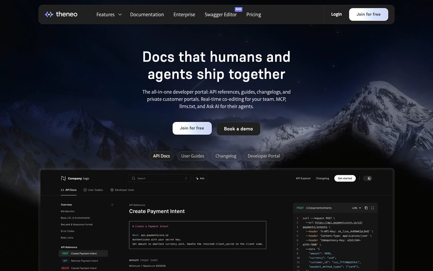
Theneo's marketing surface is a dark, developer-documentation-first interface — a near-black canvas (`{colors.canvas}` — #080808) carrying white display headlines (`{colors.ink}` — #ffffff), soft-gray body copy (`{colors.body}` — #cdcdcd), and pill-shaped CTAs. The system reads as confident modern dev-tooling: a starfield/mountain hero photo behind the headline, real product chrome and code snippets shown inside cards, and a violet-blue accent (`{colors.accent-violet}` — #566be3) reserved for the logo mark, the "NEW" badge, and small product UI moments.
Type voice splits into two custom faces: **Supreme** for headlines (h1–h4, weight 500, slight positive letter-spacing on the large sizes) and **Plein** for body + buttons (weight 400). Both are commercial typefaces; open-source substitutes are documented in the Typography section. Supreme at weight 500 gives the hero a friendly, slightly geometric voice — never heavy, never bold beyond 500.
Component voltage comes from **real product UI fragments embedded directly in cards** — the API-reference panel, a "Create Payment Intent" code block, collaboration UI screenshots, MCP/Ask-AI panels. Theneo shows the actual documentation product at small scale inside the marketing flow rather than painting abstract illustrations.
The whole page stays dark from nav to footer — there is no light-canvas band. Contrast is carried by stepped near-black surfaces (`{colors.surface}` #141414, `{colors.surface-soft}` #202020, `{colors.surface-strong}` #222222) and faint hairlines (`{colors.hairline}` — #333333) rather than by shadows; the analysis captured zero box-shadows.
**Key Characteristics:**
- Near-black canvas (`{colors.canvas}` — #080808) throughout. No light bands; depth comes from stepped dark surfaces, not shadow.
- Pill CTAs (`{rounded.pill}` — 48px). The primary CTA is a near-white pill (`{colors.white-soft}`) with dark text; the secondary CTA is a dark pill (`{colors.surface}`) with gray text.
- Custom `Supreme` display + `Plein` text pairing, both weight-light (500 / 400). Substitutes documented below.
- Real product/code fragments embedded in cards — API reference panels, cURL snippets, collaboration screenshots. Brand voltage from actual product chrome.
- Violet-blue accent (`{colors.accent-violet}` — #566be3, with soft `{colors.accent-violet-soft}` — #9fb1ff) on the logo, the "NEW" badge, and progress/UI moments. Used sparingly.
- Pill-shaped category tabs ("API Docs / User Guides / Changelog / Developer Portal") below the hero — the active tab fills to `{colors.surface-soft}`.
- Card radius is hierarchical: `{rounded.input}` (12px) for inputs and code blocks, `{rounded.card}` (14px) for content cards, `{rounded.pill}` (48px) for buttons and tabs.
## Colors
### Brand & Accent
- **Accent Violet** (`{colors.accent-violet}` — #566be3): The brand accent — logo mark, the "NEW" badge, progress bars in the Ask-AI / MCP product fragments. Used sparingly against the dark canvas.
- **Accent Violet Soft** (`{colors.accent-violet-soft}` — #9fb1ff): A lighter violet for secondary accent moments and gradient highlights.
- **Accent Blue** (`{colors.accent}` — #3898ec): A link-blue tone present in the stylesheet; appears on inline links / interactive text. Secondary to the violet brand accent.
### Surface
- **Canvas** (`{colors.canvas}` — #080808): The page floor. Also the background of the API-mockup and product-fragment cards — these cards read as canvas-colored with a hairline rather than a raised fill.
- **Surface** (`{colors.surface}` — #141414): Feature cards, code blocks, dark secondary buttons, inputs.
- **Surface Soft** (`{colors.surface-soft}` — #202020): Active category-tab fill, slightly raised nested panels.
- **Surface Strong** (`{colors.surface-strong}` — #222222): The strongest near-black step, used for inner panels and tag chips.
- **Black** (`{colors.black}` — #000000): True black, used at edges / deepest fills.
- **Hairline** (`{colors.hairline}` — #333333): 1px borders separating cards and panels on the dark canvas.
- **Hairline Soft** (`{colors.hairline-soft}` — #dddddd): A near-white divider tone used inside light product-UI fragments.
- **White Soft** (`{colors.white-soft}` — #fafafa): The primary-button pill fill.
### Text
- **Ink** (`{colors.ink}` — #ffffff): All display headlines (h1–h4) and high-contrast labels.
- **Body** (`{colors.body}` — #cdcdcd): Default running-text and button labels.
- **Muted** (`{colors.muted}` — #b4b4b4): Low-contrast secondary headings.
- **Muted Soft** (`{colors.muted-soft}` — #9c9c9c): Tertiary text, footer links.
- **Neutral** (`{colors.neutral}` — #828282) / **Neutral Mid** (`{colors.neutral-mid}` — #525252): Fine-print, captions, disabled/quiet UI text.
- **On Light** (`{colors.on-light}` — #080808): Dark text on the near-white primary-button pill.
## Typography
### Font Family
The system runs **Supreme** for display + headings and **Plein** for body + buttons. Supreme is a slightly geometric grotesque used at weight 500 with a small positive letter-spacing (0.5px) on the larger headings; Plein is a humanist sans used at weight 400 for paragraphs and button labels. Both fall back to `Inter, sans-serif`.
The split is functional:
- Supreme (headings, weight 500) — h1, h2, h3, h4
- Plein (text + UI, weight 400) — paragraphs, button labels
### Hierarchy
| Token | Size | Weight | Line Height | Letter Spacing | Use |
|---|---|---|---|---|---|
| `{typography.h1}` | 48px | 500 | 1.18 | 0.5px | Hero headline ("Docs that humans and agents ship together") — Supreme |
| `{typography.h3}` | 20px | 500 | 1.18 | 0.5px | Section heads, card titles — Supreme |
| `{typography.h2}` | 18px | 500 | 1.3 | 0 | Sub-section heads — Supreme |
| `{typography.h4}` | 14px | 500 | 1.18 | 0 | Small labels, badge / overline text — Supreme |
| `{typography.body}` | 16px | 400 | 1.5 | 0 | Default running-text — Plein |
| `{typography.button}` | 16px | 400 | 1.5 | 0 | Button + nav labels — Plein |
### Principles
Supreme carries the brand voice at weight 500 — never heavier. The headings stay light-to-medium, which keeps the dark hero feeling calm rather than shouting. Body copy stays Plein 400 at a comfortable 1.5 line-height. Note that the measured h2 (18px) is smaller than h3 (20px) — h2 functions here as a small section overline rather than a large heading, and h1 (48px) does the heavy lifting at the top of the page.
### Note on Font Substitutes
**Supreme** and **Plein** are commercial typefaces and are not shipped here. For Supreme (display), use **Hanken Grotesk** or **Inter** at weight 500 as an open-source approximation; for Plein (body), use **Inter** or **Hanken Grotesk** at weight 400. Preserve the weight (500 display / 400 body) and the small positive tracking on large headings to keep the voice close.
## Layout
### Spacing System
- **Base unit:** 4px.
- **Tokens:** `{spacing.xxs}` 4px · `{spacing.xs}` 8px · `{spacing.sm}` 12px · `{spacing.md}` 16px · `{spacing.lg}` 24px · `{spacing.xl}` 36px · `{spacing.xxl}` 40px · `{spacing.section}` 56px.
- **Dominant rhythms:** 8px (most frequent), 12px, and 24px carry the bulk of internal padding and gaps; 40px is the most common large-gap value.
- **Card internal padding:** `{spacing.lg}` (24px) for feature cards and product-mockup cards.
- **Button padding:** 8px 8px 8px 16px (measured) — asymmetric, leaving room for a trailing icon chip inside the pill.
### Grid & Container
- **Editorial body:** Center-aligned hero — headline, sub-head, and CTA row are horizontally centered on the dark canvas; the large API-mockup card sits full-width below.
- **Feature grids:** Multi-up card grids (e.g., the "Engineers, writers, PMs, and agents on the same page" collaboration cluster) at desktop, collapsing toward fewer columns on smaller screens.
- **Logo strip:** Single horizontal row of customer logos ("Trusted by 15,000+ teams").
- **Footer:** Multi-column link list (Company / Resources / Product) plus a newsletter signup column.
### Whitespace Philosophy
The page uses generous vertical breathing room between dark bands, with `{spacing.section}` (56px)-scale gaps anchoring major transitions. Because the whole page is dark, separation between sections relies on spacing and faint hairlines rather than alternating background color.
## Elevation & Depth
| Level | Treatment | Use |
|---|---|---|
| Flat canvas | `{colors.canvas}` (#080808), no shadow | Hero, nav, body sections |
| Hairline panel | 1px `{colors.hairline}` (#333333) border on canvas | Product-mockup cards, API-reference panels |
| Raised surface | `{colors.surface}` (#141414) fill, no shadow | Feature cards, code blocks, inputs |
| Stronger step | `{colors.surface-soft}` / `{colors.surface-strong}` (#202020 / #222222) | Active tab, nested panels, chips |
The analysis captured **zero box-shadows** — depth is entirely color-stepped. The system layers near-black surfaces (#080808 → #141414 → #202020 → #222222) and uses 1px hairlines to define card edges. This is a flat, shadow-free dark UI; emphasis comes from contrast steps and the violet accent, not from elevation.
### Decorative Depth
- The hero uses a starfield/mountain photograph behind the headline to add atmospheric depth without shadow tokens.
- Product UI fragments embedded in cards (API explorer, code editor, collaboration screenshots) carry their own internal chrome — these are product content, not system elevation tokens.
## Shapes
### Border Radius Scale
| Token | Value | Use |
|---|---|---|
| `{rounded.xs}` | 2px | Smallest accents (rare) |
| `{rounded.sm}` | 4px | Small chips, the "NEW" badge, tag pills |
| `{rounded.md}` | 10px | Mid-size inner panels |
| `{rounded.input}` | 12px | Inputs, code blocks (most common content radius) |
| `{rounded.card}` | 14px | Content cards, the large API-mockup card |
| `{rounded.pill}` | 48px | Buttons, category tabs (fully rounded pills) |
### Photography Geometry
The hero background photograph runs full-bleed behind the headline. Product UI fragments inside cards retain their native chrome and internal radii. The large API-mockup card uses the 14px card radius; embedded code blocks inside it step down to the 12px input radius.
## Components
### Top Navigation
**`top-nav`** — Pill-shaped floating nav bar over the dark canvas (`{colors.canvas}`). Carries the violet Theneo logo + wordmark at left, the primary menu center (Features ▾, Documentation, Enterprise, Swagger Editor with a `{component.badge-new}` chip, Pricing), and a right cluster with "Login" text and a "Join for free" `{component.button-primary}`. Labels in `{typography.button}` (Plein 16px / 400), text color `{colors.body}`.
### Buttons
**`button-primary`** — The signature CTA ("Join for free"). Near-white pill: background `{colors.white-soft}` (#fafafa), dark text `{colors.on-light}` (#080808), type `{typography.button}`, rounded `{rounded.pill}` (48px), padding 8px 8px 8px 16px (measured — asymmetric for a trailing icon).
**`button-secondary`** — The dark companion CTA ("Book a demo"). Background `{colors.surface}` (#141414), gray text `{colors.body}` (#cdcdcd), same pill radius and padding as primary.
### Tabs / Filters
**`category-tab`** + **`category-tab-active`** — The hero's content-type switcher ("API Docs / User Guides / Changelog / Developer Portal"). Inactive: transparent background, `{colors.body}` text. Active: `{colors.surface-soft}` (#202020) fill, `{colors.ink}` text. Pill radius `{rounded.pill}`, padding 8px × 16px.
### Cards & Containers
**`card`** — The base card primitive: background `{colors.canvas}` (#080808) with a `{colors.hairline}` edge, rounded `{rounded.card}` (14px), no shadow. The large hero API-mockup card uses this treatment.
**`feature-card`** — Used in the collaboration / feature clusters. Background `{colors.surface}` (#141414), rounded `{rounded.card}` (14px), padding `{spacing.lg}` (24px). Carries a small label in `{typography.h4}` and body copy in `{typography.body}`.
**`product-mockup-card`** — A card showing actual Theneo product UI (API explorer, doc editor, Ask-AI / MCP panels, collaboration screenshots). Background `{colors.canvas}` with hairline edge, rounded `{rounded.card}`, padding `{spacing.lg}` (24px). The product chrome inside is content, not decoration.
**`code-block`** — Embedded cURL / API snippet panel (e.g., "Create Payment Intent"). Background `{colors.surface}`, text `{colors.body}`, rounded `{rounded.input}` (12px), padding `{spacing.md}` (16px).
### Inputs & Forms
**`input`** — Text input (search field, newsletter email). Background `{colors.surface}`, text `{colors.body}`, type `{typography.body}`, rounded `{rounded.input}` (12px), padding 12px × 16px.
### Tags / Badges
**`badge-new`** — The small violet "NEW" chip next to the Swagger Editor nav item. Background `{colors.accent-violet}` (#566be3), text `{colors.ink}`, type `{typography.h4}` (Supreme 14px / 500), rounded `{rounded.sm}` (4px), padding 4px × 8px.
### Footer
**`footer`** — Dark footer on `{colors.canvas}` (#080808) — the page never leaves dark, so the footer continues the canvas. Multi-column link list (Company / Resources / Product) plus a newsletter signup with an `{component.input}` and `{component.button-primary}`. Link text in `{colors.muted-soft}` (#9c9c9c), type `{typography.body}`, vertical padding `{spacing.xxl}` (40px).
## Do's and Don'ts
### Do
- Keep the entire experience on the near-black canvas (`{colors.canvas}` — #080808). Theneo has no light band.
- Use pill CTAs (`{rounded.pill}` — 48px): near-white pill for primary, dark surface pill for secondary.
- Build depth with stepped dark surfaces (#080808 → #141414 → #202020 → #222222) and 1px hairlines, not shadows.
- Reserve the violet accent (`{colors.accent-violet}`) for the logo, the "NEW" badge, and product UI moments. Keep it scarce.
- Embed real product chrome and code snippets inside cards — show the documentation product, don't illustrate around it.
- Keep Supreme headings at weight 500 and Plein body at 400. The light-to-medium weights are the brand voice.
### Don't
- Don't introduce drop shadows for elevation — the system is flat and shadow-free; use surface steps instead.
- Don't bold Supreme past 500 or Plein past 400.
- Don't spread the violet accent across large fills or CTAs — primary CTAs are near-white, not violet.
- Don't add light-canvas sections; the dark canvas is continuous from nav to footer.
- Don't square off the CTAs — buttons and tabs are full pills.
- Don't document hover states; default and active/pressed only.
## Responsive Behavior
### Breakpoints
| Name | Width | Key Changes |
|---|---|---|
| Mobile | < 768px | Nav collapses to a compact bar; hero h1 reduces; CTA pills stack; feature/collaboration cards go 1-up; footer columns collapse |
| Tablet | 768–1024px | Nav tightens; feature grids reduce columns; API-mockup card scales proportionally |
| Desktop | 1024–1440px | Full pill nav with all menu items; multi-up feature clusters; full-width API-mockup card |
| Wide | > 1440px | Same as desktop with more outer breathing room; centered content |
### Touch Targets
- `{component.button-primary}` / `{component.button-secondary}` use 8/16px padding on `{typography.button}` (16px) text — comfortably above 40px tall.
- `{component.category-tab}` pills use 8 × 16 padding; effective tap area meets target minimums.
- `{component.input}` uses 12 × 16 padding for a roomy field.
### Collapsing Strategy
- Hero headline + sub-head + CTA row stay centered and reflow vertically on mobile.
- The large API-mockup card scales proportionally; embedded code blocks stay legible.
- Feature / collaboration card clusters reduce column count rather than shrinking cards excessively.
- Footer multi-column link list collapses toward stacked columns on mobile.
### Image Behavior
- The hero background photograph runs full-bleed and crops at the edges across breakpoints.
- Product UI fragments inside cards retain native aspect ratios; cards resize around them.
## Iteration Guide
1. Focus on ONE component at a time. Reference its YAML key directly (`{component.feature-card}`, `{component.button-secondary}`).
2. Variants of an existing component (`-active`, secondary) live as separate entries in `components:`.
3. Use `{token.refs}` everywhere — never inline hex.
4. Never document hover. Default and active/pressed states only.
5. Headings stay Supreme 500; body stays Plein 400. Keep the trinity intact.
6. Depth is color-stepped, not shadowed. New surfaces should pick from the #080808 → #222222 ladder.
7. The violet accent is scarce by design — when in doubt, lean on contrast and weight before color.
## Known Gaps
- The measured `button-primary` component returned `radius: 0px` and `color: #cdcdcd` — this likely captured an inner text/icon element rather than the visible pill. The visible CTAs are clearly full pills, so button radius is documented as `{rounded.pill}` (48px, the measured pill radius) and the near-white fill / dark text are **derived** from the reference screenshots using measured color tokens (`{colors.white-soft}`, `{colors.on-light}`). Exact button background hex was not directly captured.
- The `card` component measured `background: #080808` (canvas-colored with a hairline edge); the raised `surface` (#141414) feature-card fill is assigned from the surface-color set and screenshot reading, not from a per-component measurement.
- **Supreme** and **Plein** are commercial typefaces; they are not shipped here and open-source substitutes are documented in the Typography section. `fonts_licensed` was empty in the analysis, so no license flag was recorded.
- No box-shadows were captured (`shadows: []`); all elevation is documented as color-stepped. If subtle shadows exist on hover/focus they were not measured.
- The hero background photograph (starfield/mountain) is documented qualitatively; its asset spec, gradient overlays, and exact tones are not tokenized.
- Animation and transition timings (tab switching, code-panel reveals, AI/MCP fragment motion) are out of scope.
- Form validation, focus, and error states beyond the base `{component.input}` were not extracted.
- Accent usage of `{colors.accent}` (#3898ec) vs `{colors.accent-violet}` (#566be3) is inferred from frequency and screenshots; exact role boundaries (links vs brand) would need an interactive flow to confirm.
<!-- Documented by duply · real-world design systems as ready-to-use DESIGN.md for AI coding agents · https://duply.ai/theneo/design-md -->
Color Palette
Accent
Neutrals
Typography
h148px · 500 · 1.18
The quick brown fox jumpsh218px · 500 · 1.3
The quick brown fox jumpsh320px · 500 · 1.18
The quick brown fox jumpsh414px · 500 · 1.18
The quick brown fox jumpsbody16px · 400 · 1.5
The quick brown fox jumpsbutton16px · 400 · 1.5
The quick brown fox jumpsSpacing & Shape
Spacing
| Name | Value | Preview |
|---|---|---|
| xxs | 4px | |
| xs | 8px | |
| sm | 12px | |
| md | 16px | |
| lg | 24px | |
| xl | 36px | |
| xxl | 40px | |
| section | 56px |
Border Radius
| Name | Value | Preview |
|---|---|---|
| xs | 2px | |
| sm | 4px | |
| md | 10px | |
| input | 12px | |
| card | 14px | |
| pill | 48px |
More like this


---
version: alpha
name: Theneo-design-analysis
description: A dark, developer-documentation-first marketing interface built on a near-black canvas (#080808) with white display headlines, soft-gray body copy, and a violet-blue accent reserved for badges and product UI moments. The system reads as modern dev-tooling — pill-shaped CTAs, low-contrast hairline cards that hold real product/code fragments, and the custom Supreme (display) + Plein (text) type pairing. Brand voltage comes from embedded product chrome and code snippets shown inside cards rather than from heavy color.

colors:
  ink: "#ffffff"
  body: "#cdcdcd"
  muted: "#b4b4b4"
  muted-soft: "#9c9c9c"
  neutral: "#828282"
  neutral-mid: "#525252"
  canvas: "#080808"
  black: "#000000"
  surface: "#141414"
  surface-soft: "#202020"
  surface-strong: "#222222"
  hairline: "#333333"
  hairline-soft: "#dddddd"
  white-soft: "#fafafa"
  on-light: "#080808"
  accent: "#3898ec"
  accent-violet: "#566be3"
  accent-violet-soft: "#9fb1ff"

typography:
  h1:
    fontFamily: "Supreme, Inter, sans-serif"
    fontSize: 48px
    fontWeight: 500
    lineHeight: 1.18
    letterSpacing: 0.5px
  h2:
    fontFamily: "Supreme, Inter, sans-serif"
    fontSize: 18px
    fontWeight: 500
    lineHeight: 1.3
    letterSpacing: 0
  h3:
    fontFamily: "Supreme, Inter, sans-serif"
    fontSize: 20px
    fontWeight: 500
    lineHeight: 1.18
    letterSpacing: 0.5px
  h4:
    fontFamily: "Supreme, Inter, sans-serif"
    fontSize: 14px
    fontWeight: 500
    lineHeight: 1.18
    letterSpacing: 0
  body:
    fontFamily: "Plein, Inter, sans-serif"
    fontSize: 16px
    fontWeight: 400
    lineHeight: 1.5
    letterSpacing: 0
  button:
    fontFamily: "Plein, Inter, sans-serif"
    fontSize: 16px
    fontWeight: 400
    lineHeight: 1.5
    letterSpacing: 0

rounded:
  xs: 2px
  sm: 4px
  md: 10px
  input: 12px
  card: 14px
  pill: 48px

spacing:
  xxs: 4px
  xs: 8px
  sm: 12px
  md: 16px
  lg: 24px
  xl: 36px
  xxl: 40px
  section: 56px

components:
  top-nav:
    backgroundColor: "{colors.canvas}"
    textColor: "{colors.body}"
    typography: "{typography.button}"
    rounded: "{rounded.pill}"
  button-primary:
    backgroundColor: "{colors.white-soft}"
    textColor: "{colors.on-light}"
    typography: "{typography.button}"
    rounded: "{rounded.pill}"
    padding: 8px 8px 8px 16px
  button-secondary:
    backgroundColor: "{colors.surface}"
    textColor: "{colors.body}"
    typography: "{typography.button}"
    rounded: "{rounded.pill}"
    padding: 8px 8px 8px 16px
  category-tab:
    backgroundColor: transparent
    textColor: "{colors.body}"
    typography: "{typography.button}"
    rounded: "{rounded.pill}"
    padding: 8px 16px
  category-tab-active:
    backgroundColor: "{colors.surface-soft}"
    textColor: "{colors.ink}"
    typography: "{typography.button}"
    rounded: "{rounded.pill}"
    padding: 8px 16px
  card:
    backgroundColor: "{colors.canvas}"
    textColor: "{colors.body}"
    typography: "{typography.body}"
    rounded: "{rounded.card}"
  feature-card:
    backgroundColor: "{colors.surface}"
    textColor: "{colors.body}"
    typography: "{typography.body}"
    rounded: "{rounded.card}"
    padding: 24px
  product-mockup-card:
    backgroundColor: "{colors.canvas}"
    textColor: "{colors.body}"
    rounded: "{rounded.card}"
    padding: 24px
  code-block:
    backgroundColor: "{colors.surface}"
    textColor: "{colors.body}"
    rounded: "{rounded.input}"
    padding: 16px
  input:
    backgroundColor: "{colors.surface}"
    textColor: "{colors.body}"
    typography: "{typography.body}"
    rounded: "{rounded.input}"
    padding: 12px 16px
  badge-new:
    backgroundColor: "{colors.accent-violet}"
    textColor: "{colors.ink}"
    typography: "{typography.h4}"
    rounded: "{rounded.sm}"
    padding: 4px 8px
  footer:
    backgroundColor: "{colors.canvas}"
    textColor: "{colors.muted-soft}"
    typography: "{typography.body}"
    padding: 40px
---

## Overview

Theneo's marketing surface is a dark, developer-documentation-first interface — a near-black canvas (`{colors.canvas}` — #080808) carrying white display headlines (`{colors.ink}` — #ffffff), soft-gray body copy (`{colors.body}` — #cdcdcd), and pill-shaped CTAs. The system reads as confident modern dev-tooling: a starfield/mountain hero photo behind the headline, real product chrome and code snippets shown inside cards, and a violet-blue accent (`{colors.accent-violet}` — #566be3) reserved for the logo mark, the "NEW" badge, and small product UI moments.

Type voice splits into two custom faces: **Supreme** for headlines (h1–h4, weight 500, slight positive letter-spacing on the large sizes) and **Plein** for body + buttons (weight 400). Both are commercial typefaces; open-source substitutes are documented in the Typography section. Supreme at weight 500 gives the hero a friendly, slightly geometric voice — never heavy, never bold beyond 500.

Component voltage comes from **real product UI fragments embedded directly in cards** — the API-reference panel, a "Create Payment Intent" code block, collaboration UI screenshots, MCP/Ask-AI panels. Theneo shows the actual documentation product at small scale inside the marketing flow rather than painting abstract illustrations.

The whole page stays dark from nav to footer — there is no light-canvas band. Contrast is carried by stepped near-black surfaces (`{colors.surface}` #141414, `{colors.surface-soft}` #202020, `{colors.surface-strong}` #222222) and faint hairlines (`{colors.hairline}` — #333333) rather than by shadows; the analysis captured zero box-shadows.

**Key Characteristics:**
- Near-black canvas (`{colors.canvas}` — #080808) throughout. No light bands; depth comes from stepped dark surfaces, not shadow.
- Pill CTAs (`{rounded.pill}` — 48px). The primary CTA is a near-white pill (`{colors.white-soft}`) with dark text; the secondary CTA is a dark pill (`{colors.surface}`) with gray text.
- Custom `Supreme` display + `Plein` text pairing, both weight-light (500 / 400). Substitutes documented below.
- Real product/code fragments embedded in cards — API reference panels, cURL snippets, collaboration screenshots. Brand voltage from actual product chrome.
- Violet-blue accent (`{colors.accent-violet}` — #566be3, with soft `{colors.accent-violet-soft}` — #9fb1ff) on the logo, the "NEW" badge, and progress/UI moments. Used sparingly.
- Pill-shaped category tabs ("API Docs / User Guides / Changelog / Developer Portal") below the hero — the active tab fills to `{colors.surface-soft}`.
- Card radius is hierarchical: `{rounded.input}` (12px) for inputs and code blocks, `{rounded.card}` (14px) for content cards, `{rounded.pill}` (48px) for buttons and tabs.

## Colors

### Brand & Accent
- **Accent Violet** (`{colors.accent-violet}` — #566be3): The brand accent — logo mark, the "NEW" badge, progress bars in the Ask-AI / MCP product fragments. Used sparingly against the dark canvas.
- **Accent Violet Soft** (`{colors.accent-violet-soft}` — #9fb1ff): A lighter violet for secondary accent moments and gradient highlights.
- **Accent Blue** (`{colors.accent}` — #3898ec): A link-blue tone present in the stylesheet; appears on inline links / interactive text. Secondary to the violet brand accent.

### Surface
- **Canvas** (`{colors.canvas}` — #080808): The page floor. Also the background of the API-mockup and product-fragment cards — these cards read as canvas-colored with a hairline rather than a raised fill.
- **Surface** (`{colors.surface}` — #141414): Feature cards, code blocks, dark secondary buttons, inputs.
- **Surface Soft** (`{colors.surface-soft}` — #202020): Active category-tab fill, slightly raised nested panels.
- **Surface Strong** (`{colors.surface-strong}` — #222222): The strongest near-black step, used for inner panels and tag chips.
- **Black** (`{colors.black}` — #000000): True black, used at edges / deepest fills.
- **Hairline** (`{colors.hairline}` — #333333): 1px borders separating cards and panels on the dark canvas.
- **Hairline Soft** (`{colors.hairline-soft}` — #dddddd): A near-white divider tone used inside light product-UI fragments.
- **White Soft** (`{colors.white-soft}` — #fafafa): The primary-button pill fill.

### Text
- **Ink** (`{colors.ink}` — #ffffff): All display headlines (h1–h4) and high-contrast labels.
- **Body** (`{colors.body}` — #cdcdcd): Default running-text and button labels.
- **Muted** (`{colors.muted}` — #b4b4b4): Low-contrast secondary headings.
- **Muted Soft** (`{colors.muted-soft}` — #9c9c9c): Tertiary text, footer links.
- **Neutral** (`{colors.neutral}` — #828282) / **Neutral Mid** (`{colors.neutral-mid}` — #525252): Fine-print, captions, disabled/quiet UI text.
- **On Light** (`{colors.on-light}` — #080808): Dark text on the near-white primary-button pill.

## Typography

### Font Family
The system runs **Supreme** for display + headings and **Plein** for body + buttons. Supreme is a slightly geometric grotesque used at weight 500 with a small positive letter-spacing (0.5px) on the larger headings; Plein is a humanist sans used at weight 400 for paragraphs and button labels. Both fall back to `Inter, sans-serif`.

The split is functional:
- Supreme (headings, weight 500) — h1, h2, h3, h4
- Plein (text + UI, weight 400) — paragraphs, button labels

### Hierarchy

| Token | Size | Weight | Line Height | Letter Spacing | Use |
|---|---|---|---|---|---|
| `{typography.h1}` | 48px | 500 | 1.18 | 0.5px | Hero headline ("Docs that humans and agents ship together") — Supreme |
| `{typography.h3}` | 20px | 500 | 1.18 | 0.5px | Section heads, card titles — Supreme |
| `{typography.h2}` | 18px | 500 | 1.3 | 0 | Sub-section heads — Supreme |
| `{typography.h4}` | 14px | 500 | 1.18 | 0 | Small labels, badge / overline text — Supreme |
| `{typography.body}` | 16px | 400 | 1.5 | 0 | Default running-text — Plein |
| `{typography.button}` | 16px | 400 | 1.5 | 0 | Button + nav labels — Plein |

### Principles
Supreme carries the brand voice at weight 500 — never heavier. The headings stay light-to-medium, which keeps the dark hero feeling calm rather than shouting. Body copy stays Plein 400 at a comfortable 1.5 line-height. Note that the measured h2 (18px) is smaller than h3 (20px) — h2 functions here as a small section overline rather than a large heading, and h1 (48px) does the heavy lifting at the top of the page.

### Note on Font Substitutes
**Supreme** and **Plein** are commercial typefaces and are not shipped here. For Supreme (display), use **Hanken Grotesk** or **Inter** at weight 500 as an open-source approximation; for Plein (body), use **Inter** or **Hanken Grotesk** at weight 400. Preserve the weight (500 display / 400 body) and the small positive tracking on large headings to keep the voice close.

## Layout

### Spacing System
- **Base unit:** 4px.
- **Tokens:** `{spacing.xxs}` 4px · `{spacing.xs}` 8px · `{spacing.sm}` 12px · `{spacing.md}` 16px · `{spacing.lg}` 24px · `{spacing.xl}` 36px · `{spacing.xxl}` 40px · `{spacing.section}` 56px.
- **Dominant rhythms:** 8px (most frequent), 12px, and 24px carry the bulk of internal padding and gaps; 40px is the most common large-gap value.
- **Card internal padding:** `{spacing.lg}` (24px) for feature cards and product-mockup cards.
- **Button padding:** 8px 8px 8px 16px (measured) — asymmetric, leaving room for a trailing icon chip inside the pill.

### Grid & Container
- **Editorial body:** Center-aligned hero — headline, sub-head, and CTA row are horizontally centered on the dark canvas; the large API-mockup card sits full-width below.
- **Feature grids:** Multi-up card grids (e.g., the "Engineers, writers, PMs, and agents on the same page" collaboration cluster) at desktop, collapsing toward fewer columns on smaller screens.
- **Logo strip:** Single horizontal row of customer logos ("Trusted by 15,000+ teams").
- **Footer:** Multi-column link list (Company / Resources / Product) plus a newsletter signup column.

### Whitespace Philosophy
The page uses generous vertical breathing room between dark bands, with `{spacing.section}` (56px)-scale gaps anchoring major transitions. Because the whole page is dark, separation between sections relies on spacing and faint hairlines rather than alternating background color.

## Elevation & Depth

| Level | Treatment | Use |
|---|---|---|
| Flat canvas | `{colors.canvas}` (#080808), no shadow | Hero, nav, body sections |
| Hairline panel | 1px `{colors.hairline}` (#333333) border on canvas | Product-mockup cards, API-reference panels |
| Raised surface | `{colors.surface}` (#141414) fill, no shadow | Feature cards, code blocks, inputs |
| Stronger step | `{colors.surface-soft}` / `{colors.surface-strong}` (#202020 / #222222) | Active tab, nested panels, chips |

The analysis captured **zero box-shadows** — depth is entirely color-stepped. The system layers near-black surfaces (#080808 → #141414 → #202020 → #222222) and uses 1px hairlines to define card edges. This is a flat, shadow-free dark UI; emphasis comes from contrast steps and the violet accent, not from elevation.

### Decorative Depth
- The hero uses a starfield/mountain photograph behind the headline to add atmospheric depth without shadow tokens.
- Product UI fragments embedded in cards (API explorer, code editor, collaboration screenshots) carry their own internal chrome — these are product content, not system elevation tokens.

## Shapes

### Border Radius Scale

| Token | Value | Use |
|---|---|---|
| `{rounded.xs}` | 2px | Smallest accents (rare) |
| `{rounded.sm}` | 4px | Small chips, the "NEW" badge, tag pills |
| `{rounded.md}` | 10px | Mid-size inner panels |
| `{rounded.input}` | 12px | Inputs, code blocks (most common content radius) |
| `{rounded.card}` | 14px | Content cards, the large API-mockup card |
| `{rounded.pill}` | 48px | Buttons, category tabs (fully rounded pills) |

### Photography Geometry
The hero background photograph runs full-bleed behind the headline. Product UI fragments inside cards retain their native chrome and internal radii. The large API-mockup card uses the 14px card radius; embedded code blocks inside it step down to the 12px input radius.

## Components

### Top Navigation

**`top-nav`** — Pill-shaped floating nav bar over the dark canvas (`{colors.canvas}`). Carries the violet Theneo logo + wordmark at left, the primary menu center (Features ▾, Documentation, Enterprise, Swagger Editor with a `{component.badge-new}` chip, Pricing), and a right cluster with "Login" text and a "Join for free" `{component.button-primary}`. Labels in `{typography.button}` (Plein 16px / 400), text color `{colors.body}`.

### Buttons

**`button-primary`** — The signature CTA ("Join for free"). Near-white pill: background `{colors.white-soft}` (#fafafa), dark text `{colors.on-light}` (#080808), type `{typography.button}`, rounded `{rounded.pill}` (48px), padding 8px 8px 8px 16px (measured — asymmetric for a trailing icon).

**`button-secondary`** — The dark companion CTA ("Book a demo"). Background `{colors.surface}` (#141414), gray text `{colors.body}` (#cdcdcd), same pill radius and padding as primary.

### Tabs / Filters

**`category-tab`** + **`category-tab-active`** — The hero's content-type switcher ("API Docs / User Guides / Changelog / Developer Portal"). Inactive: transparent background, `{colors.body}` text. Active: `{colors.surface-soft}` (#202020) fill, `{colors.ink}` text. Pill radius `{rounded.pill}`, padding 8px × 16px.

### Cards & Containers

**`card`** — The base card primitive: background `{colors.canvas}` (#080808) with a `{colors.hairline}` edge, rounded `{rounded.card}` (14px), no shadow. The large hero API-mockup card uses this treatment.

**`feature-card`** — Used in the collaboration / feature clusters. Background `{colors.surface}` (#141414), rounded `{rounded.card}` (14px), padding `{spacing.lg}` (24px). Carries a small label in `{typography.h4}` and body copy in `{typography.body}`.

**`product-mockup-card`** — A card showing actual Theneo product UI (API explorer, doc editor, Ask-AI / MCP panels, collaboration screenshots). Background `{colors.canvas}` with hairline edge, rounded `{rounded.card}`, padding `{spacing.lg}` (24px). The product chrome inside is content, not decoration.

**`code-block`** — Embedded cURL / API snippet panel (e.g., "Create Payment Intent"). Background `{colors.surface}`, text `{colors.body}`, rounded `{rounded.input}` (12px), padding `{spacing.md}` (16px).

### Inputs & Forms

**`input`** — Text input (search field, newsletter email). Background `{colors.surface}`, text `{colors.body}`, type `{typography.body}`, rounded `{rounded.input}` (12px), padding 12px × 16px.

### Tags / Badges

**`badge-new`** — The small violet "NEW" chip next to the Swagger Editor nav item. Background `{colors.accent-violet}` (#566be3), text `{colors.ink}`, type `{typography.h4}` (Supreme 14px / 500), rounded `{rounded.sm}` (4px), padding 4px × 8px.

### Footer

**`footer`** — Dark footer on `{colors.canvas}` (#080808) — the page never leaves dark, so the footer continues the canvas. Multi-column link list (Company / Resources / Product) plus a newsletter signup with an `{component.input}` and `{component.button-primary}`. Link text in `{colors.muted-soft}` (#9c9c9c), type `{typography.body}`, vertical padding `{spacing.xxl}` (40px).

## Do's and Don'ts

### Do
- Keep the entire experience on the near-black canvas (`{colors.canvas}` — #080808). Theneo has no light band.
- Use pill CTAs (`{rounded.pill}` — 48px): near-white pill for primary, dark surface pill for secondary.
- Build depth with stepped dark surfaces (#080808 → #141414 → #202020 → #222222) and 1px hairlines, not shadows.
- Reserve the violet accent (`{colors.accent-violet}`) for the logo, the "NEW" badge, and product UI moments. Keep it scarce.
- Embed real product chrome and code snippets inside cards — show the documentation product, don't illustrate around it.
- Keep Supreme headings at weight 500 and Plein body at 400. The light-to-medium weights are the brand voice.

### Don't
- Don't introduce drop shadows for elevation — the system is flat and shadow-free; use surface steps instead.
- Don't bold Supreme past 500 or Plein past 400.
- Don't spread the violet accent across large fills or CTAs — primary CTAs are near-white, not violet.
- Don't add light-canvas sections; the dark canvas is continuous from nav to footer.
- Don't square off the CTAs — buttons and tabs are full pills.
- Don't document hover states; default and active/pressed only.

## Responsive Behavior

### Breakpoints

| Name | Width | Key Changes |
|---|---|---|
| Mobile | < 768px | Nav collapses to a compact bar; hero h1 reduces; CTA pills stack; feature/collaboration cards go 1-up; footer columns collapse |
| Tablet | 768–1024px | Nav tightens; feature grids reduce columns; API-mockup card scales proportionally |
| Desktop | 1024–1440px | Full pill nav with all menu items; multi-up feature clusters; full-width API-mockup card |
| Wide | > 1440px | Same as desktop with more outer breathing room; centered content |

### Touch Targets
- `{component.button-primary}` / `{component.button-secondary}` use 8/16px padding on `{typography.button}` (16px) text — comfortably above 40px tall.
- `{component.category-tab}` pills use 8 × 16 padding; effective tap area meets target minimums.
- `{component.input}` uses 12 × 16 padding for a roomy field.

### Collapsing Strategy
- Hero headline + sub-head + CTA row stay centered and reflow vertically on mobile.
- The large API-mockup card scales proportionally; embedded code blocks stay legible.
- Feature / collaboration card clusters reduce column count rather than shrinking cards excessively.
- Footer multi-column link list collapses toward stacked columns on mobile.

### Image Behavior
- The hero background photograph runs full-bleed and crops at the edges across breakpoints.
- Product UI fragments inside cards retain native aspect ratios; cards resize around them.

## Iteration Guide

1. Focus on ONE component at a time. Reference its YAML key directly (`{component.feature-card}`, `{component.button-secondary}`).
2. Variants of an existing component (`-active`, secondary) live as separate entries in `components:`.
3. Use `{token.refs}` everywhere — never inline hex.
4. Never document hover. Default and active/pressed states only.
5. Headings stay Supreme 500; body stays Plein 400. Keep the trinity intact.
6. Depth is color-stepped, not shadowed. New surfaces should pick from the #080808 → #222222 ladder.
7. The violet accent is scarce by design — when in doubt, lean on contrast and weight before color.

## Known Gaps

- The measured `button-primary` component returned `radius: 0px` and `color: #cdcdcd` — this likely captured an inner text/icon element rather than the visible pill. The visible CTAs are clearly full pills, so button radius is documented as `{rounded.pill}` (48px, the measured pill radius) and the near-white fill / dark text are **derived** from the reference screenshots using measured color tokens (`{colors.white-soft}`, `{colors.on-light}`). Exact button background hex was not directly captured.
- The `card` component measured `background: #080808` (canvas-colored with a hairline edge); the raised `surface` (#141414) feature-card fill is assigned from the surface-color set and screenshot reading, not from a per-component measurement.
- **Supreme** and **Plein** are commercial typefaces; they are not shipped here and open-source substitutes are documented in the Typography section. `fonts_licensed` was empty in the analysis, so no license flag was recorded.
- No box-shadows were captured (`shadows: []`); all elevation is documented as color-stepped. If subtle shadows exist on hover/focus they were not measured.
- The hero background photograph (starfield/mountain) is documented qualitatively; its asset spec, gradient overlays, and exact tones are not tokenized.
- Animation and transition timings (tab switching, code-panel reveals, AI/MCP fragment motion) are out of scope.
- Form validation, focus, and error states beyond the base `{component.input}` were not extracted.
- Accent usage of `{colors.accent}` (#3898ec) vs `{colors.accent-violet}` (#566be3) is inferred from frequency and screenshots; exact role boundaries (links vs brand) would need an interactive flow to confirm.

<!-- Documented by duply · real-world design systems as ready-to-use DESIGN.md for AI coding agents · https://duply.ai/theneo/design-md -->