DayOS
A high-contrast, editorial dark-canvas interface built around oversized condensed display type (Suisse Intl Condensed at up to 130px) and crisp white surfaces. The system reads as a confident, design-forward B2B product launch — near-black page floor, white modal and card surfaces with generous corner radii (24–48px), a single electric-yellow brand accent for the marquee CTA, and a small pastel accent palette (mint, green, pink, plum) reserved for product/illustration moments. Voltage comes almost entirely from the giant condensed headlines and the scarce yellow, not from color density.
---
version: alpha
name: DayOS-design-analysis
description: A high-contrast, editorial dark-canvas interface built around oversized condensed display type (Suisse Intl Condensed at up to 130px) and crisp white surfaces. The system reads as a confident, design-forward B2B product launch — near-black page floor, white modal and card surfaces with generous corner radii (24–48px), a single electric-yellow brand accent for the marquee CTA, and a small pastel accent palette (mint, green, pink, plum) reserved for product/illustration moments. Voltage comes almost entirely from the giant condensed headlines and the scarce yellow, not from color density.
colors:
ink: "#000000"
ink-soft: "#212121"
ink-dark: "#2f2f2f"
surface: "#ffffff"
surface-soft: "#f3f3f3"
surface-dark: "#1a1a1a"
neutral: "#979797"
neutral-light: "#c6c6c6"
neutral-border: "#dbdbdb"
muted: "#9ca3af"
on-primary: "#444444"
hairline: "#e5e5e5"
hairline-soft: "#e5e7eb"
accent-yellow: "#fff100"
accent-mint: "#d1ffca"
accent-green: "#00fd74"
accent-green-dark: "#0a2d05"
accent-pink: "#ff7ef2"
accent-pink-soft: "#ffd5f8"
accent-plum: "#3d0e35"
typography:
display-xl:
fontFamily: "SuisseIntlCond, Inter, sans-serif"
fontSize: 130px
fontWeight: 700
lineHeight: 0.9
letterSpacing: -3.9px
display-lg:
fontFamily: "SuisseIntlCond, Inter, sans-serif"
fontSize: 80px
fontWeight: 700
lineHeight: 0.9
letterSpacing: -2.4px
display-md:
fontFamily: "SuisseIntlCond, Inter, sans-serif"
fontSize: 48px
fontWeight: 700
lineHeight: 0.9
letterSpacing: -1.44px
body:
fontFamily: "SuisseIntl, Inter, sans-serif"
fontSize: 20px
fontWeight: 400
lineHeight: 1.2
letterSpacing: 0
button:
fontFamily: "SuisseIntl, Inter, sans-serif"
fontSize: 14px
fontWeight: 500
lineHeight: 1.3
letterSpacing: 0
rounded:
none: 0
xs: 4px
sm: 8px
md: 10px
lg: 12px
xl: 20px
xxl: 24px
xxxl: 32px
huge: 48px
giant: 64px
spacing:
xxs: 4px
xs: 8px
sm: 12px
md: 16px
lg: 24px
xl: 32px
xxl: 40px
block: 46px
section: 64px
section-lg: 83px
section-xl: 96px
components:
top-nav:
backgroundColor: "{colors.ink}"
textColor: "{colors.neutral}"
typography: "{typography.button}"
nav-cta:
backgroundColor: "{colors.accent-yellow}"
textColor: "{colors.ink}"
typography: "{typography.button}"
rounded: "{rounded.sm}"
padding: 0px 16px
button-primary:
backgroundColor: transparent
textColor: "{colors.on-primary}"
typography: "{typography.button}"
rounded: "{rounded.none}"
padding: 0px 16px
cta-button:
backgroundColor: "{colors.ink}"
textColor: "{colors.surface}"
typography: "{typography.button}"
rounded: "{rounded.lg}"
padding: 16px 24px
card:
backgroundColor: "{colors.surface}"
textColor: "{colors.ink}"
rounded: "{rounded.xxl}"
modal-card:
backgroundColor: "{colors.surface}"
textColor: "{colors.ink}"
rounded: "{rounded.huge}"
padding: 64px
input:
backgroundColor: "{colors.surface}"
textColor: "{colors.ink}"
typography: "{typography.body}"
rounded: "{rounded.lg}"
padding: 16px
select-dropdown:
backgroundColor: "{colors.surface}"
textColor: "{colors.neutral}"
typography: "{typography.body}"
rounded: "{rounded.lg}"
padding: 16px
modal-close-button:
backgroundColor: transparent
textColor: "{colors.ink}"
rounded: "{rounded.giant}"
---
## Overview
DayOS is a design-forward B2B product surface that runs on a **near-black canvas** (`{colors.ink}` — #000000) with **white modal and card surfaces** (`{colors.surface}` — #ffffff). The dominant voice is typographic: oversized **Suisse Intl Condensed** display headlines (up to 130px, weight 700, tight negative tracking) carry nearly all of the brand voltage. Color is used sparingly — a single electric-yellow accent (`{colors.accent-yellow}` — #fff100) marks the primary nav CTA, and a small pastel set (mint, green, pink, plum) appears only in product/illustration moments.
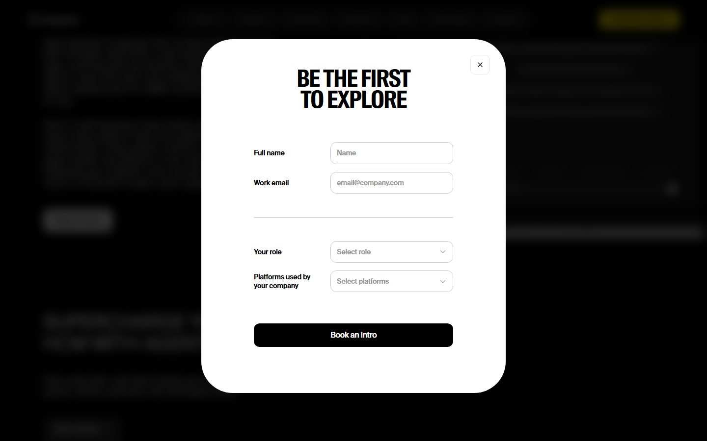
The captured pages (`landing`, `plans`) were observed primarily through the "Be the first to explore" lead-capture modal — a tall white card with very large corner radii floating over a dimmed black page. The modal embodies the system's two-surface logic: dark page floor, bright white interactive surfaces, near-black filled CTAs, and high-contrast condensed type for headings.
Type splits into exactly two families: **Suisse Intl Condensed** (display — h1/h2/h3, weight 700, negative letter-spacing) and **Suisse Intl** (body + buttons, weights 400–500, normal tracking). Both are licensed; **Inter** is the documented open-source substitute.
**Key Characteristics:**
- Dark page canvas (`{colors.ink}` — #000000) with bright white surfaces (`{colors.surface}`) for modals, cards, and inputs.
- Oversized condensed display type — `{typography.display-xl}` at 130px / 700 / -3.9px tracking is the marquee voice. Line-height stays at 0.9 across all display sizes for tight, stacked headlines.
- Single brand accent — `{colors.accent-yellow}` (#fff100) reserved for the top-right nav CTA. The rest of the system is monochrome.
- Pastel accent set (`{colors.accent-mint}`, `{colors.accent-green}`, `{colors.accent-pink}`, `{colors.accent-plum}`) used only in product/illustration moments, never on primary actions.
- Very rounded surfaces — cards at `{rounded.xxl}` (24px), the modal at `{rounded.huge}` (48px), inputs at `{rounded.lg}` (12px). Radius is a defining gesture of the system.
- Flat — no shadows were measured anywhere (`shadows: []`). Surface separation is done with color contrast (white-on-black), not elevation.
- Solid near-black filled CTA (`{component.cta-button}`) — the "Book an intro" button is black with white text.
## Colors
### Brand & Accent
- **Accent Yellow** (`{colors.accent-yellow}` — #fff100): The one electric brand accent. Used on the top-right nav CTA pill. Scarce by design.
- **Accent Mint / Green / Green-dark** (`{colors.accent-mint}` — #d1ffca, `{colors.accent-green}` — #00fd74, `{colors.accent-green-dark}` — #0a2d05): A green family seen in product/illustration fragments. Low frequency (2–3 occurrences each).
- **Accent Pink / Pink-soft / Plum** (`{colors.accent-pink}` — #ff7ef2, `{colors.accent-pink-soft}` — #ffd5f8, `{colors.accent-plum}` — #3d0e35): A magenta family, also product/illustration only. Never on CTAs.
### Surface
- **Ink / Canvas** (`{colors.ink}` — #000000): The page floor on the landing page — the system's dark base behind modals and cards.
- **Surface Dark** (`{colors.surface-dark}` — #1a1a1a) and **Ink Soft** (`{colors.ink-soft}` — #212121), **Ink Dark** (`{colors.ink-dark}` — #2f2f2f): Near-black tones used for dark panels and nav background gradations.
- **Surface** (`{colors.surface}` — #ffffff): White modal, card, and input surfaces.
- **Surface Soft** (`{colors.surface-soft}` — #f3f3f3): A faint off-white used for soft fills and subtle section dividers.
### Text & Neutrals
- **Ink** (`{colors.ink}` — #000000): All headlines and primary text — the highest-frequency color in the system (528 occurrences).
- **On Primary** (`{colors.on-primary}` — #444444): The measured button text color — a dark gray for secondary/text buttons.
- **Neutral** (`{colors.neutral}` — #979797): Placeholder text, secondary labels, nav links on dark.
- **Neutral Light** (`{colors.neutral-light}` — #c6c6c6) and **Muted** (`{colors.muted}` — #9ca3af): Tertiary text and disabled tones.
### Hairline / Border
- **Hairline** (`{colors.hairline}` — #e5e5e5), **Hairline Soft** (`{colors.hairline-soft}` — #e5e7eb), **Neutral Border** (`{colors.neutral-border}` — #dbdbdb): The 1px border tones used on inputs and dividers on white surfaces.
There are no measured semantic success/warning/error colors — see Known Gaps.
## Typography
### Font Family
The system runs **Suisse Intl Condensed** (display) and **Suisse Intl** (body + UI). Both are licensed commercial typefaces. Suisse Intl Condensed carries the headline voice: weight 700, line-height 0.9, and aggressive negative letter-spacing (-1.44px to -3.9px) that produces tightly stacked, poster-scale headlines. Suisse Intl handles running text (20px / 400) and buttons (14px / 500) at normal tracking.
### Hierarchy
| Token | Size | Weight | Line Height | Letter Spacing | Use |
|---|---|---|---|---|---|
| `{typography.display-xl}` | 130px | 700 | 0.9 | -3.9px | Hero / modal headline ("BE THE FIRST TO EXPLORE") — Suisse Intl Condensed |
| `{typography.display-lg}` | 80px | 700 | 0.9 | -2.4px | Section heads — Suisse Intl Condensed |
| `{typography.display-md}` | 48px | 700 | 0.9 | -1.44px | Sub-section heads, large card titles — Suisse Intl Condensed |
| `{typography.body}` | 20px | 400 | 1.2 | 0 | Default running text, field labels — Suisse Intl |
| `{typography.button}` | 14px | 500 | 1.3 | 0 | Button labels, nav links — Suisse Intl |
### Principles
The display/body boundary is strict: condensed 700 with negative tracking for every headline, regular Suisse Intl 400/500 for everything else. The 0.9 line-height on display sizes is essential — it produces the dense, two-line stacked headlines that define the brand. No intermediate title sizes between 48px display and 20px body were measured (see Known Gaps).
### Note on Font Substitutes
**Suisse Intl Condensed** and **Suisse Intl** are licensed and cannot be shipped. The documented substitute is **Inter** for both. For display headlines, Inter at weight 700 with ~-0.03em letter-spacing approximates the tracking signature, but Inter is not condensed — for a closer match use a condensed open-source face such as **Archivo Narrow** (weight 700) or **Saira Condensed** for display, and Inter for body. The substitution preserves weight + tracking but not the condensed proportions of Suisse Intl Condensed.
## Layout
### Spacing System
- **Base unit:** 4px.
- **Tokens:** `{spacing.xxs}` 4px · `{spacing.xs}` 8px · `{spacing.sm}` 12px · `{spacing.md}` 16px · `{spacing.lg}` 24px · `{spacing.xl}` 32px · `{spacing.xxl}` 40px · `{spacing.block}` 46px · `{spacing.section}` 64px · `{spacing.section-lg}` 83px · `{spacing.section-xl}` 96px.
- **Dominant rhythm:** 16px (`{spacing.md}`, 72 occurrences) and 24px (`{spacing.lg}`, 53 occurrences) are the workhorse spacings for internal padding and gaps.
- **Section padding:** `{spacing.section}` (64px), `{spacing.section-lg}` (83px), and `{spacing.section-xl}` (96px) handle the larger editorial vertical rhythm.
### Grid & Container
- The modal lead-capture form uses a two-column field layout: left-aligned label, right-aligned input, stacked vertically with a hairline divider between the contact block and the role/platforms block.
- Detailed page grid (column counts, container max-width) was not measurable — only the modal-obscured pages were captured. See Known Gaps.
### Whitespace Philosophy
The modal demonstrates the system's spacing intent: generous internal padding (~64px), comfortable 16–24px gaps between fields, and large breathing room around the oversized headline. The aesthetic is confident and uncrowded — type does the work, whitespace lets it breathe.
## Elevation & Depth
The analysis measured **no shadows** (`shadows: []`). The system is flat and relies on **color contrast** for depth:
| Level | Treatment | Use |
|---|---|---|
| Page floor | `{colors.ink}` (#000000) flat | Landing canvas behind the modal |
| Surface | `{colors.surface}` (#ffffff), no shadow | Modal, cards, inputs |
| Hairline | 1px `{colors.hairline}` / `{colors.hairline-soft}` | Input borders, dividers |
| Filled CTA | `{colors.ink}` block | "Book an intro" button — solid near-black on white |
The white-on-black contrast between the modal surface and the dimmed page does the elevation work that a shadow would in other systems. No drop shadows, no glassmorphism, no neumorphism were observed.
## Shapes
### Border Radius Scale
| Token | Value | Use |
|---|---|---|
| `{rounded.none}` | 0 | Measured `button-primary` (square text button) |
| `{rounded.xs}` | 4px | Small accents |
| `{rounded.sm}` | 8px | Small pills, nav CTA |
| `{rounded.md}` | 10px | Minor controls |
| `{rounded.lg}` | 12px | Inputs and select fields (most-used radius — 28 occurrences) |
| `{rounded.xl}` | 20px | Occasional medium containers |
| `{rounded.xxl}` | 24px | Cards |
| `{rounded.xxxl}` | 32px | Larger panels |
| `{rounded.huge}` | 48px | The lead-capture modal card |
| `{rounded.giant}` | 64px | Largest containers / circular icon buttons |
The radius scale is unusually deep and large-valued — the system favors soft, pill-adjacent corners across surfaces. 12px (inputs) and 24px (cards) are the everyday radii; 48px on the modal is the marquee soft-corner gesture.
### Photography / Geometry
Product UI and illustration fragments use the pastel accent families. No photographic crop ratios were measurable from the captured modal views.
## Components
### Navigation
**`top-nav`** — Top bar on the dark landing canvas. Background `{colors.ink}`, link labels in `{colors.neutral}` using `{typography.button}` (Suisse Intl 14px / 500). Carries the DayOS wordmark at left, a horizontal menu center, and the yellow CTA at right.
**`nav-cta`** — The top-right call-to-action pill. Background `{colors.accent-yellow}` (#fff100), text `{colors.ink}`, type `{typography.button}`, padding 0px × 16px, rounded `{rounded.sm}`. This is the only place the brand yellow appears — the highest-voltage element in the nav.
### Buttons
**`button-primary`** — The measured text/secondary button. Transparent background, text `{colors.on-primary}` (#444444), type `{typography.button}`, rounded `{rounded.none}` (0px — measured), padding 0px × 16px.
**`cta-button`** — The solid primary CTA ("Book an intro") inside the modal. Background `{colors.ink}`, text `{colors.surface}`, type `{typography.button}`, rounded `{rounded.lg}` (derived from the modal screenshot's button corners). Padding ~16px × 24px (derived). The black-fill-on-white treatment is the system's strongest action signal.
### Cards & Containers
**`card`** — Standard white content card. Background `{colors.surface}`, text `{colors.ink}`, rounded `{rounded.xxl}` (24px), no shadow (measured).
**`modal-card`** — The lead-capture modal ("BE THE FIRST TO EXPLORE"). Background `{colors.surface}`, very large corner radius `{rounded.huge}` (48px), internal padding ~64px (`{spacing.section}`). Holds the oversized `{typography.display-xl}` headline, stacked label/input rows, a hairline divider, two select fields, and the `{component.cta-button}` at the bottom. Floats over a dimmed `{colors.ink}` page.
### Inputs & Forms
**`input`** — Text field (Full name, Work email). Background `{colors.surface}`, text `{colors.ink}` with placeholders in `{colors.neutral}`, type `{typography.body}`, rounded `{rounded.lg}` (12px), padding ~16px, 1px `{colors.hairline}` border.
**`select-dropdown`** — Role / Platforms selector. Same surface, radius, and padding as `{component.input}`; placeholder text in `{colors.neutral}` with a chevron affordance at right.
**`modal-close-button`** — Circular close (×) at the modal's top-right. Transparent background, icon in `{colors.ink}`, rounded `{rounded.giant}` (circular).
## Do's and Don'ts
### Do
- Use `{typography.display-xl}` / `{typography.display-lg}` condensed headlines at line-height 0.9 to carry the brand voice. The tight stacking is the identity.
- Keep `{colors.accent-yellow}` scarce — reserve it for the single nav CTA.
- Use solid near-black fills (`{colors.ink}`) for the primary action; transparent dark-gray text for secondary actions.
- Maintain the dark-canvas / white-surface contrast — it replaces shadows as the depth system.
- Apply the large radii deliberately: 12px inputs, 24px cards, 48px modal.
- Keep the pastel accent families (mint/green/pink/plum) confined to product and illustration fragments.
### Don't
- Don't add drop shadows — the system measured none; depth comes from color contrast.
- Don't set display headlines in the regular (non-condensed) face or loosen their tracking — condensed 700 with negative letter-spacing is non-negotiable.
- Don't introduce additional accent colors onto CTAs; the action layer is monochrome plus the one yellow.
- Don't use small radii (4–8px) on cards or modals — the soft, large-radius gesture defines the surfaces.
- Don't document hover styling — default and active/pressed states only.
## Responsive Behavior
### Breakpoints
Specific breakpoints were not measurable from the captured pages (both views were dominated by the centered modal). The following are inferred from the modal layout and standard practice — treat as derived, not measured:
| Name | Width | Likely Changes |
|---|---|---|
| Mobile | < 768px | Nav collapses; display-xl headline scales down from 130px; modal becomes near-full-width; label/input rows stack |
| Tablet | 768–1024px | Horizontal nav tightens; modal stays centered at reduced width |
| Desktop | > 1024px | Full nav with yellow CTA; modal centered at fixed width over dimmed canvas |
### Touch Targets
- `{component.cta-button}` and `{component.input}` use ~16px vertical padding plus 20px body type, comfortably exceeding 44px tap height.
- `{component.modal-close-button}` is a circular target at the modal's top-right corner.
- `{component.nav-cta}` padding is 0px × 16px (measured horizontal only); vertical sizing was not captured.
### Collapsing Strategy
- The modal form's label/input two-column rows would stack to single-column at mobile.
- The 130px display headline must scale down substantially on small screens to remain on two lines.
## Iteration Guide
1. Focus on ONE component at a time, referencing its YAML key (`{component.modal-card}`, `{component.cta-button}`).
2. Variants of an existing component (`-active`, `-disabled`, `-focused`) belong as separate entries under `components:`.
3. Use `{token.refs}` everywhere — never inline a hex in a component.
4. Document only default and active/pressed states — never hover.
5. Display headlines stay Suisse Intl Condensed 700 at line-height 0.9 with negative tracking. Body stays Suisse Intl 400.
6. Keep yellow scarce and the page floor dark; white surfaces and large radii do the rest.
7. When emphasis is needed, go bigger in condensed display before adding color.
## Known Gaps
- Both captured pages were obscured by the "Be the first to explore" modal — full landing and `plans` page layouts (hero composition, feature grids, pricing table structure, footer) could not be measured. Component coverage is limited to the modal, nav, and the three computed components (`button-primary`, `card`, `input`).
- **Suisse Intl Condensed** and **Suisse Intl** are licensed; only the Condensed face was flagged in `fonts_licensed`. Open-source substitutes (Inter, plus a condensed face for display) are documented in Typography but will not perfectly match the condensed proportions.
- No semantic colors (success / warning / error) were measured; the green and pink accent families appear to be decorative/product colors rather than status tokens.
- The `cta-button` background, radius, and padding are derived from the modal screenshot, not directly measured — only `button-primary` (transparent text button, 0px radius) was computed.
- `nav-cta` color is derived from the visible yellow top-right button in the screenshots; its measured props are limited.
- No shadow tokens exist (`shadows: []`) — if elevation is later introduced it must be added deliberately as new tokens.
- Animation, transition timings, and form validation/focus states were not captured.
- The intermediate type ramp between `{typography.display-md}` (48px) and `{typography.body}` (20px) was not measured; if a sub-title size is needed it should be added as a measured token, not interpolated.
<!-- Documented by duply · real-world design systems as ready-to-use DESIGN.md for AI coding agents · https://duply.ai/dayos/design-md -->
Color Palette
Accent
Neutrals
Typography
display-xl130px · 700 · 0.9
The quick brown fox jumpsdisplay-lg80px · 700 · 0.9
The quick brown fox jumpsdisplay-md48px · 700 · 0.9
The quick brown fox jumpsbody20px · 400 · 1.2
The quick brown fox jumpsbutton14px · 500 · 1.3
The quick brown fox jumpsSpacing & Shape
Spacing
| Name | Value | Preview |
|---|---|---|
| xxs | 4px | |
| xs | 8px | |
| sm | 12px | |
| md | 16px | |
| lg | 24px | |
| xl | 32px | |
| xxl | 40px | |
| block | 46px | |
| section | 64px | |
| section-lg | 83px | |
| section-xl | 96px |
Border Radius
| Name | Value | Preview |
|---|---|---|
| none | 0 | |
| xs | 4px | |
| sm | 8px | |
| md | 10px | |
| lg | 12px | |
| xl | 20px | |
| xxl | 24px | |
| xxxl | 32px | |
| huge | 48px | |
| giant | 64px |
More like this


---
version: alpha
name: DayOS-design-analysis
description: A high-contrast, editorial dark-canvas interface built around oversized condensed display type (Suisse Intl Condensed at up to 130px) and crisp white surfaces. The system reads as a confident, design-forward B2B product launch — near-black page floor, white modal and card surfaces with generous corner radii (24–48px), a single electric-yellow brand accent for the marquee CTA, and a small pastel accent palette (mint, green, pink, plum) reserved for product/illustration moments. Voltage comes almost entirely from the giant condensed headlines and the scarce yellow, not from color density.

colors:
  ink: "#000000"
  ink-soft: "#212121"
  ink-dark: "#2f2f2f"
  surface: "#ffffff"
  surface-soft: "#f3f3f3"
  surface-dark: "#1a1a1a"
  neutral: "#979797"
  neutral-light: "#c6c6c6"
  neutral-border: "#dbdbdb"
  muted: "#9ca3af"
  on-primary: "#444444"
  hairline: "#e5e5e5"
  hairline-soft: "#e5e7eb"
  accent-yellow: "#fff100"
  accent-mint: "#d1ffca"
  accent-green: "#00fd74"
  accent-green-dark: "#0a2d05"
  accent-pink: "#ff7ef2"
  accent-pink-soft: "#ffd5f8"
  accent-plum: "#3d0e35"

typography:
  display-xl:
    fontFamily: "SuisseIntlCond, Inter, sans-serif"
    fontSize: 130px
    fontWeight: 700
    lineHeight: 0.9
    letterSpacing: -3.9px
  display-lg:
    fontFamily: "SuisseIntlCond, Inter, sans-serif"
    fontSize: 80px
    fontWeight: 700
    lineHeight: 0.9
    letterSpacing: -2.4px
  display-md:
    fontFamily: "SuisseIntlCond, Inter, sans-serif"
    fontSize: 48px
    fontWeight: 700
    lineHeight: 0.9
    letterSpacing: -1.44px
  body:
    fontFamily: "SuisseIntl, Inter, sans-serif"
    fontSize: 20px
    fontWeight: 400
    lineHeight: 1.2
    letterSpacing: 0
  button:
    fontFamily: "SuisseIntl, Inter, sans-serif"
    fontSize: 14px
    fontWeight: 500
    lineHeight: 1.3
    letterSpacing: 0

rounded:
  none: 0
  xs: 4px
  sm: 8px
  md: 10px
  lg: 12px
  xl: 20px
  xxl: 24px
  xxxl: 32px
  huge: 48px
  giant: 64px

spacing:
  xxs: 4px
  xs: 8px
  sm: 12px
  md: 16px
  lg: 24px
  xl: 32px
  xxl: 40px
  block: 46px
  section: 64px
  section-lg: 83px
  section-xl: 96px

components:
  top-nav:
    backgroundColor: "{colors.ink}"
    textColor: "{colors.neutral}"
    typography: "{typography.button}"
  nav-cta:
    backgroundColor: "{colors.accent-yellow}"
    textColor: "{colors.ink}"
    typography: "{typography.button}"
    rounded: "{rounded.sm}"
    padding: 0px 16px
  button-primary:
    backgroundColor: transparent
    textColor: "{colors.on-primary}"
    typography: "{typography.button}"
    rounded: "{rounded.none}"
    padding: 0px 16px
  cta-button:
    backgroundColor: "{colors.ink}"
    textColor: "{colors.surface}"
    typography: "{typography.button}"
    rounded: "{rounded.lg}"
    padding: 16px 24px
  card:
    backgroundColor: "{colors.surface}"
    textColor: "{colors.ink}"
    rounded: "{rounded.xxl}"
  modal-card:
    backgroundColor: "{colors.surface}"
    textColor: "{colors.ink}"
    rounded: "{rounded.huge}"
    padding: 64px
  input:
    backgroundColor: "{colors.surface}"
    textColor: "{colors.ink}"
    typography: "{typography.body}"
    rounded: "{rounded.lg}"
    padding: 16px
  select-dropdown:
    backgroundColor: "{colors.surface}"
    textColor: "{colors.neutral}"
    typography: "{typography.body}"
    rounded: "{rounded.lg}"
    padding: 16px
  modal-close-button:
    backgroundColor: transparent
    textColor: "{colors.ink}"
    rounded: "{rounded.giant}"
---

## Overview

DayOS is a design-forward B2B product surface that runs on a **near-black canvas** (`{colors.ink}` — #000000) with **white modal and card surfaces** (`{colors.surface}` — #ffffff). The dominant voice is typographic: oversized **Suisse Intl Condensed** display headlines (up to 130px, weight 700, tight negative tracking) carry nearly all of the brand voltage. Color is used sparingly — a single electric-yellow accent (`{colors.accent-yellow}` — #fff100) marks the primary nav CTA, and a small pastel set (mint, green, pink, plum) appears only in product/illustration moments.

The captured pages (`landing`, `plans`) were observed primarily through the "Be the first to explore" lead-capture modal — a tall white card with very large corner radii floating over a dimmed black page. The modal embodies the system's two-surface logic: dark page floor, bright white interactive surfaces, near-black filled CTAs, and high-contrast condensed type for headings.

Type splits into exactly two families: **Suisse Intl Condensed** (display — h1/h2/h3, weight 700, negative letter-spacing) and **Suisse Intl** (body + buttons, weights 400–500, normal tracking). Both are licensed; **Inter** is the documented open-source substitute.

**Key Characteristics:**
- Dark page canvas (`{colors.ink}` — #000000) with bright white surfaces (`{colors.surface}`) for modals, cards, and inputs.
- Oversized condensed display type — `{typography.display-xl}` at 130px / 700 / -3.9px tracking is the marquee voice. Line-height stays at 0.9 across all display sizes for tight, stacked headlines.
- Single brand accent — `{colors.accent-yellow}` (#fff100) reserved for the top-right nav CTA. The rest of the system is monochrome.
- Pastel accent set (`{colors.accent-mint}`, `{colors.accent-green}`, `{colors.accent-pink}`, `{colors.accent-plum}`) used only in product/illustration moments, never on primary actions.
- Very rounded surfaces — cards at `{rounded.xxl}` (24px), the modal at `{rounded.huge}` (48px), inputs at `{rounded.lg}` (12px). Radius is a defining gesture of the system.
- Flat — no shadows were measured anywhere (`shadows: []`). Surface separation is done with color contrast (white-on-black), not elevation.
- Solid near-black filled CTA (`{component.cta-button}`) — the "Book an intro" button is black with white text.

## Colors

### Brand & Accent
- **Accent Yellow** (`{colors.accent-yellow}` — #fff100): The one electric brand accent. Used on the top-right nav CTA pill. Scarce by design.
- **Accent Mint / Green / Green-dark** (`{colors.accent-mint}` — #d1ffca, `{colors.accent-green}` — #00fd74, `{colors.accent-green-dark}` — #0a2d05): A green family seen in product/illustration fragments. Low frequency (2–3 occurrences each).
- **Accent Pink / Pink-soft / Plum** (`{colors.accent-pink}` — #ff7ef2, `{colors.accent-pink-soft}` — #ffd5f8, `{colors.accent-plum}` — #3d0e35): A magenta family, also product/illustration only. Never on CTAs.

### Surface
- **Ink / Canvas** (`{colors.ink}` — #000000): The page floor on the landing page — the system's dark base behind modals and cards.
- **Surface Dark** (`{colors.surface-dark}` — #1a1a1a) and **Ink Soft** (`{colors.ink-soft}` — #212121), **Ink Dark** (`{colors.ink-dark}` — #2f2f2f): Near-black tones used for dark panels and nav background gradations.
- **Surface** (`{colors.surface}` — #ffffff): White modal, card, and input surfaces.
- **Surface Soft** (`{colors.surface-soft}` — #f3f3f3): A faint off-white used for soft fills and subtle section dividers.

### Text & Neutrals
- **Ink** (`{colors.ink}` — #000000): All headlines and primary text — the highest-frequency color in the system (528 occurrences).
- **On Primary** (`{colors.on-primary}` — #444444): The measured button text color — a dark gray for secondary/text buttons.
- **Neutral** (`{colors.neutral}` — #979797): Placeholder text, secondary labels, nav links on dark.
- **Neutral Light** (`{colors.neutral-light}` — #c6c6c6) and **Muted** (`{colors.muted}` — #9ca3af): Tertiary text and disabled tones.

### Hairline / Border
- **Hairline** (`{colors.hairline}` — #e5e5e5), **Hairline Soft** (`{colors.hairline-soft}` — #e5e7eb), **Neutral Border** (`{colors.neutral-border}` — #dbdbdb): The 1px border tones used on inputs and dividers on white surfaces.

There are no measured semantic success/warning/error colors — see Known Gaps.

## Typography

### Font Family
The system runs **Suisse Intl Condensed** (display) and **Suisse Intl** (body + UI). Both are licensed commercial typefaces. Suisse Intl Condensed carries the headline voice: weight 700, line-height 0.9, and aggressive negative letter-spacing (-1.44px to -3.9px) that produces tightly stacked, poster-scale headlines. Suisse Intl handles running text (20px / 400) and buttons (14px / 500) at normal tracking.

### Hierarchy

| Token | Size | Weight | Line Height | Letter Spacing | Use |
|---|---|---|---|---|---|
| `{typography.display-xl}` | 130px | 700 | 0.9 | -3.9px | Hero / modal headline ("BE THE FIRST TO EXPLORE") — Suisse Intl Condensed |
| `{typography.display-lg}` | 80px | 700 | 0.9 | -2.4px | Section heads — Suisse Intl Condensed |
| `{typography.display-md}` | 48px | 700 | 0.9 | -1.44px | Sub-section heads, large card titles — Suisse Intl Condensed |
| `{typography.body}` | 20px | 400 | 1.2 | 0 | Default running text, field labels — Suisse Intl |
| `{typography.button}` | 14px | 500 | 1.3 | 0 | Button labels, nav links — Suisse Intl |

### Principles
The display/body boundary is strict: condensed 700 with negative tracking for every headline, regular Suisse Intl 400/500 for everything else. The 0.9 line-height on display sizes is essential — it produces the dense, two-line stacked headlines that define the brand. No intermediate title sizes between 48px display and 20px body were measured (see Known Gaps).

### Note on Font Substitutes
**Suisse Intl Condensed** and **Suisse Intl** are licensed and cannot be shipped. The documented substitute is **Inter** for both. For display headlines, Inter at weight 700 with ~-0.03em letter-spacing approximates the tracking signature, but Inter is not condensed — for a closer match use a condensed open-source face such as **Archivo Narrow** (weight 700) or **Saira Condensed** for display, and Inter for body. The substitution preserves weight + tracking but not the condensed proportions of Suisse Intl Condensed.

## Layout

### Spacing System
- **Base unit:** 4px.
- **Tokens:** `{spacing.xxs}` 4px · `{spacing.xs}` 8px · `{spacing.sm}` 12px · `{spacing.md}` 16px · `{spacing.lg}` 24px · `{spacing.xl}` 32px · `{spacing.xxl}` 40px · `{spacing.block}` 46px · `{spacing.section}` 64px · `{spacing.section-lg}` 83px · `{spacing.section-xl}` 96px.
- **Dominant rhythm:** 16px (`{spacing.md}`, 72 occurrences) and 24px (`{spacing.lg}`, 53 occurrences) are the workhorse spacings for internal padding and gaps.
- **Section padding:** `{spacing.section}` (64px), `{spacing.section-lg}` (83px), and `{spacing.section-xl}` (96px) handle the larger editorial vertical rhythm.

### Grid & Container
- The modal lead-capture form uses a two-column field layout: left-aligned label, right-aligned input, stacked vertically with a hairline divider between the contact block and the role/platforms block.
- Detailed page grid (column counts, container max-width) was not measurable — only the modal-obscured pages were captured. See Known Gaps.

### Whitespace Philosophy
The modal demonstrates the system's spacing intent: generous internal padding (~64px), comfortable 16–24px gaps between fields, and large breathing room around the oversized headline. The aesthetic is confident and uncrowded — type does the work, whitespace lets it breathe.

## Elevation & Depth

The analysis measured **no shadows** (`shadows: []`). The system is flat and relies on **color contrast** for depth:

| Level | Treatment | Use |
|---|---|---|
| Page floor | `{colors.ink}` (#000000) flat | Landing canvas behind the modal |
| Surface | `{colors.surface}` (#ffffff), no shadow | Modal, cards, inputs |
| Hairline | 1px `{colors.hairline}` / `{colors.hairline-soft}` | Input borders, dividers |
| Filled CTA | `{colors.ink}` block | "Book an intro" button — solid near-black on white |

The white-on-black contrast between the modal surface and the dimmed page does the elevation work that a shadow would in other systems. No drop shadows, no glassmorphism, no neumorphism were observed.

## Shapes

### Border Radius Scale

| Token | Value | Use |
|---|---|---|
| `{rounded.none}` | 0 | Measured `button-primary` (square text button) |
| `{rounded.xs}` | 4px | Small accents |
| `{rounded.sm}` | 8px | Small pills, nav CTA |
| `{rounded.md}` | 10px | Minor controls |
| `{rounded.lg}` | 12px | Inputs and select fields (most-used radius — 28 occurrences) |
| `{rounded.xl}` | 20px | Occasional medium containers |
| `{rounded.xxl}` | 24px | Cards |
| `{rounded.xxxl}` | 32px | Larger panels |
| `{rounded.huge}` | 48px | The lead-capture modal card |
| `{rounded.giant}` | 64px | Largest containers / circular icon buttons |

The radius scale is unusually deep and large-valued — the system favors soft, pill-adjacent corners across surfaces. 12px (inputs) and 24px (cards) are the everyday radii; 48px on the modal is the marquee soft-corner gesture.

### Photography / Geometry
Product UI and illustration fragments use the pastel accent families. No photographic crop ratios were measurable from the captured modal views.

## Components

### Navigation

**`top-nav`** — Top bar on the dark landing canvas. Background `{colors.ink}`, link labels in `{colors.neutral}` using `{typography.button}` (Suisse Intl 14px / 500). Carries the DayOS wordmark at left, a horizontal menu center, and the yellow CTA at right.

**`nav-cta`** — The top-right call-to-action pill. Background `{colors.accent-yellow}` (#fff100), text `{colors.ink}`, type `{typography.button}`, padding 0px × 16px, rounded `{rounded.sm}`. This is the only place the brand yellow appears — the highest-voltage element in the nav.

### Buttons

**`button-primary`** — The measured text/secondary button. Transparent background, text `{colors.on-primary}` (#444444), type `{typography.button}`, rounded `{rounded.none}` (0px — measured), padding 0px × 16px.

**`cta-button`** — The solid primary CTA ("Book an intro") inside the modal. Background `{colors.ink}`, text `{colors.surface}`, type `{typography.button}`, rounded `{rounded.lg}` (derived from the modal screenshot's button corners). Padding ~16px × 24px (derived). The black-fill-on-white treatment is the system's strongest action signal.

### Cards & Containers

**`card`** — Standard white content card. Background `{colors.surface}`, text `{colors.ink}`, rounded `{rounded.xxl}` (24px), no shadow (measured).

**`modal-card`** — The lead-capture modal ("BE THE FIRST TO EXPLORE"). Background `{colors.surface}`, very large corner radius `{rounded.huge}` (48px), internal padding ~64px (`{spacing.section}`). Holds the oversized `{typography.display-xl}` headline, stacked label/input rows, a hairline divider, two select fields, and the `{component.cta-button}` at the bottom. Floats over a dimmed `{colors.ink}` page.

### Inputs & Forms

**`input`** — Text field (Full name, Work email). Background `{colors.surface}`, text `{colors.ink}` with placeholders in `{colors.neutral}`, type `{typography.body}`, rounded `{rounded.lg}` (12px), padding ~16px, 1px `{colors.hairline}` border.

**`select-dropdown`** — Role / Platforms selector. Same surface, radius, and padding as `{component.input}`; placeholder text in `{colors.neutral}` with a chevron affordance at right.

**`modal-close-button`** — Circular close (×) at the modal's top-right. Transparent background, icon in `{colors.ink}`, rounded `{rounded.giant}` (circular).

## Do's and Don'ts

### Do
- Use `{typography.display-xl}` / `{typography.display-lg}` condensed headlines at line-height 0.9 to carry the brand voice. The tight stacking is the identity.
- Keep `{colors.accent-yellow}` scarce — reserve it for the single nav CTA.
- Use solid near-black fills (`{colors.ink}`) for the primary action; transparent dark-gray text for secondary actions.
- Maintain the dark-canvas / white-surface contrast — it replaces shadows as the depth system.
- Apply the large radii deliberately: 12px inputs, 24px cards, 48px modal.
- Keep the pastel accent families (mint/green/pink/plum) confined to product and illustration fragments.

### Don't
- Don't add drop shadows — the system measured none; depth comes from color contrast.
- Don't set display headlines in the regular (non-condensed) face or loosen their tracking — condensed 700 with negative letter-spacing is non-negotiable.
- Don't introduce additional accent colors onto CTAs; the action layer is monochrome plus the one yellow.
- Don't use small radii (4–8px) on cards or modals — the soft, large-radius gesture defines the surfaces.
- Don't document hover styling — default and active/pressed states only.

## Responsive Behavior

### Breakpoints
Specific breakpoints were not measurable from the captured pages (both views were dominated by the centered modal). The following are inferred from the modal layout and standard practice — treat as derived, not measured:

| Name | Width | Likely Changes |
|---|---|---|
| Mobile | < 768px | Nav collapses; display-xl headline scales down from 130px; modal becomes near-full-width; label/input rows stack |
| Tablet | 768–1024px | Horizontal nav tightens; modal stays centered at reduced width |
| Desktop | > 1024px | Full nav with yellow CTA; modal centered at fixed width over dimmed canvas |

### Touch Targets
- `{component.cta-button}` and `{component.input}` use ~16px vertical padding plus 20px body type, comfortably exceeding 44px tap height.
- `{component.modal-close-button}` is a circular target at the modal's top-right corner.
- `{component.nav-cta}` padding is 0px × 16px (measured horizontal only); vertical sizing was not captured.

### Collapsing Strategy
- The modal form's label/input two-column rows would stack to single-column at mobile.
- The 130px display headline must scale down substantially on small screens to remain on two lines.

## Iteration Guide

1. Focus on ONE component at a time, referencing its YAML key (`{component.modal-card}`, `{component.cta-button}`).
2. Variants of an existing component (`-active`, `-disabled`, `-focused`) belong as separate entries under `components:`.
3. Use `{token.refs}` everywhere — never inline a hex in a component.
4. Document only default and active/pressed states — never hover.
5. Display headlines stay Suisse Intl Condensed 700 at line-height 0.9 with negative tracking. Body stays Suisse Intl 400.
6. Keep yellow scarce and the page floor dark; white surfaces and large radii do the rest.
7. When emphasis is needed, go bigger in condensed display before adding color.

## Known Gaps

- Both captured pages were obscured by the "Be the first to explore" modal — full landing and `plans` page layouts (hero composition, feature grids, pricing table structure, footer) could not be measured. Component coverage is limited to the modal, nav, and the three computed components (`button-primary`, `card`, `input`).
- **Suisse Intl Condensed** and **Suisse Intl** are licensed; only the Condensed face was flagged in `fonts_licensed`. Open-source substitutes (Inter, plus a condensed face for display) are documented in Typography but will not perfectly match the condensed proportions.
- No semantic colors (success / warning / error) were measured; the green and pink accent families appear to be decorative/product colors rather than status tokens.
- The `cta-button` background, radius, and padding are derived from the modal screenshot, not directly measured — only `button-primary` (transparent text button, 0px radius) was computed.
- `nav-cta` color is derived from the visible yellow top-right button in the screenshots; its measured props are limited.
- No shadow tokens exist (`shadows: []`) — if elevation is later introduced it must be added deliberately as new tokens.
- Animation, transition timings, and form validation/focus states were not captured.
- The intermediate type ramp between `{typography.display-md}` (48px) and `{typography.body}` (20px) was not measured; if a sub-title size is needed it should be added as a measured token, not interpolated.

<!-- Documented by duply · real-world design systems as ready-to-use DESIGN.md for AI coding agents · https://duply.ai/dayos/design-md -->