Column
A precise, developer-first banking-infrastructure interface built on a white canvas with a dark-navy primary CTA and custom Suisse Int'l typography. The system reads as engineered fintech — tight letter-spacing on large display heads, a near-monochrome ink/neutral text scale, soft 8px-rounded cards lifted by subtle layered shadows, embedded terminal/code snippet artifacts, dotted world-map data motifs, and a deep teal-black band that carries the "built for developers" infrastructure story.
---
version: alpha
name: Column-design-analysis
description: A precise, developer-first banking-infrastructure interface built on a white canvas with a dark-navy primary CTA and custom Suisse Int'l typography. The system reads as engineered fintech — tight letter-spacing on large display heads, a near-monochrome ink/neutral text scale, soft 8px-rounded cards lifted by subtle layered shadows, embedded terminal/code snippet artifacts, dotted world-map data motifs, and a deep teal-black band that carries the "built for developers" infrastructure story.
colors:
primary: "#12161e"
ink: "#000000"
body: "#3b3e47"
muted: "#575a64"
neutral: "#7c7f88"
neutral-soft: "#a9acb6"
canvas: "#ffffff"
surface-soft: "#f6f6f8"
surface-light: "#e3e9f2"
surface-dark: "#011821"
surface-dark-elevated: "#232730"
on-primary: "#ffffff"
accent-blue: "#7ea7e9"
accent-blue-deep: "#1e4199"
accent-navy: "#111a4a"
accent-green: "#44b48b"
accent-green-deep: "#167e6c"
accent-green-light: "#94efb7"
accent-cyan: "#88deeb"
accent-cyan-light: "#c1e8ef"
accent-orange: "#efaa65"
typography:
h1:
fontFamily: "Suisse Int'l, Inter, sans-serif"
fontSize: 52px
fontWeight: 600
lineHeight: 1.1
letterSpacing: -1.56px
h2:
fontFamily: "Suisse Int'l, Inter, sans-serif"
fontSize: 60px
fontWeight: 600
lineHeight: 1.0
letterSpacing: -0.6px
h3:
fontFamily: "Suisse Int'l, Inter, sans-serif"
fontSize: 28px
fontWeight: 500
lineHeight: 1.1
letterSpacing: -0.28px
h4:
fontFamily: "Suisse Int'l, Inter, sans-serif"
fontSize: 16px
fontWeight: 500
lineHeight: 1.1
letterSpacing: 0
body:
fontFamily: "Suisse Int'l, Inter, sans-serif"
fontSize: 16px
fontWeight: 500
lineHeight: 1.5
letterSpacing: 0
button:
fontFamily: "Suisse Int'l, Inter, sans-serif"
fontSize: 14px
fontWeight: 500
lineHeight: 1.5
letterSpacing: 0
rounded:
xs: 2px
sm: 6px
md: 8px
lg: 12px
xl: 18px
spacing:
xxs: 4px
xs: 8px
sm: 12px
md: 16px
lg: 20px
xl: 24px
xxl: 32px
xxxl: 48px
section: 72px
section-lg: 96px
components:
top-nav:
backgroundColor: "{colors.canvas}"
textColor: "{colors.primary}"
typography: "{typography.button}"
nav-link:
backgroundColor: transparent
textColor: "{colors.primary}"
typography: "{typography.button}"
button-primary:
backgroundColor: "{colors.primary}"
textColor: "{colors.on-primary}"
typography: "{typography.button}"
rounded: "{rounded.md}"
padding: 8px 16px
button-secondary:
backgroundColor: "{colors.canvas}"
textColor: "{colors.primary}"
typography: "{typography.button}"
rounded: "{rounded.md}"
padding: 8px 16px
hero-band:
backgroundColor: "{colors.canvas}"
textColor: "{colors.ink}"
typography: "{typography.h1}"
padding: 72px
eyebrow-label:
backgroundColor: transparent
textColor: "{colors.neutral}"
typography: "{typography.button}"
code-snippet-card:
backgroundColor: "{colors.canvas}"
textColor: "{colors.accent-blue}"
typography: "{typography.button}"
rounded: "{rounded.md}"
padding: 16px
logo-bar:
backgroundColor: "{colors.canvas}"
textColor: "{colors.neutral}"
feature-card:
backgroundColor: "{colors.surface-soft}"
textColor: "{colors.ink}"
typography: "{typography.h3}"
rounded: "{rounded.lg}"
padding: 32px
testimonial-card:
backgroundColor: "{colors.surface-soft}"
textColor: "{colors.ink}"
typography: "{typography.body}"
rounded: "{rounded.lg}"
padding: 32px
info-card:
backgroundColor: "{colors.canvas}"
textColor: "{colors.body}"
typography: "{typography.body}"
rounded: "{rounded.md}"
padding: 24px
dark-section:
backgroundColor: "{colors.surface-dark}"
textColor: "{colors.on-primary}"
typography: "{typography.h2}"
padding: 96px
dark-code-card:
backgroundColor: "{colors.surface-dark-elevated}"
textColor: "{colors.accent-green}"
typography: "{typography.button}"
rounded: "{rounded.md}"
padding: 16px
cookie-banner:
backgroundColor: "{colors.canvas}"
textColor: "{colors.body}"
typography: "{typography.body}"
rounded: "{rounded.lg}"
padding: 20px
---
## Overview
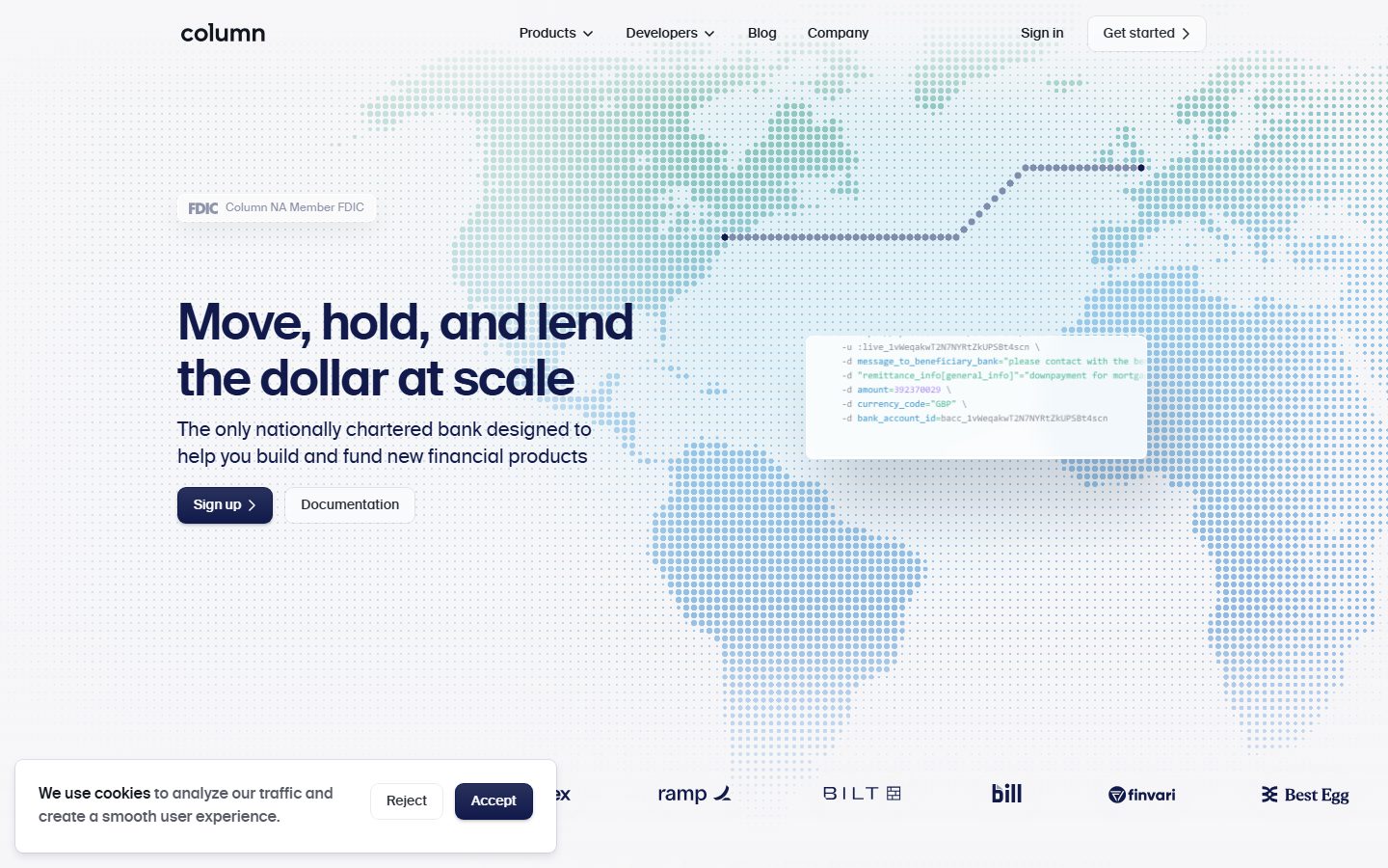
Column's marketing surface is a precise, developer-first banking-infrastructure interface. The page floor is white (`{colors.canvas}` — #ffffff) with near-black ink type (`{colors.ink}` — #000000) and a dark-navy primary CTA (`{colors.primary}` — #12161e). The voice is engineered-fintech: confident large display heads with tight negative letter-spacing, a restrained ink/neutral text scale, dotted world-map data motifs in the hero, and embedded terminal/code-snippet artifacts that signal "this is a bank built by engineers."
Type runs entirely on **Suisse Int'l** — a Swiss neo-grotesque display/text face used for headlines, body, and UI alike (substituted with **Inter** here, see Typography). The signature is the large hero head at 52px and section heads at 60px, both with aggressive negative tracking (-1.56px / -0.6px) and weight 600. Everything below display level steps down to weight 500.
The brand's chromatic interest comes not from CTA color (the button is near-black navy) but from the **data visualization layer** — a blue-and-green dotted world map (`{colors.accent-blue}` — #7ea7e9, `{colors.accent-green}` — #44b48b), code snippets tinted blue and green, and a deep teal-black infrastructure band (`{colors.surface-dark}` — #011821) that carries the "built for developers" story midway down the long-scroll page.
**Key Characteristics:**
- White canvas with a near-black navy primary CTA (`{colors.primary}` — #12161e), `{rounded.md}` (8px) corners, compact 8px × 16px padding, weight-500 label with a chevron affordance.
- Custom **Suisse Int'l** display + text typeface (substituted with Inter). Display heads carry heavy negative letter-spacing (-1.56px at 52px); supporting type sits at weight 500.
- Near-monochrome text scale: ink (#000000), body (`{colors.body}` — #3b3e47), muted (`{colors.muted}` — #575a64), neutral (`{colors.neutral}` — #7c7f88). Color is reserved for data and accents, not text.
- Dotted world-map and grid-dot data motifs in blue (`{colors.accent-blue}`) and green (`{colors.accent-green}`) — the brand's primary visual flourish.
- Embedded code/terminal snippet cards (cURL examples, API payloads) shown directly inside the marketing flow — the developer-first proof artifact.
- Soft `{colors.surface-soft}` (#f6f6f8) cards for testimonials and feature blocks, lifted by subtle layered drop shadows rather than borders.
- One deep teal-black infrastructure band (`{colors.surface-dark}` — #011821) breaks the white flow midway down, holding the developer-products narrative with green-tinted code cards.
- Border radius is shallow and consistent: `{rounded.md}` (8px) dominates buttons, cards, and inputs; `{rounded.lg}` (12px) and `{rounded.xl}` (18px) appear on larger containers.
## Colors
### Brand & Accent
- **Accent Blue** (`{colors.accent-blue}` — #7ea7e9): The highest-frequency non-text color (729). Powers the dotted world-map data motif, code-snippet syntax tint, and small UI accents.
- **Accent Blue Deep** (`{colors.accent-blue-deep}` — #1e4199): A saturated blue for emphasis dots / deep map nodes.
- **Accent Navy** (`{colors.accent-navy}` — #111a4a): A deep brand navy used in shadow tints and dark accent moments.
- **Accent Green** (`{colors.accent-green}` — #44b48b): The secondary data color — green map dots, green-tinted code in the dark band, "Technology companies" grid motif.
- **Accent Green Deep** (`{colors.accent-green-deep}` — #167e6c) and **Accent Green Light** (`{colors.accent-green-light}` — #94efb7): The green ramp for the dotted gradient map and grid-dot fields.
- **Accent Cyan** (`{colors.accent-cyan}` — #88deeb) and **Cyan Light** (`{colors.accent-cyan-light}` — #c1e8ef): Cool accents inside the map gradient.
- **Accent Orange** (`{colors.accent-orange}` — #efaa65): A rare warm accent (e.g., the Brex logo lockup / warm dotted gradient corner in the testimonial band).
### Surface
- **Canvas** (`{colors.canvas}` — #ffffff): The default page floor.
- **Surface Soft** (`{colors.surface-soft}` — #f6f6f8): Testimonial cards, feature blocks, soft section panels.
- **Surface Light** (`{colors.surface-light}` — #e3e9f2): A faint blue-gray fill / hairline tone on light surfaces.
- **Surface Dark** (`{colors.surface-dark}` — #011821): The deep teal-black infrastructure band — the only dark surface on the page.
- **Surface Dark Elevated** (`{colors.surface-dark-elevated}` — #232730): Nested code cards and elevated panels inside the dark band.
### Text
- **Ink** (`{colors.ink}` — #000000): All display headlines and primary text.
- **Body** (`{colors.body}` — #3b3e47): Default running-text color.
- **Muted** (`{colors.muted}` — #575a64): Low-contrast secondary text.
- **Neutral** (`{colors.neutral}` — #7c7f88): Eyebrow labels, captions, logo-bar text, tertiary copy.
- **Neutral Soft** (`{colors.neutral-soft}` — #a9acb6): Faintest tertiary text / fine print.
- **Primary** (`{colors.primary}` — #12161e): The near-black navy used for the primary CTA background.
- **On Primary** (`{colors.on-primary}` — #ffffff): Text on the dark button and on the dark infrastructure band.
## Typography
### Font Family
The system runs entirely on **Suisse Int'l**, a Swiss neo-grotesque used across display, headings, body, and UI. There is no secondary family — hierarchy is built from size and weight alone. Suisse Int'l is a licensed/custom typeface flagged in the analysis; **Inter** is the documented open-source substitute (see Note on Font Substitutes). The fallback stack walks `Inter, -apple-system, BlinkMacSystemFont, "Segoe UI", sans-serif`.
The weight split is functional:
- Display (h1, h2) — weight 600 with heavy negative letter-spacing (-1.56px / -0.6px)
- Everything else (h3, h4, body, buttons) — weight 500
### Hierarchy
| Token | Size | Weight | Line Height | Letter Spacing | Use |
|---|---|---|---|---|---|
| `{typography.h2}` | 60px | 600 | 1.0 | -0.6px | Largest section heads ("Flexible building blocks built on USD") |
| `{typography.h1}` | 52px | 600 | 1.1 | -1.56px | Hero headline ("Move, hold, and lend the dollar at scale") |
| `{typography.h3}` | 28px | 500 | 1.1 | -0.28px | Sub-section heads, card titles |
| `{typography.h4}` | 16px | 500 | 1.1 | 0 | Small labels, list headings |
| `{typography.body}` | 16px | 500 | 1.5 | 0 | Default running-text, descriptions |
| `{typography.button}` | 14px | 500 | 1.5 | 0 | Button labels, nav links, eyebrow labels, code snippets |
### Principles
The display weight is 600 and never heavier — Column's headlines feel precise and engineered rather than loud. The defining trait is the negative letter-spacing on the largest sizes (the 52px hero head at -1.56px); without that tracking the brand reads as generic. Below display, everything settles at weight 500 — Column never uses a true 400 light weight in this capture, which gives the body copy a slightly more substantial, technical feel.
Note the inversion: h2 (60px) is actually larger than h1 (52px). The h1 is the hero lockup; h2 governs the big mid-page section heads. Use h2 for the largest marketing statements, h1 for the hero.
### Note on Font Substitutes
Suisse Int'l is a licensed commercial typeface and is **not** shipped here. **Inter** is the documented substitute — apply weight 600 with roughly -0.03em tracking on display sizes to approximate the Suisse Int'l signature. Inter's humanist details differ subtly from Suisse Int'l's neo-grotesque forms, but the weight + negative-tracking combination preserves the voice. **Helvetica Now** or **Neue Haas Grotesk** are closer paid alternatives if licensing allows.
## Layout
### Spacing System
- **Base unit:** 4px.
- **Tokens:** `{spacing.xxs}` 4px · `{spacing.xs}` 8px · `{spacing.sm}` 12px · `{spacing.md}` 16px · `{spacing.lg}` 20px · `{spacing.xl}` 24px · `{spacing.xxl}` 32px · `{spacing.xxxl}` 48px · `{spacing.section}` 72px · `{spacing.section-lg}` 96px.
- **Most frequent step:** 12px (`{spacing.sm}`) was the single most measured spacing value, followed by 8px — Column packs interactive elements (button padding, inline gaps, label spacing) on a tight 8/12px rhythm.
- **Section padding:** `{spacing.section}` (72px) and `{spacing.section-lg}` (96px) govern the vertical band rhythm; values of 100px and 120px were also measured for the longest vertical breaks (derived as the high end of the section scale).
- **Card padding:** `{spacing.xxl}` (32px) for feature/testimonial cards; `{spacing.xl}` (24px) for info cards; `{spacing.md}` (16px) for code-snippet cards.
### Grid & Container
- **Hero:** A wide split with the headline + sub-head + button row at left and the dotted world-map data field filling the right and background.
- **Feature bands:** Two-column "label + heading + body" layouts (e.g., "The only bank built from the ground up for developers") with sub-feature columns beneath.
- **Logo bar:** A single horizontal row of partner logos (Brex, Mercury, ramp, BILT, bill, finvari, Best Egg) under the hero.
- **Dark infrastructure band:** Left-aligned narrative column with code cards stacked vertically and an isometric "stacked slabs" graphic at right.
### Whitespace Philosophy
Column uses generous vertical band spacing (72–120px) to separate major narrative sections on a very long landing page, while keeping intra-component spacing tight (8/12px). The result is a calm, scannable scroll where each band carries a single idea — paired with a dense, technical artifact (code snippet, dotted map, isometric graphic) that does the explaining.
## Elevation & Depth
| Level | Treatment | Use |
|---|---|---|
| Flat | No shadow, no border | Body sections, top nav, dark band base |
| Hairline ring | `rgba(87,90,100,0.12) 0 0 0 1px` with faint top highlight | Outlined inputs / small chips |
| Inset hairline | `rgba(0,0,0,0.05) 0 0 0 1px inset` or `rgb(255,255,255) 0 0 0 1px inset` | Card edges, inset light rings on tinted surfaces |
| Soft button lift | `rgba(17,26,74,0.1) 0 1px 3px`, `rgba(17,26,74,0.05) 0 1px 0`, plus white inset highlights | Primary/secondary buttons — a subtle navy-tinted lift with an inner top highlight |
| Layered card float | `rgba(0,0,0,0.02) 0 40px 32px` → `rgba(0,0,0,0.07) 0 3px 2px` (5-stop stack) | Floating UI/notification cards in the hero, elevated feature cards |
| Deep modal float | `rgba(0,0,0,0.024) 0 0 0 1px`, `rgba(0,0,0,0.05) 0 16px 32px`, `rgba(0,0,0,0.1) 0 4px 8px` | Highest-elevation cards / overlays |
Column's depth language is **soft, multi-stop, and physically calibrated** — the floating hero cards use five stacked shadows at low alpha to read as gently lifted glass rather than hard drop-shadowed boxes. Buttons carry a navy-tinted shadow plus a white inset top-highlight, giving them a subtle tactile bevel.
### Decorative Depth
- Dotted world-map and grid-dot fields create an ambient data texture behind the hero and lower bands — depth from density gradient rather than shadow.
- The dark infrastructure band uses an isometric stacked-slab graphic (layered translucent panels) to visualize the "building blocks" metaphor; its internal shadows are part of that illustration, not system tokens.
## Shapes
### Border Radius Scale
| Token | Value | Use |
|---|---|---|
| `{rounded.xs}` | 2px | Tiny chips, syntax tags, smallest UI accents |
| `{rounded.sm}` | 6px | Small inline elements |
| `{rounded.md}` | 8px | Dominant radius — buttons, cards, inputs, code snippets, panels |
| `{rounded.lg}` | 12px | Larger content cards, testimonial / feature panels |
| `{rounded.xl}` | 18px | Largest containers / floating cards |
The 8px radius (`{rounded.md}`) overwhelmingly dominates (measured 125 times vs. single-digit counts for all others) — Column's shape voice is one consistent, modest rounding applied almost everywhere. Larger radii appear only on the biggest floating containers.
### Geometry
Code-snippet cards, partner-logo lockups, and feature cards all share the 8px corner. The dotted map and grid-dot motifs are built from small circular dots — the only truly round geometry in the system. Isometric slab graphics in the dark band use their own perspective-skewed rounding.
## Components
### Top Navigation
**`top-nav`** — White nav bar across the top of the page. Carries the lowercase "column" wordmark at left, a center menu (Products ▾, Developers ▾, Blog, Company), and a right cluster with "Sign in" `{component.nav-link}` and a "Get started ›" outlined button. Menu items use `{typography.button}` (Suisse Int'l 14px / 500) in `{colors.primary}`.
**`nav-link`** — Inline text nav item, transparent background, `{colors.primary}` text. Used for "Sign in" and the menu items. Dropdown items (Products / Developers) carry a chevron affordance.
### Buttons
**`button-primary`** — The signature CTA ("Sign up ›"). Background `{colors.primary}` (#12161e), text `{colors.on-primary}` (#ffffff), type `{typography.button}` (Suisse Int'l 14px / 500), rounded `{rounded.md}` (8px), padding 8px × 16px. Carries a trailing chevron and a subtle navy-tinted shadow with white inset top-highlight (see Elevation).
**`button-secondary`** — Outlined light button ("Documentation", "Get started ›", "Reject"). Background `{colors.canvas}`, text `{colors.primary}`, hairline ring border, same radius and padding as primary.
### Hero
**`hero-band`** — White-canvas hero with the headline in `{typography.h1}` (52px), a `{typography.body}` sub-head ("The only nationally chartered bank designed to help you build and fund new financial products"), and a `{component.button-primary}` + `{component.button-secondary}` button row. The right side and background hold the dotted blue/green world-map data field plus a floating notification/transaction card and a `{component.code-snippet-card}`.
**`eyebrow-label`** — Small all-caps section label in `{colors.neutral}` ("TRUSTED AT SCALE", "DEVELOPER FIRST", "INFRASTRUCTURE", "COLUMN FOR", "PRODUCTS") with a trailing chevron/index marker. Type `{typography.button}` (14px / 500).
### Cards & Containers
**`code-snippet-card`** — A terminal/cURL artifact embedded in the marketing flow. Background `{colors.canvas}`, syntax tinted in `{colors.accent-blue}` and `{colors.accent-green}`, rounded `{rounded.md}` (8px), padding 16px. Monospace-style API payloads (`-d currency_code="GBP"`, `bank_account_id=...`) shown verbatim — the developer-first proof.
**`logo-bar`** — A horizontal partner-logo strip (Brex, Mercury, ramp, BILT, bill, finvari, Best Egg) on `{colors.canvas}`, logos rendered in `{colors.neutral}` monochrome.
**`feature-card`** — Soft panel used in developer-narrative bands. Background `{colors.surface-soft}` (#f6f6f8), rounded `{rounded.lg}` (12px), padding `{spacing.xxl}` (32px), heading in `{typography.h3}`.
**`testimonial-card`** — Customer-quote panel (Brex / Pedro Franceschi). Background `{colors.surface-soft}`, rounded `{rounded.lg}`, padding `{spacing.xxl}` (32px). Carries logo tabs, feature tags ("Bank Accounts", "Domestic Payments", "International Payments"), a pull-quote in `{typography.body}`, and an attribution line in `{colors.muted}`. A warm dotted gradient (`{colors.accent-orange}`) fills one corner.
**`info-card`** — Compact text block for sub-feature columns ("Close to the metal", "Scale for every size"). Background `{colors.canvas}`, body in `{typography.body}` / `{colors.body}`, rounded `{rounded.md}`, padding `{spacing.xl}` (24px).
### Dark Band
**`dark-section`** — The deep teal-black infrastructure band ("Flexible building blocks built on USD"). Background `{colors.surface-dark}` (#011821), text `{colors.on-primary}`, heads in `{typography.h2}`, generous `{spacing.section-lg}` (96px) padding. The only dark surface on the page — it visually separates the developer-products narrative from the white marketing flow above and below.
**`dark-code-card`** — Code snippet shown inside the dark band. Background `{colors.surface-dark-elevated}` (#232730), green-tinted syntax in `{colors.accent-green}`, rounded `{rounded.md}`, padding 16px.
### Utility
**`cookie-banner`** — Bottom-left consent card. Background `{colors.canvas}`, body in `{typography.body}` / `{colors.body}`, rounded `{rounded.lg}`, padding `{spacing.lg}` (20px). Carries a `{component.button-secondary}` ("Reject") and a `{component.button-primary}` ("Accept").
## Do's and Don'ts
### Do
- Reserve `{colors.primary}` (#12161e) for the primary CTA. Column's button is near-black navy, never a bright blue.
- Apply heavy negative letter-spacing to display heads (-1.56px on the 52px hero, -0.6px on 60px section heads). The tight tracking is core to the Suisse Int'l voice.
- Keep all supporting type at weight 500 — Column doesn't use a thin 400 weight in body copy.
- Use the dotted blue/green data-map motif for chromatic interest, not for CTA color. Accent color lives in data visualization.
- Embed real code/terminal snippets inside marketing bands — they are the developer-first proof artifact, not decoration.
- Use `{rounded.md}` (8px) as the default radius almost everywhere; reserve larger radii for big floating containers.
- Use the single dark band (`{colors.surface-dark}`) to separate the developer-infrastructure story; let green-tinted code cards live inside it.
- Lift floating cards with the multi-stop low-alpha shadow stack, not a single hard drop shadow.
### Don't
- Don't tint body text with accent colors — text stays on the ink → body → muted → neutral monochrome ramp.
- Don't bold display type past 600 — Column reads precise, not heavy.
- Don't add a second typeface; the system is single-family (Suisse Int'l / Inter substitute).
- Don't introduce additional dark surfaces beyond the one infrastructure band — its scarcity is the point.
- Don't apply large radii broadly; the 8px corner is the consistent voice.
- Don't document hover states — only default and active/pressed are in scope.
## Responsive Behavior
| Name | Width | Key Changes |
|---|---|---|
| Mobile | < 768px | Hamburger nav; hero headline scales down from 52px; map motif simplifies/recedes behind content; button row stacks; feature columns 1-up; dark-band code cards full-width |
| Tablet | 768–1024px | Nav tightens; hero split compresses; feature bands move from 2-up to stacked; logo bar wraps |
| Desktop | 1024–1440px | Full hero split (headline left, map + floating cards right); 2-up feature bands; full horizontal logo bar |
| Wide | > 1440px | Same as desktop with more outer breathing room; map data field extends |
### Touch Targets
- `{component.button-primary}` uses 8px × 16px padding on a 14px label — the effective tap area is modest; ensure a minimum 44px target height on touch by padding the wrapper (derived guidance; exact mobile heights not measured).
- Nav links and dropdown triggers need expanded tap padding on mobile.
### Collapsing Strategy
- Top nav collapses to a hamburger; the menu opens as a sheet.
- Hero collapses from side-by-side (text + map) to stacked, with the dotted map receding to a background texture.
- Feature/testimonial bands reduce from 2-up to 1-up.
- The dark infrastructure band keeps its narrative-then-code-card vertical order at every breakpoint.
### Image / Motif Behavior
- The dotted world-map and grid-dot fields are vector data motifs that scale/crop with the viewport.
- Code-snippet cards retain monospace legibility; wrap or scroll horizontally on narrow screens.
- The isometric stacked-slab graphic scales proportionally inside the dark band.
## Iteration Guide
1. Focus on ONE component at a time, referencing its YAML key directly (`{component.code-snippet-card}`, `{component.dark-section}`).
2. Variants of an existing component live as separate `components:` entries, not inline states.
3. Use `{token.refs}` everywhere — never inline a hex in a component.
4. Document default and active/pressed states only — never hover.
5. Display heads stay Suisse Int'l 600 with negative tracking; supporting type stays 500. The weight split does not blur.
6. Accent color belongs to data motifs and code syntax — keep CTAs and text monochrome.
7. The dark infrastructure band is the only dark surface — don't scatter dark cards elsewhere.
## Known Gaps
- Suisse Int'l is a licensed commercial typeface and is not shipped; Inter is documented as the substitute. Exact licensed-font rendering will differ from the Inter approximation.
- Only `button-primary` was captured by the component extractor (color #12161e, 8px radius, 8px × 16px padding). All other component specs (nav, cards, dark band, code cards, cookie banner) are reconstructed from screenshot ground-truth plus measured tokens; their exact paddings/heights are derived, not measured.
- The `on-primary` role in the raw analysis reported #12161e (the button's dark fill); the button label is white in the screenshots, so `{colors.on-primary}` is set to the measured canvas white (#ffffff). The dark navy is documented as `{colors.primary}`.
- Letter-spacing for h4, body, and button measured as "normal" and is recorded as 0.
- Spacing values of 100px and 120px were measured but folded into the section scale (section / section-lg) as the high end; exact band-by-band vertical rhythm is not fully enumerated.
- Footer styling, mobile nav sheet, form/input states, and animation/transition timings are out of scope (single landing-page capture).
- The blue/green accent ramp (blue, blue-deep, navy, green, green-deep, green-light, cyan, cyan-light, orange) is documented from frequency data; precise usage per motif and exact gradient stops were not individually mapped.
<!-- Documented by duply · real-world design systems as ready-to-use DESIGN.md for AI coding agents · https://duply.ai/column/design-md -->
Color Palette
Accent
Neutrals
Typography
h152px · 600 · 1.1
The quick brown fox jumpsh260px · 600 · 1
The quick brown fox jumpsh328px · 500 · 1.1
The quick brown fox jumpsh416px · 500 · 1.1
The quick brown fox jumpsbody16px · 500 · 1.5
The quick brown fox jumpsbutton14px · 500 · 1.5
The quick brown fox jumpsSpacing & Shape
Spacing
| Name | Value | Preview |
|---|---|---|
| xxs | 4px | |
| xs | 8px | |
| sm | 12px | |
| md | 16px | |
| lg | 20px | |
| xl | 24px | |
| xxl | 32px | |
| xxxl | 48px | |
| section | 72px | |
| section-lg | 96px |
Border Radius
| Name | Value | Preview |
|---|---|---|
| xs | 2px | |
| sm | 6px | |
| md | 8px | |
| lg | 12px | |
| xl | 18px |
More like this


---
version: alpha
name: Column-design-analysis
description: A precise, developer-first banking-infrastructure interface built on a white canvas with a dark-navy primary CTA and custom Suisse Int'l typography. The system reads as engineered fintech — tight letter-spacing on large display heads, a near-monochrome ink/neutral text scale, soft 8px-rounded cards lifted by subtle layered shadows, embedded terminal/code snippet artifacts, dotted world-map data motifs, and a deep teal-black band that carries the "built for developers" infrastructure story.
colors:
  primary: "#12161e"
  ink: "#000000"
  body: "#3b3e47"
  muted: "#575a64"
  neutral: "#7c7f88"
  neutral-soft: "#a9acb6"
  canvas: "#ffffff"
  surface-soft: "#f6f6f8"
  surface-light: "#e3e9f2"
  surface-dark: "#011821"
  surface-dark-elevated: "#232730"
  on-primary: "#ffffff"
  accent-blue: "#7ea7e9"
  accent-blue-deep: "#1e4199"
  accent-navy: "#111a4a"
  accent-green: "#44b48b"
  accent-green-deep: "#167e6c"
  accent-green-light: "#94efb7"
  accent-cyan: "#88deeb"
  accent-cyan-light: "#c1e8ef"
  accent-orange: "#efaa65"

typography:
  h1:
    fontFamily: "Suisse Int'l, Inter, sans-serif"
    fontSize: 52px
    fontWeight: 600
    lineHeight: 1.1
    letterSpacing: -1.56px
  h2:
    fontFamily: "Suisse Int'l, Inter, sans-serif"
    fontSize: 60px
    fontWeight: 600
    lineHeight: 1.0
    letterSpacing: -0.6px
  h3:
    fontFamily: "Suisse Int'l, Inter, sans-serif"
    fontSize: 28px
    fontWeight: 500
    lineHeight: 1.1
    letterSpacing: -0.28px
  h4:
    fontFamily: "Suisse Int'l, Inter, sans-serif"
    fontSize: 16px
    fontWeight: 500
    lineHeight: 1.1
    letterSpacing: 0
  body:
    fontFamily: "Suisse Int'l, Inter, sans-serif"
    fontSize: 16px
    fontWeight: 500
    lineHeight: 1.5
    letterSpacing: 0
  button:
    fontFamily: "Suisse Int'l, Inter, sans-serif"
    fontSize: 14px
    fontWeight: 500
    lineHeight: 1.5
    letterSpacing: 0

rounded:
  xs: 2px
  sm: 6px
  md: 8px
  lg: 12px
  xl: 18px

spacing:
  xxs: 4px
  xs: 8px
  sm: 12px
  md: 16px
  lg: 20px
  xl: 24px
  xxl: 32px
  xxxl: 48px
  section: 72px
  section-lg: 96px

components:
  top-nav:
    backgroundColor: "{colors.canvas}"
    textColor: "{colors.primary}"
    typography: "{typography.button}"
  nav-link:
    backgroundColor: transparent
    textColor: "{colors.primary}"
    typography: "{typography.button}"
  button-primary:
    backgroundColor: "{colors.primary}"
    textColor: "{colors.on-primary}"
    typography: "{typography.button}"
    rounded: "{rounded.md}"
    padding: 8px 16px
  button-secondary:
    backgroundColor: "{colors.canvas}"
    textColor: "{colors.primary}"
    typography: "{typography.button}"
    rounded: "{rounded.md}"
    padding: 8px 16px
  hero-band:
    backgroundColor: "{colors.canvas}"
    textColor: "{colors.ink}"
    typography: "{typography.h1}"
    padding: 72px
  eyebrow-label:
    backgroundColor: transparent
    textColor: "{colors.neutral}"
    typography: "{typography.button}"
  code-snippet-card:
    backgroundColor: "{colors.canvas}"
    textColor: "{colors.accent-blue}"
    typography: "{typography.button}"
    rounded: "{rounded.md}"
    padding: 16px
  logo-bar:
    backgroundColor: "{colors.canvas}"
    textColor: "{colors.neutral}"
  feature-card:
    backgroundColor: "{colors.surface-soft}"
    textColor: "{colors.ink}"
    typography: "{typography.h3}"
    rounded: "{rounded.lg}"
    padding: 32px
  testimonial-card:
    backgroundColor: "{colors.surface-soft}"
    textColor: "{colors.ink}"
    typography: "{typography.body}"
    rounded: "{rounded.lg}"
    padding: 32px
  info-card:
    backgroundColor: "{colors.canvas}"
    textColor: "{colors.body}"
    typography: "{typography.body}"
    rounded: "{rounded.md}"
    padding: 24px
  dark-section:
    backgroundColor: "{colors.surface-dark}"
    textColor: "{colors.on-primary}"
    typography: "{typography.h2}"
    padding: 96px
  dark-code-card:
    backgroundColor: "{colors.surface-dark-elevated}"
    textColor: "{colors.accent-green}"
    typography: "{typography.button}"
    rounded: "{rounded.md}"
    padding: 16px
  cookie-banner:
    backgroundColor: "{colors.canvas}"
    textColor: "{colors.body}"
    typography: "{typography.body}"
    rounded: "{rounded.lg}"
    padding: 20px
---

## Overview

Column's marketing surface is a precise, developer-first banking-infrastructure interface. The page floor is white (`{colors.canvas}` — #ffffff) with near-black ink type (`{colors.ink}` — #000000) and a dark-navy primary CTA (`{colors.primary}` — #12161e). The voice is engineered-fintech: confident large display heads with tight negative letter-spacing, a restrained ink/neutral text scale, dotted world-map data motifs in the hero, and embedded terminal/code-snippet artifacts that signal "this is a bank built by engineers."

Type runs entirely on **Suisse Int'l** — a Swiss neo-grotesque display/text face used for headlines, body, and UI alike (substituted with **Inter** here, see Typography). The signature is the large hero head at 52px and section heads at 60px, both with aggressive negative tracking (-1.56px / -0.6px) and weight 600. Everything below display level steps down to weight 500.

The brand's chromatic interest comes not from CTA color (the button is near-black navy) but from the **data visualization layer** — a blue-and-green dotted world map (`{colors.accent-blue}` — #7ea7e9, `{colors.accent-green}` — #44b48b), code snippets tinted blue and green, and a deep teal-black infrastructure band (`{colors.surface-dark}` — #011821) that carries the "built for developers" story midway down the long-scroll page.

**Key Characteristics:**
- White canvas with a near-black navy primary CTA (`{colors.primary}` — #12161e), `{rounded.md}` (8px) corners, compact 8px × 16px padding, weight-500 label with a chevron affordance.
- Custom **Suisse Int'l** display + text typeface (substituted with Inter). Display heads carry heavy negative letter-spacing (-1.56px at 52px); supporting type sits at weight 500.
- Near-monochrome text scale: ink (#000000), body (`{colors.body}` — #3b3e47), muted (`{colors.muted}` — #575a64), neutral (`{colors.neutral}` — #7c7f88). Color is reserved for data and accents, not text.
- Dotted world-map and grid-dot data motifs in blue (`{colors.accent-blue}`) and green (`{colors.accent-green}`) — the brand's primary visual flourish.
- Embedded code/terminal snippet cards (cURL examples, API payloads) shown directly inside the marketing flow — the developer-first proof artifact.
- Soft `{colors.surface-soft}` (#f6f6f8) cards for testimonials and feature blocks, lifted by subtle layered drop shadows rather than borders.
- One deep teal-black infrastructure band (`{colors.surface-dark}` — #011821) breaks the white flow midway down, holding the developer-products narrative with green-tinted code cards.
- Border radius is shallow and consistent: `{rounded.md}` (8px) dominates buttons, cards, and inputs; `{rounded.lg}` (12px) and `{rounded.xl}` (18px) appear on larger containers.

## Colors

### Brand & Accent
- **Accent Blue** (`{colors.accent-blue}` — #7ea7e9): The highest-frequency non-text color (729). Powers the dotted world-map data motif, code-snippet syntax tint, and small UI accents.
- **Accent Blue Deep** (`{colors.accent-blue-deep}` — #1e4199): A saturated blue for emphasis dots / deep map nodes.
- **Accent Navy** (`{colors.accent-navy}` — #111a4a): A deep brand navy used in shadow tints and dark accent moments.
- **Accent Green** (`{colors.accent-green}` — #44b48b): The secondary data color — green map dots, green-tinted code in the dark band, "Technology companies" grid motif.
- **Accent Green Deep** (`{colors.accent-green-deep}` — #167e6c) and **Accent Green Light** (`{colors.accent-green-light}` — #94efb7): The green ramp for the dotted gradient map and grid-dot fields.
- **Accent Cyan** (`{colors.accent-cyan}` — #88deeb) and **Cyan Light** (`{colors.accent-cyan-light}` — #c1e8ef): Cool accents inside the map gradient.
- **Accent Orange** (`{colors.accent-orange}` — #efaa65): A rare warm accent (e.g., the Brex logo lockup / warm dotted gradient corner in the testimonial band).

### Surface
- **Canvas** (`{colors.canvas}` — #ffffff): The default page floor.
- **Surface Soft** (`{colors.surface-soft}` — #f6f6f8): Testimonial cards, feature blocks, soft section panels.
- **Surface Light** (`{colors.surface-light}` — #e3e9f2): A faint blue-gray fill / hairline tone on light surfaces.
- **Surface Dark** (`{colors.surface-dark}` — #011821): The deep teal-black infrastructure band — the only dark surface on the page.
- **Surface Dark Elevated** (`{colors.surface-dark-elevated}` — #232730): Nested code cards and elevated panels inside the dark band.

### Text
- **Ink** (`{colors.ink}` — #000000): All display headlines and primary text.
- **Body** (`{colors.body}` — #3b3e47): Default running-text color.
- **Muted** (`{colors.muted}` — #575a64): Low-contrast secondary text.
- **Neutral** (`{colors.neutral}` — #7c7f88): Eyebrow labels, captions, logo-bar text, tertiary copy.
- **Neutral Soft** (`{colors.neutral-soft}` — #a9acb6): Faintest tertiary text / fine print.
- **Primary** (`{colors.primary}` — #12161e): The near-black navy used for the primary CTA background.
- **On Primary** (`{colors.on-primary}` — #ffffff): Text on the dark button and on the dark infrastructure band.

## Typography

### Font Family
The system runs entirely on **Suisse Int'l**, a Swiss neo-grotesque used across display, headings, body, and UI. There is no secondary family — hierarchy is built from size and weight alone. Suisse Int'l is a licensed/custom typeface flagged in the analysis; **Inter** is the documented open-source substitute (see Note on Font Substitutes). The fallback stack walks `Inter, -apple-system, BlinkMacSystemFont, "Segoe UI", sans-serif`.

The weight split is functional:
- Display (h1, h2) — weight 600 with heavy negative letter-spacing (-1.56px / -0.6px)
- Everything else (h3, h4, body, buttons) — weight 500

### Hierarchy

| Token | Size | Weight | Line Height | Letter Spacing | Use |
|---|---|---|---|---|---|
| `{typography.h2}` | 60px | 600 | 1.0 | -0.6px | Largest section heads ("Flexible building blocks built on USD") |
| `{typography.h1}` | 52px | 600 | 1.1 | -1.56px | Hero headline ("Move, hold, and lend the dollar at scale") |
| `{typography.h3}` | 28px | 500 | 1.1 | -0.28px | Sub-section heads, card titles |
| `{typography.h4}` | 16px | 500 | 1.1 | 0 | Small labels, list headings |
| `{typography.body}` | 16px | 500 | 1.5 | 0 | Default running-text, descriptions |
| `{typography.button}` | 14px | 500 | 1.5 | 0 | Button labels, nav links, eyebrow labels, code snippets |

### Principles
The display weight is 600 and never heavier — Column's headlines feel precise and engineered rather than loud. The defining trait is the negative letter-spacing on the largest sizes (the 52px hero head at -1.56px); without that tracking the brand reads as generic. Below display, everything settles at weight 500 — Column never uses a true 400 light weight in this capture, which gives the body copy a slightly more substantial, technical feel.

Note the inversion: h2 (60px) is actually larger than h1 (52px). The h1 is the hero lockup; h2 governs the big mid-page section heads. Use h2 for the largest marketing statements, h1 for the hero.

### Note on Font Substitutes
Suisse Int'l is a licensed commercial typeface and is **not** shipped here. **Inter** is the documented substitute — apply weight 600 with roughly -0.03em tracking on display sizes to approximate the Suisse Int'l signature. Inter's humanist details differ subtly from Suisse Int'l's neo-grotesque forms, but the weight + negative-tracking combination preserves the voice. **Helvetica Now** or **Neue Haas Grotesk** are closer paid alternatives if licensing allows.

## Layout

### Spacing System
- **Base unit:** 4px.
- **Tokens:** `{spacing.xxs}` 4px · `{spacing.xs}` 8px · `{spacing.sm}` 12px · `{spacing.md}` 16px · `{spacing.lg}` 20px · `{spacing.xl}` 24px · `{spacing.xxl}` 32px · `{spacing.xxxl}` 48px · `{spacing.section}` 72px · `{spacing.section-lg}` 96px.
- **Most frequent step:** 12px (`{spacing.sm}`) was the single most measured spacing value, followed by 8px — Column packs interactive elements (button padding, inline gaps, label spacing) on a tight 8/12px rhythm.
- **Section padding:** `{spacing.section}` (72px) and `{spacing.section-lg}` (96px) govern the vertical band rhythm; values of 100px and 120px were also measured for the longest vertical breaks (derived as the high end of the section scale).
- **Card padding:** `{spacing.xxl}` (32px) for feature/testimonial cards; `{spacing.xl}` (24px) for info cards; `{spacing.md}` (16px) for code-snippet cards.

### Grid & Container
- **Hero:** A wide split with the headline + sub-head + button row at left and the dotted world-map data field filling the right and background.
- **Feature bands:** Two-column "label + heading + body" layouts (e.g., "The only bank built from the ground up for developers") with sub-feature columns beneath.
- **Logo bar:** A single horizontal row of partner logos (Brex, Mercury, ramp, BILT, bill, finvari, Best Egg) under the hero.
- **Dark infrastructure band:** Left-aligned narrative column with code cards stacked vertically and an isometric "stacked slabs" graphic at right.

### Whitespace Philosophy
Column uses generous vertical band spacing (72–120px) to separate major narrative sections on a very long landing page, while keeping intra-component spacing tight (8/12px). The result is a calm, scannable scroll where each band carries a single idea — paired with a dense, technical artifact (code snippet, dotted map, isometric graphic) that does the explaining.

## Elevation & Depth

| Level | Treatment | Use |
|---|---|---|
| Flat | No shadow, no border | Body sections, top nav, dark band base |
| Hairline ring | `rgba(87,90,100,0.12) 0 0 0 1px` with faint top highlight | Outlined inputs / small chips |
| Inset hairline | `rgba(0,0,0,0.05) 0 0 0 1px inset` or `rgb(255,255,255) 0 0 0 1px inset` | Card edges, inset light rings on tinted surfaces |
| Soft button lift | `rgba(17,26,74,0.1) 0 1px 3px`, `rgba(17,26,74,0.05) 0 1px 0`, plus white inset highlights | Primary/secondary buttons — a subtle navy-tinted lift with an inner top highlight |
| Layered card float | `rgba(0,0,0,0.02) 0 40px 32px` → `rgba(0,0,0,0.07) 0 3px 2px` (5-stop stack) | Floating UI/notification cards in the hero, elevated feature cards |
| Deep modal float | `rgba(0,0,0,0.024) 0 0 0 1px`, `rgba(0,0,0,0.05) 0 16px 32px`, `rgba(0,0,0,0.1) 0 4px 8px` | Highest-elevation cards / overlays |

Column's depth language is **soft, multi-stop, and physically calibrated** — the floating hero cards use five stacked shadows at low alpha to read as gently lifted glass rather than hard drop-shadowed boxes. Buttons carry a navy-tinted shadow plus a white inset top-highlight, giving them a subtle tactile bevel.

### Decorative Depth
- Dotted world-map and grid-dot fields create an ambient data texture behind the hero and lower bands — depth from density gradient rather than shadow.
- The dark infrastructure band uses an isometric stacked-slab graphic (layered translucent panels) to visualize the "building blocks" metaphor; its internal shadows are part of that illustration, not system tokens.

## Shapes

### Border Radius Scale

| Token | Value | Use |
|---|---|---|
| `{rounded.xs}` | 2px | Tiny chips, syntax tags, smallest UI accents |
| `{rounded.sm}` | 6px | Small inline elements |
| `{rounded.md}` | 8px | Dominant radius — buttons, cards, inputs, code snippets, panels |
| `{rounded.lg}` | 12px | Larger content cards, testimonial / feature panels |
| `{rounded.xl}` | 18px | Largest containers / floating cards |

The 8px radius (`{rounded.md}`) overwhelmingly dominates (measured 125 times vs. single-digit counts for all others) — Column's shape voice is one consistent, modest rounding applied almost everywhere. Larger radii appear only on the biggest floating containers.

### Geometry
Code-snippet cards, partner-logo lockups, and feature cards all share the 8px corner. The dotted map and grid-dot motifs are built from small circular dots — the only truly round geometry in the system. Isometric slab graphics in the dark band use their own perspective-skewed rounding.

## Components

### Top Navigation

**`top-nav`** — White nav bar across the top of the page. Carries the lowercase "column" wordmark at left, a center menu (Products ▾, Developers ▾, Blog, Company), and a right cluster with "Sign in" `{component.nav-link}` and a "Get started ›" outlined button. Menu items use `{typography.button}` (Suisse Int'l 14px / 500) in `{colors.primary}`.

**`nav-link`** — Inline text nav item, transparent background, `{colors.primary}` text. Used for "Sign in" and the menu items. Dropdown items (Products / Developers) carry a chevron affordance.

### Buttons

**`button-primary`** — The signature CTA ("Sign up ›"). Background `{colors.primary}` (#12161e), text `{colors.on-primary}` (#ffffff), type `{typography.button}` (Suisse Int'l 14px / 500), rounded `{rounded.md}` (8px), padding 8px × 16px. Carries a trailing chevron and a subtle navy-tinted shadow with white inset top-highlight (see Elevation).

**`button-secondary`** — Outlined light button ("Documentation", "Get started ›", "Reject"). Background `{colors.canvas}`, text `{colors.primary}`, hairline ring border, same radius and padding as primary.

### Hero

**`hero-band`** — White-canvas hero with the headline in `{typography.h1}` (52px), a `{typography.body}` sub-head ("The only nationally chartered bank designed to help you build and fund new financial products"), and a `{component.button-primary}` + `{component.button-secondary}` button row. The right side and background hold the dotted blue/green world-map data field plus a floating notification/transaction card and a `{component.code-snippet-card}`.

**`eyebrow-label`** — Small all-caps section label in `{colors.neutral}` ("TRUSTED AT SCALE", "DEVELOPER FIRST", "INFRASTRUCTURE", "COLUMN FOR", "PRODUCTS") with a trailing chevron/index marker. Type `{typography.button}` (14px / 500).

### Cards & Containers

**`code-snippet-card`** — A terminal/cURL artifact embedded in the marketing flow. Background `{colors.canvas}`, syntax tinted in `{colors.accent-blue}` and `{colors.accent-green}`, rounded `{rounded.md}` (8px), padding 16px. Monospace-style API payloads (`-d currency_code="GBP"`, `bank_account_id=...`) shown verbatim — the developer-first proof.

**`logo-bar`** — A horizontal partner-logo strip (Brex, Mercury, ramp, BILT, bill, finvari, Best Egg) on `{colors.canvas}`, logos rendered in `{colors.neutral}` monochrome.

**`feature-card`** — Soft panel used in developer-narrative bands. Background `{colors.surface-soft}` (#f6f6f8), rounded `{rounded.lg}` (12px), padding `{spacing.xxl}` (32px), heading in `{typography.h3}`.

**`testimonial-card`** — Customer-quote panel (Brex / Pedro Franceschi). Background `{colors.surface-soft}`, rounded `{rounded.lg}`, padding `{spacing.xxl}` (32px). Carries logo tabs, feature tags ("Bank Accounts", "Domestic Payments", "International Payments"), a pull-quote in `{typography.body}`, and an attribution line in `{colors.muted}`. A warm dotted gradient (`{colors.accent-orange}`) fills one corner.

**`info-card`** — Compact text block for sub-feature columns ("Close to the metal", "Scale for every size"). Background `{colors.canvas}`, body in `{typography.body}` / `{colors.body}`, rounded `{rounded.md}`, padding `{spacing.xl}` (24px).

### Dark Band

**`dark-section`** — The deep teal-black infrastructure band ("Flexible building blocks built on USD"). Background `{colors.surface-dark}` (#011821), text `{colors.on-primary}`, heads in `{typography.h2}`, generous `{spacing.section-lg}` (96px) padding. The only dark surface on the page — it visually separates the developer-products narrative from the white marketing flow above and below.

**`dark-code-card`** — Code snippet shown inside the dark band. Background `{colors.surface-dark-elevated}` (#232730), green-tinted syntax in `{colors.accent-green}`, rounded `{rounded.md}`, padding 16px.

### Utility

**`cookie-banner`** — Bottom-left consent card. Background `{colors.canvas}`, body in `{typography.body}` / `{colors.body}`, rounded `{rounded.lg}`, padding `{spacing.lg}` (20px). Carries a `{component.button-secondary}` ("Reject") and a `{component.button-primary}` ("Accept").

## Do's and Don'ts

### Do
- Reserve `{colors.primary}` (#12161e) for the primary CTA. Column's button is near-black navy, never a bright blue.
- Apply heavy negative letter-spacing to display heads (-1.56px on the 52px hero, -0.6px on 60px section heads). The tight tracking is core to the Suisse Int'l voice.
- Keep all supporting type at weight 500 — Column doesn't use a thin 400 weight in body copy.
- Use the dotted blue/green data-map motif for chromatic interest, not for CTA color. Accent color lives in data visualization.
- Embed real code/terminal snippets inside marketing bands — they are the developer-first proof artifact, not decoration.
- Use `{rounded.md}` (8px) as the default radius almost everywhere; reserve larger radii for big floating containers.
- Use the single dark band (`{colors.surface-dark}`) to separate the developer-infrastructure story; let green-tinted code cards live inside it.
- Lift floating cards with the multi-stop low-alpha shadow stack, not a single hard drop shadow.

### Don't
- Don't tint body text with accent colors — text stays on the ink → body → muted → neutral monochrome ramp.
- Don't bold display type past 600 — Column reads precise, not heavy.
- Don't add a second typeface; the system is single-family (Suisse Int'l / Inter substitute).
- Don't introduce additional dark surfaces beyond the one infrastructure band — its scarcity is the point.
- Don't apply large radii broadly; the 8px corner is the consistent voice.
- Don't document hover states — only default and active/pressed are in scope.

## Responsive Behavior

| Name | Width | Key Changes |
|---|---|---|
| Mobile | < 768px | Hamburger nav; hero headline scales down from 52px; map motif simplifies/recedes behind content; button row stacks; feature columns 1-up; dark-band code cards full-width |
| Tablet | 768–1024px | Nav tightens; hero split compresses; feature bands move from 2-up to stacked; logo bar wraps |
| Desktop | 1024–1440px | Full hero split (headline left, map + floating cards right); 2-up feature bands; full horizontal logo bar |
| Wide | > 1440px | Same as desktop with more outer breathing room; map data field extends |

### Touch Targets
- `{component.button-primary}` uses 8px × 16px padding on a 14px label — the effective tap area is modest; ensure a minimum 44px target height on touch by padding the wrapper (derived guidance; exact mobile heights not measured).
- Nav links and dropdown triggers need expanded tap padding on mobile.

### Collapsing Strategy
- Top nav collapses to a hamburger; the menu opens as a sheet.
- Hero collapses from side-by-side (text + map) to stacked, with the dotted map receding to a background texture.
- Feature/testimonial bands reduce from 2-up to 1-up.
- The dark infrastructure band keeps its narrative-then-code-card vertical order at every breakpoint.

### Image / Motif Behavior
- The dotted world-map and grid-dot fields are vector data motifs that scale/crop with the viewport.
- Code-snippet cards retain monospace legibility; wrap or scroll horizontally on narrow screens.
- The isometric stacked-slab graphic scales proportionally inside the dark band.

## Iteration Guide

1. Focus on ONE component at a time, referencing its YAML key directly (`{component.code-snippet-card}`, `{component.dark-section}`).
2. Variants of an existing component live as separate `components:` entries, not inline states.
3. Use `{token.refs}` everywhere — never inline a hex in a component.
4. Document default and active/pressed states only — never hover.
5. Display heads stay Suisse Int'l 600 with negative tracking; supporting type stays 500. The weight split does not blur.
6. Accent color belongs to data motifs and code syntax — keep CTAs and text monochrome.
7. The dark infrastructure band is the only dark surface — don't scatter dark cards elsewhere.

## Known Gaps

- Suisse Int'l is a licensed commercial typeface and is not shipped; Inter is documented as the substitute. Exact licensed-font rendering will differ from the Inter approximation.
- Only `button-primary` was captured by the component extractor (color #12161e, 8px radius, 8px × 16px padding). All other component specs (nav, cards, dark band, code cards, cookie banner) are reconstructed from screenshot ground-truth plus measured tokens; their exact paddings/heights are derived, not measured.
- The `on-primary` role in the raw analysis reported #12161e (the button's dark fill); the button label is white in the screenshots, so `{colors.on-primary}` is set to the measured canvas white (#ffffff). The dark navy is documented as `{colors.primary}`.
- Letter-spacing for h4, body, and button measured as "normal" and is recorded as 0.
- Spacing values of 100px and 120px were measured but folded into the section scale (section / section-lg) as the high end; exact band-by-band vertical rhythm is not fully enumerated.
- Footer styling, mobile nav sheet, form/input states, and animation/transition timings are out of scope (single landing-page capture).
- The blue/green accent ramp (blue, blue-deep, navy, green, green-deep, green-light, cyan, cyan-light, orange) is documented from frequency data; precise usage per motif and exact gradient stops were not individually mapped.

<!-- Documented by duply · real-world design systems as ready-to-use DESIGN.md for AI coding agents · https://duply.ai/column/design-md -->