BuildWithFern
A calm, developer-tooling marketing surface from Fern (a Postman company) anchored on white canvas with near-black CTAs and the GT Planar grotesque display face set at weight 400 with aggressive negative tracking. The system reads as precise and engineering-credible — light surfaces, square-cornered inputs, soft ~10px-radius cards, a single photographic dark hero band carrying a pill segmented control, and product/docs UI fragments shown inside cards. Brand voltage comes from the green Fern leaf mark and from real docs/API chrome embedded in the flow rather than from saturated accent fields.
---
version: alpha
name: BuildWithFern-design-analysis
description: A calm, developer-tooling marketing surface from Fern (a Postman company) anchored on white canvas with near-black CTAs and the GT Planar grotesque display face set at weight 400 with aggressive negative tracking. The system reads as precise and engineering-credible — light surfaces, square-cornered inputs, soft ~10px-radius cards, a single photographic dark hero band carrying a pill segmented control, and product/docs UI fragments shown inside cards. Brand voltage comes from the green Fern leaf mark and from real docs/API chrome embedded in the flow rather than from saturated accent fields.
colors:
primary: "#0a0a0a"
ink: "#202020"
body: "#404040"
muted: "#737373"
muted-soft: "#80838d"
muted-cool: "#60646c"
muted-cool-soft: "#8b8d98"
disabled: "#a3a3a3"
hairline: "#cdced6"
hairline-soft: "#b9bbc6"
canvas: "#ffffff"
surface-soft: "#fcfcfd"
surface-muted: "#f9f9fb"
surface-dark: "#1c2024"
black: "#000000"
brand-green: "#008700"
brand-green-deep: "#3f6d4d"
accent-purple: "#8b3ac2"
accent-blue: "#1e6bd6"
accent-rust: "#c5552d"
on-primary: "#ffffff"
typography:
display:
fontFamily: "GT Planar, Hanken Grotesk, sans-serif"
fontSize: 64px
fontWeight: 400
lineHeight: 1.15
letterSpacing: -2.56px
body-lg:
fontFamily: "GT Planar, Hanken Grotesk, sans-serif"
fontSize: 24px
fontWeight: 300
lineHeight: 1.3
letterSpacing: -0.24px
button:
fontFamily: "GT Planar, Hanken Grotesk, sans-serif"
fontSize: 14px
fontWeight: 400
lineHeight: 1.429
letterSpacing: normal
rounded:
none: 0px
xs: 2px
sm: 4px
md: 6px
lg: 8px
xl: 10px
xxl: 14px
x3: 24px
pill: 32px
spacing:
xxs: 4px
xs: 6px
sm: 8px
smd: 10px
md: 12px
lg: 16px
xl: 20px
xxl: 24px
x3: 32px
x4: 40px
x5: 48px
x6: 64px
components:
top-nav:
backgroundColor: "{colors.canvas}"
textColor: "{colors.ink}"
typography: "{typography.button}"
button-primary:
backgroundColor: "{colors.primary}"
textColor: "{colors.on-primary}"
typography: "{typography.button}"
rounded: "{rounded.xl}"
padding: 0px 10px
button-secondary:
backgroundColor: "{colors.canvas}"
textColor: "{colors.ink}"
typography: "{typography.button}"
rounded: "{rounded.xl}"
padding: 0px 10px
button-text-link:
backgroundColor: transparent
textColor: "{colors.ink}"
typography: "{typography.button}"
migrate-badge:
backgroundColor: "{colors.primary}"
textColor: "{colors.on-primary}"
typography: "{typography.button}"
rounded: "{rounded.pill}"
padding: 8px 16px
segmented-control:
backgroundColor: "{colors.surface-dark}"
textColor: "{colors.on-primary}"
typography: "{typography.button}"
rounded: "{rounded.pill}"
padding: 6px
segmented-control-active:
backgroundColor: "{colors.muted-cool}"
textColor: "{colors.on-primary}"
typography: "{typography.button}"
rounded: "{rounded.pill}"
card:
backgroundColor: "{colors.canvas}"
textColor: "{colors.ink}"
rounded: "{rounded.xl}"
shadow: none
feature-card:
backgroundColor: "{colors.canvas}"
textColor: "{colors.ink}"
typography: "{typography.body-lg}"
rounded: "{rounded.xl}"
padding: 24px
stat-card:
backgroundColor: "{colors.canvas}"
textColor: "{colors.ink}"
typography: "{typography.body-lg}"
rounded: "{rounded.xl}"
padding: 20px
migration-card:
backgroundColor: "{colors.canvas}"
textColor: "{colors.body}"
typography: "{typography.body-lg}"
rounded: "{rounded.xl}"
padding: 24px
input:
backgroundColor: "{colors.canvas}"
textColor: "{colors.ink}"
typography: "{typography.button}"
rounded: "{rounded.none}"
padding: 8px 10px
footer:
backgroundColor: "{colors.surface-muted}"
textColor: "{colors.muted}"
typography: "{typography.button}"
padding: 48px
---
## Overview
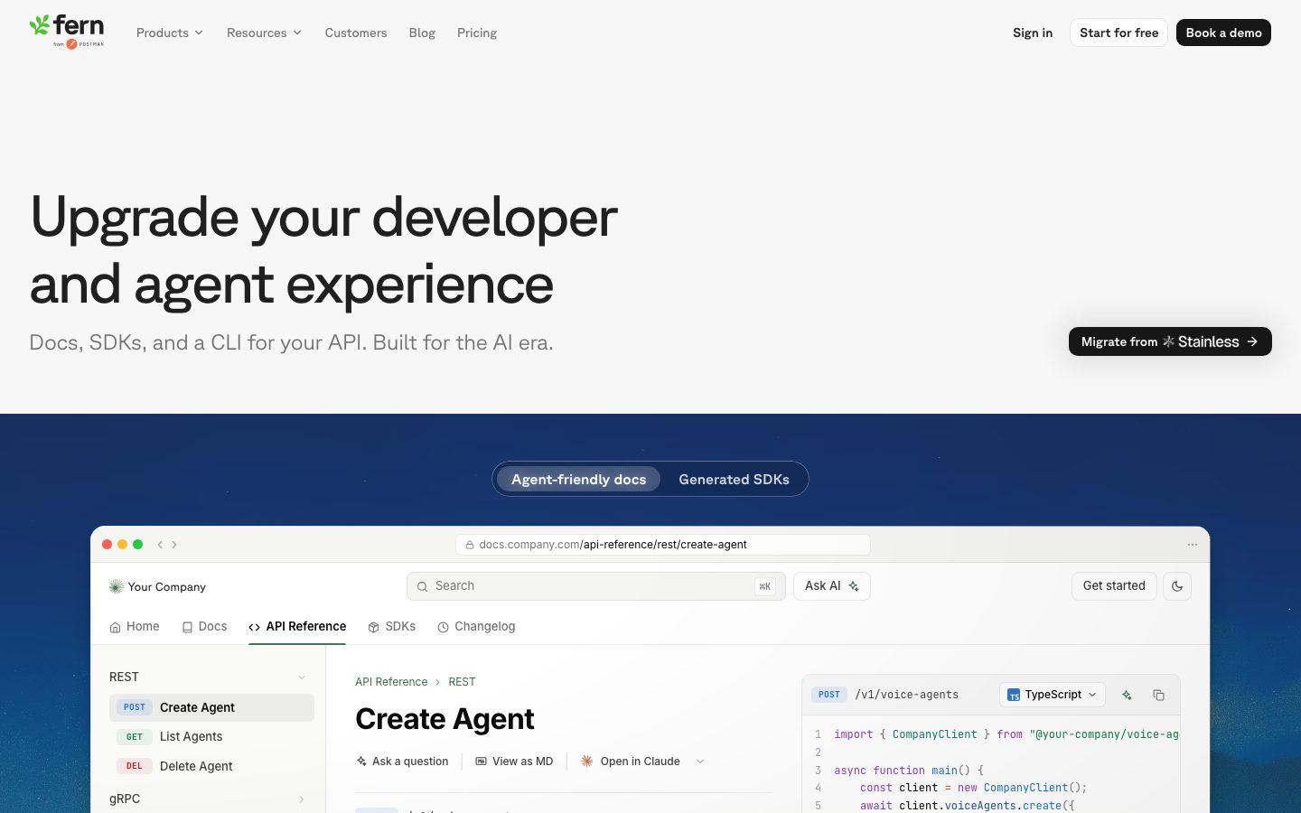
BuildWithFern (Fern, a Postman company) is a developer-tooling marketing surface built for engineering credibility, not flash. The page floor is white (`{colors.canvas}` — #ffffff), text is near-black ink (`{colors.ink}` — #202020), and the only saturated brand moment is the green Fern leaf wordmark (`{colors.brand-green}` — #008700). Primary CTAs are near-black (`{colors.primary}` — #0a0a0a) — the "Book a demo" and "Migrate to Fern" buttons.
The display voice is **GT Planar** — a tightly-tracked grotesque set at weight 400 with a very aggressive -2.56px letter-spacing at the 64px hero size. The lead body copy is the same family at weight 300 / 24px with -0.24px tracking. The whole type system is light-weight and wide, which reads as calm, modern, and engineering-precise rather than loud-marketing.
The signature structural moment is a single photographic **dark hero band** (a navy mountain image) immediately below the white hero copy. Floating on that band is a pill-shaped segmented control (`{component.segmented-control}`) toggling "Agent-friendly docs" / "Generated SDKs". Below it, real Fern docs/API-reference UI is shown inside a browser-chrome card — Fern shows the actual product, not an illustration of it.
Component voltage comes from **product UI fragments embedded directly in cards** — docs sidebars, API reference panes, code samples with syntax-colored tokens (which is where the purple `{colors.accent-purple}`, blue `{colors.accent-blue}`, and rust `{colors.accent-rust}` accents live — inside code, not on chrome).
**Key Characteristics:**
- White canvas with near-black primary CTA (`{colors.primary}` — #0a0a0a). Buttons are small and quiet: `{rounded.xl}` (10px) corners, weight-400 14px labels, tight 0px×10px padding.
- GT Planar grotesque display type with extreme negative tracking (-2.56px at 64px). Light weights (300/400) throughout — never bold.
- Soft-cornered cards at `{rounded.xl}` (10px) carrying product/docs UI fragments, mostly shadow-less (`{component.card}` shadow: none).
- Square inputs (`{rounded.none}` — 0px) — the one hard-edged component in an otherwise softly-rounded system.
- A single photographic dark band breaks the white flow and hosts the pill segmented control. The rest of the page stays light.
- Brand color is reserved for the green leaf mark; chromatic accents (purple/blue/rust) only appear inside embedded code samples.
## Colors
### Brand & Accent
- **Brand Green** (`{colors.brand-green}` — #008700): The Fern leaf wordmark. The system's only standing brand color — used sparingly on the logo and small marks.
- **Brand Green Deep** (`{colors.brand-green-deep}` — #3f6d4d): A darker green variant seen on small brand/icon moments.
- **Accent Purple** (`{colors.accent-purple}` — #8b3ac2), **Accent Blue** (`{colors.accent-blue}` — #1e6bd6), **Accent Rust** (`{colors.accent-rust}` — #c5552d): Syntax-highlight and badge accents that appear inside embedded code samples and HTTP-method badges (e.g. POST/GET/DEL tags in the docs sidebar fragment). These never appear on marketing chrome or CTAs.
### Surface
- **Canvas** (`{colors.canvas}` — #ffffff): The default page floor.
- **Surface Soft** (`{colors.surface-soft}` — #fcfcfd): Near-white inset panels.
- **Surface Muted** (`{colors.surface-muted}` — #f9f9fb): Footer background and very-soft section blocks.
- **Surface Dark** (`{colors.surface-dark}` — #1c2024): The pill segmented-control background and other dark inset chrome on the photographic band.
- **Black** (`{colors.black}` — #000000): Pure-black used in code/UI fragments.
### Text
- **Ink** (`{colors.ink}` — #202020): All headlines and primary text (highest-frequency color in the analysis).
- **Body** (`{colors.body}` — #404040): Secondary running text.
- **Muted** (`{colors.muted}` — #737373): Tertiary captions and footer body.
- **Muted Soft** (`{colors.muted-soft}` — #80838d) / **Muted Cool** (`{colors.muted-cool}` — #60646c) / **Muted Cool Soft** (`{colors.muted-cool-soft}` — #8b8d98): A cool-gray family used for sub-labels, secondary nav text, and the active segmented-control pill.
- **Disabled** (`{colors.disabled}` — #a3a3a3): Disabled / lowest-emphasis text.
- **On Primary** (`{colors.on-primary}` — #ffffff): Text on near-black CTAs and on the dark band.
### Lines
- **Hairline** (`{colors.hairline}` — #cdced6): The 1px divider tone on light surfaces — grid lines, card outlines, footer dividers.
- **Hairline Soft** (`{colors.hairline-soft}` — #b9bbc6): A slightly stronger cool-gray hairline used on borders and outlines.
## Typography
### Font Family
The system runs **GT Planar** for everything measured — display headlines, lead body copy, and button labels. GT Planar is a commercial grotesque (Grilli Type) and is not freely redistributable, so it is documented here with an open-source substitute. The defining trait is the negative tracking and low weights: the hero headline is weight 400, not 700, and the lead body is weight 300.
### Hierarchy
| Token | Size | Weight | Line Height | Letter Spacing | Use |
|---|---|---|---|---|---|
| `{typography.display}` | 64px | 400 | 1.15 | -2.56px | Hero h1 ("Upgrade your developer and agent experience") |
| `{typography.body-lg}` | 24px | 300 | 1.3 | -0.24px | Lead body / sub-headlines ("Docs, SDKs, and a CLI for your API. Built for the AI era.") |
| `{typography.button}` | 14px | 400 | 1.429 | normal | Button labels, nav links, captions |
### Principles
The voice is light and wide: display weight stays at 400, lead body drops to 300, and only the small UI/button text climbs to a still-modest 400. Negative letter-spacing is integral to the display look — GT Planar at -2.56px (64px) reads as a tight, engineered headline; remove the tracking and it reads off-brand. Body tracking is a gentle -0.24px; button text runs at normal tracking.
### Note on Font Substitutes
GT Planar is a licensed typeface and is not shipped here. **Hanken Grotesk** is the closest open-source substitute — a clean geometric grotesque that holds up at light weights (300/400) and tight tracking. **Inter** at weight 300–400 with -0.04em tracking is an acceptable fallback. Whatever substitute is used, keep the weights low (300 body, 400 display) and preserve the negative letter-spacing signature.
## Layout
### Spacing System
- **Base unit:** the scale is dense and not strictly 8-based — the highest-frequency steps are 6px and 8px, with 10px and 12px close behind.
- **Tokens:** `{spacing.xxs}` 4px · `{spacing.xs}` 6px · `{spacing.sm}` 8px · `{spacing.smd}` 10px · `{spacing.md}` 12px · `{spacing.lg}` 16px · `{spacing.xl}` 20px · `{spacing.xxl}` 24px · `{spacing.x3}` 32px · `{spacing.x4}` 40px · `{spacing.x5}` 48px · `{spacing.x6}` 64px.
- **Tight component padding:** buttons measured at 0px×10px — Fern buttons are notably compact. Cards/feature blocks sit at 20–24px internal padding.
- **Section rhythm:** larger steps (32 / 40 / 48 / 64px) carry the vertical spacing between editorial bands.
### Grid & Container
- **Editorial body:** centered single column with a wide hero. Hero copy left-aligned; the "Migrate from Stainless" badge floats right.
- **Feature grids:** 2-up (Docs as code / AI chat in docs) and 3-up / 4-up rows (llms.txt · MCP server · AI-assisted authoring; Self-host · Localization · Compliance · Support & SLAs), with visible hairline grid lines between cells.
- **Stat row:** 3-up stat cards (20M+ / 99% / 14x).
- **Footer:** multi-column link list (Documentation / Resources / Company) over a light surface.
### Whitespace Philosophy
The page leans on generous vertical whitespace and thin hairline grid lines to separate feature cells rather than heavy card fills. Most feature cells are transparent-on-white with a 1px `{colors.hairline}` border, which keeps the surface calm and lets the embedded product fragments carry visual weight.
## Elevation & Depth
| Level | Treatment | Use |
|---|---|---|
| Flat | No shadow, no border | Body sections, hero copy, top nav |
| Hairline | 1px `{colors.hairline}` border | Feature-grid cells, footer dividers |
| Card surface | `{colors.canvas}` with `shadow: none` (measured on `{component.card}`) | Standard content cards |
| Subtle | `rgba(16,18,24,0.04) 0 1px 2px` and `rgba(0,0,0,0.1) 0 1px 3px` (measured) | Inputs, small chips, low-lift cards |
| Elevated | `rgba(0,0,0,0.18) 0 20px 40px -12px, rgba(0,0,0,0.06) 0 4px 12px` (measured) | Floating product-chrome card, dropdown menus |
The elevation philosophy is **mostly flat** — cards default to no shadow and lean on hairline borders. The two stronger measured shadows are reserved for genuinely floating surfaces (the browser-chrome docs card over the dark band, and nav dropdowns).
### Decorative Depth
- The photographic dark hero band (navy mountain image) is the system's one big depth gesture — it sits behind the floating browser-chrome card and the pill segmented control. This is a background image, not a token.
- The "Native Postman support" band carries a soft peach/rust gradient wash (related to `{colors.accent-rust}`) — a gradient treatment, not a flat fill.
## Shapes
### Border Radius Scale
| Token | Value | Use |
|---|---|---|
| `{rounded.none}` | 0px | Inputs — the one square-cornered component (measured) |
| `{rounded.xs}` | 2px | Tiny code-token badges |
| `{rounded.sm}` | 4px | Small chips, inline tags |
| `{rounded.md}` | 6px | Secondary chips, small controls |
| `{rounded.lg}` | 8px | Mid-size controls and inset panels |
| `{rounded.xl}` | 10px | Standard buttons, cards (most-frequent radius — measured on `button-primary` and `card`) |
| `{rounded.xxl}` | 14px | Larger cards / media containers |
| `{rounded.x3}` | 24px | Large feature/media panels |
| `{rounded.pill}` | 32px | Pill segmented control, "Migrate from Stainless" badge |
### Photography Geometry
Embedded product UI (docs sidebar, API-reference pane, code editor) retains its own native browser-chrome radii. The floating hero docs card uses rounded top corners consistent with a browser window. Logos in the social-proof and migration rows render flat at native aspect ratio.
## Components
### Top Navigation
**`top-nav`** — White nav bar on `{colors.canvas}`. Left: the green Fern leaf wordmark ("fern, from Postman"). Center-left: menu items (Products ▾, Resources ▾, Customers, Blog, Pricing) in `{typography.button}` (GT Planar 14px / 400) in `{colors.ink}`. Right cluster: "Sign in" `{component.button-text-link}`, "Start for free" `{component.button-secondary}`, and "Book a demo" `{component.button-primary}`.
### Buttons
**`button-primary`** — The near-black CTA ("Book a demo", "Migrate to Fern"). Background `{colors.primary}` (#0a0a0a), text `{colors.on-primary}`, type `{typography.button}`, rounded `{rounded.xl}` (10px), padding 0px×10px (measured — Fern buttons are compact).
**`button-secondary`** — White outlined CTA ("Start for free"). Background `{colors.canvas}`, text `{colors.ink}`, 1px hairline border, same radius + padding as primary.
**`button-text-link`** — Bare inline text button ("Sign in"). Transparent background, `{colors.ink}` text.
**`migrate-badge`** — The dark floating pill ("Migrate from Stainless →"). Background `{colors.primary}`, text `{colors.on-primary}`, rounded `{rounded.pill}` (32px). Acts as a high-visibility contextual CTA on the hero.
### Segmented Control
**`segmented-control`** — The dark pill toggle floating on the photographic hero band ("Agent-friendly docs" / "Generated SDKs"). Background `{colors.surface-dark}` (#1c2024), text `{colors.on-primary}`, rounded `{rounded.pill}` (32px), 6px internal padding.
**`segmented-control-active`** — The selected segment renders as a lighter inset pill. Documented with background `{colors.muted-cool}` (derived — the active pill is a lighter cool-gray fill on the dark group; exact value not isolated in the analysis), text `{colors.on-primary}`, rounded `{rounded.pill}`.
### Cards & Containers
**`card`** — The base card primitive: background `{colors.canvas}`, rounded `{rounded.xl}` (10px), `shadow: none` (measured). Most surfaces inherit this flat, hairline-bordered treatment.
**`feature-card`** — Feature-grid cell ("Docs as code", "AI chat in docs", "llms.txt", "MCP server", "AI-assisted authoring", "Self-host", "Localization", "Compliance", "Support & SLAs"). Background `{colors.canvas}` with 1px `{colors.hairline}` borders forming the grid, rounded `{rounded.xl}`, ~24px padding. Carries a small icon, a title, and a `{typography.body-lg}`-derived description in `{colors.body}`.
**`stat-card`** — Social-proof stat blocks (20M+ docs pages, 99% reduction, 14x AI engagement). Background `{colors.canvas}`, rounded `{rounded.xl}`, ~20px padding. Pairs a large stat figure, a short label, and a customer logo (ElevenLabs, Adobe, unleash) with a small product thumbnail.
**`migration-card`** — "Migrated from" cards (Webflow, NVIDIA/internal, Mintlify→ElevenLabs). Background `{colors.canvas}`, rounded `{rounded.xl}`, ~24px padding. Carries a "From [tool]" eyebrow, a source logo, and a short migration description in `{colors.body}`.
### Inputs
**`input`** — Square-cornered input field (footer "Subscribe" email field). Background `{colors.canvas}`, text `{colors.ink}`, rounded `{rounded.none}` (0px — measured; the one hard-edged component in the system), ~8px×10px padding.
### Footer
**`footer`** — Light footer over `{colors.surface-muted}` (#f9f9fb). Multi-column link list (Documentation / Resources / Company), a subscribe field (`{component.input}`), social icons, status line ("Maintenance in progress", "SOC 2 Type II"), and a "© 2026 Fern, a Postman company" copyright in `{colors.muted}`. Type in `{typography.button}` (14px / 400). Padding ~48px.
## Do's and Don'ts
### Do
- Reserve `{colors.primary}` (#0a0a0a) for primary CTAs. Fern's button is near-black, never colored.
- Keep brand green (`{colors.brand-green}`) to the leaf wordmark and small marks — the brand is near-monochrome.
- Set display type in GT Planar (or its substitute) at weight 400 with the negative tracking intact. The tight letter-spacing is the look.
- Keep lead body at weight 300 / 24px — light and wide, never bold.
- Use hairline-bordered transparent feature cells rather than heavy fills; let embedded product UI carry the visual weight.
- Embed real Fern docs/API/code fragments inside cards — Fern shows the actual product, not illustrations of it.
- Keep buttons compact (0px×10px padding, 10px radius). Quiet, small, precise.
- Use the dark photographic band as a single deliberate break in the white flow; host the segmented control there.
### Don't
- Don't bold the display type. GT Planar lives at 300–400 in this system.
- Don't drop the negative letter-spacing on headlines — untracked GT Planar reads off-brand.
- Don't push chromatic accents (purple/blue/rust) onto chrome or CTAs; they belong inside code samples and method badges.
- Don't round inputs — they are square (`{rounded.none}`) by design while everything else is soft.
- Don't add shadows to the base card; it is intentionally flat (`shadow: none`). Reserve the strong drop shadow for genuinely floating surfaces.
- Don't add a second dark band — the photographic hero band is the one dark moment.
- Don't document hover states; default and active/pressed only.
## Responsive Behavior
### Breakpoints
| Name | Width | Key Changes |
|---|---|---|
| Mobile | < 768px | Hamburger nav; hero h1 scales down from 64px; feature grids collapse to 1-up; stat cards stack; footer columns wrap to 1-up |
| Tablet | 768–1024px | Tightened horizontal nav; feature grids 2-up; stat cards may go 2-up |
| Desktop | 1024–1440px | Full nav with all menu items; 3-up / 4-up feature rows; hero copy + floating badge side-by-side |
| Wide | > 1440px | Same as desktop with more outer breathing room |
(Breakpoint widths are inferred from the two captured layouts; exact values were not measured — see Known Gaps.)
### Touch Targets
- `{component.button-primary}` uses compact 0px×10px padding; vertical hit area depends on line-height (1.429 × 14px) plus surrounding layout — confirm it meets a 44px minimum tap height on mobile.
- `{component.segmented-control}` segments need adequate vertical padding (group padding 6px) to remain tappable.
- `{component.input}` is square; ensure its rendered height clears 40px on touch.
### Collapsing Strategy
- Top nav collapses to a hamburger sheet at mobile.
- The hero's headline + floating "Migrate from Stainless" badge stack vertically on narrow screens.
- Feature grids reduce column count (4 → 2 → 1) rather than shrinking cards below legibility.
- The floating browser-chrome docs card scales proportionally and keeps its code pane legible.
### Image Behavior
- The dark photographic hero band scales to fill width; the floating product card overlaps it consistently across breakpoints.
- Embedded product/docs UI retains native aspect ratios; the host cards resize around it.
## Iteration Guide
1. Focus on ONE component at a time and reference its YAML key directly (`{component.feature-card}`, `{component.segmented-control}`).
2. Variants (`-active`, `-secondary`) live as separate entries in `components:`.
3. Use `{token.refs}` everywhere — never inline a hex in a component.
4. Never document hover. Default and active/pressed only.
5. Keep display type GT Planar 400 with negative tracking; keep body 300. The light-weight, wide voice is the brand.
6. Keep the system near-monochrome — green is the leaf mark, chromatic accents stay inside code.
7. Inputs stay square; cards stay 10px and mostly flat. When in doubt, add whitespace before adding a shadow.
## Known Gaps
- **GT Planar is a licensed typeface** (Grilli Type) and is not flagged in the analysis `fonts_licensed` array (which was empty), but it is commercial and is documented here with an open-source substitute (Hanken Grotesk / Inter). The site ships the real font; do not assume it is redistributable.
- Only three typographic roles were measured (display 64px, body 24px, button 14px). Intermediate scales — sub-headings, small body, captions, code/monospace — were not captured and would need extraction from a docs/pricing flow.
- The `segmented-control-active` fill color is derived; the analysis isolated the group background (`{colors.surface-dark}`) but not the active-segment fill, so a measured cool-gray (`{colors.muted-cool}`) is used as an approximation.
- The dark hero band and the "Native Postman support" peach/rust gradient are background imagery/gradients, not solid tokens — their exact stops are out of scope.
- Button vertical height is reported only as 0px×10px horizontal/vertical padding; full rendered button height was not measured.
- Breakpoint widths and responsive collapse rules are inferred from the desktop + full-page captures, not measured.
- Form states beyond the base square `{component.input}` (focus, error, success) were not extracted.
- HTTP-method badge colors (POST purple, GET green, DEL red) appear inside the embedded docs fragment and partially map to `{colors.accent-purple}` / `{colors.brand-green}` / `{colors.accent-rust}`, but the exact per-method palette was not isolated as standalone tokens.
<!-- Documented by duply · real-world design systems as ready-to-use DESIGN.md for AI coding agents · https://duply.ai/buildwithfern/design-md -->
Color Palette
Accent
Neutrals
Typography
display64px · 400 · 1.15
The quick brown fox jumpsbody-lg24px · 300 · 1.3
The quick brown fox jumpsbutton14px · 400 · 1.429
The quick brown fox jumpsSpacing & Shape
Spacing
| Name | Value | Preview |
|---|---|---|
| xxs | 4px | |
| xs | 6px | |
| sm | 8px | |
| smd | 10px | |
| md | 12px | |
| lg | 16px | |
| xl | 20px | |
| xxl | 24px | |
| x3 | 32px | |
| x4 | 40px | |
| x5 | 48px | |
| x6 | 64px |
Border Radius
| Name | Value | Preview |
|---|---|---|
| none | 0px | |
| xs | 2px | |
| sm | 4px | |
| md | 6px | |
| lg | 8px | |
| xl | 10px | |
| xxl | 14px | |
| x3 | 24px | |
| pill | 32px |
More like this


---
version: alpha
name: BuildWithFern-design-analysis
description: A calm, developer-tooling marketing surface from Fern (a Postman company) anchored on white canvas with near-black CTAs and the GT Planar grotesque display face set at weight 400 with aggressive negative tracking. The system reads as precise and engineering-credible — light surfaces, square-cornered inputs, soft ~10px-radius cards, a single photographic dark hero band carrying a pill segmented control, and product/docs UI fragments shown inside cards. Brand voltage comes from the green Fern leaf mark and from real docs/API chrome embedded in the flow rather than from saturated accent fields.
colors:
  primary: "#0a0a0a"
  ink: "#202020"
  body: "#404040"
  muted: "#737373"
  muted-soft: "#80838d"
  muted-cool: "#60646c"
  muted-cool-soft: "#8b8d98"
  disabled: "#a3a3a3"
  hairline: "#cdced6"
  hairline-soft: "#b9bbc6"
  canvas: "#ffffff"
  surface-soft: "#fcfcfd"
  surface-muted: "#f9f9fb"
  surface-dark: "#1c2024"
  black: "#000000"
  brand-green: "#008700"
  brand-green-deep: "#3f6d4d"
  accent-purple: "#8b3ac2"
  accent-blue: "#1e6bd6"
  accent-rust: "#c5552d"
  on-primary: "#ffffff"
typography:
  display:
    fontFamily: "GT Planar, Hanken Grotesk, sans-serif"
    fontSize: 64px
    fontWeight: 400
    lineHeight: 1.15
    letterSpacing: -2.56px
  body-lg:
    fontFamily: "GT Planar, Hanken Grotesk, sans-serif"
    fontSize: 24px
    fontWeight: 300
    lineHeight: 1.3
    letterSpacing: -0.24px
  button:
    fontFamily: "GT Planar, Hanken Grotesk, sans-serif"
    fontSize: 14px
    fontWeight: 400
    lineHeight: 1.429
    letterSpacing: normal
rounded:
  none: 0px
  xs: 2px
  sm: 4px
  md: 6px
  lg: 8px
  xl: 10px
  xxl: 14px
  x3: 24px
  pill: 32px
spacing:
  xxs: 4px
  xs: 6px
  sm: 8px
  smd: 10px
  md: 12px
  lg: 16px
  xl: 20px
  xxl: 24px
  x3: 32px
  x4: 40px
  x5: 48px
  x6: 64px
components:
  top-nav:
    backgroundColor: "{colors.canvas}"
    textColor: "{colors.ink}"
    typography: "{typography.button}"
  button-primary:
    backgroundColor: "{colors.primary}"
    textColor: "{colors.on-primary}"
    typography: "{typography.button}"
    rounded: "{rounded.xl}"
    padding: 0px 10px
  button-secondary:
    backgroundColor: "{colors.canvas}"
    textColor: "{colors.ink}"
    typography: "{typography.button}"
    rounded: "{rounded.xl}"
    padding: 0px 10px
  button-text-link:
    backgroundColor: transparent
    textColor: "{colors.ink}"
    typography: "{typography.button}"
  migrate-badge:
    backgroundColor: "{colors.primary}"
    textColor: "{colors.on-primary}"
    typography: "{typography.button}"
    rounded: "{rounded.pill}"
    padding: 8px 16px
  segmented-control:
    backgroundColor: "{colors.surface-dark}"
    textColor: "{colors.on-primary}"
    typography: "{typography.button}"
    rounded: "{rounded.pill}"
    padding: 6px
  segmented-control-active:
    backgroundColor: "{colors.muted-cool}"
    textColor: "{colors.on-primary}"
    typography: "{typography.button}"
    rounded: "{rounded.pill}"
  card:
    backgroundColor: "{colors.canvas}"
    textColor: "{colors.ink}"
    rounded: "{rounded.xl}"
    shadow: none
  feature-card:
    backgroundColor: "{colors.canvas}"
    textColor: "{colors.ink}"
    typography: "{typography.body-lg}"
    rounded: "{rounded.xl}"
    padding: 24px
  stat-card:
    backgroundColor: "{colors.canvas}"
    textColor: "{colors.ink}"
    typography: "{typography.body-lg}"
    rounded: "{rounded.xl}"
    padding: 20px
  migration-card:
    backgroundColor: "{colors.canvas}"
    textColor: "{colors.body}"
    typography: "{typography.body-lg}"
    rounded: "{rounded.xl}"
    padding: 24px
  input:
    backgroundColor: "{colors.canvas}"
    textColor: "{colors.ink}"
    typography: "{typography.button}"
    rounded: "{rounded.none}"
    padding: 8px 10px
  footer:
    backgroundColor: "{colors.surface-muted}"
    textColor: "{colors.muted}"
    typography: "{typography.button}"
    padding: 48px
---

## Overview

BuildWithFern (Fern, a Postman company) is a developer-tooling marketing surface built for engineering credibility, not flash. The page floor is white (`{colors.canvas}` — #ffffff), text is near-black ink (`{colors.ink}` — #202020), and the only saturated brand moment is the green Fern leaf wordmark (`{colors.brand-green}` — #008700). Primary CTAs are near-black (`{colors.primary}` — #0a0a0a) — the "Book a demo" and "Migrate to Fern" buttons.

The display voice is **GT Planar** — a tightly-tracked grotesque set at weight 400 with a very aggressive -2.56px letter-spacing at the 64px hero size. The lead body copy is the same family at weight 300 / 24px with -0.24px tracking. The whole type system is light-weight and wide, which reads as calm, modern, and engineering-precise rather than loud-marketing.

The signature structural moment is a single photographic **dark hero band** (a navy mountain image) immediately below the white hero copy. Floating on that band is a pill-shaped segmented control (`{component.segmented-control}`) toggling "Agent-friendly docs" / "Generated SDKs". Below it, real Fern docs/API-reference UI is shown inside a browser-chrome card — Fern shows the actual product, not an illustration of it.

Component voltage comes from **product UI fragments embedded directly in cards** — docs sidebars, API reference panes, code samples with syntax-colored tokens (which is where the purple `{colors.accent-purple}`, blue `{colors.accent-blue}`, and rust `{colors.accent-rust}` accents live — inside code, not on chrome).

**Key Characteristics:**
- White canvas with near-black primary CTA (`{colors.primary}` — #0a0a0a). Buttons are small and quiet: `{rounded.xl}` (10px) corners, weight-400 14px labels, tight 0px×10px padding.
- GT Planar grotesque display type with extreme negative tracking (-2.56px at 64px). Light weights (300/400) throughout — never bold.
- Soft-cornered cards at `{rounded.xl}` (10px) carrying product/docs UI fragments, mostly shadow-less (`{component.card}` shadow: none).
- Square inputs (`{rounded.none}` — 0px) — the one hard-edged component in an otherwise softly-rounded system.
- A single photographic dark band breaks the white flow and hosts the pill segmented control. The rest of the page stays light.
- Brand color is reserved for the green leaf mark; chromatic accents (purple/blue/rust) only appear inside embedded code samples.

## Colors

### Brand & Accent
- **Brand Green** (`{colors.brand-green}` — #008700): The Fern leaf wordmark. The system's only standing brand color — used sparingly on the logo and small marks.
- **Brand Green Deep** (`{colors.brand-green-deep}` — #3f6d4d): A darker green variant seen on small brand/icon moments.
- **Accent Purple** (`{colors.accent-purple}` — #8b3ac2), **Accent Blue** (`{colors.accent-blue}` — #1e6bd6), **Accent Rust** (`{colors.accent-rust}` — #c5552d): Syntax-highlight and badge accents that appear inside embedded code samples and HTTP-method badges (e.g. POST/GET/DEL tags in the docs sidebar fragment). These never appear on marketing chrome or CTAs.

### Surface
- **Canvas** (`{colors.canvas}` — #ffffff): The default page floor.
- **Surface Soft** (`{colors.surface-soft}` — #fcfcfd): Near-white inset panels.
- **Surface Muted** (`{colors.surface-muted}` — #f9f9fb): Footer background and very-soft section blocks.
- **Surface Dark** (`{colors.surface-dark}` — #1c2024): The pill segmented-control background and other dark inset chrome on the photographic band.
- **Black** (`{colors.black}` — #000000): Pure-black used in code/UI fragments.

### Text
- **Ink** (`{colors.ink}` — #202020): All headlines and primary text (highest-frequency color in the analysis).
- **Body** (`{colors.body}` — #404040): Secondary running text.
- **Muted** (`{colors.muted}` — #737373): Tertiary captions and footer body.
- **Muted Soft** (`{colors.muted-soft}` — #80838d) / **Muted Cool** (`{colors.muted-cool}` — #60646c) / **Muted Cool Soft** (`{colors.muted-cool-soft}` — #8b8d98): A cool-gray family used for sub-labels, secondary nav text, and the active segmented-control pill.
- **Disabled** (`{colors.disabled}` — #a3a3a3): Disabled / lowest-emphasis text.
- **On Primary** (`{colors.on-primary}` — #ffffff): Text on near-black CTAs and on the dark band.

### Lines
- **Hairline** (`{colors.hairline}` — #cdced6): The 1px divider tone on light surfaces — grid lines, card outlines, footer dividers.
- **Hairline Soft** (`{colors.hairline-soft}` — #b9bbc6): A slightly stronger cool-gray hairline used on borders and outlines.

## Typography

### Font Family
The system runs **GT Planar** for everything measured — display headlines, lead body copy, and button labels. GT Planar is a commercial grotesque (Grilli Type) and is not freely redistributable, so it is documented here with an open-source substitute. The defining trait is the negative tracking and low weights: the hero headline is weight 400, not 700, and the lead body is weight 300.

### Hierarchy

| Token | Size | Weight | Line Height | Letter Spacing | Use |
|---|---|---|---|---|---|
| `{typography.display}` | 64px | 400 | 1.15 | -2.56px | Hero h1 ("Upgrade your developer and agent experience") |
| `{typography.body-lg}` | 24px | 300 | 1.3 | -0.24px | Lead body / sub-headlines ("Docs, SDKs, and a CLI for your API. Built for the AI era.") |
| `{typography.button}` | 14px | 400 | 1.429 | normal | Button labels, nav links, captions |

### Principles
The voice is light and wide: display weight stays at 400, lead body drops to 300, and only the small UI/button text climbs to a still-modest 400. Negative letter-spacing is integral to the display look — GT Planar at -2.56px (64px) reads as a tight, engineered headline; remove the tracking and it reads off-brand. Body tracking is a gentle -0.24px; button text runs at normal tracking.

### Note on Font Substitutes
GT Planar is a licensed typeface and is not shipped here. **Hanken Grotesk** is the closest open-source substitute — a clean geometric grotesque that holds up at light weights (300/400) and tight tracking. **Inter** at weight 300–400 with -0.04em tracking is an acceptable fallback. Whatever substitute is used, keep the weights low (300 body, 400 display) and preserve the negative letter-spacing signature.

## Layout

### Spacing System
- **Base unit:** the scale is dense and not strictly 8-based — the highest-frequency steps are 6px and 8px, with 10px and 12px close behind.
- **Tokens:** `{spacing.xxs}` 4px · `{spacing.xs}` 6px · `{spacing.sm}` 8px · `{spacing.smd}` 10px · `{spacing.md}` 12px · `{spacing.lg}` 16px · `{spacing.xl}` 20px · `{spacing.xxl}` 24px · `{spacing.x3}` 32px · `{spacing.x4}` 40px · `{spacing.x5}` 48px · `{spacing.x6}` 64px.
- **Tight component padding:** buttons measured at 0px×10px — Fern buttons are notably compact. Cards/feature blocks sit at 20–24px internal padding.
- **Section rhythm:** larger steps (32 / 40 / 48 / 64px) carry the vertical spacing between editorial bands.

### Grid & Container
- **Editorial body:** centered single column with a wide hero. Hero copy left-aligned; the "Migrate from Stainless" badge floats right.
- **Feature grids:** 2-up (Docs as code / AI chat in docs) and 3-up / 4-up rows (llms.txt · MCP server · AI-assisted authoring; Self-host · Localization · Compliance · Support & SLAs), with visible hairline grid lines between cells.
- **Stat row:** 3-up stat cards (20M+ / 99% / 14x).
- **Footer:** multi-column link list (Documentation / Resources / Company) over a light surface.

### Whitespace Philosophy
The page leans on generous vertical whitespace and thin hairline grid lines to separate feature cells rather than heavy card fills. Most feature cells are transparent-on-white with a 1px `{colors.hairline}` border, which keeps the surface calm and lets the embedded product fragments carry visual weight.

## Elevation & Depth

| Level | Treatment | Use |
|---|---|---|
| Flat | No shadow, no border | Body sections, hero copy, top nav |
| Hairline | 1px `{colors.hairline}` border | Feature-grid cells, footer dividers |
| Card surface | `{colors.canvas}` with `shadow: none` (measured on `{component.card}`) | Standard content cards |
| Subtle | `rgba(16,18,24,0.04) 0 1px 2px` and `rgba(0,0,0,0.1) 0 1px 3px` (measured) | Inputs, small chips, low-lift cards |
| Elevated | `rgba(0,0,0,0.18) 0 20px 40px -12px, rgba(0,0,0,0.06) 0 4px 12px` (measured) | Floating product-chrome card, dropdown menus |

The elevation philosophy is **mostly flat** — cards default to no shadow and lean on hairline borders. The two stronger measured shadows are reserved for genuinely floating surfaces (the browser-chrome docs card over the dark band, and nav dropdowns).

### Decorative Depth
- The photographic dark hero band (navy mountain image) is the system's one big depth gesture — it sits behind the floating browser-chrome card and the pill segmented control. This is a background image, not a token.
- The "Native Postman support" band carries a soft peach/rust gradient wash (related to `{colors.accent-rust}`) — a gradient treatment, not a flat fill.

## Shapes

### Border Radius Scale

| Token | Value | Use |
|---|---|---|
| `{rounded.none}` | 0px | Inputs — the one square-cornered component (measured) |
| `{rounded.xs}` | 2px | Tiny code-token badges |
| `{rounded.sm}` | 4px | Small chips, inline tags |
| `{rounded.md}` | 6px | Secondary chips, small controls |
| `{rounded.lg}` | 8px | Mid-size controls and inset panels |
| `{rounded.xl}` | 10px | Standard buttons, cards (most-frequent radius — measured on `button-primary` and `card`) |
| `{rounded.xxl}` | 14px | Larger cards / media containers |
| `{rounded.x3}` | 24px | Large feature/media panels |
| `{rounded.pill}` | 32px | Pill segmented control, "Migrate from Stainless" badge |

### Photography Geometry
Embedded product UI (docs sidebar, API-reference pane, code editor) retains its own native browser-chrome radii. The floating hero docs card uses rounded top corners consistent with a browser window. Logos in the social-proof and migration rows render flat at native aspect ratio.

## Components

### Top Navigation

**`top-nav`** — White nav bar on `{colors.canvas}`. Left: the green Fern leaf wordmark ("fern, from Postman"). Center-left: menu items (Products ▾, Resources ▾, Customers, Blog, Pricing) in `{typography.button}` (GT Planar 14px / 400) in `{colors.ink}`. Right cluster: "Sign in" `{component.button-text-link}`, "Start for free" `{component.button-secondary}`, and "Book a demo" `{component.button-primary}`.

### Buttons

**`button-primary`** — The near-black CTA ("Book a demo", "Migrate to Fern"). Background `{colors.primary}` (#0a0a0a), text `{colors.on-primary}`, type `{typography.button}`, rounded `{rounded.xl}` (10px), padding 0px×10px (measured — Fern buttons are compact).

**`button-secondary`** — White outlined CTA ("Start for free"). Background `{colors.canvas}`, text `{colors.ink}`, 1px hairline border, same radius + padding as primary.

**`button-text-link`** — Bare inline text button ("Sign in"). Transparent background, `{colors.ink}` text.

**`migrate-badge`** — The dark floating pill ("Migrate from Stainless →"). Background `{colors.primary}`, text `{colors.on-primary}`, rounded `{rounded.pill}` (32px). Acts as a high-visibility contextual CTA on the hero.

### Segmented Control

**`segmented-control`** — The dark pill toggle floating on the photographic hero band ("Agent-friendly docs" / "Generated SDKs"). Background `{colors.surface-dark}` (#1c2024), text `{colors.on-primary}`, rounded `{rounded.pill}` (32px), 6px internal padding.

**`segmented-control-active`** — The selected segment renders as a lighter inset pill. Documented with background `{colors.muted-cool}` (derived — the active pill is a lighter cool-gray fill on the dark group; exact value not isolated in the analysis), text `{colors.on-primary}`, rounded `{rounded.pill}`.

### Cards & Containers

**`card`** — The base card primitive: background `{colors.canvas}`, rounded `{rounded.xl}` (10px), `shadow: none` (measured). Most surfaces inherit this flat, hairline-bordered treatment.

**`feature-card`** — Feature-grid cell ("Docs as code", "AI chat in docs", "llms.txt", "MCP server", "AI-assisted authoring", "Self-host", "Localization", "Compliance", "Support & SLAs"). Background `{colors.canvas}` with 1px `{colors.hairline}` borders forming the grid, rounded `{rounded.xl}`, ~24px padding. Carries a small icon, a title, and a `{typography.body-lg}`-derived description in `{colors.body}`.

**`stat-card`** — Social-proof stat blocks (20M+ docs pages, 99% reduction, 14x AI engagement). Background `{colors.canvas}`, rounded `{rounded.xl}`, ~20px padding. Pairs a large stat figure, a short label, and a customer logo (ElevenLabs, Adobe, unleash) with a small product thumbnail.

**`migration-card`** — "Migrated from" cards (Webflow, NVIDIA/internal, Mintlify→ElevenLabs). Background `{colors.canvas}`, rounded `{rounded.xl}`, ~24px padding. Carries a "From [tool]" eyebrow, a source logo, and a short migration description in `{colors.body}`.

### Inputs

**`input`** — Square-cornered input field (footer "Subscribe" email field). Background `{colors.canvas}`, text `{colors.ink}`, rounded `{rounded.none}` (0px — measured; the one hard-edged component in the system), ~8px×10px padding.

### Footer

**`footer`** — Light footer over `{colors.surface-muted}` (#f9f9fb). Multi-column link list (Documentation / Resources / Company), a subscribe field (`{component.input}`), social icons, status line ("Maintenance in progress", "SOC 2 Type II"), and a "© 2026 Fern, a Postman company" copyright in `{colors.muted}`. Type in `{typography.button}` (14px / 400). Padding ~48px.

## Do's and Don'ts

### Do
- Reserve `{colors.primary}` (#0a0a0a) for primary CTAs. Fern's button is near-black, never colored.
- Keep brand green (`{colors.brand-green}`) to the leaf wordmark and small marks — the brand is near-monochrome.
- Set display type in GT Planar (or its substitute) at weight 400 with the negative tracking intact. The tight letter-spacing is the look.
- Keep lead body at weight 300 / 24px — light and wide, never bold.
- Use hairline-bordered transparent feature cells rather than heavy fills; let embedded product UI carry the visual weight.
- Embed real Fern docs/API/code fragments inside cards — Fern shows the actual product, not illustrations of it.
- Keep buttons compact (0px×10px padding, 10px radius). Quiet, small, precise.
- Use the dark photographic band as a single deliberate break in the white flow; host the segmented control there.

### Don't
- Don't bold the display type. GT Planar lives at 300–400 in this system.
- Don't drop the negative letter-spacing on headlines — untracked GT Planar reads off-brand.
- Don't push chromatic accents (purple/blue/rust) onto chrome or CTAs; they belong inside code samples and method badges.
- Don't round inputs — they are square (`{rounded.none}`) by design while everything else is soft.
- Don't add shadows to the base card; it is intentionally flat (`shadow: none`). Reserve the strong drop shadow for genuinely floating surfaces.
- Don't add a second dark band — the photographic hero band is the one dark moment.
- Don't document hover states; default and active/pressed only.

## Responsive Behavior

### Breakpoints

| Name | Width | Key Changes |
|---|---|---|
| Mobile | < 768px | Hamburger nav; hero h1 scales down from 64px; feature grids collapse to 1-up; stat cards stack; footer columns wrap to 1-up |
| Tablet | 768–1024px | Tightened horizontal nav; feature grids 2-up; stat cards may go 2-up |
| Desktop | 1024–1440px | Full nav with all menu items; 3-up / 4-up feature rows; hero copy + floating badge side-by-side |
| Wide | > 1440px | Same as desktop with more outer breathing room |

(Breakpoint widths are inferred from the two captured layouts; exact values were not measured — see Known Gaps.)

### Touch Targets
- `{component.button-primary}` uses compact 0px×10px padding; vertical hit area depends on line-height (1.429 × 14px) plus surrounding layout — confirm it meets a 44px minimum tap height on mobile.
- `{component.segmented-control}` segments need adequate vertical padding (group padding 6px) to remain tappable.
- `{component.input}` is square; ensure its rendered height clears 40px on touch.

### Collapsing Strategy
- Top nav collapses to a hamburger sheet at mobile.
- The hero's headline + floating "Migrate from Stainless" badge stack vertically on narrow screens.
- Feature grids reduce column count (4 → 2 → 1) rather than shrinking cards below legibility.
- The floating browser-chrome docs card scales proportionally and keeps its code pane legible.

### Image Behavior
- The dark photographic hero band scales to fill width; the floating product card overlaps it consistently across breakpoints.
- Embedded product/docs UI retains native aspect ratios; the host cards resize around it.

## Iteration Guide

1. Focus on ONE component at a time and reference its YAML key directly (`{component.feature-card}`, `{component.segmented-control}`).
2. Variants (`-active`, `-secondary`) live as separate entries in `components:`.
3. Use `{token.refs}` everywhere — never inline a hex in a component.
4. Never document hover. Default and active/pressed only.
5. Keep display type GT Planar 400 with negative tracking; keep body 300. The light-weight, wide voice is the brand.
6. Keep the system near-monochrome — green is the leaf mark, chromatic accents stay inside code.
7. Inputs stay square; cards stay 10px and mostly flat. When in doubt, add whitespace before adding a shadow.

## Known Gaps

- **GT Planar is a licensed typeface** (Grilli Type) and is not flagged in the analysis `fonts_licensed` array (which was empty), but it is commercial and is documented here with an open-source substitute (Hanken Grotesk / Inter). The site ships the real font; do not assume it is redistributable.
- Only three typographic roles were measured (display 64px, body 24px, button 14px). Intermediate scales — sub-headings, small body, captions, code/monospace — were not captured and would need extraction from a docs/pricing flow.
- The `segmented-control-active` fill color is derived; the analysis isolated the group background (`{colors.surface-dark}`) but not the active-segment fill, so a measured cool-gray (`{colors.muted-cool}`) is used as an approximation.
- The dark hero band and the "Native Postman support" peach/rust gradient are background imagery/gradients, not solid tokens — their exact stops are out of scope.
- Button vertical height is reported only as 0px×10px horizontal/vertical padding; full rendered button height was not measured.
- Breakpoint widths and responsive collapse rules are inferred from the desktop + full-page captures, not measured.
- Form states beyond the base square `{component.input}` (focus, error, success) were not extracted.
- HTTP-method badge colors (POST purple, GET green, DEL red) appear inside the embedded docs fragment and partially map to `{colors.accent-purple}` / `{colors.brand-green}` / `{colors.accent-rust}`, but the exact per-method palette was not isolated as standalone tokens.

<!-- Documented by duply · real-world design systems as ready-to-use DESIGN.md for AI coding agents · https://duply.ai/buildwithfern/design-md -->