
Twomuch.Studio
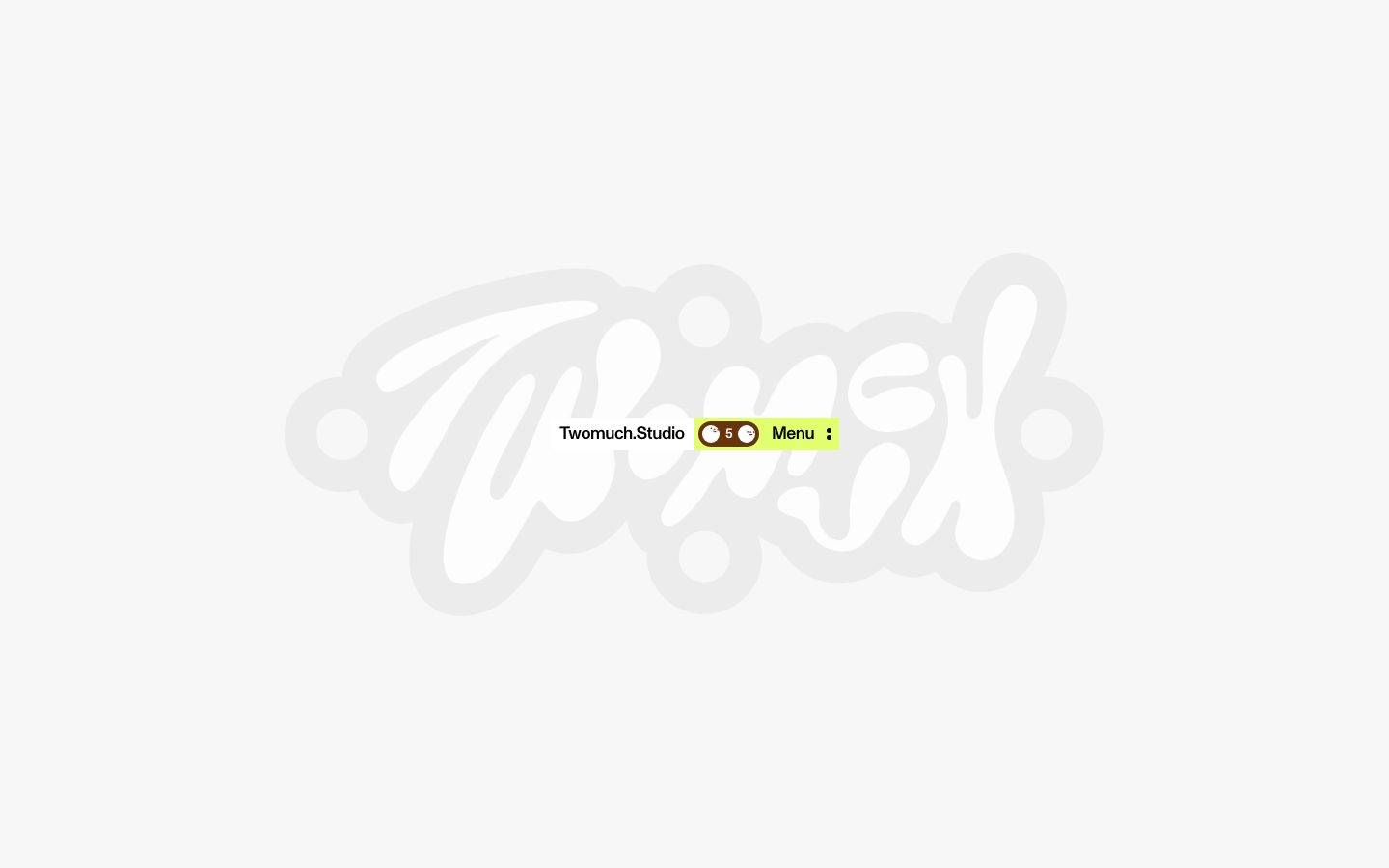
A stripped-back, playful studio-site identity built around one oversized decorative wordmark and a tiny, tightly-packed navigation cluster. The palette is almost entirely black-on-off-white, broken only by a lime-green highlight strip and a dark-brown pill-shaped counter/toggle control. Typography runs on ABC Monument Grotesk at aggressive negative tracking across every size, and shape language is strictly binary — either perfectly square (0px) or perfectly round (9999px) — with almost no space in between.
Works withClaude CodeCursorCodexGemini CLICopilotv0LovableBoltWindsurfReplit
---
version: alpha
name: Twomuch.Studio-design-analysis
description: "A stripped-back, playful studio-site identity built around one oversized decorative wordmark and a tiny, tightly-packed navigation cluster. The palette is almost entirely black-on-off-white, broken only by a lime-green highlight strip and a dark-brown pill-shaped counter/toggle control. Typography runs on ABC Monument Grotesk at aggressive negative tracking across every size, and shape language is strictly binary — either perfectly square (0px) or perfectly round (9999px) — with almost no space in between."

colors:
  primary: "#000000"
  ink: "#000000"
  canvas: "#f4f4f4"
  surface: "#ffffff"
  surface-soft: "#e6e6e6"
  hairline: "#d9d9d9"
  muted: "#9ca3af"
  accent-lime: "#e2ff70"
  accent-brown: "#68340e"

typography:
  h1:
    fontFamily: "ABCMonumentGrotesk, Space Grotesk, sans-serif"
    fontSize: 18px
    fontWeight: 500
    lineHeight: 0.9
    letterSpacing: -0.0267em
  h2:
    fontFamily: "ABCMonumentGrotesk, Space Grotesk, sans-serif"
    fontSize: 18px
    fontWeight: 500
    lineHeight: 1.0
    letterSpacing: -0.0267em
  h3:
    fontFamily: "ABCMonumentGrotesk, Space Grotesk, sans-serif"
    fontSize: 20px
    fontWeight: 500
    lineHeight: 1.0
    letterSpacing: -0.024em
  body-md:
    fontFamily: "ABCMonumentGrotesk, Space Grotesk, sans-serif"
    fontSize: 16px
    fontWeight: 500
    lineHeight: 1.05
    letterSpacing: -0.03em
  button:
    fontFamily: "ABCMonumentGrotesk, Space Grotesk, sans-serif"
    fontSize: 14px
    fontWeight: 500
    lineHeight: 1.0
    letterSpacing: -0.03em

rounded:
  none: 0px
  sm: 4px
  pill: 9999px

spacing:
  xs: 4px
  sm: 6px
  md: 8px

components:
  button-primary:
    backgroundColor: transparent
    textColor: "{colors.ink}"
    typography: "{typography.button}"
    rounded: "{rounded.none}"
    padding: 8px
  site-header:
    backgroundColor: "{colors.accent-lime}"
    textColor: "{colors.ink}"
    rounded: "{rounded.pill}"
    padding: 4px
  logo-badge:
    backgroundColor: "{colors.surface}"
    textColor: "{colors.ink}"
    typography: "{typography.body-md}"
    rounded: "{rounded.pill}"
    padding: 8px
  counter-toggle:
    backgroundColor: "{colors.accent-brown}"
    textColor: "{colors.surface}"
    typography: "{typography.button}"
    rounded: "{rounded.pill}"
    padding: 4px
  toggle-knob:
    backgroundColor: "{colors.surface}"
    textColor: "{colors.ink}"
    rounded: "{rounded.pill}"
  menu-item:
    backgroundColor: transparent
    textColor: "{colors.ink}"
    typography: "{typography.button}"
    padding: 4px
  wordmark-mark:
    backgroundColor: transparent
    textColor: "{colors.surface}"
    rounded: "{rounded.none}"
---

## Overview

Twomuch.Studio's captured landing view is almost entirely negative space: a giant decorative script wordmark rendered in near-white (`{colors.surface}` — #ffffff) against a soft off-white canvas (`{colors.canvas}` — #f4f4f4), with a compact, functional navigation cluster floating dead-center on top of it. The system reads as confidently minimal — there is effectively one typeface, one ink color, and two accent colors used only where the interface needs to communicate function (a highlight strip, a counter/toggle control).

Color is nearly monochrome. `{colors.ink}` (#000000) carries all text at 511 measured occurrences — an order of magnitude more frequent than anything else in the palette. The only chromatic notes are `{colors.accent-lime}` (#e2ff70), used as a highlight background behind the entire nav cluster, and `{colors.accent-brown}` (#68340e), used as the fill for a small pill-shaped counter/toggle control showing the number "5" flanked by two white knob shapes. Both accents are rare (measured frequency 5 each) and deliberate — they mark the one interactive/informational element on the page, not the brand as a whole.

Typography runs on **ABC Monument Grotesk**, a commercial grotesk from ABC Dinamo, at weight 500 across every measured role with consistently tight negative letter-spacing (-0.024em to -0.03em). Notably, the measured hierarchy inverts the usual size order: h3 (20px) is larger than h1 and h2 (both 18px) — a deliberate or at least observed quirk of this site's heading system, not a measurement error we should "correct." This entry documents it as found.

Shape language is strictly binary: components are either perfectly square (`{rounded.none}` — 0px, seen on the primary button/menu-item) or perfectly round (`{rounded.pill}` — 9999px, seen on the header cluster, the logo badge, and the counter/toggle). A single soft 4px radius appears at low frequency and is not confidently tied to a specific component. There is no shadow system — zero shadows were measured — reinforcing the flat, graphic-poster feel of the page.

**Key Characteristics:**
- Near-total monochrome palette: `{colors.ink}` for all text, `{colors.canvas}` / `{colors.surface}` for background layers, with two rare, purposeful accents (`{colors.accent-lime}`, `{colors.accent-brown}`).
- Single typeface family (ABC Monument Grotesk) at a single weight (500) across headings, body, and buttons — voice comes from size and tracking, not weight or family switching.
- Aggressive negative letter-spacing (-0.024em to -0.03em) on every measured type role — the type feels condensed and engineered even at small display sizes.
- Binary shape vocabulary: 0px square or 9999px pill — no mid-range card radius was measured.
- Zero shadows measured — the interface is flat, poster-like, with color and shape carrying all contrast.
- Micro-spacing scale only (4px, 6px, 8px) — the measured UI (nav cluster) is dense and tightly packed; no larger section-spacing values were captured.
- The nav cluster (`{component.site-header}`) sits on a lime highlight strip and contains a white logo badge, a brown pill counter/toggle with white knob shapes, and plain-text menu controls — a compact, playful control bar rather than a traditional top nav.
- A single oversized decorative wordmark dominates the visible viewport, rendered in white/near-white against the light canvas — brand voltage comes from this graphic mark, not from color or button styling.

## Colors

### Brand & Accent
- **Primary / Ink** (`{colors.primary}` / `{colors.ink}` — #000000): The only text and mark color measured with any real frequency (511 occurrences). It is the de facto "primary" of this system — used for headings, body copy, button labels, and the menu icon.
- **Accent Lime** (`{colors.accent-lime}` — #e2ff70): A bright yellow-green highlight used exactly once as the background strip behind the entire nav cluster. It is the system's loudest color and its rarest — reserved for calling attention to the one interactive control group on the page.
- **Accent Brown** (`{colors.accent-brown}` — #68340e): A dark, warm brown used as the fill of the pill-shaped counter/toggle control inside the nav cluster. It pairs with `{colors.surface}` white knob shapes and a numeral ("5") to form what reads as a slider or step-counter.

### Surface
- **Canvas** (`{colors.canvas}` — #f4f4f4): The page background — a soft, warm off-white rather than pure white.
- **Surface** (`{colors.surface}` — #ffffff): Used for the giant decorative wordmark fill, the logo badge background, and the toggle-knob shapes. White is treated as a foreground/mark color here, not just a background.
- **Surface Soft** (`{colors.surface-soft}` — #e6e6e6): A faint gray used for the wordmark's outline/shadow tint, giving the giant mark a subtle embossed edge against the canvas.
- **Hairline** (`{colors.hairline}` — #d9d9d9): A low-frequency neutral, likely a divider or subtle border tone; not confidently tied to a specific visible component in the captured view.

### Text
- **Ink** (`{colors.ink}` — #000000): All copy, headings, and button/menu labels.
- **Muted** (`{colors.muted}` — #9ca3af): A low-frequency gray text tone — likely a secondary label or the small counter numeral, though this was not confirmed against a specific measured node.

## Typography

### Font Family
The system runs on a single family end-to-end: **ABC Monument Grotesk**, a commercial grotesk typeface from the ABC Dinamo foundry. Because this is a licensed, non-free typeface, it is documented here with an open-source substitute rather than assumed shippable: **Space Grotesk** is the recommended stand-in — it shares the geometric-grotesk proportions and a comparably tight, technical feel at negative tracking. **General Sans** is a secondary alternative if a slightly warmer grotesk is preferred.

Every measured role uses the same weight (500) — there is no bold/regular contrast pair in the captured data. Voice comes entirely from size, line-height, and letter-spacing shifts, not weight changes.

### Hierarchy

| Token | Size | Weight | Line Height | Letter Spacing | Use |
|---|---|---|---|---|---|
| `{typography.h3}` | 20px | 500 | 1.0 | -0.024em | Largest measured heading role — note this is larger than h1/h2 in the captured data |
| `{typography.h1}` | 18px | 500 | 0.9 | -0.0267em | Primary heading role |
| `{typography.h2}` | 18px | 500 | 1.0 | -0.0267em | Secondary heading role, same size as h1 with looser line-height |
| `{typography.body-md}` | 16px | 500 | 1.05 | -0.03em | Running text |
| `{typography.button}` | 14px | 500 | 1.0 | -0.03em | Button and menu labels ("Menu") |

### Principles
Letter-spacing is negative and tight across every single role — from -0.024em on the largest heading to -0.03em on the smallest button label. This is the system's defining typographic signature: text feels compressed and engineered rather than loosely set. There is no positive-tracking caption or all-caps label role in the measured data — no `caption-uppercase` role applies here.

The h1/h2/h3 size relationship as measured (h3 largest, h1/h2 tied and smaller) should be preserved rather than "corrected" to a conventional descending hierarchy — it reflects this specific site's actual heading usage in the captured page and may be intentional editorial styling (e.g., h3 used for a large pull-quote or feature label rather than a true sub-heading).

### Note on Font Substitutes
**ABC Monument Grotesk** is a commercial typeface and must not be assumed to ship for free in derivative work. Use **Space Grotesk** (open source, SIL license) as the default substitute — set it at the same weight (500) and letter-spacing values documented above to preserve the compressed, technical voice. **General Sans** is an acceptable secondary substitute.

## Layout

### Spacing System
- **Base unit:** 4px (the smallest and most common measured value — 55 occurrences).
- **Tokens:** `{spacing.xs}` 4px · `{spacing.sm}` 6px · `{spacing.md}` 8px.
- Only three spacing values were measured on the captured page, all in a tight micro-spacing range. The nav cluster's internal gaps and padding sit inside this 4–8px band — there is no evidence of a larger section-level spacing scale (e.g., 24px, 48px, 96px) in the captured data.
- Larger layout rhythm (hero padding, section gaps) could not be measured from the single captured landing viewport and is listed under Known Gaps rather than invented here.

### Grid & Container
- The visible layout is a single centered composition: an oversized decorative wordmark filling most of the viewport, with a small horizontally-centered nav cluster (`{component.site-header}`) overlaid near vertical-center.
- No multi-column grid, card grid, or footer structure was present in the captured screenshots to measure.

### Whitespace Philosophy
Whitespace here is not a "spacing scale" in the conventional sense — it is the negative space of the giant wordmark itself. The functional UI (nav cluster) is deliberately small and dense relative to the canvas, using only the tight 4–8px micro-spacing tokens, while the surrounding canvas carries the visual weight through scale and restraint rather than through generous padding tokens.

## Elevation & Depth

No shadow values were captured on the analyzed page — the shadow set is empty. The interface reads as fully flat: color blocks (`{colors.accent-lime}`, `{colors.accent-brown}`, `{colors.surface}`) and pill/square shape contrast do all the work that shadows would otherwise do. Depth, where it exists at all, comes from the subtle tonal difference between `{colors.canvas}` and `{colors.surface-soft}` around the edges of the giant wordmark graphic — a faint embossed-outline effect rather than a true drop shadow.

Given the absence of any measured shadow, this entry does not prescribe an elevation scale; any future card, modal, or dropdown component should be measured directly from a live page rather than inferred from this landing capture.

## Shapes

### Border Radius Scale

| Token | Value | Use |
|---|---|---|
| `{rounded.none}` | 0px | Primary/menu button, likely other flat text controls |
| `{rounded.sm}` | 4px | Low-frequency — not confidently tied to a specific visible component in this capture |
| `{rounded.pill}` | 9999px | The dominant shape value (15 occurrences) — nav cluster wrapper, logo badge, counter/toggle pill, toggle-knob circles |

### Shape Philosophy
The system commits to a binary shape language: things are either hard squares (buttons, text controls) or full pills/circles (the nav container, the counter control, the knob shapes). There is no mid-range "card" radius in the measured data — if a card-style container is introduced later, its radius should be measured fresh rather than interpolated from this scale.

## Components

### Navigation

**`site-header`** — The primary (and only) captured UI cluster. A pill-shaped (`{rounded.pill}`) container with `{colors.accent-lime}` background, floating centered over the giant wordmark. Internal padding sits at `{spacing.xs}` (4px). It contains, left to right: the `logo-badge`, the `counter-toggle`, and a `menu-item` label with an adjacent icon.

**`logo-badge`** — A white (`{colors.surface}`) pill-shaped sub-container inside the header holding the "Twomuch.Studio" wordmark text in `{typography.body-md}`, colored `{colors.ink}`. Padding `{spacing.md}` (8px), rounded `{rounded.pill}`.

**`counter-toggle`** — A dark-brown (`{colors.accent-brown}`) pill control containing a centered numeral ("5") in `{colors.surface}` text and two `toggle-knob` circles flanking it. Reads as a slider, stepper, or paginator control. Padding `{spacing.xs}` (4px), rounded `{rounded.pill}`.

**`toggle-knob`** — Small white (`{colors.surface}`) circular shapes sitting inside the `counter-toggle`, rounded `{rounded.pill}`, textColor `{colors.ink}` if a glyph is present inside them.

**`menu-item`** — Plain-text "Menu" label plus a vertical-ellipsis icon, both in `{colors.ink}`, typography `{typography.button}` (14px / 500), sitting directly on the `{colors.accent-lime}` header background with no additional container. Padding `{spacing.xs}` (4px).

### Buttons

**`button-primary`** — The single measured button pattern: background transparent, text `{colors.ink}`, typography `{typography.button}`, rounded `{rounded.none}` (0px — a hard square, not the pill used elsewhere), padding 8px (`{spacing.md}`). This is the flattest possible button treatment — no fill, no border measured, just weight-500 black text at 0px radius.

### Decorative Mark

**`wordmark-mark`** — The oversized script "Twomuch" logotype rendered as a graphic fill in `{colors.surface}` (white) with a faint `{colors.surface-soft}` outline/tint, sitting behind and around the `site-header` cluster. Treated as a background/brand-mark element rather than a text component — no typography token applies to it directly since it is rendered as artwork, not live type.

## Do's and Don'ts

### Do
- Keep the palette overwhelmingly monochrome. `{colors.ink}` on `{colors.canvas}`/`{colors.surface}` should carry the vast majority of the interface.
- Reserve `{colors.accent-lime}` and `{colors.accent-brown}` for the smallest, most functional elements (a highlight strip, a counter/toggle) — never for large surfaces or primary CTAs.
- Keep letter-spacing negative and consistent (-0.024em to -0.03em) across every type role — this compression is the typographic signature.
- Keep the shape vocabulary binary: 0px square for flat text-style buttons, 9999px pill for grouped/interactive controls. Don't introduce a mid-range card radius without measuring one first.
- Let the decorative wordmark dominate the canvas — functional UI should stay small and centered against it, not compete with it in scale.

### Don't
- Don't fill `{component.button-primary}` with a background color — the measured pattern is a flat, transparent, text-only button at 0px radius.
- Don't add drop shadows or elevation effects — none were measured, and the flat, poster-like read is central to the system's character.
- Don't invent a larger spacing scale (24px, 48px, 96px section gaps) — only 4px/6px/8px were measured. If a new section needs more breathing room, measure it from a live page rather than guessing.
- Don't "correct" the h1/h2/h3 size relationship to a conventional descending scale — the measured hierarchy (h3 largest) should be preserved and treated as intentional.
- Don't claim ABC Monument Grotesk ships for free — always reference the Space Grotesk substitute when building with this system outside a licensed environment.

## Responsive Behavior

Only a single desktop-width landing viewport was captured, so no breakpoint values, column-collapse rules, or mobile-specific measurements are available. Qualitatively, the layout is a single centered composition (giant wordmark + small centered nav cluster) rather than a multi-column grid, which suggests it would scale down by shrinking the wordmark and keeping the nav cluster centered and legible at small viewport widths — but this is an inference from the visual composition, not a measurement, and should be verified against a live responsive capture before being treated as a rule.

### Touch Targets
- The `menu-item` and `counter-toggle` controls are small and tightly padded (4px); actual tap-target sizing at mobile widths was not measured and should be audited directly rather than assumed adequate.

## Iteration Guide

1. Treat this entry as a minimal seed, not a complete system — only one page (landing) and a handful of components were captured. Expand it by measuring additional pages/states before adding new components wholesale.
2. Reference tokens directly (`{colors.accent-lime}`, `{rounded.pill}`, `{typography.button}`) — never inline a hex or raw px radius in a new component.
3. Preserve the binary shape rule (0px or 9999px) until a genuine mid-radius component is measured from a live page.
4. Preserve the negative-tracking type signature on any new type role you add — don't introduce a role with positive or zero letter-spacing without new measurement evidence.
5. Keep `{colors.accent-lime}` and `{colors.accent-brown}` rare. If a new component wants an accent color and neither fits, treat that as a signal to re-measure the live site rather than picking a nearby hex.
6. Document any new component's default and active/pressed states only — this system has no documented hover states.

## Known Gaps

- Only the landing page was captured (`captured_pages: ["landing"]`); no interior/secondary pages, no scroll-depth beyond the hero, and no footer were available to measure.
- No shadow values were measured (`shadows: []`) — the Elevation & Depth section is written from the absence of data, not from a confirmed flat-design mandate.
- Only three spacing values (4px, 6px, 8px) were measured — there is no evidence for section-level or card-level spacing (e.g., 24px+), and none should be assumed until measured.
- Only one explicit component (`button-primary`) was present in the source `components` array; `site-header`, `logo-badge`, `counter-toggle`, `toggle-knob`, `menu-item`, and `wordmark-mark` are reconstructed from the reference screenshots using only already-declared color/radius/spacing tokens — they should be re-verified against live DOM measurement.
- Two colors (`#e5e7eb` and `#ff0000`, each frequency 1) were observed in the raw analysis but excluded from the token set as likely incidental (e.g., third-party icon or embedded SVG fill) rather than confirmed design tokens. Re-audit if they recur with higher frequency.
- The role of `{colors.muted}` (#9ca3af) and `{colors.hairline}` (#d9d9d9) could not be tied to a specific visible element in the captured screenshots; they are documented as available tokens but unconfirmed in application.
- ABC Monument Grotesk is a commercial ABC Dinamo typeface not flagged in `fonts_licensed` by the analyzer, but is treated as licensed here on the basis of known foundry status; Space Grotesk is documented as the substitute per system rules.
- The apparent h1/h2/h3 size inversion (h3 at 20px larger than h1/h2 at 18px) is reported as measured; it was not possible to confirm from the single landing capture whether this reflects true semantic heading usage or a page-specific styling override.
- No breakpoint, column-grid, or mobile-viewport data was available — the Responsive Behavior section is qualitative and should be replaced with real measurements from additional captures.
- The exact meaning/function of the `counter-toggle` ("5" with flanking knob shapes) — whether a slider, stepper, or decorative counter — was not confirmed interactively and is described from visual inference only.

<!-- Documented by Duply · real-world design systems as ready-to-use DESIGN.md for AI coding agents · https://duply.ai/twomuch/design-md -->
Color Palette
Accent
Neutrals
Typography
h118px · 500 · 0.9
The quick brown fox jumpsh218px · 500 · 1
The quick brown fox jumpsh320px · 500 · 1
The quick brown fox jumpsbody-md16px · 500 · 1.05
The quick brown fox jumpsbutton14px · 500 · 1
The quick brown fox jumpsSpacing & Shape
Spacing
| Name | Value | Preview |
|---|---|---|
| xs | 4px | |
| sm | 6px | |
| md | 8px |
Border Radius
| Name | Value | Preview |
|---|---|---|
| none | 0px | |
| sm | 4px | |
| pill | 9999px |
FAQ
- What colors does Twomuch.Studio use?
- Twomuch.Studio's core palette includes #000000, #000000, #f4f4f4, #ffffff, #e6e6e6. The full color set with usage roles (canvas, ink, surfaces, accent, semantic) is documented in the Twomuch.Studio DESIGN.md.
- What font does Twomuch.Studio use?
- Twomuch.Studio's primary typeface is ABCMonumentGrotesk. The complete type scale (sizes, weights, line-height and letter-spacing per role), with an open substitute where the original is licensed, is documented in the DESIGN.md.
- What is the Twomuch.Studio design system?
- A stripped-back, playful studio-site identity built around one oversized decorative wordmark and a tiny, tightly-packed navigation cluster. The palette is almost entirely black-on-off-white, broken only by a lime-green highlight strip and a dark-brown pill-shaped counter/toggle control. Typography
Get this as a working kit
Twomuch.Studio Launch Kit + DESIGN.md
$299$225
One-time payment
- A complete production-stack template, styled like Twomuch.Studio, fully built and wired.
- One-time payment and the codebase is yours. No platform fees, no subscription.
Open it with Claude Code, Cursor, or any coding agent and build in plain language, then ship a complete web app.
- Your private DESIGN.md
- Marketing pages, blog, SEO & legal
- Email capture, newsletter & contact
- Accept payments (Stripe)
- Analytics (GA4 + PostHog)
- One-click deploy
- Auth, login & roles
- A full app dashboard, when you grow
More like this

---
version: alpha
name: Twomuch.Studio-design-analysis
description: "A stripped-back, playful studio-site identity built around one oversized decorative wordmark and a tiny, tightly-packed navigation cluster. The palette is almost entirely black-on-off-white, broken only by a lime-green highlight strip and a dark-brown pill-shaped counter/toggle control. Typography runs on ABC Monument Grotesk at aggressive negative tracking across every size, and shape language is strictly binary — either perfectly square (0px) or perfectly round (9999px) — with almost no space in between."

colors:
  primary: "#000000"
  ink: "#000000"
  canvas: "#f4f4f4"
  surface: "#ffffff"
  surface-soft: "#e6e6e6"
  hairline: "#d9d9d9"
  muted: "#9ca3af"
  accent-lime: "#e2ff70"
  accent-brown: "#68340e"

typography:
  h1:
    fontFamily: "ABCMonumentGrotesk, Space Grotesk, sans-serif"
    fontSize: 18px
    fontWeight: 500
    lineHeight: 0.9
    letterSpacing: -0.0267em
  h2:
    fontFamily: "ABCMonumentGrotesk, Space Grotesk, sans-serif"
    fontSize: 18px
    fontWeight: 500
    lineHeight: 1.0
    letterSpacing: -0.0267em
  h3:
    fontFamily: "ABCMonumentGrotesk, Space Grotesk, sans-serif"
    fontSize: 20px
    fontWeight: 500
    lineHeight: 1.0
    letterSpacing: -0.024em
  body-md:
    fontFamily: "ABCMonumentGrotesk, Space Grotesk, sans-serif"
    fontSize: 16px
    fontWeight: 500
    lineHeight: 1.05
    letterSpacing: -0.03em
  button:
    fontFamily: "ABCMonumentGrotesk, Space Grotesk, sans-serif"
    fontSize: 14px
    fontWeight: 500
    lineHeight: 1.0
    letterSpacing: -0.03em

rounded:
  none: 0px
  sm: 4px
  pill: 9999px

spacing:
  xs: 4px
  sm: 6px
  md: 8px

components:
  button-primary:
    backgroundColor: transparent
    textColor: "{colors.ink}"
    typography: "{typography.button}"
    rounded: "{rounded.none}"
    padding: 8px
  site-header:
    backgroundColor: "{colors.accent-lime}"
    textColor: "{colors.ink}"
    rounded: "{rounded.pill}"
    padding: 4px
  logo-badge:
    backgroundColor: "{colors.surface}"
    textColor: "{colors.ink}"
    typography: "{typography.body-md}"
    rounded: "{rounded.pill}"
    padding: 8px
  counter-toggle:
    backgroundColor: "{colors.accent-brown}"
    textColor: "{colors.surface}"
    typography: "{typography.button}"
    rounded: "{rounded.pill}"
    padding: 4px
  toggle-knob:
    backgroundColor: "{colors.surface}"
    textColor: "{colors.ink}"
    rounded: "{rounded.pill}"
  menu-item:
    backgroundColor: transparent
    textColor: "{colors.ink}"
    typography: "{typography.button}"
    padding: 4px
  wordmark-mark:
    backgroundColor: transparent
    textColor: "{colors.surface}"
    rounded: "{rounded.none}"
---

## Overview

Twomuch.Studio's captured landing view is almost entirely negative space: a giant decorative script wordmark rendered in near-white (`{colors.surface}` — #ffffff) against a soft off-white canvas (`{colors.canvas}` — #f4f4f4), with a compact, functional navigation cluster floating dead-center on top of it. The system reads as confidently minimal — there is effectively one typeface, one ink color, and two accent colors used only where the interface needs to communicate function (a highlight strip, a counter/toggle control).

Color is nearly monochrome. `{colors.ink}` (#000000) carries all text at 511 measured occurrences — an order of magnitude more frequent than anything else in the palette. The only chromatic notes are `{colors.accent-lime}` (#e2ff70), used as a highlight background behind the entire nav cluster, and `{colors.accent-brown}` (#68340e), used as the fill for a small pill-shaped counter/toggle control showing the number "5" flanked by two white knob shapes. Both accents are rare (measured frequency 5 each) and deliberate — they mark the one interactive/informational element on the page, not the brand as a whole.

Typography runs on **ABC Monument Grotesk**, a commercial grotesk from ABC Dinamo, at weight 500 across every measured role with consistently tight negative letter-spacing (-0.024em to -0.03em). Notably, the measured hierarchy inverts the usual size order: h3 (20px) is larger than h1 and h2 (both 18px) — a deliberate or at least observed quirk of this site's heading system, not a measurement error we should "correct." This entry documents it as found.

Shape language is strictly binary: components are either perfectly square (`{rounded.none}` — 0px, seen on the primary button/menu-item) or perfectly round (`{rounded.pill}` — 9999px, seen on the header cluster, the logo badge, and the counter/toggle). A single soft 4px radius appears at low frequency and is not confidently tied to a specific component. There is no shadow system — zero shadows were measured — reinforcing the flat, graphic-poster feel of the page.

**Key Characteristics:**
- Near-total monochrome palette: `{colors.ink}` for all text, `{colors.canvas}` / `{colors.surface}` for background layers, with two rare, purposeful accents (`{colors.accent-lime}`, `{colors.accent-brown}`).
- Single typeface family (ABC Monument Grotesk) at a single weight (500) across headings, body, and buttons — voice comes from size and tracking, not weight or family switching.
- Aggressive negative letter-spacing (-0.024em to -0.03em) on every measured type role — the type feels condensed and engineered even at small display sizes.
- Binary shape vocabulary: 0px square or 9999px pill — no mid-range card radius was measured.
- Zero shadows measured — the interface is flat, poster-like, with color and shape carrying all contrast.
- Micro-spacing scale only (4px, 6px, 8px) — the measured UI (nav cluster) is dense and tightly packed; no larger section-spacing values were captured.
- The nav cluster (`{component.site-header}`) sits on a lime highlight strip and contains a white logo badge, a brown pill counter/toggle with white knob shapes, and plain-text menu controls — a compact, playful control bar rather than a traditional top nav.
- A single oversized decorative wordmark dominates the visible viewport, rendered in white/near-white against the light canvas — brand voltage comes from this graphic mark, not from color or button styling.

## Colors

### Brand & Accent
- **Primary / Ink** (`{colors.primary}` / `{colors.ink}` — #000000): The only text and mark color measured with any real frequency (511 occurrences). It is the de facto "primary" of this system — used for headings, body copy, button labels, and the menu icon.
- **Accent Lime** (`{colors.accent-lime}` — #e2ff70): A bright yellow-green highlight used exactly once as the background strip behind the entire nav cluster. It is the system's loudest color and its rarest — reserved for calling attention to the one interactive control group on the page.
- **Accent Brown** (`{colors.accent-brown}` — #68340e): A dark, warm brown used as the fill of the pill-shaped counter/toggle control inside the nav cluster. It pairs with `{colors.surface}` white knob shapes and a numeral ("5") to form what reads as a slider or step-counter.

### Surface
- **Canvas** (`{colors.canvas}` — #f4f4f4): The page background — a soft, warm off-white rather than pure white.
- **Surface** (`{colors.surface}` — #ffffff): Used for the giant decorative wordmark fill, the logo badge background, and the toggle-knob shapes. White is treated as a foreground/mark color here, not just a background.
- **Surface Soft** (`{colors.surface-soft}` — #e6e6e6): A faint gray used for the wordmark's outline/shadow tint, giving the giant mark a subtle embossed edge against the canvas.
- **Hairline** (`{colors.hairline}` — #d9d9d9): A low-frequency neutral, likely a divider or subtle border tone; not confidently tied to a specific visible component in the captured view.

### Text
- **Ink** (`{colors.ink}` — #000000): All copy, headings, and button/menu labels.
- **Muted** (`{colors.muted}` — #9ca3af): A low-frequency gray text tone — likely a secondary label or the small counter numeral, though this was not confirmed against a specific measured node.

## Typography

### Font Family
The system runs on a single family end-to-end: **ABC Monument Grotesk**, a commercial grotesk typeface from the ABC Dinamo foundry. Because this is a licensed, non-free typeface, it is documented here with an open-source substitute rather than assumed shippable: **Space Grotesk** is the recommended stand-in — it shares the geometric-grotesk proportions and a comparably tight, technical feel at negative tracking. **General Sans** is a secondary alternative if a slightly warmer grotesk is preferred.

Every measured role uses the same weight (500) — there is no bold/regular contrast pair in the captured data. Voice comes entirely from size, line-height, and letter-spacing shifts, not weight changes.

### Hierarchy

| Token | Size | Weight | Line Height | Letter Spacing | Use |
|---|---|---|---|---|---|
| `{typography.h3}` | 20px | 500 | 1.0 | -0.024em | Largest measured heading role — note this is larger than h1/h2 in the captured data |
| `{typography.h1}` | 18px | 500 | 0.9 | -0.0267em | Primary heading role |
| `{typography.h2}` | 18px | 500 | 1.0 | -0.0267em | Secondary heading role, same size as h1 with looser line-height |
| `{typography.body-md}` | 16px | 500 | 1.05 | -0.03em | Running text |
| `{typography.button}` | 14px | 500 | 1.0 | -0.03em | Button and menu labels ("Menu") |

### Principles
Letter-spacing is negative and tight across every single role — from -0.024em on the largest heading to -0.03em on the smallest button label. This is the system's defining typographic signature: text feels compressed and engineered rather than loosely set. There is no positive-tracking caption or all-caps label role in the measured data — no `caption-uppercase` role applies here.

The h1/h2/h3 size relationship as measured (h3 largest, h1/h2 tied and smaller) should be preserved rather than "corrected" to a conventional descending hierarchy — it reflects this specific site's actual heading usage in the captured page and may be intentional editorial styling (e.g., h3 used for a large pull-quote or feature label rather than a true sub-heading).

### Note on Font Substitutes
**ABC Monument Grotesk** is a commercial typeface and must not be assumed to ship for free in derivative work. Use **Space Grotesk** (open source, SIL license) as the default substitute — set it at the same weight (500) and letter-spacing values documented above to preserve the compressed, technical voice. **General Sans** is an acceptable secondary substitute.

## Layout

### Spacing System
- **Base unit:** 4px (the smallest and most common measured value — 55 occurrences).
- **Tokens:** `{spacing.xs}` 4px · `{spacing.sm}` 6px · `{spacing.md}` 8px.
- Only three spacing values were measured on the captured page, all in a tight micro-spacing range. The nav cluster's internal gaps and padding sit inside this 4–8px band — there is no evidence of a larger section-level spacing scale (e.g., 24px, 48px, 96px) in the captured data.
- Larger layout rhythm (hero padding, section gaps) could not be measured from the single captured landing viewport and is listed under Known Gaps rather than invented here.

### Grid & Container
- The visible layout is a single centered composition: an oversized decorative wordmark filling most of the viewport, with a small horizontally-centered nav cluster (`{component.site-header}`) overlaid near vertical-center.
- No multi-column grid, card grid, or footer structure was present in the captured screenshots to measure.

### Whitespace Philosophy
Whitespace here is not a "spacing scale" in the conventional sense — it is the negative space of the giant wordmark itself. The functional UI (nav cluster) is deliberately small and dense relative to the canvas, using only the tight 4–8px micro-spacing tokens, while the surrounding canvas carries the visual weight through scale and restraint rather than through generous padding tokens.

## Elevation & Depth

No shadow values were captured on the analyzed page — the shadow set is empty. The interface reads as fully flat: color blocks (`{colors.accent-lime}`, `{colors.accent-brown}`, `{colors.surface}`) and pill/square shape contrast do all the work that shadows would otherwise do. Depth, where it exists at all, comes from the subtle tonal difference between `{colors.canvas}` and `{colors.surface-soft}` around the edges of the giant wordmark graphic — a faint embossed-outline effect rather than a true drop shadow.

Given the absence of any measured shadow, this entry does not prescribe an elevation scale; any future card, modal, or dropdown component should be measured directly from a live page rather than inferred from this landing capture.

## Shapes

### Border Radius Scale

| Token | Value | Use |
|---|---|---|
| `{rounded.none}` | 0px | Primary/menu button, likely other flat text controls |
| `{rounded.sm}` | 4px | Low-frequency — not confidently tied to a specific visible component in this capture |
| `{rounded.pill}` | 9999px | The dominant shape value (15 occurrences) — nav cluster wrapper, logo badge, counter/toggle pill, toggle-knob circles |

### Shape Philosophy
The system commits to a binary shape language: things are either hard squares (buttons, text controls) or full pills/circles (the nav container, the counter control, the knob shapes). There is no mid-range "card" radius in the measured data — if a card-style container is introduced later, its radius should be measured fresh rather than interpolated from this scale.

## Components

### Navigation

**`site-header`** — The primary (and only) captured UI cluster. A pill-shaped (`{rounded.pill}`) container with `{colors.accent-lime}` background, floating centered over the giant wordmark. Internal padding sits at `{spacing.xs}` (4px). It contains, left to right: the `logo-badge`, the `counter-toggle`, and a `menu-item` label with an adjacent icon.

**`logo-badge`** — A white (`{colors.surface}`) pill-shaped sub-container inside the header holding the "Twomuch.Studio" wordmark text in `{typography.body-md}`, colored `{colors.ink}`. Padding `{spacing.md}` (8px), rounded `{rounded.pill}`.

**`counter-toggle`** — A dark-brown (`{colors.accent-brown}`) pill control containing a centered numeral ("5") in `{colors.surface}` text and two `toggle-knob` circles flanking it. Reads as a slider, stepper, or paginator control. Padding `{spacing.xs}` (4px), rounded `{rounded.pill}`.

**`toggle-knob`** — Small white (`{colors.surface}`) circular shapes sitting inside the `counter-toggle`, rounded `{rounded.pill}`, textColor `{colors.ink}` if a glyph is present inside them.

**`menu-item`** — Plain-text "Menu" label plus a vertical-ellipsis icon, both in `{colors.ink}`, typography `{typography.button}` (14px / 500), sitting directly on the `{colors.accent-lime}` header background with no additional container. Padding `{spacing.xs}` (4px).

### Buttons

**`button-primary`** — The single measured button pattern: background transparent, text `{colors.ink}`, typography `{typography.button}`, rounded `{rounded.none}` (0px — a hard square, not the pill used elsewhere), padding 8px (`{spacing.md}`). This is the flattest possible button treatment — no fill, no border measured, just weight-500 black text at 0px radius.

### Decorative Mark

**`wordmark-mark`** — The oversized script "Twomuch" logotype rendered as a graphic fill in `{colors.surface}` (white) with a faint `{colors.surface-soft}` outline/tint, sitting behind and around the `site-header` cluster. Treated as a background/brand-mark element rather than a text component — no typography token applies to it directly since it is rendered as artwork, not live type.

## Do's and Don'ts

### Do
- Keep the palette overwhelmingly monochrome. `{colors.ink}` on `{colors.canvas}`/`{colors.surface}` should carry the vast majority of the interface.
- Reserve `{colors.accent-lime}` and `{colors.accent-brown}` for the smallest, most functional elements (a highlight strip, a counter/toggle) — never for large surfaces or primary CTAs.
- Keep letter-spacing negative and consistent (-0.024em to -0.03em) across every type role — this compression is the typographic signature.
- Keep the shape vocabulary binary: 0px square for flat text-style buttons, 9999px pill for grouped/interactive controls. Don't introduce a mid-range card radius without measuring one first.
- Let the decorative wordmark dominate the canvas — functional UI should stay small and centered against it, not compete with it in scale.

### Don't
- Don't fill `{component.button-primary}` with a background color — the measured pattern is a flat, transparent, text-only button at 0px radius.
- Don't add drop shadows or elevation effects — none were measured, and the flat, poster-like read is central to the system's character.
- Don't invent a larger spacing scale (24px, 48px, 96px section gaps) — only 4px/6px/8px were measured. If a new section needs more breathing room, measure it from a live page rather than guessing.
- Don't "correct" the h1/h2/h3 size relationship to a conventional descending scale — the measured hierarchy (h3 largest) should be preserved and treated as intentional.
- Don't claim ABC Monument Grotesk ships for free — always reference the Space Grotesk substitute when building with this system outside a licensed environment.

## Responsive Behavior

Only a single desktop-width landing viewport was captured, so no breakpoint values, column-collapse rules, or mobile-specific measurements are available. Qualitatively, the layout is a single centered composition (giant wordmark + small centered nav cluster) rather than a multi-column grid, which suggests it would scale down by shrinking the wordmark and keeping the nav cluster centered and legible at small viewport widths — but this is an inference from the visual composition, not a measurement, and should be verified against a live responsive capture before being treated as a rule.

### Touch Targets
- The `menu-item` and `counter-toggle` controls are small and tightly padded (4px); actual tap-target sizing at mobile widths was not measured and should be audited directly rather than assumed adequate.

## Iteration Guide

1. Treat this entry as a minimal seed, not a complete system — only one page (landing) and a handful of components were captured. Expand it by measuring additional pages/states before adding new components wholesale.
2. Reference tokens directly (`{colors.accent-lime}`, `{rounded.pill}`, `{typography.button}`) — never inline a hex or raw px radius in a new component.
3. Preserve the binary shape rule (0px or 9999px) until a genuine mid-radius component is measured from a live page.
4. Preserve the negative-tracking type signature on any new type role you add — don't introduce a role with positive or zero letter-spacing without new measurement evidence.
5. Keep `{colors.accent-lime}` and `{colors.accent-brown}` rare. If a new component wants an accent color and neither fits, treat that as a signal to re-measure the live site rather than picking a nearby hex.
6. Document any new component's default and active/pressed states only — this system has no documented hover states.

## Known Gaps

- Only the landing page was captured (`captured_pages: ["landing"]`); no interior/secondary pages, no scroll-depth beyond the hero, and no footer were available to measure.
- No shadow values were measured (`shadows: []`) — the Elevation & Depth section is written from the absence of data, not from a confirmed flat-design mandate.
- Only three spacing values (4px, 6px, 8px) were measured — there is no evidence for section-level or card-level spacing (e.g., 24px+), and none should be assumed until measured.
- Only one explicit component (`button-primary`) was present in the source `components` array; `site-header`, `logo-badge`, `counter-toggle`, `toggle-knob`, `menu-item`, and `wordmark-mark` are reconstructed from the reference screenshots using only already-declared color/radius/spacing tokens — they should be re-verified against live DOM measurement.
- Two colors (`#e5e7eb` and `#ff0000`, each frequency 1) were observed in the raw analysis but excluded from the token set as likely incidental (e.g., third-party icon or embedded SVG fill) rather than confirmed design tokens. Re-audit if they recur with higher frequency.
- The role of `{colors.muted}` (#9ca3af) and `{colors.hairline}` (#d9d9d9) could not be tied to a specific visible element in the captured screenshots; they are documented as available tokens but unconfirmed in application.
- ABC Monument Grotesk is a commercial ABC Dinamo typeface not flagged in `fonts_licensed` by the analyzer, but is treated as licensed here on the basis of known foundry status; Space Grotesk is documented as the substitute per system rules.
- The apparent h1/h2/h3 size inversion (h3 at 20px larger than h1/h2 at 18px) is reported as measured; it was not possible to confirm from the single landing capture whether this reflects true semantic heading usage or a page-specific styling override.
- No breakpoint, column-grid, or mobile-viewport data was available — the Responsive Behavior section is qualitative and should be replaced with real measurements from additional captures.
- The exact meaning/function of the `counter-toggle` ("5" with flanking knob shapes) — whether a slider, stepper, or decorative counter — was not confirmed interactively and is described from visual inference only.

<!-- Documented by Duply · real-world design systems as ready-to-use DESIGN.md for AI coding agents · https://duply.ai/twomuch/design-md -->