Lummi
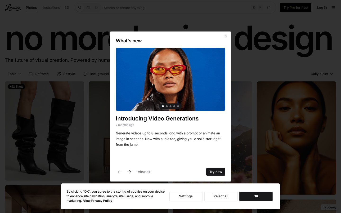
A stark, editorial AI-image-library interface built on pure white canvas with near-black ink, dominated by an oversized Inter display headline ("no more boring design") and a full-bleed masonry grid of photography. The system is aggressively monochrome — black-and-white UI chrome, pill-shaped dark CTAs, sharp-cornered cards and inputs, with the imagery itself supplying all the color. Brand voltage comes from scale (a ~141px hero headline with heavy negative tracking) rather than from color accents.
---
version: alpha
name: Lummi-design-analysis
description: "A stark, editorial AI-image-library interface built on pure white canvas with near-black ink, dominated by an oversized Inter display headline (\"no more boring design\") and a full-bleed masonry grid of photography. The system is aggressively monochrome — black-and-white UI chrome, pill-shaped dark CTAs, sharp-cornered cards and inputs, with the imagery itself supplying all the color. Brand voltage comes from scale (a ~141px hero headline with heavy negative tracking) rather than from color accents."
colors:
  ink: "#09090b"
  black: "#000000"
  ink-soft: "#18181b"
  ink-alt: "#19191b"
  ink-softer: "#27272a"
  neutral-dark: "#2d2d2d"
  gray: "#727272"
  muted: "#71717a"
  muted-soft: "#a1a1aa"
  muted-softer: "#9ca3af"
  hairline: "#d2d2d2"
  hairline-soft: "#cccccc"
  surface-soft: "#fafafa"
  surface-soft-alt: "#f7f7f7"
  surface-muted: "#f4f4f5"
  canvas: "#ffffff"
  on-ink: "#ffffff"
  accent-green: "#00c950"
  accent-gold: "#e7b008"
typography:
  display-hero:
    fontFamily: "Inter, sans-serif"
    fontSize: 141px
    fontWeight: 600
    lineHeight: 1.02
    letterSpacing: -7.056px
  title:
    fontFamily: "Inter, sans-serif"
    fontSize: 24px
    fontWeight: 600
    lineHeight: 1.333
    letterSpacing: -0.144px
  heading:
    fontFamily: "Inter, sans-serif"
    fontSize: 20px
    fontWeight: 600
    lineHeight: 1.4
    letterSpacing: -0.5px
  body:
    fontFamily: "Inter, sans-serif"
    fontSize: 20px
    fontWeight: 400
    lineHeight: 1.4
    letterSpacing: 0
  button:
    fontFamily: "Inter, sans-serif"
    fontSize: 14px
    fontWeight: 500
    lineHeight: 1.714
    letterSpacing: 0
rounded:
  sm: 4px
  md: 8px
  lg: 24px
  full: 9999px
spacing:
  xxs: 4px
  xs: 8px
  sm: 12px
  md: 16px
  lg: 20px
  xl: 24px
  xxl: 32px
  huge: 64px
components:
  top-nav:
    backgroundColor: "{colors.canvas}"
    textColor: "{colors.ink}"
    typography: "{typography.button}"
  nav-tab:
    backgroundColor: transparent
    textColor: "{colors.ink}"
    typography: "{typography.button}"
  search-input:
    backgroundColor: "{colors.canvas}"
    textColor: "{colors.muted}"
    typography: "{typography.button}"
    rounded: "{rounded.full}"
  button-primary:
    backgroundColor: "{colors.ink}"
    textColor: "{colors.on-ink}"
    typography: "{typography.button}"
    rounded: "{rounded.full}"
    padding: 6px 0px
  button-primary-active:
    backgroundColor: "{colors.ink-soft}"
    textColor: "{colors.on-ink}"
    rounded: "{rounded.full}"
  button-secondary:
    backgroundColor: transparent
    textColor: "{colors.ink}"
    typography: "{typography.button}"
    rounded: "{rounded.full}"
  tool-pill:
    backgroundColor: "{colors.canvas}"
    textColor: "{colors.ink}"
    typography: "{typography.button}"
    rounded: "{rounded.full}"
  modal-card:
    backgroundColor: "{colors.canvas}"
    textColor: "{colors.ink}"
    typography: "{typography.body}"
    rounded: "{rounded.lg}"
    padding: 24px
  modal-image:
    backgroundColor: "{colors.surface-muted}"
    textColor: "{colors.ink}"
    rounded: "{rounded.md}"
  badge-pill:
    backgroundColor: "{colors.black}"
    textColor: "{colors.on-ink}"
    typography: "{typography.button}"
    rounded: "{rounded.md}"
    padding: 4px 8px
  image-tile:
    backgroundColor: "{colors.surface-muted}"
    textColor: "{colors.ink}"
    rounded: "{rounded.md}"
  card:
    backgroundColor: "{colors.canvas}"
    textColor: "{colors.ink}"
    rounded: "{rounded.sm}"
  input:
    backgroundColor: "{colors.canvas}"
    textColor: "{colors.ink}"
    typography: "{typography.button}"
    rounded: "{rounded.sm}"
  cookie-banner:
    backgroundColor: "{colors.canvas}"
    textColor: "{colors.ink}"
    typography: "{typography.button}"
    rounded: "{rounded.lg}"
    padding: 24px
---

## Overview

Lummi's landing surface is a stark, editorial AI-image-library interface — pure white canvas (`{colors.canvas}` — #ffffff) with near-black ink (`{colors.ink}` — #09090b), dominated by an enormous Inter display headline ("no more boring design") that runs nearly the full viewport width at ~141px. Below the headline sits a full-bleed masonry grid of photography that supplies all the color in the system; the UI chrome itself stays rigorously monochrome.

The brand voice is scale, not hue. The hero headline (`{typography.display-hero}` — Inter 600 at 141px with -7.056px letter-spacing) is the single loudest element; everything else — nav, tool pills, buttons, modal copy — drops to small, quiet Inter at 14–24px. The negative tracking on the hero is extreme (≈ -0.05em) and is the defining typographic signature.

Component voltage comes from **the imagery**. Lummi shows hundreds of photos in a masonry grid; the interface around them is deliberately near-invisible — black pill CTAs, transparent text links, and sharp-cornered (0px radius) cards and inputs. The only chromatic moments measured are two faint accent values — `{colors.accent-green}` (#00c950) and `{colors.accent-gold}` (#e7b008) — which appear as status / Pro-tier flourishes, never on primary actions.

**Key Characteristics:**
- Oversized Inter display headline (`{typography.display-hero}` — 141px / 600 / -7.056px tracking). Scale is the brand.
- Pure monochrome chrome — ink (`{colors.ink}` — #09090b) on canvas (`{colors.canvas}` — #ffffff). A long ramp of neutral grays (`{colors.muted}`, `{colors.muted-soft}`, `{colors.hairline}`) handles secondary text and dividers.
- Pill-shaped (`{rounded.full}`) dark CTAs ("Try now", "OK", "Try Pro for free") sit against an otherwise flat white field.
- Sharp corners on structural elements — `{component.card}` and `{component.input}` measure 0px radius (mapped to `{rounded.sm}` 4px as the smallest declared step; see Known Gaps).
- Full-bleed masonry image grid is the page body. Image tiles carry small rounding (`{rounded.md}` — 8px).
- Accent colors are vanishingly rare — `{colors.accent-green}` and `{colors.accent-gold}` appear once or twice each, never on buttons.
- Modal "What's new" card uses the system's largest radius (`{rounded.lg}` — 24px) and the only meaningful drop shadow.

## Colors

### Brand & Ink
- **Ink** (`{colors.ink}` — #09090b): The dominant text + action color. Hero headline, body copy, primary button backgrounds.
- **Black** (`{colors.black}` — #000000): Pure black used in translucent overlays and the "+22 Shots" badge pill.
- **Ink Soft / Alt / Softer** (`{colors.ink-soft}` — #18181b, `{colors.ink-alt}` — #19191b, `{colors.ink-softer}` — #27272a): Near-black variants used on dark UI fills and pressed states.
- **Neutral Dark** (`{colors.neutral-dark}` — #2d2d2d): A dark gray for secondary dark surfaces.

### Text & Neutral Ramp
- **Gray** (`{colors.gray}` — #727272) and **Muted** (`{colors.muted}` — #71717a): Secondary text — sub-headline, timestamps ("7 months ago"), placeholder copy.
- **Muted Soft** (`{colors.muted-soft}` — #a1a1aa) and **Muted Softer** (`{colors.muted-softer}` — #9ca3af): Tertiary text, disabled labels.
- **Hairline** (`{colors.hairline}` — #d2d2d2) and **Hairline Soft** (`{colors.hairline-soft}` — #cccccc): 1px divider / border tones on light surfaces.

### Surface
- **Canvas** (`{colors.canvas}` — #ffffff): The page floor and modal background.
- **Surface Soft** (`{colors.surface-soft}` — #fafafa), **Surface Soft Alt** (`{colors.surface-soft-alt}` — #f7f7f7), **Surface Muted** (`{colors.surface-muted}` — #f4f4f5): Barely-tinted gray fills used as image-tile placeholders and faint section grounds.
- **On Ink** (`{colors.on-ink}` — #ffffff): Text on dark pill buttons and badges.

### Accent (rare)
- **Accent Green** (`{colors.accent-green}` — #00c950): Measured twice — a status/success flourish (e.g. an "online" or active indicator). Never on CTAs.
- **Accent Gold** (`{colors.accent-gold}` — #e7b008): Measured once — likely a Pro / premium highlight (the "Pro" wordmark in "Try Pro for free"). Used as a single chromatic accent.

## Typography

### Font Family
The entire system runs **Inter** — display, headings, body, and buttons. No licensed or custom typeface was detected (`fonts_licensed` is empty), so Inter ships natively. The recommended fallback stack is `Inter, -apple-system, BlinkMacSystemFont, "Segoe UI", Roboto, sans-serif`.

Inter does the full range of work here through weight and scale rather than family switching: 600 for the display headline and headings, 400 for body, 500 for buttons.

### Hierarchy

| Token | Size | Weight | Line Height | Letter Spacing | Use |
|---|---|---|---|---|---|
| `{typography.display-hero}` | 141px | 600 | 1.02 | -7.056px | Homepage hero ("no more boring design") |
| `{typography.title}` | 24px | 600 | 1.333 | -0.144px | Modal title ("Introducing Video Generations") |
| `{typography.heading}` | 20px | 600 | 1.4 | -0.5px | Section / card headings |
| `{typography.body}` | 20px | 400 | 1.4 | 0 | Sub-headline, modal body copy |
| `{typography.button}` | 14px | 500 | 1.714 | 0 | Buttons, nav links, tool pills, search placeholder |

### Principles
The hierarchy is bimodal: one enormous display size carries the entire brand statement, and everything else collapses into a compact 14–24px UI range. There is no mid-tier display step measured — the jump from 141px straight down to 24px is intentional and dramatic.

Negative letter-spacing scales with size: -7.056px at the hero, -0.5px at heading, -0.144px at title, and 0 for body and buttons. The tight tracking at large sizes is the brand signature; do not loosen it.

### Note on Font Substitutes
No substitution required — Inter is open-source (SIL Open Font License) and is the actual typeface in use. If Inter is unavailable, **Inter Tight** or system `-apple-system` are acceptable fallbacks, but the heavy negative tracking on the hero must be preserved to retain the voice.

## Layout

### Spacing System
- **Base unit:** 4px (by far the most frequent measured value — 140 occurrences).
- **Tokens:** `{spacing.xxs}` 4px · `{spacing.xs}` 8px · `{spacing.sm}` 12px · `{spacing.md}` 16px · `{spacing.lg}` 20px · `{spacing.xl}` 24px · `{spacing.xxl}` 32px · `{spacing.huge}` 64px.
- **Dominant rhythm:** 4px, 8px, and 12px dominate the measured set — the UI is built on tight, small-step spacing for the dense chrome.
- **Card / modal padding:** `{spacing.xl}` (24px) on the modal and cookie banner.
- **Section break:** `{spacing.huge}` (64px) appears once — the largest measured gap.

### Grid & Container
- **Hero band:** Full-bleed — the headline runs nearly edge-to-edge across the viewport.
- **Image grid:** Multi-column masonry that fills the full page width; columns increase with viewport width and tiles flow to varying heights.
- **Overlays:** The "What's new" modal and cookie banner are centered floating cards over a dimmed page.

### Whitespace Philosophy
Whitespace is concentrated at the top (the hero headline gets the entire first viewport to breathe) and then disappears — the masonry grid packs imagery edge-to-edge with minimal gutters. The contrast between the airy hero and the dense grid is itself a compositional device.

## Elevation & Depth

| Level | Treatment | Use |
|---|---|---|
| Flat | No shadow, no border | Hero headline, image grid, nav |
| Subtle card | `rgba(0,0,0,0.1) 0 1px 3px, 0 1px 2px -1px` | Light resting cards |
| Raised card | `rgba(0,0,0,0.1) 0 4px 6px -1px, 0 2px 4px -2px` | Buttons / small raised elements |
| Floating modal | `rgba(0,0,0,0.08) 0 4px 8px, rgba(0,0,0,0.24) 0 4px 12px` | The "What's new" modal card |
| Strong lift | `rgba(0,0,0,0.1) 0 10px 15px -3px, 0 4px 6px -4px` | The most-elevated overlay layer |

The elevation philosophy is **soft, low-alpha drop shadows** in the standard Tailwind shadow family (the measured values match `shadow`, `shadow-md`, `shadow-lg`). The modal carries a deeper double-shadow (0.24 alpha) to lift it cleanly above the dimmed page. No borders, no neumorphism, no glassmorphism.

### Decorative Depth
- The page dims behind the modal and cookie banner (a scrim overlay) — the screenshots show the masonry grid darkened beneath the active surfaces.
- Image tiles carry no shadow; they sit flat against the canvas, separated only by gutters.

## Shapes

### Border Radius Scale

| Token | Value | Use |
|---|---|---|
| `{rounded.sm}` | 4px | Smallest declared step; default for structural cards/inputs that measured 0px (see Known Gaps) |
| `{rounded.md}` | 8px | Image tiles, badge pills |
| `{rounded.lg}` | 24px | Modal card, cookie banner |
| `{rounded.full}` | 9999px | All pill buttons, search bar, tool pills |

The radius system is bimodal like the type: tight small radii (4–8px) for content tiles, full pills (`{rounded.full}`) for every interactive button, and a single large 24px radius reserved for floating overlay cards. Note that `{component.card}` and `{component.input}` measured **0px** (perfectly sharp corners) — a deliberate editorial choice for structural chrome.

### Photography Geometry
Masonry image tiles use `{rounded.md}` (8px) rounding and varying aspect ratios (portrait, landscape, square) packed into columns. The hero "What's new" modal image uses the same small rounding inside the 24px card.

## Components

### Navigation

**`top-nav`** — White nav bar across the top of the page. Carries the Lummi script wordmark at left, a `{component.nav-tab}` group (Photos / Illustrations / 3D), a large central `{component.search-input}`, and a right-side cluster with the "Try Pro for free" `{component.button-primary}` and a "Log in" `{component.button-secondary}`. Type in `{typography.button}` (Inter 14px / 500).

**`nav-tab`** — Transparent text tabs (Photos / Illustrations / 3D). Active tab carries an underline; text in `{colors.ink}`, `{typography.button}`.

**`search-input`** — Full-pill search field ("Search or create anything!") with `{rounded.full}` radius, `{colors.muted}` placeholder text, and a keyboard-shortcut hint (⌘K) at right. Background `{colors.canvas}`.

### Buttons

**`button-primary`** — The dark pill CTA ("Try now", "OK", "Try Pro for free"). Background `{colors.ink}` (#09090b), text `{colors.on-ink}`, type `{typography.button}`, rounded `{rounded.full}`. Measured padding 6px 0px (vertical only; horizontal padding not captured — see Known Gaps). Pressed state `button-primary-active` shifts to `{colors.ink-soft}` (#18181b) — derived from the near-black ramp.

**`button-secondary`** — Transparent text button ("Log in", "Reject all", "View all"). No fill, text `{colors.ink}`, type `{typography.button}`, `{rounded.full}`.

### Tool Bar

**`tool-pill`** — The horizontal toolbar below the hero (Tools, Reframe, Restyle, Background, Daily picks). Each is a white pill with `{colors.ink}` label and small icon, `{typography.button}`, rounded `{rounded.full}`. These act as filter / mode controls over the image grid.

### Cards & Overlays

**`modal-card`** — The "What's new" floating modal. Background `{colors.canvas}`, rounded `{rounded.lg}` (24px), padding `{spacing.xl}` (24px), carries the floating-modal double drop shadow. Contains a `{component.modal-image}` at top, a title in `{typography.title}`, a timestamp in `{colors.muted}`, body copy in `{typography.body}`, and a `{component.button-primary}` ("Try now") at bottom-right.

**`modal-image`** — The hero media inside the modal. Background `{colors.surface-muted}` placeholder, rounded `{rounded.md}` (8px), with a small dot-pagination indicator overlaid at the bottom.

**`image-tile`** — A masonry grid cell holding a single photo. Background `{colors.surface-muted}` placeholder while loading, rounded `{rounded.md}` (8px). The grid of these tiles is the page body.

**`badge-pill`** — Small overlay badge in the top-left corner of multi-shot tiles ("+22 Shots", "+24 Shots", "+64 Shots"). Background `{colors.black}` (translucent), text `{colors.on-ink}`, `{typography.button}`, rounded `{rounded.md}`, padding 4px 8px.

**`card`** — Generic structural card. Background `{colors.canvas}`, **0px measured radius** mapped to `{rounded.sm}`, no shadow. Sharp-cornered by default.

**`cookie-banner`** — The bottom-center consent banner. Background `{colors.canvas}`, rounded `{rounded.lg}` (24px), padding `{spacing.xl}` (24px). Carries consent copy in `{typography.button}`, a "Settings" + "Reject all" `{component.button-secondary}` pair, and an "OK" `{component.button-primary}`.

### Inputs

**`input`** — Standard text input. Background `{colors.canvas}`, text `{colors.ink}`, `{typography.button}`. **0px measured radius** mapped to `{rounded.sm}` — sharp corners, distinct from the full-pill search bar.

## Do's and Don'ts

### Do
- Let the hero headline carry the brand. Use `{typography.display-hero}` at full scale with its -7.056px tracking — the size IS the identity.
- Keep all chrome monochrome — `{colors.ink}` on `{colors.canvas}`, with the neutral gray ramp for secondary text.
- Reserve `{rounded.full}` for interactive buttons and the search bar; use sharp / small radii for structural cards and inputs.
- Use `{component.button-primary}` (dark pill) as the single emphatic action per surface.
- Let the imagery supply all color. The UI is the quiet frame around loud photography.
- Use `{colors.surface-muted}` placeholders behind images while they load.

### Don't
- Don't loosen the negative letter-spacing on the hero — Inter at 141px with default tracking reads as generic.
- Don't introduce `{colors.accent-green}` or `{colors.accent-gold}` on buttons or large surfaces — they are scarce status flourishes only.
- Don't round structural cards/inputs heavily — they are intentionally sharp (0px / `{rounded.sm}`).
- Don't add a second display size between 141px and 24px — the dramatic jump is intentional.
- Don't add hover-state styling beyond the documented active/pressed shift to `{colors.ink-soft}`.

## Responsive Behavior

### Breakpoints
The analysis captured a single desktop landing render, so breakpoints below are **derived** from the observed masonry layout and standard practice — treat as guidance, not measured truth.

| Name | Width | Key Changes (derived) |
|---|---|---|
| Mobile | < 768px | Hero headline scales down dramatically from 141px; masonry collapses to 1–2 columns; nav condenses to hamburger (the ☰ icon is present in the capture) |
| Tablet | 768–1024px | Masonry at 3 columns; toolbar pills may wrap |
| Desktop | 1024–1440px | Full masonry (4+ columns), full nav with search bar, all tool pills inline |
| Wide | > 1440px | More masonry columns; hero headline approaches full ~141px scale |

### Touch Targets
- `{component.button-primary}` pills are the primary tap targets; ensure adequate vertical padding (measured 6px vertical — likely supplemented by line-height to reach a comfortable height; see Known Gaps).
- `{component.tool-pill}` and `{component.nav-tab}` are compact; effective tap area depends on horizontal padding not fully captured.

### Collapsing Strategy
- The hamburger icon in the top-right indicates the nav collapses to a menu at narrow widths.
- The masonry grid reduces column count rather than scaling tiles down.
- Modal and cookie banner remain centered floating cards at all widths.

### Image Behavior
- Masonry tiles retain native aspect ratios and reflow into fewer columns as width shrinks.
- Placeholder fills (`{colors.surface-muted}`) hold tile dimensions before images load.

## Iteration Guide

1. Focus on ONE component at a time. Reference its YAML key directly (`{component.button-primary}`, `{component.modal-card}`).
2. Variants of an existing component (`-active`, `-disabled`) live as separate entries in `components:`.
3. Use `{token.refs}` everywhere — never inline hex.
4. Never document hover. Default and Active/Pressed states only.
5. The hero headline stays Inter 600 with heavy negative tracking. Body stays Inter 400. Don't add intermediate display sizes.
6. Keep the system monochrome; accents are scarce by design.
7. When in doubt about emphasis: bigger Inter before any color.

## Known Gaps

- `{component.button-primary}` measured padding as `6px 0px` — horizontal padding was not captured, so pill width / total button height are not reliably known. The 6px is vertical only; treat horizontal padding as a gap to fill from screenshot ground-truth.
- `{component.card}` and `{component.input}` measured **0px** border-radius. Since the smallest declared radius token is `{rounded.sm}` (4px), these components reference `{rounded.sm}` as an approximation — if pixel-perfect sharp corners are required, a `rounded.none: 0px` token should be added.
- Background colors for `{component.button-primary}`, `{component.badge-pill}`, and `{component.search-input}` are inferred from screenshots; the analyzer captured a single `color` value (text/ink) per component rather than explicit background fills.
- Accent values `{colors.accent-green}` and `{colors.accent-gold}` were each measured only 1–2 times; their exact usage context (status indicator vs. Pro highlight) is inferred from the screenshot and may differ in product surfaces.
- Only the landing page (with two overlay modals open) was captured — interior pages (Illustrations, 3D, image-detail, generation flow) and their components are out of scope.
- Responsive breakpoints are derived, not measured — only a desktop render was analyzed.
- Animation and transition timings (carousel auto-advance, modal entrance, hover reveals on tiles) were not captured.
- Form validation, disabled, and focus states beyond the default were not extracted.

<!-- Documented by duply · real-world design systems as ready-to-use DESIGN.md for AI coding agents · https://duply.ai/lummi/design-md -->
Color Palette
Accent
Neutrals
Typography
display-hero141px · 600 · 1.02
The quick brown fox jumpstitle24px · 600 · 1.333
The quick brown fox jumpsheading20px · 600 · 1.4
The quick brown fox jumpsbody20px · 400 · 1.4
The quick brown fox jumpsbutton14px · 500 · 1.714
The quick brown fox jumpsSpacing & Shape
Spacing
| Name | Value | Preview |
|---|---|---|
| xxs | 4px | |
| xs | 8px | |
| sm | 12px | |
| md | 16px | |
| lg | 20px | |
| xl | 24px | |
| xxl | 32px | |
| huge | 64px |
Border Radius
| Name | Value | Preview |
|---|---|---|
| sm | 4px | |
| md | 8px | |
| lg | 24px | |
| full | 9999px |
More like this


---
version: alpha
name: Lummi-design-analysis
description: "A stark, editorial AI-image-library interface built on pure white canvas with near-black ink, dominated by an oversized Inter display headline (\"no more boring design\") and a full-bleed masonry grid of photography. The system is aggressively monochrome — black-and-white UI chrome, pill-shaped dark CTAs, sharp-cornered cards and inputs, with the imagery itself supplying all the color. Brand voltage comes from scale (a ~141px hero headline with heavy negative tracking) rather than from color accents."
colors:
  ink: "#09090b"
  black: "#000000"
  ink-soft: "#18181b"
  ink-alt: "#19191b"
  ink-softer: "#27272a"
  neutral-dark: "#2d2d2d"
  gray: "#727272"
  muted: "#71717a"
  muted-soft: "#a1a1aa"
  muted-softer: "#9ca3af"
  hairline: "#d2d2d2"
  hairline-soft: "#cccccc"
  surface-soft: "#fafafa"
  surface-soft-alt: "#f7f7f7"
  surface-muted: "#f4f4f5"
  canvas: "#ffffff"
  on-ink: "#ffffff"
  accent-green: "#00c950"
  accent-gold: "#e7b008"
typography:
  display-hero:
    fontFamily: "Inter, sans-serif"
    fontSize: 141px
    fontWeight: 600
    lineHeight: 1.02
    letterSpacing: -7.056px
  title:
    fontFamily: "Inter, sans-serif"
    fontSize: 24px
    fontWeight: 600
    lineHeight: 1.333
    letterSpacing: -0.144px
  heading:
    fontFamily: "Inter, sans-serif"
    fontSize: 20px
    fontWeight: 600
    lineHeight: 1.4
    letterSpacing: -0.5px
  body:
    fontFamily: "Inter, sans-serif"
    fontSize: 20px
    fontWeight: 400
    lineHeight: 1.4
    letterSpacing: 0
  button:
    fontFamily: "Inter, sans-serif"
    fontSize: 14px
    fontWeight: 500
    lineHeight: 1.714
    letterSpacing: 0
rounded:
  sm: 4px
  md: 8px
  lg: 24px
  full: 9999px
spacing:
  xxs: 4px
  xs: 8px
  sm: 12px
  md: 16px
  lg: 20px
  xl: 24px
  xxl: 32px
  huge: 64px
components:
  top-nav:
    backgroundColor: "{colors.canvas}"
    textColor: "{colors.ink}"
    typography: "{typography.button}"
  nav-tab:
    backgroundColor: transparent
    textColor: "{colors.ink}"
    typography: "{typography.button}"
  search-input:
    backgroundColor: "{colors.canvas}"
    textColor: "{colors.muted}"
    typography: "{typography.button}"
    rounded: "{rounded.full}"
  button-primary:
    backgroundColor: "{colors.ink}"
    textColor: "{colors.on-ink}"
    typography: "{typography.button}"
    rounded: "{rounded.full}"
    padding: 6px 0px
  button-primary-active:
    backgroundColor: "{colors.ink-soft}"
    textColor: "{colors.on-ink}"
    rounded: "{rounded.full}"
  button-secondary:
    backgroundColor: transparent
    textColor: "{colors.ink}"
    typography: "{typography.button}"
    rounded: "{rounded.full}"
  tool-pill:
    backgroundColor: "{colors.canvas}"
    textColor: "{colors.ink}"
    typography: "{typography.button}"
    rounded: "{rounded.full}"
  modal-card:
    backgroundColor: "{colors.canvas}"
    textColor: "{colors.ink}"
    typography: "{typography.body}"
    rounded: "{rounded.lg}"
    padding: 24px
  modal-image:
    backgroundColor: "{colors.surface-muted}"
    textColor: "{colors.ink}"
    rounded: "{rounded.md}"
  badge-pill:
    backgroundColor: "{colors.black}"
    textColor: "{colors.on-ink}"
    typography: "{typography.button}"
    rounded: "{rounded.md}"
    padding: 4px 8px
  image-tile:
    backgroundColor: "{colors.surface-muted}"
    textColor: "{colors.ink}"
    rounded: "{rounded.md}"
  card:
    backgroundColor: "{colors.canvas}"
    textColor: "{colors.ink}"
    rounded: "{rounded.sm}"
  input:
    backgroundColor: "{colors.canvas}"
    textColor: "{colors.ink}"
    typography: "{typography.button}"
    rounded: "{rounded.sm}"
  cookie-banner:
    backgroundColor: "{colors.canvas}"
    textColor: "{colors.ink}"
    typography: "{typography.button}"
    rounded: "{rounded.lg}"
    padding: 24px
---

## Overview

Lummi's landing surface is a stark, editorial AI-image-library interface — pure white canvas (`{colors.canvas}` — #ffffff) with near-black ink (`{colors.ink}` — #09090b), dominated by an enormous Inter display headline ("no more boring design") that runs nearly the full viewport width at ~141px. Below the headline sits a full-bleed masonry grid of photography that supplies all the color in the system; the UI chrome itself stays rigorously monochrome.

The brand voice is scale, not hue. The hero headline (`{typography.display-hero}` — Inter 600 at 141px with -7.056px letter-spacing) is the single loudest element; everything else — nav, tool pills, buttons, modal copy — drops to small, quiet Inter at 14–24px. The negative tracking on the hero is extreme (≈ -0.05em) and is the defining typographic signature.

Component voltage comes from **the imagery**. Lummi shows hundreds of photos in a masonry grid; the interface around them is deliberately near-invisible — black pill CTAs, transparent text links, and sharp-cornered (0px radius) cards and inputs. The only chromatic moments measured are two faint accent values — `{colors.accent-green}` (#00c950) and `{colors.accent-gold}` (#e7b008) — which appear as status / Pro-tier flourishes, never on primary actions.

**Key Characteristics:**
- Oversized Inter display headline (`{typography.display-hero}` — 141px / 600 / -7.056px tracking). Scale is the brand.
- Pure monochrome chrome — ink (`{colors.ink}` — #09090b) on canvas (`{colors.canvas}` — #ffffff). A long ramp of neutral grays (`{colors.muted}`, `{colors.muted-soft}`, `{colors.hairline}`) handles secondary text and dividers.
- Pill-shaped (`{rounded.full}`) dark CTAs ("Try now", "OK", "Try Pro for free") sit against an otherwise flat white field.
- Sharp corners on structural elements — `{component.card}` and `{component.input}` measure 0px radius (mapped to `{rounded.sm}` 4px as the smallest declared step; see Known Gaps).
- Full-bleed masonry image grid is the page body. Image tiles carry small rounding (`{rounded.md}` — 8px).
- Accent colors are vanishingly rare — `{colors.accent-green}` and `{colors.accent-gold}` appear once or twice each, never on buttons.
- Modal "What's new" card uses the system's largest radius (`{rounded.lg}` — 24px) and the only meaningful drop shadow.

## Colors

### Brand & Ink
- **Ink** (`{colors.ink}` — #09090b): The dominant text + action color. Hero headline, body copy, primary button backgrounds.
- **Black** (`{colors.black}` — #000000): Pure black used in translucent overlays and the "+22 Shots" badge pill.
- **Ink Soft / Alt / Softer** (`{colors.ink-soft}` — #18181b, `{colors.ink-alt}` — #19191b, `{colors.ink-softer}` — #27272a): Near-black variants used on dark UI fills and pressed states.
- **Neutral Dark** (`{colors.neutral-dark}` — #2d2d2d): A dark gray for secondary dark surfaces.

### Text & Neutral Ramp
- **Gray** (`{colors.gray}` — #727272) and **Muted** (`{colors.muted}` — #71717a): Secondary text — sub-headline, timestamps ("7 months ago"), placeholder copy.
- **Muted Soft** (`{colors.muted-soft}` — #a1a1aa) and **Muted Softer** (`{colors.muted-softer}` — #9ca3af): Tertiary text, disabled labels.
- **Hairline** (`{colors.hairline}` — #d2d2d2) and **Hairline Soft** (`{colors.hairline-soft}` — #cccccc): 1px divider / border tones on light surfaces.

### Surface
- **Canvas** (`{colors.canvas}` — #ffffff): The page floor and modal background.
- **Surface Soft** (`{colors.surface-soft}` — #fafafa), **Surface Soft Alt** (`{colors.surface-soft-alt}` — #f7f7f7), **Surface Muted** (`{colors.surface-muted}` — #f4f4f5): Barely-tinted gray fills used as image-tile placeholders and faint section grounds.
- **On Ink** (`{colors.on-ink}` — #ffffff): Text on dark pill buttons and badges.

### Accent (rare)
- **Accent Green** (`{colors.accent-green}` — #00c950): Measured twice — a status/success flourish (e.g. an "online" or active indicator). Never on CTAs.
- **Accent Gold** (`{colors.accent-gold}` — #e7b008): Measured once — likely a Pro / premium highlight (the "Pro" wordmark in "Try Pro for free"). Used as a single chromatic accent.

## Typography

### Font Family
The entire system runs **Inter** — display, headings, body, and buttons. No licensed or custom typeface was detected (`fonts_licensed` is empty), so Inter ships natively. The recommended fallback stack is `Inter, -apple-system, BlinkMacSystemFont, "Segoe UI", Roboto, sans-serif`.

Inter does the full range of work here through weight and scale rather than family switching: 600 for the display headline and headings, 400 for body, 500 for buttons.

### Hierarchy

| Token | Size | Weight | Line Height | Letter Spacing | Use |
|---|---|---|---|---|---|
| `{typography.display-hero}` | 141px | 600 | 1.02 | -7.056px | Homepage hero ("no more boring design") |
| `{typography.title}` | 24px | 600 | 1.333 | -0.144px | Modal title ("Introducing Video Generations") |
| `{typography.heading}` | 20px | 600 | 1.4 | -0.5px | Section / card headings |
| `{typography.body}` | 20px | 400 | 1.4 | 0 | Sub-headline, modal body copy |
| `{typography.button}` | 14px | 500 | 1.714 | 0 | Buttons, nav links, tool pills, search placeholder |

### Principles
The hierarchy is bimodal: one enormous display size carries the entire brand statement, and everything else collapses into a compact 14–24px UI range. There is no mid-tier display step measured — the jump from 141px straight down to 24px is intentional and dramatic.

Negative letter-spacing scales with size: -7.056px at the hero, -0.5px at heading, -0.144px at title, and 0 for body and buttons. The tight tracking at large sizes is the brand signature; do not loosen it.

### Note on Font Substitutes
No substitution required — Inter is open-source (SIL Open Font License) and is the actual typeface in use. If Inter is unavailable, **Inter Tight** or system `-apple-system` are acceptable fallbacks, but the heavy negative tracking on the hero must be preserved to retain the voice.

## Layout

### Spacing System
- **Base unit:** 4px (by far the most frequent measured value — 140 occurrences).
- **Tokens:** `{spacing.xxs}` 4px · `{spacing.xs}` 8px · `{spacing.sm}` 12px · `{spacing.md}` 16px · `{spacing.lg}` 20px · `{spacing.xl}` 24px · `{spacing.xxl}` 32px · `{spacing.huge}` 64px.
- **Dominant rhythm:** 4px, 8px, and 12px dominate the measured set — the UI is built on tight, small-step spacing for the dense chrome.
- **Card / modal padding:** `{spacing.xl}` (24px) on the modal and cookie banner.
- **Section break:** `{spacing.huge}` (64px) appears once — the largest measured gap.

### Grid & Container
- **Hero band:** Full-bleed — the headline runs nearly edge-to-edge across the viewport.
- **Image grid:** Multi-column masonry that fills the full page width; columns increase with viewport width and tiles flow to varying heights.
- **Overlays:** The "What's new" modal and cookie banner are centered floating cards over a dimmed page.

### Whitespace Philosophy
Whitespace is concentrated at the top (the hero headline gets the entire first viewport to breathe) and then disappears — the masonry grid packs imagery edge-to-edge with minimal gutters. The contrast between the airy hero and the dense grid is itself a compositional device.

## Elevation & Depth

| Level | Treatment | Use |
|---|---|---|
| Flat | No shadow, no border | Hero headline, image grid, nav |
| Subtle card | `rgba(0,0,0,0.1) 0 1px 3px, 0 1px 2px -1px` | Light resting cards |
| Raised card | `rgba(0,0,0,0.1) 0 4px 6px -1px, 0 2px 4px -2px` | Buttons / small raised elements |
| Floating modal | `rgba(0,0,0,0.08) 0 4px 8px, rgba(0,0,0,0.24) 0 4px 12px` | The "What's new" modal card |
| Strong lift | `rgba(0,0,0,0.1) 0 10px 15px -3px, 0 4px 6px -4px` | The most-elevated overlay layer |

The elevation philosophy is **soft, low-alpha drop shadows** in the standard Tailwind shadow family (the measured values match `shadow`, `shadow-md`, `shadow-lg`). The modal carries a deeper double-shadow (0.24 alpha) to lift it cleanly above the dimmed page. No borders, no neumorphism, no glassmorphism.

### Decorative Depth
- The page dims behind the modal and cookie banner (a scrim overlay) — the screenshots show the masonry grid darkened beneath the active surfaces.
- Image tiles carry no shadow; they sit flat against the canvas, separated only by gutters.

## Shapes

### Border Radius Scale

| Token | Value | Use |
|---|---|---|
| `{rounded.sm}` | 4px | Smallest declared step; default for structural cards/inputs that measured 0px (see Known Gaps) |
| `{rounded.md}` | 8px | Image tiles, badge pills |
| `{rounded.lg}` | 24px | Modal card, cookie banner |
| `{rounded.full}` | 9999px | All pill buttons, search bar, tool pills |

The radius system is bimodal like the type: tight small radii (4–8px) for content tiles, full pills (`{rounded.full}`) for every interactive button, and a single large 24px radius reserved for floating overlay cards. Note that `{component.card}` and `{component.input}` measured **0px** (perfectly sharp corners) — a deliberate editorial choice for structural chrome.

### Photography Geometry
Masonry image tiles use `{rounded.md}` (8px) rounding and varying aspect ratios (portrait, landscape, square) packed into columns. The hero "What's new" modal image uses the same small rounding inside the 24px card.

## Components

### Navigation

**`top-nav`** — White nav bar across the top of the page. Carries the Lummi script wordmark at left, a `{component.nav-tab}` group (Photos / Illustrations / 3D), a large central `{component.search-input}`, and a right-side cluster with the "Try Pro for free" `{component.button-primary}` and a "Log in" `{component.button-secondary}`. Type in `{typography.button}` (Inter 14px / 500).

**`nav-tab`** — Transparent text tabs (Photos / Illustrations / 3D). Active tab carries an underline; text in `{colors.ink}`, `{typography.button}`.

**`search-input`** — Full-pill search field ("Search or create anything!") with `{rounded.full}` radius, `{colors.muted}` placeholder text, and a keyboard-shortcut hint (⌘K) at right. Background `{colors.canvas}`.

### Buttons

**`button-primary`** — The dark pill CTA ("Try now", "OK", "Try Pro for free"). Background `{colors.ink}` (#09090b), text `{colors.on-ink}`, type `{typography.button}`, rounded `{rounded.full}`. Measured padding 6px 0px (vertical only; horizontal padding not captured — see Known Gaps). Pressed state `button-primary-active` shifts to `{colors.ink-soft}` (#18181b) — derived from the near-black ramp.

**`button-secondary`** — Transparent text button ("Log in", "Reject all", "View all"). No fill, text `{colors.ink}`, type `{typography.button}`, `{rounded.full}`.

### Tool Bar

**`tool-pill`** — The horizontal toolbar below the hero (Tools, Reframe, Restyle, Background, Daily picks). Each is a white pill with `{colors.ink}` label and small icon, `{typography.button}`, rounded `{rounded.full}`. These act as filter / mode controls over the image grid.

### Cards & Overlays

**`modal-card`** — The "What's new" floating modal. Background `{colors.canvas}`, rounded `{rounded.lg}` (24px), padding `{spacing.xl}` (24px), carries the floating-modal double drop shadow. Contains a `{component.modal-image}` at top, a title in `{typography.title}`, a timestamp in `{colors.muted}`, body copy in `{typography.body}`, and a `{component.button-primary}` ("Try now") at bottom-right.

**`modal-image`** — The hero media inside the modal. Background `{colors.surface-muted}` placeholder, rounded `{rounded.md}` (8px), with a small dot-pagination indicator overlaid at the bottom.

**`image-tile`** — A masonry grid cell holding a single photo. Background `{colors.surface-muted}` placeholder while loading, rounded `{rounded.md}` (8px). The grid of these tiles is the page body.

**`badge-pill`** — Small overlay badge in the top-left corner of multi-shot tiles ("+22 Shots", "+24 Shots", "+64 Shots"). Background `{colors.black}` (translucent), text `{colors.on-ink}`, `{typography.button}`, rounded `{rounded.md}`, padding 4px 8px.

**`card`** — Generic structural card. Background `{colors.canvas}`, **0px measured radius** mapped to `{rounded.sm}`, no shadow. Sharp-cornered by default.

**`cookie-banner`** — The bottom-center consent banner. Background `{colors.canvas}`, rounded `{rounded.lg}` (24px), padding `{spacing.xl}` (24px). Carries consent copy in `{typography.button}`, a "Settings" + "Reject all" `{component.button-secondary}` pair, and an "OK" `{component.button-primary}`.

### Inputs

**`input`** — Standard text input. Background `{colors.canvas}`, text `{colors.ink}`, `{typography.button}`. **0px measured radius** mapped to `{rounded.sm}` — sharp corners, distinct from the full-pill search bar.

## Do's and Don'ts

### Do
- Let the hero headline carry the brand. Use `{typography.display-hero}` at full scale with its -7.056px tracking — the size IS the identity.
- Keep all chrome monochrome — `{colors.ink}` on `{colors.canvas}`, with the neutral gray ramp for secondary text.
- Reserve `{rounded.full}` for interactive buttons and the search bar; use sharp / small radii for structural cards and inputs.
- Use `{component.button-primary}` (dark pill) as the single emphatic action per surface.
- Let the imagery supply all color. The UI is the quiet frame around loud photography.
- Use `{colors.surface-muted}` placeholders behind images while they load.

### Don't
- Don't loosen the negative letter-spacing on the hero — Inter at 141px with default tracking reads as generic.
- Don't introduce `{colors.accent-green}` or `{colors.accent-gold}` on buttons or large surfaces — they are scarce status flourishes only.
- Don't round structural cards/inputs heavily — they are intentionally sharp (0px / `{rounded.sm}`).
- Don't add a second display size between 141px and 24px — the dramatic jump is intentional.
- Don't add hover-state styling beyond the documented active/pressed shift to `{colors.ink-soft}`.

## Responsive Behavior

### Breakpoints
The analysis captured a single desktop landing render, so breakpoints below are **derived** from the observed masonry layout and standard practice — treat as guidance, not measured truth.

| Name | Width | Key Changes (derived) |
|---|---|---|
| Mobile | < 768px | Hero headline scales down dramatically from 141px; masonry collapses to 1–2 columns; nav condenses to hamburger (the ☰ icon is present in the capture) |
| Tablet | 768–1024px | Masonry at 3 columns; toolbar pills may wrap |
| Desktop | 1024–1440px | Full masonry (4+ columns), full nav with search bar, all tool pills inline |
| Wide | > 1440px | More masonry columns; hero headline approaches full ~141px scale |

### Touch Targets
- `{component.button-primary}` pills are the primary tap targets; ensure adequate vertical padding (measured 6px vertical — likely supplemented by line-height to reach a comfortable height; see Known Gaps).
- `{component.tool-pill}` and `{component.nav-tab}` are compact; effective tap area depends on horizontal padding not fully captured.

### Collapsing Strategy
- The hamburger icon in the top-right indicates the nav collapses to a menu at narrow widths.
- The masonry grid reduces column count rather than scaling tiles down.
- Modal and cookie banner remain centered floating cards at all widths.

### Image Behavior
- Masonry tiles retain native aspect ratios and reflow into fewer columns as width shrinks.
- Placeholder fills (`{colors.surface-muted}`) hold tile dimensions before images load.

## Iteration Guide

1. Focus on ONE component at a time. Reference its YAML key directly (`{component.button-primary}`, `{component.modal-card}`).
2. Variants of an existing component (`-active`, `-disabled`) live as separate entries in `components:`.
3. Use `{token.refs}` everywhere — never inline hex.
4. Never document hover. Default and Active/Pressed states only.
5. The hero headline stays Inter 600 with heavy negative tracking. Body stays Inter 400. Don't add intermediate display sizes.
6. Keep the system monochrome; accents are scarce by design.
7. When in doubt about emphasis: bigger Inter before any color.

## Known Gaps

- `{component.button-primary}` measured padding as `6px 0px` — horizontal padding was not captured, so pill width / total button height are not reliably known. The 6px is vertical only; treat horizontal padding as a gap to fill from screenshot ground-truth.
- `{component.card}` and `{component.input}` measured **0px** border-radius. Since the smallest declared radius token is `{rounded.sm}` (4px), these components reference `{rounded.sm}` as an approximation — if pixel-perfect sharp corners are required, a `rounded.none: 0px` token should be added.
- Background colors for `{component.button-primary}`, `{component.badge-pill}`, and `{component.search-input}` are inferred from screenshots; the analyzer captured a single `color` value (text/ink) per component rather than explicit background fills.
- Accent values `{colors.accent-green}` and `{colors.accent-gold}` were each measured only 1–2 times; their exact usage context (status indicator vs. Pro highlight) is inferred from the screenshot and may differ in product surfaces.
- Only the landing page (with two overlay modals open) was captured — interior pages (Illustrations, 3D, image-detail, generation flow) and their components are out of scope.
- Responsive breakpoints are derived, not measured — only a desktop render was analyzed.
- Animation and transition timings (carousel auto-advance, modal entrance, hover reveals on tiles) were not captured.
- Form validation, disabled, and focus states beyond the default were not extracted.

<!-- Documented by duply · real-world design systems as ready-to-use DESIGN.md for AI coding agents · https://duply.ai/lummi/design-md -->