
itsoffbrand
A minimal, gallery-grade creative-agency interface built on a warm off-white canvas (#e5e4e0) with near-black ink (#1d1d1d) and a single custom wide-grotesque display face (Ataero Retina OB Edition). The system reads as confident and reductive — enormous display headlines, a symbolic plus/cross logo mark, tiny uppercase micro-labels, and grids of client logos and portfolio thumbnails floating in acres of empty canvas. Brand voltage comes from scale contrast (100px+ display type against 15px labels) and near-total restraint rather than color.
Works withClaude CodeCursorCodexGemini CLICopilotv0LovableBoltWindsurfReplit
---
version: alpha
name: itsoffbrand-design-analysis
description: "A minimal, gallery-grade creative-agency interface built on a warm off-white canvas (#e5e4e0) with near-black ink (#1d1d1d) and a single custom wide-grotesque display face (Ataero Retina OB Edition). The system reads as confident and reductive — enormous display headlines, a symbolic plus/cross logo mark, tiny uppercase micro-labels, and grids of client logos and portfolio thumbnails floating in acres of empty canvas. Brand voltage comes from scale contrast (100px+ display type against 15px labels) and near-total restraint rather than color."
colors:
  canvas: "#e5e4e0"
  ink: "#1d1d1d"
  ink-strong: "#000000"
  ink-soft: "#222222"
  neutral: "#ffffff"
  surface-soft: "#f1f0ec"
  muted: "#6f6f6f"
  hairline: "#dddddd"
  hairline-soft: "#cccccc"
  accent-blue: "#3898ec"
  accent-blue-strong: "#0082f3"
  accent-pink: "#ffdede"
  accent-slate: "#5d6c7b"
  accent-yellow: "#ffff00"
typography:
  display-xl:
    fontFamily: "Ataero Retina OB Edition, Archivo Expanded, sans-serif"
    fontSize: 102.86px
    fontWeight: 400
    lineHeight: 1.0
    letterSpacing: normal
  display-lg:
    fontFamily: "Ataero Retina OB Edition, Archivo Expanded, sans-serif"
    fontSize: 76.19px
    fontWeight: 400
    lineHeight: 1.0
    letterSpacing: normal
  label:
    fontFamily: "Ataero Retina OB Edition, Archivo Expanded, sans-serif"
    fontSize: 15.24px
    fontWeight: 400
    lineHeight: 1.4
    letterSpacing: normal
  body:
    fontFamily: "Ataero Retina OB Edition, Archivo Expanded, sans-serif"
    fontSize: 15.24px
    fontWeight: 400
    lineHeight: 1.4
    letterSpacing: 0.0131em
  button:
    fontFamily: "Ataero Retina OB Edition, Archivo Expanded, sans-serif"
    fontSize: 15.24px
    fontWeight: 400
    lineHeight: 1.4
    letterSpacing: normal
rounded:
  sm: 6px
  md: 10px
  lg: 30px
  xl: 95px
  pill: 152px
spacing:
  xxs: 4px
  xs: 9px
  sm: 15px
  md: 19px
  lg: 30px
  xl: 46px
  xxl: 61px
components:
  logo-mark:
    backgroundColor: transparent
    textColor: "{colors.ink}"
  button-primary:
    backgroundColor: transparent
    textColor: "{colors.ink}"
    typography: "{typography.button}"
    padding: 0px
  caption-label:
    backgroundColor: transparent
    textColor: "{colors.ink}"
    typography: "{typography.label}"
  avatar-dot:
    backgroundColor: "{colors.ink}"
    textColor: "{colors.neutral}"
    rounded: "{rounded.pill}"
  client-logo-cell:
    backgroundColor: "{colors.canvas}"
    textColor: "{colors.ink}"
    typography: "{typography.body}"
  portfolio-thumb:
    backgroundColor: "{colors.surface-soft}"
    textColor: "{colors.ink}"
    rounded: "{rounded.md}"
  display-heading:
    backgroundColor: transparent
    textColor: "{colors.ink}"
    typography: "{typography.display-xl}"
  media-band:
    backgroundColor: "{colors.ink}"
    textColor: "{colors.neutral}"
---

## Overview

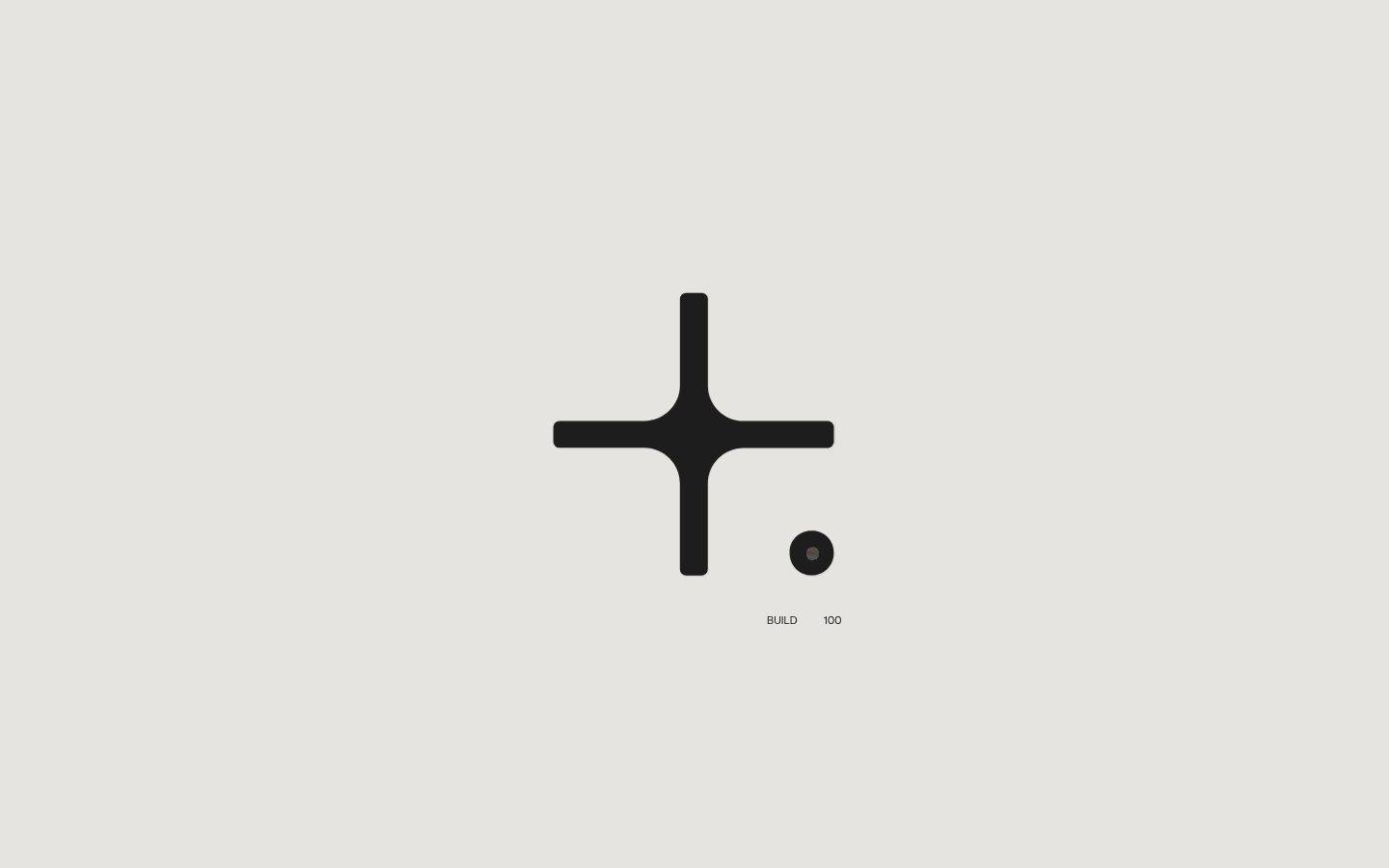
itsoffbrand.com is a reductive, gallery-grade creative-agency surface. The entire page floats on a warm off-white canvas (`{colors.canvas}` — #e5e4e0), with near-black ink (`{colors.ink}` — #1d1d1d) as the only structural color. The landing capture reads almost like a loading/splash state: a large symbolic plus/cross mark centered on empty canvas, a small dark dot beside it, and tiny uppercase micro-labels ("BUILD", "100"). Below the fold, a full-bleed dark `{component.media-band}`, a bordered grid of client logos, and a grid of portfolio thumbnails lead into an enormous display headline ("ELEVATING BRANDS IN UNEXPECTED WAYS.").

The type system is single-family and idiosyncratic: **Ataero Retina OB Edition** — a custom wide-grotesque display face used at every level, from the 102px display headline down to the 15px micro-labels. There is no secondary UI font; hierarchy is created entirely by scale (a ~6.7× jump from label to display) rather than by weight (everything is weight 400) or by family switching.

Brand voltage comes from **restraint and scale contrast**, not color. The palette is essentially monochrome — off-white canvas, near-black ink, white and soft-warm surfaces. The few accent hues that were measured (`{colors.accent-blue}`, `{colors.accent-pink}`, `{colors.accent-yellow}`, `{colors.accent-slate}`) appear at very low frequency and originate mostly from portfolio thumbnail artwork rather than from UI chrome.

**Key Characteristics:**
- Warm off-white canvas (`{colors.canvas}` — #e5e4e0) as the universal page floor — never pure white.
- One custom display face (Ataero Retina OB Edition, weight 400) across all roles; hierarchy is scale-driven.
- Enormous display headlines: `{typography.display-xl}` at 102.86px, `{typography.display-lg}` at 76.19px, both at line-height 1.0.
- Tiny 15.24px labels and body text carry the supporting information — a deliberate 6.7× scale gap.
- Near-total flatness: the only measured shadow is a transparent 1px ring (`rgba(0,0,0,0) 0px 0px 0px 1px`) — effectively no elevation.
- A symbolic plus/cross `{component.logo-mark}` and a small circular `{component.avatar-dot}` as brand signatures.
- Radius is dominated by `{rounded.md}` (10px, measured 151 times) on media/thumbnail surfaces.
- Buttons are unstyled text (`{component.button-primary}` — 0px radius, 0px padding, ink text) — actions are typographic, not boxed.

## Colors

### Brand & Structural
- **Canvas** (`{colors.canvas}` — #e5e4e0): The warm off-white page floor. The most frequent measured color (1996) — it defines the whole surface.
- **Ink** (`{colors.ink}` — #1d1d1d): The dominant text and mark color, used for the logo mark, headlines, labels, and body. Max-contrast against canvas.
- **Ink Strong** (`{colors.ink-strong}` — #000000) and **Ink Soft** (`{colors.ink-soft}` — #222222): Low-frequency near-black variants used inside dark media bands and heavy graphic marks.

### Surface & Neutrals
- **Neutral** (`{colors.neutral}` — #ffffff): Pure white — used sparingly for text on the dark media band and occasional inner surfaces.
- **Surface Soft** (`{colors.surface-soft}` — #f1f0ec): A soft warm off-white used behind media/thumbnail placeholders.
- **Muted** (`{colors.muted}` — #6f6f6f): Secondary/tertiary text tone.
- **Hairline** (`{colors.hairline}` — #dddddd) and **Hairline Soft** (`{colors.hairline-soft}` — #cccccc): The thin divider tones used on the bordered client-logo grid.

### Accents (low-frequency)
These hues were each measured only a handful of times and appear primarily inside portfolio thumbnail artwork rather than as UI chrome. Use them as content-derived flourishes, never as primary action colors:
- **Accent Blue** (`{colors.accent-blue}` — #3898ec) and **Accent Blue Strong** (`{colors.accent-blue-strong}` — #0082f3).
- **Accent Pink** (`{colors.accent-pink}` — #ffdede).
- **Accent Slate** (`{colors.accent-slate}` — #5d6c7b).
- **Accent Yellow** (`{colors.accent-yellow}` — #ffff00): Measured once — a single high-saturation moment.

## Typography

### Font Family
The system runs a single custom face — **Ataero Retina OB Edition** — a wide-set display grotesque that is clearly OffBrand's own/custom typeface ("OB Edition" = OffBrand Edition). It is used at every size, from the 102px hero headline down to 15px labels, always at weight 400. There is no separate body or UI font — the visual variety comes entirely from scale.

### Hierarchy

| Token | Size | Weight | Line Height | Letter Spacing | Use |
|---|---|---|---|---|---|
| `{typography.display-xl}` | 102.86px | 400 | 1.0 | normal | Hero display headline ("ELEVATING BRANDS IN UNEXPECTED WAYS.") — h1 |
| `{typography.display-lg}` | 76.19px | 400 | 1.0 | normal | Secondary large display heads — h2 |
| `{typography.label}` | 15.24px | 400 | 1.4 | normal | Micro-labels ("BUILD", "100", "LEADERS"), section headings (h3) |
| `{typography.body}` | 15.24px | 400 | 1.4 | 0.0131em | Running text and captions — the only role with measured positive tracking |
| `{typography.button}` | 15.24px | 400 | 1.4 | normal | Text-button labels |

### Principles
Hierarchy is scale, not weight — every role is weight 400. The ~6.7× jump between `{typography.display-xl}` (102.86px) and the 15.24px label/body tier is the defining typographic gesture: monumental headlines against near-fine-print supporting text. Display sizes use line-height 1.0 for tight, poster-like stacking; the 15.24px tier opens to 1.4 for legibility.

### Note on Font Substitutes
Ataero Retina OB Edition is a custom (studio-owned) display face and is not available as a general-purpose web font. It should not be assumed to ship. A usable open-source substitute that preserves the wide-grotesque, single-weight character is **Archivo Expanded** at weight 400 (or its wider grades); **Space Grotesk** is a narrower fallback if an expanded face is unavailable. Any substitute should keep weight 400 and line-height 1.0 on display sizes to preserve the poster feel.

## Layout

### Spacing System
- **Base unit:** Irregular; the measured scale clusters around ~15/19/30px rather than a clean multiple. A ~15px base is a reasonable derived approximation.
- **Tokens (measured):** `{spacing.xxs}` 4px · `{spacing.xs}` 9px · `{spacing.sm}` 15px · `{spacing.md}` 19px · `{spacing.lg}` 30px · `{spacing.xl}` 46px · `{spacing.xxl}` 61px.
- **Dominant rhythm:** `{spacing.md}` (19px, measured 27×) and `{spacing.lg}` (30px, measured 23×) are the workhorse gaps — grid gutters and internal padding.
- **Large gaps:** Vertical band separation relies on very generous empty canvas rather than a single large token; `{spacing.xxl}` (61px) is the largest measured discrete value.

### Grid & Container
- **Client-logo grid:** A bordered multi-column grid (5-up in the desktop capture) of client logo cells, each separated by hairline dividers.
- **Portfolio grid:** A dense grid of small thumbnail cards paired with tiny discipline labels ("DIGITAL EXPERIENCES", "WEB3/VR", "UX/UI", "APP DEVELOPMENT", "ART DIRECTION", "PRODUCT DESIGN").
- **Hero/splash:** The centered plus mark and dot sit in near-symmetrical empty canvas — extreme whitespace is the layout.

### Whitespace Philosophy
Whitespace is the primary compositional tool. The landing capture devotes the vast majority of its height to empty canvas, using isolation and scale to create drama. Elements are small and precise, surrounded by air — the opposite of a dense dashboard.

## Elevation & Depth

| Level | Treatment | Use |
|---|---|---|
| Flat | No shadow, no border | Canvas, headlines, marks, most surfaces |
| Transparent ring | `rgba(0,0,0,0) 0px 0px 0px 1px` (the only measured box-shadow) | A placeholder/reset ring — effectively invisible |
| Hairline border | 1px `{colors.hairline}` / `{colors.hairline-soft}` | Client-logo grid cell dividers |
| Dark band | `{colors.ink}` full-bleed block (`{component.media-band}`) | Color-block contrast for a full-width media/video band |

The system has essentially no elevation vocabulary — it is deliberately flat. Depth is created by full-bleed dark color blocks and by scale, not by shadows. The single measured shadow is a fully transparent 1px ring (a framework reset), so treat the system as shadowless.

## Shapes

### Border Radius Scale

| Token | Value | Use |
|---|---|---|
| `{rounded.sm}` | 6px | Small inline elements (measured once) |
| `{rounded.md}` | 10px | The dominant radius (measured 151×) — media surfaces, portfolio thumbnails |
| `{rounded.lg}` | 30px | Larger rounded containers (measured once) |
| `{rounded.xl}` | 95px | Very large soft-rounded shapes (measured twice) |
| `{rounded.pill}` | 152px | Fully-rounded circular elements such as the `{component.avatar-dot}` |

### Geometry
The plus/cross `{component.logo-mark}` is drawn with heavily rounded terminals — soft, thick strokes rather than sharp corners. Portfolio thumbnails carry the ubiquitous `{rounded.md}` (10px) corner. The small dot beside the logo is fully circular (`{rounded.pill}`). The overall shape language is soft geometric — rounded strokes and gently rounded rectangles.

## Components

### Brand Marks

**`logo-mark`** — The signature plus/cross symbol, drawn in `{colors.ink}` with thick, rounded-terminal strokes. Centered on the splash canvas as the primary brand identity. Transparent background.

**`avatar-dot`** — A small circular dot (`{rounded.pill}`) filled with `{colors.ink}`, positioned beside the logo mark. Carries a tiny inner highlight. Used as a companion brand accent.

### Typography Blocks

**`display-heading`** — The monumental page headline in `{typography.display-xl}` (102.86px), `{colors.ink}`, transparent background. Set in all caps in the capture ("ELEVATING BRANDS IN UNEXPECTED WAYS."), line-height 1.0 for tight poster stacking.

**`caption-label`** — Tiny uppercase micro-labels in `{typography.label}` (15.24px), `{colors.ink}`. Used for "BUILD", "100", "LEADERS", and the portfolio discipline tags. These are the smallest text in the system and provide the scale counterpoint to display headings.

### Actions

**`button-primary`** — Actions are typographic, not boxed. Measured as `{colors.ink}` text, 0px radius, 0px padding, `{typography.button}` — i.e. an unstyled text link rather than a filled button. Background transparent.

### Grids

**`client-logo-cell`** — A cell in the bordered client-logo grid (Slack, Microsoft, Webflow, Salesforce, Frontify, etc.). Canvas background (`{colors.canvas}`), `{colors.ink}` logos, separated by 1px hairline dividers (`{colors.hairline}` / `{colors.hairline-soft}`).

**`portfolio-thumb`** — A small thumbnail card in the portfolio grid. Background `{colors.surface-soft}` behind imagery, rounded `{rounded.md}` (10px). Paired with a `{component.caption-label}` discipline tag.

### Bands

**`media-band`** — A full-bleed horizontal block filled with `{colors.ink}`, holding media/video content with `{colors.neutral}` (white) framing. The only dark surface in the layout; used as a rhythm break against the off-white canvas.

## Do's and Don'ts

### Do
- Keep the canvas warm off-white (`{colors.canvas}` — #e5e4e0), never pure white. It defines the brand.
- Lean on scale contrast: pair `{typography.display-xl}` monumental heads with 15px `{component.caption-label}` micro-labels.
- Keep everything weight 400. Hierarchy comes from size, not from bolding.
- Keep actions typographic — `{component.button-primary}` is unstyled ink text, not a filled pill.
- Use `{rounded.md}` (10px) for media and thumbnail surfaces — it is the system's default corner.
- Reserve accent hues for content/portfolio artwork; keep UI chrome monochrome.
- Use full-bleed `{component.media-band}` dark blocks (`{colors.ink}`) as rhythm breaks, not soft shadows.

### Don't
- Don't introduce a secondary UI font. The system is single-family (Ataero Retina OB Edition).
- Don't add drop shadows or elevation layers — the system is deliberately flat.
- Don't box the buttons; keep actions as text.
- Don't promote a low-frequency accent (`{colors.accent-blue}`, `{colors.accent-yellow}`, etc.) to a primary action color.
- Don't crowd the layout — whitespace is the primary compositional device.
- Don't tighten display line-height beyond 1.0 or open it up; the tight poster stacking is intentional.

## Responsive Behavior

Only a single desktop landing capture was measured, so responsive rules below are conservative inferences from the observed grid structure — not measured breakpoint data.

### Breakpoints

| Name | Width | Key Changes (inferred) |
|---|---|---|
| Mobile | < 768px | Display headline scales down from 102px; client-logo grid reduces columns; portfolio grid stacks toward 1–2 up |
| Tablet | 768–1024px | Logo grid reduces from 5-up; portfolio thumbnails wrap |
| Desktop | > 1024px | Full 5-up client-logo grid; multi-column portfolio grid; monumental 102px display headline |

### Touch Targets
- `{component.button-primary}` is unpadded text (0px padding measured) — on touch surfaces its effective tap area would need enlarging; not confirmed from the capture.

### Collapsing Strategy
- The client-logo grid should reduce column count rather than shrink logos below legibility.
- Portfolio thumbnails should reflow to fewer columns while retaining `{rounded.md}` corners.
- Display headlines must scale down substantially on mobile — 102px will not fit narrow viewports.

## Iteration Guide

1. Focus on ONE component at a time, referencing its YAML key (`{component.client-logo-cell}`, `{component.display-heading}`).
2. Variants (`-active`, `-disabled`) belong as separate entries in `components:`.
3. Use `{token.refs}` everywhere — never inline hex in a component.
4. Never document hover; default and active/pressed states only.
5. Hierarchy is scale, not weight — reach for a bigger size before considering any weight change (the face ships at 400 only).
6. Keep the palette monochrome at the UI layer; treat accent hues as content-only.
7. When in doubt about emphasis: more empty canvas and larger display type before adding any decoration.

## Known Gaps

- Only ONE page (a landing/splash-like state) was captured; interior pages, project detail views, and navigation states are unmeasured.
- Ataero Retina OB Edition is a custom/studio-owned display face; `fonts_licensed` was empty in the analysis, but the face is clearly not a general web font — an open-source substitute (Archivo Expanded / Space Grotesk) is documented above and should be used when the custom font is unavailable.
- The only measured shadow is a fully transparent 1px ring (a framework reset), so no real elevation tokens could be derived.
- The button was measured as unstyled ink text (0px radius, 0px padding); a true filled/CTA button style, if any exists on interior pages, was not captured.
- Accent hues (`{colors.accent-blue}`, `{colors.accent-pink}`, `{colors.accent-slate}`, `{colors.accent-blue-strong}`, `{colors.accent-yellow}`) were each measured at very low frequency (1–7) and likely originate from portfolio thumbnail artwork; their intended UI roles are unconfirmed. Several (#3898ec, #f1f0ec) match Webflow platform defaults.
- The spacing scale is irregular (no clean base unit); the ~15px base is derived, not a declared system value.
- No measured breakpoints, transition/animation timings, form states, or footer specification were available.
- Large-radius values (`{rounded.lg}` 30px, `{rounded.xl}` 95px, `{rounded.pill}` 152px) were each measured only 1–2 times; their exact element assignments beyond the circular dot are inferred.

<!-- Documented by Duply · real-world design systems as ready-to-use DESIGN.md for AI coding agents · https://duply.ai/itsoffbrand/design-md -->
Color Palette
Accent
Neutrals
Typography
display-xl102.86px · 400 · 1
The quick brown fox jumpsdisplay-lg76.19px · 400 · 1
The quick brown fox jumpslabel15.24px · 400 · 1.4
The quick brown fox jumpsbody15.24px · 400 · 1.4
The quick brown fox jumpsbutton15.24px · 400 · 1.4
The quick brown fox jumpsSpacing & Shape
Spacing
| Name | Value | Preview |
|---|---|---|
| xxs | 4px | |
| xs | 9px | |
| sm | 15px | |
| md | 19px | |
| lg | 30px | |
| xl | 46px | |
| xxl | 61px |
Border Radius
| Name | Value | Preview |
|---|---|---|
| sm | 6px | |
| md | 10px | |
| lg | 30px | |
| xl | 95px | |
| pill | 152px |
FAQ
- What colors does itsoffbrand use?
- itsoffbrand's core palette includes #e5e4e0, #1d1d1d, #000000, #222222, #ffffff. The full color set with usage roles (canvas, ink, surfaces, accent, semantic) is documented in the itsoffbrand DESIGN.md.
- What font does itsoffbrand use?
- itsoffbrand's primary typeface is Ataero Retina OB Edition. The complete type scale (sizes, weights, line-height and letter-spacing per role), with an open substitute where the original is licensed, is documented in the DESIGN.md.
- What is the itsoffbrand design system?
- A minimal, gallery-grade creative-agency interface built on a warm off-white canvas (#e5e4e0) with near-black ink (#1d1d1d) and a single custom wide-grotesque display face (Ataero Retina OB Edition). The system reads as confident and reductive — enormous display headlines, a symbolic plus/cross
Get this as a working kit
itsoffbrand Launch Kit + DESIGN.md
$299$225
One-time payment
- A complete production-stack template, styled like itsoffbrand, fully built and wired.
- One-time payment and the codebase is yours. No platform fees, no subscription.
Open it with Claude Code, Cursor, or any coding agent and build in plain language, then ship a complete web app.
- Your private DESIGN.md
- Marketing pages, blog, SEO & legal
- Email capture, newsletter & contact
- Accept payments (Stripe)
- Analytics (GA4 + PostHog)
- One-click deploy
- Auth, login & roles
- A full app dashboard, when you grow
More like this
---
version: alpha
name: itsoffbrand-design-analysis
description: "A minimal, gallery-grade creative-agency interface built on a warm off-white canvas (#e5e4e0) with near-black ink (#1d1d1d) and a single custom wide-grotesque display face (Ataero Retina OB Edition). The system reads as confident and reductive — enormous display headlines, a symbolic plus/cross logo mark, tiny uppercase micro-labels, and grids of client logos and portfolio thumbnails floating in acres of empty canvas. Brand voltage comes from scale contrast (100px+ display type against 15px labels) and near-total restraint rather than color."
colors:
  canvas: "#e5e4e0"
  ink: "#1d1d1d"
  ink-strong: "#000000"
  ink-soft: "#222222"
  neutral: "#ffffff"
  surface-soft: "#f1f0ec"
  muted: "#6f6f6f"
  hairline: "#dddddd"
  hairline-soft: "#cccccc"
  accent-blue: "#3898ec"
  accent-blue-strong: "#0082f3"
  accent-pink: "#ffdede"
  accent-slate: "#5d6c7b"
  accent-yellow: "#ffff00"
typography:
  display-xl:
    fontFamily: "Ataero Retina OB Edition, Archivo Expanded, sans-serif"
    fontSize: 102.86px
    fontWeight: 400
    lineHeight: 1.0
    letterSpacing: normal
  display-lg:
    fontFamily: "Ataero Retina OB Edition, Archivo Expanded, sans-serif"
    fontSize: 76.19px
    fontWeight: 400
    lineHeight: 1.0
    letterSpacing: normal
  label:
    fontFamily: "Ataero Retina OB Edition, Archivo Expanded, sans-serif"
    fontSize: 15.24px
    fontWeight: 400
    lineHeight: 1.4
    letterSpacing: normal
  body:
    fontFamily: "Ataero Retina OB Edition, Archivo Expanded, sans-serif"
    fontSize: 15.24px
    fontWeight: 400
    lineHeight: 1.4
    letterSpacing: 0.0131em
  button:
    fontFamily: "Ataero Retina OB Edition, Archivo Expanded, sans-serif"
    fontSize: 15.24px
    fontWeight: 400
    lineHeight: 1.4
    letterSpacing: normal
rounded:
  sm: 6px
  md: 10px
  lg: 30px
  xl: 95px
  pill: 152px
spacing:
  xxs: 4px
  xs: 9px
  sm: 15px
  md: 19px
  lg: 30px
  xl: 46px
  xxl: 61px
components:
  logo-mark:
    backgroundColor: transparent
    textColor: "{colors.ink}"
  button-primary:
    backgroundColor: transparent
    textColor: "{colors.ink}"
    typography: "{typography.button}"
    padding: 0px
  caption-label:
    backgroundColor: transparent
    textColor: "{colors.ink}"
    typography: "{typography.label}"
  avatar-dot:
    backgroundColor: "{colors.ink}"
    textColor: "{colors.neutral}"
    rounded: "{rounded.pill}"
  client-logo-cell:
    backgroundColor: "{colors.canvas}"
    textColor: "{colors.ink}"
    typography: "{typography.body}"
  portfolio-thumb:
    backgroundColor: "{colors.surface-soft}"
    textColor: "{colors.ink}"
    rounded: "{rounded.md}"
  display-heading:
    backgroundColor: transparent
    textColor: "{colors.ink}"
    typography: "{typography.display-xl}"
  media-band:
    backgroundColor: "{colors.ink}"
    textColor: "{colors.neutral}"
---

## Overview

itsoffbrand.com is a reductive, gallery-grade creative-agency surface. The entire page floats on a warm off-white canvas (`{colors.canvas}` — #e5e4e0), with near-black ink (`{colors.ink}` — #1d1d1d) as the only structural color. The landing capture reads almost like a loading/splash state: a large symbolic plus/cross mark centered on empty canvas, a small dark dot beside it, and tiny uppercase micro-labels ("BUILD", "100"). Below the fold, a full-bleed dark `{component.media-band}`, a bordered grid of client logos, and a grid of portfolio thumbnails lead into an enormous display headline ("ELEVATING BRANDS IN UNEXPECTED WAYS.").

The type system is single-family and idiosyncratic: **Ataero Retina OB Edition** — a custom wide-grotesque display face used at every level, from the 102px display headline down to the 15px micro-labels. There is no secondary UI font; hierarchy is created entirely by scale (a ~6.7× jump from label to display) rather than by weight (everything is weight 400) or by family switching.

Brand voltage comes from **restraint and scale contrast**, not color. The palette is essentially monochrome — off-white canvas, near-black ink, white and soft-warm surfaces. The few accent hues that were measured (`{colors.accent-blue}`, `{colors.accent-pink}`, `{colors.accent-yellow}`, `{colors.accent-slate}`) appear at very low frequency and originate mostly from portfolio thumbnail artwork rather than from UI chrome.

**Key Characteristics:**
- Warm off-white canvas (`{colors.canvas}` — #e5e4e0) as the universal page floor — never pure white.
- One custom display face (Ataero Retina OB Edition, weight 400) across all roles; hierarchy is scale-driven.
- Enormous display headlines: `{typography.display-xl}` at 102.86px, `{typography.display-lg}` at 76.19px, both at line-height 1.0.
- Tiny 15.24px labels and body text carry the supporting information — a deliberate 6.7× scale gap.
- Near-total flatness: the only measured shadow is a transparent 1px ring (`rgba(0,0,0,0) 0px 0px 0px 1px`) — effectively no elevation.
- A symbolic plus/cross `{component.logo-mark}` and a small circular `{component.avatar-dot}` as brand signatures.
- Radius is dominated by `{rounded.md}` (10px, measured 151 times) on media/thumbnail surfaces.
- Buttons are unstyled text (`{component.button-primary}` — 0px radius, 0px padding, ink text) — actions are typographic, not boxed.

## Colors

### Brand & Structural
- **Canvas** (`{colors.canvas}` — #e5e4e0): The warm off-white page floor. The most frequent measured color (1996) — it defines the whole surface.
- **Ink** (`{colors.ink}` — #1d1d1d): The dominant text and mark color, used for the logo mark, headlines, labels, and body. Max-contrast against canvas.
- **Ink Strong** (`{colors.ink-strong}` — #000000) and **Ink Soft** (`{colors.ink-soft}` — #222222): Low-frequency near-black variants used inside dark media bands and heavy graphic marks.

### Surface & Neutrals
- **Neutral** (`{colors.neutral}` — #ffffff): Pure white — used sparingly for text on the dark media band and occasional inner surfaces.
- **Surface Soft** (`{colors.surface-soft}` — #f1f0ec): A soft warm off-white used behind media/thumbnail placeholders.
- **Muted** (`{colors.muted}` — #6f6f6f): Secondary/tertiary text tone.
- **Hairline** (`{colors.hairline}` — #dddddd) and **Hairline Soft** (`{colors.hairline-soft}` — #cccccc): The thin divider tones used on the bordered client-logo grid.

### Accents (low-frequency)
These hues were each measured only a handful of times and appear primarily inside portfolio thumbnail artwork rather than as UI chrome. Use them as content-derived flourishes, never as primary action colors:
- **Accent Blue** (`{colors.accent-blue}` — #3898ec) and **Accent Blue Strong** (`{colors.accent-blue-strong}` — #0082f3).
- **Accent Pink** (`{colors.accent-pink}` — #ffdede).
- **Accent Slate** (`{colors.accent-slate}` — #5d6c7b).
- **Accent Yellow** (`{colors.accent-yellow}` — #ffff00): Measured once — a single high-saturation moment.

## Typography

### Font Family
The system runs a single custom face — **Ataero Retina OB Edition** — a wide-set display grotesque that is clearly OffBrand's own/custom typeface ("OB Edition" = OffBrand Edition). It is used at every size, from the 102px hero headline down to 15px labels, always at weight 400. There is no separate body or UI font — the visual variety comes entirely from scale.

### Hierarchy

| Token | Size | Weight | Line Height | Letter Spacing | Use |
|---|---|---|---|---|---|
| `{typography.display-xl}` | 102.86px | 400 | 1.0 | normal | Hero display headline ("ELEVATING BRANDS IN UNEXPECTED WAYS.") — h1 |
| `{typography.display-lg}` | 76.19px | 400 | 1.0 | normal | Secondary large display heads — h2 |
| `{typography.label}` | 15.24px | 400 | 1.4 | normal | Micro-labels ("BUILD", "100", "LEADERS"), section headings (h3) |
| `{typography.body}` | 15.24px | 400 | 1.4 | 0.0131em | Running text and captions — the only role with measured positive tracking |
| `{typography.button}` | 15.24px | 400 | 1.4 | normal | Text-button labels |

### Principles
Hierarchy is scale, not weight — every role is weight 400. The ~6.7× jump between `{typography.display-xl}` (102.86px) and the 15.24px label/body tier is the defining typographic gesture: monumental headlines against near-fine-print supporting text. Display sizes use line-height 1.0 for tight, poster-like stacking; the 15.24px tier opens to 1.4 for legibility.

### Note on Font Substitutes
Ataero Retina OB Edition is a custom (studio-owned) display face and is not available as a general-purpose web font. It should not be assumed to ship. A usable open-source substitute that preserves the wide-grotesque, single-weight character is **Archivo Expanded** at weight 400 (or its wider grades); **Space Grotesk** is a narrower fallback if an expanded face is unavailable. Any substitute should keep weight 400 and line-height 1.0 on display sizes to preserve the poster feel.

## Layout

### Spacing System
- **Base unit:** Irregular; the measured scale clusters around ~15/19/30px rather than a clean multiple. A ~15px base is a reasonable derived approximation.
- **Tokens (measured):** `{spacing.xxs}` 4px · `{spacing.xs}` 9px · `{spacing.sm}` 15px · `{spacing.md}` 19px · `{spacing.lg}` 30px · `{spacing.xl}` 46px · `{spacing.xxl}` 61px.
- **Dominant rhythm:** `{spacing.md}` (19px, measured 27×) and `{spacing.lg}` (30px, measured 23×) are the workhorse gaps — grid gutters and internal padding.
- **Large gaps:** Vertical band separation relies on very generous empty canvas rather than a single large token; `{spacing.xxl}` (61px) is the largest measured discrete value.

### Grid & Container
- **Client-logo grid:** A bordered multi-column grid (5-up in the desktop capture) of client logo cells, each separated by hairline dividers.
- **Portfolio grid:** A dense grid of small thumbnail cards paired with tiny discipline labels ("DIGITAL EXPERIENCES", "WEB3/VR", "UX/UI", "APP DEVELOPMENT", "ART DIRECTION", "PRODUCT DESIGN").
- **Hero/splash:** The centered plus mark and dot sit in near-symmetrical empty canvas — extreme whitespace is the layout.

### Whitespace Philosophy
Whitespace is the primary compositional tool. The landing capture devotes the vast majority of its height to empty canvas, using isolation and scale to create drama. Elements are small and precise, surrounded by air — the opposite of a dense dashboard.

## Elevation & Depth

| Level | Treatment | Use |
|---|---|---|
| Flat | No shadow, no border | Canvas, headlines, marks, most surfaces |
| Transparent ring | `rgba(0,0,0,0) 0px 0px 0px 1px` (the only measured box-shadow) | A placeholder/reset ring — effectively invisible |
| Hairline border | 1px `{colors.hairline}` / `{colors.hairline-soft}` | Client-logo grid cell dividers |
| Dark band | `{colors.ink}` full-bleed block (`{component.media-band}`) | Color-block contrast for a full-width media/video band |

The system has essentially no elevation vocabulary — it is deliberately flat. Depth is created by full-bleed dark color blocks and by scale, not by shadows. The single measured shadow is a fully transparent 1px ring (a framework reset), so treat the system as shadowless.

## Shapes

### Border Radius Scale

| Token | Value | Use |
|---|---|---|
| `{rounded.sm}` | 6px | Small inline elements (measured once) |
| `{rounded.md}` | 10px | The dominant radius (measured 151×) — media surfaces, portfolio thumbnails |
| `{rounded.lg}` | 30px | Larger rounded containers (measured once) |
| `{rounded.xl}` | 95px | Very large soft-rounded shapes (measured twice) |
| `{rounded.pill}` | 152px | Fully-rounded circular elements such as the `{component.avatar-dot}` |

### Geometry
The plus/cross `{component.logo-mark}` is drawn with heavily rounded terminals — soft, thick strokes rather than sharp corners. Portfolio thumbnails carry the ubiquitous `{rounded.md}` (10px) corner. The small dot beside the logo is fully circular (`{rounded.pill}`). The overall shape language is soft geometric — rounded strokes and gently rounded rectangles.

## Components

### Brand Marks

**`logo-mark`** — The signature plus/cross symbol, drawn in `{colors.ink}` with thick, rounded-terminal strokes. Centered on the splash canvas as the primary brand identity. Transparent background.

**`avatar-dot`** — A small circular dot (`{rounded.pill}`) filled with `{colors.ink}`, positioned beside the logo mark. Carries a tiny inner highlight. Used as a companion brand accent.

### Typography Blocks

**`display-heading`** — The monumental page headline in `{typography.display-xl}` (102.86px), `{colors.ink}`, transparent background. Set in all caps in the capture ("ELEVATING BRANDS IN UNEXPECTED WAYS."), line-height 1.0 for tight poster stacking.

**`caption-label`** — Tiny uppercase micro-labels in `{typography.label}` (15.24px), `{colors.ink}`. Used for "BUILD", "100", "LEADERS", and the portfolio discipline tags. These are the smallest text in the system and provide the scale counterpoint to display headings.

### Actions

**`button-primary`** — Actions are typographic, not boxed. Measured as `{colors.ink}` text, 0px radius, 0px padding, `{typography.button}` — i.e. an unstyled text link rather than a filled button. Background transparent.

### Grids

**`client-logo-cell`** — A cell in the bordered client-logo grid (Slack, Microsoft, Webflow, Salesforce, Frontify, etc.). Canvas background (`{colors.canvas}`), `{colors.ink}` logos, separated by 1px hairline dividers (`{colors.hairline}` / `{colors.hairline-soft}`).

**`portfolio-thumb`** — A small thumbnail card in the portfolio grid. Background `{colors.surface-soft}` behind imagery, rounded `{rounded.md}` (10px). Paired with a `{component.caption-label}` discipline tag.

### Bands

**`media-band`** — A full-bleed horizontal block filled with `{colors.ink}`, holding media/video content with `{colors.neutral}` (white) framing. The only dark surface in the layout; used as a rhythm break against the off-white canvas.

## Do's and Don'ts

### Do
- Keep the canvas warm off-white (`{colors.canvas}` — #e5e4e0), never pure white. It defines the brand.
- Lean on scale contrast: pair `{typography.display-xl}` monumental heads with 15px `{component.caption-label}` micro-labels.
- Keep everything weight 400. Hierarchy comes from size, not from bolding.
- Keep actions typographic — `{component.button-primary}` is unstyled ink text, not a filled pill.
- Use `{rounded.md}` (10px) for media and thumbnail surfaces — it is the system's default corner.
- Reserve accent hues for content/portfolio artwork; keep UI chrome monochrome.
- Use full-bleed `{component.media-band}` dark blocks (`{colors.ink}`) as rhythm breaks, not soft shadows.

### Don't
- Don't introduce a secondary UI font. The system is single-family (Ataero Retina OB Edition).
- Don't add drop shadows or elevation layers — the system is deliberately flat.
- Don't box the buttons; keep actions as text.
- Don't promote a low-frequency accent (`{colors.accent-blue}`, `{colors.accent-yellow}`, etc.) to a primary action color.
- Don't crowd the layout — whitespace is the primary compositional device.
- Don't tighten display line-height beyond 1.0 or open it up; the tight poster stacking is intentional.

## Responsive Behavior

Only a single desktop landing capture was measured, so responsive rules below are conservative inferences from the observed grid structure — not measured breakpoint data.

### Breakpoints

| Name | Width | Key Changes (inferred) |
|---|---|---|
| Mobile | < 768px | Display headline scales down from 102px; client-logo grid reduces columns; portfolio grid stacks toward 1–2 up |
| Tablet | 768–1024px | Logo grid reduces from 5-up; portfolio thumbnails wrap |
| Desktop | > 1024px | Full 5-up client-logo grid; multi-column portfolio grid; monumental 102px display headline |

### Touch Targets
- `{component.button-primary}` is unpadded text (0px padding measured) — on touch surfaces its effective tap area would need enlarging; not confirmed from the capture.

### Collapsing Strategy
- The client-logo grid should reduce column count rather than shrink logos below legibility.
- Portfolio thumbnails should reflow to fewer columns while retaining `{rounded.md}` corners.
- Display headlines must scale down substantially on mobile — 102px will not fit narrow viewports.

## Iteration Guide

1. Focus on ONE component at a time, referencing its YAML key (`{component.client-logo-cell}`, `{component.display-heading}`).
2. Variants (`-active`, `-disabled`) belong as separate entries in `components:`.
3. Use `{token.refs}` everywhere — never inline hex in a component.
4. Never document hover; default and active/pressed states only.
5. Hierarchy is scale, not weight — reach for a bigger size before considering any weight change (the face ships at 400 only).
6. Keep the palette monochrome at the UI layer; treat accent hues as content-only.
7. When in doubt about emphasis: more empty canvas and larger display type before adding any decoration.

## Known Gaps

- Only ONE page (a landing/splash-like state) was captured; interior pages, project detail views, and navigation states are unmeasured.
- Ataero Retina OB Edition is a custom/studio-owned display face; `fonts_licensed` was empty in the analysis, but the face is clearly not a general web font — an open-source substitute (Archivo Expanded / Space Grotesk) is documented above and should be used when the custom font is unavailable.
- The only measured shadow is a fully transparent 1px ring (a framework reset), so no real elevation tokens could be derived.
- The button was measured as unstyled ink text (0px radius, 0px padding); a true filled/CTA button style, if any exists on interior pages, was not captured.
- Accent hues (`{colors.accent-blue}`, `{colors.accent-pink}`, `{colors.accent-slate}`, `{colors.accent-blue-strong}`, `{colors.accent-yellow}`) were each measured at very low frequency (1–7) and likely originate from portfolio thumbnail artwork; their intended UI roles are unconfirmed. Several (#3898ec, #f1f0ec) match Webflow platform defaults.
- The spacing scale is irregular (no clean base unit); the ~15px base is derived, not a declared system value.
- No measured breakpoints, transition/animation timings, form states, or footer specification were available.
- Large-radius values (`{rounded.lg}` 30px, `{rounded.xl}` 95px, `{rounded.pill}` 152px) were each measured only 1–2 times; their exact element assignments beyond the circular dot are inferred.

<!-- Documented by Duply · real-world design systems as ready-to-use DESIGN.md for AI coding agents · https://duply.ai/itsoffbrand/design-md -->