Tavus
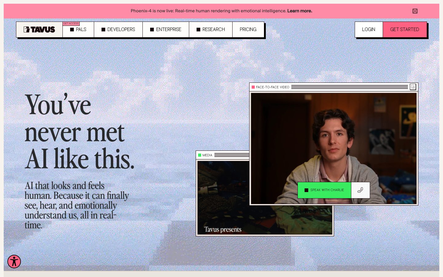
A retro-brutalist AI-research interface built on a warm cream canvas (#f7f4ef) with sharp 0px corners, hard offset drop-shadows (#140206, 6px 6px, no blur), an editorial Perfectlynineties serif for every headline, and Suisse Intl for UI text. Brand voltage comes from candy-pink CTAs (#ff6183), title-bar "window" cards that frame product video, and a collage of pixel-dithered sky imagery. The system reads as a confident, slightly nostalgic software lab — print-magazine serif headlines crossed with early-desktop window chrome.
---
version: alpha
name: Tavus-design-analysis
description: A retro-brutalist AI-research interface built on a warm cream canvas (#f7f4ef) with sharp 0px corners, hard offset drop-shadows (#140206, 6px 6px, no blur), an editorial Perfectlynineties serif for every headline, and Suisse Intl for UI text. Brand voltage comes from candy-pink CTAs (#ff6183), title-bar "window" cards that frame product video, and a collage of pixel-dithered sky imagery. The system reads as a confident, slightly nostalgic software lab — print-magazine serif headlines crossed with early-desktop window chrome.

colors:
  primary: "#ff6183"
  primary-soft: "#ffb4c5"
  ink: "#28292a"
  shadow: "#140206"
  black: "#000000"
  canvas: "#f7f4ef"
  surface: "#ffffff"
  surface-warm: "#fffdfb"
  surface-beige: "#eae5de"
  surface-tan: "#c9bdaa"
  surface-lavender: "#e4e0f2"
  accent-blue: "#00b2ff"
  accent-green: "#38f261"
  muted: "#4a5464"
  muted-soft: "#728197"
  hairline: "#dddddd"
  hairline-soft: "#cccccc"
  neutral-700: "#333333"
  neutral-800: "#222222"
  neutral-400: "#b4b4b4"
  on-primary: "#ffffff"

typography:
  display-xl:
    fontFamily: "Perfectlynineties, Georgia, serif"
    fontSize: 88px
    fontWeight: 400
    lineHeight: 1.0
    letterSpacing: 0
  display-lg:
    fontFamily: "Perfectlynineties, Georgia, serif"
    fontSize: 70px
    fontWeight: 400
    lineHeight: 1.0
    letterSpacing: 0
  display-md:
    fontFamily: "Perfectlynineties, Georgia, serif"
    fontSize: 40px
    fontWeight: 400
    lineHeight: 1.1
    letterSpacing: 0
  display-sm:
    fontFamily: "Perfectlynineties, Georgia, serif"
    fontSize: 40px
    fontWeight: 400
    lineHeight: 1.2
    letterSpacing: -1.2px
  body:
    fontFamily: "Suisse Intl, Inter, sans-serif"
    fontSize: 16px
    fontWeight: 400
    lineHeight: 1.5
    letterSpacing: 0
  button:
    fontFamily: "Suisse Intl, Inter, sans-serif"
    fontSize: 14px
    fontWeight: 400
    lineHeight: 1.5
    letterSpacing: 0

rounded:
  none: 0px

spacing:
  xxs: 4px
  xs: 8px
  sm: 12px
  md: 16px
  base: 18px
  lg: 20px
  xl: 24px
  xxl: 30px
  xxxl: 32px

components:
  nav-banner:
    backgroundColor: "{colors.primary-soft}"
    textColor: "{colors.ink}"
    typography: "{typography.body}"
    rounded: "{rounded.none}"
    padding: 12px 16px
  top-nav:
    backgroundColor: "{colors.canvas}"
    textColor: "{colors.ink}"
    typography: "{typography.button}"
    rounded: "{rounded.none}"
    padding: 16px 24px
  nav-item:
    backgroundColor: "{colors.surface}"
    textColor: "{colors.ink}"
    typography: "{typography.button}"
    rounded: "{rounded.none}"
    padding: 12px 18px
  button-primary:
    backgroundColor: "{colors.primary}"
    textColor: "{colors.on-primary}"
    typography: "{typography.button}"
    rounded: "{rounded.none}"
    padding: 12px 24px
  button-access:
    backgroundColor: "{colors.primary-soft}"
    textColor: "{colors.ink}"
    typography: "{typography.button}"
    rounded: "{rounded.none}"
    padding: 12px 24px
  button-explore-api:
    backgroundColor: "{colors.accent-green}"
    textColor: "{colors.ink}"
    typography: "{typography.button}"
    rounded: "{rounded.none}"
    padding: 12px 24px
  button-secondary:
    backgroundColor: "{colors.surface}"
    textColor: "{colors.ink}"
    typography: "{typography.button}"
    rounded: "{rounded.none}"
    padding: 12px 24px
  button-login:
    backgroundColor: "{colors.surface}"
    textColor: "{colors.ink}"
    typography: "{typography.button}"
    rounded: "{rounded.none}"
    padding: 12px 24px
  window-card:
    backgroundColor: "{colors.surface}"
    textColor: "{colors.ink}"
    typography: "{typography.body}"
    rounded: "{rounded.none}"
    padding: 4px
  window-titlebar:
    backgroundColor: "{colors.surface}"
    textColor: "{colors.ink}"
    typography: "{typography.button}"
    rounded: "{rounded.none}"
    padding: 4px 8px
  speak-button-overlay:
    backgroundColor: "{colors.accent-green}"
    textColor: "{colors.ink}"
    typography: "{typography.button}"
    rounded: "{rounded.none}"
    padding: 12px 18px
  card:
    backgroundColor: "{colors.canvas}"
    textColor: "{colors.ink}"
    typography: "{typography.body}"
    rounded: "{rounded.none}"
    padding: 24px
  models-panel:
    backgroundColor: "{colors.primary-soft}"
    textColor: "{colors.ink}"
    typography: "{typography.display-md}"
    rounded: "{rounded.none}"
    padding: 30px
  model-cell:
    backgroundColor: "{colors.primary-soft}"
    textColor: "{colors.ink}"
    typography: "{typography.body}"
    rounded: "{rounded.none}"
    padding: 24px
  pals-band:
    backgroundColor: "{colors.surface-tan}"
    textColor: "{colors.ink}"
    typography: "{typography.display-sm}"
    rounded: "{rounded.none}"
    padding: 32px
  enterprise-band:
    backgroundColor: "{colors.surface-lavender}"
    textColor: "{colors.ink}"
    typography: "{typography.display-sm}"
    rounded: "{rounded.none}"
    padding: 32px
  footer:
    backgroundColor: "{colors.canvas}"
    textColor: "{colors.ink}"
    typography: "{typography.body}"
    rounded: "{rounded.none}"
    padding: 24px
---

## Overview

Tavus's marketing surface is a **retro-brutalist AI-research interface** — a warm cream canvas (`{colors.canvas}` — #f7f4ef) carrying sharp-cornered (`{rounded.none}` — 0px) panels, hard offset drop-shadows with no blur, and an editorial serif headline voice. It reads as a confident software lab with a print-magazine streak: large Perfectlynineties serif headlines ("You've never met AI like this.") sit over pixel-dithered sky collage, while early-desktop "window" chrome frames the product video.

Type voice splits into two strict roles: **Perfectlynineties** (a custom display serif — used for h1–h4 and every editorial headline) and **Suisse Intl** (a Swiss grotesque — used for body, buttons, nav, captions). The serif at weight 400 across all sizes does the brand work; Suisse Intl handles all UI text at 14–16px.

Brand voltage comes from three places: **candy-pink CTAs** (`{colors.primary}` — #ff6183) and softer pink panels (`{colors.primary-soft}` — #ffb4c5); **hard offset shadows** (`#140206` at 6px 6px 0 0, no blur) that give buttons and cards a printed, slightly raised quality; and **title-bar window cards** that frame video and imagery like an old desktop OS ("FACE-TO-FACE VIDEO", "MEDIA", "MODELS").

The system never rounds a corner — every measured radius is 0px — and the elevation language is the offset hard-shadow rather than soft blur. The result is graphic, tactile, and deliberately un-rounded.

**Key Characteristics:**
- Warm cream canvas (`{colors.canvas}` — #f7f4ef), not white — the entire page floor is off-white paper-tone.
- Perfectlynineties serif for every headline (h1 at 88px, weight 400). The serif IS the brand voice; Suisse Intl never carries a headline.
- Sharp 0px corners everywhere — buttons, cards, nav items, window panels (measured `radius: 0px`).
- Hard offset drop-shadow `{colors.shadow}` (#140206) at 6px 6px 0 0 with zero blur — the signature elevation treatment, like a printed sticker lifted off the page.
- Candy-pink primary CTA (`{colors.primary}` — #ff6183) and soft-pink secondary panels (`{colors.primary-soft}` — #ffb4c5).
- Window-chrome cards with title bars ("FACE-TO-FACE VIDEO", "MEDIA", "MODELS") frame product video and collage imagery.
- Functional accent colors used sparingly: `{colors.accent-green}` (#38f261) on "Explore APIs"/"Speak with Charlie", `{colors.accent-blue}` (#00b2ff) as a UI accent, and warm/lavender band tints (`{colors.surface-tan}`, `{colors.surface-lavender}`) to separate Pals vs Developers sections.

## Colors

### Brand & Accent
- **Primary** (`{colors.primary}` — #ff6183): The hot-pink CTA color. "GET STARTED" in the nav, primary action buttons, and a recurring accent throughout.
- **Primary Soft** (`{colors.primary-soft}` — #ffb4c5): The lighter pink used on the top announcement banner, the "Models" panel, "GET ACCESS" buttons, and pink content blocks.
- **Accent Green** (`{colors.accent-green}` — #38f261): A vivid green used on the "Explore APIs" button and the "Speak with Charlie" overlay button inside the video window.
- **Accent Blue** (`{colors.accent-blue}` — #00b2ff): A bright blue used sparely as a UI accent inside product chrome.

### Surface
- **Canvas** (`{colors.canvas}` — #f7f4ef): The warm cream page floor and base for most bands.
- **Surface** (`{colors.surface}` — #ffffff): White window-card bodies, nav-item chips, secondary buttons.
- **Surface Warm** (`{colors.surface-warm}` — #fffdfb): A near-white warm tint for subtle panels.
- **Surface Beige** (`{colors.surface-beige}` — #eae5de): Soft beige band/divider tone.
- **Surface Tan** (`{colors.surface-tan}` — #c9bdaa): The warm band behind the "Pals" closing section.
- **Surface Lavender** (`{colors.surface-lavender}` — #e4e0f2): The cool band behind the "Developers & Enterprise" closing section.
- **Shadow** (`{colors.shadow}` — #140206): The near-black plum used exclusively as the hard offset drop-shadow tone.
- **Black** (`{colors.black}` — #000000): Pure-black icons, square bullet markers, and a secondary shadow tone.
- **Hairline** (`{colors.hairline}` — #dddddd) / **Hairline Soft** (`{colors.hairline-soft}` — #cccccc): 1px divider and border tones on light surfaces.

### Text
- **Ink** (`{colors.ink}` — #28292a): All headlines and primary text (measured as h1 color and button text color).
- **Muted** (`{colors.muted}` — #4a5464): Secondary text, supporting paragraphs.
- **Muted Soft** (`{colors.muted-soft}` — #728197): Tertiary text, captions, fine print.
- **Neutral 700/800** (`{colors.neutral-700}` — #333333 / `{colors.neutral-800}` — #222222): Dark UI text and icon tones.
- **Neutral 400** (`{colors.neutral-400}` — #b4b4b4): Disabled / placeholder grey (e.g., dimmed trust-logo row).
- **On Primary** (`{colors.on-primary}` — #ffffff): White text on the pink primary CTA.

## Typography

### Font Family
The system runs **Perfectlynineties** for display headlines and **Suisse Intl** for everything else. Perfectlynineties is a custom editorial display serif — high-contrast, magazine-like — used at weight 400 across all heading sizes. Suisse Intl is a Swiss grotesque used for body copy, buttons, navigation, and captions at 14–16px.

The split is strict:
- Perfectlynineties (serif, weight 400) — h1, h2, h3, h4, all editorial headlines
- Suisse Intl (grotesque, weight 400) — paragraphs, labels, buttons, nav, window title bars

### Hierarchy

| Token | Size | Weight | Line Height | Letter Spacing | Use |
|---|---|---|---|---|---|
| `{typography.display-xl}` | 88px | 400 | 1.0 | 0 | Hero h1 ("You've never met AI like this.") — Perfectlynineties |
| `{typography.display-lg}` | 70px | 400 | 1.0 | 0 | Large section heads ("What if you could talk to your computer like a collaborator?") — Perfectlynineties. Measured 70.08px, rounded to 70px (derived). |
| `{typography.display-md}` | 40px | 400 | 1.1 | 0 | Section/panel heads ("Models", "Build with us") — Perfectlynineties |
| `{typography.display-sm}` | 40px | 400 | 1.2 | -1.2px | Tighter-tracked headlines (closing-band titles, model names) — Perfectlynineties |
| `{typography.body}` | 16px | 400 | 1.5 | 0 | Default running text, descriptions — Suisse Intl |
| `{typography.button}` | 14px | 400 | 1.5 | 0 | Button labels, nav links, window title bars — Suisse Intl |

### Principles
Perfectlynineties is the brand voice — every display headline uses it at weight 400. The serif's high contrast and editorial character do the heavy lifting; weight never increases, so emphasis comes from size, not bolding. Suisse Intl handles all supporting UI type and never carries a headline. Body text stays at 16px / 1.5 for comfortable reading; buttons and nav drop to 14px.

### Note on Font Substitutes
- **Suisse Intl** is a licensed/commercial typeface (flagged in analysis) — substitute with **Inter** for all body and UI text. The fallback stack is `Suisse Intl, Inter, sans-serif`. Inter preserves the grotesque proportions at small sizes.
- **Perfectlynineties** is a custom/licensed display serif and is not available as a public web font. Substitute with an open-source high-contrast serif such as **Fraunces** (optical-display axis) or **Playfair Display**; the fallback stack here is `Perfectlynineties, Georgia, serif`. These approximate the editorial-magazine character but differ in the exact contrast and terminal shapes — treat as a substitute, not a match.

## Layout

### Spacing System
- **Base unit:** ~4px, with a frequent 18px step observed in the data.
- **Tokens:** `{spacing.xxs}` 4px · `{spacing.xs}` 8px · `{spacing.sm}` 12px · `{spacing.md}` 16px · `{spacing.base}` 18px · `{spacing.lg}` 20px · `{spacing.xl}` 24px · `{spacing.xxl}` 30px · `{spacing.xxxl}` 32px.
- **Button padding:** roughly 12px vertical × 24px horizontal on primary/secondary buttons (derived from the 12 / 24 spacing clusters; component-level padding measured as 0px in the brutalist reset).
- **Card / panel padding:** `{spacing.xl}` (24px) to `{spacing.xxl}` (30px) on content panels.

### Grid & Container
- **Editorial body:** Multi-column with a strong left-aligned hero — h1 + sub-head on the left, overlapping window cards on the right.
- **Three-up feature row:** "Developers / Enterprise Solutions / Pals" columns below the trust-logo strip.
- **Models panel:** A pink full-width panel with a 3-column model breakdown (Rendering / Perception / Emotional Understanding).
- **Closing bands:** A two-up split — warm-tan "Pals" band beside lavender "Developers & Enterprise" band.
- **Footer:** Multi-column link list (Company / Resources / Developers / Research / Socials / Legal / Support) on the cream canvas.

### Whitespace Philosophy
Generous vertical rhythm between bands lets the oversized serif headlines breathe. The hero leans into overlap — window cards stack and overlap each other for a layered, desktop-collage feel rather than a tidy grid. Content panels use comfortable 24–30px internal padding.

## Elevation & Depth

| Level | Treatment | Use |
|---|---|---|
| Flat | No shadow, no border | Body text bands, the cream canvas itself |
| Hairline | 1px `{colors.hairline}` / `{colors.hairline-soft}` border | Nav-item chips, window title bars, footer columns |
| Hard offset (primary) | `{colors.shadow}` (#140206) at **6px 6px 0 0**, no blur | Buttons, window cards, panels — the signature raised-sticker look |
| Hard offset (black) | `{colors.black}` at **5px 5px 0 0**, no blur | Alternate hard shadow on select cards |
| Hard offset (subtle) | `{colors.ink}` at **1px 1px 0 0**, no blur | Tight shadow on small chips/labels |
| Inset | `rgba(0,0,0,0.25)` at **3.33px 3.33px 0 0 inset**, no blur | Pressed / recessed inner edges on certain panels |

The elevation philosophy is **hard graphic offset, never soft blur**. Every shadow is a zero-blur drop with a solid offset, evoking printed paste-up / retro UI. There is no neumorphism, no glassmorphism, no Gaussian blur in the system. Note that the component analyzer recorded the generic `card` as `shadow: none` — the hard offset shadows are applied on specific buttons and window cards, not on every container.

### Decorative Depth
- Window cards carry their own title-bar chrome ("FACE-TO-FACE VIDEO", "MEDIA", "MODELS") — the chrome is content, framing real product video and collage imagery.
- Pixel-dithered sky / cloud collage runs behind the hero and several bands, adding a deliberately low-fi, nostalgic texture beneath the sharp panels.

## Shapes

### Border Radius Scale

| Token | Value | Use |
|---|---|---|
| `{rounded.none}` | 0px | Everything — buttons, cards, nav items, window panels, inputs. The system is universally square-cornered (measured `radius: 0px` on every component). |

No non-zero radius was measured anywhere in the system. Sharp corners are a core identity trait — combined with hard offset shadows, they produce the print/retro-software look.

### Photography & Imagery Geometry
- Window cards frame video and imagery in plain rectangles with title bars — no rounding, no cropping to circles.
- Imagery leans on pixel-dithered, low-fi collage (clouds, hands, birds-on-a-wire) rather than clean photography — a deliberate retro-digital texture.

## Components

### Navigation

**`nav-banner`** — The top announcement bar ("Phoenix-4 is now live…"). Background `{colors.primary-soft}` (#ffb4c5), text `{colors.ink}`, type `{typography.body}`, square corners, with a close (×) control at the right. Spans full width above the nav.

**`top-nav`** — The primary nav row on `{colors.canvas}`. Carries the TAVUS wordmark/logo at left, a center cluster of nav-item chips (PALS, DEVELOPERS, ENTERPRISE, RESEARCH, PRICING), and a right cluster with `button-login` and `button-primary` ("GET STARTED"). Type in `{typography.button}` (Suisse Intl 14px).

**`nav-item`** — Individual nav chip. Background `{colors.surface}`, text `{colors.ink}`, square corners, with a small black square bullet marker preceding the label. Padding ~12px × 18px.

### Buttons

**`button-primary`** — The signature CTA. Background `{colors.primary}` (#ff6183), text `{colors.on-primary}` (white), type `{typography.button}`, square corners (`{rounded.none}`). Used for "GET STARTED". Frequently carries the hard offset shadow.

**`button-access`** — Soft-pink action button. Background `{colors.primary-soft}` (#ffb4c5), text `{colors.ink}`. Used for "GET ACCESS" in feature columns and closing bands.

**`button-explore-api`** — Green action button. Background `{colors.accent-green}` (#38f261), text `{colors.ink}`. Used for "Explore APIs".

**`button-secondary`** — White button with hairline border + hard offset shadow. Background `{colors.surface}`, text `{colors.ink}`. Used for "JOIN THE TEAM", "EXPLORE CVI", "BOOK DEMO". Square corners.

**`button-login`** — Plain white text button in the nav ("LOGIN"). Background `{colors.surface}`, text `{colors.ink}`, square corners.

**`speak-button-overlay`** — Green action button overlaid inside the video window ("SPEAK WITH CHARLIE"). Background `{colors.accent-green}`, text `{colors.ink}`, paired with a small phone/handset icon button beside it.

### Cards & Containers

**`window-card`** — The signature desktop-window frame. White body (`{colors.surface}`), a `window-titlebar` strip at the top, square corners, and the hard offset shadow (`{colors.shadow}` 6px 6px 0 0). Used to frame the hero face-to-face video and the "MEDIA" collage.

**`window-titlebar`** — The title strip atop a window-card. Background `{colors.surface}`, small colored square indicator + uppercase label in `{typography.button}` ("FACE-TO-FACE VIDEO", "MEDIA", "MODELS"), and a window control glyph at the right.

**`card`** — Generic content container on `{colors.canvas}`, square corners, no shadow by default (measured `shadow: none`). Holds feature-column copy.

**`models-panel`** — The large pink "Models" feature panel. Background `{colors.primary-soft}` (#ffb4c5), headline in `{typography.display-md}`, square corners, internal padding ~30px. Contains a window-titlebar ("MODELS") and the bird-on-a-wire collage.

**`model-cell`** — A column inside the Models breakdown (Phoenix / Raven / Sparrow). Background `{colors.primary-soft}`, label in `{typography.button}` uppercase, model name in `{typography.display-sm}`, description in `{typography.body}`. Separated by hairline dividers.

**`pals-band`** — The warm closing band for the Pals message. Background `{colors.surface-tan}` (#c9bdaa), headline in `{typography.display-sm}` ("Realistic AI companions that listen and learn."), with a `button-access` CTA.

**`enterprise-band`** — The cool closing band for the Developers/Enterprise message. Background `{colors.surface-lavender}` (#e4e0f2), headline in `{typography.display-sm}` ("Bring human connection to every AI interaction."), with a `button-secondary` ("EXPLORE CVI").

### Footer

**`footer`** — The link-list footer on `{colors.canvas}`. Multi-column layout (Company / Resources / Developers / Research / Socials / Legal / Support), each column header preceded by a small square bullet marker, links in `{typography.body}`. The TAVUS wordmark sits at the bottom-left with the "© 2026 TAVUS | THE HUMAN COMPUTING COMPANY" copyright line. Square-cornered cells throughout.

## Do's and Don'ts

### Do
- Keep every corner square (`{rounded.none}`). The 0px radius is a core identity trait — combined with hard shadows, it makes the brand.
- Use the hard offset shadow (`{colors.shadow}` at 6px 6px 0 0, no blur) for raised buttons and window cards. Never substitute a soft/blurred shadow.
- Set every headline in Perfectlynineties at weight 400. Scale up for emphasis — never bold.
- Reserve `{colors.primary}` (#ff6183) for the top-priority CTA; use `{colors.primary-soft}` for softer secondary actions and pink panels.
- Frame product video and imagery in `window-card` title-bar chrome — the retro-desktop framing is signature.
- Use band tints (`{colors.surface-tan}`, `{colors.surface-lavender}`) to separate the Pals vs Developers closing narratives.
- Keep body and all UI text in Suisse Intl / Inter — never let the serif into running copy.

### Don't
- Don't round corners anywhere. There is no measured non-zero radius in the system.
- Don't use blurred drop-shadows. Every shadow is a zero-blur hard offset.
- Don't bold Perfectlynineties — it lives at weight 400. Bigger, not bolder.
- Don't put accent green (`{colors.accent-green}`) or blue (`{colors.accent-blue}`) on a primary brand CTA — those greens are scoped to API/Speak actions.
- Don't set the page floor to pure white — the canvas is warm cream (`{colors.canvas}` — #f7f4ef).
- Don't add hover-state styling beyond default + pressed (the inset 3.33px shadow approximates a pressed/recessed state).

## Responsive Behavior

### Breakpoints
Specific breakpoint widths were not measured. The captured desktop layout and a narrow re-flow capture imply the following behavior (the table below is derived from the screenshots, not measured token values).

| Name | Width (derived) | Key Changes |
|---|---|---|
| Mobile | < 768px | Nav collapses; hero h1 scales down from 88px; window cards stack vertically; three-up feature row → 1-up; closing bands stack |
| Tablet | 768–1024px | Nav tightens; feature row → 2-up; Models breakdown wraps; window cards reduce overlap |
| Desktop | 1024–1440px | Full horizontal nav; overlapping hero window cards; three-up feature row; three-column Models panel |
| Wide | > 1440px | Same as desktop with more outer breathing room around the cream canvas |

### Touch Targets
- Button padding (~12px × 24px, derived) gives primary/secondary buttons comfortable tap area.
- Nav-item chips at ~12px × 18px padding meet tappable size with the surrounding chip.
- Exact minimum touch-target sizes were not measured.

### Collapsing Strategy
- The overlapping hero window cards (face-to-face video over media collage) un-stack to vertical order on narrow viewports.
- The three-up feature columns and three-up Models breakdown reduce columns rather than shrinking type.
- The two closing bands (Pals / Developers) stack vertically while retaining their distinct tan and lavender tints.
- The multi-column footer collapses to fewer columns; the wordmark + copyright row stays pinned at the bottom.

## Iteration Guide

1. Focus on ONE component at a time. Reference its YAML key directly (`{component.window-card}`, `{component.models-panel}`).
2. Variants of an existing component (`-active`, `-disabled`, `-pressed`) live as separate entries in `components:`.
3. Use `{token.refs}` everywhere — never inline a hex in a component prop.
4. Never document hover. Default and Active/Pressed only (the inset hard-shadow reads as pressed).
5. Headlines stay Perfectlynineties 400; body stays Suisse Intl / Inter 400. The two roles never blur.
6. Corners stay at 0px and shadows stay zero-blur hard offsets — these two traits define the brand and should not drift toward rounded/soft conventions.
7. When in doubt about emphasis: bigger serif before bolder serif; pink CTA before any other accent.

## Known Gaps

- **Border radius** returned an empty set and all measured components report `radius: 0px` — the only declared token is `{rounded.none}`. If any rounded element exists, it was not captured.
- **Perfectlynineties** is a custom/licensed display serif not in the public font ecosystem; substitutes (Fraunces / Playfair Display) are documented but are approximations, not matches. It was not flagged in `fonts_licensed`, so no official substitute was provided by the analysis.
- **Suisse Intl** is flagged licensed with substitute Inter; the live site ships the licensed face, this spec ships Inter.
- Component-level `padding` measured `0px` on `button-primary` (a CSS reset artifact); button padding here (~12px × 24px) is **derived** from the spacing-frequency clusters and screenshots, not a direct component measurement.
- `display-lg` was measured at 70.08px and rounded to 70px (derived).
- Breakpoint widths, touch-target minimums, and grid column counts are inferred from screenshots — no measured layout tokens were provided.
- Animation, transition, and video-playback timings (the live video window, "Speak with Charlie" interaction) are out of scope.
- The Pals pricing page was captured but no distinct pricing-component tokens (tier cards, toggles) were extracted; pricing-specific components are a gap.
- Semantic states (form validation, success/error) were not captured — no form surface was measured.

<!-- Documented by duply · real-world design systems as ready-to-use DESIGN.md for AI coding agents · https://duply.ai/tavus/design-md -->
Color Palette
Accent
Neutrals
Typography
display-xl88px · 400 · 1
The quick brown fox jumpsdisplay-lg70px · 400 · 1
The quick brown fox jumpsdisplay-md40px · 400 · 1.1
The quick brown fox jumpsdisplay-sm40px · 400 · 1.2
The quick brown fox jumpsbody16px · 400 · 1.5
The quick brown fox jumpsbutton14px · 400 · 1.5
The quick brown fox jumpsSpacing & Shape
Spacing
| Name | Value | Preview |
|---|---|---|
| xxs | 4px | |
| xs | 8px | |
| sm | 12px | |
| md | 16px | |
| base | 18px | |
| lg | 20px | |
| xl | 24px | |
| xxl | 30px | |
| xxxl | 32px |
Border Radius
| Name | Value | Preview |
|---|---|---|
| none | 0px |
More like this


---
version: alpha
name: Tavus-design-analysis
description: A retro-brutalist AI-research interface built on a warm cream canvas (#f7f4ef) with sharp 0px corners, hard offset drop-shadows (#140206, 6px 6px, no blur), an editorial Perfectlynineties serif for every headline, and Suisse Intl for UI text. Brand voltage comes from candy-pink CTAs (#ff6183), title-bar "window" cards that frame product video, and a collage of pixel-dithered sky imagery. The system reads as a confident, slightly nostalgic software lab — print-magazine serif headlines crossed with early-desktop window chrome.

colors:
  primary: "#ff6183"
  primary-soft: "#ffb4c5"
  ink: "#28292a"
  shadow: "#140206"
  black: "#000000"
  canvas: "#f7f4ef"
  surface: "#ffffff"
  surface-warm: "#fffdfb"
  surface-beige: "#eae5de"
  surface-tan: "#c9bdaa"
  surface-lavender: "#e4e0f2"
  accent-blue: "#00b2ff"
  accent-green: "#38f261"
  muted: "#4a5464"
  muted-soft: "#728197"
  hairline: "#dddddd"
  hairline-soft: "#cccccc"
  neutral-700: "#333333"
  neutral-800: "#222222"
  neutral-400: "#b4b4b4"
  on-primary: "#ffffff"

typography:
  display-xl:
    fontFamily: "Perfectlynineties, Georgia, serif"
    fontSize: 88px
    fontWeight: 400
    lineHeight: 1.0
    letterSpacing: 0
  display-lg:
    fontFamily: "Perfectlynineties, Georgia, serif"
    fontSize: 70px
    fontWeight: 400
    lineHeight: 1.0
    letterSpacing: 0
  display-md:
    fontFamily: "Perfectlynineties, Georgia, serif"
    fontSize: 40px
    fontWeight: 400
    lineHeight: 1.1
    letterSpacing: 0
  display-sm:
    fontFamily: "Perfectlynineties, Georgia, serif"
    fontSize: 40px
    fontWeight: 400
    lineHeight: 1.2
    letterSpacing: -1.2px
  body:
    fontFamily: "Suisse Intl, Inter, sans-serif"
    fontSize: 16px
    fontWeight: 400
    lineHeight: 1.5
    letterSpacing: 0
  button:
    fontFamily: "Suisse Intl, Inter, sans-serif"
    fontSize: 14px
    fontWeight: 400
    lineHeight: 1.5
    letterSpacing: 0

rounded:
  none: 0px

spacing:
  xxs: 4px
  xs: 8px
  sm: 12px
  md: 16px
  base: 18px
  lg: 20px
  xl: 24px
  xxl: 30px
  xxxl: 32px

components:
  nav-banner:
    backgroundColor: "{colors.primary-soft}"
    textColor: "{colors.ink}"
    typography: "{typography.body}"
    rounded: "{rounded.none}"
    padding: 12px 16px
  top-nav:
    backgroundColor: "{colors.canvas}"
    textColor: "{colors.ink}"
    typography: "{typography.button}"
    rounded: "{rounded.none}"
    padding: 16px 24px
  nav-item:
    backgroundColor: "{colors.surface}"
    textColor: "{colors.ink}"
    typography: "{typography.button}"
    rounded: "{rounded.none}"
    padding: 12px 18px
  button-primary:
    backgroundColor: "{colors.primary}"
    textColor: "{colors.on-primary}"
    typography: "{typography.button}"
    rounded: "{rounded.none}"
    padding: 12px 24px
  button-access:
    backgroundColor: "{colors.primary-soft}"
    textColor: "{colors.ink}"
    typography: "{typography.button}"
    rounded: "{rounded.none}"
    padding: 12px 24px
  button-explore-api:
    backgroundColor: "{colors.accent-green}"
    textColor: "{colors.ink}"
    typography: "{typography.button}"
    rounded: "{rounded.none}"
    padding: 12px 24px
  button-secondary:
    backgroundColor: "{colors.surface}"
    textColor: "{colors.ink}"
    typography: "{typography.button}"
    rounded: "{rounded.none}"
    padding: 12px 24px
  button-login:
    backgroundColor: "{colors.surface}"
    textColor: "{colors.ink}"
    typography: "{typography.button}"
    rounded: "{rounded.none}"
    padding: 12px 24px
  window-card:
    backgroundColor: "{colors.surface}"
    textColor: "{colors.ink}"
    typography: "{typography.body}"
    rounded: "{rounded.none}"
    padding: 4px
  window-titlebar:
    backgroundColor: "{colors.surface}"
    textColor: "{colors.ink}"
    typography: "{typography.button}"
    rounded: "{rounded.none}"
    padding: 4px 8px
  speak-button-overlay:
    backgroundColor: "{colors.accent-green}"
    textColor: "{colors.ink}"
    typography: "{typography.button}"
    rounded: "{rounded.none}"
    padding: 12px 18px
  card:
    backgroundColor: "{colors.canvas}"
    textColor: "{colors.ink}"
    typography: "{typography.body}"
    rounded: "{rounded.none}"
    padding: 24px
  models-panel:
    backgroundColor: "{colors.primary-soft}"
    textColor: "{colors.ink}"
    typography: "{typography.display-md}"
    rounded: "{rounded.none}"
    padding: 30px
  model-cell:
    backgroundColor: "{colors.primary-soft}"
    textColor: "{colors.ink}"
    typography: "{typography.body}"
    rounded: "{rounded.none}"
    padding: 24px
  pals-band:
    backgroundColor: "{colors.surface-tan}"
    textColor: "{colors.ink}"
    typography: "{typography.display-sm}"
    rounded: "{rounded.none}"
    padding: 32px
  enterprise-band:
    backgroundColor: "{colors.surface-lavender}"
    textColor: "{colors.ink}"
    typography: "{typography.display-sm}"
    rounded: "{rounded.none}"
    padding: 32px
  footer:
    backgroundColor: "{colors.canvas}"
    textColor: "{colors.ink}"
    typography: "{typography.body}"
    rounded: "{rounded.none}"
    padding: 24px
---

## Overview

Tavus's marketing surface is a **retro-brutalist AI-research interface** — a warm cream canvas (`{colors.canvas}` — #f7f4ef) carrying sharp-cornered (`{rounded.none}` — 0px) panels, hard offset drop-shadows with no blur, and an editorial serif headline voice. It reads as a confident software lab with a print-magazine streak: large Perfectlynineties serif headlines ("You've never met AI like this.") sit over pixel-dithered sky collage, while early-desktop "window" chrome frames the product video.

Type voice splits into two strict roles: **Perfectlynineties** (a custom display serif — used for h1–h4 and every editorial headline) and **Suisse Intl** (a Swiss grotesque — used for body, buttons, nav, captions). The serif at weight 400 across all sizes does the brand work; Suisse Intl handles all UI text at 14–16px.

Brand voltage comes from three places: **candy-pink CTAs** (`{colors.primary}` — #ff6183) and softer pink panels (`{colors.primary-soft}` — #ffb4c5); **hard offset shadows** (`#140206` at 6px 6px 0 0, no blur) that give buttons and cards a printed, slightly raised quality; and **title-bar window cards** that frame video and imagery like an old desktop OS ("FACE-TO-FACE VIDEO", "MEDIA", "MODELS").

The system never rounds a corner — every measured radius is 0px — and the elevation language is the offset hard-shadow rather than soft blur. The result is graphic, tactile, and deliberately un-rounded.

**Key Characteristics:**
- Warm cream canvas (`{colors.canvas}` — #f7f4ef), not white — the entire page floor is off-white paper-tone.
- Perfectlynineties serif for every headline (h1 at 88px, weight 400). The serif IS the brand voice; Suisse Intl never carries a headline.
- Sharp 0px corners everywhere — buttons, cards, nav items, window panels (measured `radius: 0px`).
- Hard offset drop-shadow `{colors.shadow}` (#140206) at 6px 6px 0 0 with zero blur — the signature elevation treatment, like a printed sticker lifted off the page.
- Candy-pink primary CTA (`{colors.primary}` — #ff6183) and soft-pink secondary panels (`{colors.primary-soft}` — #ffb4c5).
- Window-chrome cards with title bars ("FACE-TO-FACE VIDEO", "MEDIA", "MODELS") frame product video and collage imagery.
- Functional accent colors used sparingly: `{colors.accent-green}` (#38f261) on "Explore APIs"/"Speak with Charlie", `{colors.accent-blue}` (#00b2ff) as a UI accent, and warm/lavender band tints (`{colors.surface-tan}`, `{colors.surface-lavender}`) to separate Pals vs Developers sections.

## Colors

### Brand & Accent
- **Primary** (`{colors.primary}` — #ff6183): The hot-pink CTA color. "GET STARTED" in the nav, primary action buttons, and a recurring accent throughout.
- **Primary Soft** (`{colors.primary-soft}` — #ffb4c5): The lighter pink used on the top announcement banner, the "Models" panel, "GET ACCESS" buttons, and pink content blocks.
- **Accent Green** (`{colors.accent-green}` — #38f261): A vivid green used on the "Explore APIs" button and the "Speak with Charlie" overlay button inside the video window.
- **Accent Blue** (`{colors.accent-blue}` — #00b2ff): A bright blue used sparely as a UI accent inside product chrome.

### Surface
- **Canvas** (`{colors.canvas}` — #f7f4ef): The warm cream page floor and base for most bands.
- **Surface** (`{colors.surface}` — #ffffff): White window-card bodies, nav-item chips, secondary buttons.
- **Surface Warm** (`{colors.surface-warm}` — #fffdfb): A near-white warm tint for subtle panels.
- **Surface Beige** (`{colors.surface-beige}` — #eae5de): Soft beige band/divider tone.
- **Surface Tan** (`{colors.surface-tan}` — #c9bdaa): The warm band behind the "Pals" closing section.
- **Surface Lavender** (`{colors.surface-lavender}` — #e4e0f2): The cool band behind the "Developers & Enterprise" closing section.
- **Shadow** (`{colors.shadow}` — #140206): The near-black plum used exclusively as the hard offset drop-shadow tone.
- **Black** (`{colors.black}` — #000000): Pure-black icons, square bullet markers, and a secondary shadow tone.
- **Hairline** (`{colors.hairline}` — #dddddd) / **Hairline Soft** (`{colors.hairline-soft}` — #cccccc): 1px divider and border tones on light surfaces.

### Text
- **Ink** (`{colors.ink}` — #28292a): All headlines and primary text (measured as h1 color and button text color).
- **Muted** (`{colors.muted}` — #4a5464): Secondary text, supporting paragraphs.
- **Muted Soft** (`{colors.muted-soft}` — #728197): Tertiary text, captions, fine print.
- **Neutral 700/800** (`{colors.neutral-700}` — #333333 / `{colors.neutral-800}` — #222222): Dark UI text and icon tones.
- **Neutral 400** (`{colors.neutral-400}` — #b4b4b4): Disabled / placeholder grey (e.g., dimmed trust-logo row).
- **On Primary** (`{colors.on-primary}` — #ffffff): White text on the pink primary CTA.

## Typography

### Font Family
The system runs **Perfectlynineties** for display headlines and **Suisse Intl** for everything else. Perfectlynineties is a custom editorial display serif — high-contrast, magazine-like — used at weight 400 across all heading sizes. Suisse Intl is a Swiss grotesque used for body copy, buttons, navigation, and captions at 14–16px.

The split is strict:
- Perfectlynineties (serif, weight 400) — h1, h2, h3, h4, all editorial headlines
- Suisse Intl (grotesque, weight 400) — paragraphs, labels, buttons, nav, window title bars

### Hierarchy

| Token | Size | Weight | Line Height | Letter Spacing | Use |
|---|---|---|---|---|---|
| `{typography.display-xl}` | 88px | 400 | 1.0 | 0 | Hero h1 ("You've never met AI like this.") — Perfectlynineties |
| `{typography.display-lg}` | 70px | 400 | 1.0 | 0 | Large section heads ("What if you could talk to your computer like a collaborator?") — Perfectlynineties. Measured 70.08px, rounded to 70px (derived). |
| `{typography.display-md}` | 40px | 400 | 1.1 | 0 | Section/panel heads ("Models", "Build with us") — Perfectlynineties |
| `{typography.display-sm}` | 40px | 400 | 1.2 | -1.2px | Tighter-tracked headlines (closing-band titles, model names) — Perfectlynineties |
| `{typography.body}` | 16px | 400 | 1.5 | 0 | Default running text, descriptions — Suisse Intl |
| `{typography.button}` | 14px | 400 | 1.5 | 0 | Button labels, nav links, window title bars — Suisse Intl |

### Principles
Perfectlynineties is the brand voice — every display headline uses it at weight 400. The serif's high contrast and editorial character do the heavy lifting; weight never increases, so emphasis comes from size, not bolding. Suisse Intl handles all supporting UI type and never carries a headline. Body text stays at 16px / 1.5 for comfortable reading; buttons and nav drop to 14px.

### Note on Font Substitutes
- **Suisse Intl** is a licensed/commercial typeface (flagged in analysis) — substitute with **Inter** for all body and UI text. The fallback stack is `Suisse Intl, Inter, sans-serif`. Inter preserves the grotesque proportions at small sizes.
- **Perfectlynineties** is a custom/licensed display serif and is not available as a public web font. Substitute with an open-source high-contrast serif such as **Fraunces** (optical-display axis) or **Playfair Display**; the fallback stack here is `Perfectlynineties, Georgia, serif`. These approximate the editorial-magazine character but differ in the exact contrast and terminal shapes — treat as a substitute, not a match.

## Layout

### Spacing System
- **Base unit:** ~4px, with a frequent 18px step observed in the data.
- **Tokens:** `{spacing.xxs}` 4px · `{spacing.xs}` 8px · `{spacing.sm}` 12px · `{spacing.md}` 16px · `{spacing.base}` 18px · `{spacing.lg}` 20px · `{spacing.xl}` 24px · `{spacing.xxl}` 30px · `{spacing.xxxl}` 32px.
- **Button padding:** roughly 12px vertical × 24px horizontal on primary/secondary buttons (derived from the 12 / 24 spacing clusters; component-level padding measured as 0px in the brutalist reset).
- **Card / panel padding:** `{spacing.xl}` (24px) to `{spacing.xxl}` (30px) on content panels.

### Grid & Container
- **Editorial body:** Multi-column with a strong left-aligned hero — h1 + sub-head on the left, overlapping window cards on the right.
- **Three-up feature row:** "Developers / Enterprise Solutions / Pals" columns below the trust-logo strip.
- **Models panel:** A pink full-width panel with a 3-column model breakdown (Rendering / Perception / Emotional Understanding).
- **Closing bands:** A two-up split — warm-tan "Pals" band beside lavender "Developers & Enterprise" band.
- **Footer:** Multi-column link list (Company / Resources / Developers / Research / Socials / Legal / Support) on the cream canvas.

### Whitespace Philosophy
Generous vertical rhythm between bands lets the oversized serif headlines breathe. The hero leans into overlap — window cards stack and overlap each other for a layered, desktop-collage feel rather than a tidy grid. Content panels use comfortable 24–30px internal padding.

## Elevation & Depth

| Level | Treatment | Use |
|---|---|---|
| Flat | No shadow, no border | Body text bands, the cream canvas itself |
| Hairline | 1px `{colors.hairline}` / `{colors.hairline-soft}` border | Nav-item chips, window title bars, footer columns |
| Hard offset (primary) | `{colors.shadow}` (#140206) at **6px 6px 0 0**, no blur | Buttons, window cards, panels — the signature raised-sticker look |
| Hard offset (black) | `{colors.black}` at **5px 5px 0 0**, no blur | Alternate hard shadow on select cards |
| Hard offset (subtle) | `{colors.ink}` at **1px 1px 0 0**, no blur | Tight shadow on small chips/labels |
| Inset | `rgba(0,0,0,0.25)` at **3.33px 3.33px 0 0 inset**, no blur | Pressed / recessed inner edges on certain panels |

The elevation philosophy is **hard graphic offset, never soft blur**. Every shadow is a zero-blur drop with a solid offset, evoking printed paste-up / retro UI. There is no neumorphism, no glassmorphism, no Gaussian blur in the system. Note that the component analyzer recorded the generic `card` as `shadow: none` — the hard offset shadows are applied on specific buttons and window cards, not on every container.

### Decorative Depth
- Window cards carry their own title-bar chrome ("FACE-TO-FACE VIDEO", "MEDIA", "MODELS") — the chrome is content, framing real product video and collage imagery.
- Pixel-dithered sky / cloud collage runs behind the hero and several bands, adding a deliberately low-fi, nostalgic texture beneath the sharp panels.

## Shapes

### Border Radius Scale

| Token | Value | Use |
|---|---|---|
| `{rounded.none}` | 0px | Everything — buttons, cards, nav items, window panels, inputs. The system is universally square-cornered (measured `radius: 0px` on every component). |

No non-zero radius was measured anywhere in the system. Sharp corners are a core identity trait — combined with hard offset shadows, they produce the print/retro-software look.

### Photography & Imagery Geometry
- Window cards frame video and imagery in plain rectangles with title bars — no rounding, no cropping to circles.
- Imagery leans on pixel-dithered, low-fi collage (clouds, hands, birds-on-a-wire) rather than clean photography — a deliberate retro-digital texture.

## Components

### Navigation

**`nav-banner`** — The top announcement bar ("Phoenix-4 is now live…"). Background `{colors.primary-soft}` (#ffb4c5), text `{colors.ink}`, type `{typography.body}`, square corners, with a close (×) control at the right. Spans full width above the nav.

**`top-nav`** — The primary nav row on `{colors.canvas}`. Carries the TAVUS wordmark/logo at left, a center cluster of nav-item chips (PALS, DEVELOPERS, ENTERPRISE, RESEARCH, PRICING), and a right cluster with `button-login` and `button-primary` ("GET STARTED"). Type in `{typography.button}` (Suisse Intl 14px).

**`nav-item`** — Individual nav chip. Background `{colors.surface}`, text `{colors.ink}`, square corners, with a small black square bullet marker preceding the label. Padding ~12px × 18px.

### Buttons

**`button-primary`** — The signature CTA. Background `{colors.primary}` (#ff6183), text `{colors.on-primary}` (white), type `{typography.button}`, square corners (`{rounded.none}`). Used for "GET STARTED". Frequently carries the hard offset shadow.

**`button-access`** — Soft-pink action button. Background `{colors.primary-soft}` (#ffb4c5), text `{colors.ink}`. Used for "GET ACCESS" in feature columns and closing bands.

**`button-explore-api`** — Green action button. Background `{colors.accent-green}` (#38f261), text `{colors.ink}`. Used for "Explore APIs".

**`button-secondary`** — White button with hairline border + hard offset shadow. Background `{colors.surface}`, text `{colors.ink}`. Used for "JOIN THE TEAM", "EXPLORE CVI", "BOOK DEMO". Square corners.

**`button-login`** — Plain white text button in the nav ("LOGIN"). Background `{colors.surface}`, text `{colors.ink}`, square corners.

**`speak-button-overlay`** — Green action button overlaid inside the video window ("SPEAK WITH CHARLIE"). Background `{colors.accent-green}`, text `{colors.ink}`, paired with a small phone/handset icon button beside it.

### Cards & Containers

**`window-card`** — The signature desktop-window frame. White body (`{colors.surface}`), a `window-titlebar` strip at the top, square corners, and the hard offset shadow (`{colors.shadow}` 6px 6px 0 0). Used to frame the hero face-to-face video and the "MEDIA" collage.

**`window-titlebar`** — The title strip atop a window-card. Background `{colors.surface}`, small colored square indicator + uppercase label in `{typography.button}` ("FACE-TO-FACE VIDEO", "MEDIA", "MODELS"), and a window control glyph at the right.

**`card`** — Generic content container on `{colors.canvas}`, square corners, no shadow by default (measured `shadow: none`). Holds feature-column copy.

**`models-panel`** — The large pink "Models" feature panel. Background `{colors.primary-soft}` (#ffb4c5), headline in `{typography.display-md}`, square corners, internal padding ~30px. Contains a window-titlebar ("MODELS") and the bird-on-a-wire collage.

**`model-cell`** — A column inside the Models breakdown (Phoenix / Raven / Sparrow). Background `{colors.primary-soft}`, label in `{typography.button}` uppercase, model name in `{typography.display-sm}`, description in `{typography.body}`. Separated by hairline dividers.

**`pals-band`** — The warm closing band for the Pals message. Background `{colors.surface-tan}` (#c9bdaa), headline in `{typography.display-sm}` ("Realistic AI companions that listen and learn."), with a `button-access` CTA.

**`enterprise-band`** — The cool closing band for the Developers/Enterprise message. Background `{colors.surface-lavender}` (#e4e0f2), headline in `{typography.display-sm}` ("Bring human connection to every AI interaction."), with a `button-secondary` ("EXPLORE CVI").

### Footer

**`footer`** — The link-list footer on `{colors.canvas}`. Multi-column layout (Company / Resources / Developers / Research / Socials / Legal / Support), each column header preceded by a small square bullet marker, links in `{typography.body}`. The TAVUS wordmark sits at the bottom-left with the "© 2026 TAVUS | THE HUMAN COMPUTING COMPANY" copyright line. Square-cornered cells throughout.

## Do's and Don'ts

### Do
- Keep every corner square (`{rounded.none}`). The 0px radius is a core identity trait — combined with hard shadows, it makes the brand.
- Use the hard offset shadow (`{colors.shadow}` at 6px 6px 0 0, no blur) for raised buttons and window cards. Never substitute a soft/blurred shadow.
- Set every headline in Perfectlynineties at weight 400. Scale up for emphasis — never bold.
- Reserve `{colors.primary}` (#ff6183) for the top-priority CTA; use `{colors.primary-soft}` for softer secondary actions and pink panels.
- Frame product video and imagery in `window-card` title-bar chrome — the retro-desktop framing is signature.
- Use band tints (`{colors.surface-tan}`, `{colors.surface-lavender}`) to separate the Pals vs Developers closing narratives.
- Keep body and all UI text in Suisse Intl / Inter — never let the serif into running copy.

### Don't
- Don't round corners anywhere. There is no measured non-zero radius in the system.
- Don't use blurred drop-shadows. Every shadow is a zero-blur hard offset.
- Don't bold Perfectlynineties — it lives at weight 400. Bigger, not bolder.
- Don't put accent green (`{colors.accent-green}`) or blue (`{colors.accent-blue}`) on a primary brand CTA — those greens are scoped to API/Speak actions.
- Don't set the page floor to pure white — the canvas is warm cream (`{colors.canvas}` — #f7f4ef).
- Don't add hover-state styling beyond default + pressed (the inset 3.33px shadow approximates a pressed/recessed state).

## Responsive Behavior

### Breakpoints
Specific breakpoint widths were not measured. The captured desktop layout and a narrow re-flow capture imply the following behavior (the table below is derived from the screenshots, not measured token values).

| Name | Width (derived) | Key Changes |
|---|---|---|
| Mobile | < 768px | Nav collapses; hero h1 scales down from 88px; window cards stack vertically; three-up feature row → 1-up; closing bands stack |
| Tablet | 768–1024px | Nav tightens; feature row → 2-up; Models breakdown wraps; window cards reduce overlap |
| Desktop | 1024–1440px | Full horizontal nav; overlapping hero window cards; three-up feature row; three-column Models panel |
| Wide | > 1440px | Same as desktop with more outer breathing room around the cream canvas |

### Touch Targets
- Button padding (~12px × 24px, derived) gives primary/secondary buttons comfortable tap area.
- Nav-item chips at ~12px × 18px padding meet tappable size with the surrounding chip.
- Exact minimum touch-target sizes were not measured.

### Collapsing Strategy
- The overlapping hero window cards (face-to-face video over media collage) un-stack to vertical order on narrow viewports.
- The three-up feature columns and three-up Models breakdown reduce columns rather than shrinking type.
- The two closing bands (Pals / Developers) stack vertically while retaining their distinct tan and lavender tints.
- The multi-column footer collapses to fewer columns; the wordmark + copyright row stays pinned at the bottom.

## Iteration Guide

1. Focus on ONE component at a time. Reference its YAML key directly (`{component.window-card}`, `{component.models-panel}`).
2. Variants of an existing component (`-active`, `-disabled`, `-pressed`) live as separate entries in `components:`.
3. Use `{token.refs}` everywhere — never inline a hex in a component prop.
4. Never document hover. Default and Active/Pressed only (the inset hard-shadow reads as pressed).
5. Headlines stay Perfectlynineties 400; body stays Suisse Intl / Inter 400. The two roles never blur.
6. Corners stay at 0px and shadows stay zero-blur hard offsets — these two traits define the brand and should not drift toward rounded/soft conventions.
7. When in doubt about emphasis: bigger serif before bolder serif; pink CTA before any other accent.

## Known Gaps

- **Border radius** returned an empty set and all measured components report `radius: 0px` — the only declared token is `{rounded.none}`. If any rounded element exists, it was not captured.
- **Perfectlynineties** is a custom/licensed display serif not in the public font ecosystem; substitutes (Fraunces / Playfair Display) are documented but are approximations, not matches. It was not flagged in `fonts_licensed`, so no official substitute was provided by the analysis.
- **Suisse Intl** is flagged licensed with substitute Inter; the live site ships the licensed face, this spec ships Inter.
- Component-level `padding` measured `0px` on `button-primary` (a CSS reset artifact); button padding here (~12px × 24px) is **derived** from the spacing-frequency clusters and screenshots, not a direct component measurement.
- `display-lg` was measured at 70.08px and rounded to 70px (derived).
- Breakpoint widths, touch-target minimums, and grid column counts are inferred from screenshots — no measured layout tokens were provided.
- Animation, transition, and video-playback timings (the live video window, "Speak with Charlie" interaction) are out of scope.
- The Pals pricing page was captured but no distinct pricing-component tokens (tier cards, toggles) were extracted; pricing-specific components are a gap.
- Semantic states (form validation, success/error) were not captured — no form surface was measured.

<!-- Documented by duply · real-world design systems as ready-to-use DESIGN.md for AI coding agents · https://duply.ai/tavus/design-md -->