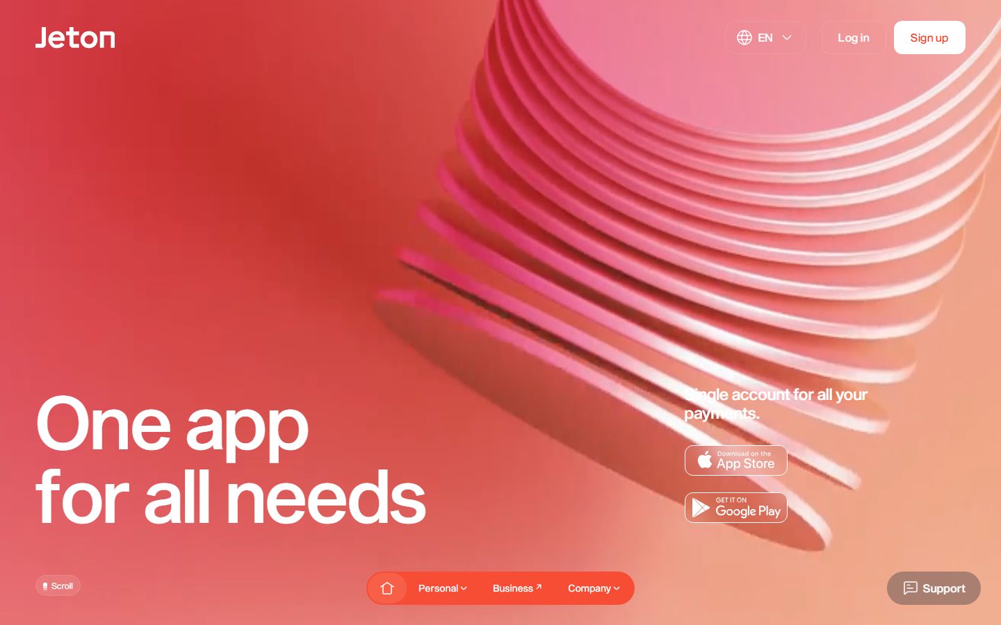
Jeton
A bold, fintech-confident landing surface built on a single saturated red-orange brand color (#f73b20) over white canvas, with oversized Sequel Sans grotesque headlines, fully-pill-shaped buttons and nav chips (84px radius), squared inputs, and bright single-color action tiles (green/blue/pink) for the Add / Send / Exchange product motions. The voice is loud and editorial — gigantic 100px+ display type, near-monochrome warm-red palette, and 3D render imagery doing the visual heavy lifting.
---
version: alpha
name: Jeton-design-analysis
description: A bold, fintech-confident landing surface built on a single saturated red-orange brand color (#f73b20) over white canvas, with oversized Sequel Sans grotesque headlines, fully-pill-shaped buttons and nav chips (84px radius), squared inputs, and bright single-color action tiles (green/blue/pink) for the Add / Send / Exchange product motions. The voice is loud and editorial — gigantic 100px+ display type, near-monochrome warm-red palette, and 3D render imagery doing the visual heavy lifting.
colors:
  primary: "#f73b20"
  primary-tint: "#f84d35"
  primary-soft: "#f96853"
  primary-deep: "#a21906"
  primary-darkest: "#360802"
  blush: "#fdcbc4"
  blush-soft: "#fee9e6"
  rose: "#f5b1a3"
  pale: "#fff6f5"
  canvas: "#ffffff"
  ink: "#ffffff"
  neutral-black: "#000000"
  action-add: "#34c771"
  action-send: "#477ee9"
  action-send-bright: "#105df1"
  action-exchange: "#fb2d54"
  accent-red-alt: "#dc3636"
typography:
  display-hero:
    fontFamily: "Sequel Sans, Hanken Grotesk, sans-serif"
    fontSize: 106px
    fontWeight: 500
    lineHeight: 1.0
    letterSpacing: normal
  display-mega:
    fontFamily: "Sequel Sans, Hanken Grotesk, sans-serif"
    fontSize: 110px
    fontWeight: 500
    lineHeight: 1.0
    letterSpacing: normal
  body:
    fontFamily: "Sequel Sans, Hanken Grotesk, sans-serif"
    fontSize: 23px
    fontWeight: 500
    lineHeight: 1.2
    letterSpacing: 0.23px
  button:
    fontFamily: "Sequel Sans, Hanken Grotesk, sans-serif"
    fontSize: 14px
    fontWeight: 450
    lineHeight: 1.4
    letterSpacing: 0.42px
rounded:
  none: 0px
  sm: 8px
  md: 12px
  lg: 16px
  xl: 22px
  xxl: 24px
  pill: 84px
  full: 150px
spacing:
  xxs: 4px
  xs: 8px
  sm: 12px
  md: 16px
  lg: 24px
  xl: 32px
components:
  top-nav:
    backgroundColor: transparent
    textColor: "{colors.ink}"
    typography: "{typography.button}"
  button-primary:
    backgroundColor: "{colors.primary}"
    textColor: "{colors.ink}"
    typography: "{typography.button}"
    rounded: "{rounded.pill}"
    padding: 0px 16px
  button-on-accent:
    backgroundColor: "{colors.canvas}"
    textColor: "{colors.primary}"
    typography: "{typography.button}"
    rounded: "{rounded.pill}"
    padding: 0px 16px
  button-secondary:
    backgroundColor: transparent
    textColor: "{colors.ink}"
    typography: "{typography.button}"
    rounded: "{rounded.pill}"
    padding: 0px 16px
  nav-pill-group:
    backgroundColor: "{colors.canvas}"
    textColor: "{colors.primary}"
    typography: "{typography.button}"
    rounded: "{rounded.pill}"
    padding: 0px 16px
  support-button:
    backgroundColor: "{colors.canvas}"
    textColor: "{colors.primary}"
    typography: "{typography.button}"
    rounded: "{rounded.pill}"
    padding: 0px 16px
  card:
    backgroundColor: "{colors.action-add}"
    textColor: "{colors.ink}"
    rounded: "{rounded.xl}"
    shadow: none
  card-elevated:
    backgroundColor: "{colors.canvas}"
    textColor: "{colors.primary}"
    rounded: "{rounded.lg}"
  input:
    backgroundColor: "{colors.canvas}"
    textColor: "{colors.primary}"
    typography: "{typography.body}"
    rounded: "{rounded.none}"
  action-tile-add:
    backgroundColor: "{colors.action-add}"
    textColor: "{colors.ink}"
    rounded: "{rounded.md}"
  action-tile-send:
    backgroundColor: "{colors.action-send}"
    textColor: "{colors.ink}"
    rounded: "{rounded.md}"
  action-tile-exchange:
    backgroundColor: "{colors.action-exchange}"
    textColor: "{colors.ink}"
    rounded: "{rounded.md}"
---

## Overview

Jeton's landing surface is a loud, single-color fintech statement: one saturated red-orange (`{colors.primary}` — #f73b20) carries the entire brand, deployed both as full-bleed warm-red hero gradient and as oversized red headline type on white canvas. The system reads as confident and consumer-payments-first — gigantic display type, near-monochrome palette, fully rounded pill controls, and high-fidelity 3D render imagery (coiled discs, the app on a pedestal, a floating card) doing the decorative work.

The type voice is a single grotesque family, **Sequel Sans**, run at medium weight (500) across every role. The defining gesture is scale: hero and section headlines render at ~106–110px with line-height 1.0, stacking into tight two-line slabs ("One app / for all needs", "Unify your / finances"). Body copy and UI labels are the same family at far smaller sizes.

Brand voltage comes from two places: the **monochrome red field** (hero, "Unify your finances", and a full-bleed solid `{colors.primary}` band), and a small set of **bright single-color action tiles** — green Add (`{colors.action-add}`), blue Send (`{colors.action-send}`), pink Exchange (`{colors.action-exchange}`) — the only place where non-red color appears.

**Key Characteristics:**
- One dominant brand color (`{colors.primary}` — #f73b20) used as both surface and text. On red surfaces text is white (`{colors.ink}`); on white canvas the headline type is red.
- Oversized Sequel Sans display type (~106–110px, weight 500, line-height 1.0). The scale itself is the design.
- Fully pill-shaped interactive controls — buttons, nav chips, and the support button all use `{rounded.pill}` (84px).
- Inputs are squared (`{rounded.none}` — 0px), a deliberate contrast against the otherwise heavily-rounded UI.
- Bright single-color action tiles (green/blue/pink) are the only chromatic departures from the red monochrome.
- Soft red-tinted drop shadows (`rgba(247,59,32,0.1)`) on elevated white cards; an upward `rgba(0,0,0,0.05)` shadow on the bottom-pinned nav.
- 3D rendered product imagery rather than flat illustration carries section visuals.

## Colors

### Brand
- **Primary** (`{colors.primary}` — #f73b20): The entire brand. Hero gradient, full-bleed solid bands, headline type on white, primary button fills. Everything orbits this one value.
- **Primary Tint** (`{colors.primary-tint}` — #f84d35) and **Primary Soft** (`{colors.primary-soft}` — #f96853): Lighter steps used in the warm-red hero gradient and lighter render highlights.
- **Primary Deep** (`{colors.primary-deep}` — #a21906) and **Primary Darkest** (`{colors.primary-darkest}` — #360802): Darker red-browns used in gradient shadow zones and the deep-toned render backdrops.

### Tints & Blush
- **Blush** (`{colors.blush}` — #fdcbc4), **Blush Soft** (`{colors.blush-soft}` — #fee9e6), **Rose** (`{colors.rose}` — #f5b1a3), **Pale** (`{colors.pale}` — #fff6f5): Pale pink-corals seen in the card render imagery and very-soft fills.

### Surface & Text
- **Canvas** (`{colors.canvas}` — #ffffff): White page floor for the editorial sections.
- **Ink** (`{colors.ink}` — #ffffff): White text — used on every red surface and inside action tiles. (Same hex as canvas; role separates "white as surface" from "white as text".)
- **Neutral Black** (`{colors.neutral-black}` — #000000): Sparse — store-badge artwork and fine details.

### Action Accents
The product's three core motions each get a dedicated bright color, shown as a rounded icon tile next to a label:
- **Add** (`{colors.action-add}` — #34c771, green)
- **Send** (`{colors.action-send}` — #477ee9, blue; a brighter `{colors.action-send-bright}` — #105df1 also appears)
- **Exchange** (`{colors.action-exchange}` — #fb2d54, pink-red)
- **Accent Red Alt** (`{colors.accent-red-alt}` — #dc3636): A secondary red seen in minor accent usage.

These accents appear only on the action tiles — never on primary CTAs, which stay red.

## Typography

### Font Family
The system runs a single grotesque, **Sequel Sans**, across all roles at weight 450–500. Sequel Sans is a commercial/licensed typeface and is **not** bundled here. The fallback and recommended open-source substitute is **Hanken Grotesk** (a near-geometric grotesque with similar proportions); **Inter** is an acceptable secondary fallback. Do not claim to ship Sequel Sans — load the substitute when the licensed font is unavailable.

The voice is defined by scale, not by family contrast: the same face renders the 110px section heads and the 14px button labels.

### Hierarchy

| Token | Size | Weight | Line Height | Letter Spacing | Use |
|---|---|---|---|---|---|
| `{typography.display-mega}` | 110px | 500 | 1.0 | normal | Section headlines ("Unify your finances") — h2 |
| `{typography.display-hero}` | 106px | 500 | 1.0 | normal | Hero headline ("One app for all needs") — h1 / h3 (measured identical) |
| `{typography.body}` | 23px | 500 | 1.2 | 0.23px | Body copy, sub-headlines, supporting text |
| `{typography.button}` | 14px | 450 | 1.4 | 0.42px | Buttons, nav chips, store badges, support label |

### Principles
Hierarchy is driven almost entirely by size. Display sizes sit at line-height 1.0 so two-line headlines read as a tight typographic slab. Body type jumps down dramatically to ~23px — there is no intermediate title tier captured on the landing page. Keep display type at weight 500; the design never goes bolder. When emphasis is needed, increase size, not weight.

### Note on Font Substitutes
Sequel Sans is licensed. **Hanken Grotesk** at weight 500 is the recommended open-source approximation; pair it with the small positive letter-spacing already encoded on body (0.23px) and button (0.42px) roles. **Inter** is a usable secondary fallback though its humanist details diverge from Sequel Sans's cleaner grotesque forms.

## Layout

### Spacing System
- **Base unit:** 4px.
- **Tokens:** `{spacing.xxs}` 4px · `{spacing.xs}` 8px · `{spacing.sm}` 12px · `{spacing.md}` 16px · `{spacing.lg}` 24px · `{spacing.xl}` 32px.
- The most frequent measured steps are 8px and 16px (component padding) and 24px (gaps between grouped elements). Supplementary off-scale values (10, 20, 22, 29, 41px) appear and are noted in Known Gaps.
- Button horizontal padding is 16px (`{spacing.md}`) with zero vertical padding — height is governed by the pill control and line-height.

### Grid & Container
- The hero uses a split composition: oversized headline anchored bottom-left, supporting copy + app-store badges mid-right, 3D render filling the upper-right.
- Editorial sections center single column headlines with generous vertical whitespace; the full-bleed solid red band spans edge to edge.
- The bottom navigation is a horizontally-centered floating pill chip group pinned above the fold.

### Whitespace Philosophy
Whitespace is generous and intentional — section headlines float in large empty fields (the "Add / Send / Exchange" sequence is widely spaced vertically), letting the oversized type and 3D renders breathe. The composition favors a few enormous elements over dense content.

## Elevation & Depth

| Level | Treatment | Use |
|---|---|---|
| Flat | No shadow | Solid red bands, white editorial sections, headline type |
| Brand-tinted card | `rgba(247, 59, 32, 0.1) 0px 8px 24px`, `rgba(247, 59, 32, 0.05) 0px 2px 8px` | Elevated white cards and CTA chips floating over white/red |
| Bottom nav lift | `rgba(0, 0, 0, 0.05) 0px -4px 16px` | The pinned bottom navigation pill — an upward shadow separating it from content below |

The elevation philosophy is soft and warm: shadows are red-tinted rather than neutral gray, reinforcing the monochrome brand even in depth. No heavy drop shadows; the 3D render imagery supplies most of the perceived depth.

### Decorative Depth
- 3D rendered objects (coiled translucent discs, the phone on a pedestal, the floating Jeton card) carry their own rendered lighting and shadow — this is content imagery, not a system shadow token.

## Shapes

### Border Radius Scale

| Token | Value | Use |
|---|---|---|
| `{rounded.none}` | 0px | Inputs — deliberately squared corners |
| `{rounded.sm}` | 8px | Small UI elements, tight tiles |
| `{rounded.md}` | 12px | Action tiles (Add / Send / Exchange icon containers) |
| `{rounded.lg}` | 16px | Default card / container radius (most frequent measured radius) |
| `{rounded.xl}` | 22px | Larger feature cards (measured ~21.66px) |
| `{rounded.xxl}` | 24px | Large containers |
| `{rounded.pill}` | 84px | Buttons, nav chip group, support button — fully pill-shaped controls |
| `{rounded.full}` | 150px | Largest rounded surfaces / near-circular containers |

The shape language is overwhelmingly rounded — `{rounded.lg}` (16px) is the most common container radius and all controls are pills. The single sharp contrast is the squared input (`{rounded.none}`), which stands out intentionally.

### Photography / Render Geometry
3D render imagery dominates: coiled disc forms, a phone mockup on a circular pedestal, and a Jeton card floating among rounded cylinders. Renders fill bleed zones and large card frames at `{rounded.xl}`–`{rounded.xxl}`.

## Components

### Navigation

**`top-nav`** — Transparent top bar over the red hero. Carries the "Jeton" wordmark at left and a right cluster: language selector ("EN"), "Log in" (`{component.button-secondary}`), and "Sign up" (`{component.button-on-accent}` — white pill with red text). Labels in `{typography.button}`.

**`nav-pill-group`** — A floating bottom-pinned pill chip group (Home / Personal / Business / Company). Background `{colors.canvas}`, red text (`{colors.primary}`), rounded `{rounded.pill}` (84px), padding 0×16px. Lifted from the content below by the upward `rgba(0,0,0,0.05) 0px -4px 16px` shadow.

**`support-button`** — Bottom-right floating pill ("Support") with a chat icon. Background `{colors.canvas}`, text `{colors.primary}`, rounded `{rounded.pill}`.

### Buttons

**`button-primary`** — The red action pill. Background `{colors.primary}`, text `{colors.ink}` (white), type `{typography.button}` (Sequel Sans 14px / 450, +0.42px tracking), rounded `{rounded.pill}` (84px), padding 0×16px. Used for "Get Started" / "Learn more" on white sections.

**`button-on-accent`** — Inverse pill used over the red hero. Background `{colors.canvas}` (white), text `{colors.primary}`, same pill radius and padding. This is the "Sign up" button.

**`button-secondary`** — Transparent text-pill ("Log in"), white label (`{colors.ink}`), rounded `{rounded.pill}`.

### Cards & Containers

**`card`** — Content card. The measured instance carried a solid `{colors.action-add}` (green) fill at rounded `{rounded.xl}` (~22px) with no shadow. Treated as the generic card frame; surface color varies by context.

**`card-elevated`** — White feature card floating on white or red, rounded `{rounded.lg}` (16px), carrying the brand-tinted shadow (`rgba(247,59,32,0.1) 0px 8px 24px`). Text in `{colors.primary}`.

### Action Tiles

**`action-tile-add`** / **`action-tile-send`** / **`action-tile-exchange`** — Small rounded-square icon tiles (`{rounded.md}` — 12px) paired with a large label, representing the three core product motions. Backgrounds are the only non-red colors in the system: `{colors.action-add}` (green), `{colors.action-send}` (blue), `{colors.action-exchange}` (pink). Icon glyphs in `{colors.ink}` (white).

### Inputs

**`input`** — Text input. Background `{colors.canvas}`, text `{colors.primary}`, type `{typography.body}`, rounded `{rounded.none}` (0px). The squared corners are deliberate against the otherwise pill-heavy UI.

## Do's and Don'ts

### Do
- Keep `{colors.primary}` (#f73b20) as the single dominant color — both surface and headline text. The brand is near-monochrome by design.
- Use white text (`{colors.ink}`) on red surfaces and red text (`{colors.primary}`) on white canvas.
- Make headlines enormous. Display type lives at ~106–110px with line-height 1.0, stacked into tight two-line slabs.
- Use full pills (`{rounded.pill}` — 84px) for every interactive control — buttons, nav chips, support button.
- Reserve the bright action colors (green/blue/pink) strictly for the Add / Send / Exchange tiles.
- Use red-tinted shadows (`rgba(247,59,32,0.1)`) on elevated white cards to keep depth on-brand.
- Keep inputs squared (`{rounded.none}`) — the one intentional sharp contrast.

### Don't
- Don't introduce a second prominent brand color. The action accents are scoped to tiles only — never to CTAs.
- Don't bolden display type past weight 500; scale up instead of bolding.
- Don't use neutral-gray shadows on warm-red cards — keep them brand-tinted.
- Don't round inputs; they stay at 0px.
- Don't add hover-state styling beyond default and pressed; this entry documents default states only.

## Responsive Behavior

Only the desktop landing page was captured, so responsive rules are largely inferred and should be confirmed against live breakpoints.

### Breakpoints (inferred)

| Name | Width | Key Changes (expected) |
|---|---|---|
| Mobile | < 768px | Hero headline scales down dramatically from ~106px; top-nav collapses; bottom nav-pill-group narrows; app-store badges stack |
| Tablet | 768–1024px | Headline tightens; split hero composition compresses; renders reposition |
| Desktop | > 1024px | Full oversized display type and split hero as captured |

### Touch Targets
- Pill buttons (`{component.button-primary}`) use 16px horizontal padding; effective height is governed by the pill and line-height — confirm against a 44px minimum on touch.
- The bottom `{component.nav-pill-group}` chips and `{component.support-button}` are persistent floating targets.

### Collapsing Strategy
- The display-size headlines must scale substantially on small screens; their 1.0 line-height keeps two-line slabs intact.
- 3D render imagery should reposition/crop rather than shrink to illegibility.

## Iteration Guide

1. Focus on ONE component at a time, referencing its YAML key (`{component.button-primary}`, `{component.action-tile-send}`).
2. Variants live as separate entries (`button-on-accent`, `card-elevated`).
3. Use `{token.refs}` everywhere — never inline a hex in a component.
4. Document only default and active/pressed states — no hover docs.
5. Headlines stay Sequel Sans (substitute Hanken Grotesk) weight 500; emphasis = bigger, not bolder.
6. The system is monochrome red; introduce new color only as a scoped action accent, never as a CTA.
7. When unsure about emphasis, increase display size before adding a second color.

## Known Gaps

- Only the landing page was captured; interior pages, footer, forms, and full navigation menus are unspecified.
- **Sequel Sans is a licensed/commercial typeface** (despite `fonts_licensed` being empty in the capture); an open-source substitute (Hanken Grotesk / Inter) is documented and must be used in place of the licensed font.
- h1, h2, and h3 measured nearly identical sizes (106–110px); the true semantic hierarchy beyond size could not be distinguished and no intermediate title tier was captured.
- No exact background hex was measured for `button-primary` / `button-secondary`; fills are inferred from screenshot ground-truth (red pill, white-on-red text). The brand red `{colors.primary}` is used as the documented fill.
- The `card` background was sampled from a single green instance (`#34c771`); surface color likely varies by context and the generic card fill is not confirmed.
- Off-scale spacing values (10, 20, 22, 29, 41px) appear in the capture and are not tokenized; the canonical scale documents the dominant 4/8/16/24px rhythm.
- App-store badge styling, the language selector, and the "Scroll" indicator chip were not measured in detail.
- Animation, scroll, and transition behaviors are out of scope.
- Responsive breakpoints are inferred, not measured.

<!-- Documented by duply · real-world design systems as ready-to-use DESIGN.md for AI coding agents · https://duply.ai/jeton/design-md -->
Color Palette
Accent
Neutrals
Typography
display-hero106px · 500 · 1
The quick brown fox jumpsdisplay-mega110px · 500 · 1
The quick brown fox jumpsbody23px · 500 · 1.2
The quick brown fox jumpsbutton14px · 450 · 1.4
The quick brown fox jumpsSpacing & Shape
Spacing
| Name | Value | Preview |
|---|---|---|
| xxs | 4px | |
| xs | 8px | |
| sm | 12px | |
| md | 16px | |
| lg | 24px | |
| xl | 32px |
Border Radius
| Name | Value | Preview |
|---|---|---|
| none | 0px | |
| sm | 8px | |
| md | 12px | |
| lg | 16px | |
| xl | 22px | |
| xxl | 24px | |
| pill | 84px | |
| full | 150px |
More like this


---
version: alpha
name: Jeton-design-analysis
description: A bold, fintech-confident landing surface built on a single saturated red-orange brand color (#f73b20) over white canvas, with oversized Sequel Sans grotesque headlines, fully-pill-shaped buttons and nav chips (84px radius), squared inputs, and bright single-color action tiles (green/blue/pink) for the Add / Send / Exchange product motions. The voice is loud and editorial — gigantic 100px+ display type, near-monochrome warm-red palette, and 3D render imagery doing the visual heavy lifting.
colors:
  primary: "#f73b20"
  primary-tint: "#f84d35"
  primary-soft: "#f96853"
  primary-deep: "#a21906"
  primary-darkest: "#360802"
  blush: "#fdcbc4"
  blush-soft: "#fee9e6"
  rose: "#f5b1a3"
  pale: "#fff6f5"
  canvas: "#ffffff"
  ink: "#ffffff"
  neutral-black: "#000000"
  action-add: "#34c771"
  action-send: "#477ee9"
  action-send-bright: "#105df1"
  action-exchange: "#fb2d54"
  accent-red-alt: "#dc3636"
typography:
  display-hero:
    fontFamily: "Sequel Sans, Hanken Grotesk, sans-serif"
    fontSize: 106px
    fontWeight: 500
    lineHeight: 1.0
    letterSpacing: normal
  display-mega:
    fontFamily: "Sequel Sans, Hanken Grotesk, sans-serif"
    fontSize: 110px
    fontWeight: 500
    lineHeight: 1.0
    letterSpacing: normal
  body:
    fontFamily: "Sequel Sans, Hanken Grotesk, sans-serif"
    fontSize: 23px
    fontWeight: 500
    lineHeight: 1.2
    letterSpacing: 0.23px
  button:
    fontFamily: "Sequel Sans, Hanken Grotesk, sans-serif"
    fontSize: 14px
    fontWeight: 450
    lineHeight: 1.4
    letterSpacing: 0.42px
rounded:
  none: 0px
  sm: 8px
  md: 12px
  lg: 16px
  xl: 22px
  xxl: 24px
  pill: 84px
  full: 150px
spacing:
  xxs: 4px
  xs: 8px
  sm: 12px
  md: 16px
  lg: 24px
  xl: 32px
components:
  top-nav:
    backgroundColor: transparent
    textColor: "{colors.ink}"
    typography: "{typography.button}"
  button-primary:
    backgroundColor: "{colors.primary}"
    textColor: "{colors.ink}"
    typography: "{typography.button}"
    rounded: "{rounded.pill}"
    padding: 0px 16px
  button-on-accent:
    backgroundColor: "{colors.canvas}"
    textColor: "{colors.primary}"
    typography: "{typography.button}"
    rounded: "{rounded.pill}"
    padding: 0px 16px
  button-secondary:
    backgroundColor: transparent
    textColor: "{colors.ink}"
    typography: "{typography.button}"
    rounded: "{rounded.pill}"
    padding: 0px 16px
  nav-pill-group:
    backgroundColor: "{colors.canvas}"
    textColor: "{colors.primary}"
    typography: "{typography.button}"
    rounded: "{rounded.pill}"
    padding: 0px 16px
  support-button:
    backgroundColor: "{colors.canvas}"
    textColor: "{colors.primary}"
    typography: "{typography.button}"
    rounded: "{rounded.pill}"
    padding: 0px 16px
  card:
    backgroundColor: "{colors.action-add}"
    textColor: "{colors.ink}"
    rounded: "{rounded.xl}"
    shadow: none
  card-elevated:
    backgroundColor: "{colors.canvas}"
    textColor: "{colors.primary}"
    rounded: "{rounded.lg}"
  input:
    backgroundColor: "{colors.canvas}"
    textColor: "{colors.primary}"
    typography: "{typography.body}"
    rounded: "{rounded.none}"
  action-tile-add:
    backgroundColor: "{colors.action-add}"
    textColor: "{colors.ink}"
    rounded: "{rounded.md}"
  action-tile-send:
    backgroundColor: "{colors.action-send}"
    textColor: "{colors.ink}"
    rounded: "{rounded.md}"
  action-tile-exchange:
    backgroundColor: "{colors.action-exchange}"
    textColor: "{colors.ink}"
    rounded: "{rounded.md}"
---

## Overview

Jeton's landing surface is a loud, single-color fintech statement: one saturated red-orange (`{colors.primary}` — #f73b20) carries the entire brand, deployed both as full-bleed warm-red hero gradient and as oversized red headline type on white canvas. The system reads as confident and consumer-payments-first — gigantic display type, near-monochrome palette, fully rounded pill controls, and high-fidelity 3D render imagery (coiled discs, the app on a pedestal, a floating card) doing the decorative work.

The type voice is a single grotesque family, **Sequel Sans**, run at medium weight (500) across every role. The defining gesture is scale: hero and section headlines render at ~106–110px with line-height 1.0, stacking into tight two-line slabs ("One app / for all needs", "Unify your / finances"). Body copy and UI labels are the same family at far smaller sizes.

Brand voltage comes from two places: the **monochrome red field** (hero, "Unify your finances", and a full-bleed solid `{colors.primary}` band), and a small set of **bright single-color action tiles** — green Add (`{colors.action-add}`), blue Send (`{colors.action-send}`), pink Exchange (`{colors.action-exchange}`) — the only place where non-red color appears.

**Key Characteristics:**
- One dominant brand color (`{colors.primary}` — #f73b20) used as both surface and text. On red surfaces text is white (`{colors.ink}`); on white canvas the headline type is red.
- Oversized Sequel Sans display type (~106–110px, weight 500, line-height 1.0). The scale itself is the design.
- Fully pill-shaped interactive controls — buttons, nav chips, and the support button all use `{rounded.pill}` (84px).
- Inputs are squared (`{rounded.none}` — 0px), a deliberate contrast against the otherwise heavily-rounded UI.
- Bright single-color action tiles (green/blue/pink) are the only chromatic departures from the red monochrome.
- Soft red-tinted drop shadows (`rgba(247,59,32,0.1)`) on elevated white cards; an upward `rgba(0,0,0,0.05)` shadow on the bottom-pinned nav.
- 3D rendered product imagery rather than flat illustration carries section visuals.

## Colors

### Brand
- **Primary** (`{colors.primary}` — #f73b20): The entire brand. Hero gradient, full-bleed solid bands, headline type on white, primary button fills. Everything orbits this one value.
- **Primary Tint** (`{colors.primary-tint}` — #f84d35) and **Primary Soft** (`{colors.primary-soft}` — #f96853): Lighter steps used in the warm-red hero gradient and lighter render highlights.
- **Primary Deep** (`{colors.primary-deep}` — #a21906) and **Primary Darkest** (`{colors.primary-darkest}` — #360802): Darker red-browns used in gradient shadow zones and the deep-toned render backdrops.

### Tints & Blush
- **Blush** (`{colors.blush}` — #fdcbc4), **Blush Soft** (`{colors.blush-soft}` — #fee9e6), **Rose** (`{colors.rose}` — #f5b1a3), **Pale** (`{colors.pale}` — #fff6f5): Pale pink-corals seen in the card render imagery and very-soft fills.

### Surface & Text
- **Canvas** (`{colors.canvas}` — #ffffff): White page floor for the editorial sections.
- **Ink** (`{colors.ink}` — #ffffff): White text — used on every red surface and inside action tiles. (Same hex as canvas; role separates "white as surface" from "white as text".)
- **Neutral Black** (`{colors.neutral-black}` — #000000): Sparse — store-badge artwork and fine details.

### Action Accents
The product's three core motions each get a dedicated bright color, shown as a rounded icon tile next to a label:
- **Add** (`{colors.action-add}` — #34c771, green)
- **Send** (`{colors.action-send}` — #477ee9, blue; a brighter `{colors.action-send-bright}` — #105df1 also appears)
- **Exchange** (`{colors.action-exchange}` — #fb2d54, pink-red)
- **Accent Red Alt** (`{colors.accent-red-alt}` — #dc3636): A secondary red seen in minor accent usage.

These accents appear only on the action tiles — never on primary CTAs, which stay red.

## Typography

### Font Family
The system runs a single grotesque, **Sequel Sans**, across all roles at weight 450–500. Sequel Sans is a commercial/licensed typeface and is **not** bundled here. The fallback and recommended open-source substitute is **Hanken Grotesk** (a near-geometric grotesque with similar proportions); **Inter** is an acceptable secondary fallback. Do not claim to ship Sequel Sans — load the substitute when the licensed font is unavailable.

The voice is defined by scale, not by family contrast: the same face renders the 110px section heads and the 14px button labels.

### Hierarchy

| Token | Size | Weight | Line Height | Letter Spacing | Use |
|---|---|---|---|---|---|
| `{typography.display-mega}` | 110px | 500 | 1.0 | normal | Section headlines ("Unify your finances") — h2 |
| `{typography.display-hero}` | 106px | 500 | 1.0 | normal | Hero headline ("One app for all needs") — h1 / h3 (measured identical) |
| `{typography.body}` | 23px | 500 | 1.2 | 0.23px | Body copy, sub-headlines, supporting text |
| `{typography.button}` | 14px | 450 | 1.4 | 0.42px | Buttons, nav chips, store badges, support label |

### Principles
Hierarchy is driven almost entirely by size. Display sizes sit at line-height 1.0 so two-line headlines read as a tight typographic slab. Body type jumps down dramatically to ~23px — there is no intermediate title tier captured on the landing page. Keep display type at weight 500; the design never goes bolder. When emphasis is needed, increase size, not weight.

### Note on Font Substitutes
Sequel Sans is licensed. **Hanken Grotesk** at weight 500 is the recommended open-source approximation; pair it with the small positive letter-spacing already encoded on body (0.23px) and button (0.42px) roles. **Inter** is a usable secondary fallback though its humanist details diverge from Sequel Sans's cleaner grotesque forms.

## Layout

### Spacing System
- **Base unit:** 4px.
- **Tokens:** `{spacing.xxs}` 4px · `{spacing.xs}` 8px · `{spacing.sm}` 12px · `{spacing.md}` 16px · `{spacing.lg}` 24px · `{spacing.xl}` 32px.
- The most frequent measured steps are 8px and 16px (component padding) and 24px (gaps between grouped elements). Supplementary off-scale values (10, 20, 22, 29, 41px) appear and are noted in Known Gaps.
- Button horizontal padding is 16px (`{spacing.md}`) with zero vertical padding — height is governed by the pill control and line-height.

### Grid & Container
- The hero uses a split composition: oversized headline anchored bottom-left, supporting copy + app-store badges mid-right, 3D render filling the upper-right.
- Editorial sections center single column headlines with generous vertical whitespace; the full-bleed solid red band spans edge to edge.
- The bottom navigation is a horizontally-centered floating pill chip group pinned above the fold.

### Whitespace Philosophy
Whitespace is generous and intentional — section headlines float in large empty fields (the "Add / Send / Exchange" sequence is widely spaced vertically), letting the oversized type and 3D renders breathe. The composition favors a few enormous elements over dense content.

## Elevation & Depth

| Level | Treatment | Use |
|---|---|---|
| Flat | No shadow | Solid red bands, white editorial sections, headline type |
| Brand-tinted card | `rgba(247, 59, 32, 0.1) 0px 8px 24px`, `rgba(247, 59, 32, 0.05) 0px 2px 8px` | Elevated white cards and CTA chips floating over white/red |
| Bottom nav lift | `rgba(0, 0, 0, 0.05) 0px -4px 16px` | The pinned bottom navigation pill — an upward shadow separating it from content below |

The elevation philosophy is soft and warm: shadows are red-tinted rather than neutral gray, reinforcing the monochrome brand even in depth. No heavy drop shadows; the 3D render imagery supplies most of the perceived depth.

### Decorative Depth
- 3D rendered objects (coiled translucent discs, the phone on a pedestal, the floating Jeton card) carry their own rendered lighting and shadow — this is content imagery, not a system shadow token.

## Shapes

### Border Radius Scale

| Token | Value | Use |
|---|---|---|
| `{rounded.none}` | 0px | Inputs — deliberately squared corners |
| `{rounded.sm}` | 8px | Small UI elements, tight tiles |
| `{rounded.md}` | 12px | Action tiles (Add / Send / Exchange icon containers) |
| `{rounded.lg}` | 16px | Default card / container radius (most frequent measured radius) |
| `{rounded.xl}` | 22px | Larger feature cards (measured ~21.66px) |
| `{rounded.xxl}` | 24px | Large containers |
| `{rounded.pill}` | 84px | Buttons, nav chip group, support button — fully pill-shaped controls |
| `{rounded.full}` | 150px | Largest rounded surfaces / near-circular containers |

The shape language is overwhelmingly rounded — `{rounded.lg}` (16px) is the most common container radius and all controls are pills. The single sharp contrast is the squared input (`{rounded.none}`), which stands out intentionally.

### Photography / Render Geometry
3D render imagery dominates: coiled disc forms, a phone mockup on a circular pedestal, and a Jeton card floating among rounded cylinders. Renders fill bleed zones and large card frames at `{rounded.xl}`–`{rounded.xxl}`.

## Components

### Navigation

**`top-nav`** — Transparent top bar over the red hero. Carries the "Jeton" wordmark at left and a right cluster: language selector ("EN"), "Log in" (`{component.button-secondary}`), and "Sign up" (`{component.button-on-accent}` — white pill with red text). Labels in `{typography.button}`.

**`nav-pill-group`** — A floating bottom-pinned pill chip group (Home / Personal / Business / Company). Background `{colors.canvas}`, red text (`{colors.primary}`), rounded `{rounded.pill}` (84px), padding 0×16px. Lifted from the content below by the upward `rgba(0,0,0,0.05) 0px -4px 16px` shadow.

**`support-button`** — Bottom-right floating pill ("Support") with a chat icon. Background `{colors.canvas}`, text `{colors.primary}`, rounded `{rounded.pill}`.

### Buttons

**`button-primary`** — The red action pill. Background `{colors.primary}`, text `{colors.ink}` (white), type `{typography.button}` (Sequel Sans 14px / 450, +0.42px tracking), rounded `{rounded.pill}` (84px), padding 0×16px. Used for "Get Started" / "Learn more" on white sections.

**`button-on-accent`** — Inverse pill used over the red hero. Background `{colors.canvas}` (white), text `{colors.primary}`, same pill radius and padding. This is the "Sign up" button.

**`button-secondary`** — Transparent text-pill ("Log in"), white label (`{colors.ink}`), rounded `{rounded.pill}`.

### Cards & Containers

**`card`** — Content card. The measured instance carried a solid `{colors.action-add}` (green) fill at rounded `{rounded.xl}` (~22px) with no shadow. Treated as the generic card frame; surface color varies by context.

**`card-elevated`** — White feature card floating on white or red, rounded `{rounded.lg}` (16px), carrying the brand-tinted shadow (`rgba(247,59,32,0.1) 0px 8px 24px`). Text in `{colors.primary}`.

### Action Tiles

**`action-tile-add`** / **`action-tile-send`** / **`action-tile-exchange`** — Small rounded-square icon tiles (`{rounded.md}` — 12px) paired with a large label, representing the three core product motions. Backgrounds are the only non-red colors in the system: `{colors.action-add}` (green), `{colors.action-send}` (blue), `{colors.action-exchange}` (pink). Icon glyphs in `{colors.ink}` (white).

### Inputs

**`input`** — Text input. Background `{colors.canvas}`, text `{colors.primary}`, type `{typography.body}`, rounded `{rounded.none}` (0px). The squared corners are deliberate against the otherwise pill-heavy UI.

## Do's and Don'ts

### Do
- Keep `{colors.primary}` (#f73b20) as the single dominant color — both surface and headline text. The brand is near-monochrome by design.
- Use white text (`{colors.ink}`) on red surfaces and red text (`{colors.primary}`) on white canvas.
- Make headlines enormous. Display type lives at ~106–110px with line-height 1.0, stacked into tight two-line slabs.
- Use full pills (`{rounded.pill}` — 84px) for every interactive control — buttons, nav chips, support button.
- Reserve the bright action colors (green/blue/pink) strictly for the Add / Send / Exchange tiles.
- Use red-tinted shadows (`rgba(247,59,32,0.1)`) on elevated white cards to keep depth on-brand.
- Keep inputs squared (`{rounded.none}`) — the one intentional sharp contrast.

### Don't
- Don't introduce a second prominent brand color. The action accents are scoped to tiles only — never to CTAs.
- Don't bolden display type past weight 500; scale up instead of bolding.
- Don't use neutral-gray shadows on warm-red cards — keep them brand-tinted.
- Don't round inputs; they stay at 0px.
- Don't add hover-state styling beyond default and pressed; this entry documents default states only.

## Responsive Behavior

Only the desktop landing page was captured, so responsive rules are largely inferred and should be confirmed against live breakpoints.

### Breakpoints (inferred)

| Name | Width | Key Changes (expected) |
|---|---|---|
| Mobile | < 768px | Hero headline scales down dramatically from ~106px; top-nav collapses; bottom nav-pill-group narrows; app-store badges stack |
| Tablet | 768–1024px | Headline tightens; split hero composition compresses; renders reposition |
| Desktop | > 1024px | Full oversized display type and split hero as captured |

### Touch Targets
- Pill buttons (`{component.button-primary}`) use 16px horizontal padding; effective height is governed by the pill and line-height — confirm against a 44px minimum on touch.
- The bottom `{component.nav-pill-group}` chips and `{component.support-button}` are persistent floating targets.

### Collapsing Strategy
- The display-size headlines must scale substantially on small screens; their 1.0 line-height keeps two-line slabs intact.
- 3D render imagery should reposition/crop rather than shrink to illegibility.

## Iteration Guide

1. Focus on ONE component at a time, referencing its YAML key (`{component.button-primary}`, `{component.action-tile-send}`).
2. Variants live as separate entries (`button-on-accent`, `card-elevated`).
3. Use `{token.refs}` everywhere — never inline a hex in a component.
4. Document only default and active/pressed states — no hover docs.
5. Headlines stay Sequel Sans (substitute Hanken Grotesk) weight 500; emphasis = bigger, not bolder.
6. The system is monochrome red; introduce new color only as a scoped action accent, never as a CTA.
7. When unsure about emphasis, increase display size before adding a second color.

## Known Gaps

- Only the landing page was captured; interior pages, footer, forms, and full navigation menus are unspecified.
- **Sequel Sans is a licensed/commercial typeface** (despite `fonts_licensed` being empty in the capture); an open-source substitute (Hanken Grotesk / Inter) is documented and must be used in place of the licensed font.
- h1, h2, and h3 measured nearly identical sizes (106–110px); the true semantic hierarchy beyond size could not be distinguished and no intermediate title tier was captured.
- No exact background hex was measured for `button-primary` / `button-secondary`; fills are inferred from screenshot ground-truth (red pill, white-on-red text). The brand red `{colors.primary}` is used as the documented fill.
- The `card` background was sampled from a single green instance (`#34c771`); surface color likely varies by context and the generic card fill is not confirmed.
- Off-scale spacing values (10, 20, 22, 29, 41px) appear in the capture and are not tokenized; the canonical scale documents the dominant 4/8/16/24px rhythm.
- App-store badge styling, the language selector, and the "Scroll" indicator chip were not measured in detail.
- Animation, scroll, and transition behaviors are out of scope.
- Responsive breakpoints are inferred, not measured.

<!-- Documented by duply · real-world design systems as ready-to-use DESIGN.md for AI coding agents · https://duply.ai/jeton/design-md -->