Greptile
A technical, brutalist-leaning developer-tool interface built on a light-gray dotted canvas with razor-sharp 0px corners, an oversized Anybody display headline, and Space Mono body copy throughout. The system reads as engineered-and-confident — high-contrast slate type on near-white surfaces, an electric green primary action, halftone reptile artwork, and dark mid-page bands that frame product/"how it works" content. Brand voltage comes from the chunky Anybody 800 display face, the all-monospace supporting type, and a small palette of fluorescent accents (green, magenta, blue, lime).
---
version: alpha
name: Greptile-design-analysis
description: A technical, brutalist-leaning developer-tool interface built on a light-gray dotted canvas with razor-sharp 0px corners, an oversized Anybody display headline, and Space Mono body copy throughout. The system reads as engineered-and-confident — high-contrast slate type on near-white surfaces, an electric green primary action, halftone reptile artwork, and dark mid-page bands that frame product/"how it works" content. Brand voltage comes from the chunky Anybody 800 display face, the all-monospace supporting type, and a small palette of fluorescent accents (green, magenta, blue, lime).
colors:
ink: "#000000"
body: "#3d3b4f"
muted-deep: "#555368"
canvas: "#e9e9e9"
surface: "#eeeeee"
surface-dark: "#2a2a2a"
hairline: "#cccccc"
hairline-soft: "#d6d6d6"
on-dark: "#ffffff"
on-dark-soft: "#9ca3af"
accent-green: "#28e99f"
accent-green-soft: "#c5ffd6"
accent-blue: "#5882ff"
accent-pink: "#ffcffe"
accent-pink-strong: "#ffacfe"
accent-lime: "#ecffa3"
accent-olive: "#7b6e32"
accent-olive-alt: "#7b8238"
accent-cream: "#fdfcf9"
accent-red: "#e5443d"
typography:
display-xl:
fontFamily: "Anybody, sans-serif"
fontSize: 96px
fontWeight: 800
lineHeight: 1.0
letterSpacing: -2.4px
display-lg:
fontFamily: "Anybody, sans-serif"
fontSize: 48px
fontWeight: 600
lineHeight: 1.0
letterSpacing: -1.92px
display-md:
fontFamily: "Anybody, sans-serif"
fontSize: 36px
fontWeight: 600
lineHeight: 1.111
letterSpacing: -1.44px
body:
fontFamily: "Space Mono, monospace"
fontSize: 14px
fontWeight: 500
lineHeight: 1.429
letterSpacing: 0.35px
button:
fontFamily: "Space Mono, monospace"
fontSize: 12px
fontWeight: 400
lineHeight: 1.333
letterSpacing: 0.6px
rounded:
none: 0px
sharp: 0px
spacing:
xxs: 4px
xs: 8px
sm: 12px
md: 16px
lg: 24px
xl: 32px
xxl: 48px
huge: 64px
section: 80px
components:
announcement-bar:
backgroundColor: "{colors.accent-green}"
textColor: "{colors.ink}"
typography: "{typography.button}"
rounded: "{rounded.none}"
padding: 4px 16px
top-nav:
backgroundColor: "{colors.surface}"
textColor: "{colors.body}"
typography: "{typography.button}"
rounded: "{rounded.none}"
padding: 16px 24px
nav-link:
backgroundColor: transparent
textColor: "{colors.body}"
typography: "{typography.button}"
button-primary:
backgroundColor: "{colors.accent-green}"
textColor: "{colors.body}"
typography: "{typography.button}"
rounded: "{rounded.none}"
padding: 4px 8px
button-secondary-dark:
backgroundColor: "{colors.surface-dark}"
textColor: "{colors.on-dark}"
typography: "{typography.button}"
rounded: "{rounded.none}"
padding: 4px 8px
hero-band:
backgroundColor: "{colors.canvas}"
textColor: "{colors.body}"
typography: "{typography.display-xl}"
rounded: "{rounded.none}"
padding: 80px
logo-marquee:
backgroundColor: "{colors.surface}"
textColor: "{colors.muted-deep}"
typography: "{typography.body}"
rounded: "{rounded.none}"
padding: 24px 32px
testimonial-quote-band:
backgroundColor: "{colors.surface}"
textColor: "{colors.body}"
typography: "{typography.display-md}"
rounded: "{rounded.none}"
padding: 48px
dark-section:
backgroundColor: "{colors.muted-deep}"
textColor: "{colors.on-dark}"
typography: "{typography.display-md}"
rounded: "{rounded.none}"
padding: 64px
how-it-works-card:
backgroundColor: "{colors.surface-dark}"
textColor: "{colors.on-dark}"
typography: "{typography.body}"
rounded: "{rounded.none}"
padding: 24px
example-card:
backgroundColor: "{colors.surface-dark}"
textColor: "{colors.on-dark}"
typography: "{typography.body}"
rounded: "{rounded.none}"
padding: 16px
rules-card:
backgroundColor: "{colors.surface}"
textColor: "{colors.body}"
typography: "{typography.body}"
rounded: "{rounded.none}"
padding: 24px
workflow-card:
backgroundColor: "{colors.canvas}"
textColor: "{colors.body}"
typography: "{typography.body}"
rounded: "{rounded.none}"
padding: 24px
testimonial-card:
backgroundColor: "{colors.surface}"
textColor: "{colors.body}"
typography: "{typography.body}"
rounded: "{rounded.none}"
padding: 24px
card:
backgroundColor: "{colors.surface}"
textColor: "{colors.body}"
rounded: "{rounded.none}"
badge-pill:
backgroundColor: "{colors.accent-pink-strong}"
textColor: "{colors.ink}"
typography: "{typography.button}"
rounded: "{rounded.none}"
padding: 4px 8px
footer:
backgroundColor: "{colors.surface}"
textColor: "{colors.muted-deep}"
typography: "{typography.body}"
rounded: "{rounded.none}"
padding: 64px
---
## Overview
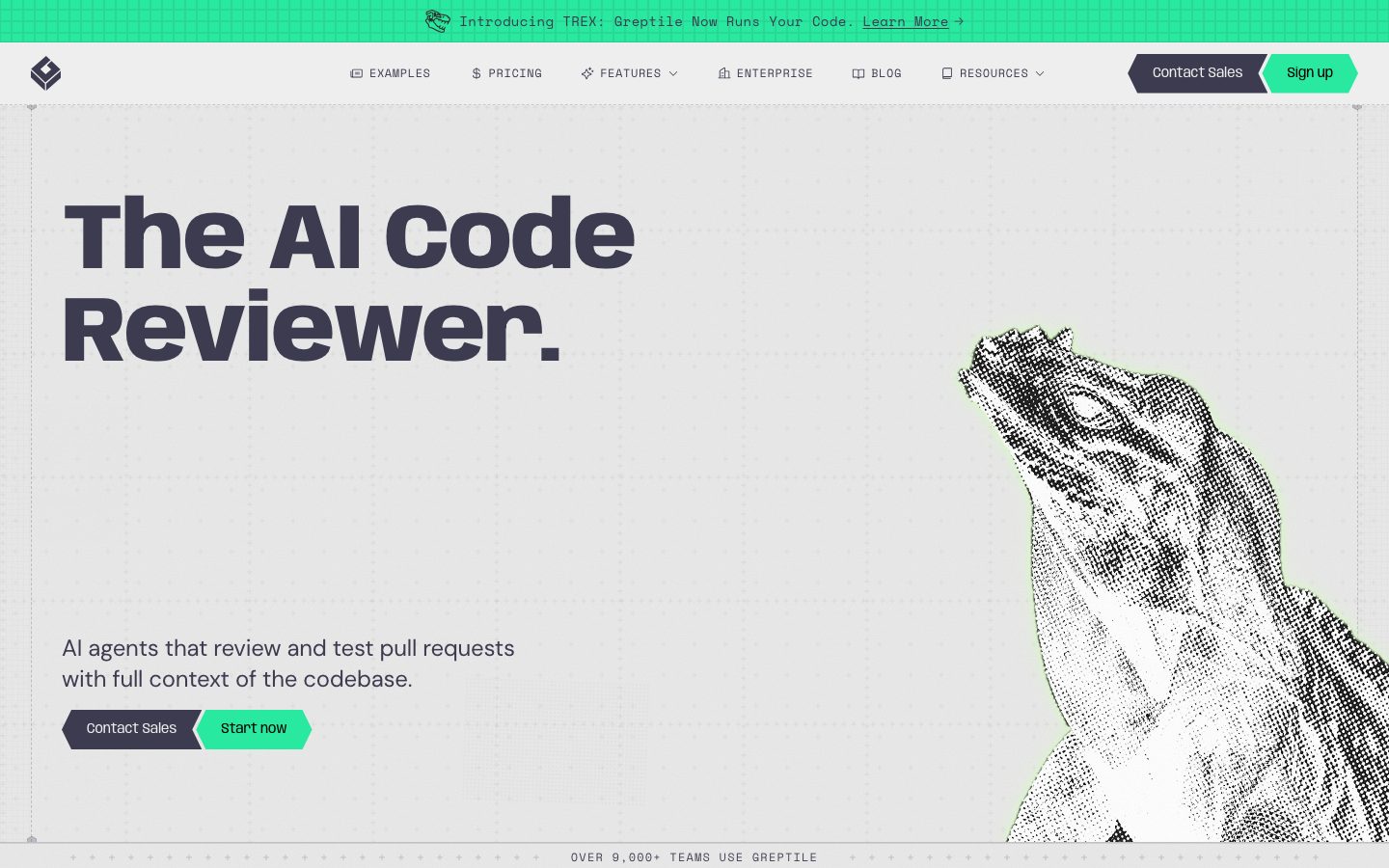
Greptile's marketing surface is a technical, brutalist-leaning developer-tool interface. The page floor is a light-gray dotted canvas (`{colors.canvas}` — #e9e9e9), corners are uniformly **sharp** (`{rounded.none}` — 0px, measured on both button and card), and the whole supporting voice is set in monospace (`{typography.body}` — Space Mono). The headline voltage comes from **Anybody** at weight 800, a chunky condensed display face that anchors the hero ("The AI Code Reviewer.").
The system splits cleanly into two type roles: **Anybody** (display — h1/h2/h3, heavy negative tracking) and **Space Mono** (everything else — body, buttons, nav, labels, captions). The monospace body is a deliberate signal — this is a tool built by and for engineers, and the type telegraphs that before a single word is read.
Color is mostly restrained — slate body text (`{colors.body}` — #3d3b4f) on near-white surfaces — punctuated by a small set of fluorescent accents: an electric green primary action (`{colors.accent-green}` — #28e99f), a soft mint (`{colors.accent-green-soft}` — #c5ffd6), and magenta/pink moments (`{colors.accent-pink}` — #ffcffe, `{colors.accent-pink-strong}` — #ffacfe) that appear on small badges and low-contrast section headings. A blue (`{colors.accent-blue}` — #5882ff) and a lime (`{colors.accent-lime}` — #ecffa3) round out the accent set.
The page alternates light bands with **dark mid-page sections** (`{colors.muted-deep}` — #555368 and `{colors.surface-dark}` — #2a2a2a) that frame the "How it works" and "Bugs that should not hit prod" product content — the dark surfaces let the green/magenta accents and code chrome pop.
**Key Characteristics:**
- Light-gray dotted canvas (`{colors.canvas}` — #e9e9e9) as the page floor — not pure white.
- Universally sharp corners — `{rounded.none}` (0px) measured on buttons and cards. Nothing is rounded.
- Oversized Anybody 800 display headline at 96px with -2.4px tracking — the dominant brand gesture.
- All-monospace supporting type (Space Mono) for body, buttons, nav, and labels.
- Electric green primary CTA (`{colors.accent-green}` — #28e99f) against a dark slate secondary button (`{colors.surface-dark}` — #2a2a2a).
- Halftone reptile artwork (the Greptile mascot) bleeding off the hero edge — a distinctive high-contrast B/W texture element.
- Dark mid-page bands (`{colors.muted-deep}`, `{colors.surface-dark}`) framing product/"how it works" content.
- No shadows anywhere (none measured) — depth comes entirely from flat color-block contrast and 1px hairlines.
## Colors
### Brand & Accent
- **Accent Green** (`{colors.accent-green}` — #28e99f): The primary action color — the "Sign up" and "Start now" buttons, the top announcement bar. The brand's most charged color.
- **Accent Green Soft** (`{colors.accent-green-soft}` — #c5ffd6): A pale mint used as a glow/edge behind the halftone reptile and as soft highlight fills.
- **Accent Blue** (`{colors.accent-blue}` — #5882ff): Used sparingly — inline rule-config highlights and the wavy line-graphic moments in product illustrations.
- **Accent Pink** (`{colors.accent-pink}` — #ffcffe) / **Accent Pink Strong** (`{colors.accent-pink-strong}` — #ffacfe): Low-contrast section headings on dark bands and small "Learn more" badge pills.
- **Accent Lime** (`{colors.accent-lime}` — #ecffa3): A rare highlight on code/diagram fragments.
- **Accent Olive** (`{colors.accent-olive}` — #7b6e32) / **Olive Alt** (`{colors.accent-olive-alt}` — #7b8238) / **Cream** (`{colors.accent-cream}` — #fdfcf9): Very-low-frequency accents observed inside product UI fragments and code-diff chrome.
- **Accent Red** (`{colors.accent-red}` — #e5443d): A scarce error/destructive tone in code-diff fragments.
### Surface
- **Canvas** (`{colors.canvas}` — #e9e9e9): The default page floor (the dotted grid background sits on this).
- **Surface** (`{colors.surface}` — #eeeeee): Slightly lighter band/card surface — nav bar, logo marquee, testimonial cards, footer.
- **Surface Dark** (`{colors.surface-dark}` — #2a2a2a): Darkest surface — the secondary button, "how it works" cards, and example/code cards.
- **Muted Deep** (`{colors.muted-deep}` — #555368): The mid-page dark band tone framing product content.
### Hairlines
- **Hairline** (`{colors.hairline}` — #cccccc): The 1px divider/border tone on light surfaces.
- **Hairline Soft** (`{colors.hairline-soft}` — #d6d6d6): A barely-visible divider between sections sharing the light canvas.
### Text
- **Ink** (`{colors.ink}` — #000000): Maximum-contrast text — labels on the green announcement bar and on accent pills.
- **Body** (`{colors.body}` — #3d3b4f): The dominant text tone — hero headline, paragraphs, nav, button labels.
- **On Dark** (`{colors.on-dark}` — #ffffff): Text on dark bands and the secondary dark button.
- **On Dark Soft** (`{colors.on-dark-soft}` — #9ca3af): Muted text on dark bands — captions, secondary labels.
## Typography
### Font Family
The system runs **Anybody** for display and **Space Mono** for everything else. Both are open-source (Google Fonts), so no proprietary substitution is required — they can ship as-is. Anybody is a heavy, slightly condensed grotesque used at weight 800 (h1) and 600 (h2/h3) with aggressive negative letter-spacing (-1.44px to -2.4px). Space Mono is a fixed-width monospace carrying all body copy, buttons, navigation, and labels at 12–14px with positive tracking (0.35–0.6px).
The split is strict:
- Anybody (display, 600–800, negative tracking) — h1, h2, h3.
- Space Mono (body + UI, 400–500, positive tracking) — paragraphs, buttons, nav, captions, code labels.
### Hierarchy
| Token | Size | Weight | Line Height | Letter Spacing | Use |
|---|---|---|---|---|---|
| `{typography.display-xl}` | 96px | 800 | 1.0 | -2.4px | Hero h1 ("The AI Code Reviewer.") — Anybody |
| `{typography.display-lg}` | 48px | 600 | 1.0 | -1.92px | Section heads ("Self-Hosted Deployment", "Your house, your rules") — Anybody |
| `{typography.display-md}` | 36px | 600 | 1.111 | -1.44px | Sub-section heads, testimonial pull-quotes — Anybody |
| `{typography.body}` | 14px | 500 | 1.429 | 0.35px | Default running text, card copy — Space Mono |
| `{typography.button}` | 12px | 400 | 1.333 | 0.6px | Button labels, nav items, eyebrow labels — Space Mono |
### Principles
Anybody at 800 with deep negative tracking is the brand voice — every hero/section headline uses it. The headline weight drops to 600 for h2/h3 but never lightens further. Space Mono is the supporting workhorse; the monospace choice is intentional and should never be swapped for a proportional sans in body copy. The positive tracking on Space Mono (0.35–0.6px) gives the mono type breathing room — do not collapse it to 0.
### Note on Font Substitutes
No licensed/custom typefaces were flagged (`fonts_licensed` is empty). Both Anybody and Space Mono are free, open-source Google Fonts and ship directly. If a fallback is ever needed, a heavy condensed grotesque (e.g. Archivo at 800) approximates Anybody, and any ui-monospace stack approximates Space Mono — but neither substitution is required.
## Layout
### Spacing System
- **Base unit:** 4px.
- **Tokens:** `{spacing.xxs}` 4px · `{spacing.xs}` 8px · `{spacing.sm}` 12px · `{spacing.md}` 16px · `{spacing.lg}` 24px · `{spacing.xl}` 32px · `{spacing.xxl}` 48px · `{spacing.huge}` 64px · `{spacing.section}` 80px.
- **Section padding:** `{spacing.section}` (80px) and `{spacing.huge}` (64px) carry the major vertical rhythm between bands.
- **Card internal padding:** `{spacing.lg}` (24px) for content cards, `{spacing.md}` (16px) for compact example/code cards.
- **Tight UI rhythm:** Buttons measured at very tight 4px × 8px padding — the monospace labels sit snug inside their flat blocks.
The most frequent measured steps were 12px and 16px (67 occurrences each), with 4px (60) close behind — confirming a tight 4px-based micro-rhythm. A single 96px value was observed (derived as an occasional top-level section gap rather than a core token).
### Grid & Container
- **Hero band:** Two-zone — display headline + sub-copy + button row at left, halftone reptile artwork bleeding off the right edge.
- **How-it-works:** 3-up card grid on the dark band (Index / Review / Learn steps).
- **Example cards:** 3-up grid of code-diff cards (NVIDIA / Meta PyTorch / Solana).
- **Workflow / feature grids:** 4-up at desktop (Fix in your IDE / Greptile MCP / Claude Code Plugin / greploop).
- **Logo marquee:** Multi-column customer logo wall on the light surface band.
### Whitespace Philosophy
Greptile pairs a tight micro-rhythm (4/8/12/16px inside components) with generous macro-spacing (64/80px between bands). The result reads as dense-but-organized — engineered, grid-aligned, never airy. The dotted background grid reinforces the technical, blueprint-like feel.
## Elevation & Depth
| Level | Treatment | Use |
|---|---|---|
| Flat | No shadow, no border | Hero band, dark sections, most cards (shadow measured as `none`) |
| Hairline | 1px `{colors.hairline}` / `{colors.hairline-soft}` border | Card outlines, section dividers, the dotted blueprint grid |
| Color-block contrast | Dark band (`{colors.muted-deep}` / `{colors.surface-dark}`) against light canvas | Mid-page "how it works" + example sections |
No shadows were measured anywhere in the system (`shadows` is empty). Depth is created entirely through **flat color-block contrast** and 1px hairlines — fully consistent with the brutalist, sharp-cornered aesthetic. There is no soft elevation, no glassmorphism, no drop shadow.
### Decorative Depth
- The halftone reptile artwork carries its own high-contrast black-and-white texture and a soft `{colors.accent-green-soft}` (#c5ffd6) edge glow — a graphic flourish, not a system shadow.
- Wavy blue (`{colors.accent-blue}`) line graphics and dotted-grid backgrounds add visual texture without implying lifted surfaces.
## Shapes
### Border Radius Scale
| Token | Value | Use |
|---|---|---|
| `{rounded.none}` | 0px | Everything — buttons, cards, inputs, badges (measured 0px on button + card) |
| `{rounded.sharp}` | 0px | Alias — the system is uniformly square-cornered |
The defining shape rule is the **absence of radius**. Every measured component returned 0px. Greptile's corners are razor-sharp — this is the single most important shape decision in the system. Introducing any rounding breaks the brutalist developer-tool voice.
### Photography / Artwork Geometry
The hero reptile is a halftone-rendered B/W image that bleeds off the page edge without a frame or rounded mask. Code-diff and product-UI fragments inside cards retain their native (square) chrome.
## Components
### Announcement & Navigation
**`announcement-bar`** — A full-width green strip pinned above the nav (`{colors.accent-green}` — #28e99f) with dark text ("Introducing TREX: Greptile Now Runs Your Code. Learn More →") in `{typography.button}` (Space Mono 12px). The single brightest band on the page.
**`top-nav`** — Light-surface nav bar (`{colors.surface}` — #eeeeee). Carries the Greptile diamond logo at left, a center menu (Examples, Pricing, Features, Enterprise, Blog, Resources) in `{typography.button}`, and a right cluster with a dark `{component.button-secondary-dark}` ("Contact Sales") plus a green `{component.button-primary}` ("Sign up").
**`nav-link`** — Inline menu item, transparent background, `{colors.body}` text, `{typography.button}` (Space Mono 12px, 0.6px tracking). Icons sit inline to the left of several labels.
### Buttons
**`button-primary`** — The signature green CTA ("Sign up", "Start now"). Background `{colors.accent-green}` (#28e99f — derived; analysis measured the label color #3d3b4f but not the fill, so the green is taken from screenshot ground-truth), text `{colors.body}`, type `{typography.button}`, sharp `{rounded.none}` corners, tight 4px × 8px padding.
**`button-secondary-dark`** — Dark companion button ("Contact Sales"). Background `{colors.surface-dark}` (#2a2a2a), text `{colors.on-dark}`, same `{typography.button}`, sharp corners, 4px × 8px padding. Paired left of the green primary in nav and hero.
### Bands & Sections
**`hero-band`** — Light dotted-canvas hero (`{colors.canvas}`). 96px Anybody headline (`{typography.display-xl}`) in `{colors.body}`, a Space Mono sub-line ("AI agents that review and test pull requests with full context of the codebase."), and a two-button row. The halftone reptile bleeds off the right edge. Vertical padding `{spacing.section}` (80px).
**`logo-marquee`** — Customer-logo wall on `{colors.surface}` ("OVER 9,000+ TEAMS USE GREPTILE") — Substack, Klaviyo, Retool, NVIDIA, Brex, Scale, PostHog, and more — in muted `{colors.muted-deep}`.
**`testimonial-quote-band`** — A centered pull-quote band on `{colors.surface}`, set large in `{typography.display-md}` (Anybody 36px), with an italic emphasis on key phrases and an attribution + "View time case study" link below.
**`dark-section`** — The mid-page dark band (`{colors.muted-deep}` — #555368) framing "How it works" and example content. Text inverts to `{colors.on-dark}`; eyebrow labels and headings appear in `{colors.accent-pink}` / `{colors.accent-pink-strong}`. The dark surface is what makes the green/magenta accents and code chrome pop.
### Cards
**`how-it-works-card`** — 3-up step cards on the dark band (`{colors.surface-dark}` — #2a2a2a). Each carries a "STEP 01/02/03" eyebrow, a title, and a Space Mono description in `{colors.on-dark}`. Sharp corners, 24px padding.
**`example-card`** — Code-diff example cards (NVIDIA / Meta PyTorch / Solana) on `{colors.surface-dark}`. Holds a repo header, stats row, a horizontal-bar mini-chart, and a one-line finding label ("Unbalanced CUDA release wipes context"). Compact 16px padding, sharp corners.
**`rules-card`** — The "Your house, your rules" custom-rules panel on `{colors.surface}`. Shows a rule-description field, repo/file-path inputs, and inline `{colors.accent-blue}` highlighted config text. 24px padding, sharp corners.
**`workflow-card`** — Light feature cards ("Fix in your IDE", "Greptile MCP", "Claude Code Plugin", "/greploop") on `{colors.canvas}`, numbered 01–04, with a short Space Mono description each.
**`testimonial-card`** — Customer-quote cards in the lower grid on `{colors.surface}`. Top row carries name + role, with the quote in `{typography.body}` below. Sharp corners, 24px padding.
**`card`** — The base measured container: `{colors.surface}` background, `{rounded.none}` corners, no shadow. All higher-level cards inherit these defaults.
### Tags
**`badge-pill`** — Small inline label ("Learn more", section eyebrows). Despite the name it is square (`{rounded.none}`), background `{colors.accent-pink-strong}` (#ffacfe), text `{colors.ink}`, type `{typography.button}`, 4px × 8px padding.
### Footer
**`footer`** — Light-surface footer (`{colors.surface}` — #eeeeee) closing the page, with muted `{colors.muted-deep}` link columns in `{typography.body}`. 64px vertical padding. Unlike many SaaS sites, Greptile does NOT close on a dark footer — the dark inversion lives mid-page instead.
## Do's and Don'ts
### Do
- Keep every corner sharp (`{rounded.none}` — 0px). The square geometry is the single most defining shape decision.
- Use Anybody for every display headline at weight 800 (hero) / 600 (sections) with negative tracking. Pair with Space Mono everywhere else.
- Set all body, buttons, nav, and labels in Space Mono — the monospace is the developer-tool signal.
- Reserve `{colors.accent-green}` (#28e99f) for primary actions and the announcement bar; pair it with the dark `{component.button-secondary-dark}`.
- Use dark bands (`{colors.muted-deep}`, `{colors.surface-dark}`) to frame product/code content mid-page — the contrast lets accents pop.
- Build depth from flat color blocks and 1px hairlines only — never add shadows.
- Let the halftone reptile artwork bleed off the page edge unframed.
### Don't
- Don't round any corner. A radius anywhere breaks the brutalist voice.
- Don't set body copy in a proportional sans — Space Mono is mandatory for supporting type.
- Don't lighten Anybody below 600 or remove its negative tracking.
- Don't add drop shadows or glassmorphism — none exist in the measured system.
- Don't scatter the fluorescent accents (pink, blue, lime) onto primary CTAs — the action layer is green-on-dark only.
- Don't close the page on a dark footer; Greptile's dark inversion is a mid-page device, and the footer stays on light `{colors.surface}`.
## Responsive Behavior
| Name | Width | Key Changes |
|---|---|---|
| Mobile | < 768px | Hamburger nav; hero h1 96→~40px (derived); reptile artwork shrinks/clips; how-it-works 3-up → 1-up; example cards stack; workflow 4-up → 1-up |
| Tablet | 768–1024px | Nav tightens; how-it-works 3-up → 2-up; workflow grid 4-up → 2-up |
| Desktop | 1024–1440px | Full horizontal nav; 3-up how-it-works/example grids; 4-up workflow grid |
| Wide | > 1440px | Same as desktop with more outer breathing room around the centered content |
### Touch Targets
- Buttons measured at a very tight 4px × 8px padding — at mobile these would need enlarged effective tap areas to meet 44px minimums (the measured padding alone is under target — flag for implementation).
- Nav links in `{typography.button}` (12px) likewise need generous surrounding hit areas on touch.
### Collapsing Strategy
- The hero's two-zone layout collapses to single-column on mobile (headline + sub-copy + buttons stack above the artwork).
- Card grids reduce column count rather than scaling type down.
- The dark mid-page bands keep full-bleed width at every breakpoint.
### Image Behavior
- The halftone reptile scales/clips against the right edge; its B/W texture stays high-contrast at all sizes.
- Code-diff and product-UI fragments inside cards retain square chrome and native ratios.
## Iteration Guide
1. Focus on ONE component at a time. Reference its YAML key directly (`{component.how-it-works-card}`, `{component.button-primary}`).
2. Variants live as separate entries in `components:` (e.g. `button-secondary-dark` is its own entry, not a state of `button-primary`).
3. Use `{token.refs}` everywhere — never inline a hex in a component.
4. Never document hover. Default and Active/Pressed states only.
5. Display stays Anybody (800/600, negative tracking); supporting type stays Space Mono. The two-font split does not blur.
6. Every corner is 0px. Reach for `{rounded.none}` by default.
7. When emphasis is needed, prefer a dark band + green accent over a shadow.
## Known Gaps
- **Radius:** the `radius` array was empty and both measured components returned 0px — `{rounded.none}`/`{rounded.sharp}` are declared from those measurements, but a full radius scale was not captured because the system uses none.
- **Shadows:** the `shadows` array was empty — the system is documented as flat. Any subtle elevation on hover/press states could not be confirmed.
- **Button fill color:** analysis measured only the button text color (#3d3b4f). The green primary fill (`{colors.accent-green}`) is derived from screenshot ground-truth; exact fill hex per button state is unconfirmed.
- **Input / form fields:** no text-input component was measured (the rules-card fields are visible in screenshots but not extracted) — input padding, height, and focus states are gaps.
- **Pricing page specifics:** the pricing page was captured but no pricing-tier component tokens (tier card sizing, featured-tier treatment) were measured.
- **Olive / cream / red accents** (`{colors.accent-olive}`, `{colors.accent-olive-alt}`, `{colors.accent-cream}`, `{colors.accent-red}`) appear at very low frequency inside code-diff chrome; their exact roles are inferred and may shift.
- **Mobile type scaling** (hero 96px → smaller) is derived from layout reasoning, not measured at mobile breakpoints.
- **Animation/transition timings** (marquee scroll, wavy-line graphics, halftone reveal) are out of scope.
<!-- Documented by duply · real-world design systems as ready-to-use DESIGN.md for AI coding agents · https://duply.ai/greptile/design-md -->
Color Palette
Accent
Neutrals
Typography
display-xl96px · 800 · 1
The quick brown fox jumpsdisplay-lg48px · 600 · 1
The quick brown fox jumpsdisplay-md36px · 600 · 1.111
The quick brown fox jumpsbody14px · 500 · 1.429
The quick brown fox jumpsbutton12px · 400 · 1.333
The quick brown fox jumpsSpacing & Shape
Spacing
| Name | Value | Preview |
|---|---|---|
| xxs | 4px | |
| xs | 8px | |
| sm | 12px | |
| md | 16px | |
| lg | 24px | |
| xl | 32px | |
| xxl | 48px | |
| huge | 64px | |
| section | 80px |
Border Radius
| Name | Value | Preview |
|---|---|---|
| none | 0px | |
| sharp | 0px |
More like this


---
version: alpha
name: Greptile-design-analysis
description: A technical, brutalist-leaning developer-tool interface built on a light-gray dotted canvas with razor-sharp 0px corners, an oversized Anybody display headline, and Space Mono body copy throughout. The system reads as engineered-and-confident — high-contrast slate type on near-white surfaces, an electric green primary action, halftone reptile artwork, and dark mid-page bands that frame product/"how it works" content. Brand voltage comes from the chunky Anybody 800 display face, the all-monospace supporting type, and a small palette of fluorescent accents (green, magenta, blue, lime).
colors:
  ink: "#000000"
  body: "#3d3b4f"
  muted-deep: "#555368"
  canvas: "#e9e9e9"
  surface: "#eeeeee"
  surface-dark: "#2a2a2a"
  hairline: "#cccccc"
  hairline-soft: "#d6d6d6"
  on-dark: "#ffffff"
  on-dark-soft: "#9ca3af"
  accent-green: "#28e99f"
  accent-green-soft: "#c5ffd6"
  accent-blue: "#5882ff"
  accent-pink: "#ffcffe"
  accent-pink-strong: "#ffacfe"
  accent-lime: "#ecffa3"
  accent-olive: "#7b6e32"
  accent-olive-alt: "#7b8238"
  accent-cream: "#fdfcf9"
  accent-red: "#e5443d"
typography:
  display-xl:
    fontFamily: "Anybody, sans-serif"
    fontSize: 96px
    fontWeight: 800
    lineHeight: 1.0
    letterSpacing: -2.4px
  display-lg:
    fontFamily: "Anybody, sans-serif"
    fontSize: 48px
    fontWeight: 600
    lineHeight: 1.0
    letterSpacing: -1.92px
  display-md:
    fontFamily: "Anybody, sans-serif"
    fontSize: 36px
    fontWeight: 600
    lineHeight: 1.111
    letterSpacing: -1.44px
  body:
    fontFamily: "Space Mono, monospace"
    fontSize: 14px
    fontWeight: 500
    lineHeight: 1.429
    letterSpacing: 0.35px
  button:
    fontFamily: "Space Mono, monospace"
    fontSize: 12px
    fontWeight: 400
    lineHeight: 1.333
    letterSpacing: 0.6px
rounded:
  none: 0px
  sharp: 0px
spacing:
  xxs: 4px
  xs: 8px
  sm: 12px
  md: 16px
  lg: 24px
  xl: 32px
  xxl: 48px
  huge: 64px
  section: 80px
components:
  announcement-bar:
    backgroundColor: "{colors.accent-green}"
    textColor: "{colors.ink}"
    typography: "{typography.button}"
    rounded: "{rounded.none}"
    padding: 4px 16px
  top-nav:
    backgroundColor: "{colors.surface}"
    textColor: "{colors.body}"
    typography: "{typography.button}"
    rounded: "{rounded.none}"
    padding: 16px 24px
  nav-link:
    backgroundColor: transparent
    textColor: "{colors.body}"
    typography: "{typography.button}"
  button-primary:
    backgroundColor: "{colors.accent-green}"
    textColor: "{colors.body}"
    typography: "{typography.button}"
    rounded: "{rounded.none}"
    padding: 4px 8px
  button-secondary-dark:
    backgroundColor: "{colors.surface-dark}"
    textColor: "{colors.on-dark}"
    typography: "{typography.button}"
    rounded: "{rounded.none}"
    padding: 4px 8px
  hero-band:
    backgroundColor: "{colors.canvas}"
    textColor: "{colors.body}"
    typography: "{typography.display-xl}"
    rounded: "{rounded.none}"
    padding: 80px
  logo-marquee:
    backgroundColor: "{colors.surface}"
    textColor: "{colors.muted-deep}"
    typography: "{typography.body}"
    rounded: "{rounded.none}"
    padding: 24px 32px
  testimonial-quote-band:
    backgroundColor: "{colors.surface}"
    textColor: "{colors.body}"
    typography: "{typography.display-md}"
    rounded: "{rounded.none}"
    padding: 48px
  dark-section:
    backgroundColor: "{colors.muted-deep}"
    textColor: "{colors.on-dark}"
    typography: "{typography.display-md}"
    rounded: "{rounded.none}"
    padding: 64px
  how-it-works-card:
    backgroundColor: "{colors.surface-dark}"
    textColor: "{colors.on-dark}"
    typography: "{typography.body}"
    rounded: "{rounded.none}"
    padding: 24px
  example-card:
    backgroundColor: "{colors.surface-dark}"
    textColor: "{colors.on-dark}"
    typography: "{typography.body}"
    rounded: "{rounded.none}"
    padding: 16px
  rules-card:
    backgroundColor: "{colors.surface}"
    textColor: "{colors.body}"
    typography: "{typography.body}"
    rounded: "{rounded.none}"
    padding: 24px
  workflow-card:
    backgroundColor: "{colors.canvas}"
    textColor: "{colors.body}"
    typography: "{typography.body}"
    rounded: "{rounded.none}"
    padding: 24px
  testimonial-card:
    backgroundColor: "{colors.surface}"
    textColor: "{colors.body}"
    typography: "{typography.body}"
    rounded: "{rounded.none}"
    padding: 24px
  card:
    backgroundColor: "{colors.surface}"
    textColor: "{colors.body}"
    rounded: "{rounded.none}"
  badge-pill:
    backgroundColor: "{colors.accent-pink-strong}"
    textColor: "{colors.ink}"
    typography: "{typography.button}"
    rounded: "{rounded.none}"
    padding: 4px 8px
  footer:
    backgroundColor: "{colors.surface}"
    textColor: "{colors.muted-deep}"
    typography: "{typography.body}"
    rounded: "{rounded.none}"
    padding: 64px
---

## Overview

Greptile's marketing surface is a technical, brutalist-leaning developer-tool interface. The page floor is a light-gray dotted canvas (`{colors.canvas}` — #e9e9e9), corners are uniformly **sharp** (`{rounded.none}` — 0px, measured on both button and card), and the whole supporting voice is set in monospace (`{typography.body}` — Space Mono). The headline voltage comes from **Anybody** at weight 800, a chunky condensed display face that anchors the hero ("The AI Code Reviewer.").

The system splits cleanly into two type roles: **Anybody** (display — h1/h2/h3, heavy negative tracking) and **Space Mono** (everything else — body, buttons, nav, labels, captions). The monospace body is a deliberate signal — this is a tool built by and for engineers, and the type telegraphs that before a single word is read.

Color is mostly restrained — slate body text (`{colors.body}` — #3d3b4f) on near-white surfaces — punctuated by a small set of fluorescent accents: an electric green primary action (`{colors.accent-green}` — #28e99f), a soft mint (`{colors.accent-green-soft}` — #c5ffd6), and magenta/pink moments (`{colors.accent-pink}` — #ffcffe, `{colors.accent-pink-strong}` — #ffacfe) that appear on small badges and low-contrast section headings. A blue (`{colors.accent-blue}` — #5882ff) and a lime (`{colors.accent-lime}` — #ecffa3) round out the accent set.

The page alternates light bands with **dark mid-page sections** (`{colors.muted-deep}` — #555368 and `{colors.surface-dark}` — #2a2a2a) that frame the "How it works" and "Bugs that should not hit prod" product content — the dark surfaces let the green/magenta accents and code chrome pop.

**Key Characteristics:**
- Light-gray dotted canvas (`{colors.canvas}` — #e9e9e9) as the page floor — not pure white.
- Universally sharp corners — `{rounded.none}` (0px) measured on buttons and cards. Nothing is rounded.
- Oversized Anybody 800 display headline at 96px with -2.4px tracking — the dominant brand gesture.
- All-monospace supporting type (Space Mono) for body, buttons, nav, and labels.
- Electric green primary CTA (`{colors.accent-green}` — #28e99f) against a dark slate secondary button (`{colors.surface-dark}` — #2a2a2a).
- Halftone reptile artwork (the Greptile mascot) bleeding off the hero edge — a distinctive high-contrast B/W texture element.
- Dark mid-page bands (`{colors.muted-deep}`, `{colors.surface-dark}`) framing product/"how it works" content.
- No shadows anywhere (none measured) — depth comes entirely from flat color-block contrast and 1px hairlines.

## Colors

### Brand & Accent
- **Accent Green** (`{colors.accent-green}` — #28e99f): The primary action color — the "Sign up" and "Start now" buttons, the top announcement bar. The brand's most charged color.
- **Accent Green Soft** (`{colors.accent-green-soft}` — #c5ffd6): A pale mint used as a glow/edge behind the halftone reptile and as soft highlight fills.
- **Accent Blue** (`{colors.accent-blue}` — #5882ff): Used sparingly — inline rule-config highlights and the wavy line-graphic moments in product illustrations.
- **Accent Pink** (`{colors.accent-pink}` — #ffcffe) / **Accent Pink Strong** (`{colors.accent-pink-strong}` — #ffacfe): Low-contrast section headings on dark bands and small "Learn more" badge pills.
- **Accent Lime** (`{colors.accent-lime}` — #ecffa3): A rare highlight on code/diagram fragments.
- **Accent Olive** (`{colors.accent-olive}` — #7b6e32) / **Olive Alt** (`{colors.accent-olive-alt}` — #7b8238) / **Cream** (`{colors.accent-cream}` — #fdfcf9): Very-low-frequency accents observed inside product UI fragments and code-diff chrome.
- **Accent Red** (`{colors.accent-red}` — #e5443d): A scarce error/destructive tone in code-diff fragments.

### Surface
- **Canvas** (`{colors.canvas}` — #e9e9e9): The default page floor (the dotted grid background sits on this).
- **Surface** (`{colors.surface}` — #eeeeee): Slightly lighter band/card surface — nav bar, logo marquee, testimonial cards, footer.
- **Surface Dark** (`{colors.surface-dark}` — #2a2a2a): Darkest surface — the secondary button, "how it works" cards, and example/code cards.
- **Muted Deep** (`{colors.muted-deep}` — #555368): The mid-page dark band tone framing product content.

### Hairlines
- **Hairline** (`{colors.hairline}` — #cccccc): The 1px divider/border tone on light surfaces.
- **Hairline Soft** (`{colors.hairline-soft}` — #d6d6d6): A barely-visible divider between sections sharing the light canvas.

### Text
- **Ink** (`{colors.ink}` — #000000): Maximum-contrast text — labels on the green announcement bar and on accent pills.
- **Body** (`{colors.body}` — #3d3b4f): The dominant text tone — hero headline, paragraphs, nav, button labels.
- **On Dark** (`{colors.on-dark}` — #ffffff): Text on dark bands and the secondary dark button.
- **On Dark Soft** (`{colors.on-dark-soft}` — #9ca3af): Muted text on dark bands — captions, secondary labels.

## Typography

### Font Family
The system runs **Anybody** for display and **Space Mono** for everything else. Both are open-source (Google Fonts), so no proprietary substitution is required — they can ship as-is. Anybody is a heavy, slightly condensed grotesque used at weight 800 (h1) and 600 (h2/h3) with aggressive negative letter-spacing (-1.44px to -2.4px). Space Mono is a fixed-width monospace carrying all body copy, buttons, navigation, and labels at 12–14px with positive tracking (0.35–0.6px).

The split is strict:
- Anybody (display, 600–800, negative tracking) — h1, h2, h3.
- Space Mono (body + UI, 400–500, positive tracking) — paragraphs, buttons, nav, captions, code labels.

### Hierarchy

| Token | Size | Weight | Line Height | Letter Spacing | Use |
|---|---|---|---|---|---|
| `{typography.display-xl}` | 96px | 800 | 1.0 | -2.4px | Hero h1 ("The AI Code Reviewer.") — Anybody |
| `{typography.display-lg}` | 48px | 600 | 1.0 | -1.92px | Section heads ("Self-Hosted Deployment", "Your house, your rules") — Anybody |
| `{typography.display-md}` | 36px | 600 | 1.111 | -1.44px | Sub-section heads, testimonial pull-quotes — Anybody |
| `{typography.body}` | 14px | 500 | 1.429 | 0.35px | Default running text, card copy — Space Mono |
| `{typography.button}` | 12px | 400 | 1.333 | 0.6px | Button labels, nav items, eyebrow labels — Space Mono |

### Principles
Anybody at 800 with deep negative tracking is the brand voice — every hero/section headline uses it. The headline weight drops to 600 for h2/h3 but never lightens further. Space Mono is the supporting workhorse; the monospace choice is intentional and should never be swapped for a proportional sans in body copy. The positive tracking on Space Mono (0.35–0.6px) gives the mono type breathing room — do not collapse it to 0.

### Note on Font Substitutes
No licensed/custom typefaces were flagged (`fonts_licensed` is empty). Both Anybody and Space Mono are free, open-source Google Fonts and ship directly. If a fallback is ever needed, a heavy condensed grotesque (e.g. Archivo at 800) approximates Anybody, and any ui-monospace stack approximates Space Mono — but neither substitution is required.

## Layout

### Spacing System
- **Base unit:** 4px.
- **Tokens:** `{spacing.xxs}` 4px · `{spacing.xs}` 8px · `{spacing.sm}` 12px · `{spacing.md}` 16px · `{spacing.lg}` 24px · `{spacing.xl}` 32px · `{spacing.xxl}` 48px · `{spacing.huge}` 64px · `{spacing.section}` 80px.
- **Section padding:** `{spacing.section}` (80px) and `{spacing.huge}` (64px) carry the major vertical rhythm between bands.
- **Card internal padding:** `{spacing.lg}` (24px) for content cards, `{spacing.md}` (16px) for compact example/code cards.
- **Tight UI rhythm:** Buttons measured at very tight 4px × 8px padding — the monospace labels sit snug inside their flat blocks.

The most frequent measured steps were 12px and 16px (67 occurrences each), with 4px (60) close behind — confirming a tight 4px-based micro-rhythm. A single 96px value was observed (derived as an occasional top-level section gap rather than a core token).

### Grid & Container
- **Hero band:** Two-zone — display headline + sub-copy + button row at left, halftone reptile artwork bleeding off the right edge.
- **How-it-works:** 3-up card grid on the dark band (Index / Review / Learn steps).
- **Example cards:** 3-up grid of code-diff cards (NVIDIA / Meta PyTorch / Solana).
- **Workflow / feature grids:** 4-up at desktop (Fix in your IDE / Greptile MCP / Claude Code Plugin / greploop).
- **Logo marquee:** Multi-column customer logo wall on the light surface band.

### Whitespace Philosophy
Greptile pairs a tight micro-rhythm (4/8/12/16px inside components) with generous macro-spacing (64/80px between bands). The result reads as dense-but-organized — engineered, grid-aligned, never airy. The dotted background grid reinforces the technical, blueprint-like feel.

## Elevation & Depth

| Level | Treatment | Use |
|---|---|---|
| Flat | No shadow, no border | Hero band, dark sections, most cards (shadow measured as `none`) |
| Hairline | 1px `{colors.hairline}` / `{colors.hairline-soft}` border | Card outlines, section dividers, the dotted blueprint grid |
| Color-block contrast | Dark band (`{colors.muted-deep}` / `{colors.surface-dark}`) against light canvas | Mid-page "how it works" + example sections |

No shadows were measured anywhere in the system (`shadows` is empty). Depth is created entirely through **flat color-block contrast** and 1px hairlines — fully consistent with the brutalist, sharp-cornered aesthetic. There is no soft elevation, no glassmorphism, no drop shadow.

### Decorative Depth
- The halftone reptile artwork carries its own high-contrast black-and-white texture and a soft `{colors.accent-green-soft}` (#c5ffd6) edge glow — a graphic flourish, not a system shadow.
- Wavy blue (`{colors.accent-blue}`) line graphics and dotted-grid backgrounds add visual texture without implying lifted surfaces.

## Shapes

### Border Radius Scale

| Token | Value | Use |
|---|---|---|
| `{rounded.none}` | 0px | Everything — buttons, cards, inputs, badges (measured 0px on button + card) |
| `{rounded.sharp}` | 0px | Alias — the system is uniformly square-cornered |

The defining shape rule is the **absence of radius**. Every measured component returned 0px. Greptile's corners are razor-sharp — this is the single most important shape decision in the system. Introducing any rounding breaks the brutalist developer-tool voice.

### Photography / Artwork Geometry
The hero reptile is a halftone-rendered B/W image that bleeds off the page edge without a frame or rounded mask. Code-diff and product-UI fragments inside cards retain their native (square) chrome.

## Components

### Announcement & Navigation

**`announcement-bar`** — A full-width green strip pinned above the nav (`{colors.accent-green}` — #28e99f) with dark text ("Introducing TREX: Greptile Now Runs Your Code. Learn More →") in `{typography.button}` (Space Mono 12px). The single brightest band on the page.

**`top-nav`** — Light-surface nav bar (`{colors.surface}` — #eeeeee). Carries the Greptile diamond logo at left, a center menu (Examples, Pricing, Features, Enterprise, Blog, Resources) in `{typography.button}`, and a right cluster with a dark `{component.button-secondary-dark}` ("Contact Sales") plus a green `{component.button-primary}` ("Sign up").

**`nav-link`** — Inline menu item, transparent background, `{colors.body}` text, `{typography.button}` (Space Mono 12px, 0.6px tracking). Icons sit inline to the left of several labels.

### Buttons

**`button-primary`** — The signature green CTA ("Sign up", "Start now"). Background `{colors.accent-green}` (#28e99f — derived; analysis measured the label color #3d3b4f but not the fill, so the green is taken from screenshot ground-truth), text `{colors.body}`, type `{typography.button}`, sharp `{rounded.none}` corners, tight 4px × 8px padding.

**`button-secondary-dark`** — Dark companion button ("Contact Sales"). Background `{colors.surface-dark}` (#2a2a2a), text `{colors.on-dark}`, same `{typography.button}`, sharp corners, 4px × 8px padding. Paired left of the green primary in nav and hero.

### Bands & Sections

**`hero-band`** — Light dotted-canvas hero (`{colors.canvas}`). 96px Anybody headline (`{typography.display-xl}`) in `{colors.body}`, a Space Mono sub-line ("AI agents that review and test pull requests with full context of the codebase."), and a two-button row. The halftone reptile bleeds off the right edge. Vertical padding `{spacing.section}` (80px).

**`logo-marquee`** — Customer-logo wall on `{colors.surface}` ("OVER 9,000+ TEAMS USE GREPTILE") — Substack, Klaviyo, Retool, NVIDIA, Brex, Scale, PostHog, and more — in muted `{colors.muted-deep}`.

**`testimonial-quote-band`** — A centered pull-quote band on `{colors.surface}`, set large in `{typography.display-md}` (Anybody 36px), with an italic emphasis on key phrases and an attribution + "View time case study" link below.

**`dark-section`** — The mid-page dark band (`{colors.muted-deep}` — #555368) framing "How it works" and example content. Text inverts to `{colors.on-dark}`; eyebrow labels and headings appear in `{colors.accent-pink}` / `{colors.accent-pink-strong}`. The dark surface is what makes the green/magenta accents and code chrome pop.

### Cards

**`how-it-works-card`** — 3-up step cards on the dark band (`{colors.surface-dark}` — #2a2a2a). Each carries a "STEP 01/02/03" eyebrow, a title, and a Space Mono description in `{colors.on-dark}`. Sharp corners, 24px padding.

**`example-card`** — Code-diff example cards (NVIDIA / Meta PyTorch / Solana) on `{colors.surface-dark}`. Holds a repo header, stats row, a horizontal-bar mini-chart, and a one-line finding label ("Unbalanced CUDA release wipes context"). Compact 16px padding, sharp corners.

**`rules-card`** — The "Your house, your rules" custom-rules panel on `{colors.surface}`. Shows a rule-description field, repo/file-path inputs, and inline `{colors.accent-blue}` highlighted config text. 24px padding, sharp corners.

**`workflow-card`** — Light feature cards ("Fix in your IDE", "Greptile MCP", "Claude Code Plugin", "/greploop") on `{colors.canvas}`, numbered 01–04, with a short Space Mono description each.

**`testimonial-card`** — Customer-quote cards in the lower grid on `{colors.surface}`. Top row carries name + role, with the quote in `{typography.body}` below. Sharp corners, 24px padding.

**`card`** — The base measured container: `{colors.surface}` background, `{rounded.none}` corners, no shadow. All higher-level cards inherit these defaults.

### Tags

**`badge-pill`** — Small inline label ("Learn more", section eyebrows). Despite the name it is square (`{rounded.none}`), background `{colors.accent-pink-strong}` (#ffacfe), text `{colors.ink}`, type `{typography.button}`, 4px × 8px padding.

### Footer

**`footer`** — Light-surface footer (`{colors.surface}` — #eeeeee) closing the page, with muted `{colors.muted-deep}` link columns in `{typography.body}`. 64px vertical padding. Unlike many SaaS sites, Greptile does NOT close on a dark footer — the dark inversion lives mid-page instead.

## Do's and Don'ts

### Do
- Keep every corner sharp (`{rounded.none}` — 0px). The square geometry is the single most defining shape decision.
- Use Anybody for every display headline at weight 800 (hero) / 600 (sections) with negative tracking. Pair with Space Mono everywhere else.
- Set all body, buttons, nav, and labels in Space Mono — the monospace is the developer-tool signal.
- Reserve `{colors.accent-green}` (#28e99f) for primary actions and the announcement bar; pair it with the dark `{component.button-secondary-dark}`.
- Use dark bands (`{colors.muted-deep}`, `{colors.surface-dark}`) to frame product/code content mid-page — the contrast lets accents pop.
- Build depth from flat color blocks and 1px hairlines only — never add shadows.
- Let the halftone reptile artwork bleed off the page edge unframed.

### Don't
- Don't round any corner. A radius anywhere breaks the brutalist voice.
- Don't set body copy in a proportional sans — Space Mono is mandatory for supporting type.
- Don't lighten Anybody below 600 or remove its negative tracking.
- Don't add drop shadows or glassmorphism — none exist in the measured system.
- Don't scatter the fluorescent accents (pink, blue, lime) onto primary CTAs — the action layer is green-on-dark only.
- Don't close the page on a dark footer; Greptile's dark inversion is a mid-page device, and the footer stays on light `{colors.surface}`.

## Responsive Behavior

| Name | Width | Key Changes |
|---|---|---|
| Mobile | < 768px | Hamburger nav; hero h1 96→~40px (derived); reptile artwork shrinks/clips; how-it-works 3-up → 1-up; example cards stack; workflow 4-up → 1-up |
| Tablet | 768–1024px | Nav tightens; how-it-works 3-up → 2-up; workflow grid 4-up → 2-up |
| Desktop | 1024–1440px | Full horizontal nav; 3-up how-it-works/example grids; 4-up workflow grid |
| Wide | > 1440px | Same as desktop with more outer breathing room around the centered content |

### Touch Targets
- Buttons measured at a very tight 4px × 8px padding — at mobile these would need enlarged effective tap areas to meet 44px minimums (the measured padding alone is under target — flag for implementation).
- Nav links in `{typography.button}` (12px) likewise need generous surrounding hit areas on touch.

### Collapsing Strategy
- The hero's two-zone layout collapses to single-column on mobile (headline + sub-copy + buttons stack above the artwork).
- Card grids reduce column count rather than scaling type down.
- The dark mid-page bands keep full-bleed width at every breakpoint.

### Image Behavior
- The halftone reptile scales/clips against the right edge; its B/W texture stays high-contrast at all sizes.
- Code-diff and product-UI fragments inside cards retain square chrome and native ratios.

## Iteration Guide

1. Focus on ONE component at a time. Reference its YAML key directly (`{component.how-it-works-card}`, `{component.button-primary}`).
2. Variants live as separate entries in `components:` (e.g. `button-secondary-dark` is its own entry, not a state of `button-primary`).
3. Use `{token.refs}` everywhere — never inline a hex in a component.
4. Never document hover. Default and Active/Pressed states only.
5. Display stays Anybody (800/600, negative tracking); supporting type stays Space Mono. The two-font split does not blur.
6. Every corner is 0px. Reach for `{rounded.none}` by default.
7. When emphasis is needed, prefer a dark band + green accent over a shadow.

## Known Gaps

- **Radius:** the `radius` array was empty and both measured components returned 0px — `{rounded.none}`/`{rounded.sharp}` are declared from those measurements, but a full radius scale was not captured because the system uses none.
- **Shadows:** the `shadows` array was empty — the system is documented as flat. Any subtle elevation on hover/press states could not be confirmed.
- **Button fill color:** analysis measured only the button text color (#3d3b4f). The green primary fill (`{colors.accent-green}`) is derived from screenshot ground-truth; exact fill hex per button state is unconfirmed.
- **Input / form fields:** no text-input component was measured (the rules-card fields are visible in screenshots but not extracted) — input padding, height, and focus states are gaps.
- **Pricing page specifics:** the pricing page was captured but no pricing-tier component tokens (tier card sizing, featured-tier treatment) were measured.
- **Olive / cream / red accents** (`{colors.accent-olive}`, `{colors.accent-olive-alt}`, `{colors.accent-cream}`, `{colors.accent-red}`) appear at very low frequency inside code-diff chrome; their exact roles are inferred and may shift.
- **Mobile type scaling** (hero 96px → smaller) is derived from layout reasoning, not measured at mobile breakpoints.
- **Animation/transition timings** (marquee scroll, wavy-line graphics, halftone reveal) are out of scope.

<!-- Documented by duply · real-world design systems as ready-to-use DESIGN.md for AI coding agents · https://duply.ai/greptile/design-md -->