Cap
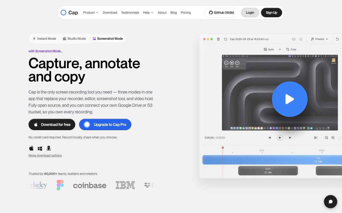
A bright, near-monochrome screen-recording product site built on an off-white canvas with floating pill navigation, deeply-rounded soft-shadow cards (28px), and high-contrast black/white CTAs. Brand voltage comes almost entirely from the product UI itself shown large in-frame — the recorder/editor chrome and a single confident blue play-button accent — rather than from decorative color. Type is a clean geometric sans at medium weight (500) running from a 60px hero headline down to 14px UI labels.
---
version: alpha
name: Cap-design-analysis
description: "A bright, near-monochrome screen-recording product site built on an off-white canvas with floating pill navigation, deeply-rounded soft-shadow cards (28px), and high-contrast black/white CTAs. Brand voltage comes almost entirely from the product UI itself shown large in-frame — the recorder/editor chrome and a single confident blue play-button accent — rather than from decorative color. Type is a clean geometric sans at medium weight (500) running from a 60px hero headline down to 14px UI labels."

colors:
  ink: "#000000"
  ink-soft: "#202020"
  neutral-900: "#111827"
  neutral-850: "#1f2022"
  neutral-800: "#292929"
  slate: "#374151"
  slate-soft: "#4b5563"
  muted: "#6b7280"
  muted-soft: "#9ca3af"
  hairline: "#e5e7eb"
  hairline-strong: "#d1d5db"
  on-primary: "#838383"
  white: "#ffffff"
  surface: "#fcfcfc"
  surface-muted: "#f0f0f0"
  accent-blue: "#3b82f6"
  accent-blue-deep: "#2675db"
  dark-navy: "#0d1830"
  dark-green: "#0d1f12"

typography:
  h1:
    fontFamily: "system-ui, -apple-system, 'Segoe UI', Roboto, sans-serif"
    fontSize: 60px
    fontWeight: 500
    lineHeight: 0.933
    letterSpacing: normal
  h2:
    fontFamily: "system-ui, -apple-system, 'Segoe UI', Roboto, sans-serif"
    fontSize: 36px
    fontWeight: 500
    lineHeight: 1.111
    letterSpacing: normal
  h3:
    fontFamily: "system-ui, -apple-system, 'Segoe UI', Roboto, sans-serif"
    fontSize: 18px
    fontWeight: 500
    lineHeight: 1.556
    letterSpacing: normal
  h4:
    fontFamily: "system-ui, -apple-system, 'Segoe UI', Roboto, sans-serif"
    fontSize: 14px
    fontWeight: 500
    lineHeight: 1.429
    letterSpacing: normal
  body:
    fontFamily: "system-ui, -apple-system, 'Segoe UI', Roboto, sans-serif"
    fontSize: 18px
    fontWeight: 400
    lineHeight: 1.556
    letterSpacing: normal
  button:
    fontFamily: "system-ui, -apple-system, 'Segoe UI', Roboto, sans-serif"
    fontSize: 14px
    fontWeight: 500
    lineHeight: 1.429
    letterSpacing: normal

rounded:
  xs: 4px
  sm: 6px
  md: 8px
  lg: 12px
  xl: 16px
  2xl: 20px
  3xl: 24px
  4xl: 28px
  pill: 9999px
  full: 9999px

spacing:
  xxs: 4px
  xxs-plus: 6px
  xs: 8px
  sm: 12px
  md: 16px
  ml: 20px
  lg: 24px
  xl: 32px
  xxl: 48px
  huge: 96px
  section: 180px

components:
  top-nav-pill:
    backgroundColor: "{colors.white}"
    textColor: "{colors.ink}"
    typography: "{typography.button}"
    rounded: "{rounded.pill}"
    padding: 8px 16px
  nav-link:
    backgroundColor: transparent
    textColor: "{colors.slate}"
    typography: "{typography.button}"
  button-primary:
    backgroundColor: "{colors.white}"
    textColor: "{colors.on-primary}"
    typography: "{typography.button}"
    rounded: "{rounded.sm}"
    padding: 0px 8px
  button-cta-dark:
    backgroundColor: "{colors.ink}"
    textColor: "{colors.white}"
    typography: "{typography.button}"
    rounded: "{rounded.pill}"
    padding: 12px 24px
  button-cta-dark-active:
    backgroundColor: "{colors.ink-soft}"
    textColor: "{colors.white}"
    rounded: "{rounded.pill}"
  button-pro-blue:
    backgroundColor: "{colors.accent-blue}"
    textColor: "{colors.white}"
    typography: "{typography.button}"
    rounded: "{rounded.pill}"
    padding: 12px 24px
  button-pro-blue-active:
    backgroundColor: "{colors.accent-blue-deep}"
    textColor: "{colors.white}"
    rounded: "{rounded.pill}"
  button-secondary:
    backgroundColor: "{colors.surface-muted}"
    textColor: "{colors.ink}"
    typography: "{typography.button}"
    rounded: "{rounded.pill}"
    padding: 12px 24px
  mode-toggle-group:
    backgroundColor: "{colors.white}"
    textColor: "{colors.slate}"
    typography: "{typography.button}"
    rounded: "{rounded.pill}"
    padding: 4px
  mode-toggle-active:
    backgroundColor: "{colors.white}"
    textColor: "{colors.ink}"
    typography: "{typography.button}"
    rounded: "{rounded.pill}"
    padding: 8px 16px
  card:
    backgroundColor: "{colors.surface}"
    textColor: "{colors.ink}"
    typography: "{typography.h3}"
    rounded: "{rounded.4xl}"
    padding: 32px
  feature-card:
    backgroundColor: "{colors.surface}"
    textColor: "{colors.ink}"
    typography: "{typography.h3}"
    rounded: "{rounded.lg}"
    padding: 24px
  pricing-card:
    backgroundColor: "{colors.surface}"
    textColor: "{colors.ink}"
    typography: "{typography.h2}"
    rounded: "{rounded.4xl}"
    padding: 32px
  testimonial-card:
    backgroundColor: "{colors.white}"
    textColor: "{colors.ink}"
    typography: "{typography.body}"
    rounded: "{rounded.lg}"
    padding: 24px
  product-mockup-frame:
    backgroundColor: "{colors.white}"
    textColor: "{colors.ink}"
    rounded: "{rounded.lg}"
  play-button-circle:
    backgroundColor: "{colors.accent-blue}"
    textColor: "{colors.white}"
    rounded: "{rounded.full}"
    size: 72px
  faq-row:
    backgroundColor: "{colors.surface}"
    textColor: "{colors.ink}"
    typography: "{typography.h3}"
    rounded: "{rounded.lg}"
    padding: 16px 24px
  chat-bubble-fab:
    backgroundColor: "{colors.ink}"
    textColor: "{colors.white}"
    rounded: "{rounded.full}"
    size: 48px
  footer:
    backgroundColor: "{colors.surface}"
    textColor: "{colors.muted}"
    typography: "{typography.h4}"
    padding: 48px
---

## Overview

Cap's marketing surface is a bright, near-monochrome interface built on a very light off-white wash (`{colors.surface-muted}` — #f0f0f0) with high-contrast pure-black ink (`{colors.ink}` — #000000) for headlines and dark CTAs. The system reads as confident developer-tooling SaaS: a floating white pill navigation at the top, generous vertical whitespace between bands, deeply-rounded soft-shadow cards, and almost no decorative color. The single recurring chromatic accent is a saturated blue (`{colors.accent-blue}` — #3b82f6) carried by the play-button and the "Upgrade to Cap Pro" CTA.

The hero pairs a heavy black wordmark-scale headline ("Capture, annotate and copy") at 60px with the actual Cap recorder/editor UI shown large in a white product frame at the right. As with most well-engineered product sites, Cap doesn't illustrate the product — it shows the product chrome directly, large, with a single blue play affordance overlaid.

Type runs at a medium weight throughout: every heading and UI label sits at weight 500, body copy at 400. The hero headline uses a tight `0.933` line-height that packs the two-line statement into a dense, confident block.

Cards are the system's signature container: `{colors.surface}` (#fcfcfc) fills against the slightly darker page wash, with very deep `{rounded.4xl}` (28px) corners and a soft, wide, low-alpha drop shadow that lets cards float rather than sit. Smaller content/feature cards drop to `{rounded.lg}` (12px), the most frequently measured radius in the system.

**Key Characteristics:**
- Off-white canvas (`{colors.surface-muted}` — #f0f0f0) with pure-black ink headlines and dark pill CTAs (`{colors.ink}` — #000000).
- Floating white pill navigation (`{component.top-nav-pill}`, `{rounded.pill}`) rather than a full-width bar — a distinct, modern signature.
- Deeply-rounded soft cards (`{rounded.4xl}` — 28px) on `{colors.surface}` (#fcfcfc) with wide low-alpha shadows. `{rounded.lg}` (12px) for the smaller feature/testimonial grid cards.
- Pill-shaped buttons (`{rounded.pill}`) — black primary CTA, blue Pro CTA, light-gray secondary.
- A single saturated blue accent (`{colors.accent-blue}` — #3b82f6) reserved for the play-button circle and the Pro upgrade path.
- Segmented mode-toggle (`Instant Mode` / `Studio Mode` / `Screenshot Mode`) as a pill-group selector — a signature interactive control.
- Medium weight (500) everywhere for headings and UI; the brand never goes heavier.
- Real product UI shown large in white frames as the hero/feature visual.

## Colors

### Brand & Accent
- **Ink** (`{colors.ink}` — #000000): The dominant brand value. Hero headline, dark CTAs, logo wordmark, chat FAB. Cap is monochrome-first — black is the brand.
- **Accent Blue** (`{colors.accent-blue}` — #3b82f6): The one recurring chromatic accent. Play-button circle and the "Upgrade to Cap Pro" CTA. Pressed/deeper variant `{colors.accent-blue-deep}` (#2675db).

### Surface
- **Surface** (`{colors.surface}` — #fcfcfc): The card floor — used for all floating cards, pricing cards, FAQ rows, and the footer.
- **Surface Muted** (`{colors.surface-muted}` — #f0f0f0): The page wash behind the cards. Slightly darker than the cards so they read as floating. Also used as the secondary-button background.
- **White** (`{colors.white}` — #ffffff): The floating nav pill, product-mockup frames, testimonial cards, and the on-dark text color sitting on ink CTAs.

### Text
- **Ink** (`{colors.ink}` — #000000): All headlines and primary text.
- **Ink Soft** (`{colors.ink-soft}` — #202020): Near-black UI text; pressed state for the dark CTA.
- **Slate** (`{colors.slate}` — #374151): Nav links and running heading-adjacent text.
- **Slate Soft** (`{colors.slate-soft}` — #4b5563): Secondary text.
- **Muted** (`{colors.muted}` — #6b7280): Footer links, supporting copy.
- **Muted Soft** (`{colors.muted-soft}` — #9ca3af): Tertiary text, fine-print, disabled labels.
- **On Primary** (`{colors.on-primary}` — #838383): The measured text color sitting inside the white measured button (`{component.button-primary}`).

### Neutrals & Hairlines
- **Neutral 900 / 850 / 800** (`{colors.neutral-900}` — #111827, `{colors.neutral-850}` — #1f2022, `{colors.neutral-800}` — #292929): Dark neutrals observed in the product-UI chrome shown inside hero/feature frames (editor toolbars, dark panels).
- **Hairline** (`{colors.hairline}` — #e5e7eb): The 1px divider tone on light surfaces.
- **Hairline Strong** (`{colors.hairline-strong}` — #d1d5db): Slightly stronger border / input outline tone.

### Observed-in-product (not UI chrome)
- **Dark Navy** (`{colors.dark-navy}` — #0d1830) and **Dark Green** (`{colors.dark-green}` — #0d1f12): Deep tones measured inside embedded product imagery / background gradients. Documented for completeness; not load-bearing on the marketing chrome.

## Typography

### Font Family
The analyzer reported the type family as `defaultFont` — the exact typeface name was not resolved from the capture, so the documented stack is a neutral geometric-sans fallback (`system-ui, -apple-system, "Segoe UI", Roboto, sans-serif`). The visual character in the screenshots is a clean geometric sans with a tight hero line-height. No licensed/custom typefaces were flagged (`fonts_licensed: []`), so no substitution is required — but the true display face should be confirmed (see Known Gaps).

The defining trait is weight discipline: **every heading and UI label is weight 500**, body copy is weight 400. The system never goes to 600/700.

### Hierarchy

| Token | Size | Weight | Line Height | Letter Spacing | Use |
|---|---|---|---|---|---|
| `{typography.h1}` | 60px | 500 | 0.933 | normal | Hero headline ("Capture, annotate and copy") — tight two-line block |
| `{typography.h2}` | 36px | 500 | 1.111 | normal | Section heads ("Built For How You Actually Work", "Simple, Honest Pricing") |
| `{typography.h3}` | 18px | 500 | 1.556 | normal | Card titles, feature headings |
| `{typography.h4}` | 14px | 500 | 1.429 | normal | Small labels, footer column heads, eyebrow tags |
| `{typography.body}` | 18px | 400 | 1.556 | normal | Default running copy, hero sub-headline |
| `{typography.button}` | 14px | 500 | 1.429 | normal | Button + nav-link labels |

### Principles
The hero headline (60px / weight 500 / 0.933 line-height) is the loudest moment in the system — the tight sub-1.0 line-height stacks the two lines into a single dense block. Notice body copy (18px) is the same size as h3 (18px) — the distinction is weight (400 vs 500), not size. Keep that contrast: do not bump body weight, do not shrink h3.

Section heads stay at h2 36px; never inflate them toward the hero size. Emphasis in this system comes from black-on-off-white contrast and size, never from extra weight.

## Layout

### Spacing System
- **Base unit:** ~4px (4px and 8px dominate the measured distribution; 8px is the single most frequent step).
- **Tokens:** `{spacing.xxs}` 4px · `{spacing.xxs-plus}` 6px · `{spacing.xs}` 8px · `{spacing.sm}` 12px · `{spacing.md}` 16px · `{spacing.ml}` 20px · `{spacing.lg}` 24px · `{spacing.xl}` 32px · `{spacing.xxl}` 48px · `{spacing.huge}` 96px · `{spacing.section}` 180px.
- **Section rhythm:** `{spacing.section}` (180px) appears repeatedly between major editorial bands — Cap uses very generous vertical air between sections (visible as large empty gaps in the full-page screenshot).
- **Card internal padding:** `{spacing.xl}` (32px) for large cards; `{spacing.lg}` (24px) for feature/testimonial cards.

### Grid & Container
- **Hero:** Two-column split — headline + sub-copy + CTA stack at left, large product-mockup frame at right.
- **Feature grid:** 3-up at desktop ("Built For How You Actually Work" — six cards in a 3-column grid).
- **Pricing:** 2-up (Desktop License / Cap Pro).
- **Testimonials:** 3-up card row.
- **Footer:** Multi-column link list (Product / Additional Links / Cap / Use Cases / Socials / Tools).

### Whitespace Philosophy
Cap leans into space aggressively — the measured 180px section spacing and the large vertical voids in the full-page capture show a layout that breathes far more than typical SaaS. Each band carries a single centered h2 + supporting sub-line, then a card grid. The result reads calm and confident.

## Elevation & Depth

| Level | Treatment | Use |
|---|---|---|
| Flat | No shadow | Page wash, body sections |
| Soft float (cards) | `rgba(0,0,0,0.05) 0px 20px 25px -5px, rgba(0,0,0,0.05) 0px 8px 10px -6px` | Primary cards on `{colors.surface}` — wide, low-alpha, lets the card hover above the wash |
| Medium float | `rgba(0,0,0,0.1) 0px 10px 15px -3px, rgba(0,0,0,0.1) 0px 4px 6px -4px` | Smaller raised elements, buttons, mockup tiles |
| Hairline lift | `rgba(0,0,0,0.05) 0px 1px 2px 0px` | Subtle resting surfaces |
| Dramatic product lift | `rgba(0,0,0,0.4) 0px 60px 40px 3px` | The large hero product-mockup frame — a deep, far-cast shadow that floats the recorder UI off the page |
| Inset highlight | `rgba(255,255,255,0.2) 0px 1.5px 0px 0px inset` (also at 0.4 alpha) | Top inner highlight on pill buttons for a subtle glossy edge |
| Focus ring | `rgb(252,252,252) 0px 0px 0px 3px, rgb(0,144,255) 0px 0px 0px 5.5px` | Keyboard focus — white gap then a blue ring |

The elevation philosophy is **soft and modern**: wide low-alpha shadows for floating cards, one dramatic deep shadow reserved for the marquee product mockup, and a subtle white inset highlight on pill buttons. No borders do the lifting — shadow does.

### Decorative Depth
- The hero product frame carries the deepest shadow in the system (`0px 60px 40px` at 0.4 alpha) — it is the single most elevated object and visually anchors the page.
- Pill buttons carry a 1.5px inset white top-highlight, giving the black/blue CTAs a slight tactile sheen.

## Shapes

### Border Radius Scale

| Token | Value | Use |
|---|---|---|
| `{rounded.xs}` | 4px | Tiny inline chips |
| `{rounded.sm}` | 6px | Measured button radius (`{component.button-primary}`), small controls |
| `{rounded.md}` | 8px | Occasional small surfaces |
| `{rounded.lg}` | 12px | The most common radius — feature cards, testimonial cards, FAQ rows, product frames |
| `{rounded.xl}` | 16px | Medium containers |
| `{rounded.2xl}` | 20px | Larger panels |
| `{rounded.3xl}` | 24px | Large panels |
| `{rounded.4xl}` | 28px | Signature large floating cards + pricing cards |
| `{rounded.pill}` | 9999px | Nav pill, all CTA buttons, mode-toggle group |
| `{rounded.full}` | 9999px | Play-button circle, chat FAB, avatars |

Two radii dominate the measured distribution equally: `{rounded.lg}` (12px) and `{rounded.pill}` (9999px) — the system is split between soft-rounded rectangles for content and full pills for actions/navigation, with the very deep `{rounded.4xl}` (28px) reserved for the marquee floating cards.

### Photography Geometry
Product UI is shown inside white frames at `{rounded.lg}` (12px). The play-button overlay is a perfect `{rounded.full}` circle. Logo/partner marks ("coinbase", "IBM", etc.) sit unframed in a trust row.

## Components

### Navigation

**`top-nav-pill`** — The floating white pill nav bar centered at the top of the page. Background `{colors.white}`, fully `{rounded.pill}`, holding the Cap logo + wordmark at left, the horizontal menu (Product, Download, Testimonials, Help, About, Blog, Pricing), and a right cluster: a "GitHub (19.6k)" chip, a `{component.button-secondary}` "Login", and a `{component.button-cta-dark}` "Sign Up". This floating pill — rather than a full-width edge-to-edge bar — is a signature of the system.

**`nav-link`** — Inline menu items in `{typography.button}` (14px / 500), `{colors.slate}`, transparent background.

### Buttons

**`button-cta-dark`** — The primary CTA. Background `{colors.ink}` (#000000), text `{colors.white}`, `{typography.button}`, fully `{rounded.pill}`. Used for "Sign Up" and "Download for free". Padding 12px × 24px is derived from screenshot proportions (the analyzer's button capture returned a tightly-padded variant). Pressed state `button-cta-dark-active` shifts to `{colors.ink-soft}` (#202020).

**`button-pro-blue`** — The Pro upgrade CTA. Background `{colors.accent-blue}` (#3b82f6), text `{colors.white}`, `{rounded.pill}`. Used for "Upgrade to Cap Pro" with a small circular toggle glyph at left. Pressed state `button-pro-blue-active` shifts to `{colors.accent-blue-deep}` (#2675db). Padding 12px × 24px derived.

**`button-secondary`** — Light-gray pill. Background `{colors.surface-muted}` (#f0f0f0), text `{colors.ink}`, `{rounded.pill}`. Used for "Login".

**`button-primary`** *(measured)* — The analyzer's measured button: background `{colors.white}`, text `{colors.on-primary}` (#838383), `{rounded.sm}` (6px), padding 0px × 8px. This captures a low-contrast inline control rather than the marquee CTAs above; documented exactly as measured.

### Mode Toggle

**`mode-toggle-group`** — A pill-group segmented control in the hero ("Instant Mode" / "Studio Mode" / "Screenshot Mode"), each segment carrying a small icon. Background `{colors.white}`, `{rounded.pill}`, internal padding 4px. Inactive segments render in `{colors.slate}`.

**`mode-toggle-active`** — The selected segment: a white `{rounded.pill}` chip with `{colors.ink}` text and a subtle float shadow inside the group. The signature interactive control that switches the hero's product visual + headline.

### Cards & Containers

**`card`** *(measured)* — The signature floating card. Background `{colors.surface}` (#fcfcfc), `{rounded.4xl}` (28px), soft wide drop shadow (`rgba(0,0,0,0.05) 0px 20px 25px -5px`). Used for the large "Studio Mode" / "Screenshot Mode" showcase cards (text block left, product visual right).

**`feature-card`** — The 3-up grid cards under "Built For How You Actually Work" ("Your Storage, Your Rules", "Privacy by Default", etc.). Background `{colors.surface}`, `{rounded.lg}` (12px), padding `{spacing.lg}` (24px). Title in `{typography.h3}`, body in `{typography.body}`, with a product-image zone above.

**`pricing-card`** — The two pricing tiers ("Desktop License" / "Cap Pro"). Background `{colors.surface}`, `{rounded.4xl}` (28px), padding `{spacing.xl}` (32px). Plan name in `{typography.h3}`, price in `{typography.h2}`.

**`testimonial-card`** — Cards in the "Loved By Builders, Trusted By Teams" row. Background `{colors.white}`, `{rounded.lg}` (12px), padding `{spacing.lg}` (24px), quote in `{typography.body}`.

**`product-mockup-frame`** — A white frame holding the actual Cap recorder/editor UI shown large (hero right column, feature-card visuals). Background `{colors.white}`, `{rounded.lg}` (12px), carrying the deep `0px 60px 40px` shadow in the hero. The product chrome inside (dark editor toolbars, timeline, zoom track) renders in the dark neutral tones (`{colors.neutral-900}`, `{colors.neutral-850}`).

**`play-button-circle`** — A 72px (derived) `{rounded.full}` blue circle (`{colors.accent-blue}`) with a white play triangle, overlaid on the hero product video frame. The single most chromatic moment in the system.

### FAQ & Misc

**`faq-row`** — Collapsible rows under "Questions? We've Got Answers." Background `{colors.surface}`, `{rounded.lg}` (12px), padding 16px × 24px, question in `{typography.h3}`, a "+" affordance at right.

**`chat-bubble-fab`** — A fixed circular support button at the bottom-right. Background `{colors.ink}`, white icon, `{rounded.full}`, 48px (derived).

### Footer

**`footer`** — A light footer closing the page. Background `{colors.surface}` (#fcfcfc), text `{colors.muted}`, multi-column link list (Product / Additional Links / Cap / Use Cases / Socials / Tools) with column heads in `{typography.h4}`. The Cap logo + tagline sit centered below the columns. Unlike many systems, Cap keeps the footer light — the whole page stays bright.

## Do's and Don'ts

### Do
- Keep the brand monochrome: `{colors.ink}` (#000000) on `{colors.surface-muted}` (#f0f0f0) does almost all the work. Reserve `{colors.accent-blue}` for the play-button and the Pro upgrade path.
- Float content in `{colors.surface}` (#fcfcfc) cards above the slightly darker `{colors.surface-muted}` wash — the contrast between the two near-whites IS the depth.
- Use `{rounded.4xl}` (28px) only for the large marquee/pricing cards; drop to `{rounded.lg}` (12px) for grid cards.
- Keep every heading and UI label at weight 500. Emphasis comes from size and black contrast, not from heavier weight.
- Use the floating `{component.top-nav-pill}` rather than a full-width bar — it's a signature of the system.
- Show the real product UI large inside white frames; let the recorder/editor chrome be the visual hero.
- Make CTAs full pills (`{rounded.pill}`) — black for primary, blue for Pro, light-gray for secondary.

### Don't
- Don't introduce additional accent colors. Cap is black/white plus one blue.
- Don't bold headings past weight 500.
- Don't sit cards directly on the same value as the page — keep `{colors.surface}` cards above the `{colors.surface-muted}` wash.
- Don't tighten the generous section spacing (`{spacing.section}` 180px) into a dense layout — the air is part of the voice.
- Don't put the dark editor neutrals (`{colors.neutral-900}`, `{colors.neutral-850}`) on the marketing chrome; they belong to the product UI shown inside frames.
- Don't add hover-state styling beyond the documented pressed states — dark CTA darkens to `{colors.ink-soft}`, blue CTA to `{colors.accent-blue-deep}`.

## Responsive Behavior

### Breakpoints

| Name | Width | Key Changes |
|---|---|---|
| Mobile | < 768px | Pill nav collapses to a compact bar / menu; hero h1 60→~36px; product-mockup frame stacks below copy; feature grid 3→1-up; pricing 2→1-up |
| Tablet | 768–1024px | Nav tightens; feature grid 3→2-up; pricing stays 2-up |
| Desktop | 1024–1440px | Full floating pill nav; hero two-column split; 3-up feature grid; 2-up pricing |
| Wide | > 1440px | Same as desktop with more outer air; content stays centered |

### Touch Targets
- `{component.button-cta-dark}` / `{component.button-pro-blue}` pills meet 44px+ with the documented 12px vertical padding around 14px label.
- `{component.chat-bubble-fab}` at ~48px exceeds the 44px minimum.
- `{component.mode-toggle-active}` segments use 8px × 16px padding; effective tap area is comfortable within the pill group.

### Collapsing Strategy
- The floating nav pill collapses to a hamburger / compact pill at mobile.
- Hero two-column split stacks: headline + sub-copy + CTAs first, product frame below.
- Feature and testimonial grids reduce columns (3 → 2 → 1) rather than shrinking cards.
- Pricing collapses 2 → 1; cards keep `{rounded.4xl}`.

### Image Behavior
- Product-mockup frames retain aspect ratio and scale down; the embedded recorder UI stays legible.
- The hero's deep product-frame shadow scales proportionally.

## Iteration Guide

1. Focus on ONE component at a time; reference its YAML key directly (`{component.card}`, `{component.button-pro-blue}`).
2. Variants (`-active`) live as separate entries in `components:`.
3. Use `{token.refs}` everywhere — never inline hex.
4. Never document hover. Default + Active/Pressed only.
5. Headings stay weight 500; body stays 400. The size ladder, not weight, carries hierarchy.
6. Blue is scarce — confine it to the play-button and Pro path.
7. When in doubt about emphasis: bigger before bolder; more air before more color.

## Known Gaps

- **Typeface unresolved:** the analyzer reported the family as `defaultFont`; the true display/UI typeface was not captured. The documented `system-ui` stack is a faithful fallback only — the real geometric sans should be confirmed and substituted in before production. No fonts were flagged as licensed.
- **Canvas vs card values:** the page-background wash is documented as `{colors.surface-muted}` (#f0f0f0, measured by frequency) and cards as `{colors.surface}` (#fcfcfc, measured on card background). The precise root `<body>` background was not directly captured as a token.
- **`button-primary` mismatch:** the analyzer's measured button (white bg / #838383 text / 6px radius / 0px 8px padding) does not match the prominent black and blue pill CTAs visible in screenshots. The dark/blue CTA values (`{component.button-cta-dark}`, `{component.button-pro-blue}`) and their padding are derived from screenshot ground-truth, not from the button measurement.
- **CTA / FAB / play-button dimensions** (padding, 48px FAB, 72px play circle) are derived from screenshot proportions, not measured.
- **Dark neutrals** (`{colors.neutral-900}`, `{colors.neutral-850}`, `{colors.dark-navy}`, `{colors.dark-green}`) are measured but largely belong to product-UI chrome shown inside frames; their exact role on marketing surfaces is uncertain.
- **Letter-spacing** was reported as `normal` for every role; no tracking values were measured.
- Animation/transition timings (mode-toggle switch, video playback, FAQ expand) are out of scope.
- Form/input and validation states were not present in the captured pages.

<!-- Documented by duply · real-world design systems as ready-to-use DESIGN.md for AI coding agents · https://duply.ai/cap/design-md -->
Color Palette
Accent
Neutrals
Typography
h160px · 500 · 0.933
The quick brown fox jumpsh236px · 500 · 1.111
The quick brown fox jumpsh318px · 500 · 1.556
The quick brown fox jumpsh414px · 500 · 1.429
The quick brown fox jumpsbody18px · 400 · 1.556
The quick brown fox jumpsbutton14px · 500 · 1.429
The quick brown fox jumpsSpacing & Shape
Spacing
| Name | Value | Preview |
|---|---|---|
| xxs | 4px | |
| xxs-plus | 6px | |
| xs | 8px | |
| sm | 12px | |
| md | 16px | |
| ml | 20px | |
| lg | 24px | |
| xl | 32px | |
| xxl | 48px | |
| huge | 96px | |
| section | 180px |
Border Radius
| Name | Value | Preview |
|---|---|---|
| xs | 4px | |
| sm | 6px | |
| md | 8px | |
| lg | 12px | |
| xl | 16px | |
| 2xl | 20px | |
| 3xl | 24px | |
| 4xl | 28px | |
| pill | 9999px | |
| full | 9999px |
More like this


---
version: alpha
name: Cap-design-analysis
description: "A bright, near-monochrome screen-recording product site built on an off-white canvas with floating pill navigation, deeply-rounded soft-shadow cards (28px), and high-contrast black/white CTAs. Brand voltage comes almost entirely from the product UI itself shown large in-frame — the recorder/editor chrome and a single confident blue play-button accent — rather than from decorative color. Type is a clean geometric sans at medium weight (500) running from a 60px hero headline down to 14px UI labels."

colors:
  ink: "#000000"
  ink-soft: "#202020"
  neutral-900: "#111827"
  neutral-850: "#1f2022"
  neutral-800: "#292929"
  slate: "#374151"
  slate-soft: "#4b5563"
  muted: "#6b7280"
  muted-soft: "#9ca3af"
  hairline: "#e5e7eb"
  hairline-strong: "#d1d5db"
  on-primary: "#838383"
  white: "#ffffff"
  surface: "#fcfcfc"
  surface-muted: "#f0f0f0"
  accent-blue: "#3b82f6"
  accent-blue-deep: "#2675db"
  dark-navy: "#0d1830"
  dark-green: "#0d1f12"

typography:
  h1:
    fontFamily: "system-ui, -apple-system, 'Segoe UI', Roboto, sans-serif"
    fontSize: 60px
    fontWeight: 500
    lineHeight: 0.933
    letterSpacing: normal
  h2:
    fontFamily: "system-ui, -apple-system, 'Segoe UI', Roboto, sans-serif"
    fontSize: 36px
    fontWeight: 500
    lineHeight: 1.111
    letterSpacing: normal
  h3:
    fontFamily: "system-ui, -apple-system, 'Segoe UI', Roboto, sans-serif"
    fontSize: 18px
    fontWeight: 500
    lineHeight: 1.556
    letterSpacing: normal
  h4:
    fontFamily: "system-ui, -apple-system, 'Segoe UI', Roboto, sans-serif"
    fontSize: 14px
    fontWeight: 500
    lineHeight: 1.429
    letterSpacing: normal
  body:
    fontFamily: "system-ui, -apple-system, 'Segoe UI', Roboto, sans-serif"
    fontSize: 18px
    fontWeight: 400
    lineHeight: 1.556
    letterSpacing: normal
  button:
    fontFamily: "system-ui, -apple-system, 'Segoe UI', Roboto, sans-serif"
    fontSize: 14px
    fontWeight: 500
    lineHeight: 1.429
    letterSpacing: normal

rounded:
  xs: 4px
  sm: 6px
  md: 8px
  lg: 12px
  xl: 16px
  2xl: 20px
  3xl: 24px
  4xl: 28px
  pill: 9999px
  full: 9999px

spacing:
  xxs: 4px
  xxs-plus: 6px
  xs: 8px
  sm: 12px
  md: 16px
  ml: 20px
  lg: 24px
  xl: 32px
  xxl: 48px
  huge: 96px
  section: 180px

components:
  top-nav-pill:
    backgroundColor: "{colors.white}"
    textColor: "{colors.ink}"
    typography: "{typography.button}"
    rounded: "{rounded.pill}"
    padding: 8px 16px
  nav-link:
    backgroundColor: transparent
    textColor: "{colors.slate}"
    typography: "{typography.button}"
  button-primary:
    backgroundColor: "{colors.white}"
    textColor: "{colors.on-primary}"
    typography: "{typography.button}"
    rounded: "{rounded.sm}"
    padding: 0px 8px
  button-cta-dark:
    backgroundColor: "{colors.ink}"
    textColor: "{colors.white}"
    typography: "{typography.button}"
    rounded: "{rounded.pill}"
    padding: 12px 24px
  button-cta-dark-active:
    backgroundColor: "{colors.ink-soft}"
    textColor: "{colors.white}"
    rounded: "{rounded.pill}"
  button-pro-blue:
    backgroundColor: "{colors.accent-blue}"
    textColor: "{colors.white}"
    typography: "{typography.button}"
    rounded: "{rounded.pill}"
    padding: 12px 24px
  button-pro-blue-active:
    backgroundColor: "{colors.accent-blue-deep}"
    textColor: "{colors.white}"
    rounded: "{rounded.pill}"
  button-secondary:
    backgroundColor: "{colors.surface-muted}"
    textColor: "{colors.ink}"
    typography: "{typography.button}"
    rounded: "{rounded.pill}"
    padding: 12px 24px
  mode-toggle-group:
    backgroundColor: "{colors.white}"
    textColor: "{colors.slate}"
    typography: "{typography.button}"
    rounded: "{rounded.pill}"
    padding: 4px
  mode-toggle-active:
    backgroundColor: "{colors.white}"
    textColor: "{colors.ink}"
    typography: "{typography.button}"
    rounded: "{rounded.pill}"
    padding: 8px 16px
  card:
    backgroundColor: "{colors.surface}"
    textColor: "{colors.ink}"
    typography: "{typography.h3}"
    rounded: "{rounded.4xl}"
    padding: 32px
  feature-card:
    backgroundColor: "{colors.surface}"
    textColor: "{colors.ink}"
    typography: "{typography.h3}"
    rounded: "{rounded.lg}"
    padding: 24px
  pricing-card:
    backgroundColor: "{colors.surface}"
    textColor: "{colors.ink}"
    typography: "{typography.h2}"
    rounded: "{rounded.4xl}"
    padding: 32px
  testimonial-card:
    backgroundColor: "{colors.white}"
    textColor: "{colors.ink}"
    typography: "{typography.body}"
    rounded: "{rounded.lg}"
    padding: 24px
  product-mockup-frame:
    backgroundColor: "{colors.white}"
    textColor: "{colors.ink}"
    rounded: "{rounded.lg}"
  play-button-circle:
    backgroundColor: "{colors.accent-blue}"
    textColor: "{colors.white}"
    rounded: "{rounded.full}"
    size: 72px
  faq-row:
    backgroundColor: "{colors.surface}"
    textColor: "{colors.ink}"
    typography: "{typography.h3}"
    rounded: "{rounded.lg}"
    padding: 16px 24px
  chat-bubble-fab:
    backgroundColor: "{colors.ink}"
    textColor: "{colors.white}"
    rounded: "{rounded.full}"
    size: 48px
  footer:
    backgroundColor: "{colors.surface}"
    textColor: "{colors.muted}"
    typography: "{typography.h4}"
    padding: 48px
---

## Overview

Cap's marketing surface is a bright, near-monochrome interface built on a very light off-white wash (`{colors.surface-muted}` — #f0f0f0) with high-contrast pure-black ink (`{colors.ink}` — #000000) for headlines and dark CTAs. The system reads as confident developer-tooling SaaS: a floating white pill navigation at the top, generous vertical whitespace between bands, deeply-rounded soft-shadow cards, and almost no decorative color. The single recurring chromatic accent is a saturated blue (`{colors.accent-blue}` — #3b82f6) carried by the play-button and the "Upgrade to Cap Pro" CTA.

The hero pairs a heavy black wordmark-scale headline ("Capture, annotate and copy") at 60px with the actual Cap recorder/editor UI shown large in a white product frame at the right. As with most well-engineered product sites, Cap doesn't illustrate the product — it shows the product chrome directly, large, with a single blue play affordance overlaid.

Type runs at a medium weight throughout: every heading and UI label sits at weight 500, body copy at 400. The hero headline uses a tight `0.933` line-height that packs the two-line statement into a dense, confident block.

Cards are the system's signature container: `{colors.surface}` (#fcfcfc) fills against the slightly darker page wash, with very deep `{rounded.4xl}` (28px) corners and a soft, wide, low-alpha drop shadow that lets cards float rather than sit. Smaller content/feature cards drop to `{rounded.lg}` (12px), the most frequently measured radius in the system.

**Key Characteristics:**
- Off-white canvas (`{colors.surface-muted}` — #f0f0f0) with pure-black ink headlines and dark pill CTAs (`{colors.ink}` — #000000).
- Floating white pill navigation (`{component.top-nav-pill}`, `{rounded.pill}`) rather than a full-width bar — a distinct, modern signature.
- Deeply-rounded soft cards (`{rounded.4xl}` — 28px) on `{colors.surface}` (#fcfcfc) with wide low-alpha shadows. `{rounded.lg}` (12px) for the smaller feature/testimonial grid cards.
- Pill-shaped buttons (`{rounded.pill}`) — black primary CTA, blue Pro CTA, light-gray secondary.
- A single saturated blue accent (`{colors.accent-blue}` — #3b82f6) reserved for the play-button circle and the Pro upgrade path.
- Segmented mode-toggle (`Instant Mode` / `Studio Mode` / `Screenshot Mode`) as a pill-group selector — a signature interactive control.
- Medium weight (500) everywhere for headings and UI; the brand never goes heavier.
- Real product UI shown large in white frames as the hero/feature visual.

## Colors

### Brand & Accent
- **Ink** (`{colors.ink}` — #000000): The dominant brand value. Hero headline, dark CTAs, logo wordmark, chat FAB. Cap is monochrome-first — black is the brand.
- **Accent Blue** (`{colors.accent-blue}` — #3b82f6): The one recurring chromatic accent. Play-button circle and the "Upgrade to Cap Pro" CTA. Pressed/deeper variant `{colors.accent-blue-deep}` (#2675db).

### Surface
- **Surface** (`{colors.surface}` — #fcfcfc): The card floor — used for all floating cards, pricing cards, FAQ rows, and the footer.
- **Surface Muted** (`{colors.surface-muted}` — #f0f0f0): The page wash behind the cards. Slightly darker than the cards so they read as floating. Also used as the secondary-button background.
- **White** (`{colors.white}` — #ffffff): The floating nav pill, product-mockup frames, testimonial cards, and the on-dark text color sitting on ink CTAs.

### Text
- **Ink** (`{colors.ink}` — #000000): All headlines and primary text.
- **Ink Soft** (`{colors.ink-soft}` — #202020): Near-black UI text; pressed state for the dark CTA.
- **Slate** (`{colors.slate}` — #374151): Nav links and running heading-adjacent text.
- **Slate Soft** (`{colors.slate-soft}` — #4b5563): Secondary text.
- **Muted** (`{colors.muted}` — #6b7280): Footer links, supporting copy.
- **Muted Soft** (`{colors.muted-soft}` — #9ca3af): Tertiary text, fine-print, disabled labels.
- **On Primary** (`{colors.on-primary}` — #838383): The measured text color sitting inside the white measured button (`{component.button-primary}`).

### Neutrals & Hairlines
- **Neutral 900 / 850 / 800** (`{colors.neutral-900}` — #111827, `{colors.neutral-850}` — #1f2022, `{colors.neutral-800}` — #292929): Dark neutrals observed in the product-UI chrome shown inside hero/feature frames (editor toolbars, dark panels).
- **Hairline** (`{colors.hairline}` — #e5e7eb): The 1px divider tone on light surfaces.
- **Hairline Strong** (`{colors.hairline-strong}` — #d1d5db): Slightly stronger border / input outline tone.

### Observed-in-product (not UI chrome)
- **Dark Navy** (`{colors.dark-navy}` — #0d1830) and **Dark Green** (`{colors.dark-green}` — #0d1f12): Deep tones measured inside embedded product imagery / background gradients. Documented for completeness; not load-bearing on the marketing chrome.

## Typography

### Font Family
The analyzer reported the type family as `defaultFont` — the exact typeface name was not resolved from the capture, so the documented stack is a neutral geometric-sans fallback (`system-ui, -apple-system, "Segoe UI", Roboto, sans-serif`). The visual character in the screenshots is a clean geometric sans with a tight hero line-height. No licensed/custom typefaces were flagged (`fonts_licensed: []`), so no substitution is required — but the true display face should be confirmed (see Known Gaps).

The defining trait is weight discipline: **every heading and UI label is weight 500**, body copy is weight 400. The system never goes to 600/700.

### Hierarchy

| Token | Size | Weight | Line Height | Letter Spacing | Use |
|---|---|---|---|---|---|
| `{typography.h1}` | 60px | 500 | 0.933 | normal | Hero headline ("Capture, annotate and copy") — tight two-line block |
| `{typography.h2}` | 36px | 500 | 1.111 | normal | Section heads ("Built For How You Actually Work", "Simple, Honest Pricing") |
| `{typography.h3}` | 18px | 500 | 1.556 | normal | Card titles, feature headings |
| `{typography.h4}` | 14px | 500 | 1.429 | normal | Small labels, footer column heads, eyebrow tags |
| `{typography.body}` | 18px | 400 | 1.556 | normal | Default running copy, hero sub-headline |
| `{typography.button}` | 14px | 500 | 1.429 | normal | Button + nav-link labels |

### Principles
The hero headline (60px / weight 500 / 0.933 line-height) is the loudest moment in the system — the tight sub-1.0 line-height stacks the two lines into a single dense block. Notice body copy (18px) is the same size as h3 (18px) — the distinction is weight (400 vs 500), not size. Keep that contrast: do not bump body weight, do not shrink h3.

Section heads stay at h2 36px; never inflate them toward the hero size. Emphasis in this system comes from black-on-off-white contrast and size, never from extra weight.

## Layout

### Spacing System
- **Base unit:** ~4px (4px and 8px dominate the measured distribution; 8px is the single most frequent step).
- **Tokens:** `{spacing.xxs}` 4px · `{spacing.xxs-plus}` 6px · `{spacing.xs}` 8px · `{spacing.sm}` 12px · `{spacing.md}` 16px · `{spacing.ml}` 20px · `{spacing.lg}` 24px · `{spacing.xl}` 32px · `{spacing.xxl}` 48px · `{spacing.huge}` 96px · `{spacing.section}` 180px.
- **Section rhythm:** `{spacing.section}` (180px) appears repeatedly between major editorial bands — Cap uses very generous vertical air between sections (visible as large empty gaps in the full-page screenshot).
- **Card internal padding:** `{spacing.xl}` (32px) for large cards; `{spacing.lg}` (24px) for feature/testimonial cards.

### Grid & Container
- **Hero:** Two-column split — headline + sub-copy + CTA stack at left, large product-mockup frame at right.
- **Feature grid:** 3-up at desktop ("Built For How You Actually Work" — six cards in a 3-column grid).
- **Pricing:** 2-up (Desktop License / Cap Pro).
- **Testimonials:** 3-up card row.
- **Footer:** Multi-column link list (Product / Additional Links / Cap / Use Cases / Socials / Tools).

### Whitespace Philosophy
Cap leans into space aggressively — the measured 180px section spacing and the large vertical voids in the full-page capture show a layout that breathes far more than typical SaaS. Each band carries a single centered h2 + supporting sub-line, then a card grid. The result reads calm and confident.

## Elevation & Depth

| Level | Treatment | Use |
|---|---|---|
| Flat | No shadow | Page wash, body sections |
| Soft float (cards) | `rgba(0,0,0,0.05) 0px 20px 25px -5px, rgba(0,0,0,0.05) 0px 8px 10px -6px` | Primary cards on `{colors.surface}` — wide, low-alpha, lets the card hover above the wash |
| Medium float | `rgba(0,0,0,0.1) 0px 10px 15px -3px, rgba(0,0,0,0.1) 0px 4px 6px -4px` | Smaller raised elements, buttons, mockup tiles |
| Hairline lift | `rgba(0,0,0,0.05) 0px 1px 2px 0px` | Subtle resting surfaces |
| Dramatic product lift | `rgba(0,0,0,0.4) 0px 60px 40px 3px` | The large hero product-mockup frame — a deep, far-cast shadow that floats the recorder UI off the page |
| Inset highlight | `rgba(255,255,255,0.2) 0px 1.5px 0px 0px inset` (also at 0.4 alpha) | Top inner highlight on pill buttons for a subtle glossy edge |
| Focus ring | `rgb(252,252,252) 0px 0px 0px 3px, rgb(0,144,255) 0px 0px 0px 5.5px` | Keyboard focus — white gap then a blue ring |

The elevation philosophy is **soft and modern**: wide low-alpha shadows for floating cards, one dramatic deep shadow reserved for the marquee product mockup, and a subtle white inset highlight on pill buttons. No borders do the lifting — shadow does.

### Decorative Depth
- The hero product frame carries the deepest shadow in the system (`0px 60px 40px` at 0.4 alpha) — it is the single most elevated object and visually anchors the page.
- Pill buttons carry a 1.5px inset white top-highlight, giving the black/blue CTAs a slight tactile sheen.

## Shapes

### Border Radius Scale

| Token | Value | Use |
|---|---|---|
| `{rounded.xs}` | 4px | Tiny inline chips |
| `{rounded.sm}` | 6px | Measured button radius (`{component.button-primary}`), small controls |
| `{rounded.md}` | 8px | Occasional small surfaces |
| `{rounded.lg}` | 12px | The most common radius — feature cards, testimonial cards, FAQ rows, product frames |
| `{rounded.xl}` | 16px | Medium containers |
| `{rounded.2xl}` | 20px | Larger panels |
| `{rounded.3xl}` | 24px | Large panels |
| `{rounded.4xl}` | 28px | Signature large floating cards + pricing cards |
| `{rounded.pill}` | 9999px | Nav pill, all CTA buttons, mode-toggle group |
| `{rounded.full}` | 9999px | Play-button circle, chat FAB, avatars |

Two radii dominate the measured distribution equally: `{rounded.lg}` (12px) and `{rounded.pill}` (9999px) — the system is split between soft-rounded rectangles for content and full pills for actions/navigation, with the very deep `{rounded.4xl}` (28px) reserved for the marquee floating cards.

### Photography Geometry
Product UI is shown inside white frames at `{rounded.lg}` (12px). The play-button overlay is a perfect `{rounded.full}` circle. Logo/partner marks ("coinbase", "IBM", etc.) sit unframed in a trust row.

## Components

### Navigation

**`top-nav-pill`** — The floating white pill nav bar centered at the top of the page. Background `{colors.white}`, fully `{rounded.pill}`, holding the Cap logo + wordmark at left, the horizontal menu (Product, Download, Testimonials, Help, About, Blog, Pricing), and a right cluster: a "GitHub (19.6k)" chip, a `{component.button-secondary}` "Login", and a `{component.button-cta-dark}` "Sign Up". This floating pill — rather than a full-width edge-to-edge bar — is a signature of the system.

**`nav-link`** — Inline menu items in `{typography.button}` (14px / 500), `{colors.slate}`, transparent background.

### Buttons

**`button-cta-dark`** — The primary CTA. Background `{colors.ink}` (#000000), text `{colors.white}`, `{typography.button}`, fully `{rounded.pill}`. Used for "Sign Up" and "Download for free". Padding 12px × 24px is derived from screenshot proportions (the analyzer's button capture returned a tightly-padded variant). Pressed state `button-cta-dark-active` shifts to `{colors.ink-soft}` (#202020).

**`button-pro-blue`** — The Pro upgrade CTA. Background `{colors.accent-blue}` (#3b82f6), text `{colors.white}`, `{rounded.pill}`. Used for "Upgrade to Cap Pro" with a small circular toggle glyph at left. Pressed state `button-pro-blue-active` shifts to `{colors.accent-blue-deep}` (#2675db). Padding 12px × 24px derived.

**`button-secondary`** — Light-gray pill. Background `{colors.surface-muted}` (#f0f0f0), text `{colors.ink}`, `{rounded.pill}`. Used for "Login".

**`button-primary`** *(measured)* — The analyzer's measured button: background `{colors.white}`, text `{colors.on-primary}` (#838383), `{rounded.sm}` (6px), padding 0px × 8px. This captures a low-contrast inline control rather than the marquee CTAs above; documented exactly as measured.

### Mode Toggle

**`mode-toggle-group`** — A pill-group segmented control in the hero ("Instant Mode" / "Studio Mode" / "Screenshot Mode"), each segment carrying a small icon. Background `{colors.white}`, `{rounded.pill}`, internal padding 4px. Inactive segments render in `{colors.slate}`.

**`mode-toggle-active`** — The selected segment: a white `{rounded.pill}` chip with `{colors.ink}` text and a subtle float shadow inside the group. The signature interactive control that switches the hero's product visual + headline.

### Cards & Containers

**`card`** *(measured)* — The signature floating card. Background `{colors.surface}` (#fcfcfc), `{rounded.4xl}` (28px), soft wide drop shadow (`rgba(0,0,0,0.05) 0px 20px 25px -5px`). Used for the large "Studio Mode" / "Screenshot Mode" showcase cards (text block left, product visual right).

**`feature-card`** — The 3-up grid cards under "Built For How You Actually Work" ("Your Storage, Your Rules", "Privacy by Default", etc.). Background `{colors.surface}`, `{rounded.lg}` (12px), padding `{spacing.lg}` (24px). Title in `{typography.h3}`, body in `{typography.body}`, with a product-image zone above.

**`pricing-card`** — The two pricing tiers ("Desktop License" / "Cap Pro"). Background `{colors.surface}`, `{rounded.4xl}` (28px), padding `{spacing.xl}` (32px). Plan name in `{typography.h3}`, price in `{typography.h2}`.

**`testimonial-card`** — Cards in the "Loved By Builders, Trusted By Teams" row. Background `{colors.white}`, `{rounded.lg}` (12px), padding `{spacing.lg}` (24px), quote in `{typography.body}`.

**`product-mockup-frame`** — A white frame holding the actual Cap recorder/editor UI shown large (hero right column, feature-card visuals). Background `{colors.white}`, `{rounded.lg}` (12px), carrying the deep `0px 60px 40px` shadow in the hero. The product chrome inside (dark editor toolbars, timeline, zoom track) renders in the dark neutral tones (`{colors.neutral-900}`, `{colors.neutral-850}`).

**`play-button-circle`** — A 72px (derived) `{rounded.full}` blue circle (`{colors.accent-blue}`) with a white play triangle, overlaid on the hero product video frame. The single most chromatic moment in the system.

### FAQ & Misc

**`faq-row`** — Collapsible rows under "Questions? We've Got Answers." Background `{colors.surface}`, `{rounded.lg}` (12px), padding 16px × 24px, question in `{typography.h3}`, a "+" affordance at right.

**`chat-bubble-fab`** — A fixed circular support button at the bottom-right. Background `{colors.ink}`, white icon, `{rounded.full}`, 48px (derived).

### Footer

**`footer`** — A light footer closing the page. Background `{colors.surface}` (#fcfcfc), text `{colors.muted}`, multi-column link list (Product / Additional Links / Cap / Use Cases / Socials / Tools) with column heads in `{typography.h4}`. The Cap logo + tagline sit centered below the columns. Unlike many systems, Cap keeps the footer light — the whole page stays bright.

## Do's and Don'ts

### Do
- Keep the brand monochrome: `{colors.ink}` (#000000) on `{colors.surface-muted}` (#f0f0f0) does almost all the work. Reserve `{colors.accent-blue}` for the play-button and the Pro upgrade path.
- Float content in `{colors.surface}` (#fcfcfc) cards above the slightly darker `{colors.surface-muted}` wash — the contrast between the two near-whites IS the depth.
- Use `{rounded.4xl}` (28px) only for the large marquee/pricing cards; drop to `{rounded.lg}` (12px) for grid cards.
- Keep every heading and UI label at weight 500. Emphasis comes from size and black contrast, not from heavier weight.
- Use the floating `{component.top-nav-pill}` rather than a full-width bar — it's a signature of the system.
- Show the real product UI large inside white frames; let the recorder/editor chrome be the visual hero.
- Make CTAs full pills (`{rounded.pill}`) — black for primary, blue for Pro, light-gray for secondary.

### Don't
- Don't introduce additional accent colors. Cap is black/white plus one blue.
- Don't bold headings past weight 500.
- Don't sit cards directly on the same value as the page — keep `{colors.surface}` cards above the `{colors.surface-muted}` wash.
- Don't tighten the generous section spacing (`{spacing.section}` 180px) into a dense layout — the air is part of the voice.
- Don't put the dark editor neutrals (`{colors.neutral-900}`, `{colors.neutral-850}`) on the marketing chrome; they belong to the product UI shown inside frames.
- Don't add hover-state styling beyond the documented pressed states — dark CTA darkens to `{colors.ink-soft}`, blue CTA to `{colors.accent-blue-deep}`.

## Responsive Behavior

### Breakpoints

| Name | Width | Key Changes |
|---|---|---|
| Mobile | < 768px | Pill nav collapses to a compact bar / menu; hero h1 60→~36px; product-mockup frame stacks below copy; feature grid 3→1-up; pricing 2→1-up |
| Tablet | 768–1024px | Nav tightens; feature grid 3→2-up; pricing stays 2-up |
| Desktop | 1024–1440px | Full floating pill nav; hero two-column split; 3-up feature grid; 2-up pricing |
| Wide | > 1440px | Same as desktop with more outer air; content stays centered |

### Touch Targets
- `{component.button-cta-dark}` / `{component.button-pro-blue}` pills meet 44px+ with the documented 12px vertical padding around 14px label.
- `{component.chat-bubble-fab}` at ~48px exceeds the 44px minimum.
- `{component.mode-toggle-active}` segments use 8px × 16px padding; effective tap area is comfortable within the pill group.

### Collapsing Strategy
- The floating nav pill collapses to a hamburger / compact pill at mobile.
- Hero two-column split stacks: headline + sub-copy + CTAs first, product frame below.
- Feature and testimonial grids reduce columns (3 → 2 → 1) rather than shrinking cards.
- Pricing collapses 2 → 1; cards keep `{rounded.4xl}`.

### Image Behavior
- Product-mockup frames retain aspect ratio and scale down; the embedded recorder UI stays legible.
- The hero's deep product-frame shadow scales proportionally.

## Iteration Guide

1. Focus on ONE component at a time; reference its YAML key directly (`{component.card}`, `{component.button-pro-blue}`).
2. Variants (`-active`) live as separate entries in `components:`.
3. Use `{token.refs}` everywhere — never inline hex.
4. Never document hover. Default + Active/Pressed only.
5. Headings stay weight 500; body stays 400. The size ladder, not weight, carries hierarchy.
6. Blue is scarce — confine it to the play-button and Pro path.
7. When in doubt about emphasis: bigger before bolder; more air before more color.

## Known Gaps

- **Typeface unresolved:** the analyzer reported the family as `defaultFont`; the true display/UI typeface was not captured. The documented `system-ui` stack is a faithful fallback only — the real geometric sans should be confirmed and substituted in before production. No fonts were flagged as licensed.
- **Canvas vs card values:** the page-background wash is documented as `{colors.surface-muted}` (#f0f0f0, measured by frequency) and cards as `{colors.surface}` (#fcfcfc, measured on card background). The precise root `<body>` background was not directly captured as a token.
- **`button-primary` mismatch:** the analyzer's measured button (white bg / #838383 text / 6px radius / 0px 8px padding) does not match the prominent black and blue pill CTAs visible in screenshots. The dark/blue CTA values (`{component.button-cta-dark}`, `{component.button-pro-blue}`) and their padding are derived from screenshot ground-truth, not from the button measurement.
- **CTA / FAB / play-button dimensions** (padding, 48px FAB, 72px play circle) are derived from screenshot proportions, not measured.
- **Dark neutrals** (`{colors.neutral-900}`, `{colors.neutral-850}`, `{colors.dark-navy}`, `{colors.dark-green}`) are measured but largely belong to product-UI chrome shown inside frames; their exact role on marketing surfaces is uncertain.
- **Letter-spacing** was reported as `normal` for every role; no tracking values were measured.
- Animation/transition timings (mode-toggle switch, video playback, FAQ expand) are out of scope.
- Form/input and validation states were not present in the captured pages.

<!-- Documented by duply · real-world design systems as ready-to-use DESIGN.md for AI coding agents · https://duply.ai/cap/design-md -->