Baseten
A high-contrast, engineering-forward AI-infrastructure interface built on a white canvas with pure-black type and sharp-cornered black CTAs. The brand voltage comes from a single electric green (#19e76e) used in the announcement bar, text highlight markers, and isometric product diagrams — paired with an oversized NeueAlteGrotesk grotesk headline set tight and heavy. The system reads as precise, technical, and confident: thin hairline grids, no shadows, square buttons, and product-architecture illustrations rendered in green line-art.
---
version: alpha
name: Baseten-design-analysis
description: "A high-contrast, engineering-forward AI-infrastructure interface built on a white canvas with pure-black type and sharp-cornered black CTAs. The brand voltage comes from a single electric green (#19e76e) used in the announcement bar, text highlight markers, and isometric product diagrams — paired with an oversized NeueAlteGrotesk grotesk headline set tight and heavy. The system reads as precise, technical, and confident: thin hairline grids, no shadows, square buttons, and product-architecture illustrations rendered in green line-art."
colors:
primary: "#000000"
ink: "#000000"
near-black: "#0e0e0e"
ink-deep: "#111827"
body: "#374151"
slate: "#425366"
slate-muted: "#5f758e"
steel: "#8999ac"
muted: "#6b7280"
muted-soft: "#9ca3af"
olive-muted: "#676e64"
neutral-300: "#cccccc"
neutral-400: "#b3b3b3"
hairline: "#e5e7eb"
hairline-strong: "#e6e6e6"
border-soft: "#d1d5db"
canvas: "#ffffff"
surface-mint: "#f5f8f4"
surface-soft: "#f7f8f9"
on-primary: "#ffffff"
brand-green: "#19e76e"
brand-green-deep: "#00b86b"
typography:
display-xl:
fontFamily: "NeueAlteGrotesk, Space Grotesk, Inter, sans-serif"
fontSize: 88px
fontWeight: 600
lineHeight: 0.909
letterSpacing: "-1.76px"
display-lg:
fontFamily: "NeueAlteGrotesk, Space Grotesk, Inter, sans-serif"
fontSize: 64px
fontWeight: 600
lineHeight: 1.094
letterSpacing: "-1.92px"
title:
fontFamily: "NeueAlteGrotesk, Space Grotesk, Inter, sans-serif"
fontSize: 24px
fontWeight: 600
lineHeight: 1.333
letterSpacing: "-0.48px"
body:
fontFamily: "NeueAlteGrotesk, Space Grotesk, Inter, sans-serif"
fontSize: 24px
fontWeight: 400
lineHeight: 1.333
letterSpacing: "-0.48px"
button:
fontFamily: "ui-sans-serif, system-ui, sans-serif"
fontSize: 16px
fontWeight: 400
lineHeight: 1.5
letterSpacing: "normal"
rounded:
none: 0px
pill: 9999px
full: 9999px
spacing:
xxs: 4px
hairline-pad: 7px
xs: 8px
sm: 12px
sm-plus: 14px
md: 16px
md-plus: 20px
lg: 24px
lg-plus: 28px
xl: 32px
xxl: 40px
xxxl: 48px
section: 56px
section-lg: 64px
components:
announcement-bar:
backgroundColor: "{colors.brand-green}"
textColor: "{colors.ink}"
typography: "{typography.button}"
rounded: "{rounded.none}"
padding: 16px
top-nav:
backgroundColor: "{colors.canvas}"
textColor: "{colors.ink}"
typography: "{typography.button}"
rounded: "{rounded.none}"
padding: 16px 24px
button-primary:
backgroundColor: "{colors.primary}"
textColor: "{colors.on-primary}"
typography: "{typography.button}"
rounded: "{rounded.none}"
padding: 7px 12px
button-secondary:
backgroundColor: "{colors.canvas}"
textColor: "{colors.ink}"
typography: "{typography.button}"
rounded: "{rounded.none}"
padding: 7px 12px
nav-link:
backgroundColor: transparent
textColor: "{colors.ink}"
typography: "{typography.button}"
hero-band:
backgroundColor: "{colors.canvas}"
textColor: "{colors.ink}"
typography: "{typography.display-xl}"
rounded: "{rounded.none}"
padding: 64px
logo-cell:
backgroundColor: "{colors.canvas}"
textColor: "{colors.muted}"
rounded: "{rounded.none}"
padding: 24px
feature-panel:
backgroundColor: "{colors.surface-mint}"
textColor: "{colors.ink}"
typography: "{typography.title}"
rounded: "{rounded.none}"
padding: 40px
feature-block:
backgroundColor: "{colors.canvas}"
textColor: "{colors.ink}"
typography: "{typography.title}"
rounded: "{rounded.none}"
padding: 24px
highlight-marker:
backgroundColor: "{colors.brand-green}"
textColor: "{colors.ink}"
typography: "{typography.display-lg}"
rounded: "{rounded.none}"
testimonial-block:
backgroundColor: "{colors.canvas}"
textColor: "{colors.body}"
typography: "{typography.body}"
rounded: "{rounded.none}"
padding: 24px
badge-pill:
backgroundColor: "{colors.surface-soft}"
textColor: "{colors.ink}"
typography: "{typography.button}"
rounded: "{rounded.pill}"
padding: 7px 12px
try-it-link:
backgroundColor: transparent
textColor: "{colors.ink}"
typography: "{typography.button}"
---
## Overview
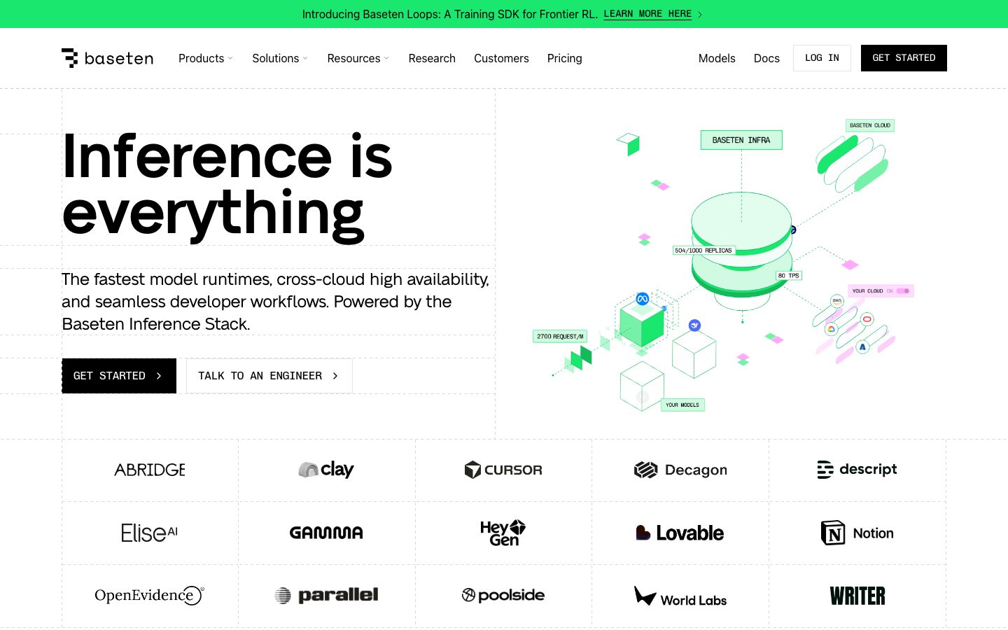
Baseten's marketing surface is a high-contrast, engineering-forward AI-infrastructure interface. It runs on a white canvas (`{colors.canvas}` — #ffffff) with pure-black type (`{colors.ink}` — #000000) and square-cornered black CTAs (`{colors.primary}` — #000000, radius 0px). The whole system reads as precise and technical: thin hairline grids divide the page, there are no measured shadows anywhere, and brand energy comes from a single electric green (`{colors.brand-green}` — #19e76e).
The green is used surgically — the top announcement bar, the inline text highlight marker ("for high-scale workloads"), and the isometric product-architecture diagrams rendered in green line-art. Everything else stays monochrome black-on-white, which makes the green read as deliberate signal rather than decoration.
Typography is the loudest voice in the system. The headline face is **NeueAlteGrotesk** — a custom grotesk set very large (h1 at 88px), heavy (weight 600), tight (line-height 0.909) and with strong negative letter-spacing (-1.76px on h1, -1.92px on h2). Body copy runs the same family at weight 400 and 24px, so the page has an unusually large minimum reading size — the editorial feel is closer to a confident product deck than a typical SaaS marketing page.
**Key Characteristics:**
- White canvas, pure-black ink, square black CTA buttons (`{component.button-primary}` — radius 0px, padding 7px × 12px). No rounded corners on action elements — the system is deliberately sharp-edged.
- Single electric green accent (`{colors.brand-green}` — #19e76e) used for the announcement bar, inline highlight markers, and product diagrams. A deeper green (`{colors.brand-green-deep}` — #00b86b) appears as a secondary tone.
- Oversized NeueAlteGrotesk headlines (substituted with Space Grotesk / Inter here) set tight and heavy with negative tracking. The same family carries body copy at 24px.
- Hairline grid system — thin neutral borders (`{colors.hairline}` — #e5e7eb) divide the hero, the customer-logo grid, and feature panels into cells.
- No measured shadows. Depth is created entirely by hairline borders and the mint surface tint (`{colors.surface-mint}` — #f5f8f4).
- Isometric green-and-black architecture diagrams are the signature visual artifact — Baseten illustrates its inference stack rather than showing product UI fragments.
- Pill radius (`{rounded.pill}` — 9999px) is the only measured radius, reserved for small badge/tag elements; everything structural is square.
## Colors
### Brand & Accent
- **Brand Green** (`{colors.brand-green}` — #19e76e): The single brand accent. Fills the top announcement bar, inline text highlight markers, and the line-art of the isometric product diagrams.
- **Brand Green Deep** (`{colors.brand-green-deep}` — #00b86b): A darker green tone used inside diagrams and small accent moments for contrast against the brighter green.
### Surface
- **Canvas** (`{colors.canvas}` — #ffffff): The default page floor and the background of nav, logo cells, and most feature blocks.
- **Surface Mint** (`{colors.surface-mint}` — #f5f8f4): A barely-tinted green-gray used for the large feature panel ("Dedicated inference for high-scale workloads").
- **Surface Soft** (`{colors.surface-soft}` — #f7f8f9): A neutral near-white used for soft section fills and badge pills.
### Text
- **Ink / Primary** (`{colors.ink}` — #000000): All headlines, body copy, and primary text. Also the fill color of `{component.button-primary}`.
- **Near Black** (`{colors.near-black}` — #0e0e0e): A secondary near-black tone used in dark UI fragments.
- **Ink Deep** (`{colors.ink-deep}` — #111827): A blue-black used for dense text and dark surfaces.
- **Body** (`{colors.body}` — #374151): Secondary running-text tone (e.g., testimonial body).
- **Slate** (`{colors.slate}` — #425366) / **Slate Muted** (`{colors.slate-muted}` — #5f758e) / **Steel** (`{colors.steel}` — #8999ac): The cool blue-gray family used for diagram labels, secondary captions, and muted UI elements.
- **Muted** (`{colors.muted}` — #6b7280) / **Muted Soft** (`{colors.muted-soft}` — #9ca3af): Tertiary text and logo-grid wordmarks.
- **Olive Muted** (`{colors.olive-muted}` — #676e64): A warm-gray tone used sparingly in muted text.
- **On Primary** (`{colors.on-primary}` — #ffffff): White text on the black primary button.
### Neutral / Hairline
- **Hairline** (`{colors.hairline}` — #e5e7eb): The primary 1px border tone dividing the hero grid, logo cells, and feature panels.
- **Hairline Strong** (`{colors.hairline-strong}` — #e6e6e6): A slightly heavier divider tone.
- **Border Soft** (`{colors.border-soft}` — #d1d5db): Input and secondary-button border tone.
- **Neutral 300** (`{colors.neutral-300}` — #cccccc) / **Neutral 400** (`{colors.neutral-400}` — #b3b3b3): Mid-gray tones used in muted iconography and dividers.
## Typography
### Font Family
The system runs a single family across all roles: **NeueAlteGrotesk**, a custom grotesk display face. It carries everything from the 88px h1 down to 24px body copy — there is no separate body typeface measured. Only the button label drops to a generic UI stack (`ui-sans-serif`) at 16px / weight 400.
NeueAlteGrotesk is set heavy (weight 600) and tight (line-height 0.909–1.094) with strong negative letter-spacing (-0.48px to -1.92px) on display sizes — the negative tracking and tight leading are the brand's typographic signature.
### Hierarchy
| Token | Size | Weight | Line Height | Letter Spacing | Use |
|---|---|---|---|---|---|
| `{typography.display-xl}` | 88px | 600 | 0.909 | -1.76px | Hero h1 ("Inference is everything") — NeueAlteGrotesk |
| `{typography.display-lg}` | 64px | 600 | 1.094 | -1.92px | Section heads ("The fastest inference takes more than GPUs.") — NeueAlteGrotesk |
| `{typography.title}` | 24px | 600 | 1.333 | -0.48px | Sub-section heads, feature-block titles — NeueAlteGrotesk |
| `{typography.body}` | 24px | 400 | 1.333 | -0.48px | Hero sub-copy and running text — NeueAlteGrotesk |
| `{typography.button}` | 16px | 400 | 1.5 | normal | Button labels, nav links — ui-sans-serif |
### Principles
The system uses one type family at two weights (600 for headings + 400 for body), so hierarchy is driven by size and weight rather than by mixing typefaces. Body copy is unusually large at 24px — keep it; shrinking body copy to a typical 16px would break the editorial voice. The negative letter-spacing on display sizes is part of the brand — display headlines without it read as off-brand.
### Note on Font Substitutes
**NeueAlteGrotesk** is a custom/licensed grotesk and is not assumed to be available as a public web font; it is not flagged in `fonts_licensed`, but it should not be shipped without a license. A close open-source substitute is **Space Grotesk** at weight 600 with negative tracking (~-0.02em), which preserves the tight, geometric-grotesk character. **Inter** at weight 600 is a more conservative fallback. The button role's `ui-sans-serif` is already a system stack and needs no substitute.
## Layout
### Spacing System
- **Base unit:** 4px (the smallest measured value).
- **Tokens:** `{spacing.xxs}` 4px · `{spacing.hairline-pad}` 7px · `{spacing.xs}` 8px · `{spacing.sm}` 12px · `{spacing.sm-plus}` 14px · `{spacing.md}` 16px · `{spacing.md-plus}` 20px · `{spacing.lg}` 24px · `{spacing.lg-plus}` 28px · `{spacing.xl}` 32px · `{spacing.xxl}` 40px · `{spacing.xxxl}` 48px · `{spacing.section}` 56px · `{spacing.section-lg}` 64px.
- **Most frequent values:** 16px (100 occurrences) and 8px / 12px / 24px (60+ each) form the core rhythm. 16px is the workhorse gutter.
- **Button padding:** 7px × 12px (`{spacing.hairline-pad}` × `{spacing.sm}`) — the unusual 7px vertical pad is measured directly off `{component.button-primary}`.
### Grid & Container
- **Hero grid:** A two-column split — oversized h1 + sub-copy + button row on the left, isometric architecture diagram on the right — with hairline borders enclosing the cells.
- **Customer-logo grid:** A 5-column × 3-row grid of bordered logo cells, each separated by `{colors.hairline}` rules.
- **Feature grids:** 3-up feature blocks under section heads; the large mint feature panel spans full content width.
- The page is divided by thin hairline rules rather than whitespace alone — the grid is visible, not implied.
### Whitespace Philosophy
Despite the hairline grid, the system breathes — large type forces generous vertical rhythm, and section bands use `{spacing.section}` (56px) to `{spacing.section-lg}` (64px) of separation. The visible hairline grid plus square corners gives the page a blueprint / technical-document feel that matches the infrastructure subject matter.
## Elevation & Depth
| Level | Treatment | Use |
|---|---|---|
| Flat | No shadow, no border | Body sections, hero copy |
| Hairline cell | 1px `{colors.hairline}` border | Hero grid, customer-logo cells, feature panels |
| Tint surface | `{colors.surface-mint}` / `{colors.surface-soft}` fill, no shadow | Feature panels, soft section bands |
| Diagram artifact | Green-and-black isometric line-art | Hero illustration, inference-stack diagrams |
The analysis measured **zero shadows** — the system has no drop-shadow elevation at all. Depth is created entirely by hairline borders and flat surface tints. This is a deliberate flat, technical aesthetic; do not add shadows to match a generic SaaS look.
### Decorative Depth
- The isometric architecture diagrams (rendered in `{colors.brand-green}` and `{colors.ink}` line-art) carry their own implied 3D depth through perspective, not through CSS shadow. These are the system's primary decorative depth device.
## Shapes
### Border Radius Scale
| Token | Value | Use |
|---|---|---|
| `{rounded.none}` | 0px | Buttons, feature panels, logo cells, hero grid — the default for all structural elements (measured off `{component.button-primary}`) |
| `{rounded.pill}` | 9999px | Small badge / tag pills (the only non-zero radius measured) |
| `{rounded.full}` | 9999px | Circular elements / pill labels |
The system is overwhelmingly square — 0px radius on every structural element. The only measured non-zero radius is the full pill (9999px), reserved for small badge/tag elements such as the "PRODUCTS" label. The square-corner discipline is part of the technical, blueprint identity.
### Photography & Illustration Geometry
Baseten uses isometric vector diagrams rather than photography. The diagrams use sharp polygonal forms in green line-art over white. Customer logos sit in square hairline-bordered cells with no rounding.
## Components
### Bars & Navigation
**`announcement-bar`** — A full-width green bar pinned to the very top of the page ("Introducing Baseten Loops: A Training SDK for Frontier RL"). Background `{colors.brand-green}` (#19e76e), text `{colors.ink}`, type `{typography.button}`, padding `{spacing.md}` (16px). Carries an underlined "LEARN MORE HERE" inline link. This is the single most prominent use of the brand green.
**`top-nav`** — White nav bar below the announcement bar. Background `{colors.canvas}`, text `{colors.ink}`. Carries the Baseten wordmark + logo at left, a horizontal menu (Products, Solutions, Resources, Research, Customers, Pricing) center, and a right-side cluster (Models, Docs, a "LOG IN" `{component.button-secondary}`, and a "GET STARTED" `{component.button-primary}`). Links use `{typography.button}`.
**`nav-link`** — Inline nav menu item, transparent background, `{colors.ink}` text, `{typography.button}`.
### Buttons
**`button-primary`** — The signature CTA ("GET STARTED"). Background `{colors.primary}` (#000000), text `{colors.on-primary}` (#ffffff), type `{typography.button}`, **square corners** (`{rounded.none}` — 0px), padding 7px × 12px. The square black button is the brand's action signature.
**`button-secondary`** — Outlined CTA ("TALK TO AN ENGINEER", "LOG IN"). Background `{colors.canvas}`, text `{colors.ink}`, 1px border in `{colors.border-soft}`, same square corners and padding as primary. Used as the lower-emphasis pairing beside primary CTAs.
**`try-it-link`** — Inline text action ("TRY IT", "EXPLORE", "LEARN MORE") used inside model-list rows and feature blocks. Transparent background, `{colors.ink}` text, `{typography.button}`, often with a chevron.
### Cards & Containers
**`hero-band`** — The white-canvas hero with a two-column hairline grid. Left holds the 88px h1 ("Inference is everything"), the 24px body sub-copy, and a button row; right holds the isometric architecture diagram. Background `{colors.canvas}`, square corners, generous padding around `{spacing.section-lg}` (64px).
**`logo-cell`** — A square hairline-bordered cell holding a single customer wordmark (Abridge, Clay, Cursor, etc.). Background `{colors.canvas}`, 1px `{colors.hairline}` border, wordmark in `{colors.muted}`, padding `{spacing.lg}` (24px). Tiled into a 5-column grid.
**`feature-panel`** — The large tinted feature panel ("Dedicated inference for high-scale workloads"). Background `{colors.surface-mint}` (#f5f8f4), text `{colors.ink}`, square corners, padding `{spacing.xxl}` (40px). Contains an isometric diagram and a `{component.button-primary}` ("START DEPLOYING").
**`feature-block`** — A 3-up text block under section heads ("Pre-optimized Model APIs", "Run Training on Baseten", "Frontier Gateway"). Background `{colors.canvas}`, `{typography.title}` heading + `{typography.body}` description, square corners, padding `{spacing.lg}` (24px), with a "LEARN MORE" `{component.try-it-link}`.
**`testimonial-block`** — Customer-quote block ("What our customers are saying"). Background `{colors.canvas}`, quote in `{typography.body}` at `{colors.body}`, with a name + role line beneath. Square corners, padding `{spacing.lg}` (24px).
### Accents & Tags
**`highlight-marker`** — An inline green text-highlight rectangle behind heading words ("for high-scale workloads"). Background `{colors.brand-green}`, text `{colors.ink}`, square corners, typically wrapping `{typography.display-lg}` or panel headings. A signature brand device.
**`badge-pill`** — Small pill label ("PRODUCTS"). Background `{colors.surface-soft}`, text `{colors.ink}`, type `{typography.button}`, `{rounded.pill}` (9999px), padding 7px × 12px. The only place pill radius appears.
## Do's and Don'ts
### Do
- Keep all structural elements square (`{rounded.none}` — 0px). The sharp-edged button and grid are core to the technical identity.
- Reserve `{colors.brand-green}` (#19e76e) for the announcement bar, inline highlight markers, and product diagrams. Its scarcity is what makes it read as signal.
- Set headlines in NeueAlteGrotesk (substituted with Space Grotesk / Inter) at weight 600 with the measured negative letter-spacing and tight line-height.
- Use the visible hairline grid (`{colors.hairline}`) to divide the page into cells — the blueprint feel is intentional.
- Keep body copy large (24px). The oversized reading size is part of the editorial voice.
- Pair a black `{component.button-primary}` with an outlined `{component.button-secondary}` for the two-CTA pattern.
- Render product concepts as isometric green-and-black diagrams rather than photographs or screenshots.
### Don't
- Don't add drop shadows — the system measured zero shadows. Depth comes from hairlines and tint, not elevation.
- Don't round button or card corners — square corners are the rule; pill radius is reserved for tiny badges only.
- Don't introduce a second accent color. The system is monochrome black-on-white plus one green.
- Don't shrink body copy to 16px to "look more like a SaaS site" — keep 24px.
- Don't set display headlines without the negative letter-spacing and tight leading — they will read as generic.
- Don't paint the green across large surfaces; it works as a thin bar, a highlight, and line-art only.
## Responsive Behavior
### Breakpoints
The capture includes a desktop landing render and a narrower stacked render. Exact pixel breakpoints were not measured; the following is inferred from the two captured layouts (derived).
| Name | Width | Key Changes |
|---|---|---|
| Mobile | < 768px (derived) | Nav collapses; hero h1 scales down from 88px; hero diagram stacks below copy; feature blocks stack 1-up; logo grid reduces columns |
| Tablet | 768–1024px (derived) | Nav tightens; feature blocks 2-up; logo grid wraps |
| Desktop | > 1024px | Full horizontal nav; two-column hero with diagram at right; 3-up feature blocks; 5-column logo grid |
### Touch Targets
- `{component.button-primary}` padding is 7px × 12px — small; on touch surfaces it should be padded up to meet a 44px minimum tap height (derived recommendation; not measured).
- Nav links rely on `{typography.button}` at 16px; spacing between them must keep tap targets separated.
### Collapsing Strategy
- The hero's two-column grid collapses to single-column — headline + copy + buttons first, diagram below.
- Feature blocks reduce columns rather than scaling type.
- The customer-logo grid reduces from 5 columns toward 2–3 columns on narrower widths.
### Image Behavior
- Isometric diagrams scale proportionally and retain their green-and-black line-art.
- Logo-cell wordmarks stay centered within their hairline cells at every width.
## Iteration Guide
1. Focus on ONE component at a time. Reference its YAML key directly (`{component.feature-panel}`, `{component.button-primary}`).
2. Variants of an existing component (`-active`, `-disabled`) live as separate entries in `components:`.
3. Use `{token.refs}` everywhere — never inline a hex in a component.
4. Never document hover. Default and Active/Pressed states only.
5. Keep corners square; the green is scarce; the type is large. These three rules define the brand.
6. When adding emphasis, use the green highlight marker or larger NeueAlteGrotesk — not a new color or a shadow.
## Known Gaps
- **NeueAlteGrotesk** is a custom display face and was not flagged in `fonts_licensed`; its license status should be confirmed before shipping. Substitutes (Space Grotesk / Inter) are documented in the Typography section.
- Only two button states were measured (`button-primary` color/radius/padding). Active/pressed, disabled, and hover styles were not captured — they would need an interactive crawl.
- The `card` component measured a 9999px radius with no shadow, which corresponds to a pill/badge element rather than a content card; it is documented as `{component.badge-pill}`. Larger content cards' exact radius/border treatment beyond hairlines was not separately measured.
- No shadow tokens were measured (the `shadows` array is empty); the flat treatment is recorded as ground truth, but any subtle elevation present in the live site at low alpha would not have been captured.
- The footer was not captured in the analysis; its colors, layout, and link structure are out of scope.
- Exact responsive breakpoints are inferred from two captured renders, not measured — marked derived.
- Diagram colors beyond the two greens (e.g., the pink/magenta and blue accents visible in the isometric illustrations) were not isolated as tokens; they appear to be illustration-only and are not part of the core palette.
- The blue-gray slate family (`{colors.slate}`, `{colors.slate-muted}`, `{colors.steel}`) appears at low frequency and is documented as diagram-label / muted-text tones; exact usage mapping may need confirmation.
<!-- Documented by duply · real-world design systems as ready-to-use DESIGN.md for AI coding agents · https://duply.ai/baseten/design-md -->
Color Palette
Accent
Neutrals
Typography
display-xl88px · 600 · 0.909
The quick brown fox jumpsdisplay-lg64px · 600 · 1.094
The quick brown fox jumpstitle24px · 600 · 1.333
The quick brown fox jumpsbody24px · 400 · 1.333
The quick brown fox jumpsbutton16px · 400 · 1.5
The quick brown fox jumpsSpacing & Shape
Spacing
| Name | Value | Preview |
|---|---|---|
| xxs | 4px | |
| hairline-pad | 7px | |
| xs | 8px | |
| sm | 12px | |
| sm-plus | 14px | |
| md | 16px | |
| md-plus | 20px | |
| lg | 24px | |
| lg-plus | 28px | |
| xl | 32px | |
| xxl | 40px | |
| xxxl | 48px | |
| section | 56px | |
| section-lg | 64px |
Border Radius
| Name | Value | Preview |
|---|---|---|
| none | 0px | |
| pill | 9999px | |
| full | 9999px |
More like this


---
version: alpha
name: Baseten-design-analysis
description: "A high-contrast, engineering-forward AI-infrastructure interface built on a white canvas with pure-black type and sharp-cornered black CTAs. The brand voltage comes from a single electric green (#19e76e) used in the announcement bar, text highlight markers, and isometric product diagrams — paired with an oversized NeueAlteGrotesk grotesk headline set tight and heavy. The system reads as precise, technical, and confident: thin hairline grids, no shadows, square buttons, and product-architecture illustrations rendered in green line-art."

colors:
  primary: "#000000"
  ink: "#000000"
  near-black: "#0e0e0e"
  ink-deep: "#111827"
  body: "#374151"
  slate: "#425366"
  slate-muted: "#5f758e"
  steel: "#8999ac"
  muted: "#6b7280"
  muted-soft: "#9ca3af"
  olive-muted: "#676e64"
  neutral-300: "#cccccc"
  neutral-400: "#b3b3b3"
  hairline: "#e5e7eb"
  hairline-strong: "#e6e6e6"
  border-soft: "#d1d5db"
  canvas: "#ffffff"
  surface-mint: "#f5f8f4"
  surface-soft: "#f7f8f9"
  on-primary: "#ffffff"
  brand-green: "#19e76e"
  brand-green-deep: "#00b86b"

typography:
  display-xl:
    fontFamily: "NeueAlteGrotesk, Space Grotesk, Inter, sans-serif"
    fontSize: 88px
    fontWeight: 600
    lineHeight: 0.909
    letterSpacing: "-1.76px"
  display-lg:
    fontFamily: "NeueAlteGrotesk, Space Grotesk, Inter, sans-serif"
    fontSize: 64px
    fontWeight: 600
    lineHeight: 1.094
    letterSpacing: "-1.92px"
  title:
    fontFamily: "NeueAlteGrotesk, Space Grotesk, Inter, sans-serif"
    fontSize: 24px
    fontWeight: 600
    lineHeight: 1.333
    letterSpacing: "-0.48px"
  body:
    fontFamily: "NeueAlteGrotesk, Space Grotesk, Inter, sans-serif"
    fontSize: 24px
    fontWeight: 400
    lineHeight: 1.333
    letterSpacing: "-0.48px"
  button:
    fontFamily: "ui-sans-serif, system-ui, sans-serif"
    fontSize: 16px
    fontWeight: 400
    lineHeight: 1.5
    letterSpacing: "normal"

rounded:
  none: 0px
  pill: 9999px
  full: 9999px

spacing:
  xxs: 4px
  hairline-pad: 7px
  xs: 8px
  sm: 12px
  sm-plus: 14px
  md: 16px
  md-plus: 20px
  lg: 24px
  lg-plus: 28px
  xl: 32px
  xxl: 40px
  xxxl: 48px
  section: 56px
  section-lg: 64px

components:
  announcement-bar:
    backgroundColor: "{colors.brand-green}"
    textColor: "{colors.ink}"
    typography: "{typography.button}"
    rounded: "{rounded.none}"
    padding: 16px
  top-nav:
    backgroundColor: "{colors.canvas}"
    textColor: "{colors.ink}"
    typography: "{typography.button}"
    rounded: "{rounded.none}"
    padding: 16px 24px
  button-primary:
    backgroundColor: "{colors.primary}"
    textColor: "{colors.on-primary}"
    typography: "{typography.button}"
    rounded: "{rounded.none}"
    padding: 7px 12px
  button-secondary:
    backgroundColor: "{colors.canvas}"
    textColor: "{colors.ink}"
    typography: "{typography.button}"
    rounded: "{rounded.none}"
    padding: 7px 12px
  nav-link:
    backgroundColor: transparent
    textColor: "{colors.ink}"
    typography: "{typography.button}"
  hero-band:
    backgroundColor: "{colors.canvas}"
    textColor: "{colors.ink}"
    typography: "{typography.display-xl}"
    rounded: "{rounded.none}"
    padding: 64px
  logo-cell:
    backgroundColor: "{colors.canvas}"
    textColor: "{colors.muted}"
    rounded: "{rounded.none}"
    padding: 24px
  feature-panel:
    backgroundColor: "{colors.surface-mint}"
    textColor: "{colors.ink}"
    typography: "{typography.title}"
    rounded: "{rounded.none}"
    padding: 40px
  feature-block:
    backgroundColor: "{colors.canvas}"
    textColor: "{colors.ink}"
    typography: "{typography.title}"
    rounded: "{rounded.none}"
    padding: 24px
  highlight-marker:
    backgroundColor: "{colors.brand-green}"
    textColor: "{colors.ink}"
    typography: "{typography.display-lg}"
    rounded: "{rounded.none}"
  testimonial-block:
    backgroundColor: "{colors.canvas}"
    textColor: "{colors.body}"
    typography: "{typography.body}"
    rounded: "{rounded.none}"
    padding: 24px
  badge-pill:
    backgroundColor: "{colors.surface-soft}"
    textColor: "{colors.ink}"
    typography: "{typography.button}"
    rounded: "{rounded.pill}"
    padding: 7px 12px
  try-it-link:
    backgroundColor: transparent
    textColor: "{colors.ink}"
    typography: "{typography.button}"
---

## Overview

Baseten's marketing surface is a high-contrast, engineering-forward AI-infrastructure interface. It runs on a white canvas (`{colors.canvas}` — #ffffff) with pure-black type (`{colors.ink}` — #000000) and square-cornered black CTAs (`{colors.primary}` — #000000, radius 0px). The whole system reads as precise and technical: thin hairline grids divide the page, there are no measured shadows anywhere, and brand energy comes from a single electric green (`{colors.brand-green}` — #19e76e).

The green is used surgically — the top announcement bar, the inline text highlight marker ("for high-scale workloads"), and the isometric product-architecture diagrams rendered in green line-art. Everything else stays monochrome black-on-white, which makes the green read as deliberate signal rather than decoration.

Typography is the loudest voice in the system. The headline face is **NeueAlteGrotesk** — a custom grotesk set very large (h1 at 88px), heavy (weight 600), tight (line-height 0.909) and with strong negative letter-spacing (-1.76px on h1, -1.92px on h2). Body copy runs the same family at weight 400 and 24px, so the page has an unusually large minimum reading size — the editorial feel is closer to a confident product deck than a typical SaaS marketing page.

**Key Characteristics:**
- White canvas, pure-black ink, square black CTA buttons (`{component.button-primary}` — radius 0px, padding 7px × 12px). No rounded corners on action elements — the system is deliberately sharp-edged.
- Single electric green accent (`{colors.brand-green}` — #19e76e) used for the announcement bar, inline highlight markers, and product diagrams. A deeper green (`{colors.brand-green-deep}` — #00b86b) appears as a secondary tone.
- Oversized NeueAlteGrotesk headlines (substituted with Space Grotesk / Inter here) set tight and heavy with negative tracking. The same family carries body copy at 24px.
- Hairline grid system — thin neutral borders (`{colors.hairline}` — #e5e7eb) divide the hero, the customer-logo grid, and feature panels into cells.
- No measured shadows. Depth is created entirely by hairline borders and the mint surface tint (`{colors.surface-mint}` — #f5f8f4).
- Isometric green-and-black architecture diagrams are the signature visual artifact — Baseten illustrates its inference stack rather than showing product UI fragments.
- Pill radius (`{rounded.pill}` — 9999px) is the only measured radius, reserved for small badge/tag elements; everything structural is square.

## Colors

### Brand & Accent
- **Brand Green** (`{colors.brand-green}` — #19e76e): The single brand accent. Fills the top announcement bar, inline text highlight markers, and the line-art of the isometric product diagrams.
- **Brand Green Deep** (`{colors.brand-green-deep}` — #00b86b): A darker green tone used inside diagrams and small accent moments for contrast against the brighter green.

### Surface
- **Canvas** (`{colors.canvas}` — #ffffff): The default page floor and the background of nav, logo cells, and most feature blocks.
- **Surface Mint** (`{colors.surface-mint}` — #f5f8f4): A barely-tinted green-gray used for the large feature panel ("Dedicated inference for high-scale workloads").
- **Surface Soft** (`{colors.surface-soft}` — #f7f8f9): A neutral near-white used for soft section fills and badge pills.

### Text
- **Ink / Primary** (`{colors.ink}` — #000000): All headlines, body copy, and primary text. Also the fill color of `{component.button-primary}`.
- **Near Black** (`{colors.near-black}` — #0e0e0e): A secondary near-black tone used in dark UI fragments.
- **Ink Deep** (`{colors.ink-deep}` — #111827): A blue-black used for dense text and dark surfaces.
- **Body** (`{colors.body}` — #374151): Secondary running-text tone (e.g., testimonial body).
- **Slate** (`{colors.slate}` — #425366) / **Slate Muted** (`{colors.slate-muted}` — #5f758e) / **Steel** (`{colors.steel}` — #8999ac): The cool blue-gray family used for diagram labels, secondary captions, and muted UI elements.
- **Muted** (`{colors.muted}` — #6b7280) / **Muted Soft** (`{colors.muted-soft}` — #9ca3af): Tertiary text and logo-grid wordmarks.
- **Olive Muted** (`{colors.olive-muted}` — #676e64): A warm-gray tone used sparingly in muted text.
- **On Primary** (`{colors.on-primary}` — #ffffff): White text on the black primary button.

### Neutral / Hairline
- **Hairline** (`{colors.hairline}` — #e5e7eb): The primary 1px border tone dividing the hero grid, logo cells, and feature panels.
- **Hairline Strong** (`{colors.hairline-strong}` — #e6e6e6): A slightly heavier divider tone.
- **Border Soft** (`{colors.border-soft}` — #d1d5db): Input and secondary-button border tone.
- **Neutral 300** (`{colors.neutral-300}` — #cccccc) / **Neutral 400** (`{colors.neutral-400}` — #b3b3b3): Mid-gray tones used in muted iconography and dividers.

## Typography

### Font Family
The system runs a single family across all roles: **NeueAlteGrotesk**, a custom grotesk display face. It carries everything from the 88px h1 down to 24px body copy — there is no separate body typeface measured. Only the button label drops to a generic UI stack (`ui-sans-serif`) at 16px / weight 400.

NeueAlteGrotesk is set heavy (weight 600) and tight (line-height 0.909–1.094) with strong negative letter-spacing (-0.48px to -1.92px) on display sizes — the negative tracking and tight leading are the brand's typographic signature.

### Hierarchy

| Token | Size | Weight | Line Height | Letter Spacing | Use |
|---|---|---|---|---|---|
| `{typography.display-xl}` | 88px | 600 | 0.909 | -1.76px | Hero h1 ("Inference is everything") — NeueAlteGrotesk |
| `{typography.display-lg}` | 64px | 600 | 1.094 | -1.92px | Section heads ("The fastest inference takes more than GPUs.") — NeueAlteGrotesk |
| `{typography.title}` | 24px | 600 | 1.333 | -0.48px | Sub-section heads, feature-block titles — NeueAlteGrotesk |
| `{typography.body}` | 24px | 400 | 1.333 | -0.48px | Hero sub-copy and running text — NeueAlteGrotesk |
| `{typography.button}` | 16px | 400 | 1.5 | normal | Button labels, nav links — ui-sans-serif |

### Principles
The system uses one type family at two weights (600 for headings + 400 for body), so hierarchy is driven by size and weight rather than by mixing typefaces. Body copy is unusually large at 24px — keep it; shrinking body copy to a typical 16px would break the editorial voice. The negative letter-spacing on display sizes is part of the brand — display headlines without it read as off-brand.

### Note on Font Substitutes
**NeueAlteGrotesk** is a custom/licensed grotesk and is not assumed to be available as a public web font; it is not flagged in `fonts_licensed`, but it should not be shipped without a license. A close open-source substitute is **Space Grotesk** at weight 600 with negative tracking (~-0.02em), which preserves the tight, geometric-grotesk character. **Inter** at weight 600 is a more conservative fallback. The button role's `ui-sans-serif` is already a system stack and needs no substitute.

## Layout

### Spacing System
- **Base unit:** 4px (the smallest measured value).
- **Tokens:** `{spacing.xxs}` 4px · `{spacing.hairline-pad}` 7px · `{spacing.xs}` 8px · `{spacing.sm}` 12px · `{spacing.sm-plus}` 14px · `{spacing.md}` 16px · `{spacing.md-plus}` 20px · `{spacing.lg}` 24px · `{spacing.lg-plus}` 28px · `{spacing.xl}` 32px · `{spacing.xxl}` 40px · `{spacing.xxxl}` 48px · `{spacing.section}` 56px · `{spacing.section-lg}` 64px.
- **Most frequent values:** 16px (100 occurrences) and 8px / 12px / 24px (60+ each) form the core rhythm. 16px is the workhorse gutter.
- **Button padding:** 7px × 12px (`{spacing.hairline-pad}` × `{spacing.sm}`) — the unusual 7px vertical pad is measured directly off `{component.button-primary}`.

### Grid & Container
- **Hero grid:** A two-column split — oversized h1 + sub-copy + button row on the left, isometric architecture diagram on the right — with hairline borders enclosing the cells.
- **Customer-logo grid:** A 5-column × 3-row grid of bordered logo cells, each separated by `{colors.hairline}` rules.
- **Feature grids:** 3-up feature blocks under section heads; the large mint feature panel spans full content width.
- The page is divided by thin hairline rules rather than whitespace alone — the grid is visible, not implied.

### Whitespace Philosophy
Despite the hairline grid, the system breathes — large type forces generous vertical rhythm, and section bands use `{spacing.section}` (56px) to `{spacing.section-lg}` (64px) of separation. The visible hairline grid plus square corners gives the page a blueprint / technical-document feel that matches the infrastructure subject matter.

## Elevation & Depth

| Level | Treatment | Use |
|---|---|---|
| Flat | No shadow, no border | Body sections, hero copy |
| Hairline cell | 1px `{colors.hairline}` border | Hero grid, customer-logo cells, feature panels |
| Tint surface | `{colors.surface-mint}` / `{colors.surface-soft}` fill, no shadow | Feature panels, soft section bands |
| Diagram artifact | Green-and-black isometric line-art | Hero illustration, inference-stack diagrams |

The analysis measured **zero shadows** — the system has no drop-shadow elevation at all. Depth is created entirely by hairline borders and flat surface tints. This is a deliberate flat, technical aesthetic; do not add shadows to match a generic SaaS look.

### Decorative Depth
- The isometric architecture diagrams (rendered in `{colors.brand-green}` and `{colors.ink}` line-art) carry their own implied 3D depth through perspective, not through CSS shadow. These are the system's primary decorative depth device.

## Shapes

### Border Radius Scale

| Token | Value | Use |
|---|---|---|
| `{rounded.none}` | 0px | Buttons, feature panels, logo cells, hero grid — the default for all structural elements (measured off `{component.button-primary}`) |
| `{rounded.pill}` | 9999px | Small badge / tag pills (the only non-zero radius measured) |
| `{rounded.full}` | 9999px | Circular elements / pill labels |

The system is overwhelmingly square — 0px radius on every structural element. The only measured non-zero radius is the full pill (9999px), reserved for small badge/tag elements such as the "PRODUCTS" label. The square-corner discipline is part of the technical, blueprint identity.

### Photography & Illustration Geometry
Baseten uses isometric vector diagrams rather than photography. The diagrams use sharp polygonal forms in green line-art over white. Customer logos sit in square hairline-bordered cells with no rounding.

## Components

### Bars & Navigation

**`announcement-bar`** — A full-width green bar pinned to the very top of the page ("Introducing Baseten Loops: A Training SDK for Frontier RL"). Background `{colors.brand-green}` (#19e76e), text `{colors.ink}`, type `{typography.button}`, padding `{spacing.md}` (16px). Carries an underlined "LEARN MORE HERE" inline link. This is the single most prominent use of the brand green.

**`top-nav`** — White nav bar below the announcement bar. Background `{colors.canvas}`, text `{colors.ink}`. Carries the Baseten wordmark + logo at left, a horizontal menu (Products, Solutions, Resources, Research, Customers, Pricing) center, and a right-side cluster (Models, Docs, a "LOG IN" `{component.button-secondary}`, and a "GET STARTED" `{component.button-primary}`). Links use `{typography.button}`.

**`nav-link`** — Inline nav menu item, transparent background, `{colors.ink}` text, `{typography.button}`.

### Buttons

**`button-primary`** — The signature CTA ("GET STARTED"). Background `{colors.primary}` (#000000), text `{colors.on-primary}` (#ffffff), type `{typography.button}`, **square corners** (`{rounded.none}` — 0px), padding 7px × 12px. The square black button is the brand's action signature.

**`button-secondary`** — Outlined CTA ("TALK TO AN ENGINEER", "LOG IN"). Background `{colors.canvas}`, text `{colors.ink}`, 1px border in `{colors.border-soft}`, same square corners and padding as primary. Used as the lower-emphasis pairing beside primary CTAs.

**`try-it-link`** — Inline text action ("TRY IT", "EXPLORE", "LEARN MORE") used inside model-list rows and feature blocks. Transparent background, `{colors.ink}` text, `{typography.button}`, often with a chevron.

### Cards & Containers

**`hero-band`** — The white-canvas hero with a two-column hairline grid. Left holds the 88px h1 ("Inference is everything"), the 24px body sub-copy, and a button row; right holds the isometric architecture diagram. Background `{colors.canvas}`, square corners, generous padding around `{spacing.section-lg}` (64px).

**`logo-cell`** — A square hairline-bordered cell holding a single customer wordmark (Abridge, Clay, Cursor, etc.). Background `{colors.canvas}`, 1px `{colors.hairline}` border, wordmark in `{colors.muted}`, padding `{spacing.lg}` (24px). Tiled into a 5-column grid.

**`feature-panel`** — The large tinted feature panel ("Dedicated inference for high-scale workloads"). Background `{colors.surface-mint}` (#f5f8f4), text `{colors.ink}`, square corners, padding `{spacing.xxl}` (40px). Contains an isometric diagram and a `{component.button-primary}` ("START DEPLOYING").

**`feature-block`** — A 3-up text block under section heads ("Pre-optimized Model APIs", "Run Training on Baseten", "Frontier Gateway"). Background `{colors.canvas}`, `{typography.title}` heading + `{typography.body}` description, square corners, padding `{spacing.lg}` (24px), with a "LEARN MORE" `{component.try-it-link}`.

**`testimonial-block`** — Customer-quote block ("What our customers are saying"). Background `{colors.canvas}`, quote in `{typography.body}` at `{colors.body}`, with a name + role line beneath. Square corners, padding `{spacing.lg}` (24px).

### Accents & Tags

**`highlight-marker`** — An inline green text-highlight rectangle behind heading words ("for high-scale workloads"). Background `{colors.brand-green}`, text `{colors.ink}`, square corners, typically wrapping `{typography.display-lg}` or panel headings. A signature brand device.

**`badge-pill`** — Small pill label ("PRODUCTS"). Background `{colors.surface-soft}`, text `{colors.ink}`, type `{typography.button}`, `{rounded.pill}` (9999px), padding 7px × 12px. The only place pill radius appears.

## Do's and Don'ts

### Do
- Keep all structural elements square (`{rounded.none}` — 0px). The sharp-edged button and grid are core to the technical identity.
- Reserve `{colors.brand-green}` (#19e76e) for the announcement bar, inline highlight markers, and product diagrams. Its scarcity is what makes it read as signal.
- Set headlines in NeueAlteGrotesk (substituted with Space Grotesk / Inter) at weight 600 with the measured negative letter-spacing and tight line-height.
- Use the visible hairline grid (`{colors.hairline}`) to divide the page into cells — the blueprint feel is intentional.
- Keep body copy large (24px). The oversized reading size is part of the editorial voice.
- Pair a black `{component.button-primary}` with an outlined `{component.button-secondary}` for the two-CTA pattern.
- Render product concepts as isometric green-and-black diagrams rather than photographs or screenshots.

### Don't
- Don't add drop shadows — the system measured zero shadows. Depth comes from hairlines and tint, not elevation.
- Don't round button or card corners — square corners are the rule; pill radius is reserved for tiny badges only.
- Don't introduce a second accent color. The system is monochrome black-on-white plus one green.
- Don't shrink body copy to 16px to "look more like a SaaS site" — keep 24px.
- Don't set display headlines without the negative letter-spacing and tight leading — they will read as generic.
- Don't paint the green across large surfaces; it works as a thin bar, a highlight, and line-art only.

## Responsive Behavior

### Breakpoints
The capture includes a desktop landing render and a narrower stacked render. Exact pixel breakpoints were not measured; the following is inferred from the two captured layouts (derived).

| Name | Width | Key Changes |
|---|---|---|
| Mobile | < 768px (derived) | Nav collapses; hero h1 scales down from 88px; hero diagram stacks below copy; feature blocks stack 1-up; logo grid reduces columns |
| Tablet | 768–1024px (derived) | Nav tightens; feature blocks 2-up; logo grid wraps |
| Desktop | > 1024px | Full horizontal nav; two-column hero with diagram at right; 3-up feature blocks; 5-column logo grid |

### Touch Targets
- `{component.button-primary}` padding is 7px × 12px — small; on touch surfaces it should be padded up to meet a 44px minimum tap height (derived recommendation; not measured).
- Nav links rely on `{typography.button}` at 16px; spacing between them must keep tap targets separated.

### Collapsing Strategy
- The hero's two-column grid collapses to single-column — headline + copy + buttons first, diagram below.
- Feature blocks reduce columns rather than scaling type.
- The customer-logo grid reduces from 5 columns toward 2–3 columns on narrower widths.

### Image Behavior
- Isometric diagrams scale proportionally and retain their green-and-black line-art.
- Logo-cell wordmarks stay centered within their hairline cells at every width.

## Iteration Guide

1. Focus on ONE component at a time. Reference its YAML key directly (`{component.feature-panel}`, `{component.button-primary}`).
2. Variants of an existing component (`-active`, `-disabled`) live as separate entries in `components:`.
3. Use `{token.refs}` everywhere — never inline a hex in a component.
4. Never document hover. Default and Active/Pressed states only.
5. Keep corners square; the green is scarce; the type is large. These three rules define the brand.
6. When adding emphasis, use the green highlight marker or larger NeueAlteGrotesk — not a new color or a shadow.

## Known Gaps

- **NeueAlteGrotesk** is a custom display face and was not flagged in `fonts_licensed`; its license status should be confirmed before shipping. Substitutes (Space Grotesk / Inter) are documented in the Typography section.
- Only two button states were measured (`button-primary` color/radius/padding). Active/pressed, disabled, and hover styles were not captured — they would need an interactive crawl.
- The `card` component measured a 9999px radius with no shadow, which corresponds to a pill/badge element rather than a content card; it is documented as `{component.badge-pill}`. Larger content cards' exact radius/border treatment beyond hairlines was not separately measured.
- No shadow tokens were measured (the `shadows` array is empty); the flat treatment is recorded as ground truth, but any subtle elevation present in the live site at low alpha would not have been captured.
- The footer was not captured in the analysis; its colors, layout, and link structure are out of scope.
- Exact responsive breakpoints are inferred from two captured renders, not measured — marked derived.
- Diagram colors beyond the two greens (e.g., the pink/magenta and blue accents visible in the isometric illustrations) were not isolated as tokens; they appear to be illustration-only and are not part of the core palette.
- The blue-gray slate family (`{colors.slate}`, `{colors.slate-muted}`, `{colors.steel}`) appears at low frequency and is documented as diagram-label / muted-text tones; exact usage mapping may need confirmation.

<!-- Documented by duply · real-world design systems as ready-to-use DESIGN.md for AI coding agents · https://duply.ai/baseten/design-md -->