Koyeb
A high-contrast developer-infrastructure interface built on a warm off-white canvas (#e6e5de) with massive condensed Anton display headlines set in all-caps, near-black UI chrome, and a single electric mint-green accent (#2eff9b) used for energy. The system reads as bold, technical, and slightly brutalist — oversized poster-type headlines, monospace-flavored terminal cards on near-black bands, and chunky dark CTAs with a printed bottom-edge inset shadow.
---
version: alpha
name: Koyeb-design-analysis
description: "A high-contrast developer-infrastructure interface built on a warm off-white canvas (#e6e5de) with massive condensed Anton display headlines set in all-caps, near-black UI chrome, and a single electric mint-green accent (#2eff9b) used for energy. The system reads as bold, technical, and slightly brutalist — oversized poster-type headlines, monospace-flavored terminal cards on near-black bands, and chunky dark CTAs with a printed bottom-edge inset shadow."
colors:
ink: "#000000"
canvas: "#e6e5de"
surface-dark: "#181618"
surface-darker: "#24292e"
accent: "#2eff9b"
accent-deep: "#0adb76"
white: "#ffffff"
navy: "#101828"
body: "#364153"
muted-cool: "#4a5565"
muted-soft: "#6a7282"
muted: "#656565"
cool-gray: "#99a1af"
ink-soft: "#5b5a58"
ink-muted: "#434446"
warm-mute: "#bbbab3"
surface-warm: "#d9d8d4"
surface-mute: "#d1d5dc"
hairline: "#e5e7eb"
hairline-soft: "#f3f4f6"
typography:
display:
fontFamily: "Anton, Oswald, Impact, sans-serif"
fontSize: 64px
fontWeight: 400
lineHeight: 1.0
letterSpacing: normal
heading:
fontFamily: "ui-sans-serif, system-ui, sans-serif"
fontSize: 32px
fontWeight: 400
lineHeight: 1.0
letterSpacing: -1px
body:
fontFamily: "ui-sans-serif, system-ui, sans-serif"
fontSize: 18px
fontWeight: 400
lineHeight: 1.333
letterSpacing: normal
button:
fontFamily: "ui-sans-serif, system-ui, sans-serif"
fontSize: 16px
fontWeight: 400
lineHeight: 1.5
letterSpacing: normal
rounded:
xs: 2px
sm: 4px
md: 6px
lg: 8px
xl: 12px
xxl: 16px
spacing:
xxs: 4px
xs: 6px
sm: 8px
md: 12px
lg: 16px
xl: 24px
xxl: 32px
section: 64px
components:
announcement-bar:
backgroundColor: "{colors.accent}"
textColor: "{colors.ink}"
typography: "{typography.button}"
padding: 16px
top-nav:
backgroundColor: "{colors.canvas}"
textColor: "{colors.ink}"
typography: "{typography.button}"
rounded: "{rounded.xxl}"
padding: 12px 16px
nav-link:
backgroundColor: transparent
textColor: "{colors.ink}"
typography: "{typography.button}"
button-primary:
backgroundColor: "{colors.surface-dark}"
textColor: "{colors.white}"
typography: "{typography.button}"
rounded: "{rounded.lg}"
padding: 16px 24px
button-signup:
backgroundColor: "{colors.surface-dark}"
textColor: "{colors.white}"
typography: "{typography.button}"
rounded: "{rounded.lg}"
padding: 16px 24px
button-link:
backgroundColor: transparent
textColor: "{colors.ink}"
typography: "{typography.button}"
rounded: "{rounded.xs}"
padding: 0px 4px
card:
backgroundColor: "{colors.white}"
textColor: "{colors.ink}"
rounded: "{rounded.sm}"
feature-card:
backgroundColor: "{colors.canvas}"
textColor: "{colors.ink}"
typography: "{typography.body}"
rounded: "{rounded.xxl}"
padding: 24px
section-dark:
backgroundColor: "{colors.surface-dark}"
textColor: "{colors.white}"
typography: "{typography.body}"
padding: 64px
terminal-card:
backgroundColor: "{colors.surface-dark}"
textColor: "{colors.accent}"
typography: "{typography.button}"
rounded: "{rounded.xxl}"
padding: 24px
stat-block:
backgroundColor: "{colors.surface-darker}"
textColor: "{colors.white}"
typography: "{typography.display}"
rounded: "{rounded.xxl}"
padding: 32px
tab-active:
backgroundColor: "{colors.accent}"
textColor: "{colors.ink}"
typography: "{typography.button}"
rounded: "{rounded.lg}"
padding: 8px 16px
tab:
backgroundColor: transparent
textColor: "{colors.white}"
typography: "{typography.button}"
rounded: "{rounded.lg}"
padding: 8px 16px
one-click-app-card:
backgroundColor: "{colors.canvas}"
textColor: "{colors.ink}"
typography: "{typography.body}"
rounded: "{rounded.xxl}"
padding: 24px
badge-pill:
backgroundColor: "{colors.accent}"
textColor: "{colors.ink}"
typography: "{typography.button}"
rounded: "{rounded.lg}"
padding: 6px 12px
---
## Overview
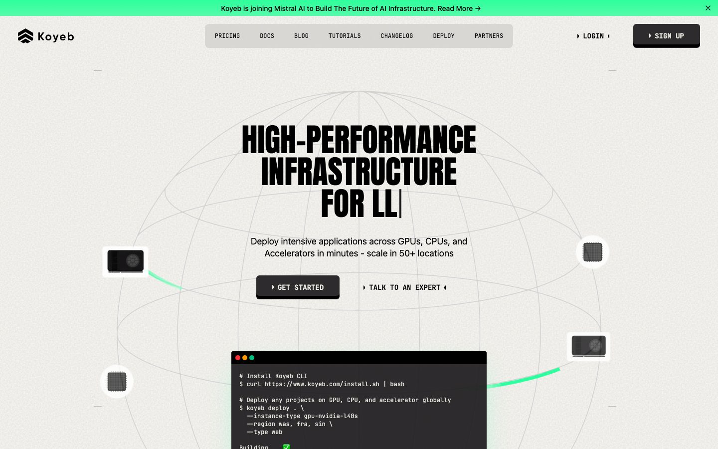
Koyeb's marketing surface is a bold, technical, slightly brutalist developer-infrastructure interface. The page floor is a warm off-white canvas (`{colors.canvas}` — #e6e5de, the single most frequent surface tone), over which oversized **Anton** all-caps display headlines dominate every band. The action layer is near-black (`{colors.surface-dark}` — #181618 / `{colors.ink}` — #000000), and the entire system is energized by exactly one accent: an electric mint green (`{colors.accent}` — #2eff9b).
The voice is poster-meets-terminal. Headlines are set in Anton — a heavy condensed grotesque — at 64px, weight 400, line-height 1.0, packed tight and uppercase ("HIGH-PERFORMANCE INFRASTRUCTURE FOR LLMs", "NEXT-GENERATION CLOUD EXPERIENCE"). Supporting type drops to a clean `ui-sans-serif` stack with a monospace-flavored, technical feel for body copy, nav, and the CLI/terminal cards.
The page alternates between two surface modes: warm-canvas editorial bands (light) and near-black product bands (`{component.section-dark}`) that host terminal cards, stat blocks, and tabbed product views. The mint green appears as the announcement bar, active tabs, CLI success highlights, and subtle glow accents — never as a body color and never spread thin.
**Key Characteristics:**
- Warm off-white canvas (`{colors.canvas}` — #e6e5de) rather than pure white — the page reads as paper, not screen.
- Massive condensed Anton all-caps display headlines (64px / 400 / line-height 1.0) — the system's loudest signal.
- A single electric accent (`{colors.accent}` — #2eff9b) for the announcement bar, active tabs, and terminal highlights.
- Near-black CTA buttons (`{colors.surface-dark}` — #181618) carrying a printed bottom-edge inset shadow (`0px -6px 0px 0px inset`) that gives them a chunky, stamped 3D look.
- Alternating light-canvas and near-black product bands (`{component.section-dark}`), with terminal cards shown directly in the flow.
- Hierarchical radius: `{rounded.sm}` (4px) for tight cards, up to `{rounded.xxl}` (16px) — by far the most-used radius — for feature cards, terminal cards, and stat blocks.
- Spacing rhythm built on a 4px base, with `{spacing.lg}` (16px) and `{spacing.xl}` (24px) doing most internal work and `{spacing.section}` (64px) between bands.
## Colors
### Brand & Accent
- **Accent** (`{colors.accent}` — #2eff9b): The single brand accent — electric mint green. Used on the top announcement bar, active product tabs, CLI success states, and glow accents inside dark bands. It is the system's only chromatic voltage.
- **Accent Deep** (`{colors.accent-deep}` — #0adb76): A deeper green used for smaller accent moments and where the bright mint needs more contrast against light surfaces.
### Surface
- **Canvas** (`{colors.canvas}` — #e6e5de): The warm off-white page floor — the dominant surface across the whole site.
- **White** (`{colors.white}` — #ffffff): Used for tight content cards and small UI fragments that need a crisp lift off the warm canvas.
- **Surface Dark** (`{colors.surface-dark}` — #181618): The near-black product-band background, CTA buttons, and terminal cards. The primary dark surface.
- **Surface Darker** (`{colors.surface-darker}` — #24292e): A nested dark tone used for stat blocks and inset panels inside dark bands.
- **Navy** (`{colors.navy}` — #101828): A cool dark accent used in select dark UI fragments.
- **Surface Warm / Mute** (`{colors.surface-warm}` — #d9d8d4, `{colors.surface-mute}` — #d1d5dc): Soft neutral fills and divider zones.
- **Hairline** (`{colors.hairline}` — #e5e7eb) / **Hairline Soft** (`{colors.hairline-soft}` — #f3f4f6): 1px borders and barely-visible section dividers on light surfaces.
### Text
- **Ink** (`{colors.ink}` — #000000): All headlines and primary text — pure black for maximum contrast on the warm canvas.
- **Body** (`{colors.body}` — #364153): Running-text body color on light surfaces.
- **Muted Cool / Soft / Muted** (`{colors.muted-cool}` — #4a5565, `{colors.muted-soft}` — #6a7282, `{colors.muted}` — #656565): Secondary and tertiary text tones.
- **Cool Gray** (`{colors.cool-gray}` — #99a1af): Fine-print and low-emphasis labels.
- **Ink Soft / Ink Muted** (`{colors.ink-soft}` — #5b5a58, `{colors.ink-muted}` — #434446): Warm-gray text on the off-white canvas.
- **Warm Mute** (`{colors.warm-mute}` — #bbbab3): Disabled / placeholder warm-gray.
- **White** (`{colors.white}` — #ffffff): Text on dark bands and CTA buttons.
## Typography
### Font Family
The system runs two families: **Anton** for all display headlines, and a generic **ui-sans-serif** system stack for everything else (headings, body, buttons, nav). Anton is a free, open-source condensed grotesque (available via Google Fonts) — heavy, narrow, designed for all-caps poster headlines. It is used at weight 400 (its only weight) at large sizes with line-height 1.0, producing the dense stacked headline blocks that define the brand.
The supporting `ui-sans-serif` stack handles body copy at 18px and UI labels at 16px. On the dark product bands and CLI cards, this same stack reads with a technical/monospace flavor (the terminal fragments use the device monospace stack as content chrome).
The split is strict:
- Anton (display, all-caps, 64px, weight 400, line-height 1.0) — h1 and h2
- ui-sans-serif (heading, body, buttons, nav) — everything else
### Hierarchy
| Token | Size | Weight | Line Height | Letter Spacing | Use |
|---|---|---|---|---|---|
| `{typography.display}` | 64px | 400 | 1.0 | normal | h1 / h2 — oversized all-caps Anton headlines ("HIGH-PERFORMANCE INFRASTRUCTURE FOR LLMs") |
| `{typography.heading}` | 32px | 400 | 1.0 | -1px | h3 — sub-section heads in ui-sans-serif with tight tracking |
| `{typography.body}` | 18px | 400 | 1.333 | normal | Default running-text |
| `{typography.button}` | 16px | 400 | 1.5 | normal | Button labels, nav links, tab labels, terminal text |
### Principles
Anton is the brand voice — every primary headline is Anton, uppercase, line-height 1.0, set in tight multi-line stacks. Never set body copy in Anton, and never set a display headline in the sans stack. The h3 role (32px) carries a -1px letter-spacing to keep larger UI headings tight; body and button roles use normal tracking.
Display weight is fixed at 400 (Anton ships only one weight) — emphasis comes from size and all-caps casing, never from bolding.
### Note on Font Substitutes
Anton is open-source and freely available (Google Fonts), so it ships as-is — no licensed-font substitution is required. If unavailable, **Oswald** (heavy weight) or condensed grotesques like **Bebas Neue** approximate the narrow all-caps poster character; the system fallback walks `Impact, sans-serif`. The body `ui-sans-serif` is a generic system stack and resolves to the platform UI font.
## Layout
### Spacing System
- **Base unit:** 4px.
- **Tokens:** `{spacing.xxs}` 4px · `{spacing.xs}` 6px · `{spacing.sm}` 8px · `{spacing.md}` 12px · `{spacing.lg}` 16px · `{spacing.xl}` 24px · `{spacing.xxl}` 32px · `{spacing.section}` 64px.
- **Dominant values:** `{spacing.lg}` (16px) and `{spacing.md}` (12px) are by far the most frequent (gaps, padding, internal rhythm); `{spacing.xl}` (24px) for card internals.
- **Section padding:** `{spacing.section}` (64px) between major bands. Larger one-off values (80px, 96px, 112px) appear rarely on hero/section breathing room — see Known Gaps.
### Grid & Container
- **Editorial bands:** Centered single-column hero with stacked Anton headline, sub-line, and CTA row.
- **Feature grids:** 4-up at desktop ("Accelerated infrastructure / Serverless containers / Available globally / Build and deploy anything"), reducing on smaller widths.
- **Product bands:** Tabbed switcher (`{component.tab}` / `{component.tab-active}`) over a 2-column layout pairing claim copy with a terminal card.
- **One-click app grid:** Horizontal row of `{component.one-click-app-card}` items with a category filter row above.
### Whitespace Philosophy
Koyeb uses tight, dense, technical spacing — 12–16px internal rhythm — rather than airy SaaS whitespace. The oversized Anton headlines provide the visual breathing room; bands stack closely with 64px separation. The result reads as confident and engineered, not spacious.
## Elevation & Depth
| Level | Treatment | Use |
|---|---|---|
| Flat | No shadow, no border | Body sections, canvas bands, top nav |
| Stamped CTA | `0px -6px 0px 0px inset` solid black bottom edge | Primary CTA buttons — a printed, chunky 3D bottom edge (measured) |
| Stamped CTA (green) | `0px -6px 0px 0px inset rgba(27,140,86,0.2)` | Green-tinted variant of the stamped bottom edge (measured) |
| Soft drop | `0px 10px 15px -3px rgba(0,0,0,0.1)` and `0px 4px 12px rgba(0,0,0,0.1)` | Floating cards and terminal/product fragments (measured) |
| Green glow | `0px 25px 50px -12px oklab(0.88 -0.19 0.086 / 0.3)` | Accent glow under highlighted dark-band elements (measured) |
The signature depth move is the **stamped CTA bottom edge** — the `-6px inset` solid edge that makes buttons look pressed/printed, reinforcing the brutalist technical tone. Most surfaces are otherwise flat; soft drop shadows are reserved for floating product/terminal fragments, and the green glow is a scarce accent inside dark bands.
### Decorative Depth
- Terminal cards on dark bands display live CLI chrome (window dots, monospace output) as content — their depth comes from the band contrast, not system shadows.
- A faint wireframe globe sits behind the hero, and small floating GPU/chip thumbnails with soft drops orbit the headline — decorative product artifacts rather than tokenized elevation.
## Shapes
### Border Radius Scale
| Token | Value | Use |
|---|---|---|
| `{rounded.xs}` | 2px | Tiny inline accents, link-button corners |
| `{rounded.sm}` | 4px | Tight content cards (measured `card` radius) |
| `{rounded.md}` | 6px | Small buttons, inline chips |
| `{rounded.lg}` | 8px | CTA buttons, tabs, pills |
| `{rounded.xl}` | 12px | Occasional mid-size panels |
| `{rounded.xxl}` | 16px | Feature cards, terminal cards, stat blocks, nav container — the dominant card radius |
### Photography & Artifact Geometry
Product UI fragments (terminal cards, app-deploy cards, stat blocks) use `{rounded.xxl}` (16px) — the most frequent radius by a wide margin. Small chip/GPU thumbnails in the hero are circular or square with `{rounded.sm}`. The system pairs very tight radii (2–4px) for dense data UI with the larger 16px for marketing card containers.
## Components
### Navigation
**`announcement-bar`** — A full-width bar pinned at the very top in `{colors.accent}` (#2eff9b) with `{colors.ink}` text ("Koyeb is joining Mistral AI to Build The Future of AI Infrastructure. Read More →"). The only place the bright green covers a full band. Padding `{spacing.lg}` (16px).
**`top-nav`** — The main nav sits in a rounded container (`{rounded.xxl}`) on the `{colors.canvas}` floor, holding the Koyeb wordmark + logo at left, center menu (PRICING, DOCS, BLOG, TUTORIALS, CHANGELOG, DEPLOY, PARTNERS) in `{component.nav-link}`, and a right-side LOGIN text link + SIGN UP button. Labels render in `{typography.button}`, uppercase, technical.
**`nav-link`** — Inline uppercase nav item, transparent background, `{colors.ink}` text, `{typography.button}`.
### Buttons
**`button-primary`** — The signature CTA ("GET STARTED"). Background `{colors.surface-dark}` (#181618), text `{colors.white}`, type `{typography.button}`, rounded `{rounded.lg}`. Carries the stamped `0px -6px 0px 0px inset` black bottom edge for a chunky pressed look. Padding `16px 24px` is derived from the spacing scale — the captured button padding measurement (`0px 4px`) reflects an inner text node, not the full hit area.
**`button-signup`** — The header SIGN UP button. Same dark surface + white text + `{rounded.lg}` treatment as the primary CTA, scaled for the nav.
**`button-link`** — A flat text-style button ("TALK TO AN EXPERT"). Transparent background, `{colors.ink}` text, `{typography.button}`, near-zero radius (`{rounded.xs}`), padding `0px 4px` (measured). Wrapped in arrow glyphs (‣ … ‣) in the brand's technical style.
### Cards & Containers
**`card`** — The base tight card. Background `{colors.white}`, rounded `{rounded.sm}` (4px), no shadow (measured). Used for small data/content fragments that lift off the warm canvas.
**`feature-card`** — Used in the 4-up "NEXT-GENERATION CLOUD EXPERIENCE" grid. Background `{colors.canvas}`, rounded `{rounded.xxl}` (16px), padding `{spacing.xl}` (24px). Carries a small product-UI thumbnail, an h3-scale title, and a `{typography.body}` description.
**`one-click-app-card`** — Used in the "DEPLOY IN PRODUCTION WITH ONE-CLICK APPS" row (DeepSeek-R1, Llama, etc.). Background `{colors.canvas}`, rounded `{rounded.xxl}`, padding `{spacing.xl}`. Carries an app icon, a title, a short uppercase description, and a "DEPLOY NOW" link.
### Dark Bands & Product UI
**`section-dark`** — The near-black product band. Background `{colors.surface-dark}` (#181618), text `{colors.white}`, padding `{spacing.section}` (64px). Hosts the tabbed "THE SERVERLESS RUNTIME FOR" switcher, stat strip, and customer-quote band. The deliberate light→dark alternation is the page's pacing device.
**`terminal-card`** — A CLI/terminal fragment shown directly in the flow. Background `{colors.surface-dark}`, monospace-flavored text with `{colors.accent}` highlights for commands and success states, rounded `{rounded.xxl}`, padding `{spacing.xl}`. Shows real `koyeb deploy` / `koyeb service update` commands — the product chrome is the content.
**`stat-block`** — The metric strip ("100% MORE PERFORMANCE", "<250MS CPU COLD START", "10 DATACENTERS", "100K DEVELOPERS"). Background `{colors.surface-darker}` (#24292e), white text, numbers in `{typography.display}` (Anton), rounded `{rounded.xxl}`, padding `{spacing.xxl}` (32px).
### Tabs & Badges
**`tab`** + **`tab-active`** — The product-view switcher (AI INFERENCE, FINE-TUNING, AI AGENTS, SAAS PLATFORMS, …). Inactive: transparent background, `{colors.white}` text. Active: `{colors.accent}` (#2eff9b) background with `{colors.ink}` text — the green pill marks the selected view. Both rounded `{rounded.lg}`, padding `8px 16px`.
**`badge-pill`** — Small category/highlight pill ("LANGUAGE MODELS"). Background `{colors.accent}`, text `{colors.ink}`, `{typography.button}`, rounded `{rounded.lg}`, padding `6px 12px`.
## Do's and Don'ts
### Do
- Set every primary headline in Anton, all-caps, line-height 1.0, in tight stacked blocks. The oversized poster headline is the brand.
- Keep the page floor warm off-white (`{colors.canvas}` — #e6e5de), not pure white. The paper tone is intentional.
- Reserve `{colors.accent}` (#2eff9b) for the announcement bar, active tabs, CLI highlights, and glow accents. One accent, used sparingly, at high voltage.
- Give primary CTAs the stamped `-6px inset` bottom edge. The chunky pressed look is signature.
- Alternate light canvas bands with `{component.section-dark}` near-black product bands. The light→dark pacing carries the page.
- Show real terminal/CLI fragments inside `{component.terminal-card}` — the product chrome is the content, not decoration.
- Use `{rounded.xxl}` (16px) for marketing card containers and `{rounded.sm}` (4px) for tight data cards.
### Don't
- Don't set body copy in Anton, and don't set headlines in the sans stack. The boundary is strict.
- Don't bold the display type — Anton ships one weight (400); scale and casing carry emphasis.
- Don't spread the mint green across large fills beyond the announcement bar. It loses voltage if overused.
- Don't add a second accent hue. The system is monochrome plus one green.
- Don't put dark surfaces on the editorial light bands except as terminal/product cards or the dedicated `{component.section-dark}` bands.
- Don't soften the brutalist tone with large airy whitespace — internal rhythm stays tight (12–16px).
## Responsive Behavior
| Name | Width | Key Changes |
|---|---|---|
| Mobile | < 768px | Nav collapses; hero Anton headline scales down from 64px; feature grid → 1-up; tab switcher scrolls horizontally; terminal cards stack below claim copy |
| Tablet | 768–1024px | Feature grid → 2-up; nav tightens; stat strip wraps |
| Desktop | 1024–1440px | Full nav row; 4-up feature grid; tabbed product band side-by-side with terminal card |
| Wide | > 1440px | Same as desktop with more outer canvas breathing room |
### Touch Targets
- `{component.button-primary}` and `{component.button-signup}` use 16px×24px padding for comfortable tap area.
- `{component.tab}` / `{component.tab-active}` use 8px×16px padding; the active green pill aids tap legibility.
- Exact measured heights for nav and buttons were not captured — see Known Gaps.
### Collapsing Strategy
- The 4-up feature grid reduces columns rather than shrinking cards.
- The product-view tab switcher becomes a horizontally scrollable row on mobile.
- Terminal cards retain their native CLI aspect and scale proportionally below claim copy.
- The light→dark band alternation is preserved at every breakpoint.
### Image Behavior
- Hero floating GPU/chip thumbnails and the wireframe globe reduce or hide on narrow widths.
- Terminal/product fragments keep monospace legibility at smaller scales.
## Iteration Guide
1. Focus on ONE component at a time. Reference its YAML key directly (`{component.terminal-card}`, `{component.stat-block}`).
2. Variants of an existing component live as separate entries in `components:`.
3. Use `{token.refs}` everywhere — never inline hex in components.
4. Never document hover. Default and Active/Pressed states only (e.g., `tab` vs `tab-active`).
5. Display headlines stay Anton 400 all-caps line-height 1.0. Body stays the ui-sans-serif stack. The boundary does not blur.
6. The mint green is the only accent — escalate emphasis with the green or with bigger Anton, never with a new hue.
7. The stamped `-6px inset` CTA edge is core to the brutalist tone; preserve it on primary actions.
## Known Gaps
- The measured `button-primary` reported `color #000000, radius 0px, padding 0px 4px` — these reflect an inner text node, not the visible dark stamped CTA. Button surface, white text, radius, and padding are documented from screenshot ground-truth plus the spacing/radius scales; padding is marked derived.
- Component heights (nav bar, buttons, inputs) were not measured — only padding/radius/color were captured.
- Large one-off spacing values (80px, 96px, 112px) appear once each in the measurement and are not promoted to named tokens; their exact role (hero/section breathing room) is inferred.
- Footer styling was not captured in the measured pages and is undocumented.
- Pricing-page-specific components were captured as a page but no pricing-tier component tokens were measured; pricing card styling is a gap.
- Form/input states (text inputs, validation) were not extracted — no sign-up flow was measured.
- The `ui-sans-serif` body family is a generic system stack; the exact branded sans (and whether the monospace terminal text uses a specific face) was not resolved by the analyzer.
- Exact accent usage of `{colors.accent-deep}` (#0adb76) vs `{colors.accent}` (#2eff9b) is inferred from frequency; precise placement rules were not measured.
- Animation/transition timings (tab switching, terminal typing, hero glow) are out of scope.
<!-- Documented by duply · real-world design systems as ready-to-use DESIGN.md for AI coding agents · https://duply.ai/koyeb/design-md -->
Color Palette
Accent
Neutrals
Typography
display64px · 400 · 1
The quick brown fox jumpsheading32px · 400 · 1
The quick brown fox jumpsbody18px · 400 · 1.333
The quick brown fox jumpsbutton16px · 400 · 1.5
The quick brown fox jumpsSpacing & Shape
Spacing
| Name | Value | Preview |
|---|---|---|
| xxs | 4px | |
| xs | 6px | |
| sm | 8px | |
| md | 12px | |
| lg | 16px | |
| xl | 24px | |
| xxl | 32px | |
| section | 64px |
Border Radius
| Name | Value | Preview |
|---|---|---|
| xs | 2px | |
| sm | 4px | |
| md | 6px | |
| lg | 8px | |
| xl | 12px | |
| xxl | 16px |
More like this


---
version: alpha
name: Koyeb-design-analysis
description: "A high-contrast developer-infrastructure interface built on a warm off-white canvas (#e6e5de) with massive condensed Anton display headlines set in all-caps, near-black UI chrome, and a single electric mint-green accent (#2eff9b) used for energy. The system reads as bold, technical, and slightly brutalist — oversized poster-type headlines, monospace-flavored terminal cards on near-black bands, and chunky dark CTAs with a printed bottom-edge inset shadow."

colors:
  ink: "#000000"
  canvas: "#e6e5de"
  surface-dark: "#181618"
  surface-darker: "#24292e"
  accent: "#2eff9b"
  accent-deep: "#0adb76"
  white: "#ffffff"
  navy: "#101828"
  body: "#364153"
  muted-cool: "#4a5565"
  muted-soft: "#6a7282"
  muted: "#656565"
  cool-gray: "#99a1af"
  ink-soft: "#5b5a58"
  ink-muted: "#434446"
  warm-mute: "#bbbab3"
  surface-warm: "#d9d8d4"
  surface-mute: "#d1d5dc"
  hairline: "#e5e7eb"
  hairline-soft: "#f3f4f6"

typography:
  display:
    fontFamily: "Anton, Oswald, Impact, sans-serif"
    fontSize: 64px
    fontWeight: 400
    lineHeight: 1.0
    letterSpacing: normal
  heading:
    fontFamily: "ui-sans-serif, system-ui, sans-serif"
    fontSize: 32px
    fontWeight: 400
    lineHeight: 1.0
    letterSpacing: -1px
  body:
    fontFamily: "ui-sans-serif, system-ui, sans-serif"
    fontSize: 18px
    fontWeight: 400
    lineHeight: 1.333
    letterSpacing: normal
  button:
    fontFamily: "ui-sans-serif, system-ui, sans-serif"
    fontSize: 16px
    fontWeight: 400
    lineHeight: 1.5
    letterSpacing: normal

rounded:
  xs: 2px
  sm: 4px
  md: 6px
  lg: 8px
  xl: 12px
  xxl: 16px

spacing:
  xxs: 4px
  xs: 6px
  sm: 8px
  md: 12px
  lg: 16px
  xl: 24px
  xxl: 32px
  section: 64px

components:
  announcement-bar:
    backgroundColor: "{colors.accent}"
    textColor: "{colors.ink}"
    typography: "{typography.button}"
    padding: 16px
  top-nav:
    backgroundColor: "{colors.canvas}"
    textColor: "{colors.ink}"
    typography: "{typography.button}"
    rounded: "{rounded.xxl}"
    padding: 12px 16px
  nav-link:
    backgroundColor: transparent
    textColor: "{colors.ink}"
    typography: "{typography.button}"
  button-primary:
    backgroundColor: "{colors.surface-dark}"
    textColor: "{colors.white}"
    typography: "{typography.button}"
    rounded: "{rounded.lg}"
    padding: 16px 24px
  button-signup:
    backgroundColor: "{colors.surface-dark}"
    textColor: "{colors.white}"
    typography: "{typography.button}"
    rounded: "{rounded.lg}"
    padding: 16px 24px
  button-link:
    backgroundColor: transparent
    textColor: "{colors.ink}"
    typography: "{typography.button}"
    rounded: "{rounded.xs}"
    padding: 0px 4px
  card:
    backgroundColor: "{colors.white}"
    textColor: "{colors.ink}"
    rounded: "{rounded.sm}"
  feature-card:
    backgroundColor: "{colors.canvas}"
    textColor: "{colors.ink}"
    typography: "{typography.body}"
    rounded: "{rounded.xxl}"
    padding: 24px
  section-dark:
    backgroundColor: "{colors.surface-dark}"
    textColor: "{colors.white}"
    typography: "{typography.body}"
    padding: 64px
  terminal-card:
    backgroundColor: "{colors.surface-dark}"
    textColor: "{colors.accent}"
    typography: "{typography.button}"
    rounded: "{rounded.xxl}"
    padding: 24px
  stat-block:
    backgroundColor: "{colors.surface-darker}"
    textColor: "{colors.white}"
    typography: "{typography.display}"
    rounded: "{rounded.xxl}"
    padding: 32px
  tab-active:
    backgroundColor: "{colors.accent}"
    textColor: "{colors.ink}"
    typography: "{typography.button}"
    rounded: "{rounded.lg}"
    padding: 8px 16px
  tab:
    backgroundColor: transparent
    textColor: "{colors.white}"
    typography: "{typography.button}"
    rounded: "{rounded.lg}"
    padding: 8px 16px
  one-click-app-card:
    backgroundColor: "{colors.canvas}"
    textColor: "{colors.ink}"
    typography: "{typography.body}"
    rounded: "{rounded.xxl}"
    padding: 24px
  badge-pill:
    backgroundColor: "{colors.accent}"
    textColor: "{colors.ink}"
    typography: "{typography.button}"
    rounded: "{rounded.lg}"
    padding: 6px 12px
---

## Overview

Koyeb's marketing surface is a bold, technical, slightly brutalist developer-infrastructure interface. The page floor is a warm off-white canvas (`{colors.canvas}` — #e6e5de, the single most frequent surface tone), over which oversized **Anton** all-caps display headlines dominate every band. The action layer is near-black (`{colors.surface-dark}` — #181618 / `{colors.ink}` — #000000), and the entire system is energized by exactly one accent: an electric mint green (`{colors.accent}` — #2eff9b).

The voice is poster-meets-terminal. Headlines are set in Anton — a heavy condensed grotesque — at 64px, weight 400, line-height 1.0, packed tight and uppercase ("HIGH-PERFORMANCE INFRASTRUCTURE FOR LLMs", "NEXT-GENERATION CLOUD EXPERIENCE"). Supporting type drops to a clean `ui-sans-serif` stack with a monospace-flavored, technical feel for body copy, nav, and the CLI/terminal cards.

The page alternates between two surface modes: warm-canvas editorial bands (light) and near-black product bands (`{component.section-dark}`) that host terminal cards, stat blocks, and tabbed product views. The mint green appears as the announcement bar, active tabs, CLI success highlights, and subtle glow accents — never as a body color and never spread thin.

**Key Characteristics:**
- Warm off-white canvas (`{colors.canvas}` — #e6e5de) rather than pure white — the page reads as paper, not screen.
- Massive condensed Anton all-caps display headlines (64px / 400 / line-height 1.0) — the system's loudest signal.
- A single electric accent (`{colors.accent}` — #2eff9b) for the announcement bar, active tabs, and terminal highlights.
- Near-black CTA buttons (`{colors.surface-dark}` — #181618) carrying a printed bottom-edge inset shadow (`0px -6px 0px 0px inset`) that gives them a chunky, stamped 3D look.
- Alternating light-canvas and near-black product bands (`{component.section-dark}`), with terminal cards shown directly in the flow.
- Hierarchical radius: `{rounded.sm}` (4px) for tight cards, up to `{rounded.xxl}` (16px) — by far the most-used radius — for feature cards, terminal cards, and stat blocks.
- Spacing rhythm built on a 4px base, with `{spacing.lg}` (16px) and `{spacing.xl}` (24px) doing most internal work and `{spacing.section}` (64px) between bands.

## Colors

### Brand & Accent
- **Accent** (`{colors.accent}` — #2eff9b): The single brand accent — electric mint green. Used on the top announcement bar, active product tabs, CLI success states, and glow accents inside dark bands. It is the system's only chromatic voltage.
- **Accent Deep** (`{colors.accent-deep}` — #0adb76): A deeper green used for smaller accent moments and where the bright mint needs more contrast against light surfaces.

### Surface
- **Canvas** (`{colors.canvas}` — #e6e5de): The warm off-white page floor — the dominant surface across the whole site.
- **White** (`{colors.white}` — #ffffff): Used for tight content cards and small UI fragments that need a crisp lift off the warm canvas.
- **Surface Dark** (`{colors.surface-dark}` — #181618): The near-black product-band background, CTA buttons, and terminal cards. The primary dark surface.
- **Surface Darker** (`{colors.surface-darker}` — #24292e): A nested dark tone used for stat blocks and inset panels inside dark bands.
- **Navy** (`{colors.navy}` — #101828): A cool dark accent used in select dark UI fragments.
- **Surface Warm / Mute** (`{colors.surface-warm}` — #d9d8d4, `{colors.surface-mute}` — #d1d5dc): Soft neutral fills and divider zones.
- **Hairline** (`{colors.hairline}` — #e5e7eb) / **Hairline Soft** (`{colors.hairline-soft}` — #f3f4f6): 1px borders and barely-visible section dividers on light surfaces.

### Text
- **Ink** (`{colors.ink}` — #000000): All headlines and primary text — pure black for maximum contrast on the warm canvas.
- **Body** (`{colors.body}` — #364153): Running-text body color on light surfaces.
- **Muted Cool / Soft / Muted** (`{colors.muted-cool}` — #4a5565, `{colors.muted-soft}` — #6a7282, `{colors.muted}` — #656565): Secondary and tertiary text tones.
- **Cool Gray** (`{colors.cool-gray}` — #99a1af): Fine-print and low-emphasis labels.
- **Ink Soft / Ink Muted** (`{colors.ink-soft}` — #5b5a58, `{colors.ink-muted}` — #434446): Warm-gray text on the off-white canvas.
- **Warm Mute** (`{colors.warm-mute}` — #bbbab3): Disabled / placeholder warm-gray.
- **White** (`{colors.white}` — #ffffff): Text on dark bands and CTA buttons.

## Typography

### Font Family
The system runs two families: **Anton** for all display headlines, and a generic **ui-sans-serif** system stack for everything else (headings, body, buttons, nav). Anton is a free, open-source condensed grotesque (available via Google Fonts) — heavy, narrow, designed for all-caps poster headlines. It is used at weight 400 (its only weight) at large sizes with line-height 1.0, producing the dense stacked headline blocks that define the brand.

The supporting `ui-sans-serif` stack handles body copy at 18px and UI labels at 16px. On the dark product bands and CLI cards, this same stack reads with a technical/monospace flavor (the terminal fragments use the device monospace stack as content chrome).

The split is strict:
- Anton (display, all-caps, 64px, weight 400, line-height 1.0) — h1 and h2
- ui-sans-serif (heading, body, buttons, nav) — everything else

### Hierarchy

| Token | Size | Weight | Line Height | Letter Spacing | Use |
|---|---|---|---|---|---|
| `{typography.display}` | 64px | 400 | 1.0 | normal | h1 / h2 — oversized all-caps Anton headlines ("HIGH-PERFORMANCE INFRASTRUCTURE FOR LLMs") |
| `{typography.heading}` | 32px | 400 | 1.0 | -1px | h3 — sub-section heads in ui-sans-serif with tight tracking |
| `{typography.body}` | 18px | 400 | 1.333 | normal | Default running-text |
| `{typography.button}` | 16px | 400 | 1.5 | normal | Button labels, nav links, tab labels, terminal text |

### Principles
Anton is the brand voice — every primary headline is Anton, uppercase, line-height 1.0, set in tight multi-line stacks. Never set body copy in Anton, and never set a display headline in the sans stack. The h3 role (32px) carries a -1px letter-spacing to keep larger UI headings tight; body and button roles use normal tracking.

Display weight is fixed at 400 (Anton ships only one weight) — emphasis comes from size and all-caps casing, never from bolding.

### Note on Font Substitutes
Anton is open-source and freely available (Google Fonts), so it ships as-is — no licensed-font substitution is required. If unavailable, **Oswald** (heavy weight) or condensed grotesques like **Bebas Neue** approximate the narrow all-caps poster character; the system fallback walks `Impact, sans-serif`. The body `ui-sans-serif` is a generic system stack and resolves to the platform UI font.

## Layout

### Spacing System
- **Base unit:** 4px.
- **Tokens:** `{spacing.xxs}` 4px · `{spacing.xs}` 6px · `{spacing.sm}` 8px · `{spacing.md}` 12px · `{spacing.lg}` 16px · `{spacing.xl}` 24px · `{spacing.xxl}` 32px · `{spacing.section}` 64px.
- **Dominant values:** `{spacing.lg}` (16px) and `{spacing.md}` (12px) are by far the most frequent (gaps, padding, internal rhythm); `{spacing.xl}` (24px) for card internals.
- **Section padding:** `{spacing.section}` (64px) between major bands. Larger one-off values (80px, 96px, 112px) appear rarely on hero/section breathing room — see Known Gaps.

### Grid & Container
- **Editorial bands:** Centered single-column hero with stacked Anton headline, sub-line, and CTA row.
- **Feature grids:** 4-up at desktop ("Accelerated infrastructure / Serverless containers / Available globally / Build and deploy anything"), reducing on smaller widths.
- **Product bands:** Tabbed switcher (`{component.tab}` / `{component.tab-active}`) over a 2-column layout pairing claim copy with a terminal card.
- **One-click app grid:** Horizontal row of `{component.one-click-app-card}` items with a category filter row above.

### Whitespace Philosophy
Koyeb uses tight, dense, technical spacing — 12–16px internal rhythm — rather than airy SaaS whitespace. The oversized Anton headlines provide the visual breathing room; bands stack closely with 64px separation. The result reads as confident and engineered, not spacious.

## Elevation & Depth

| Level | Treatment | Use |
|---|---|---|
| Flat | No shadow, no border | Body sections, canvas bands, top nav |
| Stamped CTA | `0px -6px 0px 0px inset` solid black bottom edge | Primary CTA buttons — a printed, chunky 3D bottom edge (measured) |
| Stamped CTA (green) | `0px -6px 0px 0px inset rgba(27,140,86,0.2)` | Green-tinted variant of the stamped bottom edge (measured) |
| Soft drop | `0px 10px 15px -3px rgba(0,0,0,0.1)` and `0px 4px 12px rgba(0,0,0,0.1)` | Floating cards and terminal/product fragments (measured) |
| Green glow | `0px 25px 50px -12px oklab(0.88 -0.19 0.086 / 0.3)` | Accent glow under highlighted dark-band elements (measured) |

The signature depth move is the **stamped CTA bottom edge** — the `-6px inset` solid edge that makes buttons look pressed/printed, reinforcing the brutalist technical tone. Most surfaces are otherwise flat; soft drop shadows are reserved for floating product/terminal fragments, and the green glow is a scarce accent inside dark bands.

### Decorative Depth
- Terminal cards on dark bands display live CLI chrome (window dots, monospace output) as content — their depth comes from the band contrast, not system shadows.
- A faint wireframe globe sits behind the hero, and small floating GPU/chip thumbnails with soft drops orbit the headline — decorative product artifacts rather than tokenized elevation.

## Shapes

### Border Radius Scale

| Token | Value | Use |
|---|---|---|
| `{rounded.xs}` | 2px | Tiny inline accents, link-button corners |
| `{rounded.sm}` | 4px | Tight content cards (measured `card` radius) |
| `{rounded.md}` | 6px | Small buttons, inline chips |
| `{rounded.lg}` | 8px | CTA buttons, tabs, pills |
| `{rounded.xl}` | 12px | Occasional mid-size panels |
| `{rounded.xxl}` | 16px | Feature cards, terminal cards, stat blocks, nav container — the dominant card radius |

### Photography & Artifact Geometry
Product UI fragments (terminal cards, app-deploy cards, stat blocks) use `{rounded.xxl}` (16px) — the most frequent radius by a wide margin. Small chip/GPU thumbnails in the hero are circular or square with `{rounded.sm}`. The system pairs very tight radii (2–4px) for dense data UI with the larger 16px for marketing card containers.

## Components

### Navigation

**`announcement-bar`** — A full-width bar pinned at the very top in `{colors.accent}` (#2eff9b) with `{colors.ink}` text ("Koyeb is joining Mistral AI to Build The Future of AI Infrastructure. Read More →"). The only place the bright green covers a full band. Padding `{spacing.lg}` (16px).

**`top-nav`** — The main nav sits in a rounded container (`{rounded.xxl}`) on the `{colors.canvas}` floor, holding the Koyeb wordmark + logo at left, center menu (PRICING, DOCS, BLOG, TUTORIALS, CHANGELOG, DEPLOY, PARTNERS) in `{component.nav-link}`, and a right-side LOGIN text link + SIGN UP button. Labels render in `{typography.button}`, uppercase, technical.

**`nav-link`** — Inline uppercase nav item, transparent background, `{colors.ink}` text, `{typography.button}`.

### Buttons

**`button-primary`** — The signature CTA ("GET STARTED"). Background `{colors.surface-dark}` (#181618), text `{colors.white}`, type `{typography.button}`, rounded `{rounded.lg}`. Carries the stamped `0px -6px 0px 0px inset` black bottom edge for a chunky pressed look. Padding `16px 24px` is derived from the spacing scale — the captured button padding measurement (`0px 4px`) reflects an inner text node, not the full hit area.

**`button-signup`** — The header SIGN UP button. Same dark surface + white text + `{rounded.lg}` treatment as the primary CTA, scaled for the nav.

**`button-link`** — A flat text-style button ("TALK TO AN EXPERT"). Transparent background, `{colors.ink}` text, `{typography.button}`, near-zero radius (`{rounded.xs}`), padding `0px 4px` (measured). Wrapped in arrow glyphs (‣ … ‣) in the brand's technical style.

### Cards & Containers

**`card`** — The base tight card. Background `{colors.white}`, rounded `{rounded.sm}` (4px), no shadow (measured). Used for small data/content fragments that lift off the warm canvas.

**`feature-card`** — Used in the 4-up "NEXT-GENERATION CLOUD EXPERIENCE" grid. Background `{colors.canvas}`, rounded `{rounded.xxl}` (16px), padding `{spacing.xl}` (24px). Carries a small product-UI thumbnail, an h3-scale title, and a `{typography.body}` description.

**`one-click-app-card`** — Used in the "DEPLOY IN PRODUCTION WITH ONE-CLICK APPS" row (DeepSeek-R1, Llama, etc.). Background `{colors.canvas}`, rounded `{rounded.xxl}`, padding `{spacing.xl}`. Carries an app icon, a title, a short uppercase description, and a "DEPLOY NOW" link.

### Dark Bands & Product UI

**`section-dark`** — The near-black product band. Background `{colors.surface-dark}` (#181618), text `{colors.white}`, padding `{spacing.section}` (64px). Hosts the tabbed "THE SERVERLESS RUNTIME FOR" switcher, stat strip, and customer-quote band. The deliberate light→dark alternation is the page's pacing device.

**`terminal-card`** — A CLI/terminal fragment shown directly in the flow. Background `{colors.surface-dark}`, monospace-flavored text with `{colors.accent}` highlights for commands and success states, rounded `{rounded.xxl}`, padding `{spacing.xl}`. Shows real `koyeb deploy` / `koyeb service update` commands — the product chrome is the content.

**`stat-block`** — The metric strip ("100% MORE PERFORMANCE", "<250MS CPU COLD START", "10 DATACENTERS", "100K DEVELOPERS"). Background `{colors.surface-darker}` (#24292e), white text, numbers in `{typography.display}` (Anton), rounded `{rounded.xxl}`, padding `{spacing.xxl}` (32px).

### Tabs & Badges

**`tab`** + **`tab-active`** — The product-view switcher (AI INFERENCE, FINE-TUNING, AI AGENTS, SAAS PLATFORMS, …). Inactive: transparent background, `{colors.white}` text. Active: `{colors.accent}` (#2eff9b) background with `{colors.ink}` text — the green pill marks the selected view. Both rounded `{rounded.lg}`, padding `8px 16px`.

**`badge-pill`** — Small category/highlight pill ("LANGUAGE MODELS"). Background `{colors.accent}`, text `{colors.ink}`, `{typography.button}`, rounded `{rounded.lg}`, padding `6px 12px`.

## Do's and Don'ts

### Do
- Set every primary headline in Anton, all-caps, line-height 1.0, in tight stacked blocks. The oversized poster headline is the brand.
- Keep the page floor warm off-white (`{colors.canvas}` — #e6e5de), not pure white. The paper tone is intentional.
- Reserve `{colors.accent}` (#2eff9b) for the announcement bar, active tabs, CLI highlights, and glow accents. One accent, used sparingly, at high voltage.
- Give primary CTAs the stamped `-6px inset` bottom edge. The chunky pressed look is signature.
- Alternate light canvas bands with `{component.section-dark}` near-black product bands. The light→dark pacing carries the page.
- Show real terminal/CLI fragments inside `{component.terminal-card}` — the product chrome is the content, not decoration.
- Use `{rounded.xxl}` (16px) for marketing card containers and `{rounded.sm}` (4px) for tight data cards.

### Don't
- Don't set body copy in Anton, and don't set headlines in the sans stack. The boundary is strict.
- Don't bold the display type — Anton ships one weight (400); scale and casing carry emphasis.
- Don't spread the mint green across large fills beyond the announcement bar. It loses voltage if overused.
- Don't add a second accent hue. The system is monochrome plus one green.
- Don't put dark surfaces on the editorial light bands except as terminal/product cards or the dedicated `{component.section-dark}` bands.
- Don't soften the brutalist tone with large airy whitespace — internal rhythm stays tight (12–16px).

## Responsive Behavior

| Name | Width | Key Changes |
|---|---|---|
| Mobile | < 768px | Nav collapses; hero Anton headline scales down from 64px; feature grid → 1-up; tab switcher scrolls horizontally; terminal cards stack below claim copy |
| Tablet | 768–1024px | Feature grid → 2-up; nav tightens; stat strip wraps |
| Desktop | 1024–1440px | Full nav row; 4-up feature grid; tabbed product band side-by-side with terminal card |
| Wide | > 1440px | Same as desktop with more outer canvas breathing room |

### Touch Targets
- `{component.button-primary}` and `{component.button-signup}` use 16px×24px padding for comfortable tap area.
- `{component.tab}` / `{component.tab-active}` use 8px×16px padding; the active green pill aids tap legibility.
- Exact measured heights for nav and buttons were not captured — see Known Gaps.

### Collapsing Strategy
- The 4-up feature grid reduces columns rather than shrinking cards.
- The product-view tab switcher becomes a horizontally scrollable row on mobile.
- Terminal cards retain their native CLI aspect and scale proportionally below claim copy.
- The light→dark band alternation is preserved at every breakpoint.

### Image Behavior
- Hero floating GPU/chip thumbnails and the wireframe globe reduce or hide on narrow widths.
- Terminal/product fragments keep monospace legibility at smaller scales.

## Iteration Guide

1. Focus on ONE component at a time. Reference its YAML key directly (`{component.terminal-card}`, `{component.stat-block}`).
2. Variants of an existing component live as separate entries in `components:`.
3. Use `{token.refs}` everywhere — never inline hex in components.
4. Never document hover. Default and Active/Pressed states only (e.g., `tab` vs `tab-active`).
5. Display headlines stay Anton 400 all-caps line-height 1.0. Body stays the ui-sans-serif stack. The boundary does not blur.
6. The mint green is the only accent — escalate emphasis with the green or with bigger Anton, never with a new hue.
7. The stamped `-6px inset` CTA edge is core to the brutalist tone; preserve it on primary actions.

## Known Gaps

- The measured `button-primary` reported `color #000000, radius 0px, padding 0px 4px` — these reflect an inner text node, not the visible dark stamped CTA. Button surface, white text, radius, and padding are documented from screenshot ground-truth plus the spacing/radius scales; padding is marked derived.
- Component heights (nav bar, buttons, inputs) were not measured — only padding/radius/color were captured.
- Large one-off spacing values (80px, 96px, 112px) appear once each in the measurement and are not promoted to named tokens; their exact role (hero/section breathing room) is inferred.
- Footer styling was not captured in the measured pages and is undocumented.
- Pricing-page-specific components were captured as a page but no pricing-tier component tokens were measured; pricing card styling is a gap.
- Form/input states (text inputs, validation) were not extracted — no sign-up flow was measured.
- The `ui-sans-serif` body family is a generic system stack; the exact branded sans (and whether the monospace terminal text uses a specific face) was not resolved by the analyzer.
- Exact accent usage of `{colors.accent-deep}` (#0adb76) vs `{colors.accent}` (#2eff9b) is inferred from frequency; precise placement rules were not measured.
- Animation/transition timings (tab switching, terminal typing, hero glow) are out of scope.

<!-- Documented by duply · real-world design systems as ready-to-use DESIGN.md for AI coding agents · https://duply.ai/koyeb/design-md -->