Baselime
A developer-tooling, dark-canvas observability marketing site built on pure black with an electric lime accent and Poppins throughout. The system reads as confident, technical SaaS — near-black canvas, a single high-voltage lime CTA color, dark-green-tinted product cards, and large Poppins display headlines that split a white phrase from a lime phrase. Brand voltage comes almost entirely from the lime accent against black plus real product UI screenshots shown in dark cards.
---
version: alpha
name: Baselime-design-analysis
description: A developer-tooling, dark-canvas observability marketing site built on pure black with an electric lime accent and Poppins throughout. The system reads as confident, technical SaaS — near-black canvas, a single high-voltage lime CTA color, dark-green-tinted product cards, and large Poppins display headlines that split a white phrase from a lime phrase. Brand voltage comes almost entirely from the lime accent against black plus real product UI screenshots shown in dark cards.
colors:
canvas: "#000000"
ink: "#ffffff"
ink-bright: "#fcfcfc"
muted: "#a7a9b1"
muted-strong: "#777a7e"
accent: "#a8e840"
on-accent: "#000000"
surface-accent: "#212c12"
surface: "#131416"
surface-elevated: "#1a1c20"
surface-card: "#222326"
hairline: "#35363a"
hairline-soft: "#47484d"
typography:
display:
fontFamily: "Poppins, sans-serif"
fontSize: 60px
fontWeight: 500
lineHeight: 1.2
letterSpacing: -1.2px
lead:
fontFamily: "Poppins, sans-serif"
fontSize: 18px
fontWeight: 400
lineHeight: 1.556
letterSpacing: normal
title:
fontFamily: "Poppins, sans-serif"
fontSize: 20px
fontWeight: 500
lineHeight: 1.5
letterSpacing: normal
body:
fontFamily: "Poppins, sans-serif"
fontSize: 20px
fontWeight: 400
lineHeight: 1.5
letterSpacing: normal
button:
fontFamily: "Poppins, sans-serif"
fontSize: 14px
fontWeight: 500
lineHeight: 1.429
letterSpacing: normal
rounded:
xs: 4px
sm: 6px
md: 8px
lg: 12px
xl: 24px
full: 9999px
spacing:
xxs: 4px
xs: 8px
sm: 12px
md: 16px
lg: 24px
xl: 32px
xxl: 48px
xxxl: 64px
section: 96px
section-lg: 128px
components:
announcement-bar:
backgroundColor: "{colors.accent}"
textColor: "{colors.on-accent}"
typography: "{typography.button}"
padding: 8px 16px
top-nav:
backgroundColor: "{colors.canvas}"
textColor: "{colors.ink}"
typography: "{typography.button}"
height: 64px
nav-link:
backgroundColor: transparent
textColor: "{colors.ink}"
typography: "{typography.button}"
button-primary:
backgroundColor: "{colors.surface-card}"
textColor: "{colors.ink}"
typography: "{typography.button}"
rounded: "{rounded.md}"
padding: 16px 24px
button-accent:
backgroundColor: "{colors.accent}"
textColor: "{colors.on-accent}"
typography: "{typography.button}"
rounded: "{rounded.md}"
padding: 16px 24px
text-link:
backgroundColor: transparent
textColor: "{colors.accent}"
typography: "{typography.body}"
card:
backgroundColor: "{colors.surface-accent}"
textColor: "{colors.ink}"
rounded: "{rounded.sm}"
feature-card:
backgroundColor: "{colors.surface}"
textColor: "{colors.ink}"
typography: "{typography.title}"
rounded: "{rounded.lg}"
padding: 32px
product-mockup-card:
backgroundColor: "{colors.surface-elevated}"
textColor: "{colors.ink}"
rounded: "{rounded.lg}"
padding: 16px
category-label:
backgroundColor: transparent
textColor: "{colors.accent}"
typography: "{typography.button}"
badge-pill:
backgroundColor: "{colors.accent}"
textColor: "{colors.on-accent}"
typography: "{typography.button}"
rounded: "{rounded.xs}"
padding: 4px 8px
testimonial-card:
backgroundColor: "{colors.surface}"
textColor: "{colors.muted}"
typography: "{typography.body}"
rounded: "{rounded.lg}"
padding: 24px
blog-card:
backgroundColor: "{colors.surface}"
textColor: "{colors.ink}"
typography: "{typography.title}"
rounded: "{rounded.lg}"
padding: 24px
cta-band:
backgroundColor: "{colors.accent}"
textColor: "{colors.on-accent}"
typography: "{typography.display}"
rounded: "{rounded.xl}"
padding: 64px
cookie-banner:
backgroundColor: "{colors.surface}"
textColor: "{colors.muted}"
typography: "{typography.button}"
rounded: "{rounded.lg}"
padding: 24px
footer:
backgroundColor: "{colors.surface}"
textColor: "{colors.muted}"
typography: "{typography.button}"
padding: 64px
---
## Overview
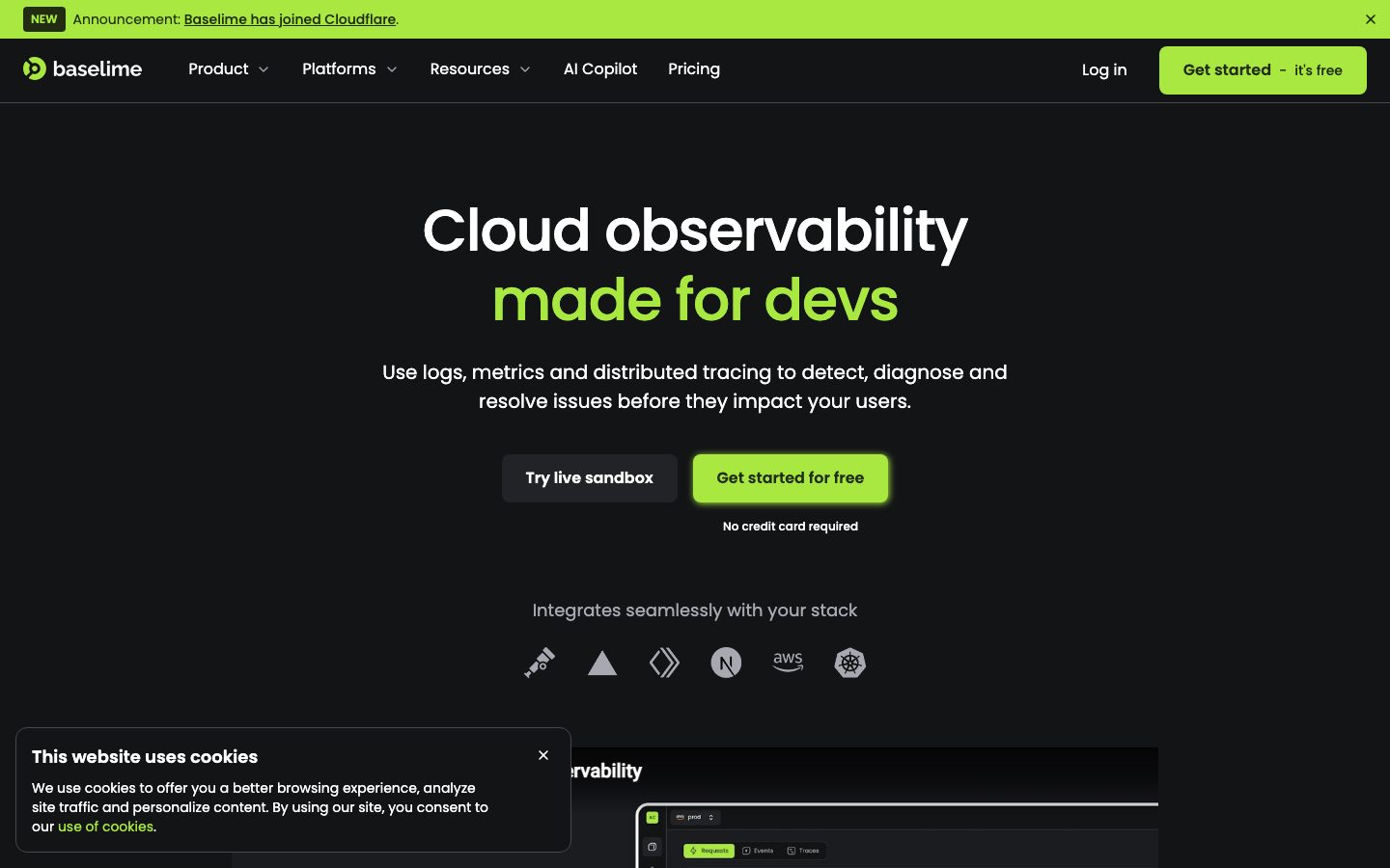
Baselime's marketing surface is a developer-tooling dark interface — pure black canvas (`{colors.canvas}` — #000000) carrying a single electric lime accent (`{colors.accent}` — #a8e840), with Poppins running every type role. The system reads as confidently technical SaaS: a near-black page floor, large display headlines that split a white phrase from a lime phrase ("Cloud observability / made for devs"), and real product UI screenshots shown inside dark cards rather than illustrated.
There is exactly one chromatic voltage source in the system: the lime accent. It carries the top announcement bar, the primary "Get started for free" CTA, inline links, category eyebrow labels ("DETECT", "TROUBLESHOOT"), and the pre-footer CTA band. Everything else is a graded ladder of near-black neutrals — black canvas, slightly-lifted surfaces (`{colors.surface}` — #131416, `{colors.surface-elevated}` — #1a1c20, `{colors.surface-card}` — #222326), and a signature dark-green-tinted card (`{colors.surface-accent}` — #212c12) that is the lime accent muted into a surface.
Type is monolithic: **Poppins** at every size. The display headline runs 60px at weight 500 with -1.2px tracking — geometric, slightly rounded, friendly-technical. Body copy is unusually large (20px), giving the page an open, readable rhythm even on a dark background.
**Key Characteristics:**
- Pure-black canvas (`{colors.canvas}` — #000000) is the dominant surface across all pages. The site is dark-mode-first; the only light bands are the lime CTA/announcement strips.
- A single high-voltage lime accent (`{colors.accent}` — #a8e840) does all the brand work — CTAs, links, eyebrow labels, and full-bleed CTA bands. Dark text (`{colors.on-accent}` — #000000) sits on lime.
- Poppins everywhere, weight 400–500. Display headlines at 60px/500 with -1.2px letter-spacing; body copy at a generous 20px.
- Dark-green-tinted card (`{colors.surface-accent}` — #212c12) is a signature surface — the accent desaturated into a panel tone, measured at `{rounded.sm}` (6px).
- Real product UI shown inside dark mockup cards (`{component.product-mockup-card}`) — error dashboards, query builders, the Tux AI Copilot chat — rather than marketing illustration.
- A scarce lime glow shadow (`rgb(168, 232, 64) 1px 1px 7px 0px`) appears once, on the focused primary CTA — the only shadow token in the system.
- Border radius is hierarchical: `{rounded.sm}` (6px) for the green card, `{rounded.md}` (8px) for buttons, `{rounded.lg}` (12px) for content/mockup cards, `{rounded.xl}` (24px) for the CTA band, `{rounded.full}` for pills and integration-logo chips.
## Colors
### Brand & Accent
- **Accent** (`{colors.accent}` — #a8e840): The single brand voltage source. Carries the announcement bar, primary CTA ("Get started for free"), inline `{component.text-link}` links, category eyebrow labels, the second line of the hero headline, and the full-bleed `{component.cta-band}`. Used against black or as a surface fill.
- **On Accent** (`{colors.on-accent}` — #000000): Dark text placed on lime surfaces — the CTA label, announcement-bar text, CTA-band headline.
### Surface
- **Canvas** (`{colors.canvas}` — #000000): The default page floor on every page.
- **Surface** (`{colors.surface}` — #131416): Slightly-lifted panels — feature sections, testimonial cards, blog cards, the footer, and the cookie banner.
- **Surface Elevated** (`{colors.surface-elevated}` — #1a1c20): Product-mockup card backgrounds and nested elevated panels.
- **Surface Card** (`{colors.surface-card}` — #222326): The dark secondary button fill (e.g., "Try live sandbox") and small chrome cards.
- **Surface Accent** (`{colors.surface-accent}` — #212c12): The signature dark-green-tinted card — the lime accent desaturated into a panel tone. Measured at 6px radius.
- **Hairline** (`{colors.hairline}` — #35363a): The 1px border tone on dark surfaces — card outlines, dividers, input borders.
- **Hairline Soft** (`{colors.hairline-soft}` — #47484d): A slightly lighter divider for nested separations.
### Text
- **Ink** (`{colors.ink}` — #ffffff): All headlines and primary text on dark surfaces.
- **Ink Bright** (`{colors.ink-bright}` — #fcfcfc): A near-white used in occasional high-emphasis chrome.
- **Muted** (`{colors.muted}` — #a7a9b1): Secondary text — sub-headlines, body descriptions on cards, footer links.
- **Muted Strong** (`{colors.muted-strong}` — #777a7e): Tertiary text — captions, fine-print ("No credit card required"), integration-logo labels.
## Typography
### Font Family
The system runs **Poppins** for every role — display, lead, title, body, and buttons. Poppins is an open-source geometric sans (available via Google Fonts), so no licensed substitute is required. The fallback stack walks `Poppins, sans-serif`. The geometric, slightly-rounded letterforms give Baselime its friendly-technical voice; the only tracking adjustment is on the display headline (-1.2px).
### Hierarchy
| Token | Size | Weight | Line Height | Letter Spacing | Use |
|---|---|---|---|---|---|
| `{typography.display}` | 60px | 500 | 1.2 | -1.2px | Hero h1 ("Cloud observability made for devs"), CTA-band headline |
| `{typography.lead}` | 18px | 400 | 1.556 | normal | Sub-headlines / section lead copy (mapped from h2) |
| `{typography.title}` | 20px | 500 | 1.5 | normal | Section titles, feature-card headings, blog-card titles (h3) |
| `{typography.body}` | 20px | 400 | 1.5 | normal | Default running text, hero sub-copy, testimonials |
| `{typography.button}` | 14px | 500 | 1.429 | normal | Button labels, nav links, eyebrow labels, footer links |
### Principles
Poppins weight stays in the 400–500 band — never 600 or heavier. The display headline is the only place letter-spacing tightens (-1.2px); everything else stays at `normal`. Body copy is intentionally large (20px), which keeps long technical descriptions legible against the black canvas. The display headline frequently splits a white phrase (`{colors.ink}`) from a lime phrase (`{colors.accent}`) — this two-tone headline is the brand's signature typographic move.
### Note on Font Substitutes
No licensed/custom typefaces are used. Poppins is freely available via Google Fonts; no substitution is required.
## Layout
### Spacing System
- **Base unit:** 4px.
- **Tokens:** `{spacing.xxs}` 4px · `{spacing.xs}` 8px · `{spacing.sm}` 12px · `{spacing.md}` 16px · `{spacing.lg}` 24px · `{spacing.xl}` 32px · `{spacing.xxl}` 48px · `{spacing.xxxl}` 64px · `{spacing.section}` 96px · `{spacing.section-lg}` 128px.
- **Dominant rhythm:** `{spacing.md}` (16px) and `{spacing.xs}` (8px) are by far the most frequent values (82 and 54 occurrences) — the small-gap rhythm of dense component chrome.
- **Section padding:** `{spacing.section}` (96px) and `{spacing.section-lg}` (128px) separate the major editorial bands.
- **Card internal padding:** `{spacing.xl}` (32px) for feature cards; `{spacing.lg}` (24px) for testimonial / blog / cookie cards.
### Grid & Container
- **Editorial body:** Centered single-column hero with a max content width around the page center; feature bands alternate a text column against a product-mockup card (left/right split).
- **Feature bands:** Two-up text-plus-mockup rows ("Stay ahead of issues", "Troubleshoot at the speed of thought", "Fix issues fast with your AI Copilot").
- **Testimonial grid:** 3-up at desktop ("These developers trust us").
- **Blog grid:** 3-up at desktop ("From our blog").
- **Footer:** Multi-column link list (Company / Product / Platforms / Resources).
### Whitespace Philosophy
Baselime balances dense component chrome (8/16px gaps inside cards and product UI) against generous band separation (96–128px between sections). The hero is heavily centered with wide vertical breathing room; lower bands tighten into alternating text/mockup rows. The result reads as a confident technical product page — open at the macro level, dense where the product UI is shown.
## Elevation & Depth
| Level | Treatment | Use |
|---|---|---|
| Flat | No shadow, no border | Black canvas body sections, top nav, hero |
| Surface lift | Background step (`{colors.surface}` → `{colors.surface-elevated}` → `{colors.surface-card}`) | Cards and panels separate from canvas by tone, not shadow |
| Hairline | 1px `{colors.hairline}` border | Card outlines, dividers, product-mockup chrome |
| Accent glow | `rgb(168, 232, 64) 1px 1px 7px 0px` | The single measured shadow — a lime glow on the focused/active primary CTA |
The elevation philosophy is **tonal, not shadowed**. On a black canvas, depth is created by stepping the surface tone upward (#000000 → #131416 → #1a1c20 → #222326) rather than by drop shadows. The only shadow in the entire system is the lime accent glow that surrounds the active "Get started for free" button — making elevation a deliberate, scarce, brand-colored signal rather than ambient.
### Decorative Depth
- Product-mockup cards carry their own internal chrome (error charts, query builders, the Tux chat bubble) — these are real product UI shown as content, with their own internal radii and borders.
- The dark-green `{colors.surface-accent}` card reads as a recessed, color-tinted panel rather than a lifted one.
## Shapes
### Border Radius Scale
| Token | Value | Use |
|---|---|---|
| `{rounded.xs}` | 4px | Small badge pills ("NEW") |
| `{rounded.sm}` | 6px | The signature dark-green card (`{component.card}`) |
| `{rounded.md}` | 8px | Buttons (primary + accent) |
| `{rounded.lg}` | 12px | Content cards — feature, testimonial, blog, product-mockup, cookie banner |
| `{rounded.xl}` | 24px | The full-bleed pre-footer CTA band |
| `{rounded.full}` | 9999px | Pills, integration-logo chips, circular avatars |
### Photography / Mockup Geometry
Product UI is shown inside cards at `{rounded.lg}` (12px); the screenshots retain their native product chrome (toolbars, charts, table rows). Integration logos in the "Integrates seamlessly with your stack" row sit as monochrome glyphs in `{colors.muted-strong}`. There are no decorative photographs — all imagery is product UI.
## Components
### Top Navigation & Announcement
**`announcement-bar`** — A full-width lime strip pinned above the nav ("NEW Announcement: Baselime has joined Cloudflare"). Background `{colors.accent}`, dark text `{colors.on-accent}`, type `{typography.button}`, padding 8px × 16px, with a dismiss "×" at the right. The only lime band at the very top of the page.
**`top-nav`** — Black nav bar, ~64px tall. Background `{colors.canvas}`, the Baselime wordmark + circular logo at left, primary menu (Product, Platforms, Resources, AI Copilot, Pricing) center, and a right cluster with "Log in" `{component.nav-link}` plus the lime `{component.button-accent}` ("Get started — it's free"). Menu items in `{typography.button}` (Poppins 14px / 500).
**`nav-link`** — Inline text nav item, transparent background, `{colors.ink}` text, `{typography.button}`.
### Buttons
**`button-accent`** — The signature primary CTA. Background `{colors.accent}` (#a8e840), dark text `{colors.on-accent}` (#000000), type `{typography.button}`, rounded `{rounded.md}` (8px). When active/focused it carries the lime glow shadow (`rgb(168, 232, 64) 1px 1px 7px 0px`). Used for "Get started for free" in the hero and nav.
**`button-primary`** — The dark secondary action ("Try live sandbox"). Background `{colors.surface-card}` (#222326), text `{colors.ink}`, type `{typography.button}`, rounded `{rounded.md}` (8px). The measured button reported `color: #ffffff` and `radius: 8px`; padding is derived from the screenshot (~16px × 24px) and listed in Known Gaps.
**`text-link`** — Inline link in `{colors.accent}` — "use of cookies", "Baselime has joined Cloudflare". The brand keeps inline links lime against body text in `{typography.body}`.
### Cards & Containers
**`card`** — The signature dark-green panel. Background `{colors.surface-accent}` (#212c12), rounded `{rounded.sm}` (6px), no shadow. Measured directly from the product-feature mockup framing.
**`feature-card`** — Used in the alternating feature bands. Background `{colors.surface}` (#131416), rounded `{rounded.lg}` (12px), internal padding `{spacing.xl}` (32px). Carries a lime `{component.category-label}` eyebrow ("DETECT"), a two-tone `{typography.title}` heading, a `{typography.body}` description in `{colors.muted}`, and a `{component.button-primary}` ("Start detecting").
**`product-mockup-card`** — A dark card showing actual Baselime product UI (error dashboards, query builder, Tux AI Copilot chat). Background `{colors.surface-elevated}` (#1a1c20), rounded `{rounded.lg}`, padding `{spacing.md}` (16px). The product UI inside carries its own chrome — these cards display the product rather than decorate around it.
**`testimonial-card`** — Used in the "These developers trust us" 3-up grid. Background `{colors.surface}`, rounded `{rounded.lg}`, padding `{spacing.lg}` (24px). Carries a name + role header and a quote in `{typography.body}` / `{colors.muted}`.
**`blog-card`** — Used in the "From our blog" 3-up grid. Background `{colors.surface}`, rounded `{rounded.lg}`, padding `{spacing.lg}`. Carries a lime `{component.category-label}` tag ("PRODUCT"), a date, a `{typography.title}` headline, and an author byline.
### Labels & Badges
**`category-label`** — A lime uppercase eyebrow label ("DETECT", "TROUBLESHOOT", "RESOLVE", "PRODUCT"). Transparent background, `{colors.accent}` text, `{typography.button}`. Used above feature headings and on blog-card tags.
**`badge-pill`** — Small lime pill ("NEW") in the announcement bar. Background `{colors.accent}`, dark text `{colors.on-accent}`, `{typography.button}`, rounded `{rounded.xs}` (4px), padding 4px × 8px.
### CTA / Footer
**`cta-band`** — The full-bleed pre-footer CTA ("Start resolving issues today. Without the hassle."). Background `{colors.accent}` (#a8e840), dark text `{colors.on-accent}`, headline in `{typography.display}`, rounded `{rounded.xl}` (24px), padding `{spacing.xxxl}` (64px). Carries a dark `{component.button-primary}` ("Get started — it's free") — a rare inversion where the dark button sits on the lime band.
**`cookie-banner`** — A floating bottom-left consent card. Background `{colors.surface}`, body text `{colors.muted}`, rounded `{rounded.lg}`, padding `{spacing.lg}` (24px), with a `{component.text-link}` lime link and a dismiss "×".
**`footer`** — Dark footer that closes the page. Background `{colors.surface}` (#131416), text `{colors.muted}`, type `{typography.button}`, vertical padding `{spacing.xxxl}` (64px). Multi-column link list (Company / Product / Platforms / Resources) with the Baselime wordmark and social links (LinkedIn, Twitter, GitHub) at left.
## Do's and Don'ts
### Do
- Keep the lime accent (`{colors.accent}` — #a8e840) as the sole brand voltage source — CTAs, links, eyebrow labels, and the CTA band only.
- Always place dark text (`{colors.on-accent}` — #000000) on lime surfaces, never white.
- Build depth by stepping surface tone (#000000 → #131416 → #1a1c20 → #222326), not by adding shadows.
- Use the two-tone display headline (white phrase + lime phrase) for the hero and major section heads.
- Show real product UI inside `{component.product-mockup-card}` rather than illustrating features.
- Reserve the lime glow shadow for the active primary CTA only — it is the system's single shadow.
- Keep Poppins at weight 400–500; tighten letter-spacing only on the 60px display headline.
### Don't
- Don't introduce a second accent color. The system is monochrome-plus-lime; any additional hue breaks the voice.
- Don't put white text on the lime accent — contrast and brand both fail.
- Don't add drop shadows to cards; tonal stepping is the elevation language.
- Don't push Poppins above weight 500 — the geometric headline reads heavier than its weight already.
- Don't use the dark-green `{colors.surface-accent}` card outside product-framing contexts; it is a scarce, deliberate panel tone.
- Don't add hover-state styling beyond the active glow on the primary CTA.
## Responsive Behavior
### Breakpoints
| Name | Width | Key Changes |
|---|---|---|
| Mobile | < 768px | Hamburger nav; hero display 60→~32px; feature bands stack text-above-mockup; testimonial + blog grids 1-up; footer columns wrap to 1 |
| Tablet | 768–1024px | Nav tightens; feature bands stay two-up but narrow; testimonial + blog grids 2-up |
| Desktop | 1024–1440px | Full horizontal nav; alternating text/mockup feature rows; 3-up testimonial + blog grids |
| Wide | > 1440px | Same as desktop with more outer breathing room; centered content max width holds |
### Touch Targets
- `{component.button-accent}` and `{component.button-primary}` carry ~16px × 24px padding, comfortably exceeding 44px tap height.
- `{component.nav-link}` items meet tap minimums with surrounding nav padding.
- The announcement-bar and cookie-banner dismiss "×" controls are small — verify against 44px on touch.
### Collapsing Strategy
- Top nav collapses to a hamburger below 768px.
- The hero stays centered single-column at all sizes; the product screenshot below it scales proportionally.
- Feature bands collapse from alternating left/right text-mockup rows to stacked text-above-mockup.
- Testimonial and blog grids reduce columns (3 → 2 → 1) rather than scaling cards down.
- The lime `{component.cta-band}` retains its 24px radius and lime fill at every breakpoint.
### Image Behavior
- Product-mockup screenshots retain native aspect ratios; their cards resize around them.
- Integration-logo glyphs stay in a single muted row, wrapping on mobile.
## Iteration Guide
1. Focus on ONE component at a time. Reference its YAML key directly (`{component.feature-card}`, `{component.cta-band}`).
2. Variants of an existing component live as separate entries in `components:` (e.g., a future `button-primary-active`).
3. Use `{token.refs}` everywhere — never inline a hex in a component.
4. Never document hover. Default and Active/Pressed states only (the primary CTA's lime glow is the one active treatment).
5. Display headlines stay Poppins 500 with -1.2px tracking; body stays Poppins 400 at 20px. Don't blur the weights.
6. The lime accent is scarce by design — adding more lime dilutes the single-voltage voice.
7. When in doubt about emphasis on the dark canvas: step the surface tone up before reaching for a shadow.
## Known Gaps
- The measured `button-primary` component reported `color: #ffffff`, `radius: 8px`, and `padding: 0px`. The 0px padding is a measurement artifact (the selector captured an inner label node); button padding (~16px × 24px) and the dark `{colors.surface-card}` background are derived from screenshot ground-truth and listed here as derived.
- The lime `{component.button-accent}` (the primary visible CTA) was not separately captured by the button selector — its background/text are documented from the measured accent color plus screenshot ground-truth.
- Spacing values of 20px and 40px were measured at low frequency and omitted from the named scale; they appear as one-off gaps and can be reintroduced if a component requires them.
- Only one shadow was measured (the lime active glow); no ambient card shadows were detected — the system is tonal. Hover/focus shadows beyond the primary CTA are unconfirmed.
- Form input, dropdown, and pricing-table component styles (visible on the pricing and product-alerting pages) were not captured by the analyzer and would need extraction from those flows.
- Exact hero responsive type sizes are inferred from the desktop 60px display value; mobile scaling points are not measured.
- The dark-green `{colors.surface-accent}` card radius is measured at 6px while other content cards measure 12px — whether this is intentional or a single-component artifact is unconfirmed.
<!-- Documented by duply · real-world design systems as ready-to-use DESIGN.md for AI coding agents · https://duply.ai/baselime/design-md -->
Color Palette
Accent
Neutrals
Typography
display60px · 500 · 1.2
The quick brown fox jumpslead18px · 400 · 1.556
The quick brown fox jumpstitle20px · 500 · 1.5
The quick brown fox jumpsbody20px · 400 · 1.5
The quick brown fox jumpsbutton14px · 500 · 1.429
The quick brown fox jumpsSpacing & Shape
Spacing
| Name | Value | Preview |
|---|---|---|
| xxs | 4px | |
| xs | 8px | |
| sm | 12px | |
| md | 16px | |
| lg | 24px | |
| xl | 32px | |
| xxl | 48px | |
| xxxl | 64px | |
| section | 96px | |
| section-lg | 128px |
Border Radius
| Name | Value | Preview |
|---|---|---|
| xs | 4px | |
| sm | 6px | |
| md | 8px | |
| lg | 12px | |
| xl | 24px | |
| full | 9999px |
More like this


---
version: alpha
name: Baselime-design-analysis
description: A developer-tooling, dark-canvas observability marketing site built on pure black with an electric lime accent and Poppins throughout. The system reads as confident, technical SaaS — near-black canvas, a single high-voltage lime CTA color, dark-green-tinted product cards, and large Poppins display headlines that split a white phrase from a lime phrase. Brand voltage comes almost entirely from the lime accent against black plus real product UI screenshots shown in dark cards.
colors:
  canvas: "#000000"
  ink: "#ffffff"
  ink-bright: "#fcfcfc"
  muted: "#a7a9b1"
  muted-strong: "#777a7e"
  accent: "#a8e840"
  on-accent: "#000000"
  surface-accent: "#212c12"
  surface: "#131416"
  surface-elevated: "#1a1c20"
  surface-card: "#222326"
  hairline: "#35363a"
  hairline-soft: "#47484d"
typography:
  display:
    fontFamily: "Poppins, sans-serif"
    fontSize: 60px
    fontWeight: 500
    lineHeight: 1.2
    letterSpacing: -1.2px
  lead:
    fontFamily: "Poppins, sans-serif"
    fontSize: 18px
    fontWeight: 400
    lineHeight: 1.556
    letterSpacing: normal
  title:
    fontFamily: "Poppins, sans-serif"
    fontSize: 20px
    fontWeight: 500
    lineHeight: 1.5
    letterSpacing: normal
  body:
    fontFamily: "Poppins, sans-serif"
    fontSize: 20px
    fontWeight: 400
    lineHeight: 1.5
    letterSpacing: normal
  button:
    fontFamily: "Poppins, sans-serif"
    fontSize: 14px
    fontWeight: 500
    lineHeight: 1.429
    letterSpacing: normal
rounded:
  xs: 4px
  sm: 6px
  md: 8px
  lg: 12px
  xl: 24px
  full: 9999px
spacing:
  xxs: 4px
  xs: 8px
  sm: 12px
  md: 16px
  lg: 24px
  xl: 32px
  xxl: 48px
  xxxl: 64px
  section: 96px
  section-lg: 128px
components:
  announcement-bar:
    backgroundColor: "{colors.accent}"
    textColor: "{colors.on-accent}"
    typography: "{typography.button}"
    padding: 8px 16px
  top-nav:
    backgroundColor: "{colors.canvas}"
    textColor: "{colors.ink}"
    typography: "{typography.button}"
    height: 64px
  nav-link:
    backgroundColor: transparent
    textColor: "{colors.ink}"
    typography: "{typography.button}"
  button-primary:
    backgroundColor: "{colors.surface-card}"
    textColor: "{colors.ink}"
    typography: "{typography.button}"
    rounded: "{rounded.md}"
    padding: 16px 24px
  button-accent:
    backgroundColor: "{colors.accent}"
    textColor: "{colors.on-accent}"
    typography: "{typography.button}"
    rounded: "{rounded.md}"
    padding: 16px 24px
  text-link:
    backgroundColor: transparent
    textColor: "{colors.accent}"
    typography: "{typography.body}"
  card:
    backgroundColor: "{colors.surface-accent}"
    textColor: "{colors.ink}"
    rounded: "{rounded.sm}"
  feature-card:
    backgroundColor: "{colors.surface}"
    textColor: "{colors.ink}"
    typography: "{typography.title}"
    rounded: "{rounded.lg}"
    padding: 32px
  product-mockup-card:
    backgroundColor: "{colors.surface-elevated}"
    textColor: "{colors.ink}"
    rounded: "{rounded.lg}"
    padding: 16px
  category-label:
    backgroundColor: transparent
    textColor: "{colors.accent}"
    typography: "{typography.button}"
  badge-pill:
    backgroundColor: "{colors.accent}"
    textColor: "{colors.on-accent}"
    typography: "{typography.button}"
    rounded: "{rounded.xs}"
    padding: 4px 8px
  testimonial-card:
    backgroundColor: "{colors.surface}"
    textColor: "{colors.muted}"
    typography: "{typography.body}"
    rounded: "{rounded.lg}"
    padding: 24px
  blog-card:
    backgroundColor: "{colors.surface}"
    textColor: "{colors.ink}"
    typography: "{typography.title}"
    rounded: "{rounded.lg}"
    padding: 24px
  cta-band:
    backgroundColor: "{colors.accent}"
    textColor: "{colors.on-accent}"
    typography: "{typography.display}"
    rounded: "{rounded.xl}"
    padding: 64px
  cookie-banner:
    backgroundColor: "{colors.surface}"
    textColor: "{colors.muted}"
    typography: "{typography.button}"
    rounded: "{rounded.lg}"
    padding: 24px
  footer:
    backgroundColor: "{colors.surface}"
    textColor: "{colors.muted}"
    typography: "{typography.button}"
    padding: 64px
---

## Overview

Baselime's marketing surface is a developer-tooling dark interface — pure black canvas (`{colors.canvas}` — #000000) carrying a single electric lime accent (`{colors.accent}` — #a8e840), with Poppins running every type role. The system reads as confidently technical SaaS: a near-black page floor, large display headlines that split a white phrase from a lime phrase ("Cloud observability / made for devs"), and real product UI screenshots shown inside dark cards rather than illustrated.

There is exactly one chromatic voltage source in the system: the lime accent. It carries the top announcement bar, the primary "Get started for free" CTA, inline links, category eyebrow labels ("DETECT", "TROUBLESHOOT"), and the pre-footer CTA band. Everything else is a graded ladder of near-black neutrals — black canvas, slightly-lifted surfaces (`{colors.surface}` — #131416, `{colors.surface-elevated}` — #1a1c20, `{colors.surface-card}` — #222326), and a signature dark-green-tinted card (`{colors.surface-accent}` — #212c12) that is the lime accent muted into a surface.

Type is monolithic: **Poppins** at every size. The display headline runs 60px at weight 500 with -1.2px tracking — geometric, slightly rounded, friendly-technical. Body copy is unusually large (20px), giving the page an open, readable rhythm even on a dark background.

**Key Characteristics:**
- Pure-black canvas (`{colors.canvas}` — #000000) is the dominant surface across all pages. The site is dark-mode-first; the only light bands are the lime CTA/announcement strips.
- A single high-voltage lime accent (`{colors.accent}` — #a8e840) does all the brand work — CTAs, links, eyebrow labels, and full-bleed CTA bands. Dark text (`{colors.on-accent}` — #000000) sits on lime.
- Poppins everywhere, weight 400–500. Display headlines at 60px/500 with -1.2px letter-spacing; body copy at a generous 20px.
- Dark-green-tinted card (`{colors.surface-accent}` — #212c12) is a signature surface — the accent desaturated into a panel tone, measured at `{rounded.sm}` (6px).
- Real product UI shown inside dark mockup cards (`{component.product-mockup-card}`) — error dashboards, query builders, the Tux AI Copilot chat — rather than marketing illustration.
- A scarce lime glow shadow (`rgb(168, 232, 64) 1px 1px 7px 0px`) appears once, on the focused primary CTA — the only shadow token in the system.
- Border radius is hierarchical: `{rounded.sm}` (6px) for the green card, `{rounded.md}` (8px) for buttons, `{rounded.lg}` (12px) for content/mockup cards, `{rounded.xl}` (24px) for the CTA band, `{rounded.full}` for pills and integration-logo chips.

## Colors

### Brand & Accent
- **Accent** (`{colors.accent}` — #a8e840): The single brand voltage source. Carries the announcement bar, primary CTA ("Get started for free"), inline `{component.text-link}` links, category eyebrow labels, the second line of the hero headline, and the full-bleed `{component.cta-band}`. Used against black or as a surface fill.
- **On Accent** (`{colors.on-accent}` — #000000): Dark text placed on lime surfaces — the CTA label, announcement-bar text, CTA-band headline.

### Surface
- **Canvas** (`{colors.canvas}` — #000000): The default page floor on every page.
- **Surface** (`{colors.surface}` — #131416): Slightly-lifted panels — feature sections, testimonial cards, blog cards, the footer, and the cookie banner.
- **Surface Elevated** (`{colors.surface-elevated}` — #1a1c20): Product-mockup card backgrounds and nested elevated panels.
- **Surface Card** (`{colors.surface-card}` — #222326): The dark secondary button fill (e.g., "Try live sandbox") and small chrome cards.
- **Surface Accent** (`{colors.surface-accent}` — #212c12): The signature dark-green-tinted card — the lime accent desaturated into a panel tone. Measured at 6px radius.
- **Hairline** (`{colors.hairline}` — #35363a): The 1px border tone on dark surfaces — card outlines, dividers, input borders.
- **Hairline Soft** (`{colors.hairline-soft}` — #47484d): A slightly lighter divider for nested separations.

### Text
- **Ink** (`{colors.ink}` — #ffffff): All headlines and primary text on dark surfaces.
- **Ink Bright** (`{colors.ink-bright}` — #fcfcfc): A near-white used in occasional high-emphasis chrome.
- **Muted** (`{colors.muted}` — #a7a9b1): Secondary text — sub-headlines, body descriptions on cards, footer links.
- **Muted Strong** (`{colors.muted-strong}` — #777a7e): Tertiary text — captions, fine-print ("No credit card required"), integration-logo labels.

## Typography

### Font Family
The system runs **Poppins** for every role — display, lead, title, body, and buttons. Poppins is an open-source geometric sans (available via Google Fonts), so no licensed substitute is required. The fallback stack walks `Poppins, sans-serif`. The geometric, slightly-rounded letterforms give Baselime its friendly-technical voice; the only tracking adjustment is on the display headline (-1.2px).

### Hierarchy

| Token | Size | Weight | Line Height | Letter Spacing | Use |
|---|---|---|---|---|---|
| `{typography.display}` | 60px | 500 | 1.2 | -1.2px | Hero h1 ("Cloud observability made for devs"), CTA-band headline |
| `{typography.lead}` | 18px | 400 | 1.556 | normal | Sub-headlines / section lead copy (mapped from h2) |
| `{typography.title}` | 20px | 500 | 1.5 | normal | Section titles, feature-card headings, blog-card titles (h3) |
| `{typography.body}` | 20px | 400 | 1.5 | normal | Default running text, hero sub-copy, testimonials |
| `{typography.button}` | 14px | 500 | 1.429 | normal | Button labels, nav links, eyebrow labels, footer links |

### Principles
Poppins weight stays in the 400–500 band — never 600 or heavier. The display headline is the only place letter-spacing tightens (-1.2px); everything else stays at `normal`. Body copy is intentionally large (20px), which keeps long technical descriptions legible against the black canvas. The display headline frequently splits a white phrase (`{colors.ink}`) from a lime phrase (`{colors.accent}`) — this two-tone headline is the brand's signature typographic move.

### Note on Font Substitutes
No licensed/custom typefaces are used. Poppins is freely available via Google Fonts; no substitution is required.

## Layout

### Spacing System
- **Base unit:** 4px.
- **Tokens:** `{spacing.xxs}` 4px · `{spacing.xs}` 8px · `{spacing.sm}` 12px · `{spacing.md}` 16px · `{spacing.lg}` 24px · `{spacing.xl}` 32px · `{spacing.xxl}` 48px · `{spacing.xxxl}` 64px · `{spacing.section}` 96px · `{spacing.section-lg}` 128px.
- **Dominant rhythm:** `{spacing.md}` (16px) and `{spacing.xs}` (8px) are by far the most frequent values (82 and 54 occurrences) — the small-gap rhythm of dense component chrome.
- **Section padding:** `{spacing.section}` (96px) and `{spacing.section-lg}` (128px) separate the major editorial bands.
- **Card internal padding:** `{spacing.xl}` (32px) for feature cards; `{spacing.lg}` (24px) for testimonial / blog / cookie cards.

### Grid & Container
- **Editorial body:** Centered single-column hero with a max content width around the page center; feature bands alternate a text column against a product-mockup card (left/right split).
- **Feature bands:** Two-up text-plus-mockup rows ("Stay ahead of issues", "Troubleshoot at the speed of thought", "Fix issues fast with your AI Copilot").
- **Testimonial grid:** 3-up at desktop ("These developers trust us").
- **Blog grid:** 3-up at desktop ("From our blog").
- **Footer:** Multi-column link list (Company / Product / Platforms / Resources).

### Whitespace Philosophy
Baselime balances dense component chrome (8/16px gaps inside cards and product UI) against generous band separation (96–128px between sections). The hero is heavily centered with wide vertical breathing room; lower bands tighten into alternating text/mockup rows. The result reads as a confident technical product page — open at the macro level, dense where the product UI is shown.

## Elevation & Depth

| Level | Treatment | Use |
|---|---|---|
| Flat | No shadow, no border | Black canvas body sections, top nav, hero |
| Surface lift | Background step (`{colors.surface}` → `{colors.surface-elevated}` → `{colors.surface-card}`) | Cards and panels separate from canvas by tone, not shadow |
| Hairline | 1px `{colors.hairline}` border | Card outlines, dividers, product-mockup chrome |
| Accent glow | `rgb(168, 232, 64) 1px 1px 7px 0px` | The single measured shadow — a lime glow on the focused/active primary CTA |

The elevation philosophy is **tonal, not shadowed**. On a black canvas, depth is created by stepping the surface tone upward (#000000 → #131416 → #1a1c20 → #222326) rather than by drop shadows. The only shadow in the entire system is the lime accent glow that surrounds the active "Get started for free" button — making elevation a deliberate, scarce, brand-colored signal rather than ambient.

### Decorative Depth
- Product-mockup cards carry their own internal chrome (error charts, query builders, the Tux chat bubble) — these are real product UI shown as content, with their own internal radii and borders.
- The dark-green `{colors.surface-accent}` card reads as a recessed, color-tinted panel rather than a lifted one.

## Shapes

### Border Radius Scale

| Token | Value | Use |
|---|---|---|
| `{rounded.xs}` | 4px | Small badge pills ("NEW") |
| `{rounded.sm}` | 6px | The signature dark-green card (`{component.card}`) |
| `{rounded.md}` | 8px | Buttons (primary + accent) |
| `{rounded.lg}` | 12px | Content cards — feature, testimonial, blog, product-mockup, cookie banner |
| `{rounded.xl}` | 24px | The full-bleed pre-footer CTA band |
| `{rounded.full}` | 9999px | Pills, integration-logo chips, circular avatars |

### Photography / Mockup Geometry
Product UI is shown inside cards at `{rounded.lg}` (12px); the screenshots retain their native product chrome (toolbars, charts, table rows). Integration logos in the "Integrates seamlessly with your stack" row sit as monochrome glyphs in `{colors.muted-strong}`. There are no decorative photographs — all imagery is product UI.

## Components

### Top Navigation & Announcement

**`announcement-bar`** — A full-width lime strip pinned above the nav ("NEW Announcement: Baselime has joined Cloudflare"). Background `{colors.accent}`, dark text `{colors.on-accent}`, type `{typography.button}`, padding 8px × 16px, with a dismiss "×" at the right. The only lime band at the very top of the page.

**`top-nav`** — Black nav bar, ~64px tall. Background `{colors.canvas}`, the Baselime wordmark + circular logo at left, primary menu (Product, Platforms, Resources, AI Copilot, Pricing) center, and a right cluster with "Log in" `{component.nav-link}` plus the lime `{component.button-accent}` ("Get started — it's free"). Menu items in `{typography.button}` (Poppins 14px / 500).

**`nav-link`** — Inline text nav item, transparent background, `{colors.ink}` text, `{typography.button}`.

### Buttons

**`button-accent`** — The signature primary CTA. Background `{colors.accent}` (#a8e840), dark text `{colors.on-accent}` (#000000), type `{typography.button}`, rounded `{rounded.md}` (8px). When active/focused it carries the lime glow shadow (`rgb(168, 232, 64) 1px 1px 7px 0px`). Used for "Get started for free" in the hero and nav.

**`button-primary`** — The dark secondary action ("Try live sandbox"). Background `{colors.surface-card}` (#222326), text `{colors.ink}`, type `{typography.button}`, rounded `{rounded.md}` (8px). The measured button reported `color: #ffffff` and `radius: 8px`; padding is derived from the screenshot (~16px × 24px) and listed in Known Gaps.

**`text-link`** — Inline link in `{colors.accent}` — "use of cookies", "Baselime has joined Cloudflare". The brand keeps inline links lime against body text in `{typography.body}`.

### Cards & Containers

**`card`** — The signature dark-green panel. Background `{colors.surface-accent}` (#212c12), rounded `{rounded.sm}` (6px), no shadow. Measured directly from the product-feature mockup framing.

**`feature-card`** — Used in the alternating feature bands. Background `{colors.surface}` (#131416), rounded `{rounded.lg}` (12px), internal padding `{spacing.xl}` (32px). Carries a lime `{component.category-label}` eyebrow ("DETECT"), a two-tone `{typography.title}` heading, a `{typography.body}` description in `{colors.muted}`, and a `{component.button-primary}` ("Start detecting").

**`product-mockup-card`** — A dark card showing actual Baselime product UI (error dashboards, query builder, Tux AI Copilot chat). Background `{colors.surface-elevated}` (#1a1c20), rounded `{rounded.lg}`, padding `{spacing.md}` (16px). The product UI inside carries its own chrome — these cards display the product rather than decorate around it.

**`testimonial-card`** — Used in the "These developers trust us" 3-up grid. Background `{colors.surface}`, rounded `{rounded.lg}`, padding `{spacing.lg}` (24px). Carries a name + role header and a quote in `{typography.body}` / `{colors.muted}`.

**`blog-card`** — Used in the "From our blog" 3-up grid. Background `{colors.surface}`, rounded `{rounded.lg}`, padding `{spacing.lg}`. Carries a lime `{component.category-label}` tag ("PRODUCT"), a date, a `{typography.title}` headline, and an author byline.

### Labels & Badges

**`category-label`** — A lime uppercase eyebrow label ("DETECT", "TROUBLESHOOT", "RESOLVE", "PRODUCT"). Transparent background, `{colors.accent}` text, `{typography.button}`. Used above feature headings and on blog-card tags.

**`badge-pill`** — Small lime pill ("NEW") in the announcement bar. Background `{colors.accent}`, dark text `{colors.on-accent}`, `{typography.button}`, rounded `{rounded.xs}` (4px), padding 4px × 8px.

### CTA / Footer

**`cta-band`** — The full-bleed pre-footer CTA ("Start resolving issues today. Without the hassle."). Background `{colors.accent}` (#a8e840), dark text `{colors.on-accent}`, headline in `{typography.display}`, rounded `{rounded.xl}` (24px), padding `{spacing.xxxl}` (64px). Carries a dark `{component.button-primary}` ("Get started — it's free") — a rare inversion where the dark button sits on the lime band.

**`cookie-banner`** — A floating bottom-left consent card. Background `{colors.surface}`, body text `{colors.muted}`, rounded `{rounded.lg}`, padding `{spacing.lg}` (24px), with a `{component.text-link}` lime link and a dismiss "×".

**`footer`** — Dark footer that closes the page. Background `{colors.surface}` (#131416), text `{colors.muted}`, type `{typography.button}`, vertical padding `{spacing.xxxl}` (64px). Multi-column link list (Company / Product / Platforms / Resources) with the Baselime wordmark and social links (LinkedIn, Twitter, GitHub) at left.

## Do's and Don'ts

### Do
- Keep the lime accent (`{colors.accent}` — #a8e840) as the sole brand voltage source — CTAs, links, eyebrow labels, and the CTA band only.
- Always place dark text (`{colors.on-accent}` — #000000) on lime surfaces, never white.
- Build depth by stepping surface tone (#000000 → #131416 → #1a1c20 → #222326), not by adding shadows.
- Use the two-tone display headline (white phrase + lime phrase) for the hero and major section heads.
- Show real product UI inside `{component.product-mockup-card}` rather than illustrating features.
- Reserve the lime glow shadow for the active primary CTA only — it is the system's single shadow.
- Keep Poppins at weight 400–500; tighten letter-spacing only on the 60px display headline.

### Don't
- Don't introduce a second accent color. The system is monochrome-plus-lime; any additional hue breaks the voice.
- Don't put white text on the lime accent — contrast and brand both fail.
- Don't add drop shadows to cards; tonal stepping is the elevation language.
- Don't push Poppins above weight 500 — the geometric headline reads heavier than its weight already.
- Don't use the dark-green `{colors.surface-accent}` card outside product-framing contexts; it is a scarce, deliberate panel tone.
- Don't add hover-state styling beyond the active glow on the primary CTA.

## Responsive Behavior

### Breakpoints

| Name | Width | Key Changes |
|---|---|---|
| Mobile | < 768px | Hamburger nav; hero display 60→~32px; feature bands stack text-above-mockup; testimonial + blog grids 1-up; footer columns wrap to 1 |
| Tablet | 768–1024px | Nav tightens; feature bands stay two-up but narrow; testimonial + blog grids 2-up |
| Desktop | 1024–1440px | Full horizontal nav; alternating text/mockup feature rows; 3-up testimonial + blog grids |
| Wide | > 1440px | Same as desktop with more outer breathing room; centered content max width holds |

### Touch Targets
- `{component.button-accent}` and `{component.button-primary}` carry ~16px × 24px padding, comfortably exceeding 44px tap height.
- `{component.nav-link}` items meet tap minimums with surrounding nav padding.
- The announcement-bar and cookie-banner dismiss "×" controls are small — verify against 44px on touch.

### Collapsing Strategy
- Top nav collapses to a hamburger below 768px.
- The hero stays centered single-column at all sizes; the product screenshot below it scales proportionally.
- Feature bands collapse from alternating left/right text-mockup rows to stacked text-above-mockup.
- Testimonial and blog grids reduce columns (3 → 2 → 1) rather than scaling cards down.
- The lime `{component.cta-band}` retains its 24px radius and lime fill at every breakpoint.

### Image Behavior
- Product-mockup screenshots retain native aspect ratios; their cards resize around them.
- Integration-logo glyphs stay in a single muted row, wrapping on mobile.

## Iteration Guide

1. Focus on ONE component at a time. Reference its YAML key directly (`{component.feature-card}`, `{component.cta-band}`).
2. Variants of an existing component live as separate entries in `components:` (e.g., a future `button-primary-active`).
3. Use `{token.refs}` everywhere — never inline a hex in a component.
4. Never document hover. Default and Active/Pressed states only (the primary CTA's lime glow is the one active treatment).
5. Display headlines stay Poppins 500 with -1.2px tracking; body stays Poppins 400 at 20px. Don't blur the weights.
6. The lime accent is scarce by design — adding more lime dilutes the single-voltage voice.
7. When in doubt about emphasis on the dark canvas: step the surface tone up before reaching for a shadow.

## Known Gaps

- The measured `button-primary` component reported `color: #ffffff`, `radius: 8px`, and `padding: 0px`. The 0px padding is a measurement artifact (the selector captured an inner label node); button padding (~16px × 24px) and the dark `{colors.surface-card}` background are derived from screenshot ground-truth and listed here as derived.
- The lime `{component.button-accent}` (the primary visible CTA) was not separately captured by the button selector — its background/text are documented from the measured accent color plus screenshot ground-truth.
- Spacing values of 20px and 40px were measured at low frequency and omitted from the named scale; they appear as one-off gaps and can be reintroduced if a component requires them.
- Only one shadow was measured (the lime active glow); no ambient card shadows were detected — the system is tonal. Hover/focus shadows beyond the primary CTA are unconfirmed.
- Form input, dropdown, and pricing-table component styles (visible on the pricing and product-alerting pages) were not captured by the analyzer and would need extraction from those flows.
- Exact hero responsive type sizes are inferred from the desktop 60px display value; mobile scaling points are not measured.
- The dark-green `{colors.surface-accent}` card radius is measured at 6px while other content cards measure 12px — whether this is intentional or a single-component artifact is unconfirmed.

<!-- Documented by duply · real-world design systems as ready-to-use DESIGN.md for AI coding agents · https://duply.ai/baselime/design-md -->