Awesomic
A bright, agency-grade SaaS marketing surface built on a pure white canvas with near-black pill-shaped CTAs, a single custom geometric display face (Cosmica) used at every level, and very soft-rounded light-gray cards (~28px) that hold product previews, talent photos, and testimonial blocks. The voice is confident, friendly, and product-forward — heavy rounding, near-monochrome palette, and small chromatic accents (orange, blue) reserved for badges.
---
version: alpha
name: Awesomic-design-analysis
description: A bright, agency-grade SaaS marketing surface built on a pure white canvas with near-black pill-shaped CTAs, a single custom geometric display face (Cosmica) used at every level, and very soft-rounded light-gray cards (~28px) that hold product previews, talent photos, and testimonial blocks. The voice is confident, friendly, and product-forward — heavy rounding, near-monochrome palette, and small chromatic accents (orange, blue) reserved for badges.
colors:
primary: "#18181b"
primary-strong: "#040308"
ink: "#09090b"
body: "#3f3f46"
muted: "#71717a"
muted-soft: "#a1a1aa"
neutral-strong: "#222222"
hairline: "#e4e4e7"
hairline-soft: "#d4d4d8"
canvas: "#ffffff"
surface-soft: "#fafafa"
surface-mid: "#f4f4f5"
surface-card: "#ececee"
on-primary: "#ffffff"
link: "#333333"
accent-navy: "#222236"
accent-blue: "#3898ec"
accent-periwinkle: "#d0d8e9"
accent-orange: "#ff5a00"
pure-black: "#000000"
neutral-line: "#dddddd"
typography:
display-xl:
fontFamily: "Cosmica, Inter, sans-serif"
fontSize: 64px
fontWeight: 600
lineHeight: 1.12
letterSpacing: 0
display-md:
fontFamily: "Cosmica, Inter, sans-serif"
fontSize: 40px
fontWeight: 600
lineHeight: 1.28
letterSpacing: 0
body-md:
fontFamily: "Cosmica, Inter, sans-serif"
fontSize: 15px
fontWeight: 400
lineHeight: 1.45
letterSpacing: 0
button:
fontFamily: "Cosmica, Inter, sans-serif"
fontSize: 13px
fontWeight: 500
lineHeight: 1.25
letterSpacing: 0
rounded:
sm: 6px
md: 12px
lg: 14px
xl: 16px
xxl: 24px
card: 28px
pill-soft: 36px
round: 64px
full: 1000px
spacing:
xxs: 4px
xs: 8px
sm: 12px
md: 16px
lg: 20px
xl: 24px
xxl: 28px
xxxl: 32px
components:
top-nav:
backgroundColor: "{colors.canvas}"
textColor: "{colors.ink}"
typography: "{typography.button}"
button-primary:
backgroundColor: "{colors.primary}"
textColor: "{colors.on-primary}"
typography: "{typography.button}"
rounded: "{rounded.lg}"
padding: 12px 12px 12px 14px
button-pill:
backgroundColor: "{colors.primary}"
textColor: "{colors.on-primary}"
typography: "{typography.button}"
rounded: "{rounded.full}"
padding: 12px 12px 12px 14px
nav-link:
backgroundColor: transparent
textColor: "{colors.ink}"
typography: "{typography.button}"
announcement-bar:
backgroundColor: "{colors.surface-mid}"
textColor: "{colors.ink}"
typography: "{typography.body-md}"
rounded: "{rounded.full}"
hero-band:
backgroundColor: "{colors.canvas}"
textColor: "{colors.ink}"
typography: "{typography.display-xl}"
email-capture:
backgroundColor: "{colors.canvas}"
textColor: "{colors.body}"
typography: "{typography.body-md}"
rounded: "{rounded.full}"
input:
backgroundColor: "{colors.canvas}"
textColor: "{colors.body}"
typography: "{typography.body-md}"
rounded: "{rounded.lg}"
card:
backgroundColor: "{colors.surface-card}"
textColor: "{colors.ink}"
typography: "{typography.body-md}"
rounded: "{rounded.card}"
category-card:
backgroundColor: "{colors.surface-card}"
textColor: "{colors.ink}"
typography: "{typography.body-md}"
rounded: "{rounded.card}"
feature-card:
backgroundColor: "{colors.surface-mid}"
textColor: "{colors.ink}"
typography: "{typography.body-md}"
rounded: "{rounded.card}"
bullet-panel-dark:
backgroundColor: "{colors.primary}"
textColor: "{colors.on-primary}"
typography: "{typography.body-md}"
rounded: "{rounded.xxl}"
testimonial-card:
backgroundColor: "{colors.surface-soft}"
textColor: "{colors.ink}"
typography: "{typography.body-md}"
rounded: "{rounded.card}"
tag-pill:
backgroundColor: "{colors.canvas}"
textColor: "{colors.muted}"
typography: "{typography.button}"
rounded: "{rounded.full}"
avatar-circle:
backgroundColor: "{colors.surface-card}"
textColor: "{colors.ink}"
rounded: "{rounded.full}"
badge-pill:
backgroundColor: "{colors.canvas}"
textColor: "{colors.ink}"
typography: "{typography.button}"
rounded: "{rounded.full}"
cta-band:
backgroundColor: "{colors.surface-mid}"
textColor: "{colors.ink}"
typography: "{typography.display-md}"
rounded: "{rounded.card}"
---
## Overview
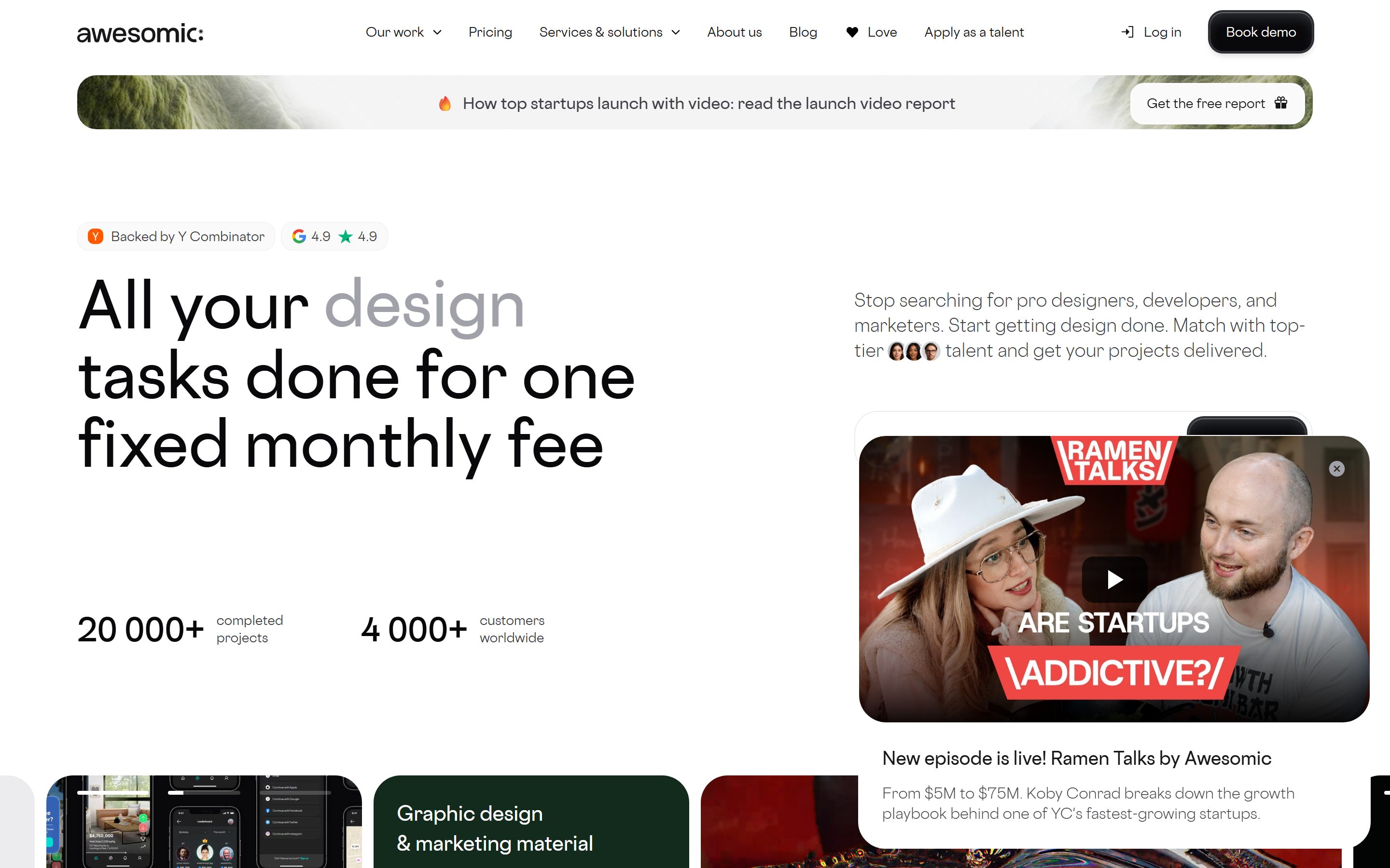
Awesomic's landing surface is a bright, agency-grade SaaS marketing page — a pure white canvas (`{colors.canvas}` — #ffffff) carrying near-black pill CTAs (`{colors.primary}` — #18181b), a single custom display typeface (**Cosmica**) used at every level, and very soft-rounded light-gray cards (`{colors.surface-card}` — #ececee at `{rounded.card}` — 28px) that show off product previews, talent photos, and testimonial blocks. The system reads as confident-but-friendly: heavy corner rounding, near-monochrome ink, and small chromatic accents reserved for badges.
The type voice is unusual — Awesomic runs **Cosmica** for *everything*: the 64px hero headline, the 40px section heads, the 15px body, and even the 13px button labels all share one geometric family. Hierarchy comes entirely from size and weight (600 for display, 400 for body, 500 for buttons), not from a display/body family split.
Color is near-monochrome. The ink ladder runs `{colors.ink}` (#09090b) for headlines, `{colors.body}` (#3f3f46) for running text, and `{colors.muted}` (#71717a) / `{colors.muted-soft}` (#a1a1aa) for secondary labels. Brand voltage comes from heavy rounding and embedded product/photo content rather than color — accents like `{colors.accent-orange}` (#ff5a00) and `{colors.accent-blue}` (#3898ec) appear only on small badges (the Y Combinator badge, Google rating star).
The signature component is the **pill** — both the primary CTA and the email-capture field use a full pill radius (`{rounded.full}`), and the inline pill button carries a richly layered inset shadow that makes it look pressed-glossy. Cards are stacked into horizontally-scrolling galleries (the "Web & product / Motion design" preview row) and into bento-style feature grids ("Why teams choose Awesomic").
**Key Characteristics:**
- Pure white canvas with near-black pill CTA (`{colors.primary}` — #18181b). The CTA carries a multi-layer inset + drop shadow for a glossy pressed look.
- Single custom display family **Cosmica** across all roles (substituted with Inter here). Hierarchy from size/weight only.
- Very soft card rounding — `{rounded.card}` (28px) is the dominant card radius (210+ occurrences at 36px and 320+ at 12px across smaller chips).
- Light-gray card surfaces (`{colors.surface-card}` — #ececee, `{colors.surface-mid}` — #f4f4f5) for category previews, feature bento cells, and testimonials.
- Near-monochrome palette; chromatic accents (`{colors.accent-orange}`, `{colors.accent-blue}`) confined to badges.
- Tag pills (`{component.tag-pill}`) under each category card listing capabilities ("UI/UX design", "Mobile app", "Packaging") in full-pill chips.
- Dark bullet panel (`{component.bullet-panel-dark}`) — a near-black rounded card listing pain-points ("Forget about unreliable freelancers") as the only dark surface above the fold.
## Colors
### Brand & Action
- **Primary** (`{colors.primary}` — #18181b): The dominant action color — all pill CTAs ("Book demo", "Get started"), the dark bullet panel. Text on it is `{colors.on-primary}` (#ffffff).
- **Primary Strong** (`{colors.primary-strong}` — #040308): A deeper near-black observed on layered dark surfaces; used as the darkest base tone.
- **Accent Orange** (`{colors.accent-orange}` — #ff5a00): A scarce hot accent on the Y Combinator badge and inline emphasis. Never on CTAs.
- **Accent Blue** (`{colors.accent-blue}` — #3898ec): Appears on the Google rating chip and inline link affordances. Rare.
- **Accent Navy** (`{colors.accent-navy}` — #222236) / **Accent Periwinkle** (`{colors.accent-periwinkle}` — #d0d8e9): Small chromatic moments inside product previews and badges.
### Surface
- **Canvas** (`{colors.canvas}` — #ffffff): The default page floor and input background.
- **Surface Soft** (`{colors.surface-soft}` — #fafafa): Barely-tinted section dividers, testimonial card fills.
- **Surface Mid** (`{colors.surface-mid}` — #f4f4f5): Announcement bar, feature bento cells, the pre-footer CTA band.
- **Surface Card** (`{colors.surface-card}` — #ececee): Category preview cards and primary content cards (measured `card.background`).
- **Hairline** (`{colors.hairline}` — #e4e4e7): 1px borders and inset top-edge highlights (the system's `inset 0 1px 0` divider tone).
- **Hairline Soft** (`{colors.hairline-soft}` — #d4d4d8) / **Neutral Line** (`{colors.neutral-line}` — #dddddd): Softer dividers and chip outlines.
- **Neutral Strong** (`{colors.neutral-strong}` — #222222) / **Pure Black** (`{colors.pure-black}` — #000000): Used in dark imagery overlays and icon strokes.
### Text
- **Ink** (`{colors.ink}` — #09090b): All headlines and max-contrast type (measured `h1.color`).
- **Body** (`{colors.body}` — #3f3f46): Default running-text color (the most frequent measured color — `body.color`).
- **Muted** (`{colors.muted}` — #71717a): Secondary labels, stat captions ("completed projects").
- **Muted Soft** (`{colors.muted-soft}` — #a1a1aa): Tertiary text, placeholder text, faded client logos.
- **Link** (`{colors.link}` — #333333): Inline anchor color.
- **On Primary** (`{colors.on-primary}` — #ffffff): Text on dark pill CTAs and the dark bullet panel.
## Typography
### Font Family
The system runs a single family — **Cosmica** — across every role. Cosmica is a custom geometric sans (not a standard web font); the fallback stack walks `Inter, sans-serif`. Unusually, there is no display/body family split: the 64px hero headline, the 40px section heads, the 15px body, and the 13px button labels all share Cosmica. Hierarchy is built from size and weight alone:
- Display (`600` weight) — h1 and h2
- Body (`400` weight) — paragraphs and card text
- Button (`500` weight) — CTA labels
### Hierarchy
| Token | Size | Weight | Line Height | Letter Spacing | Use |
|---|---|---|---|---|---|
| `{typography.display-xl}` | 64px | 600 | 1.12 | 0 | Hero headline ("All your design tasks done for one fixed monthly fee") |
| `{typography.display-md}` | 40px | 600 | 1.28 | 0 | Section heads ("Why teams choose Awesomic", "Get your product done without headache") |
| `{typography.body-md}` | 15px | 400 | 1.45 | 0 | Default running-text, card body, sub-headlines, stat captions |
| `{typography.button}` | 13px | 500 | 1.25 | 0 | Button labels, nav links, tag pills |
### Principles
Because one family carries all roles, the system leans hard on size jumps (64 → 40 → 15) and the single 600 display weight. Display headlines stay at 600 — never heavier. Body is always 400. The two-tone hero treatment (e.g. "All your **design** tasks…" where one word renders in `{colors.muted-soft}` gray) is a recurring device that uses color, not weight, to create emphasis.
### Note on Font Substitutes
**Cosmica is a custom typeface and is not available as a public web font.** If Cosmica is unavailable, **Inter** is the documented substitute (and is already the fallback in the stack). Inter at weight 600 for display and 400 for body preserves the geometric, neutral character; **Manrope** at weight 600 is a closer geometric alternative for the display headlines. Never claim to ship Cosmica.
## Layout
### Spacing System
- **Base unit:** 4px.
- **Tokens:** `{spacing.xxs}` 4px · `{spacing.xs}` 8px · `{spacing.sm}` 12px · `{spacing.md}` 16px · `{spacing.lg}` 20px · `{spacing.xl}` 24px · `{spacing.xxl}` 28px · `{spacing.xxxl}` 32px.
- The dominant measured rhythm sits at 4px (325), 8px (356), and 20px (225) — small, frequent gaps inside chips and cards, with 20–28px for card padding and gallery gutters.
### Grid & Container
- **Hero band:** A 2-column split — headline + stats on the left, supporting paragraph + email-capture on the right.
- **Category gallery:** A horizontally-scrolling row of preview cards ("Web & product", "Graphic design & marketing material", "Motion design & video production").
- **Bento grid:** The "Why teams choose Awesomic" section uses a multi-cell bento of varied card sizes (stat cells, talent photo, testimonial, skill-tag cloud).
- **Capability grid:** A 3-column grid of category cards ("UI/UX design", "Brand identity", "Product design") each with a row of tag pills.
### Whitespace Philosophy
The page uses generous vertical breathing room between bands and tight internal spacing inside cards. Stat blocks ("20 000+ completed projects") sit on a lot of open white canvas in the hero, while card interiors pack tag pills at 4–8px gaps.
## Elevation & Depth
| Level | Treatment | Use |
|---|---|---|
| Flat | No shadow | Body sections, top nav, most content cards (`card.shadow: none`) |
| Inset top-edge | `inset 0 1px 0 {colors.hairline}` and `inset 0 0.5px 0 #ffffff` | Subtle top-highlight dividers on chips and grouped controls (measured) |
| Glossy pill | Layered inset + ring + drop shadow | The primary pill CTA |
| Soft drop | `rgba(0,0,0,0.04) 0px 4px 12px` | A single soft float on an elevated card (measured) |
The signature elevation is the **glossy pill CTA**, whose measured shadow stacks four layers: `rgba(255,255,255,0.5) 0 0.5px 0 inset` (top sheen), `rgba(117,123,133,0.4) 0 9px 14px -5px inset` (inner depth), `rgb(44,46,52) 0 0 0 1.5px` (a near-black ring), and `rgba(0,0,0,0.14) 0 4px 6px` (drop). The result is a button that reads as a physical, pressed-glossy capsule. Most other surfaces are flat — depth comes from rounding and the gray card fills, not shadows.
## Shapes
### Border Radius Scale
| Token | Value | Use |
|---|---|---|
| `{rounded.sm}` | 6px | Rare small inline elements |
| `{rounded.md}` | 12px | Small chips and inner elements (most frequent at 321 occurrences) |
| `{rounded.lg}` | 14px | Buttons and inputs (measured `button.radius` + `input.radius`) |
| `{rounded.xl}` | 16px | Mid containers |
| `{rounded.xxl}` | 24px | Larger panels (the dark bullet panel) |
| `{rounded.card}` | 28px | Standard content cards (measured `card.radius`) |
| `{rounded.pill-soft}` | 36px | Large preview cards / category gallery cards (210 occurrences) |
| `{rounded.round}` | 64px | Hero/showcase container corners (29 occurrences) |
| `{rounded.full}` | 1000px | Pill CTAs, email-capture, tag pills, badges, avatars |
### Photography & Card Geometry
Category preview cards and the announcement bar use full-pill or heavily-rounded corners (`{rounded.full}`, `{rounded.pill-soft}`). Talent and testimonial avatars are perfect circles (`{rounded.full}`). The overall geometry skews very soft — there are no sharp corners anywhere in the system.
## Components
### Top Navigation
**`top-nav`** — White nav bar on `{colors.canvas}` with the lowercase "awesomic:" wordmark at left, a horizontal menu (Our work, Pricing, Services & solutions, About us, Blog, Love, Apply as a talent) center in `{typography.button}` (Cosmica 13px / 500), and a right cluster with a "Log in" `{component.nav-link}` and a "Book demo" `{component.button-pill}`.
**`nav-link`** — Inline text menu item, transparent background, `{colors.ink}` text, `{typography.button}`. Dropdown menus on "Our work" and "Services & solutions".
**`announcement-bar`** — A full-pill banner (`{rounded.full}`) on `{colors.surface-mid}` carrying a promo line ("How top startups launch with video…") with an inline "Get the free report" pill at the right end. Sits directly below the nav.
### Buttons
**`button-primary`** — The base CTA shape. Background `{colors.primary}` (#18181b), text `{colors.on-primary}`, type `{typography.button}` (Cosmica 13px / 500), rounded `{rounded.lg}` (14px), padding 12px 12px 12px 14px (measured).
**`button-pill`** — The dominant hero CTA. Same fill and type as `button-primary` but rounded `{rounded.full}` (1000px) into a full capsule and carrying the glossy multi-layer inset shadow described in Elevation. Used for "Book demo" and inline submit buttons.
### Inputs & Forms
**`input`** — Standard text input. Background `{colors.canvas}`, text `{colors.body}`, type `{typography.body-md}`, rounded `{rounded.lg}` (14px) (measured `input.radius`). Placeholder text in `{colors.muted-soft}`.
**`email-capture`** — The hero's lead-capture control: a full-pill (`{rounded.full}`) white field on `{colors.canvas}` holding an "Email address" input on the left and an embedded "Book demo" `{component.button-pill}` flush at the right edge.
### Cards & Containers
**`card`** — Standard content card. Background `{colors.surface-card}` (#ececee), rounded `{rounded.card}` (28px), no shadow (measured). Used in bento cells and content blocks.
**`category-card`** — Large preview cards in the horizontally-scrolling gallery ("Web & product", "Graphic design & marketing material", "Motion design & video production"). Background `{colors.surface-card}` or a product screenshot/imagery fill, rounded heavily (`{rounded.pill-soft}` / `{rounded.card}`), with a category label in `{typography.body-md}` and a row of `{component.tag-pill}` chips at the bottom.
**`feature-card`** — Bento-grid cells in "Why teams choose Awesomic" (stat cells like "4 000+ Customers", "30+ Skill sets", "Flat monthly fee"). Background `{colors.surface-mid}`, rounded `{rounded.card}`, holding a stat in `{typography.display-md}` scale and a caption in `{colors.muted}`.
**`bullet-panel-dark`** — The dark pain-point panel ("Forget about unreliable freelancers", "No more contractors ghosting before launch"). Background `{colors.primary}` (#18181b), text `{colors.on-primary}`, rounded `{rounded.xxl}` (24px). The only dark content surface above the fold.
**`testimonial-card`** — Customer-quote cards in the "Trusted by 4,000+ companies" grid. Background `{colors.surface-soft}`, rounded `{rounded.card}`, top row with an `{component.avatar-circle}` + name + role, quote below in `{typography.body-md}`.
### Tags / Badges
**`tag-pill`** — Full-pill capability chips under category cards ("UI/UX design", "Mobile app", "Packaging", "Banners"). Background `{colors.canvas}`, text `{colors.muted}`, type `{typography.button}`, rounded `{rounded.full}`.
**`badge-pill`** — Trust badges in the hero ("Backed by Y Combinator" with the orange YC mark, "Google 4.9 ★ 4.9"). Background `{colors.canvas}`, text `{colors.ink}`, rounded `{rounded.full}`. The YC mark uses `{colors.accent-orange}`; the Google star uses `{colors.accent-blue}`.
**`avatar-circle`** — Circular talent/testimonial photo, rounded `{rounded.full}`, default fill `{colors.surface-card}`. Overlapping avatar clusters appear inline in the hero paragraph.
### CTA / Conversion
**`cta-band`** — The pre-footer conversion bands ("Get your product done without headache", "Free consultation to scope your creative projects"). Background `{colors.surface-mid}` (or imagery), rounded `{rounded.card}`, heading in `{typography.display-md}`, with an embedded `{component.email-capture}` or `{component.button-pill}`.
## Do's and Don'ts
### Do
- Reserve `{colors.primary}` (#18181b) for pill CTAs and the dark bullet panel. Awesomic's action color is near-black, never colored.
- Use Cosmica (Inter substitute) at 600 for display and 400 for body. Build hierarchy from size, not extra weights.
- Use the two-tone headline device — render one emphasis word in `{colors.muted-soft}` gray inside an otherwise ink headline.
- Apply the glossy multi-layer shadow only to the pill CTA; keep all other surfaces flat.
- Keep cards very soft — `{rounded.card}` (28px) for content cards, `{rounded.full}` for pills, badges, and avatars.
- Confine chromatic accents (`{colors.accent-orange}`, `{colors.accent-blue}`) to small trust badges.
- Use `{component.tag-pill}` rows to enumerate capabilities under category cards.
### Don't
- Don't introduce a second type family. Cosmica (or Inter) carries every role.
- Don't bold display headlines beyond 600 or set body above 400.
- Don't add accent colors to CTAs — the action layer is monochrome near-black.
- Don't add drop shadows to content cards; the system keeps them flat (`card.shadow: none`).
- Don't use sharp corners — every surface is heavily rounded.
- Don't document hover styling — primary darkens/depresses on press; nothing else changes.
## Responsive Behavior
### Breakpoints
| Name | Width | Key Changes |
|---|---|---|
| Mobile | < 768px | Hamburger nav; hero collapses to single column (headline → stats → paragraph → email-capture); category gallery becomes a swipe carousel; bento grid stacks 1-up |
| Tablet | 768–1024px | Top nav tightens; bento cells reflow 2-up; capability grid 2-up |
| Desktop | 1024–1440px | Full horizontal nav; 2-column hero; 3-column capability grid; multi-cell bento |
| Wide | > 1440px | Same as desktop with more outer breathing room |
> Note: exact breakpoint values were not measured; the table is inferred from the captured desktop and full-page screenshots — **derived**.
### Touch Targets
- `{component.button-pill}` carries 12–14px padding; the pill silhouette provides a comfortable tap area.
- `{component.tag-pill}` chips are small; their effective tap area meets target sizes only with the surrounding row spacing (4–8px gaps).
- `{component.input}` and `{component.email-capture}` sit at standard control heights.
### Collapsing Strategy
- The horizontally-scrolling category gallery is a swipeable carousel at all sizes (note the progress-bar indicator at the top of the first preview card).
- The bento grid reduces columns rather than scaling cards down.
- The hero's 2-column split stacks to single-column with the email-capture pill last.
## Iteration Guide
1. Focus on ONE component at a time. Reference its YAML key directly (`{component.category-card}`, `{component.bullet-panel-dark}`).
2. Variants of an existing component live as separate entries in `components:`.
3. Use `{token.refs}` everywhere — never inline hex.
4. Never document hover. Default and Active/Pressed states only.
5. Keep the single-family rule: Cosmica/Inter at 600 (display) and 400 (body). Don't introduce a second typeface.
6. The glossy pill shadow belongs only on the CTA. Keep cards flat.
7. When in doubt about emphasis: bigger Cosmica, or the gray two-tone headline word — not bolder.
## Known Gaps
- **Cosmica** is a custom typeface and not publicly available; Inter is documented as the shipping substitute. The custom font was not flagged in `fonts_licensed`, but it is non-standard — exact metrics may differ from the substitute.
- Only the landing page was captured; interior pages (Pricing, Services, Apply-as-talent) are out of scope and may introduce additional components or surfaces.
- Breakpoint widths and responsive reflow are inferred from desktop + full-page screenshots, not measured — flagged **derived** above.
- Button text color is reported by the analyzer as `#18181b` (the dark fill); on-primary white text is documented from screenshot ground-truth.
- Input focus, error, and success states were not extracted — only base `{component.input}` background and radius are measured.
- The dark imagery overlays (Motion design preview, the magenta gradient in "Free consultation") carry colors from photographic/3D content, not system tokens; only the surrounding card chrome is documented.
- Animation and transition timings (carousel scroll, pill press, gallery snap) are not in scope.
- Several measured radius values (40px, 48px, 56px, 80px) occur rarely and were folded into the nearest documented token rather than given dedicated names.
<!-- Documented by duply · real-world design systems as ready-to-use DESIGN.md for AI coding agents · https://duply.ai/awesomic/design-md -->
Color Palette
Accent
Neutrals
Typography
display-xl64px · 600 · 1.12
The quick brown fox jumpsdisplay-md40px · 600 · 1.28
The quick brown fox jumpsbody-md15px · 400 · 1.45
The quick brown fox jumpsbutton13px · 500 · 1.25
The quick brown fox jumpsSpacing & Shape
Spacing
| Name | Value | Preview |
|---|---|---|
| xxs | 4px | |
| xs | 8px | |
| sm | 12px | |
| md | 16px | |
| lg | 20px | |
| xl | 24px | |
| xxl | 28px | |
| xxxl | 32px |
Border Radius
| Name | Value | Preview |
|---|---|---|
| sm | 6px | |
| md | 12px | |
| lg | 14px | |
| xl | 16px | |
| xxl | 24px | |
| card | 28px | |
| pill-soft | 36px | |
| round | 64px | |
| full | 1000px |
More like this


---
version: alpha
name: Awesomic-design-analysis
description: A bright, agency-grade SaaS marketing surface built on a pure white canvas with near-black pill-shaped CTAs, a single custom geometric display face (Cosmica) used at every level, and very soft-rounded light-gray cards (~28px) that hold product previews, talent photos, and testimonial blocks. The voice is confident, friendly, and product-forward — heavy rounding, near-monochrome palette, and small chromatic accents (orange, blue) reserved for badges.
colors:
  primary: "#18181b"
  primary-strong: "#040308"
  ink: "#09090b"
  body: "#3f3f46"
  muted: "#71717a"
  muted-soft: "#a1a1aa"
  neutral-strong: "#222222"
  hairline: "#e4e4e7"
  hairline-soft: "#d4d4d8"
  canvas: "#ffffff"
  surface-soft: "#fafafa"
  surface-mid: "#f4f4f5"
  surface-card: "#ececee"
  on-primary: "#ffffff"
  link: "#333333"
  accent-navy: "#222236"
  accent-blue: "#3898ec"
  accent-periwinkle: "#d0d8e9"
  accent-orange: "#ff5a00"
  pure-black: "#000000"
  neutral-line: "#dddddd"
typography:
  display-xl:
    fontFamily: "Cosmica, Inter, sans-serif"
    fontSize: 64px
    fontWeight: 600
    lineHeight: 1.12
    letterSpacing: 0
  display-md:
    fontFamily: "Cosmica, Inter, sans-serif"
    fontSize: 40px
    fontWeight: 600
    lineHeight: 1.28
    letterSpacing: 0
  body-md:
    fontFamily: "Cosmica, Inter, sans-serif"
    fontSize: 15px
    fontWeight: 400
    lineHeight: 1.45
    letterSpacing: 0
  button:
    fontFamily: "Cosmica, Inter, sans-serif"
    fontSize: 13px
    fontWeight: 500
    lineHeight: 1.25
    letterSpacing: 0
rounded:
  sm: 6px
  md: 12px
  lg: 14px
  xl: 16px
  xxl: 24px
  card: 28px
  pill-soft: 36px
  round: 64px
  full: 1000px
spacing:
  xxs: 4px
  xs: 8px
  sm: 12px
  md: 16px
  lg: 20px
  xl: 24px
  xxl: 28px
  xxxl: 32px
components:
  top-nav:
    backgroundColor: "{colors.canvas}"
    textColor: "{colors.ink}"
    typography: "{typography.button}"
  button-primary:
    backgroundColor: "{colors.primary}"
    textColor: "{colors.on-primary}"
    typography: "{typography.button}"
    rounded: "{rounded.lg}"
    padding: 12px 12px 12px 14px
  button-pill:
    backgroundColor: "{colors.primary}"
    textColor: "{colors.on-primary}"
    typography: "{typography.button}"
    rounded: "{rounded.full}"
    padding: 12px 12px 12px 14px
  nav-link:
    backgroundColor: transparent
    textColor: "{colors.ink}"
    typography: "{typography.button}"
  announcement-bar:
    backgroundColor: "{colors.surface-mid}"
    textColor: "{colors.ink}"
    typography: "{typography.body-md}"
    rounded: "{rounded.full}"
  hero-band:
    backgroundColor: "{colors.canvas}"
    textColor: "{colors.ink}"
    typography: "{typography.display-xl}"
  email-capture:
    backgroundColor: "{colors.canvas}"
    textColor: "{colors.body}"
    typography: "{typography.body-md}"
    rounded: "{rounded.full}"
  input:
    backgroundColor: "{colors.canvas}"
    textColor: "{colors.body}"
    typography: "{typography.body-md}"
    rounded: "{rounded.lg}"
  card:
    backgroundColor: "{colors.surface-card}"
    textColor: "{colors.ink}"
    typography: "{typography.body-md}"
    rounded: "{rounded.card}"
  category-card:
    backgroundColor: "{colors.surface-card}"
    textColor: "{colors.ink}"
    typography: "{typography.body-md}"
    rounded: "{rounded.card}"
  feature-card:
    backgroundColor: "{colors.surface-mid}"
    textColor: "{colors.ink}"
    typography: "{typography.body-md}"
    rounded: "{rounded.card}"
  bullet-panel-dark:
    backgroundColor: "{colors.primary}"
    textColor: "{colors.on-primary}"
    typography: "{typography.body-md}"
    rounded: "{rounded.xxl}"
  testimonial-card:
    backgroundColor: "{colors.surface-soft}"
    textColor: "{colors.ink}"
    typography: "{typography.body-md}"
    rounded: "{rounded.card}"
  tag-pill:
    backgroundColor: "{colors.canvas}"
    textColor: "{colors.muted}"
    typography: "{typography.button}"
    rounded: "{rounded.full}"
  avatar-circle:
    backgroundColor: "{colors.surface-card}"
    textColor: "{colors.ink}"
    rounded: "{rounded.full}"
  badge-pill:
    backgroundColor: "{colors.canvas}"
    textColor: "{colors.ink}"
    typography: "{typography.button}"
    rounded: "{rounded.full}"
  cta-band:
    backgroundColor: "{colors.surface-mid}"
    textColor: "{colors.ink}"
    typography: "{typography.display-md}"
    rounded: "{rounded.card}"
---

## Overview

Awesomic's landing surface is a bright, agency-grade SaaS marketing page — a pure white canvas (`{colors.canvas}` — #ffffff) carrying near-black pill CTAs (`{colors.primary}` — #18181b), a single custom display typeface (**Cosmica**) used at every level, and very soft-rounded light-gray cards (`{colors.surface-card}` — #ececee at `{rounded.card}` — 28px) that show off product previews, talent photos, and testimonial blocks. The system reads as confident-but-friendly: heavy corner rounding, near-monochrome ink, and small chromatic accents reserved for badges.

The type voice is unusual — Awesomic runs **Cosmica** for *everything*: the 64px hero headline, the 40px section heads, the 15px body, and even the 13px button labels all share one geometric family. Hierarchy comes entirely from size and weight (600 for display, 400 for body, 500 for buttons), not from a display/body family split.

Color is near-monochrome. The ink ladder runs `{colors.ink}` (#09090b) for headlines, `{colors.body}` (#3f3f46) for running text, and `{colors.muted}` (#71717a) / `{colors.muted-soft}` (#a1a1aa) for secondary labels. Brand voltage comes from heavy rounding and embedded product/photo content rather than color — accents like `{colors.accent-orange}` (#ff5a00) and `{colors.accent-blue}` (#3898ec) appear only on small badges (the Y Combinator badge, Google rating star).

The signature component is the **pill** — both the primary CTA and the email-capture field use a full pill radius (`{rounded.full}`), and the inline pill button carries a richly layered inset shadow that makes it look pressed-glossy. Cards are stacked into horizontally-scrolling galleries (the "Web & product / Motion design" preview row) and into bento-style feature grids ("Why teams choose Awesomic").

**Key Characteristics:**
- Pure white canvas with near-black pill CTA (`{colors.primary}` — #18181b). The CTA carries a multi-layer inset + drop shadow for a glossy pressed look.
- Single custom display family **Cosmica** across all roles (substituted with Inter here). Hierarchy from size/weight only.
- Very soft card rounding — `{rounded.card}` (28px) is the dominant card radius (210+ occurrences at 36px and 320+ at 12px across smaller chips).
- Light-gray card surfaces (`{colors.surface-card}` — #ececee, `{colors.surface-mid}` — #f4f4f5) for category previews, feature bento cells, and testimonials.
- Near-monochrome palette; chromatic accents (`{colors.accent-orange}`, `{colors.accent-blue}`) confined to badges.
- Tag pills (`{component.tag-pill}`) under each category card listing capabilities ("UI/UX design", "Mobile app", "Packaging") in full-pill chips.
- Dark bullet panel (`{component.bullet-panel-dark}`) — a near-black rounded card listing pain-points ("Forget about unreliable freelancers") as the only dark surface above the fold.

## Colors

### Brand & Action
- **Primary** (`{colors.primary}` — #18181b): The dominant action color — all pill CTAs ("Book demo", "Get started"), the dark bullet panel. Text on it is `{colors.on-primary}` (#ffffff).
- **Primary Strong** (`{colors.primary-strong}` — #040308): A deeper near-black observed on layered dark surfaces; used as the darkest base tone.
- **Accent Orange** (`{colors.accent-orange}` — #ff5a00): A scarce hot accent on the Y Combinator badge and inline emphasis. Never on CTAs.
- **Accent Blue** (`{colors.accent-blue}` — #3898ec): Appears on the Google rating chip and inline link affordances. Rare.
- **Accent Navy** (`{colors.accent-navy}` — #222236) / **Accent Periwinkle** (`{colors.accent-periwinkle}` — #d0d8e9): Small chromatic moments inside product previews and badges.

### Surface
- **Canvas** (`{colors.canvas}` — #ffffff): The default page floor and input background.
- **Surface Soft** (`{colors.surface-soft}` — #fafafa): Barely-tinted section dividers, testimonial card fills.
- **Surface Mid** (`{colors.surface-mid}` — #f4f4f5): Announcement bar, feature bento cells, the pre-footer CTA band.
- **Surface Card** (`{colors.surface-card}` — #ececee): Category preview cards and primary content cards (measured `card.background`).
- **Hairline** (`{colors.hairline}` — #e4e4e7): 1px borders and inset top-edge highlights (the system's `inset 0 1px 0` divider tone).
- **Hairline Soft** (`{colors.hairline-soft}` — #d4d4d8) / **Neutral Line** (`{colors.neutral-line}` — #dddddd): Softer dividers and chip outlines.
- **Neutral Strong** (`{colors.neutral-strong}` — #222222) / **Pure Black** (`{colors.pure-black}` — #000000): Used in dark imagery overlays and icon strokes.

### Text
- **Ink** (`{colors.ink}` — #09090b): All headlines and max-contrast type (measured `h1.color`).
- **Body** (`{colors.body}` — #3f3f46): Default running-text color (the most frequent measured color — `body.color`).
- **Muted** (`{colors.muted}` — #71717a): Secondary labels, stat captions ("completed projects").
- **Muted Soft** (`{colors.muted-soft}` — #a1a1aa): Tertiary text, placeholder text, faded client logos.
- **Link** (`{colors.link}` — #333333): Inline anchor color.
- **On Primary** (`{colors.on-primary}` — #ffffff): Text on dark pill CTAs and the dark bullet panel.

## Typography

### Font Family
The system runs a single family — **Cosmica** — across every role. Cosmica is a custom geometric sans (not a standard web font); the fallback stack walks `Inter, sans-serif`. Unusually, there is no display/body family split: the 64px hero headline, the 40px section heads, the 15px body, and the 13px button labels all share Cosmica. Hierarchy is built from size and weight alone:
- Display (`600` weight) — h1 and h2
- Body (`400` weight) — paragraphs and card text
- Button (`500` weight) — CTA labels

### Hierarchy

| Token | Size | Weight | Line Height | Letter Spacing | Use |
|---|---|---|---|---|---|
| `{typography.display-xl}` | 64px | 600 | 1.12 | 0 | Hero headline ("All your design tasks done for one fixed monthly fee") |
| `{typography.display-md}` | 40px | 600 | 1.28 | 0 | Section heads ("Why teams choose Awesomic", "Get your product done without headache") |
| `{typography.body-md}` | 15px | 400 | 1.45 | 0 | Default running-text, card body, sub-headlines, stat captions |
| `{typography.button}` | 13px | 500 | 1.25 | 0 | Button labels, nav links, tag pills |

### Principles
Because one family carries all roles, the system leans hard on size jumps (64 → 40 → 15) and the single 600 display weight. Display headlines stay at 600 — never heavier. Body is always 400. The two-tone hero treatment (e.g. "All your **design** tasks…" where one word renders in `{colors.muted-soft}` gray) is a recurring device that uses color, not weight, to create emphasis.

### Note on Font Substitutes
**Cosmica is a custom typeface and is not available as a public web font.** If Cosmica is unavailable, **Inter** is the documented substitute (and is already the fallback in the stack). Inter at weight 600 for display and 400 for body preserves the geometric, neutral character; **Manrope** at weight 600 is a closer geometric alternative for the display headlines. Never claim to ship Cosmica.

## Layout

### Spacing System
- **Base unit:** 4px.
- **Tokens:** `{spacing.xxs}` 4px · `{spacing.xs}` 8px · `{spacing.sm}` 12px · `{spacing.md}` 16px · `{spacing.lg}` 20px · `{spacing.xl}` 24px · `{spacing.xxl}` 28px · `{spacing.xxxl}` 32px.
- The dominant measured rhythm sits at 4px (325), 8px (356), and 20px (225) — small, frequent gaps inside chips and cards, with 20–28px for card padding and gallery gutters.

### Grid & Container
- **Hero band:** A 2-column split — headline + stats on the left, supporting paragraph + email-capture on the right.
- **Category gallery:** A horizontally-scrolling row of preview cards ("Web & product", "Graphic design & marketing material", "Motion design & video production").
- **Bento grid:** The "Why teams choose Awesomic" section uses a multi-cell bento of varied card sizes (stat cells, talent photo, testimonial, skill-tag cloud).
- **Capability grid:** A 3-column grid of category cards ("UI/UX design", "Brand identity", "Product design") each with a row of tag pills.

### Whitespace Philosophy
The page uses generous vertical breathing room between bands and tight internal spacing inside cards. Stat blocks ("20 000+ completed projects") sit on a lot of open white canvas in the hero, while card interiors pack tag pills at 4–8px gaps.

## Elevation & Depth

| Level | Treatment | Use |
|---|---|---|
| Flat | No shadow | Body sections, top nav, most content cards (`card.shadow: none`) |
| Inset top-edge | `inset 0 1px 0 {colors.hairline}` and `inset 0 0.5px 0 #ffffff` | Subtle top-highlight dividers on chips and grouped controls (measured) |
| Glossy pill | Layered inset + ring + drop shadow | The primary pill CTA |
| Soft drop | `rgba(0,0,0,0.04) 0px 4px 12px` | A single soft float on an elevated card (measured) |

The signature elevation is the **glossy pill CTA**, whose measured shadow stacks four layers: `rgba(255,255,255,0.5) 0 0.5px 0 inset` (top sheen), `rgba(117,123,133,0.4) 0 9px 14px -5px inset` (inner depth), `rgb(44,46,52) 0 0 0 1.5px` (a near-black ring), and `rgba(0,0,0,0.14) 0 4px 6px` (drop). The result is a button that reads as a physical, pressed-glossy capsule. Most other surfaces are flat — depth comes from rounding and the gray card fills, not shadows.

## Shapes

### Border Radius Scale

| Token | Value | Use |
|---|---|---|
| `{rounded.sm}` | 6px | Rare small inline elements |
| `{rounded.md}` | 12px | Small chips and inner elements (most frequent at 321 occurrences) |
| `{rounded.lg}` | 14px | Buttons and inputs (measured `button.radius` + `input.radius`) |
| `{rounded.xl}` | 16px | Mid containers |
| `{rounded.xxl}` | 24px | Larger panels (the dark bullet panel) |
| `{rounded.card}` | 28px | Standard content cards (measured `card.radius`) |
| `{rounded.pill-soft}` | 36px | Large preview cards / category gallery cards (210 occurrences) |
| `{rounded.round}` | 64px | Hero/showcase container corners (29 occurrences) |
| `{rounded.full}` | 1000px | Pill CTAs, email-capture, tag pills, badges, avatars |

### Photography & Card Geometry
Category preview cards and the announcement bar use full-pill or heavily-rounded corners (`{rounded.full}`, `{rounded.pill-soft}`). Talent and testimonial avatars are perfect circles (`{rounded.full}`). The overall geometry skews very soft — there are no sharp corners anywhere in the system.

## Components

### Top Navigation

**`top-nav`** — White nav bar on `{colors.canvas}` with the lowercase "awesomic:" wordmark at left, a horizontal menu (Our work, Pricing, Services & solutions, About us, Blog, Love, Apply as a talent) center in `{typography.button}` (Cosmica 13px / 500), and a right cluster with a "Log in" `{component.nav-link}` and a "Book demo" `{component.button-pill}`.

**`nav-link`** — Inline text menu item, transparent background, `{colors.ink}` text, `{typography.button}`. Dropdown menus on "Our work" and "Services & solutions".

**`announcement-bar`** — A full-pill banner (`{rounded.full}`) on `{colors.surface-mid}` carrying a promo line ("How top startups launch with video…") with an inline "Get the free report" pill at the right end. Sits directly below the nav.

### Buttons

**`button-primary`** — The base CTA shape. Background `{colors.primary}` (#18181b), text `{colors.on-primary}`, type `{typography.button}` (Cosmica 13px / 500), rounded `{rounded.lg}` (14px), padding 12px 12px 12px 14px (measured).

**`button-pill`** — The dominant hero CTA. Same fill and type as `button-primary` but rounded `{rounded.full}` (1000px) into a full capsule and carrying the glossy multi-layer inset shadow described in Elevation. Used for "Book demo" and inline submit buttons.

### Inputs & Forms

**`input`** — Standard text input. Background `{colors.canvas}`, text `{colors.body}`, type `{typography.body-md}`, rounded `{rounded.lg}` (14px) (measured `input.radius`). Placeholder text in `{colors.muted-soft}`.

**`email-capture`** — The hero's lead-capture control: a full-pill (`{rounded.full}`) white field on `{colors.canvas}` holding an "Email address" input on the left and an embedded "Book demo" `{component.button-pill}` flush at the right edge.

### Cards & Containers

**`card`** — Standard content card. Background `{colors.surface-card}` (#ececee), rounded `{rounded.card}` (28px), no shadow (measured). Used in bento cells and content blocks.

**`category-card`** — Large preview cards in the horizontally-scrolling gallery ("Web & product", "Graphic design & marketing material", "Motion design & video production"). Background `{colors.surface-card}` or a product screenshot/imagery fill, rounded heavily (`{rounded.pill-soft}` / `{rounded.card}`), with a category label in `{typography.body-md}` and a row of `{component.tag-pill}` chips at the bottom.

**`feature-card`** — Bento-grid cells in "Why teams choose Awesomic" (stat cells like "4 000+ Customers", "30+ Skill sets", "Flat monthly fee"). Background `{colors.surface-mid}`, rounded `{rounded.card}`, holding a stat in `{typography.display-md}` scale and a caption in `{colors.muted}`.

**`bullet-panel-dark`** — The dark pain-point panel ("Forget about unreliable freelancers", "No more contractors ghosting before launch"). Background `{colors.primary}` (#18181b), text `{colors.on-primary}`, rounded `{rounded.xxl}` (24px). The only dark content surface above the fold.

**`testimonial-card`** — Customer-quote cards in the "Trusted by 4,000+ companies" grid. Background `{colors.surface-soft}`, rounded `{rounded.card}`, top row with an `{component.avatar-circle}` + name + role, quote below in `{typography.body-md}`.

### Tags / Badges

**`tag-pill`** — Full-pill capability chips under category cards ("UI/UX design", "Mobile app", "Packaging", "Banners"). Background `{colors.canvas}`, text `{colors.muted}`, type `{typography.button}`, rounded `{rounded.full}`.

**`badge-pill`** — Trust badges in the hero ("Backed by Y Combinator" with the orange YC mark, "Google 4.9 ★ 4.9"). Background `{colors.canvas}`, text `{colors.ink}`, rounded `{rounded.full}`. The YC mark uses `{colors.accent-orange}`; the Google star uses `{colors.accent-blue}`.

**`avatar-circle`** — Circular talent/testimonial photo, rounded `{rounded.full}`, default fill `{colors.surface-card}`. Overlapping avatar clusters appear inline in the hero paragraph.

### CTA / Conversion

**`cta-band`** — The pre-footer conversion bands ("Get your product done without headache", "Free consultation to scope your creative projects"). Background `{colors.surface-mid}` (or imagery), rounded `{rounded.card}`, heading in `{typography.display-md}`, with an embedded `{component.email-capture}` or `{component.button-pill}`.

## Do's and Don'ts

### Do
- Reserve `{colors.primary}` (#18181b) for pill CTAs and the dark bullet panel. Awesomic's action color is near-black, never colored.
- Use Cosmica (Inter substitute) at 600 for display and 400 for body. Build hierarchy from size, not extra weights.
- Use the two-tone headline device — render one emphasis word in `{colors.muted-soft}` gray inside an otherwise ink headline.
- Apply the glossy multi-layer shadow only to the pill CTA; keep all other surfaces flat.
- Keep cards very soft — `{rounded.card}` (28px) for content cards, `{rounded.full}` for pills, badges, and avatars.
- Confine chromatic accents (`{colors.accent-orange}`, `{colors.accent-blue}`) to small trust badges.
- Use `{component.tag-pill}` rows to enumerate capabilities under category cards.

### Don't
- Don't introduce a second type family. Cosmica (or Inter) carries every role.
- Don't bold display headlines beyond 600 or set body above 400.
- Don't add accent colors to CTAs — the action layer is monochrome near-black.
- Don't add drop shadows to content cards; the system keeps them flat (`card.shadow: none`).
- Don't use sharp corners — every surface is heavily rounded.
- Don't document hover styling — primary darkens/depresses on press; nothing else changes.

## Responsive Behavior

### Breakpoints

| Name | Width | Key Changes |
|---|---|---|
| Mobile | < 768px | Hamburger nav; hero collapses to single column (headline → stats → paragraph → email-capture); category gallery becomes a swipe carousel; bento grid stacks 1-up |
| Tablet | 768–1024px | Top nav tightens; bento cells reflow 2-up; capability grid 2-up |
| Desktop | 1024–1440px | Full horizontal nav; 2-column hero; 3-column capability grid; multi-cell bento |
| Wide | > 1440px | Same as desktop with more outer breathing room |

> Note: exact breakpoint values were not measured; the table is inferred from the captured desktop and full-page screenshots — **derived**.

### Touch Targets
- `{component.button-pill}` carries 12–14px padding; the pill silhouette provides a comfortable tap area.
- `{component.tag-pill}` chips are small; their effective tap area meets target sizes only with the surrounding row spacing (4–8px gaps).
- `{component.input}` and `{component.email-capture}` sit at standard control heights.

### Collapsing Strategy
- The horizontally-scrolling category gallery is a swipeable carousel at all sizes (note the progress-bar indicator at the top of the first preview card).
- The bento grid reduces columns rather than scaling cards down.
- The hero's 2-column split stacks to single-column with the email-capture pill last.

## Iteration Guide

1. Focus on ONE component at a time. Reference its YAML key directly (`{component.category-card}`, `{component.bullet-panel-dark}`).
2. Variants of an existing component live as separate entries in `components:`.
3. Use `{token.refs}` everywhere — never inline hex.
4. Never document hover. Default and Active/Pressed states only.
5. Keep the single-family rule: Cosmica/Inter at 600 (display) and 400 (body). Don't introduce a second typeface.
6. The glossy pill shadow belongs only on the CTA. Keep cards flat.
7. When in doubt about emphasis: bigger Cosmica, or the gray two-tone headline word — not bolder.

## Known Gaps

- **Cosmica** is a custom typeface and not publicly available; Inter is documented as the shipping substitute. The custom font was not flagged in `fonts_licensed`, but it is non-standard — exact metrics may differ from the substitute.
- Only the landing page was captured; interior pages (Pricing, Services, Apply-as-talent) are out of scope and may introduce additional components or surfaces.
- Breakpoint widths and responsive reflow are inferred from desktop + full-page screenshots, not measured — flagged **derived** above.
- Button text color is reported by the analyzer as `#18181b` (the dark fill); on-primary white text is documented from screenshot ground-truth.
- Input focus, error, and success states were not extracted — only base `{component.input}` background and radius are measured.
- The dark imagery overlays (Motion design preview, the magenta gradient in "Free consultation") carry colors from photographic/3D content, not system tokens; only the surrounding card chrome is documented.
- Animation and transition timings (carousel scroll, pill press, gallery snap) are not in scope.
- Several measured radius values (40px, 48px, 56px, 80px) occur rarely and were folded into the nearest documented token rather than given dedicated names.

<!-- Documented by duply · real-world design systems as ready-to-use DESIGN.md for AI coding agents · https://duply.ai/awesomic/design-md -->