
AskDialog
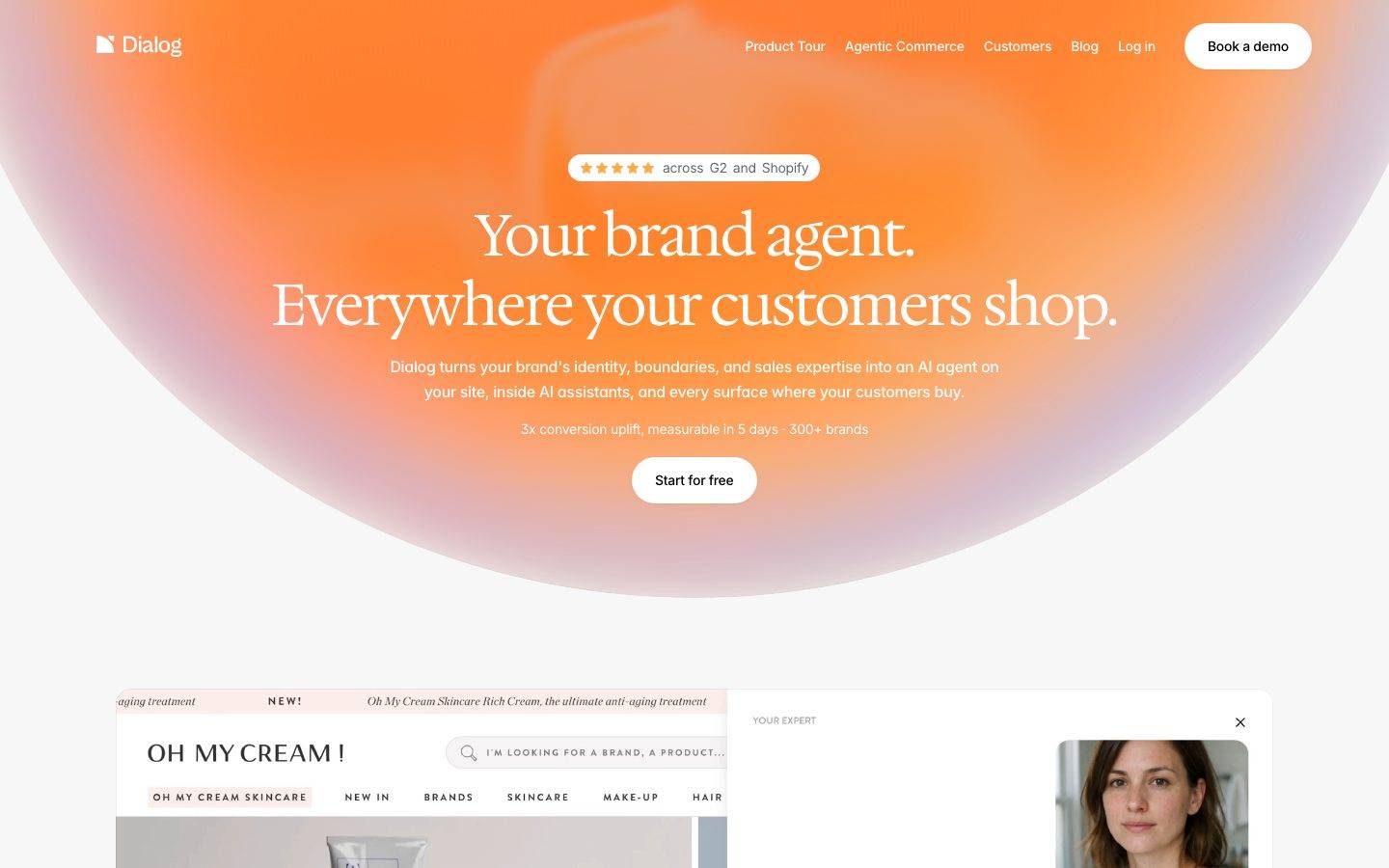
A warm, editorial AI-commerce landing surface built on a near-white canvas (#f7f7f7) with a signature orange radial-glow hero, elegant Hedvig Letters serif display headlines, and Inter body type. The system pairs soft peach-to-lavender aura shadows and heavily rounded (24px) white cards with dramatic pure-black feature bands, reading as premium, calm, and design-forward rather than typical SaaS-blue.
Works withClaude CodeCursorCodexGemini CLICopilotv0LovableBoltWindsurfReplit
---
version: alpha
name: AskDialog-design-analysis
description: "A warm, editorial AI-commerce landing surface built on a near-white canvas (#f7f7f7) with a signature orange radial-glow hero, elegant Hedvig Letters serif display headlines, and Inter body type. The system pairs soft peach-to-lavender aura shadows and heavily rounded (24px) white cards with dramatic pure-black feature bands, reading as premium, calm, and design-forward rather than typical SaaS-blue."

colors:
  ink: "#000000"
  neutral: "#999999"
  accent-orange: "#ff9752"
  canvas: "#f7f7f7"
  surface: "#ffffff"
  on-dark: "#ffffff"
  link: "#0000ee"

typography:
  display-xl:
    fontFamily: "Hedvig Letters Serif, Georgia, serif"
    fontSize: 60px
    fontWeight: 400
    lineHeight: 1.2
    letterSpacing: -0.03em
  display-lg:
    fontFamily: "Hedvig Letters Serif, Georgia, serif"
    fontSize: 42px
    fontWeight: 400
    lineHeight: 1.2
    letterSpacing: -0.03em
  title:
    fontFamily: "Hedvig Letters Sans, Inter, sans-serif"
    fontSize: 22px
    fontWeight: 400
    lineHeight: 1.3
    letterSpacing: -0.02em
  body-lg:
    fontFamily: "Inter, sans-serif"
    fontSize: 16px
    fontWeight: 400
    lineHeight: 1.6
    letterSpacing: -0.02em
  body:
    fontFamily: "Inter, sans-serif"
    fontSize: 14px
    fontWeight: 500
    lineHeight: 1.4
    letterSpacing: -0.02em

rounded:
  none: 0px
  xs: 10px
  sm: 12px
  md: 16px
  lg: 24px
  xl: 32px
  xxl: 48px
  pill: 999px
  full: 9999px

spacing:
  xxs: 4px
  xs: 8px
  sm: 12px
  md: 16px
  lg: 20px
  xl: 24px
  xxl: 32px
  xxxl: 48px
  huge: 64px
  section: 96px

components:
  top-nav:
    backgroundColor: transparent
    textColor: "{colors.on-dark}"
    typography: "{typography.body-lg}"
  nav-link:
    backgroundColor: transparent
    textColor: "{colors.on-dark}"
    typography: "{typography.body-lg}"
  button-primary:
    backgroundColor: "{colors.surface}"
    textColor: "{colors.ink}"
    typography: "{typography.body}"
    rounded: "{rounded.full}"
    padding: 12px 24px
  button-accent:
    backgroundColor: "{colors.accent-orange}"
    textColor: "{colors.on-dark}"
    typography: "{typography.body}"
    rounded: "{rounded.pill}"
    padding: 8px 16px
  rating-badge-pill:
    backgroundColor: "{colors.surface}"
    textColor: "{colors.ink}"
    typography: "{typography.body}"
    rounded: "{rounded.pill}"
    padding: 6px 12px
  hero-band:
    backgroundColor: "{colors.accent-orange}"
    textColor: "{colors.on-dark}"
    typography: "{typography.display-xl}"
    padding: 96px
  content-card:
    backgroundColor: "{colors.surface}"
    textColor: "{colors.ink}"
    typography: "{typography.body}"
    rounded: "{rounded.lg}"
    padding: 24px
  feature-card:
    backgroundColor: "{colors.surface}"
    textColor: "{colors.ink}"
    typography: "{typography.title}"
    rounded: "{rounded.xl}"
    padding: 48px
  testimonial-card:
    backgroundColor: "{colors.surface}"
    textColor: "{colors.ink}"
    typography: "{typography.body}"
    rounded: "{rounded.lg}"
    padding: 24px
  dark-feature-band:
    backgroundColor: "{colors.ink}"
    textColor: "{colors.on-dark}"
    typography: "{typography.display-lg}"
    rounded: "{rounded.xl}"
    padding: 64px
  integration-tile:
    backgroundColor: "{colors.surface}"
    textColor: "{colors.ink}"
    typography: "{typography.body}"
    rounded: "{rounded.lg}"
    padding: 24px
  input:
    backgroundColor: "{colors.surface}"
    textColor: "{colors.ink}"
    typography: "{typography.body}"
    rounded: "{rounded.none}"
    padding: 12px 16px
  chat-widget-card:
    backgroundColor: "{colors.surface}"
    textColor: "{colors.ink}"
    typography: "{typography.body}"
    rounded: "{rounded.lg}"
    padding: 24px
---

## Overview

AskDialog's landing surface is a warm, editorial take on AI-commerce marketing. The page floor is a near-white `{colors.canvas}` (#f7f7f7), and the hero opens on a full-bleed orange radial glow (`{colors.accent-orange}` — #ff9752) that fades into peach and lavender at its edges. The overall voice is calm, premium, and design-forward — it deliberately avoids the SaaS-blue-and-black-CTA convention in favor of serif display type, soft aura shadows, and heavily rounded white cards.

Type voice splits three ways: **Hedvig Letters Serif** carries the marquee headlines (h1/h2) at weight 400 with tight -0.03em tracking — a light, elegant serif that gives the brand its editorial, almost print-magazine character. **Hedvig Letters Sans** handles the mid-level subheads (h3). **Inter** handles everything supporting — small headings, body copy, buttons, nav. The serif-for-display, sans-for-support split is the system's defining typographic move.

Structurally the page alternates surface modes: white/near-white bands holding rounded cards, punctuated by dramatic pure-black feature bands (`{colors.ink}` — #000000) that carry big serif statements ("30 years of e-commerce. 30 years of patches."). The contrast between the airy light bands and the deep black bands is the primary rhythm device.

**Key Characteristics:**
- Orange radial-glow hero (`{colors.accent-orange}` — #ff9752) with white overlay text — the brand's signature opening moment. No hard color blocks; the orange dissolves into peach/lavender aura.
- Hedvig Letters Serif display headlines at weight 400 with -0.03em tracking — light, elegant, editorial. This serif IS the brand voice.
- White primary CTA (`{component.button-primary}`) — a fully-rounded white pill with black text ("Start for free", "Book a demo"). The system's action color is white-on-orange, not a colored button.
- Heavily rounded surfaces — the dominant radius is `{rounded.lg}` (24px), with feature bands going to `{rounded.xl}` (32px) and pills at `{rounded.pill}` / `{rounded.full}`.
- Alternating light/dark band rhythm — near-white card sections interspersed with pure-black `{component.dark-feature-band}` panels.
- Soft, layered elevation — faint multi-layer drop shadows plus decorative peach-and-lavender glow shadows behind hero/feature artifacts.
- Product-UI fragments (a mock storefront, a chat widget, testimonial rows) shown inside rounded white cards rather than illustrated.

## Colors

### Brand & Accent
- **Accent Orange** (`{colors.accent-orange}` — #ff9752): The signature hue. Drives the hero radial glow, small accent CTAs like the orange "Learn more" pill (`{component.button-accent}`), and warm edge-glow shadows. It is the only chromatic accent in the system.

### Surface
- **Canvas** (`{colors.canvas}` — #f7f7f7): The default near-white page floor.
- **Surface** (`{colors.surface}` — #ffffff): White cards, testimonial cards, feature cards, chat-widget cards, integration tiles, input fields, and the white CTA pills.
- **Ink as dark surface** (`{colors.ink}` — #000000): The pure-black feature bands (`{component.dark-feature-band}`) use ink as a full-bleed background, inverting text to `{colors.on-dark}`.

### Text
- **Ink** (`{colors.ink}` — #000000): All headlines and primary text on light surfaces.
- **Neutral** (`{colors.neutral}` — #999999): Secondary / muted text — captions, supporting descriptions, fine print.
- **On Dark** (`{colors.on-dark}` — #ffffff): Text over the orange hero and the black feature bands.
- **Link** (`{colors.link}` — #0000ee): The default browser-blue anchor color measured on raw `<a>` elements. This appears to be an unstyled default rather than a deliberate brand link tone (see Known Gaps).

## Typography

### Font Family
The system runs three families. **Hedvig Letters Serif** (open-source, Google Fonts) carries display headlines; **Hedvig Letters Sans** (open-source, Google Fonts) carries mid-level subheads; **Inter** carries body, buttons, nav, and small labels. All measured weights are light-to-medium (400 for display and subheads, 500 for body) — the system never goes heavy.

The split is functional:
- Hedvig Letters Serif (display, 400 weight, -0.03em tracking) — h1, h2
- Hedvig Letters Sans (subhead, 400 weight, -0.02em tracking) — h3
- Inter (support + UI, 400-500 weight, -0.02em tracking) — h4, body, buttons, nav

### Hierarchy

| Token | Size | Weight | Line Height | Letter Spacing | Use |
|---|---|---|---|---|---|
| `{typography.display-xl}` | 60px | 400 | 1.2 | -0.03em | Hero h1 ("Your brand agent. Everywhere your customers shop.") — Hedvig Letters Serif |
| `{typography.display-lg}` | 42px | 400 | 1.2 | -0.03em | Section heads ("Build your brand agent.", "30 years of e-commerce.") — Hedvig Letters Serif |
| `{typography.title}` | 22px | 400 | 1.3 | -0.02em | Sub-section / card titles — Hedvig Letters Sans |
| `{typography.body-lg}` | 16px | 400 | 1.6 | -0.02em | Nav links, intro / lead paragraphs — Inter |
| `{typography.body}` | 14px | 500 | 1.4 | -0.02em | Default running text, buttons, captions — Inter |

### Principles
The serif display type is the brand. Hedvig Letters Serif at weight 400 with -0.03em tracking reads as elegant and editorial — never bold, never tight beyond that. Body copy stays Inter and small (14px / 500). Never put running body copy in the serif, and never render a marquee headline in Inter.

The whole system stays light-weight: display sits at 400, body at 500. There is no measured bold weight anywhere — emphasis comes from size and from serif-vs-sans contrast, not from heavier strokes.

### Note on Font Substitutes
No licensed/custom typefaces were flagged. Hedvig Letters Serif, Hedvig Letters Sans, and Inter are all open-source (Google Fonts) and can be shipped directly. Fallback stacks: `Georgia, serif` for the serif display, `Inter, sans-serif` for the sans subhead and body.

## Layout

### Spacing System
- **Base unit:** 4px.
- **Tokens:** `{spacing.xxs}` 4px · `{spacing.xs}` 8px · `{spacing.sm}` 12px · `{spacing.md}` 16px · `{spacing.lg}` 20px · `{spacing.xl}` 24px · `{spacing.xxl}` 32px · `{spacing.xxxl}` 48px · `{spacing.huge}` 64px · `{spacing.section}` 96px.
- **Dominant rhythm:** 24px (`{spacing.xl}`) is by far the most frequent spacing value (105 occurrences) — it governs card padding and grid gutters.
- **Section padding:** `{spacing.huge}` (64px) and `{spacing.section}` (96px) separate major bands.
- **Card internal padding:** `{spacing.xl}` (24px) on content and testimonial cards; larger `{spacing.xxxl}` (48px) on marquee feature cards.

### Grid & Container
- **Editorial body:** centered single-column bands with cards laid in horizontal rows (testimonial carousel, integration-tile row).
- **Testimonial row:** a scrolling horizontal strip of quote cards with image tiles interleaved.
- **Integration tiles:** a multi-up row of platform tiles (BigCommerce, Salesforce Commerce, Shopify, Magento).

### Whitespace Philosophy
The layout leans generous. Large vertical gaps (64–96px) between bands let the serif headlines and rounded cards breathe, reinforcing the premium/editorial tone. Card interiors are roomy (24–48px). The alternation between airy light bands and dense black feature bands creates the page's cadence.

## Elevation & Depth

| Level | Treatment | Use |
|---|---|---|
| Flat | No shadow | Body bands, hero (glow is decorative, not elevation) |
| Hairline + soft | `rgba(0,0,0,0.04) 0 1px 2px, rgba(0,0,0,0.02) 0 2px 4px, rgba(0,0,0,0.02) 0 4px 8px` | Small cards, tiles, resting UI |
| Lifted card | `rgba(0,0,0,0.12) 0 10px 12px -6px, rgba(0,0,0,0.06) 0 0 0 1px` | Elevated content cards (shadow doubles as a 1px hairline ring) |
| Floating panel | `rgba(0,0,0,0.04) 0 32px 64px 0` | Large floating artifacts (hero mock storefront, chat widget) |
| Inset highlight | `rgba(255,255,255,0.1) 0 1px 0 inset` | Top edge highlight on dark surfaces |

### Decorative Depth
- **Aura glow shadows** are the system's signature: `rgb(245,178,152) ... , rgb(218,199,255) ...` — a peach (#f5b298) and lavender (#dac7ff) pair applied as offset blurred shadows above and below feature artifacts. These give the hero and central "Build your brand agent" glow their warm-to-cool halo.
- **Canvas fade shadows** (`rgba(247,247,247,0.5) 0 -40px 40px` and its transparent variant) create soft top-edge fades where cards meet the near-white canvas.
- These decorative shadow colors (#f5b298, #dac7ff) are effect values, not palette tokens — see Known Gaps.

## Shapes

### Border Radius Scale

| Token | Value | Use |
|---|---|---|
| `{rounded.none}` | 0px | Input fields (the one measured input has square corners) |
| `{rounded.xs}` | 10px | Small inner elements, chips |
| `{rounded.sm}` | 12px | Small cards, secondary containers |
| `{rounded.md}` | 16px | Mid-size cards |
| `{rounded.lg}` | 24px | The dominant card radius — content cards, testimonial cards, tiles |
| `{rounded.xl}` | 32px | Large feature bands / marquee cards |
| `{rounded.xxl}` | 48px | Largest rounded panels |
| `{rounded.pill}` | 999px | Accent pills, rating badge |
| `{rounded.full}` | 9999px | Primary CTA pills |

The system is emphatically round — 24px (`{rounded.lg}`) dominates by a wide margin (82 occurrences), and CTAs use full pill radius. The lone exception is the input field, measured at 0px, which reads as a deliberate square-edged form element against the otherwise soft geometry.

### Photography Geometry
Product / storefront mock imagery and testimonial thumbnails sit inside rounded white cards (`{rounded.lg}`). The hero's mock storefront and the chat-widget panel float as large rounded rectangles with the aura glow behind them.

## Components

### Navigation

**`top-nav`** — Transparent nav bar over the orange hero. Carries the "Dialog" wordmark + logo at left, a horizontal menu center-right (Product Tour, Agentic Commerce, Customers, Blog, Log in), and a white "Book a demo" pill at far right. Menu items render in `{colors.on-dark}` (white) using `{typography.body-lg}`.

**`nav-link`** — Individual menu item, transparent background, white text over the hero glow.

### Buttons

**`button-primary`** — The signature CTA. A fully-rounded (`{rounded.full}`) white pill with `{colors.surface}` background and `{colors.ink}` text ("Start for free", "Book a demo"). Type `{typography.body}` (Inter 14px / 500), padding ~12px × 24px. The action color is white-on-warm, not a colored fill.

**`button-accent`** — The smaller orange "Learn more" pill inside feature sections. Background `{colors.accent-orange}`, text `{colors.on-dark}`, rounded `{rounded.pill}`, padding ~8px × 16px. Used to advance within feature cards, never as the top-level hero CTA.

### Badges

**`rating-badge-pill`** — The hero social-proof chip ("★★★★★ across G2 and Shopify"). Background `{colors.surface}`, text `{colors.ink}`, type `{typography.body}`, rounded `{rounded.pill}`, padding ~6px × 12px.

### Cards & Containers

**`hero-band`** — Full-bleed orange radial-glow band. Background `{colors.accent-orange}`, text `{colors.on-dark}`, marquee headline in `{typography.display-xl}`. Vertical padding `{spacing.section}` (96px). The orange dissolves into peach/lavender at the band edges via the decorative aura shadows.

**`content-card`** — General white content card. Background `{colors.surface}`, rounded `{rounded.lg}` (24px), padding `{spacing.xl}` (24px). Carries a title and description with the multi-layer soft shadow.

**`feature-card`** — Larger marquee card ("AI Personal Shopper", "AI PDP assistant"). Background `{colors.surface}`, rounded `{rounded.xl}` (32px), padding `{spacing.xxxl}` (48px). Title in `{typography.title}`, body in `{typography.body}`, and an inline `{component.button-accent}`.

**`testimonial-card`** — Quote card in the horizontal testimonial strip. Background `{colors.surface}`, rounded `{rounded.lg}`, padding `{spacing.xl}`. Carries the quote in `{typography.body}` plus attribution (name + role).

**`dark-feature-band`** — Full-width pure-black panel ("30 years of e-commerce. 30 years of patches.", the ChatGPT/Gemini agent band, "Study conversations. Find insights."). Background `{colors.ink}`, text `{colors.on-dark}`, big serif statement in `{typography.display-lg}`, rounded `{rounded.xl}`, generous padding `{spacing.huge}` (64px). Sometimes carries an inset top highlight (`rgba(255,255,255,0.1) 0 1px 0 inset`).

**`integration-tile`** — Platform logo tile in the "Works with any store" row (BigCommerce, Salesforce Commerce, Shopify, Magento). Background `{colors.surface}`, rounded `{rounded.lg}`, padding `{spacing.xl}`, logo + label in `{typography.body}`.

**`chat-widget-card`** — The floating product-UI chat panel shown beside the hero mock storefront ("Your expert"). Background `{colors.surface}`, rounded `{rounded.lg}`, padding `{spacing.xl}`, floated with the large `rgba(0,0,0,0.04) 0 32px 64px` shadow.

### Inputs & Forms

**`input`** — The one measured form element. Background `{colors.surface}` (#ffffff), text `{colors.ink}`, type `{typography.body}`, and a square `{rounded.none}` (0px) corner — a deliberate contrast against the system's otherwise rounded geometry. Padding is inferred (see Known Gaps).

## Do's and Don'ts

### Do
- Reserve Hedvig Letters Serif for marquee headlines (h1/h2) at weight 400 with -0.03em tracking. This serif is the brand voice.
- Use the white pill CTA (`{component.button-primary}`) as the primary action. The action color is white-on-warm, not a colored button.
- Use `{colors.accent-orange}` for the hero glow and the small "Learn more" pill only — it is a warm accent, not a text or background workhorse.
- Keep the light/dark band rhythm — near-white card sections alternating with pure-black `{component.dark-feature-band}` panels.
- Default to 24px (`{rounded.lg}`) radius on cards; escalate to 32px only for marquee feature bands.
- Lean on the peach-and-lavender aura shadows behind hero and feature artifacts — they are the signature depth effect.
- Keep body copy small (14px Inter / 500) and let serif size carry hierarchy.

### Don't
- Don't set display headlines in bold. The system stays at weight 400 for serif display — emphasis comes from size, not weight.
- Don't put running body copy in Hedvig Letters Serif; body stays Inter.
- Don't introduce a colored primary button. White-on-warm is the CTA convention.
- Don't scatter pure-black surfaces casually — the black bands are deliberate, spaced statements.
- Don't round the input field — the square-edged input is an intentional counterpoint.
- Don't add hover-state styling beyond the default/active convention.

## Responsive Behavior

The analysis captured a single desktop landing page, so responsive rules below are inferred from structure, not measured.

### Breakpoints (inferred)
| Name | Width | Key Changes |
|---|---|---|
| Mobile | < 768px | Nav collapses to a menu trigger; hero h1 scales down from 60px; testimonial strip becomes swipeable; integration tiles stack; feature cards 1-up |
| Tablet | 768–1024px | Horizontal nav tightens; feature cards 1–2 up; testimonial cards scroll horizontally |
| Desktop | > 1024px | Full nav; hero at full 60px serif; multi-up integration tile row; horizontal testimonial strip |

### Touch Targets
- `{component.button-primary}` white pill provides ample tap area with 12px × 24px padding plus pill radius.
- `{component.nav-link}` items and `{component.button-accent}` pills would need ≥44px effective height on mobile — not verified in this capture.

### Collapsing Strategy (inferred)
- The hero mock storefront + chat-widget card likely stack vertically on narrow viewports.
- The horizontal testimonial and integration rows convert to horizontal scroll or vertical stacks.
- Dark feature bands retain full-bleed color at every width; only padding compresses.

## Iteration Guide

1. Focus on ONE component at a time. Reference its YAML key directly (`{component.feature-card}`, `{component.dark-feature-band}`).
2. Variants of an existing component (`-active`, `-disabled`) live as separate entries in `components:`.
3. Use `{token.refs}` everywhere — never inline hex.
4. Never document hover. Default and Active/Pressed states only.
5. Display headlines stay Hedvig Letters Serif 400 with -0.03em tracking; body stays Inter. The serif/sans boundary does not blur.
6. Keep 24px as the default card radius; the square input is the deliberate exception.
7. The orange is a hero-glow and accent-pill color only — resist expanding it into text or large fills.

## Known Gaps

- Only the **landing page** was captured; interior pages, the product tour, and any authenticated surfaces are out of scope.
- Component extraction returned only a single `input` (background #ffffff, radius 0px). Buttons, nav, cards, and badges are documented from screenshot ground-truth against the measured color/typography/radius tokens — their exact padding and dimensions are inferred, not measured.
- The `{colors.link}` value (#0000ee) is the browser-default anchor blue captured on raw `<a>` elements; it may be an unstyled default rather than an intentional brand link color. No styled inline-link treatment was confirmed.
- The measured "muted" role resolved to #ffffff (white text over dark/orange surfaces) and is documented here as `{colors.on-dark}`; a true low-contrast body-text gray on light surfaces was captured only as `{colors.neutral}` (#999999).
- Decorative shadow colors — peach #f5b298 and lavender #dac7ff — appear only inside aura glow box-shadows and are documented as effect values, not palette tokens.
- The pure-black feature-band background reuses `{colors.ink}` (#000000); it was not measured as a distinct surface token.
- Responsive breakpoints, touch-target sizing, and collapsing behavior are inferred from a desktop-only capture and need mobile/tablet verification.
- Animation, transition timing, and any hover/focus interaction states were not extracted.
- Exact spacing on buttons, nav, and cards (beyond the measured spacing scale) is approximate and should be confirmed against source CSS.

<!-- Documented by Duply · real-world design systems as ready-to-use DESIGN.md for AI coding agents · https://duply.ai/askdialog/design-md -->
Color Palette
Accent
Neutrals
Typography
display-xl60px · 400 · 1.2
The quick brown fox jumpsdisplay-lg42px · 400 · 1.2
The quick brown fox jumpstitle22px · 400 · 1.3
The quick brown fox jumpsbody-lg16px · 400 · 1.6
The quick brown fox jumpsbody14px · 500 · 1.4
The quick brown fox jumpsSpacing & Shape
Spacing
| Name | Value | Preview |
|---|---|---|
| xxs | 4px | |
| xs | 8px | |
| sm | 12px | |
| md | 16px | |
| lg | 20px | |
| xl | 24px | |
| xxl | 32px | |
| xxxl | 48px | |
| huge | 64px | |
| section | 96px |
Border Radius
| Name | Value | Preview |
|---|---|---|
| none | 0px | |
| xs | 10px | |
| sm | 12px | |
| md | 16px | |
| lg | 24px | |
| xl | 32px | |
| xxl | 48px | |
| pill | 999px | |
| full | 9999px |
FAQ
- What colors does AskDialog use?
- AskDialog's core palette includes #000000, #999999, #ff9752, #f7f7f7, #ffffff. The full color set with usage roles (canvas, ink, surfaces, accent, semantic) is documented in the AskDialog DESIGN.md.
- What font does AskDialog use?
- AskDialog's primary typeface is Hedvig Letters Serif. The complete type scale (sizes, weights, line-height and letter-spacing per role), with an open substitute where the original is licensed, is documented in the DESIGN.md.
- What is the AskDialog design system?
- A warm, editorial AI-commerce landing surface built on a near-white canvas (#f7f7f7) with a signature orange radial-glow hero, elegant Hedvig Letters serif display headlines, and Inter body type. The system pairs soft peach-to-lavender aura shadows and heavily rounded (24px) white cards with
Get this as a working kit
AskDialog Launch Kit + DESIGN.md
$299$225
One-time payment
- A complete production-stack template, styled like AskDialog, fully built and wired.
- One-time payment and the codebase is yours. No platform fees, no subscription.
Open it with Claude Code, Cursor, or any coding agent and build in plain language, then ship a complete web app.
- Your private DESIGN.md
- Marketing pages, blog, SEO & legal
- Email capture, newsletter & contact
- Accept payments (Stripe)
- Analytics (GA4 + PostHog)
- One-click deploy
- Auth, login & roles
- A full app dashboard, when you grow
More like this
---
version: alpha
name: AskDialog-design-analysis
description: "A warm, editorial AI-commerce landing surface built on a near-white canvas (#f7f7f7) with a signature orange radial-glow hero, elegant Hedvig Letters serif display headlines, and Inter body type. The system pairs soft peach-to-lavender aura shadows and heavily rounded (24px) white cards with dramatic pure-black feature bands, reading as premium, calm, and design-forward rather than typical SaaS-blue."

colors:
  ink: "#000000"
  neutral: "#999999"
  accent-orange: "#ff9752"
  canvas: "#f7f7f7"
  surface: "#ffffff"
  on-dark: "#ffffff"
  link: "#0000ee"

typography:
  display-xl:
    fontFamily: "Hedvig Letters Serif, Georgia, serif"
    fontSize: 60px
    fontWeight: 400
    lineHeight: 1.2
    letterSpacing: -0.03em
  display-lg:
    fontFamily: "Hedvig Letters Serif, Georgia, serif"
    fontSize: 42px
    fontWeight: 400
    lineHeight: 1.2
    letterSpacing: -0.03em
  title:
    fontFamily: "Hedvig Letters Sans, Inter, sans-serif"
    fontSize: 22px
    fontWeight: 400
    lineHeight: 1.3
    letterSpacing: -0.02em
  body-lg:
    fontFamily: "Inter, sans-serif"
    fontSize: 16px
    fontWeight: 400
    lineHeight: 1.6
    letterSpacing: -0.02em
  body:
    fontFamily: "Inter, sans-serif"
    fontSize: 14px
    fontWeight: 500
    lineHeight: 1.4
    letterSpacing: -0.02em

rounded:
  none: 0px
  xs: 10px
  sm: 12px
  md: 16px
  lg: 24px
  xl: 32px
  xxl: 48px
  pill: 999px
  full: 9999px

spacing:
  xxs: 4px
  xs: 8px
  sm: 12px
  md: 16px
  lg: 20px
  xl: 24px
  xxl: 32px
  xxxl: 48px
  huge: 64px
  section: 96px

components:
  top-nav:
    backgroundColor: transparent
    textColor: "{colors.on-dark}"
    typography: "{typography.body-lg}"
  nav-link:
    backgroundColor: transparent
    textColor: "{colors.on-dark}"
    typography: "{typography.body-lg}"
  button-primary:
    backgroundColor: "{colors.surface}"
    textColor: "{colors.ink}"
    typography: "{typography.body}"
    rounded: "{rounded.full}"
    padding: 12px 24px
  button-accent:
    backgroundColor: "{colors.accent-orange}"
    textColor: "{colors.on-dark}"
    typography: "{typography.body}"
    rounded: "{rounded.pill}"
    padding: 8px 16px
  rating-badge-pill:
    backgroundColor: "{colors.surface}"
    textColor: "{colors.ink}"
    typography: "{typography.body}"
    rounded: "{rounded.pill}"
    padding: 6px 12px
  hero-band:
    backgroundColor: "{colors.accent-orange}"
    textColor: "{colors.on-dark}"
    typography: "{typography.display-xl}"
    padding: 96px
  content-card:
    backgroundColor: "{colors.surface}"
    textColor: "{colors.ink}"
    typography: "{typography.body}"
    rounded: "{rounded.lg}"
    padding: 24px
  feature-card:
    backgroundColor: "{colors.surface}"
    textColor: "{colors.ink}"
    typography: "{typography.title}"
    rounded: "{rounded.xl}"
    padding: 48px
  testimonial-card:
    backgroundColor: "{colors.surface}"
    textColor: "{colors.ink}"
    typography: "{typography.body}"
    rounded: "{rounded.lg}"
    padding: 24px
  dark-feature-band:
    backgroundColor: "{colors.ink}"
    textColor: "{colors.on-dark}"
    typography: "{typography.display-lg}"
    rounded: "{rounded.xl}"
    padding: 64px
  integration-tile:
    backgroundColor: "{colors.surface}"
    textColor: "{colors.ink}"
    typography: "{typography.body}"
    rounded: "{rounded.lg}"
    padding: 24px
  input:
    backgroundColor: "{colors.surface}"
    textColor: "{colors.ink}"
    typography: "{typography.body}"
    rounded: "{rounded.none}"
    padding: 12px 16px
  chat-widget-card:
    backgroundColor: "{colors.surface}"
    textColor: "{colors.ink}"
    typography: "{typography.body}"
    rounded: "{rounded.lg}"
    padding: 24px
---

## Overview

AskDialog's landing surface is a warm, editorial take on AI-commerce marketing. The page floor is a near-white `{colors.canvas}` (#f7f7f7), and the hero opens on a full-bleed orange radial glow (`{colors.accent-orange}` — #ff9752) that fades into peach and lavender at its edges. The overall voice is calm, premium, and design-forward — it deliberately avoids the SaaS-blue-and-black-CTA convention in favor of serif display type, soft aura shadows, and heavily rounded white cards.

Type voice splits three ways: **Hedvig Letters Serif** carries the marquee headlines (h1/h2) at weight 400 with tight -0.03em tracking — a light, elegant serif that gives the brand its editorial, almost print-magazine character. **Hedvig Letters Sans** handles the mid-level subheads (h3). **Inter** handles everything supporting — small headings, body copy, buttons, nav. The serif-for-display, sans-for-support split is the system's defining typographic move.

Structurally the page alternates surface modes: white/near-white bands holding rounded cards, punctuated by dramatic pure-black feature bands (`{colors.ink}` — #000000) that carry big serif statements ("30 years of e-commerce. 30 years of patches."). The contrast between the airy light bands and the deep black bands is the primary rhythm device.

**Key Characteristics:**
- Orange radial-glow hero (`{colors.accent-orange}` — #ff9752) with white overlay text — the brand's signature opening moment. No hard color blocks; the orange dissolves into peach/lavender aura.
- Hedvig Letters Serif display headlines at weight 400 with -0.03em tracking — light, elegant, editorial. This serif IS the brand voice.
- White primary CTA (`{component.button-primary}`) — a fully-rounded white pill with black text ("Start for free", "Book a demo"). The system's action color is white-on-orange, not a colored button.
- Heavily rounded surfaces — the dominant radius is `{rounded.lg}` (24px), with feature bands going to `{rounded.xl}` (32px) and pills at `{rounded.pill}` / `{rounded.full}`.
- Alternating light/dark band rhythm — near-white card sections interspersed with pure-black `{component.dark-feature-band}` panels.
- Soft, layered elevation — faint multi-layer drop shadows plus decorative peach-and-lavender glow shadows behind hero/feature artifacts.
- Product-UI fragments (a mock storefront, a chat widget, testimonial rows) shown inside rounded white cards rather than illustrated.

## Colors

### Brand & Accent
- **Accent Orange** (`{colors.accent-orange}` — #ff9752): The signature hue. Drives the hero radial glow, small accent CTAs like the orange "Learn more" pill (`{component.button-accent}`), and warm edge-glow shadows. It is the only chromatic accent in the system.

### Surface
- **Canvas** (`{colors.canvas}` — #f7f7f7): The default near-white page floor.
- **Surface** (`{colors.surface}` — #ffffff): White cards, testimonial cards, feature cards, chat-widget cards, integration tiles, input fields, and the white CTA pills.
- **Ink as dark surface** (`{colors.ink}` — #000000): The pure-black feature bands (`{component.dark-feature-band}`) use ink as a full-bleed background, inverting text to `{colors.on-dark}`.

### Text
- **Ink** (`{colors.ink}` — #000000): All headlines and primary text on light surfaces.
- **Neutral** (`{colors.neutral}` — #999999): Secondary / muted text — captions, supporting descriptions, fine print.
- **On Dark** (`{colors.on-dark}` — #ffffff): Text over the orange hero and the black feature bands.
- **Link** (`{colors.link}` — #0000ee): The default browser-blue anchor color measured on raw `<a>` elements. This appears to be an unstyled default rather than a deliberate brand link tone (see Known Gaps).

## Typography

### Font Family
The system runs three families. **Hedvig Letters Serif** (open-source, Google Fonts) carries display headlines; **Hedvig Letters Sans** (open-source, Google Fonts) carries mid-level subheads; **Inter** carries body, buttons, nav, and small labels. All measured weights are light-to-medium (400 for display and subheads, 500 for body) — the system never goes heavy.

The split is functional:
- Hedvig Letters Serif (display, 400 weight, -0.03em tracking) — h1, h2
- Hedvig Letters Sans (subhead, 400 weight, -0.02em tracking) — h3
- Inter (support + UI, 400-500 weight, -0.02em tracking) — h4, body, buttons, nav

### Hierarchy

| Token | Size | Weight | Line Height | Letter Spacing | Use |
|---|---|---|---|---|---|
| `{typography.display-xl}` | 60px | 400 | 1.2 | -0.03em | Hero h1 ("Your brand agent. Everywhere your customers shop.") — Hedvig Letters Serif |
| `{typography.display-lg}` | 42px | 400 | 1.2 | -0.03em | Section heads ("Build your brand agent.", "30 years of e-commerce.") — Hedvig Letters Serif |
| `{typography.title}` | 22px | 400 | 1.3 | -0.02em | Sub-section / card titles — Hedvig Letters Sans |
| `{typography.body-lg}` | 16px | 400 | 1.6 | -0.02em | Nav links, intro / lead paragraphs — Inter |
| `{typography.body}` | 14px | 500 | 1.4 | -0.02em | Default running text, buttons, captions — Inter |

### Principles
The serif display type is the brand. Hedvig Letters Serif at weight 400 with -0.03em tracking reads as elegant and editorial — never bold, never tight beyond that. Body copy stays Inter and small (14px / 500). Never put running body copy in the serif, and never render a marquee headline in Inter.

The whole system stays light-weight: display sits at 400, body at 500. There is no measured bold weight anywhere — emphasis comes from size and from serif-vs-sans contrast, not from heavier strokes.

### Note on Font Substitutes
No licensed/custom typefaces were flagged. Hedvig Letters Serif, Hedvig Letters Sans, and Inter are all open-source (Google Fonts) and can be shipped directly. Fallback stacks: `Georgia, serif` for the serif display, `Inter, sans-serif` for the sans subhead and body.

## Layout

### Spacing System
- **Base unit:** 4px.
- **Tokens:** `{spacing.xxs}` 4px · `{spacing.xs}` 8px · `{spacing.sm}` 12px · `{spacing.md}` 16px · `{spacing.lg}` 20px · `{spacing.xl}` 24px · `{spacing.xxl}` 32px · `{spacing.xxxl}` 48px · `{spacing.huge}` 64px · `{spacing.section}` 96px.
- **Dominant rhythm:** 24px (`{spacing.xl}`) is by far the most frequent spacing value (105 occurrences) — it governs card padding and grid gutters.
- **Section padding:** `{spacing.huge}` (64px) and `{spacing.section}` (96px) separate major bands.
- **Card internal padding:** `{spacing.xl}` (24px) on content and testimonial cards; larger `{spacing.xxxl}` (48px) on marquee feature cards.

### Grid & Container
- **Editorial body:** centered single-column bands with cards laid in horizontal rows (testimonial carousel, integration-tile row).
- **Testimonial row:** a scrolling horizontal strip of quote cards with image tiles interleaved.
- **Integration tiles:** a multi-up row of platform tiles (BigCommerce, Salesforce Commerce, Shopify, Magento).

### Whitespace Philosophy
The layout leans generous. Large vertical gaps (64–96px) between bands let the serif headlines and rounded cards breathe, reinforcing the premium/editorial tone. Card interiors are roomy (24–48px). The alternation between airy light bands and dense black feature bands creates the page's cadence.

## Elevation & Depth

| Level | Treatment | Use |
|---|---|---|
| Flat | No shadow | Body bands, hero (glow is decorative, not elevation) |
| Hairline + soft | `rgba(0,0,0,0.04) 0 1px 2px, rgba(0,0,0,0.02) 0 2px 4px, rgba(0,0,0,0.02) 0 4px 8px` | Small cards, tiles, resting UI |
| Lifted card | `rgba(0,0,0,0.12) 0 10px 12px -6px, rgba(0,0,0,0.06) 0 0 0 1px` | Elevated content cards (shadow doubles as a 1px hairline ring) |
| Floating panel | `rgba(0,0,0,0.04) 0 32px 64px 0` | Large floating artifacts (hero mock storefront, chat widget) |
| Inset highlight | `rgba(255,255,255,0.1) 0 1px 0 inset` | Top edge highlight on dark surfaces |

### Decorative Depth
- **Aura glow shadows** are the system's signature: `rgb(245,178,152) ... , rgb(218,199,255) ...` — a peach (#f5b298) and lavender (#dac7ff) pair applied as offset blurred shadows above and below feature artifacts. These give the hero and central "Build your brand agent" glow their warm-to-cool halo.
- **Canvas fade shadows** (`rgba(247,247,247,0.5) 0 -40px 40px` and its transparent variant) create soft top-edge fades where cards meet the near-white canvas.
- These decorative shadow colors (#f5b298, #dac7ff) are effect values, not palette tokens — see Known Gaps.

## Shapes

### Border Radius Scale

| Token | Value | Use |
|---|---|---|
| `{rounded.none}` | 0px | Input fields (the one measured input has square corners) |
| `{rounded.xs}` | 10px | Small inner elements, chips |
| `{rounded.sm}` | 12px | Small cards, secondary containers |
| `{rounded.md}` | 16px | Mid-size cards |
| `{rounded.lg}` | 24px | The dominant card radius — content cards, testimonial cards, tiles |
| `{rounded.xl}` | 32px | Large feature bands / marquee cards |
| `{rounded.xxl}` | 48px | Largest rounded panels |
| `{rounded.pill}` | 999px | Accent pills, rating badge |
| `{rounded.full}` | 9999px | Primary CTA pills |

The system is emphatically round — 24px (`{rounded.lg}`) dominates by a wide margin (82 occurrences), and CTAs use full pill radius. The lone exception is the input field, measured at 0px, which reads as a deliberate square-edged form element against the otherwise soft geometry.

### Photography Geometry
Product / storefront mock imagery and testimonial thumbnails sit inside rounded white cards (`{rounded.lg}`). The hero's mock storefront and the chat-widget panel float as large rounded rectangles with the aura glow behind them.

## Components

### Navigation

**`top-nav`** — Transparent nav bar over the orange hero. Carries the "Dialog" wordmark + logo at left, a horizontal menu center-right (Product Tour, Agentic Commerce, Customers, Blog, Log in), and a white "Book a demo" pill at far right. Menu items render in `{colors.on-dark}` (white) using `{typography.body-lg}`.

**`nav-link`** — Individual menu item, transparent background, white text over the hero glow.

### Buttons

**`button-primary`** — The signature CTA. A fully-rounded (`{rounded.full}`) white pill with `{colors.surface}` background and `{colors.ink}` text ("Start for free", "Book a demo"). Type `{typography.body}` (Inter 14px / 500), padding ~12px × 24px. The action color is white-on-warm, not a colored fill.

**`button-accent`** — The smaller orange "Learn more" pill inside feature sections. Background `{colors.accent-orange}`, text `{colors.on-dark}`, rounded `{rounded.pill}`, padding ~8px × 16px. Used to advance within feature cards, never as the top-level hero CTA.

### Badges

**`rating-badge-pill`** — The hero social-proof chip ("★★★★★ across G2 and Shopify"). Background `{colors.surface}`, text `{colors.ink}`, type `{typography.body}`, rounded `{rounded.pill}`, padding ~6px × 12px.

### Cards & Containers

**`hero-band`** — Full-bleed orange radial-glow band. Background `{colors.accent-orange}`, text `{colors.on-dark}`, marquee headline in `{typography.display-xl}`. Vertical padding `{spacing.section}` (96px). The orange dissolves into peach/lavender at the band edges via the decorative aura shadows.

**`content-card`** — General white content card. Background `{colors.surface}`, rounded `{rounded.lg}` (24px), padding `{spacing.xl}` (24px). Carries a title and description with the multi-layer soft shadow.

**`feature-card`** — Larger marquee card ("AI Personal Shopper", "AI PDP assistant"). Background `{colors.surface}`, rounded `{rounded.xl}` (32px), padding `{spacing.xxxl}` (48px). Title in `{typography.title}`, body in `{typography.body}`, and an inline `{component.button-accent}`.

**`testimonial-card`** — Quote card in the horizontal testimonial strip. Background `{colors.surface}`, rounded `{rounded.lg}`, padding `{spacing.xl}`. Carries the quote in `{typography.body}` plus attribution (name + role).

**`dark-feature-band`** — Full-width pure-black panel ("30 years of e-commerce. 30 years of patches.", the ChatGPT/Gemini agent band, "Study conversations. Find insights."). Background `{colors.ink}`, text `{colors.on-dark}`, big serif statement in `{typography.display-lg}`, rounded `{rounded.xl}`, generous padding `{spacing.huge}` (64px). Sometimes carries an inset top highlight (`rgba(255,255,255,0.1) 0 1px 0 inset`).

**`integration-tile`** — Platform logo tile in the "Works with any store" row (BigCommerce, Salesforce Commerce, Shopify, Magento). Background `{colors.surface}`, rounded `{rounded.lg}`, padding `{spacing.xl}`, logo + label in `{typography.body}`.

**`chat-widget-card`** — The floating product-UI chat panel shown beside the hero mock storefront ("Your expert"). Background `{colors.surface}`, rounded `{rounded.lg}`, padding `{spacing.xl}`, floated with the large `rgba(0,0,0,0.04) 0 32px 64px` shadow.

### Inputs & Forms

**`input`** — The one measured form element. Background `{colors.surface}` (#ffffff), text `{colors.ink}`, type `{typography.body}`, and a square `{rounded.none}` (0px) corner — a deliberate contrast against the system's otherwise rounded geometry. Padding is inferred (see Known Gaps).

## Do's and Don'ts

### Do
- Reserve Hedvig Letters Serif for marquee headlines (h1/h2) at weight 400 with -0.03em tracking. This serif is the brand voice.
- Use the white pill CTA (`{component.button-primary}`) as the primary action. The action color is white-on-warm, not a colored button.
- Use `{colors.accent-orange}` for the hero glow and the small "Learn more" pill only — it is a warm accent, not a text or background workhorse.
- Keep the light/dark band rhythm — near-white card sections alternating with pure-black `{component.dark-feature-band}` panels.
- Default to 24px (`{rounded.lg}`) radius on cards; escalate to 32px only for marquee feature bands.
- Lean on the peach-and-lavender aura shadows behind hero and feature artifacts — they are the signature depth effect.
- Keep body copy small (14px Inter / 500) and let serif size carry hierarchy.

### Don't
- Don't set display headlines in bold. The system stays at weight 400 for serif display — emphasis comes from size, not weight.
- Don't put running body copy in Hedvig Letters Serif; body stays Inter.
- Don't introduce a colored primary button. White-on-warm is the CTA convention.
- Don't scatter pure-black surfaces casually — the black bands are deliberate, spaced statements.
- Don't round the input field — the square-edged input is an intentional counterpoint.
- Don't add hover-state styling beyond the default/active convention.

## Responsive Behavior

The analysis captured a single desktop landing page, so responsive rules below are inferred from structure, not measured.

### Breakpoints (inferred)
| Name | Width | Key Changes |
|---|---|---|
| Mobile | < 768px | Nav collapses to a menu trigger; hero h1 scales down from 60px; testimonial strip becomes swipeable; integration tiles stack; feature cards 1-up |
| Tablet | 768–1024px | Horizontal nav tightens; feature cards 1–2 up; testimonial cards scroll horizontally |
| Desktop | > 1024px | Full nav; hero at full 60px serif; multi-up integration tile row; horizontal testimonial strip |

### Touch Targets
- `{component.button-primary}` white pill provides ample tap area with 12px × 24px padding plus pill radius.
- `{component.nav-link}` items and `{component.button-accent}` pills would need ≥44px effective height on mobile — not verified in this capture.

### Collapsing Strategy (inferred)
- The hero mock storefront + chat-widget card likely stack vertically on narrow viewports.
- The horizontal testimonial and integration rows convert to horizontal scroll or vertical stacks.
- Dark feature bands retain full-bleed color at every width; only padding compresses.

## Iteration Guide

1. Focus on ONE component at a time. Reference its YAML key directly (`{component.feature-card}`, `{component.dark-feature-band}`).
2. Variants of an existing component (`-active`, `-disabled`) live as separate entries in `components:`.
3. Use `{token.refs}` everywhere — never inline hex.
4. Never document hover. Default and Active/Pressed states only.
5. Display headlines stay Hedvig Letters Serif 400 with -0.03em tracking; body stays Inter. The serif/sans boundary does not blur.
6. Keep 24px as the default card radius; the square input is the deliberate exception.
7. The orange is a hero-glow and accent-pill color only — resist expanding it into text or large fills.

## Known Gaps

- Only the **landing page** was captured; interior pages, the product tour, and any authenticated surfaces are out of scope.
- Component extraction returned only a single `input` (background #ffffff, radius 0px). Buttons, nav, cards, and badges are documented from screenshot ground-truth against the measured color/typography/radius tokens — their exact padding and dimensions are inferred, not measured.
- The `{colors.link}` value (#0000ee) is the browser-default anchor blue captured on raw `<a>` elements; it may be an unstyled default rather than an intentional brand link color. No styled inline-link treatment was confirmed.
- The measured "muted" role resolved to #ffffff (white text over dark/orange surfaces) and is documented here as `{colors.on-dark}`; a true low-contrast body-text gray on light surfaces was captured only as `{colors.neutral}` (#999999).
- Decorative shadow colors — peach #f5b298 and lavender #dac7ff — appear only inside aura glow box-shadows and are documented as effect values, not palette tokens.
- The pure-black feature-band background reuses `{colors.ink}` (#000000); it was not measured as a distinct surface token.
- Responsive breakpoints, touch-target sizing, and collapsing behavior are inferred from a desktop-only capture and need mobile/tablet verification.
- Animation, transition timing, and any hover/focus interaction states were not extracted.
- Exact spacing on buttons, nav, and cards (beyond the measured spacing scale) is approximate and should be confirmed against source CSS.

<!-- Documented by Duply · real-world design systems as ready-to-use DESIGN.md for AI coding agents · https://duply.ai/askdialog/design-md -->