Amplemarket
A warm-neutral B2B sales-software interface built on an off-white canvas (#f6f5f3) with near-black ink, a single variable display typeface (Labil Grotesk) used at weight 400 across the entire hierarchy, and dark near-black product cards that anchor the long-scroll marketing page. Brand voltage comes from a small set of saturated product-UI accents (cyan, blues, warm orange/yellow, pink) shown inside embedded app fragments and a dark high-contrast band, rather than from a colored CTA — primary actions stay monochrome black.
---
version: alpha
name: Amplemarket-design-analysis
description: A warm-neutral B2B sales-software interface built on an off-white canvas (#f6f5f3) with near-black ink, a single variable display typeface (Labil Grotesk) used at weight 400 across the entire hierarchy, and dark near-black product cards that anchor the long-scroll marketing page. Brand voltage comes from a small set of saturated product-UI accents (cyan, blues, warm orange/yellow, pink) shown inside embedded app fragments and a dark high-contrast band, rather than from a colored CTA — primary actions stay monochrome black.
colors:
ink: "#111111"
neutral-900: "#222222"
neutral-800: "#333333"
black: "#000000"
canvas: "#f6f5f3"
surface-white: "#ffffff"
surface-soft: "#fbfaf9"
surface-faint: "#fafafa"
surface-dark: "#272625"
on-dark: "#ffffff"
hairline: "#dddddd"
hairline-soft: "#cccccc"
neutral-light: "#c8c8c8"
accent-cyan: "#00bbff"
accent-blue: "#328efa"
accent-blue-deep: "#1082ec"
accent-blue-light: "#95d1fd"
accent-yellow: "#fbc768"
accent-orange: "#e16540"
accent-red: "#af051e"
accent-pink: "#ffd7f0"
typography:
display:
fontFamily: "Labil Grotesk Variable, Inter, sans-serif"
fontSize: 56px
fontWeight: 400
lineHeight: 1.0
letterSpacing: -2.8px
title-lg:
fontFamily: "Labil Grotesk Variable, Inter, sans-serif"
fontSize: 36px
fontWeight: 400
lineHeight: 1.1
letterSpacing: -1.08px
title-md:
fontFamily: "Labil Grotesk Variable, Inter, sans-serif"
fontSize: 28px
fontWeight: 400
lineHeight: 1.1
letterSpacing: -0.48px
title-sm:
fontFamily: "Labil Grotesk Variable, Inter, sans-serif"
fontSize: 24px
fontWeight: 400
lineHeight: 1.1
letterSpacing: -0.48px
body:
fontFamily: "Labil Grotesk Variable, Inter, sans-serif"
fontSize: 20px
fontWeight: 400
lineHeight: 1.3
letterSpacing: -0.4px
button:
fontFamily: "Labil Grotesk Variable, Inter, sans-serif"
fontSize: 14px
fontWeight: 500
lineHeight: 1.0
letterSpacing: normal
rounded:
xs: 3px
sm: 4px
md: 6px
lg: 8px
xl: 12px
xxl: 16px
pill: 22px
spacing:
xxs: 4px
xs: 8px
sm: 12px
md: 16px
lg: 20px
xl: 28px
xxl: 40px
components:
button-primary:
backgroundColor: "{colors.ink}"
textColor: "{colors.on-dark}"
typography: "{typography.button}"
rounded: "{rounded.lg}"
padding: 12px 16px
button-primary-active:
backgroundColor: "{colors.neutral-900}"
textColor: "{colors.on-dark}"
rounded: "{rounded.lg}"
button-secondary:
backgroundColor: "{colors.surface-white}"
textColor: "{colors.ink}"
typography: "{typography.button}"
rounded: "{rounded.lg}"
padding: 12px 16px
top-nav:
backgroundColor: "{colors.canvas}"
textColor: "{colors.ink}"
typography: "{typography.button}"
card-dark:
backgroundColor: "{colors.surface-dark}"
textColor: "{colors.on-dark}"
typography: "{typography.body}"
rounded: "{rounded.xl}"
product-mockup-card:
backgroundColor: "{colors.surface-white}"
textColor: "{colors.ink}"
rounded: "{rounded.xl}"
input:
backgroundColor: "{colors.surface-white}"
textColor: "{colors.ink}"
typography: "{typography.body}"
rounded: "{rounded.xl}"
testimonial-block:
backgroundColor: "{colors.canvas}"
textColor: "{colors.ink}"
typography: "{typography.title-md}"
---
## Overview
Amplemarket's marketing surface is a warm-neutral B2B sales-software interface. The page floor is an off-white canvas (`{colors.canvas}` — #f6f5f3) rather than pure white, which gives the whole experience a soft, paper-like warmth. Primary text and CTAs are near-black (`{colors.ink}` — #111111), and the headline voice runs entirely through a single variable display typeface, **Labil Grotesk Variable**, set at weight 400 with aggressive negative letter-spacing.
The defining structural move is the **dark band**: long stretches of the page invert to a near-black surface (`{colors.surface-dark}` — #272625, with `#000000` backgrounds in the deepest sections) to showcase the "Duo Copilot" product, with white text (`{colors.on-dark}`) and embedded product-UI fragments. These dark sections are where the brand's saturated accents appear — cyan (`{colors.accent-cyan}`), blues (`{colors.accent-blue}`, `{colors.accent-blue-deep}`), warm orange/yellow (`{colors.accent-orange}`, `{colors.accent-yellow}`), and pink (`{colors.accent-pink}`) — almost always inside real product chrome (signal tags, avatars, status pills) rather than as marketing fills.
Type is unusual: rather than splitting display vs. body across two families or weights, Amplemarket uses **one family at one weight (400)** and lets size + negative tracking do all the hierarchy work. The hero h1 is 56px with -2.8px letter-spacing — very tight, modern, slightly editorial. Only buttons step up to weight 500.
The page alternates rhythmically between warm-neutral light bands (testimonials, feature copy, logo walls) and dark product bands, closing toward a saturated full-bleed CTA band ("START YOUR SUPER SALES JOURNEY") where the gradient display text picks up the cyan/blue accents.
**Key Characteristics:**
- Warm off-white canvas (`{colors.canvas}` — #f6f5f3), not pure white. The whole system reads soft and paper-like.
- Monochrome black primary CTA (`{colors.ink}` — #111111), rounded `{rounded.lg}` (8px), compact padding 12px × 16px. The action layer is colorless.
- A single variable display face (Labil Grotesk) at weight 400 across the whole hierarchy — size and negative tracking carry the contrast, not weight.
- Dark product bands (`{colors.surface-dark}` — #272625 / `#000000`) showcasing the real "Duo Copilot" app UI with white text and saturated in-UI accents.
- Cards round at `{rounded.xl}` (12px) — the dominant radius in the system (most frequent measured value).
- A subtle 1px inset hairline shadow (`rgba(17,17,17,0.05) 0 0 0 1px inset`) outlines most light cards and inputs; large floating product mockups get a tall, soft multi-layer drop shadow.
- Accent palette (cyan, blues, orange, yellow, pink) lives almost exclusively inside embedded product chrome and the gradient CTA headline — never on primary buttons.
## Colors
### Brand & Ink
- **Ink** (`{colors.ink}` — #111111): The dominant text + action color. All headlines, body copy, and the primary CTA. The press state shifts to `{colors.neutral-900}` (#222222 — derived as a pressed-darker step from measured neutrals).
- **Neutral-900 / Neutral-800 / Black** (`{colors.neutral-900}` — #222222, `{colors.neutral-800}` — #333333, `{colors.black}` — #000000): Deep neutrals used for the darkest product bands and high-contrast surfaces. The deepest "future of sales" band sits on near-black.
### Surface
- **Canvas** (`{colors.canvas}` — #f6f5f3): The warm off-white page floor on every light band.
- **Surface White** (`{colors.surface-white}` — #ffffff): Pure white used for inputs and the floating product-mockup cards that sit on top of the canvas.
- **Surface Soft / Surface Faint** (`{colors.surface-soft}` — #fbfaf9, `{colors.surface-faint}` — #fafafa): Barely-tinted near-whites for nested panels and very-soft dividers.
- **Surface Dark** (`{colors.surface-dark}` — #272625): The warm near-black card/band surface that anchors the product showcase sections.
### Text-on-Dark
- **On Dark** (`{colors.on-dark}` — #ffffff): White text on the dark product bands and inside dark cards (this is the high-frequency white the analyzer flagged as "muted").
### Hairline & Neutral Grays
- **Hairline** (`{colors.hairline}` — #dddddd) and **Hairline Soft** (`{colors.hairline-soft}` — #cccccc): 1px borders and dividers on light surfaces.
- **Neutral Light** (`{colors.neutral-light}` — #c8c8c8): Tertiary text / muted captions and disabled glyphs.
### Accents (product-UI + gradient CTA)
A saturated set used inside embedded product chrome and the gradient hero/CTA text — never on primary CTAs:
- **Cyan** (`{colors.accent-cyan}` — #00bbff) — the strongest brand spark; gradient CTA text + active product highlights.
- **Blues** (`{colors.accent-blue}` — #328efa, `{colors.accent-blue-deep}` — #1082ec, `{colors.accent-blue-light}` — #95d1fd) — links, signal tags, charts inside product UI.
- **Yellow** (`{colors.accent-yellow}` — #fbc768) and **Orange** (`{colors.accent-orange}` — #e16540) — warm accents in product avatars/status and hero background gradients.
- **Red** (`{colors.accent-red}` — #af051e) — alert / "lost opportunity" style product signals.
- **Pink** (`{colors.accent-pink}` — #ffd7f0) — soft pastel fill in product chrome and decorative gradient moments.
## Typography
### Font Family
The entire system runs **Labil Grotesk Variable** — a contemporary grotesque used at a single weight (400) for both display and body. There is no second family in the measured data. The fallback stack walks `Inter, sans-serif`.
Hierarchy is built almost entirely from **size + negative letter-spacing**, not weight. The hero headline (56px) carries -2.8px tracking; mid headlines carry -0.48px to -1.08px; body sits at -0.4px. The tight tracking is the brand's signature — Labil Grotesk at default tracking would read as off-brand. Only buttons step up to weight 500.
### Hierarchy
| Token | Size | Weight | Line Height | Letter Spacing | Use |
|---|---|---|---|---|---|
| `{typography.display}` | 56px | 400 | 1.0 | -2.8px | Hero h1 ("Transform the way you sell with Duo Copilot") |
| `{typography.title-lg}` | 36px | 400 | 1.1 | -1.08px | Large section heads (h4-role, e.g. "All-in-one platform…") |
| `{typography.title-md}` | 28px | 400 | 1.1 | -0.48px | Section heads + pull-quote testimonials (h2) |
| `{typography.title-sm}` | 24px | 400 | 1.1 | -0.48px | Sub-section / card titles (h3) |
| `{typography.body}` | 20px | 400 | 1.3 | -0.4px | Default running text + sub-headlines |
| `{typography.button}` | 14px | 500 | 1.0 | normal | Button + nav labels (the only weight-500 role) |
### Principles
One family, one display weight. Contrast comes from scale jumps (56 → 36 → 28 → 24 → 20) and from progressively tightening letter-spacing as size grows. Never add a bold weight to create emphasis — go bigger, not heavier. Button labels are the single exception, stepping to 500 at 14px with normal tracking for legibility at small size.
### Note on Font Substitutes
**Labil Grotesk Variable** is a commercial typeface and was not flagged as bundled in the measured data. If it is unavailable, **Inter** (or another neutral grotesque such as **Söhne** or **Geist**) at weight 400 with roughly -0.03em to -0.05em letter-spacing approximates the tight-tracking grotesque voice. Do not claim to ship Labil Grotesk without a license.
## Layout
### Spacing System
- **Base unit:** 4px.
- **Tokens:** `{spacing.xxs}` 4px · `{spacing.xs}` 8px · `{spacing.sm}` 12px · `{spacing.md}` 16px · `{spacing.lg}` 20px · `{spacing.xl}` 28px · `{spacing.xxl}` 40px.
- **Dominant rhythm:** 8px and 20px are the most frequent gaps/paddings (310 and 233 occurrences), with 16px and 12px close behind — a tight, UI-dense spacing scale consistent with the embedded product chrome.
- **Button padding:** 12px × 16px (measured on `button-primary`).
### Grid & Container
- Long single-column scroll with centered content blocks; logo wall renders as a 4-up grid (Mistral AI / Pylon / omni / wasabi, etc.).
- Feature and "revenue heroes" sections use tabbed multi-column layouts within a centered max-width container.
- Product showcase bands run full-bleed dark with the app mockup centered and oversized.
### Whitespace Philosophy
Light bands are generous and editorial; dark product bands are dense and chrome-heavy. The page paces by alternating warm-neutral breathing room with high-density product evidence. Measured spacing skews tight (8/12/16/20px), reflecting how much real product UI is embedded directly in the marketing flow.
## Elevation & Depth
| Level | Treatment | Use |
|---|---|---|
| Flat | No shadow | Dark product bands, plain text sections |
| Hairline inset | `rgba(17,17,17,0.05) 0px 0px 0px 1px inset` | Light cards, inputs, logo tiles (the system's default outline — 82 occurrences) |
| Soft stacked | `rgba(17,17,17,0.04) 0px 1px 2px, 0px 4px 8px, 0px 0px 1px…` | Lightly raised panels / small cards |
| Floating mockup | `rgba(17,17,17,0.12) 0px 26px 60px -6px, 0px 28px 28px -14px, 0px 6px 6px -3px, 0px 1px 1px -0.5px` | The oversized product-mockup cards floating over the canvas |
| Heavy lift | `rgba(80,80,80,0.12) 0px 9px 46px 8px, rgba(80,80,80,0.14) 0px 24px 38px 3px, rgba(80,80,80,0.2) 0px 11px 15px -7px` | The most prominent hero product card |
The elevation philosophy is **soft, multi-layer, low-alpha**. Most surfaces use the 1px inset hairline as their entire "border," and large product mockups float on tall, very soft drop shadows that read as depth without harsh edges. There is no neumorphism or glassmorphism.
### Decorative Depth
- Embedded product-UI fragments carry their own internal chrome shadows (signal cards, message threads, toggles) — these are product content, not system tokens.
- Hero background uses soft warm gradient blooms (orange/pink derived from the accent palette) bleeding behind the floating mockup.
## Shapes
### Border Radius Scale
| Token | Value | Use |
|---|---|---|
| `{rounded.xs}` | 3px | Tiny inline chips inside product UI |
| `{rounded.sm}` | 4px | Small controls, toggles, minor tags (82 occurrences) |
| `{rounded.md}` | 6px | Secondary small buttons / inputs |
| `{rounded.lg}` | 8px | Primary CTA buttons, mid controls (146 occurrences) |
| `{rounded.xl}` | 12px | Cards, inputs, product mockups — the dominant radius (211 occurrences) |
| `{rounded.xxl}` | 16px | Larger panels / framed media |
| `{rounded.pill}` | 22px | Highly rounded pill controls / large rounded buttons |
### Geometry
Cards and inputs settle on `{rounded.xl}` (12px) — soft but not playful. Buttons use the slightly tighter `{rounded.lg}` (8px). Product-UI fragments inside cards retain their own native radii (4–8px controls). Avatars in product chrome render as circles within the embedded UI.
## Components
### Navigation
**`top-nav`** — Horizontal nav pinned over the warm canvas (`{colors.canvas}`). Carries the amplemarket wordmark + mark at left, primary menu (Product, Why us, Resources, Customers, Pricing) center, and a right cluster with an "Open app" `{component.button-secondary}` and a "Get free trial" `{component.button-primary}`. Labels in `{typography.button}` (Labil Grotesk 14px / 500).
### Buttons
**`button-primary`** — The signature CTA. Background `{colors.ink}` (#111111), text `{colors.on-dark}`, type `{typography.button}`, padding 12px × 16px, rounded `{rounded.lg}` (8px). Used for "Get free trial", "Save & Accept", "Get trial". Active state `button-primary-active` shifts to `{colors.neutral-900}` (#222222 — derived pressed step).
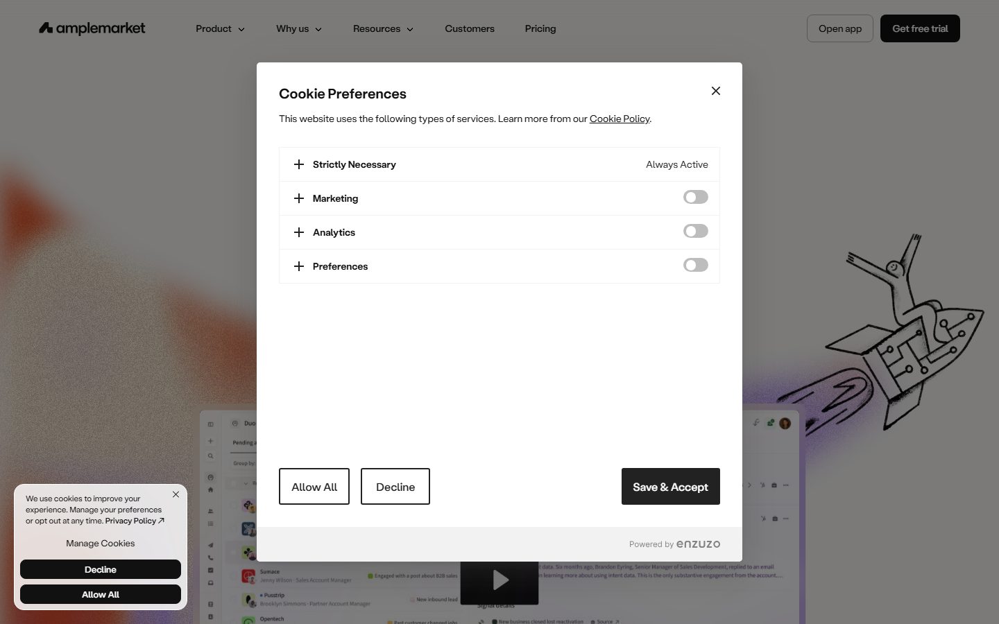
**`button-secondary`** — White button used for lower-priority actions ("Open app", "Allow All", "Decline"). Background `{colors.surface-white}`, text `{colors.ink}`, 1px hairline (`rgba(17,17,17,0.05)` inset), same padding + radius as primary.
### Cards & Containers
**`card-dark`** — The near-black surface card used in product showcase bands. Background `{colors.surface-dark}` (#272625), text `{colors.on-dark}`, rounded `{rounded.xl}` (12px), no own shadow (the dark surface carries its own contrast). Holds product chrome and signal feeds.
**`product-mockup-card`** — White floating cards showing the actual Duo Copilot app UI (lead lists, signal details, recommended sequences). Background `{colors.surface-white}`, rounded `{rounded.xl}` (12px), elevated with the tall multi-layer floating-mockup shadow. These display the real product rather than illustrating it.
**`testimonial-block`** — Centered customer pull-quotes on the canvas ("Amplemarket is like having a super assistant…"). Background `{colors.canvas}`, text `{colors.ink}`, type `{typography.title-md}` for the quote, with a small avatar + name + role row and the customer logo aligned right.
### Inputs
**`input`** — Email / form field. Background `{colors.surface-white}`, text `{colors.ink}`, type `{typography.body}`, rounded `{rounded.xl}` (12px), 1px inset hairline border. Used in the CTA band's "Enter your company email" field paired with a `{component.button-primary}`.
## Do's and Don'ts
### Do
- Use the warm off-white `{colors.canvas}` (#f6f5f3) as the page floor — not pure white. Pure white (`{colors.surface-white}`) is reserved for inputs and floating product mockups.
- Keep the primary CTA monochrome black (`{colors.ink}`). The action layer is colorless by design.
- Build type hierarchy from size + negative letter-spacing at weight 400. Tighten tracking as size grows (-0.4px body → -2.8px hero).
- Reserve saturated accents (cyan, blues, orange, yellow, pink) for inside product-UI chrome and the gradient CTA headline.
- Use `{rounded.xl}` (12px) for cards/inputs and `{rounded.lg}` (8px) for buttons — the two dominant measured radii.
- Anchor product evidence in dark bands (`{colors.surface-dark}` / black) with white text, alternating against warm light editorial bands.
- Outline light cards with the 1px inset hairline shadow rather than a hard border.
### Don't
- Don't add a bold weight to headlines for emphasis — go bigger, not heavier (only buttons use 500).
- Don't put accent colors on primary CTAs; keep them black.
- Don't use pure white as the page background — it breaks the warm-neutral feel.
- Don't apply Labil Grotesk at default tracking; the tight negative spacing is the voice.
- Don't add heavy hard-edged shadows — the system is soft, low-alpha, multi-layer.
- Don't document hover states — default and active/pressed only.
## Responsive Behavior
| Name | Width | Key Changes |
|---|---|---|
| Mobile | < 768px | Nav collapses to a menu; hero h1 (56px) scales down; logo wall stacks to 2-up; product mockups scale proportionally; dark bands stay full-bleed |
| Tablet | 768–1024px | Nav tightens; logo wall 2–3 up; feature tabs may wrap; mockups scale within container |
| Desktop | 1024–1440px | Full horizontal nav; 4-up logo wall; product mockups oversized and floated |
| Wide | > 1440px | Same as desktop with more outer canvas breathing room |
### Touch Targets
- `{component.button-primary}` at 12px × 16px padding plus 14px label yields a comfortable tap target; ensure minimum 44px height on touch.
- `{component.input}` uses body-size (20px) text at 12px radius — comfortable field height.
### Collapsing Strategy
- Single-column scroll collapses cleanly; dark product bands remain full-bleed at all breakpoints.
- Oversized floating product mockups scale proportionally rather than reflowing, so the embedded app chrome stays legible.
- Logo walls and tabbed "revenue heroes" sections reduce column count rather than shrinking cards.
### Image Behavior
- Product-UI mockups retain native aspect ratios; the white card frames resize.
- Hero gradient blooms (warm orange/pink) scale with the viewport behind the floating mockup.
## Iteration Guide
1. Focus on ONE component at a time, referencing its YAML key (`{component.card-dark}`, `{component.product-mockup-card}`).
2. Variants (`-active`, `-secondary`) live as separate entries in `components:`.
3. Use `{token.refs}` everywhere — never inline hex into a component.
4. Document default + active/pressed only; never hover.
5. Hierarchy is size + tracking at weight 400 — bigger before bolder.
6. Dark product bands are the brand's signature evidence surface; keep accents inside product chrome.
7. When in doubt about a surface, choose warm `{colors.canvas}` over pure white.
## Known Gaps
- **Labil Grotesk Variable** is a commercial typeface; it was not flagged as bundled (`fonts_licensed: []`), so license status is unverified — an open-source substitute (Inter / Söhne / Geist with tight tracking) is documented above.
- The analyzer labeled `#ffffff` as "muted" at high frequency; ground-truth shows this is white text on the dark product bands, documented here as `{colors.on-dark}`.
- `button-primary-active` (#222222) is **derived** from the measured neutral palette as a pressed-darker step; no explicit active state was captured.
- The full-bleed CTA band ("START YOUR SUPER SALES JOURNEY") uses a deep purple/navy background with gradient cyan/blue display text that was not isolated as a measured token; its background color is a Known Gap and not declared.
- Button `letterSpacing` measured as "normal" (not a numeric value); recorded verbatim.
- No nav, footer, dropdown, toggle, or tab component dimensions were measured beyond buttons, cards, and inputs — those are documented from screenshot ground-truth using existing tokens, and exact paddings/heights are gaps.
- Animation, transition timings, and form validation/focus states were not captured.
- The cookie-preferences modal visible in the landing capture is a third-party (Enzuzo) overlay, not part of the Amplemarket design system.
<!-- Documented by duply · real-world design systems as ready-to-use DESIGN.md for AI coding agents · https://duply.ai/amplemarket/design-md -->
Color Palette
Accent
Neutrals
Typography
display56px · 400 · 1
The quick brown fox jumpstitle-lg36px · 400 · 1.1
The quick brown fox jumpstitle-md28px · 400 · 1.1
The quick brown fox jumpstitle-sm24px · 400 · 1.1
The quick brown fox jumpsbody20px · 400 · 1.3
The quick brown fox jumpsbutton14px · 500 · 1
The quick brown fox jumpsSpacing & Shape
Spacing
| Name | Value | Preview |
|---|---|---|
| xxs | 4px | |
| xs | 8px | |
| sm | 12px | |
| md | 16px | |
| lg | 20px | |
| xl | 28px | |
| xxl | 40px |
Border Radius
| Name | Value | Preview |
|---|---|---|
| xs | 3px | |
| sm | 4px | |
| md | 6px | |
| lg | 8px | |
| xl | 12px | |
| xxl | 16px | |
| pill | 22px |
More like this


---
version: alpha
name: Amplemarket-design-analysis
description: A warm-neutral B2B sales-software interface built on an off-white canvas (#f6f5f3) with near-black ink, a single variable display typeface (Labil Grotesk) used at weight 400 across the entire hierarchy, and dark near-black product cards that anchor the long-scroll marketing page. Brand voltage comes from a small set of saturated product-UI accents (cyan, blues, warm orange/yellow, pink) shown inside embedded app fragments and a dark high-contrast band, rather than from a colored CTA — primary actions stay monochrome black.

colors:
  ink: "#111111"
  neutral-900: "#222222"
  neutral-800: "#333333"
  black: "#000000"
  canvas: "#f6f5f3"
  surface-white: "#ffffff"
  surface-soft: "#fbfaf9"
  surface-faint: "#fafafa"
  surface-dark: "#272625"
  on-dark: "#ffffff"
  hairline: "#dddddd"
  hairline-soft: "#cccccc"
  neutral-light: "#c8c8c8"
  accent-cyan: "#00bbff"
  accent-blue: "#328efa"
  accent-blue-deep: "#1082ec"
  accent-blue-light: "#95d1fd"
  accent-yellow: "#fbc768"
  accent-orange: "#e16540"
  accent-red: "#af051e"
  accent-pink: "#ffd7f0"

typography:
  display:
    fontFamily: "Labil Grotesk Variable, Inter, sans-serif"
    fontSize: 56px
    fontWeight: 400
    lineHeight: 1.0
    letterSpacing: -2.8px
  title-lg:
    fontFamily: "Labil Grotesk Variable, Inter, sans-serif"
    fontSize: 36px
    fontWeight: 400
    lineHeight: 1.1
    letterSpacing: -1.08px
  title-md:
    fontFamily: "Labil Grotesk Variable, Inter, sans-serif"
    fontSize: 28px
    fontWeight: 400
    lineHeight: 1.1
    letterSpacing: -0.48px
  title-sm:
    fontFamily: "Labil Grotesk Variable, Inter, sans-serif"
    fontSize: 24px
    fontWeight: 400
    lineHeight: 1.1
    letterSpacing: -0.48px
  body:
    fontFamily: "Labil Grotesk Variable, Inter, sans-serif"
    fontSize: 20px
    fontWeight: 400
    lineHeight: 1.3
    letterSpacing: -0.4px
  button:
    fontFamily: "Labil Grotesk Variable, Inter, sans-serif"
    fontSize: 14px
    fontWeight: 500
    lineHeight: 1.0
    letterSpacing: normal

rounded:
  xs: 3px
  sm: 4px
  md: 6px
  lg: 8px
  xl: 12px
  xxl: 16px
  pill: 22px

spacing:
  xxs: 4px
  xs: 8px
  sm: 12px
  md: 16px
  lg: 20px
  xl: 28px
  xxl: 40px

components:
  button-primary:
    backgroundColor: "{colors.ink}"
    textColor: "{colors.on-dark}"
    typography: "{typography.button}"
    rounded: "{rounded.lg}"
    padding: 12px 16px
  button-primary-active:
    backgroundColor: "{colors.neutral-900}"
    textColor: "{colors.on-dark}"
    rounded: "{rounded.lg}"
  button-secondary:
    backgroundColor: "{colors.surface-white}"
    textColor: "{colors.ink}"
    typography: "{typography.button}"
    rounded: "{rounded.lg}"
    padding: 12px 16px
  top-nav:
    backgroundColor: "{colors.canvas}"
    textColor: "{colors.ink}"
    typography: "{typography.button}"
  card-dark:
    backgroundColor: "{colors.surface-dark}"
    textColor: "{colors.on-dark}"
    typography: "{typography.body}"
    rounded: "{rounded.xl}"
  product-mockup-card:
    backgroundColor: "{colors.surface-white}"
    textColor: "{colors.ink}"
    rounded: "{rounded.xl}"
  input:
    backgroundColor: "{colors.surface-white}"
    textColor: "{colors.ink}"
    typography: "{typography.body}"
    rounded: "{rounded.xl}"
  testimonial-block:
    backgroundColor: "{colors.canvas}"
    textColor: "{colors.ink}"
    typography: "{typography.title-md}"
---

## Overview

Amplemarket's marketing surface is a warm-neutral B2B sales-software interface. The page floor is an off-white canvas (`{colors.canvas}` — #f6f5f3) rather than pure white, which gives the whole experience a soft, paper-like warmth. Primary text and CTAs are near-black (`{colors.ink}` — #111111), and the headline voice runs entirely through a single variable display typeface, **Labil Grotesk Variable**, set at weight 400 with aggressive negative letter-spacing.

The defining structural move is the **dark band**: long stretches of the page invert to a near-black surface (`{colors.surface-dark}` — #272625, with `#000000` backgrounds in the deepest sections) to showcase the "Duo Copilot" product, with white text (`{colors.on-dark}`) and embedded product-UI fragments. These dark sections are where the brand's saturated accents appear — cyan (`{colors.accent-cyan}`), blues (`{colors.accent-blue}`, `{colors.accent-blue-deep}`), warm orange/yellow (`{colors.accent-orange}`, `{colors.accent-yellow}`), and pink (`{colors.accent-pink}`) — almost always inside real product chrome (signal tags, avatars, status pills) rather than as marketing fills.

Type is unusual: rather than splitting display vs. body across two families or weights, Amplemarket uses **one family at one weight (400)** and lets size + negative tracking do all the hierarchy work. The hero h1 is 56px with -2.8px letter-spacing — very tight, modern, slightly editorial. Only buttons step up to weight 500.

The page alternates rhythmically between warm-neutral light bands (testimonials, feature copy, logo walls) and dark product bands, closing toward a saturated full-bleed CTA band ("START YOUR SUPER SALES JOURNEY") where the gradient display text picks up the cyan/blue accents.

**Key Characteristics:**
- Warm off-white canvas (`{colors.canvas}` — #f6f5f3), not pure white. The whole system reads soft and paper-like.
- Monochrome black primary CTA (`{colors.ink}` — #111111), rounded `{rounded.lg}` (8px), compact padding 12px × 16px. The action layer is colorless.
- A single variable display face (Labil Grotesk) at weight 400 across the whole hierarchy — size and negative tracking carry the contrast, not weight.
- Dark product bands (`{colors.surface-dark}` — #272625 / `#000000`) showcasing the real "Duo Copilot" app UI with white text and saturated in-UI accents.
- Cards round at `{rounded.xl}` (12px) — the dominant radius in the system (most frequent measured value).
- A subtle 1px inset hairline shadow (`rgba(17,17,17,0.05) 0 0 0 1px inset`) outlines most light cards and inputs; large floating product mockups get a tall, soft multi-layer drop shadow.
- Accent palette (cyan, blues, orange, yellow, pink) lives almost exclusively inside embedded product chrome and the gradient CTA headline — never on primary buttons.

## Colors

### Brand & Ink
- **Ink** (`{colors.ink}` — #111111): The dominant text + action color. All headlines, body copy, and the primary CTA. The press state shifts to `{colors.neutral-900}` (#222222 — derived as a pressed-darker step from measured neutrals).
- **Neutral-900 / Neutral-800 / Black** (`{colors.neutral-900}` — #222222, `{colors.neutral-800}` — #333333, `{colors.black}` — #000000): Deep neutrals used for the darkest product bands and high-contrast surfaces. The deepest "future of sales" band sits on near-black.

### Surface
- **Canvas** (`{colors.canvas}` — #f6f5f3): The warm off-white page floor on every light band.
- **Surface White** (`{colors.surface-white}` — #ffffff): Pure white used for inputs and the floating product-mockup cards that sit on top of the canvas.
- **Surface Soft / Surface Faint** (`{colors.surface-soft}` — #fbfaf9, `{colors.surface-faint}` — #fafafa): Barely-tinted near-whites for nested panels and very-soft dividers.
- **Surface Dark** (`{colors.surface-dark}` — #272625): The warm near-black card/band surface that anchors the product showcase sections.

### Text-on-Dark
- **On Dark** (`{colors.on-dark}` — #ffffff): White text on the dark product bands and inside dark cards (this is the high-frequency white the analyzer flagged as "muted").

### Hairline & Neutral Grays
- **Hairline** (`{colors.hairline}` — #dddddd) and **Hairline Soft** (`{colors.hairline-soft}` — #cccccc): 1px borders and dividers on light surfaces.
- **Neutral Light** (`{colors.neutral-light}` — #c8c8c8): Tertiary text / muted captions and disabled glyphs.

### Accents (product-UI + gradient CTA)
A saturated set used inside embedded product chrome and the gradient hero/CTA text — never on primary CTAs:
- **Cyan** (`{colors.accent-cyan}` — #00bbff) — the strongest brand spark; gradient CTA text + active product highlights.
- **Blues** (`{colors.accent-blue}` — #328efa, `{colors.accent-blue-deep}` — #1082ec, `{colors.accent-blue-light}` — #95d1fd) — links, signal tags, charts inside product UI.
- **Yellow** (`{colors.accent-yellow}` — #fbc768) and **Orange** (`{colors.accent-orange}` — #e16540) — warm accents in product avatars/status and hero background gradients.
- **Red** (`{colors.accent-red}` — #af051e) — alert / "lost opportunity" style product signals.
- **Pink** (`{colors.accent-pink}` — #ffd7f0) — soft pastel fill in product chrome and decorative gradient moments.

## Typography

### Font Family
The entire system runs **Labil Grotesk Variable** — a contemporary grotesque used at a single weight (400) for both display and body. There is no second family in the measured data. The fallback stack walks `Inter, sans-serif`.

Hierarchy is built almost entirely from **size + negative letter-spacing**, not weight. The hero headline (56px) carries -2.8px tracking; mid headlines carry -0.48px to -1.08px; body sits at -0.4px. The tight tracking is the brand's signature — Labil Grotesk at default tracking would read as off-brand. Only buttons step up to weight 500.

### Hierarchy

| Token | Size | Weight | Line Height | Letter Spacing | Use |
|---|---|---|---|---|---|
| `{typography.display}` | 56px | 400 | 1.0 | -2.8px | Hero h1 ("Transform the way you sell with Duo Copilot") |
| `{typography.title-lg}` | 36px | 400 | 1.1 | -1.08px | Large section heads (h4-role, e.g. "All-in-one platform…") |
| `{typography.title-md}` | 28px | 400 | 1.1 | -0.48px | Section heads + pull-quote testimonials (h2) |
| `{typography.title-sm}` | 24px | 400 | 1.1 | -0.48px | Sub-section / card titles (h3) |
| `{typography.body}` | 20px | 400 | 1.3 | -0.4px | Default running text + sub-headlines |
| `{typography.button}` | 14px | 500 | 1.0 | normal | Button + nav labels (the only weight-500 role) |

### Principles
One family, one display weight. Contrast comes from scale jumps (56 → 36 → 28 → 24 → 20) and from progressively tightening letter-spacing as size grows. Never add a bold weight to create emphasis — go bigger, not heavier. Button labels are the single exception, stepping to 500 at 14px with normal tracking for legibility at small size.

### Note on Font Substitutes
**Labil Grotesk Variable** is a commercial typeface and was not flagged as bundled in the measured data. If it is unavailable, **Inter** (or another neutral grotesque such as **Söhne** or **Geist**) at weight 400 with roughly -0.03em to -0.05em letter-spacing approximates the tight-tracking grotesque voice. Do not claim to ship Labil Grotesk without a license.

## Layout

### Spacing System
- **Base unit:** 4px.
- **Tokens:** `{spacing.xxs}` 4px · `{spacing.xs}` 8px · `{spacing.sm}` 12px · `{spacing.md}` 16px · `{spacing.lg}` 20px · `{spacing.xl}` 28px · `{spacing.xxl}` 40px.
- **Dominant rhythm:** 8px and 20px are the most frequent gaps/paddings (310 and 233 occurrences), with 16px and 12px close behind — a tight, UI-dense spacing scale consistent with the embedded product chrome.
- **Button padding:** 12px × 16px (measured on `button-primary`).

### Grid & Container
- Long single-column scroll with centered content blocks; logo wall renders as a 4-up grid (Mistral AI / Pylon / omni / wasabi, etc.).
- Feature and "revenue heroes" sections use tabbed multi-column layouts within a centered max-width container.
- Product showcase bands run full-bleed dark with the app mockup centered and oversized.

### Whitespace Philosophy
Light bands are generous and editorial; dark product bands are dense and chrome-heavy. The page paces by alternating warm-neutral breathing room with high-density product evidence. Measured spacing skews tight (8/12/16/20px), reflecting how much real product UI is embedded directly in the marketing flow.

## Elevation & Depth

| Level | Treatment | Use |
|---|---|---|
| Flat | No shadow | Dark product bands, plain text sections |
| Hairline inset | `rgba(17,17,17,0.05) 0px 0px 0px 1px inset` | Light cards, inputs, logo tiles (the system's default outline — 82 occurrences) |
| Soft stacked | `rgba(17,17,17,0.04) 0px 1px 2px, 0px 4px 8px, 0px 0px 1px…` | Lightly raised panels / small cards |
| Floating mockup | `rgba(17,17,17,0.12) 0px 26px 60px -6px, 0px 28px 28px -14px, 0px 6px 6px -3px, 0px 1px 1px -0.5px` | The oversized product-mockup cards floating over the canvas |
| Heavy lift | `rgba(80,80,80,0.12) 0px 9px 46px 8px, rgba(80,80,80,0.14) 0px 24px 38px 3px, rgba(80,80,80,0.2) 0px 11px 15px -7px` | The most prominent hero product card |

The elevation philosophy is **soft, multi-layer, low-alpha**. Most surfaces use the 1px inset hairline as their entire "border," and large product mockups float on tall, very soft drop shadows that read as depth without harsh edges. There is no neumorphism or glassmorphism.

### Decorative Depth
- Embedded product-UI fragments carry their own internal chrome shadows (signal cards, message threads, toggles) — these are product content, not system tokens.
- Hero background uses soft warm gradient blooms (orange/pink derived from the accent palette) bleeding behind the floating mockup.

## Shapes

### Border Radius Scale

| Token | Value | Use |
|---|---|---|
| `{rounded.xs}` | 3px | Tiny inline chips inside product UI |
| `{rounded.sm}` | 4px | Small controls, toggles, minor tags (82 occurrences) |
| `{rounded.md}` | 6px | Secondary small buttons / inputs |
| `{rounded.lg}` | 8px | Primary CTA buttons, mid controls (146 occurrences) |
| `{rounded.xl}` | 12px | Cards, inputs, product mockups — the dominant radius (211 occurrences) |
| `{rounded.xxl}` | 16px | Larger panels / framed media |
| `{rounded.pill}` | 22px | Highly rounded pill controls / large rounded buttons |

### Geometry
Cards and inputs settle on `{rounded.xl}` (12px) — soft but not playful. Buttons use the slightly tighter `{rounded.lg}` (8px). Product-UI fragments inside cards retain their own native radii (4–8px controls). Avatars in product chrome render as circles within the embedded UI.

## Components

### Navigation

**`top-nav`** — Horizontal nav pinned over the warm canvas (`{colors.canvas}`). Carries the amplemarket wordmark + mark at left, primary menu (Product, Why us, Resources, Customers, Pricing) center, and a right cluster with an "Open app" `{component.button-secondary}` and a "Get free trial" `{component.button-primary}`. Labels in `{typography.button}` (Labil Grotesk 14px / 500).

### Buttons

**`button-primary`** — The signature CTA. Background `{colors.ink}` (#111111), text `{colors.on-dark}`, type `{typography.button}`, padding 12px × 16px, rounded `{rounded.lg}` (8px). Used for "Get free trial", "Save & Accept", "Get trial". Active state `button-primary-active` shifts to `{colors.neutral-900}` (#222222 — derived pressed step).

**`button-secondary`** — White button used for lower-priority actions ("Open app", "Allow All", "Decline"). Background `{colors.surface-white}`, text `{colors.ink}`, 1px hairline (`rgba(17,17,17,0.05)` inset), same padding + radius as primary.

### Cards & Containers

**`card-dark`** — The near-black surface card used in product showcase bands. Background `{colors.surface-dark}` (#272625), text `{colors.on-dark}`, rounded `{rounded.xl}` (12px), no own shadow (the dark surface carries its own contrast). Holds product chrome and signal feeds.

**`product-mockup-card`** — White floating cards showing the actual Duo Copilot app UI (lead lists, signal details, recommended sequences). Background `{colors.surface-white}`, rounded `{rounded.xl}` (12px), elevated with the tall multi-layer floating-mockup shadow. These display the real product rather than illustrating it.

**`testimonial-block`** — Centered customer pull-quotes on the canvas ("Amplemarket is like having a super assistant…"). Background `{colors.canvas}`, text `{colors.ink}`, type `{typography.title-md}` for the quote, with a small avatar + name + role row and the customer logo aligned right.

### Inputs

**`input`** — Email / form field. Background `{colors.surface-white}`, text `{colors.ink}`, type `{typography.body}`, rounded `{rounded.xl}` (12px), 1px inset hairline border. Used in the CTA band's "Enter your company email" field paired with a `{component.button-primary}`.

## Do's and Don'ts

### Do
- Use the warm off-white `{colors.canvas}` (#f6f5f3) as the page floor — not pure white. Pure white (`{colors.surface-white}`) is reserved for inputs and floating product mockups.
- Keep the primary CTA monochrome black (`{colors.ink}`). The action layer is colorless by design.
- Build type hierarchy from size + negative letter-spacing at weight 400. Tighten tracking as size grows (-0.4px body → -2.8px hero).
- Reserve saturated accents (cyan, blues, orange, yellow, pink) for inside product-UI chrome and the gradient CTA headline.
- Use `{rounded.xl}` (12px) for cards/inputs and `{rounded.lg}` (8px) for buttons — the two dominant measured radii.
- Anchor product evidence in dark bands (`{colors.surface-dark}` / black) with white text, alternating against warm light editorial bands.
- Outline light cards with the 1px inset hairline shadow rather than a hard border.

### Don't
- Don't add a bold weight to headlines for emphasis — go bigger, not heavier (only buttons use 500).
- Don't put accent colors on primary CTAs; keep them black.
- Don't use pure white as the page background — it breaks the warm-neutral feel.
- Don't apply Labil Grotesk at default tracking; the tight negative spacing is the voice.
- Don't add heavy hard-edged shadows — the system is soft, low-alpha, multi-layer.
- Don't document hover states — default and active/pressed only.

## Responsive Behavior

| Name | Width | Key Changes |
|---|---|---|
| Mobile | < 768px | Nav collapses to a menu; hero h1 (56px) scales down; logo wall stacks to 2-up; product mockups scale proportionally; dark bands stay full-bleed |
| Tablet | 768–1024px | Nav tightens; logo wall 2–3 up; feature tabs may wrap; mockups scale within container |
| Desktop | 1024–1440px | Full horizontal nav; 4-up logo wall; product mockups oversized and floated |
| Wide | > 1440px | Same as desktop with more outer canvas breathing room |

### Touch Targets
- `{component.button-primary}` at 12px × 16px padding plus 14px label yields a comfortable tap target; ensure minimum 44px height on touch.
- `{component.input}` uses body-size (20px) text at 12px radius — comfortable field height.

### Collapsing Strategy
- Single-column scroll collapses cleanly; dark product bands remain full-bleed at all breakpoints.
- Oversized floating product mockups scale proportionally rather than reflowing, so the embedded app chrome stays legible.
- Logo walls and tabbed "revenue heroes" sections reduce column count rather than shrinking cards.

### Image Behavior
- Product-UI mockups retain native aspect ratios; the white card frames resize.
- Hero gradient blooms (warm orange/pink) scale with the viewport behind the floating mockup.

## Iteration Guide

1. Focus on ONE component at a time, referencing its YAML key (`{component.card-dark}`, `{component.product-mockup-card}`).
2. Variants (`-active`, `-secondary`) live as separate entries in `components:`.
3. Use `{token.refs}` everywhere — never inline hex into a component.
4. Document default + active/pressed only; never hover.
5. Hierarchy is size + tracking at weight 400 — bigger before bolder.
6. Dark product bands are the brand's signature evidence surface; keep accents inside product chrome.
7. When in doubt about a surface, choose warm `{colors.canvas}` over pure white.

## Known Gaps

- **Labil Grotesk Variable** is a commercial typeface; it was not flagged as bundled (`fonts_licensed: []`), so license status is unverified — an open-source substitute (Inter / Söhne / Geist with tight tracking) is documented above.
- The analyzer labeled `#ffffff` as "muted" at high frequency; ground-truth shows this is white text on the dark product bands, documented here as `{colors.on-dark}`.
- `button-primary-active` (#222222) is **derived** from the measured neutral palette as a pressed-darker step; no explicit active state was captured.
- The full-bleed CTA band ("START YOUR SUPER SALES JOURNEY") uses a deep purple/navy background with gradient cyan/blue display text that was not isolated as a measured token; its background color is a Known Gap and not declared.
- Button `letterSpacing` measured as "normal" (not a numeric value); recorded verbatim.
- No nav, footer, dropdown, toggle, or tab component dimensions were measured beyond buttons, cards, and inputs — those are documented from screenshot ground-truth using existing tokens, and exact paddings/heights are gaps.
- Animation, transition timings, and form validation/focus states were not captured.
- The cookie-preferences modal visible in the landing capture is a third-party (Enzuzo) overlay, not part of the Amplemarket design system.

<!-- Documented by duply · real-world design systems as ready-to-use DESIGN.md for AI coding agents · https://duply.ai/amplemarket/design-md -->