Aikido
A developer-security marketing interface that pairs a deep near-black navy hero canvas with a high-voltage violet primary action and a clean neo-grotesque (Newgrotesk) display voice. The system reads as confident, technical, and modern-SaaS — oversized tight-tracked headlines, pill-shaped product switchers, real product-dashboard chrome shown inside a large floating mockup card, and soft 8px/30px rounded surfaces. Brand voltage comes from the violet accent (#6551f3 /
---
version: alpha
name: Aikido-design-analysis
description: A developer-security marketing interface that pairs a deep near-black navy hero canvas with a high-voltage violet primary action and a clean neo-grotesque (Newgrotesk) display voice. The system reads as confident, technical, and modern-SaaS — oversized tight-tracked headlines, pill-shaped product switchers, real product-dashboard chrome shown inside a large floating mockup card, and soft 8px/30px rounded surfaces. Brand voltage comes from the violet accent (#6551f3 / #a397f8) and the dark-navy stage rather than from decorative color.
colors:
primary: "#6551f3"
primary-soft: "#a397f8"
primary-tint: "#e0dcfd"
surface-tint: "#f7f6fe"
ink: "#141031"
surface-dark: "#010024"
surface-dark-elevated: "#272654"
accent-slate: "#37364d"
body: "#737283"
muted: "#bfbfc8"
hairline: "#e5e5e9"
surface-soft: "#f9fafb"
surface-softer: "#fafbfc"
canvas: "#ffffff"
on-dark: "#ffffff"
success: "#00c07d"
black: "#000000"
typography:
display-xl:
fontFamily: "Newgrotesk, Space Grotesk, Inter, sans-serif"
fontSize: 80px
fontWeight: 500
lineHeight: 1.15
letterSpacing: -1.5px
display-md:
fontFamily: "Newgrotesk, Space Grotesk, Inter, sans-serif"
fontSize: 42px
fontWeight: 500
lineHeight: 1.2
letterSpacing: normal
title:
fontFamily: "Newgrotesk, Space Grotesk, Inter, sans-serif"
fontSize: 20px
fontWeight: 500
lineHeight: 1.2
letterSpacing: normal
label:
fontFamily: "Newgrotesk, Space Grotesk, Inter, sans-serif"
fontSize: 15px
fontWeight: 500
lineHeight: 1.2
letterSpacing: normal
body:
fontFamily: "Newgrotesk, Space Grotesk, Inter, sans-serif"
fontSize: 14px
fontWeight: 400
lineHeight: 1.714
letterSpacing: normal
rounded:
xs: 2px
sm: 8px
md: 15px
lg: 23px
xl: 30px
pill: 50px
full: 9999px
spacing:
xxs: 4px
xs: 8px
sm: 11px
md: 15px
lg: 19px
xl: 23px
xxl: 30px
components:
top-nav:
backgroundColor: "{colors.surface-dark}"
textColor: "{colors.on-dark}"
typography: "{typography.label}"
nav-pill-group:
backgroundColor: transparent
textColor: "{colors.on-dark}"
typography: "{typography.label}"
rounded: "{rounded.pill}"
padding: 8px
button-primary:
backgroundColor: "{colors.primary}"
textColor: "{colors.on-dark}"
typography: "{typography.label}"
rounded: "{rounded.pill}"
padding: 11px 23px
button-primary-active:
backgroundColor: "{colors.primary-soft}"
textColor: "{colors.on-dark}"
rounded: "{rounded.pill}"
button-secondary:
backgroundColor: transparent
textColor: "{colors.on-dark}"
typography: "{typography.label}"
rounded: "{rounded.pill}"
padding: 11px 23px
product-switch-tab:
backgroundColor: "{colors.surface-dark}"
textColor: "{colors.on-dark}"
typography: "{typography.label}"
rounded: "{rounded.sm}"
padding: 15px 19px
product-switch-tab-active:
backgroundColor: "{colors.surface-dark-elevated}"
textColor: "{colors.on-dark}"
typography: "{typography.label}"
rounded: "{rounded.sm}"
hero-band:
backgroundColor: "{colors.surface-dark}"
textColor: "{colors.on-dark}"
typography: "{typography.display-xl}"
padding: 30px
dashboard-mockup-card:
backgroundColor: "{colors.canvas}"
textColor: "{colors.ink}"
rounded: "{rounded.xl}"
padding: 23px
feature-card:
backgroundColor: "{colors.surface-dark}"
textColor: "{colors.on-dark}"
typography: "{typography.title}"
rounded: "{rounded.md}"
padding: 23px
feature-card-light:
backgroundColor: "{colors.surface-tint}"
textColor: "{colors.ink}"
typography: "{typography.title}"
rounded: "{rounded.md}"
padding: 23px
trust-checklist-row:
backgroundColor: "{colors.surface-dark-elevated}"
textColor: "{colors.on-dark}"
typography: "{typography.body}"
rounded: "{rounded.sm}"
padding: 15px 19px
testimonial-card:
backgroundColor: "{colors.surface-dark}"
textColor: "{colors.on-dark}"
typography: "{typography.title}"
rounded: "{rounded.xl}"
padding: 30px
faq-item:
backgroundColor: "{colors.surface-dark-elevated}"
textColor: "{colors.on-dark}"
typography: "{typography.label}"
rounded: "{rounded.sm}"
padding: 19px 23px
integration-tile:
backgroundColor: "{colors.surface-dark}"
textColor: "{colors.on-dark}"
typography: "{typography.body}"
rounded: "{rounded.sm}"
padding: 11px 15px
input:
backgroundColor: "{colors.canvas}"
textColor: "{colors.ink}"
typography: "{typography.body}"
rounded: "{rounded.pill}"
padding: 11px 19px
badge-pill:
backgroundColor: "{colors.primary-tint}"
textColor: "{colors.primary}"
typography: "{typography.label}"
rounded: "{rounded.pill}"
padding: 4px 11px
footer:
backgroundColor: "{colors.surface-dark}"
textColor: "{colors.muted}"
typography: "{typography.body}"
padding: 30px
---
## Overview
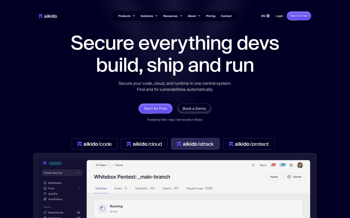
Aikido's marketing surface is a developer-security interface built on a deep near-black navy stage (`{colors.surface-dark}` — #010024) with a single high-voltage violet primary action (`{colors.primary}` — #6551f3). The landing page runs almost entirely dark; the brand's confidence comes from oversized, tightly-tracked Newgrotesk headlines and from showing the actual Aikido product dashboard inside a large floating white mockup card that breaks the dark hero floor.
Type voice is single-family: **Newgrotesk** (a neo-grotesque) handles everything — display, titles, labels, and body. Headlines sit at weight 500 (never heavier), with the hero h1 reaching ~80px and carrying -1.5px letter-spacing — the negative tracking on the largest size is the most distinctive type signature. Body text drops to 14px at a generous 1.714 line-height for comfortable scanning against the dark canvas.
Component voltage comes from two places: the **violet primary CTA** (a pill-shaped "Start for Free" button repeated through the page) and the **product chrome shown as content** — Aikido renders its real dashboard (pentest views, alert tables, agent grids) inside a white `{rounded.xl}` mockup card rather than illustrating the product abstractly. Secondary surfaces lift slightly off the navy floor using `{colors.surface-dark-elevated}` (#272654) for cards, FAQ rows, and the trust checklist.
White and lavender-tinted surfaces (`{colors.canvas}`, `{colors.surface-tint}` — #f7f6fe) appear on lighter bands (notably pricing) — #ffffff is the most-frequently-measured background overall, but the landing hero and most editorial bands are dark.
**Key Characteristics:**
- Deep navy stage (`{colors.surface-dark}` — #010024) as the dominant editorial surface, with cards lifting to `{colors.surface-dark-elevated}` (#272654).
- Single violet primary CTA (`{colors.primary}` — #6551f3), pill-shaped (`{rounded.pill}` — 50px). Press/hover-soft state uses `{colors.primary-soft}` (#a397f8).
- One typeface — Newgrotesk — across all roles, weight 500 for headings, 400 for body. Negative letter-spacing (-1.5px) on the hero h1.
- Real product-dashboard chrome shown inside a large white `{rounded.xl}` (30px) floating mockup card with a deep drop shadow.
- Pill-shaped product switcher (aikido/code · /cloud · /attack · /protect) — `{rounded.sm}` tabs that elevate to `{colors.surface-dark-elevated}` when active.
- A single green success accent (`{colors.success}` — #00c07d) used sparingly inside product UI and checklists.
- Hierarchical radius: `{rounded.sm}` (8px) for tabs/tiles/FAQ rows, `{rounded.md}` (15px) and `{rounded.xl}` (30px) for cards, `{rounded.pill}` (50px) for buttons and inputs.
## Colors
### Brand & Accent
- **Primary** (`{colors.primary}` — #6551f3): The dominant action color — the "Start for Free" CTA, active links, inline highlights. Soft/press variant `{colors.primary-soft}` (#a397f8).
- **Primary Soft** (`{colors.primary-soft}` — #a397f8): Lighter violet used on gradient CTA fills and pressed/hover-soft button states.
- **Primary Tint** (`{colors.primary-tint}` — #e0dcfd): Pale violet for small badges and chips.
- **Surface Tint** (`{colors.surface-tint}` — #f7f6fe): A near-white lavender used as a soft light-band background — the second-most-frequent measured color.
- **Success** (`{colors.success}` — #00c07d): Green confirmation accent inside the product UI and the trust checklist.
### Surface
- **Canvas** (`{colors.canvas}` — #ffffff): The light page floor (pricing, mockup cards) and the most-measured background overall.
- **Surface Soft / Softer** (`{colors.surface-soft}` — #f9fafb, `{colors.surface-softer}` — #fafbfc): Very-light dividers and nested panels on light bands.
- **Surface Dark** (`{colors.surface-dark}` — #010024): The deep navy hero + editorial stage, and the footer.
- **Surface Dark Elevated** (`{colors.surface-dark-elevated}` — #272654): Cards, FAQ rows, the trust checklist, testimonial blocks lifting off the navy floor.
- **Accent Slate** (`{colors.accent-slate}` — #37364d): A muted slate used for outlines and low-contrast UI fragments on dark.
- **Hairline** (`{colors.hairline}` — #e5e5e9): 1px border tone on light surfaces.
### Text
- **Ink** (`{colors.ink}` — #141031): Headlines and primary text on light surfaces.
- **On Dark** (`{colors.on-dark}` — #ffffff): Headlines and primary text on the navy stage.
- **Body** (`{colors.body}` — #737283): Default running-text color (used on both light and dark, slightly cool gray).
- **Muted** (`{colors.muted}` — #bfbfc8): Secondary/tertiary text, footer links, captions.
- **Black** (`{colors.black}` — #000000): Pure-black accents inside product chrome.
## Typography
### Font Family
The system runs a single typeface — **Newgrotesk**, a neo-grotesque sans — across every role. Display headlines, section heads, titles, labels, and body text all draw from the same family; hierarchy is carried by size and weight (500 for headings, 400 for body) rather than by family contrast.
### Hierarchy
| Token | Size | Weight | Line Height | Letter Spacing | Use |
|---|---|---|---|---|---|
| `{typography.display-xl}` | 80px | 500 | 1.15 | -1.5px | Hero h1 ("Secure everything devs build, ship and run") |
| `{typography.display-md}` | 42px | 500 | 1.2 | normal | Section heads ("Frequently Asked Questions", "The flow must go on") |
| `{typography.title}` | 20px | 500 | 1.2 | normal | Card titles, sub-section heads (h4) |
| `{typography.label}` | 15px | 500 | 1.2 | normal | Feature titles, nav links, button labels, tab labels (h3) |
| `{typography.body}` | 14px | 400 | 1.714 | normal | Default running-text, descriptions, footer copy |
### Principles
Headings stay at weight 500 across every size — never 600/700. The restraint keeps the oversized hero feeling modern and engineered rather than shouting. Only the hero display-xl carries negative letter-spacing (-1.5px); all smaller roles run normal tracking. Body copy uses an unusually open 1.714 line-height — calibrated for reading light gray text against the dark navy stage.
### Note on Font Substitutes
Newgrotesk is a proprietary neo-grotesque and is not available as a public web font; it was not flagged in `fonts_licensed` but should be treated as custom. Use **Space Grotesk** (weight 500, with ~-0.02em tracking on the largest display size) as the closest open-source substitute, falling back to **Inter** at weight 500. The fallback stack is `Newgrotesk, Space Grotesk, Inter, sans-serif`. Both substitutes preserve the weight-500 heading signature; apply the -1.5px tracking only at the hero size.
## Layout
### Spacing System
- **Base unit:** ~4px, but the measured rhythm clusters on a slightly irregular scale.
- **Tokens:** `{spacing.xxs}` 4px · `{spacing.xs}` 8px · `{spacing.sm}` 11px · `{spacing.md}` 15px · `{spacing.lg}` 19px · `{spacing.xl}` 23px · `{spacing.xxl}` 30px.
- **Most frequent steps:** 8px (222×) and 11px (236×) dominate small-gap usage; 15px (158×) is the standard component padding; 19px and 23px (79× each) pair as card padding; 30px is the largest band/card rhythm.
- **Card internal padding:** `{spacing.xl}` (23px) for feature cards; `{spacing.xxl}` (30px) for testimonial and mockup cards.
### Grid & Container
- **Editorial body:** Centered single column with a strong horizontal axis — the hero h1, sub-head, CTA row, and product switcher are all center-aligned.
- **Feature grids:** 3-up at desktop for the "/code" feature cards; 2-up at tablet; 1-up at mobile.
- **Integration grid:** Multi-row wrapping tile strip (logos / app tiles) full-bleed across the band.
- **Footer:** Multi-column link list collapsing to fewer columns at narrow widths.
### Whitespace Philosophy
The hero is generous and vertically tall — the oversized 80px headline gets full breathing room before the sub-head, CTA pair, and product switcher stack beneath it. Lower bands tighten to a denser feature-grid rhythm. The large product-dashboard mockup card deliberately overlaps the boundary between the dark hero and the band below, anchoring the page.
## Elevation & Depth
| Level | Treatment | Use |
|---|---|---|
| Flat | No shadow | Dark editorial bands, nav, footer |
| Surface lift | `{colors.surface-dark-elevated}` (#272654) on the navy floor | Cards, FAQ rows, trust checklist, testimonials |
| Inner highlight | `rgba(255,255,255,0.25) 0px 6px 12px inset` | Glossy inner highlight on the violet pill CTA / tab elements (4×) |
| Deep drop shadow | `rgba(0,0,0,0.3) 0px 32px 68px` | The large floating white product-dashboard mockup card (1×) |
Elevation philosophy is **color-contrast first**: cards lift off the navy floor by shifting one step lighter to `{colors.surface-dark-elevated}` rather than relying on shadow. The single heavy drop shadow is reserved for the marquee dashboard mockup, and the inset white highlight gives the primary CTA a subtle glossy edge.
### Decorative Depth
- The product-dashboard mockup inside the hero card carries its own internal product chrome (table dividers, status pills, agent tiles) — these are product UI, not system tokens.
- The violet CTA combines a primary/primary-soft gradient with the inset white highlight for a faintly three-dimensional, tactile button.
## Shapes
### Border Radius Scale
| Token | Value | Use |
|---|---|---|
| `{rounded.xs}` | 2px | Rare micro-accents inside product chrome |
| `{rounded.sm}` | 8px | The system workhorse — product-switch tabs, integration tiles, FAQ rows, small panels (201× measured) |
| `{rounded.md}` | 15px | Feature cards, mid-size panels |
| `{rounded.lg}` | 23px | Larger content cards |
| `{rounded.xl}` | 30px | The product-dashboard mockup card, testimonial cards (46× measured) |
| `{rounded.pill}` | 50px | Primary/secondary buttons, inputs, badge pills |
| `{rounded.full}` | 9999px | Avatars and circular icon chips (derived — large measured radii of 151px+ approximate full-round at component scale) |
### Photography & Mockup Geometry
The hero product mockup uses `{rounded.xl}` (30px) corners around real Aikido dashboard chrome. Avatars inside testimonial and dashboard fragments render as circles (`{rounded.full}`). Logo-strip and integration tiles keep `{rounded.sm}` (8px) corners.
## Components
### Top Navigation
**`top-nav`** — Transparent-over-navy nav pinned to the top of the dark hero. Carries the aikido wordmark + mark at left, a centered horizontal menu (Products, Solutions, Resources, About, Pricing, Contact) in `{typography.label}`, and a right cluster with a language selector (EN), a "Login" text link, and the violet `{component.button-primary}` "Start for Free". Background reads as `{colors.surface-dark}`.
**`nav-pill-group`** — The centered menu sits inside a subtle pill-radius (`{rounded.pill}`) container with `{spacing.xs}` (8px) internal padding, floating on the dark hero.
### Buttons
**`button-primary`** — The signature CTA. Background `{colors.primary}` (#6551f3) with a primary-soft gradient and inset white highlight, text `{colors.on-dark}`, type `{typography.label}` (15px / 500), pill radius (`{rounded.pill}` — 50px), padding ~11px × 23px. Press/hover-soft state `button-primary-active` shifts toward `{colors.primary-soft}` (#a397f8).
**`button-secondary`** — "Book a Demo" — transparent fill with a hairline outline on dark, text `{colors.on-dark}`, same pill radius and padding as primary.
### Product Switcher
**`product-switch-tab`** + **`product-switch-tab-active`** — The aikido/code · /cloud · /attack · /protect row beneath the hero. Inactive tabs sit on `{colors.surface-dark}` with `{rounded.sm}` (8px) corners and `{typography.label}` text. The active tab lifts to `{colors.surface-dark-elevated}` (#272654) to signal selection. Padding ~15px × 19px.
### Cards & Containers
**`hero-band`** — The full-width dark hero. Background `{colors.surface-dark}` (#010024), text `{colors.on-dark}`, h1 in `{typography.display-xl}`. Holds the headline, sub-head, CTA pair, trust line, and product switcher, with the dashboard mockup card overlapping its lower edge.
**`dashboard-mockup-card`** — The large white floating card showing Aikido's real product dashboard (pentest views, issue/endpoint/agent tabs, status rows). Background `{colors.canvas}`, rounded `{rounded.xl}` (30px), with the deep `rgba(0,0,0,0.3) 0 32px 68px` drop shadow. The product chrome inside is shown as content, not decorated around.
**`feature-card`** — Used in the "/code" feature grids (Static code analysis, Secrets detection, etc.). Background `{colors.surface-dark}` (or lifted `{colors.surface-dark-elevated}` when grouped), title in `{typography.title}`, body in `{typography.body}`, a small icon at top, and a "Learn more" link. Rounded `{rounded.md}` (15px), padding `{spacing.xl}` (23px).
**`feature-card-light`** — The light-band variant (pricing / lavender sections). Background `{colors.surface-tint}` (#f7f6fe), text `{colors.ink}`, same radius + padding as the dark feature card.
**`trust-checklist-row`** — The "Taking care of your data" checklist (Choose the repos yourself, Read-only access, etc.). Background `{colors.surface-dark-elevated}`, green `{colors.success}` checkmarks, `{typography.body}` text, rounded `{rounded.sm}`.
**`testimonial-card`** — Customer quote block ("There wasn't noise reduction in Snyk…"). Background `{colors.surface-dark}`, quote in `{typography.title}`, attribution in `{typography.body}`, rounded `{rounded.xl}` (30px), padding `{spacing.xxl}` (30px).
**`faq-item`** — Collapsible FAQ rows. Background `{colors.surface-dark-elevated}`, label in `{typography.label}`, rounded `{rounded.sm}` (8px), padding ~19px × 23px.
**`integration-tile`** — Small app/integration tiles (VSCode, GitLab, Jira, etc.) in the wrapping "The flow must go on" strip. Background `{colors.surface-dark}`, logo + name in `{typography.body}`, rounded `{rounded.sm}`.
### Inputs & Badges
**`input`** — Text field. Background `{colors.canvas}`, text `{colors.ink}`, type `{typography.body}`, pill radius (`{rounded.pill}` — 50px), padding ~11px × 19px. (The measured input recorded a `{colors.primary}` accent fill — used for the focused/active border treatment.)
**`badge-pill`** — Small chip (e.g., "Starter Plan", section eyebrows like "Features"/"Trust"/"FAQ"). Background `{colors.primary-tint}` (#e0dcfd), text `{colors.primary}`, type `{typography.label}`, pill radius, padding 4px × 11px.
### Footer
**`footer`** — Dark navy footer closing the page. Background `{colors.surface-dark}` (#010024), link/body text `{colors.muted}` (#bfbfc8), type `{typography.body}`, multi-column link list with the wordmark, blog links, and keyboard-navigation hint. Padding `{spacing.xxl}` (30px).
## Do's and Don'ts
### Do
- Reserve `{colors.primary}` (#6551f3) for the primary action. Aikido has one CTA color — the violet pill.
- Keep the navy stage (`{colors.surface-dark}`) as the dominant editorial surface; lift cards one step to `{colors.surface-dark-elevated}` rather than adding shadows.
- Use Newgrotesk weight 500 for every heading. Carry the -1.5px tracking only on the hero display-xl.
- Show real product dashboard chrome inside the white `{component.dashboard-mockup-card}` — demonstrate the product, don't illustrate it.
- Use `{rounded.pill}` (50px) for all buttons and inputs and `{rounded.sm}` (8px) for tabs/tiles/FAQ rows — the radius hierarchy is consistent.
- Reserve green `{colors.success}` (#00c07d) for confirmation/checklist accents only.
### Don't
- Don't bold headings beyond weight 500 — the system never goes heavier.
- Don't introduce a second display family; Newgrotesk carries every role.
- Don't scatter the violet across non-action elements; the primary is a scarce, deliberate signal.
- Don't use heavy drop shadows on ordinary cards — only the marquee dashboard mockup carries the deep shadow.
- Don't repeat the same surface tone in adjacent cards; alternate `{colors.surface-dark}` and `{colors.surface-dark-elevated}` for separation.
- Don't add hover styling beyond what's encoded — the primary softens toward `{colors.primary-soft}` on press; nothing else changes.
## Responsive Behavior
### Breakpoints
| Name | Width | Key Changes |
|---|---|---|
| Mobile | < 768px | Hamburger nav; hero h1 80→~40px; CTA pair stacks; product switcher wraps; feature grids 1-up; footer columns collapse |
| Tablet | 768–1024px | Nav tightens; nav-pill-group may wrap; feature cards 2-up; mockup card scales proportionally |
| Desktop | 1024–1440px | Full centered nav; 3-up feature grid; full product switcher row |
| Wide | > 1440px | Same as desktop with more outer breathing room around the centered column |
### Touch Targets
- `{component.button-primary}` pill meets comfortable tap height at ~40px+ with padding `{spacing.sm}` × `{spacing.xl}`.
- `{component.product-switch-tab}` padding (~15px × 19px) yields generous tap area.
- `{component.input}` pill field uses ~11px × 19px padding for a comfortable target.
### Collapsing Strategy
- Top nav collapses to a hamburger sheet at mobile; the centered menu becomes a vertical list.
- The hero stays center-aligned and stacks: h1 → sub-head → CTA pair → trust line → product switcher → mockup card.
- The product-dashboard mockup card scales proportionally and remains the page anchor at the hero/band boundary.
- Feature grids reduce columns (3 → 2 → 1) rather than shrinking card text.
- The integration tile strip wraps to more rows at narrow widths.
### Image Behavior
- Product dashboard chrome inside the mockup card retains native aspect ratio; the card resizes around it.
- Logo-strip and integration tiles keep `{rounded.sm}` corners and reflow into more rows on narrow viewports.
- Avatars crop to circles at every breakpoint.
## Iteration Guide
1. Focus on ONE component at a time. Reference its YAML key directly (`{component.feature-card}`, `{component.product-switch-tab-active}`).
2. Variants of an existing component (`-active`, `-light`) live as separate entries in `components:`.
3. Use `{token.refs}` everywhere — never inline hex.
4. Never document hover. Default and Active/Pressed states only.
5. Headings stay Newgrotesk 500; only the hero size carries -1.5px tracking. Body stays Newgrotesk 400.
6. The navy stage is the default; cards lift via `{colors.surface-dark-elevated}`, not shadow.
7. When in doubt about emphasis: bigger Newgrotesk before bolder Newgrotesk.
## Known Gaps
- The button frequency analyzer returned junk for `button-primary` (`color #737283`, `radius 0px`, `padding 0px`) — Aikido renders most CTAs as styled `<a>`/`<div>` elements the selector doesn't capture. Button specs (violet pill, `{rounded.pill}`, padding) are documented from screenshot ground-truth and the measured `{colors.primary}` + input radius (50px).
- Newgrotesk is a proprietary neo-grotesque (not flagged in `fonts_licensed` but not a public web font); open-source substitutes are documented in the Typography section.
- The pricing page was captured but its specific tier-card layout, prices, and toggle were not measured at the component level — pricing-tier specs are inferred from the light feature-card variant and are a gap.
- Exact hero gradient stops on the primary CTA are not measured beyond `{colors.primary}` / `{colors.primary-soft}` and the inset white highlight shadow.
- Spacing scale is mildly irregular (8/11/15/19/23/30) rather than a clean 4/8 multiple set; tokens reflect measured clusters, not a derived geometric ramp.
- Animation/transition timings (FAQ accordion, product-switcher transitions, integration-strip motion) are out of scope.
- Form validation states beyond the focused input accent are not extracted.
- The actual Aikido product dashboard (app.aikido.dev) is the product, not a marketing surface; its spec is out of scope.
<!-- Documented by duply · real-world design systems as ready-to-use DESIGN.md for AI coding agents · https://duply.ai/aikido/design-md -->
Color Palette
Accent
Neutrals
Typography
display-xl80px · 500 · 1.15
The quick brown fox jumpsdisplay-md42px · 500 · 1.2
The quick brown fox jumpstitle20px · 500 · 1.2
The quick brown fox jumpslabel15px · 500 · 1.2
The quick brown fox jumpsbody14px · 400 · 1.714
The quick brown fox jumpsSpacing & Shape
Spacing
| Name | Value | Preview |
|---|---|---|
| xxs | 4px | |
| xs | 8px | |
| sm | 11px | |
| md | 15px | |
| lg | 19px | |
| xl | 23px | |
| xxl | 30px |
Border Radius
| Name | Value | Preview |
|---|---|---|
| xs | 2px | |
| sm | 8px | |
| md | 15px | |
| lg | 23px | |
| xl | 30px | |
| pill | 50px | |
| full | 9999px |
More like this


---
version: alpha
name: Aikido-design-analysis
description: A developer-security marketing interface that pairs a deep near-black navy hero canvas with a high-voltage violet primary action and a clean neo-grotesque (Newgrotesk) display voice. The system reads as confident, technical, and modern-SaaS — oversized tight-tracked headlines, pill-shaped product switchers, real product-dashboard chrome shown inside a large floating mockup card, and soft 8px/30px rounded surfaces. Brand voltage comes from the violet accent (#6551f3 / #a397f8) and the dark-navy stage rather than from decorative color.

colors:
  primary: "#6551f3"
  primary-soft: "#a397f8"
  primary-tint: "#e0dcfd"
  surface-tint: "#f7f6fe"
  ink: "#141031"
  surface-dark: "#010024"
  surface-dark-elevated: "#272654"
  accent-slate: "#37364d"
  body: "#737283"
  muted: "#bfbfc8"
  hairline: "#e5e5e9"
  surface-soft: "#f9fafb"
  surface-softer: "#fafbfc"
  canvas: "#ffffff"
  on-dark: "#ffffff"
  success: "#00c07d"
  black: "#000000"

typography:
  display-xl:
    fontFamily: "Newgrotesk, Space Grotesk, Inter, sans-serif"
    fontSize: 80px
    fontWeight: 500
    lineHeight: 1.15
    letterSpacing: -1.5px
  display-md:
    fontFamily: "Newgrotesk, Space Grotesk, Inter, sans-serif"
    fontSize: 42px
    fontWeight: 500
    lineHeight: 1.2
    letterSpacing: normal
  title:
    fontFamily: "Newgrotesk, Space Grotesk, Inter, sans-serif"
    fontSize: 20px
    fontWeight: 500
    lineHeight: 1.2
    letterSpacing: normal
  label:
    fontFamily: "Newgrotesk, Space Grotesk, Inter, sans-serif"
    fontSize: 15px
    fontWeight: 500
    lineHeight: 1.2
    letterSpacing: normal
  body:
    fontFamily: "Newgrotesk, Space Grotesk, Inter, sans-serif"
    fontSize: 14px
    fontWeight: 400
    lineHeight: 1.714
    letterSpacing: normal

rounded:
  xs: 2px
  sm: 8px
  md: 15px
  lg: 23px
  xl: 30px
  pill: 50px
  full: 9999px

spacing:
  xxs: 4px
  xs: 8px
  sm: 11px
  md: 15px
  lg: 19px
  xl: 23px
  xxl: 30px

components:
  top-nav:
    backgroundColor: "{colors.surface-dark}"
    textColor: "{colors.on-dark}"
    typography: "{typography.label}"
  nav-pill-group:
    backgroundColor: transparent
    textColor: "{colors.on-dark}"
    typography: "{typography.label}"
    rounded: "{rounded.pill}"
    padding: 8px
  button-primary:
    backgroundColor: "{colors.primary}"
    textColor: "{colors.on-dark}"
    typography: "{typography.label}"
    rounded: "{rounded.pill}"
    padding: 11px 23px
  button-primary-active:
    backgroundColor: "{colors.primary-soft}"
    textColor: "{colors.on-dark}"
    rounded: "{rounded.pill}"
  button-secondary:
    backgroundColor: transparent
    textColor: "{colors.on-dark}"
    typography: "{typography.label}"
    rounded: "{rounded.pill}"
    padding: 11px 23px
  product-switch-tab:
    backgroundColor: "{colors.surface-dark}"
    textColor: "{colors.on-dark}"
    typography: "{typography.label}"
    rounded: "{rounded.sm}"
    padding: 15px 19px
  product-switch-tab-active:
    backgroundColor: "{colors.surface-dark-elevated}"
    textColor: "{colors.on-dark}"
    typography: "{typography.label}"
    rounded: "{rounded.sm}"
  hero-band:
    backgroundColor: "{colors.surface-dark}"
    textColor: "{colors.on-dark}"
    typography: "{typography.display-xl}"
    padding: 30px
  dashboard-mockup-card:
    backgroundColor: "{colors.canvas}"
    textColor: "{colors.ink}"
    rounded: "{rounded.xl}"
    padding: 23px
  feature-card:
    backgroundColor: "{colors.surface-dark}"
    textColor: "{colors.on-dark}"
    typography: "{typography.title}"
    rounded: "{rounded.md}"
    padding: 23px
  feature-card-light:
    backgroundColor: "{colors.surface-tint}"
    textColor: "{colors.ink}"
    typography: "{typography.title}"
    rounded: "{rounded.md}"
    padding: 23px
  trust-checklist-row:
    backgroundColor: "{colors.surface-dark-elevated}"
    textColor: "{colors.on-dark}"
    typography: "{typography.body}"
    rounded: "{rounded.sm}"
    padding: 15px 19px
  testimonial-card:
    backgroundColor: "{colors.surface-dark}"
    textColor: "{colors.on-dark}"
    typography: "{typography.title}"
    rounded: "{rounded.xl}"
    padding: 30px
  faq-item:
    backgroundColor: "{colors.surface-dark-elevated}"
    textColor: "{colors.on-dark}"
    typography: "{typography.label}"
    rounded: "{rounded.sm}"
    padding: 19px 23px
  integration-tile:
    backgroundColor: "{colors.surface-dark}"
    textColor: "{colors.on-dark}"
    typography: "{typography.body}"
    rounded: "{rounded.sm}"
    padding: 11px 15px
  input:
    backgroundColor: "{colors.canvas}"
    textColor: "{colors.ink}"
    typography: "{typography.body}"
    rounded: "{rounded.pill}"
    padding: 11px 19px
  badge-pill:
    backgroundColor: "{colors.primary-tint}"
    textColor: "{colors.primary}"
    typography: "{typography.label}"
    rounded: "{rounded.pill}"
    padding: 4px 11px
  footer:
    backgroundColor: "{colors.surface-dark}"
    textColor: "{colors.muted}"
    typography: "{typography.body}"
    padding: 30px
---

## Overview

Aikido's marketing surface is a developer-security interface built on a deep near-black navy stage (`{colors.surface-dark}` — #010024) with a single high-voltage violet primary action (`{colors.primary}` — #6551f3). The landing page runs almost entirely dark; the brand's confidence comes from oversized, tightly-tracked Newgrotesk headlines and from showing the actual Aikido product dashboard inside a large floating white mockup card that breaks the dark hero floor.

Type voice is single-family: **Newgrotesk** (a neo-grotesque) handles everything — display, titles, labels, and body. Headlines sit at weight 500 (never heavier), with the hero h1 reaching ~80px and carrying -1.5px letter-spacing — the negative tracking on the largest size is the most distinctive type signature. Body text drops to 14px at a generous 1.714 line-height for comfortable scanning against the dark canvas.

Component voltage comes from two places: the **violet primary CTA** (a pill-shaped "Start for Free" button repeated through the page) and the **product chrome shown as content** — Aikido renders its real dashboard (pentest views, alert tables, agent grids) inside a white `{rounded.xl}` mockup card rather than illustrating the product abstractly. Secondary surfaces lift slightly off the navy floor using `{colors.surface-dark-elevated}` (#272654) for cards, FAQ rows, and the trust checklist.

White and lavender-tinted surfaces (`{colors.canvas}`, `{colors.surface-tint}` — #f7f6fe) appear on lighter bands (notably pricing) — #ffffff is the most-frequently-measured background overall, but the landing hero and most editorial bands are dark.

**Key Characteristics:**
- Deep navy stage (`{colors.surface-dark}` — #010024) as the dominant editorial surface, with cards lifting to `{colors.surface-dark-elevated}` (#272654).
- Single violet primary CTA (`{colors.primary}` — #6551f3), pill-shaped (`{rounded.pill}` — 50px). Press/hover-soft state uses `{colors.primary-soft}` (#a397f8).
- One typeface — Newgrotesk — across all roles, weight 500 for headings, 400 for body. Negative letter-spacing (-1.5px) on the hero h1.
- Real product-dashboard chrome shown inside a large white `{rounded.xl}` (30px) floating mockup card with a deep drop shadow.
- Pill-shaped product switcher (aikido/code · /cloud · /attack · /protect) — `{rounded.sm}` tabs that elevate to `{colors.surface-dark-elevated}` when active.
- A single green success accent (`{colors.success}` — #00c07d) used sparingly inside product UI and checklists.
- Hierarchical radius: `{rounded.sm}` (8px) for tabs/tiles/FAQ rows, `{rounded.md}` (15px) and `{rounded.xl}` (30px) for cards, `{rounded.pill}` (50px) for buttons and inputs.

## Colors

### Brand & Accent
- **Primary** (`{colors.primary}` — #6551f3): The dominant action color — the "Start for Free" CTA, active links, inline highlights. Soft/press variant `{colors.primary-soft}` (#a397f8).
- **Primary Soft** (`{colors.primary-soft}` — #a397f8): Lighter violet used on gradient CTA fills and pressed/hover-soft button states.
- **Primary Tint** (`{colors.primary-tint}` — #e0dcfd): Pale violet for small badges and chips.
- **Surface Tint** (`{colors.surface-tint}` — #f7f6fe): A near-white lavender used as a soft light-band background — the second-most-frequent measured color.
- **Success** (`{colors.success}` — #00c07d): Green confirmation accent inside the product UI and the trust checklist.

### Surface
- **Canvas** (`{colors.canvas}` — #ffffff): The light page floor (pricing, mockup cards) and the most-measured background overall.
- **Surface Soft / Softer** (`{colors.surface-soft}` — #f9fafb, `{colors.surface-softer}` — #fafbfc): Very-light dividers and nested panels on light bands.
- **Surface Dark** (`{colors.surface-dark}` — #010024): The deep navy hero + editorial stage, and the footer.
- **Surface Dark Elevated** (`{colors.surface-dark-elevated}` — #272654): Cards, FAQ rows, the trust checklist, testimonial blocks lifting off the navy floor.
- **Accent Slate** (`{colors.accent-slate}` — #37364d): A muted slate used for outlines and low-contrast UI fragments on dark.
- **Hairline** (`{colors.hairline}` — #e5e5e9): 1px border tone on light surfaces.

### Text
- **Ink** (`{colors.ink}` — #141031): Headlines and primary text on light surfaces.
- **On Dark** (`{colors.on-dark}` — #ffffff): Headlines and primary text on the navy stage.
- **Body** (`{colors.body}` — #737283): Default running-text color (used on both light and dark, slightly cool gray).
- **Muted** (`{colors.muted}` — #bfbfc8): Secondary/tertiary text, footer links, captions.
- **Black** (`{colors.black}` — #000000): Pure-black accents inside product chrome.

## Typography

### Font Family
The system runs a single typeface — **Newgrotesk**, a neo-grotesque sans — across every role. Display headlines, section heads, titles, labels, and body text all draw from the same family; hierarchy is carried by size and weight (500 for headings, 400 for body) rather than by family contrast.

### Hierarchy

| Token | Size | Weight | Line Height | Letter Spacing | Use |
|---|---|---|---|---|---|
| `{typography.display-xl}` | 80px | 500 | 1.15 | -1.5px | Hero h1 ("Secure everything devs build, ship and run") |
| `{typography.display-md}` | 42px | 500 | 1.2 | normal | Section heads ("Frequently Asked Questions", "The flow must go on") |
| `{typography.title}` | 20px | 500 | 1.2 | normal | Card titles, sub-section heads (h4) |
| `{typography.label}` | 15px | 500 | 1.2 | normal | Feature titles, nav links, button labels, tab labels (h3) |
| `{typography.body}` | 14px | 400 | 1.714 | normal | Default running-text, descriptions, footer copy |

### Principles
Headings stay at weight 500 across every size — never 600/700. The restraint keeps the oversized hero feeling modern and engineered rather than shouting. Only the hero display-xl carries negative letter-spacing (-1.5px); all smaller roles run normal tracking. Body copy uses an unusually open 1.714 line-height — calibrated for reading light gray text against the dark navy stage.

### Note on Font Substitutes
Newgrotesk is a proprietary neo-grotesque and is not available as a public web font; it was not flagged in `fonts_licensed` but should be treated as custom. Use **Space Grotesk** (weight 500, with ~-0.02em tracking on the largest display size) as the closest open-source substitute, falling back to **Inter** at weight 500. The fallback stack is `Newgrotesk, Space Grotesk, Inter, sans-serif`. Both substitutes preserve the weight-500 heading signature; apply the -1.5px tracking only at the hero size.

## Layout

### Spacing System
- **Base unit:** ~4px, but the measured rhythm clusters on a slightly irregular scale.
- **Tokens:** `{spacing.xxs}` 4px · `{spacing.xs}` 8px · `{spacing.sm}` 11px · `{spacing.md}` 15px · `{spacing.lg}` 19px · `{spacing.xl}` 23px · `{spacing.xxl}` 30px.
- **Most frequent steps:** 8px (222×) and 11px (236×) dominate small-gap usage; 15px (158×) is the standard component padding; 19px and 23px (79× each) pair as card padding; 30px is the largest band/card rhythm.
- **Card internal padding:** `{spacing.xl}` (23px) for feature cards; `{spacing.xxl}` (30px) for testimonial and mockup cards.

### Grid & Container
- **Editorial body:** Centered single column with a strong horizontal axis — the hero h1, sub-head, CTA row, and product switcher are all center-aligned.
- **Feature grids:** 3-up at desktop for the "/code" feature cards; 2-up at tablet; 1-up at mobile.
- **Integration grid:** Multi-row wrapping tile strip (logos / app tiles) full-bleed across the band.
- **Footer:** Multi-column link list collapsing to fewer columns at narrow widths.

### Whitespace Philosophy
The hero is generous and vertically tall — the oversized 80px headline gets full breathing room before the sub-head, CTA pair, and product switcher stack beneath it. Lower bands tighten to a denser feature-grid rhythm. The large product-dashboard mockup card deliberately overlaps the boundary between the dark hero and the band below, anchoring the page.

## Elevation & Depth

| Level | Treatment | Use |
|---|---|---|
| Flat | No shadow | Dark editorial bands, nav, footer |
| Surface lift | `{colors.surface-dark-elevated}` (#272654) on the navy floor | Cards, FAQ rows, trust checklist, testimonials |
| Inner highlight | `rgba(255,255,255,0.25) 0px 6px 12px inset` | Glossy inner highlight on the violet pill CTA / tab elements (4×) |
| Deep drop shadow | `rgba(0,0,0,0.3) 0px 32px 68px` | The large floating white product-dashboard mockup card (1×) |

Elevation philosophy is **color-contrast first**: cards lift off the navy floor by shifting one step lighter to `{colors.surface-dark-elevated}` rather than relying on shadow. The single heavy drop shadow is reserved for the marquee dashboard mockup, and the inset white highlight gives the primary CTA a subtle glossy edge.

### Decorative Depth
- The product-dashboard mockup inside the hero card carries its own internal product chrome (table dividers, status pills, agent tiles) — these are product UI, not system tokens.
- The violet CTA combines a primary/primary-soft gradient with the inset white highlight for a faintly three-dimensional, tactile button.

## Shapes

### Border Radius Scale

| Token | Value | Use |
|---|---|---|
| `{rounded.xs}` | 2px | Rare micro-accents inside product chrome |
| `{rounded.sm}` | 8px | The system workhorse — product-switch tabs, integration tiles, FAQ rows, small panels (201× measured) |
| `{rounded.md}` | 15px | Feature cards, mid-size panels |
| `{rounded.lg}` | 23px | Larger content cards |
| `{rounded.xl}` | 30px | The product-dashboard mockup card, testimonial cards (46× measured) |
| `{rounded.pill}` | 50px | Primary/secondary buttons, inputs, badge pills |
| `{rounded.full}` | 9999px | Avatars and circular icon chips (derived — large measured radii of 151px+ approximate full-round at component scale) |

### Photography & Mockup Geometry
The hero product mockup uses `{rounded.xl}` (30px) corners around real Aikido dashboard chrome. Avatars inside testimonial and dashboard fragments render as circles (`{rounded.full}`). Logo-strip and integration tiles keep `{rounded.sm}` (8px) corners.

## Components

### Top Navigation

**`top-nav`** — Transparent-over-navy nav pinned to the top of the dark hero. Carries the aikido wordmark + mark at left, a centered horizontal menu (Products, Solutions, Resources, About, Pricing, Contact) in `{typography.label}`, and a right cluster with a language selector (EN), a "Login" text link, and the violet `{component.button-primary}` "Start for Free". Background reads as `{colors.surface-dark}`.

**`nav-pill-group`** — The centered menu sits inside a subtle pill-radius (`{rounded.pill}`) container with `{spacing.xs}` (8px) internal padding, floating on the dark hero.

### Buttons

**`button-primary`** — The signature CTA. Background `{colors.primary}` (#6551f3) with a primary-soft gradient and inset white highlight, text `{colors.on-dark}`, type `{typography.label}` (15px / 500), pill radius (`{rounded.pill}` — 50px), padding ~11px × 23px. Press/hover-soft state `button-primary-active` shifts toward `{colors.primary-soft}` (#a397f8).

**`button-secondary`** — "Book a Demo" — transparent fill with a hairline outline on dark, text `{colors.on-dark}`, same pill radius and padding as primary.

### Product Switcher

**`product-switch-tab`** + **`product-switch-tab-active`** — The aikido/code · /cloud · /attack · /protect row beneath the hero. Inactive tabs sit on `{colors.surface-dark}` with `{rounded.sm}` (8px) corners and `{typography.label}` text. The active tab lifts to `{colors.surface-dark-elevated}` (#272654) to signal selection. Padding ~15px × 19px.

### Cards & Containers

**`hero-band`** — The full-width dark hero. Background `{colors.surface-dark}` (#010024), text `{colors.on-dark}`, h1 in `{typography.display-xl}`. Holds the headline, sub-head, CTA pair, trust line, and product switcher, with the dashboard mockup card overlapping its lower edge.

**`dashboard-mockup-card`** — The large white floating card showing Aikido's real product dashboard (pentest views, issue/endpoint/agent tabs, status rows). Background `{colors.canvas}`, rounded `{rounded.xl}` (30px), with the deep `rgba(0,0,0,0.3) 0 32px 68px` drop shadow. The product chrome inside is shown as content, not decorated around.

**`feature-card`** — Used in the "/code" feature grids (Static code analysis, Secrets detection, etc.). Background `{colors.surface-dark}` (or lifted `{colors.surface-dark-elevated}` when grouped), title in `{typography.title}`, body in `{typography.body}`, a small icon at top, and a "Learn more" link. Rounded `{rounded.md}` (15px), padding `{spacing.xl}` (23px).

**`feature-card-light`** — The light-band variant (pricing / lavender sections). Background `{colors.surface-tint}` (#f7f6fe), text `{colors.ink}`, same radius + padding as the dark feature card.

**`trust-checklist-row`** — The "Taking care of your data" checklist (Choose the repos yourself, Read-only access, etc.). Background `{colors.surface-dark-elevated}`, green `{colors.success}` checkmarks, `{typography.body}` text, rounded `{rounded.sm}`.

**`testimonial-card`** — Customer quote block ("There wasn't noise reduction in Snyk…"). Background `{colors.surface-dark}`, quote in `{typography.title}`, attribution in `{typography.body}`, rounded `{rounded.xl}` (30px), padding `{spacing.xxl}` (30px).

**`faq-item`** — Collapsible FAQ rows. Background `{colors.surface-dark-elevated}`, label in `{typography.label}`, rounded `{rounded.sm}` (8px), padding ~19px × 23px.

**`integration-tile`** — Small app/integration tiles (VSCode, GitLab, Jira, etc.) in the wrapping "The flow must go on" strip. Background `{colors.surface-dark}`, logo + name in `{typography.body}`, rounded `{rounded.sm}`.

### Inputs & Badges

**`input`** — Text field. Background `{colors.canvas}`, text `{colors.ink}`, type `{typography.body}`, pill radius (`{rounded.pill}` — 50px), padding ~11px × 19px. (The measured input recorded a `{colors.primary}` accent fill — used for the focused/active border treatment.)

**`badge-pill`** — Small chip (e.g., "Starter Plan", section eyebrows like "Features"/"Trust"/"FAQ"). Background `{colors.primary-tint}` (#e0dcfd), text `{colors.primary}`, type `{typography.label}`, pill radius, padding 4px × 11px.

### Footer

**`footer`** — Dark navy footer closing the page. Background `{colors.surface-dark}` (#010024), link/body text `{colors.muted}` (#bfbfc8), type `{typography.body}`, multi-column link list with the wordmark, blog links, and keyboard-navigation hint. Padding `{spacing.xxl}` (30px).

## Do's and Don'ts

### Do
- Reserve `{colors.primary}` (#6551f3) for the primary action. Aikido has one CTA color — the violet pill.
- Keep the navy stage (`{colors.surface-dark}`) as the dominant editorial surface; lift cards one step to `{colors.surface-dark-elevated}` rather than adding shadows.
- Use Newgrotesk weight 500 for every heading. Carry the -1.5px tracking only on the hero display-xl.
- Show real product dashboard chrome inside the white `{component.dashboard-mockup-card}` — demonstrate the product, don't illustrate it.
- Use `{rounded.pill}` (50px) for all buttons and inputs and `{rounded.sm}` (8px) for tabs/tiles/FAQ rows — the radius hierarchy is consistent.
- Reserve green `{colors.success}` (#00c07d) for confirmation/checklist accents only.

### Don't
- Don't bold headings beyond weight 500 — the system never goes heavier.
- Don't introduce a second display family; Newgrotesk carries every role.
- Don't scatter the violet across non-action elements; the primary is a scarce, deliberate signal.
- Don't use heavy drop shadows on ordinary cards — only the marquee dashboard mockup carries the deep shadow.
- Don't repeat the same surface tone in adjacent cards; alternate `{colors.surface-dark}` and `{colors.surface-dark-elevated}` for separation.
- Don't add hover styling beyond what's encoded — the primary softens toward `{colors.primary-soft}` on press; nothing else changes.

## Responsive Behavior

### Breakpoints

| Name | Width | Key Changes |
|---|---|---|
| Mobile | < 768px | Hamburger nav; hero h1 80→~40px; CTA pair stacks; product switcher wraps; feature grids 1-up; footer columns collapse |
| Tablet | 768–1024px | Nav tightens; nav-pill-group may wrap; feature cards 2-up; mockup card scales proportionally |
| Desktop | 1024–1440px | Full centered nav; 3-up feature grid; full product switcher row |
| Wide | > 1440px | Same as desktop with more outer breathing room around the centered column |

### Touch Targets
- `{component.button-primary}` pill meets comfortable tap height at ~40px+ with padding `{spacing.sm}` × `{spacing.xl}`.
- `{component.product-switch-tab}` padding (~15px × 19px) yields generous tap area.
- `{component.input}` pill field uses ~11px × 19px padding for a comfortable target.

### Collapsing Strategy
- Top nav collapses to a hamburger sheet at mobile; the centered menu becomes a vertical list.
- The hero stays center-aligned and stacks: h1 → sub-head → CTA pair → trust line → product switcher → mockup card.
- The product-dashboard mockup card scales proportionally and remains the page anchor at the hero/band boundary.
- Feature grids reduce columns (3 → 2 → 1) rather than shrinking card text.
- The integration tile strip wraps to more rows at narrow widths.

### Image Behavior
- Product dashboard chrome inside the mockup card retains native aspect ratio; the card resizes around it.
- Logo-strip and integration tiles keep `{rounded.sm}` corners and reflow into more rows on narrow viewports.
- Avatars crop to circles at every breakpoint.

## Iteration Guide

1. Focus on ONE component at a time. Reference its YAML key directly (`{component.feature-card}`, `{component.product-switch-tab-active}`).
2. Variants of an existing component (`-active`, `-light`) live as separate entries in `components:`.
3. Use `{token.refs}` everywhere — never inline hex.
4. Never document hover. Default and Active/Pressed states only.
5. Headings stay Newgrotesk 500; only the hero size carries -1.5px tracking. Body stays Newgrotesk 400.
6. The navy stage is the default; cards lift via `{colors.surface-dark-elevated}`, not shadow.
7. When in doubt about emphasis: bigger Newgrotesk before bolder Newgrotesk.

## Known Gaps

- The button frequency analyzer returned junk for `button-primary` (`color #737283`, `radius 0px`, `padding 0px`) — Aikido renders most CTAs as styled `<a>`/`<div>` elements the selector doesn't capture. Button specs (violet pill, `{rounded.pill}`, padding) are documented from screenshot ground-truth and the measured `{colors.primary}` + input radius (50px).
- Newgrotesk is a proprietary neo-grotesque (not flagged in `fonts_licensed` but not a public web font); open-source substitutes are documented in the Typography section.
- The pricing page was captured but its specific tier-card layout, prices, and toggle were not measured at the component level — pricing-tier specs are inferred from the light feature-card variant and are a gap.
- Exact hero gradient stops on the primary CTA are not measured beyond `{colors.primary}` / `{colors.primary-soft}` and the inset white highlight shadow.
- Spacing scale is mildly irregular (8/11/15/19/23/30) rather than a clean 4/8 multiple set; tokens reflect measured clusters, not a derived geometric ramp.
- Animation/transition timings (FAQ accordion, product-switcher transitions, integration-strip motion) are out of scope.
- Form validation states beyond the focused input accent are not extracted.
- The actual Aikido product dashboard (app.aikido.dev) is the product, not a marketing surface; its spec is out of scope.

<!-- Documented by duply · real-world design systems as ready-to-use DESIGN.md for AI coding agents · https://duply.ai/aikido/design-md -->