mymind
A calm, anti-social "second brain" landing page built on pure white canvas with a single warm orange brand spark (#ff5924) and an oversized serif display headline. The system feels editorial and human — enormous tightly-tracked serif type set against soft radial peach-orange glows, slate-gray body copy, fully-pill-rounded buttons and outlined tag chips, and a single saturated orange band that closes the page. Brand voltage comes almost entirely from the giant serif headline and the warm gradient aura rather than from chrome or accent color.
---
version: alpha
name: mymind-design-analysis
description: A calm, anti-social "second brain" landing page built on pure white canvas with a single warm orange brand spark (#ff5924) and an oversized serif display headline. The system feels editorial and human — enormous tightly-tracked serif type set against soft radial peach-orange glows, slate-gray body copy, fully-pill-rounded buttons and outlined tag chips, and a single saturated orange band that closes the page. Brand voltage comes almost entirely from the giant serif headline and the warm gradient aura rather than from chrome or accent color.
colors:
ink: "#000000"
ink-soft: "#21252a"
body: "#3a475a"
body-alt: "#4a5465"
slate: "#3f4854"
slate-deep: "#343552"
muted: "#748297"
muted-alt: "#717286"
muted-soft: "#afb5c1"
canvas: "#ffffff"
surface-soft: "#f5f5f5"
surface-cool: "#f0f2f5"
surface-blush: "#fff1f1"
hairline: "#e6e6e6"
hairline-soft: "#cccccc"
neutral-mid: "#bbbbbb"
neutral-gray: "#888888"
neutral-dark: "#666666"
brand: "#ff5924"
link: "#1573dd"
on-brand: "#ffffff"
on-ink: "#ffffff"
typography:
display-hero:
fontFamily: "Avenir LT, Georgia, 'Times New Roman', serif"
fontSize: 140px
fontWeight: 400
lineHeight: 0.85
letterSpacing: -8.4px
title:
fontFamily: "neue-haas-grotesk-display, Inter, sans-serif"
fontSize: 24px
fontWeight: 500
lineHeight: 1.25
letterSpacing: normal
body:
fontFamily: "neue-haas-grotesk-display, Inter, sans-serif"
fontSize: 18px
fontWeight: 400
lineHeight: 1.5
letterSpacing: normal
caption:
fontFamily: "neue-haas-grotesk-display, Inter, sans-serif"
fontSize: 14px
fontWeight: 500
lineHeight: 1.4
letterSpacing: normal
rounded:
sm: 12px
md: 14px
lg: 16px
xl: 20px
xxl: 30px
xxxl: 36px
pill: 100px
pill-lg: 120px
spacing:
xxs: 4px
xs: 10px
sm: 18px
md: 20px
lg: 24px
xl: 32px
xxl: 40px
xxxl: 50px
components:
top-nav:
backgroundColor: "{colors.canvas}"
textColor: "{colors.ink}"
typography: "{typography.body}"
padding: 20px 50px
nav-link:
backgroundColor: transparent
textColor: "{colors.ink}"
typography: "{typography.body}"
button-text:
backgroundColor: transparent
textColor: "{colors.ink}"
typography: "{typography.body}"
button-primary:
backgroundColor: "{colors.brand}"
textColor: "{colors.on-brand}"
typography: "{typography.body}"
rounded: "{rounded.pill}"
padding: 10px 24px
cta-pill:
backgroundColor: "{colors.brand}"
textColor: "{colors.on-brand}"
typography: "{typography.caption}"
rounded: "{rounded.pill}"
padding: 10px 24px
button-platform:
backgroundColor: "{colors.canvas}"
textColor: "{colors.ink}"
typography: "{typography.body}"
rounded: "{rounded.pill}"
padding: 18px 32px
hero-band:
backgroundColor: "{colors.canvas}"
textColor: "{colors.ink}"
typography: "{typography.display-hero}"
padding: 50px
tag-pill:
backgroundColor: transparent
textColor: "{colors.brand}"
typography: "{typography.body}"
rounded: "{rounded.pill}"
padding: 4px 18px
tag-pill-bookmark:
backgroundColor: transparent
textColor: "{colors.link}"
typography: "{typography.body}"
rounded: "{rounded.pill}"
padding: 4px 18px
app-preview-card:
backgroundColor: "{colors.surface-cool}"
textColor: "{colors.ink}"
rounded: "{rounded.lg}"
padding: 24px
search-input:
backgroundColor: "{colors.surface-cool}"
textColor: "{colors.muted}"
typography: "{typography.display-hero}"
rounded: "{rounded.lg}"
padding: 24px
category-tab:
backgroundColor: transparent
textColor: "{colors.muted}"
typography: "{typography.caption}"
padding: 10px 20px
category-tab-active:
backgroundColor: transparent
textColor: "{colors.ink}"
typography: "{typography.caption}"
padding: 10px 20px
manifesto-block:
backgroundColor: "{colors.canvas}"
textColor: "{colors.body}"
typography: "{typography.body}"
padding: 40px
footer-cta-band:
backgroundColor: "{colors.brand}"
textColor: "{colors.on-brand}"
typography: "{typography.display-hero}"
padding: 50px
---
## Overview
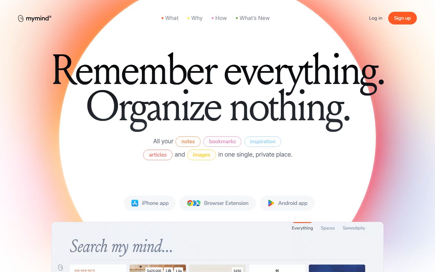
mymind's landing page is a calm, deliberately anti-social product surface: a pure white canvas (`{colors.canvas}` — #ffffff) interrupted by soft radial peach-orange glows, an enormous tightly-tracked serif headline, and a single warm brand spark (`{colors.brand}` — #ff5924). Where most SaaS pages lead with screenshots and chrome, mymind leads with **type** — "Remember everything. Organize nothing." is set huge (140px) with aggressive negative tracking (-8.4px), and that headline carries nearly all of the brand voltage.
The palette is almost monochrome at the action layer. Black ink (`{colors.ink}` — #000000) for the hero display, a family of cool slate grays (`{colors.body}` — #3a475a through `{colors.muted}` — #748297) for body and supporting copy, and exactly one warm color — the orange `{colors.brand}` — used for the Sign-up CTA, the manifesto "NO" emphasis words, and the saturated closing band. The orange always appears against white or as a warm gradient aura, never as a chrome fill behind text.
The overall voice is editorial-meets-human: serif display type, generous whitespace, fully-pill-rounded buttons (`{rounded.pill}` — 100px), and outlined tag chips ("notes", "bookmarks", "inspiration", "articles", "images") that float inline in the body copy. The page closes with a fully orange band (`{component.footer-cta-band}`) that inverts the whole composition.
**Key Characteristics:**
- Oversized serif display headline (`{typography.display-hero}` — 140px, line-height 0.85, letter-spacing -8.4px). The headline IS the hero artwork.
- Single warm brand color (`{colors.brand}` — #ff5924) reserved for the primary CTA, emphasis words, and the closing band. Everything else is black/slate/white.
- Soft radial peach-orange glow behind the hero, rendered as large blurred box-shadows (e.g. `rgba(255,167,129,0.44) 0px 57px 60px -54px`) rather than imagery.
- Fully pill-rounded interactive elements: `{rounded.pill}` (100px) for buttons and tags, `{rounded.pill-lg}` (120px) for larger pill surfaces.
- White "platform" pill buttons (iPhone app / Browser Extension / Android app) with soft gray drop-shadows carrying app-store icons.
- Outlined tag chips in brand-colored or blue (`{colors.link}` — #1573dd) outlines floating inside running copy.
- App-preview card on `{colors.surface-cool}` (#f0f2f5) showing the actual mymind board UI at small scale.
- A saturated orange closing band (`{component.footer-cta-band}`) that inverts the page and provides a strong visual full-stop.
## Colors
### Brand & Accent
- **Brand** (`{colors.brand}` — #ff5924): The single warm spark. Used for the "Sign up" primary CTA, the "TRY IT OUT" pill, the manifesto "NO" emphasis words, brand-dot nav markers, and the saturated closing band. Used sparingly — mymind is near-monochrome and the orange is the only saturated hue.
- **Link** (`{colors.link}` — #1573dd): A cool blue used on outlined tag chips ("inspiration", "bookmarks") and inline link accents.
### Text
- **Ink** (`{colors.ink}` — #000000): The hero serif display and primary headings.
- **Ink Soft** (`{colors.ink-soft}` — #21252a): Near-black variant for dense heading blocks.
- **Body** (`{colors.body}` — #3a475a) and **Body Alt** (`{colors.body-alt}` — #4a5465): Running paragraph copy in the manifesto and supporting sections.
- **Slate** (`{colors.slate}` — #3f4854) / **Slate Deep** (`{colors.slate-deep}` — #343552): Deeper slate tones used in headings and UI fragment text.
- **Muted** (`{colors.muted}` — #748297), **Muted Alt** (`{colors.muted-alt}` — #717286), **Muted Soft** (`{colors.muted-soft}` — #afb5c1): Secondary and tertiary text — sub-labels, the "Search my mind…" placeholder, inactive category tabs.
- **On Brand / On Ink** (`{colors.on-brand}` / `{colors.on-ink}` — #ffffff): Text on the orange CTA and orange closing band.
### Surface
- **Canvas** (`{colors.canvas}` — #ffffff): The default page floor.
- **Surface Soft** (`{colors.surface-soft}` — #f5f5f5): Light neutral section blocks.
- **Surface Cool** (`{colors.surface-cool}` — #f0f2f5): The app-preview / search card background.
- **Surface Blush** (`{colors.surface-blush}` — #fff1f1): A very faint warm tint used behind warm-accented chips/zones.
### Lines & Neutrals
- **Hairline** (`{colors.hairline}` — #e6e6e6): 1px dividers and card outlines.
- **Hairline Soft** (`{colors.hairline-soft}` — #cccccc): Slightly stronger divider tone.
- **Neutral Mid / Gray / Dark** (`{colors.neutral-mid}` — #bbbbbb, `{colors.neutral-gray}` — #888888, `{colors.neutral-dark}` — #666666): Iconography, fine print, and muted UI chrome inside the app preview.
## Typography
### Font Family
The system runs two faces. A **large serif display** carries the hero ("Remember everything. Organize nothing.") and the italic "Search my mind…" prompt — set enormous (140px) with line-height 0.85 and dramatic negative tracking (-8.4px). The measured computed family resolved to an `Avenir LT` book fallback string, but the rendered glyphs are unambiguously a high-contrast serif; the true display face is not cleanly identified (see Known Gaps), so the substitute stack walks `Georgia, "Times New Roman", serif`.
Supporting UI type runs **Neue Haas Grotesk Display** — a clean neo-grotesque sans used for headings (`{typography.title}` — 24px / 500), running body, captions, nav links, and button labels.
### Hierarchy
| Token | Size | Weight | Line Height | Letter Spacing | Use |
|---|---|---|---|---|---|
| `{typography.display-hero}` | 140px | 400 | 0.85 | -8.4px | Hero headline, italic "Search my mind…", closing-band headline — serif |
| `{typography.title}` | 24px | 500 | 1.25 | normal | Section headings, sub-heads — Neue Haas Grotesk |
| `{typography.body}` | 18px | 400 | 1.5 | normal | Running copy, nav links, button labels — derived from Neue Haas Grotesk baseline |
| `{typography.caption}` | 14px | 500 | 1.4 | normal | Category tabs, fine labels, CTA pill labels — derived |
`{typography.body}` and `{typography.caption}` sizes/line-heights are **derived** — the analyzer measured only the hero display (140px) and the h2 (24px); the body and caption baselines are interpolated from the Neue Haas Grotesk family and screenshot ground-truth, not measured.
### Principles
The serif display is the brand. Its signature is the extreme size + negative tracking + sub-1 line-height — at 140px / 0.85 / -8.4px the two lines nearly touch and read as a single typographic block. Body and UI copy stay in the neo-grotesque sans; never set running copy in the serif beyond pull-quotes and the search prompt.
### Note on Font Substitutes
Neither face is flagged as licensed in this capture, but both are commercial. For the serif display, an open-source substitute is **Playfair Display** or **Source Serif 4** at a regular weight with heavy negative tracking; for the Neue Haas Grotesk UI text, **Inter** or **Helvetica Now** alternatives such as **Manrope** preserve the neo-grotesque tone. Always re-apply the negative letter-spacing on the display face — the tight tracking is core to the look.
## Layout
### Spacing System
- **Base rhythm:** the most frequent measured steps are `{spacing.xs}` 10px (frequency 27), `{spacing.md}` 20px (frequency 53), `{spacing.lg}` 24px (frequency 23), and `{spacing.xxxl}` 50px (frequency 19).
- **Tokens:** `{spacing.xxs}` 4px · `{spacing.xs}` 10px · `{spacing.sm}` 18px · `{spacing.md}` 20px · `{spacing.lg}` 24px · `{spacing.xl}` 32px · `{spacing.xxl}` 40px · `{spacing.xxxl}` 50px.
- **Outer page padding / nav gutters:** `{spacing.xxxl}` (50px).
- **Inline element gaps (tags, nav dots, buttons):** `{spacing.md}` (20px) and `{spacing.xs}` (10px).
- **Card internal padding:** `{spacing.lg}` (24px).
### Grid & Container
- **Centered single-column editorial flow** — the hero headline, sub-line with inline tag chips, platform buttons, and app-preview card all stack centered.
- The app-preview card spans the content width below the hero and shows the mymind board UI.
- The manifesto runs as a narrow centered measure for readability.
### Whitespace Philosophy
mymind uses very generous whitespace — the hero headline gets enormous vertical room, and large empty stretches separate the manifesto, extension, and AI sections. The emptiness is intentional: it reinforces the "calm, anti-social, no clutter" brand promise. Sections breathe with `{spacing.xxxl}` (50px) and larger vertical gaps.
## Elevation & Depth
| Level | Treatment | Use |
|---|---|---|
| Flat | No shadow, no border | Body sections, nav, manifesto |
| Soft button shadow | `rgba(140,142,151,0.32) 0px 4px 7px -4px` | White platform pill buttons (iPhone / Browser / Android) |
| Warm CTA glow | `rgba(255,154,36,0.1) 0px 8px 16px 2px` | The orange Sign-up / CTA pills |
| Hero radial aura | `rgba(255,167,129,0.44) 0px 57px 60px -54px, rgba(255,128,36,0.27) 0px -27px 50px -40px` | The large peach-orange glow behind the hero composition |
| Ambient soft wash | `rgba(0,0,0,0.15) 0px 0px 120px 0px` | A wide, diffuse ambient shadow framing the central white zone |
The elevation philosophy is **soft and atmospheric** — there are no hard card borders or crisp drop shadows. Depth comes from large, heavily-blurred, low-alpha glows (often warm-tinted) rather than from conventional material shadows. The warm orange tint in the hero/CTA shadows is what ties the depth back to the single brand color.
### Decorative Depth
- The hero's peach-orange radial glow is the page's signature decorative element — a soft gradient bloom behind the white center, not an image.
- The app-preview card carries its own internal product chrome (image tiles, note cards, quote cards) at small scale; these are product UI shown as content, not system tokens.
## Shapes
### Border Radius Scale
| Token | Value | Use |
|---|---|---|
| `{rounded.sm}` | 12px | Small inner UI fragments inside the app preview |
| `{rounded.md}` | 14px | Small cards / tiles |
| `{rounded.lg}` | 16px | App-preview / search card, content tiles (most common — frequency 10) |
| `{rounded.xl}` | 20px | Larger cards |
| `{rounded.xxl}` | 30px | Large rounded panels |
| `{rounded.xxxl}` | 36px | Extra-rounded panels / image tiles |
| `{rounded.pill}` | 100px | Buttons, tag chips, platform pills (most common interactive radius — frequency 26) |
| `{rounded.pill-lg}` | 120px | Largest fully-rounded pill surfaces |
### Photography & Tile Geometry
Content tiles inside the app-preview card use `{rounded.lg}` (16px) through `{rounded.xxxl}` (36px) corners. Interactive controls are uniformly pill-shaped (`{rounded.pill}`). The combination — soft-rounded content tiles plus fully-pill buttons — gives the system its friendly, frictionless feel.
## Components
### Navigation
**`top-nav`** — White top bar across the page. Carries the lowercase "mymind®" wordmark at left, a centered menu with colored bullet markers ("What", "Why", "How", "What's New"), and a right cluster with `{component.button-text}` ("Log in") plus `{component.button-primary}` ("Sign up"). Outer padding `{spacing.xxxl}` (50px) horizontal, `{spacing.md}` (20px) vertical.
**`nav-link`** — Transparent menu item in `{colors.ink}`, each preceded by a small colored dot (orange / blue / pink / green markers). Type `{typography.body}`.
### Buttons
**`button-primary`** — The orange "Sign up" pill. Background `{colors.brand}` (#ff5924), text `{colors.on-brand}` (#ffffff), fully rounded `{rounded.pill}` (100px), carries a faint warm glow (`rgba(255,154,36,0.1) 0px 8px 16px 2px`). This is the only saturated CTA in the nav.
**`cta-pill`** — The mid-page "TRY IT OUT" pill. Same orange treatment as the primary button at caption scale; used as the manifesto's call-to-action.
**`button-text`** — Inline "Log in" text button, transparent, `{colors.ink}` label.
**`button-platform`** — White pill buttons with platform icons ("iPhone app", "Browser Extension", "Android app"). Background `{colors.canvas}`, text `{colors.ink}`, rounded `{rounded.pill}`, soft gray drop-shadow (`rgba(140,142,151,0.32) 0px 4px 7px -4px`), padding ~18px × 32px. App icons sit left of the label.
### Hero
**`hero-band`** — White-canvas hero. Centered serif headline in `{typography.display-hero}` (140px) over a peach-orange radial glow, followed by a sub-line with inline `{component.tag-pill}` chips, then the row of `{component.button-platform}` buttons. Padding `{spacing.xxxl}` (50px).
**`tag-pill`** — Outlined chips floating inline in the sub-line ("notes", "articles", "images"). Transparent background, brand-colored outline + text (`{colors.brand}`), rounded `{rounded.pill}`, padding ~4px × 18px.
**`tag-pill-bookmark`** — The blue-outlined variant ("inspiration", "bookmarks"). Transparent background, `{colors.link}` (#1573dd) outline + text, otherwise identical to `{component.tag-pill}`.
### Cards & Preview
**`app-preview-card`** — The large board mockup below the hero showing the actual mymind interface (image tiles, note cards, quote cards, product UI). Background `{colors.surface-cool}` (#f0f2f5), rounded `{rounded.lg}` (16px), internal padding `{spacing.lg}` (24px).
**`search-input`** — The "Search my mind…" prompt inside the preview card, rendered in italic `{typography.display-hero}` (serif) at reduced scale, color `{colors.muted}`. Sits on `{colors.surface-cool}`.
**`category-tab`** / **`category-tab-active`** — The "Everything / Spaces / Serendipity" switcher above the board. Inactive: transparent, `{colors.muted}` text. Active: transparent, `{colors.ink}` text with a small brand underline marker. Type `{typography.caption}`, padding 10px × 20px.
### Editorial
**`manifesto-block`** — The "OUR MANIFESTO" reading column. White canvas, `{colors.body}` (#3a475a) running copy in `{typography.body}`, with brand-orange "NO" emphasis words ("NO social features", "NO ads"). Padding `{spacing.xxl}` (40px).
**`footer-cta-band`** — The saturated orange closing band ("Folders are dead. This is your personal search engine."). Background `{colors.brand}` (#ff5924), text `{colors.on-brand}` (#ffffff) in `{typography.display-hero}` serif. This full-bleed orange band inverts the page and provides the visual full-stop — the only fully-saturated surface in the system.
## Do's and Don'ts
### Do
- Reserve `{colors.brand}` (#ff5924) for the primary CTA, emphasis words, dot markers, and the closing band. The orange is scarce and deliberate.
- Set the hero headline in the serif display with heavy negative tracking (-8.4px) and sub-1 line-height (0.85). The tightness is the brand.
- Keep buttons and tag chips fully pill-rounded (`{rounded.pill}` — 100px).
- Use soft, large-blur, low-alpha glows for depth — especially the warm peach-orange hero aura — instead of hard shadows.
- Let whitespace do work. The calm, empty composition reinforces mymind's anti-clutter promise.
- Show the actual product board inside `{component.app-preview-card}` rather than illustrating it.
- Pair the serif display with the Neue Haas Grotesk sans for all supporting copy — never blur the two.
### Don't
- Don't introduce a second saturated accent color. The system is monochrome except for one orange.
- Don't set running body copy in the serif display — reserve it for the hero, the search prompt, and the closing band.
- Don't add hard card borders or crisp material shadows; depth here is atmospheric and warm-tinted.
- Don't square off buttons or chips — fully-rounded pills are the interactive signature.
- Don't fill text on the orange band with anything but white (`{colors.on-brand}`).
- Don't document hover states — only default and active/pressed (e.g., the active category tab).
## Responsive Behavior
The capture covers the desktop landing page only; the screenshots show a single centered column that scales down. Documented behavior below is partly inferred from the captured layout — exact breakpoint rules are a Known Gap.
### Breakpoints (inferred)
| Name | Width | Key Changes |
|---|---|---|
| Mobile | < 768px | Nav likely collapses; hero serif scales well below 140px; platform pills stack; tag chips wrap inline |
| Tablet | 768–1024px | Centered column tightens; app-preview card scales proportionally |
| Desktop | > 1024px | Full nav, full 140px hero, app-preview card at full width |
### Touch Targets
- `{component.button-primary}` and `{component.button-platform}` are pill buttons with generous padding (≥18px vertical on platform pills) — comfortably above 44px effective height.
- `{component.category-tab}` uses 10px × 20px padding; tap area is adequate with surrounding spacing.
### Collapsing Strategy
- The hero serif headline scales fluidly; its sub-1 line-height keeps the two lines as a tight block at any size.
- Platform pill buttons reflow from a horizontal row to stacked at narrow widths.
- The app-preview card scales proportionally so the board tiles stay legible.
## Iteration Guide
1. Focus on ONE component at a time. Reference its YAML key directly (`{component.button-primary}`, `{component.app-preview-card}`).
2. Variants (`-active`, the blue `tag-pill-bookmark`) live as separate entries in `components:`.
3. Use `{token.refs}` everywhere — never inline a hex in a component.
4. Never document hover. Default and Active/Pressed only.
5. The serif display stays serif with negative tracking; the supporting sans stays Neue Haas Grotesk. The split does not blur.
6. Keep the orange scarce — one CTA, emphasis words, the closing band.
7. When adding depth, use large warm-tinted blurred glows, not hard shadows.
## Known Gaps
- **Hero display font identity is uncertain.** The analyzer's computed family for the 140px hero resolved to an `Avenir LT … Book` fallback string, but the rendered glyphs are clearly a high-contrast serif. The true display typeface is not identified; the frontmatter records the measured size/weight/line-height/tracking and a serif substitute stack, and substitutes are documented in Typography.
- **Component extraction returned degenerate values.** The measured `button-primary` reported `color:#000000, radius:0px, padding:0px` and `card` reported `radius:0px, shadow:none` — these do not match the visible pill-rounded orange CTA or the rounded preview card. Button and card specs are documented from screenshot ground-truth using the measured radius/spacing tokens; exact padding values are approximate.
- **Only two typography roles were measured** (140px display, 24px h2). The `body` and `caption` roles are derived/interpolated, not measured.
- **Tag-chip colors:** the screenshots show orange, blue, pink, and yellow outlined chips, but only orange (`{colors.brand}`) and blue (`{colors.link}`) were captured. The pink and yellow chip outlines are not in the measured palette and are not tokenized.
- **Only the landing page was captured** — interior product, pricing, and sign-up surfaces are out of scope.
- **Responsive breakpoints are inferred** from a single desktop capture; exact collapse rules are unconfirmed.
- **Animation, gradient stops, and the exact hero radial-glow gradient** are not extracted; depth is documented only from the four measured box-shadow values.
- **Dark mode** (the preview board appears to include a dark/night toggle icon) was not captured.
<!-- Documented by duply · real-world design systems as ready-to-use DESIGN.md for AI coding agents · https://duply.ai/mymind/design-md -->
Color Palette
Accent
Neutrals
Typography
display-hero140px · 400 · 0.85
The quick brown fox jumpstitle24px · 500 · 1.25
The quick brown fox jumpsbody18px · 400 · 1.5
The quick brown fox jumpscaption14px · 500 · 1.4
The quick brown fox jumpsSpacing & Shape
Spacing
| Name | Value | Preview |
|---|---|---|
| xxs | 4px | |
| xs | 10px | |
| sm | 18px | |
| md | 20px | |
| lg | 24px | |
| xl | 32px | |
| xxl | 40px | |
| xxxl | 50px |
Border Radius
| Name | Value | Preview |
|---|---|---|
| sm | 12px | |
| md | 14px | |
| lg | 16px | |
| xl | 20px | |
| xxl | 30px | |
| xxxl | 36px | |
| pill | 100px | |
| pill-lg | 120px |
More like this


---
version: alpha
name: mymind-design-analysis
description: A calm, anti-social "second brain" landing page built on pure white canvas with a single warm orange brand spark (#ff5924) and an oversized serif display headline. The system feels editorial and human — enormous tightly-tracked serif type set against soft radial peach-orange glows, slate-gray body copy, fully-pill-rounded buttons and outlined tag chips, and a single saturated orange band that closes the page. Brand voltage comes almost entirely from the giant serif headline and the warm gradient aura rather than from chrome or accent color.
colors:
  ink: "#000000"
  ink-soft: "#21252a"
  body: "#3a475a"
  body-alt: "#4a5465"
  slate: "#3f4854"
  slate-deep: "#343552"
  muted: "#748297"
  muted-alt: "#717286"
  muted-soft: "#afb5c1"
  canvas: "#ffffff"
  surface-soft: "#f5f5f5"
  surface-cool: "#f0f2f5"
  surface-blush: "#fff1f1"
  hairline: "#e6e6e6"
  hairline-soft: "#cccccc"
  neutral-mid: "#bbbbbb"
  neutral-gray: "#888888"
  neutral-dark: "#666666"
  brand: "#ff5924"
  link: "#1573dd"
  on-brand: "#ffffff"
  on-ink: "#ffffff"
typography:
  display-hero:
    fontFamily: "Avenir LT, Georgia, 'Times New Roman', serif"
    fontSize: 140px
    fontWeight: 400
    lineHeight: 0.85
    letterSpacing: -8.4px
  title:
    fontFamily: "neue-haas-grotesk-display, Inter, sans-serif"
    fontSize: 24px
    fontWeight: 500
    lineHeight: 1.25
    letterSpacing: normal
  body:
    fontFamily: "neue-haas-grotesk-display, Inter, sans-serif"
    fontSize: 18px
    fontWeight: 400
    lineHeight: 1.5
    letterSpacing: normal
  caption:
    fontFamily: "neue-haas-grotesk-display, Inter, sans-serif"
    fontSize: 14px
    fontWeight: 500
    lineHeight: 1.4
    letterSpacing: normal
rounded:
  sm: 12px
  md: 14px
  lg: 16px
  xl: 20px
  xxl: 30px
  xxxl: 36px
  pill: 100px
  pill-lg: 120px
spacing:
  xxs: 4px
  xs: 10px
  sm: 18px
  md: 20px
  lg: 24px
  xl: 32px
  xxl: 40px
  xxxl: 50px
components:
  top-nav:
    backgroundColor: "{colors.canvas}"
    textColor: "{colors.ink}"
    typography: "{typography.body}"
    padding: 20px 50px
  nav-link:
    backgroundColor: transparent
    textColor: "{colors.ink}"
    typography: "{typography.body}"
  button-text:
    backgroundColor: transparent
    textColor: "{colors.ink}"
    typography: "{typography.body}"
  button-primary:
    backgroundColor: "{colors.brand}"
    textColor: "{colors.on-brand}"
    typography: "{typography.body}"
    rounded: "{rounded.pill}"
    padding: 10px 24px
  cta-pill:
    backgroundColor: "{colors.brand}"
    textColor: "{colors.on-brand}"
    typography: "{typography.caption}"
    rounded: "{rounded.pill}"
    padding: 10px 24px
  button-platform:
    backgroundColor: "{colors.canvas}"
    textColor: "{colors.ink}"
    typography: "{typography.body}"
    rounded: "{rounded.pill}"
    padding: 18px 32px
  hero-band:
    backgroundColor: "{colors.canvas}"
    textColor: "{colors.ink}"
    typography: "{typography.display-hero}"
    padding: 50px
  tag-pill:
    backgroundColor: transparent
    textColor: "{colors.brand}"
    typography: "{typography.body}"
    rounded: "{rounded.pill}"
    padding: 4px 18px
  tag-pill-bookmark:
    backgroundColor: transparent
    textColor: "{colors.link}"
    typography: "{typography.body}"
    rounded: "{rounded.pill}"
    padding: 4px 18px
  app-preview-card:
    backgroundColor: "{colors.surface-cool}"
    textColor: "{colors.ink}"
    rounded: "{rounded.lg}"
    padding: 24px
  search-input:
    backgroundColor: "{colors.surface-cool}"
    textColor: "{colors.muted}"
    typography: "{typography.display-hero}"
    rounded: "{rounded.lg}"
    padding: 24px
  category-tab:
    backgroundColor: transparent
    textColor: "{colors.muted}"
    typography: "{typography.caption}"
    padding: 10px 20px
  category-tab-active:
    backgroundColor: transparent
    textColor: "{colors.ink}"
    typography: "{typography.caption}"
    padding: 10px 20px
  manifesto-block:
    backgroundColor: "{colors.canvas}"
    textColor: "{colors.body}"
    typography: "{typography.body}"
    padding: 40px
  footer-cta-band:
    backgroundColor: "{colors.brand}"
    textColor: "{colors.on-brand}"
    typography: "{typography.display-hero}"
    padding: 50px
---

## Overview

mymind's landing page is a calm, deliberately anti-social product surface: a pure white canvas (`{colors.canvas}` — #ffffff) interrupted by soft radial peach-orange glows, an enormous tightly-tracked serif headline, and a single warm brand spark (`{colors.brand}` — #ff5924). Where most SaaS pages lead with screenshots and chrome, mymind leads with **type** — "Remember everything. Organize nothing." is set huge (140px) with aggressive negative tracking (-8.4px), and that headline carries nearly all of the brand voltage.

The palette is almost monochrome at the action layer. Black ink (`{colors.ink}` — #000000) for the hero display, a family of cool slate grays (`{colors.body}` — #3a475a through `{colors.muted}` — #748297) for body and supporting copy, and exactly one warm color — the orange `{colors.brand}` — used for the Sign-up CTA, the manifesto "NO" emphasis words, and the saturated closing band. The orange always appears against white or as a warm gradient aura, never as a chrome fill behind text.

The overall voice is editorial-meets-human: serif display type, generous whitespace, fully-pill-rounded buttons (`{rounded.pill}` — 100px), and outlined tag chips ("notes", "bookmarks", "inspiration", "articles", "images") that float inline in the body copy. The page closes with a fully orange band (`{component.footer-cta-band}`) that inverts the whole composition.

**Key Characteristics:**
- Oversized serif display headline (`{typography.display-hero}` — 140px, line-height 0.85, letter-spacing -8.4px). The headline IS the hero artwork.
- Single warm brand color (`{colors.brand}` — #ff5924) reserved for the primary CTA, emphasis words, and the closing band. Everything else is black/slate/white.
- Soft radial peach-orange glow behind the hero, rendered as large blurred box-shadows (e.g. `rgba(255,167,129,0.44) 0px 57px 60px -54px`) rather than imagery.
- Fully pill-rounded interactive elements: `{rounded.pill}` (100px) for buttons and tags, `{rounded.pill-lg}` (120px) for larger pill surfaces.
- White "platform" pill buttons (iPhone app / Browser Extension / Android app) with soft gray drop-shadows carrying app-store icons.
- Outlined tag chips in brand-colored or blue (`{colors.link}` — #1573dd) outlines floating inside running copy.
- App-preview card on `{colors.surface-cool}` (#f0f2f5) showing the actual mymind board UI at small scale.
- A saturated orange closing band (`{component.footer-cta-band}`) that inverts the page and provides a strong visual full-stop.

## Colors

### Brand & Accent
- **Brand** (`{colors.brand}` — #ff5924): The single warm spark. Used for the "Sign up" primary CTA, the "TRY IT OUT" pill, the manifesto "NO" emphasis words, brand-dot nav markers, and the saturated closing band. Used sparingly — mymind is near-monochrome and the orange is the only saturated hue.
- **Link** (`{colors.link}` — #1573dd): A cool blue used on outlined tag chips ("inspiration", "bookmarks") and inline link accents.

### Text
- **Ink** (`{colors.ink}` — #000000): The hero serif display and primary headings.
- **Ink Soft** (`{colors.ink-soft}` — #21252a): Near-black variant for dense heading blocks.
- **Body** (`{colors.body}` — #3a475a) and **Body Alt** (`{colors.body-alt}` — #4a5465): Running paragraph copy in the manifesto and supporting sections.
- **Slate** (`{colors.slate}` — #3f4854) / **Slate Deep** (`{colors.slate-deep}` — #343552): Deeper slate tones used in headings and UI fragment text.
- **Muted** (`{colors.muted}` — #748297), **Muted Alt** (`{colors.muted-alt}` — #717286), **Muted Soft** (`{colors.muted-soft}` — #afb5c1): Secondary and tertiary text — sub-labels, the "Search my mind…" placeholder, inactive category tabs.
- **On Brand / On Ink** (`{colors.on-brand}` / `{colors.on-ink}` — #ffffff): Text on the orange CTA and orange closing band.

### Surface
- **Canvas** (`{colors.canvas}` — #ffffff): The default page floor.
- **Surface Soft** (`{colors.surface-soft}` — #f5f5f5): Light neutral section blocks.
- **Surface Cool** (`{colors.surface-cool}` — #f0f2f5): The app-preview / search card background.
- **Surface Blush** (`{colors.surface-blush}` — #fff1f1): A very faint warm tint used behind warm-accented chips/zones.

### Lines & Neutrals
- **Hairline** (`{colors.hairline}` — #e6e6e6): 1px dividers and card outlines.
- **Hairline Soft** (`{colors.hairline-soft}` — #cccccc): Slightly stronger divider tone.
- **Neutral Mid / Gray / Dark** (`{colors.neutral-mid}` — #bbbbbb, `{colors.neutral-gray}` — #888888, `{colors.neutral-dark}` — #666666): Iconography, fine print, and muted UI chrome inside the app preview.

## Typography

### Font Family
The system runs two faces. A **large serif display** carries the hero ("Remember everything. Organize nothing.") and the italic "Search my mind…" prompt — set enormous (140px) with line-height 0.85 and dramatic negative tracking (-8.4px). The measured computed family resolved to an `Avenir LT` book fallback string, but the rendered glyphs are unambiguously a high-contrast serif; the true display face is not cleanly identified (see Known Gaps), so the substitute stack walks `Georgia, "Times New Roman", serif`.

Supporting UI type runs **Neue Haas Grotesk Display** — a clean neo-grotesque sans used for headings (`{typography.title}` — 24px / 500), running body, captions, nav links, and button labels.

### Hierarchy

| Token | Size | Weight | Line Height | Letter Spacing | Use |
|---|---|---|---|---|---|
| `{typography.display-hero}` | 140px | 400 | 0.85 | -8.4px | Hero headline, italic "Search my mind…", closing-band headline — serif |
| `{typography.title}` | 24px | 500 | 1.25 | normal | Section headings, sub-heads — Neue Haas Grotesk |
| `{typography.body}` | 18px | 400 | 1.5 | normal | Running copy, nav links, button labels — derived from Neue Haas Grotesk baseline |
| `{typography.caption}` | 14px | 500 | 1.4 | normal | Category tabs, fine labels, CTA pill labels — derived |

`{typography.body}` and `{typography.caption}` sizes/line-heights are **derived** — the analyzer measured only the hero display (140px) and the h2 (24px); the body and caption baselines are interpolated from the Neue Haas Grotesk family and screenshot ground-truth, not measured.

### Principles
The serif display is the brand. Its signature is the extreme size + negative tracking + sub-1 line-height — at 140px / 0.85 / -8.4px the two lines nearly touch and read as a single typographic block. Body and UI copy stay in the neo-grotesque sans; never set running copy in the serif beyond pull-quotes and the search prompt.

### Note on Font Substitutes
Neither face is flagged as licensed in this capture, but both are commercial. For the serif display, an open-source substitute is **Playfair Display** or **Source Serif 4** at a regular weight with heavy negative tracking; for the Neue Haas Grotesk UI text, **Inter** or **Helvetica Now** alternatives such as **Manrope** preserve the neo-grotesque tone. Always re-apply the negative letter-spacing on the display face — the tight tracking is core to the look.

## Layout

### Spacing System
- **Base rhythm:** the most frequent measured steps are `{spacing.xs}` 10px (frequency 27), `{spacing.md}` 20px (frequency 53), `{spacing.lg}` 24px (frequency 23), and `{spacing.xxxl}` 50px (frequency 19).
- **Tokens:** `{spacing.xxs}` 4px · `{spacing.xs}` 10px · `{spacing.sm}` 18px · `{spacing.md}` 20px · `{spacing.lg}` 24px · `{spacing.xl}` 32px · `{spacing.xxl}` 40px · `{spacing.xxxl}` 50px.
- **Outer page padding / nav gutters:** `{spacing.xxxl}` (50px).
- **Inline element gaps (tags, nav dots, buttons):** `{spacing.md}` (20px) and `{spacing.xs}` (10px).
- **Card internal padding:** `{spacing.lg}` (24px).

### Grid & Container
- **Centered single-column editorial flow** — the hero headline, sub-line with inline tag chips, platform buttons, and app-preview card all stack centered.
- The app-preview card spans the content width below the hero and shows the mymind board UI.
- The manifesto runs as a narrow centered measure for readability.

### Whitespace Philosophy
mymind uses very generous whitespace — the hero headline gets enormous vertical room, and large empty stretches separate the manifesto, extension, and AI sections. The emptiness is intentional: it reinforces the "calm, anti-social, no clutter" brand promise. Sections breathe with `{spacing.xxxl}` (50px) and larger vertical gaps.

## Elevation & Depth

| Level | Treatment | Use |
|---|---|---|
| Flat | No shadow, no border | Body sections, nav, manifesto |
| Soft button shadow | `rgba(140,142,151,0.32) 0px 4px 7px -4px` | White platform pill buttons (iPhone / Browser / Android) |
| Warm CTA glow | `rgba(255,154,36,0.1) 0px 8px 16px 2px` | The orange Sign-up / CTA pills |
| Hero radial aura | `rgba(255,167,129,0.44) 0px 57px 60px -54px, rgba(255,128,36,0.27) 0px -27px 50px -40px` | The large peach-orange glow behind the hero composition |
| Ambient soft wash | `rgba(0,0,0,0.15) 0px 0px 120px 0px` | A wide, diffuse ambient shadow framing the central white zone |

The elevation philosophy is **soft and atmospheric** — there are no hard card borders or crisp drop shadows. Depth comes from large, heavily-blurred, low-alpha glows (often warm-tinted) rather than from conventional material shadows. The warm orange tint in the hero/CTA shadows is what ties the depth back to the single brand color.

### Decorative Depth
- The hero's peach-orange radial glow is the page's signature decorative element — a soft gradient bloom behind the white center, not an image.
- The app-preview card carries its own internal product chrome (image tiles, note cards, quote cards) at small scale; these are product UI shown as content, not system tokens.

## Shapes

### Border Radius Scale

| Token | Value | Use |
|---|---|---|
| `{rounded.sm}` | 12px | Small inner UI fragments inside the app preview |
| `{rounded.md}` | 14px | Small cards / tiles |
| `{rounded.lg}` | 16px | App-preview / search card, content tiles (most common — frequency 10) |
| `{rounded.xl}` | 20px | Larger cards |
| `{rounded.xxl}` | 30px | Large rounded panels |
| `{rounded.xxxl}` | 36px | Extra-rounded panels / image tiles |
| `{rounded.pill}` | 100px | Buttons, tag chips, platform pills (most common interactive radius — frequency 26) |
| `{rounded.pill-lg}` | 120px | Largest fully-rounded pill surfaces |

### Photography & Tile Geometry
Content tiles inside the app-preview card use `{rounded.lg}` (16px) through `{rounded.xxxl}` (36px) corners. Interactive controls are uniformly pill-shaped (`{rounded.pill}`). The combination — soft-rounded content tiles plus fully-pill buttons — gives the system its friendly, frictionless feel.

## Components

### Navigation

**`top-nav`** — White top bar across the page. Carries the lowercase "mymind®" wordmark at left, a centered menu with colored bullet markers ("What", "Why", "How", "What's New"), and a right cluster with `{component.button-text}` ("Log in") plus `{component.button-primary}` ("Sign up"). Outer padding `{spacing.xxxl}` (50px) horizontal, `{spacing.md}` (20px) vertical.

**`nav-link`** — Transparent menu item in `{colors.ink}`, each preceded by a small colored dot (orange / blue / pink / green markers). Type `{typography.body}`.

### Buttons

**`button-primary`** — The orange "Sign up" pill. Background `{colors.brand}` (#ff5924), text `{colors.on-brand}` (#ffffff), fully rounded `{rounded.pill}` (100px), carries a faint warm glow (`rgba(255,154,36,0.1) 0px 8px 16px 2px`). This is the only saturated CTA in the nav.

**`cta-pill`** — The mid-page "TRY IT OUT" pill. Same orange treatment as the primary button at caption scale; used as the manifesto's call-to-action.

**`button-text`** — Inline "Log in" text button, transparent, `{colors.ink}` label.

**`button-platform`** — White pill buttons with platform icons ("iPhone app", "Browser Extension", "Android app"). Background `{colors.canvas}`, text `{colors.ink}`, rounded `{rounded.pill}`, soft gray drop-shadow (`rgba(140,142,151,0.32) 0px 4px 7px -4px`), padding ~18px × 32px. App icons sit left of the label.

### Hero

**`hero-band`** — White-canvas hero. Centered serif headline in `{typography.display-hero}` (140px) over a peach-orange radial glow, followed by a sub-line with inline `{component.tag-pill}` chips, then the row of `{component.button-platform}` buttons. Padding `{spacing.xxxl}` (50px).

**`tag-pill`** — Outlined chips floating inline in the sub-line ("notes", "articles", "images"). Transparent background, brand-colored outline + text (`{colors.brand}`), rounded `{rounded.pill}`, padding ~4px × 18px.

**`tag-pill-bookmark`** — The blue-outlined variant ("inspiration", "bookmarks"). Transparent background, `{colors.link}` (#1573dd) outline + text, otherwise identical to `{component.tag-pill}`.

### Cards & Preview

**`app-preview-card`** — The large board mockup below the hero showing the actual mymind interface (image tiles, note cards, quote cards, product UI). Background `{colors.surface-cool}` (#f0f2f5), rounded `{rounded.lg}` (16px), internal padding `{spacing.lg}` (24px).

**`search-input`** — The "Search my mind…" prompt inside the preview card, rendered in italic `{typography.display-hero}` (serif) at reduced scale, color `{colors.muted}`. Sits on `{colors.surface-cool}`.

**`category-tab`** / **`category-tab-active`** — The "Everything / Spaces / Serendipity" switcher above the board. Inactive: transparent, `{colors.muted}` text. Active: transparent, `{colors.ink}` text with a small brand underline marker. Type `{typography.caption}`, padding 10px × 20px.

### Editorial

**`manifesto-block`** — The "OUR MANIFESTO" reading column. White canvas, `{colors.body}` (#3a475a) running copy in `{typography.body}`, with brand-orange "NO" emphasis words ("NO social features", "NO ads"). Padding `{spacing.xxl}` (40px).

**`footer-cta-band`** — The saturated orange closing band ("Folders are dead. This is your personal search engine."). Background `{colors.brand}` (#ff5924), text `{colors.on-brand}` (#ffffff) in `{typography.display-hero}` serif. This full-bleed orange band inverts the page and provides the visual full-stop — the only fully-saturated surface in the system.

## Do's and Don'ts

### Do
- Reserve `{colors.brand}` (#ff5924) for the primary CTA, emphasis words, dot markers, and the closing band. The orange is scarce and deliberate.
- Set the hero headline in the serif display with heavy negative tracking (-8.4px) and sub-1 line-height (0.85). The tightness is the brand.
- Keep buttons and tag chips fully pill-rounded (`{rounded.pill}` — 100px).
- Use soft, large-blur, low-alpha glows for depth — especially the warm peach-orange hero aura — instead of hard shadows.
- Let whitespace do work. The calm, empty composition reinforces mymind's anti-clutter promise.
- Show the actual product board inside `{component.app-preview-card}` rather than illustrating it.
- Pair the serif display with the Neue Haas Grotesk sans for all supporting copy — never blur the two.

### Don't
- Don't introduce a second saturated accent color. The system is monochrome except for one orange.
- Don't set running body copy in the serif display — reserve it for the hero, the search prompt, and the closing band.
- Don't add hard card borders or crisp material shadows; depth here is atmospheric and warm-tinted.
- Don't square off buttons or chips — fully-rounded pills are the interactive signature.
- Don't fill text on the orange band with anything but white (`{colors.on-brand}`).
- Don't document hover states — only default and active/pressed (e.g., the active category tab).

## Responsive Behavior

The capture covers the desktop landing page only; the screenshots show a single centered column that scales down. Documented behavior below is partly inferred from the captured layout — exact breakpoint rules are a Known Gap.

### Breakpoints (inferred)

| Name | Width | Key Changes |
|---|---|---|
| Mobile | < 768px | Nav likely collapses; hero serif scales well below 140px; platform pills stack; tag chips wrap inline |
| Tablet | 768–1024px | Centered column tightens; app-preview card scales proportionally |
| Desktop | > 1024px | Full nav, full 140px hero, app-preview card at full width |

### Touch Targets
- `{component.button-primary}` and `{component.button-platform}` are pill buttons with generous padding (≥18px vertical on platform pills) — comfortably above 44px effective height.
- `{component.category-tab}` uses 10px × 20px padding; tap area is adequate with surrounding spacing.

### Collapsing Strategy
- The hero serif headline scales fluidly; its sub-1 line-height keeps the two lines as a tight block at any size.
- Platform pill buttons reflow from a horizontal row to stacked at narrow widths.
- The app-preview card scales proportionally so the board tiles stay legible.

## Iteration Guide

1. Focus on ONE component at a time. Reference its YAML key directly (`{component.button-primary}`, `{component.app-preview-card}`).
2. Variants (`-active`, the blue `tag-pill-bookmark`) live as separate entries in `components:`.
3. Use `{token.refs}` everywhere — never inline a hex in a component.
4. Never document hover. Default and Active/Pressed only.
5. The serif display stays serif with negative tracking; the supporting sans stays Neue Haas Grotesk. The split does not blur.
6. Keep the orange scarce — one CTA, emphasis words, the closing band.
7. When adding depth, use large warm-tinted blurred glows, not hard shadows.

## Known Gaps

- **Hero display font identity is uncertain.** The analyzer's computed family for the 140px hero resolved to an `Avenir LT … Book` fallback string, but the rendered glyphs are clearly a high-contrast serif. The true display typeface is not identified; the frontmatter records the measured size/weight/line-height/tracking and a serif substitute stack, and substitutes are documented in Typography.
- **Component extraction returned degenerate values.** The measured `button-primary` reported `color:#000000, radius:0px, padding:0px` and `card` reported `radius:0px, shadow:none` — these do not match the visible pill-rounded orange CTA or the rounded preview card. Button and card specs are documented from screenshot ground-truth using the measured radius/spacing tokens; exact padding values are approximate.
- **Only two typography roles were measured** (140px display, 24px h2). The `body` and `caption` roles are derived/interpolated, not measured.
- **Tag-chip colors:** the screenshots show orange, blue, pink, and yellow outlined chips, but only orange (`{colors.brand}`) and blue (`{colors.link}`) were captured. The pink and yellow chip outlines are not in the measured palette and are not tokenized.
- **Only the landing page was captured** — interior product, pricing, and sign-up surfaces are out of scope.
- **Responsive breakpoints are inferred** from a single desktop capture; exact collapse rules are unconfirmed.
- **Animation, gradient stops, and the exact hero radial-glow gradient** are not extracted; depth is documented only from the four measured box-shadow values.
- **Dark mode** (the preview board appears to include a dark/night toggle icon) was not captured.

<!-- Documented by duply · real-world design systems as ready-to-use DESIGN.md for AI coding agents · https://duply.ai/mymind/design-md -->