LumaLabs
A cinematic, image-forward AI-product interface built on a pure white canvas and pure black ink, where full-bleed photographic/video heroes carry the brand voltage and the UI chrome stays deliberately quiet. The system pairs the Graphik neo-grotesque (tight negative tracking, weight 500) with soft pill buttons, heavily rounded cards (~24px), and a single deep near-black "Research" band that inverts the page. Restraint is the point — color is almost entirely monochrome, with rare muted accents (tan, navy, green) borrowed from product imagery rather than a painted accent palette.
---
version: alpha
name: LumaLabs-design-analysis
description: A cinematic, image-forward AI-product interface built on a pure white canvas and pure black ink, where full-bleed photographic/video heroes carry the brand voltage and the UI chrome stays deliberately quiet. The system pairs the Graphik neo-grotesque (tight negative tracking, weight 500) with soft pill buttons, heavily rounded cards (~24px), and a single deep near-black "Research" band that inverts the page. Restraint is the point — color is almost entirely monochrome, with rare muted accents (tan, navy, green) borrowed from product imagery rather than a painted accent palette.
colors:
ink: "#000000"
body: "#202020"
muted: "#737373"
muted-soft: "#8c8c8c"
muted-softer: "#a6a6a6"
canvas: "#ffffff"
surface-soft: "#f1f1f1"
surface-softer: "#f2f2f2"
hairline: "#e5e5e5"
border-soft: "#cccccc"
surface-dark: "#050607"
surface-dark-elevated: "#191d20"
surface-graphite: "#202020"
accent-navy: "#0b1a2e"
accent-green: "#1aa30d"
accent-tan: "#a1876b"
on-primary: "#000000"
on-dark: "#ffffff"
typography:
display-xl:
fontFamily: "Graphik, Inter, sans-serif"
fontSize: 52px
fontWeight: 500
lineHeight: 1.2
letterSpacing: -2.08px
display-lg:
fontFamily: "Graphik, Inter, sans-serif"
fontSize: 48px
fontWeight: 500
lineHeight: 1.2
letterSpacing: -1.92px
title-md:
fontFamily: "Graphik, Inter, sans-serif"
fontSize: 22px
fontWeight: 500
lineHeight: 1.4
letterSpacing: -0.66px
body-md:
fontFamily: "Graphik, Inter, sans-serif"
fontSize: 16px
fontWeight: 500
lineHeight: 1.5
letterSpacing: -0.4px
button:
fontFamily: "Graphik, Inter, sans-serif"
fontSize: 16px
fontWeight: 400
lineHeight: 1.5
letterSpacing: -0.4px
rounded:
sm: 8px
md: 16px
lg: 24px
spacing:
xxs: 6px
xs: 8px
sm: 10px
md: 12px
base: 16px
lg: 20px
xl: 24px
xxl: 32px
xxxl: 40px
section: 80px
section-lg: 160px
components:
top-nav:
backgroundColor: transparent
textColor: "{colors.on-dark}"
typography: "{typography.body-md}"
button-light:
backgroundColor: "{colors.canvas}"
textColor: "{colors.on-primary}"
typography: "{typography.button}"
rounded: "{rounded.lg}"
padding: 12px 24px
button-dark:
backgroundColor: "{colors.ink}"
textColor: "{colors.on-dark}"
typography: "{typography.button}"
rounded: "{rounded.lg}"
padding: 12px 24px
prompt-input-card:
backgroundColor: "{colors.canvas}"
textColor: "{colors.ink}"
typography: "{typography.body-md}"
rounded: "{rounded.lg}"
padding: 24px
text-input:
backgroundColor: "{colors.surface-soft}"
textColor: "{colors.muted}"
typography: "{typography.body-md}"
rounded: "{rounded.md}"
padding: 16px 20px
suggestion-pill:
backgroundColor: "{colors.canvas}"
textColor: "{colors.body}"
typography: "{typography.button}"
rounded: "{rounded.lg}"
padding: 8px 16px
announcement-pill:
backgroundColor: "{colors.canvas}"
textColor: "{colors.body}"
typography: "{typography.button}"
rounded: "{rounded.lg}"
padding: 8px 16px
product-mockup-card:
backgroundColor: "{colors.ink}"
textColor: "{colors.on-dark}"
rounded: "{rounded.lg}"
padding: 20px
research-band:
backgroundColor: "{colors.surface-dark}"
textColor: "{colors.on-dark}"
typography: "{typography.display-lg}"
padding: 80px
research-hero-card:
backgroundColor: "{colors.surface-dark-elevated}"
textColor: "{colors.on-dark}"
typography: "{typography.display-lg}"
rounded: "{rounded.lg}"
padding: 40px
model-card:
backgroundColor: "{colors.surface-dark}"
textColor: "{colors.on-dark}"
typography: "{typography.title-md}"
rounded: "{rounded.md}"
padding: 20px
news-card:
backgroundColor: "{colors.canvas}"
textColor: "{colors.ink}"
typography: "{typography.title-md}"
rounded: "{rounded.lg}"
padding: 20px
tag-badge:
backgroundColor: transparent
textColor: "{colors.muted}"
typography: "{typography.button}"
rounded: "{rounded.sm}"
padding: 6px 10px
---
## Overview
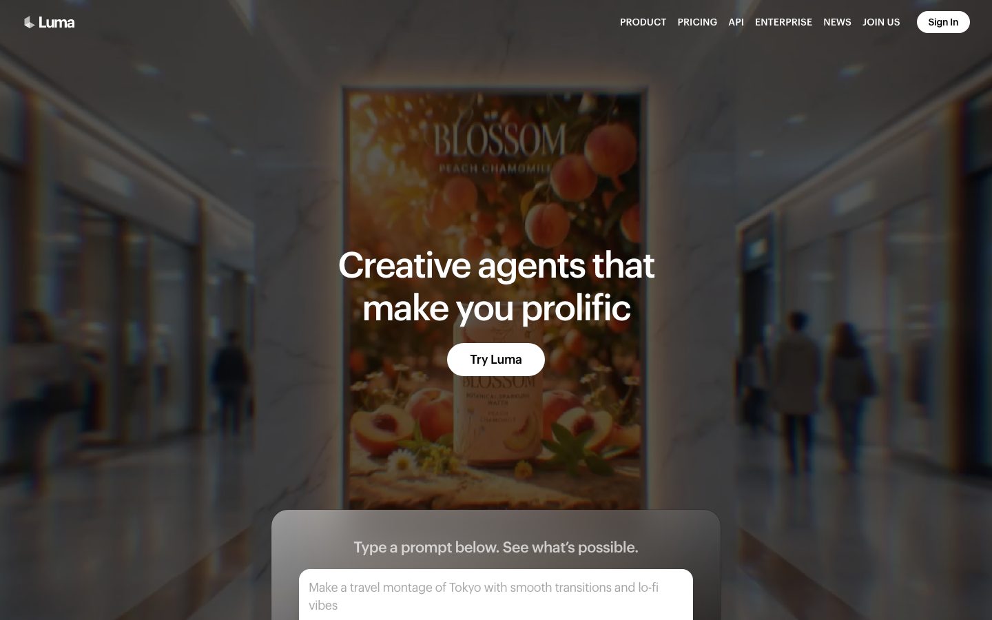
Luma's marketing surface is a cinematic, image-forward AI-product interface — a pure white canvas (`{colors.canvas}` — #ffffff) with pure black ink (`{colors.ink}` — #000000), where the brand voltage comes entirely from full-bleed photographic and video heroes (a peach-chamomile product render, a blurred retail interior, model-generated cinematic frames) rather than from any painted accent palette. The chrome is deliberately quiet: pill buttons, tightly-tracked Graphik headlines, generous whitespace, and a single deep near-black "Research" band that inverts the entire page midway down the scroll.
Type runs on a single family — **Graphik** — across every role, from the 52px hero h1 down to 16px body and button labels. The voice is neo-grotesque and confident: weight 500 almost everywhere, with aggressive negative letter-spacing (-2.08px on the hero, -0.4px even on body) that pulls the type tight and gives it an editorial, premium feel. Luma never reaches for a second display face; hierarchy is built from size and tracking alone.
The two interaction signatures are the **soft pill buttons** (white pills on imagery, black pills on light editorial sections) and the **glassy prompt-input card** that floats over the hero — a "Type a prompt below" panel that invites you straight into the product. Below the fold, suggestion pills ("Create a Pitch Deck", "Apply Cinematic Style") and an announcement pill ("Ray 3.2 Is Here") continue the rounded-pill language.
The deep near-black **Research band** (`{colors.surface-dark}` — #050607) is the system's one inversion — it closes the upper marketing flow, frames the "Open Physical AI Lab" and the model cards (RAY3.2, UNI-1), and gives the page a film-credits gravity before returning to white for the news grid.
**Key Characteristics:**
- Monochrome at the core — pure black ink on pure white canvas. Almost no chromatic accent in the chrome; the few measured accents (`{colors.accent-tan}` #a1876b, `{colors.accent-navy}` #0b1a2e, `{colors.accent-green}` #1aa30d) are sampled from product imagery, not applied as brand color.
- Single typeface — Graphik at weight 500 with tight negative tracking carries the entire hierarchy (substituted with Inter here; see Typography).
- Soft pill buttons (`{component.button-light}` / `{component.button-dark}`) — heavily rounded, low-contrast labels, white-on-imagery or black-on-white.
- Full-bleed photographic/video heroes do the persuading; the UI floats restraint on top of them.
- A floating glass prompt-input card (`{component.prompt-input-card}`) sits over the hero, pulling the visitor into the product immediately.
- One deep near-black Research band (`{colors.surface-dark}` — #050607) inverts the page; it is the only dark surface in the flow.
- Heavily rounded geometry — cards at `{rounded.lg}` (24px), inputs at `{rounded.md}` (16px), small tags at `{rounded.sm}` (8px).
- Soft, low-alpha drop shadows (`0 4px 6px -1px rgba(0,0,0,0.1)` and `0 20px 25px -5px rgba(0,0,0,0.1)`) lift floating panels off imagery — never heavy.
## Colors
### Brand & Accent
Luma is a near-monochrome system. There is no brand accent in the chrome — black and white do all the work.
- **Accent Tan** (`{colors.accent-tan}` — #a1876b): A warm earth tone sampled from product/hero imagery; appears only inside image content and warm-toned heroes.
- **Accent Navy** (`{colors.accent-navy}` — #0b1a2e): A deep blue sampled from imagery and the dark-band gradients.
- **Accent Green** (`{colors.accent-green}` — #1aa30d): A single saturated green measured at low frequency — used for a "NEW" tag accent or status dot, never on large surfaces.
These accents are documented because they were measured, but they are incidental — borrowed from photography rather than a deliberate accent palette.
### Surface
- **Canvas** (`{colors.canvas}` — #ffffff): The default page floor for the upper marketing flow and the lower news grid.
- **Surface Soft** (`{colors.surface-soft}` — #f1f1f1): The prompt-input field fill and soft section panels.
- **Surface Softer** (`{colors.surface-softer}` — #f2f2f2): A barely-distinct alternate light fill.
- **Surface Dark** (`{colors.surface-dark}` — #050607): The Research band background — the single deep near-black inversion in the page.
- **Surface Dark Elevated** (`{colors.surface-dark-elevated}` — #191d20): The "Open Physical AI Lab" hero card nested inside the dark band.
- **Surface Graphite** (`{colors.surface-graphite}` — #202020): A dark neutral used for dense dark text and graphite fills.
- **Hairline** (`{colors.hairline}` — #e5e5e5): The 1px divider tone on light surfaces (news-grid separators).
- **Border Soft** (`{colors.border-soft}` — #cccccc): A slightly stronger light border tone, used sparingly.
### Text
- **Ink** (`{colors.ink}` — #000000): All headlines and primary type on light surfaces.
- **Body** (`{colors.body}` — #202020): Default running-text and sub-heads.
- **Muted** (`{colors.muted}` — #737373): Secondary text, captions, suggestion-pill labels, tag labels.
- **Muted Soft** (`{colors.muted-soft}` — #8c8c8c): Tertiary text, placeholder copy.
- **Muted Softer** (`{colors.muted-softer}` — #a6a6a6): Fine-print and the faintest captions.
- **On Primary** (`{colors.on-primary}` — #000000): Black label text on the white pill buttons.
- **On Dark** (`{colors.on-dark}` — #ffffff): All text on the Research band, model cards, and dark mockup frames.
### Semantic
No dedicated success/warning/error palette was measured on these marketing pages. `{colors.accent-green}` (#1aa30d) is the closest measured value to a positive/status signal but is not confirmed as a semantic token. See Known Gaps.
## Typography
### Font Family
The entire system runs on **Graphik** — a neo-grotesque sans (measured as the obfuscated web-font handle `__graphik_7126cf`). There is no secondary display or mono face; Graphik carries headlines, body, and button labels alike. The defining trait is its tracking: aggressively negative letter-spacing across every role (-2.08px at the hero scale, narrowing to -0.4px at body size). The fallback stack walks `Inter, sans-serif`.
### Note on Font Substitutes
Graphik is a commercial typeface licensed from Commercial Type and cannot be shipped freely as a web font. Although it was not flagged in `fonts_licensed`, it is a paid face — do not assume distribution rights. A close open-source substitute is **Inter** (weight 500) with letter-spacing tightened to roughly -0.04em to approximate Graphik's tracking signature. **Hanken Grotesk** and **Manrope** are alternative open-source neo-grotesques that preserve the tight, modern character. The frontmatter `fontFamily` stacks list `Graphik, Inter, sans-serif` accordingly.
### Hierarchy
| Token | Size | Weight | Line Height | Letter Spacing | Use |
|---|---|---|---|---|---|
| `{typography.display-xl}` | 52px | 500 | 1.2 | -2.08px | Hero h1 ("Creative agents that make you prolific") |
| `{typography.display-lg}` | 48px | 500 | 1.2 | -1.92px | Section heads ("Our Mission is to build unified general intelligence…", "Open Physical AI Lab") |
| `{typography.title-md}` | 22px | 500 | 1.4 | -0.66px | Card titles, model names (RAY3.2, UNI-1), sub-section heads |
| `{typography.body-md}` | 16px | 500 | 1.5 | -0.4px | Default running-text, nav links, captions |
| `{typography.button}` | 16px | 400 | 1.5 | -0.4px | Button labels, pill labels (one weight step lighter than body) |
### Principles
Everything is Graphik 500 except button/pill labels, which drop to weight 400 — the only weight contrast in the system. Hierarchy is built almost entirely from size: the gap from 52px display down to 22px titles to 16px body is large and deliberate, so the heroes read as cinematic title cards. The negative tracking is non-negotiable — Graphik set with default tracking loses the editorial tightness that defines the voice. Never bold beyond 500; the system stays mid-weight to feel premium-quiet rather than loud.
## Layout
### Spacing System
- **Base unit:** measurements cluster on a loose 4px-ish grid but skew toward even values (8, 12, 16, 20, 24, 32).
- **Tokens:** `{spacing.xxs}` 6px · `{spacing.xs}` 8px · `{spacing.sm}` 10px · `{spacing.md}` 12px · `{spacing.base}` 16px · `{spacing.lg}` 20px · `{spacing.xl}` 24px · `{spacing.xxl}` 32px · `{spacing.xxxl}` 40px · `{spacing.section}` 80px · `{spacing.section-lg}` 160px.
- **Section padding:** `{spacing.section}` (80px) for standard vertical band rhythm; `{spacing.section-lg}` (160px) for the most generous editorial gaps (measured 5×). A single 144px value was also measured (derived as an intermediate band gap — see Known Gaps).
- **Card internal padding:** clusters at `{spacing.lg}` (20px) and `{spacing.xl}` (24px); `{spacing.xxxl}` (40px) on the larger Research hero card.
- **Tight rhythm:** the 8/10/12/16/20px band handles intra-component gaps (pill padding, list spacing, input padding).
### Grid & Container
- **Hero:** single centered column — headline + button stacked over a full-bleed background, with the prompt-input card floating below, overlapping the hero base.
- **Logo strip:** a single horizontal row of partner logos ("The fastest creative teams in the world make here.") in muted grayscale.
- **Model cards:** 2-up at desktop (RAY3.2 / UNI-1) inside the Research band.
- **News grid:** 3-up article cards at desktop ("Recent News"), reducing on smaller widths.
### Whitespace Philosophy
Luma is generous to the point of cinematic — the 80px and 160px section gaps leave large empty fields between bands so each full-bleed image and each tightly-tracked headline lands as its own beat. The page reads slowly and deliberately, like film titles rather than a dense SaaS landing.
## Elevation & Depth
| Level | Treatment | Use |
|---|---|---|
| Flat | No shadow, no border | Body sections, top nav, editorial text bands |
| Soft lift | `0 4px 6px -1px rgba(0,0,0,0.1)` (low-alpha) | Pills and small floating chips over imagery |
| Floating panel | `0 20px 25px -5px rgba(0,0,0,0.1)` | The prompt-input card lifting off the hero image |
| Inverted band | `{colors.surface-dark}` (#050607) background, no shadow | The Research band — color inversion does the depth work |
The elevation philosophy is **soft and atmospheric**. Shadows stay at 10% alpha and are large/diffuse rather than tight, so floating panels feel like they hover over film stills rather than sit in a flat UI. The single deep inversion (Research band) carries more depth than any shadow — color contrast, not elevation, is the strongest depth signal in the system.
### Decorative Depth
- Full-bleed hero imagery is blurred/darkened at the edges to let white headline type sit legibly on top — the depth here is photographic, not token-driven.
- The product-mockup card (`{component.product-mockup-card}`) shows the actual Luma app chrome inside a black rounded frame, with its own internal UI shadows belonging to the product, not the marketing system.
## Shapes
### Border Radius Scale
| Token | Value | Use |
|---|---|---|
| `{rounded.sm}` | 8px | Tag badges (ENGINEERING / PRODUCT / COMPANY), small chips |
| `{rounded.md}` | 16px | Prompt-input field, model cards |
| `{rounded.lg}` | 24px | Content cards, product-mockup frame, pill buttons, prompt-input card, suggestion/announcement pills |
The system is consistently round-cornered, with `{rounded.lg}` (24px) as the dominant radius (measured 14×) — it applies to nearly every container and, applied to short buttons, produces the soft full-pill silhouette seen on "Try Luma" and "Sign In". There is no sharp-cornered surface anywhere in the marketing flow.
### Photography Geometry
Hero and model imagery fills its container edge-to-edge, clipped to the parent radius (`{rounded.lg}`). The hero product render runs full-bleed behind the headline with no rounding. Partner logos in the brand strip are flat monochrome marks with no container.
## Components
### Top Navigation
**`top-nav`** — Transparent bar pinned over the hero image. Left: the Luma wordmark + mark in `{colors.on-dark}` (white over the dark hero). Center-right: text menu (PRODUCT, PRICING, API, ENTERPRISE, NEWS, JOIN US) in `{typography.body-md}`, white over imagery. Far right: a "Sign In" white pill (`{component.button-light}`). The nav carries no background fill — it relies on the darkened hero for contrast.
### Buttons
**`button-light`** — The primary CTA over imagery and dark surfaces. Background `{colors.canvas}` (white), label `{colors.on-primary}` (black), type `{typography.button}` (Graphik 16px / 400), rounded `{rounded.lg}` (24px) producing a full-pill shape, padding ~12px × 24px (derived from the spacing scale — measured component radius/padding returned 0, so the pill geometry is taken from screenshot ground-truth). Used for "Try Luma" and "Sign In".
**`button-dark`** — The inverse CTA used on light editorial sections. Background `{colors.ink}` (black), label `{colors.on-dark}` (white), same type, radius, and pill geometry. Used for "Learn more", "All news", "Discover Ray3.2", "Discover Uni-1".
### Prompt & Inputs
**`prompt-input-card`** — A floating glass panel overlapping the hero base ("Type a prompt below. See what's possible."). Background `{colors.canvas}`, rounded `{rounded.lg}` (24px), internal padding `{spacing.xl}` (24px), lifted with the large floating-panel shadow. Holds a heading and the prompt text input.
**`text-input`** — The prompt field inside the card ("Make a travel montage of Tokyo with smooth transitions and lo-fi vibes"). Background `{colors.surface-soft}` (#f1f1f1), placeholder text `{colors.muted}`, type `{typography.body-md}`, rounded `{rounded.md}` (16px), padding ~16px × 20px. A small send affordance sits at the right edge. (Measured input radius returned 0px; the rounded value is taken from screenshot ground-truth — see Known Gaps.)
**`suggestion-pill`** — Quick-start chips below the prompt card ("Create a Pitch Deck", "Turn Product into Hero Shots", "Apply Cinematic Style"). Background `{colors.canvas}`, label `{colors.body}`, type `{typography.button}`, rounded `{rounded.lg}` (full pill), padding ~8px × 16px.
**`announcement-pill`** — A wide pill announcing model releases ("Ray 3.2 Is Here: Direct Every Frame Finish Every Cut" with "Try Free" / "Learn more" links). Same pill treatment as suggestion-pill, slightly wider.
### Cards & Containers
**`product-mockup-card`** — A black rounded frame ("Where ideas become the work") showing the actual Luma app UI inside — asset grids, a channel-launch panel. Background `{colors.ink}`, text `{colors.on-dark}`, rounded `{rounded.lg}` (24px), padding `{spacing.lg}` (20px). The product chrome inside carries its own internal styling.
**`research-band`** — The page's single dark inversion ("Research / Speed like this doesn't come from a wrapper"). Background `{colors.surface-dark}` (#050607), text `{colors.on-dark}`, section padding `{spacing.section}` (80px). Frames the Open Physical AI Lab card, the model cards, and engineering article links.
**`research-hero-card`** — The "Open Physical AI Lab" headline card nested in the Research band. Background `{colors.surface-dark-elevated}` (#191d20), text `{colors.on-dark}`, type `{typography.display-lg}`, rounded `{rounded.lg}`, padding `{spacing.xxxl}` (40px). Carries the Luma mark + large headline.
**`model-card`** — Model feature cards (RAY3.2, UNI-1) in a 2-up row inside the dark band. Background `{colors.surface-dark}`, text `{colors.on-dark}`, title in `{typography.title-md}`, rounded `{rounded.md}` (16px), padding `{spacing.lg}` (20px). Each carries a thumbnail, a "NEW" tag, a description, and a `{component.button-dark}`-style "Discover" pill.
**`news-card`** — Article cards in the "Recent News" 3-up grid on white canvas. Background `{colors.canvas}`, title in `{typography.title-md}`, rounded `{rounded.lg}`, padding `{spacing.lg}` (20px). Each leads with a `{component.tag-badge}` (PRODUCT / COMPANY) + date, then a headline.
### Tags / Badges
**`tag-badge`** — Small category labels (ENGINEERING, PRODUCT, COMPANY, NEW). Transparent or hairline-outlined background, text `{colors.muted}`, type `{typography.button}`, rounded `{rounded.sm}` (8px), padding ~6px × 10px. The "NEW" badge near RAY3.2 is the rare spot where `{colors.accent-green}` may appear.
## Do's and Don'ts
### Do
- Keep the chrome monochrome — black ink, white canvas. Let full-bleed imagery carry all the color and energy.
- Set Graphik (or Inter substitute) at weight 500 with tight negative tracking. The tracking is the voice.
- Build hierarchy from size, not weight — 52px hero down to 16px body, all at 500.
- Use `{component.button-light}` (white pill) over imagery and dark bands; use `{component.button-dark}` (black pill) on white editorial sections.
- Float the prompt-input card over the hero with the large soft shadow — it's the system's invitation into the product.
- Reserve `{colors.surface-dark}` (#050607) for the single Research inversion. The page is white above and white below it.
- Keep radii round and consistent — `{rounded.lg}` (24px) is the default container shape.
### Don't
- Don't introduce a brand accent color into the chrome. The measured tans, navies, and greens are sampled from imagery, not a palette — don't paint buttons or links with them.
- Don't bold type beyond weight 500, and don't set Graphik with default/positive tracking.
- Don't add a second display typeface; Graphik does every role.
- Don't add multiple dark surfaces — the Research band is the only inversion. Extra dark cards dilute its impact.
- Don't use heavy or tight drop shadows. Shadows stay at 10% alpha, large and diffuse.
- Don't sharpen corners. There is no square-cornered surface in the system.
- Don't document hover styling — only default and active/pressed states.
## Responsive Behavior
### Breakpoints
Specific breakpoint widths were not measured on these captures. The following is inferred from the layout structure and should be confirmed against the live site (see Known Gaps).
| Name | Width (inferred) | Key Changes |
|---|---|---|
| Mobile | < 768px | Top-nav menu collapses; hero h1 scales down from 52px; model cards and news grid stack 1-up; prompt card spans full width |
| Tablet | 768–1024px | Nav tightens; news grid 2-up; model cards may stay 2-up or stack |
| Desktop | 1024–1440px | Full horizontal nav; news grid 3-up; model cards 2-up |
| Wide | > 1440px | Same as desktop with larger outer margins; section gaps widen toward `{spacing.section-lg}` (160px) |
### Touch Targets
- `{component.button-light}` / `{component.button-dark}` pills sit at ~12px × 24px padding — comfortably above 44px tall with the line-height included.
- `{component.suggestion-pill}` at ~8px × 16px padding clears tap-target minimums with surrounding gap.
- `{component.text-input}` at ~16px × 20px padding is a large, easy target.
### Collapsing Strategy
- The hero stays single-column and image-centric at every breakpoint; the prompt card reflows to full width on mobile.
- Suggestion and announcement pills wrap to multiple rows rather than shrinking.
- The Research band keeps its dark inversion at all widths; model cards stack vertically on narrow screens.
- The news grid reduces columns (3 → 2 → 1) rather than scaling cards down.
### Image Behavior
- Hero imagery stays full-bleed and crops to fill; the headline overlay stays centered.
- Card imagery clips to the parent `{rounded.lg}` radius and scales proportionally.
- Partner logos in the brand strip stay monochrome and wrap on narrow widths.
## Iteration Guide
1. Focus on ONE component at a time. Reference its YAML key directly (`{component.prompt-input-card}`, `{component.model-card}`).
2. Variants (`button-light` vs `button-dark`, future `-active` / `-disabled` states) live as separate entries in `components:`.
3. Use `{token.refs}` everywhere — never inline a hex into a component.
4. Never document hover. Default and active/pressed states only.
5. Headlines stay Graphik 500 with negative tracking; labels drop to 400. That one-step weight contrast is the only weight variation — don't add more.
6. The Research band is the only dark surface. Don't add other dark cards on the white flow.
7. When in doubt about emphasis: bigger Graphik before bolder Graphik.
## Known Gaps
- The component scraper returned `radius: 0px` and `padding: 0px` for `button-primary`, `card`, and `input` — these are clearly default/unstyled fallbacks that conflict with the visibly rounded pills and cards in the screenshots. Button and input geometry (pill radius, padding) is documented from screenshot ground-truth plus the measured radius scale; exact values should be confirmed against the live CSS.
- Graphik is a commercial typeface (Commercial Type) even though it was not flagged in `fonts_licensed`. Open-source substitutes (Inter, Hanken Grotesk, Manrope) are documented; do not ship Graphik without a license.
- No true pill/full radius token (9999px) was measured — the pill silhouette is achieved with `{rounded.lg}` (24px) on short elements. If the live buttons use a larger/full radius, add a `pill` token.
- The measured 144px spacing value (frequency 1) is treated as a derived one-off band gap and not tokenized separately.
- Accent colors (tan #a1876b, navy #0b1a2e, green #1aa30d) were measured at low frequency and appear to be sampled from imagery rather than applied as a brand palette; their intended semantic/usage role is unconfirmed.
- No footer was captured in the analysis; its styling and dark/light treatment are out of scope.
- Breakpoint widths, animation/transition timings (hero video playback, prompt-card entrance, pill interactions), and form validation/error states were not measured.
- The actual Luma app surface (asset grids, channel-launch panel shown inside `{component.product-mockup-card}`) is the product, not a marketing surface, and is out of scope.
<!-- Documented by duply · real-world design systems as ready-to-use DESIGN.md for AI coding agents · https://duply.ai/lumalabs/design-md -->
Color Palette
Accent
Neutrals
Typography
display-xl52px · 500 · 1.2
The quick brown fox jumpsdisplay-lg48px · 500 · 1.2
The quick brown fox jumpstitle-md22px · 500 · 1.4
The quick brown fox jumpsbody-md16px · 500 · 1.5
The quick brown fox jumpsbutton16px · 400 · 1.5
The quick brown fox jumpsSpacing & Shape
Spacing
| Name | Value | Preview |
|---|---|---|
| xxs | 6px | |
| xs | 8px | |
| sm | 10px | |
| md | 12px | |
| base | 16px | |
| lg | 20px | |
| xl | 24px | |
| xxl | 32px | |
| xxxl | 40px | |
| section | 80px | |
| section-lg | 160px |
Border Radius
| Name | Value | Preview |
|---|---|---|
| sm | 8px | |
| md | 16px | |
| lg | 24px |
More like this


---
version: alpha
name: LumaLabs-design-analysis
description: A cinematic, image-forward AI-product interface built on a pure white canvas and pure black ink, where full-bleed photographic/video heroes carry the brand voltage and the UI chrome stays deliberately quiet. The system pairs the Graphik neo-grotesque (tight negative tracking, weight 500) with soft pill buttons, heavily rounded cards (~24px), and a single deep near-black "Research" band that inverts the page. Restraint is the point — color is almost entirely monochrome, with rare muted accents (tan, navy, green) borrowed from product imagery rather than a painted accent palette.

colors:
  ink: "#000000"
  body: "#202020"
  muted: "#737373"
  muted-soft: "#8c8c8c"
  muted-softer: "#a6a6a6"
  canvas: "#ffffff"
  surface-soft: "#f1f1f1"
  surface-softer: "#f2f2f2"
  hairline: "#e5e5e5"
  border-soft: "#cccccc"
  surface-dark: "#050607"
  surface-dark-elevated: "#191d20"
  surface-graphite: "#202020"
  accent-navy: "#0b1a2e"
  accent-green: "#1aa30d"
  accent-tan: "#a1876b"
  on-primary: "#000000"
  on-dark: "#ffffff"

typography:
  display-xl:
    fontFamily: "Graphik, Inter, sans-serif"
    fontSize: 52px
    fontWeight: 500
    lineHeight: 1.2
    letterSpacing: -2.08px
  display-lg:
    fontFamily: "Graphik, Inter, sans-serif"
    fontSize: 48px
    fontWeight: 500
    lineHeight: 1.2
    letterSpacing: -1.92px
  title-md:
    fontFamily: "Graphik, Inter, sans-serif"
    fontSize: 22px
    fontWeight: 500
    lineHeight: 1.4
    letterSpacing: -0.66px
  body-md:
    fontFamily: "Graphik, Inter, sans-serif"
    fontSize: 16px
    fontWeight: 500
    lineHeight: 1.5
    letterSpacing: -0.4px
  button:
    fontFamily: "Graphik, Inter, sans-serif"
    fontSize: 16px
    fontWeight: 400
    lineHeight: 1.5
    letterSpacing: -0.4px

rounded:
  sm: 8px
  md: 16px
  lg: 24px

spacing:
  xxs: 6px
  xs: 8px
  sm: 10px
  md: 12px
  base: 16px
  lg: 20px
  xl: 24px
  xxl: 32px
  xxxl: 40px
  section: 80px
  section-lg: 160px

components:
  top-nav:
    backgroundColor: transparent
    textColor: "{colors.on-dark}"
    typography: "{typography.body-md}"
  button-light:
    backgroundColor: "{colors.canvas}"
    textColor: "{colors.on-primary}"
    typography: "{typography.button}"
    rounded: "{rounded.lg}"
    padding: 12px 24px
  button-dark:
    backgroundColor: "{colors.ink}"
    textColor: "{colors.on-dark}"
    typography: "{typography.button}"
    rounded: "{rounded.lg}"
    padding: 12px 24px
  prompt-input-card:
    backgroundColor: "{colors.canvas}"
    textColor: "{colors.ink}"
    typography: "{typography.body-md}"
    rounded: "{rounded.lg}"
    padding: 24px
  text-input:
    backgroundColor: "{colors.surface-soft}"
    textColor: "{colors.muted}"
    typography: "{typography.body-md}"
    rounded: "{rounded.md}"
    padding: 16px 20px
  suggestion-pill:
    backgroundColor: "{colors.canvas}"
    textColor: "{colors.body}"
    typography: "{typography.button}"
    rounded: "{rounded.lg}"
    padding: 8px 16px
  announcement-pill:
    backgroundColor: "{colors.canvas}"
    textColor: "{colors.body}"
    typography: "{typography.button}"
    rounded: "{rounded.lg}"
    padding: 8px 16px
  product-mockup-card:
    backgroundColor: "{colors.ink}"
    textColor: "{colors.on-dark}"
    rounded: "{rounded.lg}"
    padding: 20px
  research-band:
    backgroundColor: "{colors.surface-dark}"
    textColor: "{colors.on-dark}"
    typography: "{typography.display-lg}"
    padding: 80px
  research-hero-card:
    backgroundColor: "{colors.surface-dark-elevated}"
    textColor: "{colors.on-dark}"
    typography: "{typography.display-lg}"
    rounded: "{rounded.lg}"
    padding: 40px
  model-card:
    backgroundColor: "{colors.surface-dark}"
    textColor: "{colors.on-dark}"
    typography: "{typography.title-md}"
    rounded: "{rounded.md}"
    padding: 20px
  news-card:
    backgroundColor: "{colors.canvas}"
    textColor: "{colors.ink}"
    typography: "{typography.title-md}"
    rounded: "{rounded.lg}"
    padding: 20px
  tag-badge:
    backgroundColor: transparent
    textColor: "{colors.muted}"
    typography: "{typography.button}"
    rounded: "{rounded.sm}"
    padding: 6px 10px
---

## Overview

Luma's marketing surface is a cinematic, image-forward AI-product interface — a pure white canvas (`{colors.canvas}` — #ffffff) with pure black ink (`{colors.ink}` — #000000), where the brand voltage comes entirely from full-bleed photographic and video heroes (a peach-chamomile product render, a blurred retail interior, model-generated cinematic frames) rather than from any painted accent palette. The chrome is deliberately quiet: pill buttons, tightly-tracked Graphik headlines, generous whitespace, and a single deep near-black "Research" band that inverts the entire page midway down the scroll.

Type runs on a single family — **Graphik** — across every role, from the 52px hero h1 down to 16px body and button labels. The voice is neo-grotesque and confident: weight 500 almost everywhere, with aggressive negative letter-spacing (-2.08px on the hero, -0.4px even on body) that pulls the type tight and gives it an editorial, premium feel. Luma never reaches for a second display face; hierarchy is built from size and tracking alone.

The two interaction signatures are the **soft pill buttons** (white pills on imagery, black pills on light editorial sections) and the **glassy prompt-input card** that floats over the hero — a "Type a prompt below" panel that invites you straight into the product. Below the fold, suggestion pills ("Create a Pitch Deck", "Apply Cinematic Style") and an announcement pill ("Ray 3.2 Is Here") continue the rounded-pill language.

The deep near-black **Research band** (`{colors.surface-dark}` — #050607) is the system's one inversion — it closes the upper marketing flow, frames the "Open Physical AI Lab" and the model cards (RAY3.2, UNI-1), and gives the page a film-credits gravity before returning to white for the news grid.

**Key Characteristics:**
- Monochrome at the core — pure black ink on pure white canvas. Almost no chromatic accent in the chrome; the few measured accents (`{colors.accent-tan}` #a1876b, `{colors.accent-navy}` #0b1a2e, `{colors.accent-green}` #1aa30d) are sampled from product imagery, not applied as brand color.
- Single typeface — Graphik at weight 500 with tight negative tracking carries the entire hierarchy (substituted with Inter here; see Typography).
- Soft pill buttons (`{component.button-light}` / `{component.button-dark}`) — heavily rounded, low-contrast labels, white-on-imagery or black-on-white.
- Full-bleed photographic/video heroes do the persuading; the UI floats restraint on top of them.
- A floating glass prompt-input card (`{component.prompt-input-card}`) sits over the hero, pulling the visitor into the product immediately.
- One deep near-black Research band (`{colors.surface-dark}` — #050607) inverts the page; it is the only dark surface in the flow.
- Heavily rounded geometry — cards at `{rounded.lg}` (24px), inputs at `{rounded.md}` (16px), small tags at `{rounded.sm}` (8px).
- Soft, low-alpha drop shadows (`0 4px 6px -1px rgba(0,0,0,0.1)` and `0 20px 25px -5px rgba(0,0,0,0.1)`) lift floating panels off imagery — never heavy.

## Colors

### Brand & Accent
Luma is a near-monochrome system. There is no brand accent in the chrome — black and white do all the work.
- **Accent Tan** (`{colors.accent-tan}` — #a1876b): A warm earth tone sampled from product/hero imagery; appears only inside image content and warm-toned heroes.
- **Accent Navy** (`{colors.accent-navy}` — #0b1a2e): A deep blue sampled from imagery and the dark-band gradients.
- **Accent Green** (`{colors.accent-green}` — #1aa30d): A single saturated green measured at low frequency — used for a "NEW" tag accent or status dot, never on large surfaces.

These accents are documented because they were measured, but they are incidental — borrowed from photography rather than a deliberate accent palette.

### Surface
- **Canvas** (`{colors.canvas}` — #ffffff): The default page floor for the upper marketing flow and the lower news grid.
- **Surface Soft** (`{colors.surface-soft}` — #f1f1f1): The prompt-input field fill and soft section panels.
- **Surface Softer** (`{colors.surface-softer}` — #f2f2f2): A barely-distinct alternate light fill.
- **Surface Dark** (`{colors.surface-dark}` — #050607): The Research band background — the single deep near-black inversion in the page.
- **Surface Dark Elevated** (`{colors.surface-dark-elevated}` — #191d20): The "Open Physical AI Lab" hero card nested inside the dark band.
- **Surface Graphite** (`{colors.surface-graphite}` — #202020): A dark neutral used for dense dark text and graphite fills.
- **Hairline** (`{colors.hairline}` — #e5e5e5): The 1px divider tone on light surfaces (news-grid separators).
- **Border Soft** (`{colors.border-soft}` — #cccccc): A slightly stronger light border tone, used sparingly.

### Text
- **Ink** (`{colors.ink}` — #000000): All headlines and primary type on light surfaces.
- **Body** (`{colors.body}` — #202020): Default running-text and sub-heads.
- **Muted** (`{colors.muted}` — #737373): Secondary text, captions, suggestion-pill labels, tag labels.
- **Muted Soft** (`{colors.muted-soft}` — #8c8c8c): Tertiary text, placeholder copy.
- **Muted Softer** (`{colors.muted-softer}` — #a6a6a6): Fine-print and the faintest captions.
- **On Primary** (`{colors.on-primary}` — #000000): Black label text on the white pill buttons.
- **On Dark** (`{colors.on-dark}` — #ffffff): All text on the Research band, model cards, and dark mockup frames.

### Semantic
No dedicated success/warning/error palette was measured on these marketing pages. `{colors.accent-green}` (#1aa30d) is the closest measured value to a positive/status signal but is not confirmed as a semantic token. See Known Gaps.

## Typography

### Font Family
The entire system runs on **Graphik** — a neo-grotesque sans (measured as the obfuscated web-font handle `__graphik_7126cf`). There is no secondary display or mono face; Graphik carries headlines, body, and button labels alike. The defining trait is its tracking: aggressively negative letter-spacing across every role (-2.08px at the hero scale, narrowing to -0.4px at body size). The fallback stack walks `Inter, sans-serif`.

### Note on Font Substitutes
Graphik is a commercial typeface licensed from Commercial Type and cannot be shipped freely as a web font. Although it was not flagged in `fonts_licensed`, it is a paid face — do not assume distribution rights. A close open-source substitute is **Inter** (weight 500) with letter-spacing tightened to roughly -0.04em to approximate Graphik's tracking signature. **Hanken Grotesk** and **Manrope** are alternative open-source neo-grotesques that preserve the tight, modern character. The frontmatter `fontFamily` stacks list `Graphik, Inter, sans-serif` accordingly.

### Hierarchy

| Token | Size | Weight | Line Height | Letter Spacing | Use |
|---|---|---|---|---|---|
| `{typography.display-xl}` | 52px | 500 | 1.2 | -2.08px | Hero h1 ("Creative agents that make you prolific") |
| `{typography.display-lg}` | 48px | 500 | 1.2 | -1.92px | Section heads ("Our Mission is to build unified general intelligence…", "Open Physical AI Lab") |
| `{typography.title-md}` | 22px | 500 | 1.4 | -0.66px | Card titles, model names (RAY3.2, UNI-1), sub-section heads |
| `{typography.body-md}` | 16px | 500 | 1.5 | -0.4px | Default running-text, nav links, captions |
| `{typography.button}` | 16px | 400 | 1.5 | -0.4px | Button labels, pill labels (one weight step lighter than body) |

### Principles
Everything is Graphik 500 except button/pill labels, which drop to weight 400 — the only weight contrast in the system. Hierarchy is built almost entirely from size: the gap from 52px display down to 22px titles to 16px body is large and deliberate, so the heroes read as cinematic title cards. The negative tracking is non-negotiable — Graphik set with default tracking loses the editorial tightness that defines the voice. Never bold beyond 500; the system stays mid-weight to feel premium-quiet rather than loud.

## Layout

### Spacing System
- **Base unit:** measurements cluster on a loose 4px-ish grid but skew toward even values (8, 12, 16, 20, 24, 32).
- **Tokens:** `{spacing.xxs}` 6px · `{spacing.xs}` 8px · `{spacing.sm}` 10px · `{spacing.md}` 12px · `{spacing.base}` 16px · `{spacing.lg}` 20px · `{spacing.xl}` 24px · `{spacing.xxl}` 32px · `{spacing.xxxl}` 40px · `{spacing.section}` 80px · `{spacing.section-lg}` 160px.
- **Section padding:** `{spacing.section}` (80px) for standard vertical band rhythm; `{spacing.section-lg}` (160px) for the most generous editorial gaps (measured 5×). A single 144px value was also measured (derived as an intermediate band gap — see Known Gaps).
- **Card internal padding:** clusters at `{spacing.lg}` (20px) and `{spacing.xl}` (24px); `{spacing.xxxl}` (40px) on the larger Research hero card.
- **Tight rhythm:** the 8/10/12/16/20px band handles intra-component gaps (pill padding, list spacing, input padding).

### Grid & Container
- **Hero:** single centered column — headline + button stacked over a full-bleed background, with the prompt-input card floating below, overlapping the hero base.
- **Logo strip:** a single horizontal row of partner logos ("The fastest creative teams in the world make here.") in muted grayscale.
- **Model cards:** 2-up at desktop (RAY3.2 / UNI-1) inside the Research band.
- **News grid:** 3-up article cards at desktop ("Recent News"), reducing on smaller widths.

### Whitespace Philosophy
Luma is generous to the point of cinematic — the 80px and 160px section gaps leave large empty fields between bands so each full-bleed image and each tightly-tracked headline lands as its own beat. The page reads slowly and deliberately, like film titles rather than a dense SaaS landing.

## Elevation & Depth

| Level | Treatment | Use |
|---|---|---|
| Flat | No shadow, no border | Body sections, top nav, editorial text bands |
| Soft lift | `0 4px 6px -1px rgba(0,0,0,0.1)` (low-alpha) | Pills and small floating chips over imagery |
| Floating panel | `0 20px 25px -5px rgba(0,0,0,0.1)` | The prompt-input card lifting off the hero image |
| Inverted band | `{colors.surface-dark}` (#050607) background, no shadow | The Research band — color inversion does the depth work |

The elevation philosophy is **soft and atmospheric**. Shadows stay at 10% alpha and are large/diffuse rather than tight, so floating panels feel like they hover over film stills rather than sit in a flat UI. The single deep inversion (Research band) carries more depth than any shadow — color contrast, not elevation, is the strongest depth signal in the system.

### Decorative Depth
- Full-bleed hero imagery is blurred/darkened at the edges to let white headline type sit legibly on top — the depth here is photographic, not token-driven.
- The product-mockup card (`{component.product-mockup-card}`) shows the actual Luma app chrome inside a black rounded frame, with its own internal UI shadows belonging to the product, not the marketing system.

## Shapes

### Border Radius Scale

| Token | Value | Use |
|---|---|---|
| `{rounded.sm}` | 8px | Tag badges (ENGINEERING / PRODUCT / COMPANY), small chips |
| `{rounded.md}` | 16px | Prompt-input field, model cards |
| `{rounded.lg}` | 24px | Content cards, product-mockup frame, pill buttons, prompt-input card, suggestion/announcement pills |

The system is consistently round-cornered, with `{rounded.lg}` (24px) as the dominant radius (measured 14×) — it applies to nearly every container and, applied to short buttons, produces the soft full-pill silhouette seen on "Try Luma" and "Sign In". There is no sharp-cornered surface anywhere in the marketing flow.

### Photography Geometry
Hero and model imagery fills its container edge-to-edge, clipped to the parent radius (`{rounded.lg}`). The hero product render runs full-bleed behind the headline with no rounding. Partner logos in the brand strip are flat monochrome marks with no container.

## Components

### Top Navigation

**`top-nav`** — Transparent bar pinned over the hero image. Left: the Luma wordmark + mark in `{colors.on-dark}` (white over the dark hero). Center-right: text menu (PRODUCT, PRICING, API, ENTERPRISE, NEWS, JOIN US) in `{typography.body-md}`, white over imagery. Far right: a "Sign In" white pill (`{component.button-light}`). The nav carries no background fill — it relies on the darkened hero for contrast.

### Buttons

**`button-light`** — The primary CTA over imagery and dark surfaces. Background `{colors.canvas}` (white), label `{colors.on-primary}` (black), type `{typography.button}` (Graphik 16px / 400), rounded `{rounded.lg}` (24px) producing a full-pill shape, padding ~12px × 24px (derived from the spacing scale — measured component radius/padding returned 0, so the pill geometry is taken from screenshot ground-truth). Used for "Try Luma" and "Sign In".

**`button-dark`** — The inverse CTA used on light editorial sections. Background `{colors.ink}` (black), label `{colors.on-dark}` (white), same type, radius, and pill geometry. Used for "Learn more", "All news", "Discover Ray3.2", "Discover Uni-1".

### Prompt & Inputs

**`prompt-input-card`** — A floating glass panel overlapping the hero base ("Type a prompt below. See what's possible."). Background `{colors.canvas}`, rounded `{rounded.lg}` (24px), internal padding `{spacing.xl}` (24px), lifted with the large floating-panel shadow. Holds a heading and the prompt text input.

**`text-input`** — The prompt field inside the card ("Make a travel montage of Tokyo with smooth transitions and lo-fi vibes"). Background `{colors.surface-soft}` (#f1f1f1), placeholder text `{colors.muted}`, type `{typography.body-md}`, rounded `{rounded.md}` (16px), padding ~16px × 20px. A small send affordance sits at the right edge. (Measured input radius returned 0px; the rounded value is taken from screenshot ground-truth — see Known Gaps.)

**`suggestion-pill`** — Quick-start chips below the prompt card ("Create a Pitch Deck", "Turn Product into Hero Shots", "Apply Cinematic Style"). Background `{colors.canvas}`, label `{colors.body}`, type `{typography.button}`, rounded `{rounded.lg}` (full pill), padding ~8px × 16px.

**`announcement-pill`** — A wide pill announcing model releases ("Ray 3.2 Is Here: Direct Every Frame Finish Every Cut" with "Try Free" / "Learn more" links). Same pill treatment as suggestion-pill, slightly wider.

### Cards & Containers

**`product-mockup-card`** — A black rounded frame ("Where ideas become the work") showing the actual Luma app UI inside — asset grids, a channel-launch panel. Background `{colors.ink}`, text `{colors.on-dark}`, rounded `{rounded.lg}` (24px), padding `{spacing.lg}` (20px). The product chrome inside carries its own internal styling.

**`research-band`** — The page's single dark inversion ("Research / Speed like this doesn't come from a wrapper"). Background `{colors.surface-dark}` (#050607), text `{colors.on-dark}`, section padding `{spacing.section}` (80px). Frames the Open Physical AI Lab card, the model cards, and engineering article links.

**`research-hero-card`** — The "Open Physical AI Lab" headline card nested in the Research band. Background `{colors.surface-dark-elevated}` (#191d20), text `{colors.on-dark}`, type `{typography.display-lg}`, rounded `{rounded.lg}`, padding `{spacing.xxxl}` (40px). Carries the Luma mark + large headline.

**`model-card`** — Model feature cards (RAY3.2, UNI-1) in a 2-up row inside the dark band. Background `{colors.surface-dark}`, text `{colors.on-dark}`, title in `{typography.title-md}`, rounded `{rounded.md}` (16px), padding `{spacing.lg}` (20px). Each carries a thumbnail, a "NEW" tag, a description, and a `{component.button-dark}`-style "Discover" pill.

**`news-card`** — Article cards in the "Recent News" 3-up grid on white canvas. Background `{colors.canvas}`, title in `{typography.title-md}`, rounded `{rounded.lg}`, padding `{spacing.lg}` (20px). Each leads with a `{component.tag-badge}` (PRODUCT / COMPANY) + date, then a headline.

### Tags / Badges

**`tag-badge`** — Small category labels (ENGINEERING, PRODUCT, COMPANY, NEW). Transparent or hairline-outlined background, text `{colors.muted}`, type `{typography.button}`, rounded `{rounded.sm}` (8px), padding ~6px × 10px. The "NEW" badge near RAY3.2 is the rare spot where `{colors.accent-green}` may appear.

## Do's and Don'ts

### Do
- Keep the chrome monochrome — black ink, white canvas. Let full-bleed imagery carry all the color and energy.
- Set Graphik (or Inter substitute) at weight 500 with tight negative tracking. The tracking is the voice.
- Build hierarchy from size, not weight — 52px hero down to 16px body, all at 500.
- Use `{component.button-light}` (white pill) over imagery and dark bands; use `{component.button-dark}` (black pill) on white editorial sections.
- Float the prompt-input card over the hero with the large soft shadow — it's the system's invitation into the product.
- Reserve `{colors.surface-dark}` (#050607) for the single Research inversion. The page is white above and white below it.
- Keep radii round and consistent — `{rounded.lg}` (24px) is the default container shape.

### Don't
- Don't introduce a brand accent color into the chrome. The measured tans, navies, and greens are sampled from imagery, not a palette — don't paint buttons or links with them.
- Don't bold type beyond weight 500, and don't set Graphik with default/positive tracking.
- Don't add a second display typeface; Graphik does every role.
- Don't add multiple dark surfaces — the Research band is the only inversion. Extra dark cards dilute its impact.
- Don't use heavy or tight drop shadows. Shadows stay at 10% alpha, large and diffuse.
- Don't sharpen corners. There is no square-cornered surface in the system.
- Don't document hover styling — only default and active/pressed states.

## Responsive Behavior

### Breakpoints
Specific breakpoint widths were not measured on these captures. The following is inferred from the layout structure and should be confirmed against the live site (see Known Gaps).

| Name | Width (inferred) | Key Changes |
|---|---|---|
| Mobile | < 768px | Top-nav menu collapses; hero h1 scales down from 52px; model cards and news grid stack 1-up; prompt card spans full width |
| Tablet | 768–1024px | Nav tightens; news grid 2-up; model cards may stay 2-up or stack |
| Desktop | 1024–1440px | Full horizontal nav; news grid 3-up; model cards 2-up |
| Wide | > 1440px | Same as desktop with larger outer margins; section gaps widen toward `{spacing.section-lg}` (160px) |

### Touch Targets
- `{component.button-light}` / `{component.button-dark}` pills sit at ~12px × 24px padding — comfortably above 44px tall with the line-height included.
- `{component.suggestion-pill}` at ~8px × 16px padding clears tap-target minimums with surrounding gap.
- `{component.text-input}` at ~16px × 20px padding is a large, easy target.

### Collapsing Strategy
- The hero stays single-column and image-centric at every breakpoint; the prompt card reflows to full width on mobile.
- Suggestion and announcement pills wrap to multiple rows rather than shrinking.
- The Research band keeps its dark inversion at all widths; model cards stack vertically on narrow screens.
- The news grid reduces columns (3 → 2 → 1) rather than scaling cards down.

### Image Behavior
- Hero imagery stays full-bleed and crops to fill; the headline overlay stays centered.
- Card imagery clips to the parent `{rounded.lg}` radius and scales proportionally.
- Partner logos in the brand strip stay monochrome and wrap on narrow widths.

## Iteration Guide

1. Focus on ONE component at a time. Reference its YAML key directly (`{component.prompt-input-card}`, `{component.model-card}`).
2. Variants (`button-light` vs `button-dark`, future `-active` / `-disabled` states) live as separate entries in `components:`.
3. Use `{token.refs}` everywhere — never inline a hex into a component.
4. Never document hover. Default and active/pressed states only.
5. Headlines stay Graphik 500 with negative tracking; labels drop to 400. That one-step weight contrast is the only weight variation — don't add more.
6. The Research band is the only dark surface. Don't add other dark cards on the white flow.
7. When in doubt about emphasis: bigger Graphik before bolder Graphik.

## Known Gaps

- The component scraper returned `radius: 0px` and `padding: 0px` for `button-primary`, `card`, and `input` — these are clearly default/unstyled fallbacks that conflict with the visibly rounded pills and cards in the screenshots. Button and input geometry (pill radius, padding) is documented from screenshot ground-truth plus the measured radius scale; exact values should be confirmed against the live CSS.
- Graphik is a commercial typeface (Commercial Type) even though it was not flagged in `fonts_licensed`. Open-source substitutes (Inter, Hanken Grotesk, Manrope) are documented; do not ship Graphik without a license.
- No true pill/full radius token (9999px) was measured — the pill silhouette is achieved with `{rounded.lg}` (24px) on short elements. If the live buttons use a larger/full radius, add a `pill` token.
- The measured 144px spacing value (frequency 1) is treated as a derived one-off band gap and not tokenized separately.
- Accent colors (tan #a1876b, navy #0b1a2e, green #1aa30d) were measured at low frequency and appear to be sampled from imagery rather than applied as a brand palette; their intended semantic/usage role is unconfirmed.
- No footer was captured in the analysis; its styling and dark/light treatment are out of scope.
- Breakpoint widths, animation/transition timings (hero video playback, prompt-card entrance, pill interactions), and form validation/error states were not measured.
- The actual Luma app surface (asset grids, channel-launch panel shown inside `{component.product-mockup-card}`) is the product, not a marketing surface, and is out of scope.

<!-- Documented by duply · real-world design systems as ready-to-use DESIGN.md for AI coding agents · https://duply.ai/lumalabs/design-md -->