Duna
A warm, editorial AI-native compliance-platform interface built on a white canvas with near-black text, painterly full-bleed landscape imagery, and a single quietly-confident display typeface (GT America). The system reads as calm modern SaaS with an art-directed twist — soft warm neutrals (#edece7 /
---
version: alpha
name: Duna-design-analysis
description: A warm, editorial AI-native compliance-platform interface built on a white canvas with near-black text, painterly full-bleed landscape imagery, and a single quietly-confident display typeface (GT America). The system reads as calm modern SaaS with an art-directed twist — soft warm neutrals (#edece7 / #f7f7f5), generously rounded pill CTAs, large negatively-tracked headlines set in GT America Regular weight 400, and occasional saturated brand moments (lime badge dot, teal-sky AI band) punctuating an otherwise monochrome warm-gray palette.
colors:
primary: "#eeeeee"
on-primary: "#444444"
ink: "#000000"
ink-soft: "#0d0d0d"
body: "#292421"
text-muted: "#272725"
neutral-deep: "#1a1816"
neutral-strong: "#222221"
neutral-mid: "#4d4846"
muted: "#898683"
canvas: "#ffffff"
surface-soft: "#edece7"
surface-subtle: "#f7f7f5"
link: "#0000ee"
accent-purple: "#1b0624"
accent-brown: "#17100d"
accent-warm: "#2a2620"
accent-dark: "#160f0c"
accent-lime: "#aeec1d"
accent-teal: "#46838c"
typography:
h1:
fontFamily: "GT America, Inter, sans-serif"
fontSize: 72px
fontWeight: 400
lineHeight: 1.0
letterSpacing: -4.32px
h2:
fontFamily: "GT America, Inter, sans-serif"
fontSize: 44px
fontWeight: 400
lineHeight: 1.1
letterSpacing: -2.2px
h3:
fontFamily: "GT America, Inter, sans-serif"
fontSize: 40px
fontWeight: 400
lineHeight: 1.2
letterSpacing: -1.2px
h4:
fontFamily: "GT America, Inter, sans-serif"
fontSize: 32px
fontWeight: 400
lineHeight: 1.2
letterSpacing: -0.96px
body:
fontFamily: "GT America, Inter, sans-serif"
fontSize: 16px
fontWeight: 400
lineHeight: 1.5
letterSpacing: -0.16px
button:
fontFamily: "Inter, sans-serif"
fontSize: 14px
fontWeight: 400
lineHeight: 1.0
letterSpacing: 0
rounded:
xs: 8px
sm: 12px
md: 16px
lg: 24px
xl: 40px
xxl: 60px
pill: 999px
full: 9999px
spacing:
xxs: 4px
xs: 8px
tight: 10px
sm: 12px
md: 16px
base: 20px
lg: 24px
xl: 40px
xxl: 48px
huge: 60px
components:
top-nav:
backgroundColor: transparent
textColor: "{colors.body}"
typography: "{typography.body}"
button-primary:
backgroundColor: "{colors.primary}"
textColor: "{colors.on-primary}"
typography: "{typography.button}"
rounded: "{rounded.xs}"
padding: 10px
button-pill-dark:
backgroundColor: "{colors.neutral-deep}"
textColor: "{colors.canvas}"
typography: "{typography.button}"
rounded: "{rounded.pill}"
padding: 10px 24px
input:
backgroundColor: "{colors.primary}"
textColor: "{colors.body}"
typography: "{typography.body}"
rounded: "{rounded.xs}"
padding: 10px
badge-pill-dark:
backgroundColor: "{colors.accent-dark}"
textColor: "{colors.canvas}"
typography: "{typography.button}"
rounded: "{rounded.pill}"
padding: 8px 16px
badge-pill-lime:
backgroundColor: "{colors.surface-subtle}"
textColor: "{colors.body}"
typography: "{typography.button}"
rounded: "{rounded.pill}"
padding: 6px 16px
hero-band:
backgroundColor: "{colors.canvas}"
textColor: "{colors.ink}"
typography: "{typography.h1}"
padding: 60px
feature-column:
backgroundColor: transparent
textColor: "{colors.body}"
typography: "{typography.body}"
padding: 24px
logo-strip:
backgroundColor: "{colors.canvas}"
textColor: "{colors.muted}"
typography: "{typography.body}"
padding: 40px
testimonial-card:
backgroundColor: "{colors.surface-soft}"
textColor: "{colors.body}"
typography: "{typography.h4}"
rounded: "{rounded.lg}"
padding: 40px
ai-band:
backgroundColor: "{colors.accent-teal}"
textColor: "{colors.canvas}"
typography: "{typography.h3}"
rounded: "{rounded.lg}"
padding: 48px
text-link:
backgroundColor: transparent
textColor: "{colors.link}"
typography: "{typography.body}"
---
## Overview
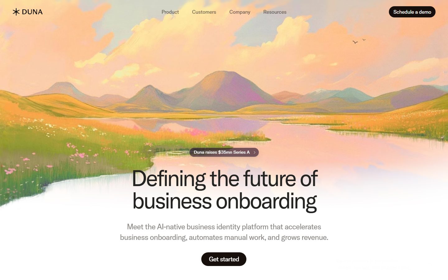
Duna's marketing surface is a warm, editorial AI-native compliance-platform interface. The page floor is a clean white canvas (`{colors.canvas}` — #ffffff) carrying near-black text (`{colors.ink}` — #000000, `{colors.body}` — #292421), but the brand voltage comes from full-bleed painterly landscape imagery — a pastel sunrise-over-mountains illustration that bleeds behind the hero headline, and a teal-sky cloud band lower on the page. The system reads as calm, confident, and art-directed: lots of whitespace, one quietly-elegant display typeface, and generously rounded pill CTAs.
Type is single-family throughout: **GT America Regular** at weight 400 across every role from the 72px hero h1 down to 16px body. The headlines lean on size and tight negative letter-spacing (-4.32px on h1) rather than weight for impact — Duna never goes bold, it goes big. This restraint is the defining typographic move.
Color is deliberately near-monochrome and warm — the neutrals are browned grays (`{colors.neutral-deep}` — #1a1816, `{colors.body}` — #292421, `{colors.muted}` — #898683) rather than cool grays, which keeps the page in harmony with the warm landscape art. Saturated accents appear rarely and intentionally: a lime dot (`{colors.accent-lime}` — #aeec1d) on the "Artificial Intelligence" badge, and a teal sky band (`{colors.accent-teal}` — #46838c) on the AI feature section.
CTAs are pill-shaped. The hero presents two pill treatments: a dark near-black "Schedule a demo" / "Get started" pill and a measured light-gray button (`{colors.primary}` — #eeeeee). Rounding runs hierarchical and generous — most surfaces use 16px or 24px corners, and interactive pills go fully rounded (`{rounded.pill}` — 999px).
**Key Characteristics:**
- White canvas with warm-browned near-black text. Neutrals are intentionally warm (#1a1816, #292421, #898683) rather than cool grays, harmonizing with painterly landscape imagery.
- Single display typeface — **GT America Regular weight 400** — used at every level. Impact comes from scale + tight negative tracking (h1 = 72px / -4.32px), never from bolding.
- Full-bleed painterly hero illustration (pastel sunrise mountains) bleeding into white, with the headline sitting over the lower fade.
- Generously rounded pills for CTAs and badges (`{rounded.pill}` — 999px); content cards and bands use `{rounded.lg}` (24px) and `{rounded.md}` (16px).
- Sparse saturated accents — lime badge dot (`{colors.accent-lime}`) and a teal-sky AI band (`{colors.accent-teal}`) — punctuating an otherwise warm-monochrome scheme.
- Soft warm surfaces (`{colors.surface-soft}` — #edece7, `{colors.surface-subtle}` — #f7f7f5) for the testimonial card and quiet section grounds.
- Feature columns presented as borderless text columns separated by hairline dividers rather than filled cards — calm, editorial pacing.
## Colors
### Brand & Accent
- **Accent Lime** (`{colors.accent-lime}` — #aeec1d): The brand's single high-chroma pop. Observed as the dot/marker on the "Artificial Intelligence" badge above the AI band. Used at minimal scale.
- **Accent Teal** (`{colors.accent-teal}` — #46838c): The teal-sky cloud band ("AI built for compliance.") ground. The only large saturated surface on the page.
- **Link** (`{colors.link}` — #0000ee): Default unstyled anchor color captured from `a.color`. Appears on raw inline links; the brand otherwise keeps links in ink tones.
- **Accent Purple / Brown family** (`{colors.accent-purple}` — #1b0624, `{colors.accent-brown}` — #17100d, `{colors.accent-warm}` — #2a2620, `{colors.accent-dark}` — #160f0c): A cluster of very-dark warm/purple-tinted tones measured at low frequency — used in dark pill badges (e.g., "Duna raises $35mn Series A") and dark CTA fills.
### Surface
- **Canvas** (`{colors.canvas}` — #ffffff): The default page floor.
- **Surface Subtle** (`{colors.surface-subtle}` — #f7f7f5): Barely-tinted section grounds and quiet dividers.
- **Surface Soft** (`{colors.surface-soft}` — #edece7): The testimonial-card background — a warm light gray.
- **Primary** (`{colors.primary}` — #eeeeee): The measured light-gray button + input fill.
### Text
- **Ink** (`{colors.ink}` — #000000): The hero h1 and primary headlines.
- **Ink Soft** (`{colors.ink-soft}` — #0d0d0d): Near-black used in dark surfaces / strong text.
- **Body** (`{colors.body}` — #292421): Default running-text color (warm near-black).
- **Text Muted** (`{colors.text-muted}` — #272725): Low-contrast headings (h3 captured here).
- **Neutral Deep** (`{colors.neutral-deep}` — #1a1816): Dark pill fills and the deepest UI neutral.
- **Neutral Strong** (`{colors.neutral-strong}` — #222221) / **Neutral Mid** (`{colors.neutral-mid}` — #4d4846): Secondary text and UI chrome.
- **Muted** (`{colors.muted}` — #898683): Tertiary text — sub-headlines, logo-strip wordmarks, fine print.
- **On Primary** (`{colors.on-primary}` — #444444): Label color on the light-gray measured button.
## Typography
### Font Family
The system runs **GT America** (GT America Regular, weight 400) for every text role — headlines, sub-heads, body, and labels. GT America is a commercial grotesque from Grilli Type; **it is licensed and should not be self-hosted without a license.** The button role alone fell back to a generic `sans-serif` in measurement, indicating button labels inherit the system sans stack.
The typographic discipline is unusual: Duna never changes weight. Every level is 400. Hierarchy is built entirely from **size + negative letter-spacing** — the larger the type, the tighter the tracking (h1 = -4.32px, h2 = -2.2px, body = -0.16px).
### Hierarchy
| Token | Size | Weight | Line Height | Letter Spacing | Use |
|---|---|---|---|---|---|
| `{typography.h1}` | 72px | 400 | 1.0 | -4.32px | Hero headline ("Defining the future of business onboarding") |
| `{typography.h2}` | 44px | 400 | 1.1 | -2.2px | Major section heads |
| `{typography.h3}` | 40px | 400 | 1.2 | -1.2px | Sub-section heads, AI-band headline |
| `{typography.h4}` | 32px | 400 | 1.2 | -0.96px | Testimonial quote, smaller heads |
| `{typography.body}` | 16px | 400 | 1.5 | -0.16px | Default running-text, sub-headlines, feature descriptions |
| `{typography.button}` | 14px | 400 | 1.0 | 0 | Button + badge labels (generic sans fallback) |
### Principles
Impact comes from scale and tracking, never from weight. Headlines stay at 400 and rely on generous size plus tight negative letter-spacing to read confident and modern. Body copy keeps a very slight negative tracking (-0.16px) and a comfortable 1.5 line-height for readability. Never bold a Duna headline — the restraint is the brand.
### Note on Font Substitutes
GT America is a licensed Grilli Type face and cannot be shipped freely. A close open-source substitute is **Inter** (a neutral grotesque) configured with weight 400 and tightened letter-spacing on display sizes to approximate GT America's tracking. **Neue Haas Grotesk Text** and **Helvetica Now** are commercial siblings if a paid license is acceptable; **Geist** or **Söhne**-style open alternatives also approximate the grotesque character. The frontmatter stacks `GT America, Inter, sans-serif` so a missing license degrades gracefully.
## Layout
### Spacing System
- **Base unit:** 4px, with a strong secondary rhythm at 10px (the single highest-frequency value measured).
- **Tokens:** `{spacing.xxs}` 4px · `{spacing.xs}` 8px · `{spacing.tight}` 10px · `{spacing.sm}` 12px · `{spacing.md}` 16px · `{spacing.base}` 20px · `{spacing.lg}` 24px · `{spacing.xl}` 40px · `{spacing.xxl}` 48px · `{spacing.huge}` 60px.
- **Button/input padding:** `{spacing.tight}` (10px) — the measured padding on the light-gray button and input.
- **Card / band padding:** `{spacing.xl}` (40px) for the testimonial card; `{spacing.xxl}` (48px) for the AI band.
- **Section rhythm:** `{spacing.huge}` (60px) and `{spacing.xl}` (40px) drive the vertical band spacing.
### Grid & Container
- **Editorial body:** Centered single column for the hero; the headline + sub-head + CTA stack vertically and center-align over the landscape fade.
- **Feature columns:** 3-up borderless text columns ("Drive revenue" / "Future-proof compliance" / "Reduce costs") separated by thin vertical hairlines.
- **Logo strip:** Single horizontal row of partner wordmarks (moss, CCV, fiserv, Plaid, Stripe, Qonto, remote) in muted gray.
- **Testimonial:** 2-column split — quote text left, portrait image right — inside a single soft-gray rounded card.
### Whitespace Philosophy
Duna uses very generous whitespace — large empty vertical gaps separate bands, letting the painterly imagery and the few text blocks breathe. The pacing is editorial and slow: one idea per band, lots of air around it, centered alignment in the hero. The result reads as calm and premium rather than dense or feature-listy.
## Elevation & Depth
| Level | Treatment | Use |
|---|---|---|
| Flat | No shadow, no border | Body sections, top nav, hero text, feature columns |
| Inset hairline | `rgba(0,0,0,0.05) 0px 0px 0px 1px inset` | Subtle 1px inner outline on inputs / framed elements |
| Soft floating shadow | `rgba(45,32,50,0.08) 0 0.6px 1.8px -0.67px, rgba(45,32,50,0.09) 0 2.29px 6.87px -1.33px, rgba(45,32,50,0.12) 0 10px 30px -2px` | A single layered drop shadow lifting a floating element (e.g., the hero "Series A" pill or a floating card) |
The elevation philosophy is **soft and minimal** — one warm-tinted layered drop shadow (note the warm `rgba(45,32,50,…)` tint rather than neutral black) and one inset hairline. No heavy shadows, no glassmorphism. Most surfaces sit flat on the canvas; depth comes primarily from the full-bleed imagery rather than from UI shadows.
### Decorative Depth
- The painterly landscape hero and the teal cloud band carry their own atmospheric depth as illustration — they are content, not UI elevation tokens.
- The dark pill badges ("Duna raises $35mn Series A") float over the hero image, lifted by the soft layered shadow above.
## Shapes
### Border Radius Scale
| Token | Value | Use |
|---|---|---|
| `{rounded.xs}` | 8px | Light-gray button + input corners |
| `{rounded.sm}` | 12px | Small framed elements |
| `{rounded.md}` | 16px | Common card / media corners (32 occurrences) |
| `{rounded.lg}` | 24px | Dominant content radius — testimonial card, AI band, large media (76 occurrences, the system default) |
| `{rounded.xl}` | 40px | Larger feature surfaces |
| `{rounded.xxl}` | 60px | Extra-large rounded panels |
| `{rounded.pill}` | 999px | CTA pills, dark/light badge pills |
| `{rounded.full}` | 9999px | Fully circular elements |
`{rounded.lg}` (24px) is the system's default surface radius and appears far more than any other value. Pill radii (999px) govern all interactive CTAs and badges. (Anomalously large measured radii — 799px / 959px — are treated as pill-family rounding on oversized elements; see Known Gaps.)
### Photography Geometry
Hero illustration bleeds full-width with no corners (edge-to-edge), fading into the white canvas at its lower edge. The testimonial portrait sits inside the soft-gray card with `{rounded.lg}` (24px) corners. The teal AI band uses `{rounded.lg}` rounded corners against the white floor.
## Components
### Top Navigation
**`top-nav`** — Transparent bar overlaid on the hero illustration. Carries the Duna asterisk logo + "DUNA" wordmark at left, a center menu (Product, Customers, Company, Resources) in `{typography.body}` / `{colors.body}`, and a dark pill "Schedule a demo" CTA at right (`{component.button-pill-dark}`). No background fill — it floats on the painterly image.
### Buttons
**`button-primary`** — The measured light-gray button. Background `{colors.primary}` (#eeeeee), label `{colors.on-primary}` (#444444), type `{typography.button}`, rounded `{rounded.xs}` (8px), padding `{spacing.tight}` (10px). This is the quiet/secondary action surface measured in computed styles.
**`button-pill-dark`** — The hero's prominent dark CTA ("Get started", "Schedule a demo"). Background `{colors.neutral-deep}` (#1a1816), label `{colors.canvas}`, fully rounded `{rounded.pill}` (999px), padding 10px × 24px. The dominant call-to-action treatment on the page.
### Badges
**`badge-pill-dark`** — Dark floating announcement pill over the hero ("Duna raises $35mn Series A ›"). Background `{colors.accent-dark}` (#160f0c), label `{colors.canvas}`, rounded `{rounded.pill}`, lifted by the soft layered shadow.
**`badge-pill-lime`** — The "Artificial Intelligence" label above the AI band, marked with the lime dot (`{colors.accent-lime}`). Light ground (`{colors.surface-subtle}`), text `{colors.body}`, rounded `{rounded.pill}`.
### Inputs & Forms
**`input`** — Measured form field. Background `{colors.primary}` (#eeeeee), text `{colors.body}`, type `{typography.body}`, rounded `{rounded.xs}` (8px). Matches the light-gray button surface.
### Cards & Bands
**`hero-band`** — Full-bleed painterly landscape behind a centered text stack: dark announcement pill, h1 in `{typography.h1}` (72px / -4.32px), a muted sub-headline in `{typography.body}`, and the dark `{component.button-pill-dark}` CTA. Background `{colors.canvas}` (the image fades into white at the lower edge).
**`feature-column`** — Borderless 3-up text columns ("Drive revenue", "Future-proof compliance", "Reduce costs"). Transparent background, small icon at top, a `{typography.body}`-class label, and a muted description. Separated by thin vertical hairlines rather than card fills. Padding `{spacing.lg}` (24px).
**`logo-strip`** — Horizontal row of muted partner wordmarks (`{colors.muted}`) on `{colors.canvas}`. Padding `{spacing.xl}` (40px).
**`testimonial-card`** — Soft warm-gray card holding a large pull-quote ("People ask how we're using AI in compliance…") left and a portrait right. Background `{colors.surface-soft}` (#edece7), quote in `{typography.h4}`, rounded `{rounded.lg}` (24px), padding `{spacing.xl}` (40px).
**`ai-band`** — Full-width teal-sky band ("AI built for compliance."). Background `{colors.accent-teal}` (#46838c), headline in `{typography.h3}` reversed to `{colors.canvas}`, a light "Discover Duna AI" pill, and the lime "Artificial Intelligence" badge above. Rounded `{rounded.lg}`, padding `{spacing.xxl}` (48px).
### Links
**`text-link`** — Inline anchor. Color `{colors.link}` (#0000ee) where unstyled; the brand otherwise keeps inline links in ink tones.
## Do's and Don'ts
### Do
- Keep all type in GT America Regular weight 400. Build hierarchy with size and negative letter-spacing, not weight.
- Use the dark pill (`{component.button-pill-dark}`) for the primary CTA and the light-gray button (`{component.button-primary}`) for quieter actions.
- Keep neutrals warm (#1a1816, #292421, #898683) so UI harmonizes with the painterly landscape art.
- Default content surfaces to `{rounded.lg}` (24px); use `{rounded.pill}` for every CTA and badge.
- Reserve saturated accents (`{colors.accent-lime}`, `{colors.accent-teal}`) for single deliberate moments — the AI badge dot and the AI band.
- Let bands breathe — one idea per section, generous vertical whitespace, centered hero alignment.
- Use the soft warm-tinted layered shadow only to float small elements (announcement pills); keep the rest flat.
### Don't
- Don't bold headlines. GT America at weight 700 reads as off-brand; impact comes from size + tracking.
- Don't introduce cool grays — Duna's neutrals are warm/browned.
- Don't spread the lime or teal accents across multiple bands; they are scarce by design.
- Don't put hard shadows or borders on feature columns — they are borderless text columns separated by hairlines.
- Don't use raw `#0000ee` link blue in primary UI; keep inline links in ink tones unless intentionally unstyled.
- Don't add hover-state styling beyond default and active/pressed.
## Responsive Behavior
### Breakpoints
Duna's analysis captured landing + product pages at desktop widths; mobile breakpoints are inferred from the layout structure and not directly measured (see Known Gaps).
| Name | Width | Key Changes |
|---|---|---|
| Mobile | < 768px | Top-nav collapses to logo + single CTA (likely hamburger); hero h1 scales down from 72px; feature columns stack 3 → 1; testimonial card stacks quote over portrait |
| Tablet | 768–1024px | Feature columns 3 → 2; logo strip wraps; hero text width tightens |
| Desktop | 1024–1440px | Full nav, 3-up feature columns, side-by-side testimonial, full-bleed hero illustration |
| Wide | > 1440px | Same as desktop with more outer breathing room; imagery scales full-width |
### Touch Targets
- `{component.button-pill-dark}` pill padding (10px × 24px) yields a comfortable tap target.
- `{component.button-primary}` and `{component.input}` use 10px padding; effective height should be verified against the 44px minimum.
### Collapsing Strategy
- Feature columns reduce column count rather than shrinking type.
- The testimonial card's 2-up quote/portrait split collapses to stacked on narrow widths.
- Full-bleed hero illustration scales proportionally and retains its lower fade into white.
### Image Behavior
- Hero and AI-band illustrations bleed full-width and scale with the viewport.
- The testimonial portrait crops inside the `{rounded.lg}` card frame.
## Iteration Guide
1. Focus on ONE component at a time. Reference its YAML key directly (`{component.testimonial-card}`, `{component.ai-band}`).
2. Variants of an existing component (`-active`, `-disabled`, `-focused`) live as separate entries in `components:`.
3. Use `{token.refs}` everywhere — never inline hex in components.
4. Never document hover. Default and Active/Pressed states only.
5. Headlines stay GT America Regular 400 with negative tracking. Don't reach for bolder weights — reach for bigger sizes.
6. Keep saturated accents scarce; the warm-monochrome scheme is the brand.
7. Default surface radius is `{rounded.lg}` (24px); CTAs and badges are always `{rounded.pill}`.
## Known Gaps
- The dark pill CTA ("Get started" / "Schedule a demo") and dark announcement pill were documented from screenshot ground-truth; only the **light-gray** button (`#eeeeee` / `#444444`, 8px radius, 10px padding) was captured as a computed `button` token. The `{component.button-pill-dark}` background uses the closest measured dark warm neutral (`{colors.neutral-deep}`) — derived from observed pill color, not a direct button measurement.
- Button label font fell back to generic `sans-serif` in measurement; actual button type likely also GT America but unconfirmed.
- GT America is a licensed Grilli Type face; `fonts_licensed` was empty in the analysis, but the family is commercial — an open-source substitute (Inter) is documented and stacked in the frontmatter.
- Anomalous radius values (799px, 959px) were measured; treated as pill-family rounding on oversized elements but not assigned distinct tokens.
- Mobile/tablet breakpoints are inferred from layout structure, not directly measured — only desktop captures were analyzed.
- The teal AI-band background uses the measured `{colors.accent-teal}` (#46838c); the cloud-sky illustration itself is imagery, not a token.
- Exact card/band background fills beyond the testimonial card (`{colors.surface-soft}`) were partially inferred; secondary section grounds use the measured `{colors.surface-subtle}`.
- Form validation, focus, disabled, and error states were not captured — only base input fill + radius.
- Animation and transition timings (hero fade, band reveals) are out of scope.
<!-- Documented by duply · real-world design systems as ready-to-use DESIGN.md for AI coding agents · https://duply.ai/duna/design-md -->
Color Palette
Accent
Neutrals
Typography
h172px · 400 · 1
The quick brown fox jumpsh244px · 400 · 1.1
The quick brown fox jumpsh340px · 400 · 1.2
The quick brown fox jumpsh432px · 400 · 1.2
The quick brown fox jumpsbody16px · 400 · 1.5
The quick brown fox jumpsbutton14px · 400 · 1
The quick brown fox jumpsSpacing & Shape
Spacing
| Name | Value | Preview |
|---|---|---|
| xxs | 4px | |
| xs | 8px | |
| tight | 10px | |
| sm | 12px | |
| md | 16px | |
| base | 20px | |
| lg | 24px | |
| xl | 40px | |
| xxl | 48px | |
| huge | 60px |
Border Radius
| Name | Value | Preview |
|---|---|---|
| xs | 8px | |
| sm | 12px | |
| md | 16px | |
| lg | 24px | |
| xl | 40px | |
| xxl | 60px | |
| pill | 999px | |
| full | 9999px |
More like this


---
version: alpha
name: Duna-design-analysis
description: A warm, editorial AI-native compliance-platform interface built on a white canvas with near-black text, painterly full-bleed landscape imagery, and a single quietly-confident display typeface (GT America). The system reads as calm modern SaaS with an art-directed twist — soft warm neutrals (#edece7 / #f7f7f5), generously rounded pill CTAs, large negatively-tracked headlines set in GT America Regular weight 400, and occasional saturated brand moments (lime badge dot, teal-sky AI band) punctuating an otherwise monochrome warm-gray palette.

colors:
  primary: "#eeeeee"
  on-primary: "#444444"
  ink: "#000000"
  ink-soft: "#0d0d0d"
  body: "#292421"
  text-muted: "#272725"
  neutral-deep: "#1a1816"
  neutral-strong: "#222221"
  neutral-mid: "#4d4846"
  muted: "#898683"
  canvas: "#ffffff"
  surface-soft: "#edece7"
  surface-subtle: "#f7f7f5"
  link: "#0000ee"
  accent-purple: "#1b0624"
  accent-brown: "#17100d"
  accent-warm: "#2a2620"
  accent-dark: "#160f0c"
  accent-lime: "#aeec1d"
  accent-teal: "#46838c"

typography:
  h1:
    fontFamily: "GT America, Inter, sans-serif"
    fontSize: 72px
    fontWeight: 400
    lineHeight: 1.0
    letterSpacing: -4.32px
  h2:
    fontFamily: "GT America, Inter, sans-serif"
    fontSize: 44px
    fontWeight: 400
    lineHeight: 1.1
    letterSpacing: -2.2px
  h3:
    fontFamily: "GT America, Inter, sans-serif"
    fontSize: 40px
    fontWeight: 400
    lineHeight: 1.2
    letterSpacing: -1.2px
  h4:
    fontFamily: "GT America, Inter, sans-serif"
    fontSize: 32px
    fontWeight: 400
    lineHeight: 1.2
    letterSpacing: -0.96px
  body:
    fontFamily: "GT America, Inter, sans-serif"
    fontSize: 16px
    fontWeight: 400
    lineHeight: 1.5
    letterSpacing: -0.16px
  button:
    fontFamily: "Inter, sans-serif"
    fontSize: 14px
    fontWeight: 400
    lineHeight: 1.0
    letterSpacing: 0

rounded:
  xs: 8px
  sm: 12px
  md: 16px
  lg: 24px
  xl: 40px
  xxl: 60px
  pill: 999px
  full: 9999px

spacing:
  xxs: 4px
  xs: 8px
  tight: 10px
  sm: 12px
  md: 16px
  base: 20px
  lg: 24px
  xl: 40px
  xxl: 48px
  huge: 60px

components:
  top-nav:
    backgroundColor: transparent
    textColor: "{colors.body}"
    typography: "{typography.body}"
  button-primary:
    backgroundColor: "{colors.primary}"
    textColor: "{colors.on-primary}"
    typography: "{typography.button}"
    rounded: "{rounded.xs}"
    padding: 10px
  button-pill-dark:
    backgroundColor: "{colors.neutral-deep}"
    textColor: "{colors.canvas}"
    typography: "{typography.button}"
    rounded: "{rounded.pill}"
    padding: 10px 24px
  input:
    backgroundColor: "{colors.primary}"
    textColor: "{colors.body}"
    typography: "{typography.body}"
    rounded: "{rounded.xs}"
    padding: 10px
  badge-pill-dark:
    backgroundColor: "{colors.accent-dark}"
    textColor: "{colors.canvas}"
    typography: "{typography.button}"
    rounded: "{rounded.pill}"
    padding: 8px 16px
  badge-pill-lime:
    backgroundColor: "{colors.surface-subtle}"
    textColor: "{colors.body}"
    typography: "{typography.button}"
    rounded: "{rounded.pill}"
    padding: 6px 16px
  hero-band:
    backgroundColor: "{colors.canvas}"
    textColor: "{colors.ink}"
    typography: "{typography.h1}"
    padding: 60px
  feature-column:
    backgroundColor: transparent
    textColor: "{colors.body}"
    typography: "{typography.body}"
    padding: 24px
  logo-strip:
    backgroundColor: "{colors.canvas}"
    textColor: "{colors.muted}"
    typography: "{typography.body}"
    padding: 40px
  testimonial-card:
    backgroundColor: "{colors.surface-soft}"
    textColor: "{colors.body}"
    typography: "{typography.h4}"
    rounded: "{rounded.lg}"
    padding: 40px
  ai-band:
    backgroundColor: "{colors.accent-teal}"
    textColor: "{colors.canvas}"
    typography: "{typography.h3}"
    rounded: "{rounded.lg}"
    padding: 48px
  text-link:
    backgroundColor: transparent
    textColor: "{colors.link}"
    typography: "{typography.body}"
---

## Overview

Duna's marketing surface is a warm, editorial AI-native compliance-platform interface. The page floor is a clean white canvas (`{colors.canvas}` — #ffffff) carrying near-black text (`{colors.ink}` — #000000, `{colors.body}` — #292421), but the brand voltage comes from full-bleed painterly landscape imagery — a pastel sunrise-over-mountains illustration that bleeds behind the hero headline, and a teal-sky cloud band lower on the page. The system reads as calm, confident, and art-directed: lots of whitespace, one quietly-elegant display typeface, and generously rounded pill CTAs.

Type is single-family throughout: **GT America Regular** at weight 400 across every role from the 72px hero h1 down to 16px body. The headlines lean on size and tight negative letter-spacing (-4.32px on h1) rather than weight for impact — Duna never goes bold, it goes big. This restraint is the defining typographic move.

Color is deliberately near-monochrome and warm — the neutrals are browned grays (`{colors.neutral-deep}` — #1a1816, `{colors.body}` — #292421, `{colors.muted}` — #898683) rather than cool grays, which keeps the page in harmony with the warm landscape art. Saturated accents appear rarely and intentionally: a lime dot (`{colors.accent-lime}` — #aeec1d) on the "Artificial Intelligence" badge, and a teal sky band (`{colors.accent-teal}` — #46838c) on the AI feature section.

CTAs are pill-shaped. The hero presents two pill treatments: a dark near-black "Schedule a demo" / "Get started" pill and a measured light-gray button (`{colors.primary}` — #eeeeee). Rounding runs hierarchical and generous — most surfaces use 16px or 24px corners, and interactive pills go fully rounded (`{rounded.pill}` — 999px).

**Key Characteristics:**
- White canvas with warm-browned near-black text. Neutrals are intentionally warm (#1a1816, #292421, #898683) rather than cool grays, harmonizing with painterly landscape imagery.
- Single display typeface — **GT America Regular weight 400** — used at every level. Impact comes from scale + tight negative tracking (h1 = 72px / -4.32px), never from bolding.
- Full-bleed painterly hero illustration (pastel sunrise mountains) bleeding into white, with the headline sitting over the lower fade.
- Generously rounded pills for CTAs and badges (`{rounded.pill}` — 999px); content cards and bands use `{rounded.lg}` (24px) and `{rounded.md}` (16px).
- Sparse saturated accents — lime badge dot (`{colors.accent-lime}`) and a teal-sky AI band (`{colors.accent-teal}`) — punctuating an otherwise warm-monochrome scheme.
- Soft warm surfaces (`{colors.surface-soft}` — #edece7, `{colors.surface-subtle}` — #f7f7f5) for the testimonial card and quiet section grounds.
- Feature columns presented as borderless text columns separated by hairline dividers rather than filled cards — calm, editorial pacing.

## Colors

### Brand & Accent
- **Accent Lime** (`{colors.accent-lime}` — #aeec1d): The brand's single high-chroma pop. Observed as the dot/marker on the "Artificial Intelligence" badge above the AI band. Used at minimal scale.
- **Accent Teal** (`{colors.accent-teal}` — #46838c): The teal-sky cloud band ("AI built for compliance.") ground. The only large saturated surface on the page.
- **Link** (`{colors.link}` — #0000ee): Default unstyled anchor color captured from `a.color`. Appears on raw inline links; the brand otherwise keeps links in ink tones.
- **Accent Purple / Brown family** (`{colors.accent-purple}` — #1b0624, `{colors.accent-brown}` — #17100d, `{colors.accent-warm}` — #2a2620, `{colors.accent-dark}` — #160f0c): A cluster of very-dark warm/purple-tinted tones measured at low frequency — used in dark pill badges (e.g., "Duna raises $35mn Series A") and dark CTA fills.

### Surface
- **Canvas** (`{colors.canvas}` — #ffffff): The default page floor.
- **Surface Subtle** (`{colors.surface-subtle}` — #f7f7f5): Barely-tinted section grounds and quiet dividers.
- **Surface Soft** (`{colors.surface-soft}` — #edece7): The testimonial-card background — a warm light gray.
- **Primary** (`{colors.primary}` — #eeeeee): The measured light-gray button + input fill.

### Text
- **Ink** (`{colors.ink}` — #000000): The hero h1 and primary headlines.
- **Ink Soft** (`{colors.ink-soft}` — #0d0d0d): Near-black used in dark surfaces / strong text.
- **Body** (`{colors.body}` — #292421): Default running-text color (warm near-black).
- **Text Muted** (`{colors.text-muted}` — #272725): Low-contrast headings (h3 captured here).
- **Neutral Deep** (`{colors.neutral-deep}` — #1a1816): Dark pill fills and the deepest UI neutral.
- **Neutral Strong** (`{colors.neutral-strong}` — #222221) / **Neutral Mid** (`{colors.neutral-mid}` — #4d4846): Secondary text and UI chrome.
- **Muted** (`{colors.muted}` — #898683): Tertiary text — sub-headlines, logo-strip wordmarks, fine print.
- **On Primary** (`{colors.on-primary}` — #444444): Label color on the light-gray measured button.

## Typography

### Font Family
The system runs **GT America** (GT America Regular, weight 400) for every text role — headlines, sub-heads, body, and labels. GT America is a commercial grotesque from Grilli Type; **it is licensed and should not be self-hosted without a license.** The button role alone fell back to a generic `sans-serif` in measurement, indicating button labels inherit the system sans stack.

The typographic discipline is unusual: Duna never changes weight. Every level is 400. Hierarchy is built entirely from **size + negative letter-spacing** — the larger the type, the tighter the tracking (h1 = -4.32px, h2 = -2.2px, body = -0.16px).

### Hierarchy

| Token | Size | Weight | Line Height | Letter Spacing | Use |
|---|---|---|---|---|---|
| `{typography.h1}` | 72px | 400 | 1.0 | -4.32px | Hero headline ("Defining the future of business onboarding") |
| `{typography.h2}` | 44px | 400 | 1.1 | -2.2px | Major section heads |
| `{typography.h3}` | 40px | 400 | 1.2 | -1.2px | Sub-section heads, AI-band headline |
| `{typography.h4}` | 32px | 400 | 1.2 | -0.96px | Testimonial quote, smaller heads |
| `{typography.body}` | 16px | 400 | 1.5 | -0.16px | Default running-text, sub-headlines, feature descriptions |
| `{typography.button}` | 14px | 400 | 1.0 | 0 | Button + badge labels (generic sans fallback) |

### Principles
Impact comes from scale and tracking, never from weight. Headlines stay at 400 and rely on generous size plus tight negative letter-spacing to read confident and modern. Body copy keeps a very slight negative tracking (-0.16px) and a comfortable 1.5 line-height for readability. Never bold a Duna headline — the restraint is the brand.

### Note on Font Substitutes
GT America is a licensed Grilli Type face and cannot be shipped freely. A close open-source substitute is **Inter** (a neutral grotesque) configured with weight 400 and tightened letter-spacing on display sizes to approximate GT America's tracking. **Neue Haas Grotesk Text** and **Helvetica Now** are commercial siblings if a paid license is acceptable; **Geist** or **Söhne**-style open alternatives also approximate the grotesque character. The frontmatter stacks `GT America, Inter, sans-serif` so a missing license degrades gracefully.

## Layout

### Spacing System
- **Base unit:** 4px, with a strong secondary rhythm at 10px (the single highest-frequency value measured).
- **Tokens:** `{spacing.xxs}` 4px · `{spacing.xs}` 8px · `{spacing.tight}` 10px · `{spacing.sm}` 12px · `{spacing.md}` 16px · `{spacing.base}` 20px · `{spacing.lg}` 24px · `{spacing.xl}` 40px · `{spacing.xxl}` 48px · `{spacing.huge}` 60px.
- **Button/input padding:** `{spacing.tight}` (10px) — the measured padding on the light-gray button and input.
- **Card / band padding:** `{spacing.xl}` (40px) for the testimonial card; `{spacing.xxl}` (48px) for the AI band.
- **Section rhythm:** `{spacing.huge}` (60px) and `{spacing.xl}` (40px) drive the vertical band spacing.

### Grid & Container
- **Editorial body:** Centered single column for the hero; the headline + sub-head + CTA stack vertically and center-align over the landscape fade.
- **Feature columns:** 3-up borderless text columns ("Drive revenue" / "Future-proof compliance" / "Reduce costs") separated by thin vertical hairlines.
- **Logo strip:** Single horizontal row of partner wordmarks (moss, CCV, fiserv, Plaid, Stripe, Qonto, remote) in muted gray.
- **Testimonial:** 2-column split — quote text left, portrait image right — inside a single soft-gray rounded card.

### Whitespace Philosophy
Duna uses very generous whitespace — large empty vertical gaps separate bands, letting the painterly imagery and the few text blocks breathe. The pacing is editorial and slow: one idea per band, lots of air around it, centered alignment in the hero. The result reads as calm and premium rather than dense or feature-listy.

## Elevation & Depth

| Level | Treatment | Use |
|---|---|---|
| Flat | No shadow, no border | Body sections, top nav, hero text, feature columns |
| Inset hairline | `rgba(0,0,0,0.05) 0px 0px 0px 1px inset` | Subtle 1px inner outline on inputs / framed elements |
| Soft floating shadow | `rgba(45,32,50,0.08) 0 0.6px 1.8px -0.67px, rgba(45,32,50,0.09) 0 2.29px 6.87px -1.33px, rgba(45,32,50,0.12) 0 10px 30px -2px` | A single layered drop shadow lifting a floating element (e.g., the hero "Series A" pill or a floating card) |

The elevation philosophy is **soft and minimal** — one warm-tinted layered drop shadow (note the warm `rgba(45,32,50,…)` tint rather than neutral black) and one inset hairline. No heavy shadows, no glassmorphism. Most surfaces sit flat on the canvas; depth comes primarily from the full-bleed imagery rather than from UI shadows.

### Decorative Depth
- The painterly landscape hero and the teal cloud band carry their own atmospheric depth as illustration — they are content, not UI elevation tokens.
- The dark pill badges ("Duna raises $35mn Series A") float over the hero image, lifted by the soft layered shadow above.

## Shapes

### Border Radius Scale

| Token | Value | Use |
|---|---|---|
| `{rounded.xs}` | 8px | Light-gray button + input corners |
| `{rounded.sm}` | 12px | Small framed elements |
| `{rounded.md}` | 16px | Common card / media corners (32 occurrences) |
| `{rounded.lg}` | 24px | Dominant content radius — testimonial card, AI band, large media (76 occurrences, the system default) |
| `{rounded.xl}` | 40px | Larger feature surfaces |
| `{rounded.xxl}` | 60px | Extra-large rounded panels |
| `{rounded.pill}` | 999px | CTA pills, dark/light badge pills |
| `{rounded.full}` | 9999px | Fully circular elements |

`{rounded.lg}` (24px) is the system's default surface radius and appears far more than any other value. Pill radii (999px) govern all interactive CTAs and badges. (Anomalously large measured radii — 799px / 959px — are treated as pill-family rounding on oversized elements; see Known Gaps.)

### Photography Geometry
Hero illustration bleeds full-width with no corners (edge-to-edge), fading into the white canvas at its lower edge. The testimonial portrait sits inside the soft-gray card with `{rounded.lg}` (24px) corners. The teal AI band uses `{rounded.lg}` rounded corners against the white floor.

## Components

### Top Navigation

**`top-nav`** — Transparent bar overlaid on the hero illustration. Carries the Duna asterisk logo + "DUNA" wordmark at left, a center menu (Product, Customers, Company, Resources) in `{typography.body}` / `{colors.body}`, and a dark pill "Schedule a demo" CTA at right (`{component.button-pill-dark}`). No background fill — it floats on the painterly image.

### Buttons

**`button-primary`** — The measured light-gray button. Background `{colors.primary}` (#eeeeee), label `{colors.on-primary}` (#444444), type `{typography.button}`, rounded `{rounded.xs}` (8px), padding `{spacing.tight}` (10px). This is the quiet/secondary action surface measured in computed styles.

**`button-pill-dark`** — The hero's prominent dark CTA ("Get started", "Schedule a demo"). Background `{colors.neutral-deep}` (#1a1816), label `{colors.canvas}`, fully rounded `{rounded.pill}` (999px), padding 10px × 24px. The dominant call-to-action treatment on the page.

### Badges

**`badge-pill-dark`** — Dark floating announcement pill over the hero ("Duna raises $35mn Series A ›"). Background `{colors.accent-dark}` (#160f0c), label `{colors.canvas}`, rounded `{rounded.pill}`, lifted by the soft layered shadow.

**`badge-pill-lime`** — The "Artificial Intelligence" label above the AI band, marked with the lime dot (`{colors.accent-lime}`). Light ground (`{colors.surface-subtle}`), text `{colors.body}`, rounded `{rounded.pill}`.

### Inputs & Forms

**`input`** — Measured form field. Background `{colors.primary}` (#eeeeee), text `{colors.body}`, type `{typography.body}`, rounded `{rounded.xs}` (8px). Matches the light-gray button surface.

### Cards & Bands

**`hero-band`** — Full-bleed painterly landscape behind a centered text stack: dark announcement pill, h1 in `{typography.h1}` (72px / -4.32px), a muted sub-headline in `{typography.body}`, and the dark `{component.button-pill-dark}` CTA. Background `{colors.canvas}` (the image fades into white at the lower edge).

**`feature-column`** — Borderless 3-up text columns ("Drive revenue", "Future-proof compliance", "Reduce costs"). Transparent background, small icon at top, a `{typography.body}`-class label, and a muted description. Separated by thin vertical hairlines rather than card fills. Padding `{spacing.lg}` (24px).

**`logo-strip`** — Horizontal row of muted partner wordmarks (`{colors.muted}`) on `{colors.canvas}`. Padding `{spacing.xl}` (40px).

**`testimonial-card`** — Soft warm-gray card holding a large pull-quote ("People ask how we're using AI in compliance…") left and a portrait right. Background `{colors.surface-soft}` (#edece7), quote in `{typography.h4}`, rounded `{rounded.lg}` (24px), padding `{spacing.xl}` (40px).

**`ai-band`** — Full-width teal-sky band ("AI built for compliance."). Background `{colors.accent-teal}` (#46838c), headline in `{typography.h3}` reversed to `{colors.canvas}`, a light "Discover Duna AI" pill, and the lime "Artificial Intelligence" badge above. Rounded `{rounded.lg}`, padding `{spacing.xxl}` (48px).

### Links

**`text-link`** — Inline anchor. Color `{colors.link}` (#0000ee) where unstyled; the brand otherwise keeps inline links in ink tones.

## Do's and Don'ts

### Do
- Keep all type in GT America Regular weight 400. Build hierarchy with size and negative letter-spacing, not weight.
- Use the dark pill (`{component.button-pill-dark}`) for the primary CTA and the light-gray button (`{component.button-primary}`) for quieter actions.
- Keep neutrals warm (#1a1816, #292421, #898683) so UI harmonizes with the painterly landscape art.
- Default content surfaces to `{rounded.lg}` (24px); use `{rounded.pill}` for every CTA and badge.
- Reserve saturated accents (`{colors.accent-lime}`, `{colors.accent-teal}`) for single deliberate moments — the AI badge dot and the AI band.
- Let bands breathe — one idea per section, generous vertical whitespace, centered hero alignment.
- Use the soft warm-tinted layered shadow only to float small elements (announcement pills); keep the rest flat.

### Don't
- Don't bold headlines. GT America at weight 700 reads as off-brand; impact comes from size + tracking.
- Don't introduce cool grays — Duna's neutrals are warm/browned.
- Don't spread the lime or teal accents across multiple bands; they are scarce by design.
- Don't put hard shadows or borders on feature columns — they are borderless text columns separated by hairlines.
- Don't use raw `#0000ee` link blue in primary UI; keep inline links in ink tones unless intentionally unstyled.
- Don't add hover-state styling beyond default and active/pressed.

## Responsive Behavior

### Breakpoints
Duna's analysis captured landing + product pages at desktop widths; mobile breakpoints are inferred from the layout structure and not directly measured (see Known Gaps).

| Name | Width | Key Changes |
|---|---|---|
| Mobile | < 768px | Top-nav collapses to logo + single CTA (likely hamburger); hero h1 scales down from 72px; feature columns stack 3 → 1; testimonial card stacks quote over portrait |
| Tablet | 768–1024px | Feature columns 3 → 2; logo strip wraps; hero text width tightens |
| Desktop | 1024–1440px | Full nav, 3-up feature columns, side-by-side testimonial, full-bleed hero illustration |
| Wide | > 1440px | Same as desktop with more outer breathing room; imagery scales full-width |

### Touch Targets
- `{component.button-pill-dark}` pill padding (10px × 24px) yields a comfortable tap target.
- `{component.button-primary}` and `{component.input}` use 10px padding; effective height should be verified against the 44px minimum.

### Collapsing Strategy
- Feature columns reduce column count rather than shrinking type.
- The testimonial card's 2-up quote/portrait split collapses to stacked on narrow widths.
- Full-bleed hero illustration scales proportionally and retains its lower fade into white.

### Image Behavior
- Hero and AI-band illustrations bleed full-width and scale with the viewport.
- The testimonial portrait crops inside the `{rounded.lg}` card frame.

## Iteration Guide

1. Focus on ONE component at a time. Reference its YAML key directly (`{component.testimonial-card}`, `{component.ai-band}`).
2. Variants of an existing component (`-active`, `-disabled`, `-focused`) live as separate entries in `components:`.
3. Use `{token.refs}` everywhere — never inline hex in components.
4. Never document hover. Default and Active/Pressed states only.
5. Headlines stay GT America Regular 400 with negative tracking. Don't reach for bolder weights — reach for bigger sizes.
6. Keep saturated accents scarce; the warm-monochrome scheme is the brand.
7. Default surface radius is `{rounded.lg}` (24px); CTAs and badges are always `{rounded.pill}`.

## Known Gaps

- The dark pill CTA ("Get started" / "Schedule a demo") and dark announcement pill were documented from screenshot ground-truth; only the **light-gray** button (`#eeeeee` / `#444444`, 8px radius, 10px padding) was captured as a computed `button` token. The `{component.button-pill-dark}` background uses the closest measured dark warm neutral (`{colors.neutral-deep}`) — derived from observed pill color, not a direct button measurement.
- Button label font fell back to generic `sans-serif` in measurement; actual button type likely also GT America but unconfirmed.
- GT America is a licensed Grilli Type face; `fonts_licensed` was empty in the analysis, but the family is commercial — an open-source substitute (Inter) is documented and stacked in the frontmatter.
- Anomalous radius values (799px, 959px) were measured; treated as pill-family rounding on oversized elements but not assigned distinct tokens.
- Mobile/tablet breakpoints are inferred from layout structure, not directly measured — only desktop captures were analyzed.
- The teal AI-band background uses the measured `{colors.accent-teal}` (#46838c); the cloud-sky illustration itself is imagery, not a token.
- Exact card/band background fills beyond the testimonial card (`{colors.surface-soft}`) were partially inferred; secondary section grounds use the measured `{colors.surface-subtle}`.
- Form validation, focus, disabled, and error states were not captured — only base input fill + radius.
- Animation and transition timings (hero fade, band reveals) are out of scope.

<!-- Documented by duply · real-world design systems as ready-to-use DESIGN.md for AI coding agents · https://duply.ai/duna/design-md -->