AutoSend
A developer-tooling email platform with a warm near-white canvas, an editorial Cooper-style serif display headline (with italic emphasis) sitting above an all-monospace Geist Mono body voice. The system reads as engineer-friendly-but-crafted — quiet warm neutrals, a single terracotta-clay accent (#d97757), low-contrast hairline-divided feature rows, and product UI fragments (webhook forms, campaign lists, project switchers) embedded directly inside light-gray cards. Brand voltage comes from the serif/mono pairing and from a small spread of saturated icon colors used only on agent-integration tiles.
---
version: alpha
name: AutoSend-design-analysis
description: A developer-tooling email platform with a warm near-white canvas, an editorial Cooper-style serif display headline (with italic emphasis) sitting above an all-monospace Geist Mono body voice. The system reads as engineer-friendly-but-crafted — quiet warm neutrals, a single terracotta-clay accent (#d97757), low-contrast hairline-divided feature rows, and product UI fragments (webhook forms, campaign lists, project switchers) embedded directly inside light-gray cards. Brand voltage comes from the serif/mono pairing and from a small spread of saturated icon colors used only on agent-integration tiles.
colors:
primary: "#d97757"
ink: "#000000"
ink-soft: "#171717"
ink-strong: "#262626"
warm-ink: "#292524"
body: "#404040"
body-soft: "#525252"
muted: "#737373"
muted-soft: "#777777"
muted-strong: "#8d8d8f"
muted-light: "#a1a1a1"
canvas: "#ffffff"
surface-soft: "#fafafa"
surface-card: "#f5f5f5"
hairline: "#e5e5e5"
accent-blue: "#51a2ff"
accent-blue-deep: "#007ebb"
accent-cyan: "#22b8cd"
accent-pink: "#ff2056"
accent-red: "#ff0000"
on-primary: "#ffffff"
on-dark: "#ffffff"
typography:
display:
fontFamily: "cooperLtBT, Georgia, serif"
fontSize: 80px
fontWeight: 400
lineHeight: 1.1
letterSpacing: normal
heading:
fontFamily: "Geist, sans-serif"
fontSize: 20px
fontWeight: 400
lineHeight: 1.5
letterSpacing: normal
body:
fontFamily: "Geist Mono, ui-monospace, monospace"
fontSize: 16px
fontWeight: 500
lineHeight: 1.5
letterSpacing: normal
button:
fontFamily: "Geist Mono, ui-monospace, monospace"
fontSize: 14px
fontWeight: 600
lineHeight: 1.429
letterSpacing: normal
rounded:
sm: 8px
md: 10px
lg: 12px
xl: 16px
spacing:
xxs: 4px
xs: 8px
sm: 12px
md: 16px
lg: 24px
xl: 40px
xxl: 64px
section: 80px
hero: 120px
components:
top-nav:
backgroundColor: "{colors.canvas}"
textColor: "{colors.ink-strong}"
typography: "{typography.button}"
height: 56px
button-primary:
backgroundColor: "{colors.primary}"
textColor: "{colors.on-primary}"
typography: "{typography.button}"
rounded: "{rounded.sm}"
padding: 4px 12px
button-login:
backgroundColor: "{colors.canvas}"
textColor: "{colors.ink-strong}"
typography: "{typography.button}"
rounded: "{rounded.sm}"
padding: 4px 12px
button-secondary:
backgroundColor: "{colors.surface-card}"
textColor: "{colors.ink-strong}"
typography: "{typography.button}"
rounded: "{rounded.sm}"
padding: 4px 12px
text-link:
backgroundColor: transparent
textColor: "{colors.primary}"
typography: "{typography.button}"
input:
backgroundColor: "{colors.canvas}"
textColor: "{colors.ink-strong}"
typography: "{typography.body}"
rounded: "{rounded.md}"
padding: 8px 12px
feature-list-item:
backgroundColor: transparent
textColor: "{colors.body}"
typography: "{typography.body}"
padding: 24px 0
feature-card:
backgroundColor: "{colors.surface-card}"
textColor: "{colors.ink-strong}"
typography: "{typography.heading}"
rounded: "{rounded.lg}"
padding: 24px
product-mockup-card:
backgroundColor: "{colors.canvas}"
textColor: "{colors.ink-strong}"
rounded: "{rounded.lg}"
padding: 16px
stat-block:
backgroundColor: "{colors.surface-soft}"
textColor: "{colors.ink-strong}"
typography: "{typography.heading}"
padding: 24px
integration-tile:
backgroundColor: "{colors.canvas}"
textColor: "{colors.ink-strong}"
typography: "{typography.body}"
rounded: "{rounded.lg}"
padding: 16px
testimonial-card:
backgroundColor: "{colors.surface-soft}"
textColor: "{colors.body}"
typography: "{typography.heading}"
rounded: "{rounded.lg}"
padding: 24px
toggle-switch:
backgroundColor: "{colors.hairline}"
textColor: "{colors.muted}"
rounded: "{rounded.xl}"
footer:
backgroundColor: "{colors.canvas}"
textColor: "{colors.muted}"
typography: "{typography.button}"
padding: 80px
---
## Overview
AutoSend's marketing surface is a warm, developer-tool interface built on a near-white canvas (`{colors.canvas}` — #ffffff, with `{colors.surface-soft}` #fafafa filling most band backgrounds). The headline voice is an editorial **Cooper-style serif** display face at 80px (`cooperLtBT`), used with italic emphasis ("Email for *teams* who ship with *agents*"), while every supporting line — body copy, labels, buttons, nav — runs in **Geist Mono**, a monospace face. The serif-display-over-monospace-body pairing is the system's defining gesture: crafted but unmistakably engineer-facing.
The single brand accent is a terracotta clay tone (`{colors.primary}` — #d97757, the most-frequent accent measured). It anchors the primary CTA and section index labels ("#01 — TRANSACTIONAL EMAILS"). A small spread of saturated colors — `{colors.accent-blue}` (#51a2ff), `{colors.accent-blue-deep}` (#007ebb), `{colors.accent-cyan}` (#22b8cd), `{colors.accent-pink}` (#ff2056), `{colors.accent-red}` (#ff0000) — appears only on agent-integration icon tiles (ChatGPT, Claude, Cursor, Copilot, etc.), never on chrome.
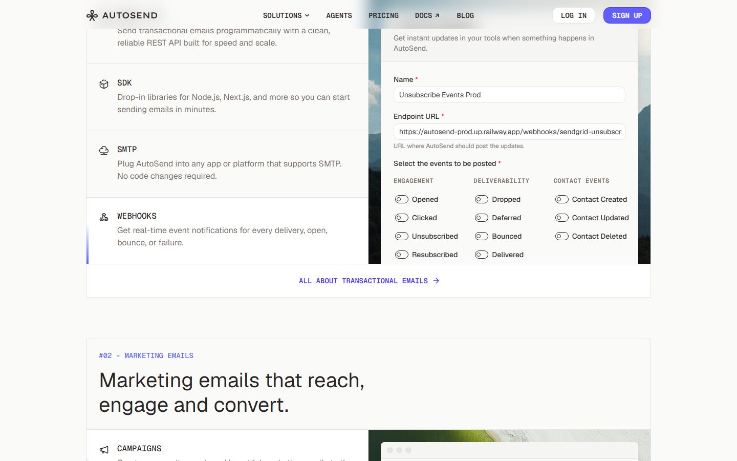
Content is organized as **hairline-divided feature rows** (a monospace label + short description, an icon at left) alongside **product UI fragments embedded in light-gray cards** — a live webhook event form, a campaign list, a multi-project switcher. AutoSend shows the actual product chrome at small scale rather than illustrating around it.
**Key Characteristics:**
- Warm near-white canvas (`{colors.surface-soft}` — #fafafa) rather than pure white sections; pure `{colors.canvas}` reserved for cards and inputs.
- Cooper-style serif display headline (`{typography.display}` — 80px / 400 / lh 1.1) with italicized emphasis words. The serif is the only non-monospace voice in the system.
- Geist Mono everywhere else — body (`{typography.body}` — 16px / 500), buttons (`{typography.button}` — 14px / 600), labels, nav.
- Single terracotta accent (`{colors.primary}` — #d97757) for the primary CTA, index labels, and inline links.
- Tight button geometry — `{rounded.sm}` (8px) corners with compact `4px 12px` padding (measured).
- Hairline-divided feature rows on transparent backgrounds, separated by `{colors.hairline}` (#e5e5e5).
- Product UI fragments shown inside `{colors.canvas}` cards rounded `{rounded.lg}` (12px), with soft elevation.
- Saturated icon colors confined entirely to agent-integration tiles.
- Spacing rhythm is generous: `{spacing.section}` (80px) between bands, up to `{spacing.hero}` (120px) around the hero.
## Colors
### Brand & Accent
- **Primary** (`{colors.primary}` — #d97757): The terracotta clay brand accent and most-frequent accent measured. Used on the primary CTA, section index labels, and inline text links (`{component.text-link}`).
- **Integration icon palette** — A saturated set used only on agent-integration tiles and never on UI chrome: `{colors.accent-blue}` (#51a2ff), `{colors.accent-blue-deep}` (#007ebb), `{colors.accent-cyan}` (#22b8cd), `{colors.accent-pink}` (#ff2056), `{colors.accent-red}` (#ff0000).
### Surface
- **Canvas** (`{colors.canvas}` — #ffffff): Cards, inputs, the nav bar, and product-mockup surfaces.
- **Surface Soft** (`{colors.surface-soft}` — #fafafa): The default warm-white band background for most sections.
- **Surface Card** (`{colors.surface-card}` — #f5f5f5): Feature cards, secondary buttons, and embedded-product card frames.
- **Hairline** (`{colors.hairline}` — #e5e5e5): The 1px divider tone between feature rows and around cards.
### Text
- **Ink** (`{colors.ink}` — #000000): Maximum-contrast text and icons.
- **Ink Soft** (`{colors.ink-soft}` — #171717) / **Ink Strong** (`{colors.ink-strong}` — #262626): Headlines and primary UI text — the display serif and nav labels.
- **Warm Ink** (`{colors.warm-ink}` — #292524): A slightly warm dark used in display headline contexts.
- **Body** (`{colors.body}` — #404040) / **Body Soft** (`{colors.body-soft}` — #525252): Running monospace body copy.
- **Muted** (`{colors.muted}` — #737373), **Muted Soft** (`{colors.muted-soft}` — #777777), **Muted Strong** (`{colors.muted-strong}` — #8d8d8f), **Muted Light** (`{colors.muted-light}` — #a1a1a1): Captions, sub-labels, eyebrow text, footer rows, and placeholder copy.
- **On Primary / On Dark** (`{colors.on-primary}` / `{colors.on-dark}` — #ffffff): Text on the terracotta CTA.
### Semantic
No dedicated success/warning/error tokens were measured on the captured pages. `{colors.accent-red}` (#ff0000) appears in the integration-icon set but was not confirmed as a validation color. See Known Gaps.
## Typography
### Font Family
The system pairs a **Cooper-style serif** (`cooperLtBT`) for display headlines with **Geist** (sans, sparingly, at the 20px subheading size) and **Geist Mono** (monospace) for body, buttons, labels, and navigation. The monospace voice dominates everything below the headline — this is the system's developer-tool signal.
- Cooper-style serif (`cooperLtBT`, weight 400) — h1 / hero display, with italic emphasis words.
- Geist (sans, weight 400) — the 20px sub-headline / `{typography.heading}` role.
- Geist Mono (weights 500–600) — body copy, buttons, eyebrow labels, nav links.
### Hierarchy
| Token | Size | Weight | Line Height | Letter Spacing | Use |
|---|---|---|---|---|---|
| `{typography.display}` | 80px | 400 | 1.1 | normal | Hero h1 ("Email for teams who ship with agents"), section headlines — Cooper-style serif |
| `{typography.heading}` | 20px | 400 | 1.5 | normal | Sub-headlines, intro paragraphs, card titles — Geist sans |
| `{typography.body}` | 16px | 500 | 1.5 | normal | Default running text, feature descriptions, inputs — Geist Mono |
| `{typography.button}` | 14px | 600 | 1.429 | normal | Buttons, nav links, eyebrow index labels — Geist Mono |
### Principles
The serif display is the only place a non-monospace, non-sans face appears — keep it for headlines and its italic emphasis words. Everything functional (labels, buttons, nav, body) stays Geist Mono. Don't blur the boundary: a monospace headline reads as console output, and a serif body reads as editorial — both break the voice. Eyebrow/index labels ("#01 — TRANSACTIONAL EMAILS") use the monospace button role in `{colors.primary}`.
### Note on Font Substitutes
`cooperLtBT` (Cooper Light BT) is a commercial/licensed serif and is not freely redistributable as a web font. A close open-source substitute is **Domine** or **Bitter** at weight 400 for the soft-slab character, or **Fraunces** (optical "Soft" axis) for the warm rounded-serif feel with a true italic. Geist and Geist Mono are open-source (Vercel) and can ship as-is. (Substitute guidance is derived; the analyzer did not flag a licensed-fonts list.)
## Layout
### Spacing System
- **Base unit:** 4px.
- **Tokens:** `{spacing.xxs}` 4px · `{spacing.xs}` 8px · `{spacing.sm}` 12px · `{spacing.md}` 16px · `{spacing.lg}` 24px · `{spacing.xl}` 40px · `{spacing.xxl}` 64px · `{spacing.section}` 80px · `{spacing.hero}` 120px.
- **Dominant rhythm:** `{spacing.lg}` (24px, the single most-frequent measured value), `{spacing.xs}` (8px), and `{spacing.md}` (16px) carry most internal gaps and paddings.
- **Section padding:** `{spacing.section}` (80px) between editorial bands; up to `{spacing.hero}` (120px) around the hero.
- **Feature-row padding:** `{spacing.lg}` (24px) vertical inside hairline-divided rows.
### Grid & Container
- **Editorial bands:** A two-column split — feature-row list (label + description) on the left, a product-mockup card on the right.
- **Stat strip:** A 4-up row of `{component.stat-block}` cells (emails sent / deliverability / time to inbox / bounce rate).
- **Integration grid:** 2-up at desktop for the agent-integration tiles.
- **Footer:** Multi-column monospace link list (Solutions / Docs / Resources / Compare / Legal).
### Whitespace Philosophy
AutoSend uses generous vertical whitespace (80–120px between bands) but tight internal spacing inside controls — buttons sit at `4px 12px` padding. The contrast of airy bands and compact controls reinforces the engineered, no-fuss tone. Feature rows lean on hairline dividers rather than card chrome to keep density legible.
## Elevation & Depth
| Level | Treatment | Use |
|---|---|---|
| Flat | No shadow, no border | Body bands on `{colors.surface-soft}`, nav, feature-row lists |
| Hairline | 1px `{colors.hairline}` divider | Feature-row separators, input borders, card outlines |
| Subtle card | `rgba(33,33,33,0.05) 0px 8px 16px 0px` (measured) | Light-elevation cards, embedded product fragments |
| Floating card | `rgba(0,0,0,0.1) 0px 20px 25px -5px` plus secondary layers (measured) | Hero product-mockup card, multi-project switcher |
The elevation philosophy is **soft and warm** — two measured shadow recipes, both low-alpha. No heavy drop shadows, no glassmorphism. The floating product-mockup card (the pixel-art mountain scene with an embedded prompt field) carries the strongest shadow in the system; everything else stays near-flat with hairline definition.
### Decorative Depth
- Embedded product UI fragments (webhook form, campaign list, project switcher) carry their own internal browser-chrome shadows — these are product artifacts shown as content, not system tokens.
- The hero artwork is a pixel-art landscape framed inside a `{rounded.xl}`-cornered container, giving the only illustrative depth on the page.
## Shapes
### Border Radius Scale
| Token | Value | Use |
|---|---|---|
| `{rounded.sm}` | 8px | Buttons (measured), secondary buttons, small controls |
| `{rounded.md}` | 10px | Text inputs (measured) |
| `{rounded.lg}` | 12px | Content cards, product-mockup cards, integration tiles |
| `{rounded.xl}` | 16px | Hero artwork frame, toggle-switch pills, larger card containers |
### Photography & Artwork Geometry
The hero uses a wide pixel-art landscape illustration inside a `{rounded.xl}` (16px) frame. Product-mockup cards retain native browser chrome at `{rounded.lg}` (12px). Integration-tile icons sit on `{colors.canvas}` tiles with `{rounded.lg}` corners. No avatar/circle treatments were measured; testimonial rows use brand-logo lockups rather than headshots.
## Components
### Top Navigation
**`top-nav`** — White nav bar with the AutoSend wordmark + asterisk-flower logo at left, a horizontal monospace menu (SOLUTIONS ▾, AGENTS, PRICING, DOCS ↗, BLOG) center, and a right cluster with `{component.button-login}` ("LOG IN") and `{component.button-primary}` ("SIGN UP"). Labels in `{typography.button}` (Geist Mono 14px / 600), color `{colors.ink-strong}`.
### Buttons
**`button-primary`** — The primary CTA ("SIGN UP", "BOOK A DEMO"). Background `{colors.primary}` (#d97757), text `{colors.on-primary}`, type `{typography.button}`, rounded `{rounded.sm}` (8px), padding `4px 12px` (measured). Compact, monospace-labeled.
**`button-login`** — White outline/ghost button ("LOG IN"). Background `{colors.canvas}`, text `{colors.ink-strong}`, same geometry as primary.
**`button-secondary`** — Light-gray fill button on quieter surfaces. Background `{colors.surface-card}`, text `{colors.ink-strong}`, rounded `{rounded.sm}`, padding `4px 12px`.
**`text-link`** — Inline monospace link in `{colors.primary}` ("ALL ABOUT TRANSACTIONAL EMAILS →", "DOCS ↗"). No background.
### Inputs & Forms
**`input`** — Standard text field (e.g. the webhook "Name" and "Endpoint URL" fields). Background `{colors.canvas}`, text `{colors.ink-strong}`, type `{typography.body}` (Geist Mono 16px), rounded `{rounded.md}` (10px, measured), 1px `{colors.hairline}` border. Padding derived at `8px 12px`.
**`toggle-switch`** — Pill switch used in the webhook event-selector grid (Opened / Clicked / Dropped …). Track `{colors.hairline}` in the off state, rounded `{rounded.xl}`. Label color `{colors.muted}`. On-state fill not confirmed in capture — see Known Gaps.
### Cards & Containers
**`feature-list-item`** — A hairline-divided row in the two-column feature bands: a small line icon at left, a monospace uppercase label (e.g. "SDK", "SMTP", "WEBHOOKS"), and a short description in `{colors.body}`. Transparent background, `{spacing.lg}` (24px) vertical padding, separated by `{colors.hairline}`.
**`feature-card`** — Light-gray card used for grouped feature content. Background `{colors.surface-card}`, rounded `{rounded.lg}` (12px), padding `{spacing.lg}` (24px), title in `{typography.heading}`.
**`product-mockup-card`** — A card showing actual AutoSend product UI (webhook event form, campaign manager, multi-project switcher). Background `{colors.canvas}`, rounded `{rounded.lg}`, padding `{spacing.md}` (16px), carrying the subtle/floating measured shadows. These display real product chrome rather than decorating around it.
**`stat-block`** — A cell in the 4-up metrics strip (1,748,120 emails / 97.02% deliverability / 1.87s time to inbox / 1.96% bounce). Background `{colors.surface-soft}`, big figure in `{typography.heading}`, monospace caption in `{colors.muted}`, padding `{spacing.lg}` (24px).
**`integration-tile`** — A tile in the agent-integration grid (ChatGPT, Claude, Codex, Cursor, Copilot, Lovable, Antigravity, Others). Background `{colors.canvas}`, rounded `{rounded.lg}`, padding `{spacing.md}` (16px), monospace label, with a saturated brand-color icon (`{colors.accent-blue}`, `{colors.accent-cyan}`, `{colors.accent-pink}`, etc.) and a corner `↗` link.
**`testimonial-card`** — Customer-quote block. Background `{colors.surface-soft}`, quote in `{typography.heading}`/`{typography.body}`, with a monospace name + brand-logo lockup beneath (First Dollar, Gistr, Vivgrid). Rounded `{rounded.lg}`, padding `{spacing.lg}` (24px).
### Footer
**`footer`** — Multi-column monospace link list (Solutions / Docs / Resources / Compare / Legal) on `{colors.canvas}`, link text in `{colors.muted}`, type `{typography.button}`. Bottom row carries the wordmark, an "ALL SYSTEMS OPERATIONAL" status pill, copyright, and social icons. Padding `{spacing.section}` (80px). The footer stays light — there is no dark footer surface in this system.
## Do's and Don'ts
### Do
- Reserve `{colors.primary}` (#d97757) for the primary CTA, eyebrow index labels, and inline links. It is the single brand accent.
- Use the Cooper-style serif (`{typography.display}`) only for headlines, and lean into italic emphasis words ("teams", "agents").
- Keep all functional text — body, labels, nav, buttons — in Geist Mono. The monospace body is the developer-tool signal.
- Confine the saturated icon palette (blue / cyan / pink / red) to agent-integration tiles only.
- Use hairline-divided `{component.feature-list-item}` rows for feature lists instead of boxing every item in a card.
- Embed real product UI fragments in `{component.product-mockup-card}` rather than illustrating around the product.
- Build bands on warm `{colors.surface-soft}` (#fafafa); reserve pure `{colors.canvas}` for cards and inputs.
### Don't
- Don't introduce additional accent colors into chrome — the integration palette is scoped to icons.
- Don't set body or labels in the serif, or headlines in monospace. The serif/mono boundary is the brand.
- Don't add heavy or dark elevation. The two measured shadows are both low-alpha; the floating hero card is the strongest the system goes.
- Don't enlarge button padding — controls stay compact at `4px 12px` with `{rounded.sm}` (8px) corners.
- Don't add a dark footer or dark sections; AutoSend's marketing surface stays warm-light throughout.
- Don't document hover state — only default and active/pressed are in scope.
## Responsive Behavior
### Breakpoints
| Name | Width | Key Changes |
|---|---|---|
| Mobile | < 768px | Nav collapses to a menu; hero display 80→~40px; feature bands stack (rows above mockup card); stat strip 4→2 or 1-up; integration grid 2→1-up |
| Tablet | 768–1024px | Horizontal nav tightens; two-column feature bands may stack; integration tiles stay 2-up |
| Desktop | 1024–1440px | Full nav with all menu items; two-column feature/mockup bands; 4-up stat strip; 2-up integration grid |
| Wide | > 1440px | Same as desktop with additional outer breathing room; content stays centered |
*(Breakpoint values are derived — the analysis captured desktop renders only.)*
### Touch Targets
- `{component.button-primary}` uses compact `4px 12px` padding; at the captured 14px monospace label its effective height is modest — pad to a 44px minimum tap area on touch.
- `{component.input}` rounded `{rounded.md}` (10px); pad to comfortable height on mobile.
- `{component.toggle-switch}` controls in the webhook grid need ≥44px tap spacing on touch.
### Collapsing Strategy
- Two-column feature bands collapse to single column — the monospace feature-row list first, then the product-mockup card.
- The stat strip reduces column count rather than shrinking figures.
- Integration tiles drop from 2-up to 1-up.
- The footer link columns wrap to fewer columns; the status pill + social row stack beneath.
### Image Behavior
- The hero pixel-art landscape scales proportionally inside its `{rounded.xl}` frame.
- Product-mockup fragments retain native chrome aspect ratios while the cards resize.
## Iteration Guide
1. Focus on ONE component at a time, referencing its YAML key directly (`{component.feature-list-item}`, `{component.product-mockup-card}`).
2. Variants of an existing component (`-active`, `-disabled`, `-focused`) live as separate entries in `components:`.
3. Use `{token.refs}` everywhere — never inline a hex in a component.
4. Never document hover. Default and active/pressed states only.
5. Headlines stay in the Cooper-style serif; everything functional stays Geist Mono. The serif/mono split does not blur.
6. The single terracotta accent carries all emphasis; saturated colors stay on integration icons.
7. When in doubt about emphasis: larger serif before introducing a second color.
## Known Gaps
- The live "SIGN UP" CTA renders as a violet/indigo button in screenshots, but no violet/purple value appears in the measured palette. `{component.button-primary}` is documented with `{colors.primary}` (#d97757), the captured brand accent; the violet CTA fill and the violet inline-link tone are unconfirmed and should be measured directly.
- `cooperLtBT` (Cooper Light BT) is a commercial typeface; the analyzer returned an empty `fonts_licensed` list, so the licensing flag is inferred from the family name. Open-source substitutes (Fraunces / Domine / Bitter) are documented but unverified against the original metrics.
- Only two typography roles beyond display/body were measured (`heading` Geist 20px, `button` Geist Mono 14px). Intermediate heading sizes (section titles render visually larger than 20px in screenshots) were not captured — section-headline sizing is a gap.
- Toggle-switch on-state color, focus states, and input focus styling were not measured.
- Semantic colors (success/warning/error) were not isolated; `{colors.accent-red}` (#ff0000) appears in the integration-icon set, not confirmed as a validation color.
- Animation, transition timings, and dropdown/menu open states are out of scope.
- Pricing-page components were captured per `captured_pages` but no pricing-specific tokens (tier cards, billing toggles) were surfaced in the measured component set.
- Exact card paddings beyond the measured button (`4px 12px`) and radii are derived from dominant spacing tokens (`{spacing.md}` / `{spacing.lg}`) and should be confirmed.
<!-- Documented by duply · real-world design systems as ready-to-use DESIGN.md for AI coding agents · https://duply.ai/autosend/design-md -->
Color Palette
Accent
Neutrals
Typography
display80px · 400 · 1.1
The quick brown fox jumpsheading20px · 400 · 1.5
The quick brown fox jumpsbody16px · 500 · 1.5
The quick brown fox jumpsbutton14px · 600 · 1.429
The quick brown fox jumpsSpacing & Shape
Spacing
| Name | Value | Preview |
|---|---|---|
| xxs | 4px | |
| xs | 8px | |
| sm | 12px | |
| md | 16px | |
| lg | 24px | |
| xl | 40px | |
| xxl | 64px | |
| section | 80px | |
| hero | 120px |
Border Radius
| Name | Value | Preview |
|---|---|---|
| sm | 8px | |
| md | 10px | |
| lg | 12px | |
| xl | 16px |
More like this


---
version: alpha
name: AutoSend-design-analysis
description: A developer-tooling email platform with a warm near-white canvas, an editorial Cooper-style serif display headline (with italic emphasis) sitting above an all-monospace Geist Mono body voice. The system reads as engineer-friendly-but-crafted — quiet warm neutrals, a single terracotta-clay accent (#d97757), low-contrast hairline-divided feature rows, and product UI fragments (webhook forms, campaign lists, project switchers) embedded directly inside light-gray cards. Brand voltage comes from the serif/mono pairing and from a small spread of saturated icon colors used only on agent-integration tiles.

colors:
  primary: "#d97757"
  ink: "#000000"
  ink-soft: "#171717"
  ink-strong: "#262626"
  warm-ink: "#292524"
  body: "#404040"
  body-soft: "#525252"
  muted: "#737373"
  muted-soft: "#777777"
  muted-strong: "#8d8d8f"
  muted-light: "#a1a1a1"
  canvas: "#ffffff"
  surface-soft: "#fafafa"
  surface-card: "#f5f5f5"
  hairline: "#e5e5e5"
  accent-blue: "#51a2ff"
  accent-blue-deep: "#007ebb"
  accent-cyan: "#22b8cd"
  accent-pink: "#ff2056"
  accent-red: "#ff0000"
  on-primary: "#ffffff"
  on-dark: "#ffffff"

typography:
  display:
    fontFamily: "cooperLtBT, Georgia, serif"
    fontSize: 80px
    fontWeight: 400
    lineHeight: 1.1
    letterSpacing: normal
  heading:
    fontFamily: "Geist, sans-serif"
    fontSize: 20px
    fontWeight: 400
    lineHeight: 1.5
    letterSpacing: normal
  body:
    fontFamily: "Geist Mono, ui-monospace, monospace"
    fontSize: 16px
    fontWeight: 500
    lineHeight: 1.5
    letterSpacing: normal
  button:
    fontFamily: "Geist Mono, ui-monospace, monospace"
    fontSize: 14px
    fontWeight: 600
    lineHeight: 1.429
    letterSpacing: normal

rounded:
  sm: 8px
  md: 10px
  lg: 12px
  xl: 16px

spacing:
  xxs: 4px
  xs: 8px
  sm: 12px
  md: 16px
  lg: 24px
  xl: 40px
  xxl: 64px
  section: 80px
  hero: 120px

components:
  top-nav:
    backgroundColor: "{colors.canvas}"
    textColor: "{colors.ink-strong}"
    typography: "{typography.button}"
    height: 56px
  button-primary:
    backgroundColor: "{colors.primary}"
    textColor: "{colors.on-primary}"
    typography: "{typography.button}"
    rounded: "{rounded.sm}"
    padding: 4px 12px
  button-login:
    backgroundColor: "{colors.canvas}"
    textColor: "{colors.ink-strong}"
    typography: "{typography.button}"
    rounded: "{rounded.sm}"
    padding: 4px 12px
  button-secondary:
    backgroundColor: "{colors.surface-card}"
    textColor: "{colors.ink-strong}"
    typography: "{typography.button}"
    rounded: "{rounded.sm}"
    padding: 4px 12px
  text-link:
    backgroundColor: transparent
    textColor: "{colors.primary}"
    typography: "{typography.button}"
  input:
    backgroundColor: "{colors.canvas}"
    textColor: "{colors.ink-strong}"
    typography: "{typography.body}"
    rounded: "{rounded.md}"
    padding: 8px 12px
  feature-list-item:
    backgroundColor: transparent
    textColor: "{colors.body}"
    typography: "{typography.body}"
    padding: 24px 0
  feature-card:
    backgroundColor: "{colors.surface-card}"
    textColor: "{colors.ink-strong}"
    typography: "{typography.heading}"
    rounded: "{rounded.lg}"
    padding: 24px
  product-mockup-card:
    backgroundColor: "{colors.canvas}"
    textColor: "{colors.ink-strong}"
    rounded: "{rounded.lg}"
    padding: 16px
  stat-block:
    backgroundColor: "{colors.surface-soft}"
    textColor: "{colors.ink-strong}"
    typography: "{typography.heading}"
    padding: 24px
  integration-tile:
    backgroundColor: "{colors.canvas}"
    textColor: "{colors.ink-strong}"
    typography: "{typography.body}"
    rounded: "{rounded.lg}"
    padding: 16px
  testimonial-card:
    backgroundColor: "{colors.surface-soft}"
    textColor: "{colors.body}"
    typography: "{typography.heading}"
    rounded: "{rounded.lg}"
    padding: 24px
  toggle-switch:
    backgroundColor: "{colors.hairline}"
    textColor: "{colors.muted}"
    rounded: "{rounded.xl}"
  footer:
    backgroundColor: "{colors.canvas}"
    textColor: "{colors.muted}"
    typography: "{typography.button}"
    padding: 80px
---

## Overview

AutoSend's marketing surface is a warm, developer-tool interface built on a near-white canvas (`{colors.canvas}` — #ffffff, with `{colors.surface-soft}` #fafafa filling most band backgrounds). The headline voice is an editorial **Cooper-style serif** display face at 80px (`cooperLtBT`), used with italic emphasis ("Email for *teams* who ship with *agents*"), while every supporting line — body copy, labels, buttons, nav — runs in **Geist Mono**, a monospace face. The serif-display-over-monospace-body pairing is the system's defining gesture: crafted but unmistakably engineer-facing.

The single brand accent is a terracotta clay tone (`{colors.primary}` — #d97757, the most-frequent accent measured). It anchors the primary CTA and section index labels ("#01 — TRANSACTIONAL EMAILS"). A small spread of saturated colors — `{colors.accent-blue}` (#51a2ff), `{colors.accent-blue-deep}` (#007ebb), `{colors.accent-cyan}` (#22b8cd), `{colors.accent-pink}` (#ff2056), `{colors.accent-red}` (#ff0000) — appears only on agent-integration icon tiles (ChatGPT, Claude, Cursor, Copilot, etc.), never on chrome.

Content is organized as **hairline-divided feature rows** (a monospace label + short description, an icon at left) alongside **product UI fragments embedded in light-gray cards** — a live webhook event form, a campaign list, a multi-project switcher. AutoSend shows the actual product chrome at small scale rather than illustrating around it.

**Key Characteristics:**
- Warm near-white canvas (`{colors.surface-soft}` — #fafafa) rather than pure white sections; pure `{colors.canvas}` reserved for cards and inputs.
- Cooper-style serif display headline (`{typography.display}` — 80px / 400 / lh 1.1) with italicized emphasis words. The serif is the only non-monospace voice in the system.
- Geist Mono everywhere else — body (`{typography.body}` — 16px / 500), buttons (`{typography.button}` — 14px / 600), labels, nav.
- Single terracotta accent (`{colors.primary}` — #d97757) for the primary CTA, index labels, and inline links.
- Tight button geometry — `{rounded.sm}` (8px) corners with compact `4px 12px` padding (measured).
- Hairline-divided feature rows on transparent backgrounds, separated by `{colors.hairline}` (#e5e5e5).
- Product UI fragments shown inside `{colors.canvas}` cards rounded `{rounded.lg}` (12px), with soft elevation.
- Saturated icon colors confined entirely to agent-integration tiles.
- Spacing rhythm is generous: `{spacing.section}` (80px) between bands, up to `{spacing.hero}` (120px) around the hero.

## Colors

### Brand & Accent
- **Primary** (`{colors.primary}` — #d97757): The terracotta clay brand accent and most-frequent accent measured. Used on the primary CTA, section index labels, and inline text links (`{component.text-link}`).
- **Integration icon palette** — A saturated set used only on agent-integration tiles and never on UI chrome: `{colors.accent-blue}` (#51a2ff), `{colors.accent-blue-deep}` (#007ebb), `{colors.accent-cyan}` (#22b8cd), `{colors.accent-pink}` (#ff2056), `{colors.accent-red}` (#ff0000).

### Surface
- **Canvas** (`{colors.canvas}` — #ffffff): Cards, inputs, the nav bar, and product-mockup surfaces.
- **Surface Soft** (`{colors.surface-soft}` — #fafafa): The default warm-white band background for most sections.
- **Surface Card** (`{colors.surface-card}` — #f5f5f5): Feature cards, secondary buttons, and embedded-product card frames.
- **Hairline** (`{colors.hairline}` — #e5e5e5): The 1px divider tone between feature rows and around cards.

### Text
- **Ink** (`{colors.ink}` — #000000): Maximum-contrast text and icons.
- **Ink Soft** (`{colors.ink-soft}` — #171717) / **Ink Strong** (`{colors.ink-strong}` — #262626): Headlines and primary UI text — the display serif and nav labels.
- **Warm Ink** (`{colors.warm-ink}` — #292524): A slightly warm dark used in display headline contexts.
- **Body** (`{colors.body}` — #404040) / **Body Soft** (`{colors.body-soft}` — #525252): Running monospace body copy.
- **Muted** (`{colors.muted}` — #737373), **Muted Soft** (`{colors.muted-soft}` — #777777), **Muted Strong** (`{colors.muted-strong}` — #8d8d8f), **Muted Light** (`{colors.muted-light}` — #a1a1a1): Captions, sub-labels, eyebrow text, footer rows, and placeholder copy.
- **On Primary / On Dark** (`{colors.on-primary}` / `{colors.on-dark}` — #ffffff): Text on the terracotta CTA.

### Semantic
No dedicated success/warning/error tokens were measured on the captured pages. `{colors.accent-red}` (#ff0000) appears in the integration-icon set but was not confirmed as a validation color. See Known Gaps.

## Typography

### Font Family
The system pairs a **Cooper-style serif** (`cooperLtBT`) for display headlines with **Geist** (sans, sparingly, at the 20px subheading size) and **Geist Mono** (monospace) for body, buttons, labels, and navigation. The monospace voice dominates everything below the headline — this is the system's developer-tool signal.

- Cooper-style serif (`cooperLtBT`, weight 400) — h1 / hero display, with italic emphasis words.
- Geist (sans, weight 400) — the 20px sub-headline / `{typography.heading}` role.
- Geist Mono (weights 500–600) — body copy, buttons, eyebrow labels, nav links.

### Hierarchy

| Token | Size | Weight | Line Height | Letter Spacing | Use |
|---|---|---|---|---|---|
| `{typography.display}` | 80px | 400 | 1.1 | normal | Hero h1 ("Email for teams who ship with agents"), section headlines — Cooper-style serif |
| `{typography.heading}` | 20px | 400 | 1.5 | normal | Sub-headlines, intro paragraphs, card titles — Geist sans |
| `{typography.body}` | 16px | 500 | 1.5 | normal | Default running text, feature descriptions, inputs — Geist Mono |
| `{typography.button}` | 14px | 600 | 1.429 | normal | Buttons, nav links, eyebrow index labels — Geist Mono |

### Principles
The serif display is the only place a non-monospace, non-sans face appears — keep it for headlines and its italic emphasis words. Everything functional (labels, buttons, nav, body) stays Geist Mono. Don't blur the boundary: a monospace headline reads as console output, and a serif body reads as editorial — both break the voice. Eyebrow/index labels ("#01 — TRANSACTIONAL EMAILS") use the monospace button role in `{colors.primary}`.

### Note on Font Substitutes
`cooperLtBT` (Cooper Light BT) is a commercial/licensed serif and is not freely redistributable as a web font. A close open-source substitute is **Domine** or **Bitter** at weight 400 for the soft-slab character, or **Fraunces** (optical "Soft" axis) for the warm rounded-serif feel with a true italic. Geist and Geist Mono are open-source (Vercel) and can ship as-is. (Substitute guidance is derived; the analyzer did not flag a licensed-fonts list.)

## Layout

### Spacing System
- **Base unit:** 4px.
- **Tokens:** `{spacing.xxs}` 4px · `{spacing.xs}` 8px · `{spacing.sm}` 12px · `{spacing.md}` 16px · `{spacing.lg}` 24px · `{spacing.xl}` 40px · `{spacing.xxl}` 64px · `{spacing.section}` 80px · `{spacing.hero}` 120px.
- **Dominant rhythm:** `{spacing.lg}` (24px, the single most-frequent measured value), `{spacing.xs}` (8px), and `{spacing.md}` (16px) carry most internal gaps and paddings.
- **Section padding:** `{spacing.section}` (80px) between editorial bands; up to `{spacing.hero}` (120px) around the hero.
- **Feature-row padding:** `{spacing.lg}` (24px) vertical inside hairline-divided rows.

### Grid & Container
- **Editorial bands:** A two-column split — feature-row list (label + description) on the left, a product-mockup card on the right.
- **Stat strip:** A 4-up row of `{component.stat-block}` cells (emails sent / deliverability / time to inbox / bounce rate).
- **Integration grid:** 2-up at desktop for the agent-integration tiles.
- **Footer:** Multi-column monospace link list (Solutions / Docs / Resources / Compare / Legal).

### Whitespace Philosophy
AutoSend uses generous vertical whitespace (80–120px between bands) but tight internal spacing inside controls — buttons sit at `4px 12px` padding. The contrast of airy bands and compact controls reinforces the engineered, no-fuss tone. Feature rows lean on hairline dividers rather than card chrome to keep density legible.

## Elevation & Depth

| Level | Treatment | Use |
|---|---|---|
| Flat | No shadow, no border | Body bands on `{colors.surface-soft}`, nav, feature-row lists |
| Hairline | 1px `{colors.hairline}` divider | Feature-row separators, input borders, card outlines |
| Subtle card | `rgba(33,33,33,0.05) 0px 8px 16px 0px` (measured) | Light-elevation cards, embedded product fragments |
| Floating card | `rgba(0,0,0,0.1) 0px 20px 25px -5px` plus secondary layers (measured) | Hero product-mockup card, multi-project switcher |

The elevation philosophy is **soft and warm** — two measured shadow recipes, both low-alpha. No heavy drop shadows, no glassmorphism. The floating product-mockup card (the pixel-art mountain scene with an embedded prompt field) carries the strongest shadow in the system; everything else stays near-flat with hairline definition.

### Decorative Depth
- Embedded product UI fragments (webhook form, campaign list, project switcher) carry their own internal browser-chrome shadows — these are product artifacts shown as content, not system tokens.
- The hero artwork is a pixel-art landscape framed inside a `{rounded.xl}`-cornered container, giving the only illustrative depth on the page.

## Shapes

### Border Radius Scale

| Token | Value | Use |
|---|---|---|
| `{rounded.sm}` | 8px | Buttons (measured), secondary buttons, small controls |
| `{rounded.md}` | 10px | Text inputs (measured) |
| `{rounded.lg}` | 12px | Content cards, product-mockup cards, integration tiles |
| `{rounded.xl}` | 16px | Hero artwork frame, toggle-switch pills, larger card containers |

### Photography & Artwork Geometry
The hero uses a wide pixel-art landscape illustration inside a `{rounded.xl}` (16px) frame. Product-mockup cards retain native browser chrome at `{rounded.lg}` (12px). Integration-tile icons sit on `{colors.canvas}` tiles with `{rounded.lg}` corners. No avatar/circle treatments were measured; testimonial rows use brand-logo lockups rather than headshots.

## Components

### Top Navigation

**`top-nav`** — White nav bar with the AutoSend wordmark + asterisk-flower logo at left, a horizontal monospace menu (SOLUTIONS ▾, AGENTS, PRICING, DOCS ↗, BLOG) center, and a right cluster with `{component.button-login}` ("LOG IN") and `{component.button-primary}` ("SIGN UP"). Labels in `{typography.button}` (Geist Mono 14px / 600), color `{colors.ink-strong}`.

### Buttons

**`button-primary`** — The primary CTA ("SIGN UP", "BOOK A DEMO"). Background `{colors.primary}` (#d97757), text `{colors.on-primary}`, type `{typography.button}`, rounded `{rounded.sm}` (8px), padding `4px 12px` (measured). Compact, monospace-labeled.

**`button-login`** — White outline/ghost button ("LOG IN"). Background `{colors.canvas}`, text `{colors.ink-strong}`, same geometry as primary.

**`button-secondary`** — Light-gray fill button on quieter surfaces. Background `{colors.surface-card}`, text `{colors.ink-strong}`, rounded `{rounded.sm}`, padding `4px 12px`.

**`text-link`** — Inline monospace link in `{colors.primary}` ("ALL ABOUT TRANSACTIONAL EMAILS →", "DOCS ↗"). No background.

### Inputs & Forms

**`input`** — Standard text field (e.g. the webhook "Name" and "Endpoint URL" fields). Background `{colors.canvas}`, text `{colors.ink-strong}`, type `{typography.body}` (Geist Mono 16px), rounded `{rounded.md}` (10px, measured), 1px `{colors.hairline}` border. Padding derived at `8px 12px`.

**`toggle-switch`** — Pill switch used in the webhook event-selector grid (Opened / Clicked / Dropped …). Track `{colors.hairline}` in the off state, rounded `{rounded.xl}`. Label color `{colors.muted}`. On-state fill not confirmed in capture — see Known Gaps.

### Cards & Containers

**`feature-list-item`** — A hairline-divided row in the two-column feature bands: a small line icon at left, a monospace uppercase label (e.g. "SDK", "SMTP", "WEBHOOKS"), and a short description in `{colors.body}`. Transparent background, `{spacing.lg}` (24px) vertical padding, separated by `{colors.hairline}`.

**`feature-card`** — Light-gray card used for grouped feature content. Background `{colors.surface-card}`, rounded `{rounded.lg}` (12px), padding `{spacing.lg}` (24px), title in `{typography.heading}`.

**`product-mockup-card`** — A card showing actual AutoSend product UI (webhook event form, campaign manager, multi-project switcher). Background `{colors.canvas}`, rounded `{rounded.lg}`, padding `{spacing.md}` (16px), carrying the subtle/floating measured shadows. These display real product chrome rather than decorating around it.

**`stat-block`** — A cell in the 4-up metrics strip (1,748,120 emails / 97.02% deliverability / 1.87s time to inbox / 1.96% bounce). Background `{colors.surface-soft}`, big figure in `{typography.heading}`, monospace caption in `{colors.muted}`, padding `{spacing.lg}` (24px).

**`integration-tile`** — A tile in the agent-integration grid (ChatGPT, Claude, Codex, Cursor, Copilot, Lovable, Antigravity, Others). Background `{colors.canvas}`, rounded `{rounded.lg}`, padding `{spacing.md}` (16px), monospace label, with a saturated brand-color icon (`{colors.accent-blue}`, `{colors.accent-cyan}`, `{colors.accent-pink}`, etc.) and a corner `↗` link.

**`testimonial-card`** — Customer-quote block. Background `{colors.surface-soft}`, quote in `{typography.heading}`/`{typography.body}`, with a monospace name + brand-logo lockup beneath (First Dollar, Gistr, Vivgrid). Rounded `{rounded.lg}`, padding `{spacing.lg}` (24px).

### Footer

**`footer`** — Multi-column monospace link list (Solutions / Docs / Resources / Compare / Legal) on `{colors.canvas}`, link text in `{colors.muted}`, type `{typography.button}`. Bottom row carries the wordmark, an "ALL SYSTEMS OPERATIONAL" status pill, copyright, and social icons. Padding `{spacing.section}` (80px). The footer stays light — there is no dark footer surface in this system.

## Do's and Don'ts

### Do
- Reserve `{colors.primary}` (#d97757) for the primary CTA, eyebrow index labels, and inline links. It is the single brand accent.
- Use the Cooper-style serif (`{typography.display}`) only for headlines, and lean into italic emphasis words ("teams", "agents").
- Keep all functional text — body, labels, nav, buttons — in Geist Mono. The monospace body is the developer-tool signal.
- Confine the saturated icon palette (blue / cyan / pink / red) to agent-integration tiles only.
- Use hairline-divided `{component.feature-list-item}` rows for feature lists instead of boxing every item in a card.
- Embed real product UI fragments in `{component.product-mockup-card}` rather than illustrating around the product.
- Build bands on warm `{colors.surface-soft}` (#fafafa); reserve pure `{colors.canvas}` for cards and inputs.

### Don't
- Don't introduce additional accent colors into chrome — the integration palette is scoped to icons.
- Don't set body or labels in the serif, or headlines in monospace. The serif/mono boundary is the brand.
- Don't add heavy or dark elevation. The two measured shadows are both low-alpha; the floating hero card is the strongest the system goes.
- Don't enlarge button padding — controls stay compact at `4px 12px` with `{rounded.sm}` (8px) corners.
- Don't add a dark footer or dark sections; AutoSend's marketing surface stays warm-light throughout.
- Don't document hover state — only default and active/pressed are in scope.

## Responsive Behavior

### Breakpoints

| Name | Width | Key Changes |
|---|---|---|
| Mobile | < 768px | Nav collapses to a menu; hero display 80→~40px; feature bands stack (rows above mockup card); stat strip 4→2 or 1-up; integration grid 2→1-up |
| Tablet | 768–1024px | Horizontal nav tightens; two-column feature bands may stack; integration tiles stay 2-up |
| Desktop | 1024–1440px | Full nav with all menu items; two-column feature/mockup bands; 4-up stat strip; 2-up integration grid |
| Wide | > 1440px | Same as desktop with additional outer breathing room; content stays centered |

*(Breakpoint values are derived — the analysis captured desktop renders only.)*

### Touch Targets
- `{component.button-primary}` uses compact `4px 12px` padding; at the captured 14px monospace label its effective height is modest — pad to a 44px minimum tap area on touch.
- `{component.input}` rounded `{rounded.md}` (10px); pad to comfortable height on mobile.
- `{component.toggle-switch}` controls in the webhook grid need ≥44px tap spacing on touch.

### Collapsing Strategy
- Two-column feature bands collapse to single column — the monospace feature-row list first, then the product-mockup card.
- The stat strip reduces column count rather than shrinking figures.
- Integration tiles drop from 2-up to 1-up.
- The footer link columns wrap to fewer columns; the status pill + social row stack beneath.

### Image Behavior
- The hero pixel-art landscape scales proportionally inside its `{rounded.xl}` frame.
- Product-mockup fragments retain native chrome aspect ratios while the cards resize.

## Iteration Guide

1. Focus on ONE component at a time, referencing its YAML key directly (`{component.feature-list-item}`, `{component.product-mockup-card}`).
2. Variants of an existing component (`-active`, `-disabled`, `-focused`) live as separate entries in `components:`.
3. Use `{token.refs}` everywhere — never inline a hex in a component.
4. Never document hover. Default and active/pressed states only.
5. Headlines stay in the Cooper-style serif; everything functional stays Geist Mono. The serif/mono split does not blur.
6. The single terracotta accent carries all emphasis; saturated colors stay on integration icons.
7. When in doubt about emphasis: larger serif before introducing a second color.

## Known Gaps

- The live "SIGN UP" CTA renders as a violet/indigo button in screenshots, but no violet/purple value appears in the measured palette. `{component.button-primary}` is documented with `{colors.primary}` (#d97757), the captured brand accent; the violet CTA fill and the violet inline-link tone are unconfirmed and should be measured directly.
- `cooperLtBT` (Cooper Light BT) is a commercial typeface; the analyzer returned an empty `fonts_licensed` list, so the licensing flag is inferred from the family name. Open-source substitutes (Fraunces / Domine / Bitter) are documented but unverified against the original metrics.
- Only two typography roles beyond display/body were measured (`heading` Geist 20px, `button` Geist Mono 14px). Intermediate heading sizes (section titles render visually larger than 20px in screenshots) were not captured — section-headline sizing is a gap.
- Toggle-switch on-state color, focus states, and input focus styling were not measured.
- Semantic colors (success/warning/error) were not isolated; `{colors.accent-red}` (#ff0000) appears in the integration-icon set, not confirmed as a validation color.
- Animation, transition timings, and dropdown/menu open states are out of scope.
- Pricing-page components were captured per `captured_pages` but no pricing-specific tokens (tier cards, billing toggles) were surfaced in the measured component set.
- Exact card paddings beyond the measured button (`4px 12px`) and radii are derived from dominant spacing tokens (`{spacing.md}` / `{spacing.lg}`) and should be confirmed.

<!-- Documented by duply · real-world design systems as ready-to-use DESIGN.md for AI coding agents · https://duply.ai/autosend/design-md -->