Adora
A playful, optimistic product-analytics SaaS interface built on a warm off-white canvas (#f9f9f7) with deep indigo ink (#21164c) and an electric violet (#592eff) primary action. The system reads as friendly-but-precise — rounded pill nav bar, generously rounded white cards (~30px), a candy-bright accent set (violet, pink, cyan, lime) used for sticker-style doodles and highlight blocks, and a chunky geometric display face (PolySans) paired with Plus Jakarta Sans body. Brand voltage comes from the bold display headlines and the multi-color accent confetti scattered through product-screenshot cards.
---
version: alpha
name: Adora-design-analysis
description: A playful, optimistic product-analytics SaaS interface built on a warm off-white canvas (#f9f9f7) with deep indigo ink (#21164c) and an electric violet (#592eff) primary action. The system reads as friendly-but-precise — rounded pill nav bar, generously rounded white cards (~30px), a candy-bright accent set (violet, pink, cyan, lime) used for sticker-style doodles and highlight blocks, and a chunky geometric display face (PolySans) paired with Plus Jakarta Sans body. Brand voltage comes from the bold display headlines and the multi-color accent confetti scattered through product-screenshot cards.
colors:
accent: "#592eff"
accent-pink: "#f843c2"
accent-cyan: "#2ed6ff"
accent-lime: "#a2ea13"
accent-cyan-soft: "#90e9ff"
accent-cyan-pale: "#bcf2ff"
accent-lime-soft: "#dfff9d"
accent-lime-deep: "#90d705"
accent-lime-shadow: "#34490b"
accent-pink-deep: "#57003d"
ink: "#21164c"
ink-alt: "#111827"
on-primary: "#353241"
muted: "#5f5f69"
surface: "#ffffff"
canvas: "#f9f9f7"
surface-soft: "#f2f3f5"
hairline: "#eeeeee"
hairline-warm: "#e0e0db"
neutral-black: "#000000"
on-accent: "#ffffff"
typography:
display-xl:
fontFamily: "PolySans, General Sans, sans-serif"
fontSize: 68px
fontWeight: 600
lineHeight: 1.1
letterSpacing: -1.36px
display-lg:
fontFamily: "PolySans, General Sans, sans-serif"
fontSize: 58px
fontWeight: 600
lineHeight: 1.1
letterSpacing: -1.16px
display-md:
fontFamily: "PolySans, General Sans, sans-serif"
fontSize: 38px
fontWeight: 600
lineHeight: 1.2
letterSpacing: -0.76px
title:
fontFamily: "PolySans, General Sans, sans-serif"
fontSize: 18px
fontWeight: 600
lineHeight: 1.1
letterSpacing: -0.36px
body:
fontFamily: "Plus Jakarta Sans, sans-serif"
fontSize: 18px
fontWeight: 500
lineHeight: 1.6
letterSpacing: normal
button:
fontFamily: "Plus Jakarta Sans, sans-serif"
fontSize: 18px
fontWeight: 500
lineHeight: 1.0
letterSpacing: normal
rounded:
xs: 8px
sm: 12px
md: 14px
lg: 16px
xl: 20px
xxl: 26px
card: 30px
huge: 40px
jumbo: 64px
pill: 200px
full: 800px
spacing:
xxs: 4px
xs: 8px
sm: 12px
md: 16px
lg: 24px
xl: 32px
xxl: 40px
xxxl: 48px
section: 50px
components:
top-nav-pill:
backgroundColor: "{colors.surface}"
textColor: "{colors.ink}"
typography: "{typography.button}"
rounded: "{rounded.pill}"
padding: 16px 24px
nav-link:
backgroundColor: transparent
textColor: "{colors.ink}"
typography: "{typography.button}"
button-primary:
backgroundColor: "{colors.accent}"
textColor: "{colors.on-accent}"
typography: "{typography.button}"
rounded: "{rounded.pill}"
padding: 14px 24px
button-secondary:
backgroundColor: "{colors.surface}"
textColor: "{colors.ink}"
typography: "{typography.button}"
rounded: "{rounded.pill}"
padding: 14px 24px
hero-band:
backgroundColor: "{colors.canvas}"
textColor: "{colors.ink}"
typography: "{typography.display-xl}"
padding: 50px
card:
backgroundColor: "{colors.surface}"
textColor: "{colors.ink}"
rounded: "{rounded.card}"
padding: 40px
screenshot-card:
backgroundColor: "{colors.surface}"
textColor: "{colors.ink}"
rounded: "{rounded.card}"
padding: 20px
feature-card:
backgroundColor: "{colors.surface}"
textColor: "{colors.ink}"
typography: "{typography.title}"
rounded: "{rounded.card}"
padding: 40px
testimonial-card-lime:
backgroundColor: "{colors.accent-lime}"
textColor: "{colors.ink}"
typography: "{typography.display-md}"
rounded: "{rounded.huge}"
padding: 48px
testimonial-card-pink:
backgroundColor: "{colors.accent-pink}"
textColor: "{colors.ink}"
typography: "{typography.display-md}"
rounded: "{rounded.huge}"
padding: 48px
badge-pill:
backgroundColor: "{colors.surface}"
textColor: "{colors.accent}"
typography: "{typography.button}"
rounded: "{rounded.pill}"
padding: 8px 16px
logo-bar:
backgroundColor: "{colors.canvas}"
textColor: "{colors.ink}"
typography: "{typography.body}"
avatar-block:
backgroundColor: "{colors.surface}"
textColor: "{colors.ink}"
rounded: "{rounded.lg}"
---
## Overview
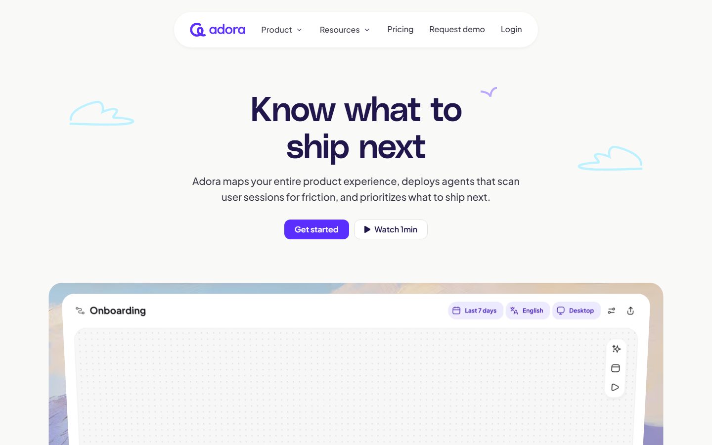
Adora's marketing surface is a playful, optimistic product-analytics interface built on a warm off-white canvas (`{colors.canvas}` — #f9f9f7) with deep indigo ink (`{colors.ink}` — #21164c) and an electric violet primary action (`{colors.accent}` — #592eff). The system reads as friendly-but-precise SaaS — soft pill shapes, very rounded white cards, and a candy-bright accent palette (violet, pink, cyan, lime) used for sticker-style doodle marks, highlight blocks, and product-screenshot framing.
Type voice splits into two roles: **PolySans** (the chunky geometric display face used for h1–h4 headlines) carries the brand voltage, and **Plus Jakarta Sans** (used for body and buttons) handles supporting copy. PolySans runs weight 600 with negative letter-spacing (-0.36px to -1.36px depending on size) — it feels rounded, confident, and slightly toy-like, which is the whole brand mood.
Component voltage comes from **product screenshots shown inside generously rounded white cards** (`{rounded.card}` — 30px), surrounded by scattered hand-drawn accent doodles (clouds, sparkles, arrows) in the accent palette. Testimonial blocks invert to fully saturated accent surfaces — lime (`{colors.accent-lime}`) and pink (`{colors.accent-pink}`) — which act as the loudest color moments on otherwise calm off-white pages.
**Key Characteristics:**
- Warm off-white canvas (`{colors.canvas}` — #f9f9f7) rather than pure white; pure white (`{colors.surface}`) is reserved for cards and the floating nav pill.
- Electric violet primary CTA (`{colors.accent}` — #592eff) rendered as a full pill (`{rounded.pill}`) with white label.
- Chunky geometric `PolySans` display face for all headlines (substituted with General Sans here). Negative letter-spacing across all display sizes.
- Floating rounded nav bar (`{component.top-nav-pill}`) — a white pill on the canvas rather than a full-width bar.
- Multi-color accent confetti — pink, cyan, lime, violet doodles scattered as decorative marks beside headlines and around screenshot cards.
- Saturated accent testimonial cards — lime and pink full-bleed blocks holding large quote type.
- Generously rounded geometry — content cards at `{rounded.card}` (30px), feature panels and accent blocks up to `{rounded.huge}` (40px), pills at `{rounded.pill}` (200px).
## Colors
### Brand & Accent
- **Accent / Primary** (`{colors.accent}` — #592eff): The dominant action color — electric violet. Primary CTA fills, the logo wordmark accent, inline highlight underlines.
- **Accent Pink** (`{colors.accent-pink}` — #f843c2): Saturated testimonial card surface and sticker doodles. Deep variant `{colors.accent-pink-deep}` (#57003d) appears as a darker accent shadow tone.
- **Accent Cyan** (`{colors.accent-cyan}` — #2ed6ff): Doodle marks and screenshot UI highlights. Softer tones `{colors.accent-cyan-soft}` (#90e9ff) and `{colors.accent-cyan-pale}` (#bcf2ff) appear in nested screenshot chrome.
- **Accent Lime** (`{colors.accent-lime}` — #a2ea13): The brightest testimonial card surface. Variants `{colors.accent-lime-soft}` (#dfff9d), `{colors.accent-lime-deep}` (#90d705), and `{colors.accent-lime-shadow}` (#34490b) appear as fills and accents in product-UI fragments.
The accent set is a four-color confetti palette (violet / pink / cyan / lime). Adora deploys it for decoration and full-bleed quote blocks — never on the primary CTA, which stays single-color violet.
### Surface
- **Canvas** (`{colors.canvas}` — #f9f9f7): The warm off-white page floor.
- **Surface** (`{colors.surface}` — #ffffff): Pure white — cards, the floating nav pill, screenshot containers.
- **Surface Soft** (`{colors.surface-soft}` — #f2f3f5): Soft gray panels and nested screenshot backgrounds.
- **Hairline** (`{colors.hairline}` — #eeeeee): Light divider tone on white surfaces.
- **Hairline Warm** (`{colors.hairline-warm}` — #e0e0db): A slightly warmer divider that matches the off-white canvas.
### Text
- **Ink** (`{colors.ink}` — #21164c): All headlines and primary text — deep indigo, not pure black.
- **Ink Alt** (`{colors.ink-alt}` — #111827): A near-black used in some UI fragment text.
- **On Primary** (`{colors.on-primary}` — #353241): The measured default button/text color — a dark slate used for nav links and dark labels on light surfaces.
- **Muted** (`{colors.muted}` — #5f5f69): Secondary running text and sub-headlines.
- **On Accent** (`{colors.on-accent}` — #ffffff): White label on the violet primary CTA.
### Neutral
- **Neutral Black** (`{colors.neutral-black}` — #000000): Used sparingly in icon strokes and the highest-contrast elements.
## Typography
### Font Family
The system runs **PolySans** for display/headlines and **Plus Jakarta Sans** for body and buttons. PolySans is a rounded geometric grotesk — weight 600, negative letter-spacing — which gives Adora its friendly-but-confident voice. Plus Jakarta Sans handles all running copy and button labels at weight 500 with a generous 1.6 line-height.
The split is functional:
- PolySans (display, 600 weight, -0.36 to -1.36px tracking) — h1, h2, h3, h4
- Plus Jakarta Sans (body + button, 500 weight) — paragraphs, labels, CTA text
### Hierarchy
| Token | Size | Weight | Line Height | Letter Spacing | Use |
|---|---|---|---|---|---|
| `{typography.display-xl}` | 68px | 600 | 1.1 | -1.36px | Hero h1 ("Know what to ship next") — PolySans |
| `{typography.display-lg}` | 58px | 600 | 1.1 | -1.16px | Section heads ("Your product team's new source of truth") — PolySans |
| `{typography.display-md}` | 38px | 600 | 1.2 | -0.76px | Sub-section heads, large quote type — PolySans |
| `{typography.title}` | 18px | 600 | 1.1 | -0.36px | Feature card titles, small labels — PolySans |
| `{typography.body}` | 18px | 500 | 1.6 | normal | Default running-text, sub-headlines — Plus Jakarta Sans |
| `{typography.button}` | 18px | 500 | 1.0 | normal | Button labels, nav links — Plus Jakarta Sans |
### Principles
PolySans is the brand voice — every headline from h1 down to the 18px h4 title uses it at weight 600 with negative letter-spacing. Plus Jakarta Sans carries body and interactive copy. The boundary is strict: headlines are PolySans, copy is Plus Jakarta Sans. Note that both the h4 title and body sit at 18px — the differentiator is family + weight + tracking, not size.
### Note on Font Substitutes
**PolySans** is a commercial typeface (not an open web font); it should not be self-hosted without a license. A close open-source substitute is **General Sans** (Fontshare) at weight 600 with ~-0.03em tracking, which preserves the rounded-geometric character. **Hanken Grotesk** weight 600 is another viable alternative. **Plus Jakarta Sans** is freely available (Google Fonts / SIL OFL) and can ship directly.
## Layout
### Spacing System
- **Base unit:** 4px (with a frequent half-step at 5px and 10px observed in measurement).
- **Tokens:** `{spacing.xxs}` 4px · `{spacing.xs}` 8px · `{spacing.sm}` 12px · `{spacing.md}` 16px · `{spacing.lg}` 24px · `{spacing.xl}` 32px · `{spacing.xxl}` 40px · `{spacing.xxxl}` 48px · `{spacing.section}` 50px.
- **Card internal padding:** `{spacing.xxl}` (40px) for content + feature cards; `{spacing.xl}` (32px) and `{spacing.xxxl}` (48px) appear on accent testimonial blocks.
- **Gutters / small gaps:** the most frequent measured gaps are 5px and 8px (tight internal clusters) scaling up to 40px for card-to-card rhythm.
### Grid & Container
- **Editorial body:** Centered single-column hero (h1 + sub-head + button row), with full-width product-screenshot bands below.
- **Feature card grids:** 3-up at desktop (Automated journey maps / AI insights / Session replays; Product design library / Ask Adora / SOC2 certified).
- **Screenshot rows:** Horizontally arranged screenshot cards in a scannable row ("Capture every screen and modal").
- **Logo bar:** Single horizontal row of partner logos (Linktree, Canva, Replit, Granola, Chess.com).
### Whitespace Philosophy
Adora uses generous vertical breathing room on a calm off-white canvas, then punctuates it with loud full-bleed accent testimonial blocks. The decorative doodles (clouds, sparkles, arrows) sit in the negative space around headlines — the whitespace itself is part of the playful composition.
## Elevation & Depth
| Level | Treatment | Use |
|---|---|---|
| Flat | No shadow, sits directly on canvas | Hero text, accent testimonial blocks, feature cards |
| Floating pill | Soft multi-layer shadow | The top nav pill and floating screenshot cards |
| Soft drop | `rgba(33,22,76,0.08) 0px 2px 8px -2px` | Subtle lift on small UI fragments / dropdowns |
The measured soft shadow stack is layered and very low-alpha: `rgba(126,137,153,0.01) 0px 9.8px 4.2px`, `rgba(126,137,153,0.05) 0px 5.6px 2.8px`, `rgba(126,137,153,0.09) 0px 2.8px 2.8px`, `rgba(126,137,153,0.1) 0px 0px 1.4px` — a diffuse, modern float used on the nav pill and elevated cards. The second shadow (`rgba(33,22,76,0.08) 0px 2px 8px -2px`) is a single-layer subtle lift tinted with the ink color.
### Decorative Depth
- Hand-drawn doodle marks (clouds, sparkles, swooshes) in accent colors float in the canvas margins around headlines — these are illustration content, not elevation tokens.
- Product-screenshot cards carry their own internal UI chrome (toolbars, badges, panels) which read as nested depth inside the white card.
## Shapes
### Border Radius Scale
| Token | Value | Use |
|---|---|---|
| `{rounded.xs}` | 8px | Small inline chips, nested UI fragments |
| `{rounded.sm}` | 12px | Small buttons, inner panels |
| `{rounded.md}` | 14px | Inputs, small cards |
| `{rounded.lg}` | 16px | Avatar/image blocks, mid panels |
| `{rounded.xl}` | 20px | Mid cards |
| `{rounded.xxl}` | 26px | Larger panels |
| `{rounded.card}` | 30px | The primary content-card radius (white cards, screenshot containers) |
| `{rounded.huge}` | 40px | Accent testimonial blocks, large feature panels |
| `{rounded.jumbo}` | 64px | Largest rounded containers / hero screenshot frame |
| `{rounded.pill}` | 200px | Nav pill, primary/secondary CTA buttons, badges |
| `{rounded.full}` | 800px | Effectively-circular elements / very large pill blocks |
The geometry is consistently soft — there are no sharp-cornered surfaces in the system. Even large blocks round to 30–64px, and all interactive pills/buttons go fully rounded.
### Photography & Image Geometry
- Product screenshots sit inside white cards rounded to `{rounded.card}` (30px).
- Avatar / portrait image blocks use `{rounded.lg}` (16px).
- Testimonial photo + image grids retain soft-rounded corners matching their container.
## Components
### Navigation
**`top-nav-pill`** — A floating white pill centered at the top of the page rather than a full-width bar. Background `{colors.surface}`, rounded `{rounded.pill}` (200px), carrying the Adora logo + violet brand mark at left and menu items (Product, Resources, Pricing, Request demo, Login) in `{typography.button}` (Plus Jakarta Sans 18px / 500). Carries the soft multi-layer float shadow.
**`nav-link`** — Inline text menu items, transparent background, `{colors.ink}` text, `{typography.button}`. Used for top-nav menu entries.
### Buttons
**`button-primary`** — The signature CTA ("Get started"). Background `{colors.accent}` (#592eff), text `{colors.on-accent}` (#ffffff), type `{typography.button}`, fully rounded `{rounded.pill}` (200px), padding ~14px × 24px (derived from the spacing scale; the measured button props captured a text-link with 0 radius/padding — see Known Gaps).
**`button-secondary`** — White companion button ("▶ Watch 1min"). Background `{colors.surface}`, text `{colors.ink}`, same pill radius and padding as primary. Carries a small play-icon glyph.
### Cards & Containers
**`hero-band`** — Centered off-white hero with h1 in `{typography.display-xl}`, a `{typography.body}` sub-headline, and the primary + secondary button row. Decorative accent doodles (clouds, swoosh) flank the headline. Sits directly on `{colors.canvas}`.
**`card`** — The base white content card. Background `{colors.surface}`, rounded `{rounded.card}` (30px), padding `{spacing.xxl}` (40px). Used as the generic container for screenshots and content blocks.
**`screenshot-card`** — A white card framing a product screenshot ("Choose your plan", "Homepage", "Dashboard"). Background `{colors.surface}`, rounded `{rounded.card}`, padding `{spacing.xl}` (20–32px), carrying a screenshot plus a small caption row with session counts.
**`feature-card`** — Used in the 3-up platform grids (Automated journey maps / AI insights / Session replays, etc.). Background `{colors.surface}`, rounded `{rounded.card}`, padding `{spacing.xxl}` (40px). Carries an icon, a `{typography.title}` heading (PolySans 18px / 600), a `{typography.body}` description, and a "Learn more" link.
**`testimonial-card-lime`** — A full-bleed saturated quote block. Background `{colors.accent-lime}` (#a2ea13), text `{colors.ink}`, large quote in `{typography.display-md}`, rounded `{rounded.huge}` (40px), padding `{spacing.xxxl}` (48px). Carries a portrait photo block + attribution row.
**`testimonial-card-pink`** — The pink variant of the saturated quote block. Background `{colors.accent-pink}` (#f843c2), otherwise identical structure to the lime variant. Used for the closing chess.com testimonial band.
**`avatar-block`** — Portrait image block in testimonial rows, rounded `{rounded.lg}` (16px), background `{colors.surface}`.
### Tags / Badges
**`badge-pill`** — Small pill label used as section eyebrows ("LIVE SCREENSHOTS", "JOURNEYS", "PLATFORM"). Background `{colors.surface}`, text `{colors.accent}`, type `{typography.button}`, rounded `{rounded.pill}`, padding `{spacing.xs}` × `{spacing.md}`.
### Logo / Social Proof
**`logo-bar`** — A single horizontal row of partner wordmarks (Linktree, Canva, Replit, Granola, Chess.com) on the `{colors.canvas}` floor with a "Loved by product-obsessed teams" caption above in `{typography.body}`.
## Do's and Don'ts
### Do
- Keep the primary CTA single-color violet (`{colors.accent}` — #592eff) with a white label. The confetti palette is for decoration, not actions.
- Use PolySans (substitute: General Sans) for every headline, weight 600 with negative letter-spacing. PolySans without the tracking reads off-brand.
- Put body and button copy in Plus Jakarta Sans weight 500 — never headlines.
- Use the warm off-white `{colors.canvas}` (#f9f9f7) as the page floor and reserve pure white `{colors.surface}` for cards and the nav pill.
- Float the nav as a centered pill (`{component.top-nav-pill}`) rather than a full-width bar.
- Use the saturated lime/pink testimonial blocks sparingly as the loud accent moments; keep the rest calm.
- Keep all interactive elements fully rounded (`{rounded.pill}`); keep content cards at `{rounded.card}` (30px) or larger.
### Don't
- Don't mix more than the four accent hues into a single block — the confetti is scattered, not crowded.
- Don't apply accent colors to primary CTAs or large text bodies; keep them violet-or-ink only.
- Don't use sharp corners anywhere — the softest element in the system still rounds to 8px.
- Don't put the saturated lime/pink surfaces behind long-form body copy; they're for short large quotes.
- Don't bold display weight beyond 600.
- Don't add hover state styling beyond default + active/pressed.
## Responsive Behavior
| Name | Width | Key Changes |
|---|---|---|
| Mobile | < 768px | Nav pill collapses toward a compact pill / menu; hero h1 scales down from 68px; button row stacks; feature grids 1-up; screenshot row scrolls horizontally |
| Tablet | 768–1024px | Nav pill stays centered; feature cards 2-up; testimonial blocks retain full-bleed accent fill |
| Desktop | 1024–1440px | Full floating nav pill with all menu items; 3-up feature grids; screenshot cards in a row |
| Wide | > 1440px | Same as desktop with more canvas breathing room around the centered hero |
### Touch Targets
- `{component.button-primary}` and `{component.button-secondary}` are pill-shaped with ~14px vertical padding on 18px labels — comfortably above 44px effective height.
- `{component.nav-link}` items sit inside the nav pill with adequate horizontal spacing.
### Collapsing Strategy
- The floating nav pill collapses its menu items on mobile.
- The centered hero stacks h1 → sub-head → buttons vertically at all widths.
- Feature grids reduce columns (3 → 2 → 1) rather than shrinking cards.
- Screenshot rows become horizontally scrollable on narrow viewports.
- Saturated testimonial blocks keep their accent fill and rounding at every breakpoint.
### Image Behavior
- Product screenshots inside `{component.screenshot-card}` retain native aspect ratios; cards resize around them.
- Portrait/avatar image blocks keep `{rounded.lg}` corners at all sizes.
- Decorative doodle marks reposition or drop on smaller viewports.
## Iteration Guide
1. Focus on ONE component at a time. Reference its YAML key directly (`{component.feature-card}`, `{component.testimonial-card-lime}`).
2. Variants (e.g., `testimonial-card-pink` vs `testimonial-card-lime`) live as separate entries in `components:`.
3. Use `{token.refs}` everywhere — never inline a hex in a component.
4. Never document hover. Default and Active/Pressed only.
5. Headlines stay PolySans 600 with negative tracking; body stays Plus Jakarta Sans 500. The boundary does not blur.
6. The confetti accents (violet/pink/cyan/lime) are decoration and full-bleed quote blocks only — keep actions violet.
7. When in doubt about emphasis: bigger PolySans before adding a new accent color.
## Known Gaps
- The measured `button-primary` component captured `color: #353241`, `radius: 0px`, `padding: 0px` — these values describe a text-link element (likely a nav link), not the violet "Get started" pill seen in screenshots. The pill fill (`{colors.accent}`), white label, `{rounded.pill}` radius, and padding are documented from screenshot ground-truth + the measured radius scale (200px is present) and spacing scale; the padding values are **derived**.
- PolySans is a commercial typeface; although `fonts_licensed` was empty in the analysis, it must not be self-hosted without a license — open substitutes (General Sans, Hanken Grotesk) are documented in Typography.
- Only the landing page was captured; interior pages (Product, Pricing, Resources) are out of scope.
- Section-level vertical spacing between major bands appears larger than the largest measured token (50px); the true large-section rhythm was not captured and may exceed the documented `{spacing.section}` value.
- Form/input states (the screenshot shows an email field "Create new account") were not measured — input radius, border, and focus styling are not extracted.
- Accent doodle illustrations (clouds, sparkles, arrows) are SVG content; their exact stroke colors beyond the documented accent set were not individually measured.
- Animation and transition timings (screenshot hover-reveal, journey-map animation) are not in scope.
- The exact white-vs-off-white usage split (which surfaces use `{colors.surface}` #ffffff vs `{colors.canvas}` #f9f9f7) is inferred from screenshots; both are measured but per-component assignment is partly derived.
<!-- Documented by duply · real-world design systems as ready-to-use DESIGN.md for AI coding agents · https://duply.ai/adora/design-md -->
Color Palette
Accent
Neutrals
Typography
display-xl68px · 600 · 1.1
The quick brown fox jumpsdisplay-lg58px · 600 · 1.1
The quick brown fox jumpsdisplay-md38px · 600 · 1.2
The quick brown fox jumpstitle18px · 600 · 1.1
The quick brown fox jumpsbody18px · 500 · 1.6
The quick brown fox jumpsbutton18px · 500 · 1
The quick brown fox jumpsSpacing & Shape
Spacing
| Name | Value | Preview |
|---|---|---|
| xxs | 4px | |
| xs | 8px | |
| sm | 12px | |
| md | 16px | |
| lg | 24px | |
| xl | 32px | |
| xxl | 40px | |
| xxxl | 48px | |
| section | 50px |
Border Radius
| Name | Value | Preview |
|---|---|---|
| xs | 8px | |
| sm | 12px | |
| md | 14px | |
| lg | 16px | |
| xl | 20px | |
| xxl | 26px | |
| card | 30px | |
| huge | 40px | |
| jumbo | 64px | |
| pill | 200px | |
| full | 800px |
More like this


---
version: alpha
name: Adora-design-analysis
description: A playful, optimistic product-analytics SaaS interface built on a warm off-white canvas (#f9f9f7) with deep indigo ink (#21164c) and an electric violet (#592eff) primary action. The system reads as friendly-but-precise — rounded pill nav bar, generously rounded white cards (~30px), a candy-bright accent set (violet, pink, cyan, lime) used for sticker-style doodles and highlight blocks, and a chunky geometric display face (PolySans) paired with Plus Jakarta Sans body. Brand voltage comes from the bold display headlines and the multi-color accent confetti scattered through product-screenshot cards.

colors:
  accent: "#592eff"
  accent-pink: "#f843c2"
  accent-cyan: "#2ed6ff"
  accent-lime: "#a2ea13"
  accent-cyan-soft: "#90e9ff"
  accent-cyan-pale: "#bcf2ff"
  accent-lime-soft: "#dfff9d"
  accent-lime-deep: "#90d705"
  accent-lime-shadow: "#34490b"
  accent-pink-deep: "#57003d"
  ink: "#21164c"
  ink-alt: "#111827"
  on-primary: "#353241"
  muted: "#5f5f69"
  surface: "#ffffff"
  canvas: "#f9f9f7"
  surface-soft: "#f2f3f5"
  hairline: "#eeeeee"
  hairline-warm: "#e0e0db"
  neutral-black: "#000000"
  on-accent: "#ffffff"

typography:
  display-xl:
    fontFamily: "PolySans, General Sans, sans-serif"
    fontSize: 68px
    fontWeight: 600
    lineHeight: 1.1
    letterSpacing: -1.36px
  display-lg:
    fontFamily: "PolySans, General Sans, sans-serif"
    fontSize: 58px
    fontWeight: 600
    lineHeight: 1.1
    letterSpacing: -1.16px
  display-md:
    fontFamily: "PolySans, General Sans, sans-serif"
    fontSize: 38px
    fontWeight: 600
    lineHeight: 1.2
    letterSpacing: -0.76px
  title:
    fontFamily: "PolySans, General Sans, sans-serif"
    fontSize: 18px
    fontWeight: 600
    lineHeight: 1.1
    letterSpacing: -0.36px
  body:
    fontFamily: "Plus Jakarta Sans, sans-serif"
    fontSize: 18px
    fontWeight: 500
    lineHeight: 1.6
    letterSpacing: normal
  button:
    fontFamily: "Plus Jakarta Sans, sans-serif"
    fontSize: 18px
    fontWeight: 500
    lineHeight: 1.0
    letterSpacing: normal

rounded:
  xs: 8px
  sm: 12px
  md: 14px
  lg: 16px
  xl: 20px
  xxl: 26px
  card: 30px
  huge: 40px
  jumbo: 64px
  pill: 200px
  full: 800px

spacing:
  xxs: 4px
  xs: 8px
  sm: 12px
  md: 16px
  lg: 24px
  xl: 32px
  xxl: 40px
  xxxl: 48px
  section: 50px

components:
  top-nav-pill:
    backgroundColor: "{colors.surface}"
    textColor: "{colors.ink}"
    typography: "{typography.button}"
    rounded: "{rounded.pill}"
    padding: 16px 24px
  nav-link:
    backgroundColor: transparent
    textColor: "{colors.ink}"
    typography: "{typography.button}"
  button-primary:
    backgroundColor: "{colors.accent}"
    textColor: "{colors.on-accent}"
    typography: "{typography.button}"
    rounded: "{rounded.pill}"
    padding: 14px 24px
  button-secondary:
    backgroundColor: "{colors.surface}"
    textColor: "{colors.ink}"
    typography: "{typography.button}"
    rounded: "{rounded.pill}"
    padding: 14px 24px
  hero-band:
    backgroundColor: "{colors.canvas}"
    textColor: "{colors.ink}"
    typography: "{typography.display-xl}"
    padding: 50px
  card:
    backgroundColor: "{colors.surface}"
    textColor: "{colors.ink}"
    rounded: "{rounded.card}"
    padding: 40px
  screenshot-card:
    backgroundColor: "{colors.surface}"
    textColor: "{colors.ink}"
    rounded: "{rounded.card}"
    padding: 20px
  feature-card:
    backgroundColor: "{colors.surface}"
    textColor: "{colors.ink}"
    typography: "{typography.title}"
    rounded: "{rounded.card}"
    padding: 40px
  testimonial-card-lime:
    backgroundColor: "{colors.accent-lime}"
    textColor: "{colors.ink}"
    typography: "{typography.display-md}"
    rounded: "{rounded.huge}"
    padding: 48px
  testimonial-card-pink:
    backgroundColor: "{colors.accent-pink}"
    textColor: "{colors.ink}"
    typography: "{typography.display-md}"
    rounded: "{rounded.huge}"
    padding: 48px
  badge-pill:
    backgroundColor: "{colors.surface}"
    textColor: "{colors.accent}"
    typography: "{typography.button}"
    rounded: "{rounded.pill}"
    padding: 8px 16px
  logo-bar:
    backgroundColor: "{colors.canvas}"
    textColor: "{colors.ink}"
    typography: "{typography.body}"
  avatar-block:
    backgroundColor: "{colors.surface}"
    textColor: "{colors.ink}"
    rounded: "{rounded.lg}"
---

## Overview

Adora's marketing surface is a playful, optimistic product-analytics interface built on a warm off-white canvas (`{colors.canvas}` — #f9f9f7) with deep indigo ink (`{colors.ink}` — #21164c) and an electric violet primary action (`{colors.accent}` — #592eff). The system reads as friendly-but-precise SaaS — soft pill shapes, very rounded white cards, and a candy-bright accent palette (violet, pink, cyan, lime) used for sticker-style doodle marks, highlight blocks, and product-screenshot framing.

Type voice splits into two roles: **PolySans** (the chunky geometric display face used for h1–h4 headlines) carries the brand voltage, and **Plus Jakarta Sans** (used for body and buttons) handles supporting copy. PolySans runs weight 600 with negative letter-spacing (-0.36px to -1.36px depending on size) — it feels rounded, confident, and slightly toy-like, which is the whole brand mood.

Component voltage comes from **product screenshots shown inside generously rounded white cards** (`{rounded.card}` — 30px), surrounded by scattered hand-drawn accent doodles (clouds, sparkles, arrows) in the accent palette. Testimonial blocks invert to fully saturated accent surfaces — lime (`{colors.accent-lime}`) and pink (`{colors.accent-pink}`) — which act as the loudest color moments on otherwise calm off-white pages.

**Key Characteristics:**
- Warm off-white canvas (`{colors.canvas}` — #f9f9f7) rather than pure white; pure white (`{colors.surface}`) is reserved for cards and the floating nav pill.
- Electric violet primary CTA (`{colors.accent}` — #592eff) rendered as a full pill (`{rounded.pill}`) with white label.
- Chunky geometric `PolySans` display face for all headlines (substituted with General Sans here). Negative letter-spacing across all display sizes.
- Floating rounded nav bar (`{component.top-nav-pill}`) — a white pill on the canvas rather than a full-width bar.
- Multi-color accent confetti — pink, cyan, lime, violet doodles scattered as decorative marks beside headlines and around screenshot cards.
- Saturated accent testimonial cards — lime and pink full-bleed blocks holding large quote type.
- Generously rounded geometry — content cards at `{rounded.card}` (30px), feature panels and accent blocks up to `{rounded.huge}` (40px), pills at `{rounded.pill}` (200px).

## Colors

### Brand & Accent
- **Accent / Primary** (`{colors.accent}` — #592eff): The dominant action color — electric violet. Primary CTA fills, the logo wordmark accent, inline highlight underlines.
- **Accent Pink** (`{colors.accent-pink}` — #f843c2): Saturated testimonial card surface and sticker doodles. Deep variant `{colors.accent-pink-deep}` (#57003d) appears as a darker accent shadow tone.
- **Accent Cyan** (`{colors.accent-cyan}` — #2ed6ff): Doodle marks and screenshot UI highlights. Softer tones `{colors.accent-cyan-soft}` (#90e9ff) and `{colors.accent-cyan-pale}` (#bcf2ff) appear in nested screenshot chrome.
- **Accent Lime** (`{colors.accent-lime}` — #a2ea13): The brightest testimonial card surface. Variants `{colors.accent-lime-soft}` (#dfff9d), `{colors.accent-lime-deep}` (#90d705), and `{colors.accent-lime-shadow}` (#34490b) appear as fills and accents in product-UI fragments.

The accent set is a four-color confetti palette (violet / pink / cyan / lime). Adora deploys it for decoration and full-bleed quote blocks — never on the primary CTA, which stays single-color violet.

### Surface
- **Canvas** (`{colors.canvas}` — #f9f9f7): The warm off-white page floor.
- **Surface** (`{colors.surface}` — #ffffff): Pure white — cards, the floating nav pill, screenshot containers.
- **Surface Soft** (`{colors.surface-soft}` — #f2f3f5): Soft gray panels and nested screenshot backgrounds.
- **Hairline** (`{colors.hairline}` — #eeeeee): Light divider tone on white surfaces.
- **Hairline Warm** (`{colors.hairline-warm}` — #e0e0db): A slightly warmer divider that matches the off-white canvas.

### Text
- **Ink** (`{colors.ink}` — #21164c): All headlines and primary text — deep indigo, not pure black.
- **Ink Alt** (`{colors.ink-alt}` — #111827): A near-black used in some UI fragment text.
- **On Primary** (`{colors.on-primary}` — #353241): The measured default button/text color — a dark slate used for nav links and dark labels on light surfaces.
- **Muted** (`{colors.muted}` — #5f5f69): Secondary running text and sub-headlines.
- **On Accent** (`{colors.on-accent}` — #ffffff): White label on the violet primary CTA.

### Neutral
- **Neutral Black** (`{colors.neutral-black}` — #000000): Used sparingly in icon strokes and the highest-contrast elements.

## Typography

### Font Family
The system runs **PolySans** for display/headlines and **Plus Jakarta Sans** for body and buttons. PolySans is a rounded geometric grotesk — weight 600, negative letter-spacing — which gives Adora its friendly-but-confident voice. Plus Jakarta Sans handles all running copy and button labels at weight 500 with a generous 1.6 line-height.

The split is functional:
- PolySans (display, 600 weight, -0.36 to -1.36px tracking) — h1, h2, h3, h4
- Plus Jakarta Sans (body + button, 500 weight) — paragraphs, labels, CTA text

### Hierarchy

| Token | Size | Weight | Line Height | Letter Spacing | Use |
|---|---|---|---|---|---|
| `{typography.display-xl}` | 68px | 600 | 1.1 | -1.36px | Hero h1 ("Know what to ship next") — PolySans |
| `{typography.display-lg}` | 58px | 600 | 1.1 | -1.16px | Section heads ("Your product team's new source of truth") — PolySans |
| `{typography.display-md}` | 38px | 600 | 1.2 | -0.76px | Sub-section heads, large quote type — PolySans |
| `{typography.title}` | 18px | 600 | 1.1 | -0.36px | Feature card titles, small labels — PolySans |
| `{typography.body}` | 18px | 500 | 1.6 | normal | Default running-text, sub-headlines — Plus Jakarta Sans |
| `{typography.button}` | 18px | 500 | 1.0 | normal | Button labels, nav links — Plus Jakarta Sans |

### Principles
PolySans is the brand voice — every headline from h1 down to the 18px h4 title uses it at weight 600 with negative letter-spacing. Plus Jakarta Sans carries body and interactive copy. The boundary is strict: headlines are PolySans, copy is Plus Jakarta Sans. Note that both the h4 title and body sit at 18px — the differentiator is family + weight + tracking, not size.

### Note on Font Substitutes
**PolySans** is a commercial typeface (not an open web font); it should not be self-hosted without a license. A close open-source substitute is **General Sans** (Fontshare) at weight 600 with ~-0.03em tracking, which preserves the rounded-geometric character. **Hanken Grotesk** weight 600 is another viable alternative. **Plus Jakarta Sans** is freely available (Google Fonts / SIL OFL) and can ship directly.

## Layout

### Spacing System
- **Base unit:** 4px (with a frequent half-step at 5px and 10px observed in measurement).
- **Tokens:** `{spacing.xxs}` 4px · `{spacing.xs}` 8px · `{spacing.sm}` 12px · `{spacing.md}` 16px · `{spacing.lg}` 24px · `{spacing.xl}` 32px · `{spacing.xxl}` 40px · `{spacing.xxxl}` 48px · `{spacing.section}` 50px.
- **Card internal padding:** `{spacing.xxl}` (40px) for content + feature cards; `{spacing.xl}` (32px) and `{spacing.xxxl}` (48px) appear on accent testimonial blocks.
- **Gutters / small gaps:** the most frequent measured gaps are 5px and 8px (tight internal clusters) scaling up to 40px for card-to-card rhythm.

### Grid & Container
- **Editorial body:** Centered single-column hero (h1 + sub-head + button row), with full-width product-screenshot bands below.
- **Feature card grids:** 3-up at desktop (Automated journey maps / AI insights / Session replays; Product design library / Ask Adora / SOC2 certified).
- **Screenshot rows:** Horizontally arranged screenshot cards in a scannable row ("Capture every screen and modal").
- **Logo bar:** Single horizontal row of partner logos (Linktree, Canva, Replit, Granola, Chess.com).

### Whitespace Philosophy
Adora uses generous vertical breathing room on a calm off-white canvas, then punctuates it with loud full-bleed accent testimonial blocks. The decorative doodles (clouds, sparkles, arrows) sit in the negative space around headlines — the whitespace itself is part of the playful composition.

## Elevation & Depth

| Level | Treatment | Use |
|---|---|---|
| Flat | No shadow, sits directly on canvas | Hero text, accent testimonial blocks, feature cards |
| Floating pill | Soft multi-layer shadow | The top nav pill and floating screenshot cards |
| Soft drop | `rgba(33,22,76,0.08) 0px 2px 8px -2px` | Subtle lift on small UI fragments / dropdowns |

The measured soft shadow stack is layered and very low-alpha: `rgba(126,137,153,0.01) 0px 9.8px 4.2px`, `rgba(126,137,153,0.05) 0px 5.6px 2.8px`, `rgba(126,137,153,0.09) 0px 2.8px 2.8px`, `rgba(126,137,153,0.1) 0px 0px 1.4px` — a diffuse, modern float used on the nav pill and elevated cards. The second shadow (`rgba(33,22,76,0.08) 0px 2px 8px -2px`) is a single-layer subtle lift tinted with the ink color.

### Decorative Depth
- Hand-drawn doodle marks (clouds, sparkles, swooshes) in accent colors float in the canvas margins around headlines — these are illustration content, not elevation tokens.
- Product-screenshot cards carry their own internal UI chrome (toolbars, badges, panels) which read as nested depth inside the white card.

## Shapes

### Border Radius Scale

| Token | Value | Use |
|---|---|---|
| `{rounded.xs}` | 8px | Small inline chips, nested UI fragments |
| `{rounded.sm}` | 12px | Small buttons, inner panels |
| `{rounded.md}` | 14px | Inputs, small cards |
| `{rounded.lg}` | 16px | Avatar/image blocks, mid panels |
| `{rounded.xl}` | 20px | Mid cards |
| `{rounded.xxl}` | 26px | Larger panels |
| `{rounded.card}` | 30px | The primary content-card radius (white cards, screenshot containers) |
| `{rounded.huge}` | 40px | Accent testimonial blocks, large feature panels |
| `{rounded.jumbo}` | 64px | Largest rounded containers / hero screenshot frame |
| `{rounded.pill}` | 200px | Nav pill, primary/secondary CTA buttons, badges |
| `{rounded.full}` | 800px | Effectively-circular elements / very large pill blocks |

The geometry is consistently soft — there are no sharp-cornered surfaces in the system. Even large blocks round to 30–64px, and all interactive pills/buttons go fully rounded.

### Photography & Image Geometry
- Product screenshots sit inside white cards rounded to `{rounded.card}` (30px).
- Avatar / portrait image blocks use `{rounded.lg}` (16px).
- Testimonial photo + image grids retain soft-rounded corners matching their container.

## Components

### Navigation

**`top-nav-pill`** — A floating white pill centered at the top of the page rather than a full-width bar. Background `{colors.surface}`, rounded `{rounded.pill}` (200px), carrying the Adora logo + violet brand mark at left and menu items (Product, Resources, Pricing, Request demo, Login) in `{typography.button}` (Plus Jakarta Sans 18px / 500). Carries the soft multi-layer float shadow.

**`nav-link`** — Inline text menu items, transparent background, `{colors.ink}` text, `{typography.button}`. Used for top-nav menu entries.

### Buttons

**`button-primary`** — The signature CTA ("Get started"). Background `{colors.accent}` (#592eff), text `{colors.on-accent}` (#ffffff), type `{typography.button}`, fully rounded `{rounded.pill}` (200px), padding ~14px × 24px (derived from the spacing scale; the measured button props captured a text-link with 0 radius/padding — see Known Gaps).

**`button-secondary`** — White companion button ("▶ Watch 1min"). Background `{colors.surface}`, text `{colors.ink}`, same pill radius and padding as primary. Carries a small play-icon glyph.

### Cards & Containers

**`hero-band`** — Centered off-white hero with h1 in `{typography.display-xl}`, a `{typography.body}` sub-headline, and the primary + secondary button row. Decorative accent doodles (clouds, swoosh) flank the headline. Sits directly on `{colors.canvas}`.

**`card`** — The base white content card. Background `{colors.surface}`, rounded `{rounded.card}` (30px), padding `{spacing.xxl}` (40px). Used as the generic container for screenshots and content blocks.

**`screenshot-card`** — A white card framing a product screenshot ("Choose your plan", "Homepage", "Dashboard"). Background `{colors.surface}`, rounded `{rounded.card}`, padding `{spacing.xl}` (20–32px), carrying a screenshot plus a small caption row with session counts.

**`feature-card`** — Used in the 3-up platform grids (Automated journey maps / AI insights / Session replays, etc.). Background `{colors.surface}`, rounded `{rounded.card}`, padding `{spacing.xxl}` (40px). Carries an icon, a `{typography.title}` heading (PolySans 18px / 600), a `{typography.body}` description, and a "Learn more" link.

**`testimonial-card-lime`** — A full-bleed saturated quote block. Background `{colors.accent-lime}` (#a2ea13), text `{colors.ink}`, large quote in `{typography.display-md}`, rounded `{rounded.huge}` (40px), padding `{spacing.xxxl}` (48px). Carries a portrait photo block + attribution row.

**`testimonial-card-pink`** — The pink variant of the saturated quote block. Background `{colors.accent-pink}` (#f843c2), otherwise identical structure to the lime variant. Used for the closing chess.com testimonial band.

**`avatar-block`** — Portrait image block in testimonial rows, rounded `{rounded.lg}` (16px), background `{colors.surface}`.

### Tags / Badges

**`badge-pill`** — Small pill label used as section eyebrows ("LIVE SCREENSHOTS", "JOURNEYS", "PLATFORM"). Background `{colors.surface}`, text `{colors.accent}`, type `{typography.button}`, rounded `{rounded.pill}`, padding `{spacing.xs}` × `{spacing.md}`.

### Logo / Social Proof

**`logo-bar`** — A single horizontal row of partner wordmarks (Linktree, Canva, Replit, Granola, Chess.com) on the `{colors.canvas}` floor with a "Loved by product-obsessed teams" caption above in `{typography.body}`.

## Do's and Don'ts

### Do
- Keep the primary CTA single-color violet (`{colors.accent}` — #592eff) with a white label. The confetti palette is for decoration, not actions.
- Use PolySans (substitute: General Sans) for every headline, weight 600 with negative letter-spacing. PolySans without the tracking reads off-brand.
- Put body and button copy in Plus Jakarta Sans weight 500 — never headlines.
- Use the warm off-white `{colors.canvas}` (#f9f9f7) as the page floor and reserve pure white `{colors.surface}` for cards and the nav pill.
- Float the nav as a centered pill (`{component.top-nav-pill}`) rather than a full-width bar.
- Use the saturated lime/pink testimonial blocks sparingly as the loud accent moments; keep the rest calm.
- Keep all interactive elements fully rounded (`{rounded.pill}`); keep content cards at `{rounded.card}` (30px) or larger.

### Don't
- Don't mix more than the four accent hues into a single block — the confetti is scattered, not crowded.
- Don't apply accent colors to primary CTAs or large text bodies; keep them violet-or-ink only.
- Don't use sharp corners anywhere — the softest element in the system still rounds to 8px.
- Don't put the saturated lime/pink surfaces behind long-form body copy; they're for short large quotes.
- Don't bold display weight beyond 600.
- Don't add hover state styling beyond default + active/pressed.

## Responsive Behavior

| Name | Width | Key Changes |
|---|---|---|
| Mobile | < 768px | Nav pill collapses toward a compact pill / menu; hero h1 scales down from 68px; button row stacks; feature grids 1-up; screenshot row scrolls horizontally |
| Tablet | 768–1024px | Nav pill stays centered; feature cards 2-up; testimonial blocks retain full-bleed accent fill |
| Desktop | 1024–1440px | Full floating nav pill with all menu items; 3-up feature grids; screenshot cards in a row |
| Wide | > 1440px | Same as desktop with more canvas breathing room around the centered hero |

### Touch Targets
- `{component.button-primary}` and `{component.button-secondary}` are pill-shaped with ~14px vertical padding on 18px labels — comfortably above 44px effective height.
- `{component.nav-link}` items sit inside the nav pill with adequate horizontal spacing.

### Collapsing Strategy
- The floating nav pill collapses its menu items on mobile.
- The centered hero stacks h1 → sub-head → buttons vertically at all widths.
- Feature grids reduce columns (3 → 2 → 1) rather than shrinking cards.
- Screenshot rows become horizontally scrollable on narrow viewports.
- Saturated testimonial blocks keep their accent fill and rounding at every breakpoint.

### Image Behavior
- Product screenshots inside `{component.screenshot-card}` retain native aspect ratios; cards resize around them.
- Portrait/avatar image blocks keep `{rounded.lg}` corners at all sizes.
- Decorative doodle marks reposition or drop on smaller viewports.

## Iteration Guide

1. Focus on ONE component at a time. Reference its YAML key directly (`{component.feature-card}`, `{component.testimonial-card-lime}`).
2. Variants (e.g., `testimonial-card-pink` vs `testimonial-card-lime`) live as separate entries in `components:`.
3. Use `{token.refs}` everywhere — never inline a hex in a component.
4. Never document hover. Default and Active/Pressed only.
5. Headlines stay PolySans 600 with negative tracking; body stays Plus Jakarta Sans 500. The boundary does not blur.
6. The confetti accents (violet/pink/cyan/lime) are decoration and full-bleed quote blocks only — keep actions violet.
7. When in doubt about emphasis: bigger PolySans before adding a new accent color.

## Known Gaps

- The measured `button-primary` component captured `color: #353241`, `radius: 0px`, `padding: 0px` — these values describe a text-link element (likely a nav link), not the violet "Get started" pill seen in screenshots. The pill fill (`{colors.accent}`), white label, `{rounded.pill}` radius, and padding are documented from screenshot ground-truth + the measured radius scale (200px is present) and spacing scale; the padding values are **derived**.
- PolySans is a commercial typeface; although `fonts_licensed` was empty in the analysis, it must not be self-hosted without a license — open substitutes (General Sans, Hanken Grotesk) are documented in Typography.
- Only the landing page was captured; interior pages (Product, Pricing, Resources) are out of scope.
- Section-level vertical spacing between major bands appears larger than the largest measured token (50px); the true large-section rhythm was not captured and may exceed the documented `{spacing.section}` value.
- Form/input states (the screenshot shows an email field "Create new account") were not measured — input radius, border, and focus styling are not extracted.
- Accent doodle illustrations (clouds, sparkles, arrows) are SVG content; their exact stroke colors beyond the documented accent set were not individually measured.
- Animation and transition timings (screenshot hover-reveal, journey-map animation) are not in scope.
- The exact white-vs-off-white usage split (which surfaces use `{colors.surface}` #ffffff vs `{colors.canvas}` #f9f9f7) is inferred from screenshots; both are measured but per-component assignment is partly derived.

<!-- Documented by duply · real-world design systems as ready-to-use DESIGN.md for AI coding agents · https://duply.ai/adora/design-md -->