
16 July 2026
What is a type scale? Font size ratios, explained simply
Every product UI that feels considered is running on one. Quick answer: a type scale is a predefined set of font sizes derived from a base size and a ratio, so every size on screen relates mathematically to every other. Instead of picking 14px, 17px and 23px by eye, you pick a base (usually 16px) and a ratio (say 1.25), and the scale generates the rest.
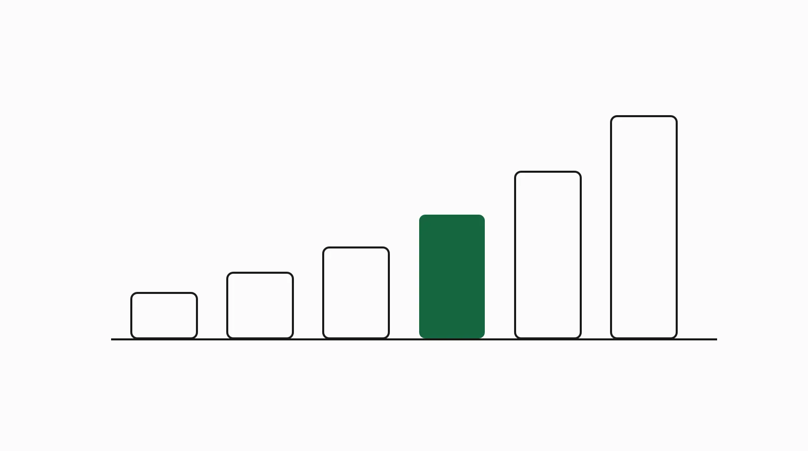
The result is hierarchy you can feel and consistency you never have to argue about. It is the typography half of a token system; the other half of the rhythm comes from its sibling, the spacing scale, covered below.
How does a type scale work?
You need two inputs:
- A base size: the size of body text, almost always 16px (1rem) on the web.
- A ratio: the multiplier between adjacent steps.
Multiply upward for headings, divide downward for captions. With base 16 and ratio 1.25 you get roughly 12.8, 16, 20, 25, 31.25, 39: six sizes that visibly belong together. This idea predates the web: the classic typographic scale used by print typographers for centuries is, as Spencer Mortensen's analysis puts it, "a collection of font sizes that are in visual harmony," and modern modular scales are its generalization.
The practical definition used across modern tools matches the one in Baseline's type scale generator: a predetermined set of font sizes that work harmoniously together, creating visual hierarchy and consistency.
What are the common type scale ratios?
Ratios borrow their names from musical intervals. The ones you will actually meet:
- 1.125 (major second): subtle, dense; good for data-heavy dashboards where headings should not shout.
- 1.2 (minor third): the safe default for product UI; clear hierarchy without huge display sizes.
- 1.25 (major third): the most common web default; balanced for marketing pages and apps alike.
- 1.333 (perfect fourth): editorial feel, strong contrast between body and headings.
- 1.618 (golden ratio): dramatic; display-heavy landing pages only, because six steps up gets enormous.
Tools like Typescale and Baseline generate the full set (plus CSS) from any base and ratio. Guides such as Design+Code's typographic scales chapter and LogRocket's typographic scaling walkthrough cover picking a ratio in more depth.
How do real design systems use type scales?
Production systems ship the scale as named roles, not raw numbers. Material Design's type system is the canonical example: a type scale of thirteen reusable styles (headline 1 through caption), each with an intended usage, so a team never debates whether a card title is 18px or 20px. The pattern repeats across the systems in our design system examples roundup: a small set of named steps, applied by rule.
On duply, every product entry captures this: Linear's DESIGN.md records the tight, restrained Inter-based scale behind its dense UI; Stripe's records the Söhne hierarchy that keeps docs and marketing coherent; Vercel's the Geist scale behind its near-monochrome look.
What is a spacing scale?
The same idea applied to whitespace: a spacing scale is a fixed set of spacing values (margins, padding, gaps) that every layout decision must pick from. Where type scales are usually ratio-based, spacing scales are usually linear-ish multiples of a base unit:
- Atlassian's spacing foundation is "built around a base unit of 8 pixels" that "determines the spacing scale and ensures visual consistency across apps."
- IBM Carbon's spacing scale uses "multiples of two, four, and eight," pairing small increments for component innards with larger layout steps.
- Nathan Curtis's essay Space in Design Systems is the standard reference for going beyond the base unit: ground the system in "a memorable base number" and scale the options nonlinearly.
A typical scale looks like 4, 8, 12, 16, 24, 32, 48, 64. The point is not the exact numbers; it is that arbitrary values (13px here, 22px there) are banned, which is what makes layouts feel rhythmic instead of noisy.
Type scale and spacing scale as tokens
Both scales are design tokens: named values stored as data. font.size.lg = 20px, space.4 = 16px. Tokenizing them is what makes the scales enforceable in code (Tailwind's text-lg and p-4 are exactly this) and, increasingly, what makes them usable by AI coding agents.
✅ Do: define the scale once, name the steps, and reference names everywhere. ✅ Do: pick fewer steps than you think you need; 5 to 7 type sizes covers most products. ✅ Do: keep body text at 16px and build the scale around it. ❌ Avoid: hard-coding one-off sizes to "fix" a specific screen; that is how scales die. ❌ Avoid: golden-ratio scales for dashboards; the display sizes crowd out data. ❌ Avoid: separate uncoordinated scales per platform or per team.
Why scales matter for AI-generated UI
An AI agent with no scale in context invents font sizes and padding per component, which is why unguided output drifts toward inconsistent, samey UI. Give the agent the scale as explicit tokens plus rules and the drift stops. That package is a DESIGN.md: every entry in the duply library ships the product's real type scale and spacing scale as copyable tokens. The workflow: pick a product whose rhythm fits, copy its DESIGN.md into your repo, and point your agent at it; per-tool setup is in how to give your AI agent a real design system.
FAQ
What is a type scale in simple terms? A short list of font sizes generated from one base size and one ratio, so all text sizes in a product relate to each other. You pick sizes from the list instead of inventing them per screen.
What is the best type scale ratio? There is no universal best. 1.2 to 1.25 suits most product UI and is the most common web default; 1.125 suits dense dashboards; 1.333 and up suits editorial and marketing pages where headline drama helps.
What base size should a type scale use? 16px (1rem) for body text on the web. It is the browser default, and building the scale around it keeps rem math and accessibility zoom behavior clean.
How many sizes should a type scale have? Five to seven covers most products. Material Design's full scale has thirteen named styles, but those include role variants (button, caption, overline), not thirteen distinct heading sizes.
What is a spacing scale? The whitespace counterpart of the type scale: a fixed set of spacing values, typically multiples of a 4px or 8px base unit, used for all margins, padding and gaps. Atlassian builds on 8px; Carbon on multiples of two, four and eight.
Are type scales and spacing scales design tokens?
Yes. Stored as named values (font.size.xl, space.6) they become enforceable in code and readable by tools and AI agents. That is the difference between a style guide PDF and a working system.
Do AI coding tools follow a type scale? Only if you give them one. With no scale in context, agents generate plausible but inconsistent values. With the scale supplied as tokens in a DESIGN.md, tools like Claude Code, Cursor, v0 and Lovable apply it reliably.
Summary
- A type scale = base size + ratio = a small set of harmonious font sizes; a spacing scale = base unit + multiples = a fixed set of whitespace values.
- Common ratios: 1.125 for dense UI, 1.2 to 1.25 for most products, 1.333+ for editorial drama.
- Real systems (Material, Atlassian, Carbon) ship scales as named roles and tokens, not raw numbers.
- Scales die when one-off values sneak in; they survive when the code references token names.
- For AI-built UI, an explicit scale in context is the difference between rhythmic and random.
Want a scale that is proven in production? Browse the duply library and copy the type and spacing tokens from a real shipped product, packaged as a DESIGN.md your agent can follow.